Business Statistics (Donnelly) Chapter 2 Displaying ... · Chapter 2 Displaying Descriptive...
74
2-1 Business Statistics (Donnelly) Chapter 2 Displaying Descriptive Statistics 1) A frequency distribution is a table that shows the number of data observations that fall into specific intervals. Answer: TRUE Diff: 1 Keywords: frequency distribution Objective: 2.2.1 2) Continuous data are values based on observations that can be counted and are typically represented by whole numbers. Answer: FALSE Diff: 1 Keywords: discrete data Objective: 2.2.1 3) Continuous data is often the result of measuring observations rather than counting them. Answer: TRUE Diff: 1 Keywords: continuous data Objective: 2.2.1 4) Discrete data can have an infinite number of values within a specific interval. Answer: FALSE Diff: 2 Keywords: discrete data Objective: 2.2.1 5) The only limitation in the number of continuous values within an interval is the level of precision of the measuring instrument. Answer: TRUE Diff: 1 Keywords: continuous data Objective: 2.2.1 6) The sum of the relative frequencies for the relative frequency distribution should be equal to or very close to 1.0 due to rounding. Answer: TRUE Diff: 1 Keywords: relative frequency distributions Objective: 2.2.1
Transcript of Business Statistics (Donnelly) Chapter 2 Displaying ... · Chapter 2 Displaying Descriptive...
2-1
Business Statistics (Donnelly) Chapter 2 Displaying Descriptive Statistics
1) A frequency distribution is a table that shows the number of data observations that fall into specific intervals. Answer: TRUE Diff: 1 Keywords: frequency distribution Objective: 2.2.1
2) Continuous data are values based on observations that can be counted and are typically represented by whole numbers. Answer: FALSE Diff: 1 Keywords: discrete data Objective: 2.2.1
3) Continuous data is often the result of measuring observations rather than counting them. Answer: TRUE Diff: 1 Keywords: continuous data Objective: 2.2.1
4) Discrete data can have an infinite number of values within a specific interval. Answer: FALSE Diff: 2 Keywords: discrete data Objective: 2.2.1
5) The only limitation in the number of continuous values within an interval is the level of precision of the measuring instrument. Answer: TRUE Diff: 1 Keywords: continuous data Objective: 2.2.1
6) The sum of the relative frequencies for the relative frequency distribution should be equal to or very close to 1.0 due to rounding. Answer: TRUE Diff: 1 Keywords: relative frequency distributions Objective: 2.2.1
2-2 Chapter 2
7) The sum of the cumulative relative frequencies for the cumulative relative frequency distribution should be equal to or very close to 1.0 due to rounding. Answer: FALSE Diff: 2 Keywords: cumulative relative frequency distributions Objective: 2.2.1
8) A symmetrical distribution is one in which the right side of the distribution looks like the mirror image of the left side of the distribution. Answer: TRUE Diff: 1 Keywords: symmetrical distributions Objective: 2.2.1
9) The goal of constructing a frequency distribution is to identify a useful pattern in the data and often there is more than one acceptable way to accomplish this with grouped quantitative data. Answer: TRUE Diff: 1 Keywords: frequency distribution, grouped quantitative data Objective: 2.2.1
10) When creating a frequency distribution with grouped qualitative data and 45 data points, five classes should be set up using the 2k n≥ rule. Answer: FALSE Diff: 1 Keywords: frequency distribution, grouped quantitative data Objective: 2.2.1
11) When constructing a frequency distribution with grouped qualitative data, occasionally you will end up with k + 1 or k — 1 classes to cover the entire data set. Answer: TRUE Diff: 1 Keywords: frequency distribution, grouped quantitative data Objective: 2.2.1
12) Fifty employees at CSC Corporation responded to a survey asking for the number of minutes they commute to work in the morning. Eighteen employees indicated that their commutes are 15 to less than 20 minutes. The relative frequency for this class in a frequency distribution would be 0.18. Answer: FALSE Diff: 1 Keywords: frequency distribution, grouped quantitative data Objective: 2.2.1
Displaying Descriptive Statistics 2-3
13) Fifty employees at CSC Corporation responded to a survey asking for the number of minutes they commute to work in the morning. Management would like to know the proportion of employees whose commute is less than 30 minutes. A cumulative relative frequency distribution using grouped data would provide the information to answer this question. Answer: TRUE Diff: 1 Keywords: cumulative relative frequency distributions Objective: 2.2.1
14) A fast food restaurant would like to examine the wait time for customers who use the drive-thru window. The following class boundaries are appropriate to construct a frequency distribution for this data.
Number of Minutes 0-2 2-4 4-6 6-8
Answer: FALSE Diff: 2 Keywords: frequency distribution, grouped quantitative data Objective: 2.2.1
15) Equal-size classes refer to classes for a frequency distribution using grouped quantitative data that do not overlap. Answer: FALSE Diff: 1 Keywords: frequency distribution, grouped quantitative data Objective: 2.2.1
16) Empty classes for a frequency distribution using grouped quantitative data result from class widths that are too wide. Answer: FALSE Diff: 1 Keywords: frequency distribution, grouped quantitative data Objective: 2.2.1
17) If the class sizes are not equal for a frequency distribution using grouped quantitative data, patterns in the distribution could be misleading. Answer: TRUE Diff: 1 Keywords: frequency distribution, grouped quantitative data Objective: 2.2.1
2-4 Chapter 2
18) Under no circumstances should open-ended classes be used for a frequency distribution using grouped quantitative data. Answer: FALSE Diff: 1 Keywords: frequency distribution, grouped quantitative data Objective: 2.2.1
19) The estimated class width for a frequency distribution using grouped quantitative data should be rounded to an integer value to make the class boundaries more readable. Answer: TRUE Diff: 1 Keywords: frequency distribution, grouped quantitative data Objective: 2.2.1
20) Histograms displaying continuous data have gaps between their bars. Answer: FALSE Diff: 1 Keywords: histograms, continuous data Objective: 2.2.2
21) Histograms displaying discrete data usually have gaps between their bars. Answer: TRUE Diff: 1 Keywords: histograms, continuous data Objective: 2.2.2
22) Income and age are examples of data that are technically discrete but are normally displayed in a continuous format. Answer: TRUE Diff: 1 Keywords: discrete data, continuous data Objective: 2.2.2
23) The cumulative percentage polygon is a line graph that plots the cumulative relative frequency distribution. Answer: TRUE Diff: 1 Keywords: cumulative percentage polygon Objective: 2.2.2
24) Quantitative data are values that are categorical, describing a characteristic such as gender or level of education. Answer: FALSE Diff: 1 Keywords: cumulative percentage polygon Objective: 2.2.2
Displaying Descriptive Statistics 2-5
25) A histogram is the appropriate type of graph to display both quantitative and qualitative data. Answer: FALSE Diff: 1 Keywords: qualitative data Objective: 2.3.1
26) Bar charts can display data either horizontally or vertically. Answer: TRUE Diff: 1 Keywords: bar charts Objective: 2.3.1
27) Clustered bar charts are preferred over stacked bar charts when you are comparing data within categories, such as which team scored more points in 2009 when compared to 2010. Answer: TRUE Diff: 1 Keywords: clustered bar charts Objective: 2.3.1
28) Clustered bar charts are preferred over stacked bar charts when you are displaying totals in each category, such as what team scored the most points over the two-year period. Answer: FALSE Diff: 1 Keywords: stacked bar charts Objective: 2.3.1
29) Pareto charts are a specific type of bar chart used in quality control programs by businesses to graphically display the causes of problems. Answer: TRUE Diff: 1 Keywords: Pareto charts Objective: 2.3.1
30) Pareto charts display the categories in an increasing order with the least problematic categories shown first. Answer: FALSE Diff: 2 Keywords: Pareto charts Objective: 2.3.1
31) Pie charts are an excellent tool for comparing proportions for qualitative (categorical) data. Answer: TRUE Diff: 1 Keywords: pie charts Objective: 2.3.1
2-6 Chapter 2
32) Each category of a pie chart occupies a segment of the pie that represents the cumulative relative frequency of that category. Answer: FALSE Diff: 1 Keywords: pie charts Objective: 2.3.1
33) When constructing a pie chart, all categories in the data set must be included in the pie. Answer: TRUE Diff: 1 Keywords: pie charts Objective: 2.3.1
34) Choose a pie chart rather than a bar chart if you want to compare the relative sizes of the classes to one another and together they comprise all possible categories. Answer: TRUE Diff: 1 Keywords: pie charts Objective: 2.3.1
35) Choose a pie chart rather than a bar chart if you want to highlight the actual data values and when the classes combined don't form a whole. Answer: FALSE Diff: 1 Keywords: pie charts Objective: 2.3.1
36) Contingency tables help us identify relationships between two or more variables. Answer: TRUE Diff: 1 Keywords: contingency tables Objective: 2.4.1
37) The stem and leaf display is a graphical technique that can used to display qualitative data. Answer: FALSE Diff: 1 Keywords: stem and leaf display Objective: 2.5.1
38) A stem and leaf display allows you to observe individual data values while a histogram groups data values together. Answer: TRUE Diff: 1 Keywords: stem and leaf display Objective: 2.5.1
Displaying Descriptive Statistics 2-7
39) The dependent variable on scatter plots is placed on the horizontal axis on the graph. Answer: FALSE Diff: 2 Keywords: scatter plot, independent variable Objective: 2.6.1
40) The independent variable on scatter plots is placed on the vertical axis on the graph. Answer: FALSE Diff: 2 Keywords: scatter plot, independent variable Objective: 2.6.1
41) The dependent variable in a scatter plot is influenced by changes in the independent variable. Answer: TRUE Diff: 2 Keywords: scatter plot, independent variable, dependent variable Objective: 2.6.1
42) A data set is known as a times series when each data point is associated with a specific point in time. Answer: TRUE Diff: 1 Keywords: time series Objective: 2.6.1
43) When graphing a time series, the convention is to place the time data on the vertical axis of the graph. Answer: FALSE Diff: 2 Keywords: time series Objective: 2.6.1
44) A ________ is a table that shows the number of data observations that fall into specific intervals. A) histogram B) frequency distribution C) percent polygon D) Pareto chart Answer: B Diff: 1 Keywords: frequency distribution Objective: 2.2.1
2-8 Chapter 2
45) ________ data are values based on observations that can be counted and are typically represented by whole numbers. A) Discrete B) Continuous C) Nominal D) Time series Answer: A Diff: 1 Keywords: frequency distribution Objective: 2.2.1
46) ________ are values that can take on any real numbers, including numbers that contain decimal points. This data is often the result of measuring observations rather than counting them. A) Discrete B) Cross-sectional C) Ordinal D) Continuous Answer: D Diff: 1 Keywords: continuous data Objective: 2.2.1
47) A(n) ________ is a category in a frequency distribution. A) polygon B) ogive C) class D) histogram Answer: C Diff: 1 Keywords: class Objective: 2.2.1
48) ________ display the proportion of observations of each class relative to the total number of observations. A) Frequency distributions B) Cumulative relative frequency distributions C) Relative frequency distributions D) Histograms Answer: C Diff: 1 Keywords: relative frequency distributions Objective: 2.2.1

Displaying Descriptive Statistics 2-9
49) ________ totals the proportion of observations that are less than or equal to the class at which you are looking. A) Frequency distributions B) Cumulative relative frequency distributions C) Relative frequency distributions D) Histograms Answer: B Diff: 1 Keywords: cumulative relative frequency distributions Objective: 2.2.1
50) A ________ is a graph showing the number of observations in each class of a frequency distribution. A) frequency distribution B) polygon C) relative frequency distribution D) histogram Answer: D Diff: 1 Keywords: histogram Objective: 2.2.2
2-10 Chapter 2
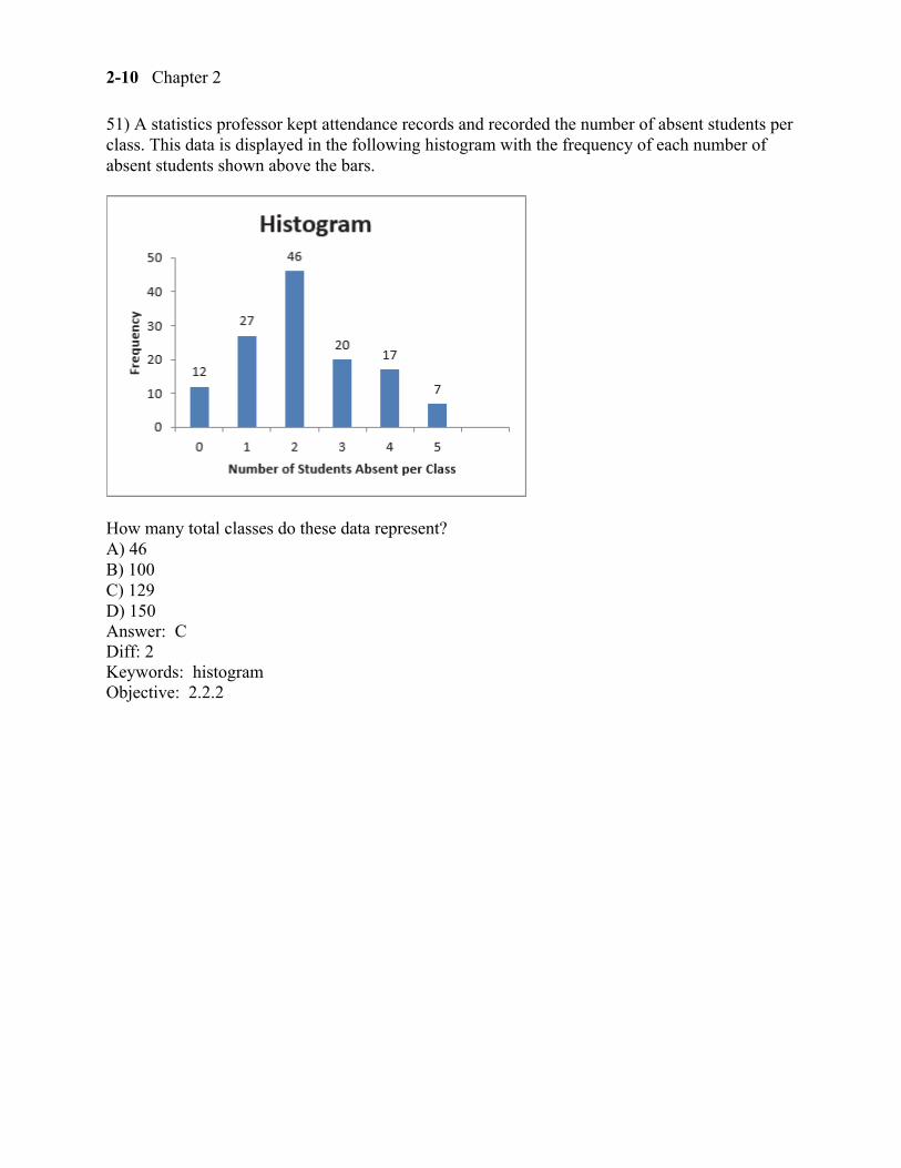
51) A statistics professor kept attendance records and recorded the number of absent students per class. This data is displayed in the following histogram with the frequency of each number of absent students shown above the bars.
How many total classes do these data represent? A) 46 B) 100 C) 129 D) 150 Answer: C Diff: 2 Keywords: histogram Objective: 2.2.2
Displaying Descriptive Statistics 2-11
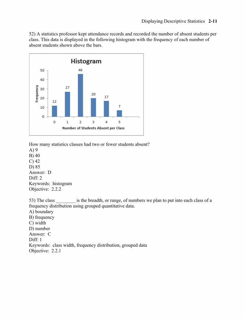
52) A statistics professor kept attendance records and recorded the number of absent students per class. This data is displayed in the following histogram with the frequency of each number of absent students shown above the bars.
How many statistics classes had two or fewer students absent? A) 9 B) 40 C) 42 D) 85 Answer: D Diff: 2 Keywords: histogram Objective: 2.2.2
53) The class ________ is the breadth, or range, of numbers we plan to put into each class of a frequency distribution using grouped quantitative data. A) boundary B) frequency C) width D) number Answer: C Diff: 1 Keywords: class width, frequency distribution, grouped data Objective: 2.2.1
2-12 Chapter 2
54) The class ________ represent the minimum and maximum values for each class of a frequency distribution using grouped quantitative data. A) boundaries B) frequencies C) widths D) numbers Answer: A Diff: 1 Keywords: class boundary, frequency distribution, grouped data Objective: 2.2.1
55) Class ________ are the number of observations for each class of a frequency distribution using grouped quantitative data. A) boundaries B) frequencies C) widths D) numbers Answer: B Diff: 1 Keywords: class frequency, frequency distribution, grouped data Objective: 2.2.1
56) Which of the following is not a rule for constructing a frequency distribution using grouped quantitative data? A) Use equal-size classes. B) Use mutually exclusive classes. C) Avoid empty classes. D) Avoid close-ended classes. Answer: D Diff: 1 Keywords: frequency distribution, grouped data Objective: 2.2.1
Displaying Descriptive Statistics 2-13
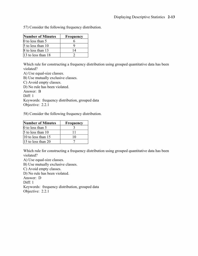
57) Consider the following frequency distribution.
Number of Minutes Frequency 0 to less than 5 6 5 to less than 10 9 8 to less than 13 14 13 to less than 18 2
Which rule for constructing a frequency distribution using grouped quantitative data has been violated? A) Use equal-size classes. B) Use mutually exclusive classes. C) Avoid empty classes. D) No rule has been violated. Answer: B Diff: 1 Keywords: frequency distribution, grouped data Objective: 2.2.1
58) Consider the following frequency distribution.
Number of Minutes Frequency 0 to less than 5 3 5 to less than 10 11 10 to less than 15 10 15 to less than 20 7
Which rule for constructing a frequency distribution using grouped quantitative data has been violated? A) Use equal-size classes. B) Use mutually exclusive classes. C) Avoid empty classes. D) No rule has been violated. Answer: D Diff: 1 Keywords: frequency distribution, grouped data Objective: 2.2.1
2-14 Chapter 2
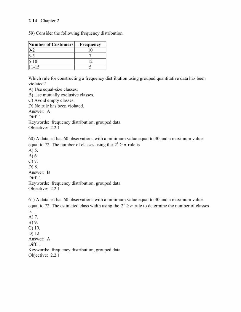
59) Consider the following frequency distribution.
Number of Customers Frequency 0-2 10 3-5 7 6-10 12 11-15 5
Which rule for constructing a frequency distribution using grouped quantitative data has been violated? A) Use equal-size classes. B) Use mutually exclusive classes. C) Avoid empty classes. D) No rule has been violated. Answer: A Diff: 1 Keywords: frequency distribution, grouped data Objective: 2.2.1
60) A data set has 60 observations with a minimum value equal to 30 and a maximum value equal to 72. The number of classes using the 2k n≥ rule is A) 5. B) 6. C) 7. D) 8. Answer: B Diff: 1 Keywords: frequency distribution, grouped data Objective: 2.2.1
61) A data set has 60 observations with a minimum value equal to 30 and a maximum value equal to 72. The estimated class width using the 2k n≥ rule to determine the number of classes is A) 7. B) 9. C) 10. D) 12. Answer: A Diff: 1 Keywords: frequency distribution, grouped data Objective: 2.2.1
Displaying Descriptive Statistics 2-15
62) ________ classes are classes with boundaries that do not overlap. A) Equal-size B) Open-ended C) Mutually exclusive D) Close-ended Answer: C Diff: 1 Keywords: frequency distribution, grouped data Objective: 2.2.1
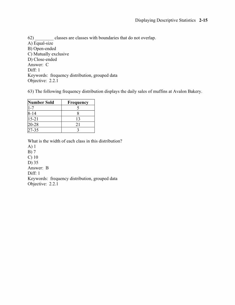
63) The following frequency distribution displays the daily sales of muffins at Avalon Bakery.
Number Sold Frequency 1-7 5 8-14 8 15-21 13 20-28 21 27-35 3
What is the width of each class in this distribution? A) 1 B) 7 C) 10 D) 35 Answer: B Diff: 1 Keywords: frequency distribution, grouped data Objective: 2.2.1
2-16 Chapter 2
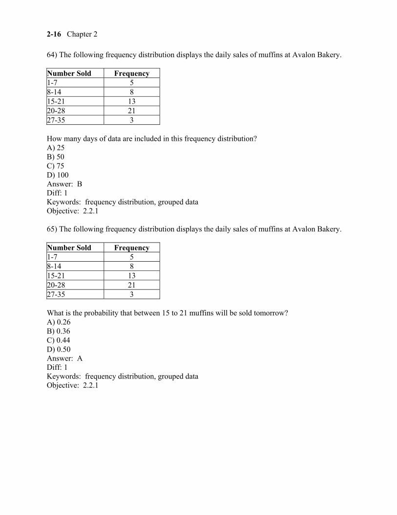
64) The following frequency distribution displays the daily sales of muffins at Avalon Bakery.
Number Sold Frequency 1-7 5 8-14 8 15-21 13 20-28 21 27-35 3
How many days of data are included in this frequency distribution? A) 25 B) 50 C) 75 D) 100 Answer: B Diff: 1 Keywords: frequency distribution, grouped data Objective: 2.2.1
65) The following frequency distribution displays the daily sales of muffins at Avalon Bakery.
Number Sold Frequency 1-7 5 8-14 8 15-21 13 20-28 21 27-35 3
What is the probability that between 15 to 21 muffins will be sold tomorrow? A) 0.26 B) 0.36 C) 0.44 D) 0.50 Answer: A Diff: 1 Keywords: frequency distribution, grouped data Objective: 2.2.1
Displaying Descriptive Statistics 2-17
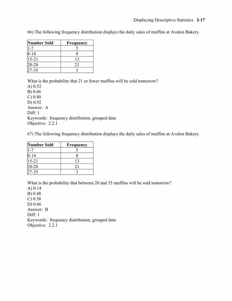
66) The following frequency distribution displays the daily sales of muffins at Avalon Bakery.
Number Sold Frequency 1-7 5 8-14 8 15-21 13 20-28 21 27-35 3
What is the probability that 21 or fewer muffins will be sold tomorrow? A) 0.52 B) 0.66 C) 0.80 D) 0.92 Answer: A Diff: 1 Keywords: frequency distribution, grouped data Objective: 2.2.1
67) The following frequency distribution displays the daily sales of muffins at Avalon Bakery.
Number Sold Frequency 1-7 5 8-14 8 15-21 13 20-28 21 27-35 3
What is the probability that between 20 and 35 muffins will be sold tomorrow? A) 0.14 B) 0.48 C) 0.58 D) 0.66 Answer: B Diff: 1 Keywords: frequency distribution, grouped data Objective: 2.2.1
2-18 Chapter 2
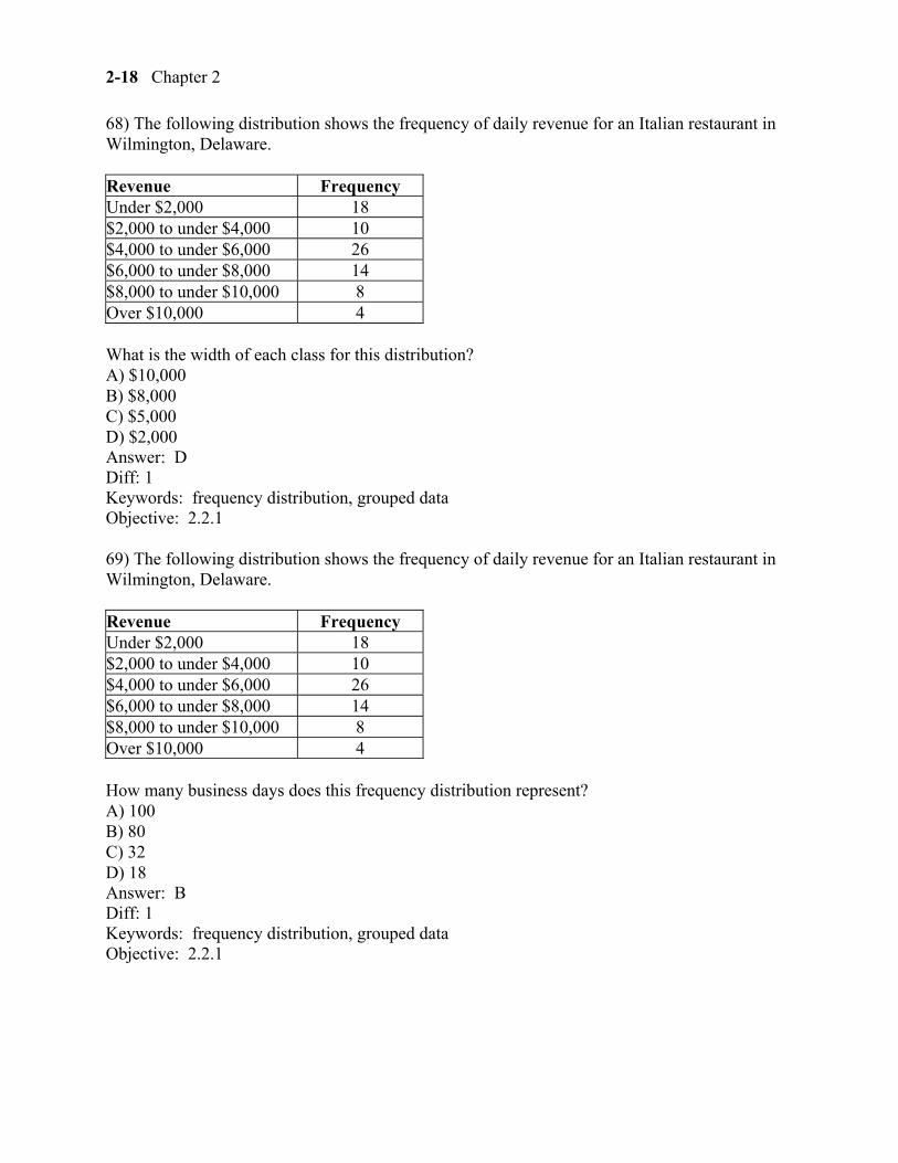
68) The following distribution shows the frequency of daily revenue for an Italian restaurant in Wilmington, Delaware.
Revenue Frequency Under $2,000 18 $2,000 to under $4,000 10 $4,000 to under $6,000 26 $6,000 to under $8,000 14 $8,000 to under $10,000 8 Over $10,000 4
What is the width of each class for this distribution? A) $10,000 B) $8,000 C) $5,000 D) $2,000 Answer: D Diff: 1 Keywords: frequency distribution, grouped data Objective: 2.2.1
69) The following distribution shows the frequency of daily revenue for an Italian restaurant in Wilmington, Delaware.
Revenue Frequency Under $2,000 18 $2,000 to under $4,000 10 $4,000 to under $6,000 26 $6,000 to under $8,000 14 $8,000 to under $10,000 8 Over $10,000 4
How many business days does this frequency distribution represent? A) 100 B) 80 C) 32 D) 18 Answer: B Diff: 1 Keywords: frequency distribution, grouped data Objective: 2.2.1
Displaying Descriptive Statistics 2-19
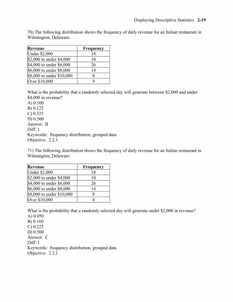
70) The following distribution shows the frequency of daily revenue for an Italian restaurant in Wilmington, Delaware.
Revenue Frequency Under $2,000 18 $2,000 to under $4,000 10 $4,000 to under $6,000 26 $6,000 to under $8,000 14 $8,000 to under $10,000 8 Over $10,000 4
What is the probability that a randomly selected day will generate between $2,000 and under $4,000 in revenue? A) 0.100 B) 0.125 C) 0.325 D) 0.500 Answer: B Diff: 1 Keywords: frequency distribution, grouped data Objective: 2.2.1
71) The following distribution shows the frequency of daily revenue for an Italian restaurant in Wilmington, Delaware.
Revenue Frequency Under $2,000 18 $2,000 to under $4,000 10 $4,000 to under $6,000 26 $6,000 to under $8,000 14 $8,000 to under $10,000 8 Over $10,000 4
What is the probability that a randomly selected day will generate under $2,000 in revenue? A) 0.050 B) 0.160 C) 0.225 D) 0.500 Answer: C Diff: 1 Keywords: frequency distribution, grouped data Objective: 2.2.1
2-20 Chapter 2
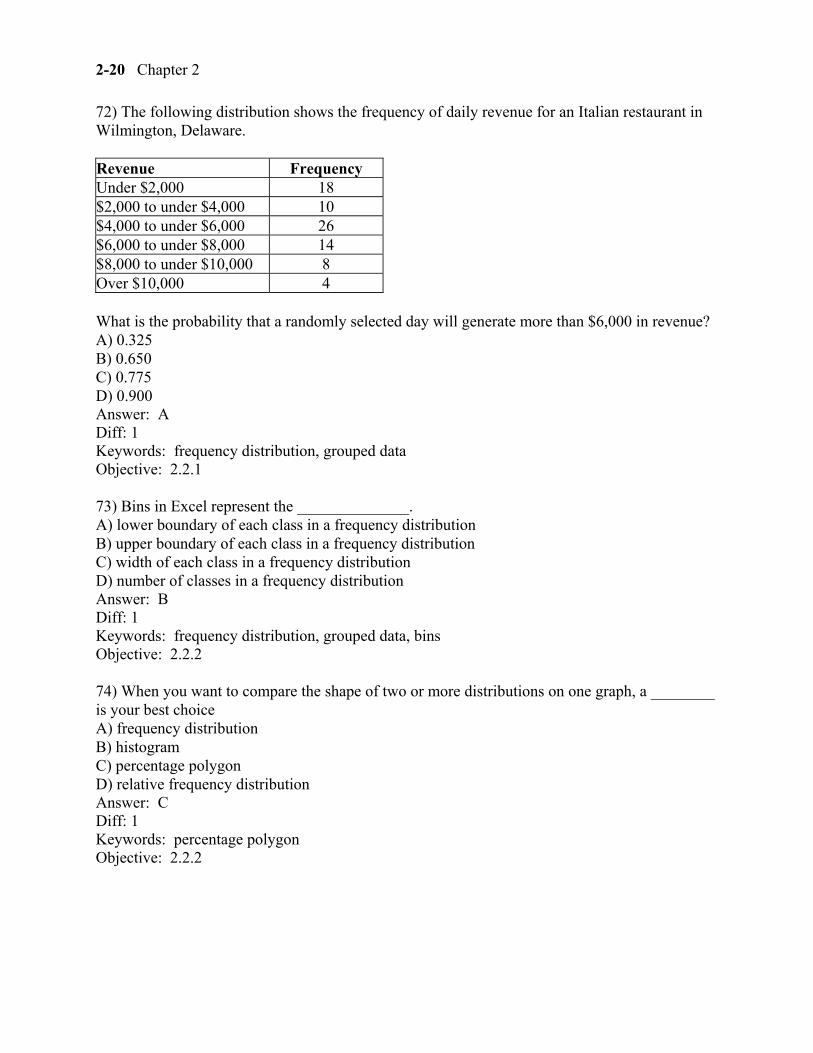
72) The following distribution shows the frequency of daily revenue for an Italian restaurant in Wilmington, Delaware.
Revenue Frequency Under $2,000 18 $2,000 to under $4,000 10 $4,000 to under $6,000 26 $6,000 to under $8,000 14 $8,000 to under $10,000 8 Over $10,000 4
What is the probability that a randomly selected day will generate more than $6,000 in revenue? A) 0.325 B) 0.650 C) 0.775 D) 0.900 Answer: A Diff: 1 Keywords: frequency distribution, grouped data Objective: 2.2.1
73) Bins in Excel represent the ______________. A) lower boundary of each class in a frequency distribution B) upper boundary of each class in a frequency distribution C) width of each class in a frequency distribution D) number of classes in a frequency distribution Answer: B Diff: 1 Keywords: frequency distribution, grouped data, bins Objective: 2.2.2
74) When you want to compare the shape of two or more distributions on one graph, a ________ is your best choice A) frequency distribution B) histogram C) percentage polygon D) relative frequency distribution Answer: C Diff: 1 Keywords: percentage polygon Objective: 2.2.2
Displaying Descriptive Statistics 2-21
75) The ________ graphs the midpoint of each class as a line rather than a column. A) bar chart B) histogram C) scatter plot D) percentage polygon Answer: D Diff: 1 Keywords: percentage polygon Objective: 2.2.2
76) The ________ is a line graph that plots the cumulative relative frequency distribution. A) ogive B) histogram C) scatter plot D) percentage polygon Answer: A Diff: 1 Keywords: ogive Objective: 2.2.2
2-22 Chapter 2
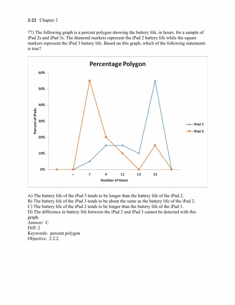
77) The following graph is a percent polygon showing the battery life, in hours, for a sample of iPad 2s and iPad 3s. The diamond markers represent the iPad 2 battery life while the square markers represent the iPad 3 battery life. Based on this graph, which of the following statements is true?
A) The battery life of the iPad 3 tends to be longer than the battery life of the iPad 2. B) The battery life of the iPad 3 tends to be about the same as the battery life of the iPad 2. C) The battery life of the iPad 2 tends to be longer than the battery life of the iPad 3. D) The difference in battery life between the iPad 2 and iPad 3 cannot be detected with this graph. Answer: C Diff: 2 Keywords: percent polygon Objective: 2.2.2
Displaying Descriptive Statistics 2-23
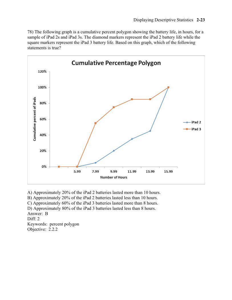
78) The following graph is a cumulative percent polygon showing the battery life, in hours, for a sample of iPad 2s and iPad 3s. The diamond markers represent the iPad 2 battery life while the square markers represent the iPad 3 battery life. Based on this graph, which of the following statements is true?
A) Approximately 20% of the iPad 2 batteries lasted more than 10 hours. B) Approximately 20% of the iPad 2 batteries lasted less than 10 hours. C) Approximately 60% of the iPad 3 batteries lasted more than 8 hours. D) Approximately 80% of the iPad 3 batteries lasted less than 8 hours. Answer: B Diff: 2 Keywords: percent polygon Objective: 2.2.2
2-24 Chapter 2
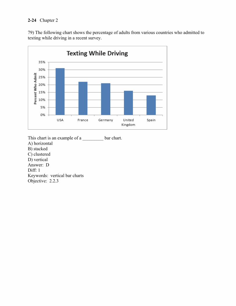
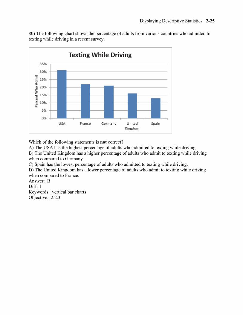
79) The following chart shows the percentage of adults from various countries who admitted to texting while driving in a recent survey.
This chart is an example of a _________ bar chart. A) horizontal B) stacked C) clustered D) vertical Answer: D Diff: 1 Keywords: vertical bar charts Objective: 2.2.3
Displaying Descriptive Statistics 2-25
80) The following chart shows the percentage of adults from various countries who admitted to texting while driving in a recent survey.
Which of the following statements is not correct? A) The USA has the highest percentage of adults who admitted to texting while driving. B) The United Kingdom has a higher percentage of adults who admit to texting while driving when compared to Germany. C) Spain has the lowest percentage of adults who admitted to texting while driving. D) The United Kingdom has a lower percentage of adults who admit to texting while driving when compared to France. Answer: B Diff: 1 Keywords: vertical bar charts Objective: 2.2.3
2-26 Chapter 2
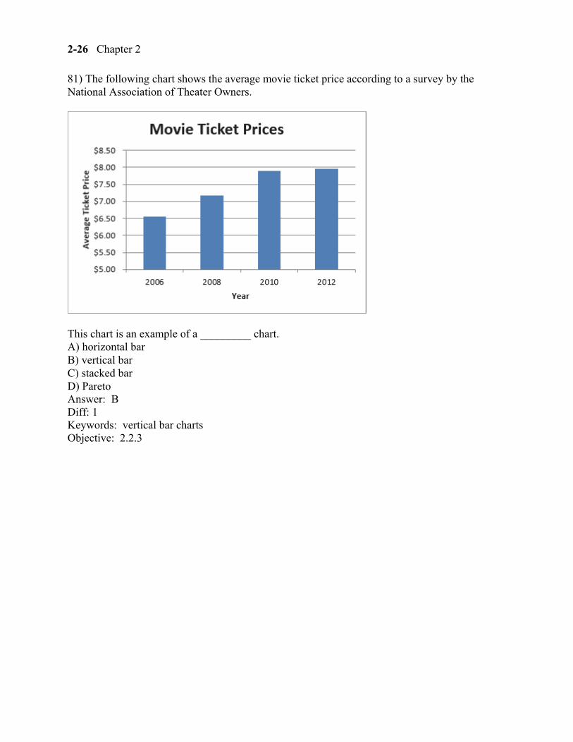
81) The following chart shows the average movie ticket price according to a survey by the National Association of Theater Owners.
This chart is an example of a _________ chart. A) horizontal bar B) vertical bar C) stacked bar D) Pareto Answer: B Diff: 1 Keywords: vertical bar charts Objective: 2.2.3
Displaying Descriptive Statistics 2-27
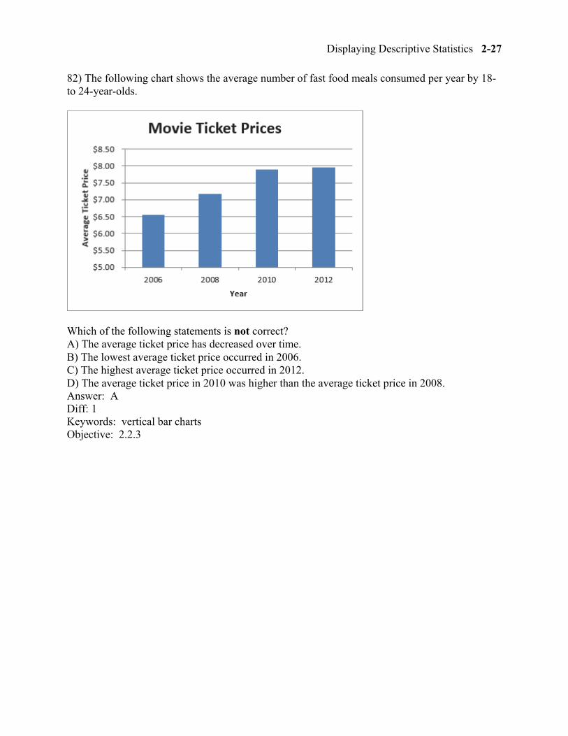
82) The following chart shows the average number of fast food meals consumed per year by 18- to 24-year-olds.
Which of the following statements is not correct? A) The average ticket price has decreased over time. B) The lowest average ticket price occurred in 2006. C) The highest average ticket price occurred in 2012. D) The average ticket price in 2010 was higher than the average ticket price in 2008. Answer: A Diff: 1 Keywords: vertical bar charts Objective: 2.2.3
2-28 Chapter 2
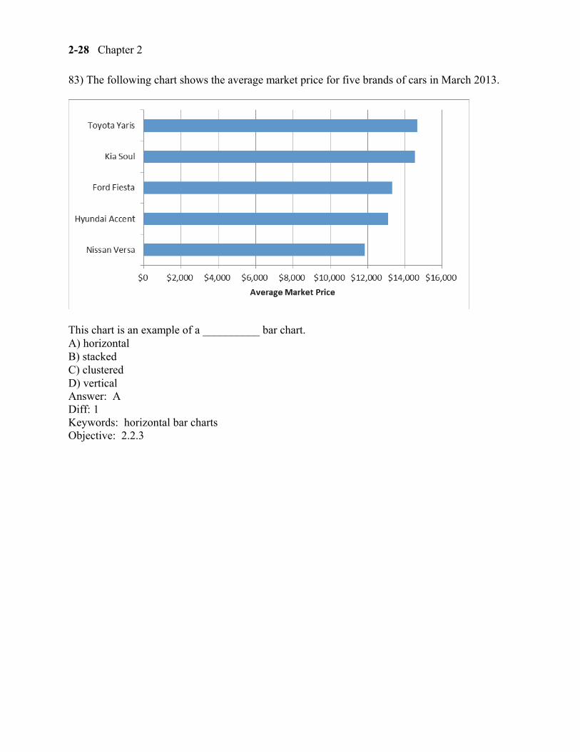
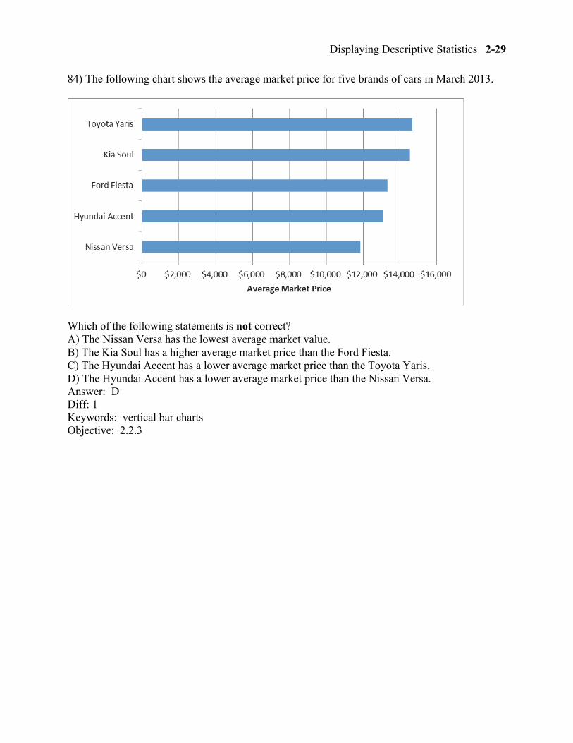
83) The following chart shows the average market price for five brands of cars in March 2013.
This chart is an example of a __________ bar chart. A) horizontal B) stacked C) clustered D) vertical Answer: A Diff: 1 Keywords: horizontal bar charts Objective: 2.2.3
Displaying Descriptive Statistics 2-29
84) The following chart shows the average market price for five brands of cars in March 2013.
Which of the following statements is not correct? A) The Nissan Versa has the lowest average market value. B) The Kia Soul has a higher average market price than the Ford Fiesta. C) The Hyundai Accent has a lower average market price than the Toyota Yaris. D) The Hyundai Accent has a lower average market price than the Nissan Versa. Answer: D Diff: 1 Keywords: vertical bar charts Objective: 2.2.3
2-30 Chapter 2
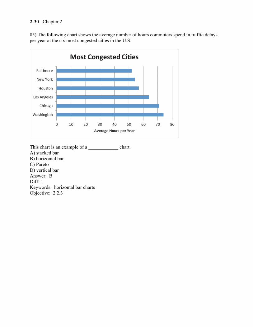
85) The following chart shows the average number of hours commuters spend in traffic delays per year at the six most congested cities in the U.S.
This chart is an example of a ____________ chart. A) stacked bar B) horizontal bar C) Pareto D) vertical bar Answer: B Diff: 1 Keywords: horizontal bar charts Objective: 2.2.3
Displaying Descriptive Statistics 2-31
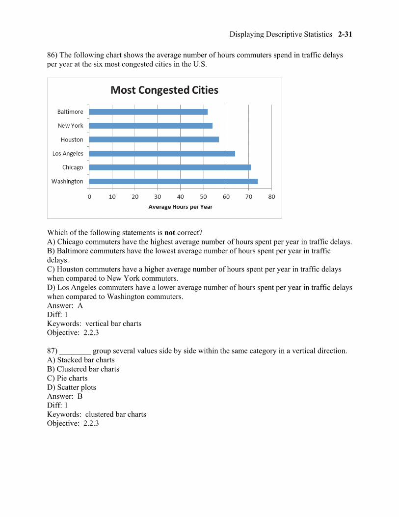
86) The following chart shows the average number of hours commuters spend in traffic delays per year at the six most congested cities in the U.S.
Which of the following statements is not correct? A) Chicago commuters have the highest average number of hours spent per year in traffic delays. B) Baltimore commuters have the lowest average number of hours spent per year in traffic delays. C) Houston commuters have a higher average number of hours spent per year in traffic delays when compared to New York commuters. D) Los Angeles commuters have a lower average number of hours spent per year in traffic delays when compared to Washington commuters. Answer: A Diff: 1 Keywords: vertical bar charts Objective: 2.2.3
87) ________ group several values side by side within the same category in a vertical direction. A) Stacked bar charts B) Clustered bar charts C) Pie charts D) Scatter plots Answer: B Diff: 1 Keywords: clustered bar charts Objective: 2.2.3
2-32 Chapter 2
88) ________ group several values in a single column within the same category in a vertical direction. A) Stacked bar charts B) Clustered bar charts C) Pie charts D) Scatter plots Answer: A Diff: 1 Keywords: stacked bar charts Objective: 2.2.3
89) ________ charts are a specific type of bar chart used in quality control programs by businesses to graphically display the causes of problems. A) Stacked bar B) Clustered bar C) Pie D) Pareto Answer: D Diff: 1 Keywords: Pareto charts Objective: 2.2.3
90) Pareto charts also plot the cumulative relative frequency as a line on the chart. This line is known as a(n) _________. A) scatter plot B) ogive C) histogram D) frequency distribution Answer: B Diff: 1 Keywords: Pareto charts, ogive Objective: 2.2.3
91) Use a ________ chart if you want to compare the relative sizes of the classes in a frequency distribution and together they comprise all possible categories. A) horizontal bar B) vertical bar C) Pareto D) pie Answer: D Diff: 1 Keywords: pie charts Objective: 2.2.3
Displaying Descriptive Statistics 2-33
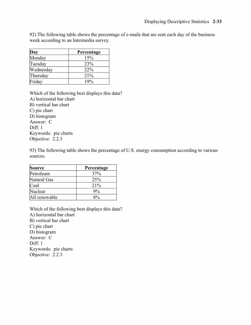
92) The following table shows the percentage of e-mails that are sent each day of the business week according to an Intermedia survey.
Day Percentage Monday 15% Tuesday 23% Wednesday 22% Thursday 21% Friday 19%
Which of the following best displays this data? A) horizontal bar chart B) vertical bar chart C) pie chart D) histogram Answer: C Diff: 1 Keywords: pie charts Objective: 2.2.3
93) The following table shows the percentage of U.S. energy consumption according to various sources.
Source Percentage Petroleum 37% Natural Gas 25% Coal 21% Nuclear 9% All renewable 8%
Which of the following best displays this data? A) horizontal bar chart B) vertical bar chart C) pie chart D) histogram Answer: C Diff: 1 Keywords: pie charts Objective: 2.2.3
2-34 Chapter 2
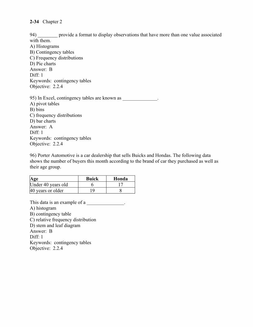
94) ________ provide a format to display observations that have more than one value associated with them. A) Histograms B) Contingency tables C) Frequency distributions D) Pie charts Answer: B Diff: 1 Keywords: contingency tables Objective: 2.2.4
95) In Excel, contingency tables are known as ______________. A) pivot tables B) bins C) frequency distributions D) bar charts Answer: A Diff: 1 Keywords: contingency tables Objective: 2.2.4
96) Porter Automotive is a car dealership that sells Buicks and Hondas. The following data shows the number of buyers this month according to the brand of car they purchased as well as their age group.
Age Buick Honda Under 40 years old 6 17 40 years or older 19 8
This data is an example of a _______________. A) histogram B) contingency table C) relative frequency distribution D) stem and leaf diagram Answer: B Diff: 1 Keywords: contingency tables Objective: 2.2.4
Displaying Descriptive Statistics 2-35
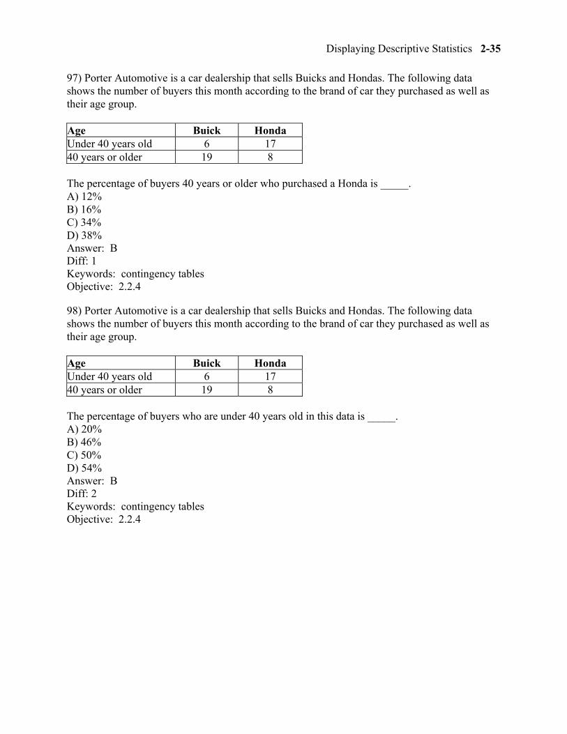
97) Porter Automotive is a car dealership that sells Buicks and Hondas. The following data shows the number of buyers this month according to the brand of car they purchased as well as their age group.
Age Buick Honda Under 40 years old 6 17 40 years or older 19 8
The percentage of buyers 40 years or older who purchased a Honda is _____. A) 12% B) 16% C) 34% D) 38% Answer: B Diff: 1 Keywords: contingency tables Objective: 2.2.4
98) Porter Automotive is a car dealership that sells Buicks and Hondas. The following data shows the number of buyers this month according to the brand of car they purchased as well as their age group.
Age Buick Honda Under 40 years old 6 17 40 years or older 19 8
The percentage of buyers who are under 40 years old in this data is _____. A) 20% B) 46% C) 50% D) 54% Answer: B Diff: 2 Keywords: contingency tables Objective: 2.2.4
2-36 Chapter 2
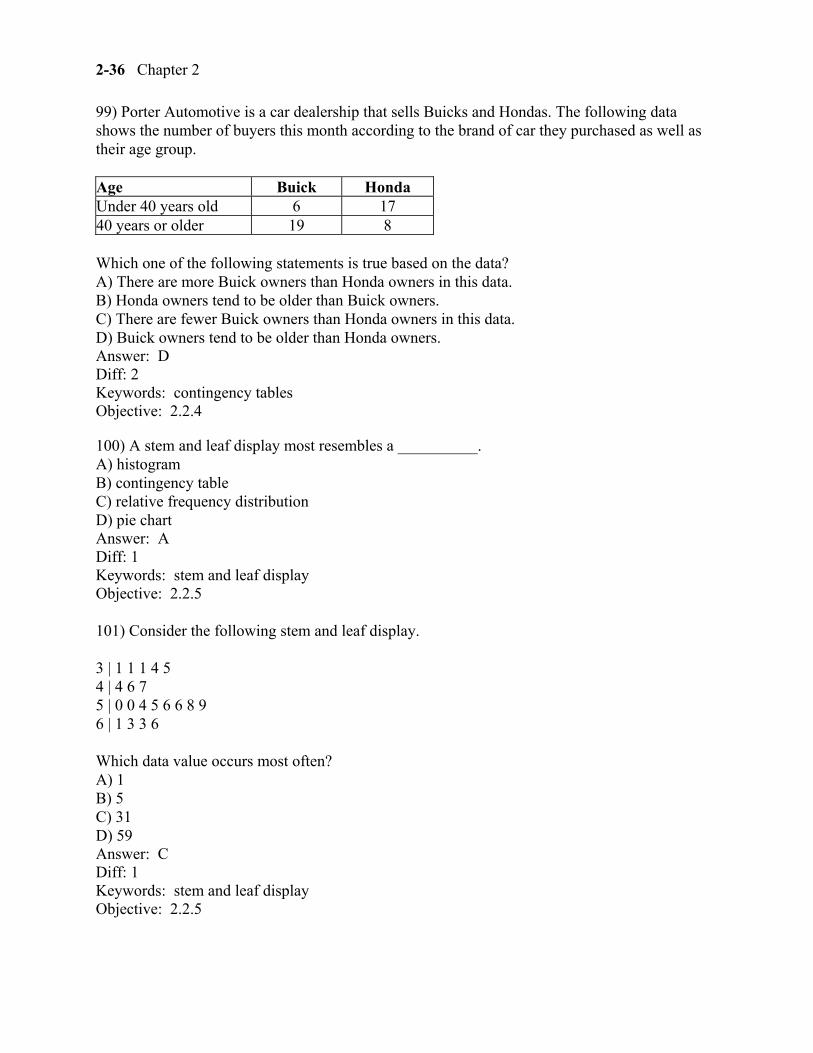
99) Porter Automotive is a car dealership that sells Buicks and Hondas. The following data shows the number of buyers this month according to the brand of car they purchased as well as their age group.
Age Buick Honda Under 40 years old 6 17 40 years or older 19 8
Which one of the following statements is true based on the data? A) There are more Buick owners than Honda owners in this data. B) Honda owners tend to be older than Buick owners. C) There are fewer Buick owners than Honda owners in this data. D) Buick owners tend to be older than Honda owners. Answer: D Diff: 2 Keywords: contingency tables Objective: 2.2.4
100) A stem and leaf display most resembles a __________. A) histogram B) contingency table C) relative frequency distribution D) pie chart Answer: A Diff: 1 Keywords: stem and leaf display Objective: 2.2.5
101) Consider the following stem and leaf display.
3 | 1 1 1 4 5 4 | 4 6 7 5 | 0 0 4 5 6 6 8 9 6 | 1 3 3 6
Which data value occurs most often? A) 1 B) 5 C) 31 D) 59 Answer: C Diff: 1 Keywords: stem and leaf display Objective: 2.2.5
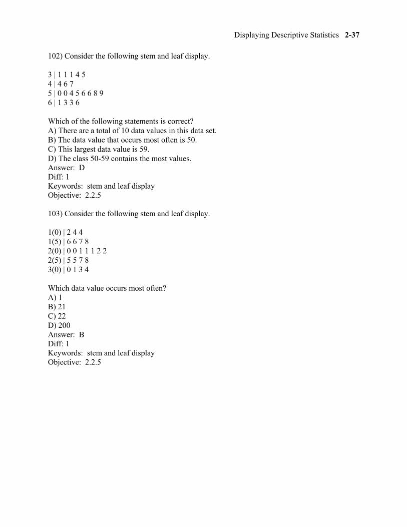
Displaying Descriptive Statistics 2-37
102) Consider the following stem and leaf display.
3 | 1 1 1 4 5 4 | 4 6 7 5 | 0 0 4 5 6 6 8 9 6 | 1 3 3 6
Which of the following statements is correct? A) There are a total of 10 data values in this data set. B) The data value that occurs most often is 50. C) This largest data value is 59. D) The class 50-59 contains the most values. Answer: D Diff: 1 Keywords: stem and leaf display Objective: 2.2.5
103) Consider the following stem and leaf display.
1(0) | 2 4 4 1(5) | 6 6 7 8 2(0) | 0 0 1 1 1 2 2 2(5) | 5 5 7 8 3(0) | 0 1 3 4
Which data value occurs most often? A) 1 B) 21 C) 22 D) 200 Answer: B Diff: 1 Keywords: stem and leaf display Objective: 2.2.5
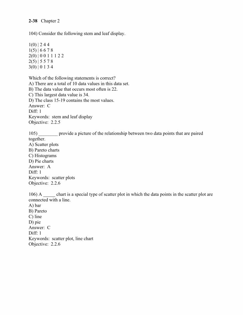
2-38 Chapter 2
104) Consider the following stem and leaf display.
1(0) | 2 4 4 1(5) | 6 6 7 8 2(0) | 0 0 1 1 1 2 2 2(5) | 5 5 7 8 3(0) | 0 1 3 4
Which of the following statements is correct? A) There are a total of 10 data values in this data set. B) The data value that occurs most often is 22. C) This largest data value is 34. D) The class 15-19 contains the most values. Answer: C Diff: 1 Keywords: stem and leaf display Objective: 2.2.5
105) ________ provide a picture of the relationship between two data points that are paired together. A) Scatter plots B) Pareto charts C) Histograms D) Pie charts Answer: A Diff: 1 Keywords: scatter plots Objective: 2.2.6
106) A _____ chart is a special type of scatter plot in which the data points in the scatter plot are connected with a line. A) bar B) Pareto C) line D) pie Answer: C Diff: 1 Keywords: scatter plot, line chart Objective: 2.2.6
Displaying Descriptive Statistics 2-39
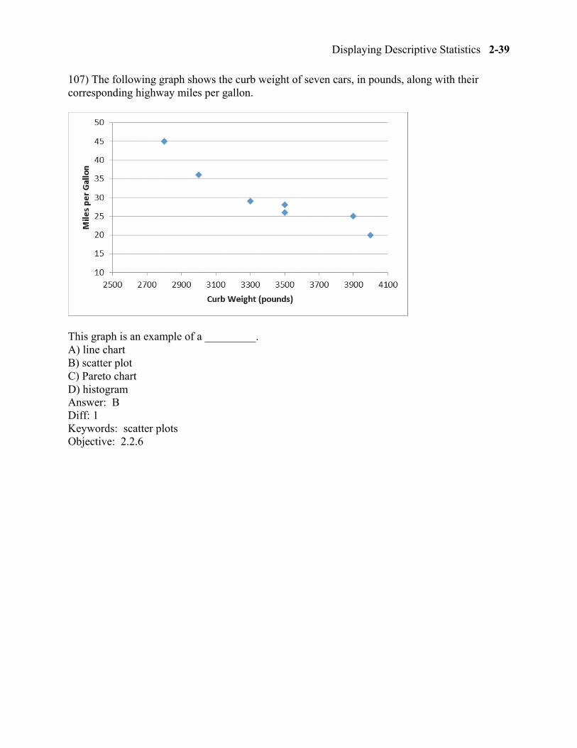
107) The following graph shows the curb weight of seven cars, in pounds, along with their corresponding highway miles per gallon.
This graph is an example of a _________. A) line chart B) scatter plot C) Pareto chart D) histogram Answer: B Diff: 1 Keywords: scatter plots Objective: 2.2.6
2-40 Chapter 2
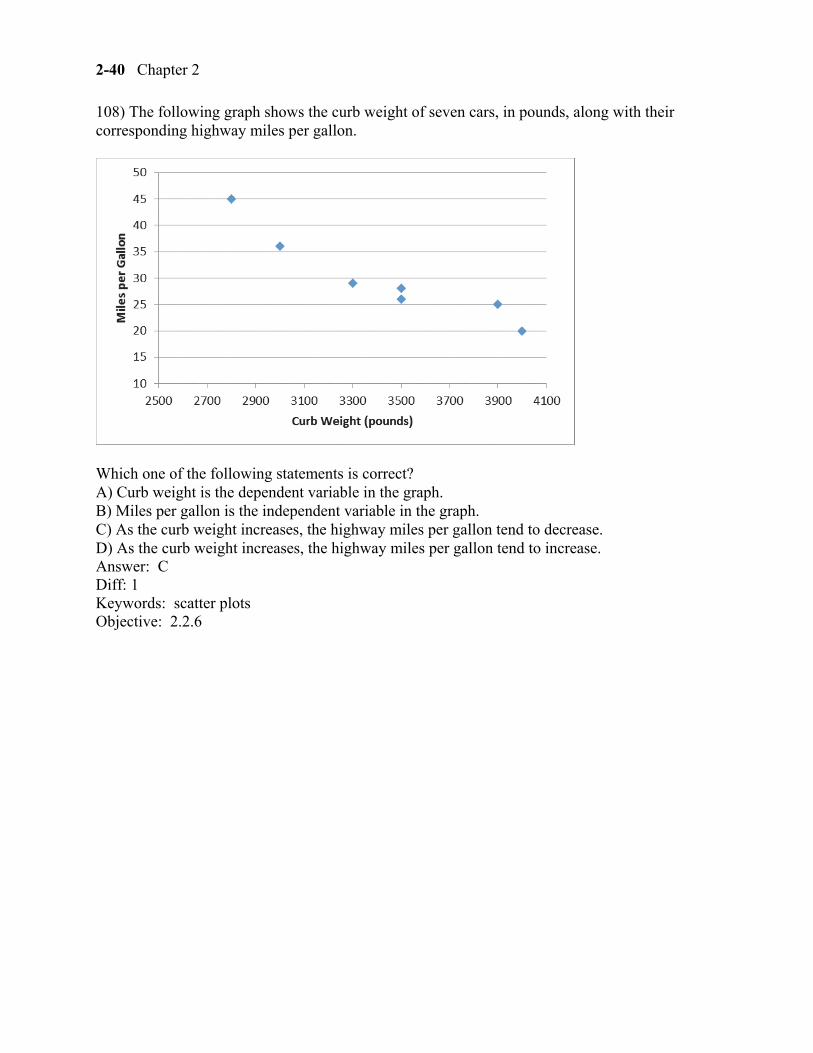
108) The following graph shows the curb weight of seven cars, in pounds, along with their corresponding highway miles per gallon.
Which one of the following statements is correct? A) Curb weight is the dependent variable in the graph. B) Miles per gallon is the independent variable in the graph. C) As the curb weight increases, the highway miles per gallon tend to decrease. D) As the curb weight increases, the highway miles per gallon tend to increase. Answer: C Diff: 1 Keywords: scatter plots Objective: 2.2.6
Displaying Descriptive Statistics 2-41
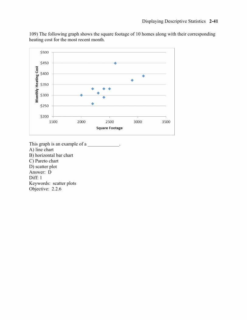
109) The following graph shows the square footage of 10 homes along with their corresponding heating cost for the most recent month.
This graph is an example of a _____________. A) line chart B) horizontal bar chart C) Pareto chart D) scatter plot Answer: D Diff: 1 Keywords: scatter plots Objective: 2.2.6
2-42 Chapter 2
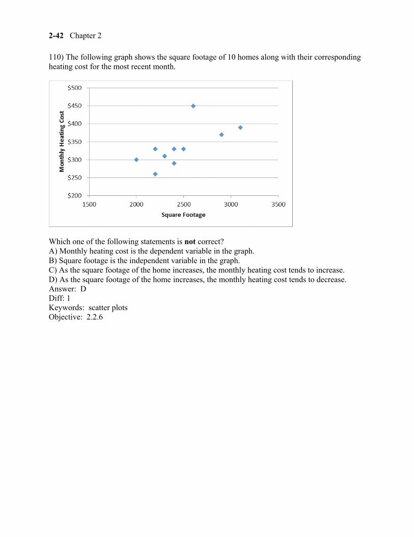
110) The following graph shows the square footage of 10 homes along with their corresponding heating cost for the most recent month.
Which one of the following statements is not correct? A) Monthly heating cost is the dependent variable in the graph. B) Square footage is the independent variable in the graph. C) As the square footage of the home increases, the monthly heating cost tends to increase. D) As the square footage of the home increases, the monthly heating cost tends to decrease. Answer: D Diff: 1 Keywords: scatter plots Objective: 2.2.6
Displaying Descriptive Statistics 2-43
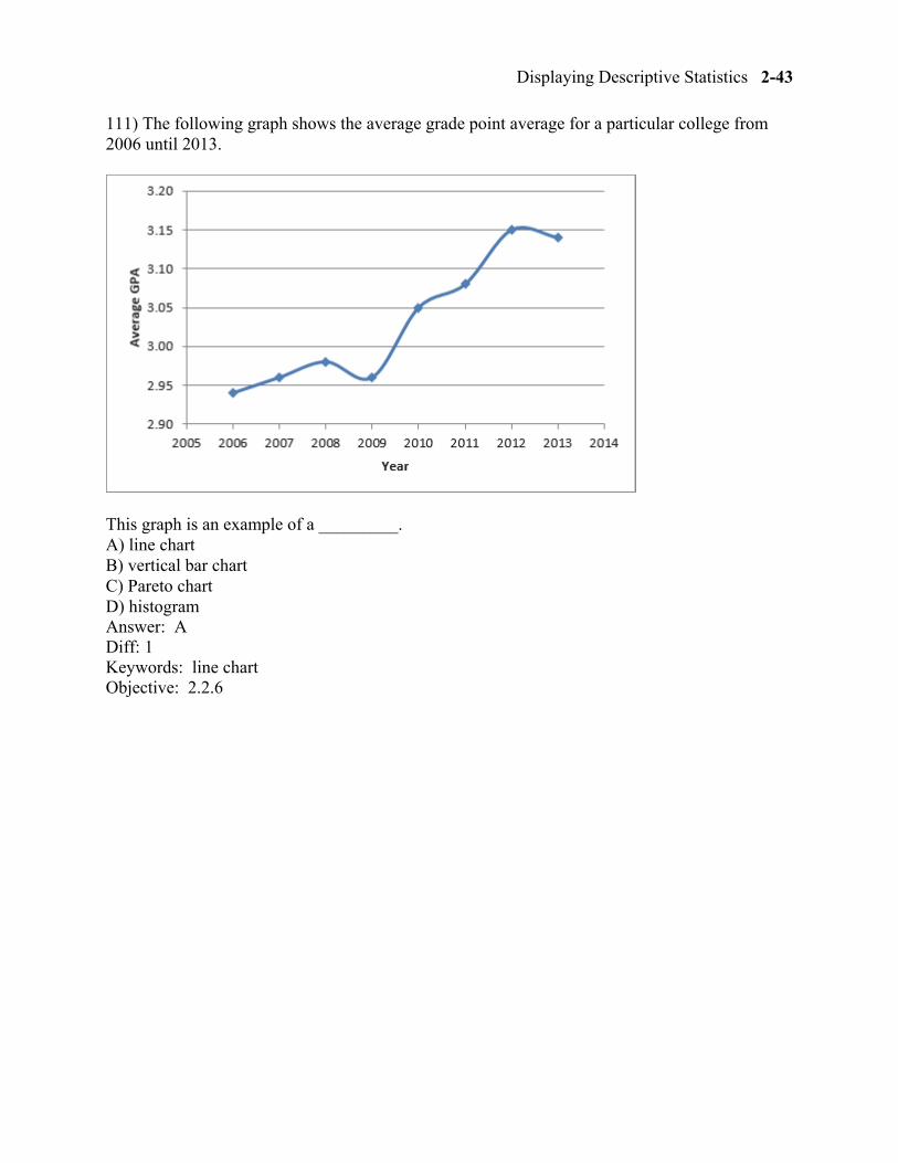
111) The following graph shows the average grade point average for a particular college from 2006 until 2013.
This graph is an example of a _________. A) line chart B) vertical bar chart C) Pareto chart D) histogram Answer: A Diff: 1 Keywords: line chart Objective: 2.2.6
2-44 Chapter 2
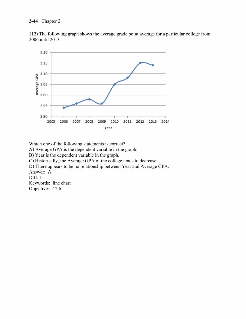
112) The following graph shows the average grade point average for a particular college from 2006 until 2013.
Which one of the following statements is correct? A) Average GPA is the dependent variable in the graph. B) Year is the dependent variable in the graph. C) Historically, the Average GPA of the college tends to decrease. D) There appears to be no relationship between Year and Average GPA. Answer: A Diff: 1 Keywords: line chart Objective: 2.2.6
Displaying Descriptive Statistics 2-45
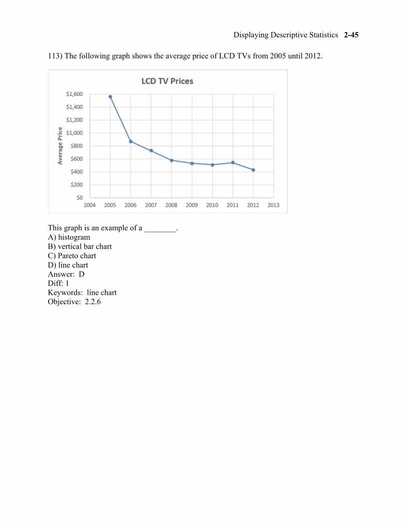
113) The following graph shows the average price of LCD TVs from 2005 until 2012.
This graph is an example of a ________. A) histogram B) vertical bar chart C) Pareto chart D) line chart Answer: D Diff: 1 Keywords: line chart Objective: 2.2.6
2-46 Chapter 2
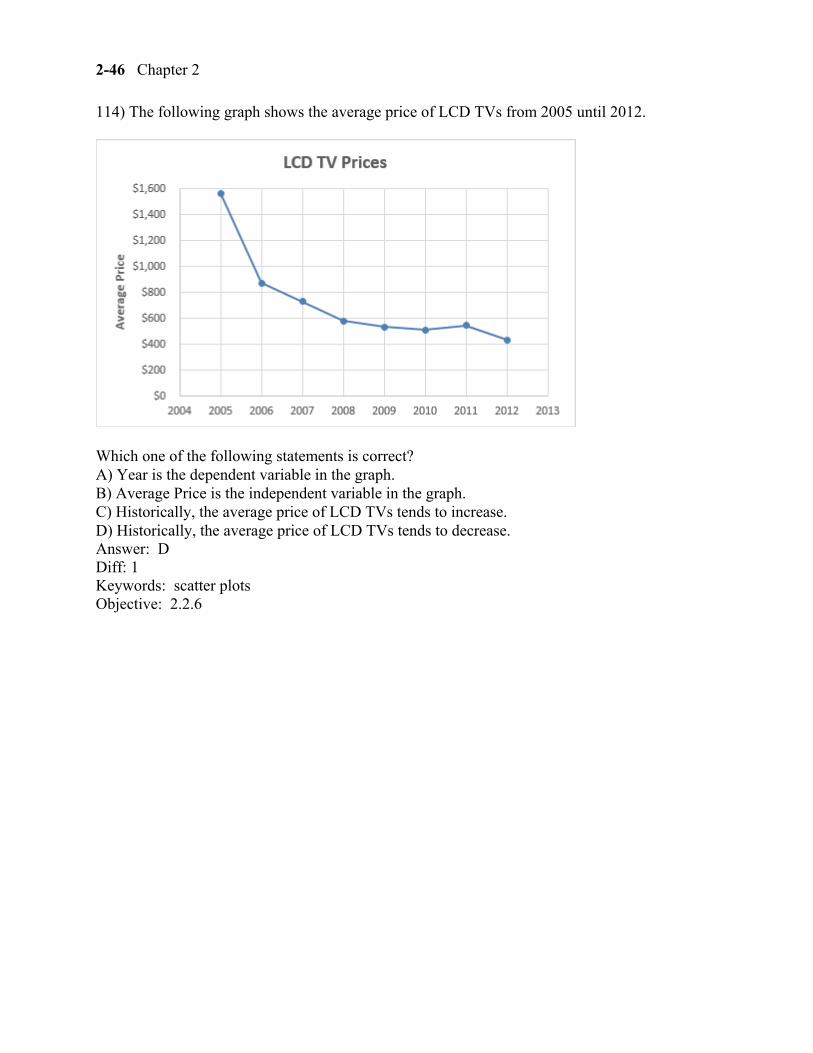
114) The following graph shows the average price of LCD TVs from 2005 until 2012.
Which one of the following statements is correct? A) Year is the dependent variable in the graph. B) Average Price is the independent variable in the graph. C) Historically, the average price of LCD TVs tends to increase. D) Historically, the average price of LCD TVs tends to decrease. Answer: D Diff: 1 Keywords: scatter plots Objective: 2.2.6
Displaying Descriptive Statistics 2-47
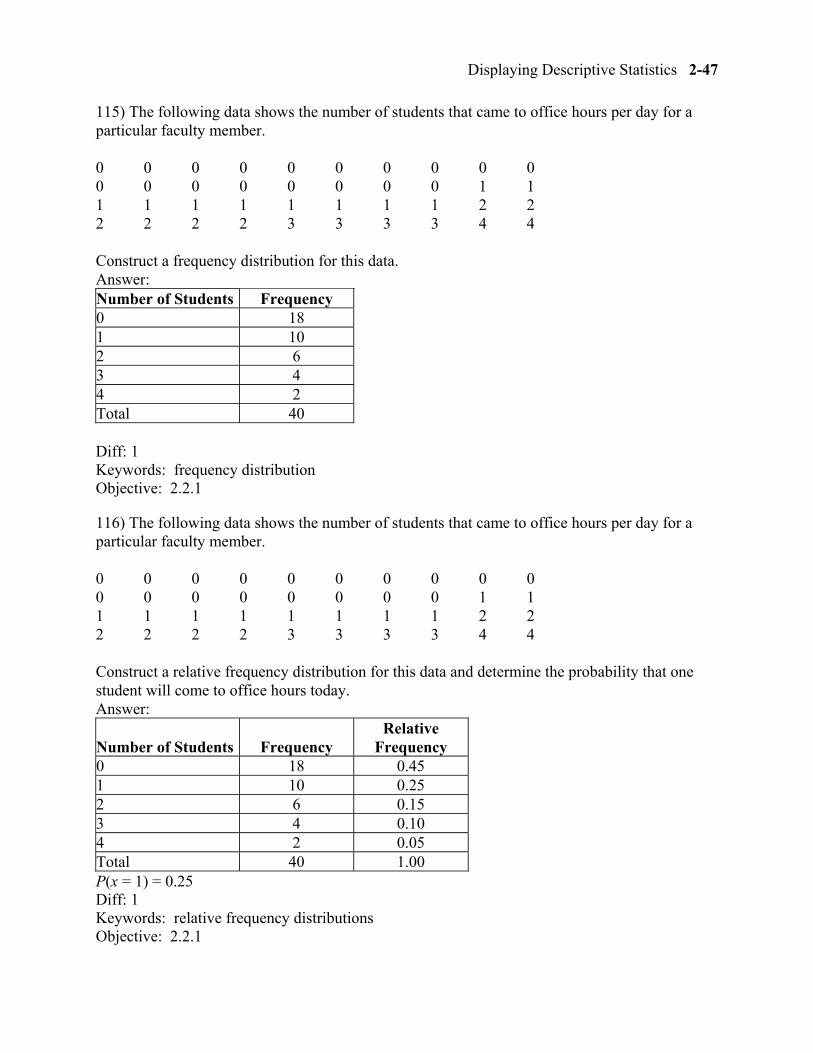
115) The following data shows the number of students that came to office hours per day for a particular faculty member.
0 0 0 0 0 0 0 0 0 0 0 0 0 0 0 0 0 0 1 1 1 1 1 1 1 1 1 1 2 2 2 2 2 2 3 3 3 3 4 4
Construct a frequency distribution for this data. Answer: Number of Students Frequency 0 18 1 10 2 6 3 4 4 2 Total 40 Diff: 1 Keywords: frequency distribution Objective: 2.2.1
116) The following data shows the number of students that came to office hours per day for a particular faculty member.
0 0 0 0 0 0 0 0 0 0 0 0 0 0 0 0 0 0 1 1 1 1 1 1 1 1 1 1 2 2 2 2 2 2 3 3 3 3 4 4
Construct a relative frequency distribution for this data and determine the probability that one student will come to office hours today. Answer:
Number of Students Frequency Relative
Frequency 0 18 0.45 1 10 0.25 2 6 0.15 3 4 0.10 4 2 0.05 Total 40 1.00 P(x = 1) = 0.25 Diff: 1 Keywords: relative frequency distributions Objective: 2.2.1
2-48 Chapter 2
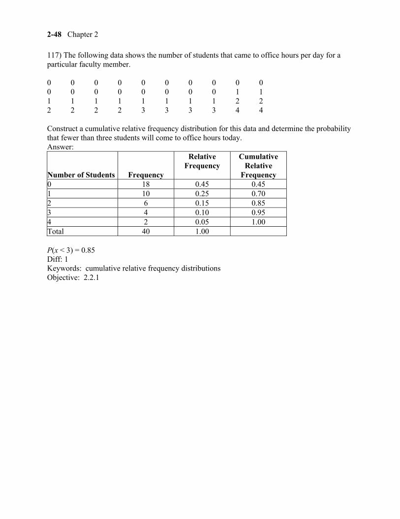
117) The following data shows the number of students that came to office hours per day for a particular faculty member.
0 0 0 0 0 0 0 0 0 0 0 0 0 0 0 0 0 0 1 1 1 1 1 1 1 1 1 1 2 2 2 2 2 2 3 3 3 3 4 4
Construct a cumulative relative frequency distribution for this data and determine the probability that fewer than three students will come to office hours today. Answer:
Number of Students Frequency
Relative Frequency
Cumulative Relative
Frequency 0 18 0.45 0.45 1 10 0.25 0.70 2 6 0.15 0.85 3 4 0.10 0.95 4 2 0.05 1.00 Total 40 1.00
P(x < 3) = 0.85 Diff: 1 Keywords: cumulative relative frequency distributions Objective: 2.2.1
Displaying Descriptive Statistics 2-49
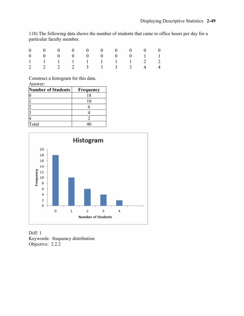
118) The following data shows the number of students that came to office hours per day for a particular faculty member.
0 0 0 0 0 0 0 0 0 0 0 0 0 0 0 0 0 0 1 1 1 1 1 1 1 1 1 1 2 2 2 2 2 2 3 3 3 3 4 4
Construct a histogram for this data. Answer: Number of Students Frequency 0 18 1 10 2 6 3 4 4 2 Total 40
Diff: 1 Keywords: frequency distribution Objective: 2.2.2
2-50 Chapter 2
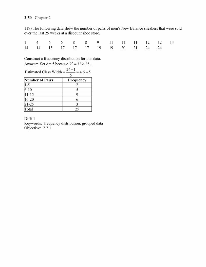
119) The following data show the number of pairs of men's New Balance sneakers that were sold over the last 25 weeks at a discount shoe store.
1 4 6 6 8 8 9 11 11 11 12 12 14 14 14 15 17 17 17 19 19 20 21 24 24
Construct a frequency distribution for this data. Answer: Set k = 5 because 52 32 25= ≥ .
24 1Estimated Class Width 4.6 5
5
−= = ≈
Number of Pairs Frequency 1-5 2 6-10 5 11-15 9 16-20 6 21-25 3 Total 25
Diff: 1 Keywords: frequency distribution, grouped data Objective: 2.2.1
Displaying Descriptive Statistics 2-51
120) The following data show the number of pairs of men's New Balance sneakers that were sold over the last 25 weeks at a discount shoe store.
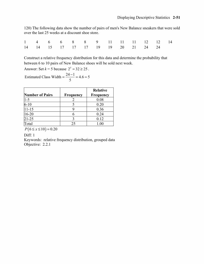
1 4 6 6 8 8 9 11 11 11 12 12 14 14 14 15 17 17 17 19 19 20 21 24 24
Construct a relative frequency distribution for this data and determine the probability that between 6 to 10 pairs of New Balance shoes will be sold next week.
Answer: Set k = 5 because 52 32 25= ≥ . 24 1
Estimated Class Width 4.6 55
−= = ≈
Number of Pairs Frequency Relative
Frequency 1-5 2 0.08 6-10 5 0.20 11-15 9 0.36 16-20 6 0.24 21-25 3 0.12 Total 25 1.00
( )6 10 0.20P x≤ ≤ =
Diff: 1 Keywords: relative frequency distribution, grouped data Objective: 2.2.1
2-52 Chapter 2
121) The following data show the number of pairs of men's New Balance sneakers that were sold over the last 25 weeks at a discount shoe store.
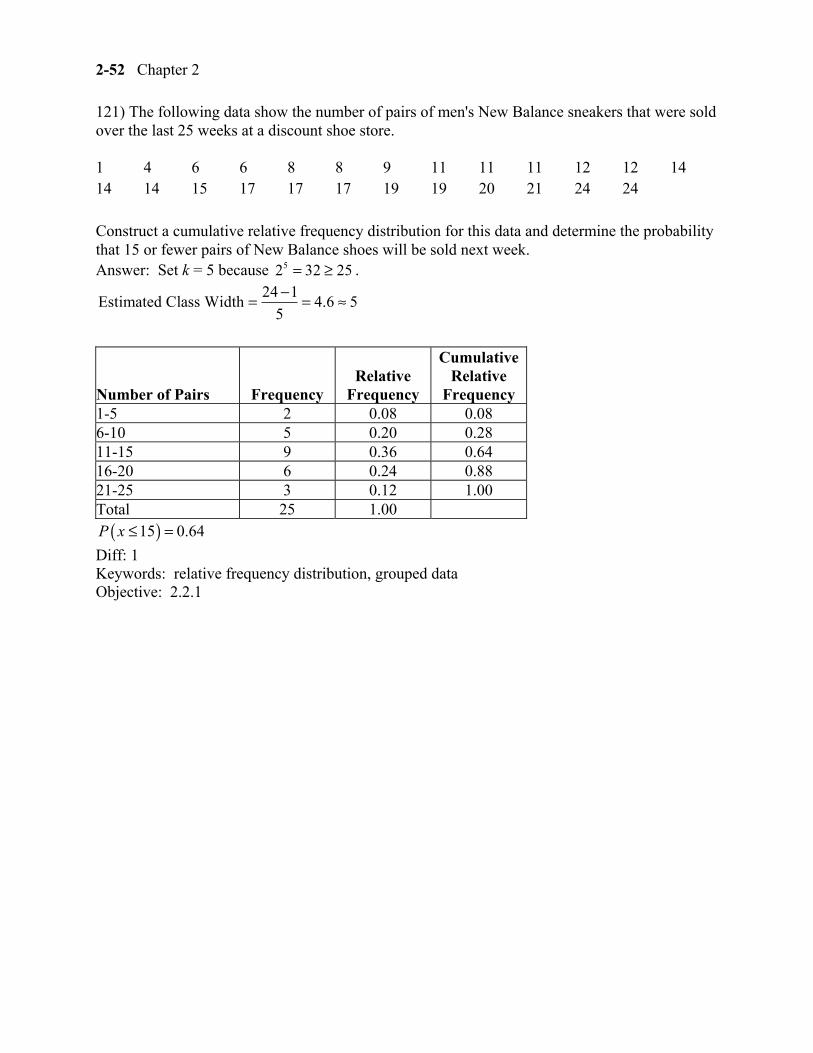
1 4 6 6 8 8 9 11 11 11 12 12 14 14 14 15 17 17 17 19 19 20 21 24 24
Construct a cumulative relative frequency distribution for this data and determine the probability that 15 or fewer pairs of New Balance shoes will be sold next week. Answer: Set k = 5 because 52 32 25= ≥ .
24 1Estimated Class Width 4.6 5
5
−= = ≈
Number of Pairs Frequency Relative
Frequency
CumulativeRelative
Frequency 1-5 2 0.08 0.08 6-10 5 0.20 0.28 11-15 9 0.36 0.64 16-20 6 0.24 0.88 21-25 3 0.12 1.00 Total 25 1.00
( )15 0.64P x ≤ =
Diff: 1 Keywords: relative frequency distribution, grouped data Objective: 2.2.1
Displaying Descriptive Statistics 2-53
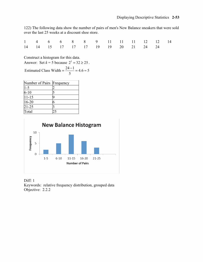
122) The following data show the number of pairs of men's New Balance sneakers that were sold over the last 25 weeks at a discount shoe store.
1 4 6 6 8 8 9 11 11 11 12 12 14 14 14 15 17 17 17 19 19 20 21 24 24
Construct a histogram for this data. Answer: Set k = 5 because 52 32 25= ≥ .
24 1Estimated Class Width 4.6 5
5
−= = ≈
Number of Pairs Frequency 1-5 2 6-10 5 11-15 9 16-20 6 21-25 3 Total 25
Diff: 1 Keywords: relative frequency distribution, grouped data Objective: 2.2.2
2-54 Chapter 2
123) The following data show the monthly rental for a random sample of one-bedroom apartments in York, Pennsylvania.
$600 $615 $660 $660 $675 $680 $690 $700 $720 $725 $755 $760 $775 $775 $780 $780 $780 $785 $810 $840
Construct a frequency distribution for this data. Answer: Set k = 5 because 52 32 20= ≥ .
$840 $600Estimated Class Width $48 $50
5
−= = ≈
Monthly Rent Frequency $600 to under $650 2 $650 to under $700 5 $700 to under $750 3 $750 to under $800 8 $800 to under $850 2 Total 20
Diff: 1 Keywords: frequency distribution, grouped data Objective: 2.2.1
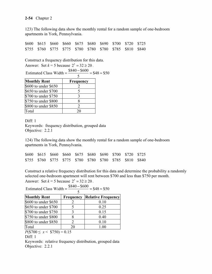
124) The following data show the monthly rental for a random sample of one-bedroom apartments in York, Pennsylvania.
$600 $615 $660 $660 $675 $680 $690 $700 $720 $725 $755 $760 $775 $775 $780 $780 $780 $785 $810 $840
Construct a relative frequency distribution for this data and determine the probability a randomly selected one-bedroom apartment will rent between $700 and less than $750 per month. Answer: Set k = 5 because 52 32 20= ≥ .
$840 $600Estimated Class Width $48 $50
5
−= = ≈
Monthly Rent Frequency Relative Frequency$600 to under $650 2 0.10 $650 to under $700 5 0.25 $700 to under $750 3 0.15 $750 to under $800 8 0.40 $800 to under $850 2 0.10 Total 20 1.00 P($700 ≤ x < $750) = 0.15 Diff: 1 Keywords: relative frequency distribution, grouped data Objective: 2.2.1
Displaying Descriptive Statistics 2-55
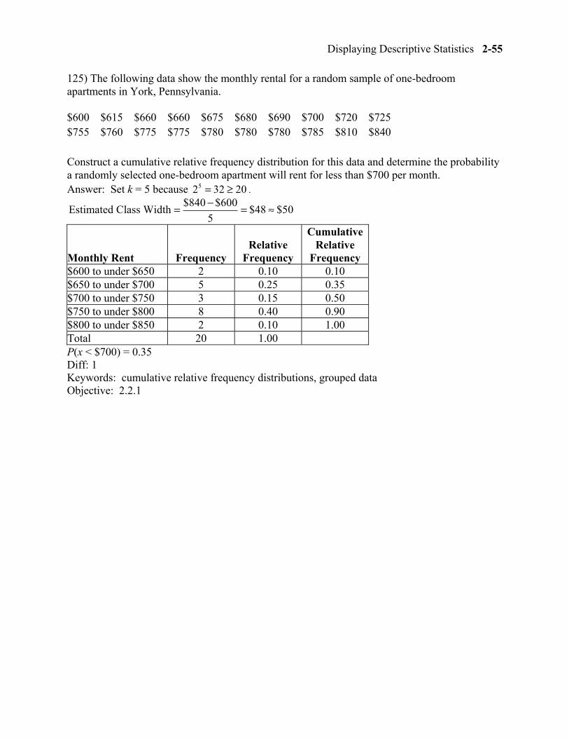
125) The following data show the monthly rental for a random sample of one-bedroom apartments in York, Pennsylvania.
$600 $615 $660 $660 $675 $680 $690 $700 $720 $725 $755 $760 $775 $775 $780 $780 $780 $785 $810 $840 Construct a cumulative relative frequency distribution for this data and determine the probability a randomly selected one-bedroom apartment will rent for less than $700 per month. Answer: Set k = 5 because 52 32 20= ≥ .
$840 $600Estimated Class Width $48 $50
5
−= = ≈
Monthly Rent Frequency Relative
Frequency
Cumulative Relative
Frequency $600 to under $650 2 0.10 0.10 $650 to under $700 5 0.25 0.35 $700 to under $750 3 0.15 0.50 $750 to under $800 8 0.40 0.90 $800 to under $850 2 0.10 1.00 Total 20 1.00 P(x < $700) = 0.35 Diff: 1 Keywords: cumulative relative frequency distributions, grouped data Objective: 2.2.1
2-56 Chapter 2
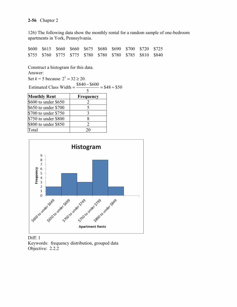
126) The following data show the monthly rental for a random sample of one-bedroom apartments in York, Pennsylvania.
$600 $615 $660 $660 $675 $680 $690 $700 $720 $725 $755 $760 $775 $775 $780 $780 $780 $785 $810 $840
Construct a histogram for this data. Answer: Set k = 5 because 52 32 20= ≥ .
$840 $600Estimated Class Width $48 $50
5
−= = ≈
Monthly Rent Frequency $600 to under $650 2 $650 to under $700 5 $700 to under $750 3 $750 to under $800 8 $800 to under $850 2 Total 20
Diff: 1 Keywords: frequency distribution, grouped data Objective: 2.2.2
Displaying Descriptive Statistics 2-57
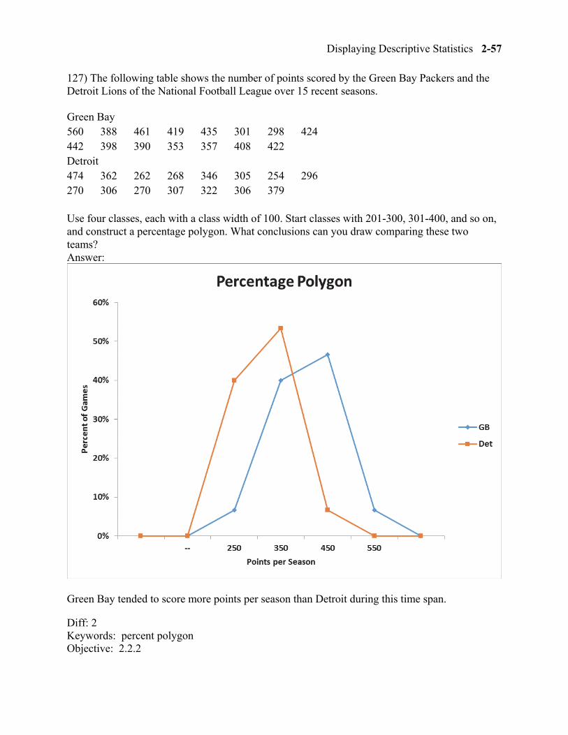
127) The following table shows the number of points scored by the Green Bay Packers and the Detroit Lions of the National Football League over 15 recent seasons.
Green Bay 560 388 461 419 435 301 298 424 442 398 390 353 357 408 422 Detroit 474 362 262 268 346 305 254 296 270 306 270 307 322 306 379
Use four classes, each with a class width of 100. Start classes with 201-300, 301-400, and so on, and construct a percentage polygon. What conclusions can you draw comparing these two teams? Answer:
Green Bay tended to score more points per season than Detroit during this time span.
Diff: 2 Keywords: percent polygon Objective: 2.2.2
2-58 Chapter 2
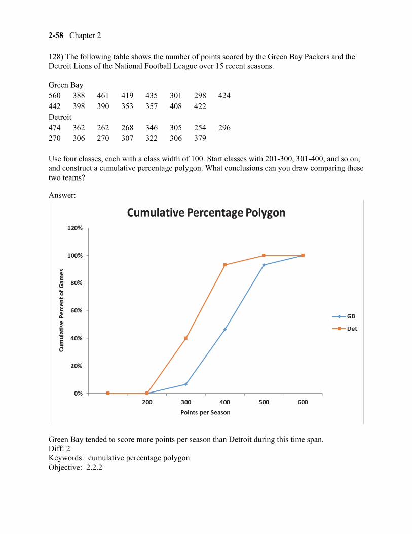
128) The following table shows the number of points scored by the Green Bay Packers and the Detroit Lions of the National Football League over 15 recent seasons.
Green Bay 560 388 461 419 435 301 298 424 442 398 390 353 357 408 422 Detroit 474 362 262 268 346 305 254 296 270 306 270 307 322 306 379
Use four classes, each with a class width of 100. Start classes with 201-300, 301-400, and so on, and construct a cumulative percentage polygon. What conclusions can you draw comparing these two teams?
Answer:
Green Bay tended to score more points per season than Detroit during this time span. Diff: 2 Keywords: cumulative percentage polygon Objective: 2.2.2
Displaying Descriptive Statistics 2-59
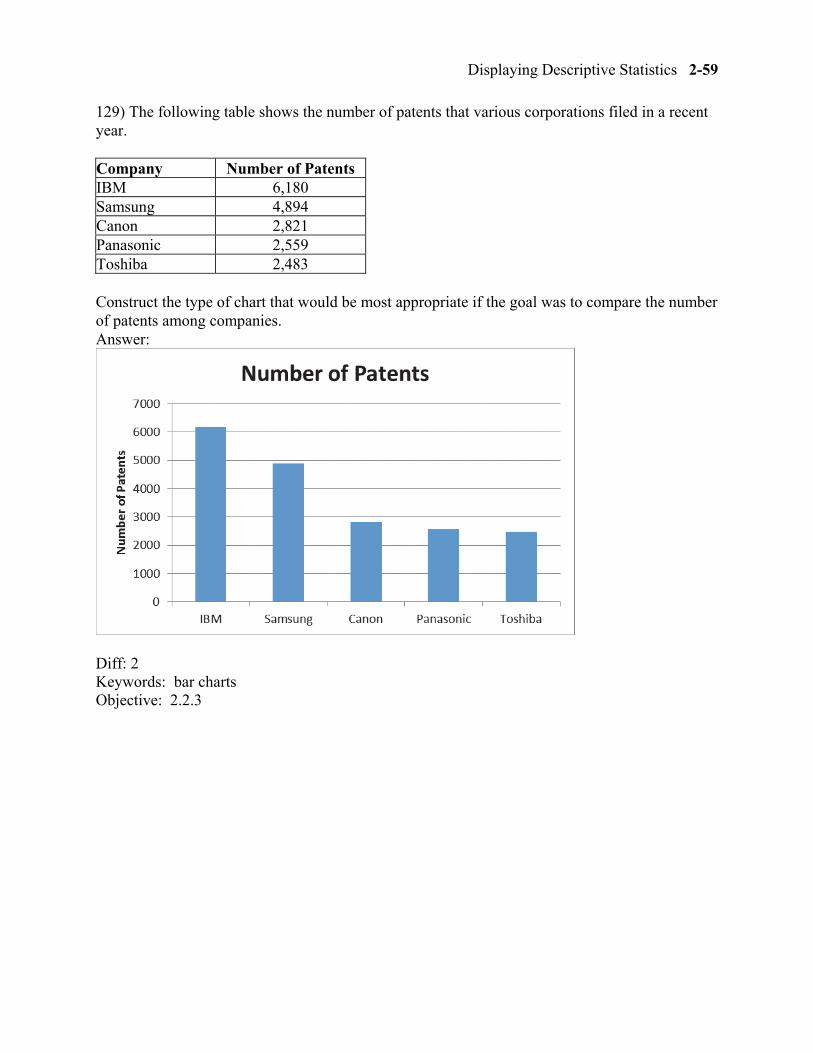
129) The following table shows the number of patents that various corporations filed in a recent year.
Company Number of Patents IBM 6,180 Samsung 4,894 Canon 2,821 Panasonic 2,559 Toshiba 2,483
Construct the type of chart that would be most appropriate if the goal was to compare the number of patents among companies. Answer:
Diff: 2 Keywords: bar charts Objective: 2.2.3
2-60 Chapter 2
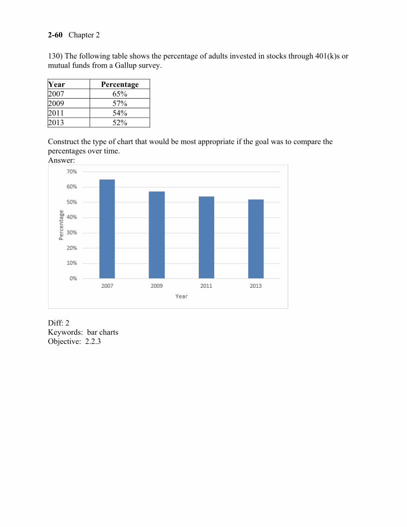
130) The following table shows the percentage of adults invested in stocks through 401(k)s or mutual funds from a Gallup survey.
Year Percentage 2007 65% 2009 57% 2011 54% 2013 52%
Construct the type of chart that would be most appropriate if the goal was to compare the percentages over time. Answer:
Diff: 2 Keywords: bar charts Objective: 2.2.3
Displaying Descriptive Statistics 2-61
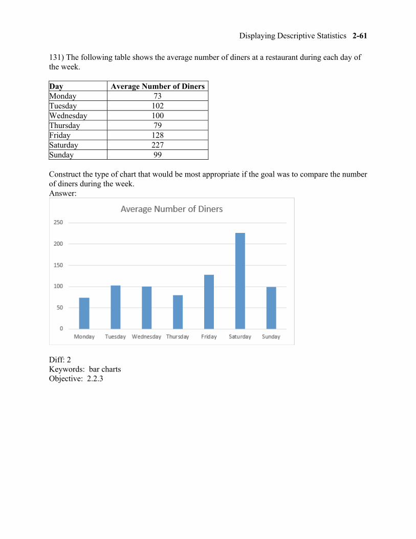
131) The following table shows the average number of diners at a restaurant during each day of the week.
Day Average Number of DinersMonday 73 Tuesday 102 Wednesday 100 Thursday 79 Friday 128 Saturday 227 Sunday 99
Construct the type of chart that would be most appropriate if the goal was to compare the number of diners during the week. Answer:
Diff: 2 Keywords: bar charts Objective: 2.2.3
2-62 Chapter 2
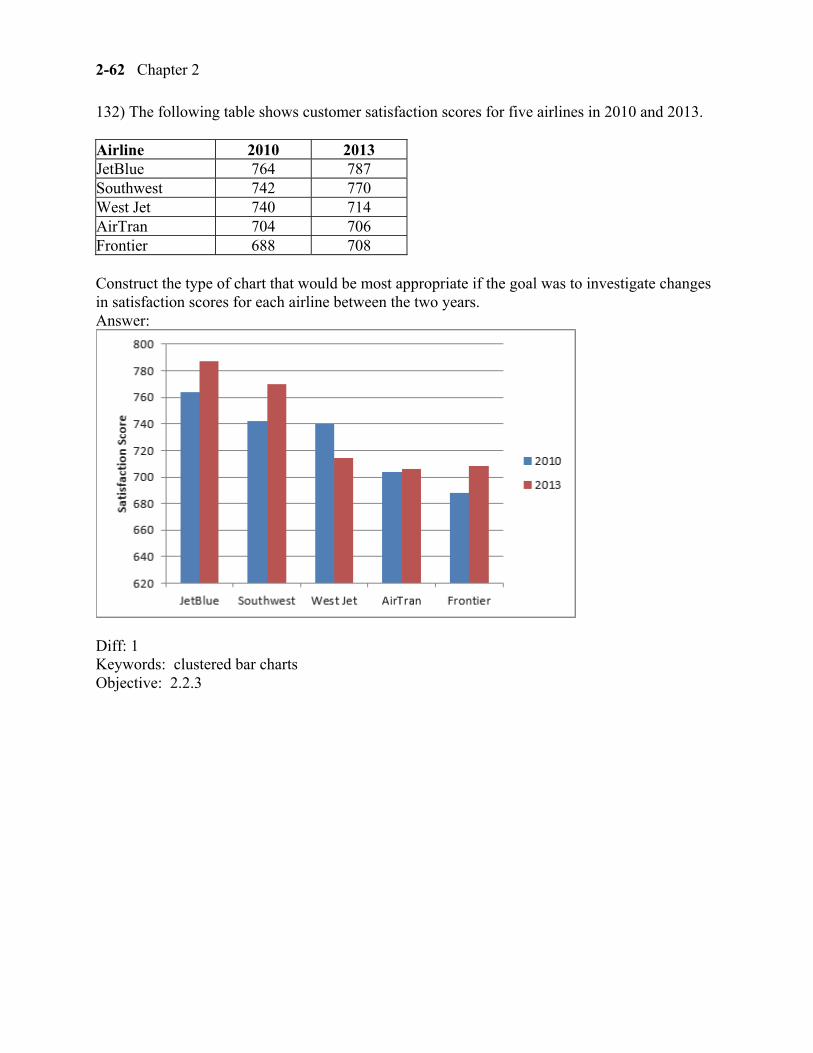
132) The following table shows customer satisfaction scores for five airlines in 2010 and 2013.
Airline 2010 2013 JetBlue 764 787 Southwest 742 770 West Jet 740 714 AirTran 704 706 Frontier 688 708
Construct the type of chart that would be most appropriate if the goal was to investigate changes in satisfaction scores for each airline between the two years. Answer:
Diff: 1 Keywords: clustered bar charts Objective: 2.2.3
Displaying Descriptive Statistics 2-63
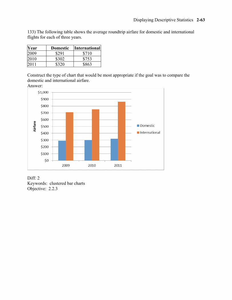
133) The following table shows the average roundtrip airfare for domestic and international flights for each of three years.
Year Domestic International2009 $291 $710 2010 $302 $753 2011 $320 $863
Construct the type of chart that would be most appropriate if the goal was to compare the domestic and international airfare. Answer:
Diff: 2 Keywords: clustered bar charts Objective: 2.2.3
2-64 Chapter 2
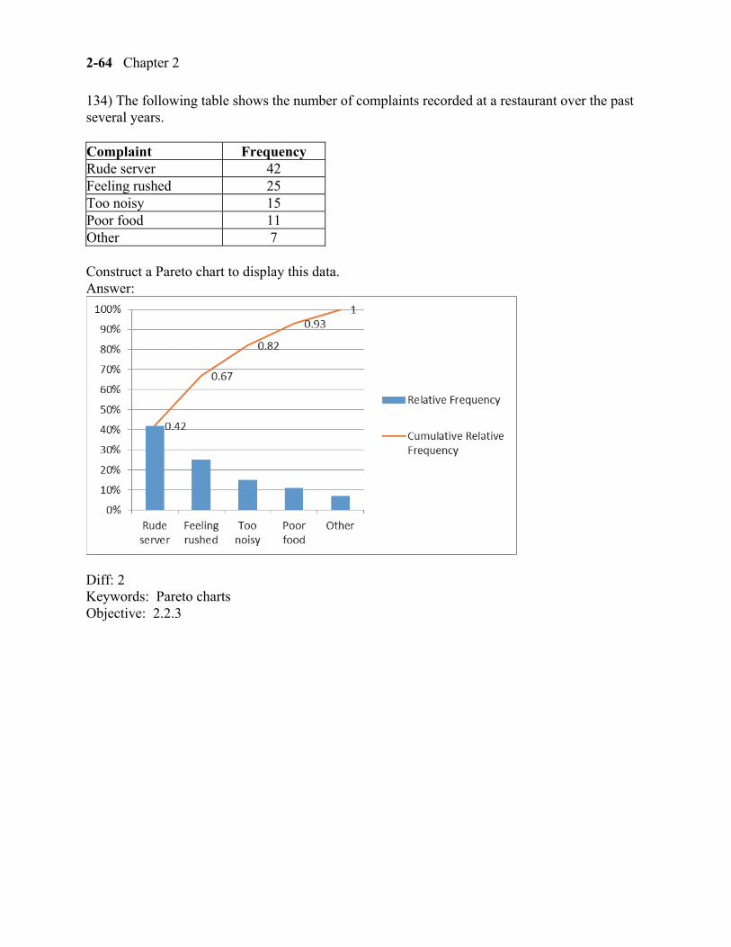
134) The following table shows the number of complaints recorded at a restaurant over the past several years.
Complaint Frequency Rude server 42 Feeling rushed 25 Too noisy 15 Poor food 11 Other 7
Construct a Pareto chart to display this data. Answer:
Diff: 2 Keywords: Pareto charts Objective: 2.2.3
Displaying Descriptive Statistics 2-65
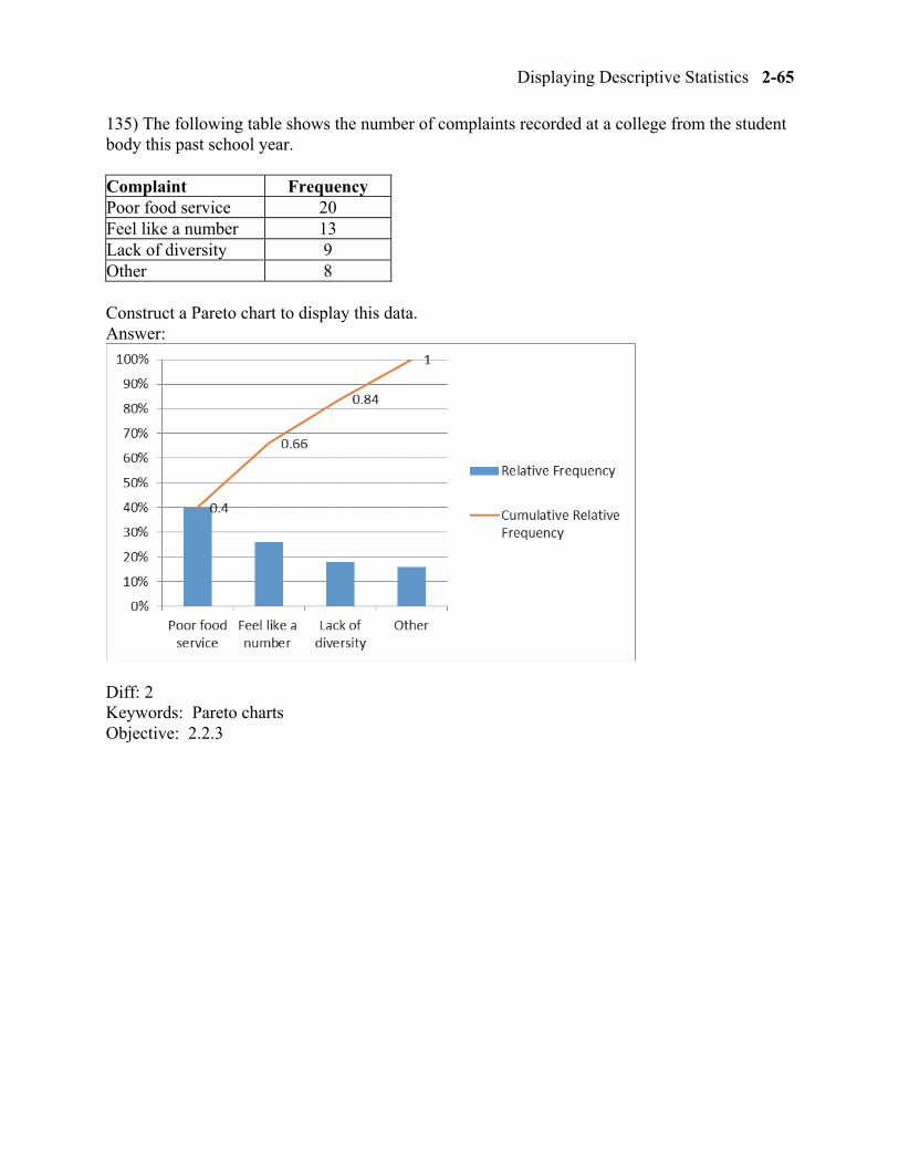
135) The following table shows the number of complaints recorded at a college from the student body this past school year.
Complaint Frequency Poor food service 20 Feel like a number 13 Lack of diversity 9 Other 8
Construct a Pareto chart to display this data. Answer:
Diff: 2 Keywords: Pareto charts Objective: 2.2.3
2-66 Chapter 2
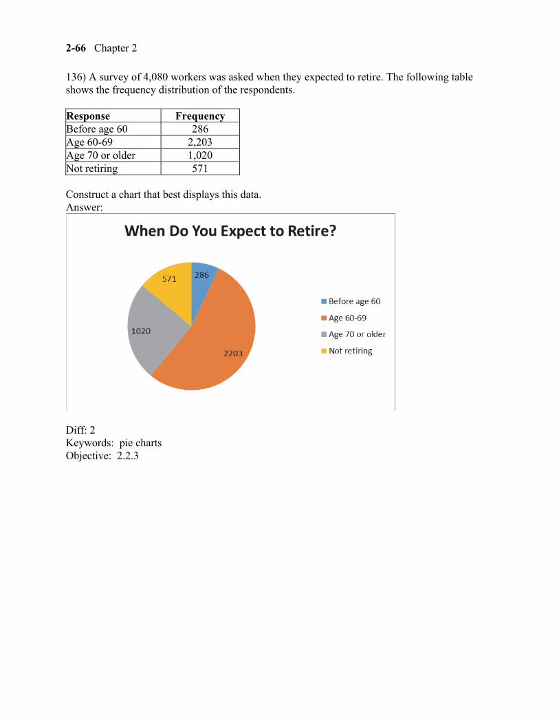
136) A survey of 4,080 workers was asked when they expected to retire. The following table shows the frequency distribution of the respondents.
Response Frequency Before age 60 286 Age 60-69 2,203 Age 70 or older 1,020 Not retiring 571
Construct a chart that best displays this data. Answer:
Diff: 2 Keywords: pie charts Objective: 2.2.3
Displaying Descriptive Statistics 2-67
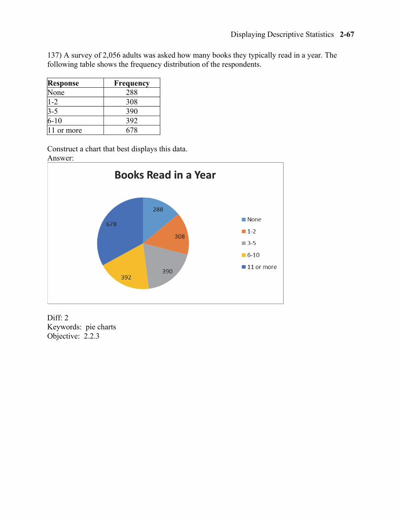
137) A survey of 2,056 adults was asked how many books they typically read in a year. The following table shows the frequency distribution of the respondents.
Response Frequency None 288 1-2 308 3-5 390 6-10 392 11 or more 678
Construct a chart that best displays this data. Answer:
Diff: 2 Keywords: pie charts Objective: 2.2.3
2-68 Chapter 2
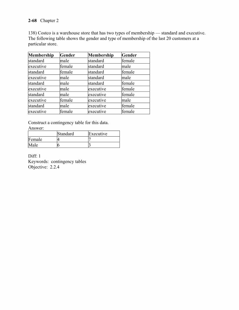
138) Costco is a warehouse store that has two types of membership — standard and executive. The following table shows the gender and type of membership of the last 20 customers at a particular store.
Membership Gender Membership Gender standard male standard female executive female standard male standard female standard female executive male standard male standard male standard female executive male executive female standard male executive female executive female executive male standard male executive female executive female executive female
Construct a contingency table for this data. Answer:
Standard Executive Female 4 7 Male 6 3
Diff: 1 Keywords: contingency tables Objective: 2.2.4
Displaying Descriptive Statistics 2-69
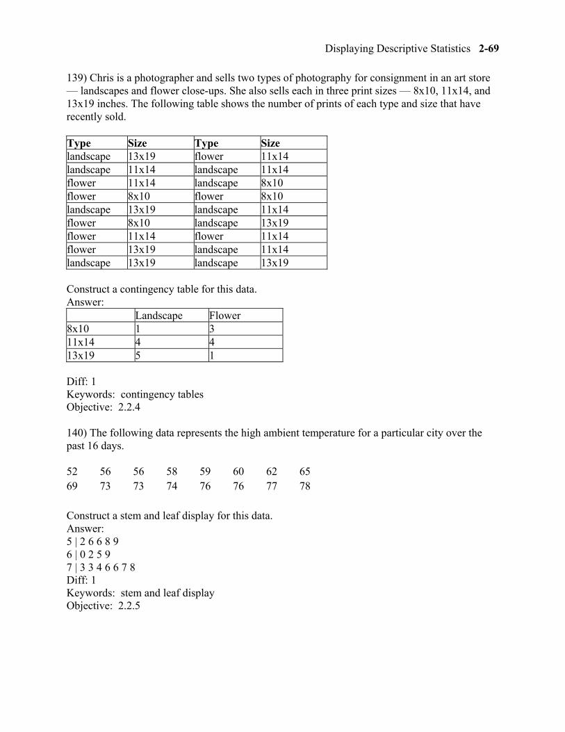
139) Chris is a photographer and sells two types of photography for consignment in an art store — landscapes and flower close-ups. She also sells each in three print sizes — 8x10, 11x14, and 13x19 inches. The following table shows the number of prints of each type and size that have recently sold.
Type Size Type Size landscape 13x19 flower 11x14 landscape 11x14 landscape 11x14 flower 11x14 landscape 8x10 flower 8x10 flower 8x10 landscape 13x19 landscape 11x14 flower 8x10 landscape 13x19 flower 11x14 flower 11x14 flower 13x19 landscape 11x14 landscape 13x19 landscape 13x19
Construct a contingency table for this data. Answer:
Landscape Flower 8x10 1 3 11x14 4 4 13x19 5 1
Diff: 1 Keywords: contingency tables Objective: 2.2.4
140) The following data represents the high ambient temperature for a particular city over the past 16 days.
52 56 56 58 59 60 62 65 69 73 73 74 76 76 77 78
Construct a stem and leaf display for this data. Answer: 5 | 2 6 6 8 9 6 | 0 2 5 9 7 | 3 3 4 6 6 7 8 Diff: 1 Keywords: stem and leaf display Objective: 2.2.5
2-70 Chapter 2
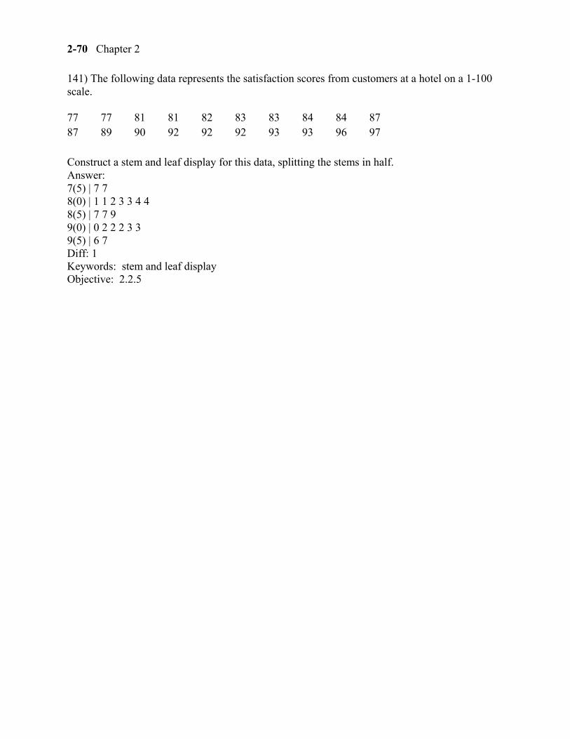
141) The following data represents the satisfaction scores from customers at a hotel on a 1-100 scale.
77 77 81 81 82 83 83 84 84 87 87 89 90 92 92 92 93 93 96 97
Construct a stem and leaf display for this data, splitting the stems in half. Answer: 7(5) | 7 7 8(0) | 1 1 2 3 3 4 4 8(5) | 7 7 9 9(0) | 0 2 2 2 3 3 9(5) | 6 7 Diff: 1 Keywords: stem and leaf display Objective: 2.2.5
Displaying Descriptive Statistics 2-71
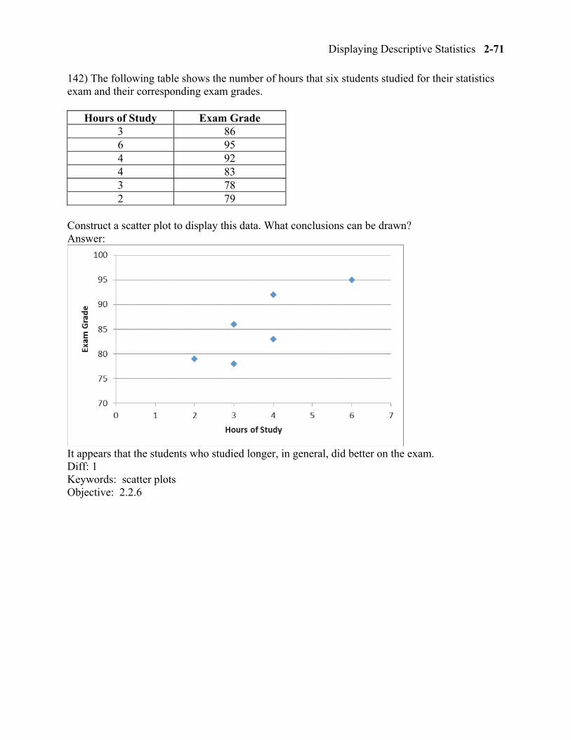
142) The following table shows the number of hours that six students studied for their statistics exam and their corresponding exam grades.
Hours of Study Exam Grade 3 86 6 95 4 92 4 83 3 78 2 79
Construct a scatter plot to display this data. What conclusions can be drawn? Answer:
It appears that the students who studied longer, in general, did better on the exam. Diff: 1 Keywords: scatter plots Objective: 2.2.6
2-72 Chapter 2
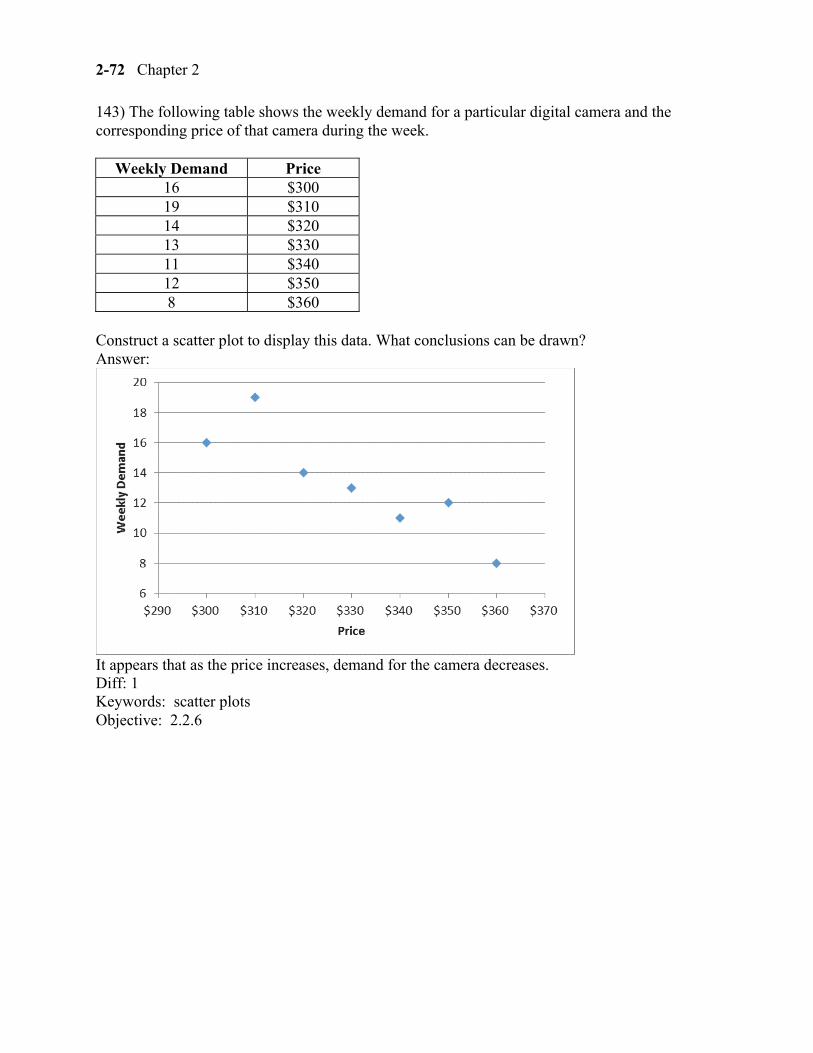
143) The following table shows the weekly demand for a particular digital camera and the corresponding price of that camera during the week.
Weekly Demand Price 16 $300 19 $310 14 $320 13 $330 11 $340 12 $350 8 $360
Construct a scatter plot to display this data. What conclusions can be drawn? Answer:
It appears that as the price increases, demand for the camera decreases. Diff: 1 Keywords: scatter plots Objective: 2.2.6
Displaying Descriptive Statistics 2-73
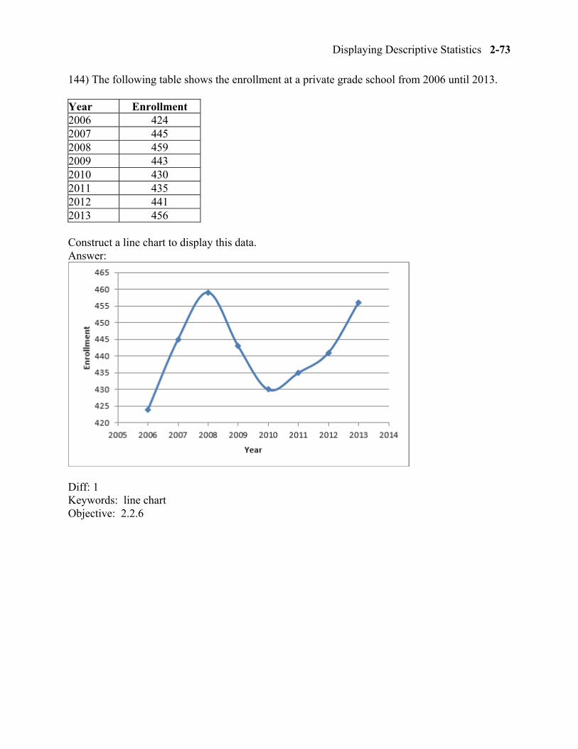
144) The following table shows the enrollment at a private grade school from 2006 until 2013.
Year Enrollment 2006 424 2007 445 2008 459 2009 443 2010 430 2011 435 2012 441 2013 456
Construct a line chart to display this data. Answer:
Diff: 1 Keywords: line chart Objective: 2.2.6
2-74 Chapter 2
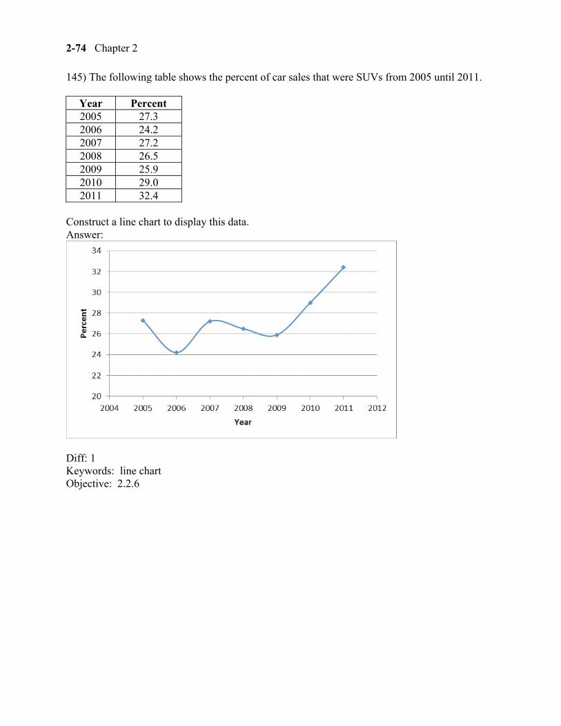
145) The following table shows the percent of car sales that were SUVs from 2005 until 2011.
Year Percent 2005 27.3 2006 24.2 2007 27.2 2008 26.5 2009 25.9 2010 29.0 2011 32.4
Construct a line chart to display this data. Answer:
Diff: 1 Keywords: line chart Objective: 2.2.6