Brochure
21
Ryan James Portfolio
-
Upload
ryan-james -
Category
Documents
-
view
10 -
download
0
description
Comm 120 brochure
Transcript of Brochure

Ryan JamesPortfolio
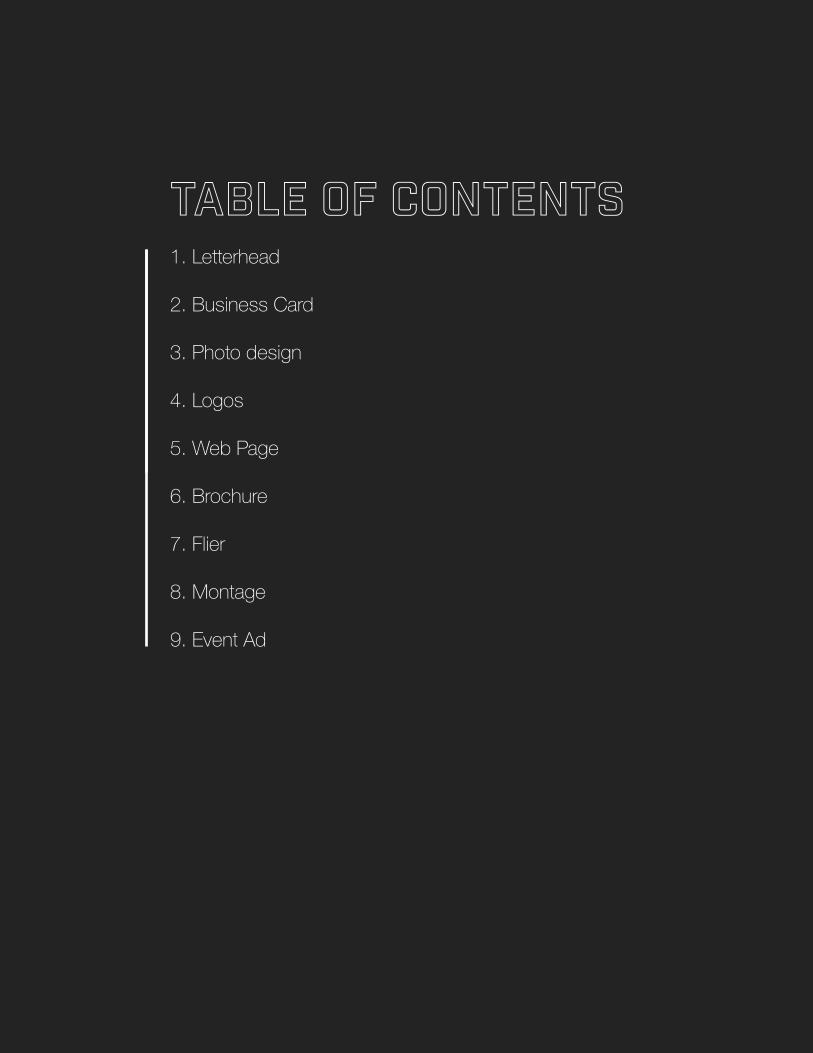
Table of Contents1. Letterhead
2. Business Card
3. Photo design
4. Logos
5. Web Page
6. Brochure
7. Flier
8. Montage
9. Event Ad

Event adDescription: Alternate Poster
Date: January 31, 2016
Programs/tools: Microsoft Word
Course: Comm 130. Emily Kunz
Objectives: Scan and import a high quality image and use in a full bleed design in Microsoft word.
Process: Created in Word. I had originally created it with some boxes and lines. After going through focus and getting to the end. I simplified… A lot. I took out almost everything to make it look like a giant picture with a title and a date.


StationaryDescription: Letterhead
Date: February 27, 2016
Programs/tools: Adobe Illustrator
Course: Comm 130. Emily Kunz
Objectives: Create a Logo and design accompanying stationary.
Process: After the logo was created and the business card layout was designed I created this stationary all in Adobe Illustrator. I used a dark header that is the same color as the business


Business CardDescription: Professional Business Cards
Date: February 27,2016
Programs/tools: Adobe Illustrator
Course: Comm 130. Emily Kunz
Objectives: Create a logo. Create integrated sta-tionary. Process: I created this business card layout in Adobe Illustrator. I also created a new logo for this project in Illustrator. I used a decorative and slab serif font for the design,


LogosDescription: Logos
Date: February 21, 2016
Programs/tools: Adobe Illustrator
Course: Comm 130. Emily Kunz
Objectives: Create a variety of logos with illustrator tools. Specifically develop skills with the pen tool and tracing.
Process: Create one new logo. I did this in Adobe Illustrator. I have presented it in three different versions. One normal, one gray scale and one on top of a background. This logo is designed to be used on multiple surfaces.


PhotodesignDescription: Photodesign Project
Date: February 7, 2016
Programs/tools: Adobe Illustrator
Course: Comm 130. Emily Kunz
Objectives: Understading shapebuilding, masks and layers.
Process: I used Adobe illustrator for all of this project. I used an image that I took just outside of my house of the stars (one of my favorite things to take pictures of) I broke everything down into a grid of thirds and tried pretty hard to stay in those boundaries and I think that it turned out pretty well. I have been learning about the use of symbols in my other classes and I thought this was a perfect time to introduce those into my projects in this class.

biologically.
atomically.
chemically.
We are all
CONNECTED

BrochureDescription: Double Sided Brochure
Date: March 27, 2016
Programs/tools: Adobe InDesign, Illustrator and Photoshop.
Course: Comm 130. Emily Kunz
Objectives: Set up and design a two sided document, print with proper alignment and incorporate quality images.
Process: I created a logo in Illustrator. I manipulated and cropped photos in Photoshop and put together the brochure in illustrator and had it printed at Staples.


MontageDescription: Photo Montage
Date: February 14, 2016
Programs/tools: Adobe Photoshop
Course: Comm 130. Emily Kunz
Objectives: Learn how to blend images together smoothly using masks and filters.
Process: I used an Original photo from my private stash for the background image and I chose one of my favorite images from the reflections of Christ series by Mark Marbry. I only used Photoshop for this project. After designing the layout I overplayed a Golden spiral to help me place the objects on the image. The savor is occupying the left 1 third of the page and the text is located in between the bottom 2/3 of the page.


Web pageDescription: HTML CSS website
Date: March 13, 2016
Programs/tools: Text Wrangler
Course: Comm 130. Emily Kunz
Objectives: Optimizing logos for the web. Designing a website using CSS and HTML. Basic understanding of hex colors, compressed files and web language.
Process: I created this web page using only Text Wrangler. I have created websites before so this was pretty simple. I have never used the code corrector website so that was a nice new feature. After I created my HTML page I attached a CSS document and customized that. I used a Monochromatic color scheme. Black, Gray and Gray – I Google searched the CMYK code number.

Cross Axe Woodshop
The cross axe woodshop logo is something I thought up for a friend and his hobby. Rex is amountain man, you're more likely to see him on the top of the mountain than walking down thestreet. When he is not climbing or hiking a mountain his favorite hobby is wood working. I wantedto make something that really fit his philosophies. He isn't interested in promoting himself orgetting alot of work he just wants to do what he loves. He'd be happy to do it even if nobody eversaw or appreciated what he made. With this design I was able to create what he wanted -something that he can stamp on all of his products as a seal of approval. Because this was theend goal I approached the logo in the simplest forms possible. Solid shapes with monochromecolor. The black is in a way symbolic of what it will look like when it is burned onto one of Rex'spieces of work. I think that this logo suits his company quite well.
Building the logoI used the Pen tool in illustrator to create the Pick Axe.
I created this logo in all black because I wanted to make something that would look the same onpaper as it would if you burned it onto a piece of wood.
The woodshop logo is meant to be seen only by people who own Rex's woodwork.
I chose a decorative font to give the logo a modern feel along with a slab serif as a reminder thatthis is an old trade.
Check out more of my designs on my blog.

FlierDescription: Black and White Flier
Date: January 24, 2016
Programs/tools: Adobe InDesign
Course: Comm 130. Emily Kunz
Objectives: Apply Design principles and use appropriate typography.
Process: For this project I used Adobe InDesign & Adobe Illustrator. I started with a few sketches and came up with one that I thought would work well for the project. I chose to use a white Title font to contrast with the black body. I also used a few different shades of gray along with the black text. This helped tie the image into the flier. After multiple critiques I adjusted the placement of the title & text. I also ended up changing the logo to one that better fit my design.


![Brochure IFS Applications Brochure 2010[1]](https://static.fdocuments.us/doc/165x107/54f6c2954a7959430c8b48f5/brochure-ifs-applications-brochure-20101.jpg)