Brand Style Guidelines - Boston Children's Hospital
27
1 Brand Style Guidelines v 1.1 | Jan. 2013
Transcript of Brand Style Guidelines - Boston Children's Hospital

1
Brand Style Guidelines
v 1.1 | Jan. 2013

2
Table of contents
3
4
5
7
8
9
12
13
15
17
18
19
20
21
23
24
26
Boston Children’s Hospital brand
Writing style
Color palette
Logo with tagline
Logo clear space
Primary and secondary logo(s)
Logo with center, department and
program names
Logo color
Black-and-white logo
Logo placement
Stationery
Affiliated logos
Logo formats
Typography
Web-safe typeface
Imagery and photography style
Print layout examples
3
Boston Children’s Hospital brand
What is a brand?
A brand is a promise, a set of perceptions about a business, service or product.
A brand is created in the minds of stakeholders — based on a track record, which sets up future expectations.
What is our brand?
Boston Children’s Hospital is a place of tireless innovation, dedication and optimism. A place that will continue to lead; continue to learn; and continue to relentlessly pursue the frontiers of science, innovation, treatment and care. When people experience our brand, they should feel:
Confident that they are getting the best care at the hands of experienced, accomplished and knowledgeable pediatric professionals.
Respected as partners in the healing process.
Valued in everything we do.
Inspired by our passion and commitment to pediatric healthcare . . .
Until every child is wellSM
To effectively represent our brand — in words, pictures or design — we must do so consistently, appropriately and with a level of quality that reflects our high standards.
This guide will provide you with the guidelines, tools and resources to effectively communicate the Boston Children’s brand.
To maintain a consistent brand identity and increase our name recognition worldwide, we have developed a comprehensive set of Boston Children’s Hospital logo and brand standards. When using the Boston Children’s logos or creating Boston Children’s marketing material, you must adhere to these guidelines.
Please contact the Boston Children’s Hospital Marketing and Communications department at [email protected] if you have any questions.

4
Boston Children’s Hospital writing style
In all our written communications, the
Boston Children’s Hospital tone should
reflect the optimism, innovation and
dedication that are fundamental to our
mission. While we are confident and
knowledgeable, we must write in a way
that is warm and approachable, never
condescending.
When referring to the hospital, writers must use “Boston Children’s Hospital” on first reference and “Boston Children’s” on all subsequent references. It is necessary to include “Boston” to avoid confusion with another children’s hospital. This convention does not apply to our satellite and network locations.
The use of the acronym BCH is not permitted.
Boston Children’s Hospital adheres to AP style in all our official communications.
If you have any questions about our writing style, please send an email to [email protected].

5
Boston Children’s Hospital color palette
Primary colors Corporate colors are used for brand
identity, marketing, correspondence,
letterhead and business cards.
Secondary colors
Along with the primary colors,
secondary colors are used in marketing,
signage and communications.
When using type over these colors,
please refer to the type-color callout
over each color chip.
Do not
No colors except Boston Black, White
and Boston Blue are authorized for logo
use (unless used as a background color
for the white logo, as on page 14).
Pantone: 287CCMYK: 100.75.2.18RGB: 0.48.135HEX: 003087
Pantone: 298CCMYK: 67.2.0.0RGB: 65.182.230HEX: 41B6E6
Pantone: WhiteCMYK: 0.0.0.0RGB: 255.255.255HEX: FFFFFF
BOSTON BLUE BOSTON SKY WHITE
USAGE: PRIMARY
Pantone: 377CCMYK: 51.5.98.23RGB: 115.150.0HEX: 739600
Pantone: 130CCMYK: 0.36.100.0RGB: 242.169.0HEX: F2A900
Pantone: 633CCMYK: 98.6.10.29RGB: 0.115.150HEX: 007396
BOSTON YELLOW
BOSTON GREEN
BOSTON INDIGO
USAGE: SECONDARY
BOSTON BLUE TYPEBOSTON BLACK TYPE
WHITE TYPEBOSTON SKY TYPE
WHITE TYPEBOSTON BLUE TYPEBOSTON BLACK TYPE WHITE TYPE
WHITE TYPEBOSTON BLUE TYPEBOSTON BLACK TYPE
Pantone: 674CCMYK: 14.79.0.0RGB: 198.87.154HEX: C6579A
Pantone: 258CCMYK: 53.79.0.0RGB: 140.71.153HEX: 8C4799
BOSTON PINK BOSTON LAVENDER
WHITE TYPEBOSTON BLUE TYPEBOSTON BLACK TYPE WHITE TYPE
Pantone: 7667CCMYK: 68.51.20.0RGB: 110.124.160HEX: 6E7CA0
BOSTON BAY
WHITE TYPE

6
Boston Children’s Hospital color palette
Tertiary colors Used to complement the secondary
colors.
When using type over these colors,
please refer to the type-color callout
over each color chip.
Do not
These colors are not authorized for logo
use (unless used as a background color
for the white logo, as on page 14).
Auxiliary colorOnly in one-color collateral (newsprint)
should the logo be “Boston Black” (see
pages 15 and 16 for assets).
In the case that Boston Blue cannot be
used in type, Boston Black should be
used as a substitute.
USAGE: TERTIARY
USAGE: AUXILIARY
Pantone: BlackCMYK: 0.0.0.100RGB: 0.0.0HEX: 000000
Pantone: 120CCMYK: 0.6.60.0RGB: 251.219.101HEX: FBDB65
Pantone: 367CCMYK: 37.0.58.0RGB: 164.214.94HEX: A4D65E
Pantone: 7528CCMYK: 5.10.17.16RGB: 197.185.172HEX: C5B9AC
BOSTON MORNING
BOSTON WARM GRAY
BOSTON BLACK
BOSTON MEADOW
BOSTON BLUE TYPEBOSTON BLACK TYPE
WHITE TYPEBOSTON BLUE TYPEBOSTON BLACK TYPE
WHITE TYPE
WHITE TYPEBOSTON BLUE TYPEBOSTON BLACK TYPE
Pantone: 242CCMYK: 32.100.11.30RGB: 128.34.95HEX: 80225F
BOSTON PURPLE
WHITE TYPE

7
Our tagline “Until every child is wellSM”
is a mission statement and a promise.
It speaks to our tireless commitment to
improving the lives of all our patients
and their families through top-quality
pediatric health care.
The tagline must be used on covers of
print pieces, on posters, on Web home
pages and in other prominent positions in
a variety of communications. The tagline
must also be used with the logo for
external placements that would benefit
from the additional context it provides.
Use only the supplied files that contain
both the logo and descriptor for this
purpose.
The tagline must be followed with the
service mark symbol “SM“whenever it is
used.
If design restrictions cannot be
reconciled with the logos provided,
please contact the Boston
Children’s Marketing and
Communications department at
Boston Children’s Hospital logo with tagline
USAGE: PRIMARY
USAGE: QUATERNARY
USAGE: TERTIARY
USAGE: SECONDARY

8
The Boston Children’s Hospital logo
is best displayed when surrounded by
a sufficiently large, clear space. This
drawing defines the minimum area that
must not be encroached on by other
graphic elements, text or the edge of the
page or screen.
The minimum margin has been defined
by the x-height of the Boston Children’s
wordmark.
1x
1x
1x
1x 1x
1x
1x
1x
1x
1x
1x
1x
1x
1x
1x
1x
1x
1x
1x 1x
Boston Children’s Hospital logo clear space

9
Boston Children’s Hospital logo
The Boston Children’s Hospital logo is
the primary visual identifier of our brand.
It comprised of the nurse-and-child seal
and the Boston Children’s logotype.
The minimum size of the logo was
designed specifically for usage at very
small sizes and should be used only at the
sizes specified.
Do not
Do not change the logo’s original
artwork. Do not rebuild or distort the
logo. Do not change the logo colors. Do
not insert the logo into text.
Do not break apart the logo and use the
seal in isolation.
logo
seal logotype
Primarylogo
FOR USE ABOVE: 1" WIDE
FOR USE: 0.5” - 0.99" WIDE

10
Shown at right are the three acceptable
configurations that have been designed
with specific proportions, typography
and spacing between elements for
different uses.
Preference should always be given to
the primary logo (page 9). When the
primary logo cannot be accommodated,
a secondary logo may be used. The
secondary logos are shown here in order
of preference.
When it is necessary to use the logo
without the tagline, be sure that the
tagline is featured prominently
elsewhere on the piece.
Do not
These configurations should not be
altered in any way.
Only the variations pictured here should
be used. No other arrangements of the
logo or wordmark should be created.
Secondarylogos
FOR USE ABOVE: 1.875" WIDE
FOR USE ABOVE: 0.75" WIDE
FOR USE ABOVE: 1.625" WIDE
Boston Children’s Hospital logo

11
The minimum size of the logo was
designed for uses at very small sizes and
should be used only at the sizes specified.
Please refer to page 9 for usage
guidelines.
Secondary logosminimum size
FOR USE: 1.25” - 1.874" WIDE
FOR USE: 0.375” - 0.74" WIDE
FOR USE: 1” - 1.624" WIDE
Boston Children’s Hospital logo

12
Boston Children’s Hospital logo with center, department and program names
The Boston Children’s Hospital center,
department and program names lock
up with the logo in a style similar to the
tagline. However, because wayfinding
is a key factor, the center names have
slightly more prominence.
These lockups may be used on
print pieces, on posters, on Web
homepages, on signage and in other
prominent positions in a variety of
communications.
If any design solutions cannot be
reconciled with the logo lockups
provided, please contact the Boston
Children’s Marketing and
Communications department at
Do not
Do not combine the tagline with the
center, department or program names
in a way that deviates from these
examples.
USAGE: PRIMARY
DESIGNATED CENTERS
DESIGNATED CENTERS
DESIGNATED CENTERS
DEPARTMENTS AND PROGRAMS
DEPARTMENTS AND PROGRAMS
DEPARTMENTS AND PROGRAMS
USAGE: SECONDARY
USAGE: WITH TAGLINE
Heart Center
13
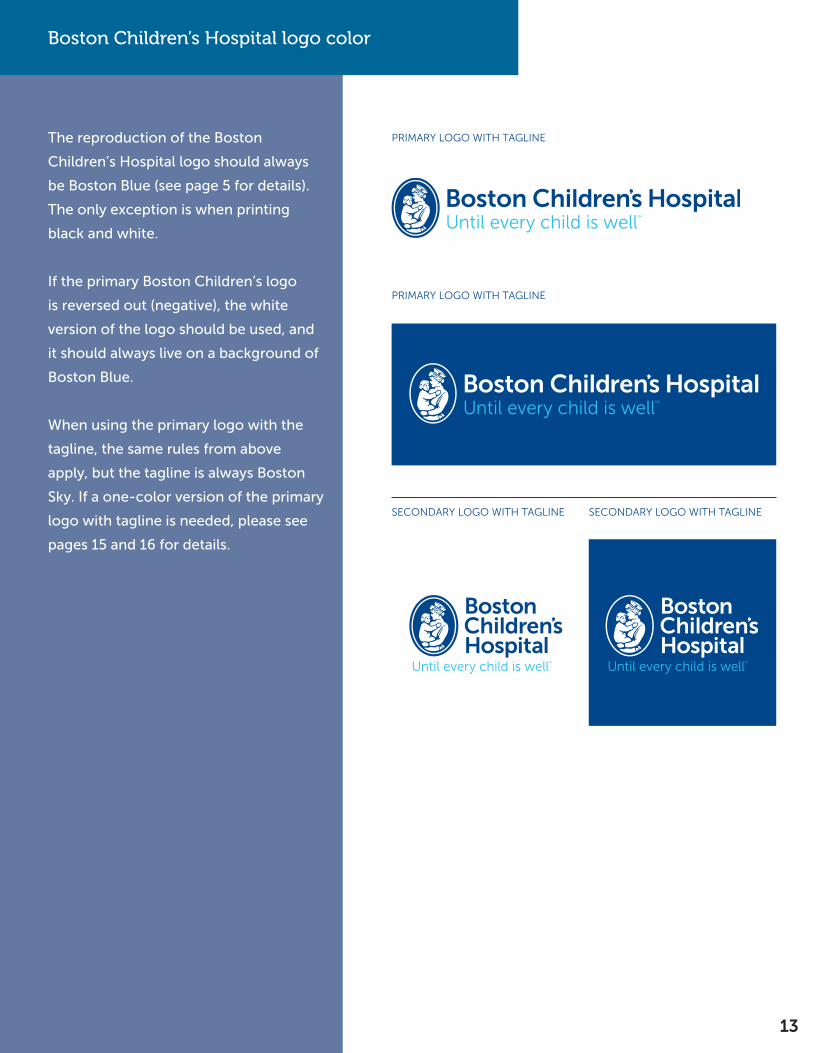
The reproduction of the Boston
Children’s Hospital logo should always
be Boston Blue (see page 5 for details).
The only exception is when printing
black and white.
If the primary Boston Children’s logo
is reversed out (negative), the white
version of the logo should be used, and
it should always live on a background of
Boston Blue.
When using the primary logo with the
tagline, the same rules from above
apply, but the tagline is always Boston
Sky. If a one-color version of the primary
logo with tagline is needed, please see
pages 15 and 16 for details.
SECONDARY LOGO WITH TAGLINE SECONDARY LOGO WITH TAGLINE
PRIMARY LOGO WITH TAGLINE
PRIMARY LOGO WITH TAGLINE
Boston Children’s Hospital logo color

14
The reproduction of the Boston
Children’s Hospital logo with center
name should be Boston Blue with the
center name in Boston Sky.
If the primary Boston Children’s logo
is reversed out (negative), the white
version of the logo should be used, and
it should always live on a background
of Boston Blue. The center name in this
case would maintain the Boston Sky
color.
When the primary logo with center
name is used over a secondary or
tertiary color, the white version of the
logo should be used. In this case, both
the logo and center name would be
reversed out as white.
Boston Children’s Hospital logo color
PRIMARY LOGO WITH CENTER NAME
PRIMARY LOGO WITH PROGRAM NAME
PRIMARY LOGO WITH CENTER, DEPARTMENT OR PROGRAM NAME OVER COLOR

15
The reproduction of the Boston
Children’s Hospital logo in color is the
preferred option, but in certain cases the
logo may be reproduced only in black or
white in black-and-white documents.
The logo can also be reversed out of
an image or printed black on an image,
depending on tonality.
The minimum size of the logo was
designed for usage at very small sizes and
should be used only at the sizes specified
on pages 9 and 11.
Boston Children’s Hospital black-and-white logo
LOGOS MINIMUM SIZE LOGOS
LOGOS WITH TAGLINE LOGOS WITH CENTER, DEPARTMENT AND PROGRAM NAMES
Heart Center

16
If the Boston Children’s logo is reversed
out (negative), both elements of the logo
— the name and the image of the nurse
and child — are white. In cases where
the logo is used in conjunction with the
tagline or center name, those elements
would also be white.
Boston Children’s Hospital black-and-white logo
LOGOS MINIMUM SIZE LOGOS
LOGOS WITH TAGLINE LOGOS WITH CENTER, DEPARTMENT AND PROGRAM NAMES

17
Boston Children’s Hospital logo placement
Preference for the placement of the
Boston Children’s Hospital logo on any
size page is in the upper-left corner or
in the lower-left or lower-right corner.

18
bostonchildrens.org
Boston Children’s Hospital stationery
Boston Children’s Hospital stationery is
based on templates in which the logo
size and position are fixed, margins are
established and type is set in the Museo
Sans typeface. This gives a consistent
appearance to Boston Children’s
communications across all departments
and assures the recipients that what
they are receiving is authentic.
Boston Children’s stationery should be
ordered through Creative Services in
the Marketing and Communications
department by placing a printing
request at http://on.chbos.org/
creativeservicesform
The layout has been designed to
accommodate varying quantities and
types of information. Creative Services
will work with you to find an appropriate
arrangement for personalized
information, but deviation
from the established stationery
templates is not permitted.
James Mandell, MD Chief Executive Officer Robert and Dana Smith Professor, Professor of Surgery (Urology), Harvard Medical School300 Longwood Avenue, Boston, MA 02115 617-355-8555 | fax 617-730-0630 [email protected] | bostonchildrens.org
Marketing and Communications 300 Longwood Avenue, LM-6401, Boston, MA 02115
James Mandell, MD Chief Executive OfficerRobert and Dana Smith Professor, Professor of Surgery (Urology), Harvard Medical School
300 Longwood AvenueBoston, MA 02115617-355-8555 | fax [email protected]

19
Boston Children’s Hospital affiliated logos
Boston Children’s Hospital is a Harvard
Medical School teaching hospital. This
distinction is represented by the logo on
the right.

20
Choosing the right logo file
Image formats are usually separated
into two groups: vector-based images
and bitmap images. As a rule of thumb,
vector images are preferred in print jobs
(magazines, brochures), and JPG or PNG
images are preferred in the digital world
(Microsoft Office and Web applications).
The biggest difference between the two
image groups is that only the vector-
based images can be scaled to any size
without deteriorating the quality of
an image. Enlarging a JPG or PNG will
make its pixels visible, which will cause
the image to lose its focus and become
blurry. It is because of this lack of
scalability that there are no logo originals
available in bitmap formats. Every time
a bitmap logo is needed, it should be
created on a case-by-case basis from a
vector image scaled to the required size.
In cases where a logo with a transparent
background is needed, use PNG format.
The Boston Children’s Hospital logos are
available in EPS (vector) file format.
The Boston Children’s logo files are
available in:
• CMYK colors (four color)
• PANTONE colors
• Black and white (white for
reversed out usage)
Boston Children’s Hospital logo formats
Applications
Four-color printed material:PublicationsAdvertisementsBrochures
Two-color printed material:Business cardsPrinted stationeryShipping boxes, labels, etc.
Black-and-white printed material:PublicationsAdvertisements
Microsoft Office documents:Microsoft WordMicrosoft PowerPoint
Internet applications:Web programsFlash animations
Recommended Format
CMYK LogoEPS format
PANTONE® LogoEPS format
Black Logo/White LogoEPS format
RGB LogoJPG formatPNG format
RGB LogoJPG formatPNG format

21
Boston Children’s Hospital typography
The consistent use of type contributes
to our unique look and feel, making
us easily distinguishable from other
institutions.
The designated brand typefaces are
Museo and Museo Sans. They have
a modern and crisp clarity, with an
approachable feel. As a sturdy, low-
contrast, geometric and highly legible
typeface, they are very well-suited for
display and text use.
Museo 500 is used for headlines and in
other situations where you want larger
type to stand out from the standard
brand typeface.
The color of the type should be Boston
Blue. In the case where Boston Blue
cannot be used, or an alternative
is needed, use Boston Black as a
substitute. See pages 5 and 6 for details.
See page 23 for Web-safe typeface
options.
BODY COPY FONT: MUSEO SANS 500
BODY COPY FONT: MUSEO SANS 700
BODY COPY FONT: MUSEO SANS 900
AaBbCcDdEe O12345 !?$/#AaBbCcDdEe O12345 !?$/#
AaBbCcDdEe O12345 !?$/#
AaBbCcDdEe O12345 !?$/#
AaBbCcDdEe O12345 !?$/#
AaBbCcDdEe O12345 !?$/#
ABCDEFGHIJKLMNOPQRSTUVWXYZabcdefghijklmnopqrstuvwxyz1234567890 $&!?”/;:#
ABCDEFGHIJKLMNOPQRSTUVWXYZabcdefghijklmnopqrstuvwxyz1234567890 $&!?”/;:#
ABCDEFGHIJKLMNOPQRSTUVWXYZabcdefghijklmnopqrstuvwxyz1234567890 $&!?”/;:#
ABCDEFGHIJKLMNOPQRSTUVWXYZabcdefghijklmnopqrstuvwxyz1234567890 $&!?”/;:#
ABCDEFGHIJKLMNOPQRSTUVWXYZabcdefghijklmnopqrstuvwxyz1234567890 $&!?”/;:#
ABCDEFGHIJKLMNOPQRSTUVWXYZabcdefghijklmnopqrstuvwxyz1234567890 $&!?”/;:#
BODY COPY FONT: MUSEO SANS 300
AaBbCcDdEe O12345 !?$/#AaBbCcDdEe O12345 !?$/#ABCDEFGHIJKLMNOPQRSTUVWXYZabcdefghijklmnopqrstuvwxyz1234567890 $&!?”/;:#
ABCDEFGHIJKLMNOPQRSTUVWXYZabcdefghijklmnopqrstuvwxyz1234567890 $&!?”/;:#
HEADLINE FONT: MUSEO 500
AaBbCcDdEe O12345 !?$/#AaBbCcDdEe O12345 !?$/#ABCDEFGHIJKLMNOPQRSTUVWXYZabcdefghijklmnopqrstuvwxyz1234567890 $&!?”/;:#
ABCDEFGHIJKLMNOPQRSTUVWXYZabcdefghijklmnopqrstuvwxyz1234567890 $&!?”/;:#

22
Boston Children’s Hospital typography
The various fonts of the Museo and
Museo Sans typefaces are associated
with specific uses. An example is shown
at right.
Lorem ipsum dolor sit amet, consectetur adipiscing elit. Suspendisse tristique velit id lorem fermentum pulvinar. Proin vehicula ipsum ante.
“Aenean sit amet enim vel felis porttitor laoreet. Nulla dignissim volutpat odio quis bibendum. Nunc imperdiet porttitor lacinia.” -Egestas Vitae
PROIN VEHICULA IPSUM ANTE.
Creating lasting connections.
BY LINE:MUSEO SANS300
HEADLINE:MUSEO 500
SUBHEAD:MUSEO SANS900
BODY COPY:MUSEO SANS300
PULL QUOTE:MUSEO SANS300 ITALIC
See page 23 for Web-safe typeface
options.

23
Boston Children’s Hospital Web-safe typeface
While consistency is important, there are
some limitations when using typefaces
online. When Museo cannot be used in
digital applications or on the Web, Arial
should be used as an alternative.
The color of the type should be Boston
Blue. In the case where Boston Blue
cannot be used or an alternative
is needed, use Boston Black as a
substitute. See pages 5 and 6 for details.
ARIAL REGULAR
ARIAL BOLD
AaBbCcDdEe O12345 !?$/#AaBbCcDdEe O12345 !?$/#
AaBbCcDdEe O12345 !?$/#AaBbCcDdEe O12345 !?$/#
ABCDEFGHIJKLMNOPQRSTUVWXYZabcdefghijklmnopqrstuvwxyz1234567890 $&!?”/;:#
ABCDEFGHIJKLMNOPQRSTUVWXYZabcdefghijklmnopqrstuvwxyz1234567890 $&!?”/;:#
ABCDEFGHIJKLMNOPQRSTUVWXYZabcdefghijklmnopqrstuvwxyz1234567890 $&!?”/;:#
ABCDEFGHIJKLMNOPQRSTUVWXYZabcdefghijklmnopqrstuvwxyz1234567890 $&!?”/;:#

24
Boston Children’s imagery and photography style
Overall, Boston Children’s Hospital’s
photography style is genuine,
unexpected and sensitive. Our
photographs should never feel staged
or artificial. Subjects should look natural,
never posed — as though captured in a
real moment.
Children, patients and families
Images of children should be
spontaneous and carefree; they should
capture the joy of childhood whenever
possible and support the tagline ideal
“Until every child is wellSM”. Outdoor
activities and bright natural
lighting are preferred.
Hospital staff and employees
Photographs of hospital staff and
employees should be active and shot
in real-life situations as appropriate.
Commercial stock images should not be
used to represent Boston Children’s staff
and employees.
For questions, please contact
our staff photographer at
See next page for imagery dos
and do nots.

25
Boston Children’s imagery and photography style
Dos and do nots on image usage:
Do:
Use close cropping to focus on people in
order to increase dramatic effect or isolate
emotion.
Use good lighting with attention to depth
and shadow.
Be warm, playful and engaging (when
appropriate).
Have a fresh, unique and unexpected
viewpoint.
Reflect the diversity of our patients and
employees.
Show subjects following all proper safety
and regulatory procedures.
Use images that are technically sound,
properly color-balanced and reproduced at
the correct resolution.
Do not:
Show subjects in pain or distress unless
there is an editorial reason for doing so.
Use photos that are harshly lit, especially
from artificial overhead lighting.
Be overly dramatic or show subjects in
contrived or unrealistic situations.
Distort proportions. When resizing, make
sure that the height and width are scaled in
equal measure.
26
Boston Children’s Hospital print layout examples
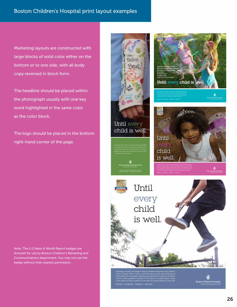
Marketing layouts are constructed with
large blocks of solid color either on the
bottom or to one side, with all body
copy reversed in block form.
The headline should be placed within
the photograph usually with one key
word highlighted in the same color
as the color block.
The logo should be placed in the bottom
right-hand corner of the page.
Note: The U.S.News & World Report badges are
licensed for use by Boston Children’s Marketing and
Communications department. You may not use the
badge without their express permission.
Until every child is free to live a whole, vibrant and healthy life, there is Boston Children’s Hospital. From the simplest treatment to the most complex procedure, no other pediatric hospital in the nation is ranked higher. Discover one of our convenient specialty care locations near you at bostonchildrens.org/until
BOSTON | LEXINGTON | PEABODY | WALTHAM
Until every child is well.
Until there is no more asthma.Until there is no more kidney disease.Until there is no more diabetes.No epilepsy.No heart defects.No brain tumors.Until there is no more cancer.
BOSTON | LEXINGTON | PEABODY | WALTHAM
t: 617.670.9700f: 617.670.9711
Date:06.05.12 Job#: CHBP12008
CD:
AE:
AD:
TM:
CW:
PR:
File: CHBP12008_Princess_11x10.5_V2Live: 11” x 10.5” Artwork Resolution: _____ Hi ___x__ Low Artwork location: _____ MMB __x___Vendor _____ ClientPublication:
We know what it’s like to care for children. We treat 170,000 of them every year from more than 150 countries. And we’re committed to doing it better than anyone else. Which may explain why no other pediatric hospital in the nation ranks higher. Learn more about our world-renowned specialty care at bostonchildrens.org/until
Until every childis well.
t: 617.670.9700f: 617.670.9711
Date:06.20.12 Job#: CHBP12008
CD:
AE:
AD:
TM:
CW:
PR:
File: CHBP12008_Cast_Weymouth_V3_5.75x21Live: 5.75” x 21” Artwork Resolution: _____ Hi ___x__ Low Artwork location: _____ MMB __x___Vendor _____ ClientPublication:
Until every child is well.
Until every child is free to live a whole, vibrant and healthy
life, Boston Children’s Physicians South will be there. The
same doctors you’d see in Boston at Boston Children’s
Hospital now come to you on the South Shore. Learn more
at childrenshospital.org/until
Boston Children’s PhysiCians south
541 Main street | WeyMouth, Ma 02190
Boston Children’s Physicians South
t: 617.670.9700f: 617.670.9711
Date:06.20.12 Job#: CHBP12008
CD:
AE:
AD:
TM:
CW:
PR:
File: CHBP12008_Scooter_V2_11x10.5Live: 11” x 10.5” Artwork Resolution: _____ Hi ___x__ Low Artwork location: _____ MMB __x___Vendor _____ ClientPublication:
Until every childis well.
Someday, maybe it will happen. Maybe children will be free to be children. Free of illness. Free of injury. Until that day, we will work tirelessly to help make them well again. Because we are Boston Children’s Hospital. And no other pediatric hospital in the nation is ranked higher. Learn more about all the conditions we treat at bostonchildrens.org/until
BOSTON | LEXINGTON | PEABODY | WALTHAM

Please contact the Boston Children’s Hospital Marketing and Communications department at
[email protected] if you have any questions.