Brand Guidelines - York University
82
Version 1.0 August 2020 Brand Guidelines
Transcript of Brand Guidelines - York University
Version 1.0August 2020
Brand Guidelines

Contents
1 Brand Overview1.1 - Brand Definition and Journey1.2 - Our Vision, Promise, Values1.3 - Our Brand Story1.4 - Key Messages1.5 - Tone and Voice1.6 - Brand Building Blocks1.7 - Brand Architecture
2 Logos2.1 - Primary Logo2.2 - Digital Logo2.3 - Vertical Version – Alternate2.4 - York U Crest2.5 - PrimaryColour Variations2.6 - DigitalColour Variations2.7 - Full Colour Logos2.8 - Reverse Logos2.9 - Sizing/Spacing2.10 - Incorrect Usage2.11 - York Logo Placement2.12 - Sub-brand – Primary2.13 - Sub-brand – Digital2.14 - Faculty – Primary2.15 - Faculty – Digital2.16 - Additional Usages and Initiatives
3 BrandElements3.1 - York Colour Palette3.2 - York Colour Palette – Proportionality3.3 - Sub-brand Palette3.4 - Sub-brand Palette – Proportionality3.5 - The Psychology of Colour3.6 - Campus Inspiration3.7 - Faculty Accent Colours3.8 - Faculty Accent Colours – Specification3.9 - Typography – Primary Font3.10 - Typography – Secondary Fonts3.11 - Typography – Usage
4 DesignSystem4.1 - Window of Positive Change4.2 - Incremental Rule4.3 - Window of Positive Change – Usage and Rules4.5 - York Logo Placement – Variations4.7 - Window of Positive Change – Usage and Rules4.12 - Faculty Accent Pillar – Examples4.13 - Faculty Accent Window – Examples4.14 - Sub-brand Accent Pillar – Examples4.15 - Sub-brand Accent Window – Examples4.18 - Social Media Avatars4.19 - Digital Examples4.20 - Social Media Examples4.21 - Social Media Examples – Sub-brand
4.22 - Faculty Print Examples4.23 - Pull-up Banners – Pillar Examples4.24 - Emblems4.25 - Emblems (Wayfinding and Action Items)4.26 - Emblems (Embellishments)4.27 - Emblem Colour Variations4.28 - Usage Summary4.29 - Campus Advertising4.30 - LCD Screens4.31 - Email Headers4.32 - Email Signatures4.33 - PowerPoint4.34 - Website4.35 - Video4.36 - Video – Lower Thirds4.37 - Merchandise4.38 - Stationery4.39 - E-Stationery4.40 - Using Print Letterhead
York University Brand Guidelines 2020 — Version 1.0 yorku.ca/brand II
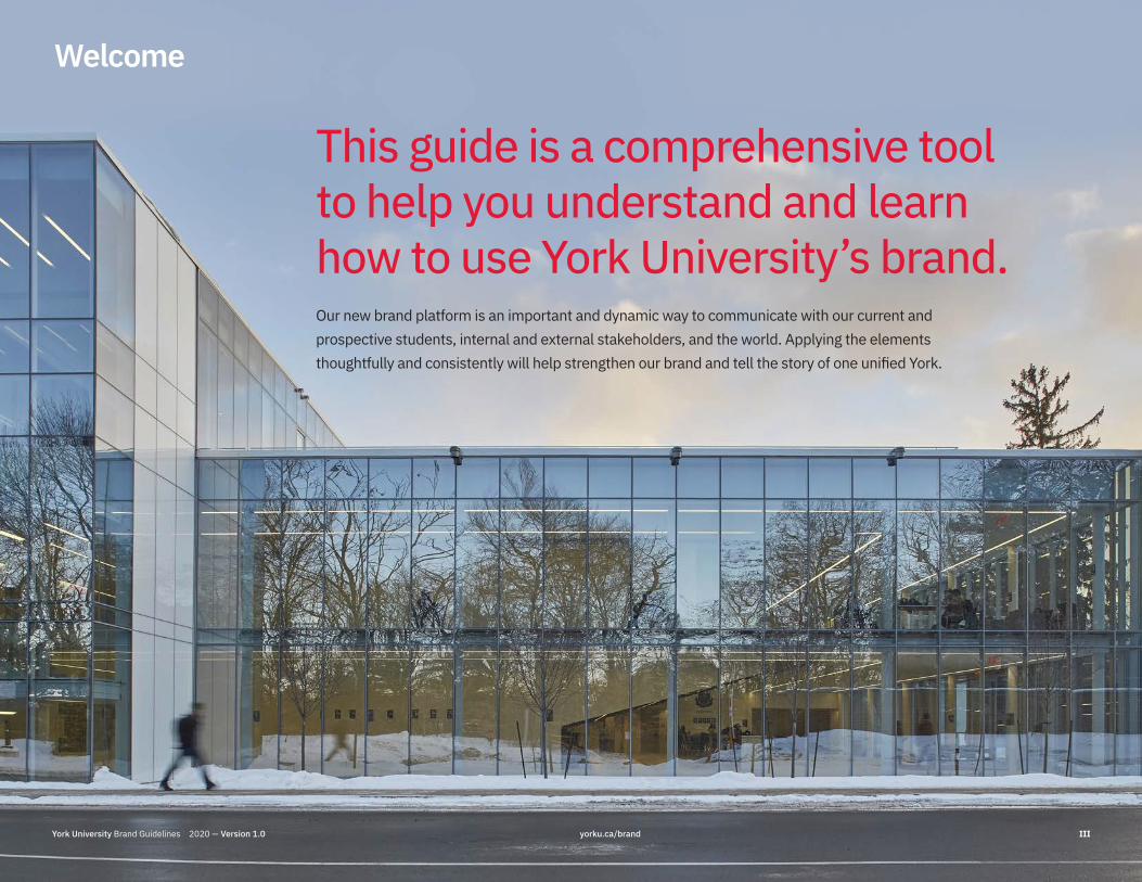
This guide is a comprehensive tool to help you understand and learn how to use York University’s brand.Our new brand platform is an important and dynamic way to communicate with our current and prospective students, internal and external stakeholders, and the world. Applying the elements thoughtfully and consistently will help strengthen our brand and tell the story of one unified York.
Welcome
York University Brand Guidelines 2020 — Version 1.0 yorku.ca/brand III

1.0
Brand Overview
York University Brand Guidelines 2020 — Version 1.0 yorku.ca/brand 1

Brand Definition and Journey
Overview
What is the brand?Our brand is our DNA. It’s how we act, think, speak and behave, and is our institutional culture and identity. It makes us stand for something unique and meaningful vs. other universities. It is the essence of who we are.
Why is the brand important? Our brand allows us to tell a consistent and powerful message to stakeholders, futurestudents and the world around us. More than a logo, font and colours, our brand is ourpromise to help create a better and more meaningful future for all.
This document contains our marketing and communications foundation. It is how we begin to build our brand and keep it strong to create positive change.
Our brand journey In 2019, we embarked on a journey to clearly define who we are and what we stand for in a compelling and memorable way. With an evidence-based strategy from extensive quantitative research and interviews with over 4,000 stakeholders, competitive reviews and validation research, we landed on Positive Change – a bold vision to take our brand further.
York University Brand Guidelines 2020 — Version 1.0 yorku.ca/brand 1.1Section 1.0

Our Vision, Promise, Values
Overview
Our visionYork is committed to giving a broad demographic of students access to a high-quality, research-intensive learning environment committed to the public good.
Our promise We are a community of change-makers. Driven by passion, we exist to create positive change for our students, our communities and the world around us.
Our values Excellence Progressive Inclusivity & diversity Social justice & equity Sustainability
York University Brand Guidelines 2020 — Version 1.0 yorku.ca/brand 1.2Section 1.0

Our Brand Story
Overview
ShortYork is a leading international teaching and research university, and a driving force for positive change. With a diverse community and uniquely global perspective, we can make things right for our future.
LongYork is a leading international teaching and research university, and a driving force for positive change. Empowered by a welcoming and diverse community with a uniquely global perspective, we are preparing our students for their long-term careers and personal success.
Home to one of the largest and most diverse student bodies in Canada, York has 53,000 students from 178 countries, 325,000+ alumni and leading professors who are working with 300+ university, industry and NGO partners to tackle pressing issues. Recognized as a global leader for two consecutive years in the new Times Higher Education Impact Rankings, and number one in global joint research publications in Ontario, York is positioned to take on the challenges that matter most.
Through our leading programs and 8,500 diverse experiential education opportunities, including internships, community placements, co-ops and capstone projects, we are preparing our students for meaningful careers, long-term success and the critical knowledge to work toward a better future.
Across our multiple campuses locally, including the Keele and bilingual Glendon campuses in Toronto, and globally in Hyderabad, India, and Costa Rica, we continue to innovate. This brings success to our students in our top-ranked Schulich School of Business and Osgoode Hall Law School, as well as in the liberal arts, creative and performing arts, professional studies, health, engineering, education and sciences.
We value collaboration, diversity and inclusivity. Together, we can make things right for ourselves, our communities, our planet and our future.
Our brand story can be used as messaging for websites, social media, brochures and presentations to articulate who we are and what we stand for. There are three versions of the story that may be used for your communications. Choose the one that best suits your needs and space allocations.
Main StoryYork is a leading international teaching and research university, and a driving force for positive change. Empowered by a welcoming and diverse community with a uniquely global perspective, we are preparing our students for their long-term careers and personal success.
Together, we can make things right for our communities, our planet and our future.
York University Brand Guidelines 2020 — Version 1.0 yorku.ca/brand 1.3Section 1.0

Key Messages
Overview
When writing key messages, consistency is critical. All communications should deliver on five key messages that can be customized with proof points. Visit York University’s Brand to learn how to apply the messaging.
Our research showed there are important key motivators for our audiences when they are considering whether to engage with York. The messages are customized for potential domestic students, current domestic students, current international students, parents of potential domestic students, faculty and staff, and alumni.
1York is an exceptionally diverse community working together to tackle complex societal challenges.• Our Faculties work together to provide unique
and valuable perspectives.• Our large and diverse student body and alumni
network offer unique and global perspectives.• We collaborate with companies and institutions
to create impact across sectors and borders.
4York is a supportive, inclusive and caring environment that promotes personal growth and well-being.• We are a welcoming learning environment that
values diversity.• We deliver superior student support
and services.
2York conducts purposeful research that advances knowledge and creates positive change.• We provide clear outcomes of how research will
or could create positive change for communities and the world.
• We pride ourselves on global and local partnerships, and collaborations.
• Our strengths and rankings are in line with the strategic research plan.
5York is an effective organization that embraces collaboration, new ideas and a strong sense of purpose.• Specific improvement initiatives are in place
to enhance the overall learning environment and student experience: i.e., improving campus service, introducing Canada’s first AI virtual assistance to help students find the information they need.
3York provides valued educational experience that prepares students for meaningful careers and long-term success.• We have program excellence, innovation
and leadership.• We have diverse relevant experiential
education opportunities with proof points.• We demonstrate student and alumni success.
York University Brand Guidelines 2020 — Version 1.0 yorku.ca/brand 1.4Section 1.0

Tone and Voice
Cared aboutFeeling supported by a welcoming university that cares deeply about the success of its community and the world at large.
ConfidentFeeling well-prepared with leading programs, global partnerships, networking opportunitiesand real-world experience that instils the confidence needed to make a positive impact and foster success.
EmpoweredFeeling empowered with the skills and values to achieve personal success, tackle meaningful global challenges and create positive change.
InspiredFeeling motivated by the innovative thinking, global perspective and shared sense of purpose that York inspires in our community to create a better future.
ProudFeeling proud to be part of a leading university championing positive change through academic success, purposeful research, global partnerships and student initiatives.
WelcomedFeeling welcomed and supported when engaging with York University, part of a warm community that embraces diversity, inclusivity and progressiveness while offering a uniquely global perspective.
It’s not just what we say but also how we say it that is important in conveying York as ambitious, confident, inspiring, friendly, warm and caring. Therefore, every piece of communication should make our audiences feel:
Overview
York University Brand Guidelines 2020 — Version 1.0 yorku.ca/brand 1.5Section 1.0

Brand Building Blocks
Overview
Logos Window of Positive Change
EmblemsTypography
Colour
VoiceCrest
IBM Plex SansIBM Plex SerifIBM Plex MonoIBM Plex Sans Condensed
AaBbCc123 Share Your
Pride!#YUPride
Imagery
The brand story, messaging and elements below form the building blocks of the York University brand system. Working together, they support our unique brand expression and our positioning of positive change.
Each aspect of the system has been developed to help communicate your ideas and will help you will in various forms of media, from digital to print including motion graphics and video. You will see how to make effective use of them in the following pages.
York University Brand Guidelines 2020 — Version 1.0 yorku.ca/brand 1.6Section 1.0

Brand Architecture
Overview
President’s OfficeProvost Office
VP Advancement VP Finance and Administration
VP People Equity and CultureVP Research and Innovation
VP Students
Athletics & Recreation Mark
* Please note that divisions and units do not have locked logos. They use IBM Plex, York’s official font, to identify themselves in print and online. See section 2.16.
Spirit Mark
Sub-brands Faculties Divisions and Units*
The York University brand architecture reflects a master-brand strategy. The brand architecture defines the organizational structure and visual relationships between the university’s various entities. It tells us how they relate to one another and to the larger institution.
York University Brand Guidelines 2020 — Version 1.0 yorku.ca/brand 1.7Section 1.0
2.0
Logos
York University Brand Guidelines 2020 — Version 1.0 yorku.ca/brand 2

Primary Logo
Logos
Typographic Signature York U Square
As it is a leading university, the York logo is recognized around the world. Throughout all our touch points, our logo represents our brand and signals our collective desire to create positive change.
The York University logo is composed of two parts: the typographic signature and the York U square. They must always be used together and should not be altered in any way.
York University Brand Guidelines 2020 — Version 1.0 yorku.ca/brand 2.1Section 2.0

Digital Logo
Logos
The digital version of the logo is a simplified version of our main logo and is designed to ensure optimum legibility and reproduction in digital media. Please use this version for social channels, digital ads, PowerPoint presentations and screens (for example, LCD and LED). In other words, please use this version of the logo for any media where it will be rendered in pixels.
York University Brand Guidelines 2020 — Version 1.0 yorku.ca/brand 2.2Section 2.0

Vertical Version Alternate
Logos
The vertical version of the logo is considered a secondary use. It is to be used only when there is not adequate space for the horizontal logo, such as on narrow web ads or pull-up banners.
York University Brand Guidelines 2020 — Version 1.0 yorku.ca/brand 2.3Section 2.0
York U Crest
Logos
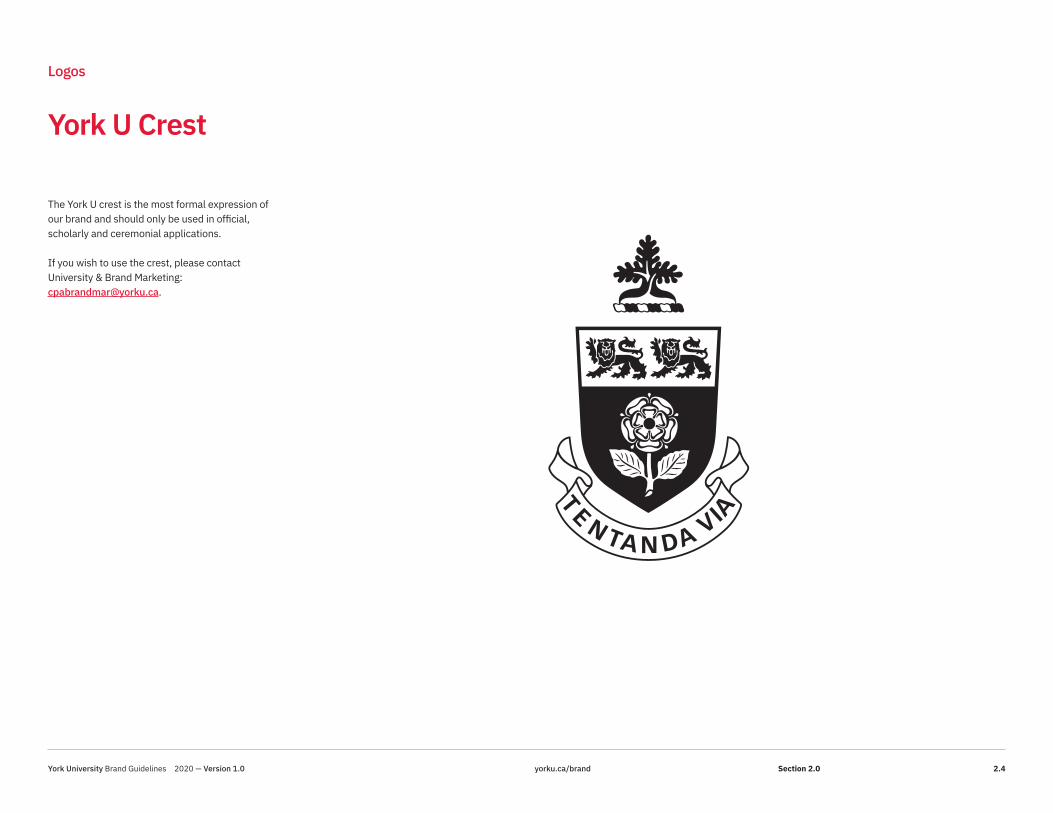
The York U crest is the most formal expression of our brand and should only be used in official, scholarly and ceremonial applications.
If you wish to use the crest, please contact University & Brand Marketing: [email protected].
York University Brand Guidelines 2020 — Version 1.0 yorku.ca/brand 2.4Section 2.0

Primary Colour Variations
Logos As a feature of the new brand system, a reverse version of our logo has been created, which makes it easier to use in a variety of applications. For example, it can be used on a solid York Red background or full-colour photograph where it will be clearly legible.
Our York Red (PMS 186; Hex E31837) plays a critical part in helping our stakeholders, peers and prospects recognize the York U brand in the marketplace. Red emphasizes our Canadian heritage and speaks to our energy and passion.
York University Brand Guidelines 2020 — Version 1.0 yorku.ca/brand 2.5Section 2.0

Digital Colour Variations
Logos To ensure maximum legibility on screens and in media where the logo will be rendered in pixels, a digital version of the logo has been created. To maintain the strength and clarity of the logo, choose the option most appropriate for the background colour or image it is placed on.
The reverse logo should only be used on solid backgrounds or on photographs where it will be clearly legible.Visit yorku.ca/brand to download York U’s Primary and Digital logos.
York University Brand Guidelines 2020 — Version 1.0 yorku.ca/brand 2.6Section 2.0

Full Colour Logos
Logos The full colour logo may be used on white backgrounds, light-coloured backgrounds and photographs with clean space where it will be clearly legible.
York University Brand Guidelines 2020 — Version 1.0 yorku.ca/brand 2.7Section 2.0

Reverse Logos
Logos The reverse logo may be used on photographs where it will be clearly legible. It may also be used on certain solid backgrounds, like York Red and the darker hues of our primary and secondary palettes.
It may also be knocked out of certain Faculty accent colours where it will be legible. When considering the reverse version of the logo, remember it must have enough contrast between the foreground and background to comply with Accessibility for Ontarians with Disabilities Act (AODA) standards. For AODA guidelines, please refer to “ Accessibility” at https://aodaweb.info.yorku.ca/.
York University Brand Guidelines 2020 — Version 1.0 yorku.ca/brand 2.8Section 2.0

Sizing/Spacing
Logos
Safety Zone
0.5x
0.5x
Horizontal Minimum Size Vertical Minimum Size
0.35"0.75"
0.5x
0.5x
x
x
Using the logo correctly helps with brand recognition for all our audiences, as well as maintaining the logo’s legibility and impact.
The logo is protected by an invisible safety space where no graphic material, other than the background, should appear. This is to ensure the logo remains free from visual interference and stands out clearly.
The safety space should be a minimum of 0.5x, where “x” is the height of the square. There may well be instances where the logo needs to be positioned further than this minimum distance from edges to ensure well-balanced design.
The safety space and minimum sizing must be observed when using the logo in any university communication.
York University Brand Guidelines 2020 — Version 1.0 yorku.ca/brand 2.9Section 2.0

Incorrect Usage
Logos
DO NOTcondense or expand the logo
DO NOTchange colours of the logo
DO NOTalter the proportions of the logo's elements
DO NOTadd additional elements to the logo
DO NOTplace the logo over “busy” imagery
DO NOTchange the lock-up of the logo
DO NOTrotate the logo
DO NOTcreate your own anniversary logo
DO NOTuse the digital-only logo in print
Your Name Goes Here
DO NOToutline the logo
DO NOTadd special effects to the logo
DO NOTplace the reverse logo over a light background
50YEARS
It is important to maintain the integrity of York’s logo and not alter it in any way. The brand system provides many opportunities for creative expression, but the locked-up logo is sacrosanct. It is the most important asset of our overall brand.
Please do not create any special event or anniversary versions of the logo. Contact University Brand & Marketing if you have any questions or special requests:[email protected].
York University Brand Guidelines 2020 — Version 1.0 yorku.ca/brand 2.10Section 2.0

York Logo Placement
Logos
In order to create more consistent communication materials, the preferred placement for the York U logo is the bottom right corner.
This rule applies to the primary, sub-brand and Faculty logos as well. The sub-brand and Faculty lock-ups are designed with a flush-right typographic setting and will always work better on the right-hand side of your design.
However, there is some flexibility in the new brand platform. For reasons like maintaining optimum legibility on a photograph or background, or to create a more pleasing layout, the York U logo may be placed in one of the other corners of your document or media file. For example, the logo will work better in the top left for e-communications.
The logo should never be centred in your design.
York University Brand Guidelines 2020 — Version 1.0 yorku.ca/brand 2.11Section 2.0

Sub-brand Primary
Logos
At York, we are proud of our affiliated schools and our bilingual Glendon campus for their excellence and contributions to the university’s reputation.
The typographic lock-up system was designed to promote the sub-brands first, while retaining the connection to the York master brand. Do not split up these locked logos, as this dilutes our overall messaging. We are stronger together.
These locked-up versions are to be used in print applications.
Official logos are available for each sub-brand by contacting the sub-brand’s communications department or University & Brand Marketing: [email protected].
York University Brand Guidelines 2020 — Version 1.0 yorku.ca/brand 2.12Section 2.0

Sub-brand Digital
Logos
These locked-up versions are to be used in digital applications like social media, PowerPoint presentations and digital ads. Whenever the logo is rendered in pixels, please use the digital version.
The reverse version of the logo may be used on a photograph or solid background, but only where it will be clearly legible. For more examples, please see section 2.6-2.8.
York University Brand Guidelines 2020 — Version 1.0 yorku.ca/brand 2.13Section 2.0

Faculty Primary
Logos
Like our sub-brands, the Faculties take a prominent position adjacent to York’s master brand. These locked-up versions are to be used in print applications and may be used in full colour, black and white or reverse.There is a separate version for digital usage.
York University Brand Guidelines 2020 — Version 1.0 yorku.ca/brand 2.14Section 2.0
Faculty Digital
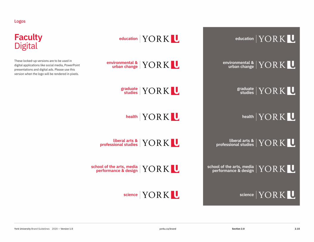
Logos
These locked-up versions are to be used in digital applications like social media, PowerPoint presentations and digital ads. Please use this version when the logo will be rendered in pixels.
York University Brand Guidelines 2020 — Version 1.0 yorku.ca/brand 2.15Section 2.0

Additional Usages and Initiatives
Logos
Sponsorship RepresentationYork’s many Faculties, divisions and units partner with external companies and institutions on a regular basis to signal how they are a part of creating positive change in any given initiative or company. Below are a number of items to consider.
ON-CAMPUS SPONSORSHIPYork is the sole sponsor: Utilize your locked logo if you have one, use that. If you are a division or unit and do not have a locked logo, utilize the York logo only and your division or unit will appear as text only.
More than one York sponsor: Use the York logo and your Faculty, division or unit can be worked into the text with one York logo.
EXTERNAL SPONSORSHIPIf you require your division or unit to be represented with the York logo in a space, you can request a sponsorship logo with your unit/division name for limited sponsorship usage by contacting University Brand & Marketing. In addition, if the sponsorship or partnership is global and not within a higher education context, we recommend using the primary logo versus the digital version of the logo.
Division or Unit Name ExpressionAs a fully comprehensive, research-intensive university with multiple campuses, York has a wide range of communications needs. As such, it is important to express our collective promise of positive change through a consistent brand expression. Its divisions, units and university and student events and initiatives will all benefit from adopting elements of the brand toolkit to ensure our brand remains strong. Here are some simple rules to guide you as you develop your materials.
1. In York’s master-brand architecture, the names of divisions and units are not locked to the York U logo. Within the creative space, divisions and units may express their area by using our official typeface, IBM Plex Sans, and the primary colour palette for the university. In exceptional circumstances, a unique sponsorship logo may be requested but would need to be discussed with University Brand & Marketing in advance. In addition, unique “taglines” are not part of the branding system. Those messages should be incorporated in the communication text. A tagline may not be used as a sign-off. This is to avoid confusion and brand proliferation.
2. To label your initiative or event, use York’s official typeface, IBM Plex Sans. It may be rendered in the primary colour palette and should not include extraneous design elements in the word mark. The York U Brand site provides other elements like imagery, emblems and the Window of Positive Change (see section 4.1) to create a unique expression.
Student-Run InitiativesClubs, organizations and student-run initiatives are not permitted to use any element of the York brand (such as the fonts, colours, logos or design system), as they are not officially sanctioned university properties.
York University Brand Guidelines 2020 — Version 1.0 yorku.ca/brand 2.16Section 2.0

3.0
Brand Elements
York University Brand Guidelines 2020 — Version 1.0 yorku.ca/brand 3
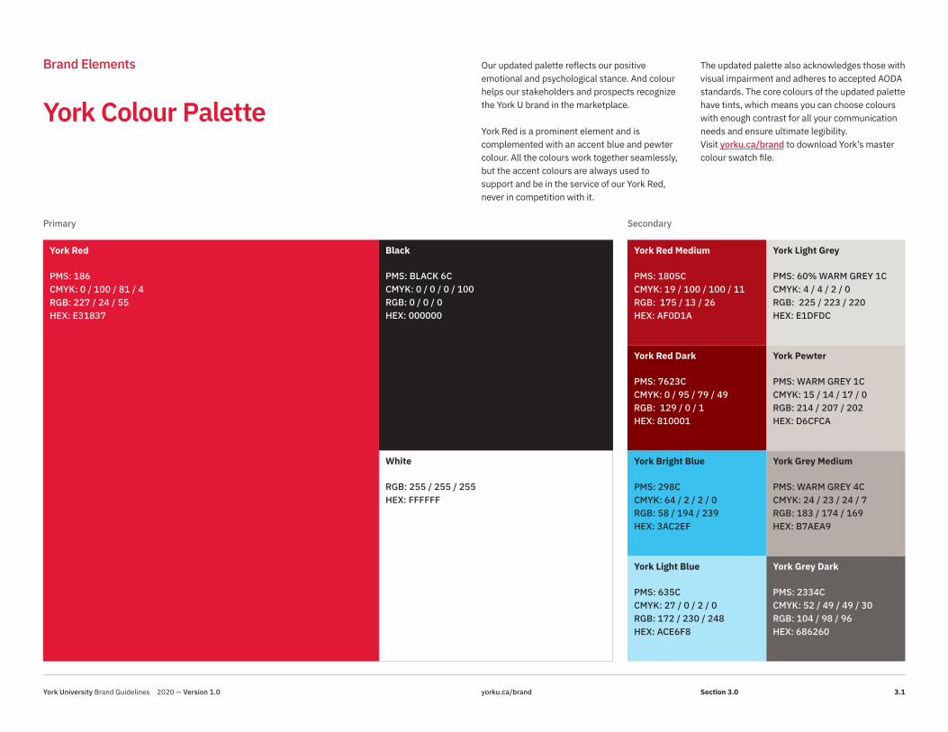
Brand Elements Our updated palette reflects our positive emotional and psychological stance. And colour helps our stakeholders and prospects recognize the York U brand in the marketplace.
York Red is a prominent element and is complemented with an accent blue and pewter colour. All the colours work together seamlessly, but the accent colours are always used to support and be in the service of our York Red, never in competition with it.
The updated palette also acknowledges those with visual impairment and adheres to accepted AODA standards. The core colours of the updated palette have tints, which means you can choose colours with enough contrast for all your communication needs and ensure ultimate legibility.Visit yorku.ca/brand to download York’s master colour swatch file.
York Red
PMS: 186CMYK: 0 / 100 / 81 / 4RGB: 227 / 24 / 55HEX: E31837
York Red Medium
PMS: 1805CCMYK: 19 / 100 / 100 / 11RGB: 175 / 13 / 26HEX: AF0D1A
York Pewter
PMS: WARM GREY 1CCMYK: 15 / 14 / 17 / 0RGB: 214 / 207 / 202HEX: D6CFCA
York Red Dark
PMS: 7623CCMYK: 0 / 95 / 79 / 49RGB: 129 / 0 / 1HEX: 810001
York Light Grey
PMS: 60% WARM GREY 1CCMYK: 4 / 4 / 2 / 0RGB: 225 / 223 / 220HEX: E1DFDC
York Bright Blue
PMS: 298CCMYK: 64 / 2 / 2 / 0RGB: 58 / 194 / 239HEX: 3AC2EF
York Grey Medium
PMS: WARM GREY 4CCMYK: 24 / 23 / 24 / 7RGB: 183 / 174 / 169HEX: B7AEA9
York Light Blue
PMS: 635CCMYK: 27 / 0 / 2 / 0RGB: 172 / 230 / 248HEX: ACE6F8
York Grey Dark
PMS: 2334CCMYK: 52 / 49 / 49 / 30RGB: 104 / 98 / 96HEX: 686260
Black
PMS: BLACK 6CCMYK: 0 / 0 / 0 / 100RGB: 0 / 0 / 0HEX: 000000
White
RGB: 255 / 255 / 255HEX: FFFFFF
York Colour Palette
Primary Secondary
York University Brand Guidelines 2020 — Version 1.0 yorku.ca/brand 3.1Section 3.0

Brand Elements
HIGH-PROFILE EXTERNAL AUDIENCES> Advertising campaigns> Ceremonies
FORMAL
CASUAL
HIGH-PROFILE EXTERNAL / INTERNAL AUDIENCES> Presentations, events and special announcements
PAN-UNIVERSITY EXTERNAL / INTERNAL AUDIENCES> On and off-campus events> Promotions> Reports
INFORMAL / INTERNAL AUDIENCES> Casual announcements> On-campus events
The scale below will help you determine how to use the colours to create communications that range from the most formal to the most informal.
The individual colours in the updated brand palette may be used in different ratios. Think about your audience and choose the right proportion of colour for the type of message you wish to convey. York Colour Palette
Proportionality
York University Brand Guidelines 2020 — Version 1.0 yorku.ca/brand 3.2Section 3.0

Brand Elements
Lassonde OsgoodeGlendon
The palette proportionality provides guidance on how much of the York Red to include in your communications. For internal audiences, sub-brands may use their primary colours more liberally. But for pan-university and external- facing communications, the York Red must be evident for alignment.
Glendon, Lassonde, Osgoode and Schulich have long-established colour palettes that are strongly associated with their identities. Using the sub-brand primary palette, along with the York palette (including reds and greys, black and white) will ensure the York master brand remains strong.
Schulich
Schulich Blue
Schulich GreenLassonde Red
Lassonde Plum
Lassonde Yellow
Lassonde Teal
Lassonde Navy
Glendon Blue
Glendon Gold
Lassonde Black Osgoode Pewter
Osgoode Red
Sub-brand Palette
York University Brand Guidelines 2020 — Version 1.0 yorku.ca/brand 3.3Section 3.0

Brand Elements
Glendon
Glendon, Lassonde, Osgoode and Schulich have long-established colour palettes that are strongly associated with their identities. Using the sub-brand primary palette, along with the addition of the York palette (including reds and greys, black and white) will ensure the York master brand remains strong.
The palette proportionality provides guidance on how much of the York Red to include in your communications. For internal audiences, sub-brands may use their primary colours more liberally. But for pan-university and external- facing communications, the York Red must be evident for alignment.
Sub-brand Palette Proportionality
FORMAL
CASUAL
Lassonde FORMAL
CASUAL
Osgoode FORMAL
CASUAL
Schulich FORMAL
CASUAL
York University Brand Guidelines 2020 — Version 1.0 yorku.ca/brand 3.4Section 3.0

Brand Elements
The Psychology of Colour
Colour is an effective identifier for our university. As such, the use of York Red will ensure connection across all our communications.
The updated York primary palette balances tradition with modernity. It has the flexibility to work in a variety of media and ensures accessibility.
Red has always been part of York’s identity, and it is complemented by timeless black and white, two darker tints of our red, as well as a variety of elegant greys. Only these colours are to be used in our high-level, external-facing communications.
New to the palette, in keeping with our message of positive change, are two hues of blue: a bright and a light version. The addition of these colours provides more opportunity for design expression and may be used university-wide (other than in the most formal circumstances).
YORK REDExciting, energizing, cultivated, courageous.
YORK MEDIUM RED Elegant, refined, mature.
YORK GREYS Sleek, quality, modern, discreet.
YORK DARK RED Earthy, warm, sturdy.
BLACK Powerful, sophisticated, bold, prestigious, modern.
YORK BRIGHT BLUE Draws attention, self-expressive, wise, stimulating, trustworthy.
YORK LIGHT BLUE Clean, joyous, patient.
WHITE Pure, clean, claear, simple, pristine.
Primary
Secondary
York University Brand Guidelines 2020 — Version 1.0 yorku.ca/brand 3.5Section 3.0

Brand Elements
Campus Inspiration
The updated colour palette drew its inspiration from all over the university’s campuses – from its modern interiors to its outdoor spaces and architecture.
IrisCampus Walk
AubergineLife Sciences Building
ChartreuseLearning Commons
RhodamineGlendon College
Sky BlueStudent Centre
AquaStudent Centre
PeriwinkleBergeron Centre
York University Brand Guidelines 2020 — Version 1.0 yorku.ca/brand 3.6Section 3.0

Brand Elements
Faculty Accent Colours
The attributes of our Faculty accent colour palette support our message of positive change. The many programs of study and areas of inquiry available through our Faculties are multi-faceted and nuanced. The suggested accent colour for each reflects the essence of the Faculty subject areas it represents. Each colour has been carefully chosen for its positive connotative associations and chromatic properties, and the way it harmonizes with York Red.
The perception of colour is extremely subjective, but within the spectrum, certain colours have, over time, developed their own histories and emotional meanings. For example, green has long been affiliated with growth, red with passion and blue with loyalty. Colours are used to create action or a response in humans – or can suggest a signal of value or a specific category. The adoption of a unique Faculty accent colour provides differentiation, as well as consistency of meaning and message. The accent colour works as a metaphor for the Faculty – however, not in a literal sense.
PERIWINKLETrusting, impressive, exhilarating.
AUBERGINE Visionary, prestigious, introspective.
CHARTREUSE Experimental, bold, cutting-edge.
AQUA Refreshing, cleansing, flourishing.
IRIS Secure, reliable, wise.
SKY BLUE Rejuvenating, energetic, soothing.
RHODAMINE Active, vibrant, stimulating.
Arts, Media, Performance & Design
Environmental & Urban Change
Education Science
Liberal Arts &Professional Studies
Health Continuing Studies
York University Brand Guidelines 2020 — Version 1.0 yorku.ca/brand 3.7Section 3.0

Faculty Accent Colours Specification
Brand Elements
FORMAL
CASUAL
Headline Text
Headline Text
Headline TextBody Text
Headline TextBody Text
Each Faculty has a specific accent colour within the palette to differentiate itself within the larger institutional brand.
Just like the institutional palette, a proportionality scale has been provided to guide you in using the Faculty colour – from its most formal application (high-profile external audiences) to its informal use for internal messaging.
To supplement the Faculty accent palette, you may use the greys from the main York palette. However, the light and bright blues, and dark and medium reds are reserved for institutional use only.
Usage of the Faculty accent colours are reserved for the specific Faculty and requires approval from the communications manager and/or University Brand & Marketing.
Science Sky Blue
COLOUR PROPORTIONALITY
York University Brand Guidelines 2020 — Version 1.0 yorku.ca/brand 3.8Section 3.0
IBM Plex Sans Thin ABCDEFGHIJKLMNOPQRSTUVWXYZ abcdefghijklmnopqrstuvxyz 1234567890
IBM Plex Sans Thin Italic ABCDEFGHIJKLMNOPQRSTUVWXYZ abcdefghijklmnopqrstuvxyz 1234567890
IBM Plex Sans Extralight ABCDEFGHIJKLMNOPQRSTUVWXYZ abcdefghijklmnopqrstuvxyz 1234567890
IBM Plex Sans Extralight ItalicABCDEFGHIJKLMNOPQRSTUVWXYZ abcdefghijklmnopqrstuvxyz 1234567890
IBM Plex Sans LightABCDEFGHIJKLMNOPQRSTUVWXYZ abcdefghijklmnopqrstuvxyz 1234567890
IBM Plex Sans Light ItalicABCDEFGHIJKLMNOPQRSTUVWXYZ abcdefghijklmnopqrstuvxyz 1234567890
IBM Plex Sans RegularABCDEFGHIJKLMNOPQRSTUVWXYZ abcdefghijklmnopqrstuvxyz 1234567890
IBM Plex Sans ItalicABCDEFGHIJKLMNOPQRSTUVWXYZ abcdefghijklmnopqrstuvxyz 1234567890
IBM Plex Sans TextABCDEFGHIJKLMNOPQRSTUVWXYZ abcdefghijklmnopqrstuvxyz 1234567890
IBM Plex Sans Text ItalicABCDEFGHIJKLMNOPQRSTUVWXYZ abcdefghijklmnopqrstuvxyz 1234567890
IBM Plex Sans Medium ABCDEFGHIJKLMNOPQRSTUVWXYZ abcdefghijklmnopqrstuvxyz 1234567890
IBM Plex Sans Medium ItalicABCDEFGHIJKLMNOPQRSTUVWXYZ abcdefghijklmnopqrstuvxyz 1234567890
IBM Plex Sans Semibold ABCDEFGHIJKLMNOPQRSTUVWXYZ abcdefghijklmnopqrstuvxyz 1234567890
IBM Plex Sans Semibold ItalicABCDEFGHIJKLMNOPQRSTUVWXYZ abcdefghijklmnopqrstuvxyz 1234567890
IBM Plex Sans BoldABCDEFGHIJKLMNOPQRSTUVWXYZ abcdefghijklmnopqrstuvxyz 1234567890
IBM Plex Sans Bold ItalicABCDEFGHIJKLMNOPQRSTUVWXYZ abcdefghijklmnopqrstuvxyz 1234567890
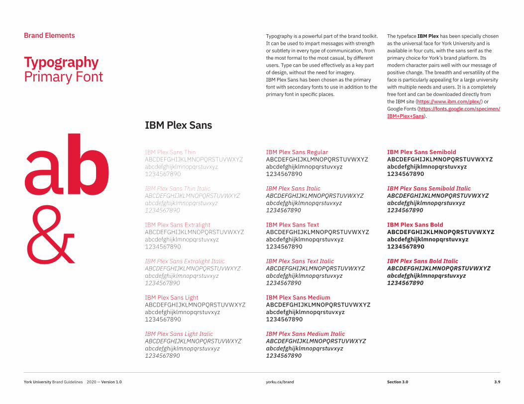
Typography Primary Font
Brand Elements
IBM Plex Sans
ab&
Typography is a powerful part of the brand toolkit. It can be used to impart messages with strength or subtlety in every type of communication, from the most formal to the most casual, by different users. Type can be used effectively as a key part of design, without the need for imagery.IBM Plex Sans has been chosen as the primary font with secondary fonts to use in addition to the primary font in specific places.
The typeface IBM Plex has been specially chosen as the universal face for York University and is available in four cuts, with the sans serif as the primary choice for York’s brand platform. Its modern character pairs well with our message of positive change. The breadth and versatility of the face is particularly appealing for a large university with multiple needs and users. It is a completely free font and can be downloaded directly from the IBM site (https://www.ibm.com/plex/) or Google Fonts (https://fonts.google.com/specimen/ IBM+Plex+Sans).
York University Brand Guidelines 2020 — Version 1.0 yorku.ca/brand 3.9Section 3.0

IBM Plex Serif Thin
IBM Plex Serif Thin Italic
IBM Plex Serif Extralight
IBM Plex Serif Extralight Italic
IBM Plex Serif Light
IBM Plex Serif Light Italic
IBM Plex Serif Regular
IBM Plex Serif Italic
IBM Plex Serif Text
IBM Plex Serif Text Italic
IBM Plex Serif Medium
IBM Plex Serif Medium Italic
IBM Plex Serif Semibold
IBM Plex Serif Semibold Italic
IBM Plex Serif Bold
IBM Plex Serif Bold Italic
IBM Plex Sans Condensed Thin
IBM Plex Sans Condensed Thin Italic
IBM Plex Sans Condensed Extralight
IBM Plex Sans Condensed Extralight Italic
IBM Plex Sans Condensed Light
IBM Plex Sans Condensed Light Italic
IBM Plex Sans Condensed Regular
IBM Plex Sans Condensed Italic
IBM Plex Sans Condensed Text
IBM Plex Sans Condensed Text Italic
IBM Plex Sans Condensed Medium
IBM Plex Sans Condensed Medium Italic
IBM Plex Sans Condensed Semibold
IBM Plex Sans Condensed Semibold Italic
IBM Plex Sans Condensed Bold
IBM Plex Sans Condensed Bold Italic
IBM Plex Mono Thin
IBM Plex Mono Thin Italic
IBM Plex Mono Extralight
IBM Plex Mono Extralight Italic
IBM Plex Mono Light
IBM Plex Mono Light Italic
IBM Plex Mono Regular
IBM Plex Mono Italic
IBM Plex Mono Text
IBM Plex Mono Text Italic
IBM Plex Mono Medium
IBM Plex Mono Medium Italic
IBM Plex Mono Semibold
IBM Plex Mono Semibold Italic
IBM Plex Mono Bold
IBM Plex Mono Bold Italic
Typography Secondary Fonts
Brand Elements
IBM Plex Serif IBM Plex Sans Condensed IBM Plex Mono
The serif, condensed and mono cuts of IBM Plex all work harmoniously with one another and can be used interchangeably to create interesting design expressions and different tones.The secondary fonts are to be used in addition to versus in place of the primary IBM Plex Sans.
Plex is a very hardworking face and was cut to address today’s digital media needs but works equally well in print. It also works very well in small sizes.
Plex is distinctive yet timeless. It balances human and rational elements.
ab&York University Brand Guidelines 2020 — Version 1.0 yorku.ca/brand 3.10Section 3.0

PositiveProgressiveProud
The York VisionYork is a leading international teaching and research university, and a driving force for positive change. With a diverse community and uniquely global perspective, we can make things right for our future.
Orientation Week
#Your #Future
September 21–25 #YUPrideYour Story Starts Here
This is the serif version of the font.
This is great for body copy or to contrast
with the sans serif.
This is the italic, and it is often
used for emphasis, quotations or
specific calls to action. #YU
Typography Usage
Brand Elements
York University’s typeface, IBM Plex, comes in four families and may be used in combination to create texture and interest in your design and communications. The serif text face is excellent for conveying longer passages and for contrasting with the sans serif.
The variety of weights available for each of the four families within the typeface provides ample opportunity for expression – from the most formal to the most casual. Use the sans serif as the primary choice, but to create hierarchical levels of information, the condensed, italic and mono faces may be used for differentiation or accent.
York University Brand Guidelines 2020 — Version 1.0 yorku.ca/brand 3.11Section 3.0

4.0
Design System
York University Brand Guidelines 2020 — Version 1.0 yorku.ca/brand 4

Window of Positive Change
Design System
Forward Bound
The Window of Positive Change is the proprietary design element of the refreshed visual design system and is an apt reference for York University – a leading proponent of positive change through its research, scholarship, progressive pedagogy, advocacy and student engagement.
This is a window onto the world. The idea offers possibility and hope – as a witness to social, technological, political and cultural change. It situates the York community in two worlds contemporaneously, both the interior and the exterior.
The Window of Positive Change is a metaphor for a progressive academic experience, openness to ideas, transparency, inquiry and critical thinking. The window is a vessel within which the York community (from the formal institution to its partners and students) has the opportunity to create meaning. At times, it places the subject inside the frame but always with a view outward. Here we may tread both worlds to gain empathy and a broader perspective.
York University Brand Guidelines 2020 — Version 1.0 yorku.ca/brand 4.1Section 4.0

Incremental Rule
Design System
0.35"20px
(1x)
0.525"30px
(1.5x)
0.7"40px
(2x)
0.875"50px
(2.5x)
1.05"60px
(3x)
0.175"10px
(0.5x)
0.0875"5px
(0.25x)
PrintDigital
Scale
The width of the Window of Positive Change is determined by the size of the square in the York logo. A simple incremental rule consisting of basic multiplication is applied to produce the various window widths in use. The rule states that starting from the base size (referred to as x), the window may grow or decrease in size by multiples of 0.5. This means the base size (x) can be multiplied by 0.5, 1, 1.5, 2, 2.5, 3, 3.5 and so on.
The only exception to this 0.5 rule is that the base size (x) can also be reduced one step further by multiplying it by 0.25. This allows for the creation of a “keyline” window. Using this formula, a vast variety of window widths can be created. There are no formal rules for how to size the logo, but users must adhere to the minimum size for proper reproduction.
The logo is a vital signifier of the university brand and therefore should be clear and prominent. Adhering to the incremental rule will ensure consistency throughout all digital and print materials.
When the York logo does NOT appear with the window (e.g., in social media posts) the minimum sizing used for the logo (0.35” for formal/print and 20px for digital) should still be applied to sizing the window. This would give a base starting width of 0.35” for formal/print and 20px for digital, which the incremental rule is then applied to. For windows that require bleed, the recommended width is 1x to allow for proper trimming.
0.35" (x) 20px (x – not to scale)
York University Brand Guidelines 2020 — Version 1.0 yorku.ca/brand 4.2Section 4.0

Window of Positive Change Usage and Rules
Design System
x
x
x
0.5x0.5x
0.5x
0.5x
xx
A foundational element of our new visual design system is the Window of Positive Change. These are illustrations of the window system blueprint. The example to the right illustrates both the dimension of the window and the safety space for the York logo. The dimensions noted comply with the incremental rule. The pink represents a sample window dimension, while the blue indicates the safety space to ensure the York logo is clear and has maximum impact.
Window
Safety Space
York University Brand Guidelines 2020 — Version 1.0 yorku.ca/brand 4.3Section 4.0

x
x
6x
6x
3x
3x
Contiguous Windows
1.5x
1.5x
1.5x1.5x 1x
1x
Window of Positive Change Usage and Rules
Design System As previously noted, the window dimension is based on the size of the square in the York U logo, but you have the flexibility to use the window (or windows) sizes that best suit your content and design.
If you are using a full-colour logo, and it is not inside a window, then use the “x” incremental rule (section 4.2) to help you determine the safety space between the logo and the window to create an aesthetically pleasing composition.
Window
Safety Space
x
York University Brand Guidelines 2020 — Version 1.0 yorku.ca/brand 4.4Section 4.0
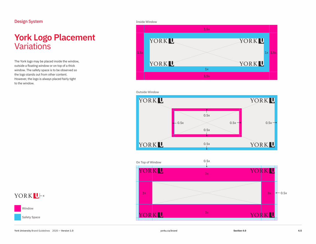
York Logo Placement Variations
Design System
The York logo may be placed inside the window, outside a floating window or on top of a thick window. The safety space is to be observed so the logo stands out from other content. However, the logo is always placed fairly tight to the window.
1.5x
3x
1.5x
3x
1.5x
3x
1.5x
3x
Inside Window
Outside Window
On Top of Window
1x
1x
0.5x0.5x
0.5x
0.5x
0.5x
0.5x
0.5x
0.5x
Window
Safety Space
x
York University Brand Guidelines 2020 — Version 1.0 yorku.ca/brand 4.5Section 4.0

York Logo Placement Variations
Design System
It is important to note that the preferred placement for the York logo is the bottom right, even in the examples here, where the window is inset.
Inside Window (Outside Inset)
Inside Window (Inside Inset)
0.5x
0.5x
1x
1x
1x
1x
1x
1x
1x
1x
0.5x
0.5x
0.5x
0.5x
Window
Safety Space
x
York University Brand Guidelines 2020 — Version 1.0 yorku.ca/brand 4.6Section 4.0

x
x
6x
6x
3x
3x
1.5x
1.5x
1.5x1.5x 1x
1x
Window of Positive Change Usage and Rules
Design System For institutional use, the window must only be red or white. A white pillar may also be used to set it off against a red window, or conversely, a red pillar may be used within a white window.
The Window of Positive Change must be used as a design element in all formal communications. However, for communications that are more casual or internal-facing, and in social media, it is not mandatory.See section 4.28 for usage summary.
Window
Safety Space
x
York University Brand Guidelines 2020 — Version 1.0 yorku.ca/brand 4.7Section 4.0

x
x0.5x0.5x
0.5x
0.5x
Design System
Floating Singular Window
xx
x
x
x
x
Floating Singular Window
Window of Positive Change Usage and Rules
0.25x0.25x
0.25x
0.25x
“Keyline” Singular Window
x
x
Window
Safety Space
x
York University Brand Guidelines 2020 — Version 1.0 yorku.ca/brand 4.8Section 4.0

x
x
xx
x
x
0.5x0.5x
0.5x
0.5x
Design System
Floating Multiple Windows in an Adjacent Arrangement
x
x
xx
x
x
0.5x0.5x
0.5x
0.5x
0.5x0.5x
0.5x
0.5x
Floating Multiple Windows with Touching Corners
Window of Positive Change Usage and Rules
Window
Safety Space
x
York University Brand Guidelines 2020 — Version 1.0 yorku.ca/brand 4.9Section 4.0

Headline Text Goes Here
Headline Text Goes Herex
x
x
x
x
x
0.5x
0.5x
0.5x
0.5x
0.5x
0.5x
0.5x
0.5x
0.5x
0.5x
Design System
x
x
0.5x
0.5x
Open Window
Open Window
Window of Positive Change Usage and Rules
Window
Safety Space
x
York University Brand Guidelines 2020 — Version 1.0 yorku.ca/brand 4.10Section 4.0

6x
xx
x
x
xx 13x
x
x
x
x
Design System
Contiguous Windows with Inset (Useful for Type and Messages)
Window of Positive Change Usage and Rules
Window
Safety Space
x
York University Brand Guidelines 2020 — Version 1.0 yorku.ca/brand 4.11Section 4.0

Faculty Accent Pillar Examples
Design System A feature of the new brand system is a “pillar” to identify sub-brands and Faculties within the larger master brand. The pillar is integrated within the overall window structure and should be the same width. The pillar may be used on the left or right side of the window, but please observe the safety space rules for the logo.
For Faculty use, the window should be red or white with the pillar in your Faculty colour.
For sub-brands, this rule is reversed: the window should be coloured in your primary brand colour (Glendon blue, for example) with a red pillar to connect it to the York brand.
x
x
6x
6x
3x
3x
1.5x
1.5x
1.5x1.5x x
x
Window
Safety Space
Faculty Accent
x
York University Brand Guidelines 2020 — Version 1.0 yorku.ca/brand 4.12Section 4.0
Faculty Accent Window Examples
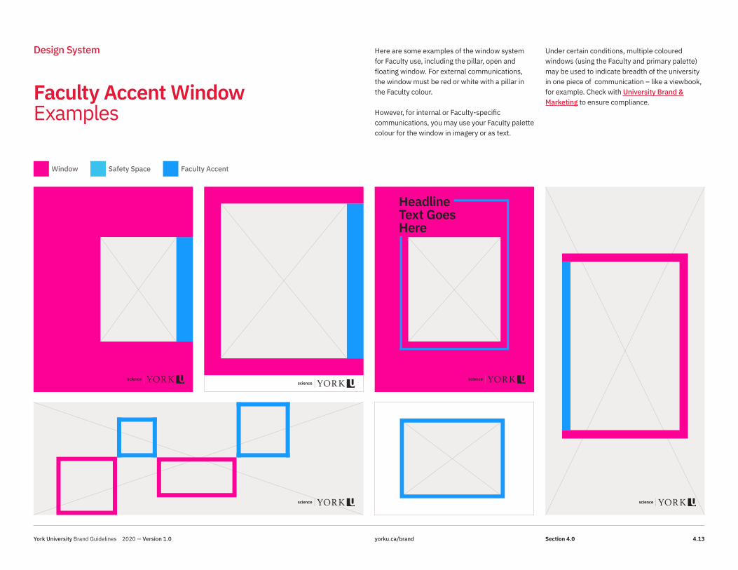
Design System Here are some examples of the window system for Faculty use, including the pillar, open and floating window. For external communications, the window must be red or white with a pillar in the Faculty colour.
However, for internal or Faculty-specific communications, you may use your Faculty palette colour for the window in imagery or as text.
Under certain conditions, multiple coloured windows (using the Faculty and primary palette) may be used to indicate breadth of the university in one piece of communication – like a viewbook, for example. Check with University Brand & Marketing to ensure compliance.
Headline Text Goes Here
Window Safety Space Faculty Accent
York University Brand Guidelines 2020 — Version 1.0 yorku.ca/brand 4.13Section 4.0

Sub-brand Accent Pillar Examples
Design System The pillar may also be used by sub-brands when communication is pan-university. The window would be coloured according to the main sub-brand colour, with a York Red pillar. For example, Osgoode Hall Law School would use a pewter window with a red pillar.
The sub-brands (and Faculties) must use the pillar on external-facing communications, but have the flexibility to use a solid Faculty-coloured window for more casual communications or for internal use. However, with this option, the York Red must still be used in the proper proportion.
Window (sub-brand primary colour)
Safety Space
x
Sub-brand Pillar (York Red)
x
x
6x
6x
3x
3x
1.5x
1.5x
1.5x1.5x x
x
York University Brand Guidelines 2020 — Version 1.0 yorku.ca/brand 4.14Section 4.0

Sub-brand Accent Window Examples
Design System
Headline Text Goes Here
Window (sub-brand primary colour) Safety Space Sub-brand Pillar (York Red)
York University Brand Guidelines 2020 — Version 1.0 yorku.ca/brand 4.15Section 4.0

Photography
Design System
York is an inspiring, welcoming and progressiveuniversity, and we express this through ourchoice of words and images. We see never- ending possibilities, and we find great delight insharing them with others. And one of the bestways to tell our story is through photography, byshowing real-life moments as our communitymembers engage in their pursuits, enjoy thecollegiality of their classmates and colleagues,and strive for positive change.
We express this with:
• Unique angles and unexpected cropping to show there is always another way of looking at things. We celebrate moments of discovery and are always happy to share a smile.
• Focus on people as a way to tell our story. This approach is a visceral and memorable way to inspire sharing, to propel curiosity and to provide a “picture” of our brand.
• Capture authentic moments with eyes to camera or create a sense that the viewer is right there in the middle of a conversation. This is much more compelling than architectural shots.
While it isn’t always easy to avoid using stockphotography, as a goal, please use no more than20% in your materials. With camera phones asgood as they are, it is usually possible to capturea real moment from your own Faculty or area tohelp tell your story.
York University Brand Guidelines 2020 — Version 1.0 yorku.ca/brand 4.16Section 4.0
Photography Assets
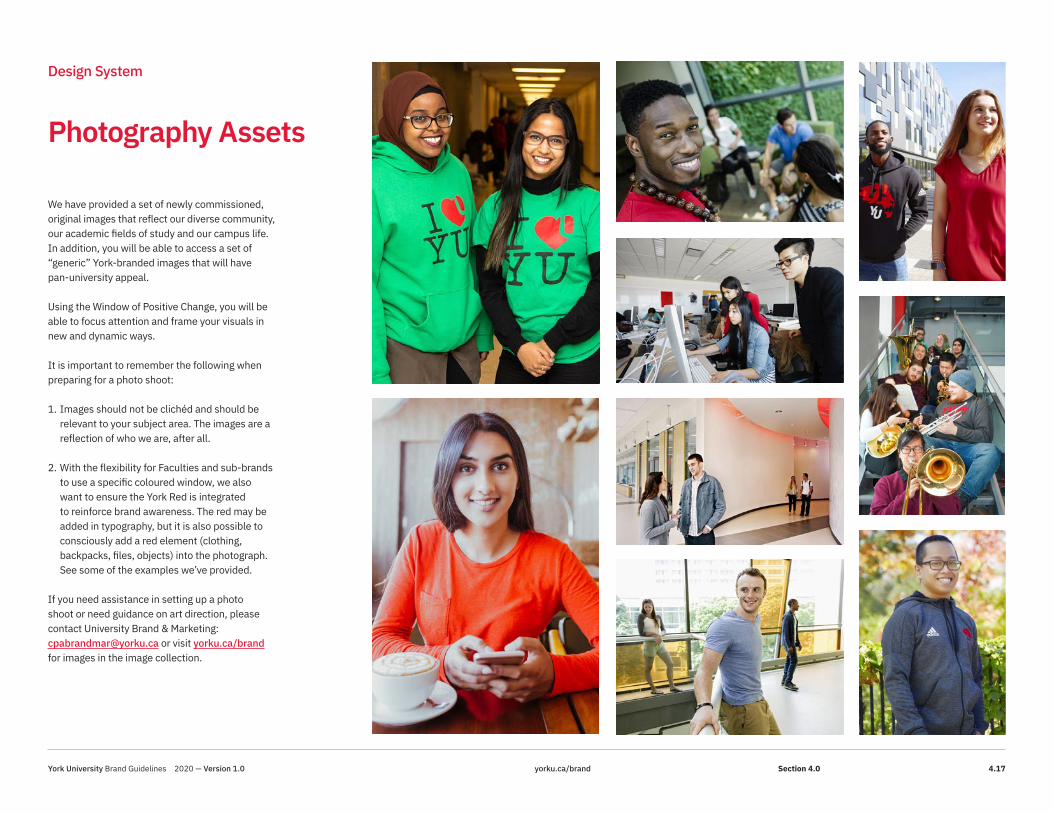
Design System
We have provided a set of newly commissioned, original images that reflect our diverse community, our academic fields of study and our campus life. In addition, you will be able to access a set of “generic” York-branded images that will have pan-university appeal.
Using the Window of Positive Change, you will be able to focus attention and frame your visuals in new and dynamic ways.
It is important to remember the following whenpreparing for a photo shoot:
1. Images should not be clichéd and should be relevant to your subject area. The images are a reflection of who we are, after all.
2. With the flexibility for Faculties and sub-brands to use a specific coloured window, we also want to ensure the York Red is integrated to reinforce brand awareness. The red may be added in typography, but it is also possible to consciously add a red element (clothing, backpacks, files, objects) into the photograph. See some of the examples we’ve provided.
If you need assistance in setting up a photo shoot or need guidance on art direction, please contact University Brand & Marketing: [email protected] or visit yorku.ca/brand for images in the image collection.
York University Brand Guidelines 2020 — Version 1.0 yorku.ca/brand 4.17Section 4.0

Social Media Avatars
Design System
To ensure brand consistency across all York University social media channels, we have developed guidelines and templates for profile avatars. These profile avatars are designed to visually identify the institution, no matter what channel or platform, with the audience to establish trust and brand recognition. The University institutional channels (and approved pan-university channels) are the only entities that may use the digital logo. All other channels are categorized into three groups: sub-brands, Faculties, and departments, and will follow the guidelines below. Sub-brands – have the option to use a photograph, their digital logo, or add a typeface Plex acronym to a solid white background or photograph within their accent-colour circle.
Faculties – have the option to either use a photograph or add a typeface Plex acronym to a solid white background or photograph within their accent-colour circle and “YorkU” bottom ribbon.
Departments – have the option to use a photograph or add a typeface Plex acronym to a solid white background or photograph within the red circle and “YorkU” bottom ribbon. If you need new Social Media Avatars, please contact University & Brand Marketing: [email protected].
Institutional ONLY social media avatars
Community/Non-institutional social media avatars
Sub-brand social media avatars
Faculty social media avatars
LA&PS ALUMNISCI BOOK STOREEDU RESEARCH CONVO CAREER
CENTRE
ALUMNI BOOK STORE RESEARCH CONVO CAREER
CENTRELA&PS SCI EDU
York University Brand Guidelines 2020 — Version 1.0 yorku.ca/brand 4.18Section 4.0

Digital Examples
Design System
Get ahead. Start on your career at York University.
Forgot your textbook at home? Check if the library has it on reserve.
START SEARCHING
Forgot your textbook at home? Check if the library has it on reserve.
START SEARCHING
Get ahead. Start on your career at York University.
Connect with us on Social Media
Instagram@YorkU_Intl
Scan the QR code to connect with York International
Twitter@YorkU_Intl
WeChat@YorkU_Intl
York University Brand Guidelines 2020 — Version 1.0 yorku.ca/brand 4.19Section 4.0

Social Media Examples
Design System
York University Brand Guidelines 2020 — Version 1.0 yorku.ca/brand 4.20Section 4.0

Social Media Examples Sub-brand
Design System
York University Brand Guidelines 2020 — Version 1.0 yorku.ca/brand 4.21Section 4.0

Faculty Print Examples
20/21
Environmental Science Overview
Bachelor of Science
20/21
Environmental Science Overview
Bachelor of Science
20/21
Biochemistry Overview
Bachelor of Science
20/21
Biochemistry Overview
Bachelor of Science
20/21
Astronomy Overview
Bachelor ofScience
20/21
Astronomy Overview
Bachelor ofScience
20/21
Mathematics Overview
Bachelor ofScience
20/21
Bachelor ofScienceChemistry Overview
Design System
York University Brand Guidelines 2020 — Version 1.0 yorku.ca/brand 4.22Section 4.0

Pull-up Banners Pillar Examples
Design System
Given the primary use of pull-up banners, they are often located in heavy-traffic areas. Banners must have the formal York U logo positioned at the top, where it is visible from a distance.
PreferredPull-up banners must feature logo treatments as indicated to the right for projects representing York U, its sub-brands, Faculties, and divisions and units.
ThinkersInitiatorsExplorers
MakersCollaborators
DreamersCreators Wonderers
InnovatorsInventors
Faculty Banner
DiscoverersExplorersPathfinders
InitiatorsTrailblazers
Institutional Banner
York University Brand Guidelines 2020 — Version 1.0 yorku.ca/brand 4.23Section 4.0

Emblems
Design System
U
U U U U
U U
U U U U
As part of the brand platform toolkit, a suite of unique emblems has been developed for use by the York community. The emblems are based on a common geometrical lozenge shape, derived from the interior of the “U” in the York University square symbol.
The emblems are flexible enough to be used in print and digital applications, and provide another element for expression – from embellishing design to wayfinding and action items. Because the emblems are based on geometry, there are opportunities to create new versions to suit your message, but please contact University Brand & Marketing for these requests.
Please remember, these emblems are used as accents and are not to be used beside a word mark or to create a logo. This is important in order to protect York’s brand integrity.
You can download these emblems at yorku.ca/brand.
York University Brand Guidelines 2020 — Version 1.0 yorku.ca/brand 4.24Section 4.0

Emblems (Wayfinding and Action Items)
Navigation ArrowBackward
ArrowFull-Screen
Plus SignAddition
Navigation ArrowForward
BurstLoading
CheckmarkYes
ArrowUp
Double Chevron RightFast-Forward
PoundHashtag
ArrowDown
Double Chevron LeftRewind
CrossClose Window
ArrowLeft
Vertical StrokesPause
HamburgerMenu
ArrowRight
InternationalFlag
Equal SignSum
Design System
York University Brand Guidelines 2020 — Version 1.0 yorku.ca/brand 4.25Section 4.0

Emblems (Embellishments)
Open Plus Sign
Triple Chevrons
Books
Pathways
Touch Point
Meeting Place Convergence
Spotlight
Hall of Justice
SmileWelcome
Double Helix
Collaboration
GroupCommunity
Links
Perspectives
StudyFocus
Gear
Forward
MovementFluidity
Design System
York University Brand Guidelines 2020 — Version 1.0 yorku.ca/brand 4.26Section 4.0

Emblem Colour Variations
There are four different versions of the emblems that may be implemented: solid York Red, solid reverse, outlined York Red and outlined reverse. This range allows for application in print and digital communications – on photos and solid backgrounds.
Design System
York University Brand Guidelines 2020 — Version 1.0 yorku.ca/brand 4.27Section 4.0

Usage Summary
Design System This chart is a general guideline on the usage and relationship of York’s branding blocks usage ranging from high-profile institutional to casual settings.
York Brand Messaging
Logo Typography Window of Positive Change
Accent Pillar Primary Colours
Secondary/ Accent Colours
Emblems Inspiring, Welcoming Imagery
Video Bumpers, Extros
HIGH-PROFILE EXTERNAL AUDIENCES> Advertising campaigns> Ceremonies
Optional Optional Optional
HIGH-PROFILE EXTERNAL / INTERNAL AUDIENCES> Presentations, events and
special announcementsOptional Optional Optional
PAN-UNIVERSITY EXTERNAL / INTERNAL AUDIENCES> On and off-campus events> Promotions> Reports
Optional Optional Optional Optional Optional Optional
INFORMAL / INTERNAL AUDIENCES> Casual announcements> On-campus events
Optional Optional Optional No Optional Optional No
York University Brand Guidelines 2020 — Version 1.0 yorku.ca/brand 4.28Section 4.0

Campus Advertising
Design System
York U Shuttles The York U shuttles are a great place to promote your message – complementary to the York community, they offer transportation services between York U and the Village (small buses), and Keele and Glendon campuses (big buses). On average, shuttles transport approximately 500 students per day on 26 shuttles to and from Glendon. That's an average of 10,000 students per month from September to April across our campuses, providing you with a unique opportunity to reach a wide student audience.The cost to post something inside the shuttle is free (excluding the cost of printing). Bus ad space specifications:Small buses:9 ¾ “ x 11’ 10” or 9 ¾ “ x 14’ 8”Small GMC low floor accessible bus:10.5 “H X 15’6”L or 10.5” H X 12’4” LLarge buses (school buses).6” H X 27” L 6 Sections Right side / 5 sections Left side6”H X 37” L 1 Section Left side
Contact Janine Frost for more information.
YFile YFile is York University’s campus “newsletter,” reporting on institutional news, major events, research and people. (YFile’s reporters provide event coverage for major pan-University events.) Published by York University’s Communications & Public Affairs Division, YFile is distributed by email each Tuesday and Thursday (during the COVID-19 pandemic), with special issues on the first and third Friday of each month. More than 5,000 faculty and staff of the University receive YFile each week. To learn more, visit the More about YFile page or contact Jenny Pitt-Clark, YFile editor.
Ad size: 580 x 340 pixels
yu link Yu link is York University’s intranet – a Passport York–protected site that is the central location for all things York. Employees visit yu link daily to find forms, documents, news and information geared toward the internal York community. Using yu link to share information, whether in the form of an announcement or news piece, is a quick way to reach thousands of faculty and staff. Please contact Vanessa Thompson and Karen Traboulay for more information.
York University Brand Guidelines 2020 — Version 1.0 yorku.ca/brand 4.29Section 4.0
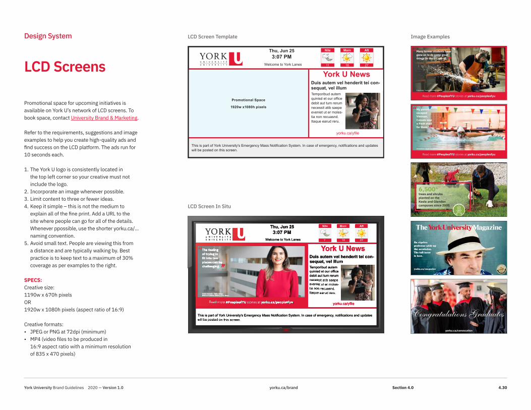
LCD Screens
Design System
Promotional Space
1920w x1080h pixels
Thu, Jun 253:07 PM
Welcome to York Lanes
This is part of York University's Emergency Mass Notification System. In case of emergency, notifications and updates will be posted on this screen.
yorku.ca/yfile
Nite
11
Morn
16
Aft
27
York U NewsDuis autem vel henderit tei con-sequat, vel illum Temporibud autem quinisd et our office debit aut tum rerum necessit atib saepe eveniet ut er moles-tia non recuasnd. Itaque earud reru.
Promotional space for upcoming initiatives is available on York U’s network of LCD screens. To book space, contact University Brand & Marketing.
Refer to the requirements, suggestions and image examples to help you create high-quality ads and find success on the LCD platform. The ads run for 10 seconds each.
1. The York U logo is consistently located in the top left corner so your creative must not include the logo.
2. Incorporate an image whenever possible.3. Limit content to three or fewer ideas.4. Keep it simple – this is not the medium to
explain all of the fine print. Add a URL to the site where people can go for all of the details. Whenever ppossible, use the shorter yorku.ca/... naming convention.
5. Avoid small text. People are viewing this from a distance and are typically walking by. Best practice is to keep text to a maximum of 30% coverage as per examples to the right.
SPECS:Creative size: 1190w x 670h pixels OR 1920w x 1080h pixels (aspect ratio of 16:9)
Creative formats:• JPEG or PNG at 72dpi (minimum)• MP4 (video files to be produced in
16:9 aspect ratio with a minimum resolution of 835 x 470 pixels)
LCD Screen Template
LCD Screen In Situ
Image Examples
Read more #PeopleofYU stories at yorku.ca/peopleofyu
Many former students have gone on to do some great things [in the art world].
P. Roch Smith – Foundry/Metal Studio Technician
‘‘’’
Congratulations Graduatesyorku.ca/convocation
LCD – 1190x670
My parents escaped Vietnam. Canada was a fresh start for them.
Vienna Nguyen – Student, Bachelor of Kinesiology
‘‘
’’
Read more #PeopleofYU stories at yorku.ca/peopleofyu
6,500+ trees and shrubs planted on the Keele and Glendon campuses since 2005
LCD – 1190x670
Nite
11
Morn
16
Aft
27
Nite
11
Morn
16
Aft
27
York University Brand Guidelines 2020 — Version 1.0 yorku.ca/brand 4.30Section 4.0

Email Headers
Design System
PRINT (EXISTING) FORMAL LOGO DIGITAL LOGO
DIGITAL LOGO VERTICALPRINT (EXISTING) FORMAL VERTICAL
PRINT LOGO (NEW X-HEIGHT) MODERN
PRINT LOGO — MODERN VERTICAL
Les Mercredis du mieux-être
The York U logo should always appear at the top of all e-communication, so it is instantly recognized as York University correspondence. If, however, the e-communication is in an attachment, the regular logo placement is acceptable. On the right are examples.
For generic York U email templates and header graphics, visit yorku.ca/brand.
Customized template/headers are available upon request. Please contact University Brand & Marketing.
York University Brand Guidelines 2020 — Version 1.0 yorku.ca/brand 4.31Section 4.0

Email Signatures
Design System
There are three versions of email signatures for you to use; York U generic signature, customized Faculty and sub-brand signatures. Select the version that represents your area. Go to yorku.ca/brand to download the word document and update accordingly. INSTRUCTIONS:• Use the template provided that best suits your
area/division, Faculty or sub-brand• Edit the text to reflect your personal
information.• Be sure to reset the links for your email address
and website if necessary.• Once your edits have been completed, copy
and paste the text into a new signature within Outlook preferences.
Rules:1. It is not permitted to use more than one
ranking. Select one that best represents your Division, Faculty or sub-brand
2. No other logos are permitted other than the York U logo
3. Do not change the size or position of the logos.4. Due to AODA, do not replace the vertical bar
with a bullet5. Keep line length to under 55 characters to
avoid text wrapping (bad breaks) on mobile devices.
Jane Doe PhDJob TitleDepartment/Unit NameC 416-123-0000T 416-736-2100 ext 00000 | ALT [email protected] | yorku.ca
Division, Faculty or Sub-brand | YORK UNIVERSITYOffice No. Campus Building4700 Keele Street Toronto ON, Canada M3J 1P3
Ranked 33rd in the World in theTimes Higher Education 2020 Impact Rankings
10pt IBM Plex Sans Bold, Hex 000000 10pt IBM Plex Sans Bold, Hex 000000 10pt IBM Plex Sans Bold, Hex 000000
8.5pt IBM Plex Sans Regular, Hex 000000
8.5pt IBM Plex Sans Regular, Hex 000000
DigitalEmail logo sized specifically for email client
8.5pt IBM Plex Sans Bold Italic, Hex 000000
Jane Doe PhDJob TitleDepartment/Unit NameC 416-123-0000T 416-736-2100 ext 00000 | ALT [email protected] | yorku.ca
Division, Faculty or Sub-brand | YORK UNIVERSITYOffice No. Campus Building4700 Keele Street Toronto ON, Canada M3J 1P3
Ranked 33rd in the World in theTimes Higher Education 2020 Impact Rankings
Jane Doe PhDJob TitleDepartment/Unit NameC 416-123-0000T 416-736-2100 ext 00000 | ALT [email protected] | yorku.ca
School of the Arts, Media, Performance & Design YORK UNIVERSITYOffice No. Campus Building4700 Keele Street Toronto ON, Canada M3J 1P3
York University named one of 2020 Canada’s Greenest Employers
Jane Doe PhDTitle | Titre du posteDepartment Name | Départment nomC 416-123-0000T /T 416-123-4567 ext 00000 | ALT [email protected] | yorku.ca
Glendon Campus / Campus GlendonUNIVERSITÉ YORK UNIVERSITYOffice No. Building Name 2275 Bayview Avenue Toronto ON, Canada M4N 3M6
Ranked 33rd in the World in theTimes Higher Education 2020 Impact Rankings / French Translation here
York University Brand Guidelines 2020 — Version 1.0 yorku.ca/brand 4.32Section 4.0

PowerPoint
Design System
A York U PowerPoint template is available at yorku.ca/brand. The template has been designed as a “theme” with the York-approved primary and secondary colours and fonts embedded for ease of use. Branded layouts are also included for title slides and section slides, featuring the York colours and campus photos.
Feel free to change these photos as you see fit for your presentation, but note that in order to protect the integrity of the brand, the York U logo must appear on the title slide. Campus images can be found in the York U Image collection at yorku.ca/brand.
Sub-brands and Faculties can use their locked logo in the presentation. If you require assistance to customize a York U PowerPoint template, please contact University Brand & Marketing. It is the responsibility of the user to maintain AODA compliance when adding content and graphics. For AODA guidelines, please refer to “ Accessibility” at https://aodaweb.info.yorku.ca/.
8
AssetsCopy and paste these elements to use on other slides. You can use these shapes and arrows to build processes and diagrams.
Add callout text here
Add callout text here
Add callout text here
Add callout text here
Add callout text here
Add callout text here
## ## ## ## ## ##
XX% XX% XX% XX% XX% XX%
CHART CALLOUTS
LINE & ARROW STYLES
SAMPLE PHOTO CAPTION TREATMENT
For additional design resources, follow the link below to the York-approved photo library:https://yorku.ca/brand/brand-assets/photo-library/
Find this caption style by accessing Level 7of paragraph styles.
You may also copy and paste this textand white box to overlay your photos.
York University Brand Guidelines 2020 — Version 1.0 yorku.ca/brand 4.33Section 4.0

Website
Design System
The web is a critical communication tool for York U and is the primary recruitment vehicle. That is why it is important to provide a memorable online experience that reflects the brand. Built on research, input and feedback from key website users, our digital properties incorporate the latest trends in design and functionality.
DIGITAL LOGOSThere is a unified online relationship between York U and its sub-brands. In web applications, the sub-brand logos appear left of the global navigation in locked form. For Faculty, division and unit websites, the primary York U digital logo remains in the upper left of the global navigation. The Faculty, division and unit name appears in text in the York U solid red bar beneath the global navigation, as pictured to the right. In addition, Faculties are provided with a faculty-specific global navigation with key audience objectives in mind.
RESPONSIVE DESIGN THEMEAs user behaviour evolves, delivering a consistent and cohesive user experience across the University’s more than one million web pages is of utmost importance. The York2020 responsive design theme in WordPress provides the best user experience for any device.
URL NAMING CONVENTIONTo allow for consistent branding and better use of SEO, all new websites using yorku.ca in their URL must use this theme (exceptions may apply). When promoting your website, please ensure the yorku.ca/sitename URL is used and a redirect to the site page set up. Consult Digital Marketing at [email protected] in University Brand & Marketing for more info.
Home Page Web
About Page Web
Home Page Mobile
About Page Mobile
CREATING YOUR NEW WEBSITEYork University’s Digital Experience HUB provide the skills and resources to develop an optimized website and consistent user experience in support of the University’s goals. To get started visit: yorku.ca/digitalexperiencehub.
York University Brand Guidelines 2020 — Version 1.0 yorku.ca/brand 4.34Section 4.0
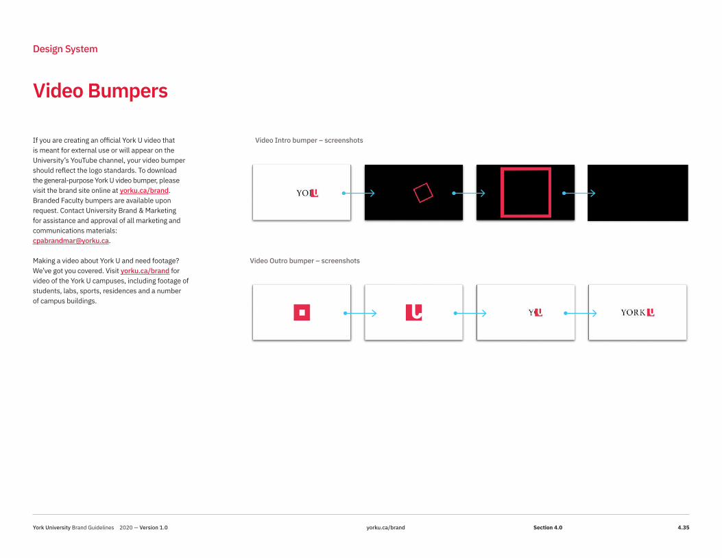
Video Bumpers
Design System
If you are creating an official York U video that is meant for external use or will appear on the University’s YouTube channel, your video bumper should reflect the logo standards. To download the general-purpose York U video bumper, please visit the brand site online at yorku.ca/brand. Branded Faculty bumpers are available upon request. Contact University Brand & Marketing for assistance and approval of all marketing and communications materials:[email protected].
Making a video about York U and need footage? We’ve got you covered. Visit yorku.ca/brand for video of the York U campuses, including footage of students, labs, sports, residences and a number of campus buildings.
Video Intro bumper – screenshots
Video Outro bumper – screenshots
York University Brand Guidelines 2020 — Version 1.0 yorku.ca/brand 4.35Section 4.0

Video – Lower Thirds
Design System
Consistency in video applications builds awareness and helps to solidify brand recognition. Guidelines for the “lower thirds” provides details pertaining to the location of name, title and subject matter while working within the Design System. To download template files, visit yorku.ca/brand.
The York watermark is optional and only to be used in paid advertisements, boosted social media, or any video that has the potential of being viewed or shared outside of York University channels. For example: Markham Campus announcements. The watermark would appear and stay for the duration of the video. For longer videos or those with a multitude of graphics and text, it can be used intermittently at the discretion of the user, in order to minimize distractions.
Single Line Name Title VersionYork Red: 100% OpacityFont: IBM Plex Sans Bold (white)Name font size: 39 px
Double Line Name Title VersionDouble Subject- Use lower third with double line name for horizontal video with two subjects.
Positioning:- Position on the screen opposite side of the subject.- Position above the Closed Caption box. Leave the bottom 25% of the screen clear for captions.
Positioning:- Position on left side of the screen.- Position above the Closed Caption box. Leave the bottom 25% of the screen clear for captions.
Double Line Name Title VersionYork Red: 100% OpacityFont: IBM Plex Sans Bold (white)Name font size: 44 px
Black: 100% OpacityFont: IBM Plex Sans Medium (white)Title font size: 29 px
16:9 video 9:16 video
Black: 100% OpacityFont: IBM Plex Sans Medium (white)Title font size: 29 px
Two Subject interview
16:9 Positioning (Horizontal)
- Position the Lower Third on the same screen side of the subject.
- Position the Lower Third above the Closed Caption box. Leave the bottom 25% of the screen clear for captions.
York University Brand Guidelines 2020 — Version 1.0 yorku.ca/brand 4.36Section 4.0
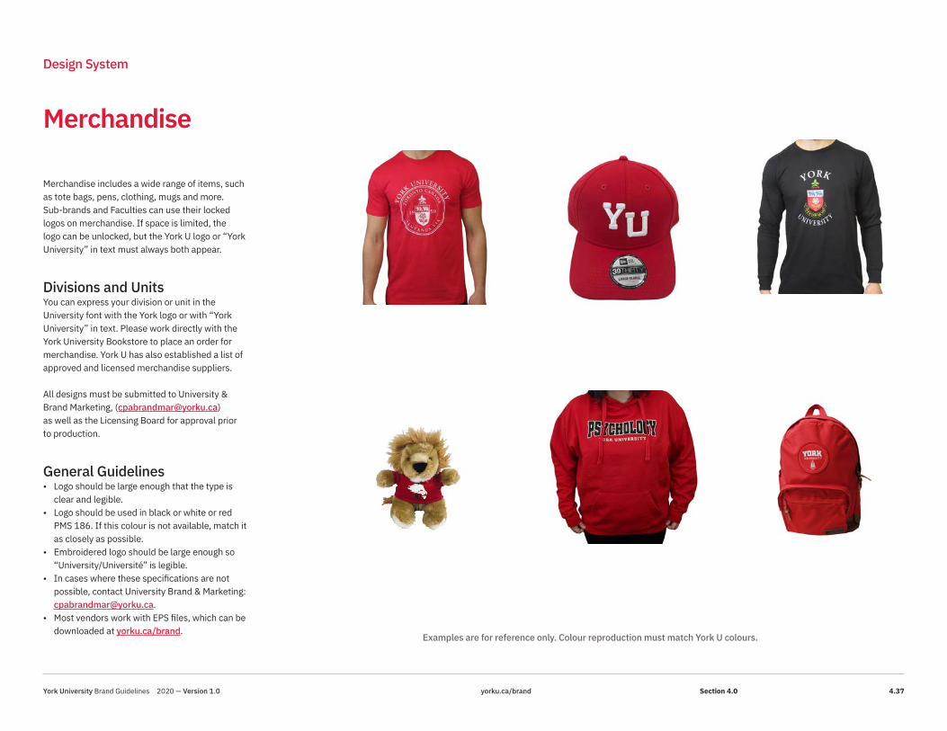
Merchandise
Design System
Merchandise includes a wide range of items, such as tote bags, pens, clothing, mugs and more. Sub-brands and Faculties can use their locked logos on merchandise. If space is limited, the logo can be unlocked, but the York U logo or “York University” in text must always both appear.
Divisions and UnitsYou can express your division or unit in the University font with the York logo or with “York University” in text. Please work directly with the York University Bookstore to place an order for merchandise. York U has also established a list of approved and licensed merchandise suppliers.
All designs must be submitted to University & Brand Marketing, ([email protected]) as well as the Licensing Board for approval prior to production.
General Guidelines• Logo should be large enough that the type is
clear and legible.• Logo should be used in black or white or red
PMS 186. If this colour is not available, match it as closely as possible.
• Embroidered logo should be large enough so “University/Université” is legible.
• In cases where these specifications are not possible, contact University Brand & Marketing: [email protected].
• Most vendors work with EPS files, which can be downloaded at yorku.ca/brand.
Examples are for reference only. Colour reproduction must match York U colours.
York University Brand Guidelines 2020 — Version 1.0 yorku.ca/brand 4.37Section 4.0

Stationery
Design System
FACULTY OR
EQUIVALENT NAME
Department Name /
Unit Name
Firstname Lastname
Title
123 BLDG ADDRESS.
456 OTTAWA RD.
4700 KEELE ST.
TORONTO ON
CANADA M3J 1P3
T 416 123 4567
EXT 12345
F 416 123 4567
CELL 416 123 4567
yorku.ca/urlnamehere
FACULTY OR EQUIVALENT NAME
Department Name / Unit Name
123 BLDG ADDRESS.
456 OTTAWA RD.
4700 KEELE ST.
TORONTO ON
CANADA M3J 1P3
T 416 123 4567
EXT 12345
F 416 123 4567
yorku.ca/urlnamehere
With the Compliments of
Name BA MBA
TitleDepartment Name / Unit Name FACULTY OR EQUIVALENT NAME
123 BLDG ADDRESS.
456 OTTAWA RD.
4700 KEELE ST.
TORONTO ON
CANADA M3J 1P3
T 416 123 4567
EXT 12345
F 416 123 4567
CELL 416 123 4567
yorku.ca/urlnamehere
Letterhead
Memo Pad
Business Card
Envelope
FACULTY OR EQUIVALENT NAMEDepartment Name / Unit NameBLDG ADDRESS.
4700 KEELE ST.
TORONTO ON
CANADA M3J 1P3
PR#
“Compliments of”
Name BA MBA
TitleDepartment Name / Unit NameFACULTY OR EQUIVALENT NAME
123 BLDG ADDRESS. 456 OTTAWA RD.
4700 KEELE ST. TORONTO ON CANADA M3J 1P3
yorku.ca/web address
T 416 123 4567
EXT 12345
F 416 123 4567
CELL 416 123 4567
Faculties and Departments York U’s Printing Services manages printing for all York U branded stationery and can assist you with all your stationery needs.
Sub-brands have a full set of stationery elements available that include their sub-brand logos.Graduate student business cards are available by request through the Faculty’s dean’s office. Students must receive approval from their dean before cards are produced.
Usage Any York branded material, whether it be the logo or letterhead, can only be used by York University employees when speaking on behalf of the University. Branded materials are meant only for institutional usage and are not permitted for personal or student use. There is an alternate version available for grad students, as well as additional languages. Contact Printing Services for more details.
York University Brand Guidelines 2020 — Version 1.0 yorku.ca/brand 4.38Section 4.0

E-Stationery
Design System
E-Letterhead Fax Memo
Electronic LetterheadElectronic letterhead is only to be used in an email attachment that is not intended to be printed by the receiver.
The template is not to be altered and must not be printed on a colour printer, as the logo will likely not match the official colour.
You can access the electronic letterhead template online at yorku.ca/brand.
Fax and Memo TemplatesYork memo and fax templates are available online at yorku.ca/brand.
FAC/DIV NAME
Dept/Unit Name
FirstnameLastname Title
123 BLDG ADDRESS
4700 KEELE ST.
TORONTO ON
CANADA M3J 1P3
T 416 123 4567
EXT 12345
F 416 123 4567
yorku.ca
Date
FirstName LastName Street Address City, Province Country PostalCode
Greeting Line,
About this Document • This document is formatted using a simple layout table with non-printing borders. To see
the table grid, select Table Tools Layout > View Gridlines (Table group). • The York logo and crest will appear on the first page only. • Contact information appears in the left-hand cell. Do not add anything else to the left-
hand cell and ensure that it remains exactly 1.5” wide. • Your letter appears in the right-hand cell. It can extend across more than one page. Add
page numbering to the footer if necessary. • To distribute this document electronically, convert it to a PDF file—this will ensure that the
alternative text from the images is accessible.
To make a reusable template Print out and then delete these instructions before editing and saving your template.
1. Edit the contact information in the left column below the York logo. Click on the generic text and phone numbers and type in your own information.
2. Add/edit any other standard information you may need for every letter. 3. Save the file as a reusable template:
a. Select File > Save As b. In the “Save as type” dropdown, choose “Word Template” c. Name the template YorkU_E_Lthd2020 d. Click Save
To create a new document: 1. Select File > New > My Templates 2. Click on your e-letterhead template, then click OK. 3. Click on the generic address and greeting lines to type your own content.
For help and support You can get assistance using the York templates from the Centre for Staff Development & Technical Learning. Visit their blog site at csdtl.info.yorku.ca for helpful resources and contact information.
FAC/DIV NAME
Dept/Unit Name
FirstnameLastname Title
123 BLDG ADDRESS
4700 KEELE ST.
TORONTO ON
CANADA M3J 1P3
T 416 123 4567
EXT 12345
F 416 123 4567
yorku.ca
Fax To: [Click here to type name]
From: [Click here to type name]
Fax: [Click here to type fax number]
Date: June 26, 2020
Subject: [Click here to type subject]
No. of Pages: [Click here to type number of pages]
[Click here to type fax content]
About this Document • This document is formatted using a simple layout table with non-printing borders. To
see the table grid, select Table Tools Layout > View Gridlines (Table group). • The York logo and crest will appear on the first page only. • Contact information appears in the left-hand cell. Do not add anything else to the left-
hand cell, and ensure it remains exactly 1.5” wide. • Content for your fax appears in the right-hand cell. It can extend across more than one
page. Add page numbering to the footer if necessary. • To distribute this document electronically, convert it to a PDF file—this will ensure that
the alternative text for the images is accessible.
To make a reusable template Print out and then delete these instructions before editing and saving your template.
1. Edit the contact information in the left column below the York logo. Just click on the generic text and type in your own information.
2. Add/edit any other standard information you may need for every fax. 3. Save the file as a reusable template:
a. Select File > Save As b. In the “Save as type” dropdown, choose “Word Template” c. Name the template YorkU_Fax2020 d. Click Save
To create a new document:
1. Select File > New > My Templates 2. Click on your fax template, then click OK. 3. To write your fax, click on the generic text placeholders and type in your own text.
FAC/DIV NAME
Dept/Unit Name
FirstnameLastname Title
123 BLDG ADDRESS
4700 KEELE ST.
TORONTO ON
CANADA M3J 1P3
T 416 123 4567
EXT 12345
F 416 123 4567
yorku.ca
Memorandum To: [Click here to type name]
From: [Click here to type name]
Date: [Click here to type date]
Subject: [Click here to type subject]
[Click here to type memo content]
About this Document • This document is formatted using a simple layout table with non-printing borders. To
see the table grid, select Table Tools Layout > View Gridlines (Table group). • The York logo and crest will appear on the first page only. • Contact information appears in the left-hand cell. Do not add anything else to the left-
hand cell, and ensure that it remains exactly 1.5” wide. • Content for your memo appears in the right-hand cell. It can extend across more than
one page. Add page numbering to the footer if necessary. • To distribute this document electronically, save it as a PDF file first—this will ensure
that the alternative text for the images is accessible.
To make a reusable template Print out and then delete these instructions before editing and saving your template.
1. Edit the contact information in the left column below the York logo. Just click on the generic text and type in your own information.
2. Add/edit any other standard information you may need for every memo. 3. Save the file as a reusable template:
a. Select File > Save As b. In the “Save as type” dropdown, choose “Word Template” c. Name the template YorkU_Memo2020 d. Click Save
To create a new document:
1. Select File > New > My Templates 2. Click on your fax template, then click OK. 3. To write your memo, click on the generic text placeholders and type in your own text.
For help and support You can get assistance using the York templates from the Centre for Staff Development & Technical Learning. Visit their blog site at csdtl.info.yorku.ca for helpful resources and contact information.
York University Brand Guidelines 2020 — Version 1.0 yorku.ca/brand 4.39Section 4.0

Using Print Letterhead
Design System
York U print letterhead can be ordered, customized and printed through Printing Services.
Preprinted letterhead shells are printed with the York logo, crest and personalized contact info (left-hand side). Once you have the preprinted shells, please use the Word template on the brand website at yorku.ca/brand (set up with the correct margins for your message) for final printing.
Please contact University Brand & Marketing for details on using sub-brand letterhead: [email protected].
UsageAny York branded material, whether it be the logo or letterhead, can only be used by York University employees when speaking on behalf of the University. Branded materials are meant only for institutional usage and are not permitted for personal or student use.
11”
8.5”
FACULTY OR
EQUIVALENT NAME
Department Name /
Unit Name
4700 KEELE ST.
TORONTO ON
CANADA M3J 1P3
T 416 123 4567
EXT 12345
F 416 123 4567
www.yorku.ca
Monday, June 29, 2020
Sarah Smith439 Soudan AvenueToronto, OntarioM4S 1X1
Dear Ms. Smith,
Epotius inglammad ut coecend veaa ratio bene sanos adsum. Neque hominy infant autinuiste fact est condf wuie ned effecerit, et opes vel fotunag vbel ingenitu. Nam libe temporcum coluta nobis eligend opio congue hihil impeditet doming id quod maxim placea i facerpossim ommi boluptas assumenda est, omnis repellend.
Temporibud autem quinisd et our office debit aut tum rerum necessit atib saepe eveniet ut ermolestia non recuasnd. Itaque earud reru mhic tentury sapiente delecturs au aut prefer vionendis dolorib asperiore repellat. Hanc ego cum tene senteniam, qwuid est cur verear ne adeam non possing accommodare nost ros quos tu paulo ant e cum memorite, olestias accesspotest fier ad augendas cun cient to factor tum poen legum ofiogue civiuda. Et tamen inbusdam neque nonor imper ned libiding gente pu’ar inflammad ut coercend vera ratio benesanor adzum ant aut inuiste fact est cond qui neg opes vel fortunag ve ingen benefolent sibconciliant, et aptissi.
Duis autem vel eum irire dolor in henderit tei consequat, vel illum dolore eu feugiat null afacilisi et iusto odio dignissim qui blandit praesent lupatum zzril in culpa qui blandit officiadeseunt mollit est, omnis repellend. Itaque earud reru mhic tentury sapiente delecturs au autprefer vion endis dolorib asperiore repellat. Hanc ego possing accommodare nost paulo ant ecum memorite, olestias access potest fier ad augendas cun cient to factor tum poen legumofiogue civiuda.
Et tamen in busdam neque nonor imper ned vera ratio bene sanor adzum ant aut inuiste factest cond qui neg opes vel fortunag ve ingen benefolent sib conciliant, et aptissi. Duis autemvel eum irire dolor in henderit tei consequat, vel illum dolore eu feugiat null a facilisi et iustoodio dignissim qui blandit praesent lupatum zzril in culpa qui blandit officia deseunt mollitanium ib est aborum et congue nihil impedier doming id quirppmaxim placeat os assumendaest, onmis
Temporibud autem quinisd et our office debit aut tum rerum necessit eveniet ut er molestianon recuasnd. Itaque earud tentury sapieneg sib conciliant, et aptissi. Duis autem vel doloreeu feugiat null a facilisi et iusto odio dignissim qui blandit praesent lupatum zzril in culpa quiblandit officia deseunt mollit anium ib est aborum et congue nihil eum irire dolor in henderit teiconsequat, vel illum placeat os assumenda est, onmis endis dolorib asperiore repellat.
Kind Regards,
John DoeAdmissionsYork University
.75”2”
0.5”
1.5”
York University Brand Guidelines 2020 — Version 1.0 yorku.ca/brand 4.40Section 4.0

Telling the full story of York University internally and externally is only possible if we execute our brand with precision and consistency across all our touch points. That’s where you come in.
Please ensure you are following our brand guidelines and using the assets and tools available at yorku.ca/brand.
Remember, all external communications must be developed in partnership with the University Brand & Marketing team.
For questions and concerns pertaining to digital or social media, please contact [email protected], for all other inquiries, contact [email protected].
How to Work with Us
York University Brand Guidelines 2020 — Version 1.0 yorku.ca/brand 4.41