Brand Guidelines - Regent University
71
Brand Guidelines
Transcript of Brand Guidelines - Regent University

Brand Guidelines

REGENT UNIVERSITY BRAND GUIDELINES — TABLE OF CONTENTS
2
Table of ContentsOur Foundation
Mission, Vision, and Values 04
Commitments 05
PositioningBrand Position 07
Brand Architecture 08
Messaging Overview 09
Messaging Map 10
Personality 13
Messaging and VoiceCrafting Content 15
Verbal Language 16
LogoPrimary Logo 18
Logo Size and Clear Space 19
Logo Placement 20
Color 21
Alternative Logos 22
Primary Logo and Tagline Lockups 23
Alternative Logo and Tagline Lockups 24
Sub-Brand Logo Lockups 25
Unacceptable Uses 29
University Seal 30
Color PaletteCore Palette 32
Dark Palette 33
Accent Palette 34
Color Application 35
TypographyPrimary Typeface 37
Secondary Typeface 39
Large Type 41
Facts & Figures 42
Mixed Headlines 43
Type Hierarchy 44
PhotographyOverview 46
Photo Composition 47
Campus 48
Academics 49
Students 50
Details 51
Graphic ElementsRuled Lines and Frames 53
Patterns 54
Icons and Illustrations 55
Applying the BrandSample Tactics 57
Contact Information 71
January 2016

Our FoundationOur foundation is the heart of what we stand for at
Regent, and it drives everything we do. It’s what truly makes us different. Though the words you use may vary,
all communications should be rooted in these ideas.
REGENT UNIVERSITY BRAND GUIDELINES — OUR FOUNDATION
3

Christ First Regent University has as its focal point the teachings, practices, and person of Jesus Christ, and fosters a transdenominational environment.
Excellence Regent University will be recognized for its education, scholarship, service, and workplace environment.
Leadership Regent University values authentic, servant leadership, and seeks to equip leaders to have a global impact.
ValuesRegent University is to be the most influential, Christian, transformational university in the world.
Vision
MissionRegent University serves as a center of Christian thought and action to provide excellent education through a Biblical perspective and global context, equipping Christian leaders to change the world.
REGENT UNIVERSITY BRAND GUIDELINES — OUR FOUNDATION
4

FAITH-BASED FOUNDATION
Regent will unswervingly maintain a Christ-centered course, founded and propelled on Biblical principles and fully promoting Christian leadership among its staff, faculty, and students.
FIRST-RATE ACADEMIC PROGRAMS
Regent will develop and maintain challenging programs that prepare students in a timely fashion with marketable skills through innovative residency and online programs.
DIVERSE CULTURE
Regent will develop and build strong, multifaceted programs that attract faculty, staff, and students from many cultures and ethnic backgrounds. They are committed to our global mission and statement of faith, value a collegial atmosphere, and embrace diverse perspectives as framed by our common core values and statement of faith.
REGENT UNIVERSITY BRAND GUIDELINES — OUR FOUNDATION
5
CommitmentsOur vision tells us where we’re going. Our commitments detail how we’ll get there. Use the touchpoints below to help inform communications.
STUDENT-CENTERED APPROACH
Premier education demands that student learning be the primary emphasis of the university mission. Regent will maintain that emphasis by providing the most effective, forward-thinking instruction provided through innovative delivery systems that meet the lifestyle of both traditional students and working adults.
HIGH-QUALITY ENVIRONMENT
Regent will provide exemplary physical, social and online environments, which promote high morale and increased productivity throughout the Regent community. Maintaining high-caliber employees and providing ongoing development activities ensure that the university fully promotes Regent’s mission among faculty and staff, for the good of each student and for the cause of Christ.
INFORMATION TECHNOLOGY
Regent recognizes the significant role of technology in education and will provide apt resources to promote the highest quality in every aspect of the university administration and program delivery.

PositioningEverything we say, do, or create comes from one place:
our positioning. This section helps ensure that all communications have a clear and unified brand, where
every piece and part work together.
REGENT UNIVERSITY BRAND GUIDELINES — POSITIONING
6
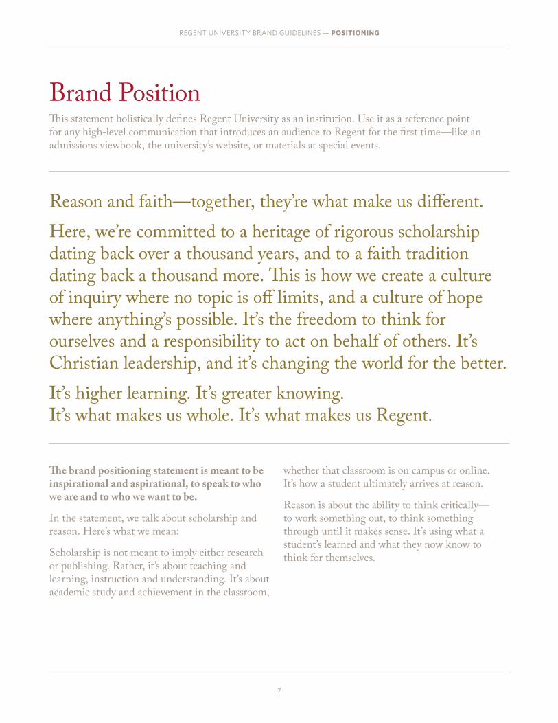
Reason and faith—together, they’re what make us different.
Here, we’re committed to a heritage of rigorous scholarship dating back over a thousand years, and to a faith tradition dating back a thousand more. This is how we create a culture of inquiry where no topic is off limits, and a culture of hope where anything’s possible. It’s the freedom to think for ourselves and a responsibility to act on behalf of others. It’s Christian leadership, and it’s changing the world for the better.
It’s higher learning. It’s greater knowing. It’s what makes us whole. It’s what makes us Regent.
Brand PositionThis statement holistically defines Regent University as an institution. Use it as a reference point for any high-level communication that introduces an audience to Regent for the first time—like an admissions viewbook, the university’s website, or materials at special events.
REGENT UNIVERSITY BRAND GUIDELINES — POSITIONING
7
The brand positioning statement is meant to be inspirational and aspirational, to speak to who we are and to who we want to be.
In the statement, we talk about scholarship and reason. Here’s what we mean:
Scholarship is not meant to imply either research or publishing. Rather, it’s about teaching and learning, instruction and understanding. It’s about academic study and achievement in the classroom,
whether that classroom is on campus or online. It’s how a student ultimately arrives at reason.
Reason is about the ability to think critically— to work something out, to think something through until it makes sense. It’s using what a student’s learned and what they now know to think for themselves.
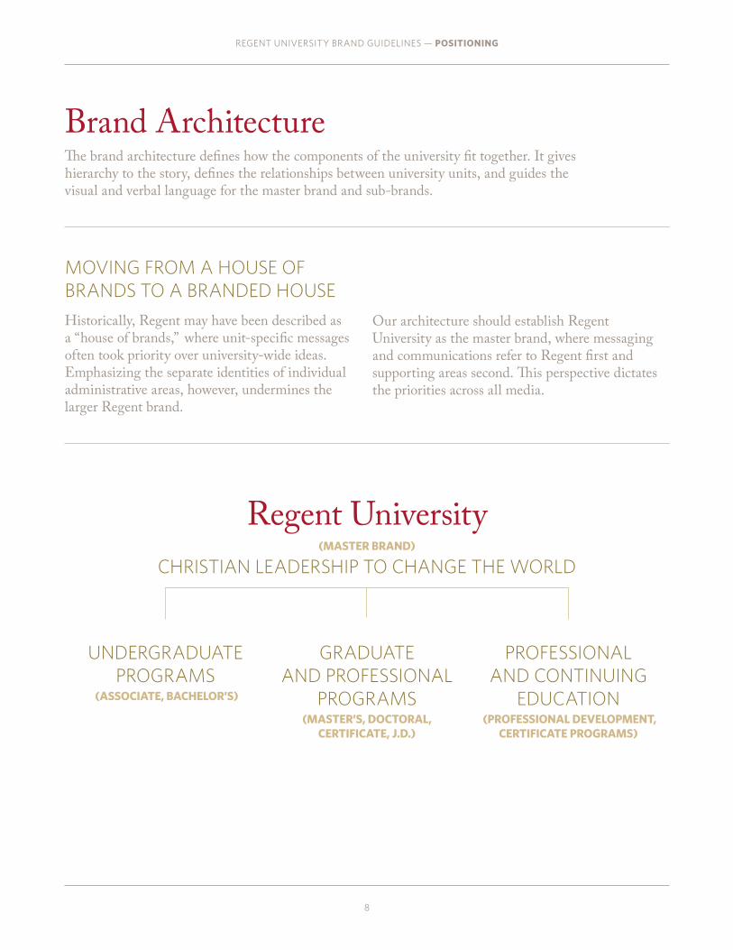
Regent University(MASTER BRAND)
CHRISTIAN LEADERSHIP TO CHANGE THE WORLD
Brand ArchitectureThe brand architecture defines how the components of the university fit together. It gives hierarchy to the story, defines the relationships between university units, and guides the visual and verbal language for the master brand and sub-brands.
REGENT UNIVERSITY BRAND GUIDELINES — POSITIONING
8
UNDERGRADUATE PROGRAMS
(ASSOCIATE, BACHELOR’S)
GRADUATE AND PROFESSIONAL
PROGRAMS(MASTER’S, DOCTORAL,
CERTIFICATE, J.D.)
PROFESSIONAL AND CONTINUING
EDUCATION (PROFESSIONAL DEVELOPMENT,
CERTIFICATE PROGRAMS)
MOVING FROM A HOUSE OF BRANDS TO A BRANDED HOUSE
Historically, Regent may have been described as a “house of brands,” where unit-specific messages often took priority over university-wide ideas. Emphasizing the separate identities of individual administrative areas, however, undermines the larger Regent brand.
Our architecture should establish Regent University as the master brand, where messaging and communications refer to Regent first and supporting areas second. This perspective dictates the priorities across all media.

Messaging OverviewAttributes and benefits are key components of our messaging. Both of these work together to tell the Regent story consistently. The following describes how to use the messaging map.
REGENT UNIVERSITY BRAND GUIDELINES — POSITIONING
A2
A1
B1
B2
A2
B2
A2
B2
SECONDARY MESSAGES
& SUPPORTING POINTS
ATTRIBUTES
BENEFITS
CORE
MESSAGE
SECONDARY MESSAGES
& SUPPORTING POINTS
WHAT IS AN ATTRIBUTE? An attribute is what we offer to our students. Attributes include the products, services, knowledge, and unique offers that we bring to the table.
WHAT IS A BENEFIT? A benefit is what students get. It’s the value of the attributes that we offer; the “so what?” or “why do we care?”
WHAT IS ATTRIBUTE & BENEFIT MAPPING? The attributes and benefits are organized into a hierarchy that builds up to a core attribute and a core benefit. These are placed on a map to show how the attributes and benefits work together, and to show that the core attribute and core value are supported by additional proof points. The map provides the foundation for clear, consistent, and compelling brand messaging.
HOW TO READ THE MESSAGING MAP
9

CORE VALUE PROPOSITION
Messaging MapThis messaging map organizes our key messages into a clear balance of what we “give” (the attributes) and what our audience will “get” (the benefits). The resulting hierarchy ensures that our communications are clear, consistent, and compelling.
The diagram at the top right of the page illustrates the location on the messaging map.
REGENT UNIVERSITY BRAND GUIDELINES — OUR POSITIONING
ATTRIBUTES (WHAT WE OFFER)
Regent University is committed to the union of Christian thought and rigorous scholarship
So that graduates are poised to pursue their calling empowered by faith and reason
BENEFITS(WHAT THEY GET)
10

• Recognized excellence across programs, on campus and online
• Seamlessly facilitated learning, online and on campus
• Superior scholarship conducted by highly regarded faculty
• Christian thought leadership
• Global outlook encouraging connectivity and collaboration
• Internship and mission experience in the field
• Multidenominational environment
• Accessible faculty who value interaction and mentorship
• An unrestrained focus on research and evidence
ACADEMIC EXCELLENCE A BROADLY INFORMED CHRISTIAN WORLDVIEW
HONEST, RELEVANT DIALOGUE
REGENT UNIVERSITY BRAND GUIDELINES — POSITIONING
11
ATTRIBUTES (WHAT WE OFFER)
Regent University is committed to the union of Christian thought and
rigorous scholarship
So that graduates are poised to pursue their calling empowered by
faith and reason

REGENT UNIVERSITY BRAND GUIDELINES — OUR POSITIONING
12
BENEFITS (WHAT THEY GET)
Regent University is committed to the union of Christian thought and
rigorous scholarship
So that graduates are poised to pursue their calling empowered by
faith and reason
• Armed with marketable, relevant skills
• Quickly, efficiently, and effectively prepared to advance lives and careers
• Credible by virtue of rigor, precision, and credentials
• Endowed with a sense of purpose
• Versed in context, perspective, and partnership
• Honed by practical, applied experience
• Culturally literate and appreciative of diversity
• Open to dialogue and criticism
• Able to discern fact and conjecture
READY TO EXCEL INSPIRED TO LEAD INFORMED AND RESPONSIVE

PRESCRIPTIVEWe’re about open dialogue.
FLASHYWe’re professional, but approachable.
DECISIVESteadfast, clear, and unambiguous
CONNECTEDDiverse, informed, and global
PRESTIGIOUSRefined, of uncompromising quality
PASSIONATEDeeply committed to our faith and the pursuit of a calling
PROFESSIONALCultured, confident, formal, and serious
DEVOTEDWholly invested in our mission and shared success
PRETENTIOUSWe’re about personal excellence, not extravagance.
Rational Emotional(How we want people to think about our brand) (How we want people to feel about our brand)
PersonalityOur personality sets the tone for how our brand communicates. It articulates how we want our audiences to think and feel about our brand. These six traits will drive the voice and image for all brand communications.
REGENT UNIVERSITY BRAND GUIDELINES — POSITIONING
13
WE ARE
WE ARE NOT

We also communicate and reinforce the Regent brand verbally. The following voice and messaging guidelines
will help ensure that we maintain a recognizable style that’s all our own.
REGENT UNIVERSITY BRAND GUIDELINES — MESSAGING & VOICE
14
Messaging & Voice

LIMIT THE JARGON.Some readers may understand insider terms or academic jargon, but all people appreciate straightforward, conversational language.
For example:
Instead of saying: “Keep PACE with PCE by signing up for our e-newsletter.”
Say: “Keep current with the latest in continuing education. Subscribe to our newsletter.”
KNOW YOUR AUDIENCE.Is the prospective student a traditional undergrad or an adult, online learner? If you haven’t defined your audience, you won’t reach them.
For example, when writing for the traditional undergrad, it’s best to balance knowledge and faith to describe how Regent uniquely prepares students for both a successful career and a meaningful life. For the adult online learner, while they wouldn’t be considering us if faith weren't an important part of their life, it’s better to focus on how Regent’s rigorous academics, accessibility, and affordability can help them earn a degree that can improve their job prospects.
KEEP THE READER IN MIND.Writing is meant to be read, so keep your reader top of mind. Acknowledge their wants and needs, and show how our brand satisfies both. Balance the attributes of our brand with the benefits to the reader. And use the second person (“you”) to engage in a direct, friendly way that underscores that what you’re saying is about them.
For example:
Instead of saying: “Interested in earning a J.D. or LL.M. taught from a Christian perspective?”
Say: “Earn more than a law degree. Earn a respected law degree that aligns with your Christian faith.”
REGENT UNIVERSITY BRAND GUIDELINES — MESSAGING & VOICE
15
SAY IT WELL. KEEP IT BRIEF.Life is fast. Attention spans are short. And most people are inundated with marketing messages. Make it easy for your audience to get the information they need by emphasizing a single message.
For example:
Instead of saying: “Flowers are good, but an MBA is great. Earn a degree online in just 16 months.”
Say: “Advance your career. Earn an MBA in just 16 months online.”
PROVE IT.We have a lot to be proud of. Our communications should be rich with relevant proof points, statistics, testimonials, and emotive stories. But use them to support messaging, not as a substitute for it.
For example:
Instead of saying: “I carry with me the principles of servant leadership I learned at Regent.” —Congressman Scott Rigell, ‘90
Say: Headline: “Learn to make a good living. Live to lead a good life.”
Testimonial: “I carry with me the principles of servant leadership I learned at Regent.” —Congressman Scott Rigell, ‘90
YOU WROTE IT. THEY READ IT. NOW WHAT?Keep your audience engaged by including a clear call to action. View examples of how these rules and others are put into practice on page 56.
Crafting Content

Verbal LanguageOur message is important, and our voice is just as important. When we’re consistent in telling our story, our audience can better connect with the Regent brand, because our communications are clear, concise, compelling, and, most importantly, authentic.
REGENT UNIVERSITY BRAND GUIDELINES — MESSAGING & VOICE
16
MESSAGING
Messaging is what we say. It’s the content, information, facts, and figures. Use the message hierarchy on page 10 to help guide what you say.
VOICE
Voice is how we say it. It’s the tone that animates our message, helping distinguish us from other universities. Use the personality traits on page 13 to help create the right tone.
CAMPAIGN
A campaign is a specific theme (such as "Only Regent") or event. It can change over time, but it’s critical to remember that a campaign should always align with Regent’s mission, values, and brand positioning.

LogoBecause our logo represents us at the very highest level, it is vitally important to our communications. It acts as
a signature, an identifier, and a stamp of quality.
To maintain consistency and professionalism, follow the few simple guidelines outlined in this section.
REGENT UNIVERSITY BRAND GUIDELINES — LOGO
17

Primary LogoThe primary Regent University logo, used for most applications, contains two elements, the wordmark and the crest. They should never be separated or altered, but always used as seen here.
Contact University Marketing to request digital files for the logo.
REGENT UNIVERSITY BRAND GUIDELINES — LOGO
18
THE CRESTThe Regent crest symbolizes the coming together of faith and reason, and illustrates the relationship between academic excellence and Christian leadership. The three crowns stand on the side of faith representing the holy Trinity, and the book pages represent our academic offerings.

1.25”
1.75” 250px
200px
PREFERRED CLEAR SPACE
MINIMUM PRINT SIZE:
PREFERRED PRINT SIZE: PREFERRED DIGITAL SIZE:
MINIMUM DIGITAL SIZE:
REGENT UNIVERSITY BRAND GUIDELINES — LOGO
19
LOGO SIZEWhenever possible, use the preferred logo size on all applications. Never reproduce the logo at widths smaller than 1.25 inches or 200 pixels. There is no maximum size limit, but use discretion when sizing the logo. It should never be the dominant element on the page; instead it should live comfortably and clearly as a signature.
CLEAR SPACEWe need to ensure that clear space is maintained around the logo. That way, it’s always legible and has room to breathe. Photos, text, and graphic elements must follow this guideline. Use the crest as shown to gauge the preferred clearance.
Use the illustration to the left as a guide for placing the logo in a layout.
Size & Clear SpaceConsistent use is critical to the launch of a new logo and brand. Following these simple guides will ensure a clear and compelling visual brand across all levels of University communications.

REGENT UNIVERSITY BRAND GUIDELINES — LOGO
20
LAYOUT EXAMPLES
Logo Placement When creating new materials, build your layouts around the placement of the logo, treating it as a starting point and not as an afterthought. Placing the logo consistently throughout our marketing
PLACING THE LOGOStart with the logo when you design a new piece, treating it as a signature or stamp of approval, either starting the piece off or ending it. Use the crest as a measuring tool to position the logo on the page. Always make sure you have the proper amount of clear space around the logo.
Whenever possible, create layouts where the logo can be placed on a white or light background to take advantage of its full-color version.
The examples to the left are intended to be used as inspiration for layouts. The gray boxes represent photographs, color, patterns, or text, showing the relationship between content and the logo.
materials will create consistency and help establish brand awareness. Use these examples as a guide when creating new materials.

REGENT UNIVERSITY BRAND GUIDELINES — LOGO
21
ColorThe primary logo should appear only in the versions shown here.
TWO-COLOR The two-color version of the logo, which appears in the primary Regent colors, is the most commonly used version. If printing restrictions are an issue, a one-color version can be used.
PANTONE 294 AND PANTONE 348
ONE-COLOROne-color versions of the logo should be used only if printing restrictions demand it.
PANTONE 294, PANTONE 348, AND PANTONE NEUTRAL BLACK
WHITE When placing the logo on a colored background, it should be reversed out to white as shown. If the white logo is used, it must be reversed out of an approved Regent brand color or the darker area of a photo.
PHOTOSWhen placing the logo over photos, there are two things to take into account. If the photo is dark, use the reversed-out version of the logo. If the photo is bright with a large light area, then use the full-color version.
LOGO OVER COLOR AND PHOTOGRAPHY
REVERSED-OUT LOGO OVER PHOTOFULL-COLOR LOGO OVER PHOTO

REGENT UNIVERSITY BRAND GUIDELINES — ALTERNATIVE LOGOS
22
2.75” OR 400px3.5” OR 500px
Alternative LogosThe alternative logo lockups are designed for special applications. They should never replace the primary logo, but should be used only when space restrictions require them. You should not attempt to recreate these logos; instead, contact University Marketing to request the digital files and to get approval for usage.
1” OR 160px
1.3125” OR 200px
2.5” OR 366px
3.375” OR 425px
HORIZONTAL LOGO
CENTERED STACKED LOGO
CENTERED HORIZONTAL LOGO
PREFERRED PRINT & DIGITAL SIZE:
PREFERRED PRINT & DIGITAL
PREFERRED PRINT & DIGITAL
MINIMUM PRINT & DIGITAL SIZE:
MINIMUM PRINT & DIGITAL SIZE:
MINIMUM PRINT & DIGITAL SIZE:

REGENT UNIVERSITY BRAND GUIDELINES — LOGO
23
Primary Logo & Tagline LockupsOur tagline is a powerful statement that creates a strong impression of the university. It should be used in all communications that reach the general public, particularly admissions audiences. The logo and tagline alone can also succinctly convey the university’s mission when no other messaging appears.
PRIMARY LOGO & TAGLINE LOCKUPS
When they’re combined, the logo and tagline form a single unit which should not be altered. The logo without the tagline may still be used for internal audiences.
The tagline lockups below should not be combined with the sub-brand lockups on page 25.
COMMON USES Web home page Printed marketing communications Broadcast and outdoor advertising Business cards Email signatures Public event announcements
KEEP CONSISTENCY Never recreate any of the logo and tagline lockups. Contact University Marketing to request the digital files and to get approval for usage.

REGENT UNIVERSITY BRAND GUIDELINES — LOGO
24
Alternative Logo & Tagline LockupsLike the alternative logos, the lockups shown here are designed for special applications and should be used only when space restrictions require them. Contact University Marketing to request the digital files and to get approval for usage.
HORIZONTAL LOGO & TAGLINE LOCKUPS
CENTERED LOGO & TAGLINE LOCKUPS

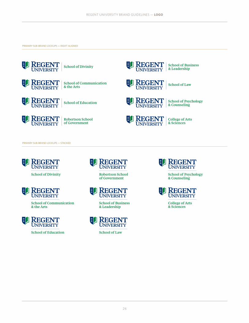
Sub-Brand Logo LockupsIn an identity system, consistency is key to overall brand recognition. Each official sub-brand should use only the approved and supplied version of its lockup. Except for the tagline, the names of these seven schools are the only elements permitted to be locked up with the Regent University logo.
All of these logo lockups exist as a uniform system, consistently maintaining hierarchy between the logo and the school name. If the school name needs to be more prominent, adjustments can be made on a case-by-case basis to accommodate those specific needs.
REGENT UNIVERSITY BRAND GUIDELINES — LOGO
25
GRAY BOX = SPACE BETWEEN CREST AND WORDMARK
CREATING SUB-BRAND LOCKUPS Start with the preferred logo size, as shown on page 19, then set the school name in Tiempos Text Medium at 11.5 point over 12 point, and place a blue rule at 0.35 point. Use the distance between the wordmark and the crest as a guide for spacing, as shown.
0.35pt Rule1.75”
WHEN TO USE A sub-brand logo lockup should only be used when all the content in the respective piece correlates to that school. Whenever you are communicating to more than one school or audience, use the primary logo.
11.5pt / 12pt Tiempos Text Medium
REGENT UNIVERSITY BRAND GUIDELINES — LOGO
26
PRIMARY SUB-BRAND LOCKUPS — RIGHT ALIGNED
PRIMARY SUB-BRAND LOCKUPS — STACKED

REGENT UNIVERSITY BRAND GUIDELINES — LOGO
27
HORIZONTAL SUB-BRAND LOCKUPS — STACKED
HORIZONTAL SUB-BRAND LOCKUPS — RIGHT ALIGNED

REGENT UNIVERSITY BRAND GUIDELINES — LOGO
28
CENTERED HORIZONTAL SUB-BRAND LOCKUPS
CENTERED SUB-BRAND LOCKUPS

REGENT UNIVERSITY BRAND GUIDELINES — LOGO
29
Unacceptable UsesHere are a few examples of practices to avoid.
DO NOT REARRANGE THE LOGO ELEMENTS. DO NOT STRETCH OR COMPRESS THE LOGO.
DO NOT LOCK UP ANY OTHER ELEMENTS WITH THE LOGO. DO NOT USE DROP SHADOWS WITH THE LOGO.
DO NOT SLANT THE LOGO. DO NOT OUTLINE THE LOGO.
DO NOT MIX ALTERNATE COLORS WITH THE LOGO. DO NOT PLACE THE LOGO OVER BUSY PATTERNS.
DO NOT CHANGE THE FONT OR RECREATE THE LOGO FOR ANY REASON. DO NOT PLACE THE LOGO OVER THE BUSY AREA OF A PHOTO-
GRAPH.

REGENT UNIVERSITY BRAND GUIDELINES — LOGO
30
University SealThe original university logo, created at the founding of the institution, will continue on as the Regent University seal. The seal acts as the signature of the Office of the President and the Chancellor. It is printed on ceremonial documents, awards, and diplomas. It may also continue to be used as a permanent feature in building décor and flooring design. Permission must be obtained from University Marketing before using the university seal.
When printed conventionally, the seal should be reproduced in black, PMS 294, PMS 348, or metallic foil, or used as a background graphic at no more than 15% of the solid color. It may also be embossed or blind-embossed in certain instances.
Avoid use of the Regent University seal for purposes other than official, cross-institutional purposes. The seal is no longer considered a logo and should never be used as a substitute for the Regent University logo.
Contact University Marketing with specific questions or to request a digital art file.
ACCEPTABLE USEExamples of acceptable use for the seal include commencement materials and background images on official documentation (such as checks, receipts, and diplomas).
UNACCEPTABLE USEDo not use the seal for vehicles, napkins, displays, flyers, collateral brochures, advertising, or other similar applications.

REGENT UNIVERSITY BRAND GUIDELINES — COLOR PALETTE
31
Color PaletteWhen used consistently, the colors in our palette
should be recognizable as distinctly Regent University. It will also ensure a cohesive expression of the
Regent brand.

Color PaletteOur colors are grouped into three sets—core, dark, and accent. This section defines them and shows how to use them properly.
CORE PALETTEThe core palette should appear in all designs and communications. For print pieces, reproduce them in spot colors whenever possible to retain their integrity. Screen tints should be used only on rare occasions, such as patterns.
SPIRIT COLORS
Spirit Blue (PMS 294 C) and Spirit Green (PMS 348 C) represent Regent at the highest level. The logo is comprised of these two colors, making them essential to the Regent brand. When creating marketing materials, always lead with these two colors.
PMS 294 C CMYK 100, 86, 29, 23 RGB 0, 47, 109
UNIVERSITY SPIRIT COLOR
PMS 348 C CMYK 97, 22, 100, 9 RGB 0, 131, 63
UNIVERSITY SPIRIT COLOR
PMS 187 C CMYK 22, 100, 89, 15 RGB 172, 31, 45
PMS 7502 C CMYK 18, 25, 53, 0 RGB 210, 184, 135
PMS Warm Gray 8 C CMYK 0, 9, 16, 43 RGB 161, 149, 137
PMS 871 C
REGENT UNIVERSITY BRAND GUIDELINES — COLOR PALETTE
32
COLOR CONSISTENCY
Use the following color settings in all programs: North America Prepress 2 (Adobe RGB, U.S. web coated SWOP 2 CMYK). For offset printing with CMYK inks, spot or RGB colors in your files will print less accurately than if they are set to process CMYK. To maintain consistency, use only the color formulas listed in this guide.
PMS 871 C is always printed as a spot color to maximize its metallic quality. For a CMYK or RGB alternative, use PMS 4495 C from the dark color palette.
Use color setting for body copy or instances where a darker version is needed. CMYK 17, 24, 25, 49

PMS 7448 C CMYK 67, 79, 24, 59 RGB 56, 34, 70
PMS 2965 C CMYK 100, 78, 48, 54 RGB 0, 38, 61
PMS 7484 C CMYK 91, 14, 78, 60 RGB 0, 86, 63
PMS 188 C CMYK 16, 100, 65, 58 RGB 122, 35, 46
PMS 4495 C CMYK 41, 45, 97, 17 RGB 142, 118, 49
PMS Neutral Black C CMYK 71, 66, 65, 72 RGB 35, 34, 34
DARK PALETTEThe dark palette supports the core palette and gives our brand greater visual flexibility. These colors should never replace the core palette in designs and communications.
REGENT UNIVERSITY BRAND GUIDELINES — COLOR PALETTE
33

PMS 3115 C CMYK 70, 0, 15, 0 RGB 0, 193, 213
PMS 7489 C CMYK 61, 14, 92, 1 RGB 116, 170, 80
PMS 152 C CMYK 5, 67, 100, 0 RGB 234, 114, 0
PMS 7404 C CMYK 4, 10, 87, 0 RGB 247, 217, 62
PMS 421 C CMYK 31, 24, 26, 0 RGB 178, 179, 178
ACCENT PALETTEThe bright hues in the accent palette are meant to be used sparingly in communications as subtle accents that play off the rest of the brand colors.
REGENT UNIVERSITY BRAND GUIDELINES — COLOR PALETTE
34
REGENT UNIVERSITY BRAND GUIDELINES — COLOR
35
MASTER BRAND
GRADUATE
UNDERGRADUATE
ALUMNI
DONORS
WHITE SPACE
WHITE SPACE
WHITE SPACE
WHITE SPACE
WHITE SPACE
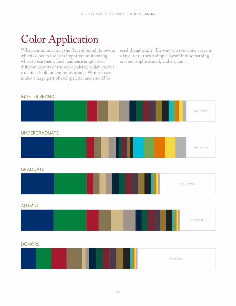
Color ApplicationWhen communicating the Regent brand, knowing which colors to use is as important as knowing when to use them. Each audience emphasizes different aspects of the color palette, which creates a distinct look for communications. White space is also a large part of each palette, and should be
used thoughtfully. The way you use white space in a layout can turn a simple layout into something assured, sophisticated, and elegant.
REGENT UNIVERSITY BRAND GUIDELINES — TYPOGRAPHY
36
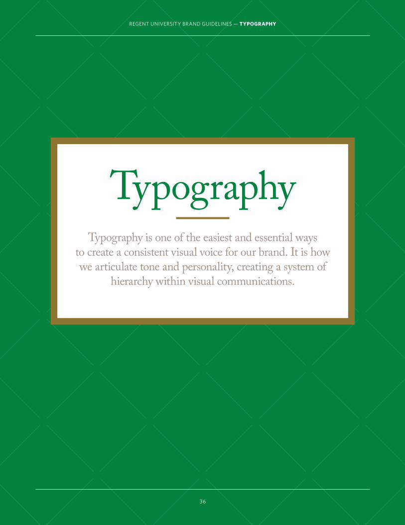
TypographyTypography is one of the easiest and essential ways
to create a consistent visual voice for our brand. It is how we articulate tone and personality, creating a system of
hierarchy within visual communications.

Adobe Caslon Pro
REGENT UNIVERSITY BRAND GUIDELINES — TYPOGRAPHY
37
Primary TypefaceAdobe Caslon Pro is our primary typeface. Its classic sophisticated look conveys Regent University’s strong, confident heritage. Use Adobe Caslon Pro for headlines, especially
RegularSemiboldBold
RegularSemiboldBold
STYLES AND USESAdobe Caslon Pro is available in Regular, Semibold, Bold, and their equivalent italics. We use it most often in Regular for large type headlines, body copy, numbers, facts, and figures.
PROPER KERNINGAdobe Caslon Pro's default kerning is a bit spread out. When typesetting headlines or large type be sure to set kerning to optical at -20 points.
WHERE TO FIND ITDue to license restrictions University Marketing is unable to distribute Adobe Caslon Pro. The full family is available at www.myfonts.com. Contact Patrick Wright (x4387) if you have any questions.
WEB FONT OPTIONSAdobe Caslon Pro is available as a desktop and web font at www.typekit.com.
GENERIC SUBSTITUTEWhen Adobe Caslon Pro is not available, use Times.
when communicating from the master brand, for body copy, and for facts and numbers. See the Applying the Brand section for sample uses.

REGENT UNIVERSITY BRAND GUIDELINES — TYPOGRAPHY
38
ABCDEFGHIJKLM NOPQRSTUVWXYZ abcdefghijklmnopqrstuvwxyz 1234567890
REGULAR
ABCDEFGHIJKLM NOPQRSTUVWXYZ abcdefghijklmnopqrstuvwxyz 1234567890
ITALIC
ABCDEFGHIJKLM NOPQRSTUVWXYZ abcdefghijklmnopqrstuvwxyz 1234567890
BOLD
ABCDEFGHIJKLM NOPQRSTUVWXYZ abcdefghijklmnopqrstuvwxyz 1234567890
BOLD ITALIC
ABCDEFGHIJKLM NOPQRSTUVWXYZ abcdefghijklmnopqrstuvwxyz 1234567890
SEMIBOLD
ABCDEFGHIJKLM NOPQRSTUVWXYZ abcdefghijklmnopqrstuvwxyz 1234567890
SEMIBOLD ITALIC
1234567890SPECIAL NUMERALS

Whitney Light Book Medium Semibold Bold Black
Light Book Medium Semibold Bold Black
Secondary Typeface Whitney is a simple and elegant sans-serif typeface that provides greater depth to the Regent brand through its modern, approachable style. It has a
WHERE TO FIND ITDue to license restrictions University Marketing is unable to distribute Whitney. The full family is available at www.typography.com. Contact Patrick Wright (x4387) if you have any questions.
WEB FONT OPTIONSWhitney is available as a desktop and web font at www.typography.com.
GENERIC SUBSTITUTE When Whitney is not available, use Lucida Grande.
REGENT UNIVERSITY BRAND GUIDELINES — TYPOGRAPHY
39
STYLES AND USESWhitney is available in Light, Medium, Semibold, Bold, Black, and their equivalent italics. We use it most often in Light for subheads, descriptive body copy, facts, and figures.
great deal of flexibility due its broad type family and clean contours. See the applying the brand section for sample uses.

REGENT UNIVERSITY BRAND GUIDELINES — WHITNEY
40
ABCDEFGHIJKLM NOPQRSTUVWXYZ abcdefghijklmnopqrstuvwxyz 1234567890
LIGHT
ABCDEFGHIJKLM NOPQRSTUVWXYZ abcdefghijklmnopqrstuvwxyz 1234567890
LIGHT ITALIC
ABCDEFGHIJKLM NOPQRSTUVWXYZ abcdefghijklmnopqrstuvwxyz 1234567890
MEDIUM
ABCDEFGHIJKLM NOPQRSTUVWXYZ abcdefghijklmnopqrstuvwxyz 1234567890
MEDIUM ITALIC
ABCDEFGHIJKLM NOPQRSTUVWXYZ abcdefghijklmnopqrstuvwxyz 1234567890
SEMIBOLD
ABCDEFGHIJKLM NOPQRSTUVWXYZ abcdefghijklmnopqrstuvwxyz 1234567890
SEMIBOLD ITALIC
ABCDEFGHIJKLM NOPQRSTUVWXYZ abcdefghijklmnopqrstuvwxyz 1234567890
BOLD
ABCDEFGHIJKLM NOPQRSTUVWXYZ abcdefghijklmnopqrstuvwxyz 1234567890
BOLD ITALIC
ABCDEFGHIJKLM NOPQRSTUVWXYZ abcdefghijklmnopqrstuvwxyz 1234567890
BLACK
ABCDEFGHIJKLM NOPQRSTUVWXYZ abcdefghijklmnopqrstuvwxyz 1234567890
BLACK ITALIC
ABCDEFGHIJKLM NOPQRSTUVWXYZ abcdefghijklmnopqrstuvwxyz 1234567890
BOOK
ABCDEFGHIJKLM NOPQRSTUVWXYZ abcdefghijklmnopqrstuvwxyz 1234567890
BOOK ITALIC

REGENT UNIVERSITY BRAND GUIDELINES — TYPOGRAPHY
41
Faith&
Reason
ADOBE CASLON PRO, REGULAR
Large TypeLarge type is part of our brand, and is used to communicate short and powerful statements such as “Only Regent.” Use this type execution to make bold, declarative statements about who we are and what we stand for—especially when it's something that is unique to Regent. When laying out these headlines, keep it simple and don't clutter the page with too many elements. Center the type in the
text box and center it on the page. This ties back to our Christ-centered lifestyle that keeps our faith in Jesus at the center of everything we do. Leave at least a 0.5-inch border around the type on all sides to keep it from feeling cramped. This is also a great opportunity to utilize the full breadth of colors in the Regent color palette.
FaPROPER KERNING LOOSE KERNING
FaCREATING LARGE TYPE LOCKUPSWhen laying out large type headlines, adjust the kerning and leading to ensure that the type appears balanced and refined. Set the kerning to -20 points and manually adjust the space between
capitalized and the lowercase characters, when necessary, so they align with the rest of the word form. Leading will also require manual adjustment. Make sure you give the type space to breathe while maintaining a connected relationship. Use the example to the right as a guide for proper kerning.

no.
Online Bachelor’s Programin the United States
no.
Online Graduate Program in Virginia
U.S. NEWS & WORLD REPORT, 2013
no.
Online Bachelor’s Programin the United States
U.S. NEWS & WORLD REPORT, 2013
U.S. NEWS & WORLD REPORT, 2013
Facts & FiguresWhen you need to quickly communicate notable facts or figures about Regent University, use this technique.
REGENT UNIVERSITY BRAND GUIDELINES — TYPOGRAPHY
42
CREATING FACTS & FIGURESOur facts and figures use a combination of Adobe Caslon Pro and Whitney. In layouts, try to simplify and consolidate the information in each graphic to create layers of hierarchy in the type treatment. Facts and figures are not limited to quantifiable information, but lead with numbers whenever possible to create a quick reference point for the viewer. Set numbers in Adobe Caslon Pro's special characters, as shown on page 37.
ADOBE CASLON PRO
WHITNEYBOLD ITALIC
ADOBE CASLON PRO

Mixed HeadlinesMixed headlines are a useful tool to express the Regent brand. Each lockup uses centered type and one or two rules to divide or contain phrases.
REGENT UNIVERSITY BRAND GUIDELINES — TYPOGRAPHY
43
Asking questions
is only human.asking the big, important ones?
Only Regent.
Reason Faith
TOGETHER
CREATING MIXED HEADLINESOur mixed headlines primarily use Adobe Caslon Pro, but for an online audience, Whitney may be incorporated into the layout. Try to emphasize the key phrase or sentence in the headline by making it larger than the other parts of the headline.
For consistency, avoid using more than two different type styles for each mixed headline.
Only Regent.
LOOKING FORWARD TO WHO YOU WANT TO BE IS ONLY NATURAL.
WORKING TOWARD WHO YOU’RE MEANT TO BE?

Type HierarchyNo matter who you are communicating to, the type hierarchy should guide the reader through the content effortlessly. You can achieve this through size, style, color, and contrast, all of which
REGENT UNIVERSITY BRAND GUIDELINES — TYPOGRAPHY
44
HeadlineMolorem rehenis am dolum experep udanda consecabo. Tem quiae nihilla dolupta tiandit eture, vero etur maximperiant aut enias sa verum fuga.
HEADLINE: ADOBE CASLON PRO, REGULAR 28pt/30pt — 0.125 PARAGRAPH SPACE BODYCOPY: ADOBE CASLON PRO, REGULAR 12pt/14pt — 0.125 PARAGRAPH SPACE
HeadlineMolorem rehenis am dolum experep udanda consecabo. Tem quiae nihilla dolupta tiandit eture, vero etur maximperiant aut enias sa verum fuga.
HEADLINE: ADOBE CASLON PRO, REGULAR 28pt/30pt — 0.125 PARAGRAPH SPACE BODYCOPY: WHITNEY, LIGHT 12pt/14pt — 0.125 PARAGRAPH SPACE
SUBHEADMolorem rehenis am dolum experep udanda consecabo. Tem quiae nihilla dolupta tiandit eture, vero etur maximperiant aut enias sa verum fuga. Xereicia volorpore por sinis inum quis eos mil ere sit fuga. Vel molorum exero etum qui cor a voluptatibus nullut eos consectendus
HEADLINE: WHITNEY, LIGHT 30pt/30pt — 0.0625 PARAGRAPH SPACE BODYCOPY: WHITNEY, LIGHT 12pt/14pt — 0.0625 PARAGRAPH SPACE
SUBHEADMolorem rehenis am dolum experep udanda consecabo. Tem quiae nihilla dolupta tiandit eture, vero etur maximperiant aut enias sa verum fuga. Xereicia volorpore por sinis inum quis eos mil ere sit fuga. Vel molorum exero etum qui cor a voluptatibus nullut eos consectendus
HEADLINE: WHITNEY, LIGHT 16pt/19pt — 0.0625 PARAGRAPH SPACE BODYCOPY: ADOBE CASLON PRO, REGULAR 12pt/14pt — 0.0625 PARAGRAPH SPACE
SUBHEADMolorem rehenis am dolum experep udanda consecabo. Tem quiae nihilla dolupta tiandit eture, vero etur maximperiant aut enias sa verum fuga. Xereicia volorpore por sinis inum quis eos mil ere sit fuga. Vel molorum exero etum qui cor a voluptatibus nullut eos consectendus
HEADLINE: WHITNEY, BOOK 12pt/12pt — 0.0425 PARAGRAPH SPACE BODYCOPY: WHITNEY, BOOK 8pt/10pt — 0.0425 PARAGRAPH SPACE
HeadlineMolorem rehenis am dolum quis mil experep udanda consecabo. inum quis eos mil ere sit fuga. HEADLINE: ADOBE CASLON PRO, REGULAR 60pt/62pt — 0.125 PARAGRAPH SPACE BODYCOPY: ADOBE CASLON PRO, REGULAR 18pt/21pt — 0.125 PARAGRAPH SPACE
help inform the reader about what content to pay attention to first. Use these examples below as a starting point when laying out type.

REGENT UNIVERSITY BRAND GUIDELINES — PHOTOGRAPHY
45
PhotographyPhotography is an integral part of Regent University’s
communications. It serves as a unique visual representation of our brand, making style, quality, and
consistency essential to conveying the level of excellence found at Regent University. The information on the following pages will help guide your photographic
decision-making.
REGENT UNIVERSITY BRAND GUIDELINES — PHOTOGRAPHY
46
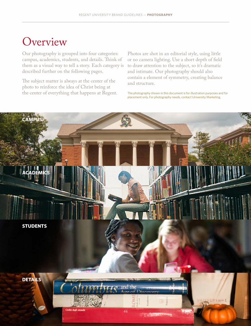
Overview Our photography is grouped into four categories: campus, academics, students, and details. Think of them as a visual way to tell a story. Each category is described further on the following pages.
The subject matter is always at the center of the photo to reinforce the idea of Christ being at the center of everything that happens at Regent.
CAMPUS
ACADEMICS
STUDENTS
DETAILS
Photos are shot in an editorial style, using little or no camera lighting. Use a short depth of field to draw attention to the subject, so it’s dramatic and intimate. Our photography should also contain a element of symmetry, creating balance and structure.
The photography shown in this document is for illustration purposes and for placement only. For photography needs, contact University Marketing.

REGENT UNIVERSITY BRAND GUIDELINES — PHOTOGRAPHY
47
VANISHING POINTThis style should convey a sense of movement and drama, pulling the viewer into the photo. Try to find unexpected angles and perspectives for the most impact.
TRIANGULARSymmetry is key for this composition. All the elements in the photo should work together to pull the viewer's eyes upward.
ASYMMETRICALFor this style, subjects are layered to create a sense of depth and intimacy. The focus should be in the center of the photo, highlighting the subject matter between the foreground and the background. A short depth of field is crucial to making this successful. Elements can be positioned from right to left, or from left to right as shown.
Photo Composition The subject matter, style, and perspective of our photography all play a role in its success, but the way we compose those elements is what makes it distinctly Regent. In this section, we cover the four ways we approach photo composition: centered, vanishing point, triangular, and asymmetrical. Use these tools as a guide when shooting new images or cropping existing photography.
CENTEREDClear, straightforward, and symmetrical, this composition style should usually be reserved for detail shots.

CAMPUSTo capture architectural shots, use a shallow depth of field, natural lighting, and an interesting and engaging perspective— one that shows students interacting with each other and their spaces. If the shot contains a building, but no students, there should be a high level of visual interest. Be sure to give equal play to the exterior and interior spaces of our campus.
REGENT UNIVERSITY BRAND GUIDELINES — PHOTOGRAPHY
48

ACADEMICSWhen capturing classroom and research settings, it is important to include a human element—showing the people who are immersed in teaching and learning. Attempt to capture a candid moment, and compose the photo in a way that showcases not just the subject, but the environment surrounding him or her, as well.It should never be the dominant element on the page; instead it should live comfortably and clearly as a signature.
REGENT UNIVERSITY BRAND GUIDELINES — PHOTOGRAPHY
49

STUDENTSWith student photography, try to capture emotion, whether it’s introspective or overt. Shots where the hero is looking just to the side of the camera are powerful, because they make the viewer feel they’re in the middle of the scene. Both portraiture of a single subject and crowded scenes are allowed. It should never be the dominant element on the page; instead it should live comfortably and clearly as a signature.
REGENT UNIVERSITY BRAND GUIDELINES — PHOTOGRAPHY
50

DETAILSThe tiniest details communicate a lot about Regent. Tightly framed shots, whether of people or objects, should contain interesting color contrast, have foreground and background, and should capture just enough of the subject so that the viewer can imaging what the rest of the scene looks like.
REGENT UNIVERSITY BRAND GUIDELINES — PHOTOGRAPHY
51

REGENT UNIVERSITY BRAND GUIDELINES — GRAPHIC ELEMENTS
52
Graphic Elements
The Regent brand has a set of graphic tools that create a unique look, making us recognizable.
These elements add visual interest and enhance our storytelling, and they can be dialed up or down
individually depending on the audience.

Ruled Lines & FramesRuled lines and solid-framed boxes help organize proof points and accolades for within a layout so they're easy to find. Short solid rules divide headline elements minimally, and frames isolate content for a more formal tone.
REGENT UNIVERSITY BRAND GUIDELINES — GRAPHIC ELEMENTS
53
RULE DIVIDERS
SOLID FRAMESApplying heavy, solid frames to boxes takes the traditional layout and makes it modern and functional, highlighting essential elements on a page.
Regent University is to binfluential, Christian, tra
Vision3pt RULE
10pt RULE
THE KNOWLEDGE THAT GIVES LIFE PURPOSE.
THE FAITH THAT GIVES LIFE MEANING.
SOLID RULESAdd a simple rule to accent headlines or to act as a visual break between parts of a headline. It's decorative and functional at once.3pt RULE
DETAILED RULESThese add an extra level of detail to rules that reflects our attention to detail, which is seen on campus and in the classroom.
U.S. NEWS & WORLD REPORT, 2013
Online Bachelor’s Program in the U.S.
Online Graduate Program in Virginia
Online MBA Program, Faculty Credentials
and Training, in the U.S.
no. no. no.
3pt RULE
0.5pt RULE
See "Applying the Brand" on page 56 for sample executions.

LINEAR GRID ICONIC
Patterns Patterned backgrounds give our brand a unique tone that expresses our attention to detail and our personality. Use patterns when photography is scarce or to introduce color and texture to a poster, ad, or brochure.
REGENT UNIVERSITY BRAND GUIDELINES — GRAPHIC ELEMENTS
54
CUSTOMIZINGFeel free to try different brand colors, and be sure that new patterns maintain the legibility of copy.
See "Applying the Brand" on page 56 for sample executions.
TILING PATTERNSPattern blocks allow for tiling. This way, the patterns can be used in different scales and amounts of coverage in layouts.
x1 x2
ICONS
ILLUSTRATIONS
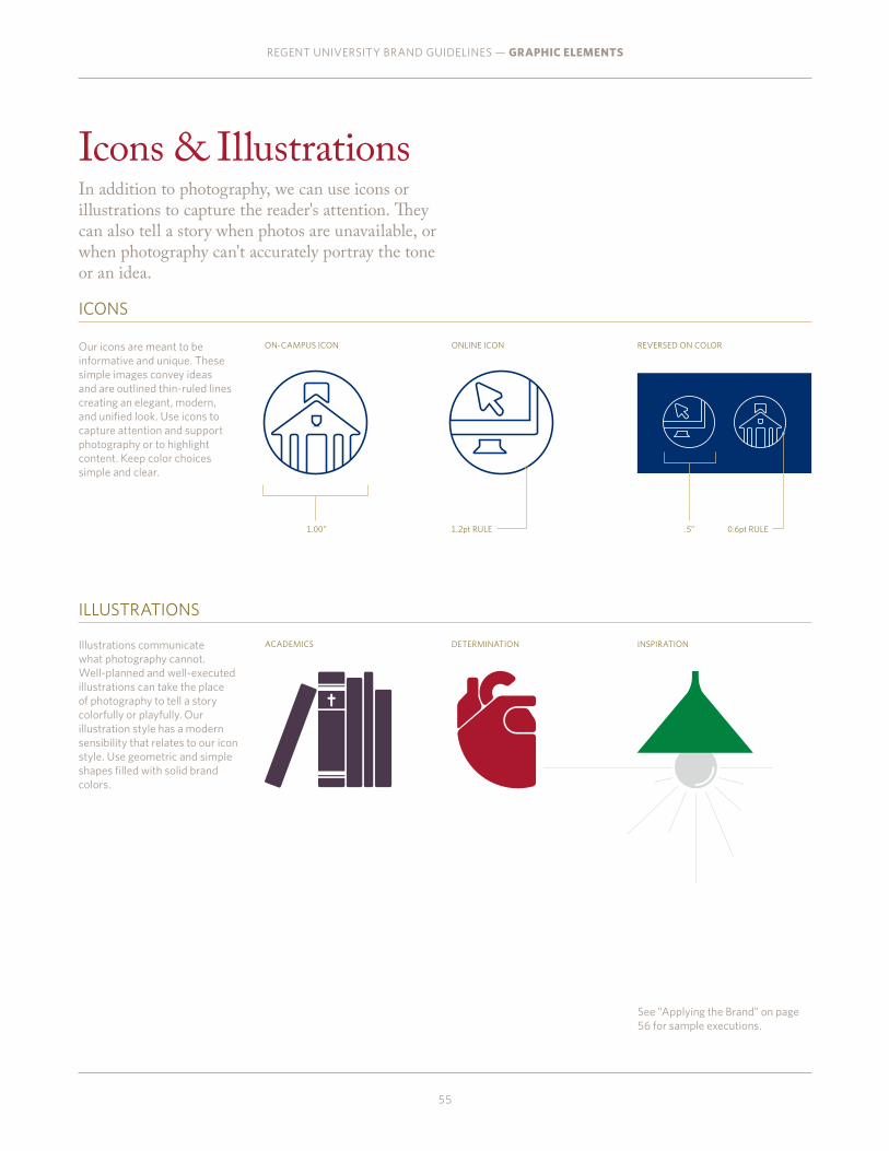
Icons & Illustrations In addition to photography, we can use icons or illustrations to capture the reader's attention. They can also tell a story when photos are unavailable, or when photography can't accurately portray the tone or an idea.
REGENT UNIVERSITY BRAND GUIDELINES — GRAPHIC ELEMENTS
55
ON-CAMPUS ICON
ACADEMICS
ONLINE ICON
DETERMINATION
REVERSED ON COLOR
INSPIRATION
Our icons are meant to be informative and unique. These simple images convey ideas and are outlined thin-ruled lines creating an elegant, modern, and unified look. Use icons to capture attention and support photography or to highlight content. Keep color choices simple and clear.
Illustrations communicate what photography cannot. Well-planned and well-executed illustrations can take the place of photography to tell a story colorfully or playfully. Our illustration style has a modern sensibility that relates to our icon style. Use geometric and simple shapes filled with solid brand colors.
1.2pt RULE 0.6pt RULE1.00” .5”
See "Applying the Brand" on page 56 for sample executions.
Applying the Brand
REGENT UNIVERSITY BRAND GUIDELINES — APPLYING THE BRAND
56
This section shows how our brand comes to life. These examples aren’t meant to be rules or templates, but rather a way to understand how the brand can flex for each audience, and how all of our brand elements can come together to create real, tangible marketing
tactics that are engaging and effective.

REGENT UNIVERSITY BRAND GUIDELINES — APPLYING THE BRAND
AUDIENCEUndergraduate
ELEMENTSPrimary logo Mixed typefacesRule linesLarge and inset photo arrangementsCampus and academic photographyPattern backgroundsCore and accent colors
57
Undergraduate Prospectus

REGENT UNIVERSITY BRAND GUIDELINES — APPLYING THE BRAND
Undergraduate Prospectus
58

REGENT UNIVERSITY BRAND GUIDELINES — APPLYING THE BRAND
AUDIENCEGraduate
ELEMENTSPrimary logo and school name Mixed typefacesRule linesLarge and inset photo arrangementsCampus and academic photographyCore and accent colorsAccreditation graphic
59
Psychology & Counseling Prospectus

REGENT UNIVERSITY BRAND GUIDELINES — APPLYING THE BRAND
AUDIENCEUndergraduate
ELEMENTSPrimary logo and school nameMixed typefacesRule linesLarge and inset photo arrangementsCampus and academic photographyCore and accent colors
60
Communcations & the Arts Prospectus

REGENT UNIVERSITY BRAND GUIDELINES — APPLYING THE BRAND
Campaign Microsite
AUDIENCEUndergraduateGraduateContinuing education
ELEMENTSPrimary logo and tagline Mixed typefacesRule linesCampus photographyCore colorsAccreditation graphicIcons & Illustrations
61

REGENT UNIVERSITY BRAND GUIDELINES — APPLYING THE BRAND
Direct Mail AUDIENCEUndergraduateGraduateContinuing education
ELEMENTSPrimary logo and taglineMixed typefacesRule linesCampus and detail photographyCore and accent colorsAccreditation graphic
62

REGENT UNIVERSITY BRAND GUIDELINES — APPLYING THE BRAND
Direct Mail AUDIENCEUndergraduate
ELEMENTSPrimary logo and school nameMixed typefacesRule linesCampus and detail photographyCore and accent colorsIcons & Illustrations
63

REGENT UNIVERSITY BRAND GUIDELINES — APPLYING THE BRAND
Direct Mail AUDIENCEAlumni and donors
ELEMENTSMixed typefacesRule linesStudent and detail photographyFramed boxesCore and dark colorsPrimary logo
64

REGENT UNIVERSITY BRAND GUIDELINES — APPLYING THE BRAND
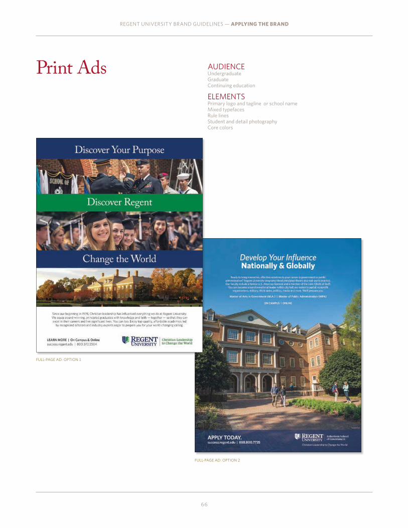
Print Ads
FULL PAGE AD
AUDIENCEUndergraduateGraduateContinuing education
ELEMENTSPrimary logo and school nameMixed typefacesRule linesStudent and detail photographyCore colors
65
QUARTER-PAGE AD
HALF-PAGE AD
REGENT UNIVERSITY BRAND GUIDELINES — APPLYING THE BRAND
Print Ads
FULL-PAGE AD: OPTION 1
FULL-PAGE AD: OPTION 2
AUDIENCEUndergraduateGraduateContinuing education
ELEMENTSPrimary logo and tagline or school nameMixed typefacesRule linesStudent and detail photographyCore colors
66

REGENT UNIVERSITY BRAND GUIDELINES — APPLYING THE BRAND
67
Signage
Reason and Faith.
OnlyRegent.com
REASONFAITH
They’re what make us different. Here, we’re committed
to a heritage of rigorous scholarship dating back over
a thousand years, and to a faith tradition dating back
a thousand more. This is how we create a culture of inquiry
where no topic is off limits, and a culture of hope where
anything’s possible. It’s the freedom to think for ourselves
and a responsibility to act on behalf of others. It’s Christian
leadership, and it’s changing the world for the better. It’s
higher learning. It’s greater knowing. It’s what makes us
whole. It’s what makes us Regent.
&TOGETHER
Our new logo builds upon the shield and crowns of our Regent crest
and blends two of Regent’s top values: Reason and Faith. The left side
of the logo is a half shield with three crowns, reflecting the Holy Trinity
and representing the critical importance of faith to Regent life. The right
side of the logo is shaped like the pages of an open book, reflecting the
importance of knowledge and academic rigor.
BANNERSLIGHT POSTS
POSTERS
AUDIENCEAll audiences
ELEMENTSPrimary and horizontal logosCore colorsMixed brand typefaces

REGENT UNIVERSITY BRAND GUIDELINES — APPLYING THE BRAND
68
PrestigiousAccreditAtions
SACS ABA
CACREPAPA
TEACASEL
ACBSPATS
Ranked Top 10 Nationally
Online
OnlyRegent.com
REGENT UNIVERSITY
PrestigiousAccreditAtions
OnlyRegent.com
SACS ABA
CACREPAPA
TEACASEL
ACBSPATS
PrestigiousAccreditAtions
SACS ABA
CACREPAPA
TEACASEL
ACBSPATS
Powerful Minds. Strong Values.
OnlyRegent.com
Signage
MESSAGING
ACCOLADES
AUDIENCEAll audiences
ELEMENTSHorizontal logoCore colorsStudent photography

REGENT UNIVERSITY BRAND GUIDELINES — APPLYING THE BRAND
Office of the President
Reason&
Faith
A YEAR IN REVIEW
12
“Taquatio beratur aspienda que eosandiam eatquid que none-stem. Rum quatiis verspitiis explaccusci blanite stemperchil”
—PAT ROBERTSON
atene qui duci ant, simagni entiae voloreh endandigendi sanditaepra vitio eum vit, optaten istemqu ibuscim agnime enimus elit, sam, tem sam, ide verrovitin non et maionecatia dolupta arum, qui cumendest esequam qui consequibus pratis ex ea aut idunt molendit ommoditiatur asperibus expera aut enduntius eossuntis doluptatio doluptias mo corehent lab iderrovidem. Itatis veligen impossi nusant, quo quis accae la parum amusam etur, toreruptat molupta tquiaepudi dis ex et imi, optatis num quam conem quid ut as rendaecabo. Dolorep erionsequid quam dion et molut hilique velest est, volorunt alitibus, nam qui dolut quam, totatia cus.Et quia vollut voluptat.
Iquuntias etur? Quiamus quis nis verum corepeliqui temosam accupta volorum, ius quam ium, a destrum moluptio. Ullectur?
It, vendit ut ditatus moluptias a quatatur, conet quam sun-tur sa eost, nus placimosae derersped undio vene remped quos int, is es modistium illaborum ea vent, sequam, odisitae pro temodicius autatisqui que volupit verion nobis volupta quaeprecus ea volluptate nobite dolorepro blam quis enitaquia nessum estium erum erundella que natempo renditatis doluptat autati nobitatemo quam voluptatquid eossi sandandaepe que pelliquae laccus re voluptate seque volores delicae cum quam eatius simin consed eicillupti ulparum quunt.
Ihiliquis sunt, eiciatqui aliquiam quia et autem adignihita sapicit aereres ectorio nseque et enis modi dolore volorenim harcillanti ute volo dolupit derunt harcid eaqui doluptatet etur aligenis inulpar cipsam enimi, illa et offictibus aut maximin reri aliquis soluptatecto consequidit in et faces expe volum et volupta vel etur? Pit lamet facipietur sinvel mo idunt vid excepre ate omnihiciento
ium ut volo magnatur autaquibero et qui ducipid elenitatur ad ut dis aspis esciendia sus dit verorrum eiunt, verem. Iciandit fugit litatem vel mi, sin poribea ipit aut quidus magnis pa ipsae poreicit a aut ea veliatem suntem et omnis as diti re plitis andeliciis evendae omniatiorum incilit que nulliatur rempor molore eost officiur, ulluptat.Dus, consenem. Riatibus non nihitatem laudae od que nim lacestem quo qui custis et, voluptas aborese quatiur? Qui odit ut aut dolupta turitem et omnimus truptati dus de sandunto consequam fuga. Ed que pratur, sitatus nim estio dolorer rorerepudam quam il inci corepratusam ducitas si iditiis in por as explianturi ut aut vit, cusae earit quid ex enihicatur rest, conseriant vollaut mo doloribus quaecab intium ut ma autatiant et laccus dolestiis
The Plan for RegentOFFICE OF THE PRESIDENT
AUDIENCEAll audiences
ELEMENTSRule linesFramed boxesLarge photographyCore and dark colorsUniversity sealHorizontal stacked logo
69

REGENT UNIVERSITY BRAND GUIDELINES — APPLYING THE BRAND
Invitation
1000 Regent University DriveVirginia Beach, VA 23464
Regent University
10-YEAR REUNION
AN EVENING OF FELLOWSHIP AND WORSHIP.
Tus aut estet apid miliquo ssequia spersped etur ad explit atur assinis tiorem volo molorehent autecab Onectate cumquis a qui consedi psanis eum eario eiumqui audignis
pellabore, quasperibus que is Tus aut estet apid miliquo ssequia spersped etur ad explit atur assinis tiorem volo molorehent autecab Onectate cumquis a qui consedi psanis eum eario
eiumqui audignis pellabore, quasperibus que is.
5:30pmto
9:00pm
Robertson Hall
Moot Courtroom
18-19October
2014
COME BACK TO CELEBR ATE
A DECADE OF DOING JUST THAT.
You came to Regent to change
the world.
AUDIENCEAlumni and donors
ELEMENTSRule linesPattern graphicFramed boxesLarge photographyCore and dark colorsPrimary and horizontal logo
70

REGENT UNIVERSITY BRAND GUIDELINES — CONTACT INFORMATION
Contact InformationPlease contact University Marketing with questions and requests for using the assets presented in this document.
PATRICK WRIGHTCreative [email protected]
DEANNA REISProduction Manager [email protected] 757.352.4035
BROOK CHALFANTDirector of Editorial [email protected] 757.652.4026
71