Brand Guidelines - Lionbrandguidelines.lionco.com/sites/default/files/Lion-Brand... · LION BRAND...
26
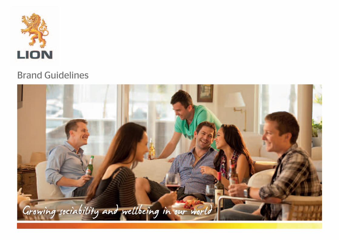
Brand Guidelines
Transcript of Brand Guidelines - Lionbrandguidelines.lionco.com/sites/default/files/Lion-Brand... · LION BRAND...
Brand Guidelines

L I O N B R A N D G U I D E L I N E S | P A G E 2
Welcome to our brand
Whether you’re meeting friends for dinner, catching up with family, or heading into a meeting at work, how you behave makes an impression. At Lion we aim to leave everyone more engaged with our business following every interaction, and maintaining the integrity of our Lion brand and what it stands for is a critical part of this.
To assist you in bringing our brand to life in an engaging way, we have developed the Lion Brand Guidelines and an easy-to-use online interface.
These Guidelines have been developed to help us communicate the warmth and personality of the Lion brand easily and consistently to all our stakeholders – from our customers and business partners to the broader community. They will ensure we positively interact with everyone we come into contact with.
Everyone at Lion has a role to play in making this happen. It’s critical that we use the right logos, colours, font, photographs, and other visual elements whenever we are out there showing the world what Lion is all about. These Guidelines provide some basic do’s and don’ts on how to use the new Lion brand, as well as ideas and downloads to make sharing the Lion story easy.
When using a third party to produce new Lion collateral, please provide them with a copy of these Guidelines.
I hope you like our new look! If you have any questions or feedback about the Guidelines, please contact Mary-Sinead McMullen at Lion External Affairs at: [email protected].
Best wishes,Rob MurrayCEO

L I O N B R A N D G U I D E L I N E S | P A G E 3
We would like ‘Lion’ to be a great corporate brand. Great brands are nurtured and protected by the companies they represent.
The Lion Sub-Brand Policy is designed to guide our people on the development of all brand types: project initiatives, service, official publications and team brands.
The ‘Lion’ brand and logo should not be changed or incorporated into any other logo or except as outlined in the Corporate Brand Guidelines.
Co-Branding
Where a sub-brand appears on collateral, soft copy or hard copy, where possible include the Lion logo with the sub-brand logo. The Lion logo and sub-brand logo do not need to appear side by side, but you should uphold the guidelines on the usage of the Lion logo as described in the Corporate Brand Guidelines.
Initiative or Service Brands
From time to time, our people will wish to align internal or external stakeholders to a change or capability initiative by creating a brand. Examples of this are Program Quattro and Project Hawkeye, Leadership Capability and the various ‘Lion Way’ capabilityinitiative brands.
The business also manages a number of service brands, for instance enable.me.
1. All change or capability initiatives or services that are internally facing should co-brand with the Lion brand and be created in line with the Corporate Brand Guidelines.
2. If the initiative or service is externally facing and will be overtly or inherently associated with Lion, the brand (and the look and feel of the communications carrying the brand) should be created in line with the Corporate Brand Guidelines.
Publication and Portal Brands
The business also uses publication or portal brands, for instance, n@tnet and onLION.
1. Internal or external publications or portals executed under the Lion name should be consistent with the Corporate Brand Guidelines, including any logos created.
2. Internal or external publications or portals created under a sub-brand should aim to co-brand with Lion (see above) and should be consistent with the provisions in the Corporate Brand Guidelines.
3. If your collateral relates to an initiative that is not intended to be seen externally as an official Lion document, for instance Beer Masters or Cheese Matters, you should not apply the brand guidelines.
Team Brands
When we changed our name to Lion, we did so to support our achievement of the goal of behaving as one company – to operate as one aligned team. To achieve this we would like teams not to create individual team brands.
However, where a team exists to provide a service to Lion people (such as IT or PeopleCapability) and that service is to the entire company, then a service brand and the provisions for service brands as described above would apply.
For those teams that have historically operated under a team brand that is not based on providing a Lion wide service or significant change or capability initiative, we will be engaging with you to discuss an evolution to operating under this Policy.
Welcome to our brand: S U B B R A N D P O L I c yWelcome to our brand: S U B B R A N D P O L I c y
We would like
‘Lion’ to be a
great corporate
brand.
Great brands are
nurtured and
protected by the
companies they
represent.
L I O N B R A N D G U I D E L I N E S | P A G E 4
Welcome to our brand: S U B B R A N D P O L I c y ( c O N t I N U E D )
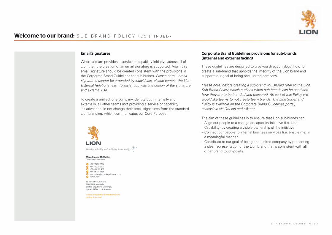
Email Signatures
Where a team provides a service or capability initiative across all of Lion then the creation of an email signature is supported. Again this email signature should be created consistent with the provisions in the Corporate Brand Guidelines for sub-brands. Please note – email signatures cannot be amended by individuals, please contact the Lion External Relations team to assist you with the design of the signature and external use.
To create a unified, one company identity both internally and externally, all other teams (not providing a service or capability initiative) should not change their email signatures from the standard Lion branding, which communicates our Core Purpose.
Corporate Brand Guidelines provisions for sub-brands (internal and external facing)
These guidelines are designed to give you direction about how to create a sub-brand that upholds the integrity of the Lion brand and supports our goal of being one, united company.
Please note: before creating a sub-brand you should refer to the Lion Sub-Brand Policy, which outlines when sub-brands can be used and how they are to be branded and executed. As part of this Policy we would like teams to not create team brands. The Lion Sub-Brand Policy is available on the Corporate Brand Guidelines portal, accessible via OnLion and n@tnet.
The aim of these guidelines is to ensure that Lion sub-brands can:– Align our people to a change or capability initiative (i.e. Lion
Capability) by creating a visible ownership of the initiative– Connect our people to internal business services (i.e. enable.me) in
a meaningful manner– Contribute to our goal of being one, united company by presenting
a clear representation of the Lion brand that is consistent with all other brand touch-pointsGrowing sociability and wellbeing in our world
Mary-Sinead McMullen Communications Assistant
+61 2 9290 6614+61 2 9320 2200+61 459 179 430+61 2 8774 4634 [email protected] lionco.com
68 York Street, Sydney,NSW 2000, Australia.Locked Bag, Royal Exchange,Sydney, NSW 1225, Australia.
Please consider the environment before printing this e-mail.

L I O N B R A N D G U I D E L I N E S | P A G E 5
Welcome to our brand: S U B B R A N D P O L I c y ( c O N t I N U E D )
Internal facing sub-brands
Sub-brands that are internally facing should co-brand with the Lion brand where possible and should be created using Lion’s typographic styles and colours only, as provided for in Lion’s Visual Language.
Elements of the Visual Language may not be altered in any way and need to be applied in a consistent manner, at all times and across all applications.
Moving forward, when creating a sub-brand you should not create a logo, but rather use Lion’s typography and colours to name the sub-brand and then align it to the Lion logo (see below). The sub-brand can either have a degree of separation from the Lion logo (as below), or be connected to the Lion logo as is outlined in the next section ‘external facing sub-brands’.
The word Lion may be used in a sub-brand name and descriptor. In the instance of existing sub-brands that were created before the Lion re-brand and already have their own logo, the Lion logo should be included alongside the sub-brand logo (but not be connected to it).
External facing sub-brands
Sub-brands that are externally facing must co-brand with the Lion brand and use the typographic styles and colours provided for in Lion’s Visual Language.
The following diagrams provide an example of how Lion’s typefaces and colours could be used, and the relationship of the Lion logo with the sub-brand (i.e. the ‘lock-up’ with the sub-brand).
Elements of the Visual Language may not be altered in any way and need to be applied in a consistent manner, at all times and across all applications.
The core Lion logo should be connected to the sub-brand. The word Lion may be used in a sub-brand name and descriptor.
ProjectInitiative

L I O N B R A N D G U I D E L I N E S | P A G E 6
Our brand looks like this: O U R L O G O
Long-standing, professional and strong
Our logo is made up of the Lion heritage symbol, positioned above or beside the Lion word mark.
To preserve the strength of our brand the logo will always appear inside a white rectangular shape.
To download logo files visit http://brandguidelines.lionco.com/logo-files

L I O N B R A N D G U I D E L I N E S | P A G E 7
Primary colour logo
This is our preferred logo format. The Lion word mark is positioned beneath the Lion symbol. Use this version wherever possible.
The primary logo is not to be reproduced at sizes smaller than 15mm (45 pixels) wide.
Secondary colour logo
This horizontal format should only be used when there is very limited vertical space.
The secondary logo is not to be reproduced at sizes smaller than 25mm for print or 70 pixels wide for digital applications.
Logo colours
The Lion symbol is reproduced in 4 colour process or RGB.
The wordmark must match PMS Cool Grey 11 coated regardless of substrate or reproduction process.
Our brand looks like this: O U R L O G O ( c O N t I N U E D )
Primary logo
Minimum size – primary logo
Secondary logo
Minimum size – secondary logo
15mm45 pixels
25mm70 pixels
L I O N B R A N D G U I D E L I N E S | P A G E 8
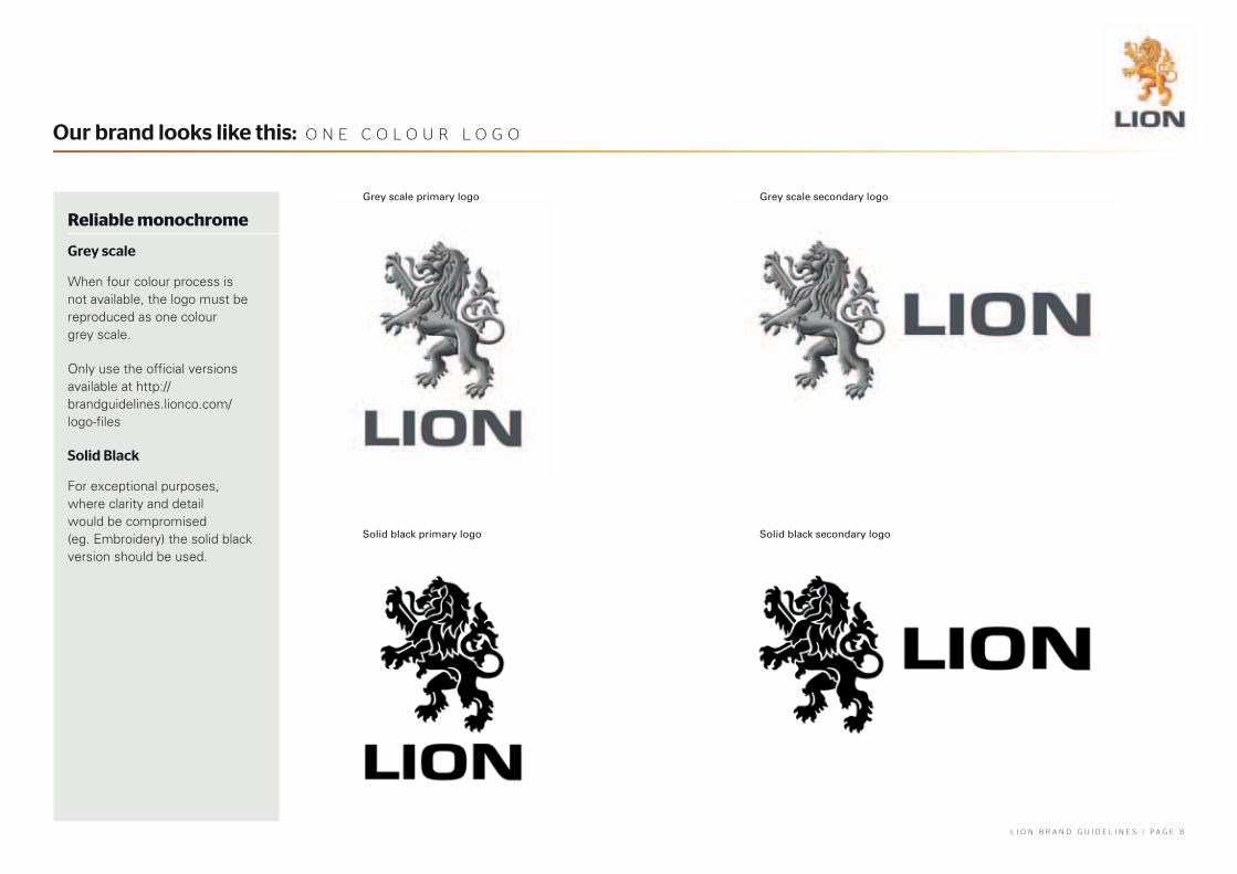
Our brand looks like this: O N E c O L O U R L O G O
Reliable monochrome
Grey scale
When four colour process is not available, the logo must be reproduced as one colour grey scale.
Only use the official versions available at http://brandguidelines.lionco.com/logo-files
Solid Black
For exceptional purposes, where clarity and detail would be compromised (eg. Embroidery) the solid black version should be used.
Grey scale primary logo
Solid black primary logo Solid black secondary logo
Grey scale secondary logo

L I O N B R A N D G U I D E L I N E S | P A G E 9
The sunshine and the shade
Our primary brand colours instil our character and personality.
Lion Yellow must match Pantone 130 coated regardless of substrate or reproduction process.
Lion Dark Grey must match Pantone Cool Grey 11 coated regardless of substrate or reproduction process.
Computer RGB colour settings should be set to sRGB and CMYK ISO-12647-2:2-2004 for best colour representation.
Our brand looks like this: P R I m A R y c O R P O R A t E c O L O U R S
Printed
Pantone
130 C
CMYK
35% Magenta100% Yellow
RGB
242 Red169 Green0 Blue
Cool Grey 11 C 75% Black 83 Red86 Green90 Blue
On Screen
Lion Yellow
Lion Dark Grey
L I O N B R A N D G U I D E L I N E S | P A G E 1 0
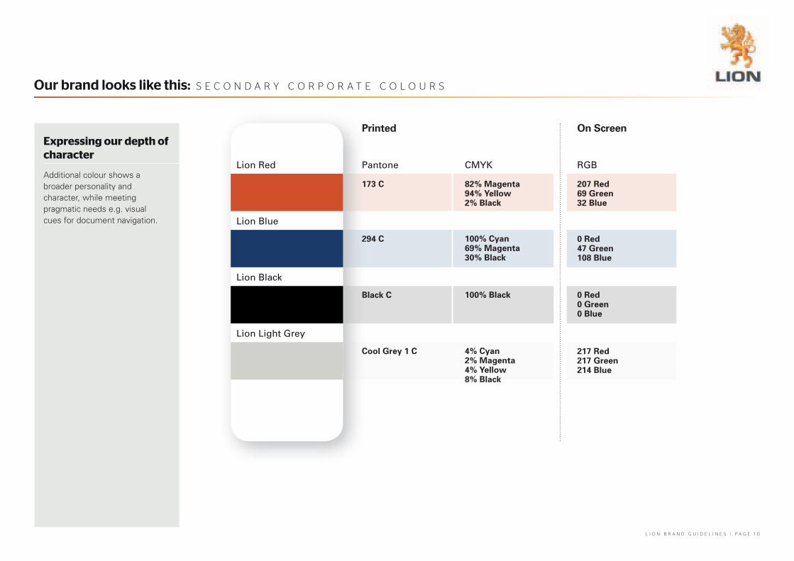
Expressing our depth of character
Additional colour shows a broader personality and character, while meeting pragmatic needs e.g. visual cues for document navigation.
Our brand looks like this: S E c O N D A R y c O R P O R A t E c O L O U R S
Printed
Pantone
173 C
294 C
Black C
Cool Grey 1 C
CMYK
82% Magenta94% Yellow2% Black
100% Cyan69% Magenta30% Black
100% Black
4% Cyan2% Magenta4% Yellow8% Black
RGB
207 Red69 Green32 Blue
0 Red47 Green108 Blue
0 Red0 Green0 Blue
217 Red217 Green214 Blue
On Screen
Lion Red
Lion Blue
Lion Black
Lion Light Grey

L I O N B R A N D G U I D E L I N E S | P A G E 1 1
Our brand looks like this: O U R L O G O O N V A R I O U S B A c K G R O U N D S
Resilient and recognisable wherever we go
When our logo is presented on a background other than plain white it will appear within a white rectangle.
Please use the clear space rules when applying the logo to a background.
The logo can sit in any corner.
The Lion stays in its official form, with no alteration.
Logo on coloured background Logo on grey background
Logo on dark background Logo on photographic background

L I O N B R A N D G U I D E L I N E S | P A G E 1 2
Room to breathe
The minimum clear space required around the logo is predetermined on the logo files supplied. When placing the logo in any document, do not allow another graphic element, including any background colour, to encroach on the logo frame.
For clarity of explanation, this minimum clear space dimension is calculated as 20% of the height of the Lion symbol.
Our brand looks like this: c L E A R S P A c E
x x=20% of ‘y’
y
x x=20% of ‘y’
y
Primary Logo
Secondary Logo
L I O N B R A N D G U I D E L I N E S | P A G E 1 3
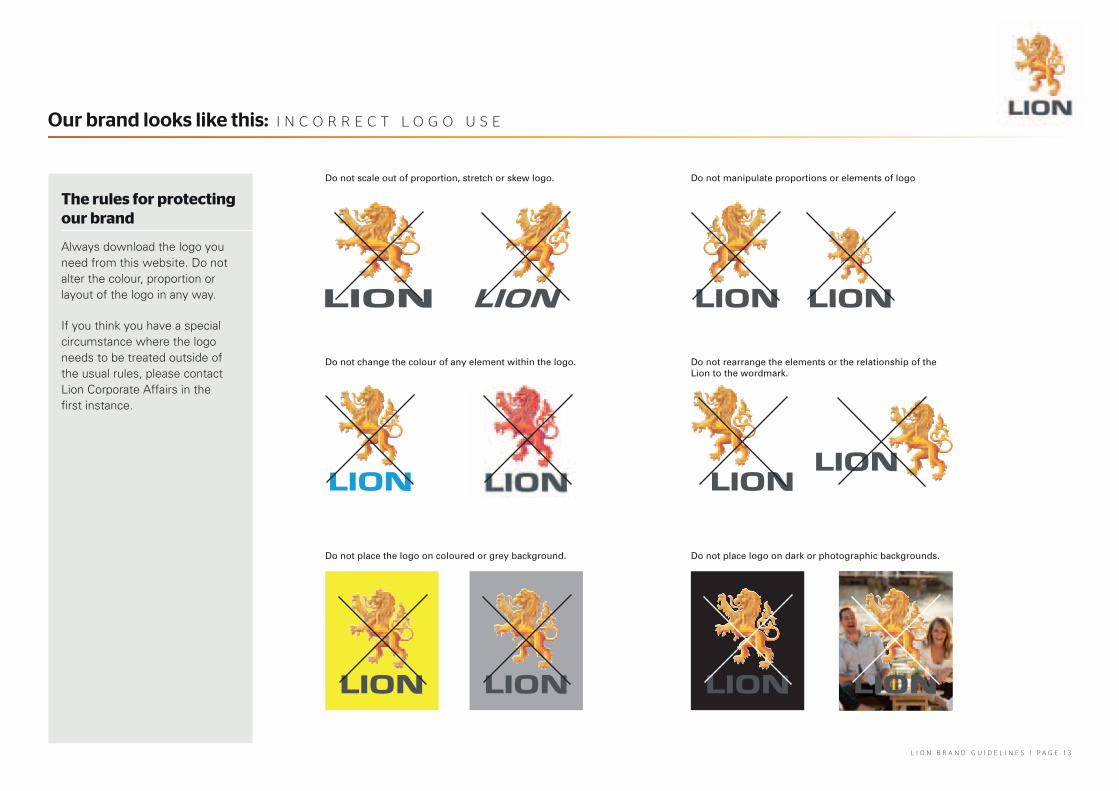
The rules for protecting our brand
Always download the logo you need from this website. Do not alter the colour, proportion or layout of the logo in any way.
If you think you have a special circumstance where the logo needs to be treated outside of the usual rules, please contact Lion Corporate Affairs in the first instance.
Our brand looks like this: I N c O R R E c t L O G O U S E
Do not scale out of proportion, stretch or skew logo.
Do not change the colour of any element within the logo.
Do not place the logo on coloured or grey background.
Do not manipulate proportions or elements of logo
Do not rearrange the elements or the relationship of the Lion to the wordmark.
Do not place logo on dark or photographic backgrounds.

L I O N B R A N D G U I D E L I N E S | P A G E 1 4
Energy and shape to voice our ideas
Consistent use of corporate typefaces (or fonts) helps to create a common appearance for all Lion materials.
For all external printed publications, the Stag Sans range of fonts should be used for headings, and the Univers and Foundry Wilson typefaces should be used for body copy.
For added personality, the James Fajardo font can be used for headlines and graphic interest use only. Never use this font in body copy.
Our brand looks like this: t y P O G R A P h y
James FajardoJames FaJardo
Expressive script – James Fajardo
Stag Sans ThinStag Sans LightStag Sans BookStag Sans MediumStag Sans SemiboldStag Sans Bold
STag SanS ThinStAG SANS LIGhtStaG SanS BookSTaG SanS MEdIuMSTag SanS SEmiboLdStag SanS Bold
Headline - Stag Sans
Body copy - Univers
How do most great products or ideas spring into being?
They find a space that no one else is dominating and they grab it for themselves. Great inventors go a step further in creating a space and a need for their product. It’s tricky in the saturated wine category, which views radical new product development as an
alien concept.This context is what has driven the multi-functional, trans-Tasman LNNF team be-hind Te Hana, our new sparkling wine brand from New Zealand. Two years of research, gathering consumer insights, product/ brand development and testing has resulted in the most exciting wine launch that LNNF has ever under-taken.These figures persuaded the
L I O N B R A N D G U I D E L I N E S | P A G E 1 5
Our brand looks like this: t y P O G R A P h y ( c O N t I N U E D )
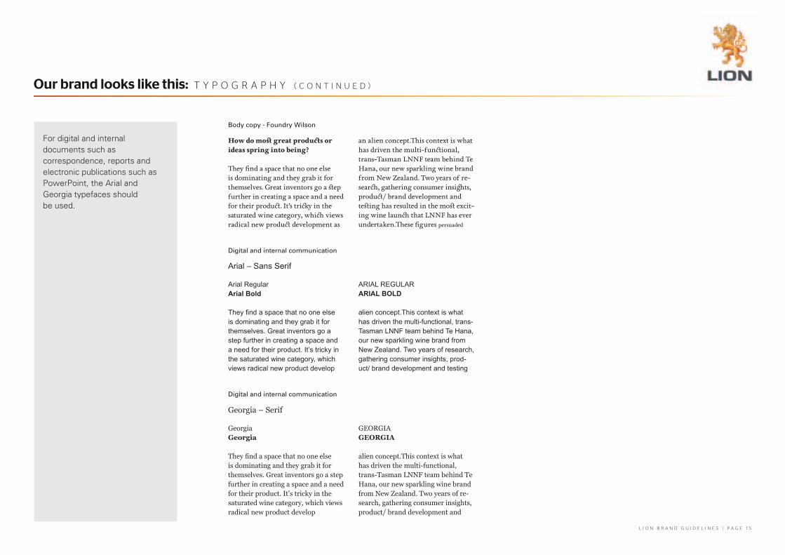
Body copy - Foundry Wilson
Digital and internal communication
Digital and internal communication
Arial – Sans Serif
Georgia – Serif
How do most great products or ideas spring into being?
They find a space that no one else is dominating and they grab it for themselves. Great inventors go a step further in creating a space and a need for their product. It’s tricky in the saturated wine category, which views radical new product development as
an alien concept.This context is what has driven the multi-functional, trans-Tasman LNNF team behind Te Hana, our new sparkling wine brand from New Zealand. Two years of re-search, gathering consumer insights, product/ brand development and testing has resulted in the most excit-ing wine launch that LNNF has ever undertaken.These figures persuaded
Arial RegularArial Bold
They find a space that no one else is dominating and they grab it for themselves. Great inventors go a step further in creating a space and a need for their product. It’s tricky in the saturated wine category, which views radical new product develop
ArIAl reGulArAriAl Bold
alien concept.This context is what has driven the multi-functional, trans-Tasman lNNF team behind Te Hana, our new sparkling wine brand from New Zealand. Two years of research, gathering consumer insights, prod-uct/ brand development and testing
GeorgiaGeorgia
They find a space that no one else is dominating and they grab it for themselves. Great inventors go a step further in creating a space and a need for their product. It’s tricky in the saturated wine category, which views radical new product develop
GeorGIaGeorGia
alien concept.This context is what has driven the multi-functional, trans-Tasman LNNF team behind Te Hana, our new sparkling wine brand from New Zealand. Two years of re-search, gathering consumer insights, product/ brand development and
For digital and internal documents such as correspondence, reports and electronic publications such as PowerPoint, the Arial and Georgia typefaces should be used.
L I O N B R A N D G U I D E L I N E S | P A G E 1 6
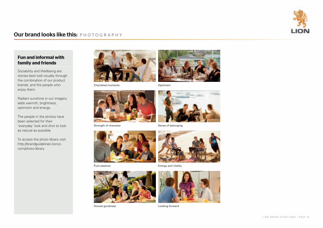
Fun and informal with family and friends
Sociability and Wellbeing are stories best told visually through the combination of our product brands, and the people who enjoy them.
Radiant sunshine in our imagery adds warmth, brightness, optimism and energy.
The people in the photos have been selected for their 'everyday' look and shot to look as natural as possible.
To access the photo library visit http://brandguidelines.lionco.com/photo-library
Our brand looks like this: P h O t O G R A P h y
Cherished moments Optimism
Strength of character Sense of belonging
Pure essence Energy and vitality
Honest goodness Looking forward
L I O N B R A N D G U I D E L I N E S | P A G E 1 7
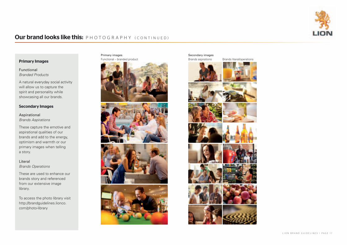
Primary Images
FunctionalBranded Products
A natural everyday social activity will allow us to capture the spirit and personality while showcasing all our brands.
Secondary Images
AspirationalBrands Aspirations
These capture the emotive and aspirational qualities of our brands and add to the energy, optimism and warmth or our primary images when telling a story.
LiteralBrands Operations
These are used to enhance our brands story and referenced from our extensive image library.
To access the photo library visit http://brandguidelines.lionco.com/photo-library
Our brand looks like this: P h O t O G R A P h y ( c O N t I N U E D )
Primary imagesFunctional – branded product
Secondary imagesBrands aspirations Brands literal/operations

L I O N B R A N D G U I D E L I N E S | P A G E 1 8
Evoking depth of character and experience
Textural backgrounds are available to add graphic interest to corporate documents.
These are always produced in colours approximating the Lion colour palette. Textures are versatile and can be used as a foil to, and replacement for, commissioning new photography and illustration.
To access the photo library visit http://brandguidelines.lionco.com/photo-library
Our brand looks like this: t E x t U R E S
Sun backgrounds Beer
Wine
Cheese Juice
Milk Yogurt

L I O N B R A N D G U I D E L I N E S | P A G E 1 9
The finishing touch
Icons provide character, along with options for literal, emotive, functional and creative interpretations.
Please talk to External Affairs if you would like to incorporate icons into your project.
Our brand looks like this: G R A P h I c E L E m E N t S
Literal Emotive
L I O N B R A N D G U I D E L I N E S | P A G E 2 0
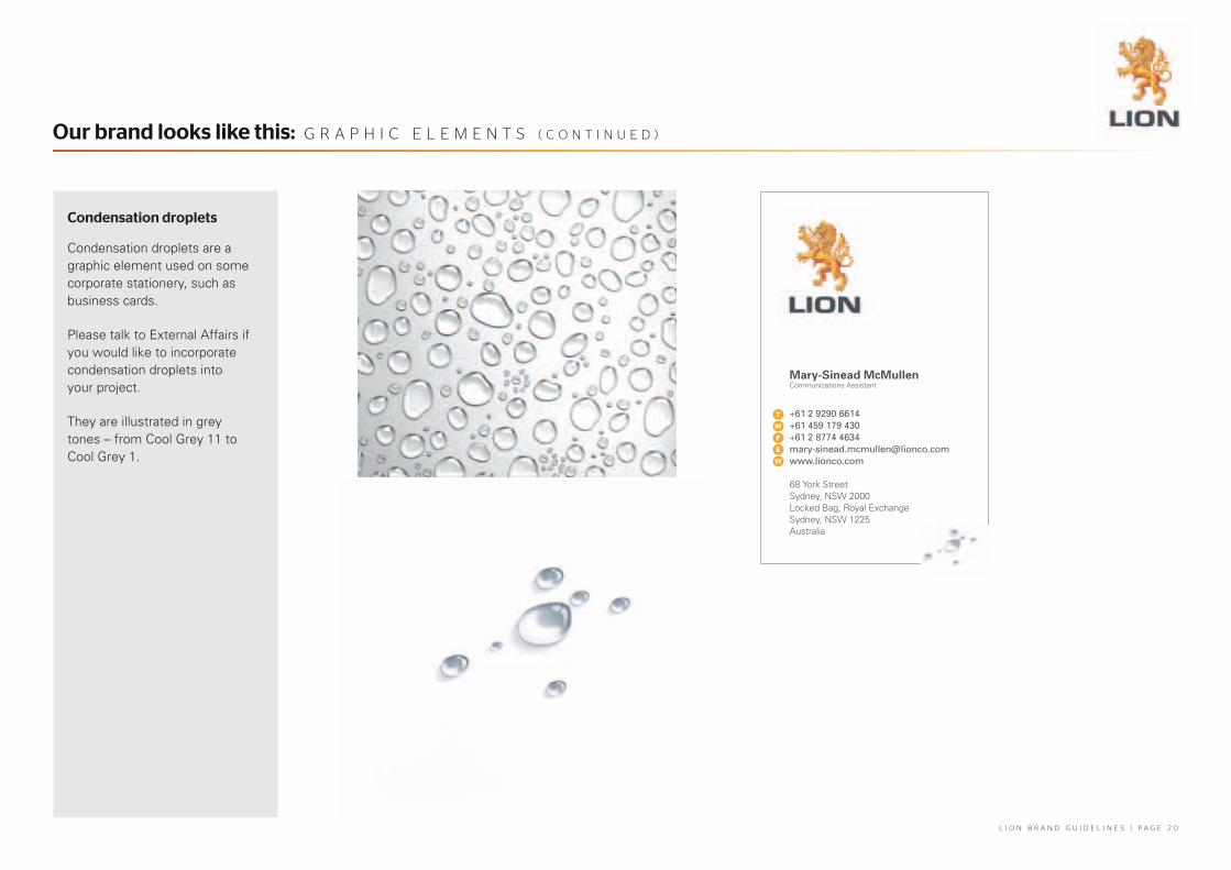
Condensation droplets
Condensation droplets are a graphic element used on some corporate stationery, such as business cards.
Please talk to External Affairs if you would like to incorporate condensation droplets into your project.
They are illustrated in grey tones – from Cool Grey 11 to Cool Grey 1.
Our brand looks like this: G R A P h I c E L E m E N t S ( c O N t I N U E D )
Mary-Sinead McMullen Communications Assistant
T
m
f
e
W
+61 2 9290 6614 +61 459 179 430 +61 2 8774 [email protected]
68 York StreetSydney, NSW 2000Locked Bag, Royal Exchange Sydney, NSW 1225Australia

L I O N B R A N D G U I D E L I N E S | P A G E 2 1
BacksFront
Our brand in practice: L E t t E R h E A D
Our letterhead looks like this.
Microsoft Word letterhead templates have been created for all business units and locations under the Lion brand. These can be downloaded at http://brandguidelines.lionco.com/letterhead-templates
The back of letterhead stationery will be printed with an image that best relates to your business unit and location.
Stationery ordering:
For all stationery requirements in both Australia and New Zealand, please access the True North link on the ARIBA home page or by clicking on the link under Resources on on-lion.

L I O N B R A N D G U I D E L I N E S | P A G E 2 2
Backs
Our business cards looks like this.
The back of your business card will be printed with an image that best relates to your business unit and location.
Stationery ordering:
For all stationery requirements in both Australia and New Zealand, please access the True North link on the ARIBA home page or by clicking on the link under Resources on on-lion.
Our brand in practice: B U S I N E S S c A R D S
Front
Mary-Sinead McMullen Communications Assistant
T
m
f
e
W
+61 2 9290 6614 +61 459 179 430 +61 2 8774 [email protected]
68 York StreetSydney, NSW 2000Locked Bag, Royal Exchange Sydney, NSW 1225Australia

L I O N B R A N D G U I D E L I N E S | P A G E 2 3
Our compliment slip looks like this.
The back of compliment slips will be printed with an image that best relates to your business unit and location.
Stationery ordering:
For all stationery requirements in both Australia and New Zealand, please access the True North link on the ARIBA home page or by clicking on the link under Resources on on-lion.
Our brand in practice: c O m P L I m E N t S L I P S
BacksFront
Growing sociability and wellbeing in our world
Growing sociability and wellbeing in our world
Growing sociability and wellbeing in our world
Growing sociability and wellbeing in our world
+61 8 8354 8888+61 8 8354 8889www.lionco.com
107 Port RoadThebartonSA 5031Australia
GPO Box 1472AdelaideSA 5001Australia
T
F
W
L I O N B R A N D G U I D E L I N E S | P A G E 2 4
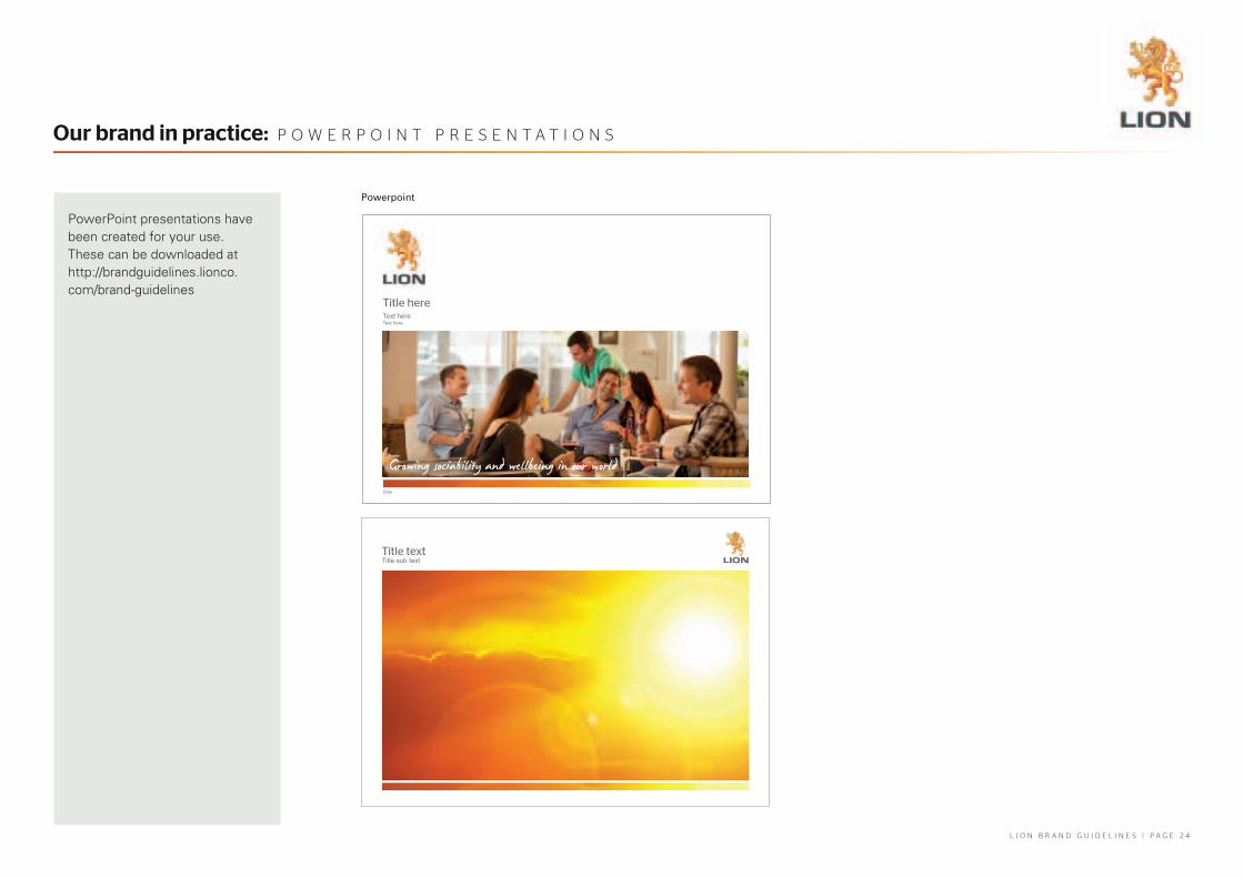
PowerPoint presentations have been created for your use. These can be downloaded at http://brandguidelines.lionco.com/brand-guidelines
Our brand in practice: P O W E R P O I N t P R E S E N t A t I O N S
Powerpoint
title hereText hereText here
Date
title textTitle sub text

L I O N B R A N D G U I D E L I N E S | P A G E 2 5
Policy coverReport cover
Templates are available for reports and policy documents. There is a templage available for each business unit.
These can be downloaded at http://brandguidelines.lionco.com/document-covers
Our brand in practice: D O c U m E N t c O V E R S
Report Name
Additional Information
Presented to Lorem IpsumBy Lorem IpsumDated 10th March, 2012
Our remuneration Philosophy
L I O N B R A N D G U I D E L I N E S | P A G E 2 6
If you are intending to set up an online environment using the Lion brand – including both internal sites such as intranets and external sites or tools – please ask External Affairs for a copy of the Online Brand Guidelines.
These Guidelines translate the standard Brand Guidelines into a web environment, and ensure our visual identity is represented consistently online, in a format best suited to the web environment.
For assistance, please contact External Affairs.
Our brand in practice: W E B