BRAND BOOK - Login : Vitra...
34
BRAND BOOK For partners
Transcript of BRAND BOOK - Login : Vitra...
BRAND BOOK
For partners
THE BRAND BOOK
When we think of a brand book it often sounds serious, complicated and corporate. This is (hopefully) not the case: this brand book is simply a story about a brand. This is the story about a company founded in Finland over 80 years ago, that is lucky enough to be distributed around the world by hundreds of dedicated people who want to tell its story.
This book is a work in progress, not something written in stone. So please get in touch if you need help on building Artek’s strong and consistent brand identity.
1.
2.
3.
THE ARTEK BRANDBrand Core: What does Artek stand for?Brand Promise: Why is Artek different?
About Artek
BRAND ELEMENTSLogo – positive & negative usageMinimum size & clearance spaceThe logo misusePartnering logosTypography & typesettingPrimary and secondary coloursGraphic language Iconographic languagePhotographyTone of voice – editorial style
Do you have questions? – Contact
1415161718192021222324
2526272829303132
BRAND APPLICATIONSGreeting cards & invitationsCommercial communication toolsBrand communication toolsBranded spacesAdvertisingDigital lifePoint of sale communication
33
3
46
10
CONTENT
CONTENT AND INTRODUCTION
3
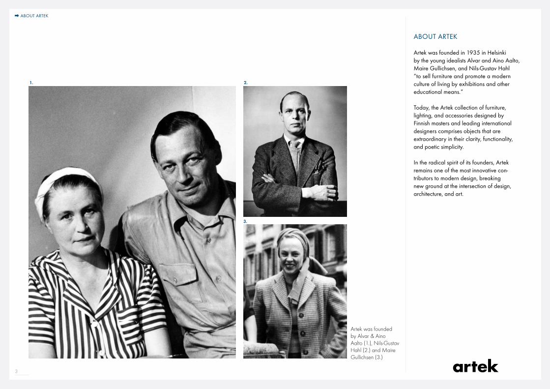
ABOUT ARTEK
Artek was founded in 1935 in Helsinki by the young idealists Alvar and Aino Aalto, Maire Gullichsen, and Nils-Gustav Hahl “to sell furniture and promote a modern culture of living by exhibitions and other educational means.” Today, the Artek collection of furniture, lighting, and accessories designed by Finnish masters and leading international designers comprises objects that are extraordinary in their clarity, functionality, and poetic simplicity.
In the radical spirit of its founders, Artek remains one of the most innovative con-tributors to modern design, breaking new ground at the intersection of design, architecture, and art.
Artek was founded by Alvar & Aino Aalto (1.), Nils-Gustav Hahl (2.) and Maire Gullichsen (3.)
2. 1.
3.
ABOUT ARTEK
1.The Artek Brand
What does Artek stand for?Why is Artek different?

5
B
RA
ND I D E N
T
IT
Y
Wh a t e l e m e n t s e x p r e s s t h e A r t e k b r a n d
?
BR
AN
D P R O MI
SE
Wh y i s A r t e k d i f f e r e n t ?
Wh
at d o e s A r t e k s t a n d
fo
r ?
BR
AN D C
O
RE

6
Artek Manifesto
WHAT DOES ARTEK STAND FOR?
The name Artek is a synthesis of ‘art’ and ‘technology’ – both key concepts of the international modernist movement that came to prominence in the 1920s. As one of modernism’s chief proponents, Walter Gropius had pronounced the reorientation of the Bauhaus and its affirmation of industry in 1923 with the famed motto ‘art and technology – a new unity.’
Technology was broadly understood to also include science and industrial produc-tion methods, while the conception of art extended beyond the fine arts to encompass architecture and design. Modernism aimed to achieve a fruitful union of these two spheres, which had previously been regarded as disparate entities. Technology was to be refined through art, and art was to be made more functional and objective through technology. This same aspiration guided the founders of Artek in their naming of the company.
ART & TECHNOLOGY
1.The Artek brand
BRAND CORE
BRAND CORE
7
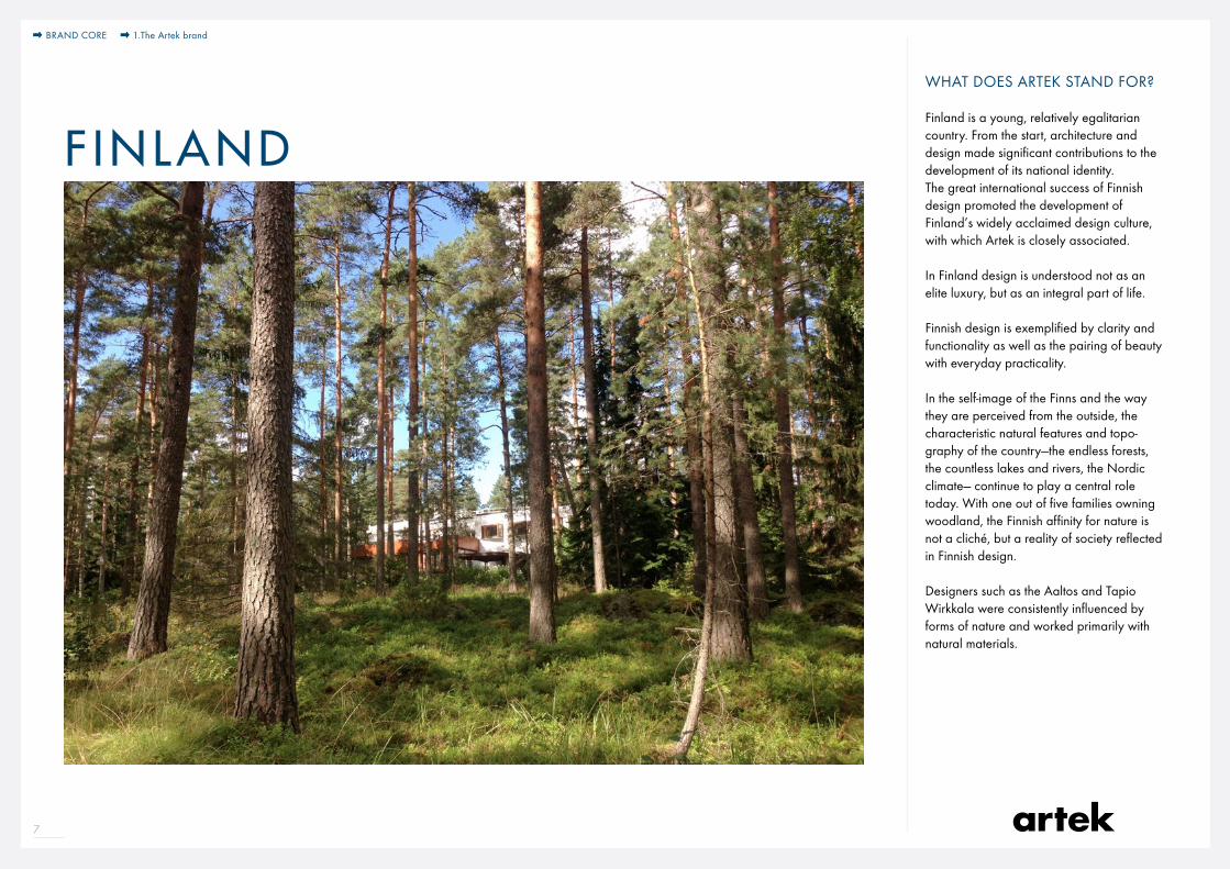
WHAT DOES ARTEK STAND FOR?
Finland is a young, relatively egalitarian country. From the start, architecture and design made significant contributions to the development of its national identity. The great international success of Finnish design promoted the development of Finland’s widely acclaimed design culture, with which Artek is closely associated.
In Finland design is understood not as an elite luxury, but as an integral part of life.
Finnish design is exemplified by clarity and functionality as well as the pairing of beauty with everyday practicality.
In the self-image of the Finns and the way they are perceived from the outside, the characteristic natural features and topo-graphy of the country—the endless forests, the countless lakes and rivers, the Nordic climate— continue to play a central role today. With one out of five families owning woodland, the Finnish affinity for nature is not a cliché, but a reality of society reflected in Finnish design.
Designers such as the Aaltos and Tapio Wirkkala were consistently influenced by forms of nature and worked primarily with natural materials.
BRAND CORE 1.The Artek brand
F INLAND
8
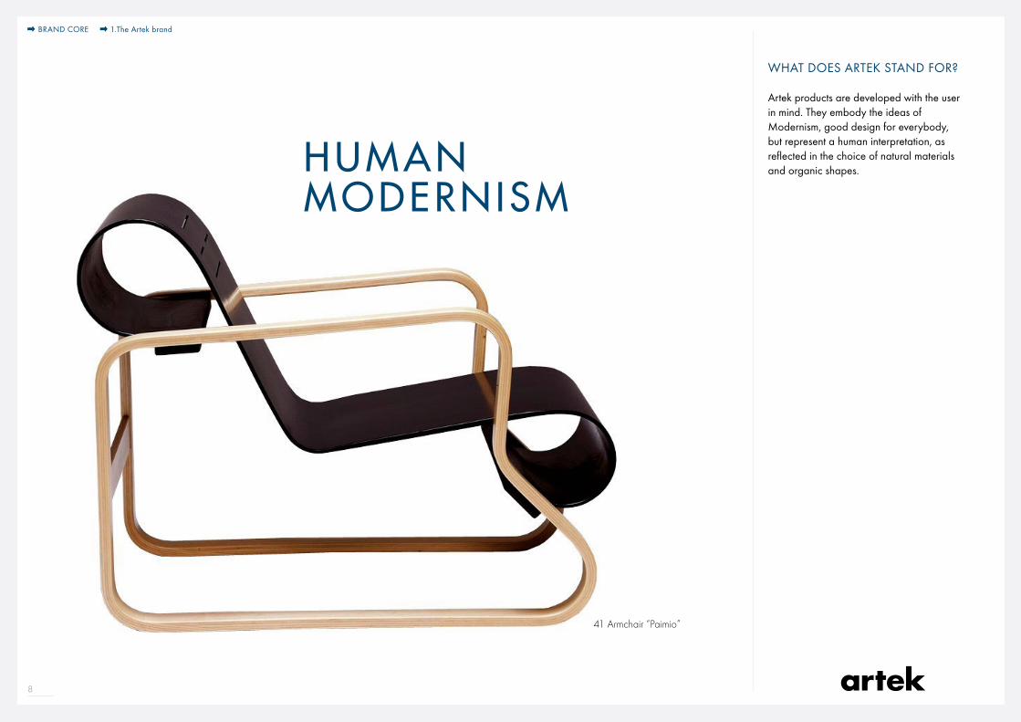
41 Armchair “Paimio”
WHAT DOES ARTEK STAND FOR?
Artek products are developed with the user in mind. They embody the ideas of Modernism, good design for everybody, but represent a human interpretation, as reflected in the choice of natural materials and organic shapes. HUMAN
MODERNISM
BRAND CORE 1.The Artek brand
9
WHAT DOES ARTEK STAND FOR?
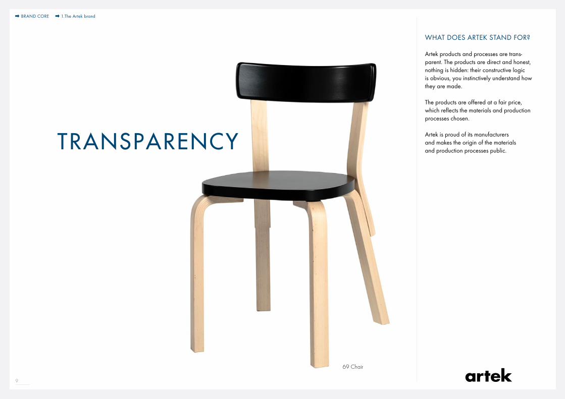
Artek products and processes are trans-parent. The products are direct and honest, nothing is hidden: their constructive logic is obvious, you instinctively understand how they are made.
The products are offered at a fair price, which reflects the materials and production processes chosen.
Artek is proud of its manufacturers and makes the origin of the materials and production processes public.TRANSPARENCY
69 Chair
BRAND CORE 1.The Artek brand
10
1.The Artek brand
WHY IS ARTEK DIFFERENT?
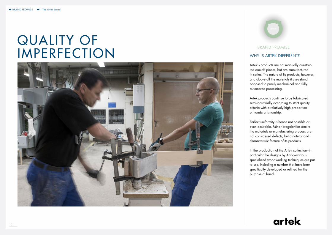
Artek’s products are not manually construc-ted one-off pieces, but are manufactured in series. The nature of its products, however, and above all the materials it uses stand opposed to purely mechanical and fully automated processing.
Artek products continue to be fabricated semi-industrially according to strict quality criteria with a relatively high proportion of handcraftsmanship.
Perfect uniformity is hence not possible or even desirable. Minor irregularities due to the materials or manufacturing process are not considered defects, but a natural and characteristic feature of its products.
In the production of the Artek collection—in particular the designs by Aalto—various specialized woodworking techniques are put to use, including a number that have been specifically developed or refined for the purpose at hand.
QUALITY OF IMPERFECTION
BRAND PROMISE
BRAND PROMISE
11
WHY IS ARTEK DIFFERENT?
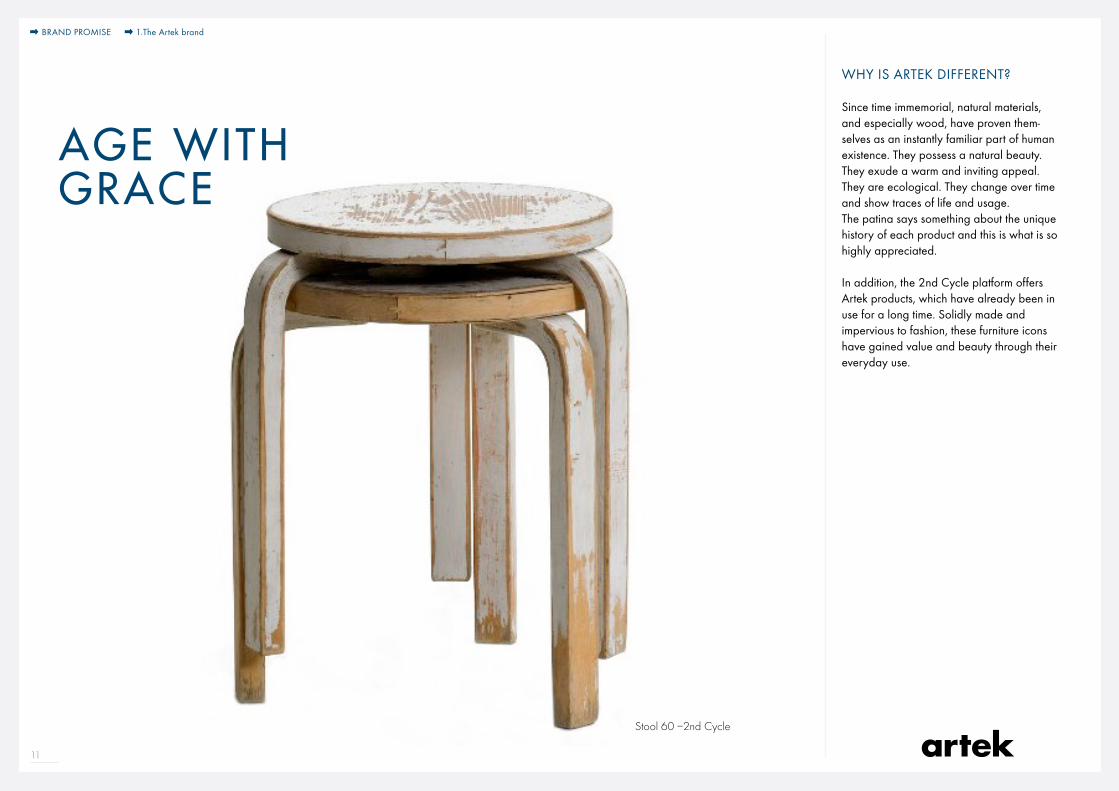
Since time immemorial, natural materials, and especially wood, have proven them-selves as an instantly familiar part of human existence. They possess a natural beauty. They exude a warm and inviting appeal. They are ecological. They change over time and show traces of life and usage. The patina says something about the unique history of each product and this is what is so highly appreciated.
In addition, the 2nd Cycle platform offers Artek products, which have already been in use for a long time. Solidly made and impervious to fashion, these furniture icons have gained value and beauty through their everyday use.
AGE WITH GRACE
Stool 60 –2nd Cycle
BRAND PROMISE 1.The Artek brand

12
WHY IS ARTEK DIFFERENT?
The Artek collection offers a range of essential products – furniture, lighting, accessories – to furnish private homes, offices or public spaces such as restaurants, hotels, schools, libraries or community centers. Many of the products were originally conceived for a specific project, but easily travel between the private and the public realms.
TRANSVERSALITY
Armchair 42 at home and in the Jewish theater in Stockholm
BRAND PROMISE 1.The Artek brand

13
WHY IS ARTEK DIFFERENT?
Today’s customers look for enduring and authentic solutions, they make fewer and more conscious choices and want to know exactly what they are investing in, where raw materials and products come from, rather than commit to unrestrained and uninformed consumption.
Artek products are hence more relevant than ever. Artek works principally with natural materials and primarily uses Finnish birch for its designs. The use of regional resources and materials initially had an economic reason: in the 1930s Finland was still not very industrialized and imports from abroad were expensive. But soon, long before the idea of sustainability turned into a popular buzzword, regional sourcing became a conviction. Today, forests cover nearly two thirds of the surface of Finland. Sustainable cultivation practices go back more than a century, the stock of trees has increased rather than decreased.
The Artek Classics have proven timeless and maintained their appeal over decades. The contemporary products share the Classics’ clarity, functionality and poetic simplicity. Artek products are current, but never stylish. Many Artek products stay easily repairable or adjustable and accompany their owners over decades.
Artek’s conscious approach is also re flected by its pace of product introduction – we present new products, when we have something relevant to say, rather than following the rhythm of international fairs.
CONSCIOUS CONSUMPTION
BRAND PROMISE 1.The Artek brand
2.How to express the Artek Brand?
BrandElements
15
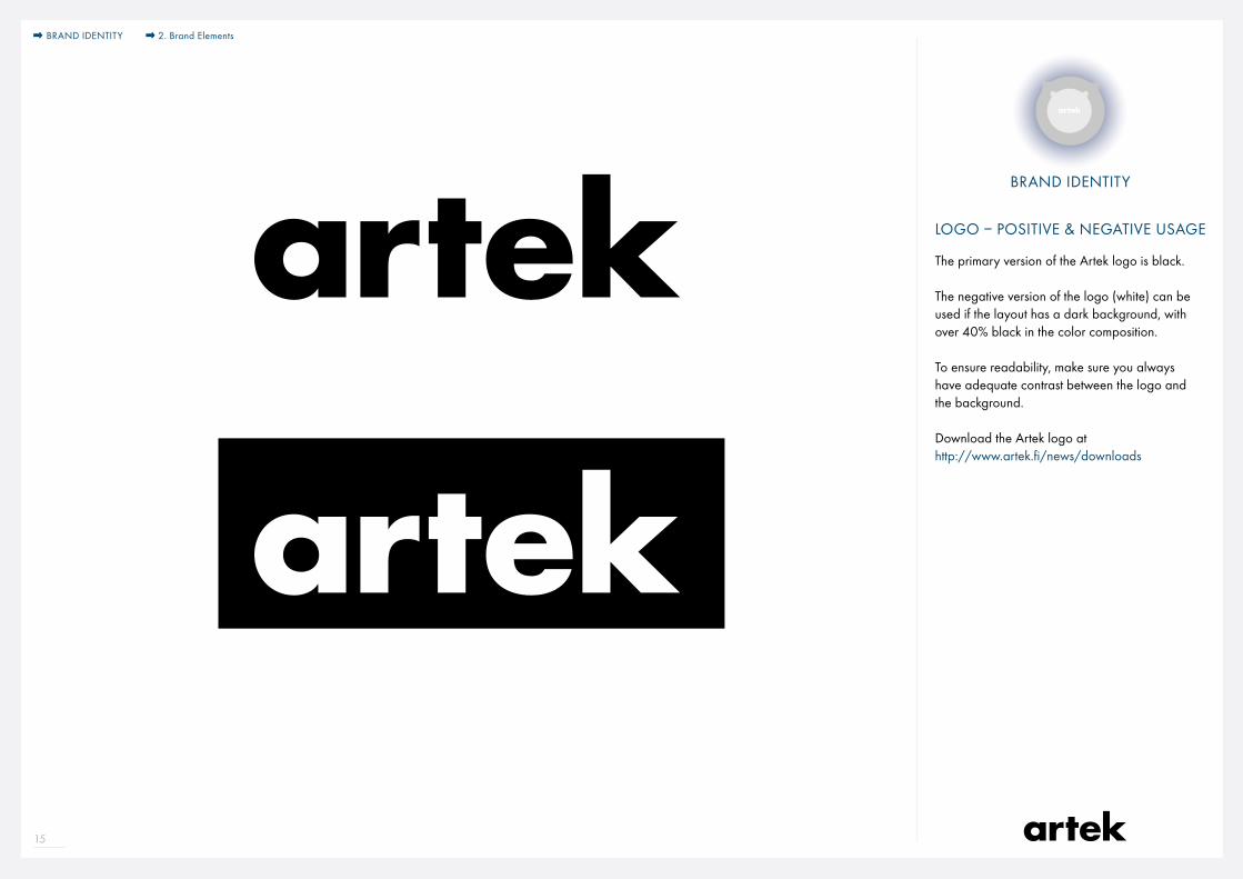
LOGO – POSITIVE & NEGATIVE USAGE
The primary version of the Artek logo is black.
The negative version of the logo (white) can be used if the layout has a dark background, with over 40% black in the color composition.
To ensure readability, make sure you always have adequate contrast between the logo and the background.
Download the Artek logo athttp://www.artek.fi/news/downloads
BRAND IDENTITY
2. Brand ElementsBRAND IDENTITY

16
MINIMUM SIZE & CLEARANCE SPACE
To ensure readability, make sure you respect the defined minimum size and the clearance space.
Allowed MINIMUM logo size for any media15mm
0.6 inches
The minimum clearance space area is defined by using the dimension of the Artek ”a”.
BRAND IDENTITY 2. Brand Elements
17
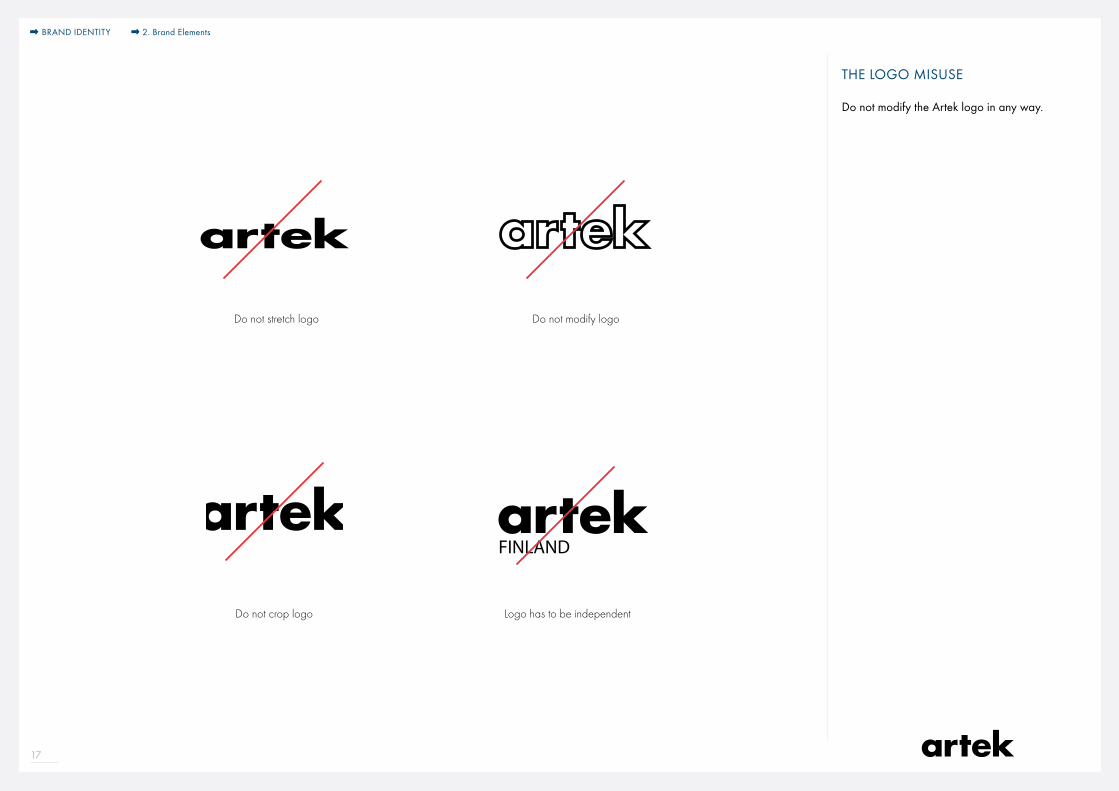
Do not crop logo
Do not stretch logo
Logo has to be independent
Do not modify logo
FINLAND
THE LOGO MISUSE
Do not modify the Artek logo in any way.
BRAND IDENTITY 2. Brand Elements

18
Artek — Art & Technology
Technology
Art
ModusWielandstraße 27-28 10707 Berlin
modus-moebel.de artek.fi
Eröffnung 16. Oktober 2015 18:00 Uhr
Ausstellung17. Oktober bis 15. November 2015
PARTNERING LOGOS
You can place the Artek logo along with partner logos.
· both logos should have the same scale and visual weight
· both logos should be used in monochromatic versions
· a black slash should separate the logos. The slash has the double length of the Artek ‘k’and is angled at 25°.
· the partnering logos and the slash are aligned with a central axis
· the slash width should be adjusted to the scale of the logos and visual weight
· No other elements should be used to separate or unite the logos.
· All usage of the Artek logo alongside anothers brand‘s logo needs to be approved by the international branding team (contacts on the last page of this document).
25°
BRAND IDENTITY 2. Brand Elements
19
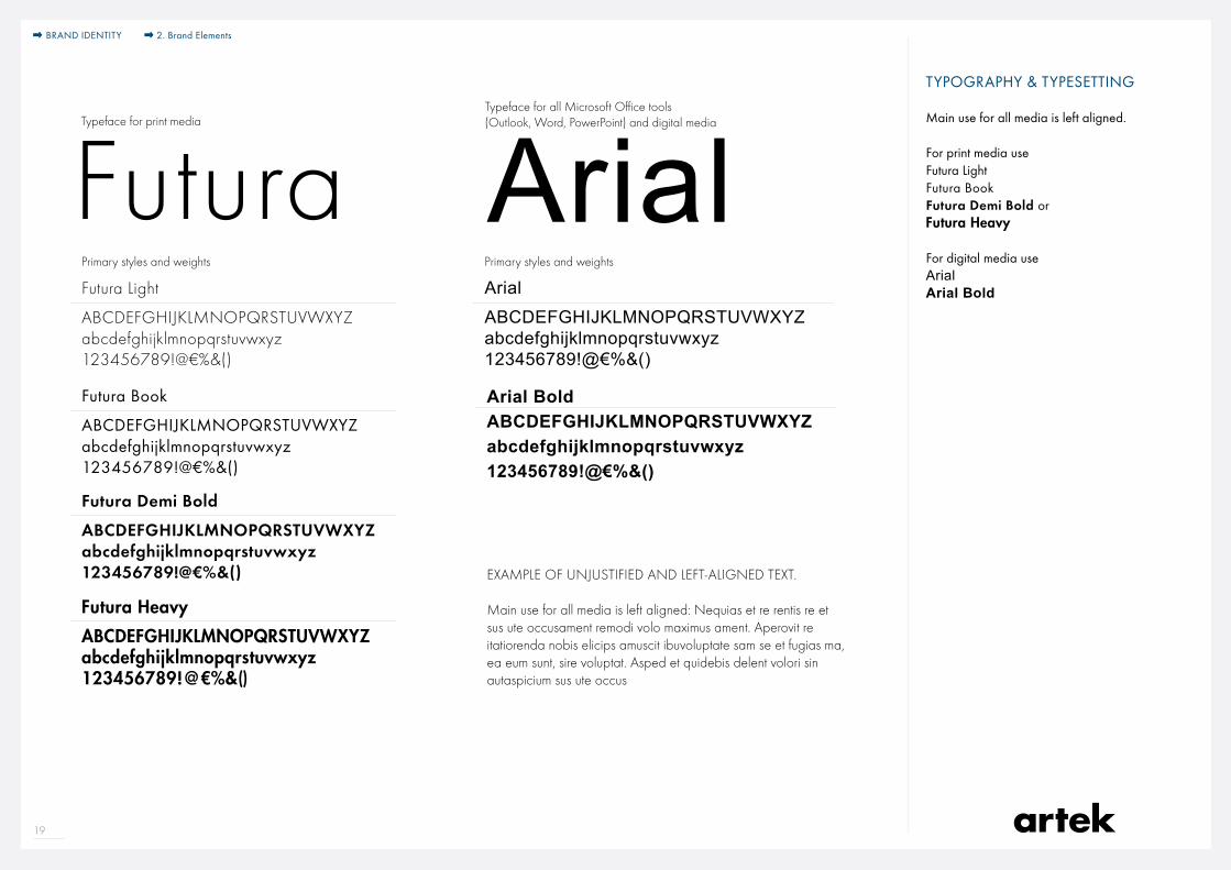
TYPOGRAPHY & TYPESETTING
Main use for all media is left aligned.
For print media useFutura LightFutura BookFutura Demi Bold orFutura Heavy
For digital media useArialArial BoldFutura Light
ABCDEFGHIJKLMNOPQRSTUVWXYZabcdefghijklmnopqrstuvwxyz123456789!@€%&()
Futura ArialArial
ABCDEFGHIJKLMNOPQRSTUVWXYZabcdefghijklmnopqrstuvwxyz123456789!@€%&()
Typeface for print media
Primary styles and weights Primary styles and weights
Typeface for all Microsoft Office tools (Outlook, Word, PowerPoint) and digital media
Futura Demi Bold
ABCDEFGHIJKLMNOPQRSTUVWXYZabcdefghijklmnopqrstuvwxyz123456789!@€%&()
Futura Book
ABCDEFGHIJKLMNOPQRSTUVWXYZabcdefghijklmnopqrstuvwxyz123456789!@€%&()
Arial BoldABCDEFGHIJKLMNOPQRSTUVWXYZabcdefghijklmnopqrstuvwxyz123456789!@€%&()
Futura Heavy
ABCDEFGHIJKLMNOPQRSTUVWXYZabcdefghijklmnopqrstuvwxyz123456789!@€%&()
EXAMPLE OF UNJUSTIFIED AND LEFT-ALIGNED TEXT.
Main use for all media is left aligned: Nequias et re rentis re et sus ute occusament remodi volo maximus ament. Aperovit re itatiorenda nobis elicips amuscit ibuvoluptate sam se et fugias ma, ea eum sunt, sire voluptat. Asped et quidebis delent volori sin autaspicium sus ute occus
BRAND IDENTITY 2. Brand Elements
20
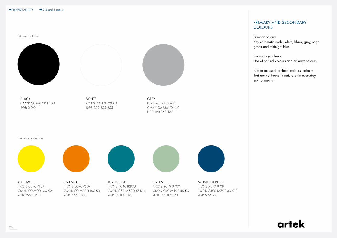
PRIMARY AND SECONDARY COLOURS
Primary coloursKey chromatic code: white, black, grey, sage green and midnight blue.
Secondary coloursUse of natural colours and primary colours.
Not to be used: artificial colours, colours that are not found in nature or in everyday environments.
BLACKCMYK C0 M0 Y0 K100RGB 0 0 0
YELLOWNCS S 0570-Y10RCMYK C0 M0 Y100 K0RGB 255 234 0
ORANGENCS S 2070-Y50RCMYK C0 M60 Y100 K0RGB 229 102 0
TURQUOISENCS S 4040 B20GCMYK C86 M32 Y37 K16RGB 15 100 116
WHITE CMYK C0 M0 Y0 K0RGB 255 255 255
MIDNIGHT BLUENCS S 7010-R90BCMYK C100 M70 Y30 K16RGB 5 55 97
GREYPantone cool gray 8CMYK C0 M0 Y0 K40RGB 163 163 163
Primary colours
Secondary colours
GREENNCS S 3010-G40YCMYK C40 M10 Y40 K0RGB 155 186 151
BRAND IDENTITY 2. Brand Elements
21
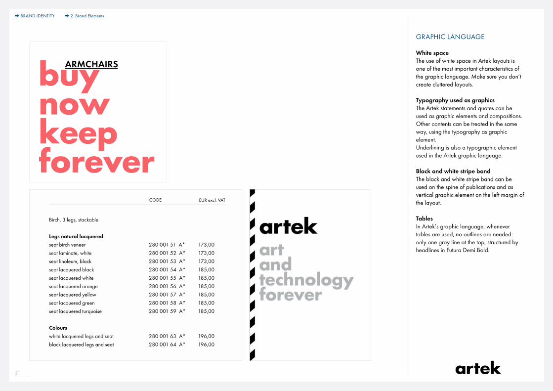
GRAPHIC LANGUAGE
White spaceThe use of white space in Artek layouts is one of the most important characteristics of the graphic language. Make sure you don’t create cluttered layouts.
Typography used as graphicsThe Artek statements and quotes can be used as graphic elements and compositions.Other contents can be treated in the same way, using the typography as graphic element. Underlining is also a typographic element used in the Artek graphic language.
Black and white stripe bandThe black and white stripe band can be used on the spine of publications and as vertical graphic element on the left margin of the layout.
TablesIn Artek’s graphic language, whenever tables are used, no outlines are needed: only one gray line at the top, structured by headlines in Futura Demi Bold.
Brand Expression Branding elements: Iconographic elements
White space Black and white stripe brand Typography used as graphics
SESSEL
37
NOJATUOLIT
36
FÅTÖLJER
ARMCHAIRSbuynowkeepforever
PAIMIO SANATORIUM /FINLAND
DESIGN ALVAR AALTO 1929–1933
BRAND IDENTITY 2. Brand Elements
8
CODECODE
60 STOOL
Seat upholstered in fabric, legs natural lacquered 280 002 00COM F1 F2 F3 F4
Seat upholstered in fabric,legs white or black lacquered 280 002 00COM F1 F2 F3 F4 Seat upholstered in leather,legs natural lacquered 280 002 00 COL L1 L2 Seat upholstered in leather,legs white or black lacquered 280 002 00 COL L1 L2
fabric requirement 2 pcs = 0,5 m leather requirement 1 pcs = 4 sq ft
DESIGNAlvar Aalto 1933
STOOLS AND BENCHES
Birch, 3 legs, stackable
Legs natural lacqueredseat birch veneer 280 001 51 A* seat laminate, white 280 001 52 A* seat linoleum, black 280 001 53 A* seat lacquered black 280 001 54 A* seat lacquered white 280 001 55 A* seat lacquered orange 280 001 56 A* seat lacquered yellow 280 001 57 A* seat lacquered green 280 001 58 A* seat lacquered turquoise 280 001 59 A*
Colourswhite lacquered legs and seat 280 001 63 A* black lacquered legs and seat 280 001 64 A*
Shipped unassembled in a Carry Away package.
Assembled, add
Please note that the article code for A-category products changes if ordered assembled, and are not available for Quick Ship.
Assembled Unassembledpcs m3 gross kg pcs m3 gross kg5 0,12 18,0 1 0,02 3,0 Unupholstered4 0,12 14,0 1 0,02 3,0 Upholstered
* A-category product. This product is kept in stock in Neuenburg/D. Dispatch usually within one week - depending on order size.
173,00173,00173,00185,00185,00185,00185,00185,00185,00
196,00196,00
10,00
173,00222,00235,00255,00276,00
196,00245,00257,00278,00298,00
183,00265,00347,00
206,00288,00370,00
EUR excl. VAT EUR excl. VAT
22
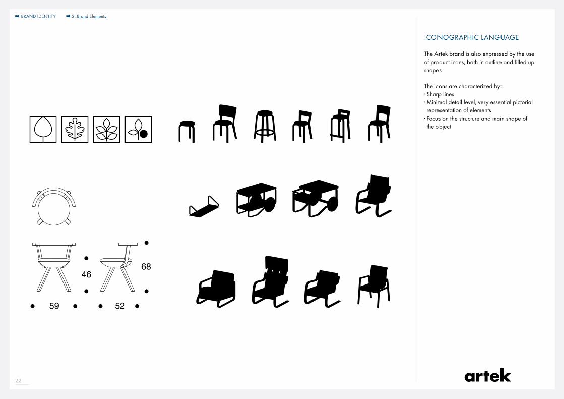
ICONOGRAPHIC LANGUAGE
The Artek brand is also expressed by the use of product icons, both in outline and filled up shapes.
The icons are characterized by:· Sharp lines· Minimal detail level, very essential pictorial representation of elements
· Focus on the structure and main shape of the object
BRAND IDENTITY 2. Brand Elements

23
PHOTOGRAPHY
· Avoid the use of overly decorated home interior images;
· Enhance natural light, architectural elements, nature;
· Products should be in relation with archi tecture elements to define scale and to convey the “soul” of the space (textures, walls, architectural references, light incidence and temperature, materials and surfaces, etc.);
· Quality of imperfection: the expression of the product in space is not meant to be too perfect, too plastic. Spaces and objects are lived in, have character;
· Images shouldn’t be detached from life. They should convey authenticity and reality;
· Aspiration and warmth: images should make people travel, imagine themselves in the space. Warmth doesn’t come from decoration, it comes from the natural materials and the use of light;
BRAND IDENTITY 2. Brand Elements
24
TONE OF VOICE – EDITORIAL STYLE
Short, straight and direct style.
No empty phrases.No long multi-cause sentences.No too-complicated passive or subjunctive constructions.
Just simple, straightforward, informative writing.
Artek was founded in 1935 in Helsinki by the young idealists Alvar and Aino Aalto, Maire Gullichsen and Nils-Gustav Hahl “to sell furniture and promote a modern culture of living by exhibitions and other educational means”.Today, the Artek collection of furniture, lighting, and accessories designed by Finnish masters and leading international designers comprises objects that are extraordinary in their clarity, functionality, and poetic simplicity. In the radical spirit of its founders, Artek remains one of the most innovative contributors to modern design, breaking new ground at the intersection of design, architecture and art.
BRAND IDENTITY 2. Brand Elements
25
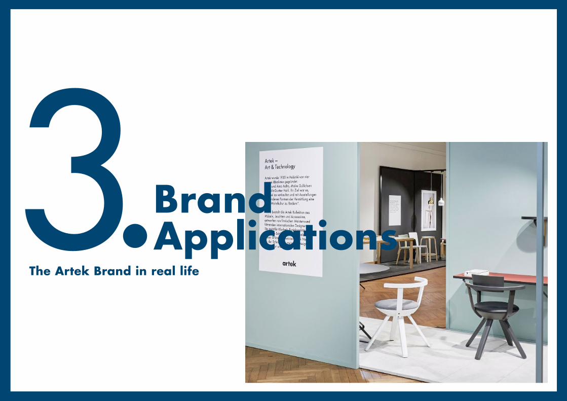
3.Brand Applications
The Artek Brand in real life

26
GREETING CARDS & INVITATIONS
80 Anniversary invitation, 2015Christmas card, 2014
Season’s Greetings &
a Happy New Year
BRAND IDENTITY 3. Brand Applications

27
COMMERCIAL COMMUNICATION TOOLS
holzstühle
Für weitere Informationen besuchen Sie
artek.fi
oder kontaktieren Sie uns unter
STÜHLEHOCKER/BARHOCKER
60 HOCKERBirke, schwarz lackiert, Sitz mit Zebra-Stoff gepolstert, stapelbarAlvar Aalto 1933
E60 HOCKERBirke, grau lackiert, auch in schwarz, weiss, rot oder klar lackiert erhältlich, stapelbarAlvar Aalto 1933
611 STUHLBirke, klar lackiert, Sitz und Rückenlehne mit naturfarbenem Leinengurtgeflecht, auch mit schwarzem, blauem, weissem, braunem und rotem Geflecht erhältlich, stapelbarAlvar Aalto 1929
611 STUHLBirke, schwarz lackiert, Sitz und Rückenlehne mit Leder gepolstert, stapelbarAlvar Aalto 1929
PIRKKA HOCKERBirke, weiss lackiert, auch erhältlich in Gestell Birke, schwarz gebeizt, Sitz Kiefer gewachst, honigfarben gebeizt oder braun gebeiztIlmari Tapiovaara 1955
PIRKKA BARHOCKERGestell Birke, schwarz gebeizt, Sitz Kiefer, gewachst, auch erhältlich in Ges-tell Birke, schwarz gebeizt, Sitz Kiefer braun gebeizt oder honigfarben gebeizt und Gestell und Sitz weiss lackiertIlmari Tapiovaara 1955
403 HALLWAY LEHNSTUHLBirke, Gestell klar lackiert, Sitzschale orange lackiert, auch mit weisser, grüner, gelber oder klar lackierter Sitzschale erhältlich, stapelbarAlvar Aalto 1932
DOMUS STUHLBirke, schwarz gebeizt, auch weiss oder klar lackiert, honigfarben gebeizt oder in Eichenholz erhältlich, stapelbarIlmari Tapiovaara 1946
DOMUS STUHLEiche, klar lackiert, Sitz und Rückenlehne mit Leder gepolstert, stapelbarAlvar Aalto 1929
423 LEHNSTUHLBirke, klar lackiert, auch in schwarz oder weiss lackiert erhältlich, stapelbarBen af Schultén 1989
423 LEHNSTUHLBirke, schwarz lackiert, Sitz und Rückenlehne mit Stoff gepolstert, stapelbarBen af Schultén 1989
64 BARHOCKERBirke, klar lackiert, Sitz auch mit schwarzem Linoleum oder weissem Laminat beschichtet erhältlichAlvar Aalto 1935
ROCKET BARHOCKEREiche, schwarz lackiert, auch in weiss lackiert oder natur geseift erhältlichEero Aarnio 1995
K65 KÜCHENSTUHLBirke, grau lackiert, auch in schwarz, weiss, rot oder klar lackiert erhältlichAlvar Aalto 1935
BABY ROCKET HOCKEREiche, weiss lackiert, auch in schwarz lackiert oder natur geseift erhältlichEero Aarnio 2006
ASLAK STUHLBirke, schwarz gebeizt, auch weiss oder klar lackiert erhältlich, stapelbarIlmari Tapiovaara 1958
ASLAK STUHLBirke, schwarz gebeizt, Sitz und Rückenlehne mit Leder gepolstert, stapelbarIlmari Tapiovaara 1958
LENTO STUHLBirke, schwarz lackiert, Sitz und Rückenlehne mit Leder gepolstert, stapelbarHarri Koskinen 2006, 2009
LENTO STUHLBirke, weiss lackiert, auch in schwarz lackiert erhältlich, stapelbarHarri Koskinen 2006, 2009
66 STUHLBirke, schwarz lackiert, auch in weiss, grau, rot oder klar lackiert erhältlich Alvar Aalto 1935
N65 KINDERSTUHLBirke, klar lackiert, Sitz auch mit schwarzem Linoleum oder weissem Laminat beschichtet erhältlichAlvar Aalto 1935
69 STUHLBirke, klar lackiert, Sitz auch mit weissem Laminat beschichtet oder gepolstert erhältlichAlvar Aalto 1935
60 HOCKERBirke, klar lackiert, Sitz Linoleum beschichtet, auch mit weissem Laminat beschichtet oder klar lackiert erhältlich, stapelbarAlvar Aalto 1933
Catalogue and product brochure
Pricelist
Product brochure
BRAND IDENTITY 3. Brand Applications

28
BRAND COMMUNICATION TOOLS
The Kaari Collection by Ronan & Erwan Bouroullec
and three other highlights from Artek
The Standard
Fall / Winter 2015–2016
Kaari by Ronan & Erwan Bouroullec
2
To design the Kaari Collection (kaari meaning “arch” in Finnish), Ronan and Erwan Bouroullec looked at Artek’s history with fresh eyes. In creating a simple bent steel band to provide support for a series of tables, shelves, a desk, and a console, they arrived at an element as practical and adaptable as the L - shaped leg patented by Alvar Aalto in 1933. While it has antecedents in Aalto’s own work, the strip has a surprisingly light outline. It could well have been drawn with the single stroke of a pen.
In the development of the Kaari Collection, the arch proved to have as much flexibility as character. The principle behind the pieces is simple: the vertical load of the tabletops and
shelves is held by a piece of solid wood, while the bent steel provides diagonal support. Both wood and steel banding are traditional materials that have featured prominently in Artek’s history, but they have never before been combined in this way.
The surfaces of the Kaari Collection are made from linoleum and glossy laminate, materials that develop a rich patina. The Bouroullecs’ designs are fresh in form, but, like all Artek’s products, they promise to last a lifetime.
The Bouroullec brothers combine formal brilliance with simple construction to generate a family of elegantly practical products.
Re - editioned in three colors, each faithful to the original design, the form of Tapio Wirkkala’s blown glass lampshade echoes that of the bulb beneath.Glass shades available starting 2016.
ca. 290 mm
Baumwolltasche „Sina“ mit Bodenfalte+ extra lange Henkeln (ca. 90 cm)
ca.
290
mm
KOM-Nr.: 5200800
Format: ca. 38 x 42 x 10 cmmax. Druckfläche ca. 29 x 29 cm
Taschenfarbe: naturDruckfarben: schwarz
The Standard
Posters & merchandising
An ingenious reworking of Alvar Aalto’s Tea Trolley 901, Hella Jongerius’s design marries a black lacquered birch frame with linoleum trays in peat and charcoal.
BRAND IDENTITY 3. Brand Applications

29
BRANDED SPACES
Art & Technology travelling exhibition at Modus, Berlin, 2015
BRAND IDENTITY 3. Brand Applications
30
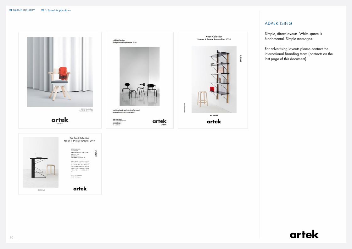
ADVERTISING
Simple, direct layouts. White space is fundamental. Simple messages.
For advertising layouts please contact the international Branding team (contacts on the last page of this document).
Kaari Collection Ronan & Erwan Bouroullec 2015
REB 009 Shelf
arte
k.fi
REB 009 Shelf
© I
mag
e St
udio
Bou
roul
lec
The Kaari Collection Ronan & Erwan Bouroullec 2015
新作「カアリ」日本初登場
Title XXXXXXXXX
日程:2015年10月24日(土)‐11月3日(日・祝)
時間:11:00 – 21:00
場所:CIBONE Aoyama
住所:東京都港区南青山2-27-25 2F
北欧モダンを代表するフィンランドのインテリアブ
ランド、アルテックは、デザインウイーク期間中、
ロナン&エルワン・ブルレックによる「カアリ」シリ
ーズを日本で初めてお披露目します。アルテック
の伝統を重んじながらも独自の美と存在感を放
つ「カアリ」の展示イベントに是非足をお運びくだ
さい。
フェイスブック Artek Japan
ツイッター@Artek Japan
arte
k.fi
REB 005 Desk
BRAND IDENTITY 3. Brand Applications
31
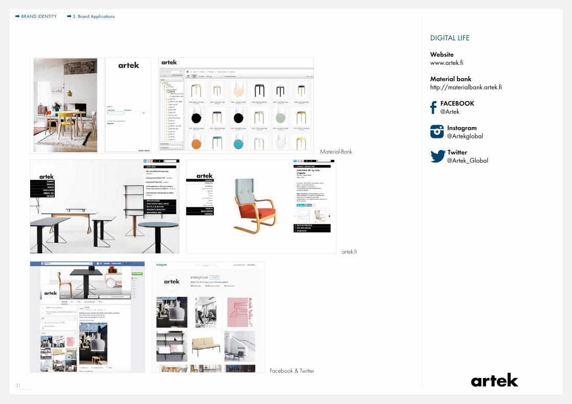
DIGITAL LIFE
Facebook & Twitter
artek.fi
Material-Bank
Websitewww.artek.fi
Material bankhttp://materialbank.artek.fi
FACEBOOK @Artek
Instagram @Artekglobal
Twitter @Artek_Global
BRAND IDENTITY 3. Brand Applications
32
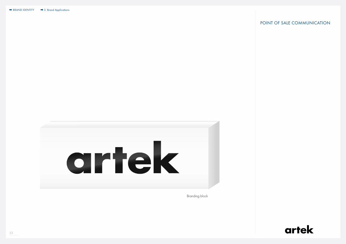
POINT OF SALE COMMUNICATION
Branding block
BRAND IDENTITY 3. Brand Applications
BRANDING & MARKETINGFor branding and sales marketingJoana Mouta Marketing [email protected] // +49 30 261 03 22 11 // +49 170 818 98 51
BRANDING & MARKETINGFor fairs and special projectsJenny Herrlin Marketing [email protected] // +46 763 22 56 45
BRANDING & MARKETINGFor brand content and PRHelena Nilsson Strängberg Communications [email protected] // +49 30 261 03 22 22
BRANDING & MARKETINGFor marketing materialsDana Reppenhagen Marketing [email protected] // +49 30 261 03 22 10
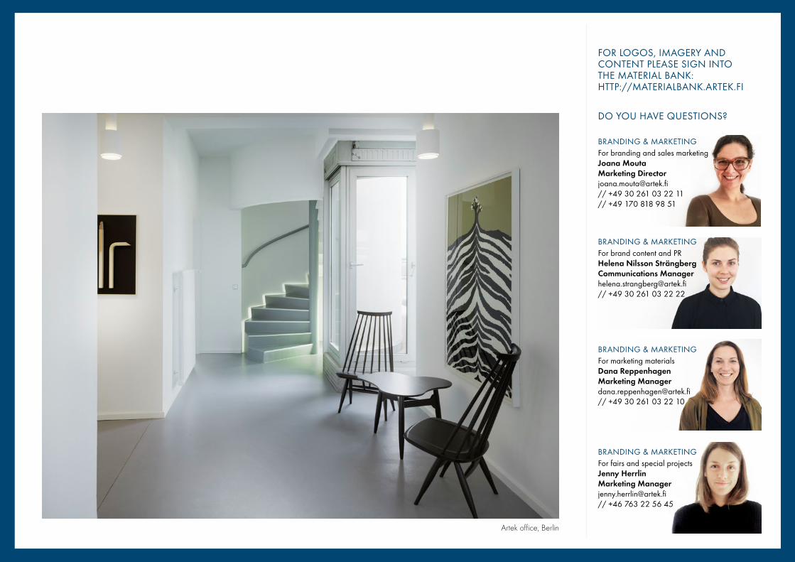
FOR LOGOS, IMAGERY AND CONTENT PLEASE SIGN INTO THE MATERIAL BANK: HTTP://MATERIALBANK.ARTEK.FI
DO YOU HAVE QUESTIONS?
Artek office, Berlin

Kiitos!
Brand Book