boards
12
Brief 01: To brand “Fresh”, a new health & beauty company. To produce a range of packaging that would be used for health and beauty products, Target Audience: 18-40 Female The Brand and Identity: The logo is the word ‘Fresh’ written by hand. This makes the word look quite clean and fluent, which reflects the products and company. Natalie Jackson OUGD301 Ba (Hons) Graphic Design Board 1 of 3 Body Lotion 4 Lemon Soothing and moisurising body lotion lait hydratant et apaisant 75 ml Body Lotion 3 Lime Soothing and moisurising body lotion lait hydratant et apaisant 75 ml Body Lotion 1 Orange Soothing and moisurising body lotion lait hydratant et apaisant 75 ml Body Lotion 2 Pink Grapefruit Soothing and moisurising body lotion lait hydratant et apaisant 75 ml Business Card & Letterhead: The business cards and letterhead will be in different colours, to reflect the different producs. They are very simple, so emphasise the fresh and clean feeling of the name and product.
-
Upload
natalie-jackson -
Category
Documents
-
view
212 -
download
0
description
boards, final, eugh
Transcript of boards
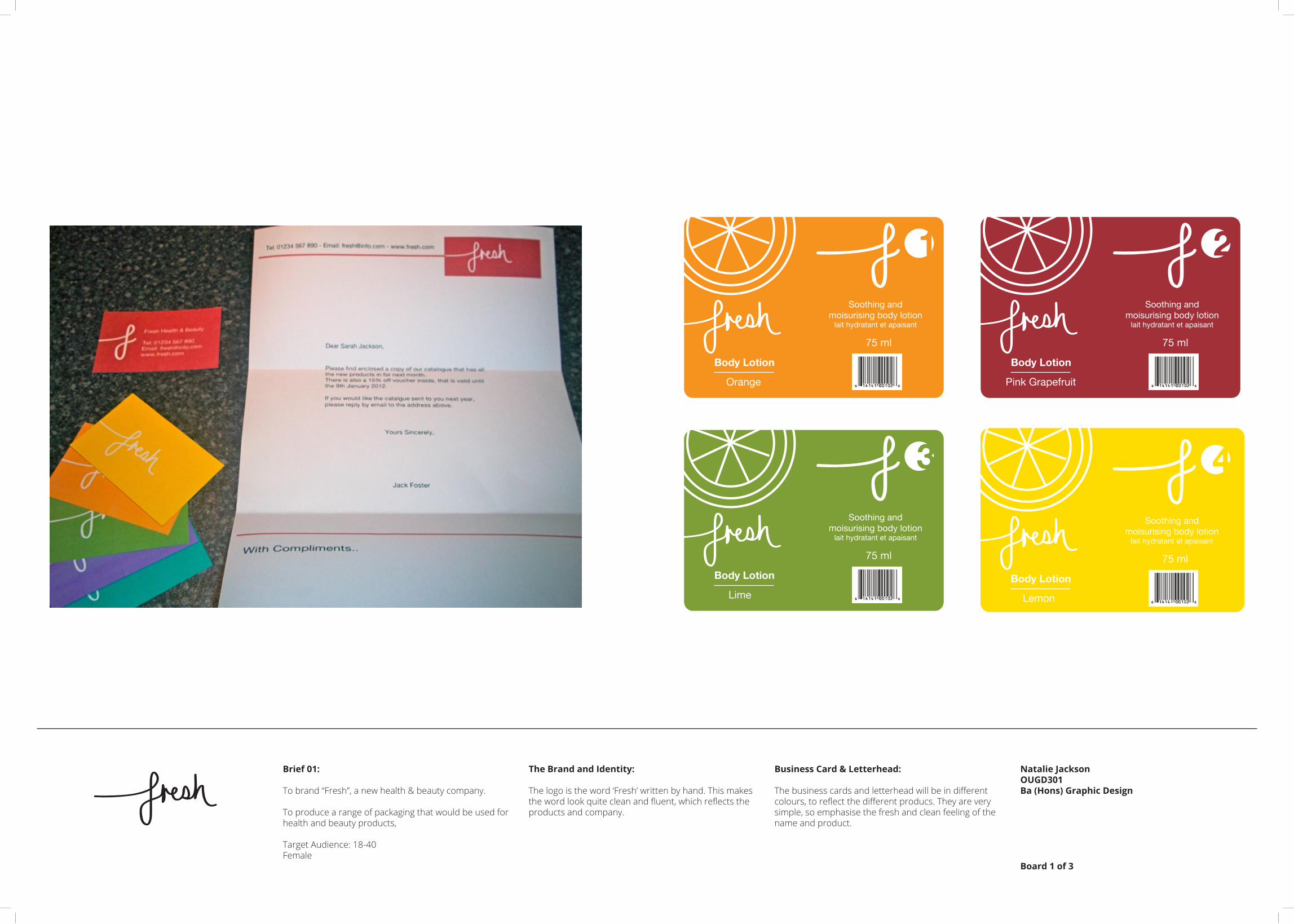
Brief 01:
To brand “Fresh”, a new health & beauty company.
To produce a range of packaging that would be used for health and beauty products,
Target Audience: 18-40 Female
The Brand and Identity:
The logo is the word ‘Fresh’ written by hand. This makes the word look quite clean and fluent, which reflects the products and company.
Natalie JacksonOUGD301Ba (Hons) Graphic Design
Board 1 of 3
Body Lotion
4
Lemon
Soothing andmoisurising body lotion
lait hydratant et apaisant
75 ml
Body Lotion
3
Lime
Soothing andmoisurising body lotion
lait hydratant et apaisant
75 ml
Body Lotion
1
Orange
Soothing andmoisurising body lotion
lait hydratant et apaisant
75 ml
Body Lotion
2
Pink Grapefruit
Soothing andmoisurising body lotion
lait hydratant et apaisant
75 ml
Business Card & Letterhead:
The business cards and letterhead will be in different colours, to reflect the different producs. They are very simple, so emphasise the fresh and clean feeling of the name and product.

Brief 01:
To brand “Fresh”, a new health & beauty company.
To produce a range of packaging that would be used for health and beauty products,
Target Audience: 18-40 Female
The Range of Products:
There are three ranges of products.Citrus body lotions, Tea Tree and the Lavender range.
The packaging for each product works best for the use, the label would be printed onto a film that would stick round the container.
Natalie JacksonOUGD301Ba (Hons) Graphic Design
Board 2 of 3
Numbered Products:
The products have been numbered so that the consumer can make sure they have the whole range

Brief 01:
To brand “Fresh”, a new health & beauty company.
To produce a range of packaging that would be used for health and beauty products,
Target Audience: 18-40 Female
Promotion:
For each range there will be a poster that would be seen in magazines, bus stops and in shop windows.
Natalie JacksonOUGD301Ba (Hons) Graphic Design
Board 3 of 3
Leaflet:
There will also be a leaflet that can be picked up from shops, given when items are purchased and in newspapers or magazines.

Brief 02:
To re-brand a local ladies boutique.
To produce a range of deliverables that would be used in the shop and to promote
The Brand & Identity:
I decided on the theme of ‘The Secret Garden’ to make the shop stand out and look a bit different from clothes shops.
The target audience was large, so it needed to accomodate for all.
Natalie JacksonOUGD301Ba (Hons) Graphic Design
Board 1 of 4
JOLIVER

Brief 02:
To re-brand a local ladies boutique.
To produce a range of deliverables that would be used in the shop and to promote
The Deliverables:
There are a range of labels that would be used to show price information and if there is money off or a sale.
The wallpaper would be seen in the shop on a big wall and in the fiting rooms, to give it a boutique feel.
The canvas bag would be given when items are purchased, there are two different sizes.
Natalie JacksonOUGD301Ba (Hons) Graphic Design
Board 2 of 4
JOLIVER The Lookbook would be available to purchase in store or on subscription. There would be a copy at the til so customers are able to look through it when buying their items.

Brief 02:
To re-brand a local ladies boutique.
To produce a range of deliverables that would be used in the shop and to promote
The Lookbook:
The Lookbook is for customers to see what the shop has in that season.So the photo’s are dont have a lot of writing over them, I have included a translucent page that has the price of the clothes on.The colours of the Lookbook needed to be the same as the labels and the look of the clothes tags and wallpaper, so it all fits in with each other.
Natalie JacksonOUGD301Ba (Hons) Graphic Design
Board 3 of 4
JOLIVERPoster:
The posters would be seen around town and on noticeboards, as it is only a small boutique shop. However, when the shop moves to a bigger location, there would be more posters that would be seen on billboards, bus stops and possibly in magazines to help promote the shop.
Front Back

Brief 02:
To re-brand a local ladies boutique.
To produce a range of deliverables that would be used in the shop and to promote
Window Display:
The window display is very important, as this is what the consumer sees first to draw them into the store.
I have decided on a banner that would hang behind the manikins and there would be the flower illustartions that would be stuck on the window to emphasise the garden and crowded flowers.
Natalie JacksonOUGD301Ba (Hons) Graphic Design
Board 4 of 4
JOLIVER
Window Display Banner
joliverLadies Boutique
Sign:
The shop sign was very plain, so I decided to add some colour and it coincides with the shop inerior and the lookbook.

Brief 03:
To promote Bacardi Rum and flirt with their fans.
To produce promotional products for Bacardi Breezer, that would be seen at the Radio One’s Hackney Music Festival in 2012.
The Bottle:
I decided to keep the original bottle shape and to change the labels slightly.
To ‘flirt’ with their fans, I went with the cheesy chat up lines, that would probably be used by the drinker and would make the night that bit more fun and enjoyable.
The chat up lines are aimed at the consumer, and said by Bacardi Breezer.
Natalie JacksonOUGD301Ba (Hons) Graphic Design
Board 1 of 3
The Bottle:
Around the bottle you can read the chat up line.
Four flavours: Apple, Lemon, Pear and Orange.

Brief 03:
To promote Bacardi Rum and flirt with their fans.
To produce promotional products for Bacardi Breezer, that would be seen at the Radio One’s Hackney Music Festival in 2012.
The Banners:
The banners reflect the four flavours I have chosen to work with, but there would be more banners with the other flavours.
They need to be big so that people at the festival can see where the tent is for the Bacardi Breezer.
Natalie JacksonOUGD301Ba (Hons) Graphic Design
Board 2 of 3

“You know
what would look
good on you?
..ME!”
Brief 03:
To promote Bacardi Rum and flirt with their fans.
To produce promotional products for Bacardi Breezer, that would be seen at the Radio One’s Hackney Music Festival in 2012.
Chat-up Cards:
These cards would be given with a lanyard as a freebie at the stall at the festival.
The cards would have different chat-up lines that can be used at the festival,
Natalie JacksonOUGD301Ba (Hons) Graphic Design
Board 3 of 3
Front
..
“You’ve gotta
be a parking
ticket..
“There must
be something
wrong with my
eyes..
“If I could
rearrange
the alphabet..“If I fo
llowed
you home..
Back
..

Brief 04: Collaboration
YCN Competition brief - Imaginary Packaging
To design packaging for Google products.
The Packaging:
The packaging is quite interactive.We focussed on the google icons, and how they can open up and do something interesting.
The packaging needed to be inspiring and creative, and I think these packages show this.
Natalie JacksonOUGD301Ba (Hons) Graphic Design
Board 1 of 2
Google We decided to package the home & office family, which was the google calendar, google docs, translate and gmail.
We were also required to package three other products, we chose youtube, google maps and google chrome.
The overall packaging has a scroll as the toolbar, which would be the same on the other family packages.

Brief 04: Collaboration
YCN Competition brief - Imaginary Packaging
To design packaging for Google products.
Chrome, Maps & Youtube:
Inside all the packaging, there will be a USB stick that would have the product on.
The USB in the Chrome packaging would be inside the blue cylinder in the middle.
Natalie JacksonOUGD301Ba (Hons) Graphic Design
Board 2 of 2
GoogleGoogle Xmas Caldendar P.O.S:
The calendar would be inside the store and each day in December a new product package would be revealed.
Has the same idea as the search bar, where it scrolls round to show what package is on that day.
As an added extra, to make it look more like the Calendar, there could be a red circle that circles the hole for that day in December.
13
14
15 16
17
2
3 22
1
78
910
11
12
56
19
20
21
184
23
24
Christmas Calendar
2. Google Chrome
Google Search I’m Feeling Lucky