
Bivariate data - Hawker Maths 2018...58 Maths Quest 12 Further MathematicsWorked example 1 For each...
38
CHAPTER 2 • Bivariate data 57 CHAPTER CONTENTS 2A Dependent and independent variables 2B Back-to-back stem plots 2C Parallel boxplots 2D Two-way frequency tables and segmented bar charts 2E Scatterplots 2F Pearson’s product–moment correlation coefficient 2G Calculating r and the coefficient of determination CHAPTER 2 Bivariate data DIGITAL DOC doc-9409 10 Quick Questions 2A Dependent and independent variables In this chapter we will study sets of data that contain two variables. These are known as bivariate data. We will look at ways of displaying the data and of measuring relationships between the two variables. The methods we employ to do this depend on the type of variables we are dealing with; that is, they depend on whether the data are numerical or categorical. We will discuss the ways of measuring the relationship between the following pairs of variables: 1. a numerical variable and a categorical variable (for example, height and nationality) 2. two categorical variables (for example, gender and religious denomination) 3. two numerical variables (for example, height and weight). In a relationship involving two variables, if the values of one variable ‘depend’ on the values of another variable, then the former variable is referred to as the dependent variable and the latter variable is referred to as the independent variable. When a relationship between two sets of variables is being examined, it is important to know which one of the two variables depends on the other. Most often we can make a judgement about this, although sometimes it may not be possible. Consider the case where a study compared the heights of company employees against their annual salaries. Common sense would suggest that the height of a company employee would not depend on the person’s annual salary nor would the annual salary of a company employee depend on the person’s height. In this case, it is not appropriate to designate one variable as independent and one as dependent. In the case where the ages of company employees are compared with their annual salaries, you might reasonably expect that the annual salary of an employee would depend on the person’s age. In this case, the age of the employee is the independent variable and the salary of the employee is the dependent variable. It is useful to identify the independent and dependent variables where possible, since it is the usual practice when displaying data on a graph to place the independent variable on the horizontal axis and the dependent variable on the vertical axis. Concept summary Read a summary of this concept. Units: 3 & 4 AOS: DA Topic: 6 Concept: 1 Dependent variable Independent variable
Transcript of Bivariate data - Hawker Maths 2018...58 Maths Quest 12 Further MathematicsWorked example 1 For each...

ChapTer 2 • Bivariate data 57
ChapTer ConTenTS 2a Dependent and independent variables 2B Back-to-back stem plots 2C Parallel boxplots 2d Two-way frequency tables and segmented bar charts 2e Scatterplots 2F Pearson’s product–moment correlation coefficient 2G Calculating r and the coefficient of determination
ChapTer 2
Bivariate data
diGiTal doCdoc-940910 Quick Questions
2a dependent and independent variablesIn this chapter we will study sets of data that contain two variables. These are known as bivariate data. We will look at ways of displaying the data and of measuring relationships between the two variables.
The methods we employ to do this depend on the type of variables we are dealing with; that is, they depend on whether the data are numerical or categorical.
We will discuss the ways of measuring the relationship between the following pairs of variables:1. a numerical variable and a categorical variable (for example, height and nationality)2. two categorical variables (for example, gender and religious denomination)3. two numerical variables (for example, height and weight).
In a relationship involving two variables, if the values of one variable ‘depend’ on the values of another variable, then the former variable is referred to as the dependent variable and the latter variable is referred to as the independent variable.
When a relationship between two sets of variables is being examined, it is important to know which one of the two variables depends on the other. Most often we can make a judgement about this, although sometimes it may not be possible.
Consider the case where a study compared the heights of company employees against their annual salaries. Common sense would suggest that the height of a company employee would not depend on the person’s annual salary nor would the annual salary of a company employee depend on the person’s height. In this case, it is not appropriate to designate one variable as independent and one as dependent.
In the case where the ages of company employees are compared with their annual salaries, you might reasonably expect that the annual salary of an employee would depend on the person’s age. In this case, the age of the employee is the independent variable and the salary of the employee is the dependent variable.
It is useful to identify the independent and dependent variables where possible, since it is the usual practice when displaying data on a graph to place the independent variable on the horizontal axis and the dependent variable on the vertical axis.
Concept summary
Read a summary of this concept.
Units: 3 & 4
AOS: DA
Topic: 6
Concept: 1
Dep
ende
nt v
aria
ble
Independent variable
ConTenTS
2a dependent and independent variables 57 exercise 2a dependent and independent variables 58
2B Back-to-back stem plots 59 exercise 2B Back-to-back stem plots 61
2C parallel boxplots 62 exercise 2C parallel boxplots 64
2d Two-way frequency tables and segmented bar charts 65 exercise 2d Two-way frequency tables and segmented bar charts 67
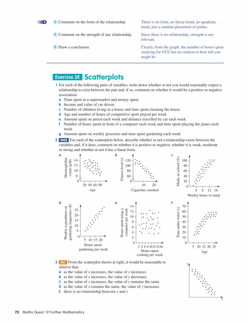
2e Scatterplots 69 exercise 2e Scatterplots 72
2F pearson’s product–moment correlation coefficient 73

58 Maths Quest 12 Further Mathematics
Worked example 1
For each of the following pairs of variables, identify the independent variable and the dependent variable. If it is not possible to identify this, then write ‘not appropriate’.a The number of visitors at a local swimming pool and the daily temperatureb The blood group of a person and his or her favourite TV channel
Think WriTe
a It is reasonable to expect that the number of visitors at the swimming pool on any day will depend on the temperature on that day (and not the other way around).
a Daily temperature is the independent variable; number of visitors at a local swimming pool is the dependent variable.
b Common sense suggests that the blood type of a person does not depend on the person’s TV channel preferences. Similarly, the choice of a TV channel does not depend on a person’s blood type.
b Not appropriate
exercise 2a dependent and independent variables 1 We1 For each of the following pairs of variables, identify the independent variable and the dependent
variable. If it is not possible to identify this, then write ‘not appropriate’.a The age of an AFL footballer and his annual salaryb The growth of a plant and the amount of fertiliser it receivesc The number of books read in a week and the eye colour of the readersd The voting intentions of a woman and her weekly consumption of red meate The number of members in a household and the size of the housef The month of the year and the electricity bill for that monthg The mark obtained for a maths test and the number of hours spent preparing for the testh The mark obtained for a maths test and the mark obtained for an English testi The cost of grapes (in dollars per kilogram) and the season of the year
2 mC In a scientific experiment, the independent variable was the amount of sleep (in hours) a new mother got per night during the first month following the birth of her baby. The dependent variable would most likely have been:a the number of times (per night) the baby woke up for a feedB the blood pressure of the babyC the mother’s reaction time (in seconds) to a certain stimulusd the level of alertness of the babye the amount of time (in hours) spent by the mother on reading
3 mC A paediatrician investigated the relationship between the amount of time children aged two to five spend outdoors and the annual number of visits to his clinic. Which one of the following statements is not true?a When graphed, the amount of time spent outdoors should be shown on the horizontal axis.B The annual number of visits to the paediatric clinic is the dependent variable.C It is impossible to identify the independent variable in this case.d The amount of time spent outdoors is the independent variable.e The annual number of visits to the paediatric clinic should be shown on the vertical axis.
4 mC Alex works as a personal trainer at the local gym. He wishes to analyse the relationship between the number of weekly training sessions and the weekly weight loss of his clients. Which one of the following statements is correct?a When graphed, the number of weekly training sessions should be shown on the vertical axis, as it
is the dependent variable.B When graphed, the weekly weight loss should be shown on the vertical axis, as it is the
independent variable.
ChapTer 2 • Bivariate data 59
C When graphed, the weekly weight loss should be shown on the horizontal axis, as it is the independent variable.
d When graphed, the number of weekly training sessions should be shown on the horizontal axis, as it is the independent variable.
e It is impossible to identify the dependent variable in this case.
2B Back-to-back stem plotsIn chapter 1, we saw how to construct a stem plot for a set of univariate data. We can also extend a stem plot so that it displays bivariate data. Specifi cally, we shall create a stem plot that displays the relationship between a numerical variable and a categorical variable. We shall limit ourselves in this section to categorical variables with just two categories, for example, gender. The two categories are used to provide two back-to-back leaves of a stem plot.
A back-to-back stem plot is used to display bivariate data, involving a numerical variable and a categorical variable with 2 categories.
Worked example 2
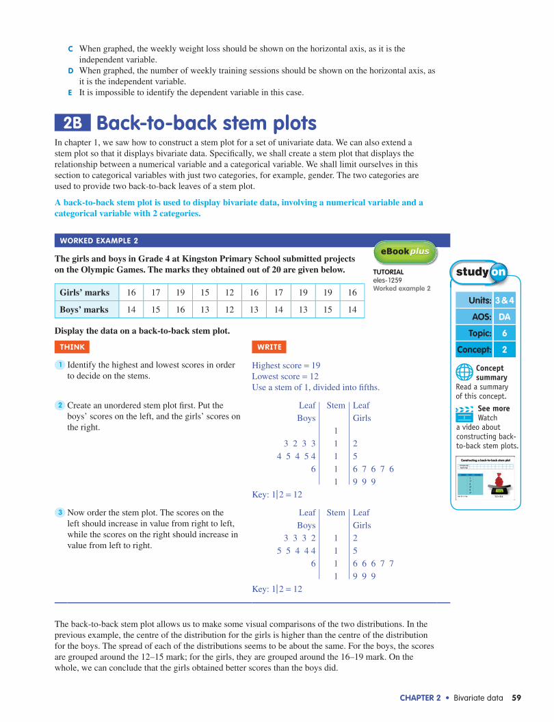
The girls and boys in Grade 4 at Kingston Primary School submitted projects on the Olympic Games. The marks they obtained out of 20 are given below.
Girls’ marks 16 17 19 15 12 16 17 19 19 16
Boys’ marks 14 15 16 13 12 13 14 13 15 14
Display the data on a back-to-back stem plot.
Think WriTe
1 Identify the highest and lowest scores in order to decide on the stems.
Highest score = 19Lowest score = 12Use a stem of 1, divided into fi fths.
2 Create an unordered stem plot fi rst. Put the boys’ scores on the left, and the girls’ scores on the right.
Leaf
Boys
3 2 3 3
4 5 4 5 4
6
Stem
1
1
1
1
1
Leaf
Girls
2
5
6 7 6 7 6
9 9 9
Key: 1| 2 = 12
3 Now order the stem plot. The scores on the left should increase in value from right to left, while the scores on the right should increase in value from left to right.
Leaf
Boys
3 3 3 2
5 5 4 4 4
6
Stem
1
1
1
1
Leaf
Girls
2
5
6 6 6 7 7
9 9 9
Key: 1| 2 = 12
The back-to-back stem plot allows us to make some visual comparisons of the two distributions. In the previous example, the centre of the distribution for the girls is higher than the centre of the distribution for the boys. The spread of each of the distributions seems to be about the same. For the boys, the scores are grouped around the 12–15 mark; for the girls, they are grouped around the 16–19 mark. On the whole, we can conclude that the girls obtained better scores than the boys did.
Concept summary
Read a summary of this concept.
Units: 3 & 4
AOS: DA
Topic: 6
Concept: 2
See more Watch
a video about constructing back-to-back stem plots.
TUTorialeles-1259Worked example 2

60 Maths Quest 12 Further Mathematics
To get a more precise picture of the centre and spread of each of the distributions, we can use the summary statistics discussed in chapter 1. Specifi cally, we are interested in:1. the mean and the median (to measure the centre of the distributions), and2. the interquartile range and the standard deviation (to measure the spread of the distributions).
We saw in chapter 1 that the calculation of these summary statistics is very straightforward and rapid using a CAS calculator.
Worked example 3
The number of ‘how to vote’ cards handed out by various Australian Labor Party and Liberal Party volunteers during the course of a polling day is shown below.
Labor 180193
233202
246210
252222
263257
270247
229234
238226
226214
211204
Liberal 204287
215273
226266
253233
263244
272250
285261
245272
267280
275279
Display the data using a back-to-back stem plot and use this, together with summary statistics, to compare the distributions of the number of cards handed out by the Labor and Liberal volunteers.
Think WriTe
1 Construct the stem plot. LeafLabor
03
4 24 1 0
9 6 6 28 4 3
7 67 2
30
Stem
1819202122232425262728
LeafLiberal
45634 50 31 3 6 72 2 3 5 90 5 7
Key: 18|0 = 180
2 Use a calculator to obtain summary statistics for each party. Record the mean, median, IQR and standard deviation in the table.(IQR = Q3 − Q1)
Labor Liberal
Mean 227.9 257.5
Median 227.5 264.5
IQR 36 29.5
Standard deviation 23.9 23.4
ChapTer 2 • Bivariate data 61
3 Comment on the relationship. From the stem plot we see that the Labor distribution is symmetric and therefore the mean and the median are very close, whereas the Liberal distribution is negatively skewed.
Since the distribution is skewed, the median is a better indicator of the centre of the distribution than the mean.
Comparing the medians therefore, we have the median number of cards handed out for Labor at 228 and for Liberal at 265, which is a big difference.
The standard deviations were similar, as were the interquartile ranges. There was not a lot of difference in the spread of the data.
In essence, the Liberal party volunteers handed out many more ‘how to vote’ cards than the Labor party volunteers did.
exercise 2B Back-to-back stem plots1 We2 The marks out of 50 obtained for the end-of-term test by the students in German and French
classes are given below. Display the data on a back-to-back stem plot.
German 20 38 45 21 30 39 41 22 27 33 30 21 25 32 37 42 26 31 25 37
French 23 25 36 46 44 39 38 24 25 42 38 34 28 31 44 30 35 48 43 34
2 The birth masses of 10 boys and 10 girls (in kilograms, to the nearest 100 grams) are recorded in the table below. Display the data on a back-to-back stem plot.
Boys 3.4 5.0 4.2 3.7 4.9 3.4 3.8 4.8 3.6 4.3
Girls 3.0 2.7 3.7 3.3 4.0 3.1 2.6 3.2 3.6 3.1
3 We3 The number of delivery trucks making deliveries to a supermarket each day over a 2-week period was recorded for two neighbouring supermarkets — supermarket A and supermarket B. The data are shown below.
A 11 15 20 25 12 16 21 27 16 17 17 22 23 24
B 10 15 20 25 30 35 16 31 32 21 23 26 28 29
a Display the data on a back-to-back stem plot.b Use the stem plot, together with some summary statistics, to compare the distributions of the
number of trucks delivering to supermarkets A and B.
4 The marks out of 20 obtained by males and females for a science test in a Year 10 class are given below.
Females 12 13 14 14 15 15 16 17
Males 10 12 13 14 14 15 17 19
a Display the data on a back-to-back stem plot.b Use the stem plot, together with some summary statistics, to compare the distributions of the
marks of the males and the females.
5 The end-of-year English marks for 10 students in an English class were compared over 2 years. The marks for 2011 and for the same students in 2012 are shown below.
2011 30 31 35 37 39 41 41 42 43 46
2012 22 26 27 28 30 31 31 33 34 36
a Display the data on a back-to-back stem plot.b Use the stem plot, together with some summary statistics, to compare the distributions of the
marks obtained by the students in 2011 and 2012.

62 Maths Quest 12 Further Mathematics
6 The age and gender of a group of people attending a fitness class are recorded below.
Female 23 24 25 26 27 28 30 31
Male 22 25 30 31 36 37 42 46
a Display the data on a back-to-back stem plot.b Use the stem plot, together with some summary statistics, to compare the distributions of the ages
of the female members to the male members of the fi tness class.
7 The scores on a board game for a group of kindergarten children and for a group of children in a preparatory school are given below.
Kindergarten 3 13 14 25 28 32 36 41 47 50
Prep. school 5 12 17 25 27 32 35 44 46 52
a Display the data on a back-to-back stem plot.b Use the stem plot, together with some summary statistics, to compare the distributions of the
scores of the kindergarten children compared to the preparatory school children.
8 mC The pair of variables that could be displayed on a back-to-back stem plot is:a the height of a student and the number of people in the student’s householdB the time put into completing an assignment and a pass or fail score on the assignmentC the weight of a businessman and his aged the religion of an adult and the person’s head circumferencee the income of an employee and the time the employee has worked for the company
9 mC A back-to-back stem plot is a useful way of displaying the relationship between:a the proximity to markets in kilometres and the cost of fresh foods on average per kilogramB height and head circumferenceC age and attitude to gambling (for or against)d weight and agee the money spent during a day of shopping and the number of shops visited on that day
2C parallel boxplotsWe saw in the previous section that we could display relationships between a numerical variable and a categorical variable with just two categories, using a back-to-back stem plot.
When we want to display a relationship between a numerical variable and a categorical variable with two or more categories, a parallel boxplot can be used.
A parallel boxplot is obtained by constructing individual boxplots for each distribution and positioning them on a common scale.
Construction of individual boxplots was discussed in detail in chapter 1 on univariate data. In this section we concentrate on comparing distributions represented by a number of boxplots (that is, on the interpretation of parallel boxplots).
Concept summary
Read a summary of this concept.
Units: 3 & 4
AOS: DA
Topic: 6
Concept: 3

ChapTer 2 • Bivariate data 63
Worked example 4
The four Year 7 classes at Western Secondary College complete the same end-of-year maths test. The marks, expressed as percentages for the four classes, are given below.
7A 40 43 45 47 50 52 53 54 57 60 69 63 63 68 70 75 80 85 89 90
7B 60 62 63 64 70 73 74 76 77 77 78 82 85 87 89 90 92 95 97 97
7C 50 51 53 55 57 60 63 65 67 69 70 72 73 74 76 80 82 82 85 89
7D 40 42 43 45 50 53 55 59 60 61 69 73 74 75 80 81 82 83 84 90
Display the data using a parallel boxplot and use this to describe any similarities or differences in the distributions of the marks between the four classes.
Think WriTe/draW
1 Use your CAS calculator to determine the fi ve number summary for each data set.
7A 7B 7C 7D
Min 40 60 50 40
Q1 51 71.5 58.5 51.5
Median = Q2 61.5 77.5 69.5 65
Q3 72.5 89.5 78 80.5
Max 90 97 89 90
2 Draw the boxplots, labelling each class. All four boxplots share a common scale.
30 40 50 60 70 80 90 100
7D
7C
7B
7A
Maths mark (%)
3 Describe the similarities and differences between the four distributions.
Class 7B had the highest median mark and the range of the distribution was only 37. The lowest mark in 7B was 60. We notice that the median of 7A’s marks is 61.5. So, 50% of students in 7A received less than 61.5. This means that about half of 7A had scores that were less than the lowest score in 7B. The range of marks in 7A was the same as that of 7D with the highest scores in each equal (90), and the lowest scores in each equal (40). However, the median mark in 7D (65) was slightly higher than the median mark in 7A (61.5) so, despite a similar range, more students in 7D received a higher mark than in 7A. While 7D had a top score that was higher than that of 7C, the median score in 7C (69.5) was higher than that of 7D and almost 25% of scores in 7D were less than the lowest score in 7C. In summary, 7B did best, followed by 7C, then 7D and fi nally 7A.
similar range, more students in 7D received a higher mark than in 7A. While 7D had a top score that was higher than that of 7C, the median score in 7C (69.5) was higher than that of 7D and almost 25% of scores in 7D were less than the lowest score in 7C. In summary, 7B did best, followed by 7C, then 7D and fi nally 7A.

64 Maths Quest 12 Further Mathematics
exercise 2C parallel boxplots 1 We4 The heights (in cm) of students in 9A, 10A and 11A were recorded and are shown in the table below.
9A 120 126 131 138 140 143 146 147 150 156 157 158 158 160 162 164 165 170
10A 140 143 146 147 149 151 153 156 162 164 165 167 168 170 173 175 176 180
11A 151 153 154 158 160 163 164 166 167 169 169 172 175 180 187 189 193 199
a Construct a parallel boxplot to show the data.b Use the boxplot to compare the distributions of height for the 3 classes.
2 The amounts of money contributed annually to superannuation schemes by people in 3 different age groups are shown below.
20–29 2 000 3 100 5 000 5 500 6 200 6 500 6 700 7 000 9 200 10 000
30–39 4 000 5 200 6 000 6 300 6 800 7 000 8 000 9 000 10 300 12 000
40–49 10 000 11 200 12 000 13 300 13 500 13 700 13 900 14 000 14 300 15 000
a Construct a parallel boxplot to show the data.b Use the boxplot to comment on the distributions.
3 The numbers of jars of vitamin A, B, C and multi-vitamins sold per week by a local chemist are shown below.
Vitamin A 5 6 7 7 8 8 9 11 13 14Vitamin B 10 10 11 12 14 15 15 15 17 19Vitamin C 8 8 9 9 9 10 11 12 12 13Multi-vitamins 12 13 13 15 16 16 17 19 19 20
Construct a parallel boxplot to display the data and use it to compare the distributions of sales for the 4 types of vitamin.
4 The daily share price of two companies was recorded over a period of one month. The results are presented below as parallel boxplots.
65 70 75 80 85 90 95 100 105Price per share (cents)
Company A
Company B
State whether each of the following statements is true or false.a The distribution of share prices for company A is symmetrical.b On 25% of all occasions, share prices for company B equalled or exceeded the highest price
recorded for company A.c The spread of the share prices was the same for both companies.d 75% of share prices for company B were at least as high as the median share price for company A.
5 Last year, the spring season of the Australian Opera included two major productions staged at the Sydney Opera House: The Pearlfishers and Orlando. The number of A-reserve tickets sold for each performance of the two operas is shown below as parallel boxplots.
400
450
500
550
600
650
700
750
800
850
900
950
Number of A-reserve tickets sold
Orlando
The Pearl�shers
diGiTal doCdoc-9410
Spreadsheetparallel boxplots
ChapTer 2 • Bivariate data 65
a Which of the two productions proved to be more popular with the public, assuming A-reserve ticket sales refl ect total ticket sales? Explain your answer.
b Which opera had a larger variability in the number of patrons purchasing A-reserve tickets? Support your answer with the necessary calculations.
6 mC The results for a maths test given to classes in two different year levels, one in Year 8 and the other in Year 10, are given by the parallel boxplots below.
25 30 35 40
Year 10
45 50 55 60 65Results out of 100
70 75 80 85 90 95 100
Year 8
a The percentage of Year 10 students who obtained a mark greater than 87 was:
a 2% B 5% C 20%d 25% e 75%
b From the parallel boxplots, it can be concluded that: a the Year 8 results were similar to the Year 10 results B the Year 8 results were lower than the Year 10 results and less variable C the Year 8 results were lower than the Year 10 results and more variable d the Year 8 results were higher than the Year 10 results and less variable e the Year 8 results were higher than the Year 10 results and more variable
2d Two-way frequency tables and segmented bar chartsWhen we are examining the relationship between two categorical variables, the two-way frequency table is an excellent tool. Consider the following example.
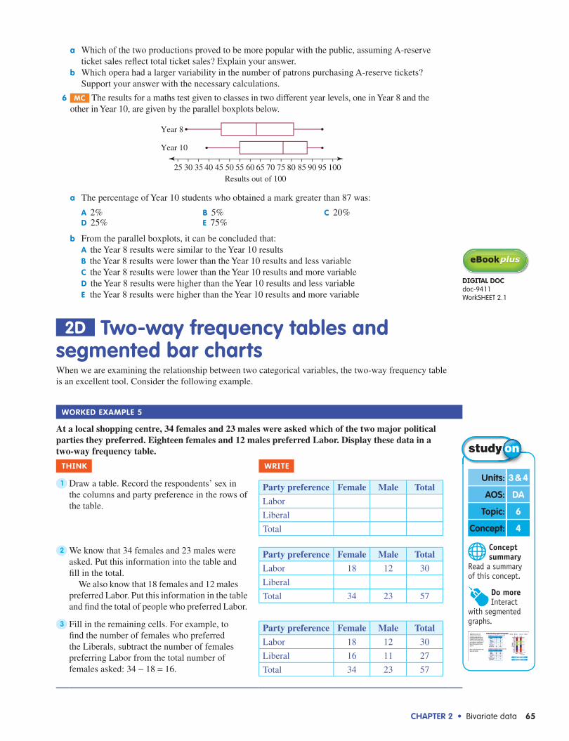
Worked example 5
At a local shopping centre, 34 females and 23 males were asked which of the two major political parties they preferred. Eighteen females and 12 males preferred Labor. Display these data in a two-way frequency table.
Think WriTe
1 Draw a table. Record the respondents’ sex in the columns and party preference in the rows of the table.
Party preference Female Male Total
Labor
Liberal
Total
2 We know that 34 females and 23 males were asked. Put this information into the table and fi ll in the total.
We also know that 18 females and 12 males preferred Labor. Put this information in the table and fi nd the total of people who preferred Labor.
Party preference Female Male Total
Labor 18 12 30
Liberal
Total 34 23 57
3 Fill in the remaining cells. For example, to fi nd the number of females who preferred the Liberals, subtract the number of females preferring Labor from the total number of females asked: 34 − 18 = 16.
Party preference Female Male Total
Labor 18 12 30
Liberal 16 11 27
Total 34 23 57
diGiTal doCdoc-9411WorkSHEET 2.1
Concept summary
Read a summary of this concept.
Units: 3 & 4
AOS: DA
Topic: 6
Concept: 4
Do more Interact
with segmented graphs.

66 Maths Quest 12 Further Mathematics
In Worked example 5, we have a very clear breakdown of data. We know how many females preferred Labor, how many females preferred the Liberals, how many males preferred Labor and how many males preferred the Liberals.
If we wish to compare the number of females who prefer Labor with the number of males who prefer Labor, we must be careful. While 12 males preferred Labor compared to 18 females, there were fewer males than females being asked. That is, only 23 males were asked for their opinion, compared to 34 females.
To overcome this problem, we can express the figures in the table as percentages.
Worked example 6
Fifty-seven people in a local shopping centre were asked whether they preferred the Australian Labor Party or the Liberal Party. The results are given at right. Convert the numbers in this table to percentages.
Think WriTe
Draw the table, omitting the ‘total’ column.Fill in the table by expressing the number in each cell as a percentage of its column’s total. For example, to obtain the percentage of males who prefer Labor, divide the number of males who prefer Labor by the total number of males and multiply by 100%.1223
× 100% = 52.2% (correct to 1 decimal place)
Party preference Female Male
Labor 52.9 52.2
Liberal 47.1 47.8
Total 100.0 100.0
We could have calculated percentages from the table rows, rather than columns. To do that we would, for example, have divided the number of females who preferred Labor (18) by the total number of people who preferred labor (30) and so on. The table below shows this:
Party preference Female Male TotalLabor 60.0 40.0 100Liberal 59.3 40.7 100
By doing this we have obtained the percentage of people who were female and preferred Labor (60%), and the percentage of people who were male and preferred Labor (40%), and so on. This highlights facts different from those shown in the previous table. In other words, different results can be obtained by calculating percentages from a table in different ways.
As a general rule, when the independent variable (in this case the respondent’s gender) is placed in the columns of the table, the percentages should be calculated in columns.
Comparing percentages in each row of a two-way table allows us to establish whether a relationship exists between the two categorical variables that are being examined. As we can see from the table in Worked example 6, the percentage of females who preferred Labor is about the same as that of males. Likewise, the percentage of females and males preferring the Liberal Party are almost equal. This indicates that for the group of people participating in the survey, party preference is not related to gender.
Segmented bar chartsWhen comparing two categorical variables, it can be useful to represent the results from a two-way table (in percentage form) graphically. We can do this using segmented bar charts.
A segmented bar chart consists of two or more columns, each of which matches one column in the two-way table. Each column is subdivided into segments, corresponding to each cell in that column.
For example, the data from Worked example 6 can be displayed using the segmented bar chart shown at right.
The segmented bar chart is a powerful visual aid for comparing and examining the relationship between two categorical variables.
Party preference Female Male TotalLabor 18 12 30Liberal 16 11 27Total 34 23 57
GenderFemale
Perc
enta
ge
10203040506070
Male
8090
100Partypreference
LiberalLabor

ChapTer 2 • Bivariate data 67
Worked example 7
Sixty-seven primary and 47 secondary school students were asked about their attitude to the number of school holidays which should be given. They were asked whether there should be fewer, the same number, or more school holidays. Five primary students and 2 secondary students wanted fewer holidays, 29 primary and 9 secondary students thought they had enough holidays (that is, they chose the same number) and the rest thought they needed to be given more holidays. Present these data in percentage form in a two-way frequency table and a segmented bar chart. Compare the opinions of the primary and the secondary students.
Think WriTe/draW
1 Put the data in a table. First, fi ll in the given information, then fi nd the missing information by subtracting the appropriate numbers from the totals.
Attitude Primary Secondary Total
Fewer 5 2 7
Same 29 9 38
More 33 36 69
Total 67 47 114
2 Calculate the percentages. Since the independent variable (the level of the student: primary or secondary) has been placed in the columns of the table, we calculate the percentages in columns. For example, to obtain the percentage of primary students who wanted fewer holidays, divide the number of such students by the total number of primary students and multiply by 100%.
That is, 567
× 100% = 7.5%.
Attitude Primary Secondary
Fewer 7.5 4.3
Same 43.3 19.1
More 49.2 76.6
Total 100.0 100.0
3 Rule out the set of axes. (The vertical axis shows percentages from 0 to 100, while the horizontal axis represents the categories from the columns of the table.) Draw two columns to represent each category — primary and secondary. Columns must be the same width and height (up to 100%). Divide each column into segments so that the height of each segment is equal to the percentage in the corresponding cell of the table. Add a legend to the graph.
School level
Primary Secondary
Attitude
Perc
enta
ge
10
20
30
40
50
60
70
80
90
100 MoreSameFewer
4 Comment on the results. Secondary students were much keener on having more holidays than were primary students.
exercise 2d Two-way frequency tables and segmented bar charts 1 We5 In a survey, 139 women and 102 men were asked whether they approved or disapproved of
a proposed freeway. Thirty-seven women and 79 men approved of the freeway. Display these data in a two-way table (not as percentages).
TUTorialeles-1260Worked example 7
diGiTal doCdoc-9413SpreadsheetTwo-way frequency table

68 Maths Quest 12 Further Mathematics
2 Students at a secondary school were asked whether the length of lessons should be 45 minutes or 1 hour. Ninety-three senior students (Years 10–12) were asked and it was found 60 preferred 1-hour lessons, whereas of the 86 junior students (Years 7–9), 36 preferred 1-hour lessons. Display these data in a two-way table (not as percentages).
3 For each of the following two-way frequency tables, complete the missing entries.a Attitude Female Male Total
For 25 i 47Against ii iii ivTotal 51 v 92
b Attitude Female Male TotalFor i ii 21Against iii 21 ivTotal v 30 63
c Party preference Female MaleLabor i 42%Liberal 53% iiTotal iii iv
4 We6 Sixty single men and women were asked whether they prefer to rent by themselves, or to share accommodation with friends. The results are shown below.
Preference Men Women TotalRent by themselves 12 23 35Share with friends 9 16 25Total 21 39 60
Convert the numbers in this table to percentages. The information in the following two-way frequency table relates to questions 5 and 6. The data show the reactions of administrative staff and technical staff to an upgrade of the computer systems at a large corporation.
Attitude Administrative staff Technical staff TotalFor 53 98 151Against 37 31 68Total 90 129 219
5 mC From the previous table, we can conclude that:a 53% of administrative staff were for the upgradeB 37% of administrative staff were for the upgradeC 37% of administrative staff were against the upgraded 59% of administrative staff were for the upgradee 54% of administrative staff were against the upgrade
6 mC From the previous table, we can conclude that:a 98% of technical staff were for the upgradeB 65% of technical staff were for the upgradeC 76% of technical staff were for the upgraded 31% of technical staff were against the upgradee 14% of technical staff were against the upgrade
7 We7 Delegates at the respective Liberal Party and Australian Labor Party conferences were surveyed on whether or not they believed that marijuana should be legalised. Sixty-two Liberal delegates were surveyed and 40 of them were against legalisation. Seventy-one Labor delegates were surveyed and 43 were against legalisation. Present the data in percentage form in a two-way frequency table and a segmented bar chart. Comment on any differences between the reactions of the Liberal and Labor delegates.
8 mC The amount of waste recycled by 100 townships across Australia was rated as low, medium or high and the size of the town as small, mid-sized or large.The results of the ratings are:
Amount of waste recycled
Type of town Small Mid-sized Large
Low 6 7 4
Medium 8 31 5
High 5 16 18
diGiTal doCdoc-9412
SkillSHEET 2.1expressing one number
as a percentage of another

ChapTer 2 • Bivariate data 69
a The percentage of mid-sized towns rated as having a high level of waste recycling is closest to:a 41% B 25% C 30% d 17% e 50%
b The variables, Amount of waste recycled and Type of town, as used in this rating are:a both categorical variables B both numerical variablesC numerical and categorical respectively d categorical and numerical respectivelye neither categorical nor numerical variables
2e ScatterplotsWe often want to know if there is a relationship between two numerical variables. A scatterplot, which gives a visual display of the relationship between two variables, provides a good starting point. Consider the data obtained from last year’s 12B class at Northbank Secondary College. Each student in this class of 29 students was asked to give an estimate of the average number of hours they studied per week during Year 12. They were also asked for the ATAR score they obtained.
Average hours of study
ATAR score
Average hours of study
ATAR score
Average hours of study
ATAR score
18 59 14 54 17 59
16 67 17 72 16 76
22 74 14 63 14 59
27 90 19 72 29 89
15 62 20 58 30 93
28 89 10 47 30 96
18 71 28 85 23 82
19 60 25 75 26 35
22 84 18 63 22 78
30 98 19 61
The fi gure at right shows the data plotted on a scatterplot.It is reasonable to think that the number of hours of study put
in each week by students would affect their ATAR scores and so the number of hours of study per week is the independent variable and appears on the horizontal axis. The ATAR score is the dependent variable and appears on the vertical axis.
There are 29 points on the scatterplot. Each point represents the number of hours of study and the ATAR score of one student.
In analysing the scatterplot we look for a pattern in the way the points lie. Certain patterns tell us that certain relationships exist between the two variables. This is referred to as correlation. We look at what type of correlation exists and how strong it is.
In the fi gure above right we see some sort of pattern: the points are spread in a rough corridor from bottom left to top right. We refer to data following such a direction as having a positive relationship. This tells us that as the average number of hours studied per week increases, the ATAR score increases.
The point (26, 35) is an outlier. It stands out because it is well away from the other points and clearly is not part of the ‘corridor’ referred to previously. This outlier may have occurred because a student exaggerated the number of hours he or she worked in a week or perhaps there was a recording error. This needs to be checked.
We could describe the rest of the data as having a linear form as the straight line in the diagram at right indicates.
Concept summary
Read a summary of this concept.
Units: 3 & 4
AOS: DA
Topic: 6
Concept: 5
ATA
R s
core
40
50
60
70
80
90
100
1050 15 20 25 30Average number of hours
of study per week
(26, 35)
ATA
R s
core
40
0
50
60
70
80
90
100
105 15 20 25 30Average number of hours
of study per week

70 Maths Quest 12 Further Mathematics
When describing the relationship between two variables displayed on a scatterplot, we need to comment on:(a) the direction — whether it is positive or negative(b) the form — whether it is linear or non-linear(c) the strength — whether it is strong, moderate or weak(d) possible outliers.
Below is a gallery of scatterplots showing the various patterns we look for.
Weak, positivelinear relationship
Moderate, positivelinear relationship
Strong, positivelinear relationship
Weak, negativelinear relationship
Moderate, negativelinear relationship
Strong, negativelinear relationship
Perfect, negativelinear relationship No relationship
Perfect, positivelinear relationship
Worked example 8
The scatterplot at right shows the number of hours people spend at work each week and the number of hours people get to spend on recreational activities during the week. Decide whether or not a relationship exists between the variables and, if it does, comment on whether it is positive or negative; weak, moderate or strong; and whether or not it has a linear form.
Think WriTe
1 The points on the scatterplot are spread in a certain pattern, namely in a rough corridor from the top left to the bottom right corner. This tells us that as the work hours increase, the recreation hours decrease.
2 The corridor is straight (that is, it would be reasonable to fi t a straight line into it).
Concept summary
Read a summary of this concept.
Units: 3 & 4
AOS: DA
Topic: 6
Concept: 6
Hou
rs f
or r
ecre
atio
n
5
10
15
20
25
10 20 30 40 50Hours worked
60 70
ChapTer 2 • Bivariate data 71
3 The points are neither too tight nor too dispersed.
4 The pattern resembles the central diagram in the gallery of scatterplots shown previously.
There is a moderate, negative linear relationship between the two variables.
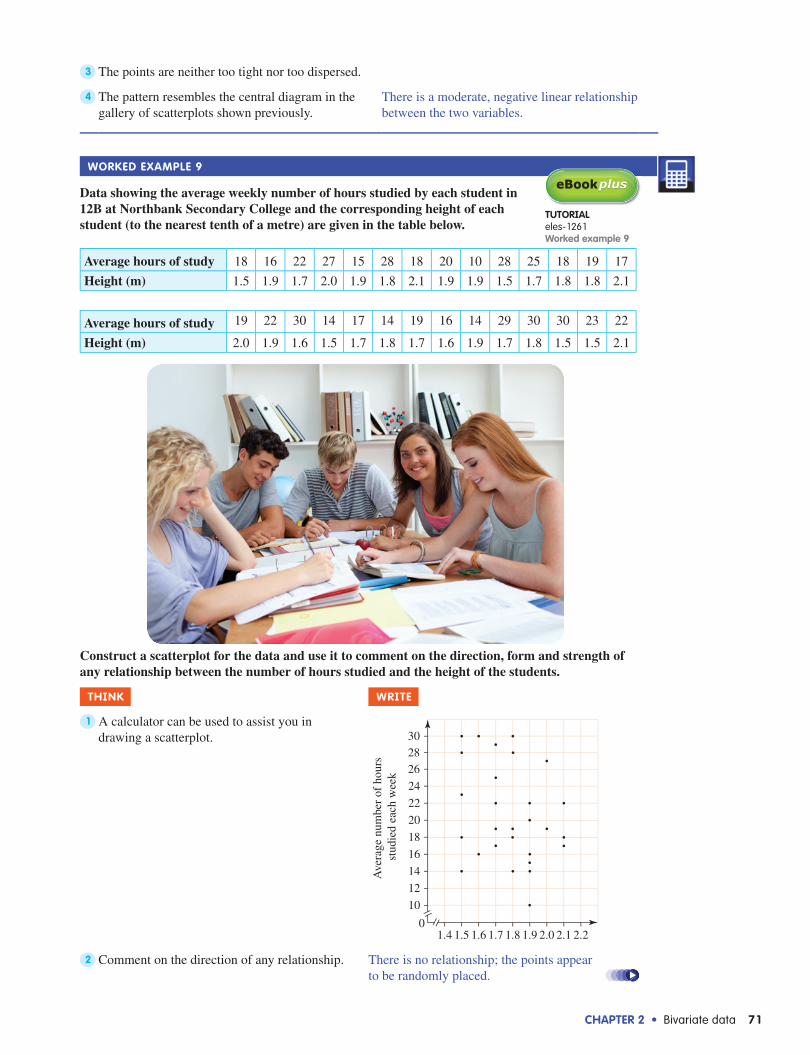
Worked example 9
Data showing the average weekly number of hours studied by each student in 12B at Northbank Secondary College and the corresponding height of each student (to the nearest tenth of a metre) are given in the table below.
Average hours of study 18 16 22 27 15 28 18 20 10 28 25 18 19 17
Height (m) 1.5 1.9 1.7 2.0 1.9 1.8 2.1 1.9 1.9 1.5 1.7 1.8 1.8 2.1
Average hours of study 19 22 30 14 17 14 19 16 14 29 30 30 23 22
Height (m) 2.0 1.9 1.6 1.5 1.7 1.8 1.7 1.6 1.9 1.7 1.8 1.5 1.5 2.1
Construct a scatterplot for the data and use it to comment on the direction, form and strength of any relationship between the number of hours studied and the height of the students.
Think WriTe
1 A calculator can be used to assist you in drawing a scatterplot.
Height (m)
Ave
rage
num
ber
of h
ours
st
udie
d ea
ch w
eek
10
12
14
16
18
20
22
24
262830
1.40
1.5 1.6 1.7 1.8 1.9 2.0 2.1 2.2
2 Comment on the direction of any relationship. There is no relationship; the points appear to be randomly placed.
TUTorialeles-1261Worked example 9
72 Maths Quest 12 Further Mathematics
3 Comment on the form of the relationship. There is no form, no linear trend, no quadratic trend, just a random placement of points.
4 Comment on the strength of any relationship. Since there is no relationship, strength is not relevant.
5 Draw a conclusion. Clearly, from the graph, the number of hours spent studying for VCE has no relation to how tall you might be.
exercise 2e Scatterplots 1 For each of the following pairs of variables, write down whether or not you would reasonably expect a
relationship to exist between the pair and, if so, comment on whether it would be a positive or negative association.a Time spent in a supermarket and money spentb Income and value of car drivenc Number of children living in a house and time spent cleaning the housed Age and number of hours of competitive sport played per weeke Amount spent on petrol each week and distance travelled by car each weekf Number of hours spent in front of a computer each week and time spent playing the piano each
weekg Amount spent on weekly groceries and time spent gardening each week
2 We8 For each of the scatterplots below, describe whether or not a relationship exists between the variables and, if it does, comment on whether it is positive or negative, whether it is weak, moderate or strong and whether or not it has a linear form.a
Age
Hae
mog
lobi
nco
unt (
g/dl
)
10
1214
20 40 60 80
8
0
b
Cigarettes smoked
Fitn
ess
leve
l (s)
80100
120
010 20
60
c
Weekly hours of study
Mar
ks a
t sch
ool (
%)
0
20
40
60
80
100
4 8 12 16
d
Hours spent gardening per week
Wee
kly
expe
nditu
re o
n ga
rden
ing
mag
azin
es (
$)
5
10
1520
25
50
10 15 20
e
Hours spentcooking per week
Hou
rs s
pent
usi
ng a
co
mpu
ter
per
wee
k
2
4
6
8
10
12
14
2 4 6 8 1012 14160
f
Age
Tim
e un
der
wat
er (
s)
10
20
30
40
50
60
70
5 10 15 20 250
3 mC From the scatterplot shown at right, it would be reasonable to observe that:a as the value of x increases, the value of y increasesB as the value of x increases, the value of y decreasesC as the value of x increases, the value of y remains the samed as the value of x remains the same, the value of y increasese there is no relationship between x and y
y
x

ChapTer 2 • Bivariate data 73
4 We9 The population of a municipality (to the nearest ten thousand) together with the number of primary schools in that particular municipality is given below for 11 municipalities.
Population(× 1000)
110 130 130 140 150 160 170 170 180 180 190
Number of primary schools
4 4 6 5 6 8 6 7 8 9 8
Construct a scatterplot for the data and use it to comment on the direction, form and strength of any relationship between the population and the number of primary schools.
5 The table below contains data for the time taken to do a paving job and the cost of the job. Construct a scatterplot for the data. Comment on whether a relationship exists between the time taken and the cost. If there is a relationship, describe it.
Time taken (hours)
Cost of job ($)
5 1000 7 1000 5 1500 8 120010 200013 250015 280020 320018 280025 400033 3000
6 The table below shows the time of booking (how many days in advance) of the tickets for a musical performance and the corresponding row number in A-reserve seating.
Time of booking
Row number
Time of booking
Row number
Time of booking
Row number
5 15 14 12 25 3
6 15 14 10 28 2
7 15 17 11 29 2
7 14 20 10 29 1
8 14 21 8 30 1
11 13 22 5 31 1
13 13 24 4
Construct a scatterplot for the data. Comment on whether a relationship exists between the time of booking and the number of the row and, if there is a relationship, describe it.
2F pearson’s product–moment correlation coefficientIn the previous section, we estimated the strength of association by looking at a scatterplot and forming a judgment about whether the correlation between the variables was positive or negative and whether the correlation was weak, moderate or strong.
A more precise tool for measuring correlation between two variables is Pearson’s product–moment correlation coeffi cient. This coeffi cient is used to measure the strength of linear relationships between variables.
diGiTal doCdoc-9414SpreadsheetScatterplot
inTeraCTiViTYint-0183pearson’s product–moment correlation coefficient
74 Maths Quest 12 Further Mathematics
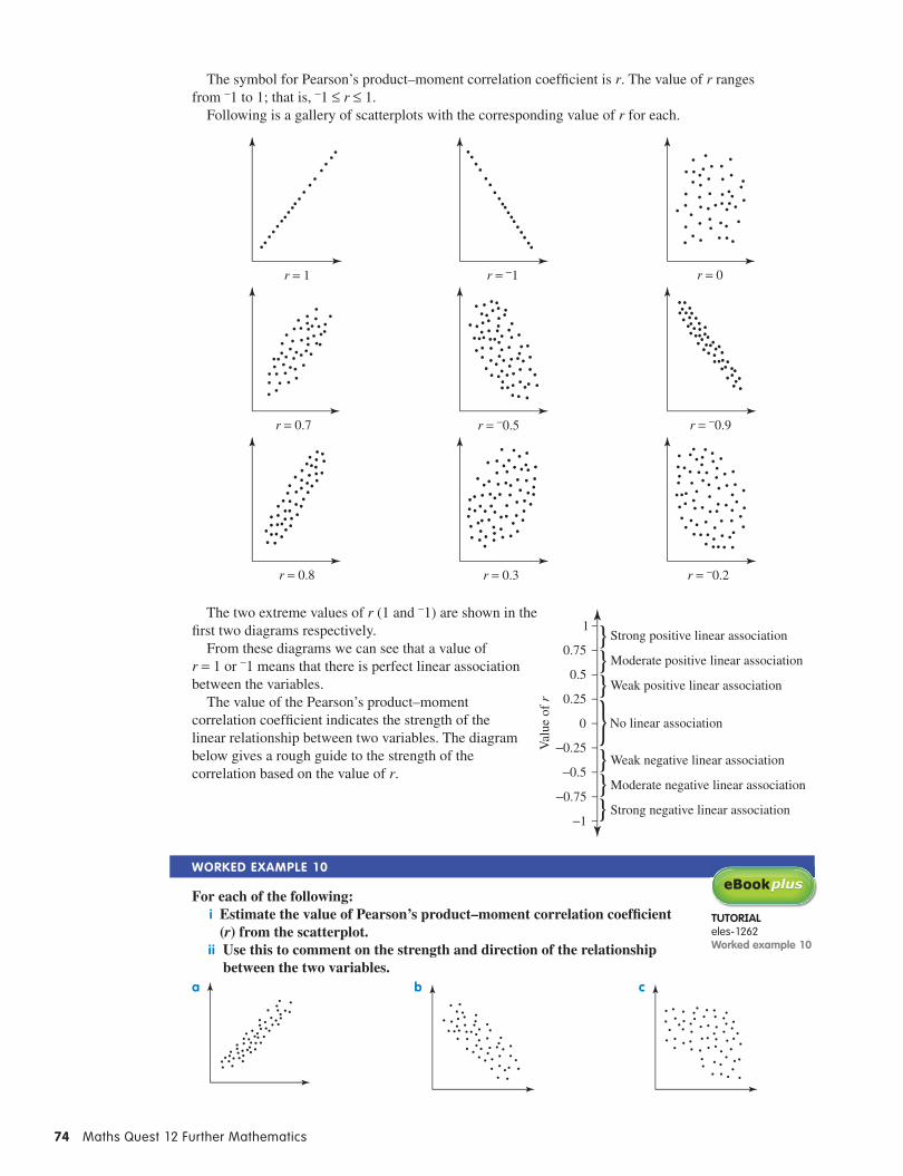
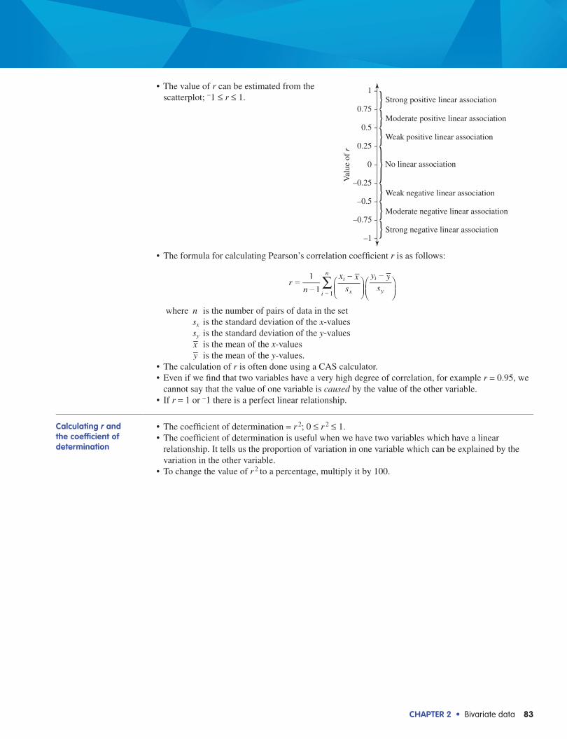
The symbol for Pearson’s product–moment correlation coeffi cient is r. The value of r ranges from −1 to 1; that is, −1 ≤ r ≤ 1.
Following is a gallery of scatterplots with the corresponding value of r for each.
r = 1 r = −1 r = 0
r = 0.7 r = −0.5 r = −0.9
r = 0.8 r = 0.3 r = −0.2
The two extreme values of r (1 and −1) are shown in the fi rst two diagrams respectively.
From these diagrams we can see that a value of r = 1 or −1 means that there is perfect linear association between the variables.
The value of the Pearson’s product–moment correlation coeffi cient indicates the strength of the linear relationship between two variables. The diagram below gives a rough guide to the strength of the correlation based on the value of r.
Worked example 10
For each of the following: i Estimate the value of Pearson’s product–moment correlation coeffi cient
(r) from the scatterplot.ii Use this to comment on the strength and direction of the relationship
between the two variables.a b c
Strong positive linear association
−0.5
−0.25
0
0.25
0.5
0.75
1
−1
−0.75
}}}
}}}}
Moderate positive linear association
Weak positive linear association
No linear association
Weak negative linear association
Moderate negative linear association
Strong negative linear association
Val
ue o
f r
TUTorialeles-1262Worked example 10

ChapTer 2 • Bivariate data 75
Think WriTe
a i Compare these scatterplots with those in the gallery of scatterplots shown previously and estimate the value of r.
a i r ≈ 0.9
ii Comment on the strength and direction of the relationship.
ii The relationship can be described as a strong, positive, linear relationship.
b Repeat parts i and ii as in a. b iii
r ≈ −0.7The relationship can be described as a moderate, negative, linear relationship.
c Repeat parts i and ii as in a. c iii
r ≈ −0.1There is almost no linear relationship.
Note that the symbol ≈ means ‘approximately equal to’. We use it instead of the = sign to emphasise that the value (in this case r) is only an estimate.
In completing the worked example above, we notice that estimating the value of r from a scatterplot is rather like making an informed guess. In the next section of work, we will see how to obtain the actual value of r.
exercise 2F pearson’s product–moment correlation coefficient
1 What type of linear relationship does each of the following values of r suggest?a 0.21 b 0.65 c −1 d −0.78e 1 f 0.9 g −0.34 h −0.1
2 We10 For each of the following: i Estimate the value of Pearson’s product–moment correlation coefficient (r), from the scatterplot.ii Use this to comment on the strength and direction of the relationship between the two variables.
a b c
d e f
g h

76 Maths Quest 12 Further Mathematics
3 mC A set of data relating the variables x and y is found to have an r value of 0.62. The scatterplot that could represent the data is:
a B C
d e
4 mC A set of data relating the variables x and y is found to have an r value of −0.45. A true statement about the relationship between x and y is:a There is a strong linear relationship between x and y and when the x-values increase, the y-values
tend to increase also.B There is a moderate linear relationship between x and y and when the x-values increase, the
y-values tend to increase also.C There is a moderate linear relationship between x and y and when the x-values increase, the
y-values tend to decrease.d There is a weak linear relationship between x and y and when the x-values increase, the y-values
tend to increase also.e There is a weak linear relationship between x and y and when the x-values increase, the y-values
tend to decrease.
2G Calculating r and the coefficient of determinationpearson’s product–moment correlation coefficient (r )The formula for calculating Pearson’s correlation coeffi cient r is as follows:
∑=−
−
−
=
rn
x xs
y ys
1
1i
x
i
yi
n
1
where n is the number of pairs of data in the set sx is the standard deviation of the x-values sy is the standard deviation of the y-values x is the mean of the x-values y is the mean of the y-values.
The calculation of r is often done using a CAS calculator.There are two important limitations on the use of r. First, since r measures the strength of a linear
relationship, it would be inappropriate to calculate r for data which are not linear — for example, data which a scatterplot shows to be in a quadratic form.
Second, outliers can bias the value of r. Consequently, if a set of linear data contains an outlier, then r is not a reliable measure of the strength of that linear relationship.
The calculation of r is applicable to sets of bivariate data which are known to be linear in form and which do not have outliers.
diGiTal doCdoc-9415
WorkSHEET 2.2
Concept summary
Read a summary of this concept.
Units: 3 & 4
AOS: DA
Topic: 6
Concept: 7
Do more Interact
with r.

ChapTer 2 • Bivariate data 77
With those two provisos, it is good practice to draw a scatterplot for a set of data to check for a linear form and an absence of outliers before r is calculated. Having a scatterplot in front of you is also useful because it enables you to estimate what the value of r might be — as you did in the previous exercise, and thus you can check that your workings on the calculator are correct.
Worked example 11
The heights (in centimetres) of 21 football players were recorded against the number of marks they took in a game of football. The data are shown in the following table.
a Construct a scatterplot for the data.b Comment on the correlation between the heights of players and the number of marks that they
take, and estimate the value of r.c Calculate r and use it to comment on the relationship between the heights of players and the
number of marks they take in a game.
Height (cm) Number of marks taken Height (cm) Number of marks taken184 6 182 7194 11 185 5185 3 183 9175 2 191 9186 7 177 3183 5 184 8174 4 178 4200 10 190 10188 9 193 12184 7 204 14188 6
Think WriTe/draW
a Height is the independent variable, so plot it on the x-axis; the number of marks is the dependent variable, so show it on the y-axis.
a
Height
Mar
k
2
0 172 176 180 184 188 192 196 200 204
4
6
8
10
12
14
TUTorialeles-1244Worked example 11
78 Maths Quest 12 Further Mathematics
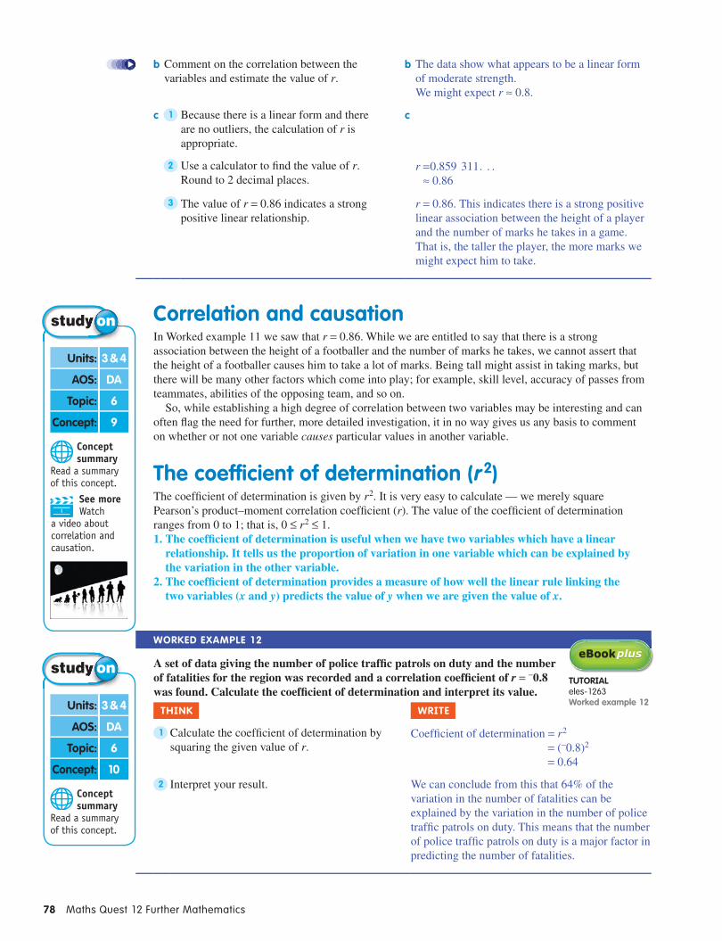
b Comment on the correlation between the variables and estimate the value of r.
b The data show what appears to be a linear form of moderate strength.We might expect r ≈ 0.8.
c 1 Because there is a linear form and there are no outliers, the calculation of r is appropriate.
c
2 Use a calculator to fi nd the value of r. Round to 2 decimal places.
r = 0.859 311 . . .≈ 0.86
3 The value of r = 0.86 indicates a strong positive linear relationship.
r = 0.86. This indicates there is a strong positive linear association between the height of a player and the number of marks he takes in a game. That is, the taller the player, the more marks we might expect him to take.
Correlation and causationIn Worked example 11 we saw that r = 0.86. While we are entitled to say that there is a strong association between the height of a footballer and the number of marks he takes, we cannot assert that the height of a footballer causes him to take a lot of marks. Being tall might assist in taking marks, but there will be many other factors which come into play; for example, skill level, accuracy of passes from teammates, abilities of the opposing team, and so on.
So, while establishing a high degree of correlation between two variables may be interesting and can often fl ag the need for further, more detailed investigation, it in no way gives us any basis to comment on whether or not one variable causes particular values in another variable.
The coefficient of determination (r 2)The coeffi cient of determination is given by r 2. It is very easy to calculate — we merely square Pearson’s product–moment correlation coeffi cient (r). The value of the coeffi cient of determination ranges from 0 to 1; that is, 0 ≤ r 2 ≤ 1.1. The coeffi cient of determination is useful when we have two variables which have a linear
relationship. It tells us the proportion of variation in one variable which can be explained by the variation in the other variable.
2. The coeffi cient of determination provides a measure of how well the linear rule linking the two variables (x and y) predicts the value of y when we are given the value of x.
Worked example 12
A set of data giving the number of police traffi c patrols on duty and the number of fatalities for the region was recorded and a correlation coeffi cient of r = −0.8 was found. Calculate the coeffi cient of determination and interpret its value.
Think WriTe
1 Calculate the coeffi cient of determination by squaring the given value of r.
Coeffi cient of determination = r 2
= (−0.8)2
= 0.64
2 Interpret your result. We can conclude from this that 64% of the variation in the number of fatalities can be explained by the variation in the number of police traffi c patrols on duty. This means that the number of police traffi c patrols on duty is a major factor in predicting the number of fatalities.
Concept summary
Read a summary of this concept.
Units: 3 & 4
AOS: DA
Topic: 6
Concept: 9
See more Watch
a video about correlation and causation.
Concept summary
Read a summary of this concept.
Units: 3 & 4
AOS: DA
Topic: 6
Concept: 10
TUTorialeles-1263Worked example 12

ChapTer 2 • Bivariate data 79
Note: In the previous worked example, 64% of the variation in the number of fatalities was due to the variation in the number of police cars on duty and 36% was due to other factors; for example, days of the week or hour of the day.
exercise 2G Calculating r and the coef ficient of determination 1 We11 The yearly salary (× $1000) and the number of votes polled in the Brownlow medal count are
given below for 10 footballers.
Yearly salary(× $1000)
180 200 160 250 190 210 170 150 140 180
Number of votes 24 15 33 10 16 23 14 21 31 28
a Construct a scatterplot for the data.b Comment on the correlation of salary and the number of votes and make an estimate of r.c Calculate r and use it to comment on the relationship between yearly salary and number of
votes.
2 We12 A set of data, obtained from 40 smokers, gives the number of cigarettes smoked per day and the number of visits per year to the doctor. The Pearson’s correlation coefficient for these data was found to be 0.87. Calculate the coefficient of determination for the data and interpret its value.
3 Data giving the annual advertising budgets (× $1000) and the yearly profit increases (%) of 8 companies are shown below.
Annual advertising budget (× $1000)
11 14 15 17 20 25 25 27
Yearly profi t increase (%) 2.2 2.2 3.2 4.6 5.7 6.9 7.9 9.3
a Construct a scatterplot for these data.b Comment on the correlation of the advertising budget and profi t increase and make an estimate of r.c Calculate r.d Calculate the coeffi cient of determination.e Write the proportion of the variation in the yearly profi t increase that can be explained by the
variation in the advertising budget.
4 Data showing the number of tourists visiting a small country in a month and the corresponding average monthly exchange rate for the country’s currency against the American dollar are given below.
Number of tourists (× 1000)
2 3 4 5 7 8 8 10
Exchange rate 1.2 1.1 0.9 0.9 0.8 0.8 0.7 0.6
a Construct a scatterplot for the data.b Comment on the correlation between the number of tourists and the exchange rate and give an
estimate of r.c Calculate r.d Calculate the coeffi cient of determination.e Write the proportion of the variation in the number of tourists that can be explained by the
exchange rate.
5 Data showing the number of people in 9 households against weekly grocery costs are given below.
Number of people in household 2 5 6 3 4 5 2 6 3
Weekly grocery costs ($) 60 180 210 120 150 160 65 200 90
a Construct a scatterplot for the data.b Comment on the correlation of the number of people in a household and the weekly grocery costs
and give an estimate of r.
diGiTal doCdoc-9416Spreadsheetpearson’s product–moment correlation

80 Maths Quest 12 Further Mathematics
c Calculate r.d Calculate the coeffi cient of determination.e Write the proportion of the variation in the weekly grocery costs that can be explained by the
variation in the number of people in a household.
6 Data showing the number of people on 8 fundraising committees and the annual funds raised are given below.
Number of people on committee
3 6 4 8 5 7 3 6
Annual funds raised ($)
4500 8500 6100 12 500 7200 10 000 4700 8800
a Construct a scatterplot for these data.b Comment on the correlation between the number of people on a committee and the funds raised
and make an estimate of r.c Calculate r.d Based on the value of r obtained in part c, would it be appropriate to conclude that the increase
in the number of people on the fundraising committee causes the increase in the amount of funds raised?
e Calculate the coeffi cient of determination.f Write the proportion of the variation in the funds raised that can be explained by the variation in
the number of people on a committee.
The following information applies to questions 7 and 8. A set of data was obtained from a large group of women with children under 5 years of age. They were asked the number of hours they worked per week and the amount of money they spent on child care. The results were recorded and the value of Pearson’s correlation coeffi cient was found to be 0.92.
7 mC Which of the following is not true?a The relationship between the number of
working hours and the amount of money spent on child care is linear.
B There is a positive correlation between the number of working hours and the amount of money spent on child care.
C The correlation between the number of working hours and the amount of money spent on child care can be classifi ed as strong.
d As the number of working hours increases, the amount spent on child care increases as well.
e The increase in the number of hours worked causes the increase in the amount of money spent on child care.
8 mC Which of the following is not true?a The coeffi cient of determination is about
0.85.B The number of working hours is the major
factor in predicting the amount of money spent on child care.
C About 85% of the variation in the number of hours worked can be explained by the variation in the amount of money spent on child care.
d Apart from number of hours worked, there could be other factors affecting the amount of money spent on child care.
e About 1720
of the variation in the amount of money spent on child care can be explained by the
variation in the number of hours worked.
ChapTer 2 • Bivariate data 81
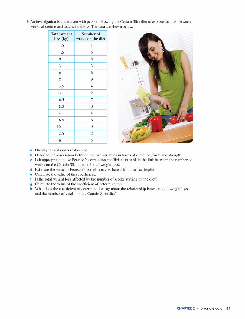
9 An investigation is undertaken with people following the Certain Slim diet to explore the link between weeks of dieting and total weight loss. The data are shown below.
Total weight loss (kg)
Number of weeks on the diet
1.5 1
4.5 5
9 8
3 3
6 6
8 9
3.5 4
3 2
6.5 7
8.5 10
4 4
6.5 6
10 9
2.5 2
6 5
a Display the data on a scatterplot.b Describe the association between the two variables in terms of direction, form and strength.c Is it appropriate to use Pearson’s correlation coefficient to explain the link between the number of
weeks on the Certain Slim diet and total weight loss?d Estimate the value of Pearson’s correlation coefficient from the scatterplot.e Calculate the value of this coefficient.f Is the total weight loss affected by the number of weeks staying on the diet?g Calculate the value of the coefficient of determination.h What does the coefficient of determination say about the relationship between total weight loss
and the number of weeks on the Certain Slim diet?

82 Maths Quest 12 Further Mathematics
Summarydependent and independent variables
• Bivariate data are data with two variables.• In a relationship involving two variables, if the values of one variable depend on the values of
another variable, then the former variable is referred to as the dependent variable and the latter variable is referred to as the independent variable.
• When data are displayed on a graph, the independent variable is placed on the horizontal axis and the dependent variable is placed on the vertical axis.
Back-to-back stem plots
• A back-to-back stem plot displays bivariate data involving a numerical variable and a categorical variable with two categories.
• Together with summary statistics, back-to-back stem plots can be used to compare the two distributions.
parallel boxplots • To display a relationship between a numerical variable and a categorical variable with two or more categories, we can use a parallel boxplot.
• A parallel boxplot is obtained by constructing individual boxplots for each distribution and positioning them on a common scale.
Two-way frequency tables and segmented bar charts
• The two-way frequency table is a tool for examining the relationship between two categorical variables.
• If the total number of scores in each of the two categories is unequal, percentages should be calculated to analyse the table properly.
• When the independent variable is placed in the columns of the table, the numbers in each column should be expressed as a percentage of that column’s total.
• The data in a two-way frequency table in percentage form can be represented graphically as a segmented bar chart.
• The columns in a segmented bar chart match the columns in a two-way frequency table. Each segment corresponds to each cell in the table.
Scatterplots • A scatterplot gives a visual display of the relationship between two numerical variables.• In analysing the scatterplot we look for a pattern in the way the points lie. Certain patterns tell us
that certain relationships exist between the two variables. This is referred to as a correlation. We look at what type of correlation exists and how strong it is.
• When describing the relationship between two variables displayed on a scatterplot, we need to comment on:(a) the direction — whether it is positive or negative(b) the form — whether it is linear or non-linear(c) the strength — whether it is strong, moderate or weak(d) possible outliers.
pearson’s product–moment correlation coefficient
• Pearson’s product–moment correlation coeffi cient is used to measure the strength of a linear relationship between two variables.
• The symbol for Pearson’s product–moment correlation coeffi cient is r.• The calculation of r is applicable to sets of bivariate data which are known to be linear in form and
which don’t have outliers.
ChapTer 2 • Bivariate data 83
• The value of r can be estimated from the scatterplot; −1 ≤ r ≤ 1.
• The formula for calculating Pearson’s correlation coeffi cient r is as follows:
rn
x xs
y ys
1
1i
x
i
yi
n
1∑=
−−
−
=
where n is the number of pairs of data in the set sx is the standard deviation of the x-values sy is the standard deviation of the y-values x is the mean of the x-values y is the mean of the y-values.
• The calculation of r is often done using a CAS calculator.• Even if we fi nd that two variables have a very high degree of correlation, for example r = 0.95, we
cannot say that the value of one variable is caused by the value of the other variable.• If r = 1 or −1 there is a perfect linear relationship.
Calculating r and the coefficient of determination
• The coeffi cient of determination = r 2; 0 ≤ r 2 ≤ 1.• The coeffi cient of determination is useful when we have two variables which have a linear
relationship. It tells us the proportion of variation in one variable which can be explained by the variation in the other variable.
• To change the value of r 2 to a percentage, multiply it by 100.
Strong positive linear association
–0.5
–0.25
0
0.25
0.5
0.75
1
–1
–0.75
Moderate positive linear association
Weak positive linear association
No linear association
Weak negative linear association
Moderate negative linear association
Strong negative linear association
Val
ue o
f r

84 Maths Quest 12 Further Mathematics
Chapter review 1 In a study on the effectiveness of vitamin C, a researcher asked a group of people with cold and flu
symptoms to record the number of days these symptoms persisted and their daily dosage (in mg) of vitamin C. If the researcher wishes to represent these data graphically, which of the following should she do? a Show the number of days the symptoms persisted on the x-axis, as this is the independent variable
and the daily dosage of vitamin C on the y-axis, as this is the dependent variable.B Show the daily dosage of vitamin C on the x-axis, as this is the dependent variable and the
number of days the symptoms persisted on the y-axis, as this is the independent variable.C Show the number of days the symptoms persisted on the x-axis, as this is the dependent variable
and the daily dosage of vitamin C on the y-axis, as this is the independent variable.d Show the daily dosage of vitamin C on the x-axis, as this is the independent variable and the
number of days the symptoms persisted on the y-axis, as this is the dependent variable.e It is impossible to decide which of the two variables is dependent and which one is independent,
so it does not matter which axes we use.
2 A back-to-back stem plot is a useful way of displaying the relationship between:a the number of children attending a day care centre and whether or not the centre has federal
fundingB height and wrist circumferenceC age and weekly incomed weight and the number of takeaway meals eaten each weeke the age of a car and amount spent each year on servicing it
The following information relates to questions 3 and 4. The salaries of people working at fi ve different advertising companies are shown on the following parallel boxplots.
3 The company with the largest interquartile range is:a Company AB Company BC Company Cd Company De Company E
4 The company with the lowest median is:a Company AB Company BC Company Cd Company De Company E
Questions 5 and 6 relate to the following information. Data showing reactions of junior staff and senior staff to a relocation of offi ces are given below in a
two-way frequency table.
Attitude Junior staff Senior staff Total
For 23 14 37
Against 31 41 72
Total 54 55 109
5 From this table, we can conclude that:a 23% of junior staff were for the relocationB 42.6% of junior staff were for the relocationC 31% of junior staff were against the relocationd 62.1% of junior staff were for the relocatione 28.4% of junior staff were against the relocation
mUlTipleChoiCe
100 150
Company D
50
Annual salary (× $1000)
Company E
Company C
Company B
Company A
10 20 30 40 60 70 80 90 110120130140

ChapTer 2 • Bivariate data 85
6 From this table, we can conclude that:a 14% of senior staff were for the relocationB 37.8% of senior staff were for the relocationC 12.8% of senior staff were for the relocationd 72% of senior staff were against the relocatione 74.5% of senior staff were against the relocation
7 The relationship between the variables x and y is shown on the scatterplot at right. The correlation between x and y would be best described as:a a weak positive associationB a weak negative associationC a strong positive associationd a strong negative associatione non-existent
8 A set of data relating the variables x and y is found to have an r value of −0.83. The scatterplot that would best represent this data set is:
a y
x
B y
x
C y
x
d y
x
e y
x
9 A set of data comparing age with blood pressure is found to have a Pearson’s correlation coefficient of 0.86. The coefficient of determination for these data would be closest to:a −0.86 B −0.74 C −0.43 d 0.43 e 0.74
ShorT anSWer
1 For each of the following, write down which is the dependent and which is the independent variable or whether it is appropriate to classify the variables as such.a The number of injuries in a netball season and the age of a netball playerb The suburb and the size of a home mortgagec IQ and weight
2 The number of hours of counselling received by a group of 9 full-time firefighters and 9 volunteer firefighters after a serious bushfire is given below.
Full-time 2 4 3 5 2 4 6 1 3
Volunteer 8 10 11 11 12 13 13 14 15
a Construct a back-to-back stem plot to display the data.b Comment on the distributions of the number of hours of counselling of the full-time fi refi ghters
and the volunteers.
y
x
86 Maths Quest 12 Further Mathematics
3 The IQ of 8 players in 3 different football teams were recorded and are shown below.
Team A 120 105 140 116 98 105 130 102
Team B 110 104 120 109 106 95 102 100
Team C 121 115 145 130 120 114 116 123
Display the data in parallel boxplots.
4 Delegates at the respective Liberal and Labor Party conferences were surveyed on whether or not they believed that uranium mining should continue. Forty-five Liberal delegates were surveyed and 15 were against continuation. Fifty-three Labor delegates were surveyed and 43 were against continuation.a Present the data as percentages in a two-way frequency table and a segmented bar chart.b Comment on any difference between the reactions of the Liberal and Labor delegates.
5 a Construct a scatterplot for the data given in the table below.
Age 15 17 18 16 19 19 17 15 17
Pulse rate 79 74 75 85 82 76 77 72 70
b Use the scatterplot to comment on any relationship which exists between the variables.
6 For the variables shown on the scatterplot below, give an estimate of the value of r and use it to comment on the nature of the relationship between the two variables.
y
x
7 The table at right gives data relating the percentage of lectures attended by students in a semester and the corresponding mark for each student in the exam for that subject.a Construct a scatterplot for these data.b Comment on the correlation between the lectures attended and the
examination results and make an estimate of r.c Calculate r.d Calculate the coeffi cient of determination.e Write the proportion of the variation in the examination results
that can be explained by the variation in the number of lectures attended.
Lectures attended (%)
Exam result (%)
70 8059 6285 8993 9878 8485 9184 8369 7270 7582 85

ChapTer 2 • Bivariate data 87
1 An investigation into the relationship between age and salary bracket among some employees of a large computer company is made and the results are shown at right.a State which is the independent variable and
which is the dependent variable.b State which of the following you could use to
display the data: i back-to-back stem plot ii parallel boxplot iii scatterplot iv two-way frequency table in percentage form.c State which of the following you could calculate in order to fi nd out more about the relationship
between age and salary bracket: i r, the Pearson product–moment correlation coeffi cient ii the coeffi cient of determination.
2 For marketing purposes, the administration of the Arts Centre needs to compare the ages of people attending two different concerts: a symphony orchestra concert and a jazz concert. Twenty people were randomly selected from each audience and their ages were recorded as shown.
Event Ages of people attending the event
Symphony orchestra concert
20, 23, 30, 35, 39, 42, 45, 45, 47, 48, 48, 49, 49, 50, 53, 54, 56, 58, 58, 60
Jazz concert 16, 18, 19, 19, 20, 23, 24, 27, 29, 30, 33, 34, 38, 39, 40, 42, 43, 45, 46, 62
a Display the data on a back-to-back stem plot.b For each category calculate the following statistics:
ii Xmin ii Q1 iii median iv Q3 v Xmax vi mean vii interquartile range (IQR) viii standard deviation.
exTended reSponSe
Salary bracket (× $1000) Age
20–39 32 21 43 23 22 27 37
40–59 29 31 37 26 33 37
60–79 41 29 39 42 47 45 43 38
80–99 43 48 38 37 49 51 53 59
100–120 48 37 55 61

88 Maths Quest 12 Further Mathematics
c Use the stem plot together with some summary statistics to compare the distributions of the ages of patrons attending the two concerts.
One month later, at the beginning of the opera season, twenty people were again selected (this time from the opera audience) and their ages were recorded as shown.
Event Ages of people attending the event
Opera 12, 18, 29, 30, 33, 35, 38, 39, 42, 46, 49, 50, 54, 56, 56, 57, 59, 63, 65, 68
The administration of the Arts Centre now wishes to compare all three distributions of the ages.d Explain why it is not possible to use a back-to-back stem plot for this task.e Calculate the eight summary statistics for the ages of the opera-goers (as in part b above). f Display the data for the three events using parallel boxplots.g Use the boxplots and some summary statistics to compare the three distributions.
3 In one study, 380 Year 12 students were asked how often they were engaged in any sporting activity outside school. Students were also asked to classify their stress level in relation to their VCE studies. The results at right were obtained.
Level of stress
Engaged in sporting activity outside school
Regularly Sometimes Never
Low 16 32 36
Medium 12 40 56
High 6 52 130
a In this study, which would be the independent variable: stress level, or the amount of sporting activity?b How many students in this study reported a high level of stress?c How many students were engaged in sport activity outside of school?d Represent the data in a two-way frequency table in percentage form.e Display the data from part d using a segmented bar chart.f Comment on any relationship between the stress level and the amount of sporting activity for this
group of Year 12 students.
4 The data in the table below show the number of hours spent by students learning to touch-type and their corresponding speed in words per minute (wpm).
Time (h) 20 33 22 39 40 37 46 44 24 36 50 48 29
Speed (wpm) 34 46 38 53 52 49 60 58 36 42 65 63 40
a State which variable is independent and which is dependent.b Represent the data on a scatterplot.c Use the scatterplot to comment on the relationship between the two variables.d Is it appropriate to use these data to calculate the value of Pearson’s product–moment correlation
coeffi cient? Explain.e Estimate the value of r from the scatterplot.f Calculate the value of r using a CAS calculator. Does the value of r support the observations you
made in part c?g Calculate the coeffi cient of determination and interpret the result.
diGiTal doCdoc-9417
Test YourselfChapter 2
Units: 3 & 4
AOS: DA
Practice VCE exam questions
Use StudyON to access all exam questions on this topic since 2002.

ChapTer 2 • Bivariate data 89
ICT activitiesChapter openerdiGiTal doC
• 10 Quick Questions doc-9409: Warm up with a quick quiz on bivariate data. (page 57)
2B Back-to-back stem plotsTUTorial
• We 2 eles-1259: Watch a tutorial on displaying data on a back-to-back stem plot. (page 59)
2C parallel boxplotsdiGiTal doCS
• Spreadsheet doc-9410: Compare two sets of data using parallel boxplots. (page 64)
• WorkSHEET 2.1 doc-9411: Identify independent and dependent variables and construct parallel boxplots and back-to-back stem plots. (page 65)
2d Two-way frequency tables and segmented bar chartsdiGiTal doCS
• Spreadsheet doc-9413: Construct a two-way frequency table. (page 67)• SkillSHEET 2.1 doc-9412: Practise expressing one number as a
percentage of another. (page 68)
TUTorial• We 7 eles-1260: Learn how to present data in a two-way table.
(page 67)
2e ScatterplotsdiGiTal doC
• Spreadsheet doc-9414: Investigate the relationship between two variables by constructing a scatterplot (page 73)
TUTorial• We 9 eles-1261: Watch a worked example on constructing a
scatterplot to determine the relationship between the heights of students and the number of hours they study. (page 71)
2F pearson’s product–moment correlation coefficientdiGiTal doC
• WorkSHEET 2.2 doc-9415: Displaying data using scatterplots and recognising linear and non-linear relationships. (page 76)
TUTorial• We 10 eles-1262: Watch a worked example on estimating r and
using it to comment on the relationship between two variables. (page 74)
inTeraCTiViTY• Pearson’s product–moment correlation coefficient int-0183: Use the
interactivity to consolidate your knowledge of Pearson’s product –moment correlation coefficient and how it relates to bivariate data. (page 73)
2G Calculating r and the coefficient of determinationdiGiTal doC
• Spreadsheet doc-9416: Investigate Pearson’s product–moment correlation coefficient and the coefficient of determination. (page 79)
TUTorialS• We11 eles-1244: Watch a worked example on how to construct a
scatterplot and use it to estimate the value of r. (page 77)• We12 eles-1263: Watch a worked example on calculating the
coefficient of determination and how it is used to interpret the relationship between two variables. (page 78)
Chapter reviewdiGiTal doC
• Test Yourself doc-9417: Take the end-of-chapter test to test your progress. (page 88)
To access eBookPLUS activities, log on to www.jacplus.com.au
90 Maths Quest 12 Further Mathematics
Answers CHAPTER 2
BiVariaTe daTa exercise 2a dependent and independent variables 1 a Independent — age, dependent — salary b Independent — amount of fertiliser,
dependent — growth c Not appropriate d Not appropriate e Independent — number in household,
dependent — size of house f Independent — month of the year,
dependent — size of electricity bill g Independent — number of hours,
dependent — mark on the test h Not appropriate i Independent — season, dependent —
cost 2 C 3 C 4 D
exercise 2B Back-to-back stem plots 1 Key: 2|3 = 23
Leaf German
2 1 1 07 6 5 5
3 2 1 0 09 8 7 7
2 15
Stem
22*33*44*
Leaf French3 45 5 80 1 4 45 6 8 8 92 3 4 46 8
2 Key: 2*|7 = 2.7 (kg)Leaf Boys
4 48 7 6
3 29 8
0
Stem
2*33*44*5
Leaf Girls6 70 1 1 2 36 70
3 a Key: 2*|5 = 25 trucksLeaf
A2 1
7 7 6 6 54 3 2 1 0
7 5
Stem
11*22*33*
LeafB05 60 1 35 6 8 90 1 25
b For supermarket A the mean is 19, the median is 18.5, the standard deviation is 4.9 and the interquartile range is 7. The distribution is symmetric.For supermarket B the mean is 24.4, the median is 25.5, the standard deviation is 7.2 and the interquartile range is 10. The distribution is symmetric.The centre and spread of the distribution of supermarket B is higher than that of supermarket A.There is greater variation in the number of trucks arriving at supermarket B.
4 a Key: 1 |2 = 12 marksLeaf
Females
3 25 5 4 4
7 6
Stem
11111
Leaf Males02 34 4 579
b For the marks of the females, the mean is 14.5, the median is 14.5, the standard deviation is 1.6 and the interquartile range is 2. The distribution is symmetric.For the marks of the males, the mean is 14.25, the median is 14, the standard deviation is 2.8 and the interquartile range is 3.5. The distribution is symmetric.The centre of each distribution is about the same. The spread of marks for the boys is greater, however. This means that there is a wider variation in the abilities of the boys compared to the abilities of the girls.
5 a Key: 2*|6 = 26 marksLeaf 2007
1 09 7 5
3 2 1 16
Stem
22*33*44*
Leaf 200826 7 80 1 1 3 46
b The distribution of marks for 2007 and for 2008 are each symmetric.For the 2007 marks, the mean is 38.5, the median is 40, the standard deviation is 5.2 and the interquartile range is 7. The distribution is symmetric.For the 2008 marks, the mean is 29.8, the median is 30.5, the standard deviation is 4.2 and the inter-quartile range is 6.The spread of each of the distributions is much the same, but the centre of each distribution is quite different with the centre of the 2008 distribution lower. The work may have become a lot harder!
6 a Key: 3*|6 = 36 years old
Leaf Female
4 38 7 6 5
1 0
Stem
22*33*44*
Leaf Male250 16 726
b For the distribution of the females, the mean is 26.75, the median is 26.5, the standard deviation is 2.8 and the interquartile range is 4.5.For the distribution of the males, the mean is 33.6, the median is 33.5,
the standard deviation is 8.2 and the interquartile range is 12.The centre of the distributions is very different: it is much higher for the males. The spread of the ages of the females who attend the fi tness class is very small but very large for males.
7 a Key: 5|0 = 50 pointsLeaf
Kindergarten3
4 38 56 27 1
0
Stem
012345
Leaf Prep.52 75 72 54 62
b For the distribution of scores of the kindergarten children, the mean is 28.9, the median is 30, the standard deviation is 15.4 and the interquartile range is 27.For the distribution of scores for the prep. children, the mean is 29.5, the median is 29.5, the standard deviation is 15.3 and the interquartile range is 27.The distributions are very similar. There is not a lot of difference between the way the kindergarten children and the prep. children scored.
8 B 9 C exercise 2C parallel boxplots 1 a
200190180170160150140130120
11A
9A
10A
Height (cm)
b Clearly, the median height increases from Year 9 to Year 11. There is greater variation in 9A’s distribution than in 10A’s. There is a wide range of heights in the lower 25% of the distribution of 9A’s distribution. There is a greater variation in 11A’s distribution than in 10A’s, with a wide range of heights in the top 25% of the 11A distribution.
2 a
10 15
40–49 agegroup
20–29 agegroup
30–39 agegroup
0 5Annual superannuation contribution (× $1000)
b Clearly, there is a great jump in contributions to superannuation for people in their 40s. The spread of contributions for that age group is smaller than for people in their 20s or 30s, suggesting that a high proportion of people in their 40s are conscious of superannuation. For people in their 20s and 30s, the range is greater, indicating a range of interest in contributing to super.

ChapTer 2 • Bivariate data 91
3
15 205 10Number of jars sold
Multi-vitamin
B
C
A
Overall, the biggest sales were of multi-vitamins, followed by vitamin B, then C and fi nally vitamin A.
4 a True b True c False d True 5 a The Pearlfi shers b Orlando 6 a D b C
exercise 2d Two-way frequency tables and segmented bar charts 1 Attitude Female Male Total
For 37 79 116
Against 102 23 125
Total 139 102 241
2 Lesson length Junior Senior Total
45 minutes 50 33 83
1 hour 36 60 96
Total 86 93 179
3 a i 22 ii 26 iii 19 iv 45 v 41
b i 12 ii 9 iii 21 iv 42 v 33
c i 47% ii 58% iii 100% iv 100%
4 Preference Men Women
Rent by themselves 57% 59%
Share with friends 43% 41%
Total 100% 100%
5 D 6 C 7 Attitude Liberal Labor
For 35.5 39.4
Against 64.5 60.6
Total 100.0 100.0
DelegatesLiberal
Perc
enta
ge
1020
3040
5060
70
Labor
8090
100Attitude Against
For
There is not a lot of difference in the reactions.
8 a C b A
exercise 2e Scatterplots 1 a Yes — positive association b Yes — positive association c Yes — positive association d Yes — negative association e Yes — positive association f Yes — negative association g No — no association 2 a Weak, negative association of linear
form b Strong, negative association of linear
form c Moderate, positive association of linear
form d Strong, positive association of linear
form e No association f Non-linear association 3 B 4
120 200
4
100Population ('000)
6
8
10
140 160 180
Num
ber
of
prim
ary
scho
ols
0
Moderate positive association of linear form, no outliers
5
Hours of paving
Cos
t ($)
1000
2000
3000
4000
5 10 15 20 25 300
Strong positive association of linear form, no outliers
6
Time of booking(Number of days
before the performance)
Row
num
ber
in A
-Res
erve
8 12 24
8
20
14
2
0
10
16
4
12
6
4 16 28 32
Strong negative association of linear form, no outliers
exercise 2F pearson’s product–moment correlation coefficient 1 a No association b Moderate positive c Strong negative d Strong negative e Strong positive
f Strong positive g Weak negative h No association 2 a i r ≈ −0.8 ii Strong, negative, linear association b i r ≈ 0.6 ii Moderate, positive, linear association c i r ≈ 0.2 ii No linear association d i r ≈ −0.2 ii No linear association e i r = 1 ii Perfect, positive, linear association f i r ≈ 0.8 ii Strong, positive, linear association g i r ≈ 0 ii No linear association h i r ≈ −0.7 ii Moderate, negative, linear association 3 B 4 E
exercise 2G Calculating r and the coefficient of determination 1 a
Yearly salary (× $1000)N
umbe
r of
vot
es
15
25
35
140 150 170 190 210 230 240 250
105
20
30
160 180 200 2200
b There is moderate, negative linear association. r is approximately −0.6.
c r = −0.66. There is a moderate negative linear association between the yearly salary and the number of votes. That is, the larger the yearly salary of the player, the fewer the number of votes we might expect to see.
2 Coeffi cient of determination is 0.7569. The portion of variation in the number of visits to the doctor that can be explained by the variation in the number of cigarettes smoked is about 76%.
3 a
Annual advertising budget (× $1000)
Yea
rly
pro�
t inc
reas
e (%
)
2
4
6
10 12 16 20 24 28 30
1
3
5
14 18 22 26
7
98
10
0
b There is strong, positive linear association. r is approximately 0.8.
c r = 0.98 d Coeffi cient of determination is 0.96. e The proportion of the variation in
the yearly profi t increase that can be explained by the variation in the advertising budget is 96%.

92 Maths Quest 12 Further Mathematics
4 a
1
0
2
3
4
5
6
7
8
9
10
Exchange rate0.2 0.4 0.6 0.8 1.0 1.2
Num
ber
of to
uris
ts (
× 10
00)
b There is strong, negative association of a linear form and r is approximately −0.9.
c r = −0.96 d Coeffi cient of determination is 0.92. e The proportion of the variation in the
number of tourists that can be explained by the variation in the exchange rate is 92%.
5 a
Number of people in household
Wee
kly
groc
ery
cost
s ($
)
100
2 3 5
50
4 6
150
200
0
b There is strong, positive association of a linear form and r is approximately 0.9.
c r = 0.98 d Coeffi cient of determination is 0.96. e The proportion of the variation in
the weekly grocery costs that can be explained by the variation in the number of people in the household is 96%.
6 a
Number of people on committee
Ann
ual f
unds
rai
sed
(× $
1000
)
4
3 4 65 7
7
10
8
5
8
11
6
9
1213
0
b There is almost perfect positive association of a linear form and r is nearly 1.
c r = 0.99 d No. High degree of correlation does
not mean we can comment on whether one variable causes particular values in another.
e Coeffi cient of determination is 0.98.
f The proportion of the variation in the funds raised that can be explained by the variation in the number of people on the committee is 98%.
7 E 8 C 9 a
Number of weeks on the dietTo
tal w
eigh
t los
s (k
g)
2
4
6
1
1 2 3 4 5 6 7 8 9 10
3
5
7
98
10
0
b The scatterplot shows strong, positive association of linear form.
c It is appropriate since the scatterplot indicates association showing linear form and there are no outliers.
d r ≈ 0.9 e r = 0.96 f We cannot say whether total weight loss
is affected by the number of weeks people stayed on the Certain Slim diet. We can only note the degree of correlation.
g r2 = 0.92 h The coeffi cient of determination tells us
that 92% of the variation in total weight loss can be explained by the variation in the number of weeks on the Certain Slim diet.
ChapTer reVieWmUlTiple ChoiCe
1 D 2 A 3 A 4 E 5 B 6 E 7 D 8 D 9 E
ShorT anSWer
1 a Number of injuries — dependent, age of player — independent
b Suburb — independent, size of mortgage — dependent
c It is not appropriate to designate one or other as independent or dependent.
2 a Leaf Full-time
12 2
4 4 3 36 5
Stem
0000011111
Leaf Volunteer
80 1 12 3 34 5
Key: 0|3 = 3 hours b Both distributions are symmetric
with the same spread. The centre of the volunteers’ distribution is much higher than that of the full-time fi refi ghters’ distribution. Clearly, the volunteers needed more counselling.
3
90 100 110 120 130 140 150
Team C
Team A
Team B
IQ
4 aAttitude Liberal Labor
For 66.7 18.9
Against 33.3 81.1
Total 100.0 100.0
DelegatesLiberal
Perc
enta
ge
1020
3040
5060
70
Labor
8090
100Attitude
AgainstFor
b Clearly, the reaction to uranium mining is affected by political affi liation.
5 a
Age
Puls
e ra
te
15 16 18
75
17 19
80
70
85
0
b There appears to be an extremely weak or no association between the variables.
6 r is approximately equal to −0.7. There is a moderate, negative linear association between the variables x and y.
7 a
Lectures attended (%)
Exa
m r
esul
t (%
)
60 70 90
65
80 100
80
95
70
85
0
55
100
75
90
60
b There is strong, positive correlation of a linear form between the variables and r is approximately equal to 0.8.
c r = 0.96

ChapTer 2 • Bivariate data 93
d The coeffi cient of determination is 0.93. e The proportion of the variation in the
exam results that can be explained by the variation in the number of lectures attended is 93%.
exTended reSponSe
1 a Age is independent and salary bracket is the dependent variable.
b Parallel boxplot c Neither, since we have categorical data
versus numerical data and not numerical data versus numerical data.
2 a Key: 1|6 = 16 years oldLeaf
Jazz concert9 9 8 6
9 7 4 3 09 8 4 3 06 5 3 2 0
2
Stem
123456
Leaf Symphony concert
0 30 5 92 5 5 7 8 8 9 90 3 4 6 8 80
b
SummarySymphony concert
Jazz concert
i Xmin 20 16
ii Q1 40.5 21.5
iii Median 48 31.5
iv Q3 53.5 41
v Xmax 60 62
vi Mean 45.45 32.35
vii IQR 13 19.5
viii Standard deviation
11.20 12.04
c Overall, it appears that people who attended the symphony concert were older than those who attended the jazz concert. The spread of ages is nearly
the same (slightly higher for the jazz audience).
d Back-to-back stem plots can be used only for data with two categories. Since there are three events, parallel boxplots should be used.
e Xmin = 12, Q1 = 34, median = 47.5, Q3 = 56.5, Xmax = 68, mean = 44.95, IQR = 22.5, standard deviation = 15.55
f
2015 25 35 45 5530 40 50 60 6570
Opera
Jazz
Symphony
Age
g Overall, the people who went to the symphony concert and to the opera were of similar ages and older than those who went to the jazz concert. The ages of people who went to the opera are the most spread out, while the ages of people who attended the symphony concert are the least spread out.
3 a The amount of sporting activity is independent; the level of stress is dependent.
b 188 c 158 d
Level of stress
Engaged in sport activity outside school
Regularly Sometimes Never
Low 47.1% 25.8% 16.2%
Medium 35.3% 32.3% 25.2%
High 17.6% 41.9% 58.6%
Total 100% 100% 100%
e
Amount of exercise
Regularly
Perc
enta
ge
1020
3040
5060
70
Sometimes Never
8090
100
Stress levelHighMediumLow
f Overall, it appears that for this group of students, stress levels are related to the amount of physical activity they are engaged in outside of school.
4 a Hours spent touch-typing — independent, speed of touch-typing — dependent.
b
3035404550556065
20 25 30 35 40 45 50
Time (h)
Spee
d (w
pm)
0
c Strong, positive, linear relationship between the two variables
d Yes, since the scatterplot shows a linear relationship with no outliers.
e r is about 0.9 f r = 0.97; yes g r2 = 0.94. This means that 94% of
variation in the speed of touch-typing can be explained by variation in the number of hours spent touch-typing.


![Students’ Integrated Maths Module for Bivariate Data 1 · [SIMM] Bivariate Data 1 3 Introduction for students: At the end of this module you should have increased your ability to;](https://static.fdocuments.us/doc/165x107/5e282fcae919422213384bc7/studentsa-integrated-maths-module-for-bivariate-data-1-simm-bivariate-data-1.jpg)
