Becoming Critical Analyzers of Data, 6th Grade Math
63
Trinity University Digital Commons @ Trinity Understanding by Design: Complete Collection Understanding by Design 6-2017 Becoming Critical Analyzers of Data, 6th Grade Math Claudia Cardenas Trinity University, [email protected] Follow this and additional works at: hp://digitalcommons.trinity.edu/educ_understandings is Instructional Material is brought to you for free and open access by the Understanding by Design at Digital Commons @ Trinity. For more information about this unie, please contact the author(s): [email protected]. For information about the series, including permissions, please contact the administrator: [email protected]. Repository Citation Cardenas, Claudia, "Becoming Critical Analyzers of Data, 6th Grade Math" (2017). Understanding by Design: Complete Collection. 372. hp://digitalcommons.trinity.edu/educ_understandings/372
Transcript of Becoming Critical Analyzers of Data, 6th Grade Math
Trinity UniversityDigital Commons @ Trinity
Understanding by Design: Complete Collection Understanding by Design
6-2017
Becoming Critical Analyzers of Data, 6th GradeMathClaudia CardenasTrinity University, [email protected]
Follow this and additional works at: http://digitalcommons.trinity.edu/educ_understandings
This Instructional Material is brought to you for free and open access by the Understanding by Design at Digital Commons @ Trinity. For moreinformation about this unie, please contact the author(s): [email protected]. For information about the series, including permissions, pleasecontact the administrator: [email protected].
Repository CitationCardenas, Claudia, "Becoming Critical Analyzers of Data, 6th Grade Math" (2017). Understanding by Design: Complete Collection. 372.http://digitalcommons.trinity.edu/educ_understandings/372

UNDERSTANDING BY DESIGN
Unit Cover Page
Unit Title: Becoming Critical Analyzers of Data
Grade Level: 6th Grade
Subject/Topic Area(s): Math
Designed By: Claudia Cárdenas
Time Frame: ~23 days
School District: SAISD
School: Tafolla Middle School
School Address and Phone: 1303 W César E Chávez Blvd, San Antonio, TX 78207 and (210) 978 - 7930
Brief Summary of Unit
This unit’s focus is on data analysis including: measures of central tendency and spread shown in dot plots, stem-
and-leaf plots, histograms, and box plots (specifically TEKS 6.12A, 6.12B, 6.12C, 6.12D, 6.13A, 6.13B). Students will
be building on their prior knowledge of bar graphs, frequency tables, dot plots and stem-and-leaf plots to include
histograms and box plots. Students will be introduced to measures of central tendency, including: mean and
median, as well as measures of spread, including: mode and range. Students will not only learn how to create each
graphical representation, but they will be expected to interpret and describe information provided by these visuals
as well. This unit will culminate in a performance assessment where students will create a survey question, gather
data, analyze the data, and present the data using the graphical representations we will be studying. In this way,
students will gain personal experience with how data is obtained, evaluated, and presented in society. Students
will be able to compare various sources of data, including: newspapers, magazines, social media, sports, etc.
Students will also discuss how data can be skewed to persuade audiences towards a certain opinion and how to
become critical analysts of data in a 21st century world.

6th Grade Math: Becoming Critical Analyzers of Data (~23 days)
Stage 1 – Desired Results
Established Goals (e.g., standards) TEKS: 6.12A: Represent numeric data graphically, including dot plots, stem-and-leaf plots, histograms and box plots. (Supporting) 6.12B: Use the graphical representation of numeric data to describe the center, spread, and shape of the data distribution. (Supporting) 6.12C: Summarize numeric data with numerical summaries, including the mean and median (measures of center) and the range and interquartile range (IQR) (measures of spread) and use these summaries to describe the center, spread, and shape of the data distribution. (Readiness) 6.12D: Summarize categorical data with numerical and graphical summaries, including the mode, the percent of values in each category (relative frequency table) and the percent bar graph, and use these summaries to describe the data distribution. (Readiness) 6.13A: Interpret numeric data summarized in dot plots, stem-and-leaf plots, histograms, and box plots. (Readiness) 6.13B: Distinguish between situations that yield data with and
Transfer Students will independently use their learning to… Critically analyze data that is shown in various forms of media, such as news, social media, magazines, sports etc. Understand how data is used to persuade audiences of specific perspectives. Inference conclusions and/or predictions from any given set of data.
Meaning
Understandings Students will understand that….
• Statistical data can be represented and described in various ways.
• Choosing a graphical representation depends on the type of question being asked about the data being presented.
• Graphical representations can skew audiences’ perspectives and interpretations.
• Analysis of data is affected by the specific graphical representation.
• Data analysis reveals valuable information in any given medium.
Essential Questions Students will keep considering….
• What is data?
• How does representations and
descriptions of data influence
conclusions and/or predictions?
• What role does data analysis play in
everyday life?
• Why is it important to critically analyze
data in a 21st century world?
• How can data be manipulated to
persuade viewers of a certain opinion?
Acquisition
Knowledge Students will know…
1. Data sets include rational numbers 2. The steps to create different
graphical representations, including: dot plots, stem-and-leaf plots, histograms, and box plots
3. The difference between measures of center and measures of spread - Measures of Center: mean and
median - Measures of Spread: range and
interquartile range (IQR) 4. How outliers affect data 5. Measures of center and Measures of
spread give a summary of what is represented graphically and numerically
6. How to describe the information on different graphical representations,
Skills Students will be able to…
1. Represent numeric data in graphs: dot plots, stem-and-leaf plots, histograms, and box plots
2. Describe center, spread and shape of graphical representations and data distributions
3. Summarize numeric data with numerical summaries: mean, median, range, interquartile range (IQR)
4. Summarize categorical data with numerical and graphical summaries: mode, relative frequency, percent bar graph
5. Interpret numeric data summarized in: dot plots, stem-and-leaf plots, histograms, and box plots
6. Distinguish between situations that yield data with and without variability

without variability. (Supporting)
including: dot plots, stem-and-leaf plots, histograms, and box plots
7. The steps to find mean, median, mode, range, and interquartile range - Mean: the sum of all numbers
divided by the quantity of data points
- Median: the middle number of a data set in numerical order
- Mode: the number that occurs the most in a data set
- Range: the difference between the greatest and least number in a list of data
- Interquartile range: the difference between the median of the third quarter and the median of the first quarter in a list of data
8. How to find the median when given two numbers in the middle of a data set
9. The differences between mean, median, mode, range, and interquartile range
10. The specific steps needed to create an accurate graphical representation
11. How to describe the data distribution using the unit’s academic vocabulary
12. How to decide which graphical representation will best visualize the given data
13. The difference between numerical data and categorical data
14. Categorical and numerical data cannot always be displayed by the same graphical representation
15. How to find relative frequency using a table
16. How to display relative frequency using a percent bar graph
17. The difference between situations that yield data with and without variability
18. Situations differ in yielding data with or without variability
7. Find mean, median, mode, range, and interquartile range (IQR) of a given data set
8. Represent data on a dot plot, stem-and-leaf plot, histogram, box plot, and percent bar graph
9. Differentiate between various graphical representations and their information
10. Determine which graphical representation will best visualize a given set of data
11. Defend arguments using academic vocabulary and data from different graphical representations
Stage 2 – Evidence
CODE (M or T)
Evaluative Criteria (for rubric)
T
M/T
T
T
M
T
M M M M M M
Content Calculations Graphs Summary Quality (Neatness) Presentation
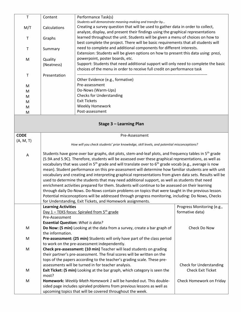
Performance Task(s) Students will demonstrate meaning-making and transfer by…
Creating a survey question that will be used to gather data in order to collect, analyze, display, and present their findings using the graphical representations learned throughout the unit. Students will be given a menu of choices on how to best complete the project. There will be basic requirements that all students will need to complete and additional components for different interests. Extension: Students will be given options on how to present this data using: prezi, powerpoint, poster boards, etc. Support: Students that need additional support will only need to complete the basic choices of the menu in order to receive full credit on performance task -------------------------------------------------------------------------------------------------- Other Evidence (e.g., formative) Pre-assessment Do-Nows (Warm-Ups) Checks for Understanding Exit Tickets Weekly Homework Post-assessment
Stage 3 – Learning Plan
CODE (A, M, T)
A
Pre-Assessment
How will you check students’ prior knowledge, skill levels, and potential misconceptions?
Students have gone over bar graphs, dot plots, stem-and-leaf plots, and frequency tables in 5th grade (5.9A and 5.9C). Therefore, students will be assessed over these graphical representations, as well as vocabulary that was used in 5th grade and will translate over to 6th grade vocab (e.g., average is now mean). Student performance on this pre-assessment will determine how familiar students are with unit vocabulary and creating and interpreting graphical representations from given data sets. Results will be used to determine the students that may need additional support, as well as students that need enrichment activities prepared for them. Students will continue to be assessed on their learning through daily Do-Nows. Do-Nows contain problems on topics that were taught in the previous lesson. Potential misconceptions will be addressed through progress monitoring, including: Do Nows, Checks for Understanding, Exit Tickets, and Homework assignments.
M
M
M
M
M
Learning Activities Day 1 – TEKS focus: Spiraled from 5th grade Pre-Assessment Essential Question: What is data? Do Now: (5 min) Looking at the data from a survey, create a bar graph of the information. Pre-assessment: (25 min) Students will only have part of the class period to work on the pre-assessment independently. Check pre-assessment: (10 min) Teacher will lead students on grading their partner’s pre-assessment. The final scores will be written on the tops of the papers according to the teacher’s grading scale. These pre-assessments will be turned in for teacher analysis. Exit Ticket: (5 min) Looking at the bar graph, which category is seen the most? Homework: Weekly Math Homework 1 will be handed out. This double-sided page includes spiraled problems from previous lessons as well as upcoming topics that will be covered throughout the week.
Progress Monitoring (e.g., formative data)
Check Do Now
Check for Understanding Check Exit Ticket
Check Homework on Friday

M
A
A/M
M
M
M
A/M
A/M
Day 2 – TEKS focus: 6.12C & 6.13B Vocabulary & Data with/without Variability Essential Question: What is data? Do Now: (5 min) Looking at the data from a survey, create a dot plot of the information. Vocabulary Intro: (20 min) Teacher will go through vocabulary including: term, definition, helpful hint and visual aid Example: Mode: the number in a data set that occurs the most Helpful hint: Mo’ often than any other number Visual: mode
1,1,1,1,1,1,1,2,2,2,3,3,4 Students will take notes on a coordinating page where they will fill in the blanks with the term and draw the visual. Data with/without Variability: (15 min) Teacher will lead students through situations that could yield data with/without variability. Students will vote on what their opinion is before revealing each answer. Students will defend the choices they made by giving their reasoning for believing it has variability or does not. Exit Ticket: (5 min) Given this situation, determine if the data would have variability or not. Support your answer. Homework: Students continue to work on Weekly Math Homework 1. Day 3 – TEKS focus: 6.12C, 6.12D Mean, Median, Mode, and Range Essential Questions: What is data? How does representations and descriptions of data influence conclusions and/or predictions? How can data be manipulated to persuade viewers of a certain opinion? Do Now: (5 min) Given the following data set, list them in ascending order. Discussion: (5 min) Teacher will lead discussion on how numbers can be manipulated and how they have been manipulated throughout the year (e.g., rational number conversions, scale factors, proportions, solving equations, etc.) Data analysis is focused on the manipulation of data to reveal even more information that what is originally seen. Lesson: (30 min) Teacher reviews terms that were touched on in the vocabulary lesson. Students can use their vocabulary page as a reference. Watch video (https://www.youtube.com/watch?v=5C9LBF3b65s). I Do: Teacher will lead students in finding the mean, median, mode, and range of given data sets, as well as write statements about what the numbers mean (e.g., On average, students read 30 pages a month. The most popular number of movies students watch during a summer is 5. The middle of the list of data was 15 sodas. The data ranged 34 likes per picture.) We Do: Students will lead the teacher in finding the mean, median, mode, and range of given data sets and include their written descriptions of the data. You Do: Students will then take on the Stacking Cups Challenge. This challenge has students work in groups (2, 3, or 4 depending on how
Check Do Now
Check for Understanding
Check for Understanding Check Exit Ticket
Check Homework on Friday
Check Do Now
Check for Understanding

M
M
M
A/M
A/M
M
M
M
M A
M
M
many data points you want students to have). They will be given a set of plastic cups. Students will have 3 min to stack up their cups into a freestanding structure without them falling over. Once time is up, the teacher will collect the data from each group writing down how many cups they have in their structure. Students will write down the completed data set and find the mean, median, mode, and range of the data. This process will repeat each round. Exit Ticket: (5 min) Given the mean, median, mode, and range of the data. Write at least two sentences about what these numbers mean given the situation? Homework: Students continue to work on Weekly Math Homework 1 Day 4 – TEKS focus: 6.13A Data in the Real World Essential Questions: How does representations and descriptions of data influence conclusions and/or predictions? What role does data analysis play in everyday life? Why is it important to critically analyze data in a 21st century world? How can data be manipulated to persuade viewers of a certain opinion? Do Now: (5 min) Given this situation, determine if the data would have variability or not. Support your answer. Discussion: (5 min) What do we know about statistics and data? Where do we see data in our everyday life? What purpose does data play in our lives? Why do we think data is important? Article Analysis: (25 min) Students will be in pairs and given a set of article cutouts and an analysis sheet. Each partner will choose a different article and answer the questions on their own analysis sheet. They may help each other on answering the questions. Article Analysis Debrief: (5 min) Teacher will lead students through a debrief of activity Exit Ticket: (5 min) What are some key words that we can look for to ensure that statistical studies are valid? Homework: Students continue to work on Weekly Math Homework 1. Day 5 – TEKS focus: 6.12A, 6.12B, 6.12C, 6.12D, 6.13A Dot Plots- Representing, Summarizing, Describing, and Interpreting Essential Questions: How does representations and descriptions of data influence conclusions and/or predictions? What role does data analysis play in everyday life? Why is it important to critically analyze data in a 21st century world? How can data be manipulated to persuade viewers of a certain opinion? Do Now: (5 min) Given the dot plot, what quantity occurs the most? Lesson: (35 min) I Do: Teacher leads students through guided notes on dot plots. We Do: Students lead teacher through the completion of practice problems on creating a dot plot. You Do: Students work independently (or with partner) to complete remaining problems. Exit Ticket: (5 min) Given the dot plot, which sentence best describes the information and why? Homework: Students turn in Weekly Math Homework 1. Day 6 & 7 – TEKS focus: 6.12A, 6.12B, 6.12C, 6.12D, 6.13A
Check for Understanding Check Exit Ticket
Check Homework on Friday
Check Do Now
Check for Understanding
Check for Understanding
Check for Understanding Check Exit Ticket
Check Homework on Friday
Check Do Now
Check for Understanding
Check Exit Ticket
Check Homework

M
A
M
M
M
A
M
M
Stem-and-Leaf Plots - Representing, Summarizing, Describing, and Interpreting (2 days are given so time can be given for each problem since students will be new to seeing rational numbers in stem-and-leaf plots. Day 6’s ending point will be Day 7’s beginning point) Essential Questions: How does representations and descriptions of data influence conclusions and/or predictions? What role does data analysis play in everyday life? Why is it important to critically analyze data in a 21st century world? How can data be manipulated to persuade viewers of a certain opinion? Do Now: (5 min) Given the stem-and-leaf plot, how many values are greater than _____? Lesson: (35 min) I Do: Teacher leads students through guided notes. We Do: Students lead teacher through the completion of practice problems on creating stem-and-leaf plots. You Do: Students work independently (or with partner) to complete remaining problems. Exit Ticket: (5 min) Given the stem-and-leaf plot, which sentence best describes the information and why? Homework: Students work on Weekly Math Homework 2. Day 8 & 9 – TEKS focus: 6.12A, 6.12B, 6.12C, 6.12D, 6.13A Histograms - Representing, Summarizing, Describing, and Interpreting (2 days are given so time can be given for each problem since students will be new to seeing histograms. Day 8’s ending point will be Day 9’s beginning point) Essential Questions: How does representations and descriptions of data influence conclusions and/or predictions? What role does data analysis play in everyday life? Why is it important to critically analyze data in a 21st century world? How can data be manipulated to persuade viewers of a certain opinion? Do Now: (5 min) Given the stem-and-leaf plot, how many values are lesser than _____? Lesson: (35 min) I Do: Teacher leads students through guided notes. We Do: Students lead teacher through the completion of practice problems on histograms. You Do: Students work independently (or with partner) to complete remaining problems. Exit Ticket: (5 min) Given the histogram, which sentence best describes the information and why? Homework: Students work on Weekly Math Homework 2. Day 10 & 11 – TEKS focus: 6.12A, 6.12B, 6.12C, 6.12D, 6.13A Box Plots - Representing, Summarizing, Describing, and Interpreting (2 days are given so time can be given for each problem since students will be new to seeing box plots. Day 10’s ending point will be Day 11’s beginning point) Essential Questions: How does representations and descriptions of data influence conclusions and/or predictions? What role does data analysis play in everyday life? Why is it important to critically analyze data in a
Check Do Now
Check for Understanding Check Exit Ticket
Check Homework on Friday
Check Do Now
Check for Understanding Check Exit Ticket
Check Homework on Friday

M
A
M
M
M A
M M
M
M
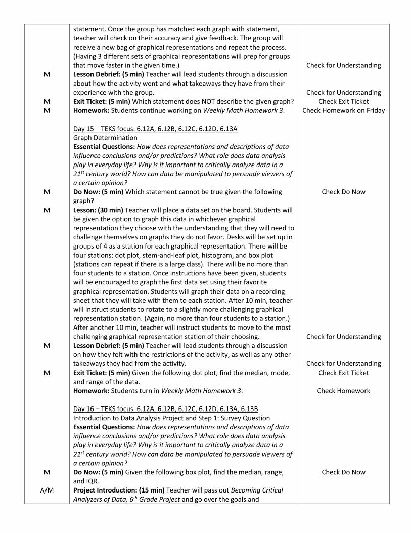
21st century world? How can data be manipulated to persuade viewers of a certain opinion? Do Now: (5 min) Given the histogram, what labels would you use for the x- and y- axes? Lesson: (35 min) I Do: Teacher leads students through guided notes. We Do: Students lead teacher through the completion of practice problems on creating box plots. You Do: Students work independently (or with partner) to complete remaining problems. Exit Ticket: (5 min) Given the box plot, which sentence best describes the information and why? Homework: Students turn in Weekly Math Homework 2 and begin working on Weekly Math Homework 3. Day 12 & 13 – TEKS focus: 6.12A, 6.12B, 6.12C, 6.12D, 6.13A Categorical Data & Relative Frequency Graphs - Representing, Summarizing, Describing, and Interpreting (2 days are given so time can be given for each problem since students will be new to creating relative frequency graphs with percents. Day 12’s ending point will be Day 13’s beginning point) Essential Questions: How does representations and descriptions of data influence conclusions and/or predictions? What role does data analysis play in everyday life? Why is it important to critically analyze data in a 21st century world? How can data be manipulated to persuade viewers of a certain opinion? Do Now: (5 min) Given the box plot, what is the range of the data? Lesson: (35 min) I Do: Teacher leads students through guided notes. We Do: Students lead teacher through the completion of practice problems on creating relative frequency graphs. You Do: Students work independently (or with partner) to complete remaining problems. Exit Ticket: (5 min) Given the graph, what was the most popular choice? Homework: Students work on Weekly Math Homework 3. Day 14 – TEKS focus: 6.12A, 6.12B, 6.12C, 6.12D, 6.13A Graph Differentiation Essential Questions: How does representations and descriptions of data influence conclusions and/or predictions? What role does data analysis play in everyday life? Why is it important to critically analyze data in a 21st century world? How can data be manipulated to persuade viewers of a certain opinion? Do Now: (5 min) Fill in the relative frequency table using the given information. Lesson: (30 min) Teacher will split students into groups of 4. Each group will be given a bag of cards. Each card will have a different graphical representation: dot plot, stem-and-leaf plot, histogram, and box plot. (These graphical representations will be graphing the same data set.) There will also be a card with the original data set and four valid statements. Students will each take a graphical representation and determine which statement best describes their graph. Students will use a recording sheet to write down which graph they matched with which
Check Do Now
Check for Understanding Check Exit Ticket
Check Homework 2
Check Do Now
Check for Understanding Check Exit Ticket
Check Homework on Friday
Check Do Now
M
M M
M
M
M
M
M
A/M
statement. Once the group has matched each graph with statement, teacher will check on their accuracy and give feedback. The group will receive a new bag of graphical representations and repeat the process. (Having 3 different sets of graphical representations will prep for groups that move faster in the given time.) Lesson Debrief: (5 min) Teacher will lead students through a discussion about how the activity went and what takeaways they have from their experience with the group. Exit Ticket: (5 min) Which statement does NOT describe the given graph? Homework: Students continue working on Weekly Math Homework 3. Day 15 – TEKS focus: 6.12A, 6.12B, 6.12C, 6.12D, 6.13A Graph Determination Essential Questions: How does representations and descriptions of data influence conclusions and/or predictions? What role does data analysis play in everyday life? Why is it important to critically analyze data in a 21st century world? How can data be manipulated to persuade viewers of a certain opinion? Do Now: (5 min) Which statement cannot be true given the following graph? Lesson: (30 min) Teacher will place a data set on the board. Students will be given the option to graph this data in whichever graphical representation they choose with the understanding that they will need to challenge themselves on graphs they do not favor. Desks will be set up in groups of 4 as a station for each graphical representation. There will be four stations: dot plot, stem-and-leaf plot, histogram, and box plot (stations can repeat if there is a large class). There will be no more than four students to a station. Once instructions have been given, students will be encouraged to graph the first data set using their favorite graphical representation. Students will graph their data on a recording sheet that they will take with them to each station. After 10 min, teacher will instruct students to rotate to a slightly more challenging graphical representation station. (Again, no more than four students to a station.) After another 10 min, teacher will instruct students to move to the most challenging graphical representation station of their choosing. Lesson Debrief: (5 min) Teacher will lead students through a discussion on how they felt with the restrictions of the activity, as well as any other takeaways they had from the activity. Exit Ticket: (5 min) Given the following dot plot, find the median, mode, and range of the data. Homework: Students turn in Weekly Math Homework 3. Day 16 – TEKS focus: 6.12A, 6.12B, 6.12C, 6.12D, 6.13A, 6.13B Introduction to Data Analysis Project and Step 1: Survey Question Essential Questions: How does representations and descriptions of data influence conclusions and/or predictions? What role does data analysis play in everyday life? Why is it important to critically analyze data in a 21st century world? How can data be manipulated to persuade viewers of a certain opinion? Do Now: (5 min) Given the following box plot, find the median, range, and IQR. Project Introduction: (15 min) Teacher will pass out Becoming Critical Analyzers of Data, 6th Grade Project and go over the goals and
Check for Understanding
Check for Understanding Check Exit Ticket
Check Homework on Friday
Check Do Now
Check for Understanding
Check for Understanding Check Exit Ticket
Check Homework
Check Do Now
T
M
T
M
T
M
M
T
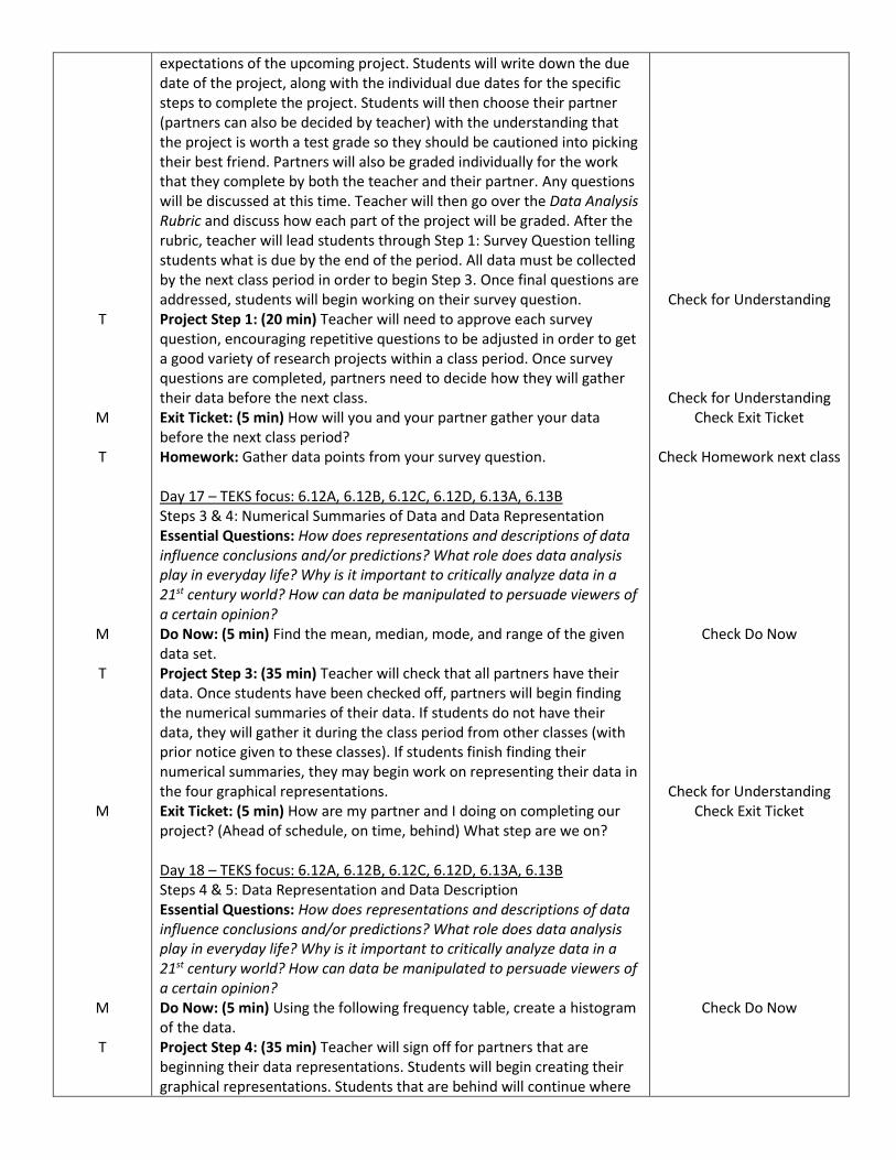
expectations of the upcoming project. Students will write down the due date of the project, along with the individual due dates for the specific steps to complete the project. Students will then choose their partner (partners can also be decided by teacher) with the understanding that the project is worth a test grade so they should be cautioned into picking their best friend. Partners will also be graded individually for the work that they complete by both the teacher and their partner. Any questions will be discussed at this time. Teacher will then go over the Data Analysis Rubric and discuss how each part of the project will be graded. After the rubric, teacher will lead students through Step 1: Survey Question telling students what is due by the end of the period. All data must be collected by the next class period in order to begin Step 3. Once final questions are addressed, students will begin working on their survey question. Project Step 1: (20 min) Teacher will need to approve each survey question, encouraging repetitive questions to be adjusted in order to get a good variety of research projects within a class period. Once survey questions are completed, partners need to decide how they will gather their data before the next class. Exit Ticket: (5 min) How will you and your partner gather your data before the next class period? Homework: Gather data points from your survey question. Day 17 – TEKS focus: 6.12A, 6.12B, 6.12C, 6.12D, 6.13A, 6.13B Steps 3 & 4: Numerical Summaries of Data and Data Representation Essential Questions: How does representations and descriptions of data influence conclusions and/or predictions? What role does data analysis play in everyday life? Why is it important to critically analyze data in a 21st century world? How can data be manipulated to persuade viewers of a certain opinion? Do Now: (5 min) Find the mean, median, mode, and range of the given data set. Project Step 3: (35 min) Teacher will check that all partners have their data. Once students have been checked off, partners will begin finding the numerical summaries of their data. If students do not have their data, they will gather it during the class period from other classes (with prior notice given to these classes). If students finish finding their numerical summaries, they may begin work on representing their data in the four graphical representations. Exit Ticket: (5 min) How are my partner and I doing on completing our project? (Ahead of schedule, on time, behind) What step are we on? Day 18 – TEKS focus: 6.12A, 6.12B, 6.12C, 6.12D, 6.13A, 6.13B Steps 4 & 5: Data Representation and Data Description Essential Questions: How does representations and descriptions of data influence conclusions and/or predictions? What role does data analysis play in everyday life? Why is it important to critically analyze data in a 21st century world? How can data be manipulated to persuade viewers of a certain opinion? Do Now: (5 min) Using the following frequency table, create a histogram of the data. Project Step 4: (35 min) Teacher will sign off for partners that are beginning their data representations. Students will begin creating their graphical representations. Students that are behind will continue where
Check for Understanding
Check for Understanding Check Exit Ticket
Check Homework next class
Check Do Now
Check for Understanding Check Exit Ticket
Check Do Now

M
M
T
M
M T
M
M
T
M
they left off. Students that finish their data representations with begin describing their data. Exit Ticket: (5 min) How are my partner and I doing on completing our project? (Ahead of schedule, on time, behind) What step are we on? Day 19 – TEKS focus 6.12A, 6.12B, 6.12C, 6.12D, 6.13A, 6.13B Steps 5 & 6: Data Description and Data Interpretation Essential Questions: How does representations and descriptions of data influence conclusions and/or predictions? What role does data analysis play in everyday life? Why is it important to critically analyze data in a 21st century world? How can data be manipulated to persuade viewers of a certain opinion? Do Now: (5 min) Given the following graph, which sentence best describes the graph? Project Steps 5 & 6: (35 min) Teacher will sign off for partners that are finishing their data description and beginning data interpretation. Students will complete both sections by the end of the day. Students that are finished with both may begin working on their data displays on whichever medium they chose: poster board, powerpoint, prezi, etc. Exit Ticket: (5 min) How are my partner and I doing on completing our project? (Ahead of schedule, on time, behind) What step are we on? Day 20 – TEKS focus: 6.12A, 6.12B, 6.12C, 6.12D, 6.13A, 6.13B Step 7: Data Display Day 1 Essential Questions: How does representations and descriptions of data influence conclusions and/or predictions? What role does data analysis play in everyday life? Why is it important to critically analyze data in a 21st century world? How can data be manipulated to persuade viewers of a certain opinion? Do Now: (5 min) Given the following data set, create a box plot. Project Step 7: (35 min) Students will all need to begin displaying their data. They may display their data on poster boards, powerpoints, prezi, etc. Exit Ticket: (5 min) How are my partner and I doing on completing our project? (Ahead of schedule, on time, behind) What step are we on? Day 21 – TEKS focus: 6.12A, 6.12B, 6.12C, 6.12D, 6.13A, 6.13B Step 7: Data Display Day 2 Essential Questions: How does representations and descriptions of data influence conclusions and/or predictions? What role does data analysis play in everyday life? Why is it important to critically analyze data in a 21st century world? How can data be manipulated to persuade viewers of a certain opinion? Do Now: (5 min) Given the following data set, create a stem-and-leaf plot. Project Step 7: (35 min) Students will continue working on their data displays. They may display their data on poster boards, powerpoints, prezi, etc. Students that are finished may take part in the Super Star Challenge where they create more than one medium for their project for extra credit (a news article, brochure, etc.). Exit Ticket: (5 min) Will my partner and I be ready to present our data tomorrow? If not, what is needed to finish before tomorrow as homework?
Check for Understanding
Check Exit Ticket
Check Do Now
Check for Understanding Check Exit Ticket
Check Do Now
Check for Understanding Check Exit Ticket
Check Do Now
Check for Understanding Check Exit Ticket
T
M
T
M
M
T
M
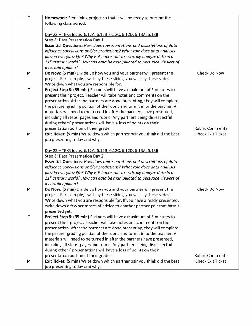
Homework: Remaining project so that it will be ready to present the following class period. Day 22 – TEKS focus: 6.12A, 6.12B, 6.12C, 6.12D, 6.13A, 6.13B Step 8: Data Presentation Day 1 Essential Questions: How does representations and descriptions of data influence conclusions and/or predictions? What role does data analysis play in everyday life? Why is it important to critically analyze data in a 21st century world? How can data be manipulated to persuade viewers of a certain opinion? Do Now: (5 min) Divide up how you and your partner will present the project. For example, I will say these slides, you will say these slides. Write down what you are responsible for. Project Step 8: (35 min) Partners will have a maximum of 5 minutes to present their project. Teacher will take notes and comments on the presentation. After the partners are done presenting, they will complete the partner grading portion of the rubric and turn it in to the teacher. All materials will need to be turned in after the partners have presented, including all steps’ pages and rubric. Any partners being disrespectful during others’ presentations will have a loss of points on their presentation portion of their grade. Exit Ticket: (5 min) Write down which partner pair you think did the best job presenting today and why. Day 23 – TEKS focus: 6.12A, 6.12B, 6.12C, 6.12D, 6.13A, 6.13B Step 8: Data Presentation Day 2 Essential Questions: How does representations and descriptions of data influence conclusions and/or predictions? What role does data analysis play in everyday life? Why is it important to critically analyze data in a 21st century world? How can data be manipulated to persuade viewers of a certain opinion? Do Now: (5 min) Divide up how you and your partner will present the project. For example, I will say these slides, you will say these slides. Write down what you are responsible for. If you have already presented, write down a few sentences of advice to another partner pair that hasn’t presented yet. Project Step 8: (35 min) Partners will have a maximum of 5 minutes to present their project. Teacher will take notes and comments on the presentation. After the partners are done presenting, they will complete the partner grading portion of the rubric and turn it in to the teacher. All materials will need to be turned in after the partners have presented, including all steps’ pages and rubric. Any partners being disrespectful during others’ presentations will have a loss of points on their presentation portion of their grade. Exit Ticket: (5 min) Write down which partner pair you think did the best job presenting today and why.
Check Do Now
Rubric Comments Check Exit Ticket
Check Do Now
Rubric Comments Check Exit Ticket
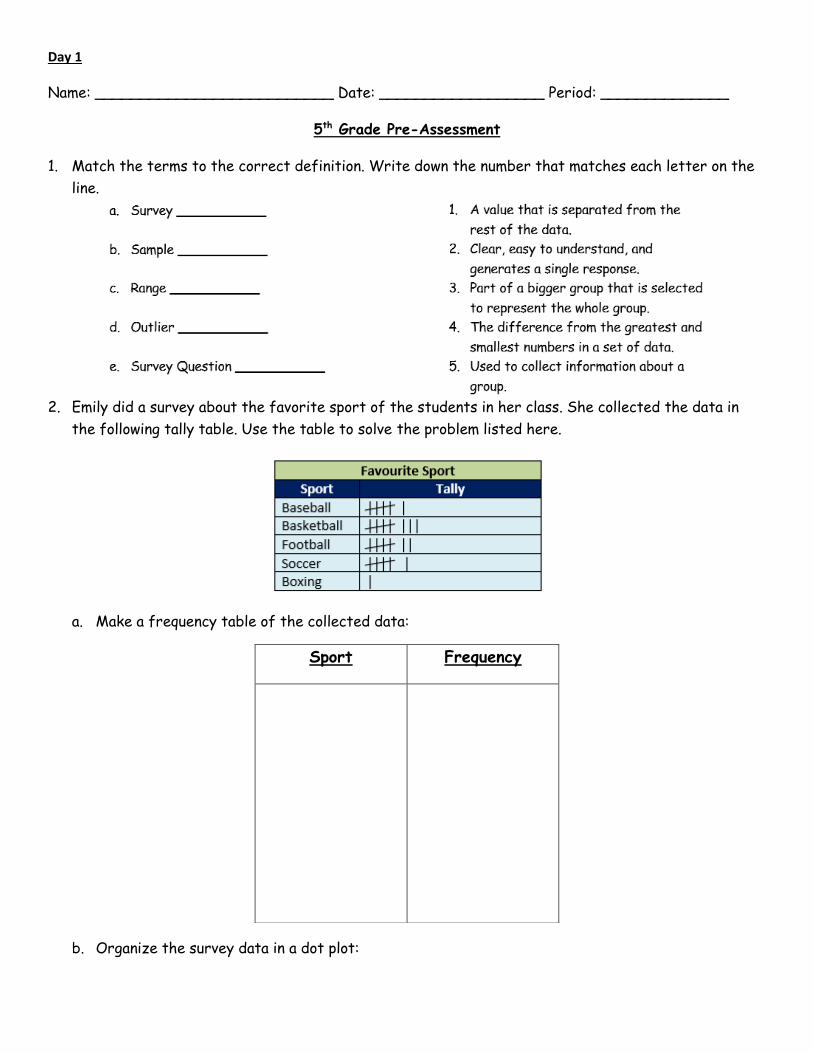
Day 1
Name: __________________________ Date: __________________ Period: ______________
5th Grade Pre-Assessment
1. Match the terms to the correct definition. Write down the number that matches each letter on the
line.
2. Emily did a survey about the favorite sport of the students in her class. She collected the data in
the following tally table. Use the table to solve the problem listed here.
a. Make a frequency table of the collected data:
b. Organize the survey data in a dot plot:
Sport Frequency
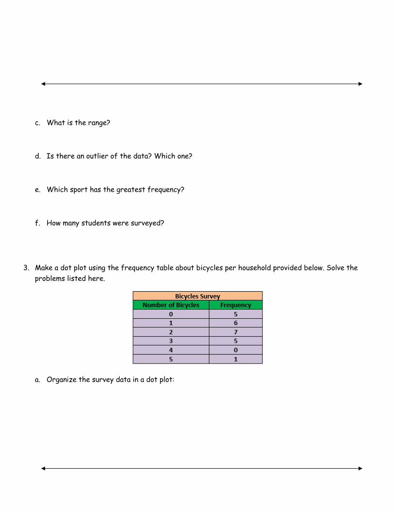
c. What is the range?
d. Is there an outlier of the data? Which one?
e. Which sport has the greatest frequency?
f. How many students were surveyed?
3. Make a dot plot using the frequency table about bicycles per household provided below. Solve the
problems listed here.
a. Organize the survey data in a dot plot:

b. What is the range of the number of bicycles?
c. Identify the outlier.
4. Emma did a survey among her friends to find out how many rooms they have in their homes. The data
is presented in the dot plot below. Use the dot plot to solve the following problems.
a. What is the range of number of rooms?
b. Which count of rooms has the least frequency?
c. How many friends were surveyed?
5. Answer the following questions based off the bar graph.
a. Did the number of eggs laid increase or decrease between Monday and Tuesday?
b. Were more eggs laid on Thursday or Friday?
c. Which day had the fewest number of eggs laid?

Day 2
Name: ____________________________ Date: ___________________ Period: _____________
Vocabulary Notes
1. _____________________: a graphical representation showing the five-number summary of
data (minimum, lower quartile, median, upper quartile, maximum)
Helpful hint: _______________________
Visual:
2. _____________________: data that represents the attributes of a group of people, events, or
objects
Helpful hint: _______________________
Visual:
3. _____________________: information that is collected about people, events, or objects
Helpful hint: _______________________
Visual:
4. _____________________: a graphical representation to organize data that uses dots (or Xs)
to show the frequency (number of times) that each number occurs
Helpful hint: _______________________
Visual:
5. _____________________: a graphical representation of adjacent bars with different heights
or lengths used to represent the frequency of data in certain ranges of continuous and equal
intervals
Helpful hint: _______________________
Visual:
6. _____________________: difference between the first quartile and the third quartile of a set
of numbers (IQR = Q3 – Q1)
Helpful hint: _______________________

Visual:
7. _____________________: average of a set of data found by finding the sum of a set of data
and dividing the sum by the number of pieces of data in the set
Helpful hint: _______________________
Visual:
8. _____________________: the middle number of a set of data that has been arranged in order
from greatest to least or least to greatest
Helpful hint: _______________________
Visual:
9. _____________________: the most frequent piece of data in a set of data
Helpful hint: _______________________
Visual:

10. _____________________: data that represents values or observations that can be measured
and placed in ascending or descending order
Helpful hint: _______________________
Visual:
11. _____________________: a graphical representation to organize data that uses solid bars that
do not touch each other to show the frequency (number of times that each category occurs as a
percentage as compared to the related part(s) or to the whole
Helpful hint: _______________________
Visual:
12. _____________________: the difference between the greatest number and least number in a
set of data
Helpful hint: _______________________
Visual:
13. _____________________: a table to organize data that lists categories and the frequency
(number of times) that each category occurs as a percent
Helpful hint: _______________________
Visual:
14. _____________________: a graphical representation used to analyze and compare groups or
clusters of numerical data by separating one place value from another place value of a data set.
The larger of the two place values is called the stem and the smaller of the two place values is
called the leaf.
Helpful hint: _______________________
Visual:
15. _____________________: measure of the spread of a set of data.
Helpful hint: _______________________
Visual:

Day 3
Name: __________________________ Date: ____________________ Period: _____________
Mean, Median, Mode, Range, IQR Practice
TEKS 6.12C, 6.12D
________________: average of a set of data found by finding the sum of a set of data and dividing
the sum by the number of pieces of data in the set.
________________: the middle number of a set of data that has been arranged in order from
greatest to least or least to greatest
________________: most frequent piece of data in a set of data
________________: the difference between the greatest number and least number in a set of data
________________: difference between the first quartile and the third quartile of a set of numbers
(IQR = Q3 – Q1)
I Do: Find the mean, median, mode, range, and IQR of the following data sets:
1) 14, 8, 7, 20, 11
Step 1: Write numbers in order from greatest to least:
Step 2: Find the median: ______________
Step 3: Find the mode: _______________
Step 4: Find the range: _______________
Step 5: Find the IQR (find the median of the upper half of the data for Q3, find the median of the
lower half of the data for Q1, subtract Q3 – Q1)
IQR: ________________

Step 6: Find the mean (add all of the numbers together and divide by how many numbers there are)
Mean: _______________
2) 16, 12, 7, 19, 10, 9, 18
Step 1: Write numbers in order from greatest to least:
Step 2: Find the median: ______________
Step 3: Find the mode: _______________
Step 4: Find the range: _______________
Step 5: Find the IQR (find the median of the upper half of the data for Q3, find the median of
the lower half of the data for Q1, subtract Q3 – Q1)
IQR: ________________
Step 6: Find the mean (add all of the numbers together and divide by how many numbers there
are)
Mean: _______________
We Do:
3) 11, 20, 9, 16, 16, 18, 20, 18
Step 1: Write numbers in order from greatest to least:
Step 2: Find the median: ______________
Step 3: Find the mode: _______________
Step 4: Find the range: _______________
Step 5: Find the IQR (find the median of the upper half of the data for Q3, find the median of
the lower half of the data for Q1, subtract Q3 – Q1)
IQR: ________________
Step 6: Find the mean (add all of the numbers together and divide by how many numbers there
are)
Mean: _______________
4) 10, 6, 19, 7, 18, 16, 6, 7
Step 1: Write numbers in order from greatest to least:
Step 2: Find the median: ______________
Step 3: Find the mode: _______________
Step 4: Find the range: _______________
Step 5: Find the IQR (find the median of the upper half of the data for Q3, find the median of
the lower half of the data for Q1, subtract Q3 – Q1)
IQR: ________________

Step 6: Find the mean (add all of the numbers together and divide by how many numbers there
are)
Mean: _______________
You Do:

Day 4
Name ____________________________Date: _______________________ Period: ___________
The Power of Statistics
How can we ensure that
a statistical study is
valid? What are some
key words look for?
It is important to be
careful as we
encounter
statistics because
sometimes they
can be
manipulated
unfairly to sway
opinions! How can
statistics be
manipulative?

Name: ___________________________ Date: ______________________ Period: _____________
Article Analysis
Using the articles that have been given to you, work with your partner to analyze them. Read through
each article and answer the following questions.
1. Write a 2-3 sentence article summary on the main points of your article.
2. What statistics (points made using data) are used in my article? Example: EXAMPLE List all
statements here:
3. Are the statistics in your article reliable? Why or why not? (use some language from the other side of
this page)

4. Would you say that the statistics in your article are powerful? Do they make the point
stronger or sway the reader’s opinion?
5. In the area below or on a separate paper, represent one of the pieces of information in your
article graphically (choose which type of graph would work best for this!)

Day 5
Name: _______________________________ Date: ____________________ Period: ________
TEKS 6.13A Dot Plots
1. How many siblings (brothers and sisters) does our class have?
a) Order the data from least to greatest: ________________________________________
b) Draw a dot plot for the data.
c) Describe the spread, center, and shape of the data distribution:
Spread: ________________________________________________________________
Center: ________________________________________________________________
Shape: ________________________________________________________________
d) Find the mean, median, mode, and range of the data.
Mean: _________________________________________________________________
Median: ________________________________________________________________
Mode: _________________________________________________________________
Range: _________________________________________________________________

2) Kate asked some friends how many movies they saw last winter.
a) Draw a dot plot for the data:
b) Describe the spread, center, and shape of the data distribution:
Spread: ________________________________________________________________
Center: ________________________________________________________________
Shape: ________________________________________________________________
c) Find the mean, median, mode, and range of the data.
Mean: _________________________________________________________________
Median: ________________________________________________________________
Mode: _________________________________________________________________
Range: _________________________________________________________________
3) Use the dot plot of the number of cars sold at a car dealership per week during the first half
of the year.

a) Find the mean, median, mode, and range of the data.
Mean: _________________________________________________________________
Median: ________________________________________________________________
Mode: _________________________________________________________________
Range: _________________________________________________________________
b) How many cars are sold in a typical week at the dealership? Explain.
___________________________________________________________________
___________________________________________________________________

Weekly Math Homework 1
Name: _____________________ Period: ______
Mean, Median, Mode, Range:

Box Plots: 1) Use the data set of the heights of several different students.
a) Order the data from least to greatest: _____________________________________
b) Find the median:______________________________________________________
c) Find the lower quartile: _________________________________________________
d) Find the upper quartile: ________________________________________________
e) Find the IQR: _______________________________________________________
f) Find the range: ______________________________________________________
g) Draw a box plot for the data.
2) The daily high temperatures for some days last month are shown.
a) Order the data from least to greatest: _____________________________________
b) Find the median:______________________________________________________
c) Find the lower quartile: _________________________________________________
d) Find the upper quartile: ________________________________________________
e) Find the IQR: _______________________________________________________
f) Find the range: ______________________________________________________
g) Draw a box plot for the data.

Day 6 & 7
Name: _____________________ Period: ______ TEKS 6.12A: Stem-and-Leaf plots
1) The 12 members of the high-school basketball team have a free-throw drill. Each player
attempts 50 free throws. The number of free throws made by each player is given.
44, 35, 29, 25, 33, 36, 35, 23, 30, 29, 19, 32
a) Order the data from least to greatest:__________________________________
b) Use the tens digits as stems. Use the ones digits as leaves. Write the leaves in
increasing order.
Free Throws Made
Stem Leaves
Key: 2│3 means 23
2) Wendy kept track of the number of text messages she sent each day for two weeks.
35, 20, 46, 29, 27, 33, 15, 52, 27, 30, 35, 24, 34, 42
a) Order the data from least to greatest:__________________________________
b) Use the tens digits as stems. Use the ones digits as leaves. Write the leaves in
increasing order.
Wendy’s Text Messages Key:
Stem Leaves

3) The number of home runs a baseball player hit in each season he played is shown in the stem-
and-leaf plot.
4) Val’s quiz scores are shown in the stem-and-leaf plot.
5) The ages of the volunteers at a local food bank are shown below.
a) Order the data from least to greatest:
___________________________________________________
b) How many seasons are included in the stem-and-leaf plot?_____
c) Find the median:______________
d) Find the mode:_______________
e) Find the range:_______________
f) Find the mean:_____________________________________
a) Order the data from least to greatest:
___________________________________________________
b) How many scores are included in the stem-and-leaf plot?_____
c) Find the median:______________
d) Find the mode:_______________
e) Find the range:_______________
a) Order the data from least to greatest:
___________________________________________________
b) How many volunteers are included in the stem-and-leaf plot?____
c) Find the median:______________
d) Find the mode:_______________
e) Find the range:_______________
Day 8 & 9
Name: _____________________ Period: ______
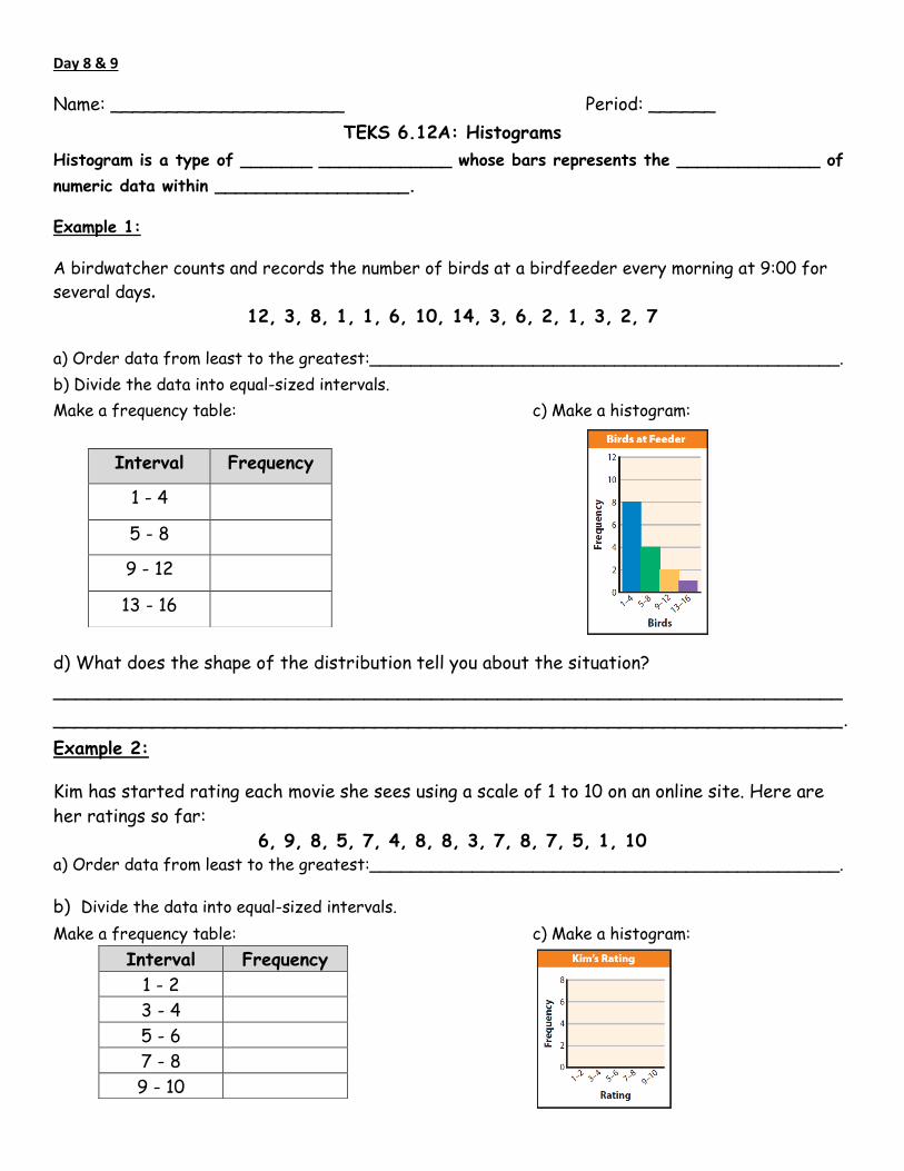
TEKS 6.12A: Histograms
Histogram is a type of _______ _____________ whose bars represents the ______________ of
numeric data within ___________________.
Example 1:
A birdwatcher counts and records the number of birds at a birdfeeder every morning at 9:00 for
several days.
12, 3, 8, 1, 1, 6, 10, 14, 3, 6, 2, 1, 3, 2, 7
a) Order data from least to the greatest:______________________________________________.
b) Divide the data into equal-sized intervals.
Make a frequency table: c) Make a histogram:
d) What does the shape of the distribution tell you about the situation?
_______________________________________________________________________
_______________________________________________________________________.
Example 2:
Kim has started rating each movie she sees using a scale of 1 to 10 on an online site. Here are
her ratings so far:
6, 9, 8, 5, 7, 4, 8, 8, 3, 7, 8, 7, 5, 1, 10 a) Order data from least to the greatest:______________________________________________.
b) Divide the data into equal-sized intervals.
Make a frequency table: c) Make a histogram:
Interval Frequency
1 - 4
5 - 8
9 - 12
13 - 16
Interval Frequency
1 - 2
3 - 4
5 - 6
7 - 8
9 - 10

You try:
3) Ed counted the number of seats available in each café in his town. Complete the frequency
table and the histogram.
18, 20, 22, 26, 10, 12, 16, 18, 7, 8
a) Order data from least to the greatest:______________________________________________.
b) Divide the data into equal-sized intervals.
Make a frequency table: c) Make a histogram:
4) An amusement park employee records the ages of the people who ride the new roller coaster
during a fifteen–minute period.
Ages of riders: 47, 16, 16, 35, 45, 43, 11, 29, 31, 50, 23, 18, 18, 20, 29, 17, 18,
48, 56, 24, 18, 21, 38, 12, 23. a) Order data from least to the greatest:______________________________________________.
b) Divide the data into equal-sized intervals.
Make a frequency table: c) Make a histogram:
Interval Frequency
1 – 7
8 – 14
15 – 21
22 - 28
Interval Frequency
10 – 19
20 – 29

Day 10 & 11
Name: _____________________ Period: ______ TEKS 6.12A: Box Plots
1) The RBIs (runs batted in) for 15 players from the 2010 Seattle Mariners are shown
h) Order the data from least to greatest: __________________________________________
i) Find the median (middle) :_____________________________________________________
j) Find the lower quartile (the median of the lower half of the data) _______________________
k) Find the upper quartile (the median of the upper half of the data) _______________________
l) Find the IQR (upper quartile – lower quartile): _____________________________________
m) Find the range ( greatest – least): _____________________________________________
n) Draw a box plot for the data.
2) The heights of several students are shown. Make a box plot for the data.
a) Order the data from least to greatest: __________________________________________
b) Find the median (middle) :_____________________________________________________
c) Find the lower quartile (the median of the lower half of the data) _______________________
d) Find the upper quartile (the median of the upper half of the data) _______________________
e) Find the IQR (upper quartile – lower quartile): _____________________________________
f) Find the range (greatest – least): _____________________________________________
g) Draw a box plot for the data.
0

TEKS 6.12A: Box Plots
3) The box plots compare the ages of dancers in two different dance troupes.
a) Find the IQR for each set of data.
Group A: IQR = Upper quartile − Lower quartile
Group B: IQR = Upper quartile − Lower quartile
b) Compare the IQRs. How do the IQRs describe the distribution of the ages in each group?
_____________________________________________________________________
_____________________________________________________________________
____________________________________________________________________.
4) The box plots compare the weekly earnings of two groups of salespeople from different
clothing stores.
a) Find the IQR for each set of data.
Group A: IQR = Upper quartile − Lower quartile
Group B: IQR = Upper quartile − Lower quartile
b) Compare the IQRs. How do the IQRs describe the distribution of the weekly earnings in each
group?
_____________________________________________________________________
_____________________________________________________________________
____________________________________________________________________.

Weekly Math Homework 2
Name: _____________________ Period: ______ *Remember*
Measures of Center
Mean Add all of the numbers together and divide by how many numbers there are.
Median The middle number. If there are two numbers in the middle, add them up and divide by 2.
Mode The number that occurs the most. If there isn’t one, write no mode.
Range Subtract the largest number minus the smallest number.
Measures of Center:
1) Find the mean, median, mode and range of the data set.
2, 5, 9, 11, 17, 19
a) Mean: _________________________________________________________________
b) Median:________________________________________________________________
c) Mode: _________________________________________________________________
d) Range: _________________________________________________________________
Box Plots:
2) Make a box plot for the data set.
36, 42, 44, 52, 61, 70, 78
a) Find the median (middle) :___________________________________________________
b) Find the lower quartile (the median of the lower half of the data) _____________________
c) Find the upper quartile (the median of the upper half of the data) ____________________
d) Find the IQR (upper quartile – lower quartile): ___________________________________
e) Find the range ( greatest – least): ____________________________________________
f) Draw a box plot for the data.

Dot Plots:
3) A baseball team scored the following number of runs over a 10-game period:
6, 6, 8, 5, 4, 6, 4, 3, 8, 4
a) Make a dot plot for the data.
b) Find the mean, median, mode, and range of the data.
Mean: ____________________________________________________________________
Median: __________________________________________________________________
Mode: ____________________________________________________________________
Range: ___________________________________________________________________
Stem-and-Leaf Plots:
4) Wendy kept track of the number of text messages she sent each day for two weeks.
a. Complete the stem-and-leaf plot.
First, order the data from smallest to largest.
Histograms:
5) Make a histogram for the data set.
First, order the data from least to
greatest.

Day 12 & 13
Name: ____________________________ Date: _____________________ Period: _____________
TEKS 6.12D Categorical Data
1. Make a histogram for the data.
Order the data from least to greatest:
Divide data into equal-sized intervals and make a frequency table:
2. Pamela sells red, blue, black, white, and green shirts online. One day Pamela received orders for 4
red, 5 blue, 6 black, 6 white, and 3 green shirts.
Complete the dot plot of Pamela’s shirt orders for the day.
Interval Frequency

Which shirt color or colors were the most and least popular that day?
Most: ________________ Least: _________________ Mode(s) of the data: ________________
Is it possible to find the mean or median of Pamela’s data set? Explain.
______________________________________________________________________________
The relative frequency of a category is the _______________ of its frequency to the ____________
of the frequencies for all categories. Relative frequency is often written as a fraction or a percent.
3. What is our class’s favorite summer sport?
Favorite Summer Sport
Sport Basketball Baseball Swimming Soccer Volleyball Football
Frequency
Step 1: Find the sum of the frequencies for all categories.
Step 2: Write the relative frequency of each category as a fraction of the total and as a percent.

Favorite Summer Sport
Sport Basketball Baseball Swimming Soccer Volleyball Football
Relative
Frequency
You try:
4. Frida has 40 dimes, 20 pennies, 10 nickels, and 10 quarters in her coin jar. Make a relative frequency
table of the coins in the jar.
Coins in a Jar
Type of
Coin
Frequency
Step 1: Find the sum of the frequencies for all categories.
Step 2: Write the relative frequency of each category as a fraction of the total and as a percent.
Coins in a Jar
Type of
Coin
Relative
Frequency

Name: ________________________ Date: ___________________ Period: _________
TEKS 6.12D Categorical Data
1. The table shows the results of a survey taken in Mr. Jaime’s music class about the student’s favorite
musical instruments. Make a percent bar graph. Then find the mode and describe how the data are
distributed.
Favorite Musical Instrument Instrument Drums Guitar Bass Saxophone Trumpet Clarinet
Frequency 6 5 3 3 2 1 Relative
Frequency
Make a bar graph of the relative frequencies.
What is the instrument mentioned most often? ________________________________________
2. Yuliana is growing tulips in her garden. She has 24 red tulips, 11 yellow tulips, and 15 purple tulips.
Make a percent bar graph and describe the distribution.

Step 1: Find the relative frequencies of the data:
Step 2: Graph the relative frequencies and determine the mode:
Mode: ______________________________________________
You try:
3. Ms. Mitchell surveyed her class about their favorite summer activity. Four students chose reading, 7
chose movies, 7 chose sports, and 5 chose travel.
Step 1: Make a dot plot of the data.
Step 2: Identify the mode(s) of the data set. _________________________________________
4. The garden club is planning their spring and summer garden. They have 20 plots. Tomatoes will be in 3
plots, kale will be in 5 plots, strawberries will be in 6 plots, zucchini will be in 2 plots, and melons will
be in 4 plots.
Step 1: Make a relative frequency table of the data that shows both fractions and percents.
Summer Garden Plots Plant Tomatoes Kale Strawberries Zucchini Melons
Relative
Frequency

Step 2: Make a percent bar graph of the relative frequencies of the garden plots.
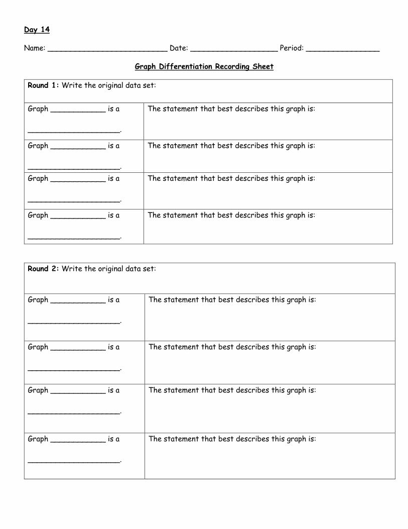
Day 14
Name: __________________________ Date: ___________________ Period: ________________
Graph Differentiation Recording Sheet
Round 1: Write the original data set:
Graph ____________ is a
____________________.
The statement that best describes this graph is:
Graph ____________ is a
____________________.
The statement that best describes this graph is:
Graph ____________ is a
____________________.
The statement that best describes this graph is:
Graph ____________ is a
____________________.
The statement that best describes this graph is:
Round 2: Write the original data set:
Graph ____________ is a
____________________.
The statement that best describes this graph is:
Graph ____________ is a
____________________.
The statement that best describes this graph is:
Graph ____________ is a
____________________.
The statement that best describes this graph is:
Graph ____________ is a
____________________.
The statement that best describes this graph is:
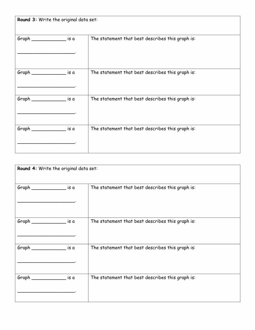
Round 4: Write the original data set:
Graph ____________ is a
____________________.
The statement that best describes this graph is:
Graph ____________ is a
____________________.
The statement that best describes this graph is:
Graph ____________ is a
____________________.
The statement that best describes this graph is:
Graph ____________ is a
____________________.
The statement that best describes this graph is:
Round 3: Write the original data set:
Graph ____________ is a
____________________.
The statement that best describes this graph is:
Graph ____________ is a
____________________.
The statement that best describes this graph is:
Graph ____________ is a
____________________.
The statement that best describes this graph is:
Graph ____________ is a
____________________.
The statement that best describes this graph is:

Day 15
Name: _____________________________ Date: ____________________ Period: _____________
Graph Determination Recording Sheet
Write the data set for Round 1:
What graphical representation did you choose
for Round 1?
Numerical Summaries:
Mean: _________________
Median: ________________
Mode: _________________
Range: _________________
IQR: __________________
Graphical Representation
Write the data set for Round 2:
What graphical representation did you choose
for Round 2?
Numerical Summaries:
Mean: _________________
Median: ________________
Mode: _________________
Range: _________________
IQR: __________________

Graphical Representation
Write the data set for Round 3:
What graphical representation did you choose
for Round 3?
Numerical Summaries:
Mean: _________________
Median: ________________
Mode: _________________
Range: _________________
IQR: __________________
Graphical Representation

Day 16 – 19
Name: ____________________________ Date: ________________ Period: _______________
Becoming Critical Analyzers of Data, 6th Grade Project
Due: _________________________
Project Overview:
After studying graphs, analyzing and measuring data, you will apply your knowledge to conduct your very
own research study. In groups of two, you will decide on a question to conduct your study at Tafolla
Middle School. You and your partner will gather the data, analyze it, describe it, and then display your
findings to the class using the graphical representations we learned in class (i.e., dot plots, stem-and-
leaf plots, histograms, and box plots). Project will be completed in class. If class time is misused, then
work will be taken home to complete on time. Project will be the equivalent of a test grade, 15% of
your grade!
Essential Questions:
• Why is it important to critically analyze data in a 21st century world?
• What value is there in gathering quality data?
• How do you determine a valid and reliable data source?
• How does representations and descriptions of data influence conclusions and/or predictions?
Learning Objectives: TEKS 6.12A, 6.12B, 6.12C, 6.12D, 6.13A, 6.13B
• Represent numeric data in graphs
o Dot plots
o Stem-and-leaf plots
o Histograms
o Box plots
o Relative frequency table & percent bar graph
• Use the graphical representation to describe the data distribution
o Center: mean, median
o Spread: mode, range, interquartile range (IQR)
o Shape: cluster, gap, outlier
• Summarize numeric data with numerical summaries
o Mean, median, mode, range, interquartile range
• Interpret numeric data summarized in graphical representations
• Distinguish between situations that yield data with and without variability

Project Steps:
1. Write a survey question
- Answer to question must be a number in order to yield data with variability
o Non-example: What is your favorite tv show?
o Example: How many minutes of TV do you watch each day?
o Question needs to be approved by teacher before data collection
2. Data collection
- Collect at least 25 data points using your research question
3. Find the numerical summaries of the data
- Mean, median, mode, range, and interquartile range of your data points
4. Represent your data
- Create four of the following professional mathematical graphs. Remember to give each graph a
title and that the x- and y- axes are labeled and numbered appropriately for your data.
- Required graphs:
o 1 Histogram
o 1 Box plot
- Choose 2 of the following 3 graphs:
o 1 Frequency table with percent bar graph
o 1 Dot plot
o 1 Stem-and-leaf plot
- Total: 4 graphs
5. Data Description
- Describe how you gathered your data using complete sentences:
o What type of people did you ask? (Children, females, etc.)
o Do you think your answers would be different if you asked a different group of people?
(Adults, males, etc.)
6. Data Interpretation
- Use at least 4 sentences to describe which of your 4 graphical representations describes your
data set the best and why. Use at least 4 sentences to describe which of your 4 graphical
representations describes your data set the worst and why.
7. Data Display
- Decide how you want to display your data:
o You may choose:
▪ Powerpoint
▪ Poster board
▪ Prezi
▪ Alternate approved presentation, such as:
• News article
• Brochure
• Your own creative idea
8. Data Presentation
- Present your findings to the class
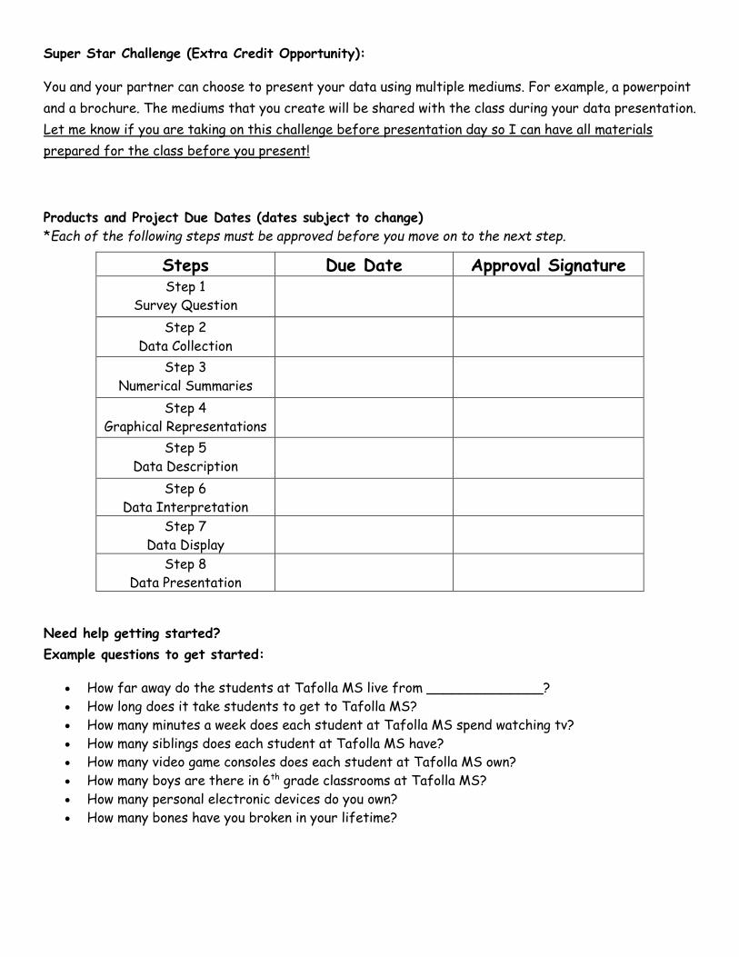
Super Star Challenge (Extra Credit Opportunity):
You and your partner can choose to present your data using multiple mediums. For example, a powerpoint
and a brochure. The mediums that you create will be shared with the class during your data presentation.
Let me know if you are taking on this challenge before presentation day so I can have all materials
prepared for the class before you present!
Products and Project Due Dates (dates subject to change)
*Each of the following steps must be approved before you move on to the next step.
Steps Due Date Approval Signature Step 1
Survey Question
Step 2
Data Collection
Step 3
Numerical Summaries
Step 4
Graphical Representations
Step 5
Data Description
Step 6
Data Interpretation
Step 7
Data Display
Step 8
Data Presentation
Need help getting started?
Example questions to get started:
• How far away do the students at Tafolla MS live from ______________?
• How long does it take students to get to Tafolla MS?
• How many minutes a week does each student at Tafolla MS spend watching tv?
• How many siblings does each student at Tafolla MS have?
• How many video game consoles does each student at Tafolla MS own?
• How many boys are there in 6th grade classrooms at Tafolla MS?
• How many personal electronic devices do you own?
• How many bones have you broken in your lifetime?

Step 1: Survey Question
Names of Group Members: 1. ______________________ 2. ______________________
Brainstorm Ideas:
What would you like to conduct a study on? What would you like to know about our student
population at Tafolla MS?
Use this space to divide responsibilities of this project for you and your partner. For example, I
will do the histogram and the stem-and-leaf plot, my partner will do the box plot and the dot
plot. (Look at all the steps of the project on the previous pages):
My Responsibility: My Partner’s Responsibility:
I agree to complete the above parts to the project.
Incompletion of the above will result in the loss of
points on my personal grade.
Signed,
I agree to complete the above parts to the project.
Incompletion of the above will result in the loss of
points on my personal grade.
Signed,
Final Question:
___________________________________________________________________________________
___________________________________________________________________________________
___________________________________________________________________________________
Teacher Approval:____________

Step 2: Data Collection
Write down your survey question here:
___________________________________________________________________________________
___________________________________________________________________________________
___________________________________________________________________________________
Interview Form
Name: Response:
1)
2)
3)
4)
5)
6)
7)
8)
9)
10)
11)
12)
13)
14)
15)
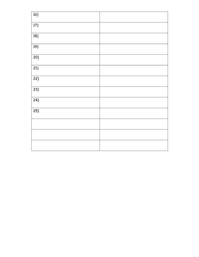
16)
17)
18)
19)
20)
21)
22)
23)
24)
25)
Step 3: Numerical Summaries
Write your data list here:
Order your data from least to greatest:
Determine the measures of center and measures of spread. Show all your work:
Work Space: (if more space is needed, staple scratch work to back of packet)

Step 4: Graphical Representations
Use the following space to create your four graphical representations. The final draft will be done on
individual sheets of paper per graph.
Graph #1: _____________________
Graph #2: _____________________

Graph #3: _____________________
Graph #4: _____________________
Step 5: Data Description
Answer the following questions using complete sentences.
1) What two things stood out about your data?
1. _________________________________________________________________________
_________________________________________________________________________
2. _________________________________________________________________________
_________________________________________________________________________
2) What type of people did you gather your data from? (students, all females, etc.)
___________________________________________________________________________________
___________________________________________________________________________________
3) Do you think your answers would be different if you asked a different group of people? (adults,
males, etc.)
___________________________________________________________________________________
___________________________________________________________________________________
Step 6: Data Interpretation
Use at least 4 sentences to describe which of your 4 graphical representations describes your data set
the best and why. (IF more space is needed, use scratch paper and staple to the back of the packet.)
The graphical representation that best describes our data is ______________________ because
___________________________________________________________________________________
___________________________________________________________________________________
__________________________________________________________________________________
___________________________________________________________________________________

Use at least 4 sentences to describe which of your 4 graphical representations describes your data set
the worst and why. (IF more space is needed, use scratch paper and staple to the back of the packet.)
The graphical representation that describes our data the worst is ______________________ because
___________________________________________________________________________________
___________________________________________________________________________________
___________________________________________________________________________________
___________________________________________________________________________________
Day 20 - 23
*** These days are for data display and data presentation, see Rubric***