Band image manipulation
3
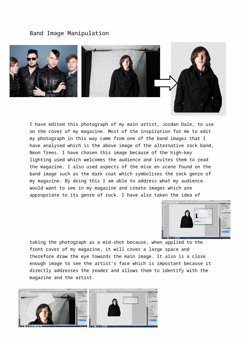
Band Image Manipulation I have edited this photograph of my main artist, Jordan Dale, to use on the cover of my magazine. Most of the inspiration for me to edit my photograph in this way came from one of the band images that I have analysed which is the above image of the alternative rock band, Neon Trees. I have chosen this image because of the high-key lighting used which welcomes the audience and invites them to read the magazine. I also used aspects of the mise en scene found on the band image such as the dark coat which symbolises the rock genre of my magazine. By doing this I am able to address what my audience would want to see in my magazine and create images which are appropriate to its genre of rock. I have also taken the idea of taking the photograph as a mid-shot because, when applied to the front cover of my magazine, it will cover a large space and therefore draw the eye towards the main image. It also is a close enough image to see the artist’s face which is important because it directly addresses the reader and allows them to identify with the magazine and the artist.
-
Upload
laurencooney97 -
Category
Education
-
view
51 -
download
0
Transcript of Band image manipulation
Band Image Manipulation
I have edited this photograph of my main artist, Jordan Dale, to use on the cover of my magazine. Most of the inspiration for me to edit my photograph in this way came from one of the band images that I have analysed which is the above image of the alternative rock band, Neon Trees. I have chosen this image because of the high-key lighting used which welcomes the audience and invites them to read the magazine. I also used aspects of the mise en scene found on the band image such as the dark coat which symbolises the rock genre of my magazine. By doing this I am able to address what my audience would want to see in my magazine and create images which are appropriate to its genre of rock. I have also taken the idea of taking the photograph as a mid-shot because, when applied to the front cover of my magazine, it will cover a large space and therefore draw the eye towards the main image. It also is a close enough image to see the artist’s face which is important because it directly addresses the reader and allows them to identify with the magazine and the artist.
To edit my raw image, I first used the Polygonal Lasso tool to delete the background which allowed me to draw more attention to my image by removing the distractions of the dark wall and white curtain. This also enabled me to place the image onto a background of my choice which I decided should be the white background of my cover as it would make the dark image stand out against the light colour.
I next altered the brightness, contrast and levels to reduce the amount of shadow on my artist’s face. By doing this I have made the lighting of my photograph high-key which creates a more welcoming feel and therefore makes the audience more comfortable and able to identify with the image.
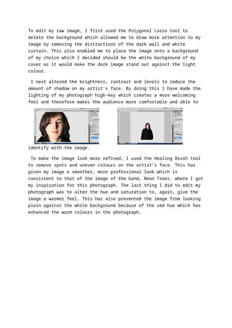
To make the image look more refined, I used the Healing Brush tool to remove spots and uneven colours on the artist’s face. This has given my image a smoother, more professional look which is consistent to that of the image of the band, Neon Trees, where I got my inspiration for this photograph. The last thing I did to edit my photograph was to alter the hue and saturation to, again, give the image a warmer feel. This has also prevented the image from looking plain against the white background because of the red hue which has enhanced the warm colours in the photograph.