Averages and Variation 3. Section 3.3 Percentiles and Box-and-Whisker Plots.
28
Averages and Variation 3
-
Upload
amber-meredith-pitts -
Category
Documents
-
view
224 -
download
0
Transcript of Averages and Variation 3. Section 3.3 Percentiles and Box-and-Whisker Plots.

Averages and Variation
3

Section 3.3
Percentiles and Box-and-Whisker
Plots

3
Focus Points
• Interpret the meaning of percentile scores.
• Compute the median, quartiles, and five-number summary from raw data.
• Make a box-and-whisker plot. Interpret the results.
• Describe how a box-and-whisker plot indicates spread of data about the median.
4
1. Percentiles
5
1. Percentiles
We’ve seen measures of central tendency and spread for a set of data. The arithmetic mean x and the standard deviation s will be very useful in later work.
However, because they each utilize every data value, they can be heavily influenced by one or two extreme data values.
In cases where our data distributions are heavily skewed or even bimodal, we often get a better summary of the distribution by utilizing relative position of data rather than exact values.

6
1. Percentiles
We know that the median is an average computed by using relative position of the data.
If we are told that 81 is the median score on a biology test, we know that after the data have been ordered, 50% of the data fall at or below the median value of 81.
The median is an example of a percentile; in fact, it is the 50th percentile. The general definition of the P th percentile follows.
7
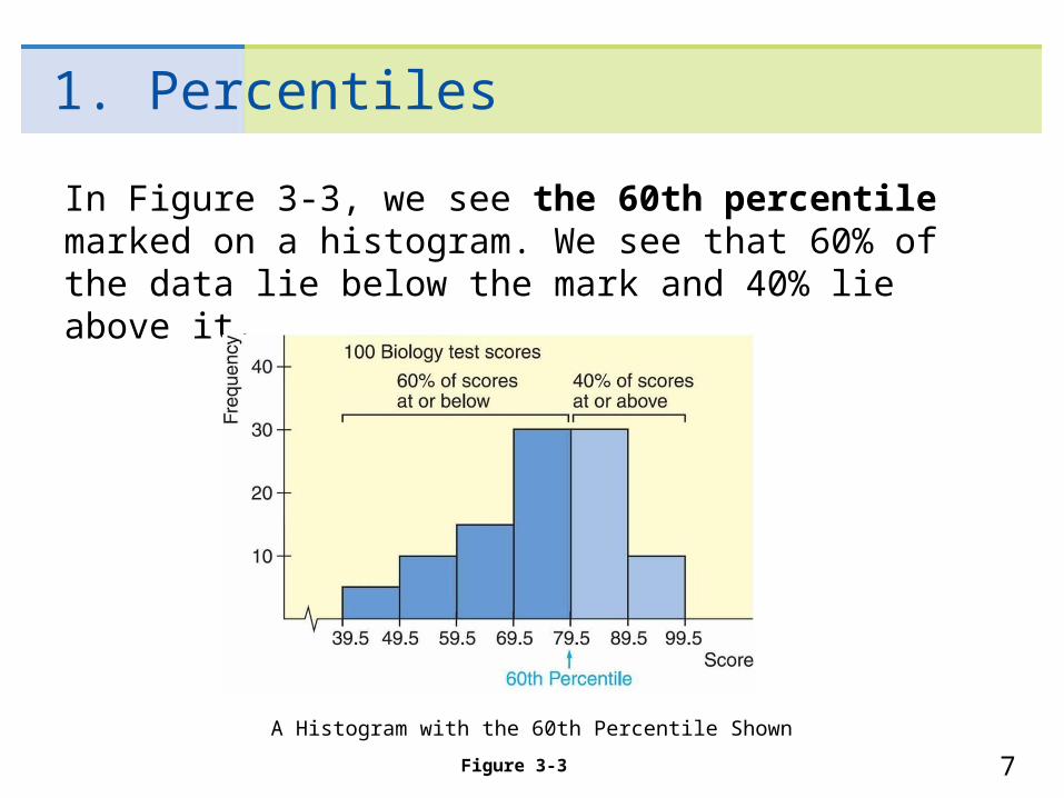
1. Percentiles
In Figure 3-3, we see the 60th percentile marked on a histogram. We see that 60% of the data lie below the mark and 40% lie above it.
A Histogram with the 60th Percentile Shown
Figure 3-3
8
1. Percentiles
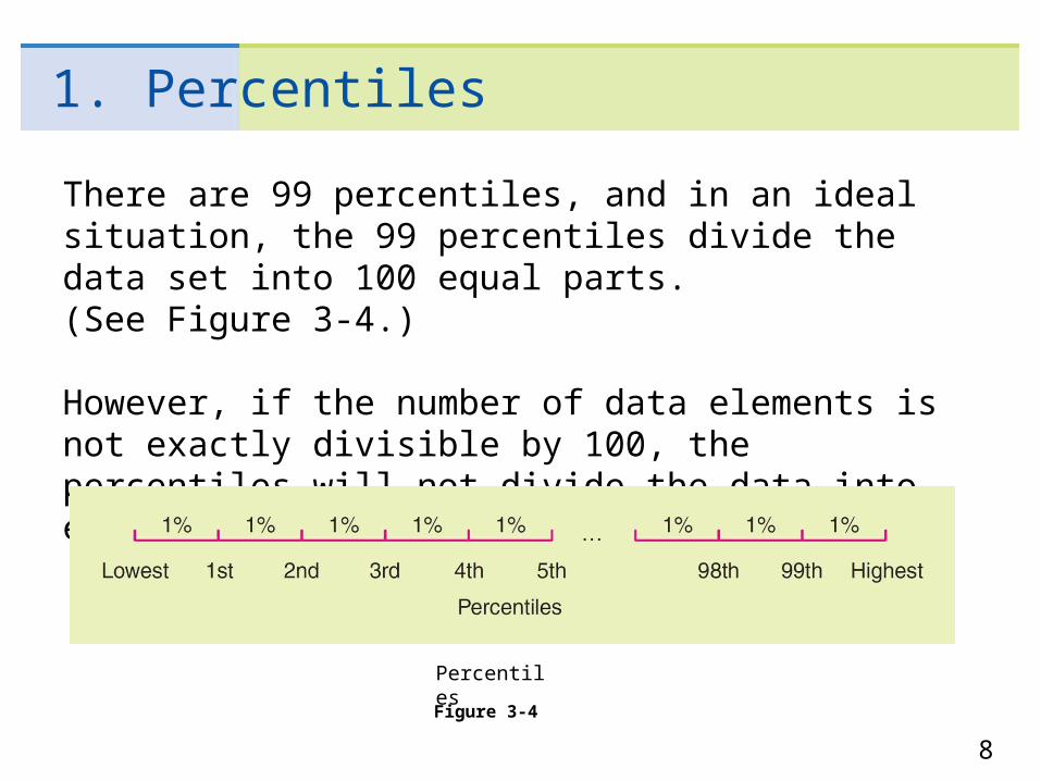
There are 99 percentiles, and in an ideal situation, the 99 percentiles divide the data set into 100 equal parts.(See Figure 3-4.)
However, if the number of data elements is not exactly divisible by 100, the percentiles will not divide the data into equal parts.
Percentiles
Figure 3-4
9
1. Percentiles
There are several widely used conventions for finding percentiles. They lead to slightly different values for different situations, but these values are close together.
For all conventions, the data are first ranked or ordered from smallest to largest. A natural way to find the Pth percentile is to then find a value such that P% of the data fall at or below it.
This will not always be possible, so we take the nearest value satisfying the criterion. It is at this point that there is a variety of processes to determine the exact value of the percentile.

10
1. Percentiles
We will not be very concerned about exact procedures for evaluating percentiles in general.
However, quartiles are special percentiles used so frequently that we want to adopt a specific procedure for their computation.
Quartiles are those percentiles that divide the data into fourths.

11
1. Percentiles
The first quartile Q1 is the 25th percentile, the second quartile Q2 is the median, and the third quartile Q3 is the 75th percentile. (See Figure 3-5.)
Again, several conventions are used for computing quartiles, but the convention on next page utilizes the median and is widely adopted.
Quartiles
Figure 3-5
12
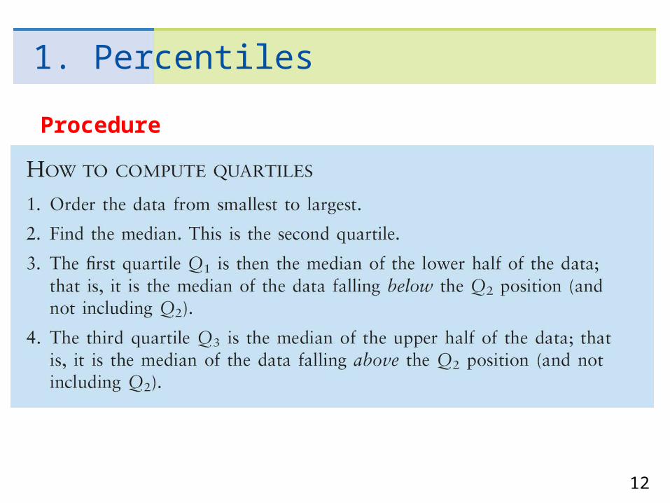
1. Percentiles
Procedure

13
1. Percentiles
In short, all we do to find the quartiles is find three medians. The median, or second quartile, is a popular measure of the center utilizing relative position.
A useful measure of data spread utilizing relative position is the interquartile range (IQR). It is simply the difference between the third and first quartiles.
Interquartile range = Q3 – Q1
The interquartile range tells us the spread of the middle half of the data. Now let’s look at an example to see how to compute all of these quantities.

14
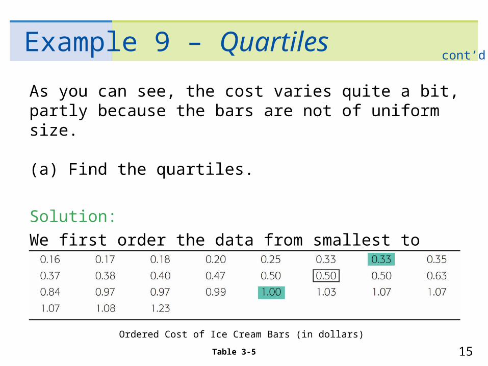
Example 9 – Quartiles
In a hurry? On the run? Hungry as well? How about an icecream bar as a snack? Ice cream bars are popular amongall age groups.
Consumer Reports did a study of ice cream bars. Twenty-seven bars with taste ratings of at least “fair” werelisted, and cost per bar was included in the report.
Just how much does an ice cream bar cost? The data, expressed in dollars, appear in Table 3-4.
Cost of Ice Cream Bars (in dollars)
Table 3-4
15
Example 9 – Quartiles
As you can see, the cost varies quite a bit, partly because the bars are not of uniform size.
(a) Find the quartiles.
Solution:
We first order the data from smallest to largest. Table 3-5 shows the data in order.
cont’d
Ordered Cost of Ice Cream Bars (in dollars)
Table 3-5
16
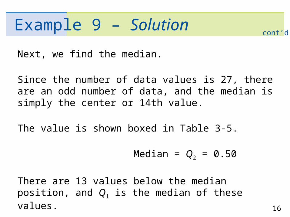
Example 9 – Solution
Next, we find the median.
Since the number of data values is 27, there are an odd number of data, and the median is simply the center or 14th value.
The value is shown boxed in Table 3-5.
Median = Q2 = 0.50
There are 13 values below the median position, and Q1 is the median of these values.
cont’d
17
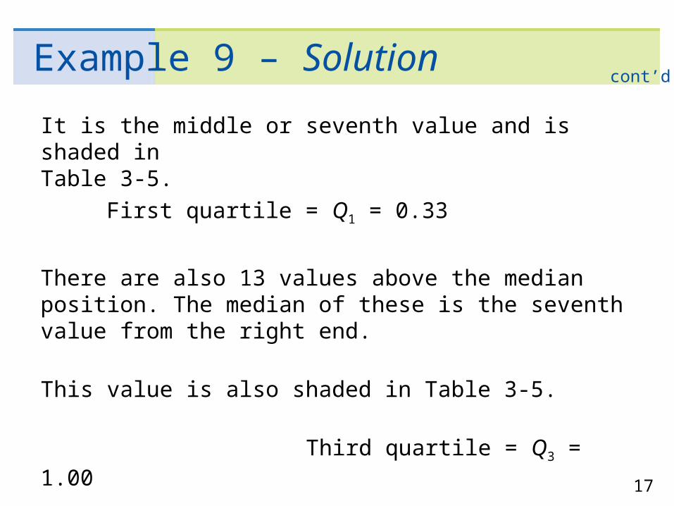
Example 9 – Solution
It is the middle or seventh value and is shaded in Table 3-5.
First quartile = Q1 = 0.33
There are also 13 values above the median position. The median of these is the seventh value from the right end.
This value is also shaded in Table 3-5.
Third quartile = Q3 = 1.00
cont’d

18
Example 9 – Quartiles
(b) Find the interquartile range.
Solution:
IQR = Q3 – Q1
= 1.00 – 0.33
= 0.67
This means that the middle half of the data has a cost spread of 67¢.
cont’d

19
Guided Exercise 7: Quartiles
Many people consider the number of calories in an ice cream bar as important as, if not more important than, the cost. The Consumer Reports article also included the calorie count of the rated ice cream bars (Table 3-6). There were 22 vanilla- flavored bars rated. Again, the bars varied in size, and some of the smaller bars had fewer calories. The calorie counts for the vanilla bars follow.
Table 3-6 Calories in Vanilla-Flavored Ice Cream Bars
(a)Our first step is to order the data.
342 377 319 353 295 234 294 286 377 182 310 439 111 201 182 197 209 147 190 151 131 151
111 131 147 151 151 182 182 190 197 201 209234 286 294 295 310 319 342 353 377 377 439

20
Guided Exercise 7: Quartiles
(b) There are 22 data values. Find the median.
(c) How many values are below the median position? Find
Q1.
(d) There are the same number of data above as below the median. Use this fact to find Q3.
(e) Find the interquartile range and comment on its meaning.
21
2. Box-and-Whisker Plots
22
2. Box-and-Whisker Plots
The quartiles together with the low and high data values give us a very useful five-number summary of the data and their spread.
We will use these five numbers to create a graphic sketch of the data called a box-and-whisker plot. Box-and-whisker plots provide another useful technique from exploratory data analysis (EDA) for describing data.

23
1. Box-and-Whisker Plots
Procedure
The next example demonstrates the process of making a box-and-whisker plot.
Box-and-Whisker Plot
Figure 3-6

24
Example 10 – Box-and-whisker plot
Make a box-and-whisker plot showing the calories in vanilla-flavored ice cream bars.
Use the plot to make observations about the distribution of calories.
(a) We ordered the data (see Table 3-7) and found the values of the median, Q1, and Q3.
Ordered Data
Table 3-7
25
Example 10 – Box-and-whisker plot
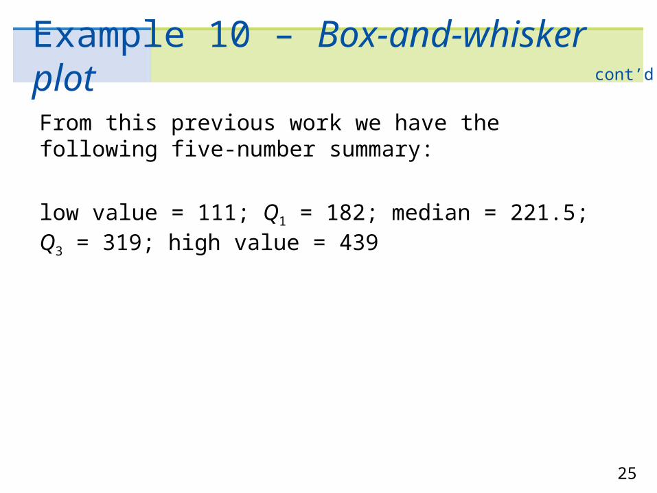
From this previous work we have the following five-number summary:
low value = 111; Q1 = 182; median = 221.5; Q3 = 319; high value = 439
cont’d

26
Example 10 – Box-and-whisker plot
(b) We select an appropriate vertical scale and make the plot (Figure 3-7).
Box-and-Whisker Plot for Calories inVanilla-Flavored Ice Cream BarsFigure 3-7
cont’d

27
Example 10 – Box-and-whisker plot
(c) Interpretation A quick glance at the box-and-whisker plot reveals the following:
(i) The box tells us where the middle half of the data lies, so we see that half of the ice cream bars have between 182 and 319 calories, with an interquartile range of 137 calories.
(ii) The median is slightly closer to the lower part of the box. This means that the lower calorie counts are more concentrated. The calorie counts above the median are more spread out, indicating that the distribution is slightly skewed toward the higher values.
cont’d
28
Example 10 – Box-and-whisker plot
(iii) The upper whisker is longer than the lower, which again emphasizes skewness toward the higher values.
cont’d