As media evaluation question 6
31
AS Media Evaluation: Technology
Transcript of As media evaluation question 6

AS Media Evaluation:
Technology
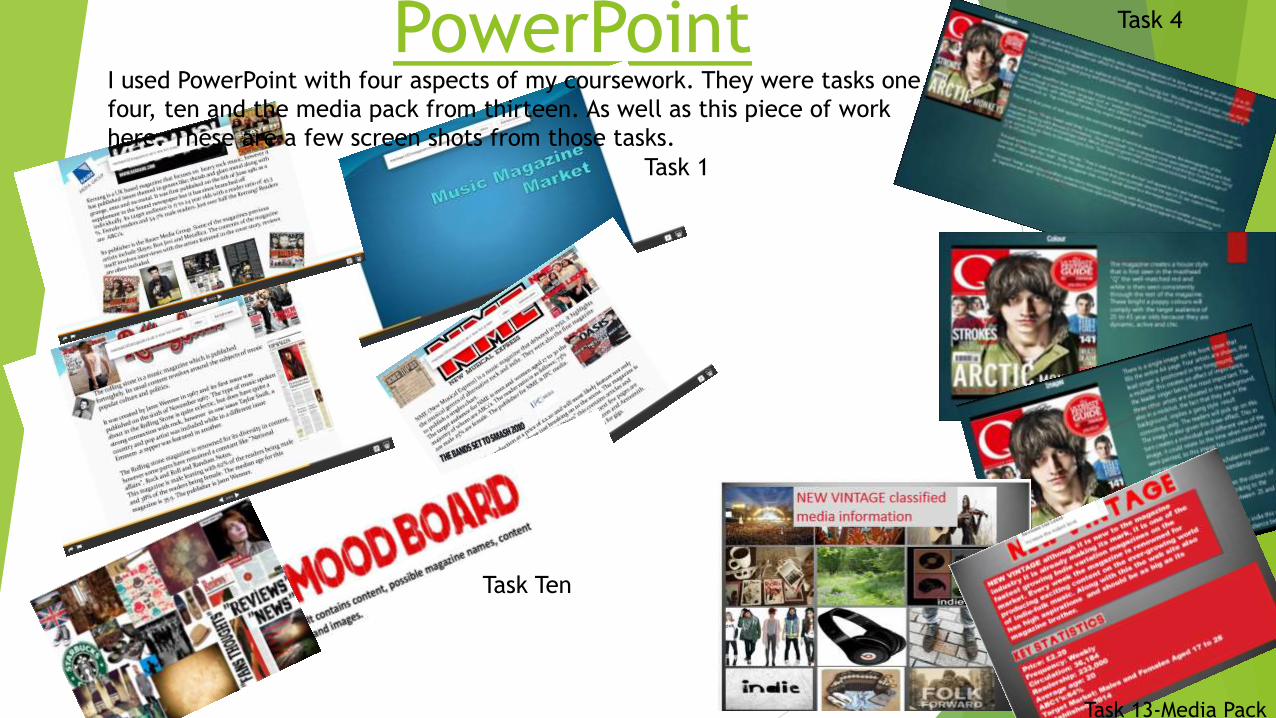
PowerPoint I used PowerPoint with four aspects of my coursework. They were tasks one,
four, ten and the media pack from thirteen. As well as this piece of work
here. These are a few screen shots from those tasks.
Task 1
Task 4
Task Ten
Task 13-Media Pack

The PowerPoint software allows you to create
things in perfect chronological order with its
easy slide system, this was particularly useful
when I had to cover specific areas like
“language” “genre and “content”

PreziI used the presentation software of Prezi for the following pieces of coursework;
homework one, task five, and homework two and task 14 and evaluation question 2
These are some screenshots of this work.
Task 5
Homework 2
Task 14
Evaluation
Question 2
Homework 1
Prezi allows my presentations to be fluid
further more its features meant all of the
work could be done on one canvas rather
than slides. To add to this the brackets
provided meant pieces of text can be broken
up.

WordWord was used on four occasions. They were in tasks two, three and twelve as
well as some questionnaire summaries. Here are the examples.
Task two
Task 3
Task 12
Contents Page and front
cover questionnaire
Summary
Word is great for large volumes of text based
work. It allowed me to give vast detail on the
above pieces of work.
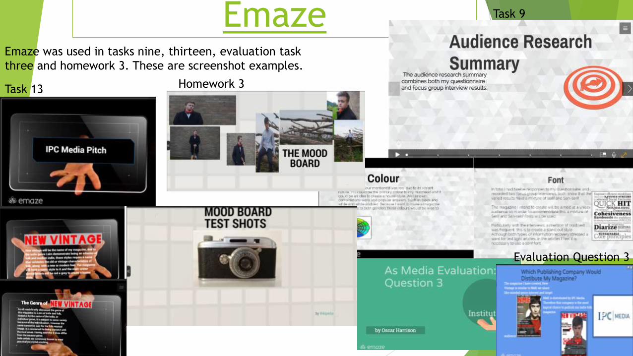
EmazeEmaze was used in tasks nine, thirteen, evaluation task
three and homework 3. These are screenshot examples.
Task 9
Task 13 Homework 3
Evaluation Question 3
Emaze has helped the slides in my
presentation become more visual which
is different to PowerPoint.

PoppletI have only used Popplet once during my coursework, and it was with task 6.
Popplet is ideal for a mind map style, its
tools and layout meant that I could explain
the work in different sections with ease and
clarity.
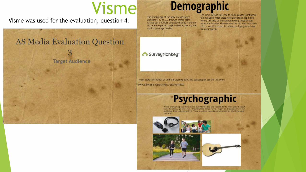
VismeVisme was used for the evaluation, question 4.
Visme is very similar to PowerPoint in the way its
slide format helps to methodically complete work.
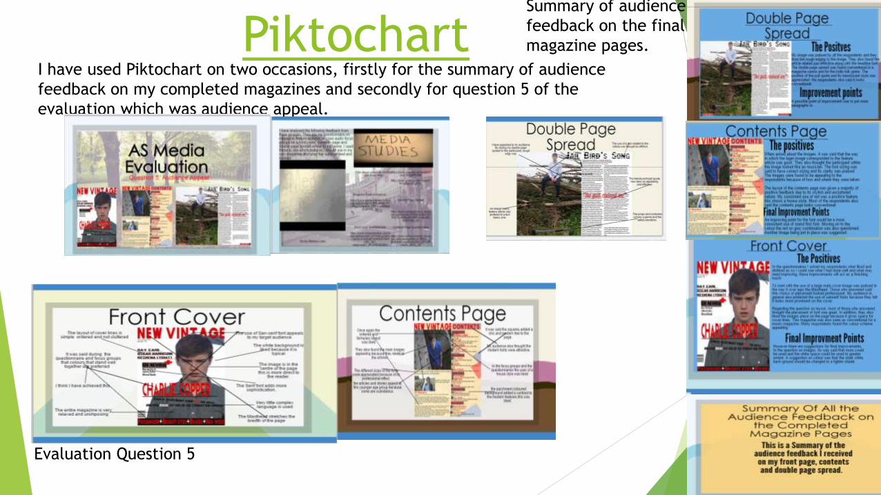
PiktochartI have used Piktochart on two occasions, firstly for the summary of audience
feedback on my completed magazines and secondly for question 5 of the
evaluation which was audience appeal.
Evaluation Question 5
Summary of audience
feedback on the final
magazine pages.
Piktochart gives me the option to import a
wide range of resources like charts, images
and videos.

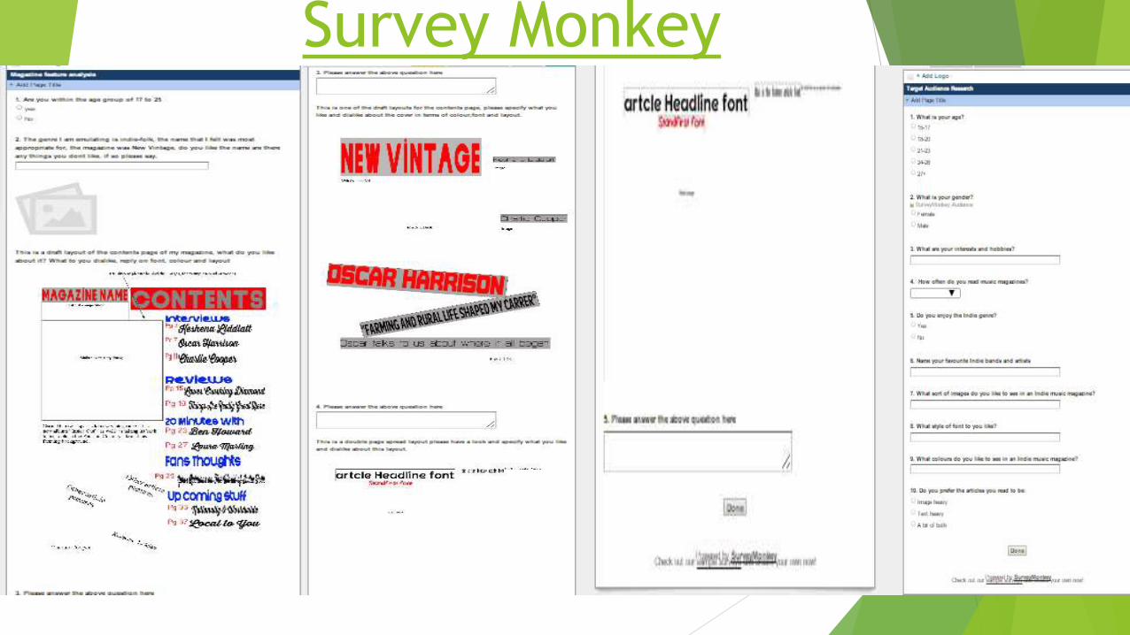
Survey Monkey I have completed the majority of my audience feedback on this survey site.
Final Front
Cover Feedback
Questionnaire
Final Contents
Page Feedback
Questionnaire
Final Double page
Spread Feedback
Questionnaire
Draft Front Cover
feedback
Questionnaire
Survey Monkey

Survey monkey has allowed me to get genuine results from a target audience as
well as collect results through the social media.

YouTube/CamcorderYouTube helped me publicise my focus group interviews and the use of a
camcorder meant I could create audio resources.
YouTube is perfect for coursework because it can be accessed by anyone. The camcorder is
very useful because an audio piece added variety to my work.
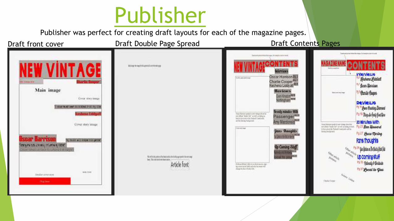
Publisher Publisher was perfect for creating draft layouts for each of the magazine pages.
Draft front cover Draft Double Page Spread Draft Contents Pages
Publishers page options allowed me to pick
the correct page sizes when making the page
draft layouts. Furthermore the shape tool
meant I could display where texts like
Mastheads and feature article would go.
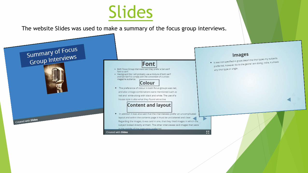
SlidesThe website Slides was used to make a summary of the focus group interviews.

Slides meant I could uses a familiar PowerPoint layout whist not using PowerPoint
itself.
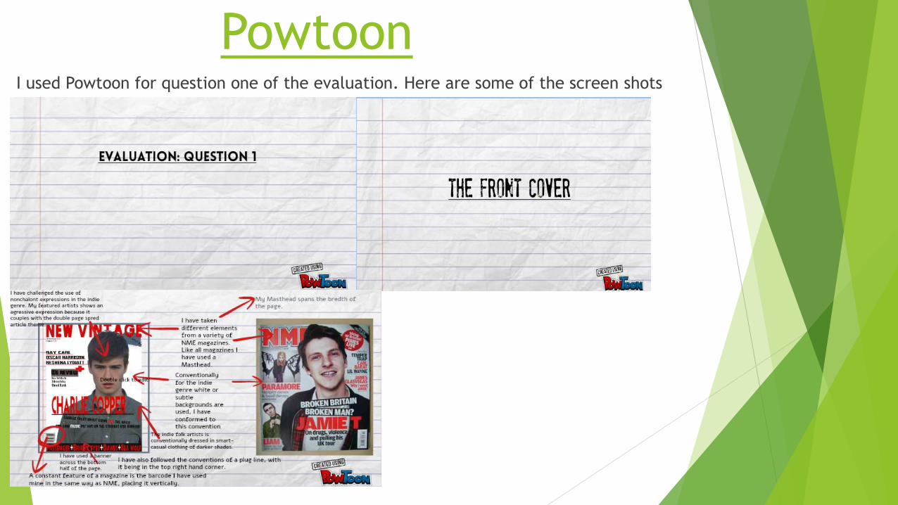
Powtoon I used Powtoon for question one of the evaluation. Here are some of the screen shots

Powtoon had the ability to help me create an audio visual piece of work, once
again this give more variety compared to the other presentation websites.
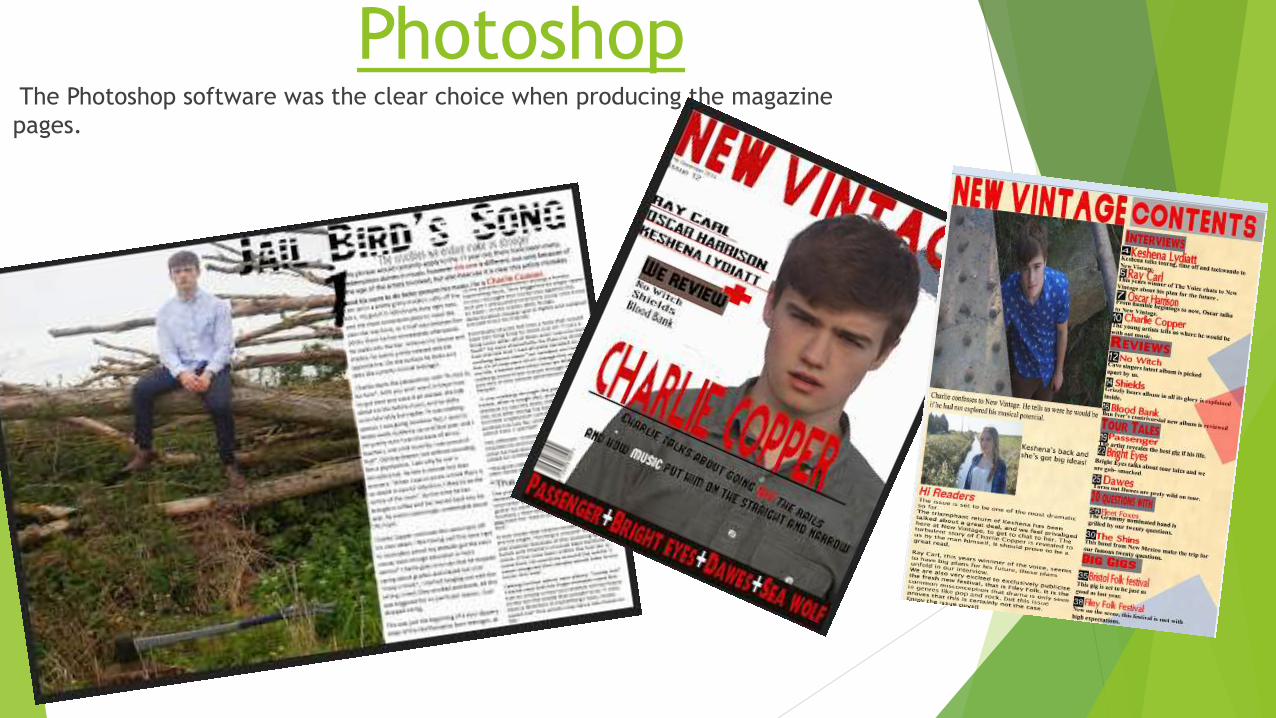
PhotoshopThe Photoshop software was the clear choice when producing the magazine
pages.

Production of the Front Cover
All of the fonts besides the date and issue
number were copy and pasted from the
website, Fontspace.
Each font was pasted
with a white background
to eliminate the
clashing backgrounds
the magic eraser tool
was used.
To create a visual metaphor,
used different colours on
different words “Off” from “Off
the rails” is in red to connote
its negativity. In the same way
the word “Music” is in white to
signify a positivity.
To create this effect I used
two tools. They were
magic wand tool. By
selecting each letter
separately it highlighted
that specific letter, which
allowed me to colour it
using the paint brush.
The cross was
coloured in white
with a colour
replacement
tool.
The slant on this sentence was
again put in place to amplify the
visual metaphor. This was easily
done, using the free transform
option to resize and rotate the
words accordingly.
Everything you see on the page
was put in place with the arrow
and transformation tool. For the
acute movements, free transform
and the arrow keys were utilized.
The main image was put behind the text. To do
this the layer that had this image on was placed
just above the base layer meaning almost all other
objects would be on top of it.
The white background is very
conventional for most music
magazines. This was simple to
create on the very bottom layer I
just had to ensure the canvas was
set to white.
As with previous elements the
background was removed from the
image with magic eraser tool
The barcode was
created from a
barcode
generator site.
After this it was
copy and pasted
in.
I attempted to create a
jean effect for this this
plug. This was done with
the textured filter and
blue from the colour
spectrum.
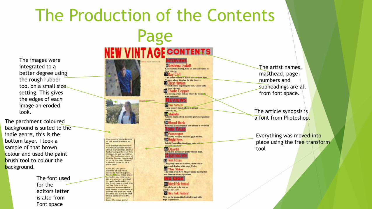
The Production of the Contents
Page
The artist names,
masthead, page
numbers and
subheadings are all
from font space.
The article synopsis is
a font from Photoshop.The parchment coloured
background is suited to the
indie genre, this is the
bottom layer. I took a
sample of that brown
colour and used the paint
brush tool to colour the
background.
The font used
for the
editors letter
is also from
Font space
The images were
integrated to a
better degree using
the rough rubber
tool on a small size
setting. This gives
the edges of each
image an eroded
look.
Everything was moved into
place using the free transform
tool
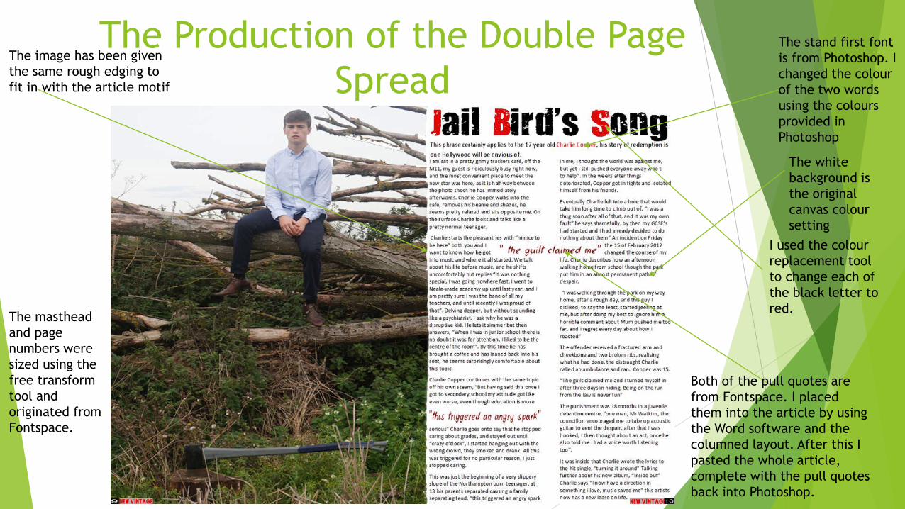
The Production of the Double Page
Spread
I used the colour
replacement tool
to change each of
the black letter to
red.
The stand first font
is from Photoshop. I
changed the colour
of the two words
using the colours
provided in
Photoshop
Both of the pull quotes are
from Fontspace. I placed
them into the article by using
the Word software and the
columned layout. After this I
pasted the whole article,
complete with the pull quotes
back into Photoshop.
The image has been given
the same rough edging to
fit in with the article motif
The masthead
and page
numbers were
sized using the
free transform
tool and
originated from
Fontspace.
The white
background is
the original
canvas colour
setting
Photoshop is the ideal editing software to create a
magazine page. It is the tools that allow this to
happen. These tools include airbrush, this helps
modify your artist complexion to a “perfect”
standard, without blemishes or spots. The ability to
change your canvas size means you can find the
correct size for your page.