AS Media Evaluation
28
IN WHAT WAYS DOES YOUR MEDIA PRODUCT USE, DEVELOP OR CHALLENGE FORMS AND CONVENTIONS OF REAL MEDIA PRODUCTS?
-
Upload
gibson8955 -
Category
Education
-
view
26 -
download
0
Transcript of AS Media Evaluation

IN WHAT WAYS DOES YOUR MEDIA PRODUCT USE, DEVELOP OR CHALLENGE FORMS AND CONVENTIONS OF REAL MEDIA PRODUCTS?
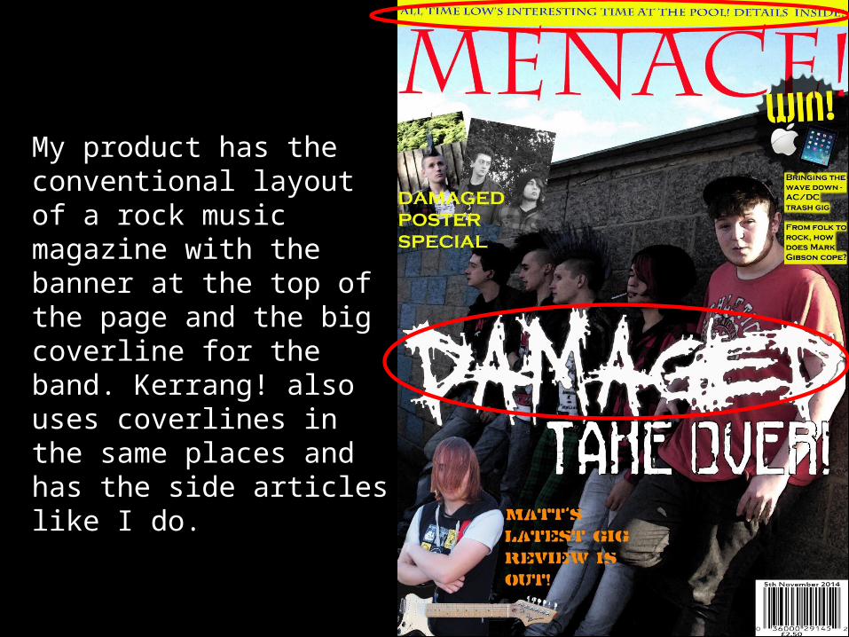
My product has the conventional layout of a rock music magazine with the banner at the top of the page and the big coverline for the band. Kerrang! also uses coverlines in the same places and has the side articles like I do.
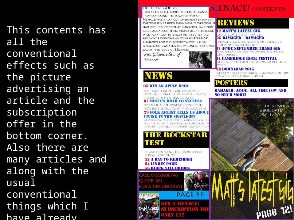
This contents has all the conventional effects such as the picture advertising an article and the subscription offer in the bottom corner. Also there are many articles and along with the usual conventional things which I have already mentioned, I have used an editor letter as this is conventional too.
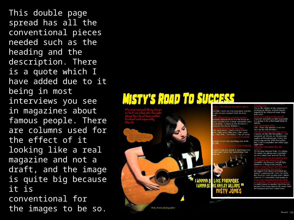
This double page spread has all the conventional pieces needed such as the heading and the description. There is a quote which I have added due to it being in most interviews you see in magazines about famous people. There are columns used for the effect of it looking like a real magazine and not a draft, and the image is quite big because it isconventional for the images to be so.

This is the template I used for the cover. As you can see, it has the big coverline for the main band and the banner at the top. Using other covers as well, I found out that one of the conventions for a music magazine from this genre is the poster advert in the corner and the competition in the top of the page. Also the banner at the top and bottom of the page advertising the bands that are in the issue.
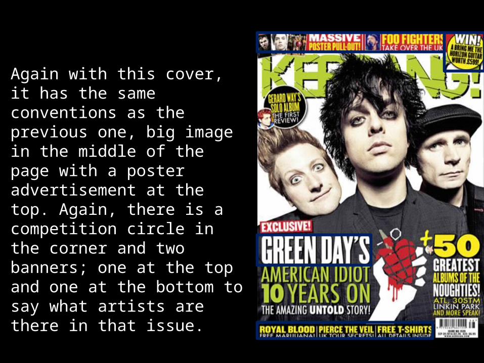
Again with this cover, it has the same conventions as the previous one, big image in the middle of the page with a poster advertisement at the top. Again, there is a competition circle in the corner and two banners; one at the top and one at the bottom to say what artists are there in that issue.

As for this contents example that I used for my contents, it has a big image of a band and a description of what it is about; it also has a lot of page listings due to there being a lot of articles. An editors letter is at the bottom and there is a subscription advertisement in the bottom right hand corner.
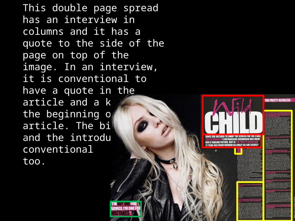
This double page spread has an interview in columns and it has a quote to the side of the page on top of the image. In an interview, it is conventional to have a quote in the article and a kicker in the beginning of the article. The big title and the introduction are conventionaltoo.

In this double page spread, the quote is in the middle of the text and this is just an article with quotes from Amy Lee from Evanescence. Again, the title is quite big and the introduction is underneath it like my double page spread and the previous example.

Looking at this cover again (I have edited it since the first time it had been shown) I have added a banner at the bottom so now the cover has both a banner at the bottom and the top. There are more article names down the side of the cover. Looking at the other front covers, I have seemed to get all of the conventions from this genre of music magazine into one page.
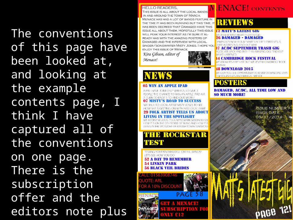
The conventions of this page have been looked at, and looking at the example contents page, I think I have captured all of the conventions on one page. There is the subscription offer and the editors note plus the title names (news; posters; reviews etc)

From the first draft that I put up on here, I have added more questions and I have looked at the conventions from the other two double page spreads that I have added onto this PowerPoint. On this double page spread, the conventions are highlighted and so you can see them in comparison to the other pages. I think I have captured them perfectly in this page.

How does your media product represent particular
social groups?
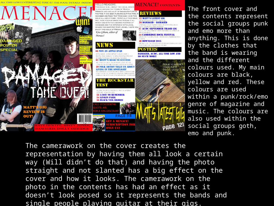
The front cover and the contents represent the social groups punk and emo more than anything. This is done by the clothes that the band is wearing and the different colours used. My main colours are black, yellow and red. These colours are used within a punk/rock/emo genre of magazine and music. The colours are also used within the social groups goth, emo and punk.
The camerawork on the cover creates the representation by having them all look a certain way (Will didn’t do that) and having the photo straight and not slanted has a big effect on the cover and how it looks. The camerawork on the photo in the contents has had an effect as it doesn’t look posed so it represents the bands and single people playing guitar at their gigs.

Again, the social groups represented in the page are punk, goth and emo. This is done again by the colours but also by the clothing that Misty is wearing. The editing also shows the social genre again with the dark, grungy look of the photo. It shows the social groups by the answers to the questions and the colours of the font.

What kind of media institutionmight distribute your media
product and why?
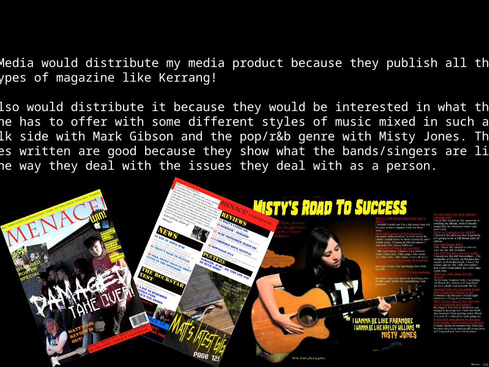
Bauer Media would distribute my media product because they publish all the rock types of magazine like Kerrang!
They also would distribute it because they would be interested in what themagazine has to offer with some different styles of music mixed in such as the folk side with Mark Gibson and the pop/r&b genre with Misty Jones. The articles written are good because they show what the bands/singers are like and also the way they deal with the issues they deal with as a person.
Who would be the audiencefor your media product?
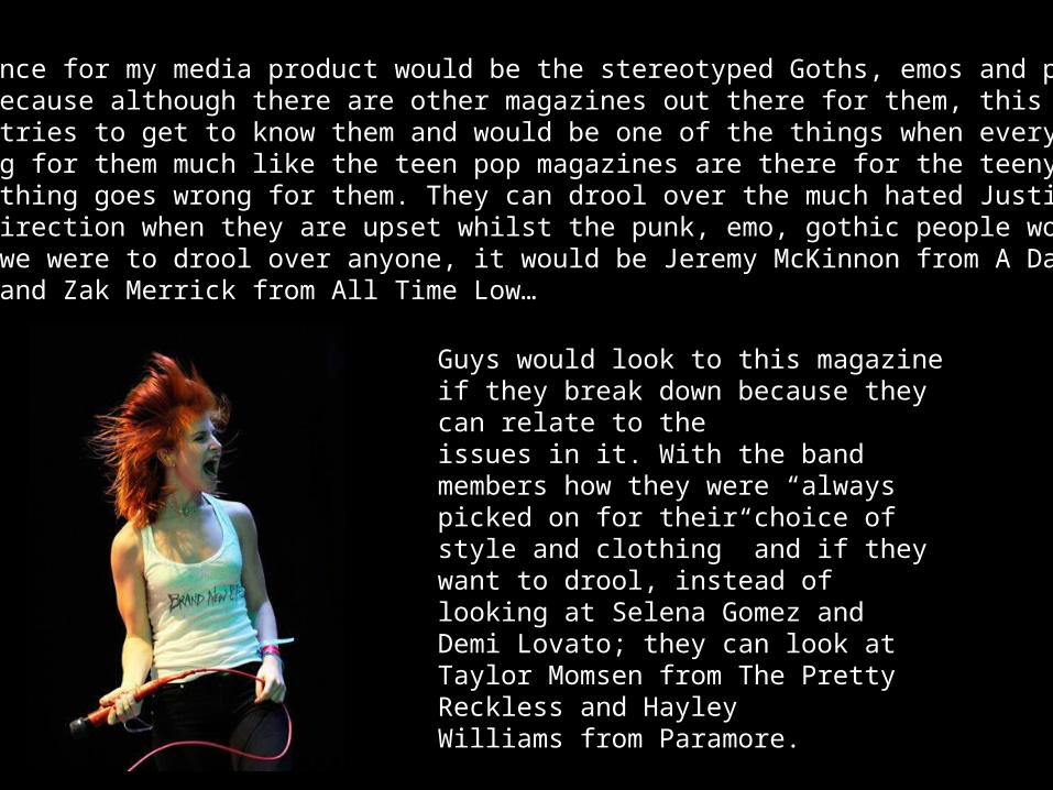
The audience for my media product would be the stereotyped Goths, emos and punks. This is because although there are other magazines out there for them, this music magazine tries to get to know them and would be one of the things when everythinggoes wrong for them much like the teen pop magazines are there for the teenyboppers when something goes wrong for them. They can drool over the much hated Justin Bieberand One Direction when they are upset whilst the punk, emo, gothic people wouldn’t do that. If we were to drool over anyone, it would be Jeremy McKinnon from A Day To Remember and Zak Merrick from All Time Low…
Guys would look to this magazine if they break down because they can relate to the issues in it. With the band members how they were “always picked on for their choice of style and clothing” and if they want to drool, instead of looking at Selena Gomez and Demi Lovato; they can look at Taylor Momsen from The Pretty Reckless and HayleyWilliams from Paramore.

HOW DID YOU ATTRACT/ADDRESS YOUR AUDIENCE?
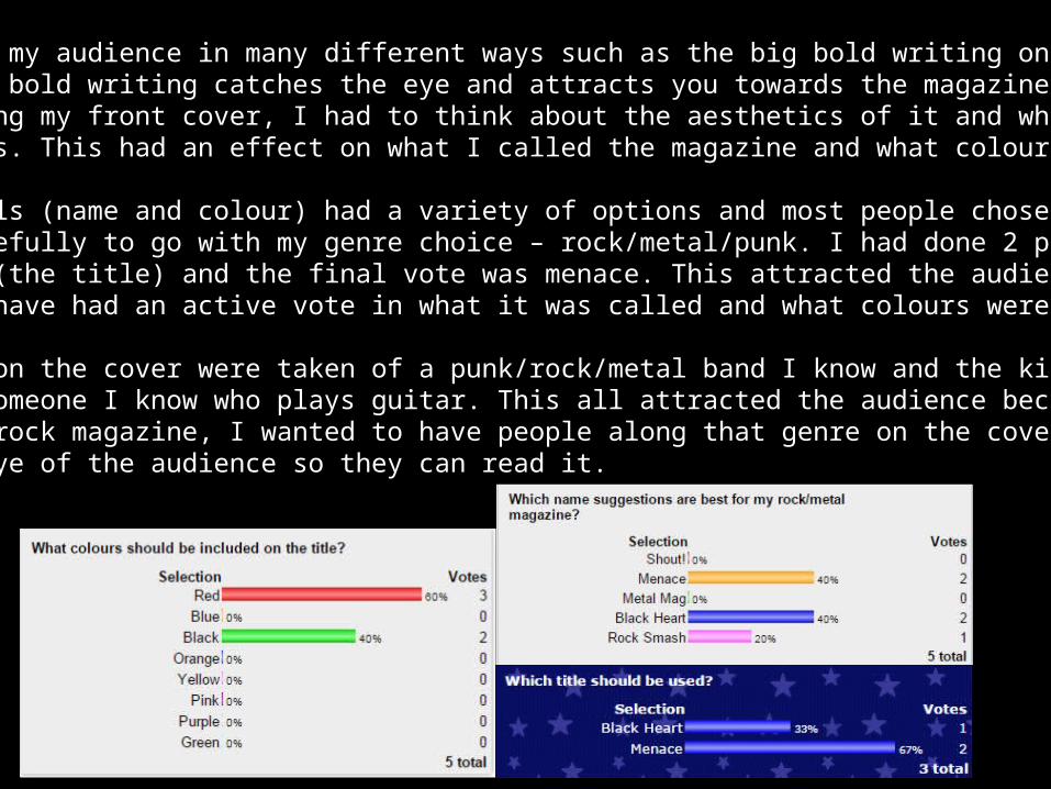
I attracted my audience in many different ways such as the big bold writing on the front cover. This bold writing catches the eye and attracts you towards the magazine. When creating my front cover, I had to think about the aesthetics of it and who the audience was. This had an effect on what I called the magazine and what colours I used.
Both my polls (name and colour) had a variety of options and most people chose their options carefully to go with my genre choice – rock/metal/punk. I had done 2 polls for the same thing (the title) and the final vote was menace. This attracted the audience because they would have had an active vote in what it was called and what colours were used.
The photos on the cover were taken of a punk/rock/metal band I know and the kid in the corner is someone I know who plays guitar. This all attracted the audience because as it is a punk/metal/rock magazine, I wanted to have people along that genre on the cover to catch the eye of the audience so they can read it.
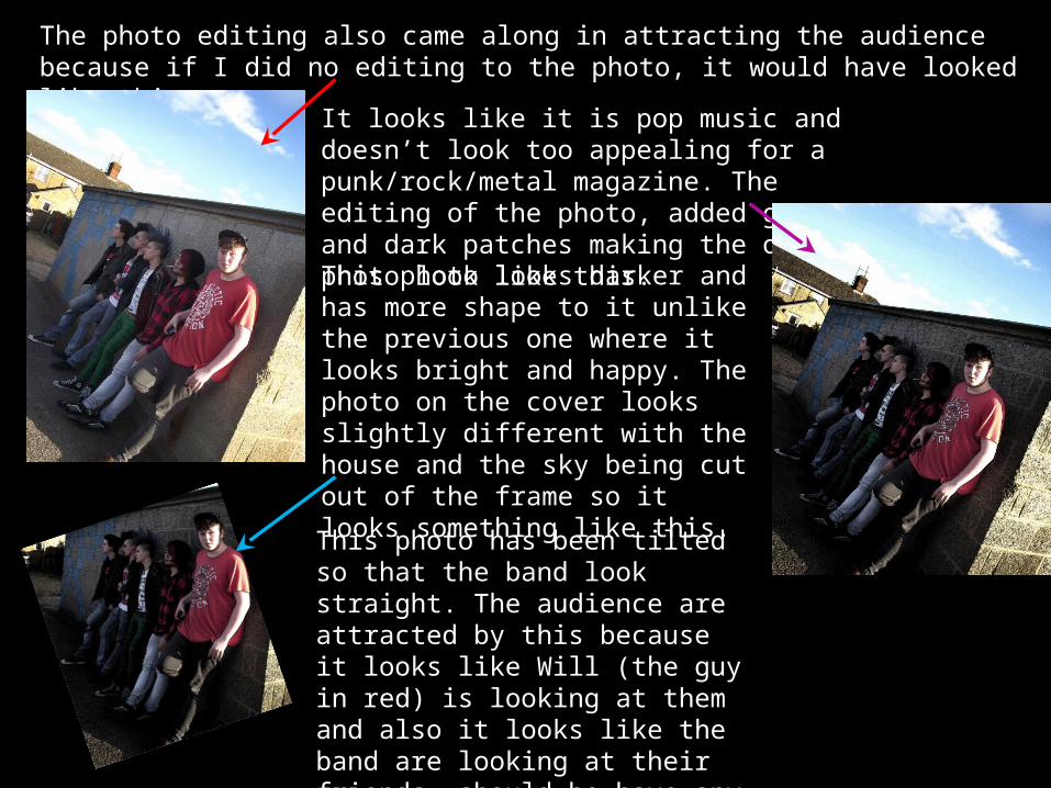
The photo editing also came along in attracting the audience because if I did no editing to the photo, it would have looked like this…
It looks like it is pop music and doesn’t look too appealing for a punk/rock/metal magazine. The editing of the photo, added grunge and dark patches making the original photo look like this.
This photo looks darker and has more shape to it unlike the previous one where it looks bright and happy. The photo on the cover looks slightly different with the house and the sky being cut out of the frame so it looks something like this.
This photo has been tilted so that the band look straight. The audience are attracted by this because it looks like Will (the guy in red) is looking at them and also it looks like the band are looking at their friends, should he have any near him when picking up the magazine.
What have you learnt abouttechnologies from the processof constructing this product?
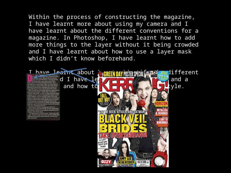
Within the process of constructing the magazine, I have learnt more about using my camera and I have learnt about the different conventions for a magazine. In Photoshop, I have learnt how to add more things to the layer without it being crowded and I have learnt about how to use a layer mask which I didn’t know beforehand.
I have learnt about how to identify the different genres and I have learnt what a masthead and a kicker is and how to identify the font style.
Looking back at your preliminary task, what do you
feel you have learnt in the progression from it to the full
product?
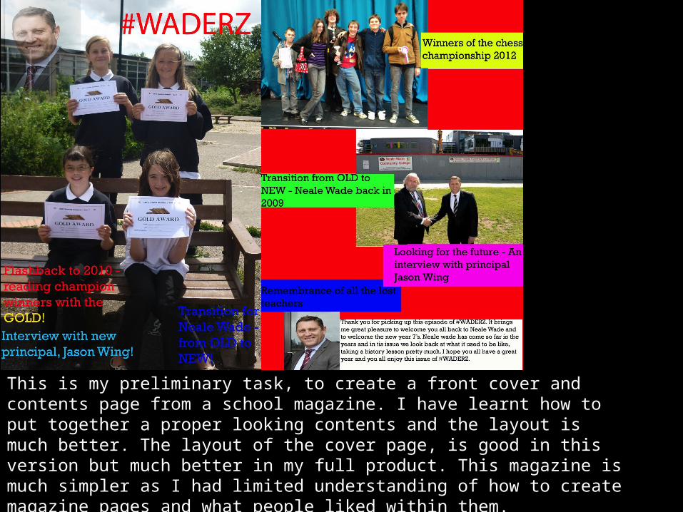
This is my preliminary task, to create a front cover and contents page from a school magazine. I have learnt how to put together a proper looking contents and the layout is much better. The layout of the cover page, is good in this version but much better in my full product. This magazine is much simpler as I had limited understanding of how to create magazine pages and what people liked within them.
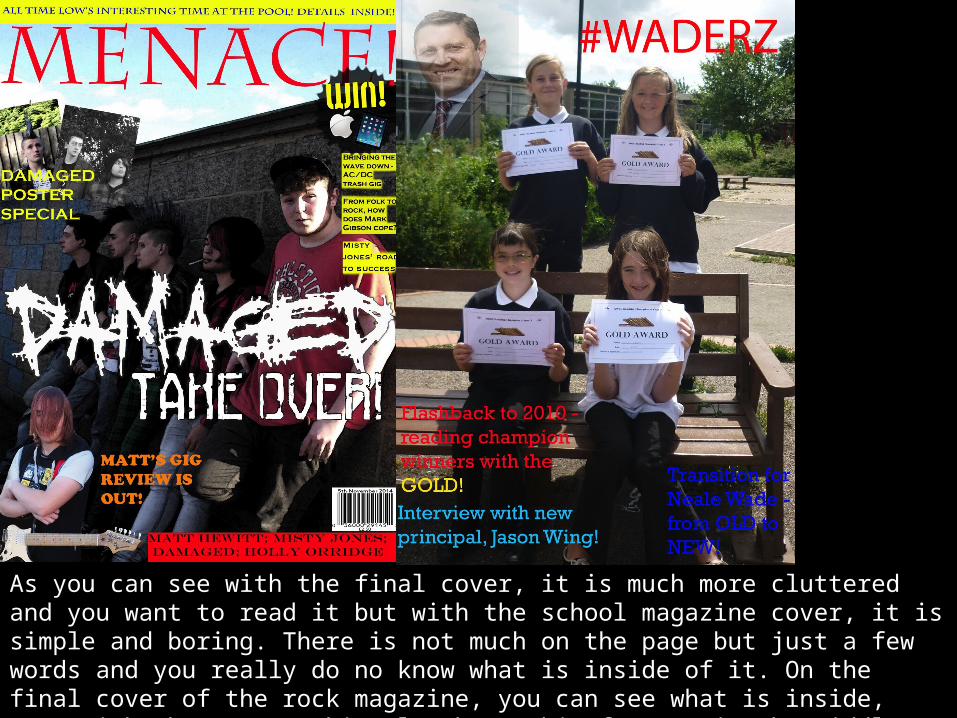
As you can see with the final cover, it is much more cluttered and you want to read it but with the school magazine cover, it is simple and boring. There is not much on the page but just a few words and you really do no know what is inside of it. On the final cover of the rock magazine, you can see what is inside, even with the cover. This also has a big feature in the middle catching your eye so you can see what band is being featured that day.

With the contents page, again it is much more cluttered but there is also more to look at and you have a better idea of what’s in the issue whereas the school contents page has very little on it and isn’t realistic. The first draft of the contents page has good article names on it and an editors note which all magazines have to have. However, it is very vague and although there are quite a few pictures on it, it isn’t enough to warrant being good enough to actually being in a magazine. With the current final draft, there are plenty of articles and although few pictures, it is made up for with writing and articles.