Article Analysis
4
ARTICLE ANALYSIS By Rebecca Dafter
-
Upload
rebeccadafter -
Category
Documents
-
view
82 -
download
1
Transcript of Article Analysis

ARTICLE ANALYSISBy Rebecca Dafter
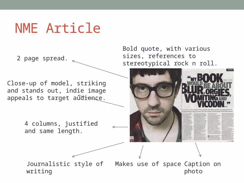
NME Article
2 page spread.
Close-up of model, striking and stands out, indie image appeals to target audience.
4 columns, justified and same length.
Bold quote, with various sizes, references to stereotypical rock n roll.
Journalistic style of writing Makes use of space Caption on photo
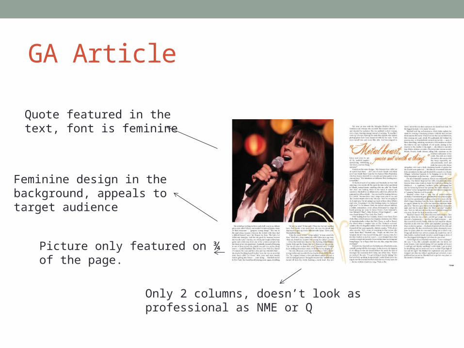
GA Article
Quote featured in the text, font is feminine
Feminine design in the background, appeals to target audience
Picture only featured on ¾ of the page.
Only 2 columns, doesn’t look as professional as NME or Q

Kerrang Article
Follows house style of magazine.
Font is bright, bold and has a rock theme to it, makes it stand out
Includes a fact file
3 columns, looks more professional
Name of band and caption are seen
Picture is a stereotypical rock image, appeals to target audience