Article 3: The Wind Resource
8
5 3.1 Where Does the Wind Blow? Wind surrounds us, and we have all experienced its effects. Sometimes strong winds are welcome, as on a hot summer day, but if they get too strong, being outdoors can become unpleasant. This personal “observational experiment” with wind informs us that some locations experience much stronger winds than others, and that even at a specific location wind speed varies a lot. Quantitative measurements of wind using accurate sensors, when combined with computer modeling, can explain much of this variability. The distinct patterns of airflow that the atmosphere displays when averaged over a decade or more are consistent enough to allow mariners to rely on them to sail the world. Figure 3.1 below shows the modeled main patterns of spatial variability of the average global wind speed, using observational data to improve the model’s accuracy. These are averages over the seventy-year Article 3: The Wind Resource Winds available for wind power today are within the first few hundred meters of the atmosphere. They carry significant amounts of energy, relative to the amount of energy used by human beings. This article seeks to convey the physical characteristics of these winds – both their regularity and their variability over various lengths of time and over various distances. It concludes with a brief history of when humans began understanding wind’s characteristics. Figure 3.1: Average wind speed (in meters per second) near the Earth’s surface (at about 50 meters altude), calculated from the climate simulaons by the Naonal Centers for Environmental Predicon for Jan 1948 to Jan 2018. The horizontal axis indicates east and west longitudes (for example, 60 degrees east) and the vercal axis shows latudinal degrees from the equator north and south. The integers on the map are the wind speeds, in meters per second, of the corresponding contours, and the colors are keyed to the color code below the map. Source: Naonal Oceanic and Atmospheric Administraon, Earth System Research Laboratory, hps://www.esrl.noaa.gov/psd/data/gridded/data.ncep.reanalysis.html.
Transcript of Article 3: The Wind Resource

5
3.1 Where Does the Wind Blow?
Wind surrounds us, and we have all experienced its effects. Sometimes strong winds are welcome, as on a hot summer day, but if they get too strong, being outdoors can become unpleasant. This personal “observational experiment” with wind informs us that some locations experience much stronger winds than others, and that even at a specific location wind speed varies a lot. Quantitative measurements of wind using
accurate sensors, when combined with computer modeling, can explain much of this variability.
The distinct patterns of airflow that the atmosphere displays when averaged over a decade or more are consistent enough to allow mariners to rely on them to sail the world. Figure 3.1 below shows the modeled main patterns of spatial variability of the average global wind speed, using observational data to improve the model’s accuracy. These are averages over the seventy-year
Article 3: The Wind ResourceWinds available for wind power today are within the first few hundred meters of the atmosphere. They carry significant amounts of energy, relative to the amount of energy used by human beings. This article seeks to convey the physical characteristics of these winds – both their regularity and their variability over various lengths of time and over various distances. It concludes with a brief history of when humans began understanding wind’s characteristics.
Figure 3.1: Average wind speed (in meters per second) near the Earth’s surface (at about 50 meters altitude), calculated from the climate simulations by the National Centers for Environmental Prediction for Jan 1948 to Jan 2018. The horizontal axis indicates east and west longitudes (for example, 60 degrees east) and the vertical axis shows latitudinal degrees from the equator north and south. The integers on the map are the wind speeds, in meters per second, of the corresponding contours, and the colors are keyed to the color code below the map. Source: National Oceanic and Atmospheric Administration, Earth System Research Laboratory, https://www.esrl.noaa.gov/psd/data/gridded/data.ncep.reanalysis.html.

6
period from January 1948 to January 2018 for wind speeds about 50 meters above the Earth’s surface.
A few patterns quickly come to one’s attention:
1) General wind patterns are strongly influenced by continents, and the contours of average wind speed track the land-sea boundary in coastal areas.
2) Near the Earth’s surface, winds over oceans are much stronger than over land. This is something many would have experienced when visiting the shore or islands in the middle of the ocean, or when sailing. Stronger winds over the oceans are mainly the result of the “smoother” liquid water surface that creates less drag on overlying wind currents. Land surfaces are rougher as a result of their mountains, forests, and even buildings and factories. All of these topographic features of the land slow down winds significantly over continents. But these same obstacles can funnel airflow to create local areas of high winds suitable for building wind farms. The near absence of land in the southern hemisphere at latitudes of about 40 degrees south is the reason behind the band of strong winds at these latitudes, commonly called the “Roaring Forties.”
3) Even if one ignores this “Roaring Forties” band, significant changes in latitude affect wind speeds. For example, regions near the equator are characterized by low winds, while mid-latitudes experience much faster airflow.
4) The overall range of annually-averaged wind speeds is from about two meters per second (roughly five miles per hour) in the interiors of South America and Africa near the equator, to about 11 meters per second (roughly 25 miles per hour) in the Roaring Forties.
If we now examine the U.S. specifically, instead of the whole world, we can observe spatial variability at a smaller scale (see Figure 3.2). Average annual winds are shown, now at 80 meters above the surface, where wind turbines are typically installed. (Winds at 80 meters are roughly 10 percent stronger than at 50 meters.) Topography evidently has a large influence on wind patterns over land: mountains funnel wind flow and induce large spatial variations in wind patterns; stretches of flat land allow wind to gain speed; and the boundary between land and oceans creates its own patterns. A wide band of high winds with average annual speeds nearing 10 meters per second (22 miles per hour) runs north-south through the Great Plains to the east of the Rocky Mountains. The map also shows how quickly wind responds spatially to
a change in the underlying surface topography. For example, observe the rapid changes in average wind speed near land-water transitions over the Great Lakes and at many locations offshore quite close to the coasts, again due to the smoothness of water surfaces.
Notice that winds off the coasts of Florida are significantly weaker than those off the coast of New England. In the next few sections we will explain how this pattern of strong latitudinal variation of atmospheric flow emerges and how the wind varies in time at a fixed location.
3.2 Why Does the Wind Blow?
The movements of air that we call wind are driven by differences in pressure that have their origin in the heating of the Earth’s surface by the Sun unevenly – more near the equator and less near the poles. This imbalanced heating creates significant temperature differences in the atmosphere, and masses of air cannot stand still when they experience such gradients. There are similarities to water boiling in a pot, where the water heated at the bottom becomes less dense, rises, and mixes with cooler water to homogenize the temperature. Geophysical flows of air (and ocean water) are also seeking to homogenize the Earth’s temperature, but they can never fully succeed. In the case of wind, air at the equator, heated by contact with the hot Earth surface, expands and rises, while polar air cools and sinks.
A Rotating Planet
If a planet mostly like ours were not rotating, its major surface winds would blow toward the equator from both poles. At the equator air would rise to the top of the troposphere, called the tropopause, where it would be redirected poleward. (The troposphere is the lowest layer of the atmosphere; it extends from the Earth’s surface to a height of 11 to 18 kilometers, a little higher than the Earth’s highest mountains.) At the poles air would flow downward to the surface to close
Figure 3.2: Estimated average annual wind speeds for the U.S. at 80 meter altitude, onshore and offshore. Source: National Renewable Energy Laboratory, https://www.nrel.gov/gis/images/80m_wind/awstwspd80onoffbigC3-3dpi600.jpg.

7
the cycle; such a cycle is called a convection cell. This convection cell would convey heat from the equator to the poles very efficiently, since the winds would be perfectly aligned along lines of constant longitude (ignoring continents for now).
But the Earth does rotate, and very fast. The Earth’s surface at the equator is moving at a staggering 463 meters per second (1,036 miles per hour), and this rotation affects the wind patterns substantially. The rotation of the Earth results in three convection cells in each hemisphere, as shown in Figure 3.3. The Hadley cell is found at latitudes near the equator. At the highest latitudes is the polar cell, and at mid-latitudes the intermediate circulation is called the Ferrel Cell. These three cells, working together, still convey heat from the equator to the poles, but less efficiently than as a single cell.
Wind Patterns
The Earth’s rotation affects the wind patterns seen by a wind turbine rotating with the Earth’s surface: the winds are no longer north-south (longitudinally) aligned. Instead, they acquire a very significant east-west (latitudinal) component, larger than the north-south component. In the northern hemisphere, the Earth’s rotation causes a rightward deflection of the surface winds generated by the three cells, while in the southern hemisphere surface winds veer leftward. This helps to explain why the Earth’s wind patterns are organized in largely self-contained “belts” that wrap around within given latitude ranges. Someone moving from one latitude to another (moving north-south) can experience large shifts in wind patterns (as illustrated in Figure 3.1).
These belts and circulations shift with the season. Figure 3.3 depicts their conditions at the March and
September equinoxes; they move southward from September to March (when the sun’s radiation is stronger in the southern hemisphere), and northward from March to September.
Winds in the belt at the equator blow primarily westward. These are the “trade winds” that enabled Europeans, including Columbus, to sail to the Caribbean and Brazil. By convention, a wind blowing westward – that is, toward the west – is called an easterly wind, named for the direction from which the wind is coming. So, the trade winds are northeasterly in the northern hemisphere and southeasterly in the southern hemisphere. A second important belt is the westerlies belt that dominates mid-latitudes in both the northern and southern hemispheres. Columbus sailed back to Europe on a route much further to the north than his outward journey in order to ride these westerlies. The final significant belt is the polar easterlies; these are so close to the poles that they are not very applicable to marine navigation, although the melting of the polar sea ice might change this.
The Wind Rose
The combination of background climatology (circulations and belts) and geographic factors (e.g., topography and proximity to coasts) determines whether a given location is a good site for extracting power from the wind. A widely used way to illustrate site-specific climatology is the “wind rose.” For any single location, a wind rose displays how often wind comes from each direction, and the distribution of wind speeds for that direction.
Figure 3.4: Wind rose for Boulder, Colorado, U.S., with data from 2015. The radial extent of a colored element of the wind rose in a given direction is proportional to the fraction of the time that wind comes from that direction within a particular range of wind speeds. Data are for 100 meters above ground, obtained from the Boulder Atmospheric Observatory. Source: National Oceanic and Atmospheric Administration, Earth System Research Laboratory, https://www.esrl.noaa.gov/psd/technology/bao/.
Figure 3.3: Long-term average circulation patterns for our rotating Earth, highlighting the climatic features of the winds. The circulation in each hemisphere is characterized by three cells (loops of air motion). Source: Climatica, http://climatica.org.uk/climate-science-information/earth-system.

8
Figure 3.4 shows a specific wind rose – for the Boulder Atmospheric Observatory, a tall tower in Colorado, U.S. The wind speed (in this case, measured at 100 meters above the ground) is shown for six ranges of speeds in six colors, starting with speeds less than 3 meters per second and ending with speeds higher than 15 meters per second. The incoming wind direction is similarly divided into sixteen ranges of angles. The larger a box, the more the wind comes from that direction and at that speed. For example, wind blows from the north about 10 percent of the time, but more than half of these winds have speeds less than 3 meters per second. Most wind speeds for this location are between 0 and 6 meters per second. The most frequent winds are the northerlies, but the strongest winds blow from the west.
The wind rose is particularly convenient and easy to interpret. Wind speed data can help developers decide if a site is appropriate for a wind farm and to select an appropriate turbine, while data about wind direction can help design the layout of its turbines.
3.3 Why Does the Wind Blow Chaotically?
In introducing Figure 3.1 we commented that the wind patterns shown are averages over a decade or more. Contributing to these average winds, including the three circulation cells, are the Earth’s land-sea boundaries, its topography, and its speed of rotation. These average winds are features of the Earth’s climate, which is the state of the atmosphere that one can observe if winds, temperatures, precipitation, and other pertinent variables are averaged over many years.
But continents and mountains do not move on time scales relevant to wind, and the Earth’s speed of rotation is essentially constant. Nonetheless, the world’s wind patterns are not stable. They break down into smaller air masses that move around chaotically. Why do winds vary so chaotically in speed and direction from day to day, and even hour to hour, creating what we call weather?
Weather
From personal experience, we know that weather varies to a considerable extent and appears unpredictable, especially more than several days ahead. Figures 3.1 to 3.4 reflect only the wind climatology, where the many short-term fluctuations of the weather are averaged out. In some regions of the globe the weather fluctuations are much weaker than the patterns of climatic circulation. This is the case near the equator, where climatic patterns dominate. Intrepid sailors have depended on this regularity for their travels. However, the absence of weather fluctuations also means the winds are generally calmer, leading to periods commonly referred to as doldrums, very slow wind speeds that can trap sailing ships for multiple days.
In other regions such as mid-latitudes, the climatic circulation breaks down. The winds are stronger and their fluctuations from the average climate are larger. The resulting motions of air masses (the weather systems) are more chaotic. Chaos refers to a characteristic of a system where small changes in its current state can lead to much larger differences in future states. The length scales of these weather systems range approximately from 10 to 1,000 kilometers, and they persist for many weeks in the atmosphere, continuously in motion. Because a weather system requires from two days to two weeks to pass over a given location, that location generally experiences this weather for only a fraction of the system’s lifespan. The two most important factors that control the airflow in these systems are: (1) the Earth’s rotation (again), and (2) differences in air pressure between a given air mass and adjacent ones (a weather system’s highs and lows).
Air pressure in the atmosphere reflects air temperature and airflow. It typically varies by about one tenth of one percent over a distance of 100 kilometers, but that is more than sufficient to modulate the weather by accelerating the air masses significantly. These pressure differences create a flow between adjacent air masses.
Weather Maps
Movements of air over periods of hours to days are captured by weather maps. As expected, there maps are more complicated than maps of the average climate, because they display the patterns of air pressure and wind at a particular moment. Consider Figure 3.5, which shows a weather map for the continental U.S. at a particular time on June 9, 2017. Locations of maximum and minimum pressure are marked as a blue H for a
Figure 3.5: A typical weather map for the U.S. showing the complex weather patterns at a particular time and date, in this case Friday June 9, 2017, at 10:26 Universal Time Coordinated (formerly, Greenwich Mean Time). The thin grey contours are curves of equal pressure. Source: National Oceanic and Atmospheric Administration, National Weather Service, https://www.weather.gov/zjx/sfc_analysis.
9
high-pressure system (an air mass that has originated where the vertical cell circulation is downward) and a red L for a low-pressure system (originating where the vertical cell circulation is upward). Air flows from regions of high pressure toward regions of low pressure, but the Earth’s rotation prevents straight-line flow from high to low. Instead, the winds spiral almost parallel to the lines of constant pressure (known as isobars). In the northern hemisphere the winds move clockwise and slightly outward as they circulate around from highs, and anti-clockwise and slightly inward around lows. (These directions of rotation are the opposite for highs and lows in the southern hemisphere.) In Figure 3.5, the Southeastern U.S. is experiencing high-pressure air, while low pressures dominate over the West.
The blue and red curves show “fronts,” which are boundaries between air masses with substantially different temperatures; at fronts, there is often rainfall. The motion of these fronts tracks the motion of the air masses and their boundaries. The blue curves are cold fronts, where cold air is displacing warmer air. The red curves are warm fronts where the opposite is occurring. The curve with both red and blue is a stationary front that is not moving. When two fronts merge, a complex meteorology is the result. The isobars that connect points of constant pressure on the map reveal the strength of the wind. Isobars that are closer together imply greater pressure gradients and therefore stronger winds (e.g. around the low off the coast of New York). The Pacific Northwest is experiencing light winds on this particular day. The dashed orange lines are low-pressure “troughs” (equivalent to the valleys on a topographic map) and often bring rain.
Weather maps like Figure 3.5 also inform us, indirectly, about how far away from a generally windy place is there a calm place, at various times of the year. If the wind power generated at two places where the wind speeds are often different can be combined, a less variable total wind power output will result, which will reduce the problems created by unpredictable and variable electricity production.
The correlation between the strengths of winds at two different locations is related to the typical size of the chaotic air masses, which, as noted before, range from 10 to 1,000 kilometers. So, we expect locations that are less than 10 kilometers apart to be strongly correlated, and locations that are more than 1,000 kilometers apart to be very weakly so. This has practical significance for wind power: combining the wind power from two locations far from one another may require the construction of new electric power transmission lines. Transmission lines may need to extend hundreds of kilometers from one another, or more, to create a substantial reduction in the variability of some wind power resources.
3.4 When Does the Wind Blow, and How Variably, at a Single Location?
In the previous section we explored variations from place to place in the wind at a given moment. The other kind of variation is from one time to another at the same place.
The variability of wind in time at a single location occurs on scales ranging from a few minutes to a few days to entire seasons. The strongest variability and the one most relevant for wind energy is the one emanating from weather systems. Consider one of the smaller weather systems, about 10 kilometers in size, moving past a wind turbine at a speed of 5 meters per second. It would affect the turbine for about 2,000 seconds, or about half an hour. By contrast, one of the largest weather systems, spanning 1,000 kilometers and moving at the same speed, would affect the turbine for about two days.
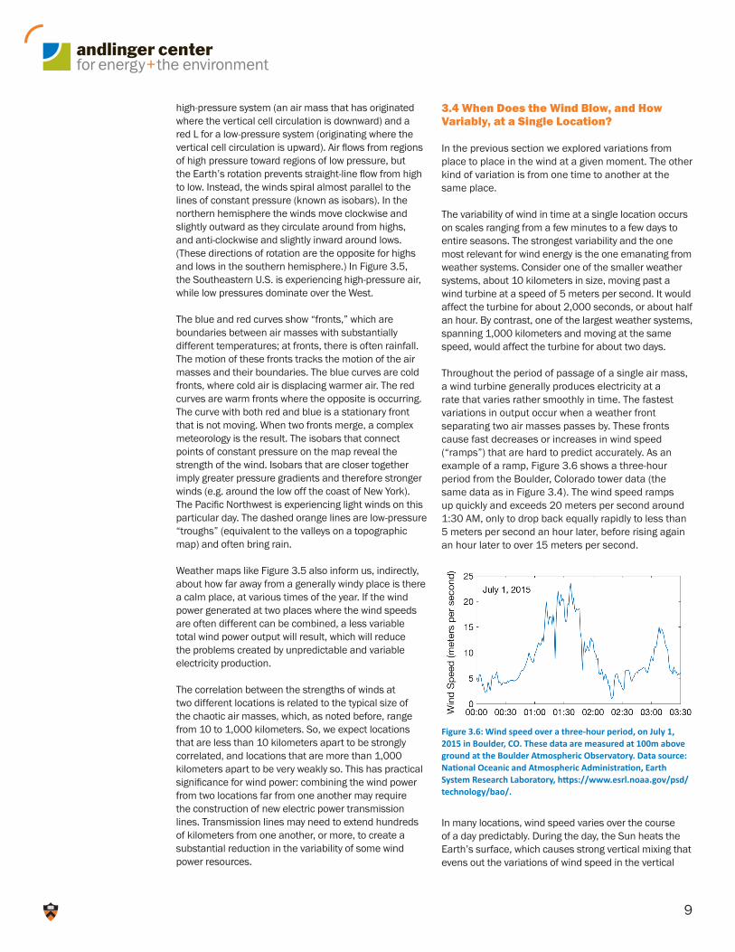
Throughout the period of passage of a single air mass, a wind turbine generally produces electricity at a rate that varies rather smoothly in time. The fastest variations in output occur when a weather front separating two air masses passes by. These fronts cause fast decreases or increases in wind speed (“ramps”) that are hard to predict accurately. As an example of a ramp, Figure 3.6 shows a three-hour period from the Boulder, Colorado tower data (the same data as in Figure 3.4). The wind speed ramps up quickly and exceeds 20 meters per second around 1:30 AM, only to drop back equally rapidly to less than 5 meters per second an hour later, before rising again an hour later to over 15 meters per second.
In many locations, wind speed varies over the course of a day predictably. During the day, the Sun heats the Earth’s surface, which causes strong vertical mixing that evens out the variations of wind speed in the vertical
Figure 3.6: Wind speed over a three-hour period, on July 1, 2015 in Boulder, CO. These data are measured at 100m above ground at the Boulder Atmospheric Observatory. Data source: National Oceanic and Atmospheric Administration, Earth System Research Laboratory, https://www.esrl.noaa.gov/psd/technology/bao/.
10
direction, accelerating the wind near the surface and decelerating it further above. Nighttime conditions create the opposite effect, reducing the vertical mixing and creating stronger variability of the wind with height. This vertical mixing is produced by turbulent eddies and gusts, which can cause wind variations at time scales ranging from minutes down to thousandths of a second. One result is fast changes in wind speed at sunrise and sunset, when vertical mixing is changing rapidly.
Winds also often demonstrate predictable seasonal variability, as shown by the belts and circulations of the global climate in Figure 3.3. These features move northward and southward with the season, altering the background climatological wind and the stability of the climatic circulation. These changes, in turn, affect the formation and properties of the chaotically moving air masses. One result is that winters, for each hemisphere, are almost always windier than summers.
However, information about the range of wind speeds at a given location is also critically important. The fastest recorded wind speed near the Earth’s surface was 113 meters per second (254 miles per hour). It was a gust lasting only seconds, measured during Tropical Cyclone Olivia on Barrow Island, 50 kilometers (30 miles) offshore in Western Australia on April 10, 1996. The same cyclone generated winds sustained for ten minutes that exceeded 54 meters per second (120 miles per hour). In general, tropical cyclones (including hurricanes) and tornadoes generate the strongest winds on the planet, but only for short periods of time.
While a lot of energy can be generated from the highest winds, they are very rare, and it makes little financial sense to build wind turbines that target such extremes. Instead, wind turbines are designed to operate in wind conditions ranging, typically, from 3 to 25 meters per second (7 to 65 miles per hour). A site is chosen for wind farm development based on detailed local data. We turn now to how these data are developed and displayed.
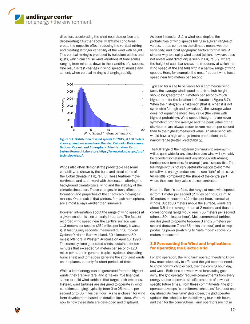
As seen in section 3.2, a wind rose depicts the probabilities of wind speeds falling in a given ranges of values. It thus combines the climatic mean, weather variability, and local geographic factors for that site. A simpler way to display wind speed (which, however, does not reveal wind direction) is seen in Figure 3.7, where the height of each bar shows the frequency at which the wind speed at the site falls within a narrow range of wind speeds. Here, for example, the most frequent wind has a speed near two meters per second.
Typically, for a site to be viable for a commercial wind farm, the average wind speed at turbine hub height should be greater than 7 meters per second (much higher than for the location in Colorado in Figure 3.7). When the histogram is “skewed” (that is, when it is not symmetric for high and low values), the average value does not equal the most likely value (the value with highest probability). Wind-speed histograms are never symmetric: both the average and the peak value of the distribution are always closer to zero meters per second than to the highest measured value. An ideal wind site would have a high average (more production) and a narrow range (better predictability).
The full range of the histogram (minimum to maximum) will be quite wide for any site, since zero wind will invariably be recorded sometimes and very strong winds (during hurricanes or tornados, for example) are also possible. The full range is thus not very useful information to estimate overall wind energy production: the rare “tails” of the curve tell us little, compared to the shape of the central part where the more likely values are concentrated.
Near the Earth’s surface, the range of most wind speeds is from 1 meter per second (2 miles per hour, calm) to 10 meters per second (22 miles per hour, somewhat windy). But at 80 meters above the surface, winds are about 3.5 times stronger than at 2 meters, and thus the corresponding range would reach 35 meters per second (almost 80 miles per hour). Most commercial turbines are designed to operate between 3 and 25 meters per second (between 7 and 55 miles per hour) and to stop producing power (switching to “safe mode”) above 25 meters per second.
3.5 Forecasting the Wind and Implications for Operating the Electric Grid
For grid operation, the wind farm operator needs to know how much electricity to offer and the grid operator needs to know how much to expect, over the coming hour, day, and week. Both lose out when wind forecasting goes awry. The grid operator requires commitments from every energy source to provide specific amounts of power at specific future times. From these commitments, the grid operator develops “commitment schedules” for about one day ahead. As “real time” gets closer, the grid operator updates the schedule for the following four-to-six hours and then for the coming hour. Farm operators are not in
Figure 3.7: Distribution of wind speeds for 2015, at 100 meters above ground, measured near Boulder, Colorado. Data source: National Oceanic and Atmospheric Administration, Earth System Research Laboratory, https://www.esrl.noaa.gov/psd/technology/bao/.

11
as much control of future production as most others on the grid. When the time arrives to deliver the electricity, a wind generator might be producing more or less than it had committed to provide, due to forecast errors.
What is needed by both the grid and farm operator is accurate information about future winds at a site. The well-behaved climatological averages captured by wind roses and wind-speed histograms, which guide farm design, become of secondary importance. The required capability is weather forecasting.
Weather forecasting is improving thanks to increasingly sophisticated models and observations that capture the dynamics of chaotically moving air masses. As noted above, chaotic weather systems are highly sensitive to their starting conditions and to minute details of their motions, making it difficult, but not impossible, to predict how they will play out over time.
The general rules of chaos theory were discovered and formulated first by a meteorologist, Edward Lorenz, in the 1960s, while he was researching atmospheric dynamics. One can think of a chaotic system as a road with many forks: at each fork where there is the choice to go either left or right, and the choice can lead to two very disparate final locations. Even with the help of supercomputers, the limited ability to describe the initial state of the weather restricts the quality of predictions, leading to models that potentially go the wrong way at a fork. Resulting errors can underestimate or overestimate the strength of a future wind, or alternatively they can get the magnitude of some future wind right but its time of arrival wrong (for example due to an error in capturing the time of arrival of a front).Modern-day meteorological forecasting, which relies on
simulation codes running on massive computational infrastructure, aims to compensate for these limitations by incorporating into models a wide range of observational data. The result, over the past two decades, has been significantly improved descriptions of the atmosphere’s initial state. The other two major contributors to improved weather forecasting are advances in the description of the physics embedded in these models, and better computing resources. More simulations with finer spatial resolution can now be run (either multiple models or the same model run many times), improving the value of the average of the various outputs. However, despite these advances, forecasting remains imperfect, and weather prediction errors can never be expected to be eliminated altogether. A realistic aim is to continue to reduce prediction errors by improving the models used in forecasting and the estimates of their uncertainties, so that farm operators and grid operators can know how much confidence to place in a given forecast.
The simplest method for predicting the weather assumes that the wind at some location will not change. Known as the persistence method, it is more accurate than the outputs from weather forecasting models for very short time periods and specific sites. “Improvement over persistence” continues to be used as a metric of how well a model performs. For a typical site, the most sophisticated numerical weather prediction models today outperform the persistent method after the prediction period exceeds about six hours. For winds a few days ahead, weather forecasters can predict wind speeds at mid-latitudes reasonably well, despite the fact that such wind speeds are usually very different from the average values indicated in Figures 3.1-3.4.
Figure 3.8: The accuracy of the persistence method and a numerical weather prediction model are compared for a specific site. The “root mean square error” on the vertical axis measures the average inaccuracy of a forecast methodology: higher values reflect more inaccurate forecasting. The persistence method predicts that the wind speed will be the same from one hour to the next. The numerical weather prediction model shown here is from the National Center for Atmospheric Research. The data and predictions being compared are from January 2012 at the CHLV Virginia Buoy, a data station off the coast of Virginia near the mouth of the Chesapeake Bay. This hindcasting exercise was made using the 2017 version of the Weather Research and Forecasting Model. For a forecasting horizon of less than six hours, the persistence method performs better.

12
Figure 3.8 makes this point. It compares a U.S. numerical weather prediction model from the National Center for Atmospheric Research (blue curve) with the persistence method (red curve). The vertical axis measures the inaccuracy of the forecast (a higher value is a more inaccurate average forecast). The persistence model is more accurate than the complex weather model when the forecast is for the wind speed less than six hours ahead. Other weather prediction models give broadly similar results.
Numerical weather-forecasting models, like the European and American Weather Models, are steadily improving. Also under development are “statistical models” that use machine learning to recognize patterns of change in site-specific multi-year data. Moreover, the blending of purely statistical approaches and numerical weather models is currently an active research topic, and aggregate forecasts have shown the ability to beat what each approach can accomplish on its own.
Fast ramps in wind speed are a frequent feature of winds when a front passes by, or when a rapid change in the heating of the Earth’s surface (e.g., during sunrise and sunset) modifies atmospheric turbulence. One of the open challenges in forecasting is to predict these ramps accurately. Numerical weather prediction models have a hard time capturing ramps, while the persistence method, on its own, obviously, completely misses them. Much desired is a methodology for short-term forecasting that can capture ramps, or at least can warn of an increased probability of their occurrence.
3.6 Coda: A Brief History of Understanding the Wind
Figuring out how to think about air was a major scientific achievement of the 17th century.
The initial development of technologies to serve human needs is often based on intuition, and only later does a deep understanding of the underlying physical laws emerge. Wind technologies are no exception. Early humans built aerodynamically shaped arrows and harnessed the winds to sail over the seas and to mill grains. They did not know, and did not need to know, that air is a substance which has mass and is therefore subject to large-scale forces.
Hero (or Heron) of Alexandria (~ 10–70 AD), in his treatise on pneumatics, was probably the first scientist to postulate that air is a fluid, that is, a form of matter like water or oil. He is also credited with the first design of a device to harness wind energy to power a machine, a wind organ. However, science had to wait until the 17th century for Galileo Galilee (1564-1642) and Evangelista Torricelli (1608-1647) to provide experimental proof of the nature of air. Torricelli was the first scientist known to have provided a description of the atmosphere that is consistent with current understanding: “We live submerged at the bottom of an ocean of air.” He also described air motion: “Winds are produced by differences of air temperature, and hence density, between two regions of the Earth.”
More than a century earlier, Leonardo Da Vinci (1452-1519) had laid the basis for experimental fluid mechanics, showing the value of formulating theories and making deductions based on observations rather than on pure thought. Modern wind engineering also owes much to Sir Isaac Newton (1642-1726), who formalized and developed the core concepts and physical laws that, when later applied to fluids, gave us the equations we still use today to model weather and climate at all scales: how air moves, what controls its speed and direction, how its properties change with altitude, and how it is slowed down by the Earth’s surface. The same equations are used to design the aerodynamics of airplanes and cars. Finally, given how important the Earth’s rotation is, as outlined in this article, credit is due to Gaspard-Gustave de Coriolis (1792-1843), who formalized mathematically the way the Earth’s rotation affects how the motion of matter, including air, is perceived by an observer on Earth.


![Wind Speed Characteristics and Resource Assessment Using ... Wind speed... · This article was downloaded by: [S. Rehman] On: 07 December 2012, At: 20:51 Publisher: Taylor & Francis](https://static.fdocuments.us/doc/165x107/5f01b41a7e708231d400a2ff/wind-speed-characteristics-and-resource-assessment-using-wind-speed-this.jpg)