Art Site Tour
10
THE ART OF LINDA ALBERTINI A quick tour of my website
-
Upload
linda-albertini -
Category
Documents
-
view
233 -
download
2
Transcript of Art Site Tour

THE ART OF LINDA ALBERTINI A quick tour of my website
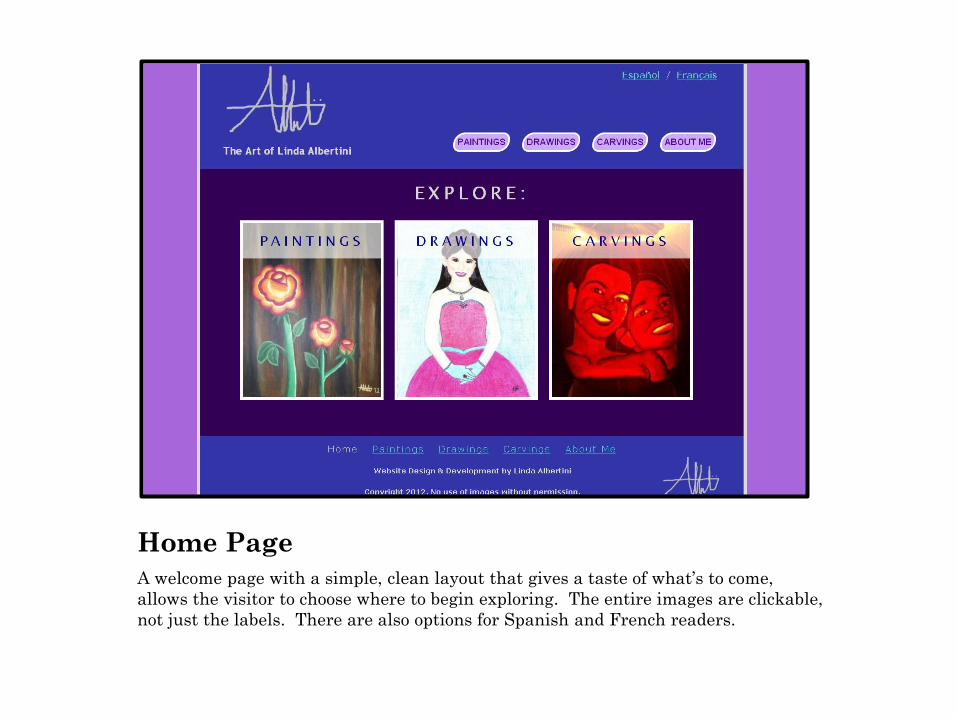
Home Page
A welcome page with a simple, clean layout that gives a taste of what’s to come,
allows the visitor to choose where to begin exploring. The entire images are clickable,
not just the labels. There are also options for Spanish and French readers.

Paintings Gallery
Features a gallery of thumbnails of my paintings. When clicked on, visitors can see larger versions of the images with captions in a “light box” that they can click through. There is also a personal quote on the bottom to give visitors more insight on my experience painting.

Drawings Gallery
Similar format as the paintings gallery, only with thumbnails of my
drawings. The cool color scheme of the site allows the images to stand
out. Off the home page, the logo and title in the header become clickable
links to the home page.
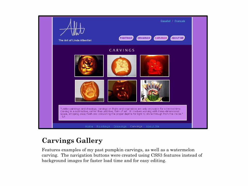
Carvings Gallery
Features examples of my past pumpkin carvings, as well as a watermelon
carving. The navigation buttons were created using CSS3 features instead of
background images for faster load time and for easy editing.

About Me Page
Tells visitors about my passion for making art and web design, includes
a photo of me and contact information.

No-script Warning
On the gallery pages, displays a warning on browsers that have JavaScript
turned off, with a link to instructions for enabling it. Fortunately, even without
JavaScript, visitors can still click on the thumbnails to see larger versions of the
images – just without the “light box” feature.
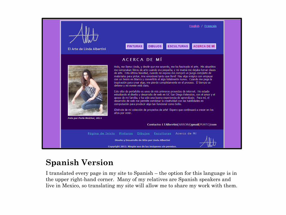
Spanish Version
I translated every page in my site to Spanish – the option for this language is in
the upper right-hand corner. Many of my relatives are Spanish speakers and
live in Mexico, so translating my site will allow me to share my work with them.

French Version
In addition to Spanish, I also translated my website to French, my third language,
so I can share my work with my French-speaking family members. Note that this
and the previous screenshot were taken in an older version of Internet Explorer.
It does not support the rounded borders feature of CSS3, but still renders the
navigation buttons in an attractive way.

SUMMARY
Page structure and style built entirely from scratch
using HTML5 and CSS3
CSS-based layout, no tables or templates
Gallery “light box” featuring JavaScript
Blue link colors throughout to avoid confusing visitors
Tested in Chrome, Firefox, and IE
Target browser width: 1024px
Thank you!