Animated Presentation of Static Infographics with InfoMotion
12
Eurographics Conference on Visualization (EuroVis) 2021 R. Borgo, G. E. Marai, and T. von Landesberger (Guest Editors) Volume 40 (2021), Number 3 Animated Presentation of Static Infographics with InfoMotion Yun Wang 1 , Yi Gao 1,2 , Ray Huang 1 , Weiwei Cui 1 , Haidong Zhang 1 , and Dongmei Zhang 1 1 Microsoft Research Asia 2 Nanjing University Figure 1: (a) An example infographic design. (b) The animated presentations for this infographic show the start time, duration, and animation effects applied to the visual elements. InfoMotion automatically generates animated presentations of static infographics. Abstract By displaying visual elements logically in temporal order, animated infographics can help readers better understand layers of information expressed in an infographic. While many techniques and tools target the quick generation of static infographics, few support animation designs. We propose InfoMotion that automatically generates animated presentations of static infographics. We first conduct a survey to explore the design space of animated infographics. Based on this survey, InfoMotion extracts graphical properties of an infographic to analyze the underlying information structures; then, animation effects are applied to the visual elements in the infographic in temporal order to present the infographic. The generated animations can be used in data videos or presentations. We demonstrate the utility of InfoMotion with two example applications, including mixed-initiative animation authoring and animation recommendation. To further understand the quality of the generated animations, we conduct a user study to gather subjective feedback on the animations generated by InfoMotion. CCS Concepts • Human-centered computing → Visualization design and evaluation methods; 1. Introduction Combining diverse visual elements, infographics have become a per- vasive means of improving the comprehension of complex informa- tion. Enhanced by well-crafted animations, infographics can present contents progressively and narratively to facilitate perception of information [Fis10]. In addition, creative animations can guide view- ers’ attention and improve user engagement [CRP * 16]. Professional designers and artists create animated infographics to expand the influence of content. Non-experts such as marketers and government agencies also leverage animations to create informative, aesthetic, compelling, and impressive presentations. However, the design of animated infographics requires tremendous effort [ARL * 17]. Creat- ing an elaborate animated infographic involves multiple steps. One needs to carefully plan the timings and effects of animations. Consider a hypothetical example in which a nutritionist, Diana, is preparing a presentation to illustrate Mediterranean diet (Figure 1a). To leave a great impression to the audience, she goes through design examples of animated infographics, and imagines an animation like this: First, the central icon and title show. Then, every slice of the donut spin clockwise one by one. When the slice is spinning in, the links wipe in at the same time. For each slice, when the links are completely shown, the icons, numbers, and descriptions should gradually appear one by one. To implement the animation design, she needs to carefully draw out a timeline to arrange the start time points for each animation (Figure 1b), and apply animation effects © 2021 The Author(s) Computer Graphics Forum © 2021 The Eurographics Association and John Wiley & Sons Ltd. Published by John Wiley & Sons Ltd. https://diglib.eg.org https://www.eg.org
Transcript of Animated Presentation of Static Infographics with InfoMotion

Eurographics Conference on Visualization (EuroVis) 2021R. Borgo, G. E. Marai, and T. von Landesberger(Guest Editors)
Volume 40 (2021), Number 3
Animated Presentation of Static Infographics with InfoMotion
Yun Wang1, Yi Gao1,2, Ray Huang1, Weiwei Cui1, Haidong Zhang1, and Dongmei Zhang1
1Microsoft Research Asia 2Nanjing University
Mediterranean Diet
5%
30%20%
10%
Meats, sweets
35%Whole grains, pasta, beans, whole grain bread
Vegetables and fruits 30%Vegetables and fruits Fish, seafood, poultry,
dairy food, eggs
Oliver oil
time
slicelinkdoticontitledescription
spinwipe
zoomzoomzoomwipe
Element Animation effect
(a) (b)
Figure 1: (a) An example infographic design. (b) The animated presentations for this infographic show the start time, duration, and animationeffects applied to the visual elements. InfoMotion automatically generates animated presentations of static infographics.
AbstractBy displaying visual elements logically in temporal order, animated infographics can help readers better understand layers ofinformation expressed in an infographic. While many techniques and tools target the quick generation of static infographics, fewsupport animation designs. We propose InfoMotion that automatically generates animated presentations of static infographics.We first conduct a survey to explore the design space of animated infographics. Based on this survey, InfoMotion extractsgraphical properties of an infographic to analyze the underlying information structures; then, animation effects are applied tothe visual elements in the infographic in temporal order to present the infographic. The generated animations can be used indata videos or presentations. We demonstrate the utility of InfoMotion with two example applications, including mixed-initiativeanimation authoring and animation recommendation. To further understand the quality of the generated animations, we conducta user study to gather subjective feedback on the animations generated by InfoMotion.
CCS Concepts• Human-centered computing → Visualization design and evaluation methods;
1. Introduction
Combining diverse visual elements, infographics have become a per-vasive means of improving the comprehension of complex informa-tion. Enhanced by well-crafted animations, infographics can presentcontents progressively and narratively to facilitate perception ofinformation [Fis10]. In addition, creative animations can guide view-ers’ attention and improve user engagement [CRP∗16]. Professionaldesigners and artists create animated infographics to expand theinfluence of content. Non-experts such as marketers and governmentagencies also leverage animations to create informative, aesthetic,compelling, and impressive presentations. However, the design ofanimated infographics requires tremendous effort [ARL∗17]. Creat-
ing an elaborate animated infographic involves multiple steps. Oneneeds to carefully plan the timings and effects of animations.
Consider a hypothetical example in which a nutritionist, Diana, ispreparing a presentation to illustrate Mediterranean diet (Figure 1a).To leave a great impression to the audience, she goes through designexamples of animated infographics, and imagines an animation likethis: First, the central icon and title show. Then, every slice of thedonut spin clockwise one by one. When the slice is spinning in,the links wipe in at the same time. For each slice, when the linksare completely shown, the icons, numbers, and descriptions shouldgradually appear one by one. To implement the animation design,she needs to carefully draw out a timeline to arrange the start timepoints for each animation (Figure 1b), and apply animation effects
© 2021 The Author(s)Computer Graphics Forum © 2021 The Eurographics Association and JohnWiley & Sons Ltd. Published by John Wiley & Sons Ltd.
DOI: 10.1111/cgf.14325
https://diglib.eg.orghttps://www.eg.org

Yun Wang et al. / Animated Presentation of Static Infographics with InfoMotion
to each visual element. If the resulting animation is not satisfactoryenough, she needs to repeat this process iteratively through trial anderror. The entire process can be tedious and laborious. Non-expertusers without an animation design background may not have clearanimation designs in mind and be hindered by such complicatedsettings. They may compromise by simply using a monotonousanimation design, e.g., adopting the same effect and showing all theelements at once, though they might intend to create more elaboratedones with abundant animation effects and carefully designed timearrangements to display and convey their messages.
Visual elements in an infographic compose information structuresimplicitly. For example, in Figure 1, an assembly of slice, percent-age, icon, etc., composes one repeating unit. With similar visualrepresentations, each unit presents a single part of the whole story,and at the same time, they are combined to tell the whole story. Bymanually coding of 965 infographics, researchers [LWL∗20] findthe majority (64.1%) of infographics contain clear narrative flows.People inject visual hints to imply narrative flows and relations ofvisual elements. One step further, we aim to infer semantic rolesof each visual element in these static infographics and organizingthem into information structures, so that we can arrange animationsequences and effects accordingly.
In this paper, we propose an automatic approach of animationdesign, InfoMotion, that recognizes underlying structures of staticinfographics and further applies animation sequences and effects,based on the underlying information structures, to enhance presen-tations of infographics. First, we conduct a survey on real-worlddesigns of animated infographics and summarize the design of an-imation into design primitives to compose information structures.Then, we propose InfoMotion, a technique that generates animatedpresentations of static infographics. InfoMotion infers informationstructure from a static infographic by analyzing visual properties ofthe elements; presentation orders and animation effects are arrangedto animate the visual elements. We report quantitative evaluationsof our structure inference on 120 infographic examples. We demon-strate the utility of InfoMotion with two example applications, i.e.,mixed-initiative animation authoring and animation recommenda-tion. We further conduct a user study to gather subjective feedbackon the animations generated by InfoMotion and understand the dif-ferences between auto-generated animations and animations craftedby designers. Participants shown no preference on the 12/18 anima-tion pairs generated by InfoMotion and crafted by designers.
2. Related Work
2.1. Infographics
Infographics have gained increasing interest among researchersin the field of visualization. Combining data content and visualembellishments, infographics can engage and impress users eas-ily [BMG∗10, HKF15, BVB∗13, WSK∗19]. Researchers have ex-plored automated approaches to understand infographics from theperspective of visual importance [BKO∗17], personality [ZCL18],and quality [FWD∗19,WXL∗21]. Recently, Lu et al. [LWL∗20] ana-lyze the presentation flow of static infographics leveraging indexes(numbers and letters) extracted from bitmap images. Inspired by thiswork, we further propose an algorithm to reconstruct information
structures so as to enable animation arrangement for static info-graphics. On a related note, Thompson et al. recently summarize thedesign space of animated visualizations [TLLS20]. However, thestudy only focuses on summarizing low-level primitives of anima-tion design. There is a lack of empirical studies to understand howanimation creators present infographics gradually to reveal informa-tion. To this end, we collect a dataset of animated infographics andanalyze the design space of presenting animated infographics.
Authoring tools and automated generation techniques havebeen proposed to assist in creating more expressive visualizations[WWS∗21]. For example, Data Illustrator [LTW∗18] and Charticula-tor [RLB19] help with the design of bespoke visualizations throughdata binding applied to vector graphic properties. Researchers havealso proposed design tools for expressive infographics with im-ages, icons, and hand-drawn shapes. For example, DDG [KSL∗17],DataInk [XHRC∗18], and InfoNice [WZH∗18] enable data bind-ing with custom shapes, hand-drawn shapes, and icons, images,and texts, respectively. Automated approaches are also explored togenerate infographic data stories, e.g., organizing data facts intofact sheets [WSZ∗20], generating infographics from natural lan-guage statements [CZW∗20], or extracting timeline templates frominfographic images [CWW∗19]. While the authoring of static info-graphics is well-studied, there is no existing technique or tool thatsupports the animating of expressive visualizations or infographicswith rich design elements such as icons and embellishments. In ourwork, we propose InfoMotion to generate animated presentation ofstatic infographics.
2.2. Animation Design in Visualization
Animations are commonplace in visualization and have been re-searched for a long time. Early work by Tversky et a. [TMB02]finds although animations might not be effective for data analysis,they are attractive in presentations. Animations can serve a wide vari-ety of purposes in presentations, such as revealing data relationships,helping with orientation, catching attention, etc [CRP∗16, BS90].In the context of visual analytics, animated transition techniqueshave been adopted to keep users oriented during changes and manip-ulations of complex datasets, such as dynamic networks [BPF14],streaming data [HVF13], multidimensional data [EDF08], and doc-ument histories [CDBF10]. To improve the tracking of movingobjects, researchers have explored animation strategies such as stag-ing [CRP∗20], trajectory bundling [DCZL15], and temporal distor-tion [DBJ∗11]. Described as visually pleasing and engaging, anima-tion is also an effective method of vividly telling stories to improveunderstandability and enhance user experience [HR07, ARL∗15] .For example, Ruchikachorn et al. [RM15] propose teaching visu-alizations by linking a new one to another more familiar one andchange through animated morphing; Kim et al. [KCH19] designanimated visualizations to convey common aggregation operations;Wang et al. [WCL∗16] design animated narrative visualization topresent video clickstream data.
More recently, Ge et al. [GZL∗20] and Kim et al. [KH20] proposehigh-level languages that enable users to specify the animationsfor data charts. Although the proposed techniques also generateanimated graphics for static ones, they focus on data charts that arerepresented by well-structured forms (data-enriched SVG or Vega-
© 2021 The Author(s)Computer Graphics Forum © 2021 The Eurographics Association and John Wiley & Sons Ltd.
508
Yun Wang et al. / Animated Presentation of Static Infographics with InfoMotion
lite), where the roles (e.g., marks, axes) of each visual element (e.g.,lines, circles) are clearly assigned. However, the visual elements inan infographic are usually not structured semantically. Likewise, wepropose information structures that animations can be organizedand arranged accordingly.
InfoMotion takes a reverse-engineering way to construct infor-mation structures. While existing work on reverse-engineering vi-sualizations constructs visualization structures by analyzing vectorgraphics [SKC∗11, SHL∗16, PH17, JKS∗17, WTD∗20], they onlytarget standard chart templates such as bar charts and line charts.InfoMotion more flexibly identifies repeating units and constructinformation structures to cover a variety of infographics. Throughthis way, different animation strategies can be further configured tocater various needs of expressive animated presentations.
Authoring tools have sought to empower people to create ani-mated infographics. Commercial tools such as Flourish [flo20] andVisme [Vis20] support animations through a template-editing man-ner, where system developers need to create animated infographictemplates in advance. DataClips [ARL∗17] similarly provides a setof templates for users to craft data-driven video. However, withthe template-editing approach, the number of templates limits therichness of resulting animations. The animations created with aparticular tool may look similar. Presentation tools like PowerPoint,provide more flexible templates (e.g., SmartArt) with informationstructure embedded. Users can configure animations by choosingeffect options (i.e., all at once, one by one, and as one object). How-ever, it is still a closed system where users cannot add new templates.When InfoMotion is leveraged by the developers of template-editingtools, animation templates can be created automatically from staticinfographics; when InfoMotion is integrated into authoring tools, itcan empower the tools to generate animation design candidates andhelp users create animated presentation easily.
3. Survey of Animated Infographic Presentations
Infographics are a composition of visual elements. The variety ofvisual elements is rich. Within an infographic design, the authormay use different icons, colors, and texts to convey information.To ease the interpretation of data and information, infographic au-thors may inject visual hints to guide readers to trace the readingflows [DMM04]. Lu et al. [LWL∗20] found that 64.1% infograph-ics of a large infographic dataset with 965 infographics containclear narrative flow, where visual elements are organized into higherlevel visual units to convey messages. Because of the complexity of"other" infographics, as a first step, we scope our research on thismajority type of infographics that enumerate information pieces inparallel or sequentially.
An effective animated presentation of infographics arranges theappearance of visual elements in temporal order to guide users’ atten-tion and convey data and information clearly and logically [CRP∗16],which, however, involves a lot of low-level controls over visual ele-ments. Our goal with InfoMotion is to facilitate the easy creation ofmeaningful animations while striking a balance between flexibilityand expressiveness. Therefore, we first conduct a survey to under-stand common design practices in animated infographics crafted byhuman designers that organize visual elements into effective andmeaningful animation sequences.
2016
TITLE 03
2015
TITLE 02
2014
TITLE 01
2017
TITLE 04
History of Architecture
www.historyofarchitecture.nowhere
Lorem ipsum dolor sit amet, consectetur adipi-scing elit, sed do eius-mod tempor incididunt ut labore et dolore magna aliqua.
Lorem ipsum dolor sit amet, consectetur adipi-scing elit, sed do eius-mod tempor incididunt ut labore et dolore magna aliqua.
Lorem ipsum dolor sit amet, consectetur adipi-scing elit, sed do eius-mod tempor incididunt ut labore et dolore magna aliqua.
Lorem ipsum dolor sit amet, consectetur adipi-scing elit, sed do eius-mod tempor incididunt ut labore et dolore magna aliqua.
b
a
c
j
i
h
f
g
e
d
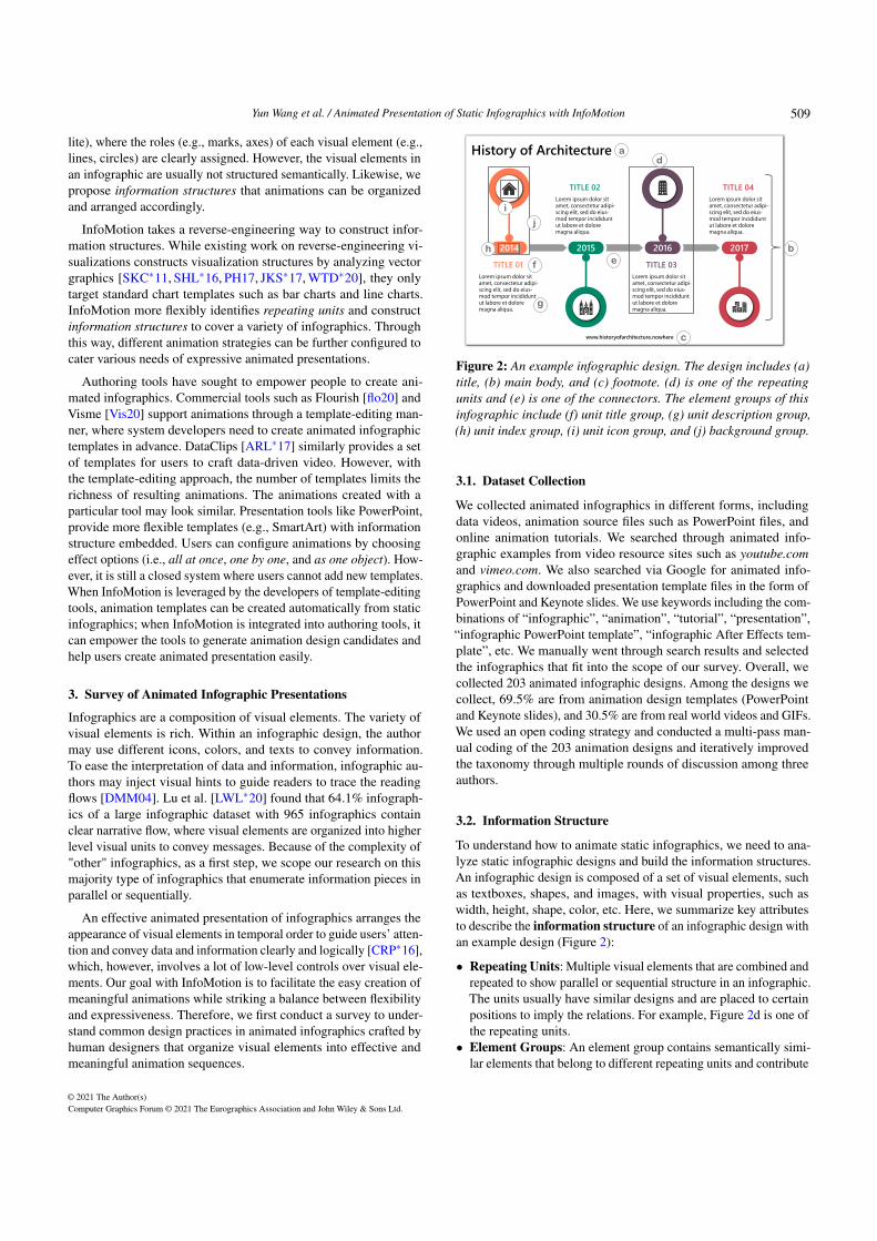
Figure 2: An example infographic design. The design includes (a)title, (b) main body, and (c) footnote. (d) is one of the repeatingunits and (e) is one of the connectors. The element groups of thisinfographic include (f) unit title group, (g) unit description group,(h) unit index group, (i) unit icon group, and (j) background group.
3.1. Dataset Collection
We collected animated infographics in different forms, includingdata videos, animation source files such as PowerPoint files, andonline animation tutorials. We searched through animated info-graphic examples from video resource sites such as youtube.comand vimeo.com. We also searched via Google for animated info-graphics and downloaded presentation template files in the form ofPowerPoint and Keynote slides. We use keywords including the com-binations of “infographic”, “animation”, “tutorial”, “presentation”,“infographic PowerPoint template”, “infographic After Effects tem-plate”, etc. We manually went through search results and selectedthe infographics that fit into the scope of our survey. Overall, wecollected 203 animated infographic designs. Among the designs wecollect, 69.5% are from animation design templates (PowerPointand Keynote slides), and 30.5% are from real world videos and GIFs.We used an open coding strategy and conducted a multi-pass man-ual coding of the 203 animation designs and iteratively improvedthe taxonomy through multiple rounds of discussion among threeauthors.
3.2. Information Structure
To understand how to animate static infographics, we need to ana-lyze static infographic designs and build the information structures.An infographic design is composed of a set of visual elements, suchas textboxes, shapes, and images, with visual properties, such aswidth, height, shape, color, etc. Here, we summarize key attributesto describe the information structure of an infographic design withan example design (Figure 2):
• Repeating Units: Multiple visual elements that are combined andrepeated to show parallel or sequential structure in an infographic.The units usually have similar designs and are placed to certainpositions to imply the relations. For example, Figure 2d is one ofthe repeating units.
• Element Groups: An element group contains semantically simi-lar elements that belong to different repeating units and contribute
© 2021 The Author(s)Computer Graphics Forum © 2021 The Eurographics Association and John Wiley & Sons Ltd.
509

Yun Wang et al. / Animated Presentation of Static Infographics with InfoMotion
(c) (d)(a) (b)
Figure 3: The repeating units in infographics are categorized into four layout patterns: (a) Linear layout [con19, tim18, tut17]; (b) Radiallayout [mil18, 6op19, 9op19]; (c) Segmented layout [pro19, rou19, pen19]; (d) Freeform layout [tim19, bal18, map18].
to the design of each repeating unit. The elements in an elementgroup are usually visually similar. For example, the unit title el-ement group have all the unit titles, which have the same fonts;the unit icon element group have all the unit icons, which havesimilar color and sizes.
• Unit Layout: The spatial arrangement of visual elements is usu-ally carefully chosen. The locations of repeating units in an info-graphic determines the unit layout of the infographic. Generally,the unit layout determines the presentation order.
• Connectors: Some infographic designs may contain specific or-der themselves. Animations are then applied in a particular orderbased on infographic designs. These infographics have connec-tors like lines, arrows to connect visual elements and expresstheir relations. Then the designs can clearly convey the logicconnections and reading orders of the infographics.
• Semantic Tags: The roles of visual elements in an infographicdesign. For example, textboxes are used as titles (Figure 2a),footnotes (Figure 2c), etc., for an infographic.
3.3. Infographic Unit Layout
Designers place visual units into different layout patterns, forminginformation sequences. Figure 3 shows four main styles of info-graphic unit layouts we found in our dataset:
• Linear Layouts (86; 42.36%) are mostly seen in infographicdesigns. All the infographic units are arranged into a horizontal,vertical, or diagonal line. Different from segmented layouts, theinner layout of each unit should be the same for linear layouts.
• Radial Layouts (49; 24.14%) refers to the layouts of an info-graphic with visual units placed together forming an arc or acircle. It is also a common design in infographics.
• Segmented Layouts (33; 16.26%) refers to layouts when unitsare arranged in a zigzag manner. Usually, the direction of the unitsis reversed successively. For example, they may be placed on bothsides along a center line. They can also be placed in horizontal,vertical, or diagonal ways.• Freeform Layouts (35; 17.24%) are layouts when the units are
not put in regular patterns. For example, in the first infographicdesign in Figure 3d, the text descriptions follow the curved arrows.Other infographics with clear structure may also have random
layouts for the units. For example, when the units are placed on amap, they may not form clear layouts. Designers may use arrowsor other visual elements to indicate the internal logic structuresof the elements.
3.4. Animated Presentation Design
We further study the arrangement of temporal animation sequencesfor each visual element. Overall, we observe most animations followcommon reading order, e.g, starting from the up-left corner to thebottom-right corner, based on the layouts. Another major style showsanimations following content semantics. For example, they mayshow the title, subtitle, and then the core part.
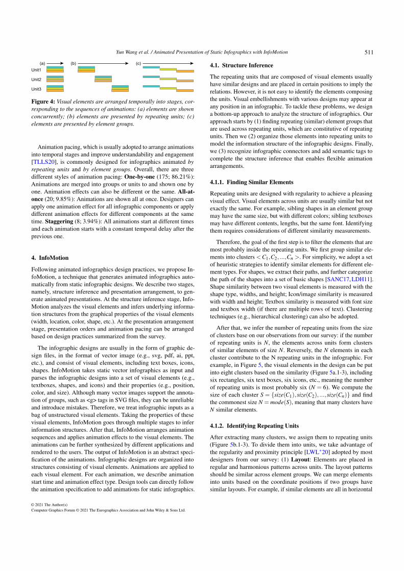
Animation designers follow the information structure to groupthe elements inside the units and apply animations to them as awhole. Similar to previous research on narrative structures [HKL17],animation designers develop three main styles for the structuredinformation (Figure 4). (1) Concurrently (20; 9.85%): The ani-mations are applied to the whole structure of the infographics andare shown all at once. (2) By repeating units (170; 83.74%): Theinfographics are divided into similar or repeating units to composethe infographic structure. This method prioritizes the unit relationsof the elements. Where units are shown one by one and the ele-ments in a unit tend to appear together. (3) By element groups(13; 6.40%): This method prioritizes the element relations acrossunits. Similar elements are shown together. For example, all the unittitles may appear at first and all the unit descriptions may follow.Designers sometimes show visual elements by element groups. Forexample, designers may show the titles of each unit at first and thenthe detailed descriptions together.
For those with connectors (97; 47.78%), we categorize the se-quences into five types (1) Connector-first (33; 34.02%): Connec-tors in the infographic are shown first, and then the units, whichis usually applied to connectors passing through all the units; (2)Content-first (5; 5.15%): Units in the infographic are shown first,and then connectors; (3) Interleaved (51; 52.58%): Connectors andunits are shown one by one alternately. (4) Embellishment-first (2;2.06%): Embellishments in the infographic are shown first, and thenother components; (5) All at once (6; 6.19%): Major componentsare shown all at once.
© 2021 The Author(s)Computer Graphics Forum © 2021 The Eurographics Association and John Wiley & Sons Ltd.
510
Yun Wang et al. / Animated Presentation of Static Infographics with InfoMotion
Unit1
Unit2
Unit3
(b)(a) (c)
Figure 4: Visual elements are arranged temporally into stages, cor-responding to the sequences of animations: (a) elements are shownconcurrently; (b) elements are presented by repeating units; (c)elements are presented by element groups.
Animation pacing, which is usually adopted to arrange animationsinto temporal stages and improve understandability and engagement[TLLS20], is commonly designed for infographics animated byrepeating units and by element groups. Overall, there are threedifferent styles of animation pacing: One-by-one (175; 86.21%):Animations are merged into groups or units to and shown one byone. Animation effects can also be different or the same. All-at-once (20; 9.85%): Animations are shown all at once. Designers canapply one animation effect for all infographic components or applydifferent animation effects for different components at the sametime. Staggering (8; 3.94%): All animations start at different timesand each animation starts with a constant temporal delay after theprevious one.
4. InfoMotion
Following animated infographics design practices, we propose In-foMotion, a technique that generates animated infographics auto-matically from static infographic designs. We describe two stages,namely, structure inference and presentation arrangement, to gen-erate animated presentations. At the structure inference stage, Info-Motion analyzes the visual elements and infers underlying informa-tion structures from the graphical properties of the visual elements(width, location, color, shape, etc.). At the presentation arrangementstage, presentation orders and animation pacing can be arrangedbased on design practices summarized from the survey.
The infographic designs are usually in the form of graphic de-sign files, in the format of vector image (e.g., svg, pdf, ai, ppt,etc.), and consist of visual elements, including text boxes, icons,shapes. InfoMotion takes static vector infographics as input andparses the infographic designs into a set of visual elements (e.g.,textboxes, shapes, and icons) and their properties (e.g., position,color, and size). Although many vector images support the annota-tion of groups, such as <g> tags in SVG files, they can be unreliableand introduce mistakes. Therefore, we treat infographic inputs as abag of unstructured visual elements. Taking the properties of thesevisual elements, InfoMotion goes through multiple stages to inferinformation structures. After that, InfoMotion arranges animationsequences and applies animation effects to the visual elements. Theanimations can be further synthesized by different applications andrendered to the users. The output of InfoMotion is an abstract speci-fication of the animations. Infographic designs are organized intostructures consisting of visual elements. Animations are applied toeach visual element. For each animation, we describe animationstart time and animation effect type. Design tools can directly followthe animation specification to add animations for static infographics.
4.1. Structure Inference
The repeating units that are composed of visual elements usuallyhave similar designs and are placed in certain positions to imply therelations. However, it is not easy to identify the elements composingthe units. Visual embellishments with various designs may appear atany position in an infographic. To tackle these problems, we designa bottom-up approach to analyze the structure of infographics. Ourapproach starts by (1) finding repeating (similar) element groups thatare used across repeating units, which are constitutive of repeatingunits. Then we (2) organize those elements into repeating units tomodel the information structure of the infographic designs. Finally,we (3) recognize infographic connectors and add semantic tags tocomplete the structure inference that enables flexible animationarrangements.
4.1.1. Finding Similar Elements
Repeating units are designed with regularity to achieve a pleasingvisual effect. Visual elements across units are usually similar but notexactly the same. For example, sibling shapes in an element groupmay have the same size, but with different colors; sibling textboxesmay have different contents, lengths, but the same font. Identifyingthem requires considerations of different similarity measurements.
Therefore, the goal of the first step is to filter the elements that aremost probably inside the repeating units. We first group similar ele-ments into clusters <C1,C2, ...,Cn >. For simplicity, we adopt a setof heuristic strategies to identify similar elements for different ele-ment types. For shapes, we extract their paths, and further categorizethe path of the shapes into a set of basic shapes [SANC17, LDH11].Shape similarity between two visual elements is measured with theshape type, widths, and height; Icon/image similarity is measuredwith width and height; Textbox similarity is measured with font sizeand textbox width (if there are multiple rows of text). Clusteringtechniques (e.g., hierarchical clustering) can also be adopted.
After that, we infer the number of repeating units from the sizeof clusters base on our observations from our survey: if the numberof repeating units is N, the elements across units form clustersof similar elements of size N. Reversely, the N elements in eachcluster contribute to the N repeating units in the infographic. Forexample, in Figure 5, the visual elements in the design can be putinto eight clusters based on the similarity (Figure 5a.1-3), includingsix rectangles, six text boxes, six icons, etc., meaning the numberof repeating units is most probably six (N = 6). We compute thesize of each cluster S = {size(C1),size(C2), ...,size(Cn)} and findthe commonest size N = mode(S), meaning that many clusters haveN similar elements.
4.1.2. Identifying Repeating Units
After extracting many clusters, we assign them to repeating units(Figure 5b.1-3). To divide them into units, we take advantage ofthe regularity and proximity principle [LWL∗20] adopted by mostdesigners from our survey: (1) Layout: Elements are placed inregular and harmonious patterns across units. The layout patternsshould be similar across element groups. We can merge elementsinto units based on the coordinate positions if two groups havesimilar layouts. For example, if similar elements are all in horizontal
© 2021 The Author(s)Computer Graphics Forum © 2021 The Eurographics Association and John Wiley & Sons Ltd.
511

Yun Wang et al. / Animated Presentation of Static Infographics with InfoMotion
GLOBALANIMAL
DOLPHIN06
PANDA05
KOLA01
FOX04
PENGUIN02
SNAKE03
DOLPHIN06
PANDA05
KOLA01
FOX04
PENGUIN02
SNAKE03
DOLPHIN06
PANDA05
KOLA01
FOX04
PENGUIN02
SNAKE03
GLOBALANIMAL
DOLPHIN06
PANDA05
KOLA01
FOX04
PENGUIN02
SNAKE03
GLOBALANIMAL
DOLPHIN06
PANDA05
KOLA01
FOX04
PENGUIN02
SNAKE03
x 6 x 6
x 6
x 6
x 6
x 12
x 1
x 1
(a.1) (a.2)
(a.3) (b.1)
(b.2) (b.3)
(c.1) (c.2)
GLOBAL ANIMAL
PENGUIN02
Title
Background Unit Background
Unit Icon
Unit TitleUnit Index
Shape Shape
Text Shape
Icon
TextText
Shape
Figure 5: Structure inference process: InfoMotion first decomposesthe visual elements in an infographic (a.1), extracts visual properties(a.2), and clusters similar elements (a.3). Then it identifies repeatingunits by finding one cluster with the commonest cluster size (b.1,N=6), merging other clusters with sizes of N (b.2) and greater thanN (b.3). Finally, it attaches layouts (c.1) and semantic tags for theelements (c.2) and output the information structure.
layouts, we sort the elements based on horizontal positions and putthem into units one by one. (2) Element Proximity: Designers avoidcrossing and long distance for relative elements. Infographic designswithout standard layouts usually leverage proximity to enhanceperception – elements within a unit are more likely placed close toeach other.
The algorithm that merges clusters into units works as follows(Algorithm 1): we first identify the layout type of every cluster ofsize(Cn) = N by classifying them into one of the four layout types(Figure. 3). We take the most frequent layout type as the overallunit layout (Line 3, Algorithm 1). Then we try to merge clusters ofsize(Cn)>= N one by one into units by layout or proximity (Line8-12, Algorithm 1). When the clusters’ layouts are identified andthe same with the units’ layout, and the sizes of the clusters are of N,we naturally try to merge them into the N units by layout; otherwise,we merge them by proximity. When elements are merged by layout,they are sorted according to their positions and added to the unitsaccordingly. When elements are assembled by proximity (please
Algorithm 1 Merge Cluster1: procedure MERGECLUSTER(clusters,n)2: units← []3: unitLayout ← mostFrequentLayout(clusters)4: unitCands← filter(clusters,c⇒ c.len≥ n)5: others← filter(clusters,c⇒ c.len < n)6: u← unitCands.pop()7: while u 6= NULL do8: layout ← detectLayout(u)9: if layout == unitLayout and u.len == N then
10: assembleResult ← assembleByLayout(units,u)11: else12: assembleResult ← assembleByProximity(units,u)13: if assembleResult == NULL then14: add u to others15: else16: add assembleResult.selected to units17: if assembleResult.le f t.len ≥ n then18: add assembleResult.le f t to tail of unitCands19: else20: add assembleResult.le f t to tail of others21: u← unitCands.pop()
return (unitLayout, units, others)
find more details about the algorithm of merging by proximity inthe supplementary material), we calculate the distance betweenthe elements in the new cluster and existing units, and put eachelement in the cluster into correct units. To ensure proper merginginto units, we further leverage element regularity across units bycalculating standard deviations of the distances between currentunits and the newly added elements. The standard deviation shouldbe lower than a threshold p to avoid grouping by mistakes. Thedefault value of p is set to 0.04 based on our experiments. Whenthe clusters are of size(Cn) > N, we take out the elements to bemerged to the units, and check whether the remaining elements arestill of size(Cn) >= N. It is common that the remaining elementscan still contribute to the units. We put them back to the tail ofcandidate clusters. If the remaining elements are of size less thanN, we put the remaining elements to the set of others. Finally,the others elements that cannot be successfully merged into unitswill be further considered as connectors, embellishments, or othercomponents in the next step.
4.1.3. Recognizing Connectors and Semantic Tags
After organizing elements into repeating units, we can further iden-tify connectors between units and determine sequences. Connectorsare a special type of repeating unit. We search through visual ele-ments of line or arrow shapes that fall in the region between any twounits. We attach the layout tags to the infographics (Figure 5c.1).
We further add semantic tags (e.g., title, icon, image, footnote, andbackground, etc.) for the infographic components to enable flexibleanimation arrangements based on heuristic rules (Figure 5c.2). First,we add semantic tags for the elements left out from the repeatingunits and connectors as global level infographic components, liketitle, description, background, and footnotes. For example, we assign
© 2021 The Author(s)Computer Graphics Forum © 2021 The Eurographics Association and John Wiley & Sons Ltd.
512

Yun Wang et al. / Animated Presentation of Static Infographics with InfoMotion
textboxes at the bottom with smaller font sizes as footnotes andtextboxes with larger font sizes as titles. Then, we also add semantictags to the visual elements within a unit with similar heuristics.Usually, elements within a unit act as unit titles, unit icons, unitbackground, etc. The semantic tags can be easily extended to makethe role categories finer.
4.2. Presentation Arrangement
With information structure inferred, InfoMotion arranges the pre-sentation orders and animation pacing that are applied to the visualelements based on the design patterns summarized in our survey.Animations should be arranged into temporal sequences logically.Showing all animations one by one can be cluttered and unfocused,while showing animations at the same time can be overwhelmingand hard to follow.
4.2.1. Animation Sequence
Presentation Order. The presentation order of the animated info-graphics are configurable parameters for users to choose. We pro-vide three design strategies to arrange the sequence of animations.Animation designers can choose from any of the three presenta-tion orders to arrange the presentations: (1) Animation based onsequences: For infographics with obvious sequence indexes, wefollow the original orders of the infographics. We go through textboxes to check whether there are strong indicators of presentationorders, such as number indexes (1-10) or letter indexes (A-Z). Ifthere are connectors and the connectors are with directions such asarrows, we follow the directions of connectors to assign a sequencefor the units. (2) Animation sequence based on common readingorder: infographic components within an infographic design maynot have clear dependencies or logical orders. We provide choicesof reading orders (e.g., from left to right, from top to bottom, clock-wise or counterclockwise) based on the layout of an infographic toarrange animation sequences. (3) Animation based on semantic tags:many designs adopt a semantic order. For example, the title appearsfirst, followed by the subtitle. The footnotes appear last. For thosewithout a clear sequence pattern, this approach can be taken. Basedon the semantic tags, it is easy to adjust content sequences. Besidesthese default choices, more sequence options can also be providedto users.
Pacing. Based on the two ways of arranging the elements summa-rized in our survey, (i.e., by repeating unit, and by element group),InfoMotion supports three pacing strategies based on our survey, i.e.,one-by-one, all-at-once, and staggering, which can be applied tomerge animations into several stages. For example, InfoMotion canstagger repeating units/element groups, and show elements withinunits or groups all at once. By default, InfoMotion chooses “byrepeating units”, and repeating units are also shown “one by one”,which is the most popular way from our survey. Within each unit,visual elements are shown in a “staggering” manner with 10% over-lapping. By setting these parameters, we can compute the sequenceand start time of showing visual elements. These parameters canbe adjusted by different application scenarios and user preferencesaccording to the needs.
4.2.2. Animation Effects
InfoMotion further applies animation effects for each visual element.However, from our survey, we do not observe obvious design pat-terns of choosing animations. Moreover, there is no consensus onthe taxonomy of animation effects. For example, animation creatingtools such as Adobe After Effects allow users to have low-levelcontrols over objects, while presentation tools like Keynote andPowerPoint animate static object by injecting preset animations.Similar to [GZL∗20], InfoMotion borrows the taxonomy of preseteffects used in presentation tools and tries to balance expressivenessand conciseness.
Following this taxonomy, we identify more than 20 animation ef-fects applied to the infographics from our dataset, including fade andwipe that are most frequently used. Other effects like path, stretch,swivel, and wheel appear only 1 or 2 times in our dataset. With ourdataset, we explore a data-driven method to build an element-effectmodel. Through this way, we can further understand whether de-signers have similar considerations when adopting animation effects.We select six common animation styles, namely, fading, floating,zooming, wiping, flying, and splitting, as general choices for theeffects, covering 95.5% of the effects in the dataset. In total, weextract 461 visual element-animation effect pairs.
We train a random forest model (with more details described inthe supplementary material) to recommend top-k ideal effects forthe visual elements [rf20]. Random forests are an ensemble learningmethod of constructing a multitude of decision trees at training timeand outputting the majority vote from these individual trees as finalpredictions. The parameters for each element include element width,element height, element shape, unit layout, and element position. Wecalculate the accuracy of animation prediction if the animation effectin one test case is included. The average accuracy of cross validationis 86.98% (k=3), 73.69% (k=2), and 65.8% (k=1). Depending onthe flexibility of animation design environments, animation designapplications can recommend top-1 or top-k animation effect(s) to theusers. When users need to modify the animation effect for a givencomponent, applications can recommend a ranked list of effects.This enables users to easily modify the animation effects based ontheir personal preferences.
5. Evaluation
5.1. Experiments on Structure Inference
To evaluate the infographic structure inference algorithm, we takethe animated infographics analyzed in Section 3 from real-worlddesigners. We manually preprocess the files to remove animationsfrom the source files and excluded the animations that cannot bedecomposed (e.g., videos, GIFs), adding up to 120 infographicdesigns. The 120 designs contain 45.83% (55) linear, 18.33% (22)radial, 22.50% (27) segmented, and 13.33% (16) freeform layouts.Among them, 46.67% (56) have connectors while 53.33% (64) donot have connectors. We have manually tagged the infographicelements into similar element groups and repeating units. We furthertagged connectors if the infographics contain.
We compare the automatically analyzed infographic structure(element groups and repeating units) with manually labeled ones.
© 2021 The Author(s)Computer Graphics Forum © 2021 The Eurographics Association and John Wiley & Sons Ltd.
513

Yun Wang et al. / Animated Presentation of Static Infographics with InfoMotion
(a) (b)
Figure 6: Failure cases [sli19, pre18] from structure inference. Re-peating units are hard to identify when (a) designers adopt uncom-mon layout or (b) repeating unit designs are not similar enough.
The criteria for judging success are (1) the number of units arecorrect, (2) the element groups containing only similar elements thatare tagged by humans. We mark the case as “correct” if elementsmissed out are embellishments, meaning that the embellishmentsare not repeated across units and they are very easy to be fixed. Fromthe 120 designs, we got 94 success cases, reaching an accuracy of78.33%. Overall, our algorithm can successfully identify infographicstructure in various design cases. We further report our success ratesregarding different aspects as follows.
• Infographic Layout. From the layout perspective, the accuracyof InfoMotion reaches 83.64% (46/55) for linear, 86.36% (19/22)for radial, 62.96% (17/27) for segmented, and 75% (12/16) forfreeform layouts.
• Connector. InfoMotion reaches an accuracy of 73.21% (41/56)for infographics with connectors and 82.81% (53/64) for thosewithout connectors.
For failure cases (Figure 6), there are two common problems:(1) The layouts do not fall into common layout types, resulting infailures of sequencing units. For example, the textboxes in Figure6a are placed along an arbitrary curve. The shapes and directionscannot be parsed with InfoMotion. When infographic structuresare not correctly inferred, applications can provide interfaces thatusers can inject correct structures through user interfaces to generateanimations accordingly. (2) Designers may adopt very differentvisual elements across repeating units. When there is only one oreven no similar elements, it is hard to get an anchor element with thealgorithm. Consequently, it is harder to identify repeating units fromthe design (e.g., Figure 6b), resulting in failure. Taking the bubbleswith different sizes and colors as an example, InfoMotion cannotjudge which ones were repeated.
5.2. Example Application
We demonstrate the utility of InfoMotion with applications in theform of PowerPoint add-in †. We choose PowerPoint for three rea-sons: (1) PowerPoint is one of the most popular presentation au-thoring tools for general users to create infographics and presentdata stories. Users can take advantage of this existing workflow togenerate animations and enhance their presentations automatically.(2) A large number of static and animated infographics are designedby designers using PowerPoint. The VSTO tools [VST20] enables
† https://www.microsoft.com/en-us/research/project/infomotion/
the extraction of visual properties from the PowerPoint slides andthe attachment of animations to the infographic designs. (3) We takethe taxonomy of PowerPoint preset effects to recommend animationeffects.
InfoMotion can be implemented as a standalone application. Af-ter computing the animations applied for different shapes, animatedinfographics can be further synthesized. InfoMotion can also be inte-grated smoothly into the workflow of other infographic design tools,which can help users easily extend static designs into animated ones.We believe InfoMotion opens up new opportunities for infographicanimation design and authoring.
Mixed-Initiative Animation Authoring. InfoMotion can beused to create a mixed-initiative animation authoring experience.Users can design and import static infographics in the form of Pow-erPoint slides. Once an infographic is designed, users can click onthe InfoMotion button to show a design panel of the animations.Users can modify the groupings based on their needs through thedesign panel (Figure 7a). They can also adjust the sequence by mov-ing up and down the element groups. After that, users can clickthe “Add animation” button on the design penal to apply animationeffects to the visual elements. They can also configure presentationorder and animation pacing through the design panel. Users canclick “Play” or “Preview” button in PowerPoint to review the ani-mation effects. If they want to modify the animations, they can alsoleverage the InfoMotion Designer to select a group of objects oncanvas. As such, users can easily select elements and fine-tune theanimation configurations at any granularity. Integrating InfoMotionin a mixed-initiative authoring tool preserves human creativity buteases the repetitive efforts in creating animations.
Animation Recommendation. Another possible usage of Info-Motion is to recommend many animated infographic designs basedon one static infographic. Users no longer need to imagine anima-tion effects before they start to design. They just need to choosethe animations that they prefer most. This can reduce the barrier ofusing animations, which can be especially useful for novice users.As shown in Figure 7b, when a user completes the design of aninfographic, with just one click, InfoMotion shows a list of anima-tion design candidates. The design candidates are generated throughthe combinations of different animation settings, such as animationsequence, staging, and effects. Users can choose one from the can-didates and further adjust the animation designs to fine tune theresults.
5.3. User Study
We conduct a user study to gather subjective feedback and under-stand the quality of the InfoMotion-generated animated infograph-ics, by comparing them with the designer-crafted ones randomlyselected from the animated infographic tutorials in our survey.
Participants. We recruited 32 participants (19 male, 13 female,aged from 23 to 52) from a local tech company. The participantsinclude data analysts, researchers, engineers, program managers,and intern students. They are general users who need to present dataand communicate insights through slide decks in their daily work.All of them have used presentation tools like PowerPoint or Keynoteto create animated presentations. Five of them had experience with
© 2021 The Author(s)Computer Graphics Forum © 2021 The Eurographics Association and John Wiley & Sons Ltd.
514

Yun Wang et al. / Animated Presentation of Static Infographics with InfoMotion
(a) (b)
Figure 7: Sample applications: (a) A PowerPoint add-in that supports mixed-initiative animation authoring; (b) Another add-in that supportsanimation recommendation for one static infographic. It provides multiple animation design candidates for users to choose.
graphic design tools such as Adobe Illustrator and Photoshop. Noparticipant reported vision impairments.
Study Design. To avoid users paying attention to the graphicaldesigns of the infographics, we conduct a pair-wise within-subjectcomparison study between two groups of animations. (1) Auto-generated group: With the prototype applications (Section 5.2) athand, we prepare the study stimuli by randomly selecting info-graphic templates in the form of PowerPoint files, which mightindicate the high-quality of the animated infographics. Then wemanually remove all the animation actions, resulting in 18 staticinfographic designs. We run InfoMotion for each static infographicand pick the top-ranked generated animated infographic for thestudy. (2) Designer-crafted group: the original animated infograph-ics corresponding to the auto-generated animations naturally formthe designer-crafted group. We calculate the number of mouse clicksin the tutorial videos that demonstrate the authoring process of theanimations without design iterations. The average number is 73.6clicks (max = 176, min = 13, median = 56), excluding the clicksfor static infographic design, which could be more difficult if theresulting designs are indefinite, and the users are non-experts. Thisindicates the complexity of the animation design tasks and the ef-forts involved to author these animations from static infographicdesign.
Procedure. The participants rated their preferences between thetwo groups of animations with a 7-point bidirectional Likert-scale.Each participant performed 18 trials. In each trial, the participantswere shown a pair of animated infographics. The sequence of thetwo animations and the 18 pairs was shuffled and users were notinformed that half of them are auto-generated until they completedrating. The participants were asked to view pairs of animations byclicking the “preview” button for animations when viewing a Power-Point file. For each pair, we used 7-point bidirectional Likert-Scaleranging from “the first one is strongly better” to “the second oneis strongly better” to understand users’ preference between the twoanimations. During the study, participants were encouraged to thinkaloud or write down their reasons for choices. After the completionof the ratings, the participants were told that half of the animationsare automatically generated. We conducted a semi-structured inter-
view to review and discuss the considerations involved during theirratings and asked them to complete a short demographic survey.
Subjective Ratings. All participants completed the ratings withroughly 10-15 minutes in total. We collected a total of 32×18= 576ratings. The median of all ratings is 0 with the scale [−3,3]. Figure8 shows the percentages and absolute numbers of subjective ratingsranging from -3 to 3 provided by the participants for each animationpair (AP). Both the median values and the p-values obtained fromthe Wilconxon test on whether the medians equal to 0 are also listedfor each pair. After applying Bonferroni correction to set the signifi-cant value at c= 0.05/18, 13 out of the 18 tests yield non-significantp-values (p > c), which indicates that participants shown no prefer-ence over the designer-crafted and machine-generated animationsin the majority of the trials. The participants showed statisticallysignificant preference on five human-generated infographics (AP1,AP4, AP9, AP10, AP15). A detailed investigation over those pairssuggests that humans perform better than machines when complexor context-dependent animations are required. For example, themain body of one infographic (AP10) is a cartoon pencil made upof multiple rectangles. While the auto-generated animation showsthe pencil segment by segment, the designer-crafted one shows thepencil as a whole. The other examples (AP1, AP4, AP9, AP15) usesmultiple shapes to mimic layers, shadows, and depth of real-worldobjects.
Qualitative Observations. The overall reactions from the partic-ipants were promising. Most participants felt it is more engagingto watch animations than static infographics. As P9 said, “I thinkthe difference between these pairs is not much. All of them are muchbetter than static ones.” Participants did not realize that half of thecases were machine-generated. After knowing that half of them wereautomatically generated, many of the participants felt surprised, withone saying “Can you let me know which ones are automaticallygenerated? It is not easy to guess.” Another participant mentioned,
“Hard to imagine they are generated with just one click!”
Through the interview, we also learn lessons from users’ prefer-ences of animation designs. First, users have different preferencesof animation ordering. Some of them preferred to adopt a commonreading order (e.g., left-to-right, up-to-down), while some others
© 2021 The Author(s)Computer Graphics Forum © 2021 The Eurographics Association and John Wiley & Sons Ltd.
515

Yun Wang et al. / Animated Presentation of Static Infographics with InfoMotion
-100 % 60%Percentage
StronglyDisagree
Disagree SomewhatDisagree
Neutral SomewhatAgree
Agree StronglyAgree
Response
80%40%20%0%-20%-40%-60%-80%
[M=-1.0, P<0.001][M= 0.0, P=0.640][M= 1.5, P=0.034][M=-2.0, P=0.001][M=-0.5, P=0.128][M=-0.5, P=0.843][M= 0.0, P=0.036][M= 1.0, P=0.025][M=-1.0, P<0.001][M=-2.0, P<0.001][M= 0.5, P=0.764][M= 1.5, P=0.006][M= 1.0, P=0.008][M= 1.0, P=0.012][M=-2.0, P=0.003][M= 0.0, P=0.793][M= 0.0, P=0.786][M= 0.0, P=0.166]
AP 1 AP 2 AP 3 AP 4 AP 5 AP 6 AP 7 AP 8 AP 9 AP 10AP 11AP 12AP 13AP 14AP 15AP 16AP 17AP 18
Figure 8: User ratings for the 18 animations pairs for each in-fographic design: from strongly prefer designer-crafted ones tostrongly prefer auto-generated ones.
prefer to show the theme first. For example, P2 preferred up-to-down order because “it is easy to follow with my eyes”, while P18preferred theme-first order because “I prefer (unit) titles shown first.”This indicates the importance of applications to have a user interfacefor users inject their preferences. Another interesting finding is theusage of redundancy. Some designers may highlight elements byflickering or bouncing for a short time, applying more than oneanimation effects to the same shape to emphasize some parts of theinfographics, while the automatic-generated animations apply oneanimation for each visual element by default. The redundancy makessome of the human-designed animations lively and attractive, whilemachine-generated ones seem a bit rigid. Some participants (2/32)thought the animations (designed by humans) are nonsensical andtoo superfluous. One participant said, “This one should be reduced.I don’t want to watch this bubble flickering for such a long time”,while some other participants (2/32) mentioned these animationswere interesting and attractive.
6. Discussion
Benefits and Drawbacks of Automatic Generation The creationof animated infographics is time-consuming even for professionaldesigners. Users need to take a great amount of time assigningtimings and effects one by one to each visual element. InfoMo-tion can save these manual efforts and make it possible to generatedelicate animations in one click even for non-designers. However,the automatically generated animations are not perfect and cannotbe as creative as the animations made by top designers. For exam-ple, designers sometimes design more creative animations based onphysical properties (e.g., balls falling under gravity, clouds floatingin the air, papers tearing apart). Current design of InfoMotion onlyconsiders abstract shapes. To make these designs possible, we needto further understand graphical objects with real-world meanings tomake animations more attractive and natural.
Animation Designing vs. Authoring Most common visualiza-tion authoring tools assume that users want to author, instead ofdesign a visualization [SLR∗19]. In other words, the authoring toolsassume users have a specific design in mind or sketched on paper.
However, it is very hard for users to sketch animations on paper.With traditional animation authoring tools, users have to imaginein mind, which restricts the exploration of animation design space.As illustrated in Section 5.2, the automatic method has changed theauthoring process of animation design in two ways. With just a fewclicks, users can start from many draft animations. They can eveneasily compare among multiple design prototypes in parallel andget inspiration from the generated designs.
Animated Infographic Design Paradigms The current designof the animation generation considers the direct generation of in-fographics from static ones. To better exploit human ingenuity andcreativity, other design paradigms can also be explored. Supportedby our information model, we can consider a 1-to-many way – totransfer the animation design from one unit to another, or even oneinfographic to another infographic with similar layouts and struc-tures. This approach leaves out the labor-intensive parts but injectshuman’s creativity to the creation of animations.
Limitations Based on the repeating units, InfoMotion does notsupport more complex and advanced infographic-style diagrams,visualizations, and tables that encode size, length, position, and colorof the units with data fields. The encoding scheme varies across charttypes. For example, pyramid charts have different colors and shapesfor each unit. Gantt charts may use color and length to encodenumerical value or duration. Therefore, the repeating patterns maynot be easy to detect without further knowledge of chart types.Another limitation is the number of cases we adopt for evaluation.Although a number of animated infographic videos and GIFs couldbe collected, source files that can be converted to vector images arenot easy to gain. In the future, we plan to invite human users toproduce more animations from the static designs for more detailedcomparison analysis. Similarly, the performance of the decision treemodel is highly related to the animations we collect. We hope tocollect more animations to improve the model in the future.
7. Conclusion and Future Work
In this paper, we contribute an automated approach to present an-imated infographics from static infographic designs. Through ananalysis of existing animated infographic designs, we summarizecommon patterns in real-world design practices. Based on the anal-ysis, InfoMotion can model the information structures, composethe visual elements into animation sequences, and apply a set ofanimation effects. To illustrate the usage of InfoMotion, we developexample applications in the form of PowerPoint add-ins, which au-tomatically attaches various built-in animation effects to the visualelements in a slide. We further conduct a user study to compare ani-mations generated by InfoMotion with the ones crafted by designers.Our study shows the results of automatic generated infographicdesigns are promising in terms of animation quality.
We believe InfoMotion opens new avenues and encourages moreresearch on the authoring and generation of animated infographics.In the future, we plan to develop an animated infographic platformthat can take multiple infographic design forms as input and helpusers generate and publish enjoyable infographic videos. We alsoplan to generate and recommend animated infographics directlyfrom datasets or text information based on advanced infographicgeneration techniques.
© 2021 The Author(s)Computer Graphics Forum © 2021 The Eurographics Association and John Wiley & Sons Ltd.
516

Yun Wang et al. / Animated Presentation of Static Infographics with InfoMotion
References[6op19] 6 options infographic slide in powerpoint / business presentation
/ powerpoint tutorial. https://www.youtube.com/watch?v=LGC9DA2xDR4, 2019. 4
[9op19] 9 options infographic slide in powerpoint / animated powerpointslide design tutorial. https://www.youtube.com/watch?v=BSf-b3puhCA, 2019. 4
[ARL∗15] AMINI F., RICHE N. H., LEE B., HURTER C., IRANIP.: Understanding data videos: Looking at narrative visualizationthrough the cinematography lens. In Proceedings of the 33rd An-nual ACM Conference on Human Factors in Computing Systems, CHI2015, Seoul, Republic of Korea, April 18-23, 2015 (2015), pp. 1459–1468. URL: https://doi.org/10.1145/2702123.2702431, doi:10.1145/2702123.2702431. 2
[ARL∗17] AMINI F., RICHE N. H., LEE B., MONROY-HERNÁNDEZ A.,IRANI P.: Authoring data-driven videos with dataclips. IEEE Trans. Vis.Comput. Graph. 23, 1 (2017), 501–510. URL: https://doi.org/10.1109/TVCG.2016.2598647, doi:10.1109/TVCG.2016.2598647. 1,3
[bal18] How to design easy and beautiful slide in powerpoint - part 2 |balance scale design. https://www.youtube.com/watch?v=X66-FHjZE4U, 2018. 4
[BKO∗17] BYLINSKII Z., KIM N. W., O’DONOVAN P., ALSHEIKH S.,MADAN S., PFISTER H., DURAND F., RUSSELL B., HERTZMANN A.:Learning visual importance for graphic designs and data visualizations.In Proceedings of the 30th Annual ACM symposium on user interfacesoftware and technology (2017), pp. 57–69. 2
[BMG∗10] BATEMAN S., MANDRYK R. L., GUTWIN C., GENEST A.,MCDINE D., BROOKS C.: Useful junk? the effects of visual embellish-ment on comprehension and memorability of charts. In Proceedings ofthe SIGCHI conference on human factors in computing systems (2010),pp. 2573–2582. 2
[BPF14] BACH B., PIETRIGA E., FEKETE J.: Visualizing dynamic net-works with matrix cubes. In CHI Conference on Human Factors inComputing Systems, CHI’14, Toronto, ON, Canada - April 26 - May01, 2014 (2014), pp. 877–886. URL: https://doi.org/10.1145/2556288.2557010, doi:10.1145/2556288.2557010. 2
[BS90] BAECKER R., SMALL I.: Animation at the interface. The art ofhuman-computer interface design (1990), 251–267. 2
[BVB∗13] BORKIN M. A., VO A. A., BYLINSKII Z., ISOLA P.,SUNKAVALLI S., OLIVA A., PFISTER H.: What makes a visualizationmemorable? IEEE Transactions on Visualization and Computer Graphics19, 12 (Dec 2013), 2306–2315. doi:10.1109/TVCG.2013.234. 2
[CDBF10] CHEVALIER F., DRAGICEVIC P., BEZERIANOS A., FEKETEJ.: Using text animated transitions to support navigation in documenthistories. In Proceedings of the 28th International Conference on HumanFactors in Computing Systems, CHI 2010, Atlanta, Georgia, USA, April10-15, 2010 (2010), pp. 683–692. URL: https://doi.org/10.1145/1753326.1753427, doi:10.1145/1753326.1753427. 2
[con19] 4 step infographic concept slide for powerpoint - free ppt. https://www.youtube.com/watch?v=hmApxMVNg10, 2019. 4
[CRP∗16] CHEVALIER F., RICHE N. H., PLAISANT C., CHALBI A.,HURTER C.: Animations 25 years later: New roles and opportunities.In Proceedings of the International Working Conference on AdvancedVisual Interfaces, AVI 2016, Bari, Italy, June 7-10, 2016 (2016), pp. 280–287. URL: https://doi.org/10.1145/2909132.2909255, doi:10.1145/2909132.2909255. 1, 2, 3
[CRP∗20] CHALBI A., RITCHIE J., PARK D., CHOI J., ROUSSEL N.,ELMQVIST N., CHEVALIER F.: Common fate for animated transitions invisualization. IEEE Trans. Vis. Comput. Graph. 26, 1 (2020), 386–396.URL: https://doi.org/10.1109/TVCG.2019.2934288, doi:10.1109/TVCG.2019.2934288. 2
[CWW∗19] CHEN Z., WANG Y., WANG Q., WANG Y., QU H.: Towardsautomated infographic design: Deep learning-based auto-extraction of
extensible timeline. IEEE transactions on visualization and computergraphics 26, 1 (2019), 917–926. 2
[CZW∗20] CUI W., ZHANG X., WANG Y., HUANG H., CHEN B., FANGL., ZHANG H., LOU J., ZHANG D.: Text-to-viz: Automatic gener-ation of infographics from proportion-related natural language state-ments. IEEE Trans. Vis. Comput. Graph. 26, 1 (2020), 906–916. URL:https://doi.org/10.1109/TVCG.2019.2934785, doi:10.1109/TVCG.2019.2934785. 2
[DBJ∗11] DRAGICEVIC P., BEZERIANOS A., JAVED W., ELMQVIST N.,FEKETE J.: Temporal distortion for animated transitions. In Proceedingsof the International Conference on Human Factors in Computing Systems,CHI 2011, Vancouver, BC, Canada, May 7-12, 2011 (2011), pp. 2009–2018. URL: https://doi.org/10.1145/1978942.1979233, doi:10.1145/1978942.1979233. 2
[DCZL15] DU F., CAO N., ZHAO J., LIN Y.: Trajectory bundling for ani-mated transitions. In Proceedings of the 33rd Annual ACM Conference onHuman Factors in Computing Systems, CHI 2015, Seoul, Republic of Ko-rea, April 18-23, 2015 (2015), pp. 289–298. URL: https://doi.org/10.1145/2702123.2702476, doi:10.1145/2702123.2702476. 2
[DMM04] DESOLNEUX A., MOISAN L., MOREL J.-M.: Gestalt theoryand computer vision. In Seeing, Thinking and Knowing. Springer, 2004,pp. 71–101. 3
[EDF08] ELMQVIST N., DRAGICEVIC P., FEKETE J.: Rolling the dice:Multidimensional visual exploration using scatterplot matrix navigation.IEEE Trans. Vis. Comput. Graph. 14, 6 (2008), 1539–1148. URL:https://doi.org/10.1109/TVCG.2008.153, doi:10.1109/TVCG.2008.153. 2
[Fis10] FISHER D.: Animation for visualization: Opportunities and draw-backs., 2010. 1
[flo20] Flourish. https://flourish.studio, 2020. 3
[FWD∗19] FU X., WANG Y., DONG H., CUI W., ZHANG H.: Visualiza-tion assessment: A machine learning approach. In 2019 IEEE Visualiza-tion Conference (VIS) (2019), IEEE, pp. 126–130. 2
[GZL∗20] GE T., ZHAO Y., LEE B., REN D., CHEN B., WANG Y.: Canis:A high-level language for data-driven chart animations. In ComputerGraphics Forum (2020), vol. 39, Wiley Online Library, pp. 607–617. 2, 7
[HKF15] HAROZ S., KOSARA R., FRANCONERI S. L.: Isotype visualiza-tion: Working memory, performance, and engagement with pictographs.In Proceedings of the 33rd annual ACM conference on human factors incomputing systems (2015), pp. 1191–1200. 2
[HKL17] HULLMAN J., KOSARA R., LAM H.: Finding a clear path:Structuring strategies for visualization sequences. In Computer GraphicsForum (2017), vol. 36, Wiley Online Library, pp. 365–375. 4
[HR07] HEER J., ROBERTSON G. G.: Animated transitions in statisticaldata graphics. IEEE Trans. Vis. Comput. Graph. 13, 6 (2007), 1240–1247. URL: https://doi.org/10.1109/TVCG.2007.70539, doi:10.1109/TVCG.2007.70539. 2
[HVF13] HURON S., VUILLEMOT R., FEKETE J.: Visual sedimentation.IEEE Trans. Vis. Comput. Graph. 19, 12 (2013), 2446–2455. URL:https://doi.org/10.1109/TVCG.2013.227, doi:10.1109/TVCG.2013.227. 2
[JKS∗17] JUNG D., KIM W., SONG H., HWANG J.-I., LEE B., KIM B.,SEO J.: Chartsense: Interactive data extraction from chart images. InProceedings of the 2017 chi conference on human factors in computingsystems (2017), pp. 6706–6717. 3
[KCH19] KIM Y., CORRELL M., HEER J.: Designing animated tran-sitions to convey aggregate operations. Comput. Graph. Forum 38, 3(2019), 541–551. URL: https://doi.org/10.1111/cgf.13709,doi:10.1111/cgf.13709. 2
[KH20] KIM Y., HEER J.: Gemini: A grammar and recommendersystem for animatedtransitions in statistical graphics. arXiv preprintarXiv:2009.01429 (2020). 2
© 2021 The Author(s)Computer Graphics Forum © 2021 The Eurographics Association and John Wiley & Sons Ltd.
517

Yun Wang et al. / Animated Presentation of Static Infographics with InfoMotion
[KSL∗17] KIM N. W., SCHWEICKART E., LIU Z., DONTCHEVA M., LIW., POPOVIC J., PFISTER H.: Data-driven guides: Supporting expressivedesign for information graphics. IEEE Transactions on Visualization andComputer Graphics 23, 1 (Jan 2017), 491–500. doi:10.1109/TVCG.2016.2598620. 2
[LDH11] LI D., DENG L., HUANG Z.: Shape similarity computation forsvg. International Journal of Computational Science and Engineering 6,1-2 (2011), 105–113. 5
[LTW∗18] LIU Z., THOMPSON J., WILSON A., DONTCHEVA M., DE-LOREY J., GRIGG S., KERR B., STASKO J.: Data illustrator: Augmentingvector design tools with lazy data binding for expressive visualizationauthoring. In Proceedings of the 2018 CHI Conference on Human Factorsin Computing Systems (New York, NY, USA, 2018), CHI ’18, ACM,pp. 123:1–123:13. URL: http://doi.acm.org/10.1145/3173574.3173697, doi:10.1145/3173574.3173697. 2
[LWL∗20] LU M., WANG C., LANIR J., NANXUAN Z., HANSPETERP., COHEN-OR D., HUANG H.: Exploring visual information flows ininfographics. In Proceedings of the 2020 CHI Conference on HumanFactors in Computing Systems (New York, NY, USA, 2020), CHI ’20,ACM. URL: http://doi.acm.org/10.1145/3173574.3173697,doi:https://doi.org/10.1145/3313831.3376263. 2, 3, 5
[map18] Powerpoint animation tutorial - map location. https://www.youtube.com/watch?v=-tP7w7Jju5Y, 2018. 4
[mil18] Timeline, process, milestones, achievements, targets, sales, steps,workflow design in powerpoint. https://www.youtube.com/watch?v=ej_uDR6qgSQ, 2018. 4
[pen19] How to make a creative 3d pencil infographic on powerpoint| powerpoint show. https://www.youtube.com/watch?v=aqaSt_61wp4, 2019. 4
[PH17] POCO J., HEER J.: Reverse-engineering visualizations: Recover-ing visual encodings from chart images. In Computer Graphics Forum(2017), vol. 36, Wiley Online Library, pp. 353–363. 3
[pre18] Powerpoint presentation slide animation tutorial. https://www.youtube.com/watch?v=QF9kG8QTgVI, 2018. 8
[pro19] Process slide in powerpoint. https://www.youtube.com/watch?v=ND3WY2FSrl8, 2019. 4
[rf20] sklearn.ensemble.randomforestclassifier. https://scikit-learn.org/stable/modules/generated/sklearn.ensemble.RandomForestClassifier.html, 2020. 7
[RLB19] REN D., LEE B., BREHMER M.: Charticulator: Interactiveconstruction of bespoke chart layouts. IEEE Transactions on Visualizationand Computer Graphics 25, 1 (Jan 2019), 789–799. doi:10.1109/TVCG.2018.2865158. 2
[RM15] RUCHIKACHORN P., MUELLER K.: Learning visualizationsby analogy: Promoting visual literacy through visualization morphing.IEEE transactions on visualization and computer graphics 21, 9 (2015),1028–1044. 2
[rou19] 4 steps infographic slide in powerpoint | round squares infograph-ics. https://www.youtube.com/watch?v=Zq9TdHJa2UI, 2019. 4
[SANC17] SEEL-AUDOM C., NAIYAPO W., CHOUVATUT V.: A searchfor geometric-shape objects in a vector image: Scalable vector graphics(svg) file format. In 2017 9th International Conference on Knowledgeand Smart Technology (KST) (2017), IEEE, pp. 305–310. 5
[SHL∗16] SIEGEL N., HORVITZ Z., LEVIN R., DIVVALA S., FARHADIA.: Figureseer: Parsing result-figures in research papers. In EuropeanConference on Computer Vision (2016), Springer, pp. 664–680. 3
[SKC∗11] SAVVA M., KONG N., CHHAJTA A., FEI-FEI L., AGRAWALAM., HEER J.: Revision: Automated classification, analysis and redesignof chart images. In Proceedings of the 24th annual ACM symposium onUser interface software and technology (2011), pp. 393–402. 3
[sli19] Timeline slide in powerpoint. https://www.youtube.com/watch?v=hdhxNqE5pKg, 2019. 8
[SLR∗19] SATYANARAYAN A., LEE B., REN D., HEER J., STASKO J.,THOMPSON J., BREHMER M., LIU Z.: Critical reflections on visualiza-tion authoring systems. IEEE transactions on visualization and computergraphics 26, 1 (2019), 461–471. 10
[tim18] Timeline infographic - animated powerpoint template. https://www.youtube.com/watch?v=R-gXjpNtZHs, 2018. 4
[tim19] Timeline slide in powerpoint. https://www.youtube.com/watch?v=hdhxNqE5pKg, 2019. 4
[TLLS20] THOMPSON J., LIU Z., LI W., STASKO J.: Understandingthe design space and authoring paradigms for animated data graphics.In Computer Graphics Forum (2020), vol. 39, Wiley Online Library,pp. 207–218. 2, 5
[TMB02] TVERSKY B., MORRISON J. B., BETRANCOURT M.: Anima-tion: can it facilitate? International journal of human-computer studies57, 4 (2002), 247–262. 2
[tut17] Animated powerpoint infographic slide design tutorial. https://www.youtube.com/watch?v=OZKTzpbnGOA, 2017. 4
[Vis20] Visme. https://www.visme.co/, 2020. 3
[VST20] Vsto add-in developer’s guide. https://docs.microsoft.com/en-us/office/dev/add-ins/overview/learning-path-transition, 2020. 8
[WCL∗16] WANG Y., CHEN Z., LI Q., MA X., LUO Q., QU H.: Ani-mated narrative visualization for video clickstream data. In SIGGRAPHAsia 2016 Symposium on Visualization (2016), pp. 1–8. 2
[WSK∗19] WANG Y., SEGAL A., KLATZKY R., KEEFE D. F., ISENBERGP., HURTIENNE J., HORNECKER E., DWYER T., BARRASS S.: Anemotional response to the value of visualization. IEEE computer graphicsand applications 39, 5 (2019), 8–17.
[WSZ∗20] WANG Y., SUN Z., ZHANG H., CUI W., XU K., MA X.,ZHANG D.: Datashot: Automatic generation of fact sheets from tabulardata. IEEE Trans. Vis. Comput. Graph. 26, 1 (2020), 895–905. URL:https://doi.org/10.1109/TVCG.2019.2934398, doi:10.1109/TVCG.2019.2934398. 2
[WTD∗20] WU A., TONG W., DWYER T., LEE B., ISENBERG P., QU H.:Mobilevisfixer: Tailoring web visualizations for mobile phones leveragingan explainable reinforcement learning framework. IEEE Transactions onVisualization and Computer Graphics (2020). 3
[WWS∗21] WU A., WANG Y., SHU X., MORITZ D., CUI W., ZHANGH., ZHANG D., QU H.: Survey on artificial intelligence approaches forvisualization data. arXiv preprint arXiv:2102.01330 (2021). 2
[WXL∗21] WU A., XIE L., LEE B., WANG Y., CUI W., QU H.: Learn-ing to automate chart layout configurations using crowdsourced pairedcomparison. arXiv preprint arXiv:2101.03680 (2021). 2
[WZH∗18] WANG Y., ZHANG H., HUANG H., CHEN X., YIN Q., HOUZ., ZHANG D., LUO Q., QU H.: Infonice: Easy creation of informationgraphics. In Proceedings of the 2018 CHI Conference on Human Factorsin Computing Systems (New York, NY, USA, 2018), CHI ’18, ACM,pp. 335:1–335:12. URL: http://doi.acm.org/10.1145/3173574.3173909, doi:10.1145/3173574.3173909. 2
[XHRC∗18] XIA H., HENRY RICHE N., CHEVALIER F., DE ARAUJOB., WIGDOR D.: Dataink: Direct and creative data-oriented drawing. InProceedings of the 2018 CHI Conference on Human Factors in ComputingSystems (2018), ACM, p. 223. 2
[ZCL18] ZHAO N., CAO Y., LAU R. W.: What characterizes personalitiesof graphic designs? ACM Transactions on Graphics (TOG) 37, 4 (2018),1–15. 2
© 2021 The Author(s)Computer Graphics Forum © 2021 The Eurographics Association and John Wiley & Sons Ltd.
518