Analysis postersmagazines
7
Analysis of film magazines and posters BY ERIKA WHITE
-
Upload
tomharris2905 -
Category
Design
-
view
75 -
download
0
Transcript of Analysis postersmagazines
Analysis of film magazines and postersBY ERIKA WHITE
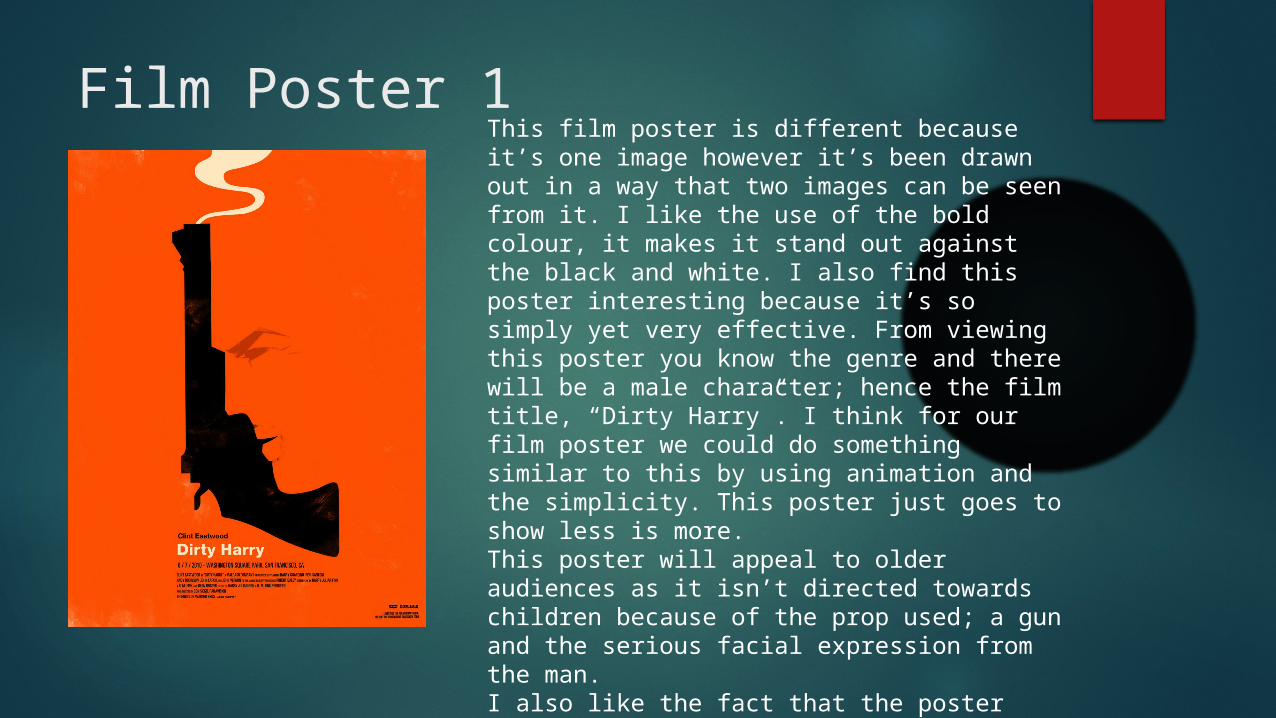
Film Poster 1This film poster is different because it’s one image however it’s been drawn out in a way that two images can be seen from it. I like the use of the bold colour, it makes it stand out against the black and white. I also find this poster interesting because it’s so simply yet very effective. From viewing this poster you know the genre and there will be a male character; hence the film title, “Dirty Harry”. I think for our film poster we could do something similar to this by using animation and the simplicity. This poster just goes to show less is more. This poster will appeal to older audiences as it isn’t directed towards children because of the prop used; a gun and the serious facial expression from the man. I also like the fact that the poster doesn’t give away too much about the film, yet enough for you as a viewer to want to go see the film.
Film Poster 2
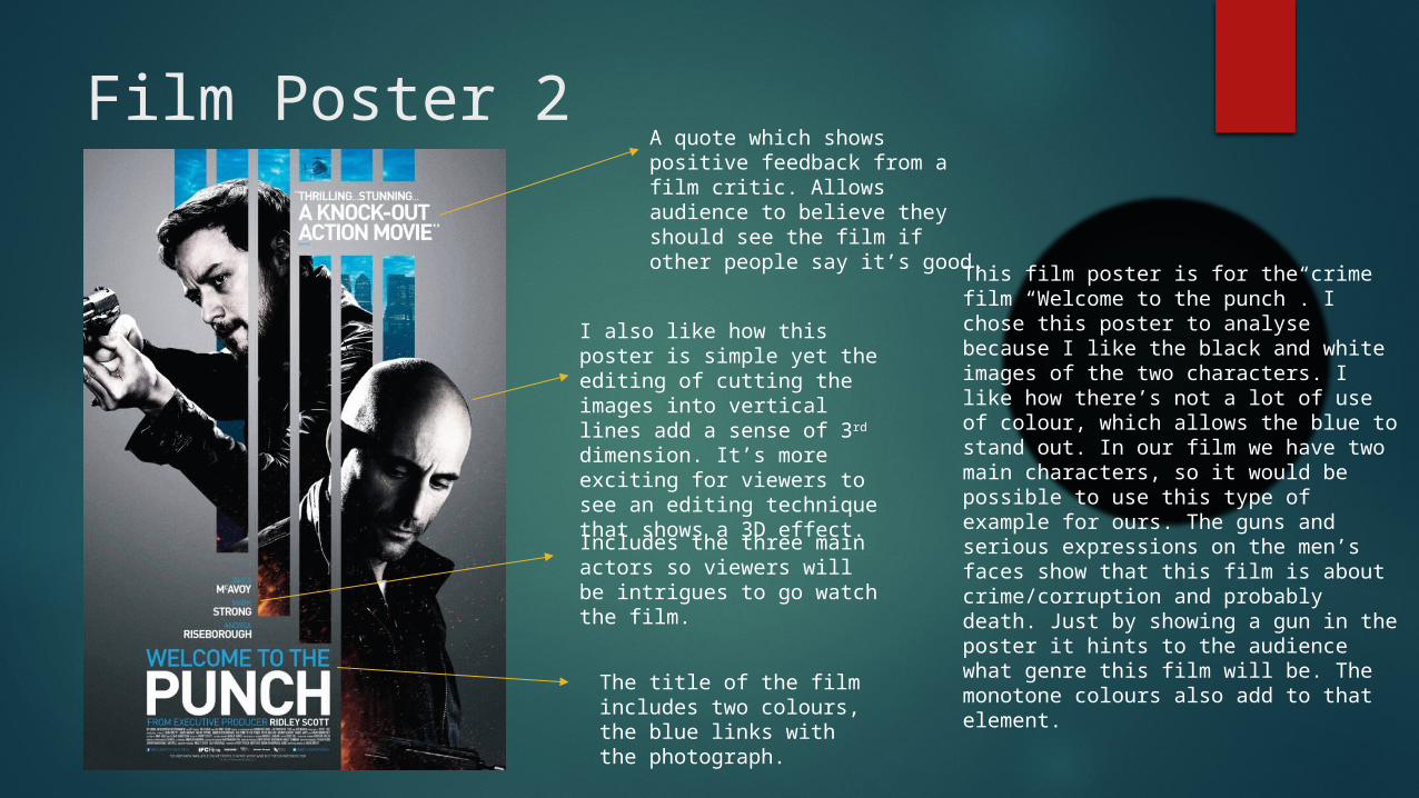
This film poster is for the crime film “Welcome to the punch”. I chose this poster to analyse because I like the black and white images of the two characters. I like how there’s not a lot of use of colour, which allows the blue to stand out. In our film we have two main characters, so it would be possible to use this type of example for ours. The guns and serious expressions on the men’s faces show that this film is about crime/corruption and probably death. Just by showing a gun in the poster it hints to the audience what genre this film will be. The monotone colours also add to that element.
A quote which shows positive feedback from a film critic. Allows audience to believe they should see the film if other people say it’s good.
I also like how this poster is simple yet the editing of cutting the images into vertical lines add a sense of 3rd dimension. It’s more exciting for viewers to see an editing technique that shows a 3D effect.
Includes the three main actors so viewers will be intrigues to go watch the film.
The title of the film includes two colours, the blue links with the photograph.

Film Poster 3Those colours used are often found in crime/action films. The silhouette of the male figure in a suit, which then turns into a dripping of red suggests blood. There’s a gun in his hand as well, this creates ideas of what the film could be about. Crime, action, thriller, adventure, fiction.
This poster from the film “Skyfall” stood out for me because it’s got a lot of white space, this contrasts against the black and red.
The font is in block capitals, this suggests it will be a serious narrative coming from the mature font.
This effect of blood smudged across the silhouette suggests blood and death.
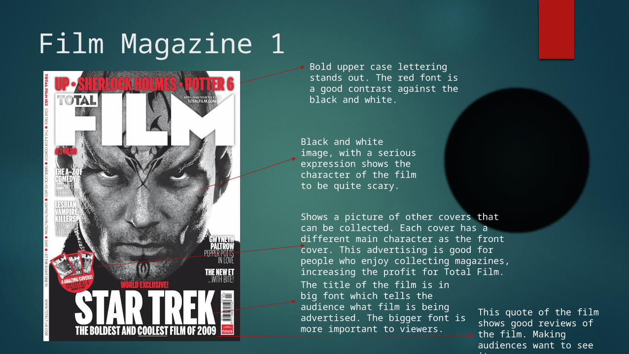
Film Magazine 1
Black and white image, with a serious expression shows the character of the film to be quite scary.
Bold upper case lettering stands out. The red font is a good contrast against the black and white.
The title of the film is in big font which tells the audience what film is being advertised. The bigger font is more important to viewers.
Shows a picture of other covers that can be collected. Each cover has a different main character as the front cover. This advertising is good for people who enjoy collecting magazines, increasing the profit for Total Film.
This quote of the film shows good reviews of the film. Making audiences want to see it.

Film Magazine 2The title of the magazine has been edited so it looks like shattered glass. This suggests the film is bound to include violence, action and crime.
Title of film is upper case and in a very large font. This stands out to viewers.
The gun held in hand gives away the genre. The serious expression from the character enables you to have an insight into the characters personality for the film.
The background for the magazine is subtle and adds colour to the cover. There’s not too much going on, so doesn’t take away the attention from the character.
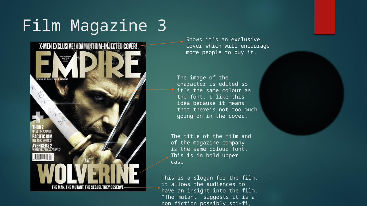
Film Magazine 3Shows it’s an exclusive cover which will encourage more people to buy it.
The title of the film and of the magazine company is the same colour font. This is in bold upper case
The image of the character is edited so it’s the same colour as the font. I like this idea because it means that there’s not too much going on in the cover.
This is a slogan for the film, it allows the audiences to have an insight into the film. “The mutant” suggests it is a non fiction possibly sci-fi, action film.