Analysis Of Toc
5
Analysis of existing products: Table of Contents
-
Upload
guestdc3961 -
Category
Documents
-
view
153 -
download
1
Transcript of Analysis Of Toc
Analysis of existing products:Table of Contents
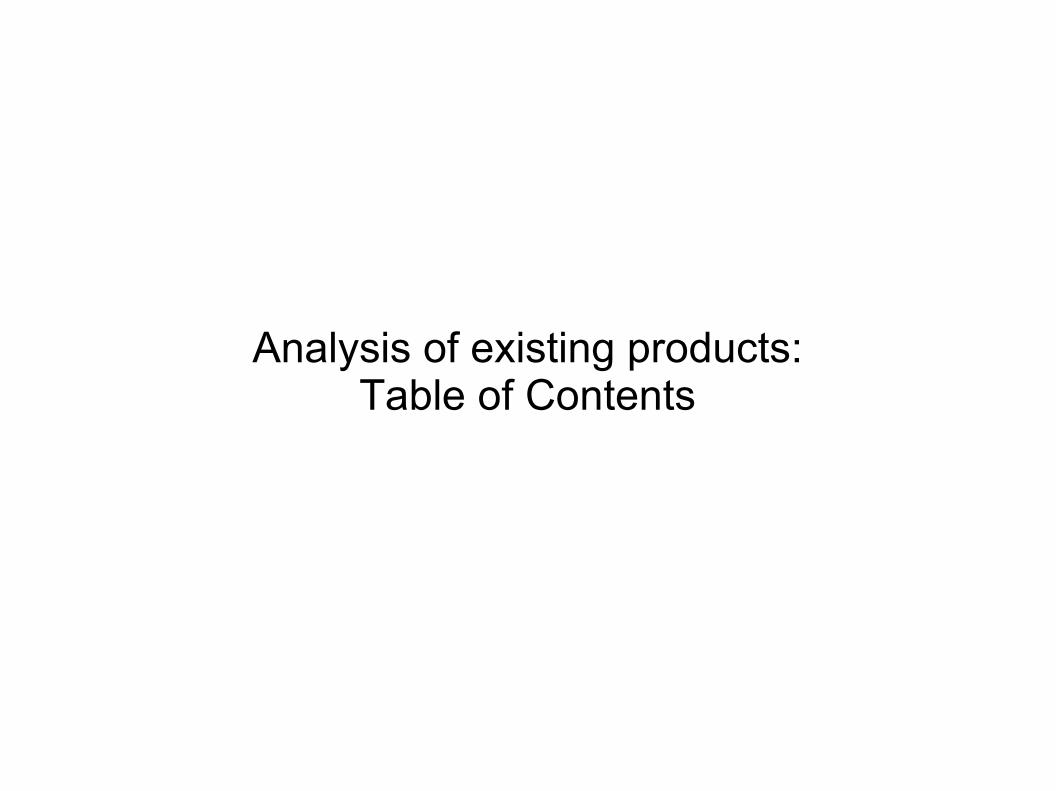
Contents page: Kerrang
Images take up the majority of page – two thirds
Pull Quote
Editor's Note
Subscription section
Images of past issues
Editorial Pillars – summarizes which bands are in the magazine; this could attract the reader
Image of front cover
Bands featured in the image section are not mentioned in the editorial pillars
Title
The big image featured are articles from the features section
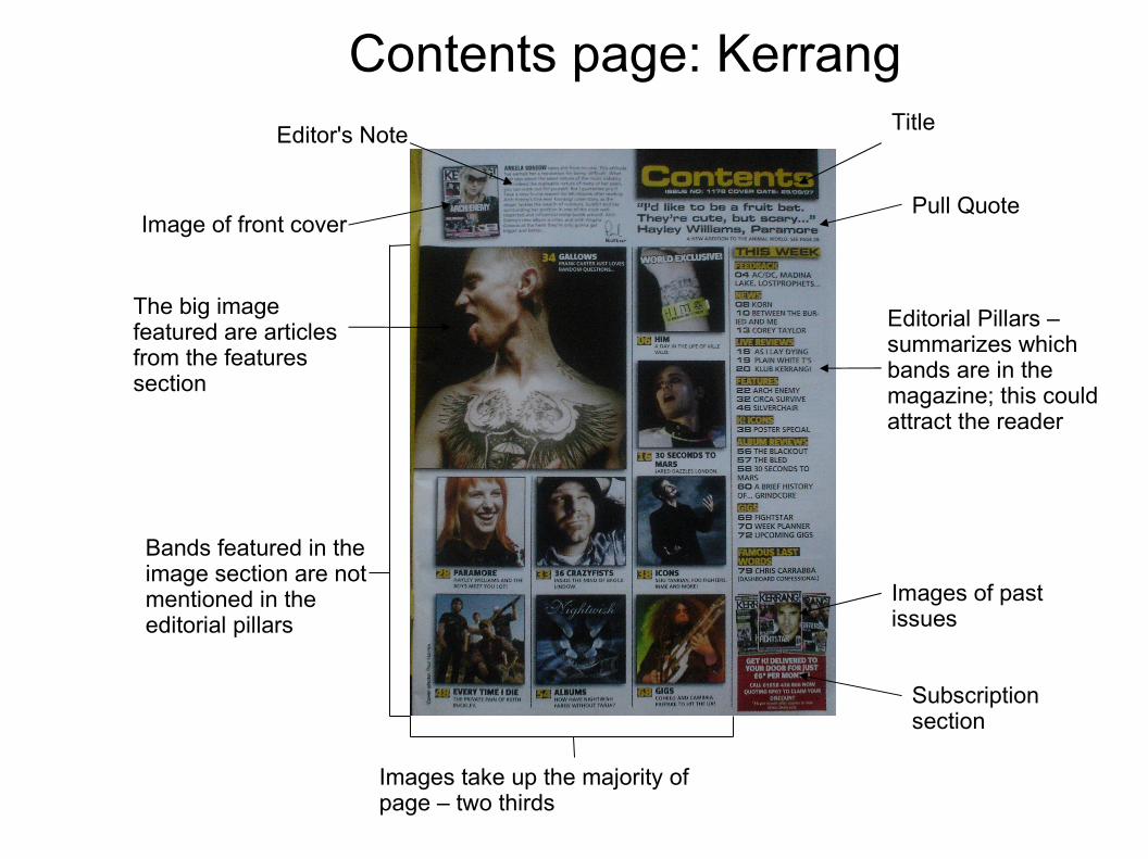
Eye flow goes in a 'C' shape (shown by the green line)
The text are all in a sans serif font
Consistent in colour scheme from the front cover
Article title – larger size than the other text so it can stand out.
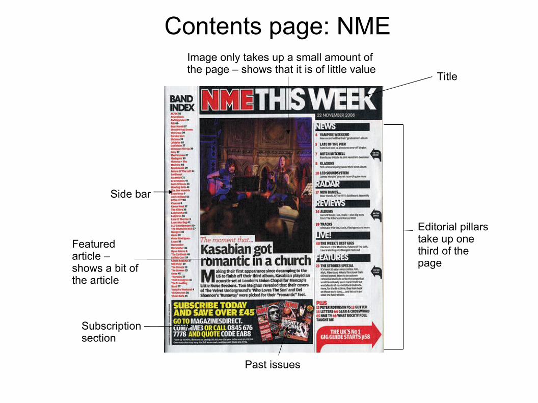
Contents page: NMEImage only takes up a small amount of the page – shows that it is of little value
Title
Editorial pillars take up one third of the page
Side bar
Subscription section
Featured article – shows a bit of the article
Past issues

All text are in a sans serif font
Eye flow is in a 'S' shape
Consistent colour scheme
Title is in a bigger size from the rest of the text so it can stand out