Analysis of regional magazines contents page
6
ANALYSIS OF REGIONAL MAGAZINE CONTENTS PAGES By Georgia Hardy
Transcript of Analysis of regional magazines contents page

ANALYSIS OF REGIONAL MAGAZINE CONTENTS PAGESBy Georgia Hardy

The layout is very simple and sleek. It is also very easy to navigate due to the pairing of page numbers with images linking them to articles. This will appeal to the target audience as it allows them to find the information on a particular article this relates to the ‘surveillance’ theory. Its also presented in a neat and tidy way in columns which is a convention of any type of magazines content page. This again helps with easy navigation.
The font type is very sophisticated, this may establish the texts ideology and reflect the target audience’s taste. The text also relates the images, as they are also sophisticated, e.g. the image of ballerinas and a canal boat. This shows the magazine is targets an upmarket audience and this will therefor appeal to them.
The colour scheme of the page is simplistic. Overall the colours used are white, black, gold and pink. The black text against the white background allows the audience to easily navigate themselves to the various articles. The gold colour of the numbers could represent the lavish and sophisticated side to the magazine, as it may be representing.
The model in the main image is creating direct mode of address and therefor creating a relationship with the audience. This suggests that this is going to be the main article, and therefore brings the audience’s attention to this photograph.
The content of the articles show that the magazine focuses on a wide range of topics throughout Bristol. This allows the magazine to open up to a larger audience from many classes and ages.
There is constant referencing to Bristol throughout the page. This may create a personal relationship between the product and the audience as it is directly addressing the local area , where manty of the readers will be residents.
The house style is sophisticated with serif font being used throughout the contents page and the rest of the magazine, the colour scheme of black and gold is also consistent in this magazine.
The masthead is of the issue month (September) instead of the conventional ‘Contents’ which is still situated at the top of the page however very small.
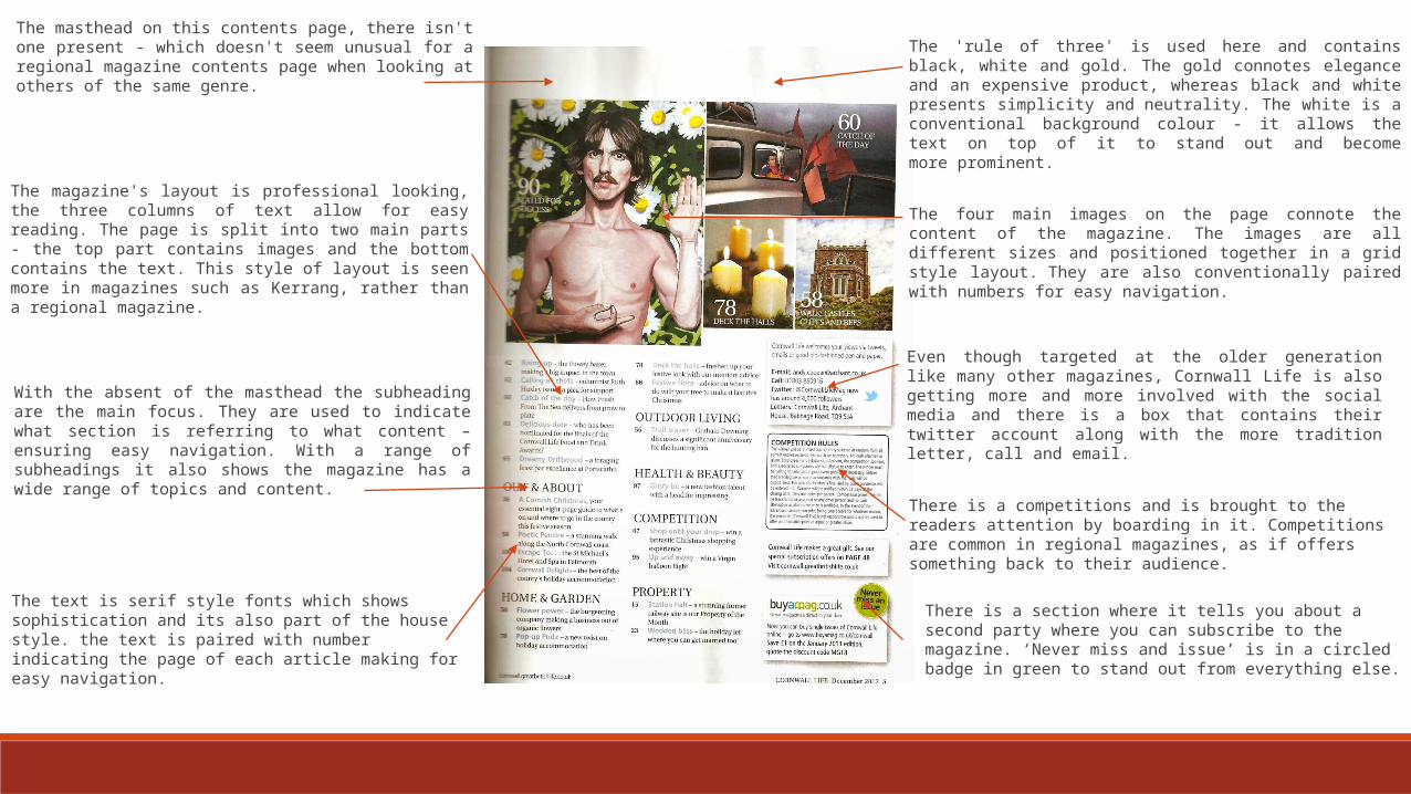
The 'rule of three' is used here and contains black, white and gold. The gold connotes elegance and an expensive product, whereas black and white presents simplicity and neutrality. The white is a conventional background colour - it allows the text on top of it to stand out and become more prominent.
The masthead on this contents page, there isn't one present - which doesn't seem unusual for a regional magazine contents page when looking at others of the same genre.
The text is serif style fonts which shows sophistication and its also part of the house style. the text is paired with number indicating the page of each article making for easy navigation.
The four main images on the page connote the content of the magazine. The images are all different sizes and positioned together in a grid style layout. They are also conventionally paired with numbers for easy navigation.
The magazine's layout is professional looking, the three columns of text allow for easy reading. The page is split into two main parts - the top part contains images and the bottom contains the text. This style of layout is seen more in magazines such as Kerrang, rather than a regional magazine.
With the absent of the masthead the subheading are the main focus. They are used to indicate what section is referring to what content – ensuring easy navigation. With a range of subheadings it also shows the magazine has a wide range of topics and content.
Even though targeted at the older generation like many other magazines, Cornwall Life is also getting more and more involved with the social media and there is a box that contains their twitter account along with the more tradition letter, call and email.
There is a section where it tells you about a second party where you can subscribe to the magazine. ‘Never miss and issue’ is in a circled badge in green to stand out from everything else.
There is a competitions and is brought to the readers attention by boarding in it. Competitions are common in regional magazines, as if offers something back to their audience.

There is a editors note, which is not commonly found in a regional magazine more in a music or fashion one. This suggests that its aiming it more and more towards the younger audiences.
The colour scheme is the same throughout the magazine, using red, white and black, which is a common colour scheme for any magazine as the colours strongly contrast each other. The red and the black font stand out against the white background, grabbing the attention of the audience. This makes the magazine easily identifiable to the audience.
The font used is simple and modern, in relation to the type of language that is used. None of it is fancy showing it again is aiming this magazine and the younger target audiences like students.
The magazine displays its social network accounts within the contents page. This again will help appeal to their target audience as many of them will be young adults. It also shows the magazine is up to date and modern as readers have a wide range of accessing their information. This links to the reception theory, as the majority of readers are likely to have some sort of social media account.
The images are there to promote the articles, this is more visually appealing than text. The images are also paired with page numbers which makes for easy navigation. The images are also paired with a little snippet of the article this will entice the reader more as they will want to read the full article.
Includes a regulars column this shows a relationship between magazine and its devoted readers, part of the uses and gratifications theory.
The layout is presented in columns which makes easy navigation for the readers and makes the page look neat and professional.
Timeout logo down the in corner for brand awarness.

SW’s logo is centred where conventionally they masthead of contents would usually be, however this is for audience brand recognition.
The layout of the contents page is very simple. There are a mixture of texts and images in both columns. The columns and lists make for easy navigation which will appeal to their target audience of older generations which need help with navigation.
The colour scheme is also simplistic with the use of the rule of there with white, black and green. However in the bottom right hand corner there is a strip of red this is used to highlight the text within showing its importance.
There are several images used, all are linked with pages numbers to link them with certain articles, making it more visually appealing for the reader. The images in the second column are also organised neatly making easy navigation.
The font for all the text apart from ‘Contents’ is sans serif font which is simple and easy to read, this connects to the theme of the magazine and will appeal to the target audience. This may also establish the texts ideology.
The Masthead is in an unconventional place for the normal ‘Contents’ masthead however it is still the largest and boldest text on the page. It is in serif font and italic which is strange and very uncommon considering the rest of the font is sans serif, however it does make it stand out from the rest of the text.
There is a link down at the bottom of the page to their website advertising it.
Includes a regulars column this shows a relationship between magazine and its devoted readers, part of the uses and gratifications theory.
The main image is of a room (technically a landscape) this connotes that it is aimed at the older demographic as its not unusual and linked to an article that would be of interest to them.

Conclusion:After researching into regional magazine contents pages I found that the codes and conventions include: Organised in columns – easy navigation for readers, displays information in neat tidy way.
Linking Images with page numbers – makes it more visual for read which also results in easier navigation.
Social Media links – such as Facebook, twitter and especially their website. This is mostly common in magazines targeted at the younger youth however the more traditional magazines have also started using it.
Sub-headings – common ones such as ‘Regulars’ and ‘Features’, creates relationship with reader. (Uses and Grats)