Analysis Of Album Artwork
16
History of Album Artwork
-
Upload
dannymanning -
Category
Education
-
view
866 -
download
1
description
Transcript of Analysis Of Album Artwork

History of Album Artwork
What is album artwork?
• Album Artwork is the front of the packaging of a commercially released audio recording product, or album
Early History
• Around 1910, when records were now taking over the previous phonograph cylinders, records were being sold in brown paper or cardboard sleeves. These were usually plain but sometimes had the name of the manufacturer printed on the front.
Nutcracker Suite
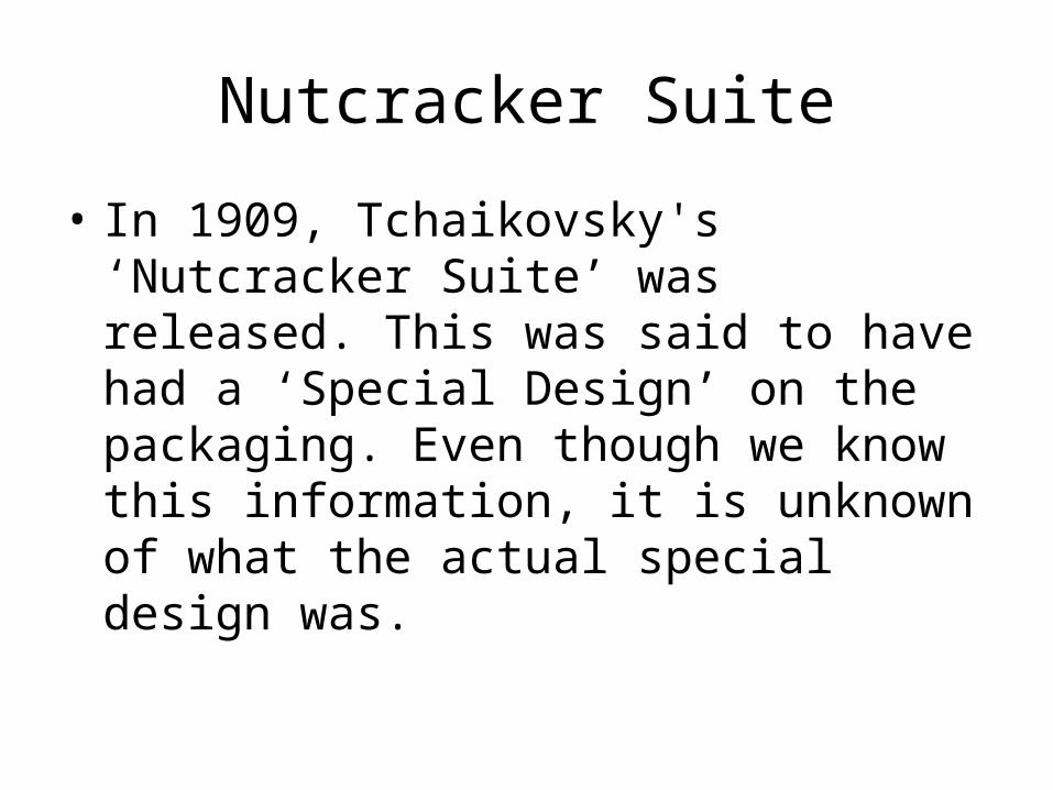
• In 1909, Tchaikovsky's ‘Nutcracker Suite’ was released. This was said to have had a ‘Special Design’ on the packaging. Even though we know this information, it is unknown of what the actual special design was.
Alex Steinweiss
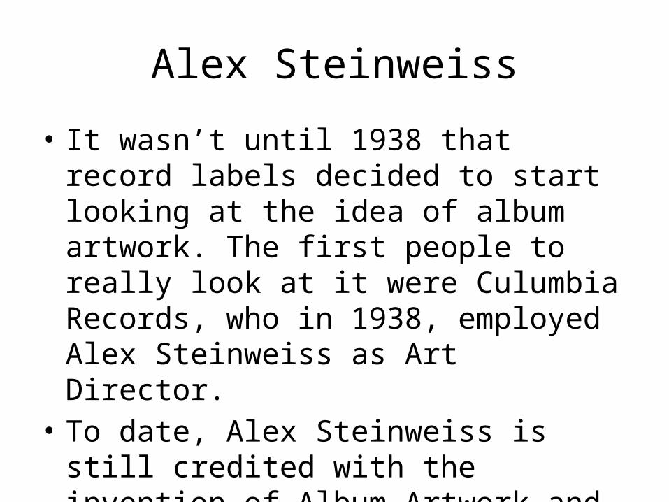
• It wasn’t until 1938 that record labels decided to start looking at the idea of album artwork. The first people to really look at it were Culumbia Records, who in 1938, employed Alex Steinweiss as Art Director.
• To date, Alex Steinweiss is still credited with the invention of Album Artwork and the concept of Album Cover.
1940’s
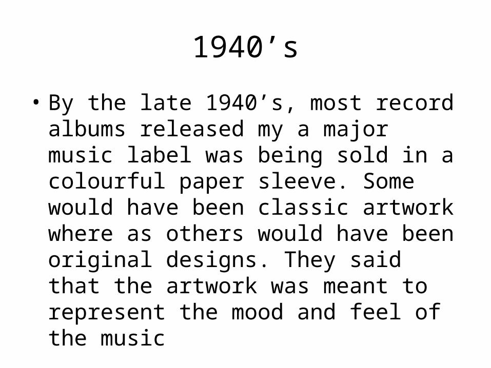
• By the late 1940’s, most record albums released my a major music label was being sold in a colourful paper sleeve. Some would have been classic artwork where as others would have been original designs. They said that the artwork was meant to represent the mood and feel of the music
Album Artwork in the 50’s
• In the 50’s the artwork didn’t really change much from the previous decade. More LPs were started to be released in cardboard sleeves, meaning artwork could start to be more detailed.
• The big artists in the 50’s for album artwork were; • Reid Miles for Blue Note• Burt Goldblatt for Savoy & Bethlehem• David Stone Martin for Norgan and Verve• William Claxton for Pacific Jazz.
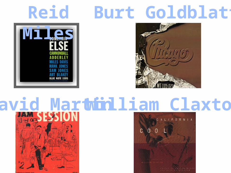
Reid Miles Burt Goldblatt
David Martin William Claxton
The Beatles
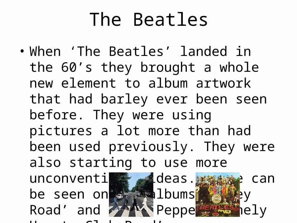
• When ‘The Beatles’ landed in the 60’s they brought a whole new element to album artwork that had barley ever been seen before. They were using pictures a lot more than had been used previously. They were also starting to use more unconventional ideas. These can be seen on the albums ‘Abbey Road’ and ‘SGT. Peppers Lonely Hearts Club Band’
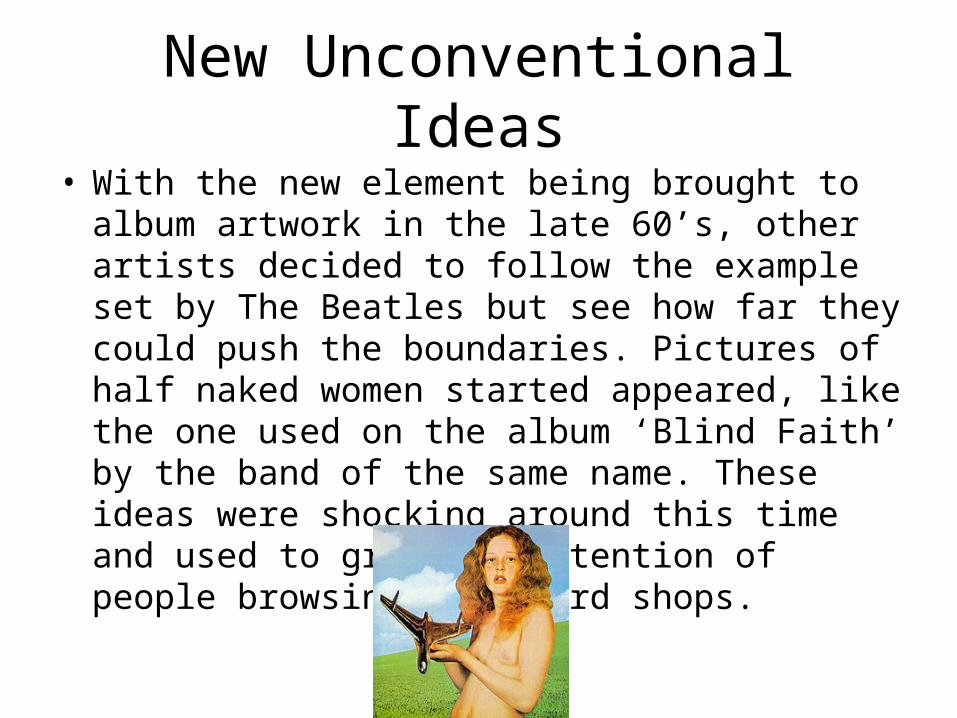
New Unconventional Ideas• With the new element being brought to album
artwork in the late 60’s, other artists decided to follow the example set by The Beatles but see how far they could push the boundaries. Pictures of half naked women started appeared, like the one used on the album ‘Blind Faith’ by the band of the same name. These ideas were shocking around this time and used to grab the attention of people browsing in record shops.
The CD
• In the early to mid 90’s we started to see the increase in popularity of the Compact Disk, better known to use now as a CD. The new ‘Digipak’ was being used regularly, a combination of cardboard and plastic and brought along with it a whole new range of album artwork.
90’s to the 21st Century
• Although there aren’t many differences between artwork in the 90’s to how we see it today, we have gained a lot of technology along the way which has moved album artwork on more than can be seen to the naked eye.
90’s to the 21st Century
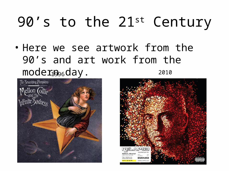
• Here we see artwork from the 90’s and art work from the modern day.
1996 2010
90’s to the 21st Century
• Even though both images are made on a computer we can see a very big difference in the quality of the images
• In the 90’s shocking images still weren’t being used, as we see in the artwork fro 1996, the appearance of regular art was still being used. However when we look at Relapse from 2010 we see a mans face being made from prescription drugs and the whole artwork being made from ideas from medication. The details are in the form of a prescription (bottom left) and the actual CD is made to look like the top of a pill bottle.
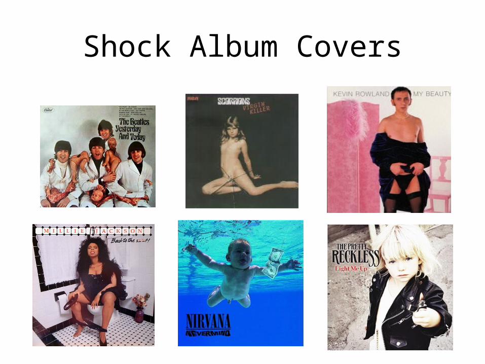
Shock Album Covers
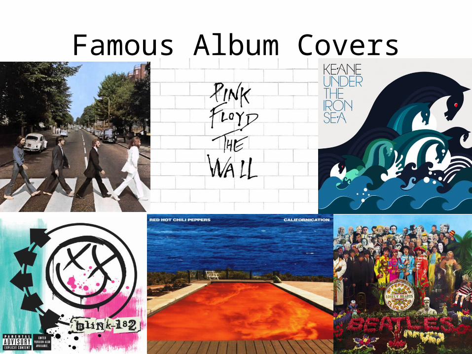
Famous Album Covers


![Untitled-1 [] · Album Cover Artwork with Decorative Patterns Create an ... - Genre Analysis - Ideological Criticism - Discourse Analysis Assignments Analyse Media Texts ... Semiotic](https://static.fdocuments.us/doc/165x107/5e97ca0be4c26934476a0156/untitled-1-album-cover-artwork-with-decorative-patterns-create-an-genre.jpg)