An SPSS companion book - SFU.cajackd/SPSS/SPSS_19_Stat203_Guide.pdf · 1 An SPSS companion book to...
179
1 An SPSS companion book to Basic Practice of Statistics – 6 th Edition. SPSS is owned by IBM. Basic Practice of Statistics 6 th Edition by David S. Moore, William I. Notz, Michael A. Flinger. Published by W.H. Freeman and Company. Companion Book by Michael “Jack” Davis of Simon Fraser University, [email protected] , factotumjack.blogspot.ca last updated 2015 January 3.
Transcript of An SPSS companion book - SFU.cajackd/SPSS/SPSS_19_Stat203_Guide.pdf · 1 An SPSS companion book to...

1
An SPSS companion book to
Basic Practice of Statistics –
6th Edition. SPSS is owned by IBM.
Basic Practice of Statistics 6th Edition by David S. Moore, William I. Notz,
Michael A. Flinger. Published by W.H. Freeman and Company.
Companion Book by Michael “Jack” Davis of Simon Fraser University,
[email protected], factotumjack.blogspot.ca last updated 2015 January 3.

2
Topic Related Textbook Chapters
Page
About SPSS 3 Inputting Data Introduction 6 Transforming and Sorting Data Ch. 1 22 One-Variable Graphs Ch. 1 39 Descriptives Ch. 2 62 Correlation and Scatterplots Ch. 4 72 Regression, Least Squares Lines Ch. 5, 24 83 Crosstabs, Odds Ratio, Chi-Squared Ch. 6, 21, 23 104 Random Selection Ch. 9 127 One-Sample T-Tests Ch. 16-18 131 Two-Sample T-Tests Ch. 19 138 One-Sample Proportion Test Ch. 20 154 Two-Sample Proportion Test Ch. 21 160 Weights Ch. 23 166 One-Way ANOVA Ch. 25 170
3
About SPSS
SPSS stands for Statistical Package for Social Sciences. It was briefly
called PASW, so you may also see that acronym tossed around.
It’s a menu-based system for graphing and analyzing data. Having
some experience which a spreadsheet program like Excel will be of
some help.
Having experience with another menu-based statistical program
like JMP or Statcrunch will help a lot.

4
SPSS versions are updated often. As of January 2015, the newest
version was SPSS 23. This guide is based on SPSS 19.
However, basic usage changes very little from version to version.
Many of instructions for SPSS 19-23 are the same as they were in
SPSS 11.
SPSS is owned by IBM, and they offer tech support and a
certification program which could be useful if you end up using
SPSS often after this class.
http://www-03.ibm.com/certify/certs/47100101.shtml

5
Some datasets used in this guide are available at
http://www.sfu.ca/~jackd/SPSS/Datasets/
The datasets for problems and examples in Basic Practice of Statistics are
available at
http://content.bfwpub.com/webroot_pubcontent/Content/BCS_5/BPS6e
/Student/DataSets/SPSS/SPSS.zip
Knowing how to use SPSS is not the same as knowing statistics. It’s
becoming increasingly important to know what the most appropriate
tools and analyses are for a given situation rather than rote
memorization. Interpretation of terms, such as ‘p-value’ is also
important, but is covered in your textbook instead of this guide.

6
Inputting Data
There are a few ways to input data in SPSS. The simplest way to
input data is from its own format, the .sav file.
Sometimes data doesn’t come in the .sav format. Data can come
from another program like Excel using the .xls, or .xlsx formats, It
can come as a multi-program portable file in the .por format, or as
text in the .txt or .csv formats.
Basic Practice of Statistics datasets are in the .por format.

7
Inputting data in SPSS manually isn’t ideal, but sometimes it needs
to be done, so that is covered here as well.
To input (import) data from a .sav file, first open SPSS. You’ll first
get a dialog like this:

8
This dialog can get your started quickly, but we’re assuming SPSS is
already running in the examples in this guide, so click Cancel in
the lower right.

9
You’ll get a window that looks like this. This is the data view
window. Sometimes called the main window

10
To open a file, click on the icon in the upper left, or use file
open data, also in the upper left.

11
Then, in the navigation dialog, navigate the folder containing the
file you want and click Open.

12
If you’ve done it correctly, the data should fill in the cells of the
main window.
13
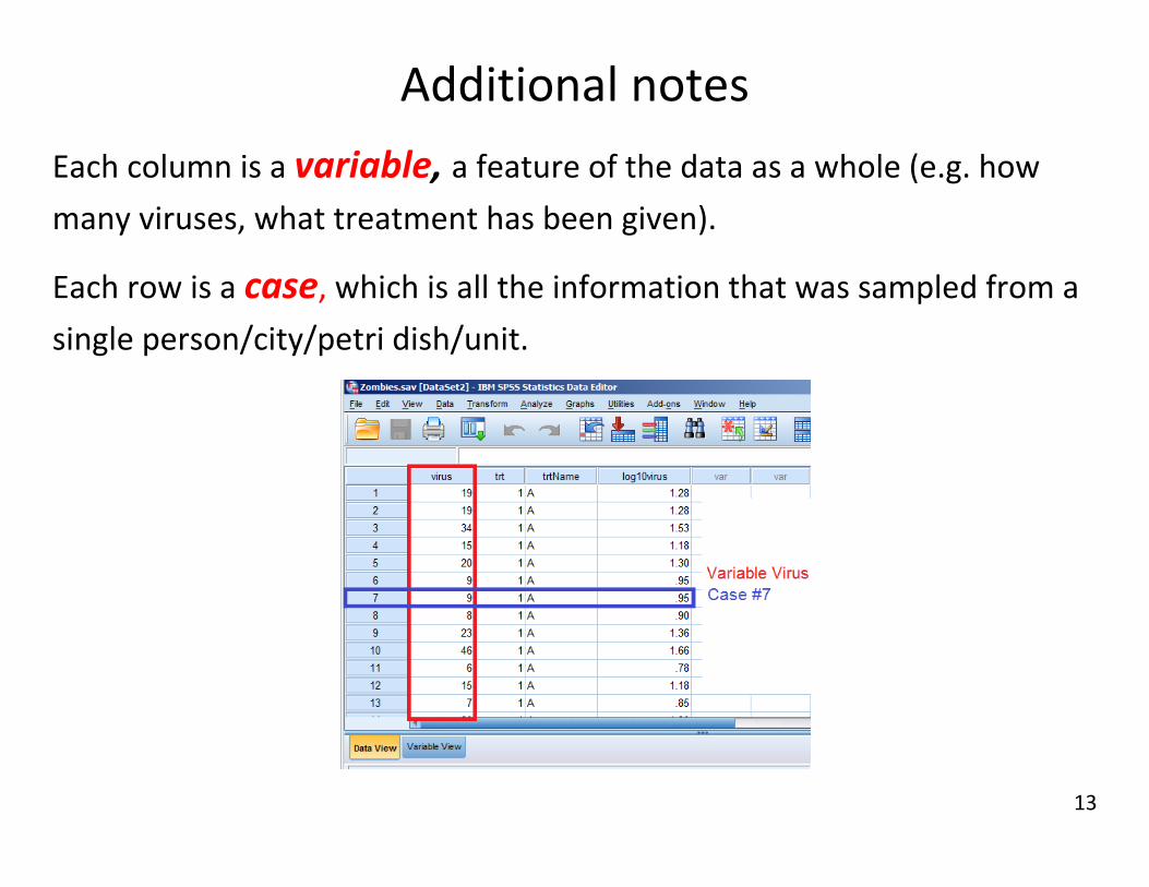
Additional notes
Each column is a variable, a feature of the data as a whole (e.g. how
many viruses, what treatment has been given).
Each row is a case, which is all the information that was sampled from a
single person/city/petri dish/unit.
14
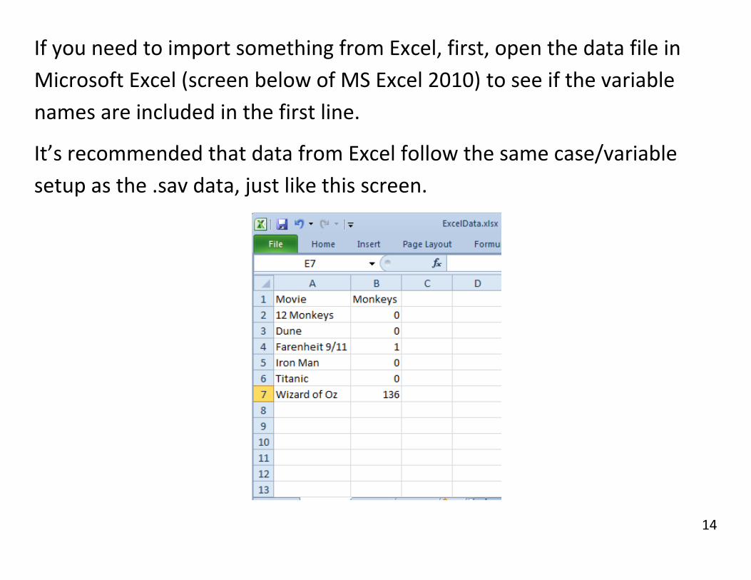
If you need to import something from Excel, first, open the data file in
Microsoft Excel (screen below of MS Excel 2010) to see if the variable
names are included in the first line.
It’s recommended that data from Excel follow the same case/variable
setup as the .sav data, just like this screen.

15
Then, in SPSS (screen from SPSS 19, use the icon or File Open
Data again, but this time in the dialog, change the Files of type
pulldown to Excel before selecting the file you want and clicking
Open. (Excel files won’t appear otherwise)

16
When loading .por datasets, make sure the file type Portable is set.

17
If the variable names were in the first row, make sure this box (see
arrow) is checked. Otherwise, leave it unchecked.
If your excel file has multiple sheets, use Worksheets to make sure
you have the right one (by default it will usually be right)
Then Click OK

18
If everything was done right, your SPSS main window should look
like the screen below. “Movie” and “Monkeys” have been
interpreted as variables and not part of the data.
Note that the filename is Untitled; SPSS doesn’t open the Excel file,
it makes a copy. Changes in SPSS won’t affect the original Excel file.

19
You can also click on cells (where a column and row intersect) and
type in new cases if you need to. “Dragonball Z” and “9001” have
been typed in.
SPSS won’t let you type letters into a numeric variable.

20
Finally, note the two tabs in the bottom left of the main window.
We’re currently in Data View, but clicking the Variable View tab will
bring up this:

21
Instead of displaying the data, Variable View displays information
about each of the variables.
If you want to see more/fewer decimals, you can click on the
appropriate cell to change it.

22
You can change the type (String is words, Numeric is numbers)
You can also give variables more descriptive names in the labels.

23
Transforming and Sorting Data
This part may or may not be part of your course. It’s included
here because it’s useful knowledge for managing data in
general, and because it helps solve an example in the
crosstabs section.
Here we take a nominal variable with three categories and
transform it into a nominal variable with two categories,
effectively merging two categories together.

24
(From the dataset Ch9_24.sav, based on Exercise 9.24)
To take the three category variable Young/Middle/Old
And make a two category variable Young/Not Young
Transform Recode into Different Variables.
25
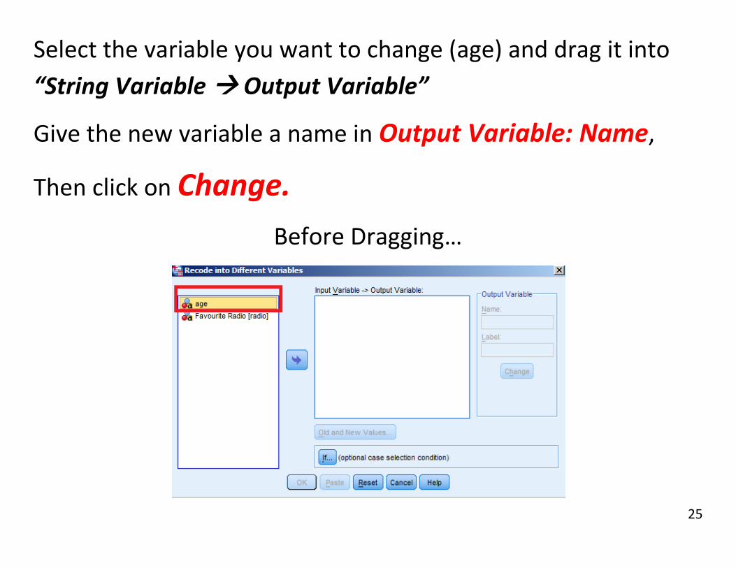
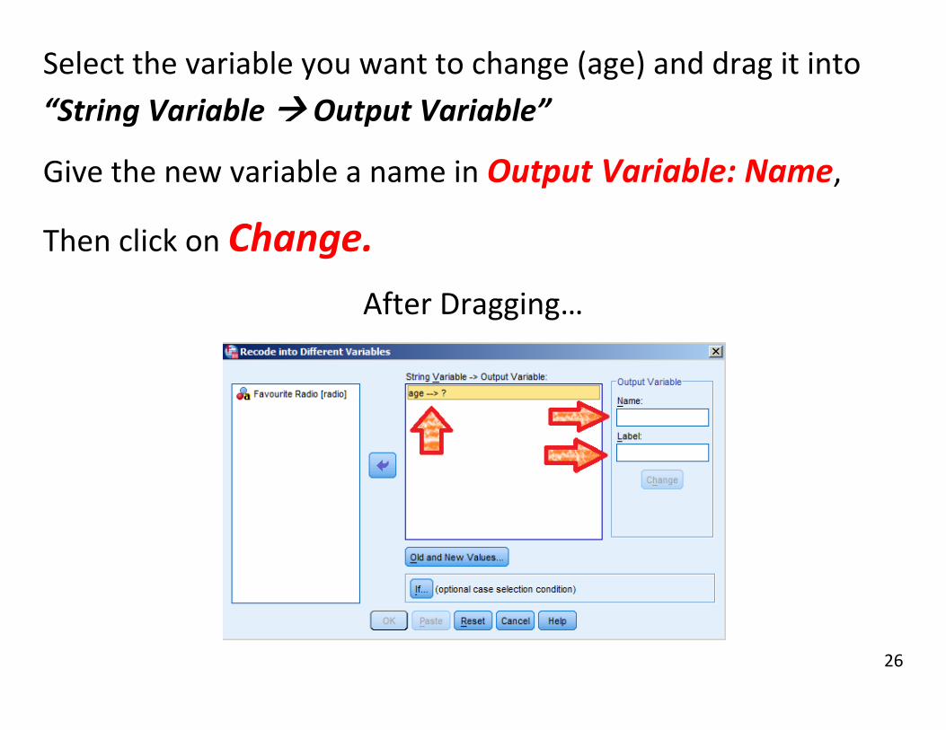
Select the variable you want to change (age) and drag it into
“String Variable Output Variable”
Give the new variable a name in Output Variable: Name,
Then click on Change.
Before Dragging…
26
Select the variable you want to change (age) and drag it into
“String Variable Output Variable”
Give the new variable a name in Output Variable: Name,
Then click on Change.
After Dragging…

27
Then, click on Old and New Values.
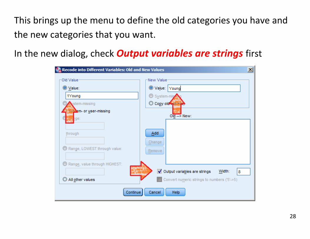
28
This brings up the menu to define the old categories you have and
the new categories that you want.
In the new dialog, check Output variables are strings first

29
Then enter the old category name in Old Value: Value
And enter the new category name in New Value: Value
Click Add and repeat the previous slide for each category.

30
Repeat until the Old New box reads:
‘1Young’ Young’,
‘2MiddleAge’ ‘NotYoung’,
‘3OlderAdult’ ‘NotYoung’.
31
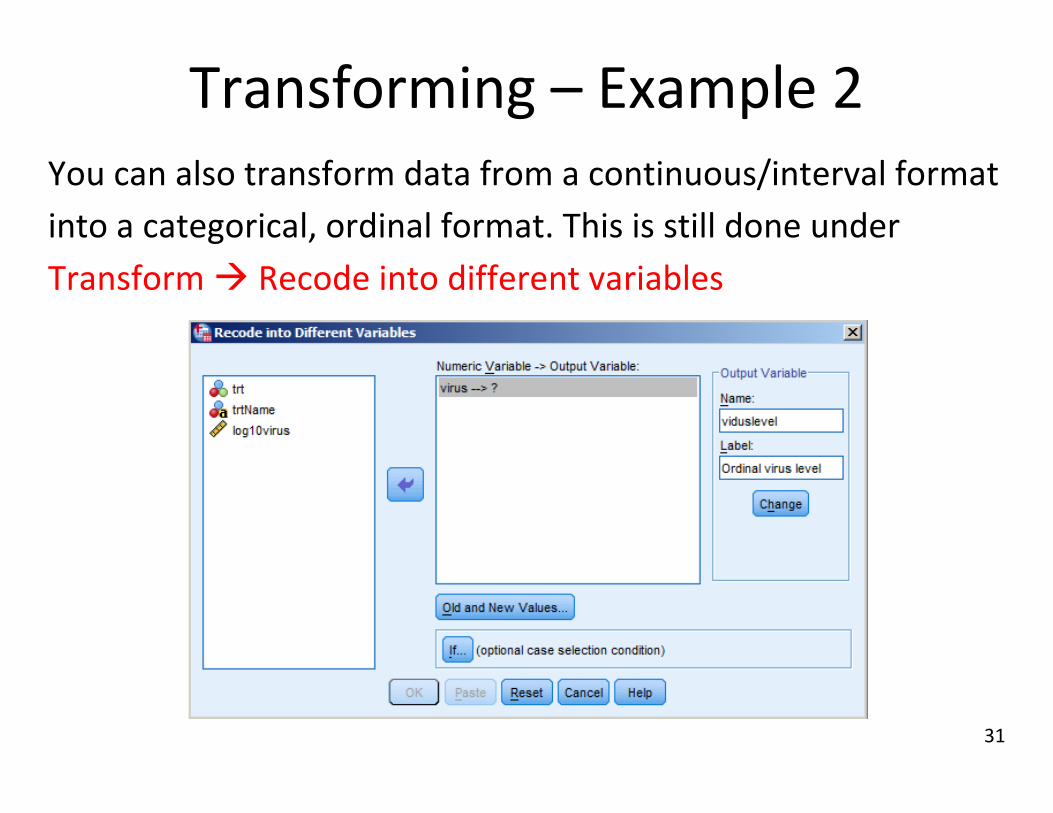
Transforming – Example 2 You can also transform data from a continuous/interval format
into a categorical, ordinal format. This is still done under
Transform Recode into different variables
32
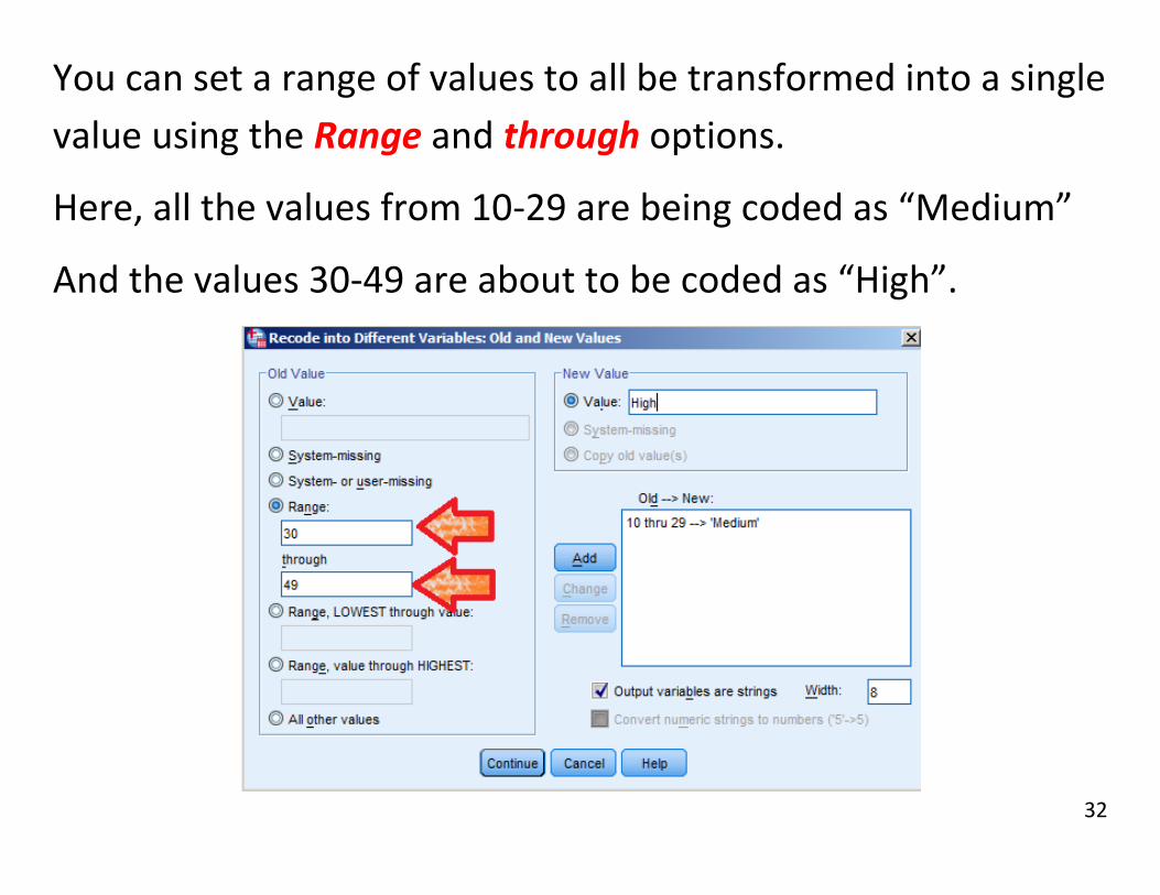
You can set a range of values to all be transformed into a single
value using the Range and through options.
Here, all the values from 10-29 are being coded as “Medium”
And the values 30-49 are about to be coded as “High”.

33
If you want “anything X or lower” to be coded together, use
the LOWEST through value
Here, anything of 9 or less is being coded as “Low”.

34
Likewise, you can have a code for “X or higher” with the value
through HIGHEST option.
Here, anything 50 or higher is being coded as “very high”

35
Now the numerical virus counts have been turned into
categories.

36
Sorting by a Variable Problem 1.29 calls for a bar graph of universities ordered by
excellence rating. To sort data, use the top menu and go to
Data Sort Cases

37
In the dialog that pops up, move the variable you which to sort
by into the “Sort by” box, by either dragging or using the
button. Then click OK.
In problem 1.29, you want to sort by [excellen].

38
Your data should now be sorted:
Problem 1.29 has only 10 rows, so this could have been done
manually, however, if there were 10,000 rows like there are in
some professional datasets, that wouldn’t have been possible.

39
One-Variable Graphs
Here we build a bar graph, histogram, a boxplot, and a side-by-side
boxplot using the datasets radioformat.por, descriptives XYZ.sav
and dragons.sav
Quick reference:
Analyze Descriptive Statistics Frequencies
Graphs Legacy Dialogs Bar
Graphs Legacy Dialogs Histogram
Graphs Legacy Dialogs Boxplot
Graphs Legacy Dialogs Pie

40
For the Bar Graphs in 1.3c,
load the radioformat.por dataset and use the menu options:
Graphs Legacy Dialogs Bar

41
In the first dialog,
- use the Simple option (only one variable to deal with)
- Choose Values of individual cases (each row is a category)
- Click Define

42
The height of the bars should be the % of market share, so put
pctshare in the Bars Represent box.
The labels should be of the music formats themselves, so under
Category Labels, choose Variable and put format in the box.
Click OK, and you’re done!

43
To build a histogram
Option 1: In Graphs Legacy Dialogs Histogram…
44
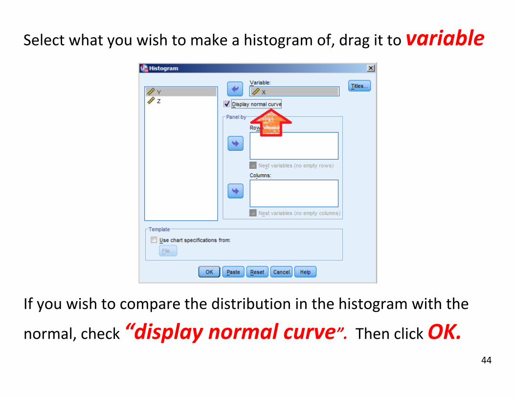
Select what you wish to make a histogram of, drag it to variable
If you wish to compare the distribution in the histogram with the
normal, check “display normal curve”. Then click OK.

45
In the output window, a histogram of your variable will appear.

46
Option 2: In Analyze Descriptive Statistics Frequencies

47
Drag any variables of which you wish to build histograms from the
field on the left (empty in screen) into the variable(s) field.
Click on “Charts”, on the right end of the dialog.
48
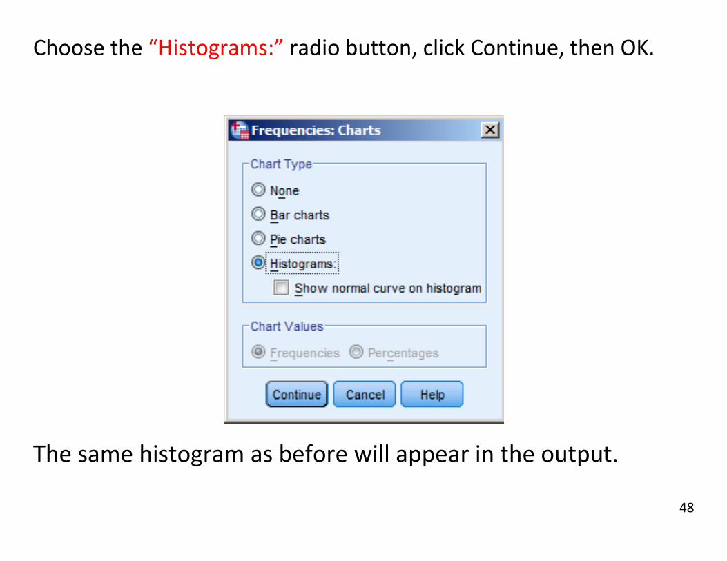
Choose the “Histograms:” radio button, click Continue, then OK.
The same histogram as before will appear in the output.

49
Boxplots (Grouped by case) For the boxplots in 2.43, the gastricbands.por dataset has all the
numeric data in a single column, so you can leave options as they
are: Simple, and Summaries for groups of cases

50
Loss is the variable we’re interested in, so it goes in Variable.
The boxplots will be split by whatever we put in the Category Axis.
In this case, either group or groupnum will do, but group is more
informative.
Click OK, and you’re done!

51
Boxplots (Separate Variables) To build a boxplot in SPSS, go to
Graphs Legacy Dialogs Boxplot

52
X, Y, and Z are separate variables. Therefore, in the boxplot
dialog, we will switch the radio button to “Summaries of
separate variables” before clicking “Define”.

53
Move the variables you want into “Boxes Represent”
Then click OK

54
This is the result. Side-by-side boxplots can be used to
compare more than 2 variables.

55
Including only one variable in boxplots will give you one
boxplot, including multiple variables will give you side-by-
side boxplots on the same scale.

56
To build a Pie Chart,
Graphs Legacy Dialogs Pie
Then choose summaries for groups of cases, and define.

57
Choose a variable and drag it into Define Slices by: then
click OK.
58
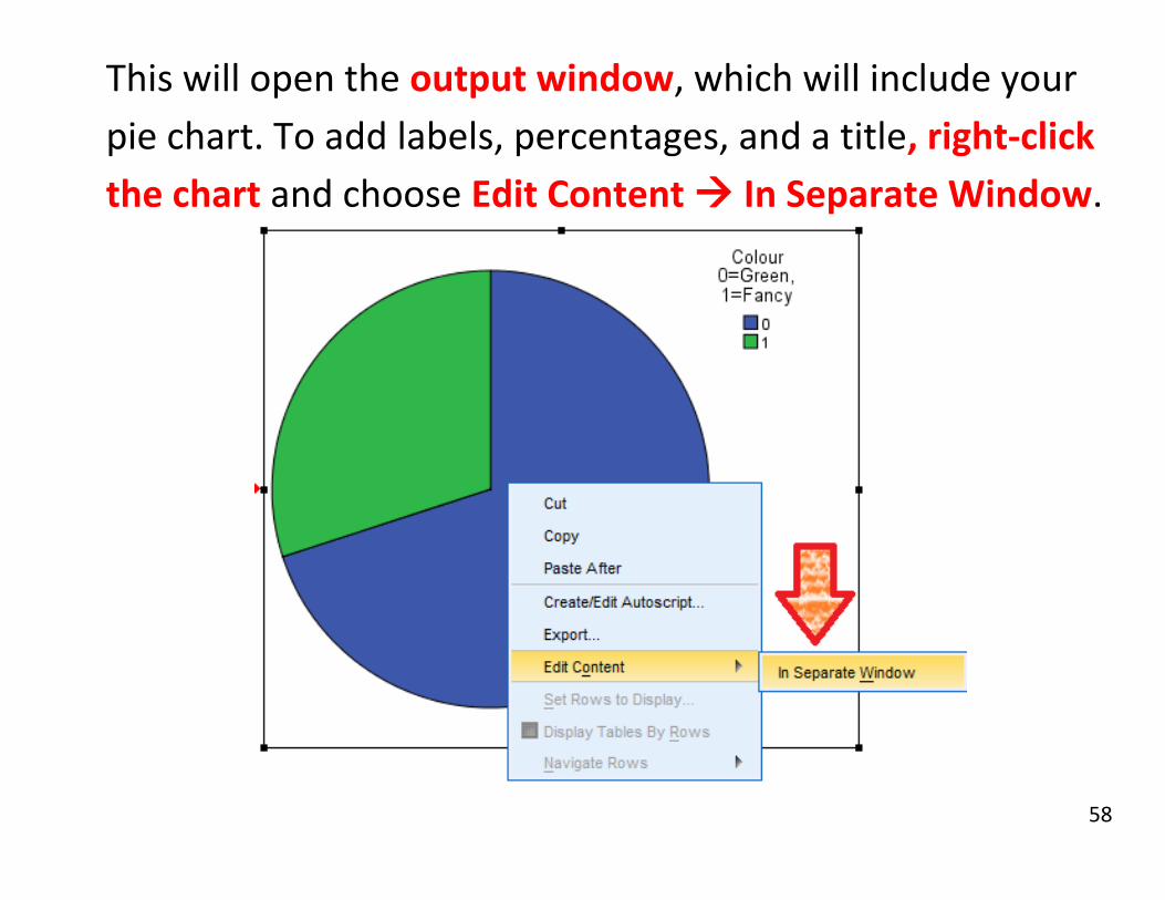
This will open the output window, which will include your
pie chart. To add labels, percentages, and a title, right-click
the chart and choose Edit Content In Separate Window.
59
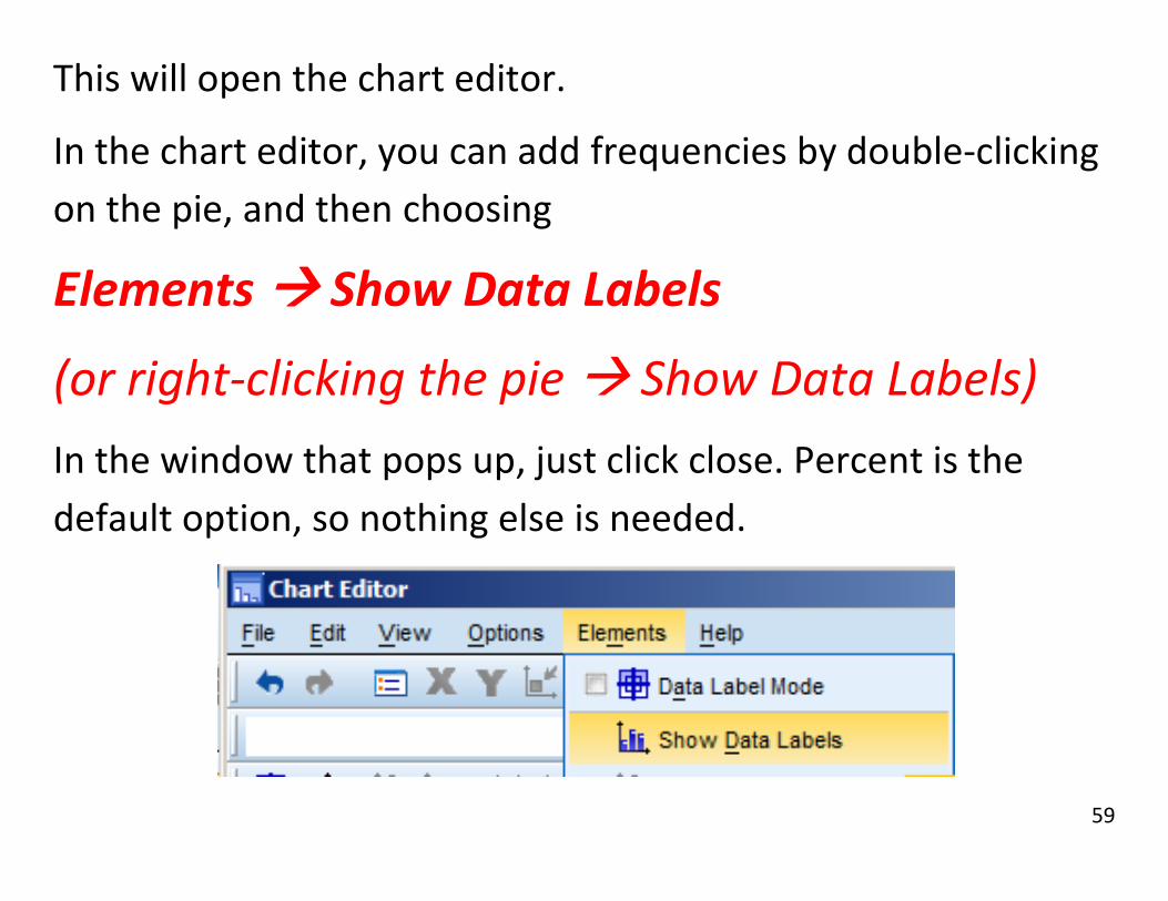
This will open the chart editor.
In the chart editor, you can add frequencies by double-clicking
on the pie, and then choosing
Elements Show Data Labels
(or right-clicking the pie Show Data Labels)
In the window that pops up, just click close. Percent is the
default option, so nothing else is needed.

60
Also in the chart editor, you can choose to add a title in
Options Title
Then type in your title then closing the dialog that appears.

61
The result is a pie chart with a title and frequencies.

62
Descriptives
In this chapter, we calculate central measures like the mean and
median, and measures of spread like the standard deviation and
interquartile range (IQR) from the dataset Descriptives XYZ.sav
Quick reference:
Analyze Descriptive Statistics Frequencies
Analyze Descriptive Statistics Descriptives
Analyze Descriptive Statistics Explore

63
- First, open a file as shown in Inputting Data.
To calculate the mean, median, IQR, or standard deviation, go to
Analyze Descriptive statistics Frequencies

64
In the dialog that appears, uncheck ‘Display Frequency Tables’.
Select all the variables you’re interested in and move them to the
right by dragging or using the button in the middle.
Click on “Statistics” in the upper right of this dialog window, and a
second dialog window will open.

65
Check “Mean”, “Median” (upper right), and “Skewness” (lower
right), then click “Continue” in the lower left. to close this dialog.
Click “OK” in the dialog with the variables listed.

66
A results window should open, giving you the mean, median, and
skew of our three variables.

67
Calculating the standard deviation from SPSS is the same as
calculating the mean, median, and quartiles:
Analyze Descriptive Statistics Frequencies
Choose your variables, click on “Statistics”

68
Check off “Std. deviation” and “Variance”

69
Standard Error of the mean (Sometimes called Standard Error)
is also listed here as S.E. Mean.

70
You can also find percentiles by checking Percentile(s), typing
in a value from 0 to 100, and clicking Add.

71
Final note: You can right-click on, and copy-paste tables and
graphs from SPSS into a word document or MS paint program.
Here are the results from directly copying the table from the
exercise above and increasing the font size.
Statistics
X Y Z
N Valid 100 100 100
Missing 0 0 0 Mean 32.9500 -.1780 4.7477 Median 30.5000 -.2360 2.9067 Std. Deviation 21.14518 .98133 3.48949 Variance 447.119 .963 12.177 Percentiles
25 15.2500 -.8246 1.8547
50 30.5000 -.2360 2.9067
75 48.0000 .4913 8.4302

72
Correlation and Scatterplots
Here we will find correlations and construct scatterplots using
the Dragons.sav dataset.
Quick Reference:
Analyze Correlate Bivariate
Graphs Legacy Dialogs Scatter/Dot

73
To find a correlation (using Dragons.sav) in SPSS, go to
Analyze Correlate Bivariate

74
Pick the variables you want to correlate, drag them to
variables. Then click OK.
The default coefficient is Pearson.
If you also want the Spearman coefficient check its box.

75
There is a correlation of r = .940 between weight and height.
It’s a significant correlation, with a p-value of less than .001
(appears as Sig. (2-tailed) = .000)
Also, anything correlates with itself perfectly, so the
correlation between length and length is r= 1

76
You can calculate the bivariate correlation of more than two
variables at once by dragging them into variables .

77
The table given in the output will be of every pair of variables.
N is the number of cases with BOTH variables.

78
To build a scatterplot, go to
graphs legacy dialogs Scatter/Dot

79
In the dialog, choose Simple Scatter if it’s not already picked,
and click Define.

80
Move the independent variable into the x-axis,
And the dependent variable into the y-axis,
then click OK (way at the bottom)

81
The result:

82
Each dot represents a case, the farther right it is the longer
that dragon. The farther up it, the heavier that dragon.
Compare the scatterplot to the correlation between length
and weight shown earlier in this section.

83
Regression In this section we investigate further the relationship
between the variables in the Dragons.sav dataset.
We look at simple regression,
regression on a dummy variable,
multiple regression,
drawing the regression line and
building the residual plot.
Quick Reference:
Analyze Regression Linear
Graphs Legacy Dialogs Scatter/Dot

84
The regressions will be done through
Analyze Regression Linear

85
For a simple regression, put your response variable (Weight) in the
dependent slot.
Put your explanatory variable in the Independent box.

86
After clicking OK, these are the results.
The model summary tells you what proportion of the
variance in the response was explained by your explanatory
variable as R-squared
In a simple regression, this should be the Pearson
correlation squared.

87
The coefficients table is the important one.
In the Unstandardized Coefficients B column,
(Constant) is the intercept.
Length in cm is the slope.
The Dependent variable is mentioned at the bottom.

88
In this case, a bearded dragon with zero length weights -470
grams on average.
For every increase of 1 cm of length, the average weight
increases by 34.154 grams.

89
We can also see that p-value is less than .001 (Sig. = .000), this
is strong evidence against the null hypothesis that the true
slope is zero.
The large t-score of 47.771 of the slope also indicates a slope.
t = 0 would indicate absolutely no evidence

90
We can draw a scatterplot with the regression equation.
First, build a scatterplot with Graphs Legacy Dialogs
Scatter/Dot.
Use the same response/dependent for Y and
explanatory/independent for X as you did in the regression.

91
In the output, Right-Click on the Scatterplot and choose
Edit Content In Separate Window.

92
In the chart window that pops up, choose
Elements Fit Line at Total

93
We’re doing a linear regression, so the fit line should be set to
Linear (this is the default), then click Apply.

94
Close the chart editor and the scatterplot with the regression
line will remain.

95
Another graph we may be interested in is the residual graph.
When setting the variables for regression, click on Plots

96
Then put ZRESID in the Y slot, and
DEPENDNT in the X slot. Then click Continue and OK.

97
Along with the rest of the regression output, the residual graph
will appear. There should be no obvious patterns if the
regression works. In weight vs. length, there could be issues.

98
When editing a plot in a separate window, some other options
you have include…
Changing the bounds of the graph.
Edit Set Y-Axis, and Edit Set X-Axis
Put a reference line (especially useful for residual plots)
Options Y-Axis reference line, then click Apply

99
Other Regression Examples
We can also do regression on dummy variables. These are
variables coded so that 0 means one category and 1 means
another. Example: Weight as a function of colour.
Weight is interval, and colour is a dummy variable.
0 = Green
1 = “Fancy”, anything but green.

100
Here it is in Analyze Regression Linear. Then Click OK.

101
Here is the output for Weight vs. Colour.
The intercept (448.061) is the average weight when all the
explanatory variables are 0. In this case that just means the
average green dragon weight.
The slope (105.059) is the average amount a fancy dragon is
heavier than a green dragon.

102
Multiple explanatory variables can be included by putting
then both in the independent(s) box.
This is weight as explained by Length AND Age together.

103
The output gives an intercept and two slopes, one for each
explanatory variable.
The slope for length here is the amount weight increases on
average as length increases AND while age stays the same.

104
Crosstabs, Odds Ratio, Chi-Squared Crosstabs are tables of combinations of two categorical
variables. Odds ratio and Chi-Squared are tool we can use
to investigate the relationship between these variables.
Here we do a 2x2 crosstab and compute the odds ratio,
Do a 3x3 crosstab and calculate the expected frequencies
and chi-squared, and merge two categories together to fix
an potential problem.
Quick Reference:
- Analyze Descriptive Statistics Crosstabs

105
First, a 2x2 crosstab from Ch9_15.sav, based on the textbook
exercise 9.15. (Taken Driver course vs. Passing Test)
Analyze Descriptive Statistics Crosstabs

106
- In the crosstab dialog, move one variable to rows and one
to columns.

107
- For the odds ratio, click on the statistics button in the
upper right.

108
- To calculate the odds ratio, check off risk. - It’s under “risk” because odds ratio is related to relative
risk.
-
109
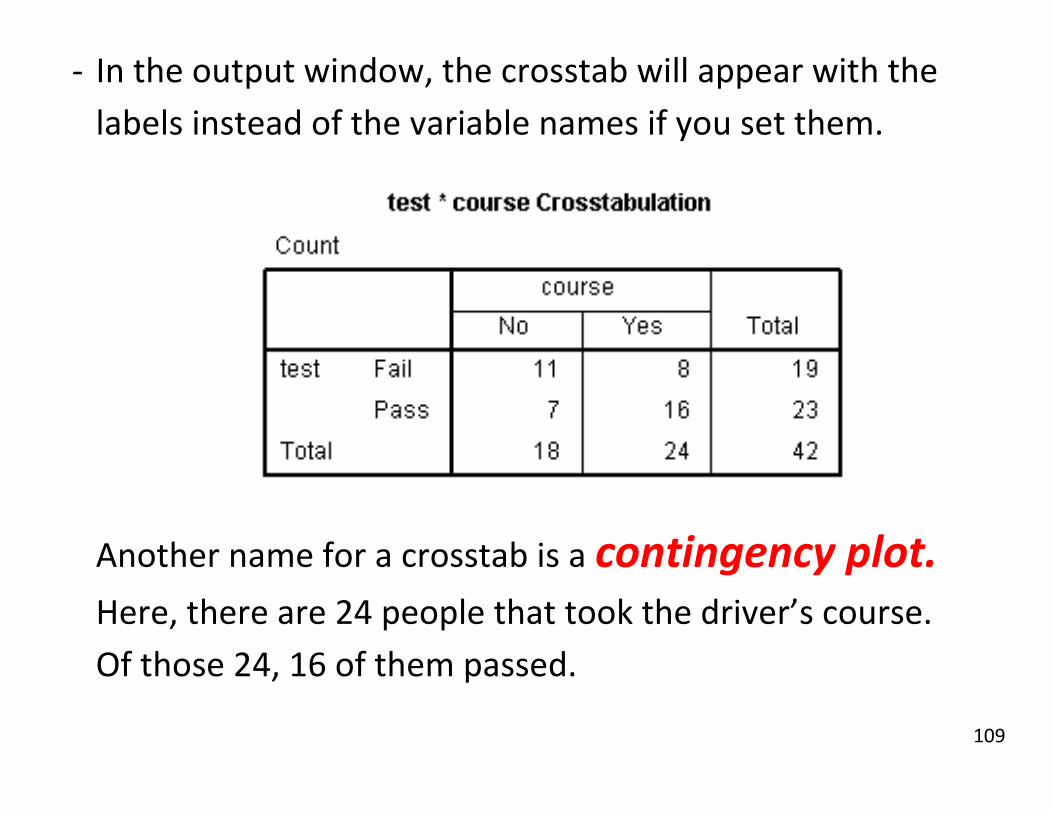
- In the output window, the crosstab will appear with the
labels instead of the variable names if you set them.
Another name for a crosstab is a contingency plot. Here, there are 24 people that took the driver’s course.
Of those 24, 16 of them passed.
110
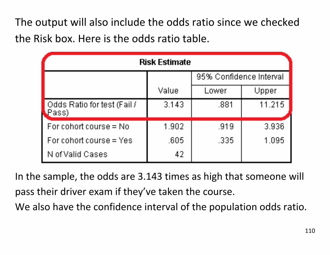
The output will also include the odds ratio since we checked
the Risk box. Here is the odds ratio table.
In the sample, the odds are 3.143 times as high that someone will
pass their driver exam if they’ve taken the course.
We also have the confidence interval of the population odds ratio.

111
Now let’s try with a 3x3 cross tab, Ch9_21.sav, based on music
choices and age groups.
We start the same way:
Analyze Descriptive Stats Crosstabs
Then put one variable in row, and the other in column.

112
The odds ratio doesn’t make sense for a 3x3, but we can
calculate the expected values and the chi-squared statistic.
First, go to Cells.

113
From the cells menu, you can decide you want to see the
observed frequencies (on by default), the expected
frequencies (off by default), or both.

114
Here are the observed frequencies from the output window.

115
Here are the expected frequencies. Note that the totals are the
same in both tables.
Click Continue to get out of the Cells menu.

116
From the main crosstabs dialog, you can also calculate the chi-
squared statistic by clicking on the Statistics button.

117
Then, put a check next to Chi-Square in the upper left.
Then click Continue, then OK.

118
Checking Chi-Squared produces the following table.
We want the Pearson Chi-Square
χ2 = 10.268 and df = 4.
The p-value against independence is .036.

119
The Chi-Square test also tells us of potential problems.
The test assumes there is a large number of respondents in
each cell. The standard rule is that every cell should have a
frequency of at least 5.

120
There are ways to deal with cells with small n. The easiest one
is to find a logical way to group categories together.
We could merge the middle age and older adult categories
into a “not young” category. This is done by coding a new
variable, as outlined in the transformation section.

121
We can look at the expected frequencies.
(Crosstabs menu, Statistics button, Check “Expected”)

122
Even though one cell has observed frequency less than 5, its
expected frequency is more than 5, so the potential problem is
lessened.

123
We can also do the chi-squared test again and see if there’s a
problem or a change in the p-value.
0/6 cells are too small instead of 3/9.
We went from 4 df to 2 because we now have a 2x3 crosstab.
(2 – 1) x (3 -1 ) = 2.

124
Also, the most important part, the p-value, hasn’t changed
dramatically. (In the 3x3 table it was .036)

125
This implies that merging middle age and older didn’t change
anything major.
We reject the null ; radio choice depends on age.

126
It’s easier to detect differences in larger groups, so we would
expect the p-value to go down a little, but not to something
dramatically lower like .001 or .000.
If the p-value had increased much we would have lost the
ability to reject the null. (A bad merge can do this).

127
Random Selection In the data window, choose
Data Select Cases

128
In the dialog box that comes up, choose the “Random sample
of cases”, and click “Sample”

129
In this secondary dialog, choose whatever % or sample size you
need.
For example, in problem 9.34, choose “Exactly 15 cases from
the first 30” as shown and click “Continue”.

130
The cases that are in your sample are the ones that aren’t
crossed out.
In 9.34, the selected ones can be group 1, the rest group 2.
If you do any analysis on this data without resetting the cases
you’ve selected, then the analyses will ignore cases that are
crossed out.

131
One-Sample T-Tests
Here we run a one-sample t-test on the variable X from
Descriptives XYZ.sav to test against the null hypothesis that
the population mean is 30.
We’re also going to produce a confidence interval of the
mean.
Quick Reference:
Analyze Compare Means One Sample T-Test

132
Most “get a specific answer” functions are done in Analyze.
T-tests give specific answers, they are in Compare Means.
We’ll start with a One-Sample T-Test

133
In the one-sample T Test dialog,
move X over to Test Variable(s):
Then, since we’re testing against a null hypothesis of mean=30,
put 30 in for the Test Value

134
This test will also produce a 95% confidence interval by default.
If you wish to change the confidence level, click on Options.
In the options dialog, change the confidence level to whatever
you need and click Continue, then OK.

135
This is the output table.
Everything here is in relation to the null hypothesis and a two-
tailed or two-sided alternative hypothesis.
Sig. (2-tailed) is the p-value of the t-test. “Sig. “ stands for
“Significance”
Mean Difference is the difference between the sample
mean and the test value. (The sample mean is 32.95)

136
The confidence interval is also in relation to the null
hypothesis, that the mean is 30.
The confidence interval if the mean is
30 – 0.5609 to 30 + 6.4609
Or
29.4391 to 36.4609.

137
Finally, t is the t-score, and df is the degrees of freedom.
You can use these to do a t-test on a table from this
information as well.

138
Two-Sample T-Tests There are two kinds of two sample t-tests we’ll cover in this
section. Paired samples t-tests, and independent t-tests.
An additional check is done in independent t-tests for equal
variance, or pooled variance.
Quick Reference:
Analyze Compare Means Independent T Test
Analyze Compare Means Paired T Test

139
For samples that have a pairing structure between them, use
the paired samples t-test. Paired t-tests can only be done on
data that’s in two side-by-side columns.
This is using the dataset Gas.sav

140
To perform a paired t-test, go to
Analyze Compare Means Paired-Samples T Test…

141
Then drag the paired variables into the same pair. (Order
doesn’t matter for two-tailed tests) Then click OK.

142
If you want to change the confidence interval, press the
options button, change it, then click Continue.
When you’re ready, click OK on the main dialog.

143
The table we want is the Paired Samples Test

144
The paired test only looks at the differences between
values, so the mean is the mean difference. A negative
mean implies that the second group is larger on average.
Likewise, Std. Deviation and Std. Error Mean are the
standard deviation and the standard error of the mean
difference between the values.

145
The confidence interval is of the differences, t is the t-score
against the mean difference being zero, Sig. (2-tailed) is the
p-value for a two-tailed alternative.
The degrees of freedom is of the variance of the
differences, it’s the number of pairs minus 1.

146
For unpaired data, we use the independent t-test. As found in
RedCars.sav
Independent t-test data needs to be all in a single column
(speed). A second column is used as a grouping variable to tell SPSS which sample each car belongs to.
147
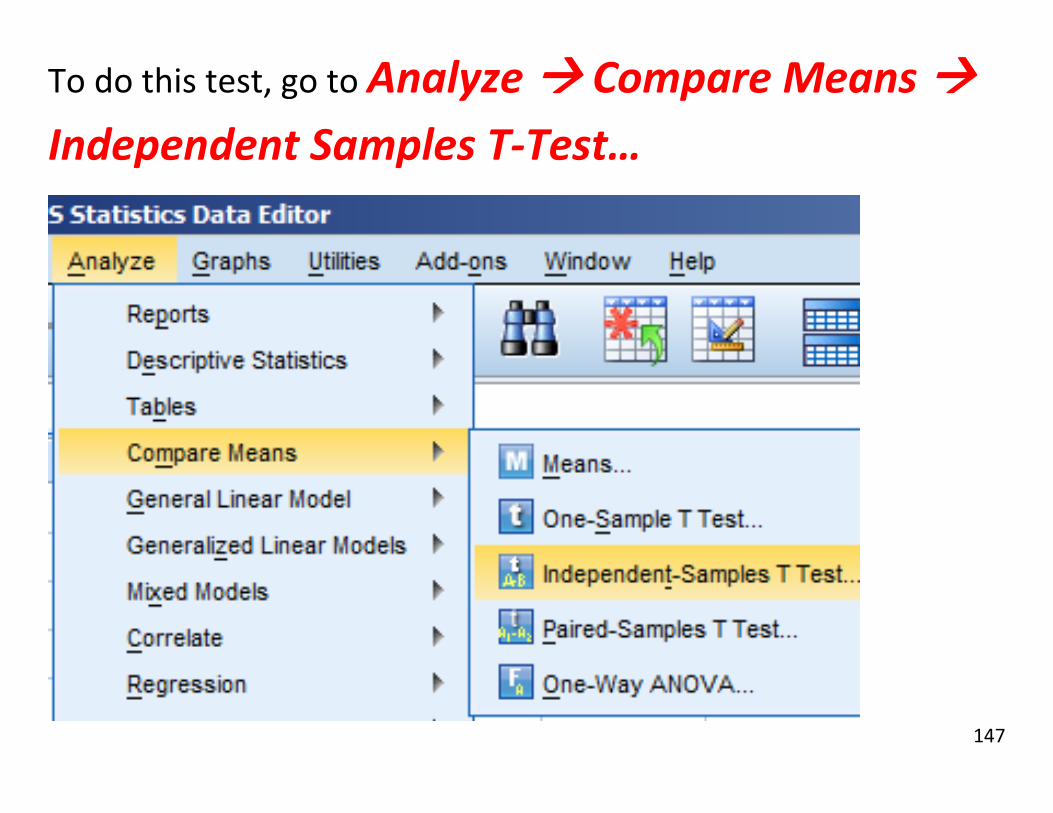
To do this test, go to Analyze Compare Means
Independent Samples T-Test…

148
Put the response (speed) into the Test Variable(s) section.
Put the grouping variable (colour) into the Grouping Variable spot,
and click Define Groups.
149
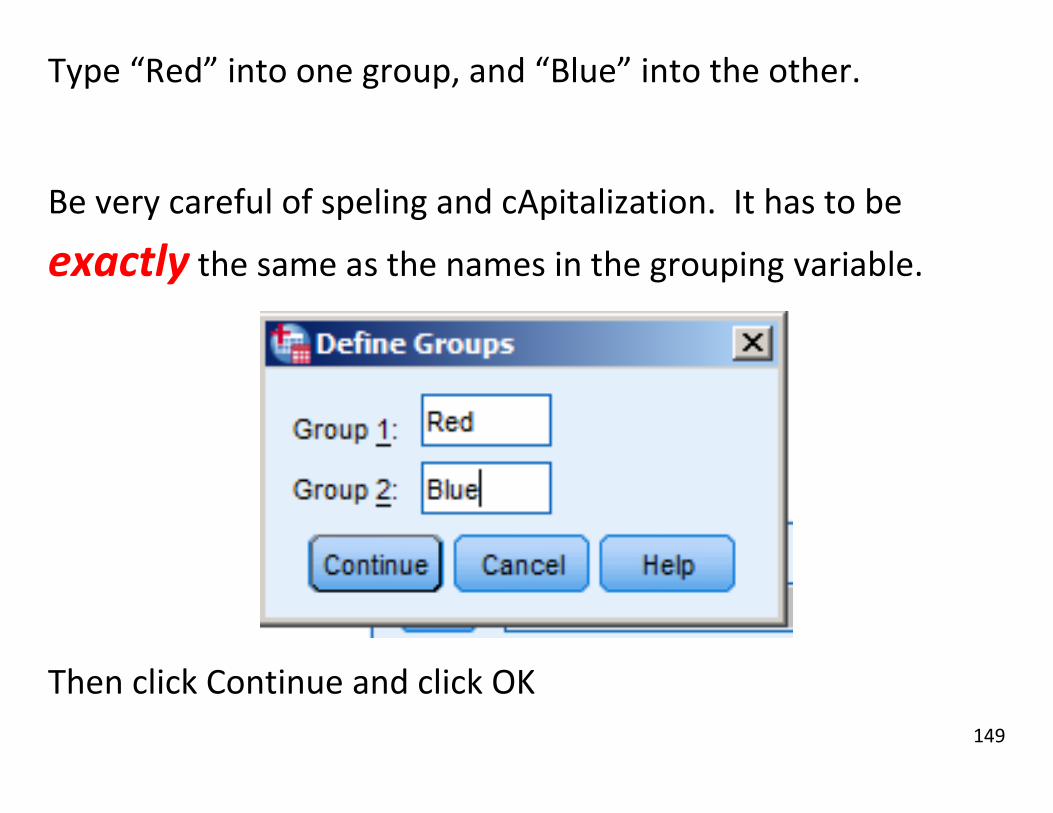
Type “Red” into one group, and “Blue” into the other.
Be very careful of speling and cApitalization. It has to be
exactly the same as the names in the grouping variable.
Then click Continue and click OK

150
SPSS outputs a large table. The first part is the results from
testing the assumption of equal variance. This is what
tells us if pooled standard deviation SP is reasonable.
The null assumption is equal variance holds. The p-value is
.137, which is large, so we’ll use SP, the top row results.

151
The middle part is the actual hypothesis test results.
T, df, and Sig. (2-tailed)are the t-score, degrees of freedom,
and p-value respectively. Just like in a one-sample t-test.
Mean Difference is the difference between the sample means.

152
Std. Error Difference is the standard error of the difference.
The top row uses the assumption of equal variances. Note that
this row has more degrees of freedom.

153
The last part is the confidence interval approach to the same
problem.
This is the confidence interval of the difference between the
means, the null hypothesis being a difference of 0. Note that 0
is in this confidence interval, what does that mean?

154
One-Sample Proportion Tests One-sample proportion tests are used to test if a
proportion is significantly different from a specified value.
They are similar to t-tests, but are used when all responses
are in a “Yes”/”No” or 0/1 format.
Here we test if the proportion of bearded dragons that are
fancy is significantly more than 20%. (Dragons.sav)
Quick Reference:
Analyze Nonparametic Tests Legacy Dialogs
Binomial

155
Here is the sex and colour data from 8 of the 300 bearded
dragons that we have data on.

156
To start a test against a hypothesized proportion go to
Analyze Nonparametric Tests Legacy
Dialogs Binomial

157

158
The results appear in a table with the observed proportion
(what was actually seen in the data), and the test
proportion (the null hypothesis proportion).
As usual, a smaller p-value indicates strong evidence
against that null hypothesis.

159
A bit unusual for SPSS is that the one-tailed p-value is
given.
For a two-tailed test, double the p-value.
The alternative hypothesis is generated automatically to be
the one that would generate the lower p-value of the two
one-tailed alternative hypotheses.

160
Two-Sample Proportion Tests Two-sample proportion tests are to two-sample t-tests as
one-sample proportion tests are to one-sample t-tests. The
common null hypothesis to check is whether or not there is
a difference in the proportions of two groups.
Here we test for a difference in the proportion of car
colours by the gender of driver. (RedCars.csv)
Quick Reference:
- Analyze Descriptive Stats Crosstabs

161
First, construct a crosstab of gender and colour in
Analyze Descriptive Stats Crosstabs
…as found in the crosstabs chapter, starting on p.95.
(0 is Male, 1 is Female)

162
When making a crosstab, in the main crosstabs dialog, you can
also calculate the chi-squared statistic by clicking on the
Statistics button.

163
Then, put a check next to Chi-Square in the upper left.
Then click Continue, then OK.

164
The Pearson Chi-Squared is the value that matters here.
The Z-score is the square root of the Pearson Chi-Squared
(ONLY IN THIS 2x2 CASE), so
Z = sqrt( 0.014) = 0.118.

165
Z = 0.118.
If you are using a Z-table, you can verify that about 0.453 of
the probability mass is above Z = 0.12. Since the test is two-
sided, that’s 0.453 on each side, to make 0.906 in total.
Just like the p-value here.

166
Weights In problem 23.28 and others in Chapter 23, you deal with
count data, like the smokecess.por dataset as shown below.

167
Most of the data you’ve dealt with up until this point has been
in long format, meaning that one row is one observation.
However, in the smokecess.por dataset, the first row
represents 155 observations (i.e. the count) of non-smokers on
Chantrix, the second row represents 97 observations and so
on.

168
We need to tell SPSS that each row is more than a single
observation. In short, we need to weight the observations.
To set observation weights, go to Data Weight Cases

169
In the dialog that opens, put the variable you wish to have
determine the weights (In the case of 23.28, this is [count]) in
the Frequency Variable field. Then click OK.
Now you can continue with your analysis and SPSS will read
the data correctly.

170
One-Way ANOVA
ANOVA is for comparing more than two means to see if the
population means could be all the same. One-Way ANOVA is the
last of the compare means tools in this guide.
Here we do an Analysis of Variance (ANOVA) on the caffeine
content of black teas from four countries. (Caffeine.sav)
Quick Reference:
- Analyze Compare Means One-Way ANOVA

171
Here is the caffeine content of teas from our four countries. A
sample of size 10 from each. (Built with a scatterplot)

172
First, One-Way ANOVA is in
Analyze Compare Means One-Way ANOVA

173
We want to know how caffeine varies as country changes.
Put Caffeine in the Dependent List, and
Country Number in the Factor
ANOVA requires the factor to be numeric, hence country
number instead of country name.

174
After clicking OK, we get this in the output.
Sig. is the p-value of the test that all the population means
are the same. There is strong evidence that they aren’t.
The F-Stat (61.385) and the numerator df (3) and
denominator df (36) are also available for you test by table.

175
Also, the proportion of variance in caffeine explained by
country can be found from Between Groups / Total
235.611 / 281.67 = 0.836
So 83.6% of the variation in caffeine content is explained by
the differences between country means.

176
A useful exercise: Open the redcars.sav data do an ANOVA
with
- Speed of cars as dependent, and
- Colour as the factor.
Compare the ANOVA results to those of the independent
samples t-test of the same data. Assume equal variances.
The p-values and df of the ANOVA and the T-test should be
identical.

177
Why? The t-test is testing the null that “the means of
these two groups the same.”
The F-test in ANOVA is testing the null that “the means of
all the groups are the same.”
Logically, these mean the same thing when there are only two
groups.
ANOVA assumes equal variance, so you need to assume equal
variance with the t-test as well to make a fair comparison.

178
Acknowledgements, Other Resources
Thanks to Dr. Tim Swartz of Simon Fraser University and
RobMagus of Reddit for the input that made this guide
better.
Proportion test chapters adapted from guides at
http://www.stat.vcu.edu/help/SPSS/ at the Statistical Sciences and Operations Research
department at Virginia Commonwealth University,

179
For tutorials of more advanced functions, try the videos for
Discovering Statistics using SPSS, by Dr. Andy Field, at
http://www.sagepub.com/field3e/SPSSstudentmovies.htm
For additional theoretical help, I recommend:
The Online Stat Book led by David Lane, Rice University
http://www.onlinestatbook.com/2/
The Open Learning Initiative by Carnegie Mellon University
http://oli.cmu.edu/