An overview paragraph will set out the development team’s ... · An overview paragraph will set...
47
The report attached comprehensively focuses on the last round of user testing (November 2016) and provides a good view of the specific moment in time in which testing took place. However, as a result of this it needs to further capture the broader context for why the direction has been taken on various features. The development team have requested revisions to be made to the report to meet this need as well as provide greater clarity and fairness for the findings in our usability testing. The Authority is asked to note this addendum when reviewing the report. As the service is in a beta state we have tested it ‘as is’. This means that some elements of functionality were not in the preferred state of presentation. The report recommends certain changes be made that the development team are already aware of and will be made as part of the continued development of the website. By also looking at the ‘as is’ state it does not take into account previous testing comments which will have influenced the current iteration. The testing method applied aimed to provide as realistic a setting as could be gained from an observed hour long test. The method presented an emotionally engaging experience that resonates with the participant moving the testing away from a potentially artificial task based exercise. As the report deals with a small sample set (specifically for the purpose of qualitative feedback) the report will replace percentage measures to actual participant numbers. A short bullet point will be applied to each section to introduce the positive aspects of the site so the team understands what is working well. The report itself focuses on areas for improvement but the positive aspects will help set the broader picture of how close to meeting user needs the site is. Referencing the existing HFEA service – we acknowledge that the new website is an improvement on the existing one given the foundation level of understanding of its flaws. To this end we do not want to compare it with the old site as a measure of quality. The old website is of its time and thus is fully expected to not be as good as the new one. There is generalisation applied to various points throughout the report. We are asking for references to user testers to be stated in majority/minority or specific numbers. This will avoid ambiguity in weighing up the decision to act on recommendations or areas of concern raised in the report. An overview paragraph will set out the development team’s approach to the redesign of the website. This will context set the instances of ‘long’ scrolling pages etc.
Transcript of An overview paragraph will set out the development team’s ... · An overview paragraph will set...

The report attached comprehensively focuses on the last round of user testing (November 2016) and provides a good view of the specific moment in time in which testing took place. However, as a result of this it needs to further capture the broader context for why the direction has been taken on various features. The development team have requested revisions to be made to the report to meet this need as well as provide greater clarity and fairness for the findings in our usability testing.
The Authority is asked to note this addendum when reviewing the report.
As the service is in a beta state we have tested it ‘as is’. This means that some elements of
functionality were not in the preferred state of presentation. The report recommends certain changes
be made that the development team are already aware of and will be made as part of the continued
development of the website. By also looking at the ‘as is’ state it does not take into account previous
testing comments which will have influenced the current iteration.
The testing method applied aimed to provide as realistic a setting as could be gained from an observed
hour long test. The method presented an emotionally engaging experience that resonates with the
participant moving the testing away from a potentially artificial task based exercise.
As the report deals with a small sample set (specifically for the purpose of qualitative feedback) the
report will replace percentage measures to actual participant numbers.
A short bullet point will be applied to each section to introduce the positive aspects of the site so the
team understands what is working well. The report itself focuses on areas for improvement but the
positive aspects will help set the broader picture of how close to meeting user needs the site is.
Referencing the existing HFEA service – we acknowledge that the new website is an improvement on
the existing one given the foundation level of understanding of its flaws. To this end we do not want to
compare it with the old site as a measure of quality. The old website is of its time and thus is fully
expected to not be as good as the new one.
There is generalisation applied to various points throughout the report. We are asking for references to
user testers to be stated in majority/minority or specific numbers. This will avoid ambiguity in weighing
up the decision to act on recommendations or areas of concern raised in the report.
An overview paragraph will set out the development team’s approach to the redesign of the website.
This will context set the instances of ‘long’ scrolling pages etc.

Assumptions are made from the user testers actions. We want to reflect more accurately on what has
come directly from them. These should be quoted or more accurately noted. Additionally, where an
individual commented on something that has been presented it will be stated. The comment will be
viewed in the broader context of suitability for the majority of users.
More clarity will be provided around points of frustration to better explain whether the fault lay in
content, layout, usability or design. Issues known by the team (for example the page stepping process
currently applied to the detailed statistics section of CaFC) will be acknowledged.
More generally, the report will be adjusted to cite specific areas of the site that a comment was
targeted at. For example, the presentation of CaFC tackled a different set of user needs to the
information pages. This will help set the priority of development work needed.
Comments that needed to be pushed for will be made clearer. For the most part the testing aimed to
get the views as they were from the participants; where necessary the team would probe with more
exploratory, open questions.
There is a strong focus on rationalists and as a result some of the suggestions for conformists and
‘intuitive/dependant’ thinkers will be elaborated upon for balance.
The pre testing questionnaire will be packaged as an appendix. The charts displayed provide an
aggregated score applied by the user testing team to determine the cognitive behavioural fit.

HFEA Public beta usability review
Point of Contact for Questions Karen Haydon Project director Ian Huckvale Head of user engagement
Website and CaFC Public beta usability review – initial findings
Reading Room Ltd Fairfax House, 15 Fulwood Place, London, WC1V 6AY T: +44 (0) 20 7025 1800 F: +44 (0) 20 7439 4190 W: www.readingroom.com
Date: 31st October 2016 Document Revision: 1.0
Status: DRAFT

HFEA Public beta usability review
Contents
1 EXECUTIVE SUMMARY .................................................................................................................. 4
2 METHOD .............................................................................................................................................. 5
2.1 PUBLIC BETA PROTOTYPE ................................................................................................................ 5
2.2 1-TO-1 USABILITY TESTING.............................................................................................................. 5
2.3 RECRUITMENT OF USERS ................................................................................................................. 5
3 THREE DECISION MAKING STYLES ........................................................................................... 7
3.1 DEPENDENT / INTUITIVE .................................................................................................................. 7
3.2 RATIONALE / CRITICAL ................................................................................................................... 9
3.3 CONFORMIST ..................................................................................................................................10
4 HOME PAGE ......................................................................................................................................12
5 AUDIENCE AND TREATMENT PAGES .......................................................................................13
5.1 AUDIENCE JOURNEYS, CONNECTION WITH NAVIGATION OPTIONS AND EXPECTATIONS OF CONTEXT
13
5.2 TREATMENT JOURNEY FEATURE .....................................................................................................15
5.3 EMOTIVE USER STORIES ..................................................................................................................15
5.4 Q&A STYLING ................................................................................................................................16
5.5 PRECISION OF LANGUAGE ...............................................................................................................17
5.6 TREATMENT ABROAD .....................................................................................................................18
5.7 AUDIENCE CATEGORIES ..................................................................................................................18
5.8 A LACK OF CONTENT AIMED AT ‘CONFORMISTS’ ............................................................................19
5.9 CONTENT AIMED AT DONORS .........................................................................................................20
6 CHOOSE A FERTILITY CLINIC ....................................................................................................21
6.1 SUPPORTING CONTENT AROUND CAFC SEARCH .............................................................................21
6.2 CAFC SEARCH FORM ......................................................................................................................24
6.3 CAFC RESULTS LISTING .................................................................................................................24
6.4 CLINIC DETAIL PAGES .....................................................................................................................31
6.5 CLINIC DETAIL PAGES: STATS .........................................................................................................32
6.6 CLINIC DETAIL PAGES: DETAILED STATS PAGES .............................................................................35

HFEA Public beta usability review
6.7 CLINIC DETAIL PAGES: PATIENT RATINGS .......................................................................................38
7 GENERAL COMMENTS ..................................................................................................................40
7.1 NAVIGATION ..................................................................................................................................40
7.2 HFEA ROLE IN COMPLAINTS ..........................................................................................................40
7.3 TECHNICAL / DESIGN GLITCHES ......................................................................................................41
7.4 ANTIVIRUS SOFTWARE CONFLICT ...................................................................................................41
7.5 WHITESPACE ..................................................................................................................................41
7.6 LENGTH OF PAGES ..........................................................................................................................42
8 ENCOURAGING EXPLORATION AND LEARNING JOURNEYS ...........................................43
HFEA Public beta usability review
1 EXECUTIVE SUMMARY
Reading Room conducted a review of the Public Beta website with a representative sample of 12
potential site users.
The purpose of the review was to examine whether the user experience is meeting expectations
and needs and identify improvements that can be made.
Tests were conducted on site at Reading Room and on Skype. The HFEA product owner and
other staff observed the sessions.
The website experience is very well aligned with user expectations and needs, and
participants were unanimous that it is a huge improvement to the current version.
The Choose a Fertility Clinic service is the USP for the site and was highly praised,
although there are still usability improvements that can be made to the search, search
results and clinic detail pages.
Content was seen as welcoming and well written, with the conversational tone coming
across very well. However, in some places the site was seen as lacking emotional
engagement.
We studied how well the site meets the needs of the three cognitive decision making
types who had been identified in the discovery research. Currently it is working well for
‘rational/critical’ types but there are improvements that could be made to the experience
to better meet the needs of ‘conformists’ and ‘intuitive/dependents’.
Changes to information architecture and content introduced at Public Beta stage,
especially around the Choose a Fertility Clinic and Treatments sections have had a
negative impact on findability of key content since the previous round of testing and
should be reviewed.
There were concerns over the presentation of Patient Feedback, and the process for
gathering it, and doubts about how reliable this data will be.
There are a number of site wide design issues to address to improve the experience.
More could be done to link-up content around informative / educational journeys.
This report focusses on issues – once we have had an opportunity to discuss findings with the
HFEA project team members we will be in a position to make recommendations.
The HFEA should then review and decide which recommendations to take forward, adding any
changes to the backlog for the Website and CaFC where they can be prioritised alongside other
work.

HFEA Public beta usability review
2 METHOD
2.1 Public beta prototype
The project is at Public Beta stage, a working prototype of the final system. The public beta
prototype is built onto the full Umbraco environment, and hosted in Azure. The only difference
between the environments and those that will be used for the final system is bandwidth, since the
hosting was using a free test area, speed of page load is compromised, but it is otherwise a
similar experience.
The prototype had been loaded with a substantial amount of content by HFEA, including the full
Choose a Fertility Clinic dataset.
2.2 1-to-1 usability testing
To test the usability of the Website and Choose a Fertility Clinic service we followed an industry
standard technique known as ‘think aloud testing’ whereby a small sample of potential users of
the site are asked to use the site. The tests are facilitated one-to-one sessions with a usability
expert who observes their behaviour and asks them to explain as they go what they are doing
and what they are thinking.
For the beta tests we focussed on self-driven journeys, starting with a short interview in which
people were asked about situations in the past where they had needed advice or guidance on
fertility treatment, and then asked them to show us what they would have done with the HFEA
website if they had access to it at the time. This gives deep insight into their user experience and
any issues that are preventing them from achieving their objectives.
Half the tests were conducted face to face, with the remainder being conducted over Skype. All
sessions were recorded.
2.3 Recruitment of users
The 12 participants included 11 women and one man undergoing treatment. They represented a
range of our target audiences, including:
women undergoing treatment
partner in a same sex couple
partner in a heterosexual couple
women who have donated eggs (egg sharing)
single women who have undergone treatment
a GP (who was being interviewed as a fertility patient herself rather than as a doctor)
Participants were paid a small financial incentive for taking part.

HFEA Public beta usability review
The sample had an over-representation of people who had been through treatment already, as
opposed to those seeking treatment. This may introduce bias due to people looking at the site ‘in
hindsight’, with much greater knowledge of fertility treatment than they would have had at the
start of their treatment journey.
There was also an over-representation of people who had used donor eggs or sperm, due to the
recruitment channel adopted by the HFEA. It is not thought that this will have had much influence
on their views or information needs with the exception of an interest in the practical and legal
issue around use of donated gametes.

HFEA Public beta usability review
3 THREE DECISION MAKING STYLES
A pre-session questionnaire was designed in order to assess the individual differences in the
ways people prefer to process information and make decisions (rational, dependent/intuitive, and
conformist). This approach enabled us to explore how well the HFEA website meets the needs of
the varied audiences and helped us understand how we can increase the level of engagement of
the different decision-making styles with the new version of the website. The decision-making
style, as a measure, was formed by averaging responses to 15 separate questions and in total all
12 people who were recruited to participate in the 1-to-1 usability sessions completed the
questionnaire.
Based on earlier research we have identified three decision styles; a rational style; a
dependent/intuitive style; and a conformist style. However, it is worth mentioning that the
decision-making styles are independent but not mutually exclusive and that some people seem to
use a combination of decision-making styles when making important decisions. Out of the 12
people who participated in the testing we have identified two patterns: some people exhibit a mix
of decision-making styles while for others only one of the aforementioned styles dominates.
3.1 Dependent / intuitive
Most respondents (76%) revealed that they tend to rely on hunches and feelings whilst they are
making a decision and that they value the advice of people in similar situations to them (e.g.
“When I make a decision about the right clinic for me, it is more important for me that the decision
feels right”, “When I make decisions about which clinic(s) to consider, I tend to rely on my intuition
and my inner feelings & reactions after talking to the clinic”, “It’s important to me that I talk to
women who have undergone similar treatment before I make any decisions”). Only 11% of
respondents indicated that they are not dependent/intuitive, as can be seen in the graph below.

HFEA Public beta usability review
Respondents who were identified as dependent / intuitive were generally happy with the look and
feel of the new version of the website. Font style and colour choices were well received and the
absence of baby images was very much appreciated. Tone of voice and language were also
praised as were the personal stories in the emotional support page. The idea of including videos
alongside the written text was welcomed by most participants.
One notable example was a woman who had successful treatment in the past and when she was
prompted to read a personal story, commented:
“The more that you feel that you are not on your own the easier it becomes.”
However, participants were unable to connect with the patients’ stories that are scattered through
the audience and treatment pages due to lack of images, names, and links to expanded stories.
Additionally, a desire to find information about emotional support and post treatment counselling
was expressed by some participants. There were also some concerns that there was no content
aimed at men (or at least, they didn’t see themselves in any of the categories offered) and single
women sometimes objected to the term ‘single’.
Patient ratings were considered as a very important factor in their decision-making process, for
example one participant commented:
“There is nothing more useful in this world than the experience of people who actually were
patients in a clinic.”
However, some participants struggled to relate to the star ratings alone and expected to see free-
text comments and reviews. There were also some people who felt that it wasn’t clear if the
patients’ rating comes from the clinic or HFEA. Finally, it is worth mentioning that for people who
have the tendency to trust their gut feelings and the advice of people they can relate to, statistics
and success rates still matter to them as long as they are presented in a clear and uncomplicated
way so that they can understand and appreciate them.

HFEA Public beta usability review
3.2 Rationale / Critical
The rational / critical style, which refers to the tendency to make decisions using rationality,
seems to apply to the majority of the participants, since 64% either agreed or strongly agreed with
questions aiming to identify the rational decision-making style (e.g. ‘‘My decisions about the clinic
I use requires a lot of careful thought’’, “I will make any decisions about the right clinic in a logical
and systematic way”, “When making a decision about which clinic to use, I initially consider all
clinics in my area that I feel can help me, and research each of them in turn before narrowing
down the number”). Only 17% of them disagreed or strongly disagreed with the relevant
statements, although it is worth mentioning that 19% remain indecisive, as can be seen in the
graph below.
In general, respondents who were identified as rational decision-making styles admitted that the
new version of the website was a significant improvement on the current HFEA website. Rational
decision makers use analysis, facts and a step-by-step process to come to a decision and the
structure and content of the beta website resonated with them. The key facts in the treatment
pages as well as the more detailed information about clinics drew people’s attention and received
a warm approval. In general, the language and tone of voice appeal to participants, commenting
that: “tone of voice feels appropriate”, “language is good and uncomplicated”, “very
straightforward language and easy to understand”. It is worth noting, though, that a lack of clarity
and explanation over language was noticed and criticised by some respondents. More
specifically, a need for more precise language around birth rates (live or all), success rates (for
which treatment, which age), and inspection rating was expressed and led some to question the
value of the data. Particularly regarding the inspection rating some respondents weren’t aware

HFEA Public beta usability review
that the HFEA gives clinics a rating and didn’t know where this data had come from, and there
were also a few misinterpretations of some questions, e.g. “How do our inspectors rate the
clinic?” caused confusion as to whether the question refers to a specific clinic or implies more
generic information with some respondents stating that “How do our inspectors rate this clinic?”
would be clearer.
There is a large amount of information presented to users while searching for a fertility clinic, the
main purpose of which was to help them make a more informed decision by breaking down the
searching process. The downside is that there is now so much content in advance of finding the
call to action that inadvertently results to overloading people with too much information. Most of
the respondents were unable to process the amount of information presented to them and they
were ending up feeling lost or frustrated and some even giving up.
Rational decision makers seemed really happy with the detailed statistics and more importantly
with the fact that they would be able to access data for people in a much more similar situation to
their own. There was even one respondent who commented: “this is the only data that really
matters” and another one who revealed “statistics for me is the most influential thing”. However,
the process that needs to be followed in order to review the detailed statistics, splitting the form
over 4 pages, frustrated respondents with one giving up entirely. Furthermore, even for people
with a reasonable understanding of basic statistical ideas, a confusion around the graphs was
evident and whilst most people correctly interpreted the clinic birth rate vs the national rate, there
was little understanding of ‘reliability’ despite an explanation being on the page itself.
Finally, it became apparent that for people who are making decisions using rationality, the
patients’ rating plays a less important role in their decision making process, as one of the
respondents clearly explained: “I will definitely take patients’ ratings into consideration but for me
it’s the actual statistics and success rates that are most important”. In addition to that, people
appeared more suspicious of the authenticity and value of the ratings, expected more clarity on
how the ratings are to be policed and how the HFEA intends to establish whether ratings are from
patients, and some even questioned whether they would trust the ratings without this knowledge.
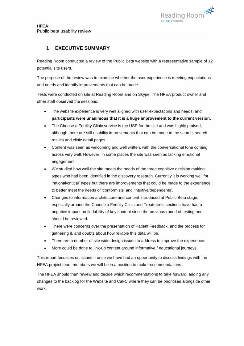
3.3 Conformist
Interestingly, only 36% of respondents indicated that they are conformists and that they rely
purely on the opinions of healthcare professionals and medical experts whilst they are making a
decision (e.g. “My choice of clinic is influenced by the recommendations of my GP”, “I spend time
reading the thoughts and opinions of experts before making any decisions about treatment and/or
clinic”, “It’s important that I am given guidance by professionals about which clinic I should use”).
An almost equal number of respondents (33%) disagreed or strongly disagreed with the
questions aiming to identify the conformist decision-making style. Also, 31% didn’t express a
clear view and preferred to remain neutral, as can be seen in the graph below.
HFEA Public beta usability review
Although the data suggests that respondents tend to rely less on the opinions and
recommendations of professionals and medical experts when they are making decisions for a
treatment and/or clinic, this by no means infers that they don’t value the impartial, valid and
accurate information that comes from an expert or an independent source. One notable example
was a donor conception parent who commented: “Legitimacy is the most important thing for
people, anything endorsed by HFEA would be reassuring for me”. Similarly, another woman who
had successful treatment revealed that: “just the fact that the information comes from HFEA
makes it safe”. Based on these comments and given that there was no content specifically aimed
at conformists within the treatment pages (for example, HFEA endorsement for treatment pages
or explanation of the role of HFEA at this level), we recommend to add HFEA endorsements that
would establish the authority of the content. As one participant stated: “I wouldn’t question the
authenticity of HFEA”.
HFEA Public beta usability review
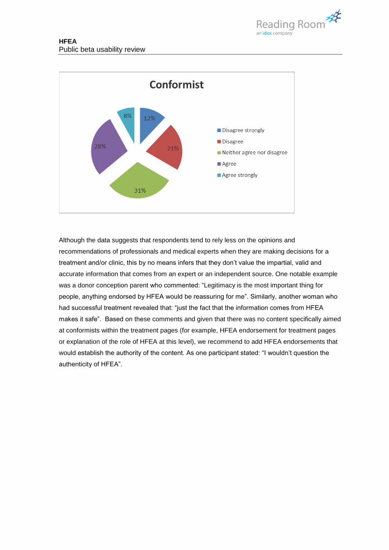
4 HOME PAGE
The home page was well received – seen as
providing a good statement as to who the
HFEA are, and was a welcoming route in.
Users liked the vibrancy of the colours used
and the bold, large text.
Since the last version we tested, the “I am
seeking treatment for” and “Treatment search”
boxes had been switched round. This
appeared to work better for users.
Few users took the time to review content
below the green box, although this may be
because of the nature of testing and the
scenarios we asked them to explore, which
didn’t call for them to find anything specifically
on the home page.
Recommendations
We have no specific recommendations for changes to the homepage, which appears to be
performing well. However, please refer to later recommendations on providing a cue to indicate
long scrolling pages, and closing up unneeded whitespace – in Section 7.

HFEA Public beta usability review
5 AUDIENCE AND TREATMENT PAGES
5.1 Audience journeys, connection with navigation options and
expectations of context
- People who start their journey by accessing one of the audience pages such as Women
over 38, or Single Women are then expecting that this will set the context for the rest of
their journey, and are surprised at seeing general information on treatment types.
To explain this observation in more detail – we saw people who started by selecting an audience
landing page as their route in who then seemed to expect it to set the context for their usage of
the site, as if these were routes into dedicated site areas for this type of user. For example, one
participant who had chosen “Women over 38” as her starting point then was confused when she
had navigated to a page about IVF treatment, because the site switched back to talking about the
treatment in general and not about her specific needs as a woman over 38.
We may need to do more to emphasise that the landing pages are just a starting point, they are
not dedicated audience specific sub-sections of the website.
Recommendations
Description Type
On the audience pages we recommend changing link texts to indicate that these are linking out of section – for example under treatments, the link for IVF currently just says “Find out more”. This could be changed to the version shown on the right, which indicates that the target is in a different section.
Content

HFEA Public beta usability review
In vitro fertilisation
(IVF)
IVF is suitable for people with
a wide range of fertility issues
and is the one of the most
commonly used and
successful treatments
available for many people.
Read about IVF in the
Treatments section
- The IA of the Treatments section includes a layer that groups treatments as “Explore
fertility treatment”, “Fertility preservation” and “embryo testing and treatments for
disease”, with actual treatments such as IVF, ICSI and IUI moving down a level. This
appeared to lead to more people going through audience landing pages as they relate to
the terms more, and haven’t seen the treatment options that they were seeking.
The reasoning here is that people have in their mind what they want to find, and that relates to
treatment types and clinics (the two main use cases for the site), but the Treatments navigation
doesn’t feature familiar terms, and this appeared to lead to most users ignoring it and instead
selecting one of the audience landing pages, which they could relate to more closely.
Recommendations
Description Type
We could add the three high profile treatments, IVF, IUI and ICSI, as navigation options in the Treatments menu, running as a second row beneath the current options and providing short-cuts that take the user directly to the relevant treatment page. However, we recommend that action on this recommendation is deferred until after launch once analytics on live site usage are available.
Content
HFEA Public beta usability review
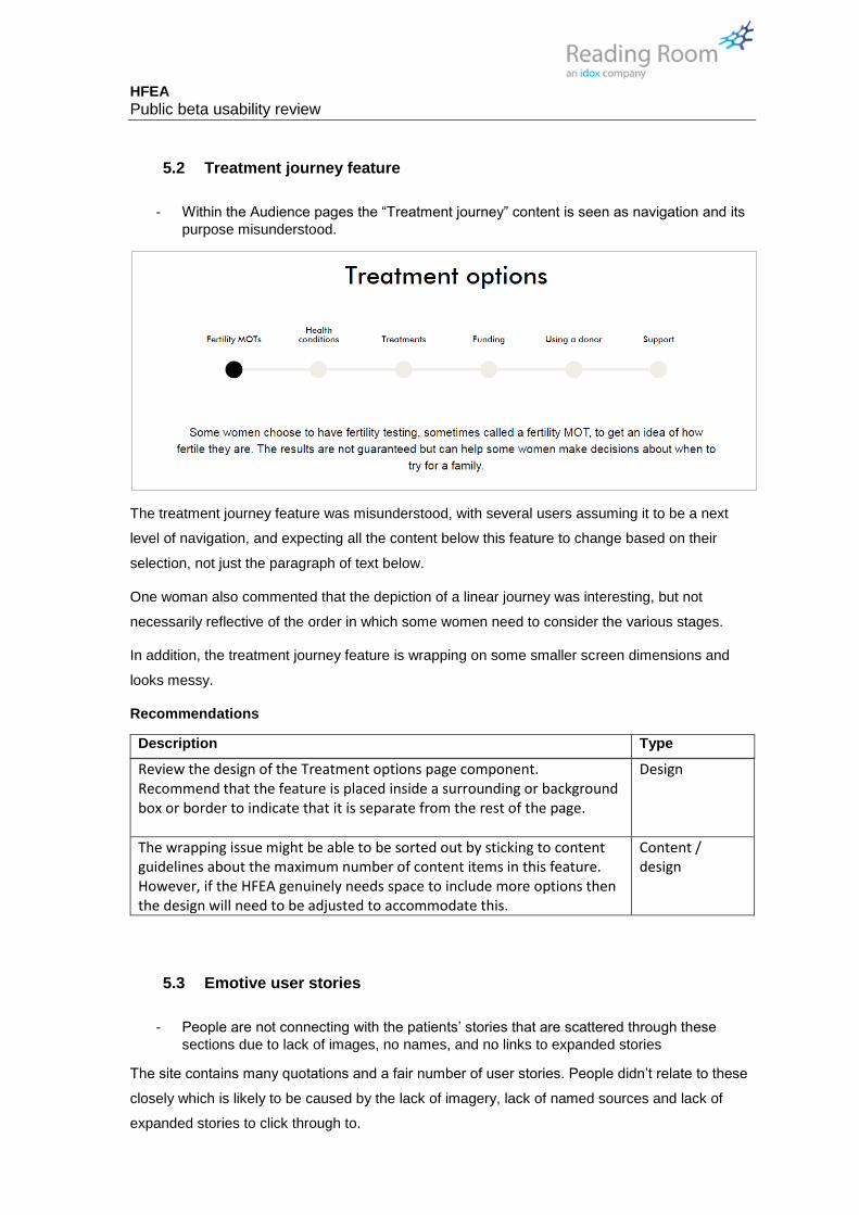
5.2 Treatment journey feature
- Within the Audience pages the “Treatment journey” content is seen as navigation and its
purpose misunderstood.
The treatment journey feature was misunderstood, with several users assuming it to be a next
level of navigation, and expecting all the content below this feature to change based on their
selection, not just the paragraph of text below.
One woman also commented that the depiction of a linear journey was interesting, but not
necessarily reflective of the order in which some women need to consider the various stages.
In addition, the treatment journey feature is wrapping on some smaller screen dimensions and
looks messy.
Recommendations
Description Type
Review the design of the Treatment options page component. Recommend that the feature is placed inside a surrounding or background box or border to indicate that it is separate from the rest of the page.
Design
The wrapping issue might be able to be sorted out by sticking to content guidelines about the maximum number of content items in this feature. However, if the HFEA genuinely needs space to include more options then the design will need to be adjusted to accommodate this.
Content / design
5.3 Emotive user stories
- People are not connecting with the patients’ stories that are scattered through these
sections due to lack of images, no names, and no links to expanded stories
The site contains many quotations and a fair number of user stories. People didn’t relate to these
closely which is likely to be caused by the lack of imagery, lack of named sources and lack of
expanded stories to click through to.

HFEA Public beta usability review
Without a name or a face to attach to, it is not immediately clear who the quotes are from: the
HFEA, a patient, a doctor? This led to people not associating themselves with the people the
quote is from.
Recommendations
Description Type
The quotation component appears to be being used for both pull-quotes from an article and for quotes from a patient story. The designs for these two elements need to be distinctly different. Early designs for patient stories included imagery of the people involved, names and links to detailed stories. These should be revisited as they will resonate with users much more.
design
5.4 Q&A styling
- The Q&A style is liked but implementation is clunky – especially the “open” and “close”
controls, and the impact of long side boxes linked to a Q&A area that create lots of white
space
In general people responded very positively to the question and answer style and the tone of
voice being used. However, some didn’t understand the ‘open’ and ‘close’ controls. This is likely
to be causes as the user needs to click no a separate control rather than the text of the question
itself, which would be more intuitive. It is made worse when the presence of a side bar feature
forces the length of the content area to expand (as shown below), and in this case the “close”
control is some distance away from the actual content it relates to, and the other side of a dividing
line which some will see as a mental ‘stop’ signal.
HFEA Public beta usability review
Description Type
Change the design of the Q&A block so that the user clicks on the actual text of the question to open the content feature. Also, review the styling of the ‘close’ link to be more closely associated with the text of the Q&A content.
Design
The whitespace issue with “Key Facts” shown above is best treated as a content issue. Editors needs to write content to achieve balance in length between the central column and the content blocks used on the right.
Content
5.5 Precision of language
- There is a need for more precise language around birth and success rates
Some users were annoyed by the lack of precision when quoting statistics. For example, on the
treatment page for ICSI the following statistic is shown.
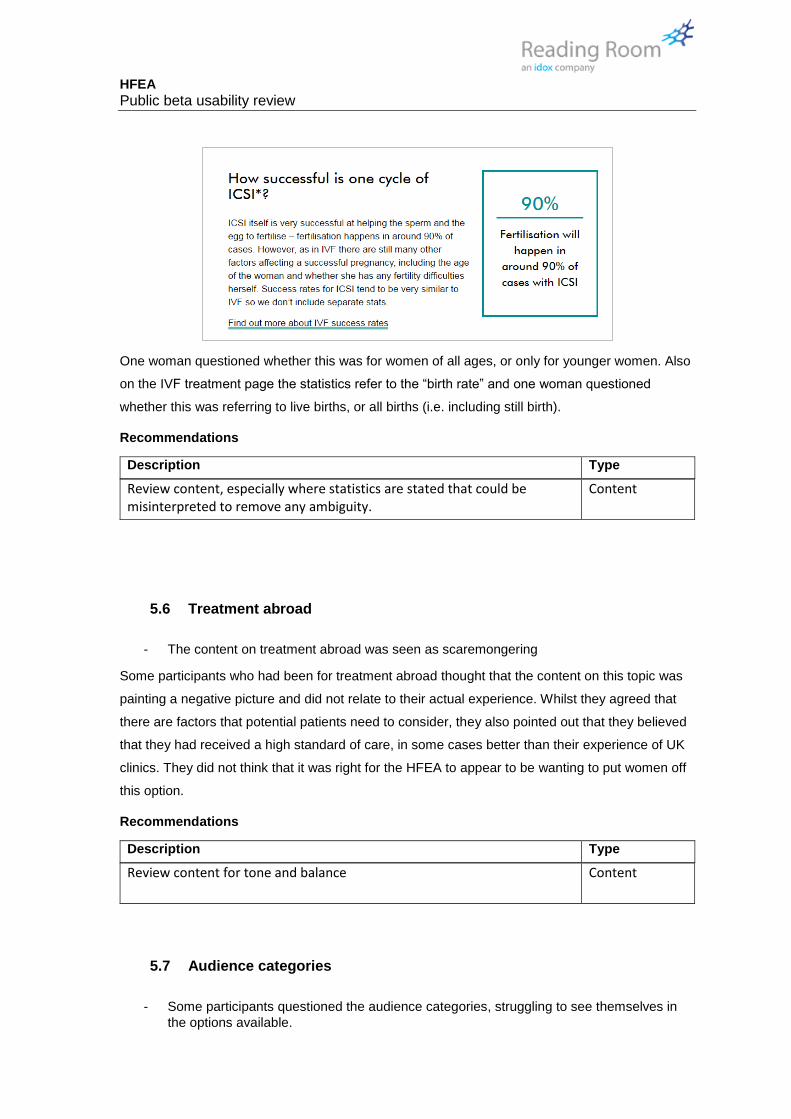
HFEA Public beta usability review
One woman questioned whether this was for women of all ages, or only for younger women. Also
on the IVF treatment page the statistics refer to the “birth rate” and one woman questioned
whether this was referring to live births, or all births (i.e. including still birth).
Recommendations
Description Type
Review content, especially where statistics are stated that could be misinterpreted to remove any ambiguity.
Content
5.6 Treatment abroad
- The content on treatment abroad was seen as scaremongering
Some participants who had been for treatment abroad thought that the content on this topic was
painting a negative picture and did not relate to their actual experience. Whilst they agreed that
there are factors that potential patients need to consider, they also pointed out that they believed
that they had received a high standard of care, in some cases better than their experience of UK
clinics. They did not think that it was right for the HFEA to appear to be wanting to put women off
this option.
Recommendations
Description Type
Review content for tone and balance Content
5.7 Audience categories
- Some participants questioned the audience categories, struggling to see themselves in
the options available.

HFEA Public beta usability review
In particular, there was no content aimed at men (or at least, the male participant didn’t see
himself in any of the categories offered), Single women sometimes objected to the term “single”
and some donor conceived parents questioned being put into a joint category with donor
conceived children.
Recommendations
Description Type
Add an audience category and content page for “Men” (exact name tbc) Content
Consider separating out Donor conceived children and Parents of donor conceived children into two separate categories.
Content
N.B. We do not recommend having more than 12 audience categories at the very most, as the navigation will become visually difficult to process.
5.8 A lack of content aimed at ‘Conformists’
- There was no content specifically aimed at conformists within the Treatment pages
Conformists are likely to respond well to content that they see as coming from an authority on a
particular topic. The HFEA is one of the leading authorities on fertility treatment. Opportunities to
communicate this authority to first time visitors are being missed. We think this is especially true
on the key treatment pages for IVF, ICSI and IUI, which are known to be some of the most
popular landing pages on the website.
An HFEA endorsement on these pages explaining the role of HFEA could help to establish the
authority of the content.
Recommendations
Description Type
Create a styled spotlight for inclusion on the Treatment pages that informs people this is official guidance from the government regulator. This could be placed at the top left of all Treatment pages
Design / content

HFEA Public beta usability review
Fertility treatment
information provided by
HFEA, the official
regulator for fertility
treatment in the UK.
This needs design review – it is just a mock-up for illustrative purposes
5.9 Content aimed at Donors
- There is some confusion over the information architecture for donors, donor-conceived
people, parents of donor conceived people + people seeking treatment with a donor
This round of testing involved several women who had used donor sperm or eggs, and some who
had donated eggs as part of their own treatment. There was some confusion over the
arrangement of content on the site aimed at the various circumstances.
Some patients questioned the “Donation” section grouping which encompasses content
aimed at people looking to become a donor, people seeking treatment with donor
gametes and donor-conceived children and their parents.
One patient questioned the audience category “A parent of / or a donor-conceived child”
suggesting that they believed these should be separate groups.
Although it is possible to construct an argument for splitting out all these groups into their own
section it should be highlighted that donor gametes are used in only 6% of all treatment, and so
giving this audience an entire section of the website is already offering them high prominence
given their numbers. It may be better to look at this as an issue of better sub-division and labelling
of content within the relevant sections.
Recommendations
Description Type
On the Donation section landing page – use content headings to clearly sub-divide the page into information for different audience groups, as is done on the audience landing page targeting Parents of / Child born through donor conception.
Content

HFEA Public beta usability review
6 CHOOSE A FERTILITY CLINIC
6.1 Supporting content around CaFC search
- Some users are getting lost or frustrated trying to find the actual search form, and some
giving up completely
The HFEA took a decision that it doesn’t want to provide direct access to the CaFC search from
the homepage (as is done on the current live site) and rather it would like people to only access it
after first having considered what it is they should be looking for in a clinic. A lot of content has
been added to explain to users the various factors they may wish to take into account and to
explain where the data comes from and how to read it.
We saw at Private Beta stage that the users responded well to this content and were still able to
find the search form, however since then the content in this section has expanded, and based on
our observations it appears to have gone too far, with some users struggling to find the search
form and some giving up entirely.
It should be pointed out that users did feel there was a lot of useful content here, and things that
they really should know about – it’s just that there is so much of it between them and their actual
goal that they are getting lost.
- Too many similar titled pages in the CaFC section caused confusion, including people
ending up on circular journeys.
Part of the issue above is caused by having several pages with similar titles and content that
appears to cross-over. We observed several users appearing to get lost on circular journeys
taking them back to the page they started on, and others ending up going off on a tangent and
leaving the Choose a Clinic section.
“Choose a clinic” (from the main navigation and “Learn how to choose a clinic” (from the
second level navigation) appear to be identical.
“Choose a fertility clinic” (from the second level of navigation) is ambiguous given that the
whole section of the IA is called “Choose a clinic” – many saw this as the same thing.
“What to look for in a clinic” sounds very similar to “Learn how to choose a clinic” but
these are different pages – this link also appears twice in the current page content, once
at the top and once in a blue box
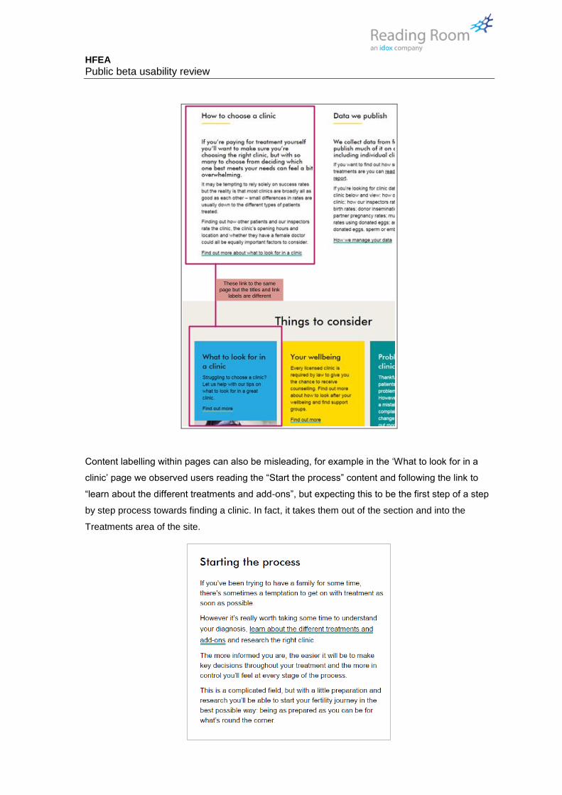
HFEA Public beta usability review
These link to the same
page but the titles and link
labels are different
Content labelling within pages can also be misleading, for example in the ‘What to look for in a
clinic’ page we observed users reading the “Start the process” content and following the link to
“learn about the different treatments and add-ons”, but expecting this to be the first step of a step
by step process towards finding a clinic. In fact, it takes them out of the section and into the
Treatments area of the site.

HFEA Public beta usability review
Also on this page there are links to “Search for a clinic”, “Searching for a clinic” and “Choose a
clinic”. These all take the user to the search form, having three different labels caused confusion
with people wondering if they are the same page.
- The main CTA button for CaFC doesn’t draw the users’ attention and was missed by
some even if they were on the correct page, and on the right area of the page.
The placement and styling of the main CTA for CaFC didn’t help users to find the search form.
Apart from appearing right at the bottom of a very long page (5 pages of scrolling on an average
laptop screen), the placement and styling caused some users to miss it entirely. This could be
because the label “Choose a Fertility Clinic” is too similar to the label of the section as a whole, or
could be because of the poor colour contrast on the CTA button (white on lime green), or
because the content box it is contained in looks remarkably similar to the other coloured content
boxes on the page. Either way, it was not apparent to some users, even those who were looking
at the right area of the page.

HFEA Public beta usability review
Recommendations
Description Type
Review page titles in this section to remove cross over and ambiguity. Content
Reduce the number of and/or length of content items on the main Choose a Fertility Clinic page.
Content
Avoid using terms like “start the process” unless referring to an actual online process.
Content
Consistently refer to the Choose a Fertility Clinic search with the same link title … e.g. “Choose a Fertility Clinic” (if that is to be the chosen name).
Content
Review styling of the final CTA on the Choose a Clinic page. Suggested style is centred, full width and using large type and high contrast for the call to action button.
Design / Content
6.2 CaFC search form
The CaFC search form had been rearranged since the Private Beta to draw attention to the ability
to specify a distance from a postcode. The new arrangement worked a lot better.
Recommendations
Description Type
Shorten “Please enter your location (Optional)” removing the word
“(optional)” – although GDS do encourage labelling of optional form fields,
this isn’t really a form in the true sense, and this is probably superfluous.
The functionality to show all clinics should be made more explicit if that was
the intention.
Design / Content (RR)
6.3 CaFC results listing
- Cannot update search criteria from the results page, users needed to go back a page.
From the Search results page we asked some users how they would update their criteria, and we
observed people looking for a way to do this on the page, and then generally hitting the browser
back button.
In the page content the link to “Update search criteria” is visually separated from the statement of
the criteria used, which may have led to people missing it. Although it should also be questioned

HFEA Public beta usability review
why they cannot simply update the criteria from this page, given that there are only two (a
postcode and a distance).
Recommendations
Description Type
Place controls to update the location and distance criteria directly onto the search results page, and then remove the “update search criteria” link which will no longer be needed.
Design / Functionality
- The “view as map” option was missed entirely
Nobody used the “view as map” feature on the listing page, despite some users suggesting that
the exact location of a clinic is important to them. This could be because they are only interested
in the exact location after first deciding if this is a clinic that interests them, or could be because
they were missing the ‘view as map’ control.

HFEA Public beta usability review
Although it did not come up in testing, the accessibility of the map function should also be
reviewed.
Recommendations
Description Type
Move the “view as list” “view on map” controls to sit directly above the search results list. N.B. Connected to recommendation to remove sort control below.
Design / Functionality
Review functionality of map to add a side bar with a basic list, working in a similar way to the main Google Maps service. N.B. This did not come up in testing.
Design / Functionality
- Sorting options were misunderstood, and seen as superfluous by some
Some of the users who tried interacting with the sort control didn’t understand the sort options
offered – “distance”, “A-Z” or “Z-A”. Some thought that the “Z-A” option this was unnecessary, and
others thought the whole control was unnecessary.
Recommendations
Description Type
Based on lack of interest / understanding of this feature – recommend it is removed (commented out).
Design
ALTERNATIVE If the feature is to be kept it should be on the same horizontal line as the “view as list” and “view on map” controls.
Design
If all the three recommendations above are all implemented the search results page might look
something like the wireframe illustration shown below.

HFEA Public beta usability review
Your search results
N16 7AQ Within 25 miles Search
Location
Enter your postcode or region
Distance from postcodeSelect a distance from your location that
you would be willing to travel
Your search returned 39 clinics
Homerton Fertility Centre
Treatment with storage
- Some users missed links to detailed pages
There is no indication that the clinic name is clickable unless you hover over it, and the style
reuses the H1 style. Some users did not actually think there were detailed pages about each
clinic until prompted.
H2 tag – not clickable
Clinic name – uses same
style, not clickable

HFEA Public beta usability review
Recommendations
Description Type
Review design of hyperlinks in the search results – either adding a consistent style to the hyperlinks such as the underline used elsewhere on the site or a button to “view clinic details”.
Design
ALTERNATIVE RECOMMENDATION Make the entire rectangular area for each clinic clickable rather than just the title, and use a visual affordance such as brightening/dimming to indicate that the results can be clicked
Design
- The treatments list on the search listing is not exhaustive, and some users pointed out
omissions such as donor insemination.
The image below shows the display of treatments for the Homerton Fertility Centre. On the
results page, only three of the four treatments were shown (see inset). One user who had been to
a clinic that she was reviewing highlighted a similar omission. This confused them to a point
where they were saying “I’m sure they offer donor insemination, so this isn’t right”
Recommendations
Description Type
If treatments are to be listed on the results page they must be the full set offered by that clinic, not a subset. This may mean changing the style of this area as some clinics will have long lists of treatments and the current bulleted list style may not be appropriate given the content area limitations. Given that the two surrounding content areas (“Treats” and
Design
HFEA Public beta usability review
“Staffing”) use the same style, it may be necessary to include those in the review as well.
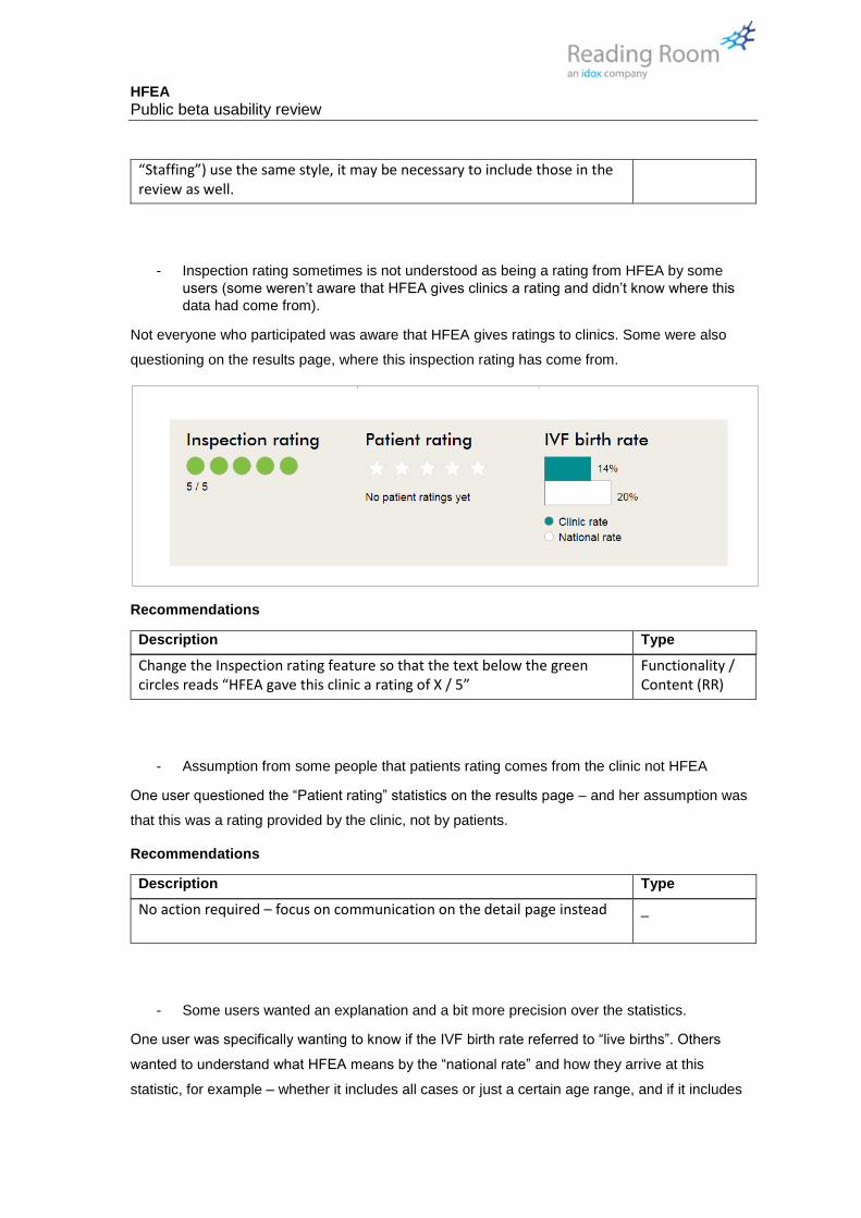
- Inspection rating sometimes is not understood as being a rating from HFEA by some
users (some weren’t aware that HFEA gives clinics a rating and didn’t know where this
data had come from).
Not everyone who participated was aware that HFEA gives ratings to clinics. Some were also
questioning on the results page, where this inspection rating has come from.
Recommendations
Description Type
Change the Inspection rating feature so that the text below the green circles reads “HFEA gave this clinic a rating of X / 5”
Functionality / Content (RR)
- Assumption from some people that patients rating comes from the clinic not HFEA
One user questioned the “Patient rating” statistics on the results page – and her assumption was
that this was a rating provided by the clinic, not by patients.
Recommendations
Description Type
No action required – focus on communication on the detail page instead _
- Some users wanted an explanation and a bit more precision over the statistics.
One user was specifically wanting to know if the IVF birth rate referred to “live births”. Others
wanted to understand what HFEA means by the “national rate” and how they arrive at this
statistic, for example – whether it includes all cases or just a certain age range, and if it includes

HFEA Public beta usability review
patients of a particular type – such as single women and same sex couples who may not have a
fertility problem.
Recommendations
Description Type
Include a help icon as part of the ratings bar which can be used to reveal information on how clinics are rated. A mockup of how this might look is below:
?
?
Our clinic ratings:
Inspection rating is the ratings given to this clinic by HFEA inspectors at their last visit
Patient rating is an average of ratings given by patients who have attended this clinic in the
last 12 months
IVF birth rate is the overall percentage of IVF cycles for women of all ages that resulted in
a live birth in the last 12 months
IUI birth rate is the overall percentage of IUI cycles for women of all ages that resulted in a
live birth in the last 12 months
Note that IVF is shown as a default rating, if the clinic doesn’t offer IVF then IUI will typically
be shown instead.
Find out more about how we rate clinics
Design / functionality
- There were some cases where for a clinic the IUI rate is reported on the results page, but
it wasn’t clear to users why some clinics show IVF and some IUI
The data shown on the results page is based on a simple choice, if the clinic offers IVF then this
is shown, if it doesn’t then IUI is shown. The exception being clinics that have recently begun
treatment in which case no data is shown at all.
Users were confused by these discrepancies, including one who was frustrated that the clinics
were showing different treatments and pointed out that they weren’t “comparing like for like”, and
another who had received IVF treatment at a particular clinic but their data wasn’t showing,
presumably because it was a new service, but there was nothing on screen to explain this, just a
bank space. She commented that “I know they offer it, because I’ve been a patient there”.
Recommendations
Description Type
See recommendation above concerning adding a help icon to the ratings box.
-
HFEA Public beta usability review
6.4 Clinic detail pages
It should be pointed out that in general users responded very well to the clinic detail pages and
saw them as a huge improvement on the current site. That is not to say there isn’t room for
improvement.
- Some key details may need more prominence as users were searching around for them–
particularly Clinic web address, Clinic street address and Opening hours
These details are in the Clinic Details accordion at the bottom of the page. Some users felt that
they needed more prominence as they thought this was important information.
Recommendations
Description Type
Replace the text hyperlink for the clinic’s web-address with a CTA button labelled “Visit clinic website”
Functionality / Design
Change the ordering of items in Clinic details to show address, contact and opening hours first, followed by the map and image, followed by the remaining details.
Functionality / Design

HFEA Public beta usability review
Visit clinic website
6.5 Clinic detail pages: Stats
- The explanatory texts around the graph were ignored by most users, they aren’t visually
associating them as an explanation of the graph
Many users struggled to correctly interpret the graph for statistics. In particular, there was
confusion over the term “national rate”, with some wondering how this is calculated, and also over
the “reliability range”. The explanatory text for both of these is visually disassociated from the
graph due to the number of things that are being said on one page. Above the graph, the full
explanatory text for all three charts is shown although only one is visible on screen. Whereas with
the reliability range, on a standard laptop screen, if the graph is in the middle of the page the
explanation of reliability is off the bottom of the screen.

HFEA Public beta usability review
This is the explanatory
text for the graph in its
current view – it is visually
diassociated
The explanation of
Reliability Range is also
disassociated – it is off
the screen on standard
laptop dimensions
Recommendations
Description Type
Move the explanatory text for each graph inside the dynamic screen area, so that only the explanatory text for the current active graph is shown.
Functionality / Design
Use in-line help icons to reveal the explanation of “national rate” and “reliability range” instead of this text being visible all the time.
Functionality / Design
- The graphs themselves were not well understood – whilst most, but not all, people
correctly interpreted the clinic birth rate vs the national rate, there was little understanding
of ‘reliability’ despite an explanation being on the page itself.

HFEA Public beta usability review
Not everyone understood what HFEA means by the National Rate. It is notable that the
explanatory text that appears simply advises people on not reading too much into statistics, it
does not actually say what the National Rate represents or how it is calculated. Some wanted to
know if there were age brackets used in the calculation, for example. Others wondered if it
included types of patient like same sex couples, who do not have a fertility problem.
In terms of the chart itself one user questioned why the national rate line is longer than the clinic’s
performance line, and if this signified anything. Two users questioned why the scale of the chart
isn’t labelled and didn’t know what the numbers mean.
Reliability was more problematic, with the majority of users not understanding correctly what this
was indicating. On some screens the reliability bar was not seen by the user due to low contrast
with the background, they only saw the end strips. Some users were observed clicking or
hovering over the text ‘reliability range’ and expecting a pop up hint of some type.
Recommendations
Description Type
Review the explanation of “national rate” which does not actually state how this is currently calculated.
Content
Change the styling of the graph to be closer to that styling used on the “detailed statistics” page (example shown below). Specifically introducing bigger fonts for a statement of the clinic rate, and a clearer indication of the national average, and whether this clinic is consistent with it.
Design
- Some users thought this information was too detailed and wanted something that was
more high level.
It should be noted that the mathematics behind confidence intervals are difficult to explain, and
some participants still didn’t understand fully even when it was explained to them by the
facilitator. Some did comment that this was too much detail for them, they would be happy with a
simple percentage.
Recommendations

HFEA Public beta usability review
Description Type
See recommendation above regarding introduction of large font for the headline stat from the clinic.
Design
- The graph controls were missed by some
Not everyone initially saw the graph controls to the right – although most did figure them out
eventually. Some used the “view detailed statistics” button before noticing the control.
Recommendations
Description Type
Integrate the graph controls into the central column rather than to the right.
Design
If all the recommendations on graphing are followed the page might look something like the
mock-up below, although design input is clearly required:
What is the clinic's IVF birth rate?
Find out this clinic’s IVF/ICSI rates for births per embryo transferred, births
per egg collection and multiple births.
We present births per embryo transferred (rather than births per cycle)
because fertility professionals say it’s the best measure of a clinic’s
success and it allows you to make a fair comparison between clinics.
Remember, it can’t tell you your individual chance of success (only your
doctor can do that); but it does give a fair overall view of their
performance.
All Under 38 38 and over
Births per embryo transferred
Births per egg collection
Multiple birth rate
Births per embryo transferred
01/07/2013 to 30/06/2014
??
6.6 Clinic detail pages: Detailed stats pages
- Splitting the form over 4 pages frustrated people, with one giving up entirely

HFEA Public beta usability review
Many users were frustrated with the interface to access detailed statistics, which is split over four
pages, made more cumbersome as the control is off the bottom of the page on a standard laptop
screen dimension, meaning users have to scroll to reach it.
Recommendations
Description Type
Create a single, dynamic form page instead of four separate pages, using the four separate pages as a fall back only for people who don’t have JavaScript.
Functionality / Design
- Some users were very happy with the level of detail, others didn’t need it
Although the detailed statistics were too much for some people, others thought it was very good,
with one even commenting that this was the only data that really mattered as it meant she could
access data for people in a much more similar situation to her own.
Recommendations
Description Type
No action required -
- The colour coding on graphs and page features was not explained
On the detailed graphs for pregnancies and births some commented that the colour coding on the
graphs isn’t explained (it is the same as on the main clinic detail pages, but not explained here).
Recommendations
Description Type

HFEA Public beta usability review
Add a key to the colours used, as appears on the main clinic details page Design
- The display of high level percentages and the “Consistent with average” badges was
seen as better than that on the main Clinic details page.
Some users commented that they preferred this presentation of data to the main clinic detail
pages, in particular they liked the big clear statistics in large type.
Recommendations
Description Type
No action required
- One user questioned what stats of 0% meant
One participant spotted that some of the graphs show a statistic of 0% and questioned whether
this meant the clinic had no successes, the HFEA has no data, or the clinic doesn’t actually offer
that treatment option. Note that this can be interpreted in the example below by looking at the
number of pregnancies per cycle, in this example the clinic has performed the operation 22 times
with no successes, it is possible that if the user had longer on the task they would have worked
this out.
Recommendations
Description Type
No action required -
HFEA Public beta usability review
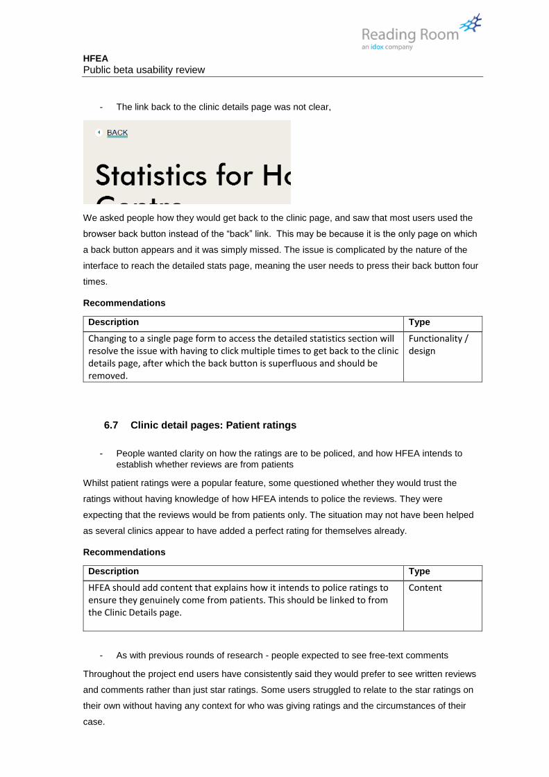
- The link back to the clinic details page was not clear,
We asked people how they would get back to the clinic page, and saw that most users used the
browser back button instead of the “back” link. This may be because it is the only page on which
a back button appears and it was simply missed. The issue is complicated by the nature of the
interface to reach the detailed stats page, meaning the user needs to press their back button four
times.
Recommendations
Description Type
Changing to a single page form to access the detailed statistics section will resolve the issue with having to click multiple times to get back to the clinic details page, after which the back button is superfluous and should be removed.
Functionality / design
6.7 Clinic detail pages: Patient ratings
- People wanted clarity on how the ratings are to be policed, and how HFEA intends to
establish whether reviews are from patients
Whilst patient ratings were a popular feature, some questioned whether they would trust the
ratings without having knowledge of how HFEA intends to police the reviews. They were
expecting that the reviews would be from patients only. The situation may not have been helped
as several clinics appear to have added a perfect rating for themselves already.
Recommendations
Description Type
HFEA should add content that explains how it intends to police ratings to ensure they genuinely come from patients. This should be linked to from the Clinic Details page.
Content
- As with previous rounds of research - people expected to see free-text comments
Throughout the project end users have consistently said they would prefer to see written reviews
and comments rather than just star ratings. Some users struggled to relate to the star ratings on
their own without having any context for who was giving ratings and the circumstances of their
case.

HFEA Public beta usability review
Recommendations
Description Type
Given that HFEA has decided not to publish free-text reviews, it should instead state why it does not, and go on to explain that comments left as part of the rating process will be made available to HFEA inspectors. This should be communicated on the Clinic details page and on the Rating form.
Content
- One user questioned why of the 4 ratings, four provide only an average, whereas the fifth
shows how many people voted each rating.
The rating system used shows four ratings as an overall average and one split out into separate
numbers of votes for each grade. One user questioned why the extra detail wasn’t available for
every rating. This may be because they are expecting to be able to drill down into the ratings
based on experience of using similar systems on sites like TripAdvisor and Google Maps.
Recommendations
Description Type
The four-star ratings that show only an average should support drill down to reveal how many people gave each rating. This could be delayed until more data has been gathered, as it would be rather superfluous before then.
Functionality / design

HFEA Public beta usability review
7 GENERAL COMMENTS
7.1 Navigation
- Implementation of main navigation could be improved – some users struggled
The hover interaction used on the main navigation is very sensitive, especially when trying to
traverse the mouse from right to left. It is easy to accidentally trigger a neighbouring section of the
navigation when making sweeping mouse movements.
Users attention is
here...
.. but the options
appear at the
other side of the
screen
This was most apparent on the Choose a clinic menu, where the menu options appear at the
opposite end of the screen to the user’s mouse, making this problem more apparent. Several
users became frustrated with the navigation.
Recommendations
Description Type
Right align options in the mega drop-down menu on desktop view to reduce the issue with having to make large mouse movements to reach items at the other side of the screen.
Design
7.2 HFEA role in complaints
- Some didn’t know that HFEA can get involved in complaints against clinics. Some people
see failure of fertility treatment as personal rather than anything to do with the clinic, and
also don’t know how to complain.
As an observation some participants were surprised to hear that HFEA can get involved in
complaints against clinics. This may need to brought out more.
Recommendations
Description Type
Add information about HFEA’s role in complaints handling to the About Us landing page.
Content

HFEA Public beta usability review
7.3 Technical / design glitches
- Some technical issues were seen with users on older version of IE
Two users were testing on IE9. We saw some graphical glitches, especially within CaFC search
and clinic detail pages.
Recommendations
Description Type
Review and resolve design glitches in IE 9 Design / Functionality
7.4 Antivirus software conflict
- Some issues were seen when viewing the site with particular anti-virus plug-ins,
especially Norton
Users with Norton AV were having pop up alerts on most pages that they had to continually
dismiss.
Recommendations
Description Type
Review and resolve clashes with common AV software Functionality
7.5 Whitespace
- Some templates have strange amounts of whitespace, in extreme cases leading to
people erroneously believing they were at the bottom of a page
On some pages the gaps between content seem to be notably wider. Some users erroneously
believed they were at the bottom of the page, for example, on the Choose a Fertility Clinic page.
This issue is extenuated for users of Internet Explorer, where the browser scroll bar is hidden
automatically when the user isn’t moving their viewing window, so there is no visual cue that there
is more content further down the page.
Recommendations
Description Type

HFEA Public beta usability review
Review all page templates and determine if proportion of whitespace between / within content components is appropriate, especially when viewed on ‘standard’ sized screen resolutions.
Design
7.6 Length of pages
- There is a concern that some pages have become too long.
Whilst people did scroll, many didn’t go all the way to the bottom or had stopped reading the
detail lower down long pages. There is no prompt to tell them to keep scrolling on some pages.
Recommendations
Description Type
Add a visible indicator that there is more content below the current viewing window, with a click action that the user can press to scroll down by the height of one screen.
Functionality / design

HFEA Public beta usability review
8 ENCOURAGING EXPLORATION AND LEARNING JOURNEYS
Note – this content is repeated from the report from the Private Beta stage. The observations and
the recommendations have not changed.
• We want to take users on a journey where they learn through using the site. Some areas
of the site do a good job of educating the user, others less so
• There are many instances of things users wanted to click on to find out more, that don’t
currently go anywhere – HFEA should consider expanding content in these areas
• Onward journeys through “where next” features at the bottom of the page were not
noticed by many, they need to be seen as part of the page flow rather than a bolt on
• CaFC pages are not currently linking back to main site content to explain terms and
concepts and educate site visitors

HFEA Public beta usability review
Recommendations
Description Type
Fact box/spotlights should link through to more information on that topic OR be positioned next to a content section where they are pulling data out from that content block.
Design & Content
"Where next?" content blocks should be part of the main page column layout – to make them appear to be part of the article not the footer.
Design
CaFC pages should be linking back into content on treatments to help people to learn what they are looking at. (also discussed in the Clinic Details recommendations)
Design
Headline IVF birth rate – births per embryo transferred The AG has not changed its recommendation that birth events per embryo
transferred is the best measure because it reflects good embryology skills and promotes single embryo transfer.
Headline IVF birth rate – grouping all ages The HFEA should only present whether a clinic is consistent, above or below the
national average in search results and at the top of a clinic page (as the headline birth measure) because this is the most important message for patients.
The basis for this calculation should be the under 38 group of patients.
Headline IVF birth rate – grouping treatments Natural cycles, donor egg and cycles including embryo testing should be excluded
from the calculation of the headline IVF birth rate.
The HFEA should consider presenting the natural IVF birth rates for clinics that do this treatment further down the clinic page next to DI, IVF and IUI.
The HFEA should use only fresh IVF and ICSI cycles with the patient’s own eggs for the headline calculation.
The HFEA should make it even clearer to patients that the headline figure and all clinic statistics will indicate to them the quality of a clinic but will not be a personal predictor.
Births per egg collection (cumulative rate) The HFEA should continue to calculate the cumulative rate, ‘births per egg
collection’ on a two-year period.
Detailed statistics – age breakdown at 38 and getting the right balance The HFEA should continue to use the two age bands (under 38, 38 and over) on the
clinic profile page along with data for all ages. Other more detailed age bands (the 6 currently used) should still be available on the
detailed statistics pages.
Reliability range and small sample sizes The reliability range is a useful piece of information when presenting clinic statistics
and the HFEA should ensure that this is made more understandable to users.
The HFEA should set a sensible minimum data level for data presentation so that data is not identifying when there are small sample sizes