An Easy Guide to Cool Color Combos
7
A N E A S Y G U I D E T O T I P S & T R I C K S COOL COLOR COMBOS
description
How are you color combinations in your designs? Canva put together a quick cool color combo guide for you to help make your designs even better. Read the full post here: http://blog.canva.com/an-easy-guide-cool-color-combos/
Transcript of An Easy Guide to Cool Color Combos

A N E A S Y G U I D E T O
T I P S & T R I C K S
COOL COLORCOMBOS

C O L O R M E H A P P Y
If you’re not a professional designer, we’ve added a littleglossary to help with the design lingo.
Some words you might not know

N A T U R A L L Y N E U T R A L
The neutral color family evokes feelings of harmony - great touse for designs with earthy, organic or natural content.
f1eae2 ‘Linen’ and 74475d ‘Grey Plum’
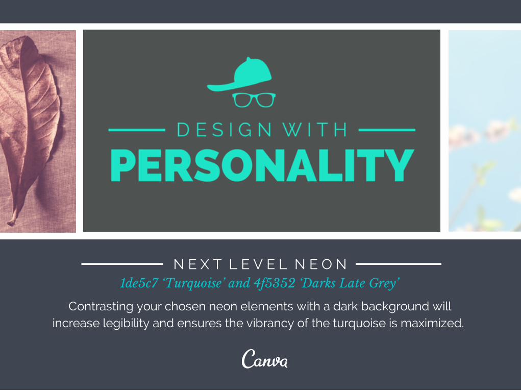
N E X T L E V E L N E O N
Contrasting your chosen neon elements with a dark background willincrease legibility and ensures the vibrancy of the turquoise is maximized.
1de5c7 ‘Turquoise’ and 4f5352 ‘Darks Late Grey’

P A L E , P R E T T Y, P A S T E L
You don’t have to use different fonts to get a dramatic effect, use light and bold versions of the same family for versatility.
90c6df ‘Lavender Blue’ and daa9c8 ‘Dusty Pink’
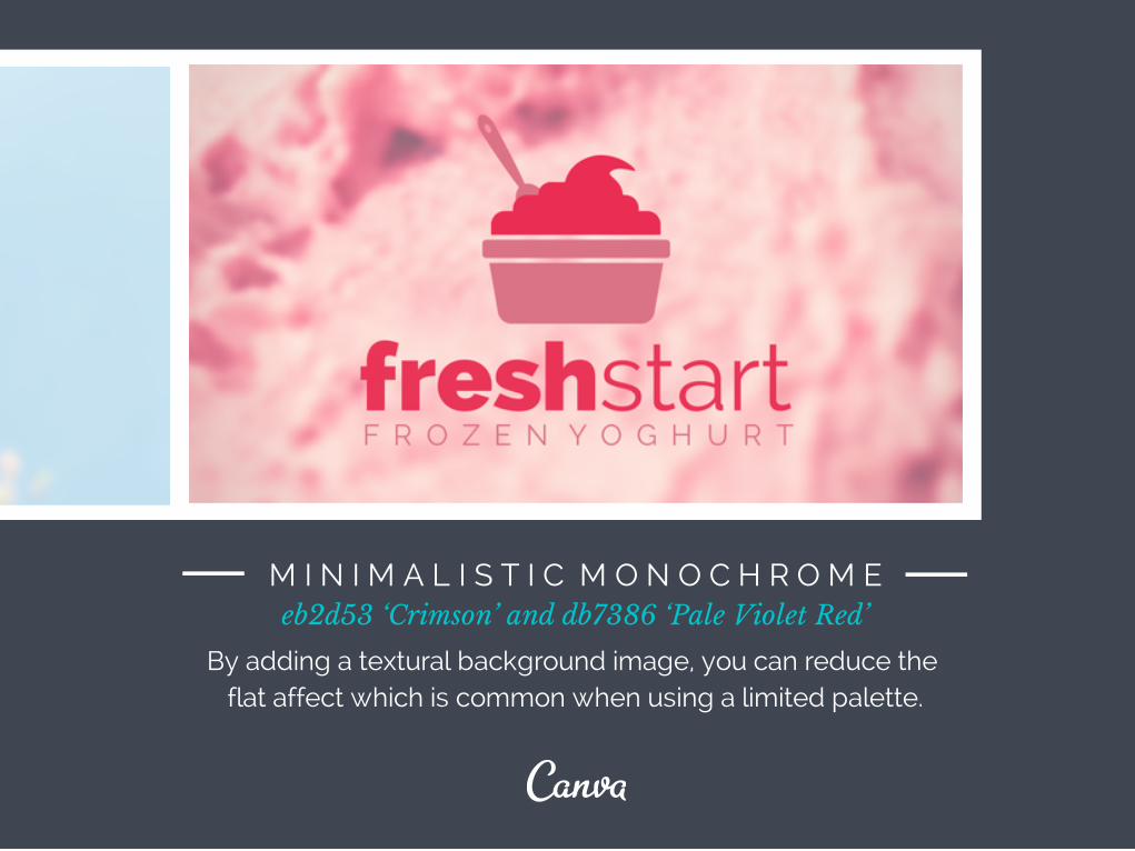
M I N I M A L I S T I C M O N O C H R O M E
By adding a textural background image, you can reduce the flat affect which is common when using a limited palette.
eb2d53 ‘Crimson’ and db7386 ‘Pale Violet Red’

W H I C H C O M B O A R E
T I P S & T R I C K S
YOU EXCITED TO TRY?