AN APPROACH TO DESIGN VISUALS FOR ARCHETYPES BASED …
105
AN APPROACH TO DESIGN VISUALS FOR ARCHETYPES BASED ON CHARACTER ARCHETYPE TAXONOMIES A Thesis by ANGELA WANG Submitted to the Office of Graduate and Professional Studies of Texas A&M University in partial fulfillment of the requirements for the degree of MASTER OF SCIENCE Chair of Committee, Ergun Akleman Committee Members, Joshua Hicks Takashi Yamauchi Head of Department, Tim McLaughlin May 2018 Major Subject: Visualization Copyright 2018 Angela Wang
Transcript of AN APPROACH TO DESIGN VISUALS FOR ARCHETYPES BASED …

AN APPROACH TO DESIGN VISUALS FOR ARCHETYPES BASED ON
CHARACTER ARCHETYPE TAXONOMIES
A Thesis
by
ANGELA WANG
Submitted to the Office of Graduate and Professional Studies of
Texas A&M University
in partial fulfillment of the requirements for the degree of
MASTER OF SCIENCE
Chair of Committee, Ergun Akleman
Committee Members, Joshua Hicks
Takashi Yamauchi
Head of Department, Tim McLaughlin
May 2018
Major Subject: Visualization
Copyright 2018 Angela Wang
ABSTRACT
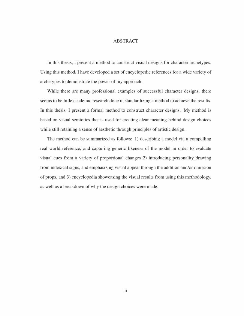
In this thesis, I present a method to construct visual designs for character archetypes.
Using this method, I have developed a set of encyclopedic references for a wide variety of
archetypes to demonstrate the power of my approach.
While there are many professional examples of successful character designs, there
seems to be little academic research done in standardizing a method to achieve the results.
In this thesis, I present a formal method to construct character designs. My method is
based on visual semiotics that is used for creating clear meaning behind design choices
while still retaining a sense of aesthetic through principles of artistic design.
The method can be summarized as follows: 1) describing a model via a compelling
real world reference, and capturing generic likeness of the model in order to evaluate
visual cues from a variety of proportional changes 2) introducing personality drawing
from indexical signs, and emphasizing visual appeal through the addition and/or omission
of props, and 3) encyclopedia showcasing the visual results from using this methodology,
as well as a breakdown of why the design choices were made.
ii

DEDICATION
To my mother and my grandfather.
iii

CONTRIBUTORS AND FUNDING SOURCES
This work was supported by Texas A&M University and a thesis committee consisting
of Professor Ergun Akleman and Professor Joshua Hicks and Professor Takashi Yamauchi
of the Department of Psychology.
The methodology and results in chapter 3 were conducted by the student and Professor
Ergun Akleman and will be published at SIGGRAPH.
All other works conducted for the thesis was completed by the student independently.
No outside financial support was provided for this research.
iv

TABLE OF CONTENTS
Page
ABSTRACT . . . . . . . . . . . . . . . . . . . . . . . . . . . . . . . . . . . . . . ii
DEDICATION . . . . . . . . . . . . . . . . . . . . . . . . . . . . . . . . . . . . iii
CONTRIBUTORS AND FUNDING SOURCES . . . . . . . . . . . . . . . . . . iv
TABLE OF CONTENTS . . . . . . . . . . . . . . . . . . . . . . . . . . . . . . . v
LIST OF FIGURES . . . . . . . . . . . . . . . . . . . . . . . . . . . . . . . . . . vii
1. INTRODUCTION . . . . . . . . . . . . . . . . . . . . . . . . . . . . . . . . . 1
1.1 Motivation and Inspiration . . . . . . . . . . . . . . . . . . . . . . . . . 1
1.2 Introduction . . . . . . . . . . . . . . . . . . . . . . . . . . . . . . . . . 1
2. BACKGROUND AND LITERATURE REVIEW . . . . . . . . . . . . . . . . 3
2.1 Designing by Simplexity . . . . . . . . . . . . . . . . . . . . . . . . . . 3
2.2 Integrating Psychology-based Analysis into Artistic Design . . . . . . . . 4
2.3 Related Works . . . . . . . . . . . . . . . . . . . . . . . . . . . . . . . . 5
3. METHODOLOGY . . . . . . . . . . . . . . . . . . . . . . . . . . . . . . . . 8
3.1 Describing a Model by Capturing Genuine Likeness . . . . . . . . . . . 9
3.1.1 Capturing Genuine Likeness . . . . . . . . . . . . . . . . . . . . 10
3.1.2 Relative Proportion . . . . . . . . . . . . . . . . . . . . . . . . . 12
3.2 Introducing Personality . . . . . . . . . . . . . . . . . . . . . . . . . . . 13
3.2.1 Form . . . . . . . . . . . . . . . . . . . . . . . . . . . . . . . . 14
3.2.2 Head and Face . . . . . . . . . . . . . . . . . . . . . . . . . . . 17
3.2.3 Staging . . . . . . . . . . . . . . . . . . . . . . . . . . . . . . . 24
3.3 Emphasizing Visual Appeal . . . . . . . . . . . . . . . . . . . . . . . . 33
3.4 Results . . . . . . . . . . . . . . . . . . . . . . . . . . . . . . . . . . . . 39
4. PSYCHOLOGY PERSONALITIES AND THEIR BREAKDOWNS . . . . . . 41
4.1 Dark Personalities . . . . . . . . . . . . . . . . . . . . . . . . . . . . . . 41
4.2 Extrovert-Introvert Personalities . . . . . . . . . . . . . . . . . . . . . . 46
4.3 Big Five Personalities . . . . . . . . . . . . . . . . . . . . . . . . . . . . 54
v
4.4 Results . . . . . . . . . . . . . . . . . . . . . . . . . . . . . . . . . . . . 55
5. LITERARY ARCHETYPES AND THEIR BREAKDOWNS . . . . . . . . . . 65
5.1 Cultural-Specificity with Clarity . . . . . . . . . . . . . . . . . . . . . . 65
5.2 Action-Focused Designing . . . . . . . . . . . . . . . . . . . . . . . . . 76
5.3 Off-the-Ground Posturing . . . . . . . . . . . . . . . . . . . . . . . . . . 85
5.4 Results . . . . . . . . . . . . . . . . . . . . . . . . . . . . . . . . . . . . 91
6. CONCLUSION AND FUTURE WORK . . . . . . . . . . . . . . . . . . . . 93
6.1 Conclusion . . . . . . . . . . . . . . . . . . . . . . . . . . . . . . . . . 93
6.2 Further Study . . . . . . . . . . . . . . . . . . . . . . . . . . . . . . . . 93
REFERENCES . . . . . . . . . . . . . . . . . . . . . . . . . . . . . . . . . . . . 94
vi

LIST OF FIGURES
FIGURE Page
2.1 McCloud’s expressions from "Understanding Comics: The Invisible Art" . 5
2.2 Blair’s Heavy archetype breakdown from "Cartoon Animation" . . . . . . 7
3.1 An example that demonstrates the steps to describing a model . . . . . . . 9
3.2 Head-to-Body Proportions (silhouette comparison and head stack compar-
ison) . . . . . . . . . . . . . . . . . . . . . . . . . . . . . . . . . . . . . 10
3.3 Top-Bottom Comparison (divided by the waistline) . . . . . . . . . . . . 11
3.4 Torso Evaluation (through shapes) . . . . . . . . . . . . . . . . . . . . . 12
3.5 Aesthetic proportional adjustments . . . . . . . . . . . . . . . . . . . . . 13
3.6 Iterations on shape . . . . . . . . . . . . . . . . . . . . . . . . . . . . . 14
3.7 Shape language connotations . . . . . . . . . . . . . . . . . . . . . . . . 16
3.8 Designing stroke forms in a meaningful manner . . . . . . . . . . . . . . 17
3.9 Iterations on head structure . . . . . . . . . . . . . . . . . . . . . . . . . 18
3.10 Iterations on proportions around the eyes . . . . . . . . . . . . . . . . . . 19
3.11 Iterations on proportions around the mouth . . . . . . . . . . . . . . . . . 21
3.12 Adjusting the final face iteration for final face result . . . . . . . . . . . . 22
3.13 Process of figuring out the facial expression . . . . . . . . . . . . . . . . 23
3.14 Problems with unedited staging in silhouette form . . . . . . . . . . . . . 24
3.15 Blair’s demonstration of line of action . . . . . . . . . . . . . . . . . . . 25
3.16 Four types of the weight-carrying line . . . . . . . . . . . . . . . . . . . 26
3.17 Using the weight-carrying line to identify the simple-complex sides . . . 28
vii

3.18 Identifying staging error . . . . . . . . . . . . . . . . . . . . . . . . . . . 29
3.19 Considering dimensionality . . . . . . . . . . . . . . . . . . . . . . . . . 30
3.20 Three types of head orientation . . . . . . . . . . . . . . . . . . . . . . . 31
3.21 Comparison between unedited staging and the edited staging . . . . . . . 32
3.22 Omitting props and simplifying the outfit . . . . . . . . . . . . . . . . . . 33
3.23 Emphasis with baton . . . . . . . . . . . . . . . . . . . . . . . . . . . . 34
3.24 Emphasis with handcuff and police hat . . . . . . . . . . . . . . . . . . . 36
3.25 Emphasis with cigar . . . . . . . . . . . . . . . . . . . . . . . . . . . . . 37
3.26 Emphasis with sunglasses . . . . . . . . . . . . . . . . . . . . . . . . . . 38
3.27 Archetype Breakdown Template . . . . . . . . . . . . . . . . . . . . . . 40
4.1 Sadist Scientist Breakdown . . . . . . . . . . . . . . . . . . . . . . . . . 42
4.2 Psycho Priest Breakdown . . . . . . . . . . . . . . . . . . . . . . . . . . 43
4.3 Machiavellian Magician Breakdown . . . . . . . . . . . . . . . . . . . . 44
4.4 Narcissist Alchemist Breakdown . . . . . . . . . . . . . . . . . . . . . . 45
4.5 Judge-by-Thinking Jazzy Introvert Reevaluation + Final Breakdown . . . 47
4.6 Judge-by-Thinking Jazzy Extrovert Reevaluation + Final Breakdown . . . 48
4.7 Judge-by-Feeling Jazzy Introvert Breakdown . . . . . . . . . . . . . . . . 49
4.8 Judge-by-Feeling Jazzy Extrovert Reevaluation + Final Breakdown . . . . 50
4.9 Perceive-by-Observation Jazzy Introvert Breakdown . . . . . . . . . . . . 51
4.10 Perceive-by-Observation Jazzy Extrovert Reevaluation + Final Breakdown 52
4.11 Perceive-by-Intuition Jazzy Introvert Reevaluation + Final Breakdown . . 53
4.12 Perceive-by-Intuition Jazzy Extrovert Reevaluation + Final Breakdown . . 56
4.13 More Agreeable Archer Breakdown . . . . . . . . . . . . . . . . . . . . 57
4.14 Less Agreeable Archer Breakdown . . . . . . . . . . . . . . . . . . . . . 58
viii

4.15 More Conscientious Cowboy Breakdown . . . . . . . . . . . . . . . . . . 59
4.16 Less Conscientious Cowgirl Breakdown . . . . . . . . . . . . . . . . . . 60
4.17 More Neurotic Nerd Breakdown . . . . . . . . . . . . . . . . . . . . . . 61
4.18 Less Neurotic Nerd Breakdown . . . . . . . . . . . . . . . . . . . . . . . 62
4.19 More Open Office Worker Breakdown . . . . . . . . . . . . . . . . . . . 63
4.20 Less Open Office Worker Breakdown . . . . . . . . . . . . . . . . . . . . 64
5.1 Medieval Chinese Prince Breakdown . . . . . . . . . . . . . . . . . . . . 66
5.2 Medieval Chinese Blabbermouth/Gossiper Reevaluation + Final Breakdown 67
5.3 Medieval Chinese Playboy/Rogue Breakdown . . . . . . . . . . . . . . . 68
5.4 Medieval Chinese Adventurer/Daredevil/Explorer Reevaluation + Final Break-
down . . . . . . . . . . . . . . . . . . . . . . . . . . . . . . . . . . . . . 69
5.5 Medieval Chinese Conqueror/Warrior Reevaluation + Final Breakdown . . 70
5.6 Medieval Chinese Girl-Next-Door Breakdown . . . . . . . . . . . . . . . 71
5.7 Medieval Chinese Cold/Princess/Snob Reevaluation + Final Breakdown . 72
5.8 Medieval Chinese Lost Soul/Outcast/Wanderer Reevaluation + Final Break-
down . . . . . . . . . . . . . . . . . . . . . . . . . . . . . . . . . . . . . 73
5.9 Medieval Chinese Boss Breakdown . . . . . . . . . . . . . . . . . . . . . 74
5.10 Medieval Chinese Innocent/Orphan/Waif Reevaluation + Final Breakdown 75
5.11 Ice Skating Dark Lady/Seductress/Siren Breakdown . . . . . . . . . . . . 77
5.12 Roller Blading Comedian/Darling/Free-Spirit Breakdown . . . . . . . . . 78
5.13 Skateboarding Spunky Kid Breakdown . . . . . . . . . . . . . . . . . . . 79
5.14 Skateboarding Bad Boy/Outlaw/Rebel Breakdown . . . . . . . . . . . . . 80
5.15 Roller Blading Best Friend/Confidant/Mr. Nice Guy Breakdown . . . . . 81
5.16 Ice Skating Crusader/Rescuer/Zealot Breakdown . . . . . . . . . . . . . 82
5.17 Racecar Driver Ice Breakdown . . . . . . . . . . . . . . . . . . . . . . . 83
ix

5.18 Racecar Driver Fire Breakdown . . . . . . . . . . . . . . . . . . . . . . . 84
5.19 Motorcyclist Caregiver/Nurturer/Wise Woman Breakdown . . . . . . . . 86
5.20 Motorcyclist Leader Breakdown . . . . . . . . . . . . . . . . . . . . . . 87
5.21 Bicyclist Working Girl Breakdown . . . . . . . . . . . . . . . . . . . . . 88
5.22 Side Saddling Bookworm/Know-it-All/Organized/Librarian Breakdown . 89
5.23 Jockey Avenger/Knight Breakdown . . . . . . . . . . . . . . . . . . . . . 90
5.24 Bicyclist Absent-Minded/Professor Breakdown . . . . . . . . . . . . . . 92
x

1. INTRODUCTION
1.1 Motivation and Inspiration
There exists large numbers of verbal descriptions for character archetypes. We under-
stand these words, but there’s no formally defined visual definition of these characteristics.
Even though there is a wide range of professionally designed archetypes shown in media
that one can emulate, tackling this task can be overwhelming without a structured way
to approach the design problem [1]. There are design concepts such as shape language
that is often discussed among character designers [2, 3, 4], but with the inundation of dif-
ferent opinions and resources on character designing and no academic filter, it is hard to
gauge what is actually credible advice. It is also a question whether these concepts that
characters designers hold in high regard are actually the most logical starting points in the
design process. My approach provides a methodological standard to designing characters
with an encyclopedia of 44 archetypes to support the method, invoking principles simi-
lar to those used by the masters of animation [1, 5] as well as psychology-based analysis
[6, 7, 8, 9, 10, 11].
1.2 Introduction
On a daily basis, people are able to identify what certain signs are referencing purely
through visual cue. This is because these signs were made on the basis of visual semiotics,
the study of using visual design to communicate a message [9]. It is also important to
apply this theory to designing characters. For instance, we cannot just use a generic rep-
resentation to portray a character in the same sense that we understand that we cannot just
use any representation of a boy and a girl to represent a gendered restroom sign. Providing
clear and intentional staging, especially in the silhouette is fundamental to creating read-
able icons [5] such as symbols like the gendered restroom sign. Sure enough, the concept
1

of providing clarity had also been defined early on in the history of classic animation [5],
which then paved the way for legnedary animators like Preston Blair to go on to formalize
the design formula of memorable classic animation archetypes [1].
My goal for this research is to create a methodological approach and analysis structure,
and present it as an academic resource that character designers can use and reference to
in a professional setting and an academic context. While there are many published books
that discuss character design, they come from artists varying credentials due to the lack of
a standardization on the subject. The proof formulas of my method is structured similar
to Blair’s breakdown of the classic animation archetypes, only my method emphasizes on
psychology-based analysis. Additionally, rather than just covering archetypes pertaining
to a very specific style of Western animation, I cover a total of 44 archetypes that con-
sist of well-accepted personality types found in academic psychology studies and literary
archetypes. These breakdowns are driven by the following goals:
• Define a logical and objective base model for the character design to be built upon,
and analyze how to manipulate proportional bias from this model.
• Provide guidelines for the method of creating a design unique from the base model
with deliberate and clear intentions and strong appeal.
• Using the method, have the ability to visualize psychology-based personality types.
• Using the method, have the ability to visualize literary archetypes from specific
cultural contexts, with action emphasis, and with off-the-ground posturing.
2

2. BACKGROUND AND LITERATURE REVIEW
Though character design is not often subjected to academic research, there is literature
regarding media such as animation and comics that can be relevant to studying character
design. Animation and comics are built on the idea of creating characters from scratch,
making decisions for every detail in order to ensure the most understandable and favorable
design. In this chapter, I examine the works of my predecessors related to my research of
design theory and character designing.
2.1 Designing by Simplexity
In discussion surrounding the principles of character design, the concept of shape lan-
guage is often the first topic that comes up. This is due to the psychological power that
simple shapes can invoke [2, 12] due to the way humans make associations of the forms to
real world objects [3]. The reason why shape language is so emphasized among character
designers is because the foundation "shape" that a successful character design is built upon
is the clearest indicator of what feeling the design is supposed to invoke.
Pixar animation expands on the reason why shape language is effective through the
adoption of the concept of simplexity–the principle of "less is more"; the idea that com-
plexity tends to rise as elements specialize to solve specific challenges, while simplicity
tends to improve usability of the complex system [4]. This phenomenon relates to the
recognition-by-components theory that finds that line drawings are better recognized than
actual pictures due to the fact that the simplified forms allows the needed visual infor-
mation to be in the focus [7]. Disney storyboard artist Lemay also supports this concept
in staging figure art, stating that more complex design should only be used with the pur-
pose of indicating "where you want your audience to look" [13]. Although there is much
evidence that shape language is a fundamental element to address in character design, it
3

might not necessarily be the most intuitive place for artists to start. It is even difficult to
support heavily founding character design under shape language because the description
of character can get too complex for single shapes with limited connotations to represent.
2.2 Integrating Psychology-based Analysis into Artistic Design
While there are plenty of classic and modern masters of character designing that as-
piring designers can reference, there does not seem to be much academic research on the
topic on how to make the critical choices like the masters do. This is an issue because there
is also an inundation of published resources from less credible sources that can easily be
wrongly considered.
To make the most universally understood artistic choices as possible, it is best to look
through the lenses of objective, scientific-based thought. The concepts from visual semi-
otics can be applied to character designing; for instance, a referenced image or idea, which
is the signifier in visual semiotics [9], plays a same role to the real world visual allusion
we could start with on a character design. Meanwhile the signified in visual semiotics, the
visual representation of the signifier [9], can be thought of as a design element in character
designing. Using this framework, it is understood that design elements can fall into the
three categories of being iconic, indexical, or symbolic in visual communication [9]; this
knowledge can help a character designer make informative choices on clarity of design
elements.
Evaluating facial expressions in character design can easily borrow the ideas of psy-
chologist Paul Ekman, the pioneer of the study of emotions and their relation to facial
expressions. In Ekman’s studies, at least seven fundamental expressions have been found
to be universally understood even among isolated populations [8]. This is powerful infor-
mation to use as it is a designed element that can be understood by a universal audience.
Comic artist McCloud vouches for this power, and provides his own visual guide as shown
4

(a) Reprinted from [14]
Figure 2.1: McCloud’s expressions from "Understanding Comics: The Invisible Art"
in Figure 2.1 for a vast amount of possible expressions based on the dialing the intensity of
the fundamental expressions and combining expressions [14]. Having all of these proofs
for aesthetic concepts gathered in a singular academic source would be immensely useful
for character designers to support their artistic choices.
2.3 Related Works
From the beginnings of Disney’s animated film, the animators often based key char-
acters off of their actual voice actors/actresses or their live action models. This was done
to capture the complexities of the acting in their real world reference. Johnston and and
5

Thomas reason that "while the live actor has charisma, the animated drawing has appeal"
[5]. While this is historically a principle used to aid aesthetics in character animation, it
also feels relevant to serve a starting point for the fundamental design of characters.
Animator Blair provides quality guidelines and visual examples on the design concepts
form, staging, and appeal as shown in Figure 2.2 [1]. The breakdowns he provides for the
animation archetypes is useful in presenting a proof for the success of a design. However,
Blair only covers a handful of archetypes that are specific to a certain style in Western
animation. My research intends to cover character designing that can be applied to all
genres. The dark personalities, the big five personalities, and extrovert-introvert personal-
ity dimensions [15, 16, 17] are the psychology-based archetypes that provide reference for
expressing universally understood personality types. Literary archetypes, while not all are
as universally understood as personality types, are still useful in defining characters with
commonly seen roles in media work [18, 19]. While designing archetypes, I also borrow-
ing essential concepts on form, staging, and portraying weight from the Lemays’s Tuesday
Tips, a series of cartooning tips from a professional storyboard artist and character design
artist [13, 20], to further aid in visual appeal.
Additionally, it is still limiting to purely base character designing off of the visions
of others. Cartoonist and computer graphics researcher Akleman introduced a morph-
ing technique as an accessible method for artists to evaluate proportional bias and ulti-
mately create caricatures [6]. The accessibility of this method can work as good refer-
ence point for artists to quickly evaluate meaningful decisions in proportional biases of
a character design. Identifying proportional biases can be visually quantified via shape
data analysis through comparing similarities and dissimilarities [10]. The psychology be-
hind recognition-by-components theory supports Akleman’s process of breaking down the
proportion analysis by individual traits as a more intuitive way to develop caricatured pro-
portions [6, 7].
6

(a) Reprinted from [1]
Figure 2.2: Blair’s Heavy archetype breakdown from "Cartoon Animation"
Ultimately, it seems it would be beneficial to have the combination of both a solid
methodology and a encyclopedia of archetype design references at hand. In the following
chapters, I propose the method on how evaluate proportional bias both by aesthetic and
meaning-making. In addition, there is the breakdown for 44 archetype designs that were
created using the stated method to serve as a proof of the methodology’s useful as well as
provide an additional reference point for artists to use on how to analyze character design
as well as create successful designs.
7

3. METHODOLOGY
In this chapter, I present my method for designing characters. The method consists of
10 steps as follows:
• Referencing: In this step, we construct an initial base model based on a verbal
description. The details of this step is explained in section3.1.
• Proportions: In this step, we identify the proper exaggeration for individual physi-
cal characteristics of the base model’s body. 3.1.1.
• Relative Proportion: In this step, we readjust the exaggeration relative to its sur-
rounding proportions. The details of this step is explained in section 3.1.2.
• Form: In this step, we use shape language and line stroke to describe character. The
details of this step is explained in section 3.2.1.
• Head and Face: In this step, we adjust proportions and use facial expression to
bring personality. The details of this step is explained in section 3.2.2.
• Staging: In this step, we describe character through the clarity of the posture. The
details of this step is explained in section 3.2.3.
• Context: In this step, we learn what props to omit and simplify, and what props to
emphasize. The details of this step is explained in section 3.3.
I describe the steps of the process using "tough police woman" as an example. I first
show techniques to identify proportional bias from a base reference to create iconic im-
agery. Then using these techniques, I explain visual connotations behind different pro-
portional biases, facial expressions, and postures to create a compelling personality via
8

indexical design elements. Finally, I emphasize visual appeal through symbolic props in
order to create not only a compelling personality, but ultimately a unique and appealing
character.
3.1 Describing a Model by Capturing Genuine Likeness
Figure 3.1: An example that demonstrates the steps to describing a model
In my method, the character design begin with a mere idea, provided as a textual
description. This textual description would usually consist of a personality and/or a social
role. It is useful as long as it describes a visual personality, from which we can find a
base reference. The middle image in the Figure 3.1 shows a base reference I found by
searching the term "tough police woman" (a repaint of the photograph done by myself is
used to avoid copyright issues). In this stage, the key step is to obtain a base model from
this base reference image. This base model describes a visual that a designer intuitively
believes to invoke some qualities of a character description. The base model also serves
as a starting point of our visual analysis and ultimately a final character design.
Starting from a reference to the real world rather than something abstract is useful to
9
(adapted from [21])

create an instant sense of complexity, therefore relatability, in a character design [5].
3.1.1 Capturing Genuine Likeness
The second step is being able to identify the correct proportional biases, which is the
first step to creating meaningful design elements. The process to evaluate proportions
works similarly to the art of caricaturing [6]. The base model is divided into sections, and
a proportional bias in each section is identified through analyzing which bias direction the
base model’s proportions contains. The correct iteration exaggerates the proportions in the
same direction as the base model’s bias direction [10] to capture genuine likeness.
Figure 3.2: Head-to-Body Proportions (silhouette comparison and head stack comparison)
The first area to iterate on is the head proportion relative to the body. The result should
either be an exaggeratedly small or an exaggeratedly large head. Take a look at the two
points of the spectrum compared to the base and identify which visually feels more similar
to the base model. Looking at the silhouette rather than purely just the literal models helps
to take away unnecessary clutter when evaluating the biases. If it is still difficult to evaluate
10
(adapted from [21])

the bias through silhouette, stack the head across the height of the figure and compare the
proportional bias similarities visually and numerically (See Figure 3.2). In this case, it is
correct to exaggerate the head towards the smaller end.
Figure 3.3: Top-Bottom Comparison (divided by the waistline)
After the head-to-body evaluation, the next step is to evaluate is whether the body is
biased to be top-heavy (torso emphasis) or bottom-heavy (legs-emphasis). The dividing
point between the two halves is located at the waistline. The visual cues in evaluating
are similar to the first round in that there is a numerical way to compare (which involves
comparing which side has more of the thirds that divides up the body), and general spacing
that can be eyeballed as shown in Figure 3.3. The body in the last image of the Figure 3.3
has more of emphasis on the legs.
The last area to evaluate is the width of the body, more specifically the torso width (See
Figure 3.4). Here we use basic shapes that are commonly associated with the concept of
shape language although in this situation, the proportions of the shapes are the only pieces
of information that is used. Compare the widths of the general neck area and the general
11

Figure 3.4: Torso Evaluation (through shapes)
crotch area. The neck area of this person is not particularly strong, especially with the fact
that the head is quite small, while the hips are noticeably wider. Figure 3.3 demonstrates
that the triangle torso seems to be the best fit, especially compared to the straighter torso
from the latest iteration until now that would’ve been the second choice.
3.1.2 Relative Proportion
Readjustments to the proportions like shown in Figure 3.3 are usually necessary due to
the idea of relative proportion–for example, the head proportions could have been adjusted
to likeness in the beginning, but by the time the torso is getting adjusting the torso, the it
might negate the necessity of the level of exaggeration in the previous head proportion.
This problem is more likely to happen if distortions are purely made through morph-
ing rather than redrawing. The morphing method is good to use for critical evaluation,
especially in an efficient and easily graspable way, but redrawing the character inevitably
always produce a more aesthetically controllable outcome.
Also there will be moments where the amount of exaggeration incorrectly; there are
body types that naturally have more exaggeration than others, so exaggerating those bodies
to a more extreme degree makes sense in capturing likeness, but maybe not so much for a
more neutrally proportioned bodies.
12

Figure 3.5: Aesthetic proportional adjustments
Hand and feet proportion can be deduced through relative proportion. A large character
would have smaller hands and feet to emphasize the body mass while a lanky character
would have larger hands and feet to make the body look relatively smaller. A skinny
character with smaller hands and feet would appear overall small and delicate, while a
large character with smaller hands and feet appear overall large and harsh. In Figure 3.3,
we see that the smaller feet and hands already seem to work as the base model has an
emphasized body mass.
With the head, at this point I just have it distorted along the core shape; head and facial
modifications is explored in greater depth when personality is introduced.
3.2 Introducing Personality
The end result of the methodology is a distinct character, so elements outside of the
base reference need to be introduced in order to not make the design a mere caricature,
and also to ensure the character description is illustrated to its best potential.
13

The first step is to make sure the shape and line quality supports, and more importantly
does not detract from the intended feeling given from the character description. After
solidifying the design of the general body, the head and face proportions are evaluated in
detail. The last aspect in supporting the personality is getting the staging of the character
to amplify the design intent after all the design elements have been figured out.
3.2.1 Form
Figure 3.6: Iterations on shape
Previously shape language and keeping shape consistency had been mentioned in cre-
ating visually appealing proportions. Shape language also comes with heavy connotative
baggage as well, and you would definitely like to make sure that your design intentions
are not misconstrued. The circle, square, and triangle are usually cited as the most basic
forms of shape language. I prefer to include the inverted triangle as its own shape because
it has a fairly different definition to the regular triangle.
Character designer and comic artist Brookes Eggleston explains the circles and gen-
eral rounded shapes give a feeling of "a warm, cheerful character", the square "a dull,
14

unamused, and boring", but also "stability", "establishment", and "stubbornness", and the
triangle "is devious and conniving" [2, 12].
One can also find information on the shapes by contrasting them with each other. The
square has a "static and unmoving" quality in contrast to the more "dynamic and animated"
appeal in the triangle due to the contrast of diagonality in the triangle’s lines as opposed to
the uniform appearance with the square’s lines [2]. The circle has the most "relatability"
factor [2] due to it being a more naturalistic in contrast to the other shapes, and its similarity
to real life associations to roundness like babies.
The triangle has an extra layer of complexity compared to the other two shapes in that
it can be flipped at different angles. A bottom heavy triangle differs from a top heavy, also
known as an inverted triangle. Bottom heavy triangles can convey a sense of heaviness in
weight, while top heavy triangles can give the feeling of agility, the exact opposite appeal
[12]. These different appeals from the same shape is created through the difference in how
the shape is proportioned.
More complex shapes like flames or teardrops, or combination of shapes, can be used,
especially to describe more complex characters. But because of the less universal nature
of other shapes, be wary that the shape meaning might not be as immediately readable as
the fundamental shapes.
In the case of the "tough police woman", it seems that the square and the inverted
triangle shapes are both valid to choose, as shown in Figure 3.7. The square fits the rigid
and "establishment" look that goes with the police aspect. The inverted triangle gives
off the tough vibe particularly with the broad shoulders. Meanwhile, the circle and the
standard triangle are less imposing and more meek looking, which does not fit the character
description.
If one specific aspect is called to be emphasized more, a single shape could be chosen
in that scenario. However for this case, I want to emphasize both "tough" and "police"
15

Figure 3.7: Shape language connotations
equally so I opted to combine the shapes.
I gave the character a mostly square head to emphasize "police" aspect, since the em-
phasis on brains is not a necessary part of the design. I did include slight lean in the upper
part of the head towards the gaze direction to show alertness; the jaw however is kept
strong, stern look for "tough". The top of the body gets the inverted triangle to give the
look of muscle for the "tough", and legs are more square because the the structural, police
aspect seemed more relevant to emphasize than agility.
On the subject of stroke form, Lemay brings up the idea of "straight versus curve" to
add more contrasting visual interest. He explains that the origins of this aesthetic to be
found in natural and man-made anatomical structures, as well as in the aesthetic of how
weight acts on objects in life [20]. Though there are some designs that can get away with
only one type of stroke, that is often reserved for much more basic and simple archetypes
like a one-dimensionally "cute" character (who would consist of curves) or "boring" char-
acter (who would consist of straights). Most characters are more complex, and therefore
16

Figure 3.8: Designing stroke forms in a meaningful manner
also more interesting, so having the contrast in most cases aids a design.
Shape language is the first place to start in identifying where to use what stroke. If
the shape language consists of only straight strokes, try diversifying the strokes by adding
curves to areas that fall out of the body core, as well as taking advantage of gender markers.
The strokes should be long and confident. Even a greater level of detail in the linework
is desired like the last iteration in Figure 3.8, the overall stroke flow should still feel like
the long strokes.
3.2.2 Head and Face
The head and face area has its own set of guidelines due to the expressiveness of the
region. For instance, here in Figure 3.9 we can see the dynamic properties of the triangle
shape really play out when applying it to the head shape; the triangle head can be read in
four unique ways due to the way the eyes and mouth are placed on the triangle surface.
There are two dimensions to evaluate in the look; 1) the intensity of eye gaze and 2)
upper (brain) or lower (jaw) region emphasis. These respectively describe the level of
engagement or alertness the character is characterized by, and whether the character is
emphasized in the brains or the brawn.
17
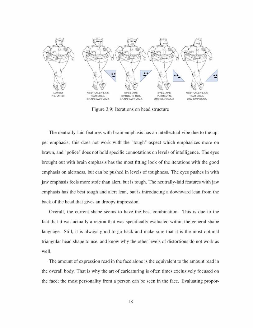
Figure 3.9: Iterations on head structure
The neutrally-laid features with brain emphasis has an intellectual vibe due to the up-
per emphasis; this does not work with the "tough" aspect which emphasizes more on
brawn, and "police" does not hold specific connotations on levels of intelligence. The eyes
brought out with brain emphasis has the most fitting look of the iterations with the good
emphasis on alertness, but can be pushed in levels of toughness. The eyes pushes in with
jaw emphasis feels more stoic than alert, but is tough. The neutrally-laid features with jaw
emphasis has the best tough and alert lean, but is introducing a downward lean from the
back of the head that gives an droopy impression.
Overall, the current shape seems to have the best combination. This is due to the
fact that it was actually a region that was specifically evaluated within the general shape
language. Still, it is always good to go back and make sure that it is the most optimal
triangular head shape to use, and know why the other levels of distortions do not work as
well.
The amount of expression read in the face alone is the equivalent to the amount read in
the overall body. That is why the art of caricaturing is often times exclusively focused on
the face; the most personality from a person can be seen in the face. Evaluating propor-
18

tional biases and their physical limitations of the eye region (See Figure 3.10), the mouth
(See Figure 3.11), and the nose length is addressed first (See Figure 3.11), and then I eval-
uate for the proper facial expression (See Figure 3.12). I will generally not go over the
sizes of facial features because they do not have as significant connotations as proportions,
and when they do, it can often tread into unwanted stereotyping of certain facial features.
Figure 3.10: Iterations on proportions around the eyes
The first dimension for evaluating the eyes is their width distance away from each
other. The limitations to the widest the eyes can get from each other is that they cannot
go past the edges of the front part of the skull. The wideness tends to be associated with
baby-like proportions, which makes characters often seem cuter. The limitations the the
narrowest the eyes can be with each other is that they cannot go past the sides of the
nose; or at most extreme, the nostrils. The narrowness makes the brows come closer
together, which can often give the impression of sternness. For the tough police woman,
emphasizing sternness and more adult-like features is desired. Therefore, narrowing the
19

eye width is the ideal choice for this dimensional change.
The next dimension for evaluating the eyes is the height they and the brows sit on
the face. The limitations the lowest the eye region can go on the face is to the nose
creases. This is again more similar to baby proportions, and therefore inherently adds
a cuteness factor. The limitations the highest the eye region can go on the face is up to the
hairline. Especially with a strong widow’s peak, this can make a character look angrier.
Smaller foreheads also inherently have a more masculine, and therefore older appeal as
well. Again, the tough police woman is supposed to be darker and more adult-like, so
raising the eyes would make sense.
The last dimension for evaluating the eyes is its distance from the brows. The limi-
tations of the lowest the brows can go is the top of the eye. The lowered brows adds a
intensity to the gaze. The limitations of the highest the brows can go it up to the hairline.
Usually this would make the character appear more approachable and soft. The current
iteration does have the brows touching the hairline, but because it is fairly close to the eyes
as well, the usual connotation might not be quite evident. Both iterations work, but the
lowered brow ultimately works better because it has an even more intense glare.
After figuring out the proportions around the eye region, the next step to address in the
proportions around the mouth. The first dimension for evaluating the mouth is the height
it sit on the face. The limitations to the lowest the mouth can go is the top of the chin. This
deemphasizes the jaw and makes the character feel older, but in the more feeble way. The
limitations to the highest the mouth can go is to the bottom of the nose. This emphasizes
the jaw, making the character feel stronger. The tough police woman definitely needs a
strong vibe, so the raised mouth is the desired choice.
The last dimension for evaluating the mouth is the width. The limitations to the widest
the mouth can go is that they cannot go past the edges of the front part of the skull. This
makes the character look like a blabbermouth or a loudmouth, which gives off an immature
20

Figure 3.11: Iterations on proportions around the mouth
vibe. The limitation to the narrowest the mouth can go is that it cannot go past the sides of
the nose; or at most extreme, the nostrils. This makes the character look stoic and quieter,
and even a bit cute. Dependent of the interpretation of a "tough police woman", there can
be an argument for either side. In my view, "police" implies a level of professionalism that
the more narrow mouth supports. Though the description certainly does not imply "cute",
the narrower mouth does additionally gives more space to the jaw which contributes to the
"tough" aspect. Therefore, I would personally go with the narrow mouth for this tough
police woman.
The final dimension to be discussed is the length of the nose (with the mouth staying
the same proportionally relative to the nose). The limitations to the shortest the nose length
can go is the nose tip region cannot go past the bottom of the eyes. This can create a cuter
look because of the baby-like proportions, but in this situation it also emphasizes the jaw,
which can contribute to a strong look. The limitations to the longest the nose length can go
is the top of the chin. This makes the character look older, but also smaller since the jaw
21

is deemphasized and the fact that it resembles the idea of looking in a downward angle at
the character. While "cute" might not be a characteristic that should be emphasized for the
design, the shorter nose still seems to work better because of the strong jaw. Meanwhile,
the longer nose does not really fulfill any connotation desired for the character.
Figure 3.12: Adjusting the final face iteration for final face result
After analyzing through all of the dimensions, it is noticeable that not every section
has an extreme bias that perfectly matches the intended connotation. For instance, al-
though I believe I have chosen the most fitting extremes in the sixth iteration as seen in
Figure 3.12, there are some remnants of the unwanted "cute" elements to the face, partic-
ularly in regards to the nose height and the mouth width. In my adjustments, I lengthened
the nose slightly and widened the nose a bit as well to remove the unwanted qualities. Ulti-
mately, the most important thing to note about these dimensions is the overall connotation
22

of moving a feature from one bias end to the other, and making sure that you do not design
towards the incorrect end (but it is not a necessity to have to go extreme for everything
either if the character is more subtle and complex).
The last section of the face to address is the facial expression.
Figure 3.13: Process of figuring out the facial expression
Figuring the expression is a much more organic process than morphing proportions.
Although my initial emotion-word association with "tough" and "police" was "sternness",
it actually became the least desirable result. To me, it looks too calm and undirected,
whereas the idea of toughness seems to imply "tough" behavior being directed towards
something, especially with the fact that I have also associated the idea of "alertness" with
the character. My favorite reference that I found ended up being the snarl from the "Car
Trader" image shown in Figure 3.13, and it turns out that a combination of indignation and
contempt did the trick. This is an example of how it is important to reference other artistic
depictions as well rather than purely relying on theory and intuition.
23
(adapted from [22]

3.2.3 Staging
Figure 3.14: Problems with unedited staging in silhouette form
The last thing to address in creating a unique personality in the character is the staging.
Johnston and Thomas emphasize that is is crucial to have the staging of the action "so that
it is understood, [and] a personality is recognizable" [5]. They define good staging itself
as "the presentation of any idea so that it is completely and unmistakably clear" [5].
To start figuring out what might be the best way to stage the character, we must first
find out what is a problem with the current staging. It is helpful to look at the silhouette for
this task to see if clarity is presented in its most fundamental form. In the current state of
our design, the line of action is extremely light and subtle, not very fitting for "tough" and
"police". Her planted foot is also weakly placed, which is opposite to the "tough police"
24

image, and even the square shape language that we intended her legs to have. Other factors
that are bringing down the silhouette are the overall non-directional, boring symmetry in
the policewoman’s core shape, as well as her weakly posed hands.
(a) Reprinted from [1]
Figure 3.15: Blair’s demonstration of line of action
Blair describes the line of action as "an imaginary line extending [through] the main
action of the body" [1]. What a successful line of action creates is essentially an ap-
pealing flow throughout the forms of the body. This is a fundamental concept to good
staging as seen in Figure 3.15, but it might be too abstract and simplistic of a descrip-
tion for a complicated process. I have broken down the process into four mini sections
25

as a supplementary explanation to the concept of line of action that starts off with 1) the
weight-carrying line (first part of the line of action, See Figure 3.16), 2) the simple and
complex flow of the forms around the line of action (See Figure 3.17), 3) dimensionality
in form (See Figure 3.19), and 4) head orientation (second part of the line of action, See
Figure 3.20).
Figure 3.16: Four types of the weight-carrying line
The weight-carrying line demonstrated in Figure 3.16 refers to the line that goes from
the leg carrying the most weight (where the foot is planted) and through the spine line. The
logic of using this sort of guideline goes back to the conceptualization of the contrapposto
stance, where artists shifted away from an unrealistic, stiff portrayal of posture to a more
realistic stance supported by understanding weight. There are four types of these lines that
can be created 1) lean-in line, where the line is straight and the body is leaning towards the
direction it faces 2) lean-out line, where the line is straight and the body is leaning away
26

from the direction it faces 3) perky line, where the line is curved with the chest puffed out,
and finally 4) droopy line, where the line is curved with the back turning downward.
The lean-in line appears aggressive and indicate a purposeful direction. This is a po-
tentially good lean for a tough and engaged character like the tough police woman. Mean-
while the lean-out line carries the feeling of jumping back, which implies surprise or dis-
gust. These connotations are not relevant to the tough police woman. The perky line gives
a confident, positive feeling. This could work for the tough police woman, but does not
feel as purposeful as a tough character would. The droopy line can indicate cautiousness,
curiosity, or sadness. These connotation are not relevant to the tough police woman. The
pose I went along with was the lean-in line due to the fact that the aggressive appeal is
very fitting for the "tough" aspect.
A big reason purely just going by the line of action is too simplistic of a description is
because it does not inform an artist how the forms around the lines should be constructed.
Lemay’s "Pick A Side" offers a solution to the issue with the explanation that there should
be a simple side and a complex side, and have the complex side serve as the "point of
interest" [13].
To make this concept more understandable, I divided the silhouette into two halves
using the weight-carrying line as the divider as shown in Figure 3.17. I then identified
which side had the more complex flow; the unedited pose is fairly even, but there is a slight
bias towards the screen right side with the leg that pokes out. Using that logic, I chose the
screen right side as the side with the complex flow. In the redrawing of the silhouette to
emphasize on the respective flows, I made the adjustment to have the screen right arm stick
out in a more aggressive stance, and kept the screen left arm flowing alongside the body. I
had the screen right leg stick out more, but I chose not to have it stick out too much to not
break the inverted triangle core shape. After adjusting the silhouette, I transferred these
proportions to a redraw of the character.
27

(a) Identify the respective simple and complex side
(b) Simplify the simple side, make the more complex size more prominent and readable
Figure 3.17: Using the weight-carrying line to identify the simple-complex sides
I was about to settle with the results from Figure 3.17, until I remembered the last two
crucial concepts. This realization came about when I was given the edit (iteration on the
right) shown in Figure 3.18.
During a critique session demonstrated in Figure 3.18, it was brought to my attention
that the posture in my iteration after the simple-complex edit had a weak stance, like the
character was about to fall over. One of the main points I missed when remaking the
posture was dimensionality.
I did not notice that I actually created the wrong weight-carrying line lean due to the
fact that I was only thinking about it in terms of the 2D space rather than in 3D space.
28

Figure 3.18: Identifying staging error
Additionally, I unconsciously removed some foreshortening elements that were actually
more visible in the silhouette mock up than my final edit; this happened because, again, I
flattened the dimensions so naturally the dimensionality went away as well.
In Figure 3.19’s edit on the right, I adjusted the spine to bring back an aggressive lean,
made the feet follow a three dimensional space, and emphasized on the foreshortened ele-
ments. This edit makes the posture feel more powerful, particularly with the strong swing-
ing legs. The shoulders are also twisted more dramatically opposed to the hip movements,
which creates a more naturalistic feeling in the weight compared to the stiff shoulders of
the previous iteration. However, this was not the only missing element.
The head orientation, shown in Figure 3.20, is the last element, and essentially the final
end of the line of action. The full line of action demonstrated by Blair in Figure 3.15 is
equivalent to what I describe as the weight-carrying line and the head orientation com-
bined. The reason I did not address the two elements together is that I felt it was important
to understand that while the spine and leg can move flexibly, the head merely moves by
rotation. This separation also helps in simplifying the categorization of the connotative
meanings of all the curves and orientations. And lastly, merely just mentioning the line of
29

Figure 3.19: Considering dimensionality
action does not address how to deal with creating the form around it, which is crucial to
appealing staging.
There are three types of orientations of the head; 1) downward lean, 2) straight, and
3) upward lean. The connotations of the orientations are more numerous than those of the
weight-carrying lines because of the separate meanings each different eye gaze conveys in
every head orientation. The four gazes that each head orientation consists of are 1) gaze
ahead, 2) gaze behind, 3) gaze down, and 4) gaze up. For simplicity’s sake, I only evaluate
the tough police woman’s design in terms of the default gaze she has, since it has been
consistently decided for her to be gazing towards something (though I still go over the
connotative meanings for all the other gazes).
The first lean is the downward lean. When the gaze is ahead, it gives a feeling of focus
and engagement. When the gaze is behind, it feels like disgust and judgment. When the
gaze is down, the looks feels angry or sad, depending on the brow intensity. If the character
30

Figure 3.20: Three types of head orientation
is smiling with a downward lean and a downward gaze, which is an unusual combination,
they can look timid and shy. When the gaze is up, the character seems like they are lost in
thought. The tough police woman has a gaze ahead in Figure 3.20, a focused gaze, which
works for what we want. However, there is also an awkward tension created between the
shoulder and head lean that weakens the power in the posture, so it is better to look for a
different head orientation.
The second lean shown in Figure 3.20 is the straight. When the gaze is ahead, the
gaze looks curious. When the gaze is behind, the looks feels cautious. When the gaze is
down, the character looks ashamed or contemplative depending on the overall expression.
When the gaze is up, it looks like an eye roll which indicates disbelief or exasperation.
The tough police woman has a gaze ahead in Figure 3.20, a curious gaze, which is not a
strong enough expression for the "tough" characterization.
The last lean is the upward lean. When the gaze is ahead, the look feels alert. When
they gaze is behind, the character seems fearful and nervous. When the gaze is down,
31

the character appears intimidating or prideful. When the gaze is up, it gives a dazed or
carefree impression. In this case when the head was oriented, it also cause the gaze to
appear downward. The intimidating and prideful look is the most optimal match for the
tough police woman aesthetic. Additionally, the pose feels comfortable and confident,
making it feel strong.
Figure 3.21: Comparison between unedited staging and the edited staging
For staging, I do not deal with the clothes and props unless they influence the silhou-
ette shape significantly. It can be seen in Figure 3.21 that even without the clothes, the
personality of the character comes off more effectively than the original staging with the
clothes.
32

3.3 Emphasizing Visual Appeal
The final step of character designing is knowing what props to emphasize on, and how
exactly to design these props in an appealing manner. When designing the outfit and and
any extra props associated with the character, it’s important that every detail included in is
symbolic for an element that supports the intent of the design. Although the methodology
initially starts with a real world reference, designing the outfit by the real world reference
is not helpful because the realistic details can detract from the overall style and the appeal,
and because of the visual plasticity in how human process imagery [11], the real world ref-
erence is often less recognizable than a symbolic or simplified representation of the outfit.
However, it is useful to use the real world reference as a starting point of understanding
what aspects of the outfit can be removed or simplified in order to create an appealing
outfit.
Figure 3.22: Omitting props and simplifying the outfit
On the far right of Figure 3.22 is the final simplified outfit. I took out all of the belt
details because a lot of the shapes were fairly hard to read and not necessary for defining
33

the character as a police officer. I simplified the belt into a black belt with a light buckle
because I believe the darkness is the overall most noticeable thing about the police belt,
and the buckle is light to make the belt easily identifiable as a belt. Similarly, I felt dark
shoes would also be more readable than the detailed shoes. For the top, I felt the button-
down shirt with shoulder marks and a police badge were the only necessary elements. I
further simplified the police badge since the sheriff’s badge is particularly recognized for
the star shape rather than the shape of the circular rim.
In the middle of Figure 3.22, I demonstrated why the far right result is the most sim-
plified the outfit can get. The outfit without the shoulder marks makes the outfit read
ambiguously; it could merely look like an office worker with a star badge. The outfit with-
out the badge is also fairly ambiguous, and even if it were recognizable as police, it is not
as commanding as the outfit with a badge to actually indicate status. Finally, the outfit that
does not indicate the dark tones is much harder to immediately read as police as opposed
to the toned design.
Figure 3.23: Emphasis with baton
34
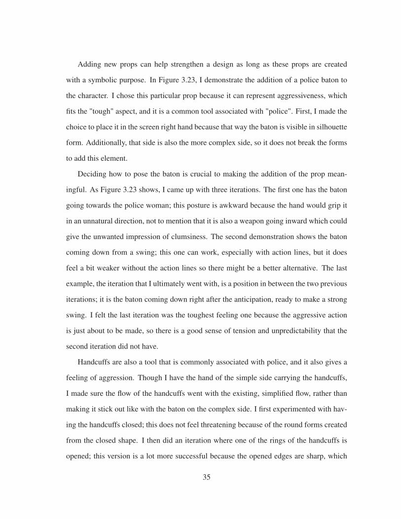
Adding new props can help strengthen a design as long as these props are created
with a symbolic purpose. In Figure 3.23, I demonstrate the addition of a police baton to
the character. I chose this particular prop because it can represent aggressiveness, which
fits the "tough" aspect, and it is a common tool associated with "police". First, I made the
choice to place it in the screen right hand because that way the baton is visible in silhouette
form. Additionally, that side is also the more complex side, so it does not break the forms
to add this element.
Deciding how to pose the baton is crucial to making the addition of the prop mean-
ingful. As Figure 3.23 shows, I came up with three iterations. The first one has the baton
going towards the police woman; this posture is awkward because the hand would grip it
in an unnatural direction, not to mention that it is also a weapon going inward which could
give the unwanted impression of clumsiness. The second demonstration shows the baton
coming down from a swing; this one can work, especially with action lines, but it does
feel a bit weaker without the action lines so there might be a better alternative. The last
example, the iteration that I ultimately went with, is a position in between the two previous
iterations; it is the baton coming down right after the anticipation, ready to make a strong
swing. I felt the last iteration was the toughest feeling one because the aggressive action
is just about to be made, so there is a good sense of tension and unpredictability that the
second iteration did not have.
Handcuffs are also a tool that is commonly associated with police, and it also gives a
feeling of aggression. Though I have the hand of the simple side carrying the handcuffs,
I made sure the flow of the handcuffs went with the existing, simplified flow, rather than
making it stick out like with the baton on the complex side. I first experimented with hav-
ing the handcuffs closed; this does not feel threatening because of the round forms created
from the closed shape. I then did an iteration where one of the rings of the handcuffs is
opened; this version is a lot more successful because the opened edges are sharp, which
35

Figure 3.24: Emphasis with handcuff and police hat
create an imposing presence. The opened cuffs also give an impression of active pursuit,
which adds to the aggressive, tough feeling.
On the last iteration in Figure 3.24, I added a police hat to amplify the police vibe.
When considering with props like the police hat, be wary that they can vary in appearance
dependent on the country, so make sure there are other more universally applicable design
elements to support the intended character. In this case, the uniform and the baton give a
fairly good indication of the police role, so the hat does just serve as an embellishment. In
regards to the placement of the hat, I made sure it did not cover the eyes since the intense
gaze is fairly important in emphasizing on the "tough" personality.
To add onto tough characteristic, I chose cigars as the next prop to add. It is important
to make sure the placement and orientation of the cigar allows the cigar’s silhouette to
read clearly, while at the same time not take away the head silhouette shape. Figure 3.25
shows a breakdown two different placements of the cigar, with two types of orientation
demonstrated for both placements.
The iterations on the left show the cigar placed screen left where the teeth are more
bared. Already it is evident that the cigar does not read clearly in the silhouette, which
36

Figure 3.25: Emphasis with cigar
is not desired. On top of that, having the cigar be placed within the face muddles the
visibility of facial features. The only benefit to this placement is that the trail of smoke,
which should follow the flow of the simple side, is fully visible and can be artistically
adjusted flexibly.
The iterations on the right show the cigar placed screen right where the lips are closing
in on the clench. The cigar silhouette is only visible in the version where it is held up,
which makes it the most promising candidate. That version is also good because having
the cigar held up indicates a strong grip, something that should be seen in a tough char-
acter. The only real problem with the held up cigar screen right is that the smoke trail
volume needs to be compromised for the silhouette of the head to be visible. The smoke
trail cannot trail off the other direction because the body is moving in a specific direction
(screen left to right) which only allows the smoke trail to move from screen right to left.
Ultimately, the cigar carries the heavier symbolic meaning than the smoke trail, so it is
fine to compromise for this instance.
Figure 3.26 shows last prop I added to the character: sunglasses, which I feels en-
compasses both "tough" and "police" characteristics. I went with the rounded type of
37

Figure 3.26: Emphasis with sunglasses
sunglasses that are commonly worn by actual police; one problem that arose from this
is that the sunglasses completely hid the eyes, which I had previously made a deliberate
effort not to obscure since the eyes served an important role in defining the personality.
To remedy this problem, I tilted to sunglasses downward so the eyes and gaze would be
clearly visible. Another solution I could have opted for was to just have the eyes show
through the sunglasses since the lenses of the sunglasses are semi-transparent. I did not
go for this for a couple of reasons; the first reason is that in the end, having the features
in dark tone would still lessen the visibility of the eyes. The second reason is that the
sharper corners of the sunglasses in perspective emphasize much more on toughness than
the round corners the sunglasses have in a flattened view. It is worth noting that a benefit
of the round sunglasses is that it would be more recognizable, but I felt that the sunglasses
in perspective would still be recognizable enough, and the sunglasses in perspective had
much more overall benefits.
Lastly, it is not necessary to add a lot extra props to every design; the tough police
woman probably could be easily recognizable as such without a couple of the props for
38

extra emphasis. However for demonstration purposes, this example gives a good idea on
how to deal with a varying types of props.
3.4 Results
The following Figure 3.27 demonstrates the breakdown template for the archetypes
created using this methodology, drawing analysis points from real world references and
analysis like the discussed points throughout the methodology.
39

Figure 3.27: Archetype Breakdown Template
40

4. PSYCHOLOGY PERSONALITIES AND THEIR BREAKDOWNS
The previous chapter addressed how to use the methodology using one example, but
more samples from the methodology are necessary to cover more specific design issues.
The following chapters provides visual examples and breakdowns of a variety of personali-
ties and archetypes that further expand on the design concepts laid out in the methodology.
The first step to addressing common archetypes is first knowing how to describe their
mental and motivational personality. In this section, I purely cover how to describe per-
sonalities alone.
4.1 Dark Personalities
This category addresses what I believe to be the missing piece in Preston Blair’s anima-
tion archetypal categories: the villains archetype. Of course just looking purely at exam-
ples of animated villains, it is evident that there is more than one defined villain archetype.
Using figures with strong ideologies, I describe different types of villains based on the
psychology’s Dark Tetrad personalities [15].
41

Figure 4.1: Sadist Scientist Breakdown
42

Figure 4.2: Psycho Priest Breakdown
43

Figure 4.3: Machiavellian Magician Breakdown
44

Figure 4.4: Narcissist Alchemist Breakdown
45

4.2 Extrovert-Introvert Personalities
Evaluating extroverted and introverted personalities involves a more methodically an-
alyzable process than all other archetypes. Extroverts are clearly characterized by more
open and dramatic body motion and posture while introverts are clearly characterized by
more subtle, shy, and closed-in postures. The dimensions within the extrovert and introvert
categories are mainly characterized through their eye-gaze to indicate the specific mental-
ity of the personality dimensions. Using musicians in a jazz band, I explain the different
dimensions of extroverted and introverted personalities [17].
46

Figure 4.5: Judge-by-Thinking Jazzy Introvert Reevaluation + Final Breakdown
47

Figure 4.6: Judge-by-Thinking Jazzy Extrovert Reevaluation + Final Breakdown
48

Figure 4.7: Judge-by-Feeling Jazzy Introvert Breakdown
49

Figure 4.8: Judge-by-Feeling Jazzy Extrovert Reevaluation + Final Breakdown
50

Figure 4.9: Perceive-by-Observation Jazzy Introvert Breakdown
51

Figure 4.10: Perceive-by-Observation Jazzy Extrovert Reevaluation + Final Breakdown
52

Figure 4.11: Perceive-by-Intuition Jazzy Introvert Reevaluation + Final Breakdown
53

4.3 Big Five Personalities
For designing more specifically about the motivation of a character rather than just their
mentality, it is good to reference the well-known Big Five Personalities [16]. Extroversion,
though it is one personality of the five, is not addressed in this section since it has already
been covered in detail in the previous section. The two dimensions of one personality
are given the same theme for the clear comparison of the personality dimensions, though
each personality has a different theme from other personalities to showcase flexibility in
describing through the Big Five personalities.
54

4.4 Results
Even without going into character roles, it is evident that strong characters can be
formed purely through personality. With this solid base, a more rich and fleshed-out char-
acterization can be formed when moving on to designing for literary archetypes.
55

Figure 4.12: Perceive-by-Intuition Jazzy Extrovert Reevaluation + Final Breakdown
56

Figure 4.13: More Agreeable Archer Breakdown
57

Figure 4.14: Less Agreeable Archer Breakdown
58

Figure 4.15: More Conscientious Cowboy Breakdown
59

Figure 4.16: Less Conscientious Cowgirl Breakdown
60

Figure 4.17: More Neurotic Nerd Breakdown
61

Figure 4.18: Less Neurotic Nerd Breakdown
62

Figure 4.19: More Open Office Worker Breakdown
63

Figure 4.20: Less Open Office Worker Breakdown
64

5. LITERARY ARCHETYPES AND THEIR BREAKDOWNS
In addition to having a strong personality, a fully-fleshed character should also have
a well-defined role. This is how reoccurring and iconic archetypes came to be formed in
classic literature [19, 18], and continue to be found in modern storytelling. The specific
design issues I address are 1) making culturally-specific designs widely readable, 2) de-
signing action and movement in a deliberate manner, and 3) describing weight properly
for characters that do not stand on the ground.
5.1 Cultural-Specificity with Clarity
Stories can take place in diverse settings, even environments that can be completely
foreign to most, but using well-known archetypes ground characters from these stories to
familiar territories for wide audiences. Balancing the interesting elements of culturally-
specific design while aiming to make the character archetype still more or less universally
understood is the ideal result for creating a unique character. I use a medieval Chinese
backdrop as a culturally-specific element to ten literary archetypes to explain how to main-
tain the balance.
65

Figure 5.1: Medieval Chinese Prince Breakdown
66

Figure 5.2: Medieval Chinese Blabbermouth/Gossiper Reevaluation + Final Breakdown
67
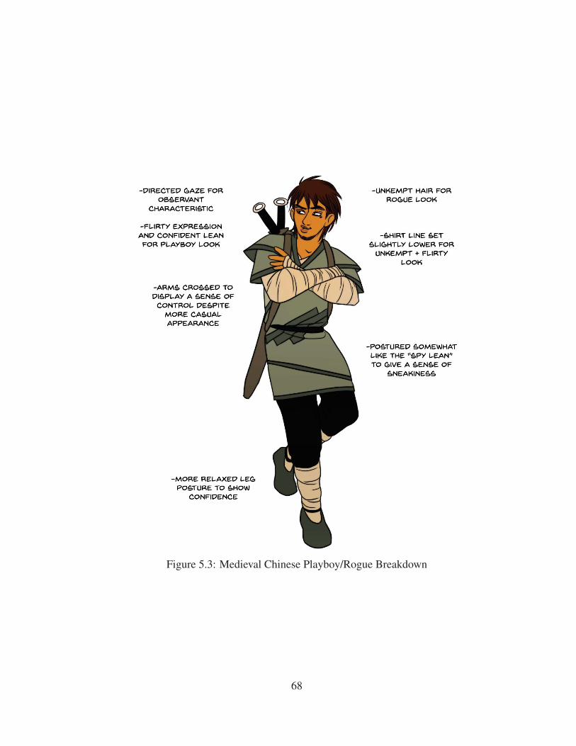
Figure 5.3: Medieval Chinese Playboy/Rogue Breakdown
68

Figure 5.4: Medieval Chinese Adventurer/Daredevil/Explorer Reevaluation + Final Break-
down
69

Figure 5.5: Medieval Chinese Conqueror/Warrior Reevaluation + Final Breakdown
70
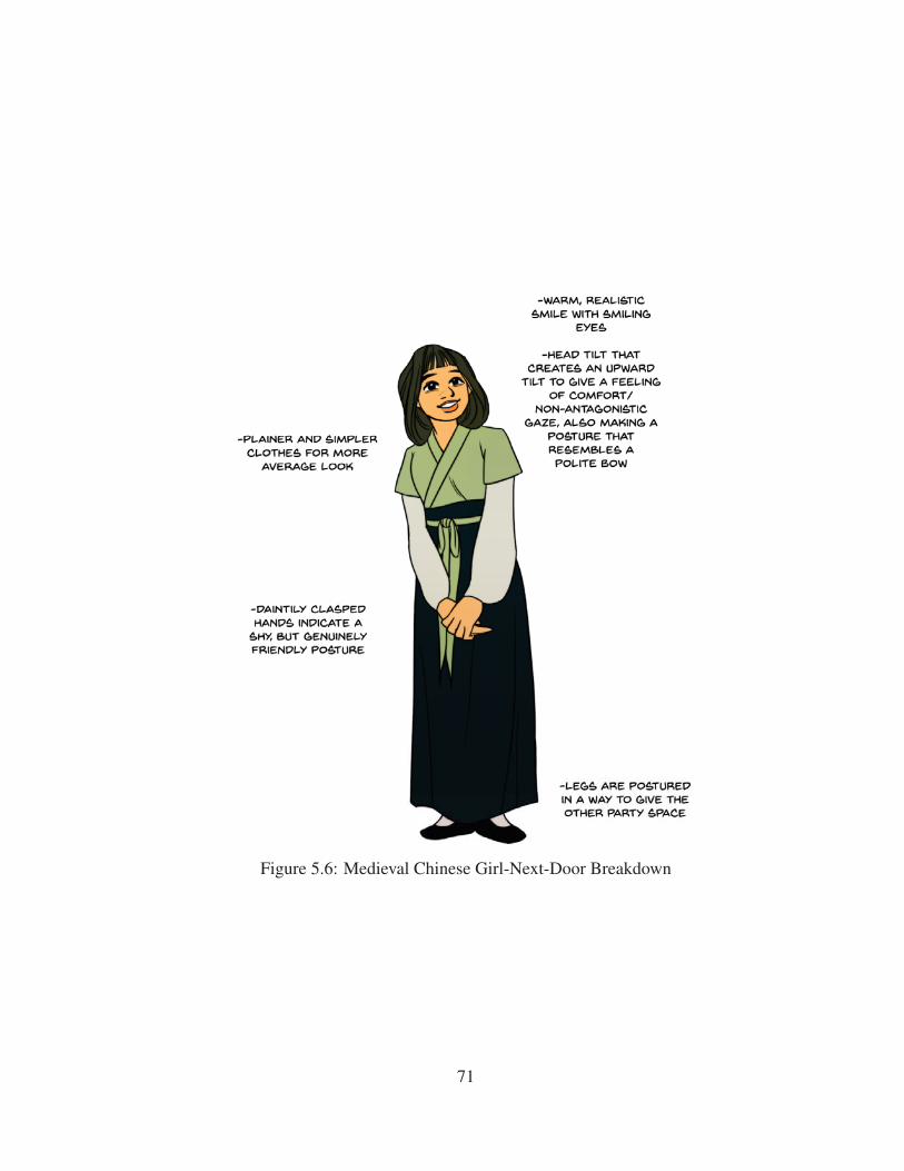
Figure 5.6: Medieval Chinese Girl-Next-Door Breakdown
71

Figure 5.7: Medieval Chinese Cold/Princess/Snob Reevaluation + Final Breakdown
72

Figure 5.8: Medieval Chinese Lost Soul/Outcast/Wanderer Reevaluation + Final Break-
down
73

Figure 5.9: Medieval Chinese Boss Breakdown
74
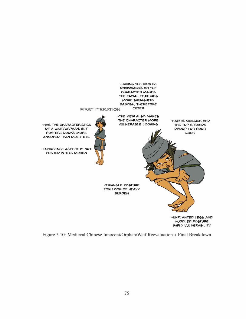
Figure 5.10: Medieval Chinese Innocent/Orphan/Waif Reevaluation + Final Breakdown
75

5.2 Action-Focused Designing
When selling the action of a character, it is crucial to have the action be immediately
readable and also maintain consistency in the personality described throughout the rest of
the design choices. Using eight literary archetypes performing skating and driving sports,
I explain how to analyze through a variety of motions that are both readable and describe
a personality.
76

Figure 5.11: Ice Skating Dark Lady/Seductress/Siren Breakdown
77

Figure 5.12: Roller Blading Comedian/Darling/Free-Spirit Breakdown
78

Figure 5.13: Skateboarding Spunky Kid Breakdown
79

Figure 5.14: Skateboarding Bad Boy/Outlaw/Rebel Breakdown
80

Figure 5.15: Roller Blading Best Friend/Confidant/Mr. Nice Guy Breakdown
81

Figure 5.16: Ice Skating Crusader/Rescuer/Zealot Breakdown
82

Figure 5.17: Racecar Driver Ice Breakdown
83

Figure 5.18: Racecar Driver Fire Breakdown
84

5.3 Off-the-Ground Posturing
In my methodology as well much of the archetypes I have explored thus far, using
the planted foot and a standing line of action has been an important part to indicating
personality. However, there is definitely times where a character is posed off the ground,
and it is important to still emphasize on the same feeling of weight despite no clear or even
present planted foot to carry the line of action. Using six literary archetypes performing
riding activities, I explain how to deal with the posturing of characters who sit off the
ground.
85

Figure 5.19: Motorcyclist Caregiver/Nurturer/Wise Woman Breakdown
86

Figure 5.20: Motorcyclist Leader Breakdown
87

Figure 5.21: Bicyclist Working Girl Breakdown
88
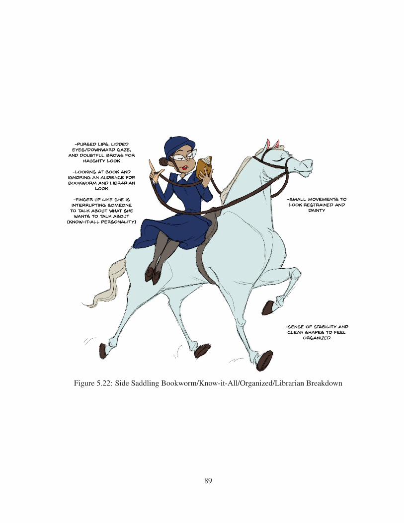
Figure 5.22: Side Saddling Bookworm/Know-it-All/Organized/Librarian Breakdown
89

Figure 5.23: Jockey Avenger/Knight Breakdown
90
5.4 Results
The resulting proofs provide an additional resource to addressing more specific design
problems. Addressing these design problems through making sure they support the clear
description of archetypes also provides a template to addressing any other specific de-
sign problems. Ultimately, strong and recognizable character designs rise from thorough
analysis, comparisons, and iterations.
91

Figure 5.24: Bicyclist Absent-Minded/Professor Breakdown
92

6. CONCLUSION AND FUTURE WORK
6.1 Conclusion
Having a standardized methodology allows for better accessibility and greater under-
standing of the core elements in character designing. It allows artists to explain their design
choices in a more explicit manner to a professional audience. This resulting proofs of the
methodology also provide solid starting points to reference for a variety of personalities
and archetypes.
6.2 Further Study
While the current stage of the research provides a solid foundation of a standard to
character designing, more detailed research needs to be explored in every section of the
methodology. The methodology provides a good generalized explanation of why various
design choices work, but elements like proportioning of specific features, aesthetic flow,
and form can definitely be expanded on. Expanding beyond humanoid characters and
adding personality and appeal to other creature designs or even prop and environment
design is worthy of its own field.
Gender perception is also a big topic that was largely avoided in this paper. My
methodology was designed under the assumption that gendered elements are a non-factor
to creating a strong design; however, it is clear that many major media studios actually
do account gender in designs, and having a discussion on the psychological reasoning to
make gender an important factor in designing is an important discussion in regards to the
relationship between media and societal norms.
Furthermore, it is also be more useful to have a larger group of professional design-
ers to contribute to the research ideas as well. Hopefully providing a solid foundation
encourages further academic research on the subject of character designing.
93

REFERENCES
[1] P. Blair, Cartoon Animation. Lake Forest, California, USA: Walter Foster, 1994.
[2] B. Eggleston, “Shape language 1: Intro and round shapes
www.youtube.com/watch?v=fbtoo6zfj3o,” 2015.
[3] H. Ekström, How Can a Character’s Personality be Conveyed Visually, through
Shape. Karlstad, Sweden: Karlstad University, 2013.
[4] B. Robertson, The Shape of Animation. Glendale, California, USA: Computer Graph-
ics World, Jul 2009.
[5] F. Thomas, O. Johnston, and F. Thomas, The Illusion of Life: Disney Animation.
Hyperion New York, 1995.
[6] E. Akleman, “Making caricatures with morphing,” in ACM SIGGRAPH 97 Visual
Proceedings: The art and interdisciplinary programs of SIGGRAPH’97, (Los Ange-
les, California, USA), p. 145, ACM, 1997.
[7] I. Biederman, “Recognition-by-components: A theory of human image understand-
ing.,” Psychological Review, vol. 94, no. 2, p. 115, 1987.
[8] P. Ekman and H. Oster, “Facial expressions of emotion,” Annual Review of Psychol-
ogy, vol. 30, no. 1, pp. 527–554, 1979.
[9] S. E. Moriarty, “The symbiotics of semiotics and visual communication,” Journal of
Visual Literacy, vol. 22, no. 1, pp. 19–28, 2002.
[10] A. Srivastava and E. P. Klassen, Functional and Shape Data Analysis. Salmon Tower
Building, New York City, USA: Springer, 2016.
94

[11] M. A. Webster and D. I. MacLeod, “Visual adaptation and face perception,” Philo-
sophical Transactions of the Royal Society of London B: Biological Sciences,
vol. 366, no. 1571, pp. 1702–1725, 2011.
[12] B. Eggleston, “Shape language part 2: Square and triangular shapes
www.youtube.com/watch?v=wr1dktfahko,” 2015.
[13] Lemay and N. Sastrawinata-Lemay, Griselda, “Tuesday tips - "pick a side"
www.grizandnorm.tumblr.com/post/102392699363/tuesday-tips-pick-a-side-to-
create-appeal-and,” 2014.
[14] S. McCloud, Understanding Comics: The Invisible Art. William Morrow Paper-
backs, 1993.
[15] J. Mededovic and B. Petrovic, “The dark tetrad,” Journal of Individual Differences,
vol. 36, no. 4, pp. 1 – 5, 2015.
[16] O. P. John and S. Srivastava, “The big five trait taxonomy: History, measurement,
and theoretical perspectives,” Handbook of Personality: Theory and Research, vol. 2,
no. 1999, pp. 102–138, 1999.
[17] C. G. Jung, The Archetypes and the Collective Unconscious. Routledge, 2014.
[18] V. Schmidt, 45 Master Characters. Writer’s Digest Books, 2007.
[19] T. D. Cowden, C. LaFever, and S. Viders, The Complete Writer’s Guide to Heroes
Heroines: Sixteen Master Archetypes. Archetype Press, 2013.
[20] Lemay and N. Sastrawinata-Lemay, Griselda, “Tuesday tips - "straight against
curves" www.grizandnorm.tumblr.com/post/89782784953/tuesday-tips-straight-
against-curves-this,” 2014.
[21] D. Hayward, S. Bridger, and J. Churchill, Flynet Pictures. Flynet Pictures, Aug 2011.
[22] R. Cohen, The Fast and the Furious. Universal Pictures, 2001.
95