Alter Ego #78 Trial Cover - TwoMorrows Publishing, …twomorrows.com/media/InfantinoPreview.pdf ·...
25
CARMINE Penciler ● Publisher ● Provacateur by Jim Amash with Eric Nolen-Weathington $ 26. 95 in the US Softcover ISBN 978-1-60549-025-0 ISBN-13: 978-1-60549-025-0 ISBN-10: 1-60549-025-3 9 7 8 1 6 0 5 4 9 0 2 5 0 5 2 6 9 5 Carmine Infantino is the artistic and publishing visionary whose mark on the comic book industry pushed conventional boundaries. As a penciler and cover artist, he was a major force in defining the Silver Age of comics, co-creating the modern Flash and revitalizing the Batman franchise. As editorial director, publisher, and president he steered DC Comics through one of the most creative and fertile periods in their long history. Presented here is the life and career of Carmine Infantino, in his most candid and thorough interview ever, along with the amazing images that made him a legend. All characters featured on cover are ™ and © DC Comics. All rights reserved. by Jim Amash with Eric Nolen-Weathington by Jim Amash with Eric Nolen-Weathington Penciler ● Publisher ● Provocateur Penciler ● Publisher ● Provocateur CARMINE CARMINE
-
Upload
vuonghuong -
Category
Documents
-
view
213 -
download
0
Transcript of Alter Ego #78 Trial Cover - TwoMorrows Publishing, …twomorrows.com/media/InfantinoPreview.pdf ·...

CARMIN
EPenciler
�Publisher
�Provacateur
byJim
Amash
with
EricN
olen-Weathington
$26.95 in the US
Softcover ISBN 978-1-60549-025-0
ISBN-13: 978-1-60549-025-0ISBN-10: 1-60549-025-3
9 781605 490250
52695
Carmine Infantino is the artistic andpublishing visionary whose mark onthe comic book industry pushedconventional boundaries. As a pencilerand cover artist, he was a major forcein defining the Silver Age of comics,co-creating the modern Flash andrevitalizing the Batman franchise. Aseditorial director, publisher, andpresident he steered DC Comicsthrough one of the most creative andfertile periods in their long history.Presented here is the life and career ofCarmine Infantino, in his most candidand thorough interview ever, alongwith the amazing images that madehim a legend.
All characters featured on cover are™ and © DC Comics. All rights reserved.
by Jim Amash with Eric Nolen-Weathingtonby Jim Amash with Eric Nolen-Weathington
Penciler � Publisher � ProvocateurPenciler � Publisher � Provocateur
CARMINECARMINE

Penciler � Publisher � Provocateur
Carmine

CARMINE INFANTINOPENCILER � PUBL ISHER � PROVOC ATEUR
Interviews • Jim AmashTranscription • Brian K. Morris
Editing • Jim Amash and Eric Nolen-WeathingtonPublication Design • Eric Nolen-Weathington
Cover Pencils • Carmine InfantinoCover Inks • Terry AustinCover Color • Tom ZiukoIntroduction • Roy Thomas
Published by
www.twomorrows.com • e-mail: [email protected]
No part of this book may be reproduced in any form without written permission from the publisher.
First Printing • August 2010All rights reservedPrinted in Canada
Softcover ISBN: 978-1-60549-025-0Hardcover ISBN: 978-1-60549-026-7
Trademarks & CopyrightsAll illustrations contained herein are copyrighted by their respective copyright holders and are reproduced for historical reference and research purposes.
All characters featured on cover are ™ and © DC Comics. All rights reserved.DC Comics does not endorse or confirm the accuracy, or the views expressed in, this book.Editorial package ©2010 Jim Amash, Eric Nolen-Weathington, and TwoMorrows Publishing.
DedicationTo my wife, Heidi, and to Keif Simon and Terry Austin. — Jim
Special ThanksThis book would not have been possible without the help and cooperation of the following people,
and we give them our most sincere thanks:
Heritage Auctions (www.ha.com)
and:Alter Ego, David Armstrong,Terry Austin, Bob Bailey, Mike W. Barr, The Batcave Companion, Rod Beck,Tom Bradley,
Michael Browning, Mike Costa, Irwin Donenfeld, Mike Dunne, Foundation’s Edge, Frank Giella, Joe Giella,Tony Gleeson,Arnie Grieves, Jeff Harnett, The Jack Kirby Collector, Mike Jackson,Alex Johnson, Nick Katradis, Joe Kubert, Gary Land,
Emmanuel Lapuente, Rob Ledford, Jim Ludwig, Dr. Jeff McLaughlin, Joe and Nadia Mannarino, Peter Meskin, Jim Murtaugh,Ken Quattro, Pat Sekowsky, Jim Simon, Joe Simon, Keif Simon, Mark Sinnott,Anthony Snyder (www.anthonysnyder.com),
Roy Thomas, Jim Vadeboncoeur Jr., Dr. Michael “Doc V.” Vassallo, Hames Ware, Bob Wiacek
TwoMorrows Publishing10407 Bedfordtown Dr.Raleigh, North Carolina 27614

Table of ContentsIntroduction by Roy Thomas. . . . . . . . . . . . . . . . . . . . . . . . . . . 4
Chapter One: Education Comes First . . . . . . . . . . . . . . . . . . . . . . 6
Chapter Two: Making the Rounds. . . . . . . . . . . . . . . . . . . . . . . 13
Chapter Three: Settling in with DC . . . . . . . . . . . . . . . . . . . . . 25
Chapter Four: Lightning Strikes Again . . . . . . . . . . . . . . . . . . . . 58
Chapter Five: Life Ain’t Easy at the Top . . . . . . . . . . . . . . . . . . . 103
Chapter Six: Back to the Drawing Board. . . . . . . . . . . . . . . . . . . 132
Art Gallery . . . . . . . . . . . . . . . . . . . . . . . . . . . . . . . . . . . 157
FLASH, REVERSE-FLASH ™ AND © DC COMICS.

JA: How did you find out that there was going to be anew Flash?CI: One day I was delivering a job, and Juliesays, “Carmine, we’re going start doing super-heroes again.” I said, “Aw, no!” I didn’t want to dothem. I figured it’s old hat all over again. And hesaid to me, “No, no, you don’t understand. We’regoing to do the Flash, but we’re going to do anew version of the Flash.” Bob Kanigher sat in onthat meeting, and said the same thing: it was tobe different, exciting, blah, blah, blah. Julie said,“We’re changing everything about him. I’d liketo see some sketches from you for the Flash.”
Later, Kanigher was over at my apartment
and saw the Flash sketches I had done. He likedthem. My Flash costume was designed toemphasize the fact that he was a runner. The oldcostume didn’t really do that; it wasn’t as skin-tight as mine. I added the lightning accents tothe costume for identification and because Iknew I could do something with them when Idrew the Flash running.
JA: How often did Kanigher come to your house?CI: Oh, quite a bit. He used to stop by everycouple of weeks. He’d stop in, we’d talk, kidaround. I lived about six, seven blocks away fromDC. He loved to talk. When he wasn’t in theoffice, he was a different guy. He could be fun.We never talked business though, isn’t that strange?
JA: Had a script been written when you had this meetingwith Julie and Kanigher?CI: I don’t believe so, not yet. Julie said, “Whenyou come in next week, Bob said we’ll have ascript ready.” And Julie added, “Bring somesketches in for covers.” I said okay, but by thetime I’d come in, Bob has his own cover sketch,and that’s the one they took.
JA: Kanigher gave you the idea for the film strip cover[Showcase #4].CI: Yeah, it was his idea. I did three different roughversions of that cover, but they were all variationsof the same idea. One of them was of the Flashrunning towards the reader, breaking through apage. Another had Barry Allen in the background,with the costume coming out of the ring. Andthe third had the film strip, which, of course, weused. But it was really Kanigher’s basic idea, and
58
(below) Meet the Flash!An all-new Flash spedonto the scene in thepages of Showcase #4.This opening splash pagewas a play on one ofCarmine’s cover sketchesfor the book, andshowed off a sleek, newspeedster.FLASH ™ AND © DC COMICS.
Lightning Strikes AgainCH
APTER4

59
that’s the one that Julie wanted. It was a goodidea, and as it turned out it’s a classic cover.
JA: Do you think Julie picked you to be the artist becauseyou were his “number one” artist or were you picked becauseyou had been the last artist to draw the Golden Age Flash?CI: I don’t know. I never thought about havingbeen the last Flash artist or whether or not thatinfluenced Julie’s decision to have me draw thenew Flash.
JA: Julie also chose the last “Hawkman” artist — JoeKubert — to do the new “Hawkman” series. He couldn’tuse the last “Green Lantern” artists — Alex Toth andIrwin Hasen — to revive that character, because they wereno longer working for DC.CI: That’s right. I’m sure all of that entered intoJulie’s thinking. And he put Mike Sekowsky onthe Justice League because most of the original“JSA” artists were either not at DC or too busyon other books. I’m glad I didn’t have to drawthe Justice League. That was a busy book! I wasbusy enough with Julie’s other titles.
JA: When you’re going to draw the new Flash, becauseyou had been the artist of the old Flash, you’re not the sameperson, you’re not the same artist any more.CI: I didn’t feel that way in the way you phrasedit. I didn’t even think of it that way. I don’t thinkthey did either... I don’t know.
JA: But you knew that you were different, that your workwas changing.CI: I knew that I was different.
JA: When you were thinking about, “How am I going todraw him running?” thinking about what Mort Meskin didwith “Johnny Quick,” thinking about what you had doneon the Golden Age “Flash”... what were your thoughts?CI: My immediate thought is, “Think animationhere, think animation.” That was my basicthought. How could I get more movement? Ididn’t want it to look like the old Flash, andneither did anyone else. That was the key, andmy basic aim was “get movement here.” If we
didn’t accomplish that, we weren’t going toaccomplish anything. There wasn’t much realmovement in the old Flash. He was a littlestupid-looking with that hat.
JA: So what did you do to create more movement?CI: Well, I used multiple figures. I tilted theFlash’s body when he ran. Don’t forget, when a
(above) This panel fromthe final page of Showcase#8 was the first instanceof Carmine using multipleimages of the new Flashto depict his speed.(left) Wide horizontalpanels helped Carminegive the Flash a sense ofmovement.COURTESY OF HERITAGEAUCTIONS (WWW.HA.COM).
FLASH ™ AND © DC COMICS.
(above) Barry Allendiscovers he has super-speed when a falling plateof food seemingly freezesin mid-air before his eyes.From Showcase #4.Written by Bob Kanigher,with inks by Joe Kubert.FLASH ™ AND © DC COMICS.

figure’s running, the head and torso lean forward.The body takes almost an elbow-shaped angle.I drew the last figure first and the first figure last.That created more motion, but I didn’t explain alot of this to Bob or Julie— I just did it. They likedit, but they didn’t know why they liked it. It wasa lot of work to draw it that way, but it worked!
JA: What was your initial impression when you read thefirst script?CI: I loved the part with the costume in the ringand the part in therestaurant where thewaitress spills thesoup. That was allBob’s thinking, and,again, he was creatingas much motion as hecould in the scripts.Every story element heused was promotingmotion. He was very
sharp that way. I give him a lot of credit. He andI thought in the same direction. Of course, Ibrought it in, he said, “That’s it. I love it.” Hedidn’t talk that way, ever. Praise for others wasnot common for him, but it made me feel goodthis time.
For some reason, Julie took Kanigher off thebook after that lead story. Something happenedthere that I wasn’t privy to, but when I went in toget the next story, I saw that John Broome hadwritten it. I looked at Bob; he looked at me and
shook his head.
JA: Actually, Kanigherwrote one story in eachShowcase, and Broomewrote the other. Kanigherdidn’t write The Flashwhen it first became a series,though he came back yearslater.CI: Okay. But no mat-ter what, Bob did notlike losing the series orsharing responsibilityfor writing the stories.This I know absolutely!And you can’t blamehim, because he did thehard work of recreatingthe Flash, and then, allof a sudden, there’sJohn Broome writingwhat Kanigher felt was
his series. Well, Julie and Bob didn’t like eachother, I think.
JA: There’s no question they disliked each other. But yearslater, Kanigher did write some Flash again. I know thatKanigher wrote a story [#161] in the mid-’60s. Julie hada story idea about the Flash giving up his costume, and hehad Gardner Fox and Kanigher each write a story basedon that idea.CI: I created the cover for that idea, and theyhad to invent stories around that, right?
JA: Right. And in the letters page on one issue, Julie saidthat Kanigher was the originator of the Flash.CI: Really? I’m surprised by that.
JA: Around ’69 or ’70, John Broome retired from comics,and Kanigher wrote some Flash stories again, includingthe 200th issue. In issue #201, Kanigher wrote a new“Golden Age Flash” back-up that Murphy Andersonpenciled and inked.
60
(right and below) Thecover of The Flash #159,inspired not one, but twostories — one in thatissue written by GardnerFox, and another in issue#161 (issue #160 was anall-reprint issue) writtenby Bob Kanigher. Coverinks by MurphyAnderson and interiorinks by Joe Giella.COURTESY OF HERITAGEAUCTIONS (WWW.HA.COM).
FLASH ™ AND © DC COMICS.

62
This is what Julie told me: Irv Novick lived a block orso away from Kanigher, and sometimes Novick woulddrive over to Kanigher’s house and give him the pages. ThenKanigher would bring them in to Julie. So one day there’reno pages. Julie went to Kanigher and asked, “Where areNovick’s pages? They’re supposed to be in today.”Kanigher coldly said to Julie, “Novick is your problem.”That was the last straw for Julie.CI: I never heard that story. What book wasNovick doing?
JA: He drew The Flash for a long time, but he also drewBatman for Julie.CI: His Batman work was terrific. You couldn’tget much work out of him. He was very slow. Heused to do a lot of advertising in between comicsstories. That’s why he couldn’t get the work doneon time.
JA: Of all the Flash writers...CI: Bob and John were the best. Gardner wrotepretty nicely, but Julie rewrote his stuff so muchit was like Julie wrote it himself. It was reallyoverdone, I thought.
JA: What do you feel that Gardner Fox’s stories lackedthat John Broome’s had?CI: Warmth. John was much more creative, slow.But Gardner was very academic.
JA: Contrast an Eddie Herron script with a John Broomescript.CI: They were very different. John’s stories weremore light-hearted. Eddie was not light-hearted.It was good, hard, solid stuff, but he could befunny, too. They both wrote detailed scripts.
JA: You didn’t like having scenes described in that much detail.CI: No, I didn’t pay attention to them anyway.[laughs]
JA: It took a while for the Flash to get his own book.CI: Well, what happened is they put out four issuesin Showcase. When the first sales figures came inon “The Flash,” they couldn’t believe them becausethey were so high. Then the second one came in,and they were even higher, and the third andfourth were higher still. They knew they had a hit.
JA: Do you have any idea why they started the number-ing at 105? It was a continuation of Flash Comics’numbering from the 1940s.CI: Is that what it was? Maybe they had a thingabout starting with issue #1? They probablywanted the distributors and the fans to think thisbook had a history. People don’t always want totry new stuff. These were conservative times.That’s my guess.
JA: How did you feel when you found out that TheFlash was going to be a regular series?CI: Well, they didn’t tell you very much, youknow. I came into the office one day and Juliesaid, “The Flash is going to be a regular series.” Hesaid nothing else. I didn’t have any feeling oneway or another. It was work, and, after SenatorKefauver and Doctor Wertham’s witch hunts,that’s all I cared about at the time.
I know this is off the subject, but I want tointerject something here. Comic books today showand tell everything. There aren’t many boundariesnow, and I don’t like it. There was one good thingabout the Comics Code, though I didn’t realizeit at the time. We weren’t allowed to do some
(below) The new Flashseries picked up rightwhere Flash Comics leftoff. It’s hard to believe intoday’s market, but atthe time it was believedthat newstands wouldrather stock a long-running series than takea chance with a newtitle.COURTESY OF HERITAGEAUCTIONS (WWW.HA.COM).
FLASH ™ AND © DC COMICS.

63
stuff, and though I don’t like censorship, thatcensorship forced us to be more creative in away. We had to imply what we couldn’t show. Itforced us and the readers to use our imaginations.
JA: How good were you about meeting deadlines?CI: I was perfect. I never missed a deadline in mywhole life. One time I had to go to the hospitalfor an operation. I called Julie and said, “I’ll getyour work done before I go in.” Julie said,“Carmine, you need to take it easy.” I said, “No,no. I’ll get the work done.” I had someone deliverthe work for me, but I got it in on time.
There were a few guys who were notoriousfor blowing deadlines. Julie didn’t like havinghis schedules disrupted and would get upsetsometimes. We considered those guys to beunprofessional.
JA: Did you have any input with the scripts once youstarted drawing the stories?CI: No, I never did that.
JA: Not even on an artistic level? For instance, if you had apage that called for five panels, would you ever stretch it to six?CI: No. I always adhered pretty closely to whatI was asked to do. [pauses]Well, sometimes I mighthave added a panel. I didn’t make a habit of it.JA: There was never a time when you said to Julie, “Thisplot point doesn’t make sense”?CI: No, no. I never saw a need to do that. Juliealways edited very tightly. At times there wasmore rewriting on the scripts than what origi-nally had been written. The only person Juliedidn’t rewrite was John Broome.
JA: Did you ever think about writing your own stuff forJulie?CI: No. I did write my own stuff for the newspaperstrip ideas I had, but only then. I was too busy
drawing to even consider writing. The one timeI did, Julie said, “I’ve got my own writers. I don’twant anybody else.” And since John Broome wasso good, how could I compete with him? My fatewas just to pencil for Julie, except when I couldtalk him into doing a little inking. I had todemand that with “Detective Chimp” and“Elongated Man,” and got my way then.
JA: Did you feel as though Julie was more enthusiasticabout doing the science-fiction comics as compared to hisother books?CI: Absolutely. If you read his super-hero storiescarefully, you’ll see he always had a lot of sci-ence-fiction in them — Batman being the excep-tion. But Julie worked just as hard on theWesterns as he did on the science-fiction. Juliewas diligent; he worked very hard to make his
(above) Julie Schwartz,of course, came to DCComics from the field ofscience fiction, havingbeen an agent for manysuccessful SF authors. Itmade perfect sense forhim to edit titles such asMystery in Space andStrange Adventures. Seenhere are an openingsplash panel fromMystery in Space #39(Aug.-Sept. 1957) and apage from Mystery inSpace #14 (June-July1953).COURTESY OF JIM LUDWIG ANDTONY GLEESON.
©1957 AND 1953 DC COMICS.

64
books the best. Julie knew what he wanted andwhat worked. That’s what made him so good.And he began to like what I did, so I was in goodshape. When I was in his office, he made meread the script before I left. He said, “Read thescript. If you have any problems, tell me aboutthem now.” If there was a problem, we’d talk itout, but generally there were no problems.
And later, when we did“Strange Sports Stories”... I’mnot sure, but I think IrwinDonenfeld wanted a sportsbook, so Julie came up withthis idea. Julie called me andsaid, “I want this to look dif-ferent.” I came up with thosesilhouettes in the captions tomake it different. I alwaystried my best to please Julie,and he respected me. We hada good rapport after a while.
JA: So your relationship with Juliestarted changing?CI: A little. He started askingme to come up with coverideas with which he’d basestories on. That’s when I knewhe was starting to comearound. He said, “Why don’tyou do covers for me, and I’ll build storiesaround them? You’ll get more work that way.” I’dbring in two or three cover layouts about thesize of typewriter paper, and he’d pick out whichones he wanted. Sometimes, he’d take the wholethree at a shot.
JA: Before we get further into the Flash discussion, I wantto talk about your artwork and how it was changing.
CI: That started in the early 1950s, I feel. I studiedunder William C. McNulty at the Art StudentsLeague, and he said to me, “Have you ever readanything about art?” Of course, he saw some of thestuff I’d been drawing. I was putting backgroundsin the scenes. “So why are you doing that?” Isaid, “I like to draw the whole scene.” He said,“Why?” I said, “I like to balance everything out.”
So he showed me a FrankLloyd Wright book. I wentnuts over it and went out andbought my own copy.
JA: Is it fair to say that in the ’40s— your first decade of work — thatmost of the art you were doing wasmore intuitive rather than studied?CI: Yes, absolutely.
JA: So this was mostly work fromyour gut. You were not analyzingyour work.CI: No, no, not at all.
JA: Joe Kubert told me he was thesame way then.CI: Really? I didn’t know that.That’s interesting. Well,McNulty tore me to shreds,and then he rebuilt me. I was
drawing my brains out on the figure, every nutand bolt. He says, “What are you doing?” I said,“I’m drawing realistically.” [chuckles] He said,“You’re making photographs when you do that.And photographs can do it better than you can,so why bother?” That comment made me tearthe drawing to shreds. Then he says, “I want youto rethink,” and thus, he taught me to think. SoI said, “Well, that’s easy.” “No,” he said, “That’s
(right) The Charles andDorothy Manson House,designed by renownedarchitect, Frank LloydWright, who in the early’50s became one ofCarmine’s biggestinfluences.
(above and right)Carmine studied for twoyears at the Art StudentsLeague, under theguiding hand of WilliamC. McNulty. It wasduring this time thatCarmine’s work took adramatic change, movingaway from illustrationand further into design.McNulty (1889-1963)was a painter and print-maker best known forhis etchings of buildingsand cityscapes. Shownhere is a print of “In theFifties (Whirlpool),” a1930 etching of NewYork City.©1969 PETER A. JULEY & SON.

not easy. What I’m telling you to do is not easy.I’m telling you to restructure your thinking.You’re a designer, but you don’t know it.” He wastough. He was good. I studied with him forabout two years, three times a week, because I soadmired him.
JA: As far as I can tell, it looks like you must have beenstudying there around ’51 or ’52.CI: Yeah, but my comic book work got very badbecause of my studies. Julie says, “What are youdoing here, for Christ’s sake?” I was changingrapidly, the stuff was going through a wholemetamorphosis, and Julie was really upset with thenew stuff I was turning in. He said, “You’re turningin crap, you know that? Don’t you want to workany more?” They didn’t know what I was doing.I didn’t explain it either. Julie wasn’t an artist andcouldn’t understand what I was going through.
JA: Well, this was the first time you started thinking aboutpositive and negative shapes, deep focus in space, and theway shapes work with each other. Because you were justdrawing by rote before then, this was the first time youreally analyzed what you were doing.CI: By rote, yeah, and I didn’t do that any more,thanks to McNulty. He’d sit down with me andsay, “Why this shape? Why this? And why areyou putting this shape against this shape?” Thenhe would say to me, “You put a figure on a page,right? About one-quarter of the page — makeeverything point to that figure.” When I did that,I saw what he was talking about. You build up allyour backgrounds, pointing to that bigger fig-ure, and it works. It started to work, but it tooka while to understand this. I had never thoughtabout positive and negative space before.
JA: This is where you really start to become a designer.Would you agree?CI: Yes, but Julie, he hated the stuff when Ibegan changing. When change happens, you’rea nothing in between the changes, you knowwhat I mean? I was stopping the drawing. I wasliterally dropping all the drawing. I didn’t careabout it any more, and the designing was takingshape and form, and it overtook my drawing.
JA: Was Kanigher saying anything to you?CI: He liked what I was doing, Bobby did. Isn’tthat funny? He used to say to Julie, “Leave himalone, leave him alone. I like what he’s doing.”
JA: Alex Toth told me that in the late ’40s, early ’50s, SolHarrison used to be on his back all the time.
CI: Oh, he was a pain. He didn’t like me. Hehated everybody. He promoted himself as theArt Director at DC Comics, but he wasn’t. Hewas the production man, period.
JA: Alex told me — I’m talking late ’40s, early ’50s —that he would show Sol his work, and Sol would say, “It’svery nice, Alex. But you don’t know what to leave out.”Did you ever hear stuff like that?CI: No. He never talked to me like that.
JA: So when your art was changing, there was silence.CI: Not a word. I never even went near [SolHarrison]. I didn’t bother him at all. Alex used tolook for comments from everybody. That wasthe difference. He went to him, he went to JackAdler, he went to everybody. I didn’t care. I didmy own thing, so I didn’t care what anyone elsethought. That’s the loner in me. [laughs]
JA: In late ‘40s, early ’50s, Alex, Joe, and Jack Adler toldme that DC set up a modeling session one night a weekwhere they drew from a model.
(below) Jack Potter(1927-2002) was asuccessful illustratorwith an impressionisticstyle, who made hisname with a series ofads for Coca-Cola in1956-57. Not longafterwards, he left theworld of commercial artto become a teacher atthe School of VisualArts. He developed aclass called,“Drawingand Thinking,” which hetaught for 45 years untilhis death.©1957 COCA-COLA.
65

CI: I didn’t go. I didn’t have a need for it, I felt. Iwas going to the Art Students League, and thenI went to the School for Visual Arts. I was get-ting my education from trained professionals.
JA: Did you go to Visual Arts after the Art Students League?CI: Yes. I needed more, and I studied with JackPotter.
JA: What did Jack Potter do for you?CI: He was a brilliant designer. He really pushedme further into design. Whatever I was doing indesign wasn’t enough. He would really elongatethe figures more. He stretched them like rubber.He’d look at my work and say, “See these figureson the paper? They’ve got no purpose. Do threefigures or four or five.” “I don’t see why.” He’danswer, “Just do it. Do it.” And I’d draw the threefigures, or five figures there, depending on whatthe eye would see when the figure’s in a certainposition. I did this for about two years. Afterthat, I was through. I never had another teacher.I was on my own then. I think I had developedby that time what I wanted to do. I was at a pointthen that I knew where I was going with this stuff.
JA: In the past, we’ve talked about how Modigliani andDegas had influenced you.CI: William McNulty put me onto Modigliani,Giacometti, Degas, and Frank Lloyd Wright.The shapes that Wright used in his housedesigns greatly influenced me. It was his workthat got me to thinking about how to drawhouses and place them in a scene. I took his ideasabout shape and design and did my own version.There was drama in his style, and I incorporatedthat drama into my work.
JA: What did you learn from Degas’ work?CI: Design. He, like Modigliani was a designer.Degas used his shapes beautifully. There’s a beau-tiful painting he did of the absinthe drinker. He’ssitting there with the prostitute, having a drink,and, if you notice, the table begins on the far rightand turns right into the picture, takes you rightinto the picture. That’s designing. And thenDegas had his figure bent forward, his arm isholding the drink; every part of the figure is posedto lead your eye down to the drink. The girl isbending forward into the drink and pointing up tohim. Everything points to him, but he does it very
66
(above) On the left is“L’Absinthe,” 1876, oilon canvas, by EdgarDegas (1834-1917), aFrench painter and oneof the founders ofImpressionism. On theright is “Seated Nude,”1916, oil on canvas,by Amedeo Modigliani(1884-1920), an Italian-born painter and sculptorwho primarily workedwith figures and nudes.

subtly, very gently, and your eye goes there with-out realizing what you’re doing. That’s designing.
JA: And Degas’ approach to drawing human forms?CI: Again, the same quality. If you look at hisstuff carefully, there’s no real design there, noreality to his clothing designs or the folds in hisclothes. It’s all basic shapes — that’s all it is.Where there’s clothing, there’s just one, bigshape with touches of shadow. Same thing withhis figures. It’s so simple, it’s frightening.
JA: What did you learn from Giacometti?CI: He had a real raw quality about his work,which is contrasted with Degas, who was
feminine in style. I shouldn’t say “feminine,” just“softer,” but Giacometti’s work was harder. Ifyou combine the two styles, it makes a wonderfulfigure and a wonderful look.
JA: Let’s tie this in with The Flash. By the time you weredrawing the series, your approach to page and panelcomposition was changing.CI: Yes, I wanted to emphasize his speed andused long, stretched-out panels for that effect.
JA: Your emphasis on horizontal panels rather than thestandard vertical helped create the sense of speed, but, also,it caused you to think differently about spatial relation-ships of forms.CI: There’re two things involved: I was usingnegative space all of a sudden and using longpanels for speed effects. It was a matter of usingboth or one opposed to the other... anything tocreate contrast.
JA: As far as the captions were concerned —CI: That was my idea. When I was a kid, I neveronce read a caption. No one did. So I figured,“I’ll fix that.” I took the caption — it was one bigpiece — and broke it into three sections. I putthe pointing hands on the boxes, and everybodyliked that.
JA: What gave you the idea to do that? You didn’t do thatbefore, so why now?CI: Jim, I didn’t read them myself. I startedthinking, “Why don’t I read them?” Because theywere boring! All of a sudden, I saw the captionsas a detriment. I figured, “Let’s make them part of
67
(left) A 1910 self-portrait, oil on canvas,by Swiss painterGiovanni Giacometti(1868-1933), who wasstrongly influenced by theFrench Impressionists.
(below) In this panelfrom The Flash #116(Nov. 1960), Carminecombines severaltechniques to give thedrawing a sense ofmotion: multiple incom-plete images of Flashrunning, connected byspeed lines; a long,stretched-out panelshape; and negativespace. Flash seems likehe is almost falling intothe white space abovethe silhoutted skyline.FLASH ™ AND © DC COMICS.

the composition. Readers would pay more atten-tion to them if I did.” Everything I did there wasfor the sake of the composition.
JA: When you penciled it, did you place the balloons?CI: Oh, yes. Every word balloon, I placed specif-ically. Balloons are part of the composition, andI would get pissed the first couple of times theyscrewed around with me there. I said to Julie,“I’m going to stop doing this thing if they don’tfollow my balloon [placement]. The shape ispart of the picture.” Julie got wise to what I wassaying and said, “Okay, I understand that.” Theyfollowed [my placements from then on].
JA: When you roughed out the panels on a page, did youconsider each panel as a separate drawing, or the wholepage as one drawing, as one piece of art composed of sepa-rate drawings?CI: Sometimes I added panels on my own andsometimes I combined panels; I had that libertyfrom Julie. I was thinking, “If I was a reader, what
would please me more?” The whole page wasalways a unit, and one panel would flow to theother. Then, of course, I did three across the top.The third one would always point towards thenext one down below. I drove the reader where Iwanted him to go.
JA: When you were laying out a page, were you laying itout abstractly?CI: Abstractly. I laid the whole story out frombeginning to end. But after I laid out the wholestory, I went back and, if there were some areasI didn’t like, I reinforced or changed them. Sometimes I changed whole pages or threw wholepages away if I felt that what I did wouldn’t work.Once that was done, I was satisfied; then I finishedthem off. Some artists thought page by page,panel by panel. I didn’t think that way. I thoughtof the page as a whole shape, one big package.
JA: Then drawing line directionals to make the eye travelsmoothly across a page was intentional.CI: Always. It was very important, I thought.
JA: Around the mid-’50s, you started using moresilhouettes, too.CI: Yeah, that was the “Strange Sports” stuff; thatwas done purposely.
JA: Yes, but you were doing it before that.CI: To a degree, but not like that. That wasspecial with the sports stories.
68
(right) In the “StrangeSports Stories” features,such as this one fromThe Brave and the Bold#49 (Aug.-Sept. 1963),Carmine made extensiveuse of small silhouttepanels — sometimeseven alternating betweensilhouettes and tradition-al panels. Inks by JoeGiella.©1963 DC COMICS.
(below) In order todraw attention to oftenskipped caption boxes,Carmine used littletricks like drawing handscoming out of the boxes.He usually reserved thistreatment for splashpages with lots of text.The Flash #145 (June1964). Inks by Joe Giella.FLASH ™ AND © DC COMICS.

69
JA: What led you to drawing more silhouettes?CI: It’s a different approach to a drawing. Ialways tried to get a different approach. Everyissue, I tried something different.
JA: Your backgrounds versus your foregrounds — usual-ly the foreground is what the viewer sees first unless youdesign otherwise.CI: If I wanted the reader to look into the back-ground first, I’d use a very simple shape in theforeground. Let’s say there’s a guy’s head; I usedthe most basic shape I could, and all the detailwould be in the background stuff. You’ve got tolook there first.
JA: More often than not, your backgrounds were designed,but it was the way you spotted blacks. You saved yourblacks, it seems, for the important areas.CI: I used them as sparingly as possible, espe-cially for The Flash. I didn’t think The Flash need-ed much black. I believe that very strongly,because large, negative spaces keep the panelswide open. It’s not a Batman story where blacksclose things in. The Flash was much lighter; it hadmuch more flow. Once you get dark and heavy,you lose the kind of space I wanted the stories totake place in.
JA: “Adam Strange” had a little more black in it.CI: Not much, but he was a different kind ofcharacter. The space scenes took more black.But then the other settings went to the reverse.Dark on the planet, and open on the space: Itook all kinds of chances on this. But, again, itwas effective, I think.
JA: Your cityscapes were very modernistic for the time.CI: Yeah, that was the whole trade thing. Ialways wanted to be an architect, and how elsecould it come out of me? I couldn’t afford to goto school to be an architect, so my feelings forart came out in the science fiction and thecityscapes whenever I had a chance. Even if Ihad a background of forest and trees, you’llnotice it was very organized all the time. I likeddoing those kinds of backgrounds, too. But Ipreferred to draw cities.
JA: When you drew interiors, they looked more roomythan a lot of other artist’s interiors.CI: Yes, because I’m a fan of the Baja School ofArchitecture. You know what that is? That waswhere my base idea of drawing rooms camefrom. They were very basic with your effects —mostly on the walls. The paintings, the book-cases, and the furniture were simple structures.My own apartment is built that way right now.[laughs] There’s always space around a couch orat a table or around something when peoplewalked in. I would design rooms, I wouldn’t justdraw a room.
JA: Were you using any reference for this?CI: No. They were all my own invention. I wassurprised when I heard years later that peoplepaid attention to what I was doing.
JA: Sometimes you drew backgrounds and cityscapes justfor decorative purposes. When would you do a trade-offbetween decoration and functionality?
(below) In Mystery inSpace #72 (Dec. 1961),Adam Strange arrives onRann 100,000 years inthe future, giving Carminean opportunity to fill thebottom of a page with afuturistic cityscape. Butsince Adam Strange isstill the focus of thestory, Carmine has himlooming in the fore-ground, in a detailed suitand with heavy blacks.The city, meanwhile isopen and sparselydetailed, leaving it firmlyin the background. Inksby Murphy Anderson.COURTESY OF HERITAGEAUCTIONS (WWW.HA.COM).
ADAM STRANGE ™ AND © DCCOMICS.

CI: It depended on what was happening in ascene. I never disrespected a storyline. That wasvery important to me, because the story had to besimple and to the point — always. I got that fromwatching Alfred Hitchcock movies. That was hismain theme. If you’ve read anything he said abouthis movies, it’s that his storylines were alwayssimple and to the point. You never destroy thestoryline. Backgrounds are supposed to be back-grounds. You show them, but you don’t makethem the most important thing, unless there’s areason to do so. The story dictates that. That’sthe difference between decoration and function.
JA: Did you ever look at your work in a mirror?CI: No, why would I do that?
JA: A lot of artists, in order to check their composition,look at their art in a mirror.CI: No, I was very confident about what I wasdoing by this time.
JA: When you were drawing scenes, say a fight scene or awar scene with lots of noise, did you hear the noises in yourhead when you drew?
CI: No, I just let the fantasy take over my headfor what I imagined was taking place, period.
JA: Jack Kirby told me he heard the sound effects in hishead when he drew.CI: Really? That’s amazing. I didn’t know that.
JA: Joe Kubert said he didn’t hear them either.CI: I’m with Joe.
JA: Did you ever identify with the characters you drew?For instance, if the Flash was running —CI: No, I was not a runner. I played tennis.
JA: But you never fantasized yourself as being any of thecharacters?CI: No, never.
JA: Your inking was like your penciling: scratchy, morechoppy, rather than a smooth flow. You knew yourinks weren’t considered commercial, so what led you toink that way?CI: I was comfortable inking that way. I wanteda complete replica of how I penciled. I wantedmy inking to be like my penciling, my drawing,
70
(above) Yes, Carminedidn’t just draw rooms,he designed them.Andhere’s the proof! Thissketch was done in 1961on the back of an “AdamStrange” page forMystery in Space #72.Carmine uses simplestructures and lots ofopen space in his designs.COURTESY OF BOB BAILEY.
© CARMINE INFANTINO.

71
(above) Carmine didn’t often get the chance to ink his own work at DC. He was, however, able to inka dozen ten-page “Elongated Man” back-up stories, including this one from Detective Comics #329 (July
1964). Carmine inked primarily with a chiseled-down fountain pen.The only brushwork evident on thispage can be seen in Sue Dibny’s hair, where it appears Carmine applied a dry-brush technique.
COURTESY OF TERRY AUSTIN.
ELONGATED MAN ™ AND © DC COMICS.

73
to reflect my style. I took a fountain pen andchiseled it down. I sandpapered the end of thefountain pen. I wanted a flat, dead line. Then Iadded little spots of black here or there. It wasvery strong and different. It was my look. JoeKubert had his own look, Alex Toth had his ownlook, and I had my own look. When somebodyelse inked it, it really wasn’t me anymore.
JA: A lot of pencilers don’t fill in the black areas. They’lljust put an “X.” Did you put Xs in?CI: No, I shaded in the black areas with the sideof the pencil. I always put the blacks in. I wouldnever leave that to the inker. That’s all part of thepage design.
JA: How much brush did you use?CI: Very little, just to put the blacks in. I chippedoff the end of the brush, just spreading out flatblacks, really. The blacks were pretty solid. I wasusing a solid mass to get a line, and I thought itworked very nicely. It’s pure design. That’s whythe inkers used to complain — MurphyAnderson and Joe Giella — that they had to fixmy drawing. I was very pissed about that. ButMurphy, later on, came to understand what I hadbeen doing and has said so.
Murphy kept putting the drawing back intomy work. At the beginning, they couldn’t figureout what I was doing. Murphy used to complainabout inking my work. Joe Giella didn’t under-stand what I was going for. We were on a panelin San Diego a few years back, and Joe said heused to erase my pages down before he inkedthem. He said he was fixing my drawing. Butwhen he inked — redrew, whatever you want tocall it — he enlarged the heads of my figures andmade them look like toy dolls. Dan DiDio, whowas on that panel, was surprised by this, and saidthat he didn’t think that my work neededredrawing. And it didn’t. This always botheredme, because people thought I drew those big
heads on the Flash bodies. The inkers didn’tunderstand what I was doing.
Murphy’s inks gave my work a commerciallook that the fans liked. But the fans also likedmy own inking. Still, I have to admit that, as ateam, Murphy and I were popular. We gaveDC a good, solid look that turned fans on.Looking back, our work was important to thecompany.
JA: But Julie was telling Joe and Murphy to make thosechanges to your work.
CI: But, like a lot of artists, I wanted my workto look like my work. You’re the same way.When you ink somebody, you keep to theirstyle, don’t you?
(above) Joe Giella’s (seenhere with author, JimAmash in 2008) inkedmore of Carmine’s workthan anyone else, includingthis page from The Flash#138 (Aug. 1963).COURTESY OF TERRY AUSTIN.
ELONGATED MAN, FLASH, PIEDPIPER ™ AND © DC COMICS.
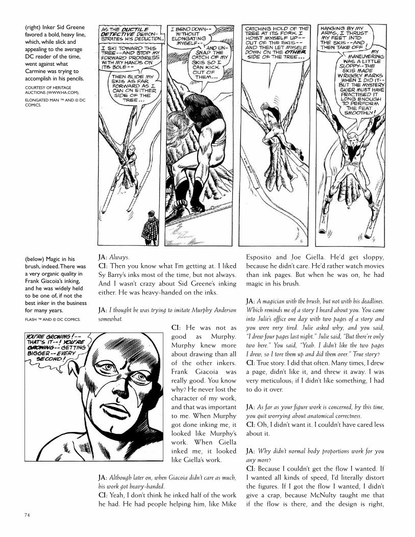
74
JA: Always.CI: Then you know what I’m getting at. I likedSy Barry’s inks most of the time, but not always.And I wasn’t crazy about Sid Greene’s inkingeither. He was heavy-handed on the inks.
JA: I thought he was trying to imitate Murphy Andersonsomewhat.
CI: He was not asgood as Murphy.Murphy knew moreabout drawing than allof the other inkers.Frank Giacoia wasreally good. You knowwhy? He never lost thecharacter of my work,and that was importantto me. When Murphygot done inking me, itlooked like Murphy’swork. When Giellainked me, it lookedlike Giella’s work.
JA: Although later on, when Giacoia didn’t care as much,his work got heavy-handed.CI: Yeah, I don’t think he inked half of the workhe had. He had people helping him, like Mike
Esposito and Joe Giella. He’d get sloppy,because he didn’t care. He’d rather watch moviesthan ink pages. But when he was on, he hadmagic in his brush.
JA: A magician with the brush, but not with his deadlines.Which reminds me of a story I heard about you. You cameinto Julie’s office one day with two pages of a story andyou were very tired. Julie asked why, and you said,“I drew four pages last night.” Julie said, “But there’re onlytwo here.” You said, “Yeah. I didn’t like the two pagesI drew, so I tore them up and did them over.” True story?CI: True story. I did that often. Many times, I drewa page, didn’t like it, and threw it away. I wasvery meticulous; if I didn’t like something, I hadto do it over.
JA: As far as your figure work is concerned, by this time,you quit worrying about anatomical correctness.CI: Oh, I didn’t want it. I couldn’t have cared lessabout it.
JA: Why didn’t normal body proportions work for youany more?CI: Because I couldn’t get the flow I wanted. IfI wanted all kinds of speed, I’d literally distortthe figures. If I got the flow I wanted, I didn’tgive a crap, because McNulty taught me thatif the flow is there, and the design is right,
(below) Magic in hisbrush, indeed.There wasa very organic quality inFrank Giacoia’s inking,and he was widely heldto be one of, if not thebest inker in the businessfor many years.FLASH ™ AND © DC COMICS.
(right) Inker Sid Greenefavored a bold, heavy line,which, while slick andappealing to the averageDC reader of the time,went against whatCarmine was trying toaccomplish in his pencils.COURTESY OF HERITAGEAUCTIONS (WWW.HA.COM).
ELONGATED MAN ™ AND © DCCOMICS.

(below) It’s AdamStrange to the rescue inthis commission pencilillustration.COURTESY OF TERRY AUSTIN.
ADAM STRANGE ™ AND © DCCOMICS.
forget the drawing. It doesn’t mean anything.Now, not everybody agrees with that, but that’sthe way I felt.
I was an Impressionist. If creating movementmeant drawing broken feet, then I drew brokenfeet. I drew whatever it took to create move-ment, at the expense of correct drawing. And itworked for me.
JA: I kind of think of you almost as much as anExpressionist as an Impressionist, because your lines areExpressionistic. Your ink lines are active, expressive, anddramatic.CI: That’s what I was going for. I went againstthe house look.
JA: Were you, in a sense, rebelling against the Dan Barry-type of DC house style?CI: Yes. I could not work that way and I wouldn’twork that way. But I wasn’t being a rebel. I justfelt I had to ink my way. Of course, Julie didn’twant it. I don’t understand that. So I did histhings the way he wanted with my penciling,and, when I got a chance to ink, I did it my way.Oh, how Julie hated it. He used to look at thosepages, [imitates Julie growling] I could see him
marking all over it, and I’d sit there and smile athim. [chuckling] I could be a bastard sometimes.[Jim laughs] Isn’t that funny? “How do you like it,Julie?” [imitates Julie growling again]
Now, you’re laughing at what I was doing.You see, I inked a story for Kanigher, “Tank Trap”[in Star Spangled War Stories #21]. I enjoyed that.That was a beaut, I thought. I inked other stuff,like “Pow-Wow Smith” and “Super-Chief.” Theother editors didn’t object to my inking, butJulie did.
JA: You’ve got a period here from the mid-’50s to the early’60s where you’re really doing a variety of different things,not just The Flash. You drew war stories up until 1958,Westerns, “Detective Chimp,” and “Adam Strange” camealong.CI: When I took it over — I’m not trying to patmyself on the back — the sales jumped likecrazy.
JA: Did Adam Strange ever strike you as another versionof Captain Comet?CI: I didn’t think it was that way at all.
JA: But you did not design the Adam Strange costume.
75

77
(left) One of the odderstrips Carmine workedon was “Super-Chief,”written by Gardner Fox.This splash panel is fromAll-StarWestern #119(June-July 1961), the finalissue of the title.COURTESY OF TERRY AUSTIN.
SUPER-CHIEF ™ AND © DCCOMICS.
(right) After pencilingtheir debut in All-StarWestern #58, Carminedrew nearly half of the“Trigger Twins” features.More often than not hewas inked by Joe Giella(or Sy Barry), but hewas able to ink severalof the strips himself,such as this one fromAll-StarWestern #105(Feb.-Mar. 1959).COURTESY OF TERRY AUSTIN.
TRIGGER TWINS ™ AND © DCCOMICS.

CI: No, I did not. It was a bout between Murphyand Gil Kane about who designed that costume.I think Gil did it, but Murphy claims he did. Idon’t know who the designer was. I was on anoverseas tour with the National CartoonistsSociety at the time “Adam Strange” was devel-oped. But Julie told Mike Sekowsky, who drewthe Showcase issues, that “Adam Strange” wouldbe my feature when it got made into a regularseries. I made sure of that, because I didn’t wantto take a character away from anyone. I spoke toMike, and he said, “I knew from the beginningthat [‘Adam Strange’ would] be your featurewhen you got back.” I didn’t like the shortsleeves that Gil Kane gave Adam Strange, andJulie said, “Change it if you want.”
JA: Then you didn’t see much correlation between CaptainComet and Adam Strange.CI: Not really, no. Adam Strange was a differentcharacter altogether. It was a little more fun,actually, because the stories were better and
tightly written. He had personality, and CaptainComet did not. Of course, we did have morepages to work with, which helped.
JA: Why were the “Adam Strange” stories so short inlength, usually nine to twelve pages?CI: I don’t know. Maybe because I was too busywith other projects to draw a whole issue of“Adam Strange” stories? Maybe because Julieliked anthology books?
JA: By the time you drew “Adam Strange,” several yearshad passed since the “Captain Comet” series. Your wholeapproach to architecture and design changed in the mean-time. When you were designing Rann, where AdamStrange would go visit, what entered your thought processon designing a futuristic city?CI: That was it. Rann had to be a futuristic city.It was not Central City, where the Flash lived —it was a whole, different city. I did one splash —I don’t know if you even remember it — I hadthree different layers of city where they lived onRann. The city was built on layers. Of course,the ground was dead. It was gone. It was veryinteresting, the premise. The scientists of theperiod said, “We’ve got to build an area where it’spollution-free, smoke-free.” So I built cities inlayers, and they got smaller as they went up, andthey floated above the ground, which is clever, Ithink. Gardner Fox didn’t write it that way, bythe way. He said, “Make three different walls.” I
78
(above) It takes morethan clothes to make theman.Though Carminegenerally preferred JohnBroome’s writing toGardner Fox’s, in thiscase the opposite wastrue. Carmine saw Fox’s“Adam Strange” as amuch better strip towork on than Broome’s“Captain Comet.” Shownhere are the covers forMystery in Space #83(May 1963), inked byMurphy Anderson, andStrange Adventures #10(July 1951), inked byBernard Sachs.COURTESY OF JOE AND NADIAMANNARINO AND HERITAGEAUCTIONS (WWW.HA.COM).
ADAM STRANGE, CAPTAINCOMET ™ AND © DC COMICS.

said, “How are you going to have three differentwalls on Rann? You can’t do that. You’re going togo to world, to world, to world?” So on my own,I made them layers of cities. Julie said, “Hey, itlooks better.” I said, “Good, because I’m notchanging it.” [laughter]
JA: When you drew backgrounds in Westerns, it seems likeyou were drawing more panoramas when you drew theprairie than when you drew a city.CI: Well, I was influenced by the great Westernmovies of the time: Shane and High Noon. And ofcourse, the John Ford movies: She Wore a YellowRibbon, Stagecoach, etc. I pulled away from that alittle bit. I started with the Ford stuff, but thatwas very tightly-meshed, not as airy as GeorgeStevens’ Shane. Stevens was a little more open asa director. You had the feeling of space in hisscenes. You always saw the prairie and the sky. Orthe town and the sky. That’s what I picked up on.I didn’t quite get that with Ford for the most part.
Stevens believed in very strong contrasts.You’d have a long, long shot, then — boom —he’d hit you with a close-up. That’s the way heworked, which was clever. Remember the greatscene where the villain [Jack Palance] came intothe bar in Shane, and you know he’s a villain? Allyou see are his black boots standing there. Thedog gets up and moves to the other side of theroom. That’s genius. You knew he was the villainjust from that reaction. And the great scenewhere Elisha Cook, Jr. was shot by Jack Palance.His body went flying backwards a long way.That’s movement!
JA: Your panoramic scenes of deserts, jungles... MonumentValley, which was a favorite location of John Ford —you saved those shots for when you needed them. Youdidn’t just put them in there.CI: That’s the John Ford idea. I read a lot abouthim and studied his films like crazy. That was hismethod. Hit them with lots of long and mediumshots, and then stun them with a bold shot.
JA: More often than not, that’s what your vertical panelsdid. They were your close-up shots, as a contrast to yourhorizontal panoramic views.CI: Absolutely, and they worked just as you said.I tried to think that way. One of my favoritemovies is The Third Man. The English directorsreally understand staging, and I was alwaysattracted to their movies.
JA: How often did you watch movies during the ’50sand ‘60s?
CI: I used to go a couple of times a week. FrankGiacoia and I used to go all the time. We workedso late at night, we’d be dog tired. We’d go to amovie, sometimes fall asleep during the thing.And then we’d have to watch it again. [laughter]
JA: Who picked the movies, you or Frank?CI: Both of us together. We’d toss a coin. We’dsee a Ford film, or a Hitchcock.
JA: Since the Westerns were starting to fade out in thelate ’50s —CI: And the romance comics were starting tofade. It’s basically The Flash, “Adam Strange,”“Detective Chimp” — he was a back-up charac-ter and then he disappeared.
JA: Did you think the “Super Chief” series was an attemptto save the Western genre?CI: In a way, but [the genre] was dying. Nobodycould save it. You could see it was toward theend. Name characters from movie or televisionWesterns — they were dying, too.
JA: You also drew some “Space Museum.”CI: Yeah, those were fill-ins. I enjoyed doingit and got to ink some of the stories, too.Gardner wrote good stories there. Julie didn’twield too much of an editorial hand in thosebecause they were short stories. I think Gardnergot screwed that way. Julie squeezed him toohard. He didn’t let him get a creative flow going.That’s my feeling, anyway.
JA: The Elongated Man originally appeared in a“Flash” story, but eventually got his own feature.You really liked that character.CI: I did. He was fun to do; I likedthe stories very much. The read-ers must have liked him, too,because Julie got fan mailabout him. He and hiswife Sue were like
79
(below) The “Super-Chief” back-up featureblended the Western,super-hero, supernatural,and sci-fi genres like noother series. Maybethat’s why it only lastedthree issues. On the plusside, Carmine was ableto pencil and ink allthree stories, includingthis one — featuring arace of giant NativeAmericans — from All-StarWestern #118 (Apr.-May 1961).COURTESY OF TERRY AUSTIN.
SUPER-CHIEF ™ AND © DCCOMICS.

Nick and Nora Charles from the Thin Man series.They were a good couple.
JA: Did Plastic Man enter your thinking here?CI: No, isn’t that strange? It should have, but itdidn’t. It must have been in the back of my mind.I loved Jack Cole’s work, so it had to be in mymind, maybe instinctively.
JA: Was there any discussion about Plastic Man whenyou did “The Elongated Man” with Julie?CI: No, he never mentioned him. First of all, theElongatedManwas never meant to be an importantcharacter. When he became one, we had to figureout what to do with him. John Broome did that.
JA: When you started drawing “The Elongated Man,”this presented another series of layout challenges for you.How did you adapt to the layouts on “Elongated Man,”because you’ve got a guy that stretches? That’s a differentvisual than a guy who runs.CI: That’s right. Here’s a guy who’s like a rubberband, so your panels had to work the same way.Horizontal panels worked well here, but I did itfor a different reason than I did on The Flash.
JA: Did it take more time to draw the “Elongated Man”stories, because it required a different kind of thinkingfor you?CI: Yes. Look at the panels I used in the stories.They had to encompass that long stretching —vertically and horizontally. The panel shapeshad to reflect that. It was a challenge, but I wasready for it. It was hard work, but fun.
JA: By 1960, you seemed more secure about the business,because you’re doing a lot of features. What changedyour feelings?
(right) Carmine, alwaysone to experiment withlayouts, made the mostof Elongated Man’sabilities by often showinghim use his powers invery vertical or veryhorizontal panels.Thispanel from DetectiveComics #350 (Apr. 1966),which Carmine himselfinked, stretched fullyfrom the top of the pageto the bottom — some-thing rarely done at thetime.ELONGATED MAN ™ AND © DCCOMICS.
(far right) The wide,horizontal panels thatworked so well whendrawing the Flash inaction, worked just aswell with a stretchedout Elongated Man.Panel from The Flash#112 (Apr.-May 1960).Inks by Joe Giella.ART COURTESY OF HERITAGEAUCTIONS
ELONGATED MAN, FLASH ™ AND© DC COMICS.
80
CI: When Irwin Donenfeld came into Julie’soffice and asked, “Who did those covers?” Juliesaid, “Carmine.” That’s how I knew my work wasselling. And with Julie giving me all the work Icould handle, I knew how he felt, too, even if hewasn’t going to tell me. [laughs]
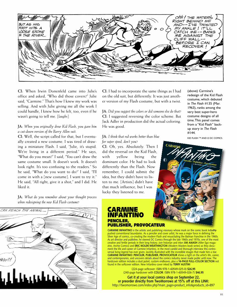
JA: When you originally drew Kid Flash, you gave hima cut-down version of the Barry Allen suit.CI: Well, the script called for that, but I eventu-ally created a new costume. I was tired of draw-ing a miniature Flash. I said, “Julie, it’s stupid.We’re living in a different period.” He says,“What do you mean?” I said, “You can’t draw thesame costume small. It doesn’t work. It doesn’tlook right. It’s too confusing to the readers.” Sohe said, “What do you want to do?” I said, “I’llcome in with a [new costume]. I want to try it.”He said, “All right, give it a shot,” and I did. Heliked it.
JA: What do you remember about your thought processwhen redesigning the new Kid Flash costume?
CI: I had to incorporate the same things as I hadon the old suit, but differently. It was just anoth-er version of my Flash costume, but with a twist.
JA: Did you suggest the colors or did someone else do that?CI: I suggested reversing the color scheme. ButJack Adler in production did the actual coloring.He was good.
JA: I think that red works better than bluefor super speed, don’t you?CI: Oh, yes. Absolutely. Then Idid the reversal on the Kid Flash,with yellow being thedominant color. He had to lookdifferently than the Flash. Nowremember, I could submit theidea, but they didn’t have to lis-ten to me. [Artists] didn’t havethat much influence, but I waslucky they listened to me.
81
(above) Carmine’sredesign of the Kid Flashcostume, which debutedin The Flash #135 (Mar.1963), ranks among thevery best super-herocostume designs of alltime.This panel comesfrom a “Kid Flash” back-up story in The Flash#144.KID FLASH ™ AND © DC COMICS.
CARMINEINFANTINOPENCILER,PUBLISHER, PROVOCATEURCARMINE INFANTINO is the artistic and publishing visionary whose mark on the comic book industrypushed conventional boundaries. As a penciler and cover artist, he was a major force in defining theSilver Age of comics, co-creating the modern Flash and resuscitating the Batman franchise in the 1960s.As art director and publisher, he steered DC Comics through the late 1960s and 1970s, one of the mostcreative and fertile periods in their long history. Join historian and inker JIM AMASH (Alter Ego maga-zine, Archie Comics) and ERIC NOLEN-WEATHINGTON (Modern Masters book series) as they docu-ment the life and career of Carmine Infantino, in the most candid and thorough interview this contro-versial living legend has ever given, lavishly illustrated with the incredible images that made him a star.CARMINE INFANTINO: PENCILER, PUBLISHER, PROVOCATEUR shines a light on the artist’s life, career,and contemporaries, and uncovers details about the comics industry never made public until now. Thehardcover edition includes a dust jacket, custom endleaves, plus a 16-PAGE FULL-COLOR SECTION notfound in the softcover edition. New Infantino cover inked by TERRY AUSTIN!
(224-page softcover: ISBN 978-1-60549-025-0) $26.95(240-page hardcover with COLOR: ISBN 978-1-60549-026-7) $46.95
Get it at your local comics shop on September 22,or preorder directly from TwoMorrows at 15% off at this LINK:
http://twomorrows.com/index.php?main_page=product_info&products_id=897