Excel 2013 Level 2 Unit 1 Advanced Formatting, Formulas, and Data Management
Upload
prashanth-shivakumarCategory
view
147download
0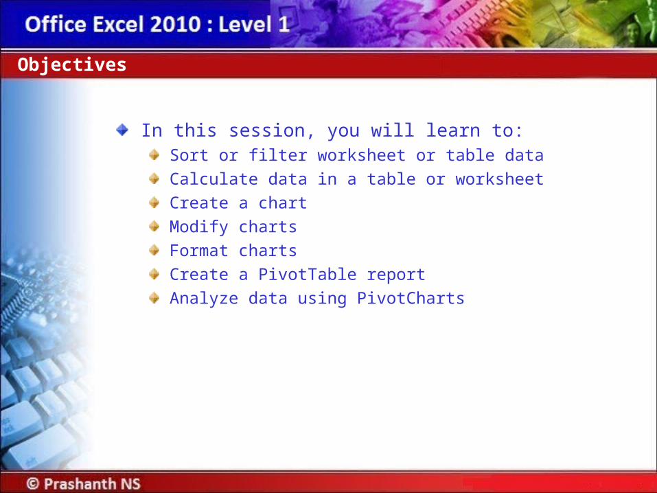
In this session, you will learn to:Sort or filter worksheet or table data
Calculate data in a table or worksheet
Create a chart
Modify charts
Format charts
Create a PivotTable report
Analyze data using PivotCharts
Objectives

Sorting:Sort is a method of viewing data that arranges all the data into a specific order.
Data can be sorted in either ascending order or descending order.
Data can be sorted on a single criterion or multiple criteria.
Sort or Filter Worksheet or Table Data
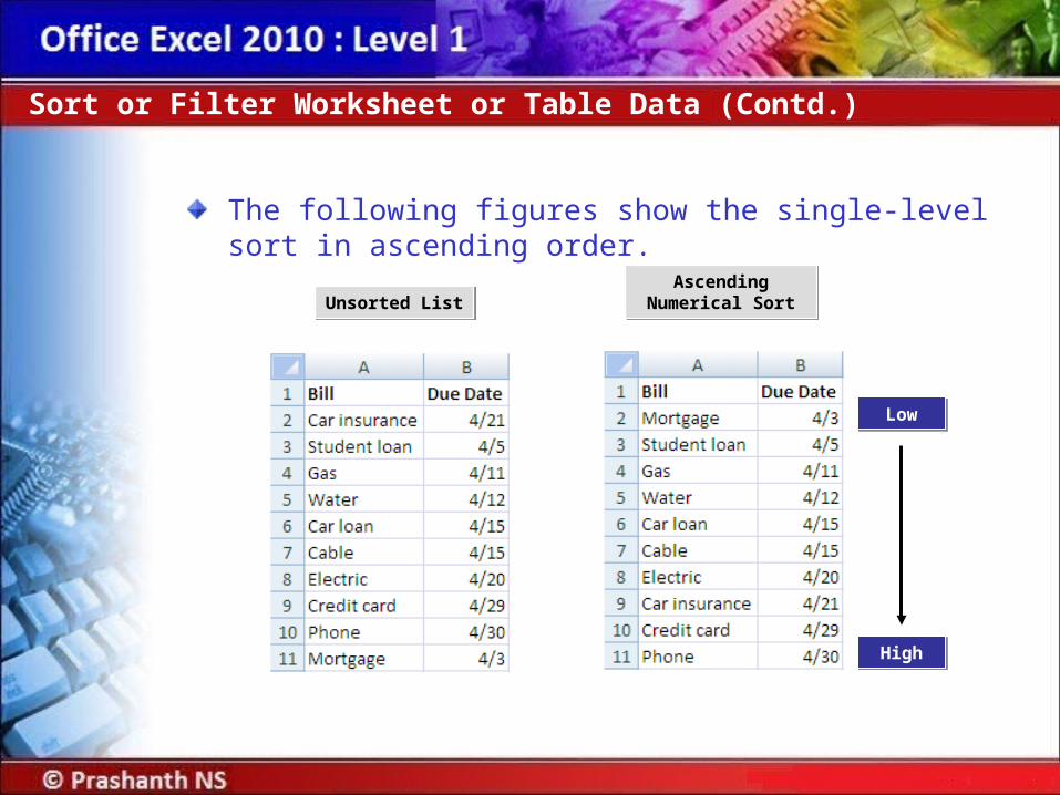
The following figures show the single-level sort in ascending order.
Sort or Filter Worksheet or Table Data (Contd.)
Ascending Numerical Sort
Ascending Numerical SortUnsorted ListUnsorted List
LowLow
HighHigh
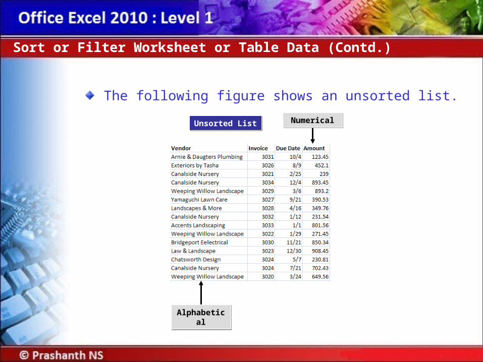
The following figure shows an unsorted list.
Sort or Filter Worksheet or Table Data (Contd.)
Unsorted ListUnsorted List
AlphabeticalAlphabetical
NumericalNumerical

The following figure shows a multiple-level sort in both ascending and descending orders.
Sort or Filter Worksheet or Table Data (Contd.)
Alphabetical Ascending Order
Alphabetical Ascending Order
Numerical Descending Order
Numerical Descending Order
Sorted ListSorted List
Criterion 1Criterion 1 Criterion 2Criterion 2
HighHigh
LowLow
HighHigh
LowLow
LowLow
HighHigh
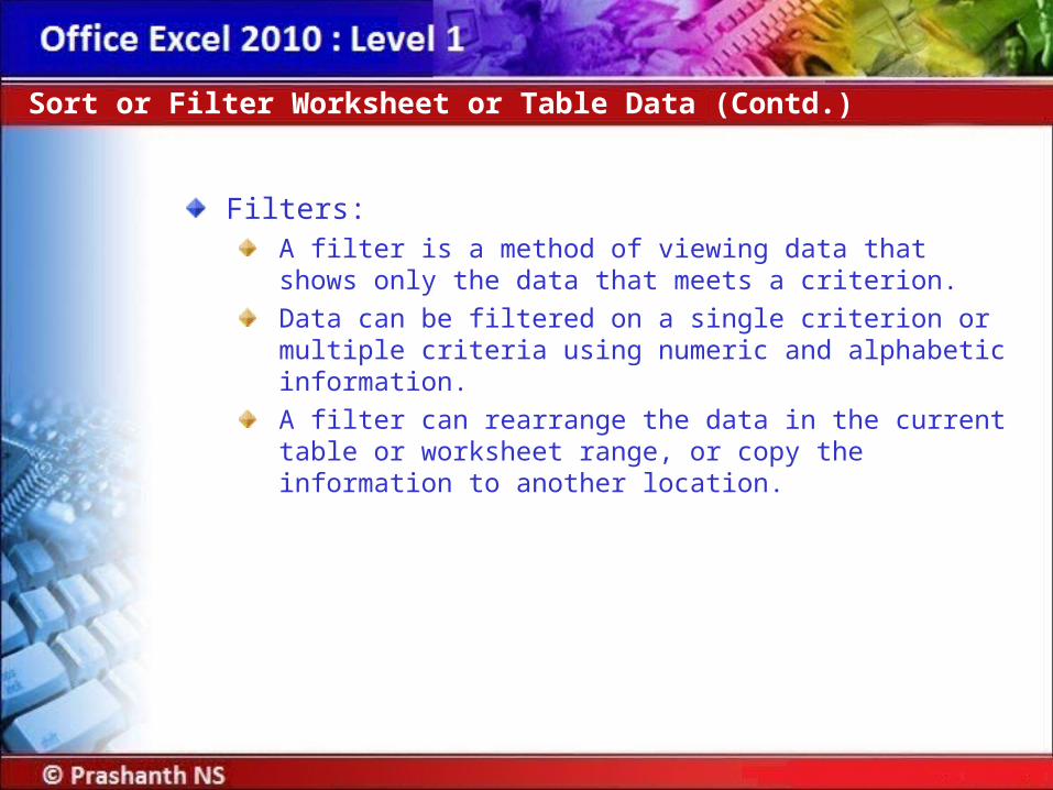
Filters:A filter is a method of viewing data that shows only the data that meets a criterion.
Data can be filtered on a single criterion or multiple criteria using numeric and alphabetic information.
A filter can rearrange the data in the current table or worksheet range, or copy the information to another location.
Sort or Filter Worksheet or Table Data (Contd.)

The following figures show the unfiltered and filtered data.
Sort or Filter Worksheet or Table Data (Contd.)
Filtered ListFiltered List
Rows that do not meet criteria are
hidden
Rows that do not meet criteria are
hidden
Unfiltered ListUnfiltered List
Filter CriteriaFilter Criteria
Selected CriterionSelected Criterion
Arrows indicate filter is on
Arrows indicate filter is on

Scenario:You want to quickly look up employees by having your employee table sorted. You will need to add a new employee to your list so you will be required to re-sort the employees for the new employee to be displayed in the correct physical order. Your manager has asked you for a list of only those employees in the Account Department who have been employed for 10 years or more. After you create the list, you want to display all employees to make future filters easier.
Demo: Sorting and Filtering Tables
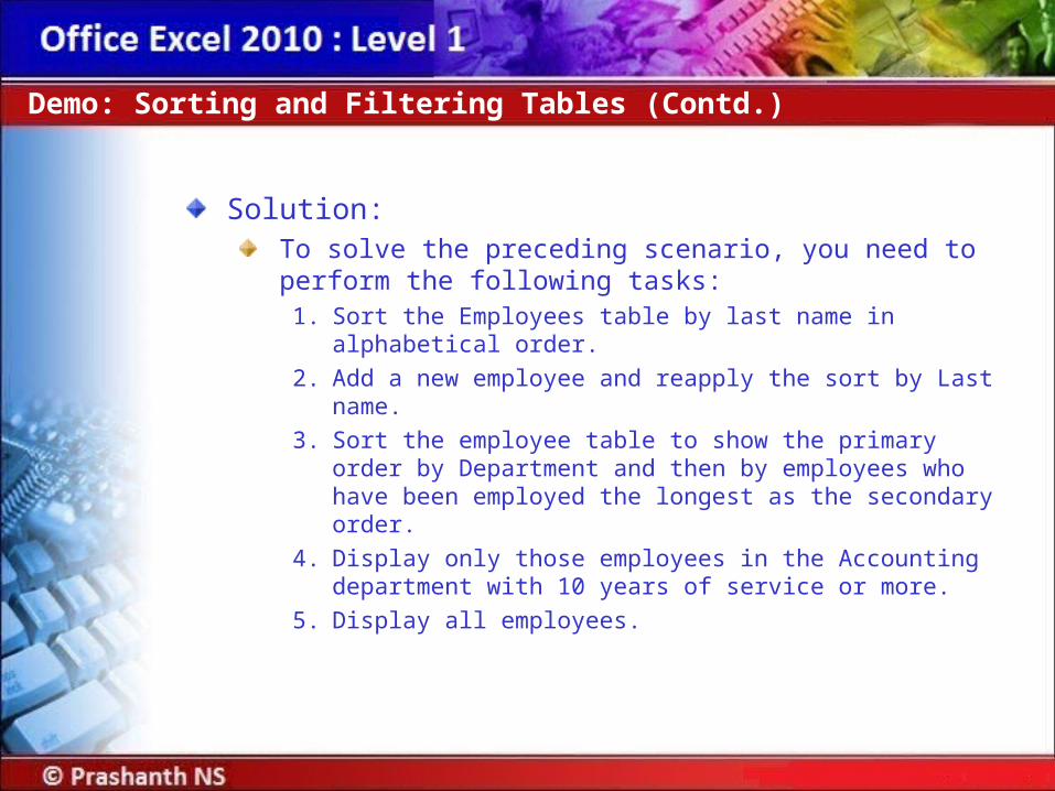
Solution:To solve the preceding scenario, you need to perform the following tasks:
1. Sort the Employees table by last name in alphabetical order.
2. Add a new employee and reapply the sort by Last name.
3. Sort the employee table to show the primary order by Department and then by employees who have been employed the longest as the secondary order.
4. Display only those employees in the Accounting department with 10 years of service or more.
5. Display all employees.
Demo: Sorting and Filtering Tables (Contd.)

When you perform a calculation in a worksheet, you have to choose the data you want included in the calculation:
This can be very time-consuming if there is a large amount of data.
A database function can find the data you are looking for and perform the calculation all in one step.
Summary functions in tables:If your table has a totals row, you can use the drop-down list for each total cell to insert summary results for that column of the table.
Calculate Data in a Table or Worksheet
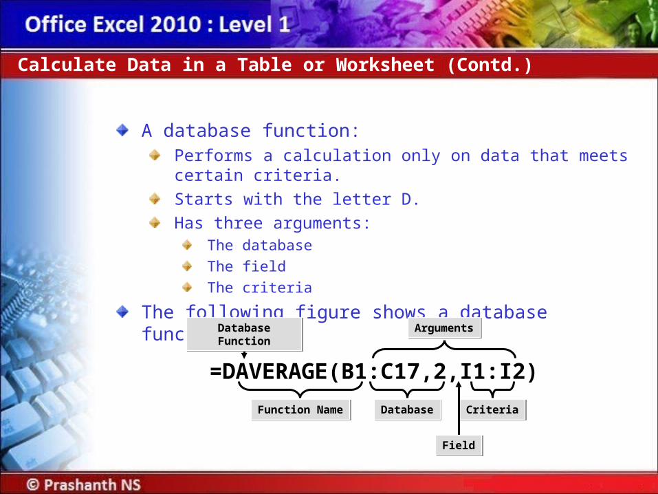
A database function:Performs a calculation only on data that meets certain criteria.
Starts with the letter D.
Has three arguments:The database
The field
The criteria
The following figure shows a database function.
Calculate Data in a Table or Worksheet (Contd.)
ArgumentsArguments
Function NameFunction Name DatabaseDatabase CriteriaCriteria
Database FunctionDatabase Function
FieldField
=DAVERAGE(B1:C17,2,I1:I2)
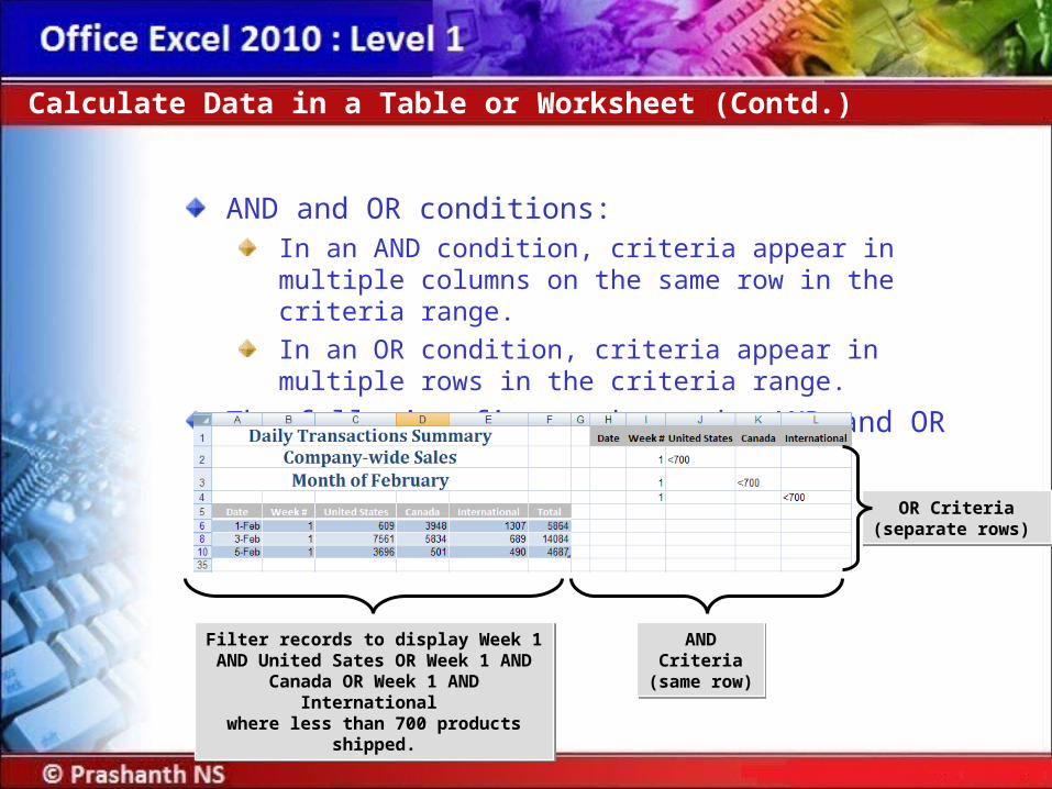
AND and OR conditions:In an AND condition, criteria appear in multiple columns on the same row in the criteria range.
In an OR condition, criteria appear in multiple rows in the criteria range.
The following figure shows the AND and OR conditions.
Calculate Data in a Table or Worksheet (Contd.)
AND Criteria(same row) AND Criteria(same row)
OR Criteria(separate rows)
OR Criteria(separate rows)
Filter records to display Week 1 AND United Sates OR Week 1 AND Canada
OR Week 1 AND International where less than 700 products shipped.
Filter records to display Week 1 AND United Sates OR Week 1 AND Canada
OR Week 1 AND International where less than 700 products shipped.

A subtotal:Is a function performed on a subset of the data in a worksheet data range that has been sorted.
Can be created using several functions such as sum, average, and count.
Calculate Data in a Table or Worksheet (Contd.)
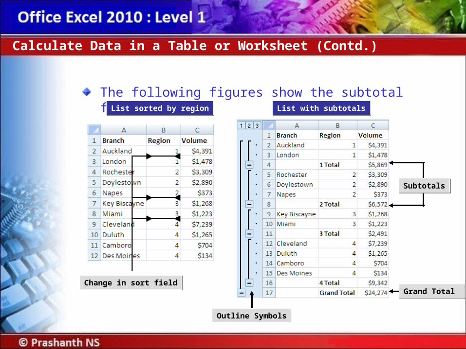
The following figures show the subtotal function.
Calculate Data in a Table or Worksheet (Contd.)
List sorted by regionList sorted by region List with subtotalsList with subtotals
Grand Total Grand Total
Outline SymbolsOutline Symbols
SubtotalsSubtotals
Change in sort fieldChange in sort field
Scenario:You have been asked to provide some figures based on the February Sales. The Sales Manager has asked for a list of all the days when total sales were in excess of $8,000. Based on that list, he would like to know the total sales, average sales, and total number of days on the list. Later he requests a list of days when any one on the regions had sales totaling less than $1,000. Finally, he would like a list of all sales for February subtotaled by week.
Demo: Applying Calculations to a Table or Worksheet
Solution:To solve the preceding scenario, you need to perform the following tasks:
1. Calculate the number of days when the total sales for the company is greater than 8000.
2. Create a summary area on the worksheet that calculates total, average, and count of the days that the total sales is greater than 8000.
3. Perform an advanced filter on the February Sales Calculations list to show all days in February when either the U.S., Canada, or International regions had sales less than 1000.
4. Subtotal the February Sales data by week.
Demo: Applying Calculations to a Table or Worksheet (Contd.)
A chart:Is a visual representation of data from a worksheet or Excel table.
Can include:Chart title
Legend
Scale or values on the vertical axis
Category on the horizontal axis
Can be embedded as a graphic object on a worksheet page.
Can appear on a dedicated chart sheet that contains only the chart and associated chart tools and commands.
Create a Chart
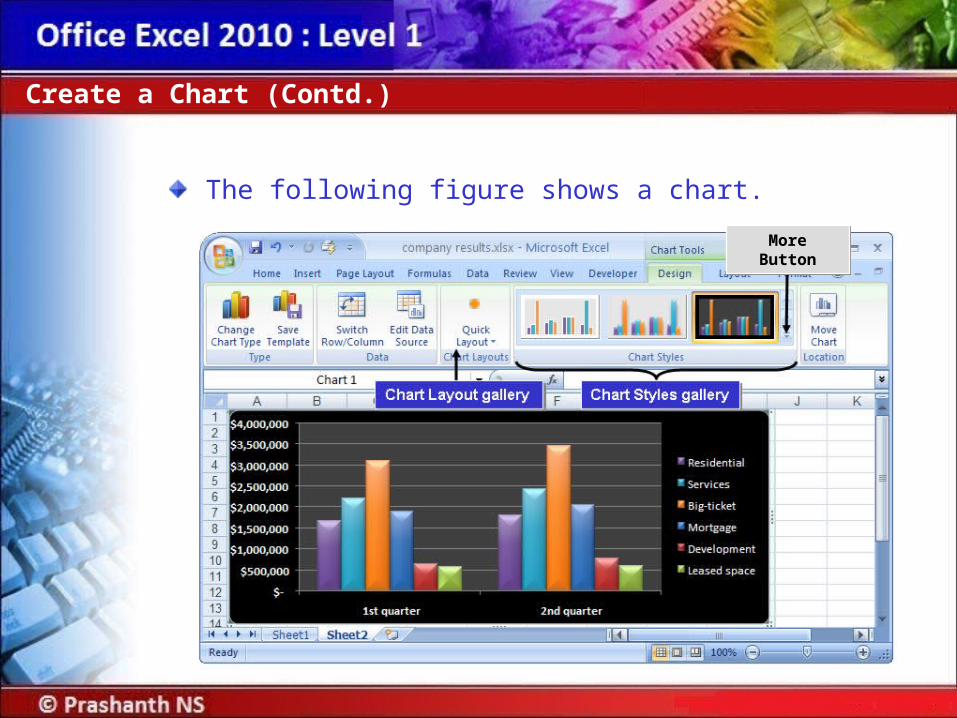
The following figure shows a chart.
Create a Chart (Contd.)
More ButtonMore Button
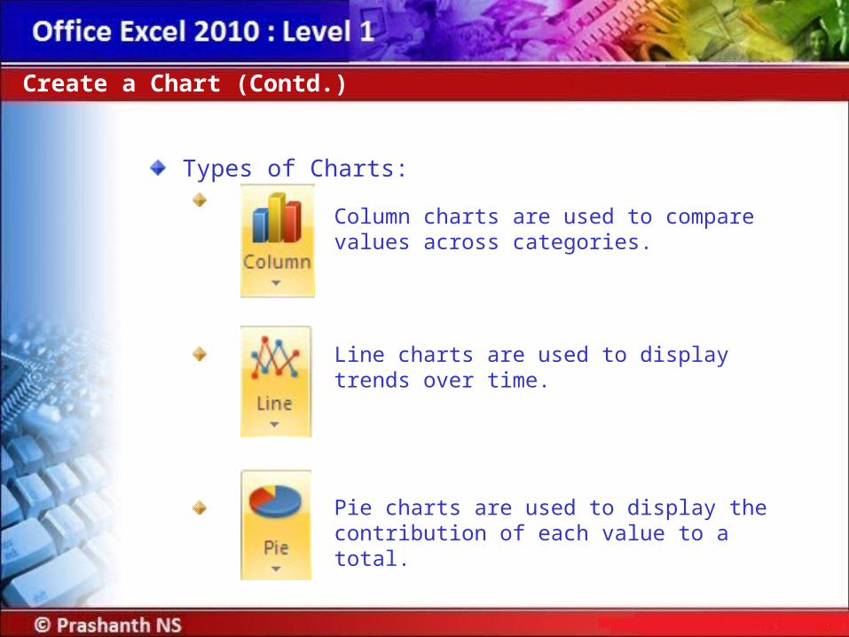
Types of Charts:
Create a Chart (Contd.)
Column charts are used to compare values across categories.
Line charts are used to display trends over time.
Pie charts are used to display the contribution of each value to a total.

Create a Chart (Contd.)
Bar charts are used for comparing multiple values.
Area charts are used to emphasize differences between several sets of data over a period of time.
Scatter charts are used to compare pairs of values.

Scenario:You have been asked to present your company’s financial sales report at a board meeting. Your manager has requested that you present the data in a way that the board members will be able to clearly see the relationships between the different sections of the data. You have determined that a bar chart will be used to compare the monthly sales of Books versus CDs and tapes. You would also like to show board members that the sales of fiction has steadily increased during the past year and you will use a line chart to show this trend. To show how the total budget amount has been allocated between departments, you have decided to use a pie chart.
Demo: Creating Charts
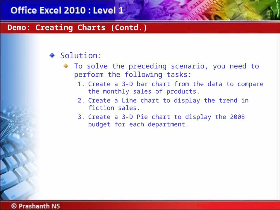
Solution:To solve the preceding scenario, you need to perform the following tasks:
1. Create a 3-D bar chart from the data to compare the monthly sales of products.
2. Create a Line chart to display the trend in fiction sales.
3. Create a 3-D Pie chart to display the 2008 budget for each department.
Demo: Creating Charts (Contd.)
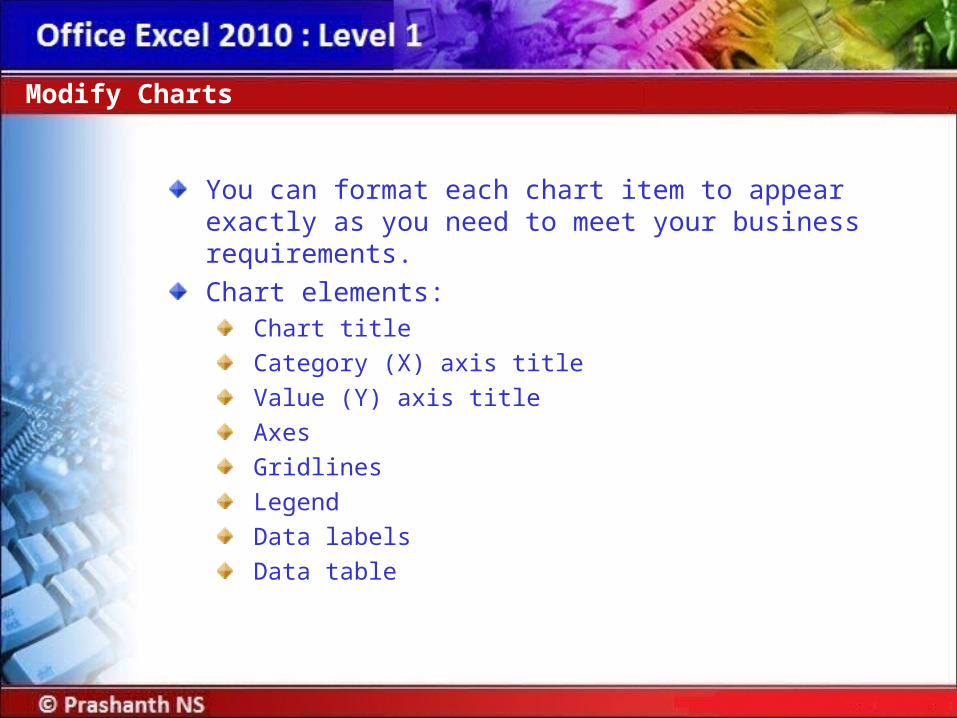
You can format each chart item to appear exactly as you need to meet your business requirements.
Chart elements:Chart title
Category (X) axis title
Value (Y) axis title
Axes
Gridlines
Legend
Data labels
Data table
Modify Charts
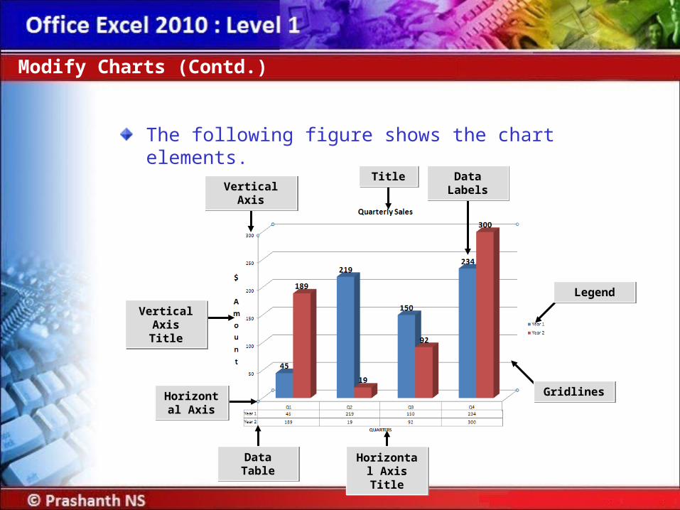
The following figure shows the chart elements.
Modify Charts (Contd.)
Vertical Axis TitleVertical
Axis Title
Horizontal Axis
Horizontal Axis
Data TableData Table
Vertical AxisVertical AxisTitleTitle
LegendLegend
Data LabelsData Labels
GridlinesGridlines
Horizontal Axis Title
Horizontal Axis Title

Scenario:After reviewing the bar chart, you feel that the data would be better represented in a column chart. You have also decided to increase the size of the line chart.
Demo: Changing a Chart Type
Solution:To solve the preceding scenario, you need to perform the following tasks:
1. Change the bar chart to a 3-D Clustered Column chart.
2. Increase the size of the line chart by approximately 1 inch.
Demo: Changing a Chart Type (Contd.)
Scenario:You have just created charts for the different sets of data. You have decided to present the pie chart in a separate chart sheet and you would like to modify the chart to include percentages to show the board members how the budget has been divided between the departments. To ensure that the board members can see what the chart represents, you have decided to add a chart title as well as vertical and horizontal axis titles.
Demo: Modifying a Chart
Solution:To solve the preceding scenario, you need to perform the following tasks:
1. Move the pie chart to a chart sheet and name the sheet 2008 Budget.
2. Modify the pie chart to display each department’s percentage of the total budget for 2008.
3. Add the chart title Sales Data to the 3-D column chart.
4. On the 3–D column chart, add a horizontal and vertical axis title.
Demo: Modifying a Chart (Contd.)
There are many styles and layouts to choose from to format the chart:
Change the appearance of the chart elements by using options on the Chart Tools Format contextual tab.
Implement a standard set of chart elements by applying one of the pre-defined chart layouts.
Customize the appearance of individual chart elements by using the options on the Chart Tools Layout contextual tab.
Format Charts
Scenario:You have created a line chart to represent the sales trend of fiction book sales. You would like to format the chart to enhance its presentability by having it reflect the same color style as the table. You would also like to exaggerate the horizontal axis of the chart.
Demo: Formatting a Chart
Solution:To solve the preceding scenario, you need to perform the following tasks:
1. Apply a chart style to the line chart.
2. Apply a chart layout.
3. Format the border of the chart.
4. Format the horizontal axis.
Demo: Formatting a Chart (Contd.)
PivotTables:A PivotTable report is an interactive worksheet table used to summarize and analyze large amounts of worksheet data quickly.
You create a PivotTable report from source data in an Excel workbook or from an external data source.
There are four types of PivotTable fields:Page
Row
Column
Data fields
Create a PivotTable Report
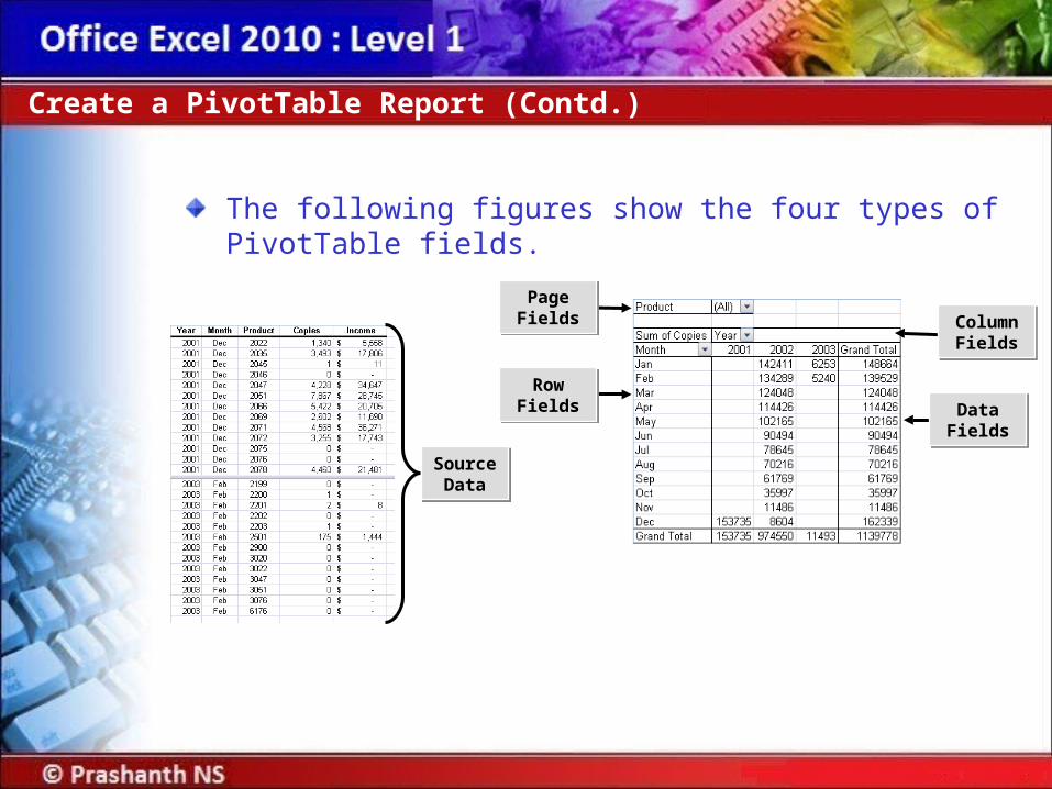
The following figures show the four types of PivotTable fields.
Create a PivotTable Report (Contd.)
Source Data
Source Data
Data FieldsData
Fields
Row FieldsRow
Fields
Page FieldsPage Fields Column
FieldsColumn Fields

The PivotTable Field List pane:Appears when you select a PivotTable report.
Includes Drop Zones into which you can drag and drop fields.
The Value Field Settings dialog box:Is used to display or hide subtotals for individual column and row fields.
Is used to display or hide column and row grand totals for the entire report.
Is used to calculate the subtotals and grand totals with or without filtered items.
Create a PivotTable Report (Contd.)

Scenario:You have a large volume of information about products that have shipped in the past several months in the Shipping workbook. Your manager has also asked you to print a list of products that have not shipped that were sold by the salesperson Anne Dodsworth. Your manager has requested another report to review the average price of the products Anne shipped the first week in January by company. Since you are confident that your manager will have a similar request in the future, you have decided to create a PivtotTable report to easily extract the information without constantly having to rearrange the data by sorting and re-creating formulas. You have decided to first review Anne’s data using the Sort tool before creating the report.
Demo: Creating a PivotTable

Solution:To solve the preceding scenario, you need to perform the following tasks:
1. To locate products that have not shipped for Anne Dodsworth sort the worksheet by Salesperson and Shipped Date in ascending order.
2. Create a PivotTable report to extract products sold by salesperson and by shipped date.
3. Modify the Values field settings to calculate the average Extended Price, replace the column label in the PivotTable report to Average Amount Sold, and change the number format to Currency.
4. Create a filter to group the PivotTable by Salesperson and then display products that Anne Dodsworth sold.
5. Display products that Anne Dodsworth shipped the first week in January.
Demo: Creating a PivotTable (Contd.)
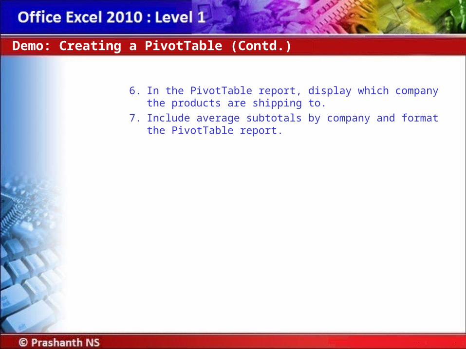
6. In the PivotTable report, display which company the products are shipping to.
7. Include average subtotals by company and format the PivotTable report.
Demo: Creating a PivotTable (Contd.)
Graphical representations of data make data analysis easy.
PivotChart reports help facilitate data analysis by graphically representing data from PivotTable reports.
A PivotChart report is an interactive chart that graphically represents the data in a PivotTable report.
Analyze Data Using PivotCharts
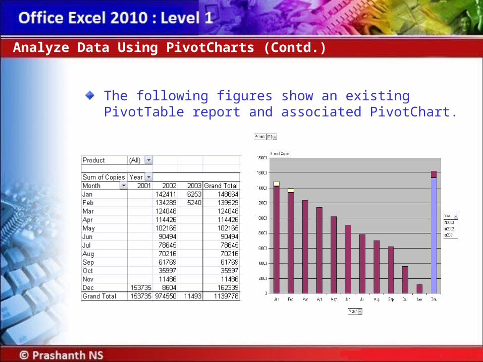
The following figures show an existing PivotTable report and associated PivotChart.
Analyze Data Using PivotCharts (Contd.)

Scenario:Your sales managers has asked you to create a column chart, based on the data that is in the Invoices sheet, to show the sales people how they have been doing with their sales to Germany. This is a meeting that is held weekly, and the next week will be presentation on sales to France. You have decided to create a PivotChart to have the flexibility to switch the chart by country.
Demo: Creating a PivotChart
Solution:To solve the preceding scenario, you need to perform the following tasks:
1. Create a PivotChart.
2. Create a PivotChart report filter that will filter the chart by product and/or country, and then filter the chart to display quantity amounts for Germany by sales person.
3. Format the PivotChart.
4. Change the Chart Title to Germany and remove the Legend.
Demo: Creating a PivotChart (Contd.)
Summary
In this session, you learned that:A sort is a method of viewing data that arranges all the data into a specific order.
A filter is a method of viewing data that shows only the data that meets a criterion.
A database function performs a calculation only on data that meets certain criteria.
A chart enables you to observe a large amount of data and draw relevant conclusions quickly.
PivotTables and PivotCharts enable you to interactively analyze and manipulate large amounts of data.
PivotTable reports help you quickly combine and compare data in large worksheets.
A PivotChart report is an interactive chart that graphically represents the data in a PivotTable report.


![Advanced Excel[1]](https://static.fdocuments.us/doc/165x107/552a46a65503468e428b45a4/advanced-excel1.jpg)