Addendum 02: Design & production tips – Wayfinding signage
27
Issue 01 Addendum 02: Design & production tips – Wayfinding signage November 2019 1
Transcript of Addendum 02: Design & production tips – Wayfinding signage

Issue 01
Addendum 02:Design & production tips– Wayfinding signageNovember 2019
1
Important signage design information
2Addendum 02: Design & production tips – Wayfinding signage Important design information

Inclusive design standardsOur approach to design is user centered and is about access for all users.
In the first instance all signage should comply with best practice standards, briefly these cover content hierarchy, colour contrast, message sequencing, typeface selection, reading distance and information layout.
Accessible statutory signage
The following information has been drawn from the relevant codes and guidelines to highlight requirements in relation to providing compliant accessible signage.
It should be noted that constant change is occurring in relation to Australian Standards for Access and Mobility and Building Codes.
Due reference should be given to updated documents.
The Disability (Access to Premises Buildings) Standard 2010 and the BCA (2019) part D3.6: Signage, in a building required to be accessible requires:
A. Braille and tactile signage complying with specification D3.6 and incorporating the international symbol of access in accordance with AS1428.1 should identify each-sanitary facility, except a sanitary facility within a sole-occupancy unit in a Class 1b or Class 3 building; and
B. Braille and tactile signage, including the international symbol for deafness in accordance with AS1428.1 should be provided within a room containing a hearing augmentation system identifying the type of hearing augmentation; and the area covered within the room; and if receivers are being used and where the receivers can be obtained; and
C. signage in accordance with AS1428.1 should be provided for accessible unisex sanitary facilities to identify if the facility is suitable for left or right hand use; and
D. signage to identify an ambulant accessible sanitary facility, in accordance with AS1428.1 should be located on the door of the facility; and
E. where a pedestrian entrance is not accessible, directional signage incorporating the international symbol of access, in accordance with AS428.1 should be provided to direct a person to the location of the nearest accessible entrance; and
F. where a bank of sanitary facilities is not provided with an accessible unisex sanitary facility, directional signage incorporating the international symbol of access, in accordance with AS428.1 should be placed at the location of the sanitary facilities that are not accessible, to direct a person to the location of the nearest accessible unisex sanitary facility.
3Addendum 02: Design & production tips – Wayfinding signage Important design information

Accessible braille and tactile signage
BCA (2019) Specification D3.6 Braille and Tactile Signs
1. Scope
Requirements for the design and installation of Braille and tactile signage required by D3.6
Location of Braille and tactile signs Braille and tactile components should be located 1200mm-1600mm AFFL.
Signs with single lines of characters should have the single line no less than 1250mm and not more than 1350mm AFFL.
Signs identifying rooms should be located on the wall on the latch side of the door with the leading edge of the sign located between 50mm-300mm from the architrave; and where not possible, on the door itself.
2. Braille and tactile sign specification
Tactile characters should be raised or embossed to a height not less than 1mm and not more than 1.5mm.
Sentence case should be used for all tactile characters, and:
Upper case to be 15mm-55mm; and
Lower case characters should have a height 505 of related upper case characters
Tactile characters, symbols and the like, should have rounded edges.
The entire sign, including any frame, should have rounded edges.
The background should be matte or low sheen.
The characters symbols, logos should be matte or low sheen.
The minimum lettering spacing of tactile characters on signs should be 2mm.
The minimum word spacing of tactile characters on signs should be 10mm.
The thickness of letter strokes should be not less than 2mm and not more than 7mm.
Tactile text should be left justified, except single words may be centre justified.
3. Luminance contrast
The background, negative space, fill of a sign or border with a minimum width of 5mm should have a luminance contrast with the surface on which it is mounted of not less than 30%.
Tactile characters and symbols should have a luminance contrast of 30% to the surface on which the characters are mounted.
Luminance contrast should be met under the lighting conditions in which the sign is located.
4. Lighting
Braille and tactile signs should be illuminated to ensure luminance contrast requirements are met at all times during which the sign is required to be read.
5. Braille
Braille should be grade 1 (uncontracted in accordance with the criteria set out in the Australian Braille Authority).
Braille should be raised and domed.
Braille should be located 8mm below the bottom line of text.
Braille should be left justified.
Where an arrow is used in the tactile sign, a solid arrow should be provided for Braille readers.
On signs with multiple lines of text and characters, a semicircular Braille locator at the left margin should be horizontally aligned with the first line of Braille text.
Please contact the Brand team if further assistance is needed when Braille is required on your sign.
In our bus stops the stop ID number should be supplied
in tactile and braille.
4Addendum 02: Design & production tips – Wayfinding signage Important design information
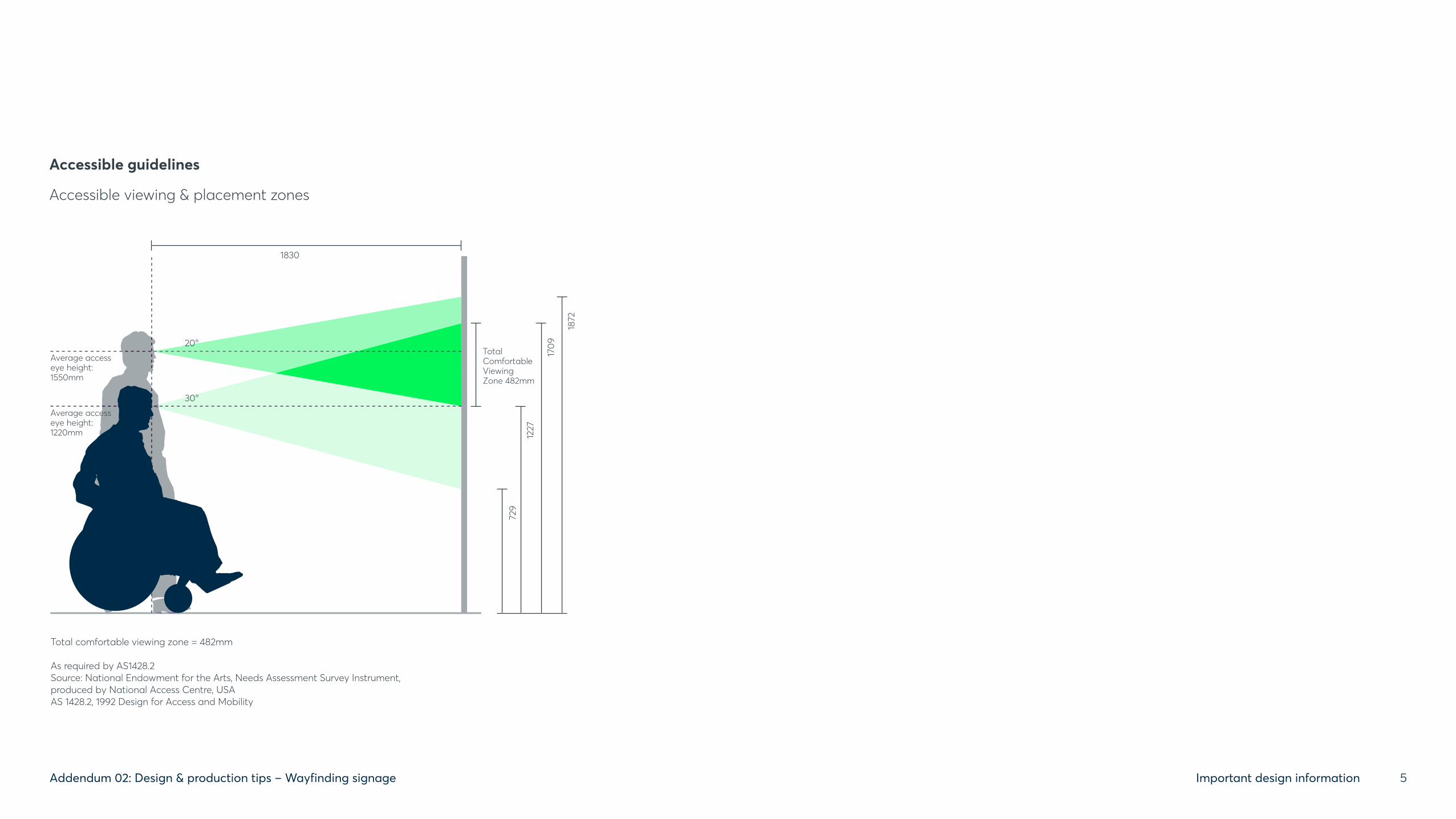
Total comfortable viewing zone = 482mm
As required by AS1428.2Source: National Endowment for the Arts, Needs Assessment Survey Instrument, produced by National Access Centre, USAAS 1428.2, 1992 Design for Access and Mobility
Average access eye height:1550mm
20°
1830
Average access eye height:1220mm
TotalComfortableViewingZone 482mm
30°
729
1227
1709
1872
Accessible guidelinesAccessible viewing & placement zones
Accessible guidelines
Accessible viewing & placement zones
5Addendum 02: Design & production tips – Wayfinding signage Important design information
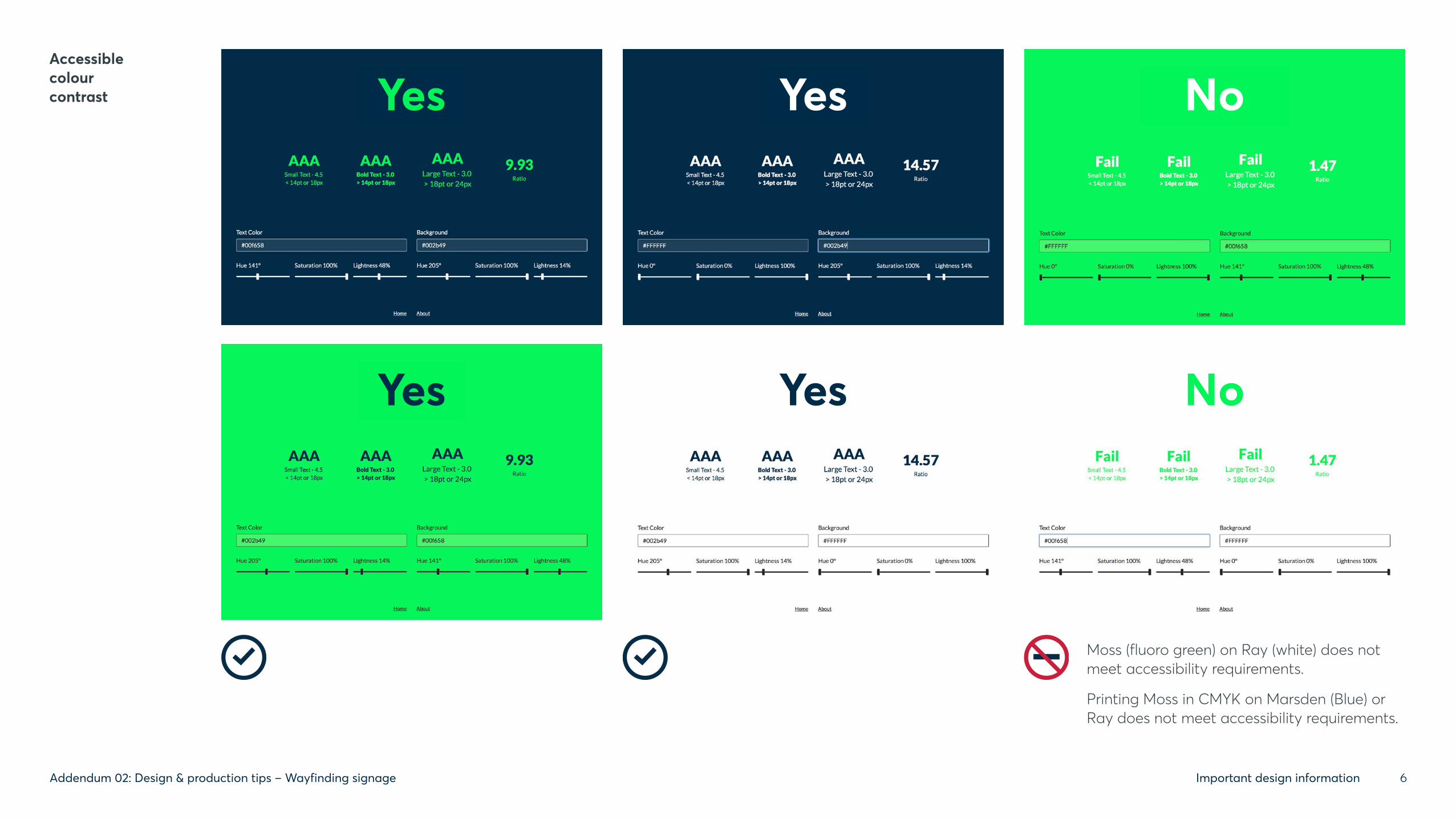
Accessible colour contrast
Moss (fluoro green) on Ray (white) does not meet accessibility requirements.
Printing Moss in CMYK on Marsden (Blue) or Ray does not meet accessibility requirements.
Yes
Yes Yes No
Yes No
6Addendum 02: Design & production tips – Wayfinding signage Important design information

For accessible signs: Avery film:874 brilliant blue
to match B21 Ultramarine as per AS2700
For warning signs: Avery film:849 geranium red
to match R13 Signal Red as per AS2700
RAL: 5003 Sapphire blue
Avery cast film: 82401 deep blue
Pantone: 7463
CMYK: 100.63.12.67
RGB: 0.43.73
Marsden
Recommended materials and colour specifications.
RAL: 6038 Luminous green
Avery cast film: 814 lime
Pantone: 802
CMYK: Not achievable
RGB: 0.246.88
Moss
RAL: white
Avery cast film: 830 Matte white
Pantone: White
CMYK: 0.0.0.0
RGB: 255.255.255
Ray
Windermere Phillip
7Addendum 02: Design & production tips – Wayfinding signage Important design information

Leveraging an asset already owned by the City of Parramatta.
Why: As an extension of our visual identity we encourage the integration of the circle and circular forms, both graphic and built form whenever and wherever possible.
The circle has been part of our logo from its inception. It is a powerful symbol with a long connection to both indigenous and modern Parramatta: it has no beginning or end, it is a sign of positivity, power, harmony and protection. It suggests unity, community, integrity and perfection. Geographically it is relevant too, arteries leading in and out of the Sydney’s central city from every direction.
How: As opportunities arise for the development of community spaces (inside and outside), the circle should be considered a central theme. It can be integrated into the design of playgrounds, equipment, pathways and buildings in a combination of subtle (textures and details) or overt ways (physical structures).
Some inspiration appears right, but the possibilities are endless.
Owning the circle – to inspire design choices
8Addendum 02: Design & production tips – Wayfinding signage Important design information

This project is focussed on wayfinding only.
An interpretive signage project is being scheduled.
For further information, please contact
the Brand team.
9Addendum 02: Design & production tips – Wayfinding signage Important design information
Identifying & capitalising on opportunitiesSurprise and delight
We encourage staff to look beyond the functional for opportunities to improve the visitor experience by creating special moments. This can take many forms but will begin with a desire to share knowledge or just observe pain points for users and find solutions.
Promotion
We encourage staff to identify and maximise opportunities to promote Council services and facilities.
For example, placing a small sign and QR code in relevant locations would provide immediate access to booking page for a community hall or tennis court. Or create a place to promote local events and news. These are especially relevant in areas where visitors dwell for a period of time such as bbq sites or playgrounds...
Links should only be made to council sites or council approved organisations/services. Signtype D22 or H6 might be appropriate for this use.

Other helpful considerations
(outside of design delivery)
10Addendum 02: Design & production tips – Wayfinding signage Other helpful considerations

3.DestinationIdentification
2.Decision and
confirmation pointDirectional
2. Decision pointDirectional
1. EntryIdentification/Directory
1. EntryIdentification/Directory
Sign locationsWhere do I need information?
Parramatta
River
Riverside Walk
Harris ParkHeritage Walk
WSU Walk
Park Walk Western Sydney UniversityParramatta Campus
CumberlandMedicalPrecinct
The DairyCottage
OldGovernment
House
FormerFemaleFactory
George StGatehouse
Macquarie StGatehouse Hambledon
Cottage
ElizabethFarmExperiment
Farm Cottage
TownHall
Westfield Shopping
Centre
LancerBarracks
All SaintsChurch
ParramattaLeagues Club
RSLSt John’s
Cathedral
Former FemaleOrphan School/
The Whitlam Institute
Jessie StCentre
Brislington
Police
St Patrick’sCathederal
St John’sCemetery
RiversideTheatres HMAS
ParramattaMemorial
JusticePrecinct
Elizabeth StFootbridge
Weir
Footbridge
Footbridge
Mays HillCemetery
All SaintsCemetery
Ollie WebbReserve
DoyleGround
RosehillGardens
Racecourse
PrinceAlfredSquare
James RuseReserve
BaludarriWetland
RangihouReserve
JubileePark
ParramattaGaol
WestmeadStation500m
Lake Parramatta
TransportInterchange
ParramattaWharf
Queens WharfReserve
Harris ParkStation
Parramatta Heritage &Visitor Information Centre
WesternSydneyStadium
Harris ParkTown Centre
CentenarySquare
CITYCENTRE
PARRAMATTAPARK
HARRISPARK
PURC
HA
SE ST
HASSALL ST
MACQUARIE ST
GREAT WESTERN HWY
ALICE ST
JAM
ES RUSE D
R
MARION ST
HASSALL ST
PARKES ST
PHILLIP ST
ARGYLE ST
CH
URC
H S
T
CH
URC
H ST
SMIT
H S
T
CH
ARL
ES S
T
HA
RRIS
ST
MAC
ART
HU
R ST
MA
RSD
EN S
T
O’C
ON
NEL
L ST
PITT
ST
GEORGE ST
GROSE ST
GEORGE ST
VICTORIA RD
PARK PDE
CROWN ST
WIG
RAM
ST
No PedestrianAccess
shuttlebuses
Walking route to station
Parramatta River
Centenary Square
RiversideWalk
CITYCENTRE
EG
DI RB N
OTN
AB EINREB
BARR
Y W
ILD
E BR
IDG
ELEN
NO
X B
RID
GE
Free
mas
ons
Arm
s Ln
Macquarie Ln
Phill
ip L
n
Oyster Ln
Houison Pl
Uni
ted
Ln
Batm
an W
k
Barr
ack
Ln
And
rew
Nas
h Ln
Dirr
abar
ri Ln
Geo
rge
Khat
tar L
n
China Rose Wy
Auctioneer Ln
Red Cow Ln
Hor
woo
d Pl
Hunter St
Darcy St Temporarily
Hor
woo
d Pl
Palmer St
Lamont St
Market St
Sorrell St
Closed - No Access
MACQUARIE ST
VICTORIA RD
GEORGE ST
PHILLIP ST
CH
URC
H S
T
CH
URC
H S
T
SMIT
H S
T
SMITH
STW
ILDE AV
E
MA
RSD
EN S
TM
ARI
ST P
LV
ILLE
RS S
T
78
75
96
91 93
60
8357
41
132
188
17
202
197
10
20
262
302
279
285
355
382
12
239
235
264
Leigh MemorialChurch
PostOffice
ArchaeologyDisplay
City CentreCar Park
Parramall
Roxy
Arc
ade
CivicArcade
CommunityMigrantResourceCentre
MayfairPlaza
GreenwayArcade
McNamaraCentre
OctagonCentre
The Roxy
Lancer Barracks
WSUCity Campus
Perth House
St John’sCathedral
Children’sCourt
CommonwealthLaw Courts
Jessie Street Centre
ATO
Jeffrey House
Colonial HospitalArchaeology Display
Brislington
ParramattaLocal Courts
Police
St Patrick’sCathederal
All SaintsChurch
Our Lady of MercyCollege
ResidentialArea
Clock
Bandstand
WarMemorial
Old KingsSchool
ParramattaArtists
Studios
SydneyWater
‘The Dome’
Eat StreetCar Park
RiverbankCar Park
Former Post OfficeBuilding
University ofNew EnglandCampus
JusticePrecinct
3
6 48
5
Town Hall
Parramatta Heritage& Visitor InformationCentre
RiversideTheatres
Footbridge
Steps
Weir
Steps
Steps
Steps
BridgeFountain
Elizabeth StreetFootbridge
BrickfieldCreek
Prince AlfredSquare
David FraterReserve
O’Connell StPublic School
Waterplay
Under ConstructionParramatta Square
h
h
h
h
You are here
5 minutes walk – 350m
North
Free Shuttle Bus Operates frequently on a circuit around the city centre from: 7am–6.30pm Monday-Friday 8am–4pm Saturdays No service on public holidays. Look for the green bus stops.
For public transport information:Visit transportnsw.infoCall 131 500 TTY 1800 637 500
For route details go totransportnsw.info
On street info mapPublic /accessible wcSeating
Archaeologysite
View
Public artInternetaccess
Major hotel
Taxi rank
Bike rack
Parking
Legend
h
The Riverside Walk artwork depicts the Aboriginal history of the Burramattagal people.
© Parramatta City Council 2018 | maps by visualvoice.com.au
Parramatta City Council 9806 5000www.discoverparramatta.comDiscover Parramatta on foot
6
A B C D E F
Parramatta
0 500m 1 km
7 min 15 min
Park Walk A2A walk around the Governor’s Domain & The Dairy Cottage. 2km, 30 minutes walk.Riverside Walk D2A walk from the Visitor Information Centre to Parramatta Wharf. 650m, 10 minutes walk.
Harris ParkHeritage Walk F4 The walk begins at Parramatta Wharf & loops around the heritage properties. 2.4km, 35 minutes walk.
St John’s Cemetery ................B4St Patrick’s Cathedral ...........C2The Dairy Cottage..................A2StreetsAlice St.......................................E4Argyle St....................................C4Charles St..................................D3Church St ..................................C3George St ..................................D3
Harris St.....................................E3Hassall St ..................................D4Macquarie St ...........................C3Marsden St ...............................C4O’Connell St .............................B3Parkes St ...................................D4Phillip St.....................................D3Smith St .....................................C3Victoria Rd................................D2
Places of interestBrislington.................................C3Elizabeth Farm .......................F4Experiment Farm Cottage....E4Hambledon Cottage .............E4Information Centre ................C2Justice Precinct .......................C3Lancer Barracks......................D4Old Government House........B3St John’s Cathedral................C4
WSU Walk E2A shared path along the river from Parramatta Wharf toThe Whitlam Institute at Western Sydney University.1.6km, 24 minutes walk.
Allow additional time to visitthe heritage properties.Opening times vary.
Walks
North
Auditing & procurementEncouraging users to use spatial organisation of building and/or landscape layout is considered the first major component in wayfinding and enables us to reduce the amount of signage we deploy. Utilising architectural features to define different areas and/or zones to enhance the natural orientation of a space reduces the volume of signage required – playgrounds, trees, buildings, sports facilities, gates, etc. all help in creating navigation points in a cognitive map (e.g. remembering to take a left at the playground).
Creating decision making points in areas with open vistas helps visitors ‘read’ their environment and make smarter decisions about where to next. This can only be enhanced when combined with good maps featuring key landmarks and features at decision making points.
Auditing a location requires a visit to truly understand the context. How much the land rises or falls, what are the facilities, clear or obstructed sightlines, features, preferred pathways from A to B and best locations.
Signs should be plotted to maps with content noted for artwork.
Once signs have been assigned, reviewed and designed, the process of approval and procurement begins.
A signage schedule and mark up on a map will document every sign in a package. This documentation will be reviewed and approved by key stakeholders.
Once signs are approved, layouts will be converted to artwork for production.
Once signs have been installed, the location should be reviewed and evaluated for their fit-for-purpose and any changes made accordingly. This process of refinement creates learnings that can be adopted for future locations.
Walk the journey and test design solutions. By walking this journey in the user’s shoes we provide the right information at the right time and anything else (except where legislated) can be ignored or removed and delivered when it is truly relevant.
11Addendum 02: Design & production tips – Wayfinding signage Other helpful considerations
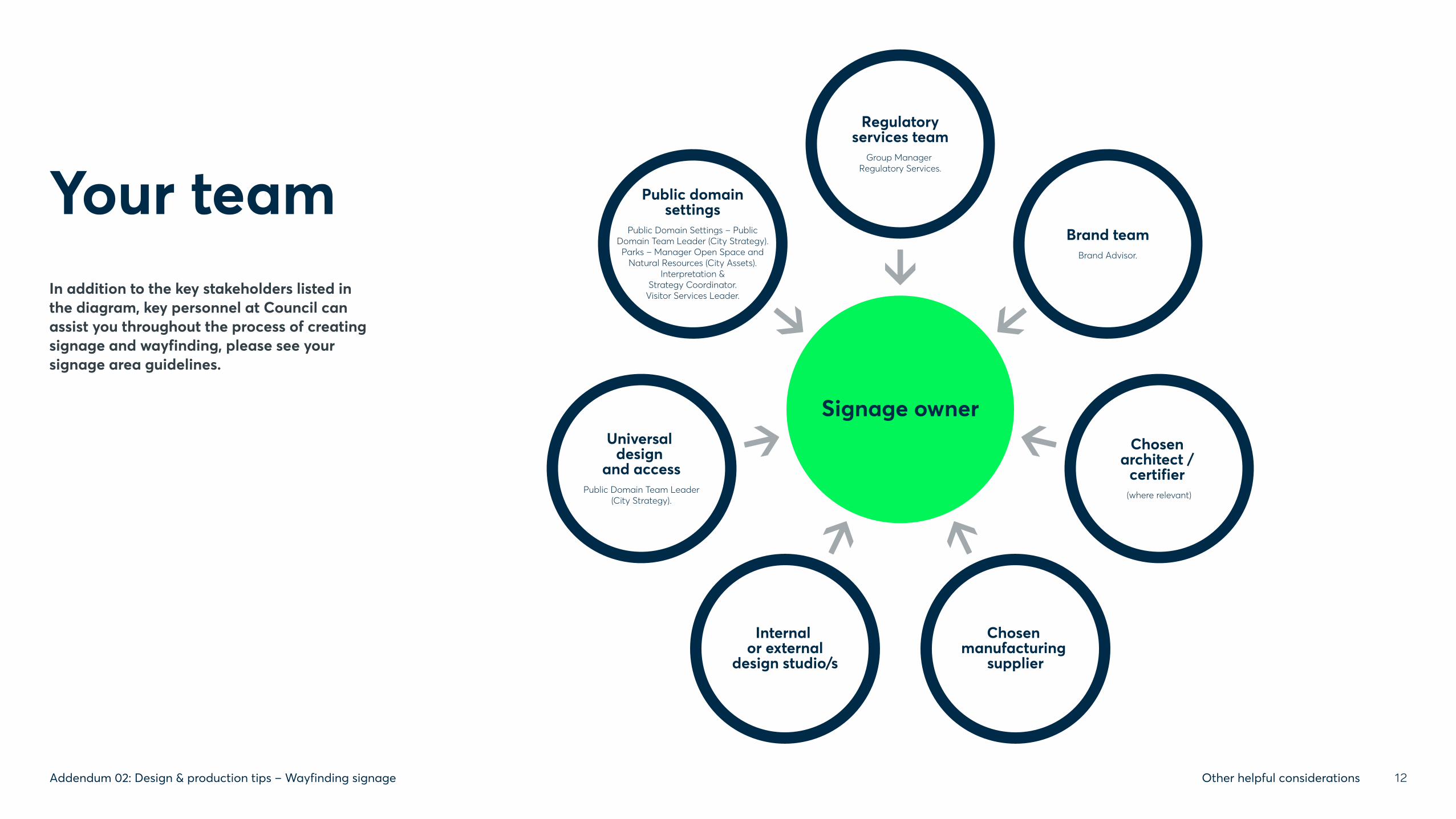
Your team
Signage owner
Regulatoryservices team
Group Manager Regulatory Services.
Internal or external
design studio/s
Chosen architect /
certifier (where relevant)
Public domainsettings
Public Domain Settings – PublicDomain Team Leader (City Strategy).Parks – Manager Open Space and
Natural Resources (City Assets).Interpretation &
Strategy Coordinator.Visitor Services Leader.
Brand teamBrand Advisor.
Universal design
and accessPublic Domain Team Leader
(City Strategy).
Chosen manufacturing
supplier
In addition to the key stakeholders listed in the diagram, key personnel at Council can assist you throughout the process of creating signage and wayfinding, please see your signage area guidelines.
12Addendum 02: Design & production tips – Wayfinding signage Other helpful considerations

Process overview
Outlined right is a best practice process for implementing signage. It identifies the stages of planning and implementation and who is responsible for each step.
The process is the same for one sign or one thousand.
KEY:
boxes indicate where signage owner and/or a nominated supplier carries out the work.
boxes show where the Graphic Consultant or the Signage Contractor share responsibility to deliver the work.
boxes indicate where the Signage Contractor is responsible for carrying out the work.
boxes indicate where the Brand team contribute to and approve the work.
triangles indicate key moments to refer to the wayfinding signage guidelines.
Graphic Consultant: Creates graphic design and layout. This could be an internal or external consultant.
Wayfinding Consultant: Defines and locates signtypes. Can assist with content.
The Graphic and Wayfinding Consultants could be the same supplier or separate suppliers.
Signage Contractor: Manufactures and installs signage.
STEP 1 ESTABLISH
Signage owner to establish need for signage. Seek advice from key representative in the signage area that fits your case and needs.
STEP 11 PROCUREMENT
Brief Signage Contractor to supply a quote. Signage Contractor appointed.
STEP 12 SITE INSPECTION
Signage Contractor to conduct a site inspection to confirm accurate dimensions and locations of signs.
STEP 24 MAINTENANCE AND REVIEW
Ongoing maintenance schedule begins.
STEP 13 CREATION OF ARTWORK
Create final artwork for signage and develop mapping artwork (if required).
STEP 16 DISPATCH OF ARTWORK
Graphic Consultant dispatches artwork for production once approved.
STEP 23 FINAL APPROVAL
City of Parramatta grants final approval of signage.
STEP 3 AUDIT
Audit and review park or building plans, identify what signs are required based on function and circulation routes.
STEP 10 SIGN CONTENT
Define messaging and apply to templates.
STEP 14 APPROVAL OF SIGNAGE ARTWORK
Signage owner gives approval of artwork.
STEP 22 RECTIFICATION
Rectification requirements confirmed and implemented.
STEP 4 BRIEF
Write brief defining clear strategy and response deliverables.
STEP 17 CREATION OF SHOP DRAWINGS
Signage Contractor creates shop drawings.
STEP 21 DEFECTS REVIEW
Defects inspection carried out by City of Parramatta team and/or Signage Contractor.
STEP 5 CONNECT
Connect with the key point of contact in the Brand team to discuss project.
STEP 15 BRAND TEAM APPROVAL
Submit artwork to the Brand team for approval.
STEP 20 INSTALLATION
Signs delivered to the park/site and installed by Signage Contractor or City of Parramatta team.
STEP 6 ISSUE
Issue tender brief to relevant Graphic and Wayfinding Consultants. Appoint Graphic and/or Wayfinding Consultants.
STEP 7 SIGN LOCATIONS
Indicate on plans the location of all signs using unique identifiers and prepare signage schedule/s.
STEP 18 APPROVAL OF SHOP DRAWINGS
Signage owner gives approval for manufacture.
STEP 19 FABRICATION
Signage Contractor commences manufacture of signs.
STEP 2 REVIEW
Review latest documentation; Wayfinding Signage Guidelines and Addendums. These will always be available on the Brand portal.
STEP 9 DOWNLOAD
Download templates from Brand portal/send to Graphic Consultant (along with Wayfinding Signage Guidelines and Addendum 01).
STEP 8 SIGN SELECTION
Select signtypes from the Wayfinding Signage Guidelines based on messaging requirements and sign location.
13Addendum 02: Design & production tips – Wayfinding signage Other helpful considerations

!(XG
ÆÆ!ME
ÆÆ!ME
##**
!36 2(
!(GP
!(GP
³±³±TXT
³±³±TXT
!(A
!56 5( Farn
el l A
ven
ue
Ba l ak a D r i v e
Hib is cu
sA
venue
Pa r k l an d Ro a d
Ch er ry Av enu e
Ba l aka D r i ve
JOHN WEARN RESERVE
NORTH ROCKS PARK
Rosew
oo
d Ave
nue
Man i l dr a
Avenue
Signage Layout:John WearnReserve
0 10 20 30 405Meters
±
Parks Signage LocationsD TBD
Sign Type- Description
!(EF Fitness Equipment Sign
!36 2( 632 Sign- On Post- D
##** 632 Sign- Triangle- G
!56 5( 655 Sign- On Post- E
¾¾¾¾¾¾¾ÀB-SN COMMU Building Sign- Community
¾¾¾¾¾¾¾ÀB-SN PUBTL Building Sign- Public Toilets
¾¾¾¾¾¾¾ÀB-SN SP ORT Building Sign- Sports Pavilion
GF Directional Sign- Tall (Street Style)- F
!(A Emergency Access Sign
³± Entrance Sign- Standard- A
³±³±TXT
Entrance Sign- Tall- B
ÆÆ!ME Main Entrance Sign- Standard C
¬!( Main Entrance Sign- Tall- D
³±PG Playground Sign- A
!(GP Playground Sign- Gates
! Splashpark Sign- Large- B
! Splashpark Sign- Standard- A An example of a location map markup.
Each signtype is noted and located. Once approved, these maps help with procurement and installation and their ongoing management. The package generated for approval contains a visual and the specific content of each sign.
14Addendum 02: Design & production tips – Wayfinding signage Other helpful considerations

Updating signageThere are many reasons or causes that will mean signs need to be updated in the coming months or years ahead.
Often there are changes to legislation, errors are found or an incident has occurred and signs need to be updated to reduce similar incidents occurring in the future.
Equally, damage through natural wear and tear or environmental factors (for example, sun/hail damage) accidental damage (for example, impact from footballs, other sporting equipment or cycling collision) or intentional damage through graffiti or theft are just some of the reasons that our signs might need to be replaced.
When any of these (or other) scenarios exist, we need to react efficiently to correct the situation. This might well be simply ordering and installing a replacement, but it is important that we consider if there are additional improvements that can be made. We take learnings from history and want to avoid adding more and more signs and leading to a similar cluttered environment.
How to handle new scenarios:
If there is not an immediately available signtype or template to suit a situation, the first step should be to consider if a signtype or template can be modified or repurposed for this scenario.
In most cases this will be possible with the flexibility provided within our signage system.
If not, a new signtype should be created and for efficiency, shared internally for future use by council. This will include new signtype codes being generated by the production team (ongoing project, please contact the Brand team). All new signtypes should visually align with the rest of our signage system.
Updates vs new scenarios:
For like-for-like replacement signs, the signage owner will manage ordering and installation.
For signs that require minor updates prior to production or entirely new signs (or packages for new locations), the signage owner will have artwork generated and seek approval before managing ordering and installation.
15Addendum 02: Design & production tips – Wayfinding signage Other helpful considerations

Production & construction tipsAs the signage owner, these tips are provided to help protect the safety, investment and longevity of our signs, and apply high quality and best-practice standards. They should be read and considered in-line with the process diagram and full signtype library:
Panels should be a minimum 3mm marine grade aluminum panel, free of damage or other surface degradation.
All panels shall be full length with no jointing in materials other than those detailed. Edges and surfaces should be clean, neat and free from burrs and indentations, remove sharp edges to a fine pencil round without excessive radiusing. Fine pencil round corners are to be applied instead of large radius corners. The form of our signs is square to highlight
the circular beacon. A large radius visually competes and uses important real estate on our signs. The exception of this rule is for panels that are architecturally adjusted to be mounted flush within frames. Where this is the case, the hardware will dictate the radius and signage content should be adapted accordingly. Ensure that the panels are flat and rigid and are capable of withstanding the ‘wear and tear’ of the external public environment.
All fixings are to be permanent to the wall, fence or structural steel frame, which itself should be powder-coated, rustproof, and as required for panel size and form of sign and footing/ground plane condition. Wherever possible, signage hardware should be hidden behind panels and not a strong visual feature.
All footings to be buried under ground so surface level is clean, neat and free of any potential trip or catch hazards.
All fixings and fasteners should be corrosion resistant and vandal proof below 2m from finished floor level. The size and number of the fasteners are to be appropriate for the weight of the sign and appropriate to the type of substrate they are fixing into, ie masonry, timber or hollow wall construction, concrete slab, structural steel framing. Holes at fixing points to allow for normal movement of materials. Wherever possible, all fixings should be invisible. Where this is not possible, fixings should be positioned close to the edge of the panel, free from obstructing content and colour matched so they are visually recessive.
All signs should be installed straight and level at appropriate heights and locations using high quality fixings and equipment. High quality installation is as important as the high quality design and manufacturing.
To be fully engineered and certified by a structural engineer with the allowance for all scenarios required e.g. wind loads. Shop drawings of every sign should be produced and approved before production. We highly recommend including the Brand team in this process.
All signs and production techniques to be sampled, prototyped and assessed by the signage owner and Brand team before implementation.
16Addendum 02: Design & production tips – Wayfinding signage Other helpful considerations

To be 80% matte satin-finish, to match the COP Palette colours with an anti-graffiti film applied to all signs mounted below 2m from finished floor level.
All paints shall be low VOC (volatile organic compound) and provide full and permanent adhesion of vinyl/digital print applied to surfaces.
Mask and spray signage to be created using cut vinyl by a vinyl cutting machine. Apply graphics by spray painting or high pressure cleaning. All corners and edges of finished letter form, numerals, arrows, pictograms, logotypes or other symbols shall be sharp and true to the Parramatta typeface or artwork with accurate, even curves where applicable.
When spray painting, ensure even distribution of paint across the graphic application, and no build up at the mask edges. Paint system to be external grade system prepared and installed as per manufacturers instructions. Finish to be free of dust, scratches and other imperfections and applied in safe environment.
Vinyl text, arrows and other graphics to be cast, exterior, high grade, and applied as individual vinyl characters, computer cut from self adhesive vinyl. All corners and edges of finished letter forms, numerals, arrows, pictograms, logotypes or other symbols shall be sharp and true to the selected typeface or artwork with accurate, even curves where applicable.
Graphic prints are to be high resolution and colour accurate.
Where production cannot be managed in-house, it is highly recommended that a tender process be employed for the procurement of services and signs.
A list of approved suppliers can be requested from the Brand and Marketing team.
Final sign-off and all certifications should be achieved before production begins.
Our strategy to ‘declutter’ applies to the number of signs we use as much as what we put on each sign. All content should be minimised. Some practical examples of this are: using the minimum number of ‘do not’ icons for that specific location instead of a generic set that cover all possible locations and scenarios. Headlines and narrative should be condensed to the minimum number of words required to deliver the message, don’t feel you need to fill signs, generous ‘clear space’ is as important as the content and demonstrates brand confidence. Short URL’s and QR codes to be used instead of full articulations so the community can type or scan them quickly and easily on the go.
17Addendum 02: Design & production tips – Wayfinding signage Other helpful considerations

Does your supplier understand our quality and
service expectations?
Unsure? Please organise a briefing meeting with Council’s Brand Advisor.
Does your supplier have the production capability to achieve our fluorescent Moss colour and
80% matte colour contrast accessibility requirement?
Please check with your supplier.
Have your signs been created from the master artwork
templates and follow the wayfinding signage guidelines?
No? Please refer to your signage area guidelines
on the Brand portal.
Have your signs been approved by the Brand team?
No? Please engage the Brand team at an early stage and submit your signage suite.
Do your designs align with our strategy and meet
our ‘decluttering’ objective?
Unsure? Please check with Council’s Public
Domain Team Leader.
Troubleshooting
18Addendum 02: Design & production tips – Wayfinding signage Other helpful considerations

We will be judged by the quality, finish and effectiveness of the installed finished system. Therefore time and care should be taken at every step to ensure a premium finished product.
Installation is the final step in a long process and the one that will effected most and judged most by the community.
At installation it is critical that the installation plan is followed. All signs should be installed in the correct location, in the correct orientation.
We choose to locate and orientate signs in the most logical places and directions. Understanding the direction of preferred (and possible) approach is critical.
Signs should generally be orientated at 90° to the path of travel so it can be seen and read upon approach and the content applied to
each sign is carefully adjusted to that specific location and to read above as ahead.
This means that a sign identifying a location that sits alongside a road should have it’s content duplicated on both sides and (where possible) should be set at 90° so that it can be read upon approach from either direction.
Signs that have blades pointing to a destination must be orientated accurately to point in the correct direction.
All safety requirements are mandatory and that possible future risks are considered, reported and addressed. If safety or effectiveness of the sign to be installed is compromised in any way, works should cease and advice from the signage owner be sought.
Locating the signs should be contextual and not be disruptive or a danger to users.
Generally signs should be placed just off the path of travel, ready to help if needed but safely out of the way if it isn’t or safely over head height if mounted on a pole or other hardware.
When mounting to walls and fences, context, legislation and sightlines should be considered.
Signs will be mounted between 1000 and 1700mm FFL. If multiple signs are mounted in the same location, the top edges should be aligned.
The bottom edge of pole mounted blade signs should never be lower than 2000mm FFL. The bottom edge of suspended signs should never be lower than 2400mm FFL.
Signage zone standardsAS1428.2, 1992 Design for Access and Mobility
2400–2900mm: Suspended SignsSuspended signs should be no less than 2400mm above finished floor level to keep out of reach
1200–1600mm: Wall-mount SignsSigns should be no less than 1400mm and not more than 1600mm above finished floor level.
2000–2400mm: Pole-mount SignsSigns should be no less than 2000mm above finished floor level.
1000–1200mm: Wall-mount SignsWhere space in the Tactile Signage Zone is already taken, the signage zone may be extended down to no less than 1000mm above finished floor level.
2900
2400
1600
1400
1200
1000
Construction & mounting principles
19Addendum 02: Design & production tips – Wayfinding signage Other helpful considerations

Maintenance & reviewA maintenance policy and program of regular maintenance is required to ensure all signs display the correct message and are free of defects and/or signs of vandalism.
Regular cleaning of signs is required to prevent build up of dirt/pollution to ensure signs are legible and presentable. For signs located in high density or built-up areas cleaning should be undertaken more regularly at the discretion of the signage area’s maintenance department.
An in-house computer register of signs with inspection and maintenance records should be established and maintained. Signs should be inspected periodically and conditions compared with the previous entry in the register.
Signs are to be checked for:
+ Appropriateness of message
+ Condition of sign panels and blade systems
+ Condition of footings/pole/connection to base building/fence
+ Condition of materials and welds
+ Condition and security of hardware
+ Evidence of vandalism/damage
+ Assessment of suitable repairs
Following inspection maintenance any rectification is to be implemented as per council policy.
20Addendum 02: Design & production tips – Wayfinding signage Other helpful considerations

SustainabilityRefer to:
Policy #287 Procurement Policy
Policy #354 Corporate Sustainability
21Addendum 02: Design & production tips – Wayfinding signage Other helpful considerations

Definitions & help
22Addendum 02: Design & production tips – Wayfinding signage Definitions & help

DefinitionsAccess General abbreviated term for accessibility.
Accessible Having features to permit use by people with disabilities (BCA).
Accessible Colour Contrast Good colour contrast between text and the background it sits on assists people with vision impairment, including colour blindness, and cognitive impairments when viewing content.
Acknowledgement Council’s acknowledgement of the traditional land owners.
Adobe Illustrator Computer software, part of the Creative Cloud developed by Adobe. Used to create and edit sign templates for the creation and production of artwork.
Architectural Signage Custom or unusual signage. This can be structural ‘hardware’, 3D lettering, or sculptural signs.
Arrow Zone Area at left or right end of signs reserved for arrows.
Artwork High quality, final electronically drafted design suitable for production.
AS Australian Standard.
Ascender Portion of a lower case letter above the x-height.
ATSI Aboriginal and Torres Strait Islander.
BCA Building Code of Australia – current edition.
Beacon Our fluoro green circle.
Braille A system of touch reading for the blind, which employs raised dots, evenly arranged in quadrangular letter spaces or cells. See also Tactile Signage.
CMYK Cyan Magenta Yellow Black. A colour system where colours are created by mixing four primary process colours.
COP City of Parramatta.
Descender Portion of the lower case letter below the x-height.
Directional Signs Includes directories and directional signs. Directory signs list destinations, Directional signs direct to places and destinations.
DDA Disability Discrimination Act.
DSD Disability Standard Document(s) approved by the Commonwealth Attorney General that satisfies the DDA.
FFL Finished floor level.
Finger Blade Sign Signage mounted to a freestanding pole and positioned to indicate the direction you should travel from that point. Poles installed at a junction in the user journey.
Fittings Fixed items attached to walls, floors or ceilings that do not require services such as curtain and IV tracks, hooks, mirrors, blinds, joinery, pin boards, etc.
23Addendum 02: Design & production tips – Wayfinding signage Definitions & help

Fixings The bolts, screws and other methods of fixing signs (temporary or permanent) to the signage hardware.
Fixtures Fixed items that require service connection (e.g. electrical, hydraulic, mechanical) and includes basins, light fittings, clocks, medical service panels, etc.
Fonts A set of type of one particular face and size.
Gateway Sign Large signage that typically includes a detailed map. The map allows a visitor to visually picture their entire journey. Installed at ‘gateways’ to the LGA such as major transport hubs and generally forms the first sign to be encountered in the wayfinding system. Totem signs and Finger Blade Signs provide confirmation along the way.
Hardware The physical elements of a sign, including fittings, fixtures, footings and panels.
Hearing Loop Assistive listening system, used with International symbol for deafness.
Icon A picture representing a word or idea.
Identification Signs Identify places and destinations.
Justified To adjust the spaces between words in a line of type so that it is of the required width or length to fit exactly.
Layout A drawing or sketch of proposed sign-face.
Letterform Space between adjacent letters.
Logo Name and symbol of an organisation (City of Parramatta) in a special design used as a consistent identifying mark.
LGA Local Government Area.
Lowercase Type without capitals.
Luminance Contrast The amount of light reflected from one surface or component, compared to the amount of light reflected from the background or surrounding surfaces.
Masterplan A drawing, typically utilising a building plan or landscape plan indicating sign locations utilising the sign code or unique identifier.
Message Zone Area between arrow zones reserved for message wording.
Neg Negative. A light coloured graphic element suited for a dark coloured background.
OHS Occupational Health and Safety act.
Operational Signs Illustrate statutory and functional messages.
Pictogram A picture representing a word or idea. Typically more illustrative/detailed than an icon.
PMS Pantone Measuring System. A colour system based upon over 1,800 standardised ink colours.
Pos Positive. A dark coloured graphic element suited for a light coloured background.
Promotional Signs Signage promoting a product or service.
ROC Rydalmere Operations Centre.
Sign A combination of graphic elements on a background to convey a message – includes visual, auditory or tactile devices.
Sign Code / Unique identifier A system that allocates signs into groups or categories and includes the allocation of individual numbers or letters to allow identification of each sign item.
Signage Collection of signs.
Signage Schedule A document illustrating sign types (via a sign code) the message to be illustrated on the sign (including arrows, written text, pictograms) to be read in conjunction with the Masterplan. Primarily used for accurately costing/tendering.
Signtype Common sizes of signs are referred to as signtypes.
24Addendum 02: Design & production tips – Wayfinding signage Definitions & help

Special Project Signs Signage can identify a significant area or be designed through materials or form, to integrate into a unique environment.
Statutory Signs Signage required by law to comply with health and safety legislation.
Symbol A graphic or pictorial device used to represent objects or concepts.
Tactile Signage Signage incorporating raised text/or symbols to enable touch reading by the blind and touch enhancement for visual perception for visually impaired readers.
Template Master device with which many reproductions of the same element can be made.
Temporary Signs Signage with a limited lifespan or that is mobile and can be put in place when needed.
Totem Sign Freestanding signage that provides key information and confirmation that they are ‘on-track’ along the journey. A combination of content is typically included, such as identification, maps and directional messaging.
Typeface The styling of lettering or alphabet.
Typography The use of lettering or alphabet.
Unique identifier / Sign Code A system that allocates signs into groups or categories and includes the allocation of individual numbers or letters to allow identification of each sign item.
Visual Identity The visual elements that portray City of Parramatta’s identity, such as logo, fonts, colours and imagery.
VOC Volatile Organic Compound.
Wayfinding Strategy to assist people in finding their way, includes signage.
Word Space Space between adjacent words.
X-Height Height of the lower case letter ‘x’.
25Addendum 02: Design & production tips – Wayfinding signage Definitions & help

Help
Brand team For questions regarding any of the visual identity assets or principles recommended in this document, please contact the Brand Team.
Brand Advisor Vanessa Mouledous [email protected] +61 2 9806 5884
Council’s key contact to assist on your project for specific questions related to:
Project Officer – Universal Design & Access Hamish Murray [email protected] +61 2 9806 5830
Group Manager Social & Community David Moutou [email protected] +61 2 9806 5112
Council’s key contact to assist on your project for specific questions related to:
Accessibility: Project Officer – Universal Design & Access Hamish Murray [email protected] +61 2 9806 5830
Aboriginal and Torres Strait Islander community: Group Manager Social & Community David Moutou [email protected] +61 2 9806 5112
Interpretation & Strategy Coordinator Michelle Desailly [email protected] +61 2 8839 3334
Regulatory: Group Manager Regulatory Services Paul Lyth [email protected] +61 2 9806 5369
Project Working Group The following people have worked with the City of Parramatta giving feedback to help inform this project:
Parks: Ian Hasselman, Tim Dale, James Smallson, Adam Cooke, Troy Holbrooke.
Libraries: Michele Burton, Gary Moore, Yan Zhang.
Public Domain: Michelle Desailly, Adam Fowler, Andrew Tam, Raquel Bloom, Deborah Eastment.
Community Centres: Gregory Radford and Gary Moore.
Bus Shelters: Andy Ling.
Events: Christopher Snelling and Jeffrey Stein.
Hoarding: Paul Lyth and Mario Trifiro.
Car Parks: Jodie Carter.
Heritage Centre: Christopher Snelling and Justine Dowd.
Early Learning Centre: Carolyn Isaac-Dean and Gary Moore.
Places: Bruce Mills, Melinda Ta, Rosamund Palmer, Beth Andean, Lily Wang, Steven Ellis, Myly Truong, Stephanie Cascun, Eva Vizas.
Keith Baker, Michelle Burke, Rebecca Grasso, Laila Hage-Ali, Sophia Koujoumdjian, Paul Lyth, David Moutou, Hamish Murray, Ranjini Panicker, Steven Ross, Jeff Stein, Robert Williams, Lindsay Woodland.
26Addendum 02: Design & production tips – Wayfinding signage Definitions & help

Thank you
27Addendum 02: Design & production tips – Wayfinding signage