A2.2 MINITAB - wps.pearsoned.com.auwps.pearsoned.com.au/wps/media/objects/8574/8780272/Minitab...
4
FIGURE A2.3 Minitab Unstack Columns Dialog Box FIGURE A2.4 Minitab Bar Charts Dialog Box A2.2 MINITAB You can use Minitab to create many of the tables and charts discussed in this chapter. If you have not already read Appendix 1.3, “Introduction to Minitab,” on page 19, you should do so now. Unstacking Data Data are usually arranged so that all of the values of a vari- able are stacked vertically down a column. In many cases, you need to separately analyze different subgroups in terms of a numerical variable of interest. For example, in the mutual fund data, you may want to separately analyze the 2003 percentage return of the growth funds and the value funds. This can be accomplished by unstacking the 2003 percentage return variable so that the 2003 percentage returns for the growth funds are located in one column and the 2003 percentage returns for the value funds are located in a different column. To accomplish this task, open the MUTUALFUNDS2004.MTW worksheet. Select Data Unstack Columns. Then do the following: Step 1: In the Unstack Columns dialog box (see Figure A2.3), enter C7 or Return 2003 in the Unstack the data in: edit box. Step 2: Enter C3 or Objective in the Using Subscripts in: edit box. Step 3: Select the After last column in use option button. Select the Name the columns containing the unstacked data check box. Click the OK button. The new variables Return2003_Growth and Return2003_Value are now in columns C13 and C14. Change the names of these variables as desired. Bar Chart To produce the bar chart in Figure 2.1 on page 23, open the ONLINESHOPPING.MTW worksheet. Select Graph Bar Chart. Then do the following: Step 1: In the Bar Charts dialog box (see Figure A2.4), in the Bars represent: drop-down list box, select Values from a table since the frequencies in each category are provided. (If you are using raw data such as from the MUTUALFUNDS2004.MTW worksheet, select Counts of unique values in the bars represent dialog box.) Select the Simple graph box. Click the OK button. Step 2: In the Bar Chart— Values from a table, One column of values, Simple dialog box (see Figure A2.5), enter C2 or Percentage (%) in the Graph Variables: edit box. Enter C1 or Reason in the Categorical variable: edit box. Click the OK button.
-
Upload
nguyenkhanh -
Category
Documents
-
view
216 -
download
0
Transcript of A2.2 MINITAB - wps.pearsoned.com.auwps.pearsoned.com.au/wps/media/objects/8574/8780272/Minitab...

FIGURE A2.3 Minitab Unstack Columns Dialog Box
FIGURE A2.4 Minitab Bar Charts Dialog Box
A2.2 MINITABYou can use Minitab to create many of the tables and chartsdiscussed in this chapter. If you have not already readAppendix 1.3, “Introduction to Minitab,” on page 19, youshould do so now.
Unstacking DataData are usually arranged so that all of the values of a vari-able are stacked vertically down a column. In many cases,you need to separately analyze different subgroups in termsof a numerical variable of interest. For example, in themutual fund data, you may want to separately analyze the2003 percentage return of the growth funds and the valuefunds. This can be accomplished by unstacking the 2003percentage return variable so that the 2003 percentagereturns for the growth funds are located in one column andthe 2003 percentage returns for the value funds are locatedin a different column.
To accomplish this task, open the MUTUALFUNDS2004.MTW
worksheet. Select Data Unstack Columns. Then do thefollowing:
Step 1: In the Unstack Columns dialog box (see FigureA2.3), enter C7 or Return 2003 in the Unstackthe data in: edit box.
Step 2: Enter C3 or Objective in the Using Subscriptsin: edit box.
Step 3: Select the After last column in use option button.Select the Name the columns containing theunstacked data check box. Click the OK button.The new variables Return2003_Growth andReturn2003_Value are now in columns C13 andC14. Change the names of these variables asdesired.
Bar ChartTo produce the bar chart in Figure 2.1 on page 23, open theONLINESHOPPING.MTW worksheet. Select GraphBar Chart. Then do the following:
Step 1: In the Bar Charts dialog box (see Figure A2.4), inthe Bars represent: drop-down list box, selectValues from a table since the frequencies in eachcategory are provided. (If you are using raw datasuch as from the MUTUALFUNDS2004.MTWworksheet, select Counts of unique values in thebars represent dialog box.) Select the Simplegraph box. Click the OK button.
Step 2: In the Bar Chart— Values from a table, One columnof values, Simple dialog box (see Figure A2.5),enter C2 or Percentage (%) in the Graph Variables:edit box. Enter C1 or Reason in the Categoricalvariable: edit box. Click the OK button.
BEREMC02_0131536869.QXD 1/24/05 8:01 PM Page 66

Appendix 67
FIGURE A2.5 Minitab Bar Chart—Values from aTable, One Column of Values, Simple Dialog Box
FIGURE A2.6 Minitab Pie Charts Dialog Box
FIGURE A2.7 Minitab Pie Charts—Labels Dialog Box
To select colors for the bars and borders in the bar chart:
Step 1: Right-click on any of the bars of the bar chart.
Step 2: Select Edit Bars.
Step 3: In the Attributes tab of the Edit Bars dialog box,enter selections for Fill Pattern and Border andFill Lines.
Pie ChartTo produce a pie chart similar to Figure 2.4 on page 25,open the MUTUALFUNDS2004.MTW worksheet. SelectGraph � Pie Chart. Then do the following:
Step 1: In the Pie Chart dialog box (see Figure A2.6),select the Chart raw data option button sinceyou are using the raw data from the worksheet. (Ifyou are using the frequencies in each categorysuch as from the ONLINE SHOPPING.MTWworksheet, select the Chart values from a tableoption button). Enter C10 or Risk in the categori-cal variables: edit box.
Step 2: Select the Labels button. In the Pie Chart—Labelsdialog box (see Figure A2.7), select the SliceLabels tab. Then select the Category name andPercent check boxes. Click the OK button to returnto the Pie Chart dialog box. Click the OK button.
Pareto DiagramTo produce the Pareto diagram of Figure 2.6 on page 27,open the KEYBOARD.MTW worksheet. This data setcontains the causes of the defects in column C1 and the fre-quency of defects in column C2. Select Stat � QualityTools � Pareto Chart. In the Pareto Chart dialog box (seeFigure A2.8)
Step 1: Select the Chart defects table option button.
Step 2: In the Labels in: edit box, enter C1 or Cause.
Step 3: In the Frequencies in: edit box, enter C2 orFrequency.
Step 4: In the Combine defects after the first edit box,enter 99.9.
Step 5: Click the OK button.
FIGURE A2.8 Minitab Pareto Chart Dialog Box
BEREMC02_0131536869.QXD 1/24/05 8:01 PM Page 67
68 CHAPTER TWO Presenting Data in Tables and Charts
FIGURE A2.9 Minitab Stem-and-Leaf Dialog Box
FIGURE A2.10 Minitab Histograms Dialog Box
FIGURE A2.11 Minitab Histogram—Simple Dialog Box
If the variable of interest was located in a single columnand is in raw form with each row indicating a type of error,you would select the Charts defects data in: option buttonand you would enter the appropriate column number orvariable name in the Chart defects data in: edit box.
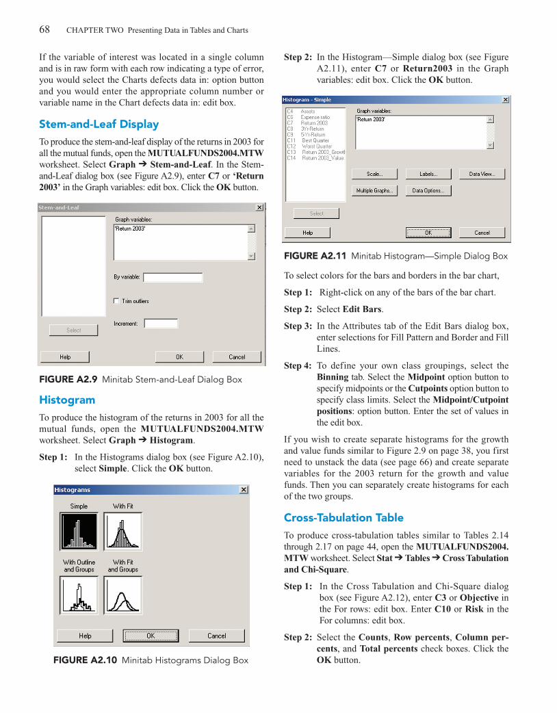
Stem-and-Leaf DisplayTo produce the stem-and-leaf display of the returns in 2003 forall the mutual funds, open the MUTUALFUNDS2004.MTWworksheet. Select Graph � Stem-and-Leaf. In the Stem-and-Leaf dialog box (see Figure A2.9), enter C7 or ‘Return2003’ in the Graph variables: edit box. Click the OK button.
HistogramTo produce the histogram of the returns in 2003 for all themutual funds, open the MUTUALFUNDS2004.MTWworksheet. Select Graph � Histogram.
Step 1: In the Histograms dialog box (see Figure A2.10),select Simple. Click the OK button.
Step 2: In the Histogram—Simple dialog box (see FigureA2.11), enter C7 or Return2003 in the Graphvariables: edit box. Click the OK button.
To select colors for the bars and borders in the bar chart,
Step 1: Right-click on any of the bars of the bar chart.
Step 2: Select Edit Bars.
Step 3: In the Attributes tab of the Edit Bars dialog box,enter selections for Fill Pattern and Border and FillLines.
Step 4: To define your own class groupings, select theBinning tab. Select the Midpoint option button tospecify midpoints or the Cutpoints option button tospecify class limits. Select the Midpoint/Cutpointpositions: option button. Enter the set of values inthe edit box.
If you wish to create separate histograms for the growthand value funds similar to Figure 2.9 on page 38, you firstneed to unstack the data (see page 66) and create separatevariables for the 2003 return for the growth and valuefunds. Then you can separately create histograms for eachof the two groups.
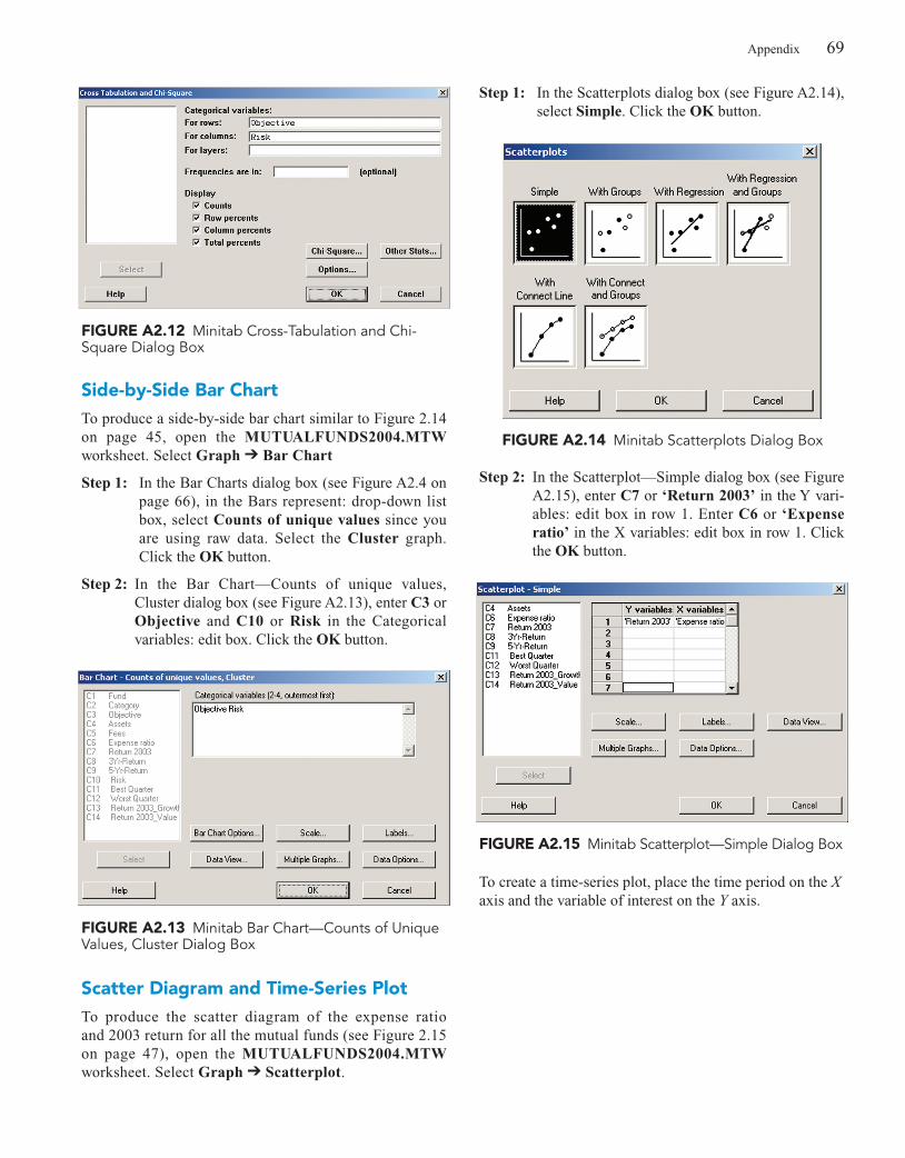
Cross-Tabulation TableTo produce cross-tabulation tables similar to Tables 2.14through 2.17 on page 44, open the MUTUALFUNDS2004.MTW worksheet. Select Stat � Tables � Cross Tabulationand Chi-Square.
Step 1: In the Cross Tabulation and Chi-Square dialogbox (see Figure A2.12), enter C3 or Objective inthe For rows: edit box. Enter C10 or Risk in theFor columns: edit box.
Step 2: Select the Counts, Row percents, Column per-cents, and Total percents check boxes. Click theOK button.
BEREMC02_0131536869.QXD 1/24/05 8:01 PM Page 68
Appendix 69
FIGURE A2.12 Minitab Cross-Tabulation and Chi-Square Dialog Box
FIGURE A2.13 Minitab Bar Chart—Counts of UniqueValues, Cluster Dialog Box
FIGURE A2.14 Minitab Scatterplots Dialog Box
Side-by-Side Bar ChartTo produce a side-by-side bar chart similar to Figure 2.14on page 45, open the MUTUALFUNDS2004.MTWworksheet. Select Graph � Bar Chart
Step 1: In the Bar Charts dialog box (see Figure A2.4 onpage 66), in the Bars represent: drop-down listbox, select Counts of unique values since youare using raw data. Select the Cluster graph.Click the OK button.
Step 2: In the Bar Chart—Counts of unique values,Cluster dialog box (see Figure A2.13), enter C3 orObjective and C10 or Risk in the Categoricalvariables: edit box. Click the OK button.
Scatter Diagram and Time-Series PlotTo produce the scatter diagram of the expense ratio and 2003 return for all the mutual funds (see Figure 2.15on page 47), open the MUTUALFUNDS2004.MTWworksheet. Select Graph � Scatterplot.
Step 1: In the Scatterplots dialog box (see Figure A2.14),select Simple. Click the OK button.
Step 2: In the Scatterplot—Simple dialog box (see FigureA2.15), enter C7 or ‘Return 2003’ in the Y vari-ables: edit box in row 1. Enter C6 or ‘Expenseratio’ in the X variables: edit box in row 1. Clickthe OK button.
FIGURE A2.15 Minitab Scatterplot—Simple Dialog Box
To create a time-series plot, place the time period on the Xaxis and the variable of interest on the Y axis.
BEREMC02_0131536869.QXD 1/24/05 8:01 PM Page 69