A2 Coursework
33
A2 Coursework By Michael Elliott
-
Upload
mike-elliott -
Category
Documents
-
view
233 -
download
0
description
Graphics A2 coursework
Transcript of A2 Coursework

A2 Coursework
By Michael Elliott

Logo Research Before designing my
logo, I looked up some already existing logo’s to see if they would inspire me in anyway. After looking at these logo’s I have decided I am going to design 3 logos. One design will be simple but professional looking design, a formal logo that would be placed on business letters. The second will be more exciting and involve colours, spelling out the name of the business. The third will be a more fun logo, that would be placed on the businesses product.

Initial Logo designs.


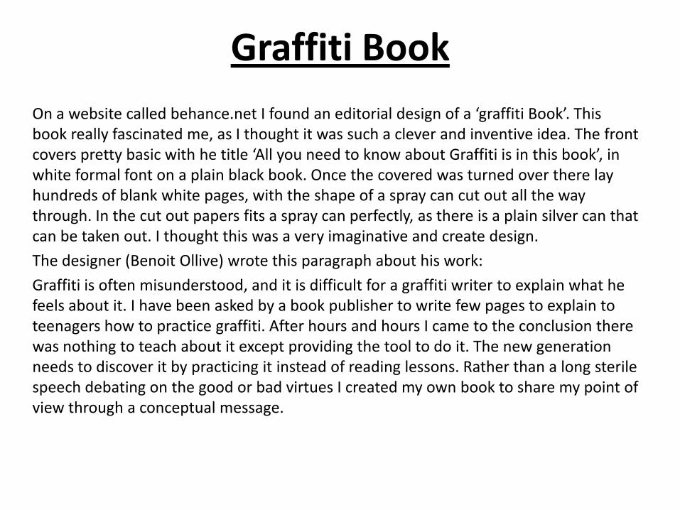
Graffiti Book
On a website called behance.net I found an editorial design of a ‘graffiti Book’. This book really fascinated me, as I thought it was such a clever and inventive idea. The front covers pretty basic with he title ‘All you need to know about Graffiti is in this book’, in white formal font on a plain black book. Once the covered was turned over there lay hundreds of blank white pages, with the shape of a spray can cut out all the way through. In the cut out papers fits a spray can perfectly, as there is a plain silver can that can be taken out. I thought this was a very imaginative and create design.
The designer (Benoit Ollive) wrote this paragraph about his work:
Graffiti is often misunderstood, and it is difficult for a graffiti writer to explain what he feels about it. I have been asked by a book publisher to write few pages to explain to teenagers how to practice graffiti. After hours and hours I came to the conclusion there was nothing to teach about it except providing the tool to do it. The new generation needs to discover it by practicing it instead of reading lessons. Rather than a long sterile speech debating on the good or bad virtues I created my own book to share my point of view through a conceptual message.

After seeing this book I thought it was really interesting and unique. I thought I’d try out this with my own topic, that I chose ‘skate’ (with a wheel inside the book), and thought it turned out alright. Benoit Ollive inspired me to create this. For the cover I used an old book cover and cut out the word ‘Skate’ from it. I used a knife to then cut out the circle through all the pages.

Stephen Wiltshire Stephen Wiltshire is an artist that mainly paints and draws detailed buildings and cityscapes.
He draws more portraits of people than anything else, but has the compositions stored in his personal private sketchbook.
He was born in London on the 24th April 1974, with his parents being west Indian. As a child he was mute, and did not relate to other people. Aged three, he was diagnosed as autistic. Stephen fully learnt to speak at the age of nine as he had problems due to his disability.
At the age of five, Stephen was sent to Queensmill School in London, this was when he was discovered he was extraordinary talented and enjoyed drawing. It soon became apparent he communicated with the world through the language of drawing; first animals, then London buses, and finally buildings. These drawings show a masterful perspective, a whimsical line, and reveal a natural innate artistry.
When he was about seven, Stephen became fascinated with sketching landmark London buildings. One of Stephen's teachers took a particular interest in him, who later accompanied his young student on drawing excursions and entered his work in children's art competitions, many of which garnered Stephen awards. The local press became increasingly suspicious as to how a young child could produce such masterful drawings.

Stephen has a fantastic memory as most of his drawings of landscapes and cities are drawn from his memory. As he spends a certain amount of time analyzing the sight, then goes back to his studio to draw what he saw. He works by hand only using his pencil, pen and paint. His compositions are effective as there are dominant, emphasized coloured areas of his work that stand out greatly due to the rest of the work being in black and white. The use of limited colours helps to guide your eye around the page and hold the design together. Although some of his art work has areas that have been coloured, others don’t, they stick to a simple but very effective style of black and white.
I chose to study Stephen as I wanted to experiment with how different artist’s work so I could get a real feel with what styles my strengths are. I admire the way that Stephen draws as its very detailed drawings but with a scribble sort of affect. He has a very unique style that is recognized across the whole word. He uses a limited range of color with his drawings mainly in black and white, with the acceptation with a different colour here and there, balancing his compositions effectively.
This artwork is all in black and white with the acceptations of the busses, with have been emphasized and painted in red. This is a great way to add importance, as you can tell from just one glance that the drawing is off London with the busses giving it away.
The same goes for this picture, but instead of busses, it’s cabs/taxi’s. This is a drawing of America as you can tell by the buildings but mainly by the taxi’s and there colourings. The colour enhances the picture and really brings out the meaning.


World Gesture Guide Alba Durana created this editorial.
“The project carries out an analysis of the variety of gestures that are internationals and seeks all those who have different meanings and can lead to error, and eases knowledge of those who only performed in a particular country through different compact-formats. One conversation is gestuality in a 60%, and therefore knows their secrets can only enhance our communication with the rest of people who live in this world.”
I decided to look at this editorial as the design of the front cover attracted me. I liked the way how it was unusual and that the title drifted off the page and onto the spine of the book as well. Inside the nook it looks very plain but attractive, there is limited colour used which is only black and white. The paper is white and the text is black on most pages, but it swaps around on one page which is an interesting surprise. There are 3 images in this editorial, 2 take up a page each and the last takes up two. The images are in black and white, and their importance is being showed by them filling at least a page each. This is a nice style as it fills a page and gives the readers something interesting to view. The structure for the text is 2 columns. There isn’t much text in this editorial, and it’s spread among the pages to make it seem less and easier to read.

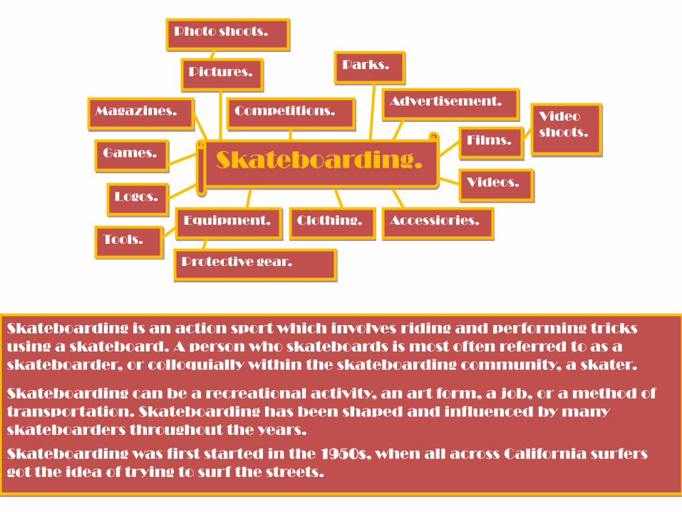
Skateboarding.
Magazines.
Pictures.
Games.
Competitions.
Logos.
Equipment. Clothing. Accessiories.
Videos.
Films.
Advertisement.
Parks.
Tools.
Protective gear.
Photo shoots.
Video
shoots.
Skateboarding is an action sport which involves riding and performing tricks
using a skateboard. A person who skateboards is most often referred to as a
skateboarder, or colloquially within the skateboarding community, a skater.
Skateboarding can be a recreational activity, an art form, a job, or a method of
transportation. Skateboarding has been shaped and influenced by many
skateboarders throughout the years.
Skateboarding was first started in the 1950s, when all across California surfers
got the idea of trying to surf the streets.

Sidewalk Magazine
Originally known as Sidewalk Surfer at its inception it later changed its name to the current Sidewalk moniker. Sidewalk Surfer replaced R.A.D (Read and Destroy) Magazine as the Britain's only skateboarding magazine (at the time).
Founded in 1995, Sidewalk Surfer began publishing under Jim Peskett, owner of Permanent Publishing with Ben Powell at the helm as editor. Initially, the publishing and editorial team were all based in Oxford, England, where they worked alongside the editorial teams of sister titles White lines Snowboard Magazine and The Surfer's Path.
Andy Horsley, Chris Forder, Jon Robson and with Wig Worland as photo editor and chief photographer was the line up at its inception. Wig remained with Sidewalk until 2004 although he is still currently credited as a staff photographer.
I chose to look at sidewalk magazine as it is the best skateboard magazine out there in my opinion. As I am creating my magazine about skateboarding, I believed that this would be the perfect magazine to analysis as I could get ideas on what makes it appeal to its target market. Sidewalk is a top selling magazine known by any skateboarder that follows skateboarding. I will analysis it to find out what techniques are used to attract it to such a large audience. It’ll help me create my initial designs for my magazine with the help of its effective techniques.

The cover of the magazine has it similarities each month. But the most exciting thing is that the cover is constantly completely each month, with an amazing new picture taking up the whole of it, and the every changing text of the title. On some months the cover will only consist of a barcode, issue number/date, price, title text and the amazing picture. This can sound very boring but the way that it is all put together just makes you want to pick it up, and see what spectacular things are stored beyond the cover. It has a sense of mystery and excitement. With the abstract title, always looking similar, but never the same when it comes to size, font, colour fill and outline. Other months the cover of sidewalk could be insanely busy with lots of things going on, attracting the readers to get involved as they feel like they’re missing out. It can be covered with text, pictures and competitions informing the users what’s inside. ` More often than not sidewalk magazines cover is plain, leaving readers in suspense to what’s stored inside. This creates limited distractions leaving the reader having their whole focus on the amazing photography that takes up the whole page. It’s a very simplistic technique, which I shall consider to use in my magazine designs.

On the inside of sidewalk there are some very effective methods used that isn’t used so much in other magazines. There are several whole pages throughout the magazine that are just pictures. Sometimes they’re in a row and others scattered around. As this technique isn’t used a lot it’s very interesting and easy on the readers’ eyes. On almost every page there is a picture the magazine is picture based with very limited text given only when necessary. Text is used for titles and when necessary when information should be provided. Sidewalk defies the rule of columns and the text is placed where ever it wants to be, with what looks good or suits the page. This is a very effective technique as they don’t have set rules, it’s unpredictable and exciting. Every month sidewalk is completely different to the last issue this is what makes it a successful magazine, as the element of surprise is exciting. I will be looking at and understanding how to use such styles and techniques and will have a play around with them in my designs.
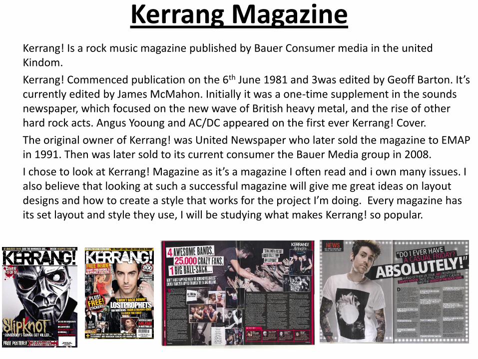
Kerrang Magazine Kerrang! Is a rock music magazine published by Bauer Consumer media in the united
Kindom.
Kerrang! Commenced publication on the 6th June 1981 and 3was edited by Geoff Barton. It’s currently edited by James McMahon. Initially it was a one-time supplement in the sounds newspaper, which focused on the new wave of British heavy metal, and the rise of other hard rock acts. Angus Yooung and AC/DC appeared on the first ever Kerrang! Cover.
The original owner of Kerrang! was United Newspaper who later sold the magazine to EMAP in 1991. Then was later sold to its current consumer the Bauer Media group in 2008.
I chose to look at Kerrang! Magazine as it’s a magazine I often read and i own many issues. I also believe that looking at such a successful magazine will give me great ideas on layout designs and how to create a style that works for the project I’m doing. Every magazine has its set layout and style they use, I will be studying what makes Kerrang! so popular.

The cover of Kerrang! has the same structure every week. With the big bold title situated at the top across the middle and the subtitle nearer the bottom of the page across the middle. This makes the magazine very recognizable as it’s clear to see what magazine it is. Every week there’s a different photo of a featured artist or band, taking up almost all of the cover. All around and over the picture are text boxes and small pictures describing what else is stored in the rest of the magazine, leaving the readers intrigued and eager to continue.
The way that every week there’s a massive image covering the whole page is a great technique to attract people as its emphasised. Kerrang! is set out in the same way and is very original and eye catching, a lot of people can tell what magazine it is, with once glance and not even reading the title. The text is placed perfectly as the title is one of the first things spotted, as it’s bold and sharp, informing you straight away what magazine it is, this is a strong technique. The pictures and text placed around the cover, gives it a busy effect. This makes the audience believe it’s busy inside too, this is an interesting and exciting method as it pulls the readers in. I will be experimenting with these techniques when designing my cover.
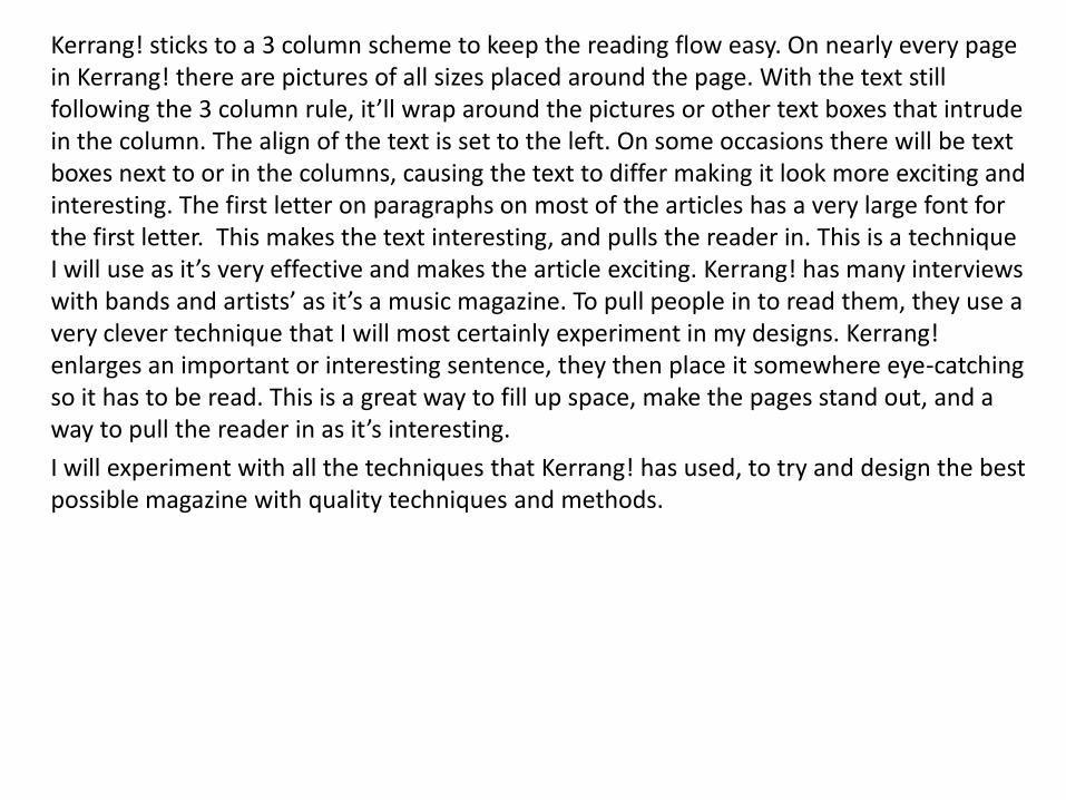
Kerrang! sticks to a 3 column scheme to keep the reading flow easy. On nearly every page in Kerrang! there are pictures of all sizes placed around the page. With the text still following the 3 column rule, it’ll wrap around the pictures or other text boxes that intrude in the column. The align of the text is set to the left. On some occasions there will be text boxes next to or in the columns, causing the text to differ making it look more exciting and interesting. The first letter on paragraphs on most of the articles has a very large font for the first letter. This makes the text interesting, and pulls the reader in. This is a technique I will use as it’s very effective and makes the article exciting. Kerrang! has many interviews with bands and artists’ as it’s a music magazine. To pull people in to read them, they use a very clever technique that I will most certainly experiment in my designs. Kerrang! enlarges an important or interesting sentence, they then place it somewhere eye-catching so it has to be read. This is a great way to fill up space, make the pages stand out, and a way to pull the reader in as it’s interesting.
I will experiment with all the techniques that Kerrang! has used, to try and design the best possible magazine with quality techniques and methods.
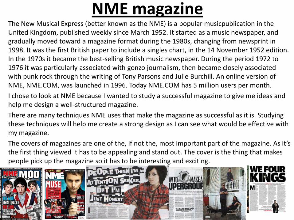
NME magazine The New Musical Express (better known as the NME) is a popular musicpublication in the
United Kingdom, published weekly since March 1952. It started as a music newspaper, and gradually moved toward a magazine format during the 1980s, changing from newsprint in 1998. It was the first British paper to include a singles chart, in the 14 November 1952 edition. In the 1970s it became the best-selling British music newspaper. During the period 1972 to 1976 it was particularly associated with gonzo journalism, then became closely associated with punk rock through the writing of Tony Parsons and Julie Burchill. An online version of NME, NME.COM, was launched in 1996. Today NME.COM has 5 million users per month.
I chose to look at NME because I wanted to study a successful magazine to give me ideas and help me design a well-structured magazine.
There are many techniques NME uses that make the magazine as successful as it is. Studying these techniques will help me create a strong design as I can see what would be effective with my magazine.
The covers of magazines are one of the, if not the, most important part of the magazine. As it’s the first thing viewed it has to be appealing and stand out. The cover is the thing that makes people pick up the magazine so it has to be interesting and exciting.

In every NME issue the title is always situated in the top left hand corner, in the same size and font. This makes the magazine very recognizable as if you’ve seen it once, it’ll stand out to you when you get a glance of it at anytime. A consistent title is a great method, and would help if it were abstract and very original to create more recognition. There is also a picture of a band or artist in the background, behind everything else. With a subtitle of the name of the band or artist. The massive picture and subtitled, shout out the audience as they’re both first seen, because they’re bold and emphasized. The size of the image magnifies its importance, with the abstract use of lettering changing every week from the font, font size, font colour and position on the cover. This leaves the cover with almost the same layout each week, but the changes are unpredictable and exciting. Around the title and sub title text, there’s small pictures and text placed carefully in the negative space and over the unimportant parts of the background picture. This technique is a key to their success and could help me with my magazine cover composition designs. Pictures and text information are used in the background to give the design depth as well as a strong use of scale to make some images more dominant.
Inside the magazine beyond the cover there’s a 4 column structure, to where all the text has to be placed in the column for the reader to have an easier read. Although there’s a strict rule that keeps the text situated in the columns, pictures and other text may interfere. When this happens the text wraps around what ever has interfered. It may seem that there’s a lot of random images and text placed on the pages, messing with the 4 column rule, but the images are balanced dividing the design and creating a route to where readers eyes are directed too when the page is first opened. There’s a bottom layer of every page (the back ground), which is seen beneath the text, and is the last layer behind everything. The background is mostly a creamy white colour, (it changes in every issue, but usually a dull light colour). It’s plain and lacks colour as it helps to guide the eye around the page and holds the design together, instead of leaving the readers distracted and unfocused.

NME is a popular magazine that sells thousands of copies every week. I believe that I have learnt a lot from analyzing this magazine, and will take all the techniques I’ve spotted and my thoughts into designing the layout of my magazine.

Images used - all primary

V

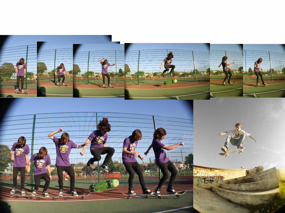
Narrative I chose to look at the work of Paul Smith because I wanted to study an illustrator with a different way of looking at narrative. His work is going to help me investigate the idea of story telling with in a graphical piece of work. I like the way that his work tells stories using the same person in a scene wearing different clothes doing different things, making it as though the pictures just been taken with different people. Paul Smith uses photography and computer software such as Photoshop to create his story telling compositions. He uses effects such as leading lines to guide the eye around the page, so the story is easily seen. Having dominant images and colour areas help guide the eye around the work so the story is easily told. His compositions are effective as the same person is used in the artwork, but appears in different positions doing different things, with different styles emphasizing certain sections making it easy to follow. I am going to be looking at his style in work to then experiment, creating my own story telling art work. Here are 4 images of my favorite artwork Paul Smith has produced.

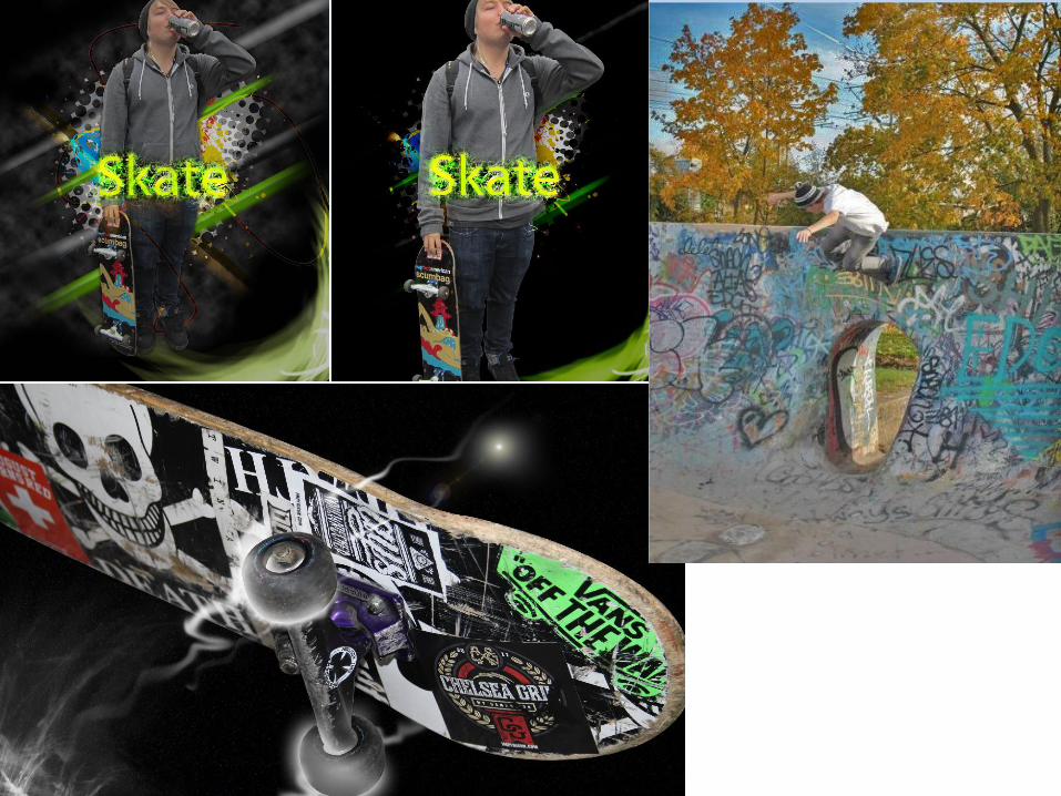
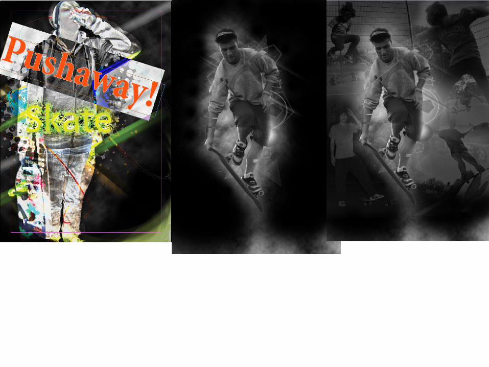
Here I have experimented
using the styles and techniques that Paul
smith uses to create his artwork.
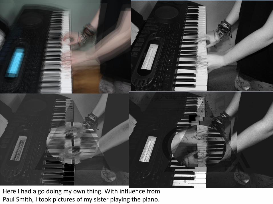
Here I had a go doing my own thing. With influence from Paul Smith, I took pictures of my sister playing the piano.

Skate man Stop motion video

Crime stop motion movie.