A practical guide to designing with data b. suda (five simple steps, 2010) bbs
235
A Practical Guide to Designing with Data by Brian Suda
-
Upload
ezecom-isp-users -
Category
Documents
-
view
445 -
download
3
Transcript of A practical guide to designing with data b. suda (five simple steps, 2010) bbs

1 A Practical Guide to Information Architecture
A Practical Guide to
Designingwith Data
by Brian Suda
i A Practical Guide to Designing with Data
A Practical Guide to Designing with Data
by Brian Suda
Published in 2010 by Five Simple Steps
Studio Two, The Coach House
Stanwell Road
Penarth
CF64 3EU
United Kingdom
On the web: www.fivesimplesteps.com
and: www.designingwithdata.com
Please send errors to [email protected]
Publisher: Five Simple Steps
Editor: Owen Gregory
Production Editor: Emma Boulton
Art Director: Mark Boulton
Designer: Nick Boulton
Copyright © 2010 Brian Suda
All rights reserved. No part of this publication may be reproduced or transmitted in any form or by
any means, electronic or mechanical, including photocopy, recording or any information storage and
retrieval system, without prior permission in writing from the publisher.
ISBN: 978-1-907828-00-3
A catalogue record of this book is available from the British Library.

ii

iii A Practical Guide to Designing with Data
Jeremy Keith
I have known Brian Suda for many years. We first met through
the microformats community, where he uses his skills to make
structured data readily available and easily understandable.
Now he is applying those skills to the world of data.
I am covetous of Brianʼs mind. It is the mind of a scientist,
constantly asking questions: “What was the first man-made object
with a unique identifier?”, “What would a hypercube of bread
classification look like?”, “What would it sound like to say all fifty
of the United States at the same time?”
Okay, that last one was from Family Guy. But whereas you or I
would be content to laugh at the joke and move on, Brian actually
tried it by layering fifty audio recordings on top of one another.
For the record, it sounds like this: Mwashomomakota.
As you would expect from such an enquiring mind, this book
is not a shallow overview of graphs and charts. If you are looking
for a quick fix on how to make your PowerPoint presentations pop,
this isnʼt the book for you. But if you want to understand what
happens when the human brain interacts with representations of
data, you have hit the motherlode.
It isnʼt hyperbole to say that this book will change the way
you look at the world. In the same way that typography geeks canʼt
help but notice the good and bad points of lettering in everyday
life, youʼre going to start spotting data design all around you.
Better still, you are going to learn how to apply that deep
knowledge to your own work. You will begin asking questions
of yourself: “Am I communicating data honestly and effectively?”,
“What is the cognitive overhead of the information I am
presenting?”
Your mind will be more Suda-like once you have read this
book. The phrase “change your mind” is usually used to mean
“reverse a decision”. I want to use the phrase in a different, more
literal way.
This book will change your mind.
Foreword

iv

v A Practical Guide to Designing with Data
Over the years, I have been digging through large data sets both for
work and pleasure. I love numbers, charts, graphs, visualizations,
zeitgeists, raumzeitgeists, infographics and old maps. Getting to
peek into what companies like Google get to see on a daily basis
– trends, fads, search volume, relatedness, all bundled up in an
interesting illustration – makes my day. Some people re-read the
same book over and over; I can stare at a dense illustration and
re-read its story. It makes me ask, “What caused these numbers?
Where did they all come from?” It has been estimated that the
Large Hadron Collider produces fifteen petabytes (fifteen million
gigabytes) of data a year. Itʼs impossible to look at a table of
fifteen petabytes of information – there has to be a graphical
representation for anyone to comprehend data at this volume.
This is what excites me: the challenge of how to take these
boring numbers and design something more compelling. To tell
the story behind the data, we need to stop grasping for the perfect
visualization and instead return to the basic language of charts
and graphs. Only then can we begin to uncover the meaning and
relationships the data has to offer.
Beyond the basic bar charts and line graphs taught in
schools, a new breed of illustrations has recently appeared. These
new ʻvisualizationsʼ are an attempt to explain the underlying
information with a powerful visual impact. They take complex
ideas and distil them into beautiful graphics revealing the
interrelationships in the data. Some are so brilliantly executed
that there are now annual awards for newspaper and magazine
infographics to highlight their achievements. Sadly, over recent
years terms such as visualization and infographic have been
bandied around with almost no regard to their proper use or
meaning. Existing chart types and even slide shows have been
saddled with the more gratuitous term ʻinfographsʼ to sound
more impressive. There is a new vernacular in the realm of data
representation, but that doesnʼt mean we should ignore the
underlying principles and best practices of humble charts and
graphs. Once you have mastered the basics, more complex designs
and visualizations become easier to create.
Introduction

vi
I wrote this book because I feel that people arenʼt taking the
fundamentals of graphs and charts seriously. Many people are
inspired by fancy visualizations and jump right in over their heads.
As with any discipline, you need to put in the hard work by starting
from the beginning.
If you look at publishersʼ catalogues, there are plenty of books
on this topic, but they all cover somewhat esoteric aspects of
specific charts and graphs: either from an academic point of view,
stating how to right align numeric values or calculate confidence
intervals to two standard deviations; or illustrated guides to
beautiful posters and the information they represent. While these
topics are certainly important, you need to consider the dataʼs
context and the readers who are looking to your charts and graphs
for answers. Having a beautiful poster or a well documented
confidence interval is worthless if the rest of the design is
unreadable. I wrote this book in an attempt to distil as much
knowledge as possible into just the information you will need
day-to-day. There are plenty of specific kinds of charts for very
specialized fields, from financial to weather data and everything
in between, but they all require a fundamental understanding of
the basics. Just because someone might be an expert in their field
doesnʼt mean that they have the know-how to design with data.
This book is a peek into the pinball machine of my mind,
always bouncing around various related and sometimes unrelated
topics. I wanted to draw together several techniques you can use
in your charts and graphs, such as how to minimize the number
of pixels, and at the same time explain some interesting aspects of
colour in our lives. In addition, I felt it was important to explain
how to spot bad or misleading design: the kind that unscrupulous
people use to trick us into believing their interpretation of data
rather than the facts. Only then can you properly focus on the data,
bypass unnecessary distractions and avoid misrepresenting the
information.

vii A Practical Guide to Designing with Data
The main purpose of this book is to encourage you to visualize
and design for data in such a way that it engages the reader and
tells a story rather than just being flashy, cluttered and confusing.
Much like authors choose their words, sentences and paragraphs
to structure ideas, informaticians have a bevy of concepts at their
disposal to tell stories with data. What I want to focus on are best
practices. These pages donʼt describe the one true way to design
with data, but set out some guiding principles you can have at
your disposal when you sit down and illustrate data.
The Five Simple Steps team has been great during this whole
process. They let me write the book I wanted to write and were
incredibly patient with my digressions. I hope that some of them
help explain my thought processes as well as entertain with
some interesting tidbits now and then. The five in Five Simple
Steps is a great constraint for a writer, but it does mean that this
is hardly a complete list of types of graphs and charts. New ideas
and concepts are always appearing, some good, some bad. Instead
of following an endless trail, this is an overview of the common
types youʼll run into on a regular basis and how to push them to
get the maximum value.
The title Designing with data was chosen because I wanted
to focus not on data collection, statistics or other mathematical
analysis, but rather on the visualization of data. Much like you
create a narrative in words, illustrations of data need to tell a story.
How you go about designing with data is just about as open as how
to write a book. The one thing we do know is that it is important
to get the basics right. This book is an introduction to those basics
and an invitation to you to become the next expert data designer.

viii
Dow
nlo
ad fro
m W
ow
! eBook
<w
ww
.wow
ebook.
com
>

vii A Practical Guide to Information Architecture
Contents
The visual language of dataGraph Genesis
Chart literaCy
DynamiC anD statiC Charts
Does this make me look fat?
Chart junk
13
9
13
17
25
3133
45
53
57
69
Colour and inkData to pixel ratio
how to Draw attention to the Data
rasterization ainʼt Got those Curves
just a splash of Colour
in rainbows
Part 1
Part 2
Dow
nlo
ad fro
m W
ow
! eBook
<w
ww
.wow
ebook.
com
>

viii
Common types of chartsline Graphs
bar Charts
area Graphs anD Charts
pie Charts
sCatter plots
Not so common chartsmaps, Choropleths anD CartoGrams
raDar plots
GauGes anD thermometers
sounD
everythinG anD the kitChen sink
How to deceive with datatrompe lʼœil (triCk the eye)
relative versus absolute
sins of omission
CauGht reD-hanDeD: The problem of false posiTives
fuDGe faCtor
Part 4
Part 5
Part 3
7577
85
89
93
101
171173
185
195
201
207
109111
119
129
143
161
1 A Practical Guide to Designing with Data
Whether writing words, sketching a cartoon or illustrating a graph,
you are telling a story to the reader. We all know the emotional power
of a good book. The words on paper allow you to get sucked into
the characters and plot. Classic paintings do the same. Millions of
people go to see the Mona Lisa every year. Her eyes, her smile tell us
a mysterious story. Who is she? The oil painting draws us into another
world that we are welcome to explore. An effective illustration must do
the same.
This book is about designing with data. Charts, graphs and other
data visualizations have a language of their own. They convey meaning
and information that is not available in words while demonstrating
relationships within the data, and they allow the reader to make
projections and better grasp the concepts. We need to learn how to
tell a story with data and how to design it in such a way that it is no
different than a great work of art or a bedtime story you remember
from childhood. Well designed data should provoke emotions, tell a
story, draw the reader in and let them explore.
The visual language of data
Part 1

2
Graph genesis
Chart literacy
Dynamic and static charts
Does this make me look fat?
Chart junk

3 A Practical Guide to Designing with Data
Some of the objects we use in our daily lives are so ubiquitous that
we assume they have been around for all time. Even something
as simple as the humble directional arrow, pointing the way and
giving us instructions, once didnʼt exist. It was ʻinventedʼ for its
modern day use. The barcode is a very modern invention (first
conceived in the late 1940s but not widely used until the 1970s),
yet we see it everywhere. One day, children will never have known
a world without e-mail, the Internet or 3-D projection televisions.
In this book, I address the common types of charts and
graphs, discuss some uncommon types and the reasons why they
should stay that way. Itʼs also important to look back at how many
of these creations started off. As weʼll see, they werenʼt so different
than the charts we use today – two hundred years on and not
much has changed. It makes you wonder, were charts and graphs
invented or simply discovered? Were they destined to arrive in the
form they did or are they so useful and near-perfect that we have
just stuck with them?
Believe it or not, there once was a time before graphs and
charts – they too were invented. The ancient Egyptians didnʼt have
PowerPoint® presentations or pie charts (probably they also lived
in blissful ignorance of a world of bulleted lists). Socrates taught
his followers without the use of bar charts or Venn diagrams.
Even the Romans didnʼt use graphs to visualize their luxurious
spending sprees over the years, or miles of new roads constructed
throughout the empire. Yet we assume that we canʼt live without
three-dimensional quarterly projections from Excel®.
If we look back to the time when some of the very first charts
were created, weʼll see that they were born out of the need to
explain large amounts of financial, political and social data.
It wasnʼt until William Playfair (1759–1823), a Scottish engineer and
political economist, published The Commercial and Political Atlas
in 1786 and Statistical Breviary in 1801 that many of our modern
visual devices for data first saw the light of day. He is credited
with inventing the bar chart, line chart, pie chart and circle graph
(see part 4).
Graph genesis 1
~ Graph genesis
Dow
nlo
ad fro
m W
ow
! eBook
<w
ww
.wow
ebook.
com
>

4
Though Playfair gets most of the credit for kicking off this
revolution, there are several other notable contributors who
developed the tools we use today. You might know Joseph Priestley
as ʻthe inventor of air .̓ Priestley was born in 1733 in England where
he spent his life until 1791, when he fled persecution to the newly
established USA. In 1765, he published A Chart of Biography which
outlined the years of births and deaths of “statesmen of learning”.
This is one of the first timelines showing relative length and
durations as a chart rather than as a table.
About twenty years after Priestley, in 1786, William Playfair
published some of the first extant visual charts and graphs in
his books about economics. Priestleyʼs timeline certainly had
an effect on Playfair as he created the bar charts. It is likely that
William Playfair was aware of Priestley through various channels:
the publication of Priestleyʼs papers and books, almost certainly,
but possibly also through the University of Edinburgh, which
conferred the degree of Doctor of Law on Priestley in 1764. The
Playfair family designed some of the most notable buildings of
Edinburgh and its university, along with being deeply involved in
the Enlightenment movement, as was Priestley.
Another contribution to the visualization of large sets of data
came from Charles Dupin (1784–1873), a French mathematician
and engineer. His contribution to the advancement of charts was

5 A Practical Guide to Designing with Data
the choropleth map, first published in 1826. A choropleth map
(sometimes called a cartogram – see chapter 21) is a diagrammatic
map whose regions are variously coloured or shaded to illustrate a
particular statistic, such as population density or voting choices.
The first choropleth map designed by Dupin illustrated the
illiteracy rate in Franceʼs regions.
A few years later, André-Michel Guerry (1802–1866) took
Dupinʼs idea and began to build, embrace and extend. In 1833, he
published his Essay on moral statistics of France which presented
suicide and crime statistics in France on maps. The statistics were
broken down and the maps coloured by just about every variable
available. Guerry was fascinated by these charts and their social
and economic impacts. He was the first to work in this field which
later became known as moral statistics.
In 1854, a cholera epidemic swept through the city of London
killing thousands of people every day. The health inspectors at
the time believed that cholera was transmitted by infected air, but
physician John Snow (1813–1858) believed that the outbreak was
not airborne, but passed through the water supply. Using a map,
he went door-to-door asking local residents about cholera deaths
and marked each location to show the outbreak density. Using this
data he traced the source of contamination to a local water pump
and ordered the pumpʼs handle removed, thereby preventing
further spread of the disease in the neighbourhood. His map
wasnʼt exactly a choropleth and it wasnʼt exactly a bar chart either.
He mixed two chart methods to form a different kind of early
visualization. Using geographically specific data, he concluded
that the density of cases could be attributed to a local pump,
strengthening his waterborne argument.
~ Graph genesis
6
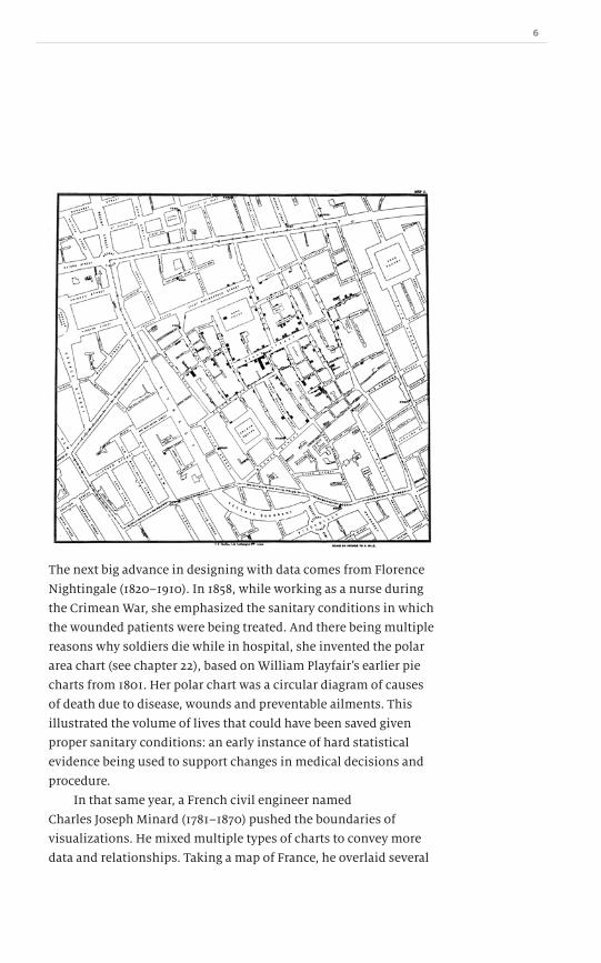
The next big advance in designing with data comes from Florence
Nightingale (1820–1910). In 1858, while working as a nurse during
the Crimean War, she emphasized the sanitary conditions in which
the wounded patients were being treated. And there being multiple
reasons why soldiers die while in hospital, she invented the polar
area chart (see chapter 22), based on William Playfairʼs earlier pie
charts from 1801. Her polar chart was a circular diagram of causes
of death due to disease, wounds and preventable ailments. This
illustrated the volume of lives that could have been saved given
proper sanitary conditions: an early instance of hard statistical
evidence being used to support changes in medical decisions and
procedure.
In that same year, a French civil engineer named
Charles Joseph Minard (1781–1870) pushed the boundaries of
visualizations. He mixed multiple types of charts to convey more
data and relationships. Taking a map of France, he overlaid several

7 A Practical Guide to Designing with Data
pie charts to show the geographic positions of the data sets. A few
years later in 1869, he published his now famous chart depicting
Napoleonʼs march into Russia. This has been hailed as one of the
greatest landmark works in data visualization history. It is a flow
graph which uses a map to show the relative transfers of goods
and people, geographic positions over time and several other
related pieces of data such as temperature and troop size.
Within the last ten to twenty years, several new forms of charts
have appeared. I attribute some of these to recent advances
and innovations, but itʼs more likely that new charts and graph
types are always being invented. Sometimes their usefulness is
minimal and they disappear and no one remembers them. Only
the recent developments that have not yet been proven useful or a
burden seem innovative to us. Some of these new designs, such as
treemaps (see chapter 18), will be discussed in this book because
it is important to know their strengths and weaknesses before you
jump in and use them in your own work.
~ Graph genesis

8

9 A Practical Guide to Designing with Data
The amount of information rendered in a single financial graph
is easily equivalent to thousands of words of text or a page-sized
table of raw values. A graph illustrates so many characteristics of
data in a much smaller space than any other means. Charts also
allow us to tell a story in a quick and easy way that words cannot.
Graphs and charts are appearing more and more in our
popular culture. Sites like Graph Jam1 and Indexed2 take concepts,
song lyrics, observations and allegories and render them in rather
silly or humorous pie and bar charts.
Chart literacy 2
~ Chart literacy
We immediately understand them and they tell a story in their
own right, sometimes more so than the original data. The fact that
they give another dimension and life to the data demonstrates
their worth.
Much of the value of graphs and charts comes from their
clear, usable, legible interface whether on paper, screen or other
medium. But graphs alone do not make something that is long,
difficult and tedious instantly useful. It takes skill to be able to
make a chart exciting and engaging without obscuring the facts.
1 graphjam.com
2 thisisindexed.com
http://www.graphjam.com
Dow
nlo
ad fro
m W
ow
! eBook
<w
ww
.wow
ebook.
com
>

10
Florence Nightingale used charts to improve the conditions
for hospital patients and in the process saved countless lives.
John Snowʼs cholera map transformed a table of dry names and
addresses into a heat map of the affected areas. Both of these
visualizations were clear and concise, and resulted in changes
which benefited humanity. Had these been descriptions or raw
values they would have been less likely to carry the weight that
they had.
Thatʼs not to say that there arenʼt poorly designed charts
or graphs that are useful. But this book offers five simple steps
to creating effective charts and graphs by describing the
situations where each chart type performs best and which to
avoid completely.
And this is just the start of the journey: a well designed chart
only gets you so far. Good graphic design is not a panacea for bad
copy, poor layout or misleading statistics. If any one of these facets
are feebly executed it reflects poorly on the work overall, and this
includes bad graphs and charts.
Humans have been writing for thousands of years. The
personal computer started the desktop publishing boom we have
today (ten thousand fonts and all), and it was only very recently
that charts and graphs became so easy to create, yet so often
missing the mark.
With further explanations of the techniques of good design,
we can improve the outlook for everyone, make the data clearer
and tell a better story.
This book focuses on taking data and putting it into charts
and graphs. Everything here is applicable to a fairly new term:
ʻvisualizations .̓ It is a sort of empty word, simply meaning
ʻpretty pictures with statistical values .̓ I feel that, unfortunately,
visualizations has become a buzzword. Several websites now list
“the top 10 cool visualizations”, or the “35 best visualizations of
the year”.
So what is the difference between a chart or graph and a
visualization? My distinction is, perhaps, an arbitrary one and
others will have different definitions, but a chart or graph is a clean
and simple atomic piece; bar charts contain a short story about the

11 A Practical Guide to Designing with Data
data being presented. A visualization, on the other hand, seems to
contain much more ʻchart junk,̓ with many sometimes complex
graphics or several layers of charts and graphs. A visualization
seems to be the super-set for all sorts of data-driven design.
The fact that visualization has entered the vernacular reveals its
growing popularity, even though no one seems to know exactly
what it means.
Another indication of the importance of good chart design is
the emergence of multiple awards, ceremonies and organizations
championing and measuring chart design. All in all, chart literacy
is an important tool, both for people creating the design to convey
the message and for readers to understand the dataʼs story.

12
13 A Practical Guide to Designing with Data
With the invention of the personal computer came a much more
interactive medium through which to view charts and adjust data
values. In the past, charts and graphs were printed on paper and
were as static as the medium. Both dynamic and static charts have
their advantages and disadvantages. In this book, I will mostly
address static charts and graphs, but the same concepts apply to
interactive ones. Just because your design is interactive doesnʼt
mean that you can throw away everything youʼve learnt about
static chart design.
Interactive charts
The most common dynamic chart you are aware of is the weather
map. When meteorologists give the five-day forecast and an
animated storm front sweeps across the screen, this is a dynamic
chart. Itʼs displaying thousands of data points of storm intensity
mapped on to latitude and longitude. When animated, it shows
these values over time in a very complex way. It actually consists
of several static charts rendered and animated to be played
backwards and forwards. An animation saves a lot of space when
compared with a printout of pages and pages of similar data. The
downside is that only media that can play animations can use it.
That said, dynamic graphs arenʼt just animations. They can
be designed to be interactive so that you can select only certain
regions of the chart, or turn values on and off to remove clutter or
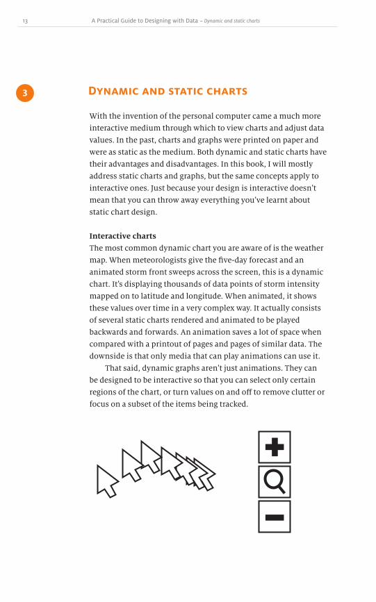
focus on a subset of the items being tracked.
Dynamic and static charts 3
~ Dynamic and static charts
14
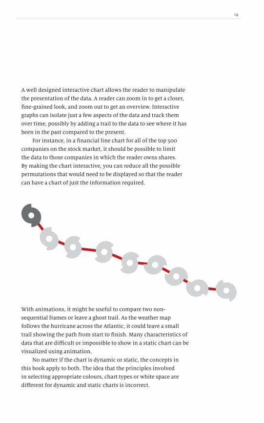
A well designed interactive chart allows the reader to manipulate
the presentation of the data. A reader can zoom in to get a closer,
fine-grained look, and zoom out to get an overview. Interactive
graphs can isolate just a few aspects of the data and track them
over time, possibly by adding a trail to the data to see where it has
been in the past compared to the present.
For instance, in a financial line chart for all of the top 500
companies on the stock market, it should be possible to limit
the data to those companies in which the reader owns shares.
By making the chart interactive, you can reduce all the possible
permutations that would need to be displayed so that the reader
can have a chart of just the information required.
With animations, it might be useful to compare two non-
sequential frames or leave a ghost trail. As the weather map
follows the hurricane across the Atlantic, it could leave a small
trail showing the path from start to finish. Many characteristics of
data that are difficult or impossible to show in a static chart can be
visualized using animation.
No matter if the chart is dynamic or static, the concepts in
this book apply to both. The idea that the principles involved
in selecting appropriate colours, chart types or white space are
different for dynamic and static charts is incorrect.

15 A Practical Guide to Designing with Data
My greatest concern about dynamic and interactive graphs is
not how badly they can be designed, but about their longevity.
We can look at the earliest extant charts and graphs from over
two hundred years ago because they were encoded in an analog
format; they were etched into metal plates and printed with ink
onto paper. They were reproduced in several different books,
magazines, newspapers and periodicals; no single source had the
only copy of the design.
As we design fancy Flash® animations, MPEG videos, SMIL
animations and use other proprietary formats that reside only on
our one, fragile server, do we consider whether the files can be
opened in two hundred yearsʼ time? The first computer-animated
graph is probably already lost to us because it was rendered in
a format now obsolete. This isnʼt a problem of lost back-ups or
misplaced files, it is a genuine issue for forward-thinking design.
Animations are difficult in an analog world, but not
impossible: an orrery is a mechanical model of our solar system.
As the clockwork gears are wound, the planets move in relation
to one another. Such a system doesnʼt suffer from file format
incompatibility two hundred years after it was made. Can the
same be said about some of the content that you are producing on
a daily basis?
Dynamic graphs are excellent tools for exploring data, but if
they canʼt be printed out or cast in metal, they wonʼt last.
Static charts
Much of this book addresses static charts and graphs. I want to
bring your attention to some of the benefits of them being static.
Analog formats last a long time. The Rosetta stone has an
analog format: text cut into stone. It is several thousand years old
and it works. The new Rosetta Project1 , which aims to record all
the worldʼs languages, has an online archive, but the data collected
is also available on a micro-etched nickel alloy disc that can be
read using a microscope. Static, analog formats such as paper
~ Dynamic and static charts
1 http://rosettaproject.org

16
printouts, bound books and metal plates last much longer than
digital files with specific encodings, file formats and digital rights
management.
Thatʼs not to mention the versatility of static charts. When not
constrained by animation, charts, graphs and visualizations can
end up in the oddest of places. From newspapers and printouts, to
statues and architecture.
Since there is no need for any mechanical or moving parts,
static works can more easily be reproduced and shared in several
different media, thereby reaching a much wider audience. This
isnʼt to belittle interactive design, but it is a point to consider
next time you get excited at the prospect of animating a chart just
because you can.

17 A Practical Guide to Designing with Data
When designing any sort of visualization, you need to know how
much space to allocate to the layout; this will determine your
chartʼs dimensions. Depending on the content and type of your
chart, the size will vary. Pie charts, radar plots and other circular
charts need to be symmetrical, but others can be rectangular.
Then there are the qualities inherent to web and print.
They are two very different media. On the web we can set text and
container sizes as percentages relative to the browser window,
whereas in print the paper has fixed dimensions. Each mediumʼs
strengths and weaknesses, as well as layout constraints, make
designing charts for each medium different.
There is no correct answer as to what proportions are best, but
here are a few pleasing suggestions and some details as to how our
culture arrived at these dimensions.
Golden ratio
Phi or, as it is more commonly known, the golden ratio, has been
a popular design tool for around 2,500 years. The ancient Greeks
used this ratio in the construction of ideal buildings and statues.
Notre Dame in Paris also has aspects of the golden ratio in its
construction.
Does this make me look fat? 4
~ Does this make me look fat?
http://www.flickr.com/photos/bruchez/400273223/
18
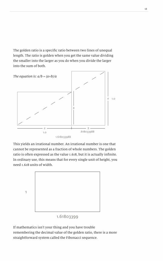
The golden ratio is a specific ratio between two lines of unequal
length. The ratio is golden when you get the same value dividing
the smaller into the larger as you do when you divide the larger
into the sum of both.
The equation is: a/b = (a+b)/a
1.61803399
1
1.618033988
.6180339881.0
1.0
a
a
b
b
This yields an irrational number. An irrational number is one that
cannot be represented as a fraction of whole numbers. The golden
ratio is often expressed as the value 1.618, but it is actually infinite.
In ordinary use, this means that for every single unit of height, you
need 1.618 units of width.
If mathematics isnʼt your thing and you have trouble
remembering the decimal value of the golden ratio, there is a more
straightforward system called the Fibonacci sequence.
19 A Practical Guide to Designing with Data
Fibonacci sequence
Leonardo Pisano Bogollo (called Fibonacci after his father,
Guglielmo Fibonacci) was an Italian mathematician who lived in
in the late 1100s to early 1200s. He helped spread the use of the
Arabic numeral system in Europe, the system we still use today.
His other major contribution was his Book of Calculation (Liber
Abaci) in which he discussed the Fibonacci sequence. He didnʼt
invent the system, but popularized it such that it was named after
him. The sequence has plenty of interesting uses in mathematics,
but in this chapter weʼre interested only in the ratios.
The sequence of Fibonacci numbers is:
1, 1, 2, 3, 5, 8, 13, 21, 34 ... and it continues infinitely. The
sequence is built by starting with 1 and adding 1 to it, giving the
result 2. We then take that answer and add it to the previous value,
in this case 1. 1 + 2 = 3. The process is repeated so that 2 + 3 = 5, 3 +
5 = 8 and so on:
1 + 1 = 2
1 + 2 = 3
2 + 3 = 5
3 + 5 = 8
5 + 8 = 13
8 + 13 = 21
13 + 21 = 34
The sequence isnʼt intrinsically interesting, but itʼs easy to
remember. The useful part begins when you divide one Fibonacci
number by the preceding Fibonacci number. Doing so results in an
approximation of the golden ratio (1.618).
1∕1 = 1
2∕1 = 2
3∕2 = 1.5
5∕3 = 1.666
8∕5 = 1.6
13∕8 = 1.625
21∕13 = 1.615
~ Does this make me look fat?
Dow
nlo
ad fro
m W
ow
! eBook
<w
ww
.wow
ebook.
com
>

20
As the series continues the results get closer and closer to the
precise value of the golden ratio. If you are looking for a nice
rectangular ratio for your charts then select any multiples of two
consecutive values in the sequence: 210 pixels by 130 pixels, 890
pixels by 550 pixels, and so on.
The golden ratio is similar to other common aspect ratios
we see every day. The ratio 3:2 is used in 135 film cameras. The
standard 35mm silver halide emulsion film is 36mm × 24mm. 3:2 is
easy to remember and is close to the golden ratio.
Before widescreen (16:9) became popular, movies, computer
monitors and television screens had a ratio of 4:3, which is
somewhere between 3:2 and 5:3, but also gives pleasing results.
Using the Fibonacci sequence to derive a ratio is just one way
to determine ʻidealʼ dimensions, but there are plenty of other
equally valid, if perhaps arbitrary, choices.
ISO A series paper
A4 paper has an interesting ratio of 1:√2 which is approximately
1.414. For each single vertical unit there are 1.414 horizontal units.
An A0 sheet of paper has an area of one metre squared and each
subsequent size has half the area. So A1 is half as big as A0, A2 half
of A1, smaller and smaller each time, while retaining the same
proportions.
1.41428571429
1
The advantage to the A series is that if you double the size of an A4
sheet, it fits exactly into an A3; if you have an A5 page, two will fit
precisely side-by-side in an A4. All the ratios are perfectly tucked
inside the next A series page.

21 A Practical Guide to Designing with Data
This nesting makes for a convenient ratio when rotating, because
the scaled version always splits the previous in half. From an A0
sheet of paper, all other sizes can be cut without waste.
Nesting A series paper
16:9 Widescreen
The 16:9 ratio has been picked up as the widescreen format for
movies and TV. It also has a ratio close to the golden ratio: 1:1.777
makes it slightly wider than 1.618 but still within the same general
area and dimensions.
~ Does this make me look fat?
16
9
As more and more TV screens and films move to this ratio
(though many movies use other, even wider ratios like 1.85:1 and
2.39:1), it might become more aesthetically pleasing in our culture.
With 16:9 becoming the de facto standard, it makes you wonder,
does art imitate life or life imitate art?

22
Silver ratio
If you have a golden ratio, then why not a silver, or even a bronze
ratio? The silver ratio is another irrational number, a number that
goes on and on, just like the golden ratio.
The silver ratio is calculated in a similar way to the golden
ratio. You need two lines, one longer than the other. First, take
the longer side, double its length and then add the shorter length.
Then divide that total by the longer length. If the result equals the
division of the short length by the long length, then you have a
silver ratio.
a∕b = (2a + b)∕a
It all sounds quite complicated, but the final result is 1 + √2, which
gives a ratio of 1:2.414. For every single vertical unit there are 2.414
horizontal units. This makes a very wide (or tall) rectangle, even
more so than 16:9.
There are several ways to arrive at a silver ratio. The easiest
is to take a standard A4 piece of paper and remove the largest
possible square from it. This has made its proportions a common
size for compliment slips.
A4 size
a
b
What is left is a rectangle that is 1:2.414 in ratio. Now you can see
the long and skinny aspect of the silver ratio.

23 A Practical Guide to Designing with Data
Egyptian pyramids
The Greeks werenʼt the only ones with an ideal ratio. Before them,
the Egyptians experimented with finding harmonies between
two lengths. There is a great debate about whether the Egyptian
pyramid builders used the mathematical concept of π (pi, 3.142)
deliberately or that pi appeared naturally due to the use of wheels
in construction. The circumference of circles can be calculated
using pi (2πr). If an Egyptian builder paced out the length of a side
of a pyramid as forty-two revolutions of his wheel, that distance is
a multiple of pi. It is always possible, of course, that we have tried
too hard to make pi fit into Egyptian calculations retrospectively –
either that or it was aliens.
After the measurements of the Great Pyramid of Khufu
(sometimes referred to as Cheops) were accurately determined,
some experts asserted that the Egyptians must have been aware of
pi. Before explaining what they based their claim on, we would do
well to remember that errors in data donʼt always originate with
the mathematics or visualizations, but instead at the source when
the original data was first recorded (more on that in chapter 8).
How is it possible to measure exactly the sides of a stone structure
subject to 4,000 years of erosion? It isnʼt, but weʼll humour those
who made the effort.
If you double one side of the square base of the Great Pyramid
and divide it by the pyramidʼs height, the result, approximately, is
pi. There are plenty of conspiracy theories on why this is the case,
so it must be said that all the pyramids have different heights and
widths. The fact that the Great Pyramidʼs dimensions allow you to
calculate pi is almost certainly down to coincidence or particular
construction methods rather than a planned attempt at some
perfect ratio.
~ Does this make me look fat?
24
1
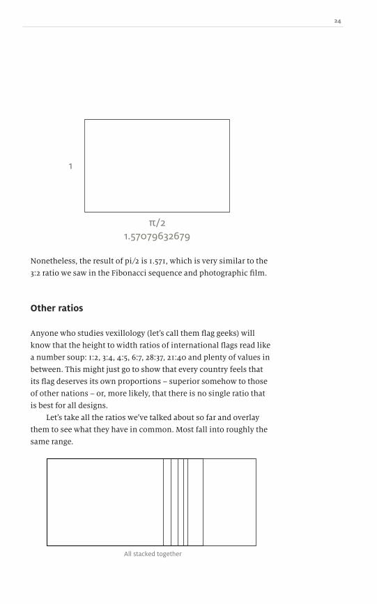
Nonetheless, the result of pi∕2 is 1.571, which is very similar to the
3:2 ratio we saw in the Fibonacci sequence and photographic film.
Other ratios
Anyone who studies vexillology (letʼs call them flag geeks) will
know that the height to width ratios of international flags read like
a number soup: 1:2, 3:4, 4:5, 6:7, 28:37, 21:40 and plenty of values in
between. This might just go to show that every country feels that
its flag deserves its own proportions – superior somehow to those
of other nations – or, more likely, that there is no single ratio that
is best for all designs.
Letʼs take all the ratios weʼve talked about so far and overlay
them to see what they have in common. Most fall into roughly the
same range.
All stacked together
25 A Practical Guide to Designing with Data
In his 1983 book, The Visual Display of Quantitative Information,
Edward Tufte, an American statistician and information design
expert, referred to all the pointless illustrations that go along with
charts as junk. The definition of junk is wide and varied, but if
you remove something from the chart and it doesnʼt change the
meaning, itʼs chart junk.
We call it junk because it obscures the true meaning and
intention of the graph, which is to convey information and tell a
story. Any extraneous imagery is not part of the information. It
uses up valuable pixels and takes short-term memory resources
away from the data and draws the eye to the pretty pictures
instead.
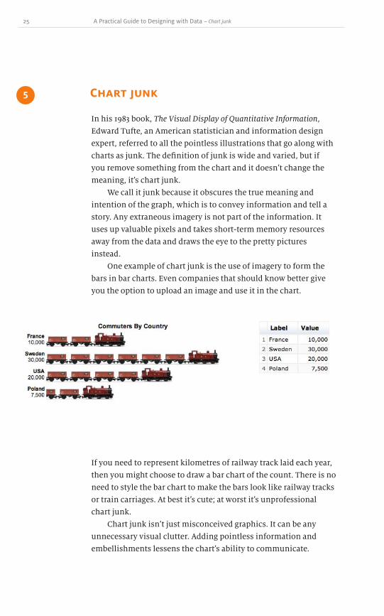
One example of chart junk is the use of imagery to form the
bars in bar charts. Even companies that should know better give
you the option to upload an image and use it in the chart.
Chart junk 5
~ Chart junk
If you need to represent kilometres of railway track laid each year,
then you might choose to draw a bar chart of the count. There is no
need to style the bar chart to make the bars look like railway tracks
or train carriages. At best itʼs cute; at worst itʼs unprofessional
chart junk.
Chart junk isnʼt just misconceived graphics. It can be any
unnecessary visual clutter. Adding pointless information and
embellishments lessens the chartʼs ability to communicate.

26
This chart uses the common gender icons to illustrate how
many more men or women visit particular websites. Can you
spot the problem? (This example was taken from a real-world
visualization.) Information is duplicated by the text value 52% and
the additional two female icons. The problem here is that there
should be four female icons. 100% − 52% is 48%: a difference of
four per cent. The icons are not only misleading and wrong, but
also unnecessary in this context.
When discussing gender differences, it is easy to slip into
using the male and female icons seen on bathroom doors. If you
find yourself doing this, ask yourself, “Can I delineate gender-
related information without these icons? Is this chart junk?”
There are times when iconography is important. Gender icons
are well-established across cultural boundaries. If your charts are
to be produced in a local newspaper, text might suffice, but if the
chart will appear in an academic journal being read worldwide by
native speakers and non-native speakers, then icons could help
remove ambiguity.
52%
Male
FamousSocial Network
Female

27 A Practical Guide to Designing with Data
Junk in the trunk
Chart junk isnʼt limited to the chart data. When you begin to over-
or underlay extra information like photos or graphs, it distracts
the eye. We rarely put large amounts of complex text on to photos,
so why put even more complex and dense data there instead?
~ Chart junk
1920
Urban Growth
1921 1922 1923
Keep your charts as free from clutter and open to white space as
possible. The information needs room to breathe; donʼt throw
more pointless data into the mix. The data to pixel ratio should be
as close as possible to one (see chapter 6). Every pixel should be
doing its best to be data, and tangential photos and imagery are
designed to catch the eye rather than let the data tell a story.
Dow
nlo
ad fro
m W
ow
! eBook
<w
ww
.wow
ebook.
com
>

28
Corporate branding
There is an old saying, “Do as I say, not as I do,” which I think
is apt here. Iʼll be honest and say that I donʼt always follow my
own advice. And neither should you. We know that chart junk is
certainly junk, yet we sometimes add it in anyway.
I am guilty of this sometimes when it comes to corporate
branding. After spending hours of work crafting a cleanly designed
chart to explain very complex issues and being proud of my hard
work, I then put a giant watermark over the entire chart, just so
no one can claim it as theirs. You will surely have to make similar
decisions about this at some point in time: protecting the work at
the expense of legibility.
Some people are unscrupulous and will pass off anotherʼs hard
work as their own. A small logo in the margins of your chart might
get cropped out or erased, but a big watermark is hard to remove!
It is very tempting to do this and your client or boss might insist
on it. To me, a massive watermark over everything is rather like
peeing on it all to claim it as your own. It works, but there must be
a more elegant solution!
1920 1921 1922 1923
Urban Growth

29 A Practical Guide to Designing with Data
I also know that with computers the ability to mash up previously
unconnected data sets to produce interesting results is easier
than ever. In doing so, much of the layout is pre-built and the
data flows into it like water into a bucket. Sometimes the data is
messy, sometimes it isnʼt. Creating charts automatically with an
application leaves less room for design decisions, such as where
to place the logo. Because of this, on many occasions branding is
faded into the background and is as large as possible so no matter
the data, at least part of it can be seen. This might be a trade off
you are willing to accept: your readers puzzle over what is in the
background and you get the chance to have some branding visible
some of the time.
This is also a way for companies to re-sell their charting
software: your graph carries the manufacturerʼs brand unless you
pay the premium to remove it or replace it with your own.
Ultimately, a balance must be struck between protecting
the chart from plagiarists and not distracting or annoying your
readers. A fine line, indeed.
Summary
Now that we know the perils of bad design, weʼre going to dig into
the specifics of colour and ink. Getting the dimensions correct
is important, as is keeping the chart junk out, but how do you
achieve this? In part 2, weʼll get into the specifics of highlighting
specific portions of the design, how to use colour and ink to your
advantage and, more importantly, how to use them correctly.
Plus, weʼll look at a few colour psychology experiments and
potential hazards of not designing with tritanopia (a form of
colour-blindness) in mind.
~ Chart junk

30

31 A Practical Guide to Designing with Data
There is no denying the impact that colour has on us. Colour stirs
emotions, moves us to be patriotic, soothes our anger, builds
associations with specific products and warns us of danger. But colour
can easily be misused: too many colours and we canʼt make heads or
tails of the information; too similar a colour and we canʼt discern
a difference.
Traditionally, colour was made using ground up pigments, but
now on the web we paint freely with pixels. The range of colours far
exceeds anything weʼve had before. With graphics cards able to display
true colour in over 16.7 million distinct values, we are in danger of
overloading our readers. With ink, each new colour adds cost; with
pixels, itʼs a different story.
Colour and ink
Part 2

32
Data to pixel ratio
How to draw attention to the data
Rasterization ainʼt got those curves
Just a splash of colour
In Rainbows
33 A Practical Guide to Designing with Data
From Elements of Style, by Strunk and White
“Vigorous writing is concise. A sentence should contain no
unnecessary words, a paragraph no unnecessary sentences,
for the same reason that a drawing should have no
unnecessary lines and a machine no unnecessary parts. This
requires not that the writer make all his sentences short, or
that he avoid all detail and treat his subjects only in outline,
but that every word tell.”
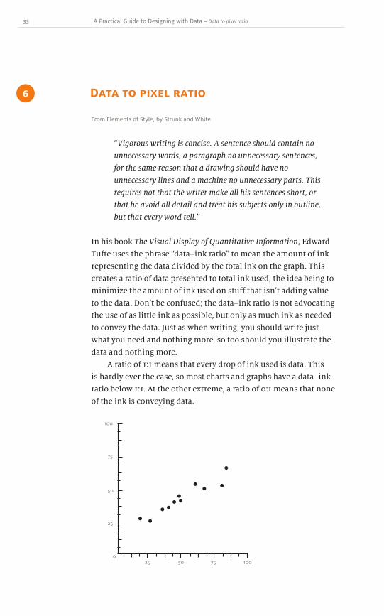
In his book The Visual Display of Quantitative Information, Edward
Tufte uses the phrase “data–ink ratio” to mean the amount of ink
representing the data divided by the total ink on the graph. This
creates a ratio of data presented to total ink used, the idea being to
minimize the amount of ink used on stuff that isnʼt adding value
to the data. Donʼt be confused; the data–ink ratio is not advocating
the use of as little ink as possible, but only as much ink as needed
to convey the data. Just as when writing, you should write just
what you need and nothing more, so too should you illustrate the
data and nothing more.
A ratio of 1:1 means that every drop of ink used is data. This
is hardly ever the case, so most charts and graphs have a data–ink
ratio below 1:1. At the other extreme, a ratio of 0:1 means that none
of the ink is conveying data.
Data to pixel ratio 6
~ Data to pixel ratio
100
100
75
75
50
50
25
25
0

34
In this example, ink has been used to create the axes, labels,
tickmarks and the data points. If we assume that the amount of ink
used to draw the axes and tickmarks is 60% of the total ink, then
we get the following ratio:
• data–ink ratio = (data ink)∕(total ink used)
• data–ink ratio = 40 units∕100 units
The data–ink ratio equals 2:3. More than half of the ink used to
create the chart does not add any value. In this chapter weʼll dig
into how to reduce the unnecessary ink to level out this ratio as
much as possible to 1:1. On screen, weʼre not dealing with ink.
Instead, we can think of this value as a data to pixels ratio. How
many unnecessary pixels were displayed to convey the message?
Can we reduce that number and still say the same thing?

35 A Practical Guide to Designing with Data
This is a standard chart generated by Excel. All the unnecessary
pixels are highlighted. In a graphic that is 250px wide and 150px
tall (37,500 pixels total) about 55% are lit up, all of them distracting
your eyes and adding no value.
Had you asked someone in the year 2000 if it were possible
to have conversations in bursts of less than 140 characters,
they would have laughed at you; yet only a few years later SMS-
length microblogging sites have sprung up all over the place. The
constraint has been short messages: get to the point, rewrite and
reword it until it fits. (Wouldnʼt it be great if e-mail were the same
way! You gotta love senten.se1) We need to take a similar approach
to designing with data. Cut out all the cruft and get to the story
behind the data. Obviously the data points canʼt be removed so we
need to focus on other information that we assume is needed and
see if we can reduce those pixels.
The axes
Most graphs have an x-axis, a y-axis and some scale values. Some
have grid lines to help the viewer. Much of this is superfluous and
can be removed to increase our data to pixel ratio.
75
100
50
25
0
Q1 Q2 Q3 Q4
~ Data to pixel ratio
1 http://sentenc.es/
Dow
nlo
ad fro
m W
ow
! eBook
<w
ww
.wow
ebook.
com
>

36
Once we begin to add the data, we can ask ourselves, “Do we still
need all the grid information?” What if we start where the data
starts and end where the data ends? That way only the data range
is marked. This has two effects: first, it emphasizes the minimum
and maximum values; and second, it reduces the number of pixels
in the image. This technique can work on both axes.
0
58
32
Q1 Q2 Q3 Q4
0
58
32
Q1 Q2 Q3 Q4
As you can see, by only labelling the data range, we can reduce the
amount of pixels.
Remember, we still need to keep the baseline zero/zero scale.
Later on in part 3, when we talk about how to deceive with data,
weʼll see why this is important.
Once we have set up the basic frame in which our data will
flow, we can minimize its influence on the data. The story the data
are telling us doesnʼt include the vertical and horizontal lines; itʼs
the graph of data in between that interests the readers.
The axes, grid and labels should take the roles of a supporting
cast and simply help the lead role when needed. By minimizing
the line weight, lightening its colour, removing the portions not
being used and reducing the labels, we can move the grid from the
foreground to the background.

37 A Practical Guide to Designing with Data
Thereʼs still room for improvement. On screen, it is hard to draw
lines thinner than one pixel; it is possible, but for these examples
weʼll set one pixel as the baseline. When designing for print,
it might be possible to draw even finer lines.
We can go still further and remove those portions of the lines
that are above the maximum data value or below the minimum.
We can also remove the tick marks as separators.
0
58
32
Q1 Q2 Q3 Q4
0
58
32
Q1 Q2 Q3 Q4
To retain the rhythm for each quarter, we can remove more parts
of the grid and the axis itself, leaving small lacunae where the
lines would have crossed the data line. Sometimes the absence of
ink can be as telling as the ink itself.
~ Data to pixel ratio
38
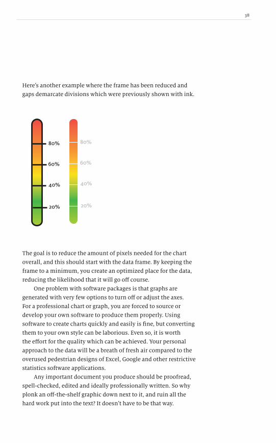
Hereʼs another example where the frame has been reduced and
gaps demarcate divisions which were previously shown with ink.
60%
40%
20%
80%
60%
40%
20%
80%
The goal is to reduce the amount of pixels needed for the chart
overall, and this should start with the data frame. By keeping the
frame to a minimum, you create an optimized place for the data,
reducing the likelihood that it will go off course.
One problem with software packages is that graphs are
generated with very few options to turn off or adjust the axes.
For a professional chart or graph, you are forced to source or
develop your own software to produce them properly. Using
software to create charts quickly and easily is fine, but converting
them to your own style can be laborious. Even so, it is worth
the effort for the quality which can be achieved. Your personal
approach to the data will be a breath of fresh air compared to the
overused pedestrian designs of Excel, Google and other restrictive
statistics software applications.
Any important document you produce should be proofread,
spell-checked, edited and ideally professionally written. So why
plonk an off-the-shelf graphic down next to it, and ruin all the
hard work put into the text? It doesnʼt have to be that way.
39 A Practical Guide to Designing with Data
Charts and graphs should have as much care put into their design
as the text. They should complement each other, reinforce
the companyʼs brand and image as much as any other piece of
photography or graphic design. Not only should the charts look
good, but they should be formed properly and tell a story. This is
the difference between a chart designed as eye-candy to fill space
and a chart designed to show trends and hundreds of data points
that would otherwise be an unwieldy table.
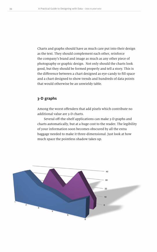
3-D graphs
Among the worst offenders that add pixels which contribute no
additional value are 3-D charts.
Several off-the-shelf applications can make 3-D graphs and
charts automatically, but at a huge cost to the reader. The legibility
of your information soon becomes obscured by all the extra
baggage needed to make it three-dimensional. Just look at how
much space the pointless shadow takes up.
~ Data to pixel ratio

40
Placing lines behind other lines only works when the values in
the background are higher than those in the foreground – that is,
theyʼre not hidden – but there is no guarantee that this will always
be the case. As you can see above, no matter the order of the data,
some part of it is invisible. The 3-D aspect of this chart does not
make the message clearer: on the contrary, it hides the facts.

41 A Practical Guide to Designing with Data
3-D line graphs make it difficult for the eye to determine the values
in relation to the axes. And since they are offset from the baseline,
itʼs difficult to compare data between two different rows of 3-D
bars. Take, for instance, item 5 in S1: how large is that value? How
does it compare to item 4 in S2?
Adding the extra pixels to create a 3-D chart doesnʼt add value;
it simply adds more pixels and ink, reducing the white space and
cluttering up the chart.
A large proportion of this graph consists of unnecessary pixels.
Everything in pink could be removed without changing the story.
In fact, it might actually improve it. How much of the readerʼs time
has been wasted sorting out what is important and what isnʼt?
In chapter 17 weʼll go into more depth about bar charts and look at
how to represent this same information in a more readable way.
~ Data to pixel ratio
42
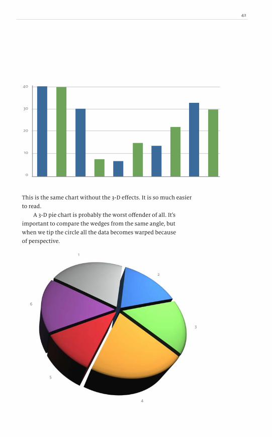
This is the same chart without the 3-D effects. It is so much easier
to read.
A 3-D pie chart is probably the worst offender of all. Itʼs
important to compare the wedges from the same angle, but
when we tip the circle all the data becomes warped because
of perspective.
4
5
3
2
6
1
40
30
20
10
0
Dow
nlo
ad fro
m W
ow
! eBook
<w
ww
.wow
ebook.
com
>

43 A Practical Guide to Designing with Data
The three-dimensionality distorts the wedges: those closest to us
appear to be bigger and the those further away appear smaller. Can
you describe the percentage values for each wedge? Go ahead and
try: the sum of the pie is 100%, so what are the individual values?
As weʼll see in chapter 19, which is all about pie charts, the only
solution is to label each wedge and at that point you need to ask
yourself whether the pie chart is redundant altogether.
If we look closely at the pie chart, youʼll see that wedge 1 at
top right is receding into the distance, so its perspective makes it
look smaller. Wedge 4 at the front is made to look closer, so it is
distorted further and the depth of the pie is visible, adding more
pixels. In fact, wedges 1 and 4 are identical in value, but youʼd
never know that because of the perspective. Some people use this
to their advantage to obscure the truth, as weʼll see in chapter 19.
The whole point of a chart or graph is to clarify a jumble of
numbers in a table. When charts are put into three dimensions,
they do anything but!
~ Data to pixel ratio

44

45 A Practical Guide to Designing with Data
When tracking and plotting several different data sets, we often
need to highlight some portions of data. There are several ways to
call out specific parts of a diagram without drastically increasing
the pixels required. What follows is a selection of ideas to do this.
It is not an exhaustive list, nor will it work for every type of graph,
but each draws attention and focus to particular parts of the data.
Colour
Colour is a powerful tool in highlighting information. There are
two ways to use colour which make a particular item stand out.
Using a single colour within a black and white bar graph
calls attention to that information without the need for extra
labels. The addition of a single colour is a signal to the reader that
something is different, but this works most effectively when that
colour can have some meaning. When each piece of the chart is a
different colour, then the impact of any individual colour is lost.
This technique works when the graph is black and white, or a
single hue. A sudden burst of colour demands attention.
How to draw attention to the data 7
~ How to draw attention to the data
MonSun Tues Wed Thurs Fri Sat
46
MonSun Tues Wed Thurs Fri Sat
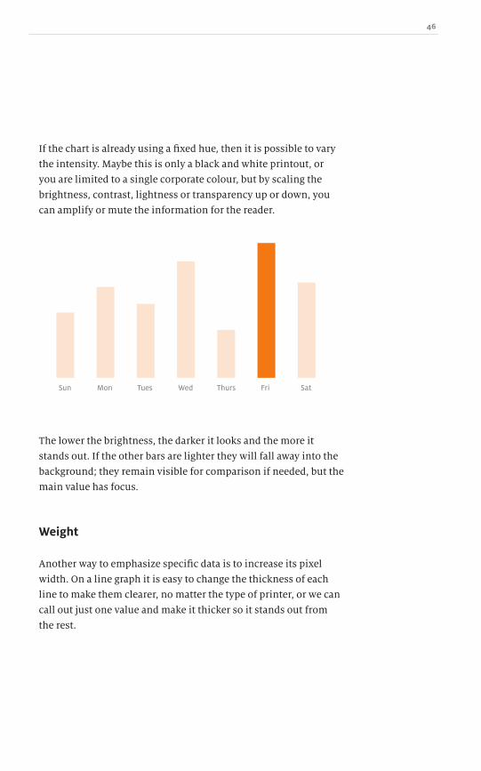
If the chart is already using a fixed hue, then it is possible to vary
the intensity. Maybe this is only a black and white printout, or
you are limited to a single corporate colour, but by scaling the
brightness, contrast, lightness or transparency up or down, you
can amplify or mute the information for the reader.
The lower the brightness, the darker it looks and the more it
stands out. If the other bars are lighter they will fall away into the
background; they remain visible for comparison if needed, but the
main value has focus.
Weight
Another way to emphasize specific data is to increase its pixel
width. On a line graph it is easy to change the thickness of each
line to make them clearer, no matter the type of printer, or we can
call out just one value and make it thicker so it stands out from
the rest.

47 A Practical Guide to Designing with Data
A brief warning: changing an itemʼs weight might indicate
something other than straightforward emphasis. For instance,
changing the thickness of a bar in a bar chart could be misleading;
perhaps the larger dimensions of the bar signify a stronger
correlation with other data. We donʼt want to confuse the reader
– we want to better tell the story. Altering the weight of objects
could change the story in an unintentional way.
MonSun Tues Wed
Jan
0
25
50
Feb Mar Apr May Jun
Thurs Fri Sat
It is important to change the weight of a variable only when it
wonʼt be mistaken for another factor.
~ How to draw attention to the data

48
Q2 Q2
Q2
Q1 Q1
Q1
Q3 Q3
Q3
Q4
2009
2010
Q4
Q4
Position
The human mind is very good at creating artificial groupings based
on relative position and shape. One way to provoke this tendency
is through deliberate use of white space. Using white space
effectively is more of an art than a science. I am sure there are
heuristic equations somewhere that attempt to quantify this, but
sometimes it is better to just go with your gut.
The position of some data relative to other data can lend
emphasis. For example, take a list of quarterly returns on a bar
chart. With some extra space between the fourth and first quarters
of two distinct years, a natural association and grouping emerges.
It is also possible to isolate individual values and focus on them.
If we had an average for all quarters in 2009, followed by the
quarterly breakdown for 2010, we could push the average column
away slightly so it remains clear.

49 A Practical Guide to Designing with Data
Weʼve managed to isolate and call attention to specific data
or groups of data without having to add extra pixels to box in
information. A little more white space and proximity has done
the trick.
Shapes
Shapes offer an alternative to colour when identifying data sets.
Shapes have the advantage of working well in black and white, and
are therefore more robust.
Youʼre probably familiar with the selection of horrible shapes
produced by graphing software when using multiple trend lines:
small squares, circles, triangles, crosses and others. While they
might not be aesthetically pleasing, they do play an important role
in distinguishing the data sets.
Take the scatter plot below. There are two variables, one on the
x-axis, the other on the y-axis. We can plot several different items
into this space, but we need a way to identify them. Colour works,
but can cause problems for readers with vision problems as weʼll
see in chapter 9. Shapes are a good substitute.
~ How to draw attention to the data
Jan Feb Mar Apr May Jun
0
25
50
Dow
nlo
ad fro
m W
ow
! eBook
<w
ww
.wow
ebook.
com
>

50
A quick aside: many of the issues under discussion here are
relevant beyond just charts and graphs. They can arise within
interface design generally. Buried in Appleʼs iChat® program is the
option to display the online/away status as shapes. For the small
percentage of people who are red-green colour-blind, they can now
make a distinction between the different statuses using
these shapes.
125
0.23 1.0
1000

51 A Practical Guide to Designing with Data
The downside with shapes is that there is a limited set of distinct
shapes that can be used before they start to look too similar to
one another. Circles, squares, triangles, crosses and stars are
common; beyond that, the differences between the shapes become
difficult to see, particularly at small sizes. The last thing you want
is someone counting the sides of the shape to determine if it is a
pentagon, hexagon or octagon.
It is possible to use themed items, such as male/female icons,
weather-related shapes and others but, as we have seen in chapter
5, this soon borders on chart junk and should be avoided.
Animation
With dynamic charts, another option is open to us: the ability to
animate the data. With this power comes great responsibility, as
an over-animated chart could look like a circus or pinball machine
with movement and flashing lights everywhere.
Colour can be animated with a pulse or glow to grab attention.
This was the premise behind the ʻYellow Fadeʼ technique
developed by 37Signals back in 20041. When an area of the data
changes, it is briefly shaded yellow before fading away and not
constantly nagging the user. It says, “Yeah, I changed what you
asked me to, and hereʼs the result. If you need anything else, just
ask. See ya.”
~ How to draw attention to the data
1 http://37signals.com/svn/archives/000558.php

52
Different weights can be applied in a static chart, but in an
interactive world the userʼs actions can trigger the effect. Hovering
over a line or bar can cause a change in weight or colour, or any
other appropriate attribute. A readerʼs action could make the
corresponding line brighter and thicker, and mute all the others.
Changing the position of a chart element in a static graph can
be enhanced by movement. The item could rotate and spin, bounce
or move back and forth, or go through some other animation. The
problem is that the chart has the potential to become very busy.
Finally, shapes can be animated. Instead of a circle, square or
triangle, you could add a spinning triangle or a pulsating triangle-
square morph. This very quickly becomes pointless chart junk and
falls apart when the animation is disabled, but you can see that it
is possible to achieve additional emphasis through the use
of animations.
Dynamic charts raise all kinds of questions. What happens
when the chart is printed out? Is it possible for the reader to
still distinguish the differences in the data? The animation was
intended to make a distinction and draw attention to it but is the
effect lost without it? Even if you intend the visualization to be
seen only online, the reader always has the option of printing it
out. When the medium changes, does the message change?

53 A Practical Guide to Designing with Data
An obvious problem with charting software is that it is designed
almost exclusively for the screen. Programs like Excel, Google
Charts and other paid and free alternatives all focus on output for
the monitor. They often assume that what you are generating will
be used in slideshows and stay only within the computer. We need
to consider print media such as newspapers and books.
Your desktop monitor has a resolution of between 72 and 96
pixels per inch. In contrast, your local newspaper is printed at
150–220 dots per inch and most books even higher, at 300 or more.
This means a good coffee table book is around four times denser
per unit of printing than a computer screen, yet badly pixelated
graphics are often transferred from screens directly into
printed media.
Rasterization ainʼt got those curves 8
I have seen screenshots from Excel printed in newspapers.
Due to scaling, one centimetre on screen and one centimetre in
print are of very different quality. They take up the same physical
dimensions, but the number of pixels in each is vastly different.
Because of this, graphs look a lot more pixelated in print than
on screen.
~ Rasterisation ainʼt got those curves

54
With all this horrible scaling a curve isnʼt smooth anymore, itʼs
a jagged, blocky line. The readerʼs attention focuses on the poor
quality of the visualization rather than on the data it tries
to convey.
The higher the resolution of the printer, the more data per
inch we can achieve. So why do we use the exact same charts in
print as on screen? You end up with sloppy, pixelated printed
graphs if you do not adjust.
If you are serious about your visualizations, then use a vector
format rather than a rasterized GIF, JPG or PNG, not simply for
the quality but to ease the editing process. If your final design is a
rasterized graphic and then you are asked to change the text colour,
unless you have the original or are some Photoshop® wizard, this
is almost impossible to get right. Vector-based art allows for easier
changes, even if the original file isnʼt available.
Vector formats scale nicely no matter the print resolution or
size. Now, if you donʼt have an application that generates graphs
in vector format, you can always trace them. This can be a tedious
process, but the resulting quality is much higher and more
professional.
As your workflow evolves, there are many possibilities as
charts and graphs are generated programatically; for instance, a
new weather map can be rendered and saved every hour. There
are several formats you could choose from. As weʼve discussed,
some obvious ones are GIF, JPG and PNG, but they suffer from the
rasterization problem. In HTML5, we now have a new <canvas>
element. It is a sort of sneaky halfway house between rasterization
and vector. On screen it is a vector: you describe it as arcs and
lines which are easily scalable, and it is then rendered to the
screen. If your charts and graphs are only for this medium, then
<canvas> works well, but as part of a larger workflow, the <canvas>
element is rendered as a GIF and is not suitable for sending to a
professional printer.

55 A Practical Guide to Designing with Data
Another scriptable, vector-based solution is scalable vector
graphics (SVG). You can view SVG in most modern browsers, and
many vector applications such as Illustrator® 1 will open and
save SVG files. Just as <canvas> describes the shapes as arcs and
lines, so too does SVG, but in an XML format. Since SVG is a pure
vector-based format, when printed at high resolutions it holds
a much better curve. From a workflow perspective, this is worth
considering. Do you create everything as SVG and then rasterize
it as needed for each medium? Do you use <canvas> and target
the dots per inch for different printers when rasterizing? By now,
youʼll realize that rendering as a GIF or PNG wonʼt cut it, unless
you have a large file size in height and width so that when it is
converted from 72dpi screen resolution to 300dpi print resolution
readers wonʼt notice.
Have a look at any magazine or newspaper with a large
readership and youʼll see charts and graphs redrawn in a smooth
vector format. In smaller regional papers, youʼll more often see
badly drawn charts (even the professionals arenʼt immune to this).
This is usually due to the lack of tools, time or know-how to make
it work in print.
If you are sending graphics to print, find out what the desired
output size is. Applications such as Photoshop can adjust the dots
per inch and you can make the rasterized version of your charts
and graphs large enough so that in higher density printouts they
wonʼt be as prone to pixelation. It is best if you can design or trace
your graphs as vectors, so you donʼt have to worry about various
media or sizes now or in the future.
~ Rasterisation ainʼt got those curves
1 See Illustrator and Inkscape: http://www.inkscape.org (free alternative available)

56

57 A Practical Guide to Designing with Data
Colour is a very powerful way to draw attention to specific
portions of the design. Colour evokes feelings and emotions,
making it an essential component in branding. There is a visceral
response to and association between certain colours and brands.
(T-Mobile carefully guards its hot pink in the mobile sector and
what would Coca-Cola be without its red?)
On the web, we tend not to think about the cost of colour;
whether we use one colour or ten, pixels always come for free. In
offset printing this isnʼt true! In the movement from black and
white to spot colour, to four colours or more, each time another
process is begun, another ink, all adding cost. This physical
process just isnʼt present when designing on and for the screen.
Adding more colours into a print design raises the cost and thatʼs
the kicker. When you are designing charts and graphs that will
be sent to third parties, it costs them to print, and weʼre not just
talking about printing in colour. Iʼve seen (and probably been
responsible for) horrible oversights in this area! Airline boarding
passes and other printable tickets that are so over-designed and
branded that they use up a good chunk of the colour ink in my
printer. And had I printed in greyscale, it would have just used a
hearty portion of my black ink instead!
Henry Ford once said, “Any customer can have a car painted
any colour that he wants so long as it is black”. Although the
Model T was available in multiple colours at various points during
its production, there was a time when black was the customerʼs
only option. This was due to a switch in the manufacturing
process to a quick-drying paint that only came in black. It just
goes to show that everyone is concerned about their ink (or paint)
supplies.
With graphs and charts, we should take into account that
each new colour introduced costs someone money. Knowing this,
we also need to make sure that our visualizations work for the
lowest common denominator: poor quality black and white inkjet
printers. The information needs to convey the same story with or
Just a splash of colour9
~ Just a splash of colour
Dow
nlo
ad fro
m W
ow
! eBook
<w
ww
.wow
ebook.
com
>

58
Weʼve all seen ugly faxes that are so poor in quality that they are
hard to read. Now, imagine that is your data. Is it so dependent on
colour and print quality that it would just become a blob?
0
50
25
Feb Mar Apr MayJan Jun
0
50
25
Feb Mar Apr MayJan Jun
How can we avoid this and make sure our message gets through?
Well, instead of depending on colour to convey the meaning, we
can look into other aspects such as line style or thickness. All the
things discussed in chapter 7 apply. Establishing a robust design
will prevent problems in the future.

59 A Practical Guide to Designing with Data
“But my design isnʼt for print, itʼs dynamic and will only ever
be used on screen.”
Thatʼs fine, but there are still several aspects that need to be
considered, such as the distinct variations in the colours that can
be used. Eight per cent of males suffer from some sort of colour-
blindness. So when you say, “The red line represents annual
growth”, they canʼt identify the correct line; they see two greyish
lines which are all but indistinguishable.
In colour or black and white, instead of refering to “the red
line” you can change the thickness or add shapes. All the different
steps discussed in chapter 7 are relevant.
Types of colour-blindness
Letʼs start out with a rainbow gradient consisting of all the colours
in the visible spectrum. For people with full colour vision, this
is the baseline which weʼll render as if through various types of
colour-blindness and compare the differences.
In one variety of colour-blindness it would look like the following:
~ Just a splash of colour

60
Deuteranopia affects about five per cent of males, who are unable
to detect medium wavelength colours. This makes it difficult to
distinguish colour differences in the red-yellow-green portion of
the spectrum and the indigo-violet end of the spectrum. If you
have normal colour vision, the first half of the spectrum appears
mainly in yellow tones and the second half lacks the red tint which
combines with blue to make up purple.
Protanopia affects about one per cent of males. It has many of
the same attributes as deuteranopia, but rather than medium
wavelength detection problems, it is longer wavelengths that are
missed. This results in a greater absence of the red end of the
spectrum, making colours there seem even darker.
Tritanopia affects less than one per cent of the combined male
and female population. In this case the yellows are missing,
making colours within the green to blue part of the spectrum
indistinguishable.

61 A Practical Guide to Designing with Data
If you use colour to delineate certain parts of your design,
then you should realize that some colour-blind users might
misinterpret your data. In the world of fashion, someone might
confuse a red shirt for a green one and be mildly embarrassed.
On the road, however, you donʼt want someone confusing a red
traffic light with a green. To minimize potential accidents, traffic
lights are always laid out red/yellow/green from top to bottom
or left to right. A colour-blind person can at least rely on the
consistent positioning.
There are several colour-blindness simulators online which
can be used to view images as if through the eyes of people with
the various types of colour-blindness. There is also a desktop
application called Color Oracle1. which converts a whole computer
screen into these different modes. This makes checking your
design straightforward. Another benefit of running Color Oracle
locally is that it can be used without sending potentially sensitive
data over the web.
To help colour-blind people determine which colour is which,
an organization called Color Add2 has started a campaign to define
a set of icons to represent all the primary and secondary colours.
The pictorial language starts by representing the three
primary colours plus black and white.
~ Just a splash of colour
1 http://colororacle.cartography.ch/
2 http://coloradd.net
Blue Red Yellow Black White
Using the primary colours, itʼs then possible to combine the
shapes to make the secondary colours.
62
Adding the symbols for white and black helps express the shading
of colours.
Itʼs a long way from describing the 16.7 million possible colours
on computer screens, but for a limited set of hues it represents an
alternative. And it is certainly an interesting project with some
potential to replace those outlandish descriptive labels on the box
of crayons or coloured pencils that we all grew up with.
For more information, you can read more at the Color Add
website1 and learn how to make greys and metallics.
1 http://coloradd.net/codigo%20EN.htm
LightGreen
DarkGreen
Blue Yellow Green

63 A Practical Guide to Designing with Data
Colour quartiles
Using colour, itʼs possible to increase the density of information
even further. A single colour can be used to represent two
variables simultaneously. The difficulty, however, is that there is
a limited amount of information that can be packed into colour
without confusion. As weʼll see in chapter 20, a scatter plot is
capable of distinguishing four variables: the two axes; the shape of
the data point to describe its type; and its size to represent another
variable. By adding a single colour, it is possible to add not only a
fifth variable, but also a sixth.
Letʼs say that we are measuring a schoolʼs national test results.
Assuming a random sample, the results of all the schools will
probably look like a bell curve. It is possble to break down that
curve into quartiles: the values that separate the data into four
equal parts. We could give each of those four parts a distinct
colour, plot them and be done.
~ Just a splash of colour

64
But what if we also wanted to measure a second variable, such as
the studentsʼ happiness? Again assuming a random sample, there
could be a second happiness bell curve with quartiles there too.
When we graph these variables, we could use a second type of
indicator such as a different shape or thickness. This would mean,
for example, that weʼd have some red (first quartile: test results)
squares (first quartile: happiness) and all the combinations. Trying
to include a third variable becomes very difficult and cluttered.
Dow
nlo
ad fro
m W
ow
! eBook
<w
ww
.wow
ebook.
com
>

65 A Practical Guide to Designing with Data
Instead, we could take the two existing variables and map
them onto a 4×4 grid. This gives us sixteen possible colour
combinations into which every schoolʼs test average and
happiness must fall.
If we look at the example grid, the one:one box (top left) is a dark
golden colour and four:four is a sky blue (bottom right). We could
map the schools which have a very high test score combined
with a very low happiness rating as one:four, the light green box
(bottom left). Conversely, a school which has very happy students,
but does not perform well on tests, would be a four:one, the black
square (top right).
~ Just a splash of colour
Happiness
Test
Sco
res
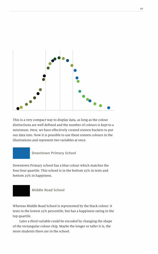
66
This is a very compact way to display data, as long as the colour
distinctions are well defined and the number of colours is kept to a
minimum. Here, we have effectively created sixteen buckets to put
our data into. Now it is possible to use these sixteen colours in the
illustrations and represent two variables at once.
Downtown Primary School
Middle Road School
Downtown Primary school has a blue colour which matches the
four:four quartile. This school is in the bottom 25% in tests and
bottom 25% in happiness.
Whereas Middle Road School is represented by the black colour: it
tests in the lowest 25% percentile, but has a happiness rating in the
top quartile.
Later a third variable could be encoded by changing the shape
of the rectangular colour chip. Maybe the longer or taller it is, the
more students there are in the school.

67 A Practical Guide to Designing with Data
Stroop effect
In 1929, John Ridley Stroop, an American psychologist, published
a paper about subjectsʼ reaction time completing a task involving
colour names printed in a different coloured ink. Itʼs a very simple
experiment to replicate.
What became known as the Stroop effect can be observed
using some coloured markers, index cards and a group of friends.
Write the names of colours on the index cards, but use a different
colour ink than the coloursʼ names: RED, BLUE, ORANGE, GREEN,
PURPLE. When you flash up the word, the subject should respond
as quickly as possible by saying what colour ink the text is written
in, not the word itself. For instance, if the word RED written in
green ink is flashed up, the participant should say “green”, but
their first thought will probably be “red”, leading to a delay before
their response, or an error. There are several online examples you
can take to test your reaction time and experience the effect at
first hand.
The Stroop effect reveals that the text (or, rather, the readerʼs
comprehension of the text) has a stronger impact than the colour
of ink used to print it. The issues of misdirection and assumptions
are important factors in charts and design. As weʼll see in part 3,
it is possible to deceive with data because the brain focuses on
different aspects of the representation, just as in the Stroop test
we are primed for one response rather than another.
~ Just a splash of colour

68

69 A Practical Guide to Designing with Data
It should be obvious by now that colour plays a significant part
in any visual presentation. Sometimes large sets of data are
generated dynamically and you canʼt spend time selecting the
perfect set of hues. What is needed is a way to choose a wide
range of colours programatically and arrive at the same result
every time.
The best way I have seen is a simple algorithm developed
by Dopplr1. This takes a text string, in Dopplrʼs case a city name,
runs it through some simple programming code and out pops a
hexadecimal (hex) colour value suitable for the web.
For those of you who are not programmers, donʼt worry; there
are plenty of websites which can do all of this for you. It just takes
a bit of cutting and pasting on your part.
The algorithm is very simple and it isnʼt random, so you will
get the same result for the same string every time. The first step is
to apply an MD5 hash function to the text string. A hash is a one-
way cryptographic function, but you donʼt need to know anything
about cryptography to use this. The MD5 hash function converts
any text into a 32-character hex string.
When we run ʻBrian Sudaʼ through an MD5 function it produces:
338c88ea7790424ec9ad2a3beaeab910
This value is, to all intents and purposes, unique. Every system
that supports MD5 will produce the same answer, which is great
because itʼs a consistent way of converting a string into a really
big number.
A quick web search for “online md5” will find plenty of
websites that take a text string and return a 32-character hex value.
Try several different sites to check that the same result is returned
each time – it will be. It is also worth noting that MD5 is case-
sensitive. Typing ʻBrian Sudaʼ will give a different answer than
typing ʻbrian suda .̓
In Rainbows 10
~ In rainbows
1 http://blog.dopplr.com/2007/10/23/in-rainbows/
Dow
nlo
ad fro
m W
ow
! eBook
<w
ww
.wow
ebook.
com
>

70
Now that we have our hex value of
338c88ea7790424ec9ad2a3beaeab910, how do we convert that into a
colour? The simplest way to make a six-character hex colour string
like those used in HTML out of the 32-character hex string weʼve
generated is to only look at the first six characters. In programming
parlance, we take a six-character substring. For non-programmers,
simply copy the first six characters of the MD5 result.
338c88 = substring("338c88ea7790424ec9ad2a3beaeab910",0,6)
The string ʻBrian Sudaʼ always equates to #338c88, which is a sort of
dark turquoise colour.
Brian Suda#338c88
If you are working with applications that donʼt understand hex,
it can be converted into RGB values with a simple equation. To do
this, break the six-character string into three sets of two-character
hex strings: 33; 8c; and 88. Most drawing applications support
hex values, but it only requires a little bit of mathematics to
understand hex values and to convert them to decimal values
for RGB.
Hexadecimal numbers use base-16. Base-16 means that instead
of 0–9, we have 0–F, where A equals 10, B equals 11, and so on up to
15. The hexadecimal value FF is (15 × 16) + 15 = 255 in base-10, our
normal way of counting. Thatʼs how we get #FFFFFF to be white
at RGB(255,255,255) and black #000000 to be RGB(0,0,0). For the
ʻBrian Sudaʼ value, the hex number 33 is (3 × 16) + 3 = 51 in base-10.
So, 8c is (8 × 16) + 12 (140 in base-10), and 88 is (8 × 16) + 8 (136 in
base-10), giving RGB(51,140,136).
(3×base-16)+333

71 A Practical Guide to Designing with Data
Using this MD5 technique means that the colours are reproducible
across multiple machines, languages and instances. My name
Brian Suda will be the same colour today as tomorrow on my
computer or on another server. When using large sets of data,
sets so large it isnʼt possible to sit down and assign every value a
unique colour, using this alogrithm will save time and effort. To
make this algorithm your own, you could just as easily take the
last six characters, or the first, third, fifth, seventh, thirteenth or
any combination. As long as you are consistent, you will get the
same result time and time again.
The major disadvantage of using this method is that
sometimes you get some ugly colours! Or white with off-white, or
black with near-black. Or worse, several shades of the same colour
that are very similar, making it difficult to distinguish between
them. When such results are unavoidable, you need to make
the best of a bad situation and adjust the layout and, perhaps,
change the precision of the the data for the best visualization. For
instance, if the month names create clashing colours, you can put
the month and year name through the algorithm, for example,
using the string “Jan 2010” rather than just “Jan”, or “January”
rather than the abbreviation. But remember to be consistent.
Jan Feb Mar Apr May Jun Jul Aug Sep Oct Nov Dec
~ In rainbows

72
There is also a complementary algorithm which can help. It returns
black or white based on a given hue. This equation is used to find
whether black or white has more contrast with the colour. If the
resulting colour is very light, this algorithm recommends using
black text. If the colour is very dark, it recommends white text. It is
a solution to the randomness of the MD5 algorithm when the value
returned is unknown.
function contrast($hexcolor){
return (hexdec($hexcolor) >0xffffff/2)? black : white ;
}
Janu
ary
Feb
urar
yM
arch
Ap
ril
May
June
July
Aug
ust
Sep
tem
ber
Oct
ob
erN
ove
mb
erD
ecem
ber
pxst
However, when you surrender completely to an algorithm you are
stuck with it completely. Even if the colours are ugly and donʼt
work, you must stick with it so it can be reproduced consistently.
One use for the MD5 algorithm is to generate background
colours for a web page. This creates a little delight for your visitors,
as each time they return to the site it can be a different colour. Like
the BBCʼs homepage1 which changes colour based on the colours in
the main photo, you can use a random colour. Instead of using the
source of an image as the colour we could use the current time on
the server.
$backgroundColor = substring(md5(time()),0,6);
1 http://www.bbc.co.uk/

73 A Practical Guide to Designing with Data
This will give a different background colour for every millisecond
when someone visits the site. Again, you have to be willing to take
the good with the bad, because there will be times you get hot
pink, mustard yellow, mint green or a muddy brown.
Recently, I decided to change the face of my wall clock. Being
inspired by the designs of others, I created a similar look, but
wanted to generate the colours programmatically.
My first run produced horrible colours, so I changed the text
slightly, but this didnʼt produce much better results. I realized
that I canʼt change fate, so I went with the design as prescribed by
the code. Through the algorithm I ran the text “00:00”, “00:30”,
“01:00”, “01:30”, all the way up to “11:00” and “11:30”, and saved
the list of corresponding hex colours. The final design of the clock
face is as follows; itʼs not bad, but not great, and I can always say
that I didnʼt decide on the colours myself, so if you donʼt like it,
you canʼt blame me.
~ In rainbows

74
If your projects revolve around a large set of values that need to be
shown in relation to one another, then this algorithm might be a
useful tool for you.
Summary
Mixing and matching colours, removing lines until you can
remove no more takes both a creative eye and the approach of a
scientist who questions everything. The chapters in this section
demonstrated the perils of bad chart design. Having poor quality
graphics or too much noise both contribute to a bad experience.
Designing with data needs to be about clarity in the story.
Sometimes you need some characters to stand out and others to
play a supporting role, but both are important in advancing the
plot. Colour and ink are both used to achieve this.
As weʼve seen in this section, ink and colour are probably the
largest contributors when designing charts and graphs, so you
need to know how to wield them carefully.
As Antoine de Saint-Exupery, the author of The Little Prince
said, “Perfection is achieved, not when there is nothing more to
add, but when there is nothing left to take away.” With practice,
youʼll reduce your data to pixel ratio to the minimum possible
leaving only what is necessary for your readers to enjoy the story.
In the next section, Iʼll show you how to abuse what youʼve
learnt to trick your readers into thinking something they
shouldnʼt. Iʼm not showing you how to do this so you can befuddle
your readers, but so that you donʼt get tricked. To outfox a fox, you
need to think like one.
75 A Practical Guide to Designing with data
“There are three kinds of lies: lies, damned lies, and statistics.”
– Anonymous, popularized by Mark Twain
The impact of visualizations often tempts us to contort the data into
the results we want. This is done both knowingly and unknowingly.
In this section, Iʼll run down a few of the different ways that
visualizations can lie about the real data. Itʼs important to understand
these issues so you can spot bad design and avoid falling into these
traps. In production, the chart might seem sensible, but if you know
the pitfalls you can correct mistakes and avoid any misrepresentation.
Next time you read a newspaper or magazine, be conscious of
the design decisions taken by the illustrator and wonder if they are
deliberately trying to influence your opinion.
How to deceive with data
Part 3
Dow
nlo
ad fro
m W
ow
! eBook
<w
ww
.wow
ebook.
com
>

76
Trompe lʼœil (trick the eye)
Relative versus absolute
Sins of omission
Caught red-handed: The problem of false positives
Fudge factor

77 A Practical Guide to Designing with data
Human consciousness discerns patterns, even where none exist.
Thoughout our evolution, predators have threatened to eat us
and enemies attacked each other to take over territory. This sense
of danger lies behind why our brains are wired to see shapes in
clouds or cheese toasties. Our brains evolved to fill in the gaps.
We use this skill on a daily basis and it can be exploited for
both good and bad. When presented with partial data, our brains
try to find patterns and project the lines where data is missing
which leads to misinterpretation.
Next time you wander down the main shopping street, have
a look at the advertisements that span multiple shop windows.
Does the ad stop at the window frame and continue again in the
next pane leaving a few inches gap, or have a few inches of the
advertisement been removed?
Hipposterous!
In chapter 6 we described the problems with 3-D charts and
graphs, and in chapter 19 we'll talk about the problems people
have judging the relative sizes of wedges in a pie chart. For now,
we'll look at how readers assess the relative size of items of chart
junk and other random or distracting shapes.
One way a chart can lie is through overemphasis of the size
and scale of items, particularly when the dimension of depth
isnʼt considered.
Letʼs take a simple bar chart comparing the amount of food
consumed by two hippos. We see that Hippo One consumes two
units of food, where as Hippo Two consumes four units. The
bar chart correctly shows that Hippo Two eats twice as much as
One because of the relative heights of the bars. This is as clean as
possible, all unnecessary pixels have been removed from the chart.
Trompe lʼœil (trick the eye)11
~ Trick the eye
Dow
nlo
ad fro
m W
ow
! eBook
<w
ww
.wow
ebook.
com
>

78
While this is an interesting statistic, maybe the illustrator wanted
to show off a bit and try to make the chart more compelling by
replacing the bars with sacks. Itʼs a little kitsch, but as the chart is
about units of food eaten, itʼs not a stretch to picture them as bags
of food.
Hippo #12 units
Hippo #12 units
Hippo #24 units
Hippo #24 units
The scale still claims the same values: the first item is two units
tall and the second item is four units tall. Nothing has changed in
the chart except there are graphics rather than bars. The problem
arises because we can all imagine actual bags of food in our minds
and how much effort it will be to lift one!
The chart is disorienting because although it demonstrates
a two-fold increase, the three-dimensional objects confuse our
spacial awareness. Doubling the height of the sack effectively
cubes the area, so the pixels used to draw the second sack
represent eight times the amount, yet the illustrator passes this
off as double.

79 A Practical Guide to Designing with data
Even though we read the labels, our brain perceives the second
sack as a lot more than twice the size of the first. If we were to take
the 3-D nature of a bag of food into consideration, a doubling in
volume would actually be represented like this:
Hippo #12 units
Hippo #12 units
Hippo #24 units
Hippo #24 units
To the untrained eye, the second sack is barely bigger than the
first. Youʼd be hard-pressed to guess it was double the volume, yet
this is more or less what the values would look like in real life.
The additional depth dimension makes the height appear much
smaller than a doubling.
Turning this idea around, converting a competitorʼs sales
figures into three dimensions can make them seem much closer
to your own. If your competitors produce twice as many widgets
as you, itʼs possible to hide most of the difference using depth to
make you look less far behind.
Sometimes there is no connection between the size of the
graphics and the values they represent. The scale of the second
item is just made bigger and then labelled correctly. We are
intended to believe the numbers, but the graphic makes a deeper
impression on us and that is what we tend to remember.
~ Trick the eye
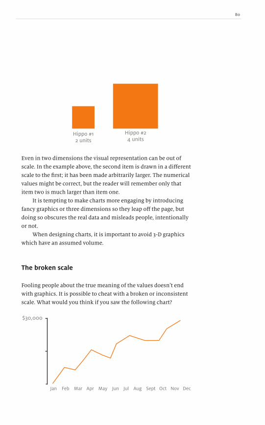
80
Hippo #12 units
$30,000
Jan Feb Mar Apr May Jun Jul Aug Sept Oct Nov Dec
Hippo #24 units
Even in two dimensions the visual representation can be out of
scale. In the example above, the second item is drawn in a different
scale to the first; it has been made arbitrarily larger. The numerical
values might be correct, but the reader will remember only that
item two is much larger than item one.
It is tempting to make charts more engaging by introducing
fancy graphics or three dimensions so they leap off the page, but
doing so obscures the real data and misleads people, intentionally
or not.
When designing charts, it is important to avoid 3-D graphics
which have an assumed volume.
The broken scale
Fooling people about the true meaning of the values doesnʼt end
with graphics. It is possible to cheat with a broken or inconsistent
scale. What would you think if you saw the following chart?

81 A Practical Guide to Designing with data
It looks quite dynamic, stretching from the bottom of the chart
to the top. If the graph represented annual sales figures, then
perhaps the company has shot up and is doing well. If it showed
rises in the cost of living, weʼd all be crying foul! What has been
omitted is the rest of the graph below the data line. If that and a
scale are added, the graph tells a very different story.
$30,000
$28,500$30,000
$15,000
$0
$0
~ Trick the eye
There isnʼt such a great movement when put into full context.
The graph was exaggerated using a smaller, relative difference for
a reason; it was designed to make an emotional impact. It wasnʼt
about the data but the shape!
This is why in chapter 6 we talked about not realigning the
graphʼs origin. Even though our goal is to remove unnecessary
pixels, we mustnʼt sacrifice understanding. Pixels can still be
removed, but the scale must remain anchored and consistent.
Jan Feb Mar Apr May Jun Jul Aug Sept Oct Nov Dec
Jan Feb Mar Apr May Jun Jul Aug Sept Oct Nov Dec

82
Mon Tues Wed Thurs Fri
Here, the unnecessary vertical tick marks have been removed so
that only the minimum and maximum values are labelled, along
with the origin so there is a consistent scale. There always needs to
be a baseline for comparison, otherwise the chart is biased to the
small, sample set of data being shown. Scales and context cannot
be judged accurately without knowing the zero point.
The valueless scale
Another sneaky way to cheat is to create a graph with no explicit
values. A line sloping upwards on a chart looks impressive but, if
the scale is not provided, who is to say the steps are $1 or $1,000?
Without any reference, we canʼt grasp if this is impressive or
meagre growth. Given that labels were abandoned, Either the
author is hiding the truth, or the entire chart was fabricated in
an attempt to look significant without actually conveying any
information at all.

83 A Practical Guide to Designing with data ~ Trick the eye
By changing the scale, it is possible to change the shape of the
graph and, therefore, peopleʼs impression of the growth.
1 1 1
2 4 10
3 9 100
4 16 1000
5 25 10000
As you move from left to right, each chart seems to show ever
more impressive growth, but in reality they are the same chart.
In the first, the scale grows linearly: 1, 2, 3, 4, 5, and so on; in the
second, it increases polynomially: 1, 4, 9, 16, 25; and in the third,
logarithmically: 1, 10, 100, 1000. It is exactly the same data, but
plotted using different scales. This is why you should never trust a
chart that lacks some sort of explicit explanation of what is being
measured.

84
Dow
nlo
ad fro
m W
ow
! eBook
<w
ww
.wow
ebook.
com
>

85 A Practical Guide to Designing with data
Another way to obscure the truth is to hide it with relative
numbers. Weʼre bombarded with this all the time in quotes like,
“computer sales are up three per cent from last month”.
That sounds fine, but three per cent up from what?
Relative scales are always given as percentages or
proportions. An increase or decrease of a given percentage only
tells us part of the story, however. We are missing the anchoring
of absolute values.
Take this truthful, but misleading press release:
“ABC Widget Corporation had an incredible fourth quarter.
It increased sales by 135% over the same time last year. If we
compare that to its nearest rival, XYZ Cogs, which had only
a 34% increase in sales this quarter, ABC Widget Corp. is
flying high.”
Relative versus absolute12
~ Relative versus absolute
ABC Widgets 135%
34%XYZ Cogs
This looks like an increase of over 100% in sales for ABC Widget
Corp. versus its rival. The problem is that this is only half the story.
We are missing the absolute values.

86
A quick lesson in logarithms
A logarithmic series is one that increases by powers of ten at each step: 1, 10, 100, 1,000 on up;
a zero is added to the end each time. So why is this important? Well, increasing ten widgets by
one represents a ten per cent increase. Adding one to a hundred widgets is only a one per cent
increase. One widget added to another one, and the widgets have doubled: a 100% increase!
Looking back at the sales figures for ABC Widget Corporation versus sales at XYZ Cogs,
something similar is happening.
ABC Widget Corp. is a small, family-run business that sells around
10,000 widgets each quarter. In the fourth quarter, it happened
to get a large order from a new customer and increased sales to
23,500, a relative increase of 135% and an absolute increase of
13,500.
XYZ Cogs is a multinational firm that sells around three
million widgets per quarter. With a growing widget market, it
added an additional 900,000 widgets in this quarter. Thatʼs only a
relative 34% increase, but an absolute increase many times greater
than ABC Widget Corp.
ABC Widgets
ANUAL GROWTH IN UNITS
XYZ Cogs

87 A Practical Guide to Designing with data
When we look at the numbers in absolute terms, then ABC Widget
Corp.̓s press release isnʼt as stunning as it originally sounded.
With a production of 23,500 widgets in total, compared to XYZ
Cogsʼ 3.9 million, it is laughable to compare itself to its rival in this
way. The smaller 34% increase for XYZ Cogs is hundreds of times
larger than all of ABC Widget Corporationʼs entire sales. The moral
of the story is not to be fooled by relative values: they could be
much less of a feat than the PR company would have you believe.
Using relative values to your advantage
There are times when you might want to use the relative values
rather than the absolute. One example might be poll results. In
my local free newspaper, there is usually some sort of survey
question. I am very sceptical when the response values are 75% to
25%, or 67% to 33%. It just makes me think that only three or four
people responded!
Relative values hide the number of participants (N), which
can be a good thing in some cases. A poll that shows exactly the
number of votes cast is an open invitation to spammers! If people
can see that their individual vote has been added, some will keep
voting to watch it roll over and over and over to the next number.
With a very large N value, it takes many more submissions to
move the relative values from 49% to 50% than to make an
absolute count keep ticking over one higher each time.
In political elections, to show the N values might discourage
people from voting in what is a close race relatively. If the tallies
for the candidates were 51% to 49% with N values of 5.1 million
to 4.9 million, voters might question the power of their vote and
become apathetic.
~ Relative versus absolute

88
Jumping lists
Another place where relative values are used without reference to
their absolute positions is in lists. Shocking headlines that read,
“More people worried about volcano eruptions than filing late
taxes!” arenʼt really telling us anything. There is no reference point
to understand how worried people are in these situations.
Imagine a list of life concerns. Maybe forgetting to file your
taxes was 37th on the list and volcano eruptions ruining your
holiday was 38th. In a particular month, perhaps more people
worried about volcanic ash clouds and pushed it up to 36th place,
forcing down killer bee attacks to 37th and pushing tax deadlines
down to 38th place.
Simply saying that more people are worrying about volcanoes
than tax deadlines is missing the point. The real question that
needs answering is by how much.
This returns us to our lesson in logarithms. If a survey only
found one person worrying about tax deadlines, then only two
people need to worry about volcanoes to beat it. Thatʼs a 100%
increase by doubling. But what if the survey found that 1,000
people were worrying about tax deadlines and only 501 about
volcanoes? Again, a 100% relative increase would be needed to beat
tax dealines, but now that means 500 people! When newspapers
publish outlandish jumping list style headlines, you have to
wonder if it was newsworthy in the first place. Omitting absolute
figures for the lists is a pretty good give away.

89 A Practical Guide to Designing with data
A sin of omission – leaving something out – is a strong one and
not always recognized; itʼs hard to ask for something you donʼt
know is missing. When looking into the data, even before it is
graphed and charted, there is potential for abuse. Simply not
having all the data or the correct data before telling your story can
cause problems and unhappy endings.
Self-biasing surveys
There are surveys which eliminate some of the factors being
researched. Phone polls work well for people who have phones!
They also over-represent stay-at-home parents and retired people
and under-represent the workforce, students and younger people.
“100% of the people we e-mailed use the Internet”
A good survey organization will take this into account and either
adjust the data accordingly, adjust the margin of error, or focus
their polling on the under-represented groups in a different ways.
But not all companies are so thorough.
The statistics are only as good as the cross section of data
they represent. Asking 1,000 older people about their favourite
video game does not make for a good survey result if youʼre
trying to find out what will be the hottest this Christmas, even if
scientifically conducted.
Missing data
Sometimes it is less about bad data and more about data that is
missing altogether. In some situations, the group of people asked
to participate is self-selecting; results can be biased because only
those people available or willing to participate complete
the survey.
Sins of omission 13
~ Sins of omission

90
I remember hearing a story that beginnerʼs luck really does exist
and that it disappears over time. I found it very hard to believe!
Games of chance are just that, chance, not luck, and the longer
you play, the more averages come in to force. It turns out that the
explanation for the idea that beginnerʼs luck really does exist is not
mathematical but psychological.
Letʼs say ten friends get together to play a new card game. After
the first game, five people lose; they are so disappointed that they
quit and never want to play the card game again. The remaining
five continue to play for the rest of their lives. The more they play,
the more they feel that they had beginnerʼs luck and as they lose
(or, more accurately, the house catches up) it wears off. In some
ways, for these players the myth of beginnerʼs luck is true. In their
eyes and the eyes of any observer, their record started off with a
series of wins and steadily got worse. The missing data is all the
people who lost in the beginning and never continued to play; they
dropped out of the statistical pool. All of these people disprove the
idea of beginnerʼs luck, but they are nowhere to be seen.
The same goes for why all the places you visit seem more
popular than expected. It is a strange phenomenon, but if we peel
back the statistics weʼll see it isnʼt so unusual. Is that favourite
coffee shop always more crowded when you visit? Well, you are
more likely to end up at a place when it is crowded than when it
isnʼt simply because when places arenʼt crowded there are less
people to make up the statistic.
Similarly, this is why it seems that our friends have more
friends than we do. The probability that we will make friends with
someone who has only one or two friends is very low, whereas the
probability of making friends with someone who has a thousand
friends is much higher. Therefore, it seems that your friends
always have more friends than you do. You arenʼt considering all
the people in the world with few friends that you donʼt know.
When looking at data sets produced by others, you need to ask
yourself if there could be missing data.
Dow
nlo
ad fro
m W
ow
! eBook
<w
ww
.wow
ebook.
com
>

91 A Practical Guide to Designing with data
Meta-analysis
If you throw enough information at the wall, something will stick.
When searching for a specific result, you can run a test enough
times to achieve any answer you are looking for. And if your
desired outcome is a one-in-a-million chance, you just need to
run a million tests.
It is like the infinite amount of monkeys typing on an infinite
number of typewriters; one will eventually recreate the works of
Shakespeare. Nothing is impossible, just improbable.
Within any given sample there will be outliers. If the sample
set is small enough then these outliers can overwhelm the data.
A company wanting to present itself in a particular manner
can just continue to run test after test until the result it
wants is achieved. This is how nine out of ten doctors end up
recommending X as the leading brand. How many sets of ten
doctors did this test include? Maybe during the first trial only
three out of ten approved. Those results were trashed and the
trial was rerun. Next time the results were worse and only one
in ten approved. The tests continued until a set of nine doctors
approved. At this point the tests were stopped and the company
could slap a sticker on the product saying “Nine out of ten doctors
recommend Brand X. Itʼs been scientifically tested and approved!”
This is where meta-analysis comes into play. Meta-analysis
consists of taking data from several trials and analysing them
together as if they were from one test. The extreme outliers for the
pros and cons will be smoothed into a more realistic reflection of
the data.
~ Sins of omission

92
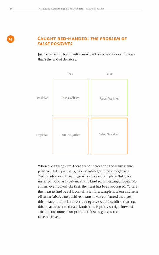
93 A Practical Guide to Designing with data
Just because the test results come back as positive doesnʼt mean
thatʼs the end of the story.
Caught red-handed: the problem of false positives
14
~ Caught red-handed
True
True Positive
True Negative False Negative
False Positive
False
Positive
Negative
When classifying data, there are four categories of results: true
positives; false positives; true negatives; and false negatives.
True positives and true negatives are easy to explain. Take, for
instance, popular kebab meat, the kind seen rotating on spits. No
animal ever looked like that: the meat has been processed. To test
the meat to find out if it contains lamb, a sample is taken and sent
off to the lab. A true positive means it was confirmed that, yes,
this meat contains lamb. A true negative would confirm that, no,
this meat does not contain lamb. This is pretty straightforward.
Trickier and more error prone are false negatives and
false positives.
94
A false positive is when something is reported as true when it is
actually not the case. In our kebab example, the lab would report
back that, yes, the meat contains lamb, when in fact it doesnʼt.
A false negative is just the opposite, when the lab reports, no, this
does not contain lamb when in fact it does.
Finding out what your dinner contains, however, might not be
the most exciting example of false positives.
The same logic applies to every test that has some probability
of an error – everything from carbon dating to DNA tests, Martian
soil samples to loan agreements. With all of these examples,
some cases are truly correct and incorrect, but others are always
mislabelled one way or another. The key is to minimize or at least
account for these situations.
Letʼs say you and your work colleagues are gearing up for
a Subbuteo® championship. One hundred people enter the
competition but, before it starts, everyone is required to take a
drug test to check for performance enhancing substances.
The test results are 90% accurate and take only a few minutes.
To your misfortune, you have tested positive and are barred from
competing. All those hours of training down the drain!
Letʼs assume that ten people really are taking controlled
substances. After administering the test, nine out of those ten
will get caught as true positives because the test is 90% accurate.
This also means that there is one false negative: one person has
slipped through the drug test net. He or she is taking controlled
substances, but represents the 10% where the test failed.
So that leaves us with ninety honest, hard-working people.
Youʼd assume that if they are clean, then theyʼll pass the test just
fine. Whatʼs to worry about, right? On average, however, with
ninety participants there will be nine people who are clean but
test positive; a 90% accuracy rate for the test means 10% will test
positive. In the sample set of ninety, there will be nine
false positives.

95 A Practical Guide to Designing with data ~ Caught red-handed
10 Actual cheaters90 Honest hard-working players
True negatives (people who passed the test and are clean)
False positives (people who failed the test, but are actually clean)
True positives (people who failed the test and are taking controlled substances)
False negatives (people who passed the test, but are taking controlled substances)
So what are the odds that someone who tests positive is actually
clean? Well, nine people have tested positive as false positives,
but there were also nine others who tested as true positives.
That means there are eighteen people who failed the test. So
thereʼs a fifty-fifty chance that any one of these people who have
been removed from the tournament are not taking performance
enhancing drugs.
Just because someone tests positive, doesnʼt necessarily mean
that they are positive. Using a cheap test with a high margin of
error will inadvertently flag some false positives. In this example,
the sample group is small, only eighteen out of the hundred, and
therefore longer, more expensive and complex tests can be used
just on those eighteen to narrow down the positive results.
Controlled substance tests, just like tests for cheating and money
laundering, are screening for positive results. Therefore, itʼs
best to minimize the chances of false negatives: someone who

96
is actually cheating, but tests negative and slips through the net.
In our sample set, there is one person who fits this category, the
false negative. Mathematically, the more we reduce the chance
of someone slipping through (false negatives), the more people
accidentally get blamed (false positives).
The equation to determine false/true positives/negatives is
pretty easy if you have the data.
If everyone in the US population, all 300 million people, were
to take a free test which looked for a life-threatening disease, how
many peopleʼs tests would be false positives? First, we need to
know how accurate the test is; letʼs say that it is 99.9% correct in its
diagnosis. Next, we need to know how many people are affected by
this disease. In this example, only one in a million people.
To test how many people are safe from the disease (the true
negative) we take the total one million and subtract the expected
one to get 999,999 people who are expected to test negatively. We
then divide that by the million to find the probability of not having
the disease, which is 0.999. This leaves a very small chance that
any individual is affected. Next, we need to take that probability
and multiply it by our sample size (in this case, the population of
the USA: 300 million) and then multiply the result by the accuracy
of the test: 99.9% (or 99.9∕100 = 0.999).
For our true negative count weʼd have:
300,000,000 × (999,999∕1,000,000) × 0.999 = 299,699,700
(population size) × (probability of not having the disease) × (quality of the test)
Thatʼs 299,699,700 people who test clean and are truly clean.
For our true positive count, weʼd use almost the same equation, but
instead of multiplying by the probability of being healthy, we use
the likelihood of having the disease, in this case one in a million:
300,000,000 × (1∕1,000,000) × 0.999 = 299.7
Dow
nlo
ad fro
m W
ow
! eBook
<w
ww
.wow
ebook.
com
>

97 A Practical Guide to Designing with data ~ Caught red-handed
So just about 300 people will test positive and be positive for
the disease – these are our true positives. This result also makes
sense; if one in a million people have the disease, then weʼd expect
300 people in our sample size to have it.
Now letʼs work out how many people are false positive. These
are the ones who receive bad news when in fact they are perfectly
healthy. This is the time when someone should ask for a second
opinion or a different type of test to move them out of the false
positive pool and into the true negatives.
We use the same equation as the true negative, except we use
the probability that the test is wrong instead of correct, in this case
0.1% – the test is 99.9% accurate, remember.
300,000,000 × (999,999∕1,000,000) × 0.001 = 299,999.7
It seems high, but makes sense if you understand that 0.1% of the
people will fall through the testing margin of error. These 300,000
people are getting bad news, but are actually healthy.
But the worst category to be in is the false negative. You pass
the test, but donʼt know you have the disease. We use the same
equation as the true positive, but change the probability of the test
to 0.1%.
300,000,000 × (1∕1,000,000) × 0.001 = 0.3
Fortunately, there is less than one person out of 300 million who
received a clean bill of health, but is very sick.
The false positives and false negatives are all the people who
are at risk. In our case, 300,000 people were wrongly identified as
positive and 0.3 people were wrongly identified as clean. Thatʼs
one out of every thousand people who are incorrectly diagnosed.
In a large population, thatʼs a lot of people who could be told the
wrong result even though the test is 99.9% correct!

98
True
300,000,000 ×(1/1,000,000) × .999 =
300,000
300,000,000 ×(999,999/1,000,000) ×
.999 =
299,699,700
300,000,000 ×(999,999/1,000,000) ×
.001 =
300
300,000,000 ×(1/1,000,000) × .001
=
0.3
False
Positive
Negative
To double-check that our calculations are correct, you can add up
all the totals in each of the squares.
299,699,700 + 300 + 300,000 + 0 = 300,000,000
So every person in the sample set is accounted for in the matrix
of possibilities.
However, the maths that makes the test 99.9% accurate
through eliminating people as true negatives also means that a
positive test result has a 99.9% probability of being wrong.
If we look at everyone who tested positive we get a total of
300,300. If someone received the bad news of a positive result,
what are the odds that they are actually positive? To calculate those
odds, we need to take the 300,000 false positives and divide that by
all those who tested positive, whether truly or not: 300,300. That
gives them a 99.9% chance of being clean even if they are given the
bad news.

99 A Practical Guide to Designing with data ~ Caught red-handed
So the next time a doctor tells a patient that this test is 99.9%
accurate and he or she has tested positive, the patient should
know there is a 99.9% probability that the result is a false positive
– I would ask for a second opinion.
False positives and false negatives are sometimes referred to
as Type I and Type II errors. If you are interested in learning more,
there is plenty of literature out there on this topic.

100

101 A Practical Guide to Designing with data
One thing to be aware of both when designing visualizations
and reading them, is the amount of information behind each
data point.
A weather map gives a general impression of whether the
temperature will be warm or cold, or if rain is likely. Somewhere
along the line, someone thought about providing a three-day and
then a five-day forecast. Forecasting involves taking advanced
weather models and extrapolating out for a few days into the
future, but the accuracy of past forecasts is rarely mentioned.
Nor do people rely on the five-day forecast without checking
again during those five days. There is a continual refinement of
the information as time passes.
That said, what if you were planning a big party this weekend?
If you consulted the five-day forecast on a Monday and there
was a 60% chance of rain, what would the margin of error be?
You simply donʼt know. If it were 60% plus or minus 30%, the
possibility of rain would be anywhere within a 30% to 90%
chance. Flipping a coin – heads it rains, tails it doesnʼt – has a
better prediction accuracy: you have a 50% chance of getting it
right. The forecastʼs margin of error is 60%!
The margin of error or ʻfudge factorʼ is important, but itʼs
something that is seldom mentioned or displayed.
One area in which margins of error are displayed is political
polling. Organizations canvass people to ask if they are going to
vote for Candidate A or Candidate B. It might be reported in the
newspaper that Candidate A has a lead of 51% with a margin of
error of 3%.
Fudge factor 15
~ Fudge factor
Candidate A50.9%
* With a margin of error of 3%
Candidate B49.1%

102
With such a small margin of error, the difficulty is that in one poll
Candidate A might be as low as 48% and Candidate B as high as
52% because three percentage points can be added or subtracted
from each total. Claiming a victory for Candidate A when the
margin of error does not exceed the difference between the two
candidatesʼ shares is a gamble at best.
When dealing with statistics, there are several ways to generate a
margin of error, but we need to worry less about the methods and
more about the design of the data.
The most common way to visualize margin of error is whisker
bars. Many software applications allow you to add these into your
graphs and charts.
Associated Press, taken by Byron Rollins
Dow
nlo
ad fro
m W
ow
! eBook
<w
ww
.wow
ebook.
com
>

103 A Practical Guide to Designing with data
The whisker bars allow us to show a value at the height drawn, but
provide a range within which the actual value might reside. These
work well for discrete measurements, but in an example running
over time, it might be better to have an upper bound line and a
lower bound line. This gives an area in which the value could
be recorded.
~ Fudge factor
The line represents the recorded values, and the shaded area is the
region where the values could appear given the margin of error at
any particular time. The narrower the shaded area, the better. That
means the measurements are more precise and the data will be
closer to the measured value. In this example, the data could be at
the very top or very bottom of the shaded region creating a large
range of possibility for the true answer.
Certain types of data do not have margins of error. A budget
assessment, for example, reports that $123.45 was spent this week
or it wasnʼt. So area graphs, pie charts and others that canʼt have
whisker bars are ideal for presenting this fixed type of data. Future
projections, sample sets and experimental observations could well
contain a range for each value which area graphs and pie charts
cannot account for.

104
Precision error
An indication that the data is not statistically sound is when it is
almost too precise. Saying that on average a family of four spends
around $127.86 per week on groceries sounds much more scientific
than saying that it spends around $130 a week. But where might
such an exact value have come from?
It was probably the average taken from the sample. The
problem is that nothing is known about the sample: was it 100
people, or 100,000 people? Were people asked to produce receipts
or just write down what they thought they spent? Personally, I
might be able to tell you how much I spent on my last trip to the
grocery store, but for the last 52 weeks?
Be wary of any such exact values quoting the average anything
of a group of people. One aspect we havenʼt discussed, which
is beyond the scope of designing charts and graphs, is data
collection. It is possible to create averages, graphs, time series and
all sorts of fancy plots but if the initial data is not reliable then
everything else that follows falls down. This goes back to chapter
13 about sins of omission.
There can be many issues surrounding the quality of a survey:
the sample group and size; the self-selecting nature of the group,
and so on. Asking people about their salaries rarely results in a
precise average; people are often reluctant to reveal how little they
make and tend to round up or, conversely, they might round down
to put off the tax man, or even refuse to answer. Like the phone
poll that reported that 100% of people have phones, there is always
the chance of a built-in bias which charts and graphs
cannot expose.

105 A Practical Guide to Designing with data ~ Fudge factor
A quick note about averages
Something we all learned years ago in our mathematics lessons,
but have probably forgotten, is that there are actually three
different ways to reach an average: mode; median; and mean.
For the following values
1, 1, 2, 2, 2, 3, 3, 3, 3, 3, 3, 3, 4, 15, 121
we can compute three different types of average.
Mode
The mode is the most frequently occuring value in the set. In this
example the mode is 3 because it appears seven times in the set.
Median
The median is the middle value in the ordered set. There are
fifteen items in the list, so the eighth item is in the middle,
separating the top half of the set from the bottom half of the set.
The eighth value is 3.
Mean
The mean is what most people understand as the average.
To calculate the mean, add up all the values, then divide by the
total number of values. Thus, 169 divided by 15 equals 11.26.
Confidence and error
The margin of error used in every calculation is related to the confidence interval. Since surveys
only use a sample, say a thousand people rather than the entire population, it can never be said
that the sample set exactly represents the true outcome. This is why a confidence interval is set;
you are 99% confident, or 95% or 90% and so on. Lowering the confidence interval lowers the
margin of error. If you are only 30% confident that the results are correct, then the margin of error
does not have to be large. If you claim a higher confidence interval, then the margin of error also
increases. It appears somewhat counter-intuitive, but thatʼs the way it works.
The confidence interval determines the margin of error based on the t-value in a look-
up table. There are whole textbooks written about sampling procedures, sampling error and
confidence intervals based on the bell curve.
106
From these results you can see it is possible to quote one average
which is wildly different from another! An average of over eleven
is impressive; an average of three less so. Neither is a lie: each one
just reflects a selective use of the data to influence a decision.
Average personal income can be examined in this way. The
salaries of the inhabitants of any given neighbourhood would yield
different averages. One or two wealthy individuals could raise the
mean because their high income gets spread amongst everyone
elseʼs. So when boasting about how great your neighbourhood is,
you could inflate your status to the point where it makes you look
the best. In this case, having a few wealthy individuals raising the
mean makes you look good too.
The mode and median of the neighbourhoodʼs salaries
could be much lower than the mean. If everyoneʼs salary was
different, but maybe two or three people at the lower end all made
minimum wage, then the minimum wage would be the mode and
one possible average. But why would anyone want to quote their
neighbourhood at the lower end? Well, maybe when it comes to
paying council tax, residents could try to claim their area is poor
and should pay a lower amount because the average citizen canʼt
afford to pay more: the average person just makes minimum wage.
The same goes for the median – it too could be used to obscure
the truth. It isnʼt a lie: the median value is an average, just not the
expected mean average.
You should always fully explain which type of average you
are using, and if you are looking at a chart that doesnʼt then you
should be suspicious and ask questions.

107 A Practical Guide to Designing with data ~ Fudge factor
Summary
I hope the next time you see an infographic, youʼll look twice now
to see if it is trying to trick you! Not everyone does it on purpose;
ignorance of the issues is the most likely cause.
Knowing about these issues, you can always ask yourself how
to redraw the chart to remove ambiguity. If you can dissect the
design and rebuild it to be more understandable then you wonʼt
get fooled; plus, youʼll learn how to create a better design if you
run into the same problems.
So far weʼve spent the first three parts of the book learning
indirectly about charts and graphs. Weʼve delved into some
background information and historical context, the problems
of static and dynamic designs, and the physical dimensions of a
chart. Then we moved on to ink and colour, learning how to set
the framework for a good story, and how to call out and highlight
specific portions of the data. In this section, we covered how
people mislead with data design. Understanding this will prevent
you from making the same mistakes when designing.
Youʼve been given the groundwork for creating your own chart
and graph designs. You have the knowledge to question what is
wrong and the tools to fix mistakes.
In the next two parts, weʼre going to examine specific types of
charts and graphs, pulling out a few common charts in Part 4 and
discovering the situations in which to use each one. Weʼll weigh
up the pros and cons, where each type of chart fails and succeeds,
along with a bit of history and some things you probably
didnʼt know.

108
In part 5, weʼll spend five chapters looking at less common charts
and graphs. There are two major reasons for taking time to study
these more unusual forms. Firstly, when you do encounter these
rare designs, youʼll be able to spot problems with them. You
wonʼt be awed by something new and cool; you can sit back and
say, “Sure, itʼs pretty, but itʼs not working well here.” Secondly, as
you graduate from the basics of charts and graphs and progress
to visualizations and infomation graphics, knowing about the
problems and failings of these more unusual types will be useful.
Theyʼre not so common for a reason: they are either less effective,
more difficult to interpret, or incredibly specific in their usage, all
of which are important for a well-rounded designer of data
to understand .
109 A Practical Guide to Designing with data
To speak any language, we start with the basics. This is no less true for
the language of charts, graphs and visualizations. In this section, weʼll
discuss five common types of charts and the various ways they can be
presented. It is important to examine the strengths and weaknesses
inherit in each design; understanding the ins and outs of these
common types of charts will help you identify the types of stories they
are best at telling.
Common types of charts
Part 4
Dow
nlo
ad fro
m W
ow
! eBook
<w
ww
.wow
ebook.
com
>

110
Line graphs
Bar charts
Area graphs and charts
Pie charts
Scatter plots

111 A Practical Guide to Designing with data
Line graphs are so called because they contain at least one
continuous line which connects data points in a series.
Multiple sets of data points can be plotted on to the same line
graph. For instance, a line graph could represent time against
income, or income against population; you name it, anything
goes as long as there are just two variables.
Line graphs work best when the data is continuous. This
could be a temperature rising and falling, the velocity of a moving
object, or other continuous data. This type of data is information
that can be sliced into smaller and smaller pieces and still offer a
corresponding value.
This is where the line graph differs from other charts and
graphs: its ability to tell a story between the plotted points –
a story that is as powerful as the data that is known.
Line graphs16
~ Line graphs
10
1
2
3
4
2 3 4 5
One of most common variables used in line graphs is time; we
want to know how something is progressing through time. Time
is continuous: it is possible to divide the units into smaller and
smaller pieces. (Like that old story about talking a step halfway to
the wall: youʼll never actually get there – we can keep splitting a
second into smaller and smaller pieces and never reach zero.) A

112
line graph can also be used to project trends into the past or future.
After the data points have been collected, a best fit line is created
and extended in both directions. The validity of any projection is
in no way guaranteed by the use of a line chart, but the chart can be
used as a visual aid.
In the following table of dates and values, could you easily
work out the point at which the company will break the one
million dollar mark?
1 June $200,000
$200,000
$400,000
$600,000
$800,000
$210,000 $220,000$240,000
$290,000
$510,000
$780,000
$1,000,000
1 July $210,000
1 August $220,000
1 September $240,000
1 October $290,000
1 November $510,000
1 December
June July Aug Sept Oct Nov Dec Jan Feb Mar
$780,000
What would you guess? January? Maybe February or March to be on
the safe side?
What about if those same data points were converted into a
line graph?
Dow
nlo
ad fro
m W
ow
! eBook
<w
ww
.wow
ebook.
com
>
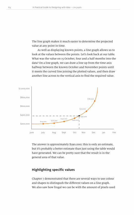
113 A Practical Guide to Designing with data
The line graph makes it much easier to determine the projected
value at any point in time.
As well as displaying known points, a line graph allows us to
look at the values between the points. Letʼs look back at our table.
What was the value on 15 October, four and a half months into the
data? On a line graph, we can draw a line up from the time axis
halfway between the known October and November points until
it meets the curved line joining the plotted values, and then draw
another line across to the vertical axis to find the required value.
$200,000
$400,000
$600,000
$800,000
$1,000,000
June July Aug Sept Oct Nov Dec Jan Feb
The answer is approximately $390,000; this is only an estimate,
but itʼs probably a better estimate than just using the table would
have generated. We can be pretty sure that the result is in the
general area of that value.
Highlighting specific values
Chapter 7 demonstrated that there are several ways to use colour
and shapes to distingush the different values on a line graph.
We also saw how frugal we can be with the amount of pixels used
~ Line graphs
$210,000 $220,000$240,000
$290,000
$510,000
$390,000
$780,000

114
$200,000
$400,000
$600,000
$800,000
$1,000,000
June July Aug Sept Oct Nov Dec Jan Feb
in a line graph compared to other types of graph. Since line graphs
are fundamental to designing with data, you need to always be
aware of the strengths and weaknesses of how to bring specific
values to the reader's attention.
Multi-variable line graphs
Creating charts that display one variable at a time is
straightforward. Line graphs can track two variables with a single
graph: one variable on the x-axis and one on the y-axis. But can we
encode more than two?
Itʼs possible to plot n dimensions, but this rapidly becomes
confusing and enters into the realm of visualizations – the spectre
of chart junk looms before us. Itʼs a useful exercise to walk through
how this happens and to see for yourself that the limits are
stretched pretty quickly.
Letʼs take a companyʼs net worth over time and plot those two
on a line graph.

115 A Practical Guide to Designing with data
The longer the company is in business, the more money it makes.
This is a standard two-variable plot: time and net worth. To add
a third variable, letʼs map the number of employees into the line.
The larger the dot at each measurement, the more employees work
at the company. We'll be looking at problems with circles and
relative size comparisons in chapter 19.
$200,000
$400,000
$600,000
$800,000
$1,000,000
June July Aug Sept Oct Nov Dec Jan Feb
$200,000
$400,000
$600,000
$800,000
$1,000,000
June July Aug Sept Oct Nov Dec Jan Feb
A fourth variable could also be illustrated by changing the colour
of the line. Each colour might represent a different CEO.
~ Line graphs

116
This week XYZ companyʼs stock shot up to 34th on the market
The number of variables that can be plotted is limited only by
your imagination, the amount of colours you want to use and how
far you take it before chart junk develops and the graph collapses
under its own weight.
Sparklines
Sparklines are small lines introduced right into the text where the
items are being discussed. Edward Tufte formulated this concept
in his 2006 book, Beautiful Evidence, but it harks back to a much
older idea. In the 1500s, Nicolaus Copernicus jotted down notes
in the margins of his observation log books as he stared through
his telescope at distant planets. Some of his notes took the form of
small inline illustrations which acted like words. He was exploring
such new territory in his studies of the heavens that he just drew
pictures of what he saw rather than writing a lengthy explanation.
Edward Tufte did something similar by embedding small line
graphs within with text.
16.76
85.12
There are several computer applications which generate sparklines
based on a data set.
The biggest difference between line graphs and sparklines is
that a sparkline is compact with no grid lines. It isnʼt meant to give
precise values; rather, it should be considered just like any other
word in the sentence. Its general shape acts as another term and
lends additional meaning in its context.
The driving forces behind these compact sparklines are speed
and convenience. Instead of discussing a teamʼs performance
and then referring to “Table 3 on page 896”, the information is
displayed right there, inline. It keeps the reader in the flow of the

117 A Practical Guide to Designing with data
text, adds information where it is needed, aids comprehension
and gives a scale and weight to the values in the prose. If I said,
“It was a great year for the company!” it might sound impressive;
having a sparkline available would let people decide if my
excitement was warranted or not.
~ Line graphs

118
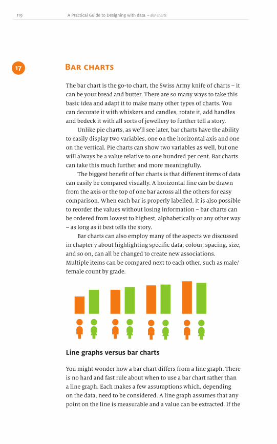
119 A Practical Guide to Designing with data
The bar chart is the go-to chart, the Swiss Army knife of charts – it
can be your bread and butter. There are so many ways to take this
basic idea and adapt it to make many other types of charts. You
can decorate it with whiskers and candles, rotate it, add handles
and bedeck it with all sorts of jewellery to further tell a story.
Unlike pie charts, as weʼll see later, bar charts have the ability
to easily display two variables, one on the horizontal axis and one
on the vertical. Pie charts can show two variables as well, but one
will always be a value relative to one hundred per cent. Bar charts
can take this much further and more meaningfully.
The biggest benefit of bar charts is that different items of data
can easily be compared visually. A horizontal line can be drawn
from the axis or the top of one bar across all the others for easy
comparison. When each bar is properly labelled, it is also possible
to reorder the values without losing information – bar charts can
be ordered from lowest to highest, alphabetically or any other way
– as long as it best tells the story.
Bar charts can also employ many of the aspects we discussed
in chapter 7 about highlighting specific data; colour, spacing, size,
and so on, can all be changed to create new associations.
Multiple items can be compared next to each other, such as male/
female count by grade.
Bar charts17
~ Bar charts
Line graphs versus bar charts
You might wonder how a bar chart differs from a line graph. There
is no hard and fast rule about when to use a bar chart rather than
a line graph. Each makes a few assumptions which, depending
on the data, need to be considered. A line graph assumes that any
point on the line is measurable and a value can be extracted. If the

120
values on your horizontal axis are 1, 2, 3, 4 and so on, then every
point on that line has a value. For instance, you could compute the
value of the line for 1.5 or 3.14 or 5.618.
A bar chart models discrete values. There might not be a
bar chart value for 1.5 unless there is actually a bar there. This
is why there is normally a space between the bars of a bar chart,
to show that they are not connected and that one value does not
flow into the next. There are some instances where the bars can
be put together, when the data does flow, and weʼll discuss these
histograms later in this chapter.
With bar charts, order is not necessarily important. Each bar is
independent of the others, so they can be sorted alphabetically, by
value or in some other order. With a line graph, the correct order is
essential since the data represented is continuous.
What determines whether you should use a bar chart or line
graph is the type of data and how flexible it is. The differences are
subtle, but can be very important overall.
Whiskers
One advantage of the bar chart is that the bars can be decorated
to reveal some additional statistical information. As we saw in
chapter 15, there is often a fudge factor, a percentage that might
be over- or underestimated. This is often seen in political polling:
Candidate A is leading 54% to 46% with a margin of error of plus or
minus 2%.
10%
A B
20%
30%
40%
50%

121 A Practical Guide to Designing with data
To illustrate this using a pie chart is impossible – there is no way
to add this four per cent buffer – but with line and bar charts
we can. Whiskers added to each bar reveal the upper and lower
boundaries of the data.
Each whisker is a small vertical line representing plus or
minus two per cent from the value, with some horizontal lines
to make the ends easier to see and measure. As discussed in
chapter 6, the data to pixel ratio should be kept to a minimum, so
remember to keep the design as light as possible.
Taken to extremes, the bars are removed from the chart
altogether. Rather than using all the ink for the bar, what if
the value was shown as just a point? The whiskers can extend
vertically from that.
10%
A B
20%
30%
40%
50%
Depending on your needs and how abstract you want this line of
thinking to be, this reduction in ink can be taken quite far.
Candlestick chart
You might not have heard of a candlestick chart. Itʼs a very
specialized chart for financial data, but is basically a bar chart in
disguise. Knowing how a candlestick chart works could be useful,
because you might be asked to model some data which has similar
characteristics and, rather than reinvent the wheel, you can use
this bar chart derivation.
~ Bar charts
Dow
nlo
ad fro
m W
ow
! eBook
<w
ww
.wow
ebook.
com
>

122
The candlestick chart was adopted around 1900 by Charles
Dow, founder of Dow Jones & Company and The Wall Street
Journal, and it has remained in the financial world ever since. Its
origins actually go back to the eighteenth century Japanese rice
market. However, it doesnʼt really matter how it started or where it
came from – knowledge of how the design works is the important
part.
$87
1
$88
$89
$90
$91
$92
The bar in this case represents the opening and closing prices
of the stock. Here, the stock on day one opened at $89.10 and
increased in value to $89.80. So the bar portion starts at a little
over 89 and continues just about up to 90. Thatʼs straightforward
and not unexpected in a bar chart. The whiskers, or wicks, that
extend up and down do not measure margin of error, but the
maximum and minimum selling price on that day. On day one the
lowest offer was not much lower than the opening price, whereas
the highest value was $91.00, significantly higher than the $89.90
closing price. Perhaps at some point in the day some great news
was released about the company, causing the price to rise.
But later, traders discovered that the news wasnʼt all it was cracked
up to be, so the price declined slightly back to around $90.
Day four in the following chart shows something very
different. The opening value is $90.90, which follows from the
previous dayʼs closing, but the closing price for day four is $88.80,
much lower than $90.90. To represent this loss, the bar is coloured
in, either in black or any solid colour, whereas a gain is white or
no colour.

123 A Practical Guide to Designing with data
A candlestick chart provides an effective overview of the highs
and lows within a given period of time. It wonʼt describe every last
detail of what happened between the highs and lows, or precisely
when they occurred, but it does reveal a trend, something that
would be near impossible in a table.
Financial traders give special names to the patterns that
emerge from the different design possibilities: hammer; inverted
hammer; spinning top; and others. It isnʼt important to know
these names, but if you want to dig deeper into the history of
candlestick charts and their jargon, there are plenty of
resources online.
Histograms
Histograms have many of the same characteristics as bar charts,
but they have some significant properties of their own which
make them distinct.
A histogram represents frequency over a closed range.
Grades on a test, for example, must lie between zero and one
hundred per cent; every grade will fall along that line somewhere.
$87
1 3 5 72 4 6 8
$88
$89
$90
$91
$92
$93
~ Bar charts

124
0% 25% 50% 75% 100%
10
15
20
Letʼs put each grade into one of four buckets: 0–25%, 26–50%,
51–75% and 76–100%. The height of the bar is the number of grades
in each bucket. This follows similar rules to bar charts except that
in a histogram the correct order is essential. It doesnʼt make sense
to place the 76–100% set first.
Histograms create an overall picture, quite often tending
towards a bell curve shape; there are a few people in the lower
groups, most in the middle, then trailing off again toward the
high end. Since the data consists of ranges and flows from one
container to the next, there are no gaps in the values and there
are no gaps in the chart. The bars are placed right next to each
other, sharing a vertical edge. Bar charts are illustrated with space
between the bars, but in a histogram they touch.
Another aspect of histograms, also because of their range
distribution, is that empty sets must be shown. The same sample
data, spread across ten buckets rather than four, might reveal a
completely different distribution.
0% 10% 20% 30% 40% 50% 60% 70% 80% 90% 100%
10
15
20

125 A Practical Guide to Designing with data
In this case, there were no grades between 51–60%. This could be
omitted in a bar chart, but in a histogram it is important to retain
and display the empty space. It contributes to the picture of the
data as a whole.
When data is in a continuous range with a fixed lower
and upper bound, a histogram is a useful way to present the
information.
The return of chart junk
Be aware that bar charts provide ample opportunities for chart
junk. The space within the bars is enticingly empty and it is
tempting to put images or textures in the background. Some
designers even swap out the standard bars for graphics. As
discussed in chapter 5, this is a bad idea – itʼs chart junk, plain and
simple. It adds no value to the data and distracts the reader from
the real story.
~ Bar charts
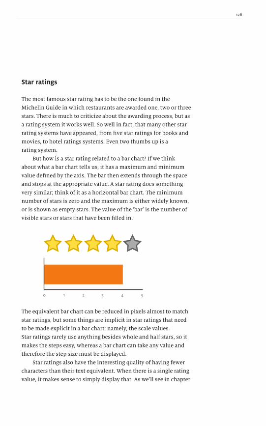
126
0 2 31 4 5
Star ratings
The most famous star rating has to be the one found in the
Michelin Guide in which restaurants are awarded one, two or three
stars. There is much to criticize about the awarding process, but as
a rating system it works well. So well in fact, that many other star
rating systems have appeared, from five star ratings for books and
movies, to hotel ratings systems. Even two thumbs up is a
rating system.
But how is a star rating related to a bar chart? If we think
about what a bar chart tells us, it has a maximum and minimum
value defined by the axis. The bar then extends through the space
and stops at the appropriate value. A star rating does something
very similar; think of it as a horizontal bar chart. The minimum
number of stars is zero and the maximum is either widely known,
or is shown as empty stars. The value of the ʻbarʼ is the number of
visible stars or stars that have been filled in.
The equivalent bar chart can be reduced in pixels almost to match
star ratings, but some things are implicit in star ratings that need
to be made explicit in a bar chart: namely, the scale values.
Star ratings rarely use anything besides whole and half stars, so it
makes the steps easy, whereas a bar chart can take any value and
therefore the step size must be displayed.
Star ratings also have the interesting quality of having fewer
characters than their text equivalent. When there is a single rating
value, it makes sense to simply display that. As weʼll see in chapter

127 A Practical Guide to Designing with data
23 about gauges and thermometers, sometimes people feel it
necessary to explain one value by wrapping it in a large amount of
chart junk. If a movie received five stars, isnʼt it better to write “5
stars”? But thatʼs seven characters, whereas the Unicode star ( )
written five times is two characters less and tells the same story.
Thatʼs something to think about when looking to reduce the data
to pixel ratio.
In several Unicode fonts, there are characters for a filled star
and an empty star. BLACK STAR (U+2605 ) and WHITE STAR
(U+2606 ) can be used instead of images in your text, HTML and
documents. Not all fonts support these characters, but some of
the pre-installed ones do, such as MS Gothic and MS Mincho on
Windows and Apple Gothic on a Mac.
While star ratings have a limited range of use and are in
danger of being overused (and they can also cause confusion – do
only whole stars count or half stars as well? Whatʼs the maximum
to use? Can your eleven star rating map to my two thumbs up
system?), they are still a useful tool as long as you understand that
they are just a particular visual representation of a bar chart.
~ Bar charts

128

129 A Practical Guide to Designing with data
If you are dealing with multiple data sources and you want to see
the data broken down by each item as well as the sum of all the
parts, then area graphs are the solution. There are area equivalents
of all our favourite charts, each providing both general totals and
particular results. They come in various guises: from stacked bar
charts and area graphs to area bar charts. In this chapter weʼll take
a look at some examples and how to use them.
Letʼs imagine three roadside stands: one selling lemonade;
one selling hamburgers; and a third selling fresh vegetables.
The stands are in place for the whole summer, a period of twelve
weeks. Each week, the vendors calculate their sales figures,
providing thirty-six data points to be plotted.
Since time is a factor, it makes most sense to plot time along
the x-axis and label the twelve weeks of summer, and on the
vertical axis to plot the three standsʼ sales figures. There are two
ways to achieve this. The first is a series of bar charts next to each
other. This follows everything we have learnt about bar charts
and good design. The grid is minimized, three distinct colours
are available, and the weeks are carefully spaced to make logical
groups and reduce the total pixel count.
Area graphs and charts 18
~ Area graphs and charts
200
100
300
400
1 2 4 5 6 7 8 9 10 11 123
Depending on the story we are trying to tell, this might be the
ideal representation. If you want to compare this yearʼs lemonade
income to last yearʼs, or compare vegetable sales to hamburger
sales in this summer period, bar charts in series work great.

130
Stacked bar charts
On the other hand, if you are more interested in seeing how
profitable this strip of highway is for roadside stands, you might
want to see the cumulative sales figures. To achieve this, the bars
from each chart are stacked on top of one another. This shows
not only the week with the greatest sales, but also which stand
contributed most to the total figure during any given week.
100
200
300
400
500
600
700
800
1 2 4 5 6 7 8 9 10 11 123
Stacked bar charts describe totals while allowing a degree of
internal breakdown of the data. In this example, the overall
income from the sales is illustrated well, but only the first stacked
values (blue) can be accurately compared as they share a common
baseline. The middle and third stacked values (black and orange)
never start at the same place, so it is harder to compare one weekly
value to another. The one advantage is that the order of the stack
can be swapped without changing the overall total.
Like regular bar charts, stacked bar charts can be illustrated
both vertically and horizontally. The orientation you choose
depends on the space available and the data being described. In our
example, sales are graphed over time. The convention is that time
is plotted horizontally, but if we were using a different variable,
such as location, then rotating the illustration so that location is
Dow
nlo
ad fro
m W
ow
! eBook
<w
ww
.wow
ebook.
com
>
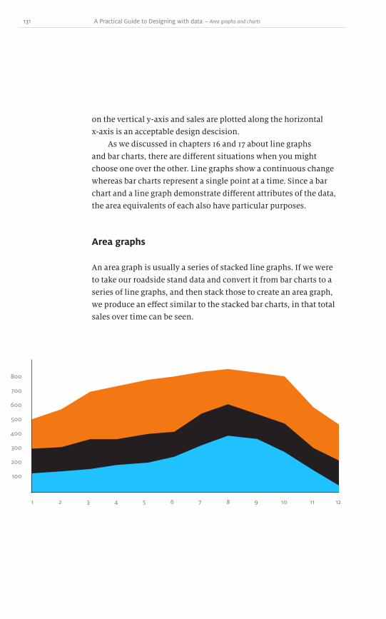
131 A Practical Guide to Designing with data
on the vertical y-axis and sales are plotted along the horizontal
x-axis is an acceptable design descision.
As we discussed in chapters 16 and 17 about line graphs
and bar charts, there are different situations when you might
choose one over the other. Line graphs show a continuous change
whereas bar charts represent a single point at a time. Since a bar
chart and a line graph demonstrate different attributes of the data,
the area equivalents of each also have particular purposes.
Area graphs
An area graph is usually a series of stacked line graphs. If we were
to take our roadside stand data and convert it from bar charts to a
series of line graphs, and then stack those to create an area graph,
we produce an effect similar to the stacked bar charts, in that total
sales over time can be seen.
100
200
300
400
500
600
700
800
1 2 4 5 6 7 8 9 10 11 123
~ Area graphs and charts

132
100 100
200 200
300 300
400 400
500 500
600 600
700 700
800 800
1 1
Area bar charts
Stacked bar charts take the existing data and stack it to reveal a
different perspective. Stacking the different bars creates something
equivalent to a pie chart. It visualizes the relative percentage
of each item in a particular week, but since the bars represent
absolute values rather than relative ones, we could keep
making these stacked bars for each week and compare them to
one another.
What if there was a way to get this relative view when the
values are stacked, but also encode a second variable? Since the
data sets are stacked, their shapes canʼt be changed to a star or
circle. But we can change the size in one dimension.
The stacked value for each week shows the total number of
units sold split into three sections. What if we also wanted to
display the profit margin? Selling 100 units of one product might
only make $1 profit on each one, whereas selling 50 units of
another product might generate $3 in profit each time for a total
of $150.
To represent this, each segment can be extruded as if it were a
horizontal bar chart – though we must be careful not to overload
the reader. Each axis must be carefully labelled and thereʼs a
danger that the display of the full twelve weeks will be cluttered.

133 A Practical Guide to Designing with data
Still, it is possible to present multiple variables in a stacked bar
chart – something that canʼt be done with an area graph. As soon
as further variables are added to a stacked bar chart it becomes
known as an area bar chart.
Those dotted pie chart wannabes
You know all those teenagers who rebel against conformity?
Yeah, those same ones that all dress the same and conform to this
nonconformist ideal. The same ones who, when you try to explain
this to them, get all frustrated and walk away in a huff.
Well, this next kind of area graph is just a pie chart in
disguise. It knew how bad pie charts really were (youʼll see what I
mean later) and didnʼt want to conform, so it went off and did its
own thing, thereby conforming to something just as ineffective.
~ Area graphs and charts
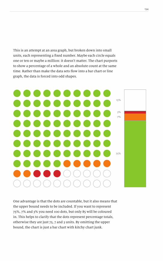
134
This is an attempt at an area graph, but broken down into small
units, each representing a fixed number. Maybe each circle equals
one or ten or maybe a million: it doesnʼt matter. The chart purports
to show a percentage of a whole and an absolute count at the same
time. Rather than make the data sets flow into a bar chart or line
graph, the data is forced into odd shapes.
15%
75%
3%
7%
One advantage is that the dots are countable, but it also means that
the upper bound needs to be included. If you want to represent
75%, 7% and 3% you need 100 dots, but only 85 will be coloured
in. This helps to clarify that the dots represent percentage totals,
otherwise they are just 75, 7 and 3 units. By omitting the upper
bound, the chart is just a bar chart with kitchy chart junk.

135 A Practical Guide to Designing with data
Stream graphs
Stream graphs have emerged only recently. Their name stems from
their appearance: a river or stream of data pouring down or across
the graph. They have many of the attributes of an area graph, but
donʼt display them particularly well.
The first was created by information designers Lee Byron
and Martin Wattenberg in an example for last.fm in late 2006. A
little over a year later, The Washington Post worked with Byron and
Wattenberg to create a stream graph to display box office revenue1.
The data produced a beautiful twisting ribbon of the ebbs and
flows of a fickle publicʼs movie-going habits.
When you create a stream graph from a data set, your mileage
may vary. Here is some sample data which produces what looks
like a psychedelic slug trail rather than aiding understanding of
the data hidden within it.
~ Area graphs and charts
1 http://www.leebyron.com/else/streamgraph/
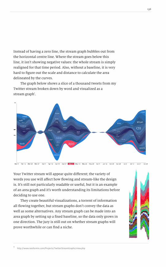
136
Your Twitter stream will appear quite different; the variety of
words you use will affect how flowing and stream-like the design
is. Itʼs still not particularly readable or useful, but it is an example
of an area graph and itʼs worth understanding its limitations before
deciding to use one.
They create beautiful visualizations, a torrent of information
all flowing together, but stream graphs donʼt convey the data as
well as some alternatives. Any stream graph can be made into an
area graph by setting up a fixed baseline, so the data only grows in
one direction. The jury is still out on whether stream graphs will
prove worthwhile or can find a niche.
Instead of having a zero line, the stream graph bubbles out from
the horizontal centre line. Where the stream goes below this
line, it isnʼt showing negative values: the whole stream is simply
realigned for that time period. Also, without a baseline, it is very
hard to figure out the scale and distance to calculate the area
delineated by the curves.
The graph below shows a slice of a thousand tweets from my
Twitter stream broken down by word and visualized as a
stream graph1.
1 http://www.neoformix.com/Projects/TwitterStreamGraphs/view.php

137 A Practical Guide to Designing with data
Treemap (mosaic graph)
A treemap is a relatively young chart type that has the ability to
show multi-variable information using both relative size and
colour. In 1990, Ben Shneiderman, a professor of computer science
at the University of Maryland, experienced the common problem
of running out of computer disk space. He wanted a way to
visualize the entire disk and see how much space was taken up by
each directory and subdirectory. To scratch this itch, Shneiderman
required a new type of graph and he invented treemaps out of the
necessity to better understand the data.
(He has written more about his experiences and the thought
process on his website1.) In my research for this book, I found
a statistical atlas of the United States, published in 1870, which
contains what looks like an early treemap.
The concept, then, has been around for a long time and was
rediscovered and refined only recently.
A treemap has a defined area, usually rectangular, which
represents all of the data under examination. Itʼs similar to a pie
chart, but square. Each of the items being measured is allotted
a relative size within the larger rectangle. No matter how many
~ Area graphs and charts
1 http://www.cs.umd.edu/hcil/treemap-history/index.shtml
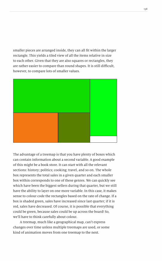
138
smaller pieces are arranged inside, they can all fit within the larger
rectangle. This yields a tiled view of all the items relative in size
to each other. Given that they are also squares or rectangles, they
are rather easier to compare than round shapes. It is still difficult,
however, to compare lots of smaller values.
The advantage of a treemap is that you have plenty of boxes which
can contain information about a second variable. A good example
of this might be a book store. It can start with all the relevant
sections: history; politics; cooking; travel, and so on. The whole
box represents the total sales in a given quarter and each smaller
box within corresponds to one of these genres. We can quickly see
which have been the biggest sellers during that quarter, but we still
have the ability to layer on one more variable. In this case, it makes
sense to colour code the rectangles based on the rate of change. If a
box is shaded green, sales have increased since last quarter; if it is
red, sales have decreased. Of course, it is possible that everything
could be green, because sales could be up across the board! So,
weʼll have to think carefully about colour.
A treemap, much like a geographical map, canʼt express
changes over time unless multiple treemaps are used, or some
kind of animation moves from one treemap to the next.

139 A Practical Guide to Designing with data
In the interactive world, a treemap made up of categories of books
could be activated by the user, and then the selected category
becomes the full treemap and all the subcategories can be mapped
within it. Each of these in turn can be activated, revealing further
subcategories or individual books. Because each box in a treemap
is itself a small treemap, it is possible to drill down further and
further in a dynamic fashion.
A treemap may or may not be suitable for the data. Since a
treemap describes all of a data set, a pie chart could be used (weʼll
see in chapter 19 if this is a good idea). A stacked bar chart might
also be an option; this shows all of the data in a consistent width
bar for easy comparison, but if there are many items the bar chart
might extend a long way in just one direction. A treemap tends to
make all the areas within it square and therefore more compact. It
is not always possible, however, to show different parts of the data
in similar dimensions. This forces the reader to compare two areas
across the distance of the treemap which are drawn at dissimilar
ratios and sizes (the same applies to wedges of a pie chart).
~ Area graphs and charts
One way to solve this is with the stacked bar chart, since the
dimensions for each item would be similar, but it doesnʼt solve
the issue of comparing two items over a large distance. The other
problem with a stacked bar chart is that the ability to display a
second variable represented by a different colour is lost. Putting
two bars next to each other with the same colour would make
them look as if they have merged into one; a unique colour for
each item represented is needed. For a small number of items this
is feasible, but a treemap excels at representing large volumes of
data and we know from chapter 9 that colour can be problematic.

140
Another potential way to respresent the data is a standard bar
chart. Each item would have its own bar of similar dimensions
and, because they are distinct, the second variable of colour
could be kept and comparing or reordering the bars accordingly is
straightforward. The advantage of the treemap over a bar chart is
that it saves space and similar items can be clustered together, but
comparison and labelling suffer in exchange for compactness.
Horizon graph
Horizon graphs are a kind of overlaid line graph. They are a
relatively new invention, so their usefulness is still undetermined,
and their strengths and weaknesses are still emerging. They were
developed by a data visualization company called Panopticon to
better visualize and compare several data sets over time, side by
side without overlapping them.
In our roadside stand example there are three separate
businesses, but what if there were thirty? Thirty bar charts per
week lined up next to each other would be too much. A stacked bar
chart gives us the total sales, but what if we wanted to compare
within each week? We could make a line graph for each store and
then plot all thirty on the same graph. That, too, would quickly
get overcrowded with information. As weʼve seen, once we exceed
about five or six, we start to run out of unique colours, shapes,
thicknesses and so on. Graphing thirty at once becomes a mess.
100
200
300
400
1 2 4 5 6 7 8 9 10 11 123
Dow
nlo
ad fro
m W
ow
! eBook
<w
ww
.wow
ebook.
com
>

141 A Practical Guide to Designing with data
This is the niche that horizon graphs are designed to fill. They are
basic line graphs split horizontally into a set number of bands.
This example uses four bands, but they can contain as many
as required. Each of the bands is coloured with an increasing
intensity of blue. So far, this is no different than a standard line
graph with some interesting shading.
The next part is the Eureka! moment. Since we are really only
interested in the outer edge of the line graph, why not collapse
each of the bands on top of each other to save space?
Now we have the same data presented in a quarter of the space.
By changing the colour of the shading, the graph appears to be
stacking up the parts. There is nothing hiding behind any of the
peaks so, unlike 3-D charts, nothing is being obscured.
This works with both positive and negative values.
Maybe in some weeks the shops were making a loss, which can
be represented with a different colour, such as varying intensities
of red.
1 2 4 5 6 7 8 9 10 11 123
~ Area graphs and charts
100
200
300
400
1 2 4 5 6 7 8 9 10 11 123

142
1 2 3 4 5 6 7 8 9 10 11 12 13 14 15 16 17 18 19 20
100
-100
-200
-300-400
200300
400
1 2 3 4 5 6 7 8 9 10 11 12 13 14 15 16 17 18 19 20
Shop 30
Shop 29
Shop 28
Shop 27
1 2 3 4 5 6 7 8 9 10 11 12 13 14 15 16 17 18 19 20
Now you can rapidly see which weeks saw gains and which saw
losses, and at the same time also watch the line trend upwards
or downwards.
The horizon graph works really well when large numbers of
data sets need to be compared. Converting one line graph into a
horizon graph does save some space, but now that we have this
ribbon, we can stack more ribbons on top to get a quick view of all
the different shops and compare them in a limited space.
The downside of horizon graphs appears when the data sets are
very large. This example was broken down into only four colour
bands; this was sufficient to allow each to be distinct. The more
bands required, however, the more colours and the greater
potential for confusion. By limiting the number of divisions, each
band represents a larger portion of the data. To compare several
horizon graphs, their coloured bands need to represent the same
divisions; if they donʼt, the comparison will be difficult.

143 A Practical Guide to Designing with data
I wonʼt hide the fact that I am not a fan of pie charts. They are the
scourge of the graph and charts world! They add little or no value
over a table of figures and can easily be misused to misrepresent
the data.
Even popular culture has latched on to their ridiculousness.
Sites like Graph Jam1 and Indexed2 are constantly making jokes
using pie charts.
One of the problems with pie charts is that the amount of data
they represent is very limited. The total value of the information
must add up to one hundred per cent and therefore a pie chart can
only represent relative amounts. If you remember, in chapter 12
we discussed the issues of relative data: comparing data across
sets is problematic because ten per cent of one data set can be a
vastly different absolute amount than ten per cent in another.
The most effective pie charts comprise only two items, such
as the percentage of male or female customers. If we introduce
more than two wedges, the eye must rotate at least one of the
wedges to a cardinal point to figure out the percentage value. With
only two wedges the angle is shared, making it easier to determine
the proportions of each.
Pie charts19
~ Pie charts
If one side of the wedge follows a cardinal direction, then only the
arm of the angle which doesnʼt needs to be compared. When the
two values meet at the 12 oʼclock position, only the bottom half
needs to be examined to see how much more or less each value is
compared to the other. If the segments do not meet at a cardinal
1 graphjam.com
2 thisisindexed.com
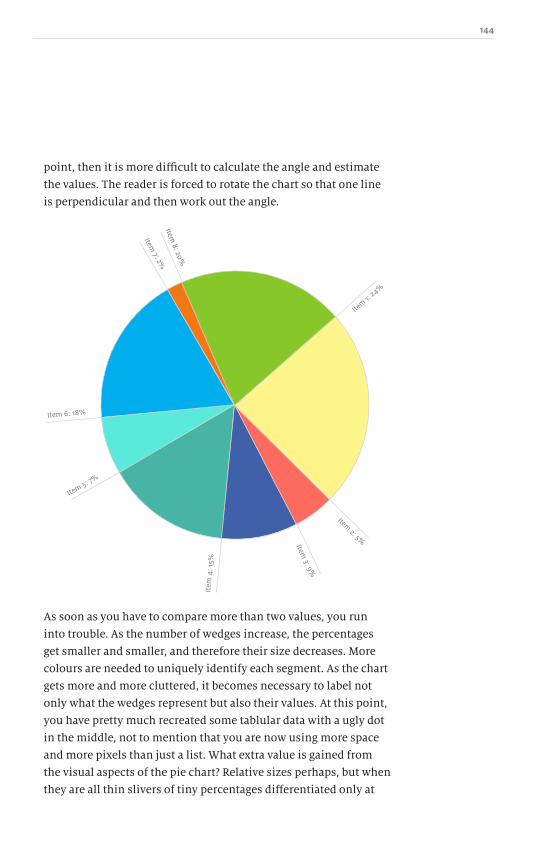
144
point, then it is more difficult to calculate the angle and estimate
the values. The reader is forced to rotate the chart so that one line
is perpendicular and then work out the angle.
Item 1:
24%
Item 8: 20%
Item 7: 2%
Item 6: 18%
Item 5: 7%
Item
4: 1
5%
Item 3: 9%
Item 2: 5%
As soon as you have to compare more than two values, you run
into trouble. As the number of wedges increase, the percentages
get smaller and smaller, and therefore their size decreases. More
colours are needed to uniquely identify each segment. As the chart
gets more and more cluttered, it becomes necessary to label not
only what the wedges represent but also their values. At this point,
you have pretty much recreated some tablular data with a ugly dot
in the middle, not to mention that you are now using more space
and more pixels than just a list. What extra value is gained from
the visual aspects of the pie chart? Relative sizes perhaps, but when
they are all thin slivers of tiny percentages differentiated only at

145 A Practical Guide to Designing with data
the decimal point, does the chart tell a story or is it just eye candy?
Can you remove it and have nothing change?
100% or bust!
The values displayed in a pie chart must represent all the answers
for a single question. This might sound obvious, but there have
been pie charts broadcast on television which add up to more than
one hundred per cent. This is impossible! If you have reached this
outcome, then you obviously have a problem.
This mistake is probably attributable to the survey consisting
of three separate questions that became illustrated in the wrong
type of chart. The people polled were asked about their opinion on
several topics and responded to each.
68%
21%
42%
• Q1: Would you support Candidate 1 if he ran for office? (yes/no)
• Q2: Would you support Candidate 2 if she ran for office? (yes/no)
• Q3: Would you support Candidate 3 if he ran for office? (yes/no)
Instead of making three pie charts, one for each question, the ʻyesʼ
counts for all three questions were put into a single pie chart.
Since the questions were discrete, the values of the answers donʼt
add up to one hundred per cent. In these instances, a pie chart
isnʼt the correct way to display the data: it just doesnʼt make sense!
~ Pie charts

146
Doughnut chart
Iʼd like to meet the person who thought that a doughnut chart
was a good idea. Someone took a pie chart with all its failings and
then had the brilliant idea to cut the middle out! Now, it does save
on ink, so that is one thing in its favour, but it offers absolutely
nothing more than the pie chart.
I wonder if it was once added into a software package as a feature
and it stuck. It is hard to remove features once they are in there,
and as soon as one package had doughnut charts, everyone had to
have doughnut charts. Sometimes itʼs better to have fewer choices
and focus on the charts that best convey the story. A doughnut
chart is not one of these.
By removing the centre of a pie chart, it further hinders the
ability to judge the weight of each segment. Moving from a healthy
wedge to two arcs makes it harder for people to comprehend what
value is represented. We know that a full pie chart is one hundred
per cent and that any wedge is a fraction of that; if we are presented
with only an arc, is it equivalent to the wedge, or is it less because
it is missing a portion?
Here the full wedge represents 45% compared to just the
arc which also represents 45%. But the volume is very different
between them. Are they really equal?
If you create doughnut charts after reading this, Iʼll hunt
you down!
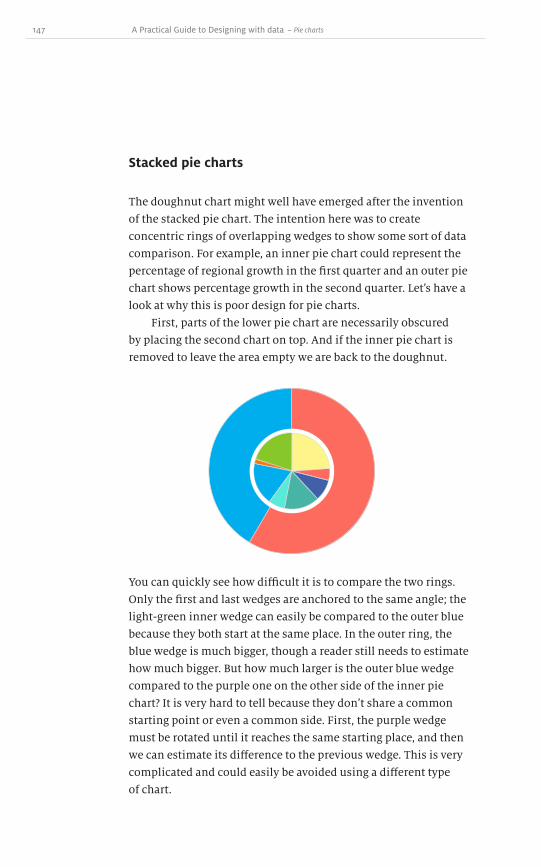
147 A Practical Guide to Designing with data
Stacked pie charts
The doughnut chart might well have emerged after the invention
of the stacked pie chart. The intention here was to create
concentric rings of overlapping wedges to show some sort of data
comparison. For example, an inner pie chart could represent the
percentage of regional growth in the first quarter and an outer pie
chart shows percentage growth in the second quarter. Letʼs have a
look at why this is poor design for pie charts.
First, parts of the lower pie chart are necessarily obscured
by placing the second chart on top. And if the inner pie chart is
removed to leave the area empty we are back to the doughnut.
You can quickly see how difficult it is to compare the two rings.
Only the first and last wedges are anchored to the same angle; the
light-green inner wedge can easily be compared to the outer blue
because they both start at the same place. In the outer ring, the
blue wedge is much bigger, though a reader still needs to estimate
how much bigger. But how much larger is the outer blue wedge
compared to the purple one on the other side of the inner pie
chart? It is very hard to tell because they donʼt share a common
starting point or even a common side. First, the purple wedge
must be rotated until it reaches the same starting place, and then
we can estimate its difference to the previous wedge. This is very
complicated and could easily be avoided using a different type
of chart.
~ Pie charts
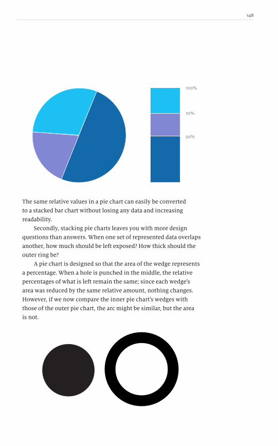
148
100%
70%
50%
The same relative values in a pie chart can easily be converted
to a stacked bar chart without losing any data and increasing
readability.
Secondly, stacking pie charts leaves you with more design
questions than answers. When one set of represented data overlaps
another, how much should be left exposed? How thick should the
outer ring be?
A pie chart is designed so that the area of the wedge represents
a percentage. When a hole is punched in the middle, the relative
percentages of what is left remain the same; since each wedgeʼs
area was reduced by the same relative amount, nothing changes.
However, if we now compare the inner pie chartʼs wedges with
those of the outer pie chart, the arc might be similar, but the area
is not.
Dow
nlo
ad fro
m W
ow
! eBook
<w
ww
.wow
ebook.
com
>
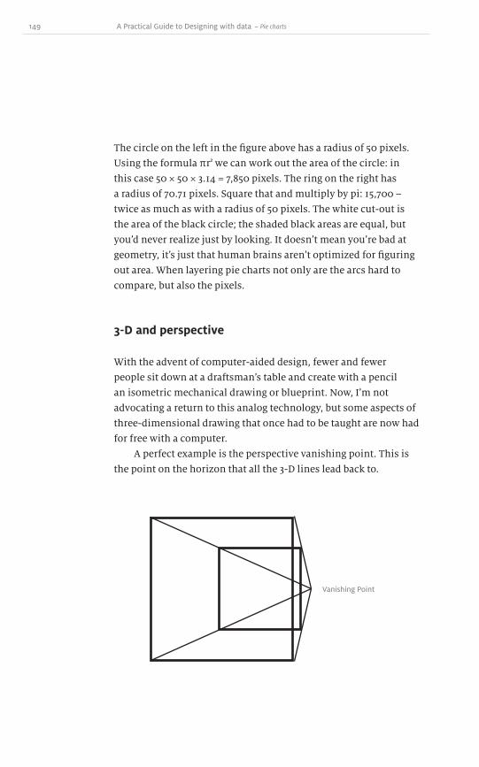
149 A Practical Guide to Designing with data
The circle on the left in the figure above has a radius of 50 pixels.
Using the formula πr2 we can work out the area of the circle: in
this case 50 × 50 × 3.14 = 7,850 pixels. The ring on the right has
a radius of 70.71 pixels. Square that and multiply by pi: 15,700 –
twice as much as with a radius of 50 pixels. The white cut-out is
the area of the black circle; the shaded black areas are equal, but
youʼd never realize just by looking. It doesnʼt mean youʼre bad at
geometry, itʼs just that human brains arenʼt optimized for figuring
out area. When layering pie charts not only are the arcs hard to
compare, but also the pixels.
3-D and perspective
With the advent of computer-aided design, fewer and fewer
people sit down at a draftsmanʼs table and create with a pencil
an isometric mechanical drawing or blueprint. Now, Iʼm not
advocating a return to this analog technology, but some aspects of
three-dimensional drawing that once had to be taught are now had
for free with a computer.
A perfect example is the perspective vanishing point. This is
the point on the horizon that all the 3-D lines lead back to.
Vanishing Point
~ Pie charts

150
Vanishing Point
Vanishing Point
When building 3-D pie charts, there is also a vanishing point.
This skews the shape of the pie.
So even though the wedges closest to and furthest away from us
are the same value, they are very different shapes and sizes. This
is not ideal when trying to explain the values with as little bias as
possible.
Projecting a pie chart in this way gives an arbitrary height
to the closer wedges, thereby adding more pixels to their weight
without actually adding more value into their count.
Now, you might be thinking, who would ever go this far to
trick the reader? Well, thereʼs a great article called “Lies, Damn
Lies and Steve Jobs keynotes” by Jack Schofield in The Guardian
newspaper1. In the article, Schofield highlights the Apple keynote
in which Steve Jobs explained how well the sales of the iPhone
were coming along. He used the Keynote® presentation software,
which allows for crazy 3-D pie charts.
1 http://www.guardian.co.uk/technology/blog/2008/jan/21/liesdamnliesandstevejobs

151 A Practical Guide to Designing with data
As you can see, there are six wedges; sales of the iPhone are
illustrated by the green wedge that has been pulled away from the
rest. Since the pie chart is displayed in three dimensions on a flat
screen, the data appears distorted. The front part of the pie chart
looks closer and therefore larger than the back. Conveniently,
Appleʼs 19.5% share is at the front, making it look significantly
bigger than the 21.2% in the back, which is larger in value, but
smaller in pixels.
There is no doubt that the design of this pie chart was
conceived to intentionally mislead the viewer. Three-dimensional
projects make this very easy to accomplish and, once you realize
this, you will begin to see it everywhere.
A simple, more truthful solution would be to convert this pie
chart into a simple bar chart.
RIM (39%)
Other (21.2%)
Apple (19.5%)
Palm (9.8%)
Motorola (7.4%)
Nokia (3.1%)
This solves the issues of colour, scale, size, proximity and labels.
It isnʼt as flashy and colourful, but it more accurately reflects the
reality of the situation.
Highlighting specific data
As discussed in chapter 7, there are several different ways to
highlight a subset of the data to draw more attention to it. There
are a few techniques that can be used when dealing with pie
charts, such as colour, location and shape.
~ Pie charts

152
To highlight just one region, it is possible to mute or remove all the
colours except on the single wedge under consideration. It is also
possible to explode the pie chart and pull one of the pieces away
from the circle. By moving the location, even slightly, the brain
makes a distinction.
Even though Iʼve tried to convince you why 3-D pie charts are
inappropriate, perhaps youʼre determined (or obliged) to use
them. If so, then it is possible to extend the shape of the wedge
vertically so that it is taller than the other pieces. This isnʼt
recommended because of all the distortion issues of 3-D objects in
two dimensions. Furthermore, in chapter 11 we talked about how
to deceive with data and that 3-D objects take up a greater volume
and therefore assume a greater value than what ought to
be represented.
At this point, I hope I have demonstrated how pie charts are
often more of a hindrance than a help. Their shape, the amount
of data they can encode, the number of variables: all are very
restrictive. Even though the pie chart is a very common chart,
you shouldnʼt pick it out of your designer tool box too often. As
weʼll see next, however, there are a few situations in which a round
chart style does excel.

153 A Practical Guide to Designing with data
Pie charts and time
There are a few instances where a circular chart is useful. The best
example is when we are discussing time and clocks. It is possible
to use our knowledge of a clock face and adapt a pie chart so
instead of expressing one hundred per cent of something, it can
represent portions of twelve or twenty-four hours.
Closed 5pm8am
Noon
As a circular diagram, it is easy to understand that the store is
open from 8am to 5pm, but a problem arises when the opening
hours need to be extended. What would a circular diagram look
like if you were open from 8am to 10pm? Now you have an overlap!
If you are going to use this technique instead of a simple table of
opening and closing times, youʼd better do it right!
~ Pie charts

154
Monday - Friday
12
6
9 9 93 3 3
High Volume
LEGENDMild Volume
Low Volume
Closed
Saturday
12
6
Sunday
12
6
IKEA used these circular clock face diagrams to explain its opening
hours and the customer traffic levels; this allowed shoppers
to decide when to visit the store based on how many other
customers were there. (There are several problems dealing with the
psychology of publishing this information and how it affects the
decisions of the shoppers, but thatʼs another book entirely.)
If we look at the IKEA examples, theyʼre a good first start.
The diagrams make use of our knowledge of the clock face to
represent opening times. So far so good, but the labelling could
be confusing. Is ʻ6 ,̓ 6am or 6pm? On Saturday, what time does
the store open? You could assume 9am, but then the graph isnʼt
actually telling you a story: you are just jumping to a conclusion.
There is an easy solution to fix some of these ambiguities:
convert the round clock-like chart into a horizontal stacked bar
chart. Time is read from left to right, so nothing is lost in the
conversion. We now know when the shop opens – thatʼs the
leftmost point – and weʼve relabelled “12” as “noon”. Using the 24-
hour clock is another alternative.

155 A Practical Guide to Designing with data
9
9
9
10
10
10
11
11
11
noon
noon
noon
1
1
1
2
2
2
3
3
3
4
4
4
5
5
5
6
6
6
7
7
7
8
8
8
9
9
9
Monday - Friday
Saturday
Sunday
Roll out those circles
Any pie chart can be converted into a much more useful and
readable stacked bar chart. When a pie chart seems to be a bad
idea, it can be ʻrolled outʼ into something better. Imagine rolling
the wheel of the pie chart and leaving a trace on the ground. The
length of that line is equivalent to the circumference of the wheel.
Donʼt worry, no maths needed here.
~ Pie charts

156
Now we can see the portions of the pie chart as relative rectangular
lengths. This rolled out pie chart still shows all the data, and the
pieces within it are much easier to compare and reorder without
having to do any mental rotation of the wedges.
Who ate my pie?
One situation in which a pie chart completely falls down is with
negative numbers. Letʼs say a large corporation wants to create a
pie chart of its annual income, broken down by each division. If
there are five divisions, what would a pie chart look like if their
incomes were as follows?
A = 2,000
B = 3,000
C = 500
D = −300
E = 2,300
This is very easy to represent as a bar chart, because values below
zero can be drawn; as a pie chart, it is almost impossible. All of
the profits can be represented, but how is division Dʼs loss
accounted for? A pie wedge canʼt overlap another to demonstrate
negative income.
Microsoftʼs Excel simply plots the negative value as positive
in a pie chart, but labels it as negative. Dealing with this issue is so
problematic, however, that it is best to just avoid it altogether by
selecting a more appropriate chart type.
Decagraph
If you must use a pie chart, then you should consider a decagraph.
It follows the exact same rules as a pie chart, but instead of having
a circular border, its shape is that of a decagon – a ten-sided figure.
This has the advantage of each corner representing ten per cent.
Dow
nlo
ad fro
m W
ow
! eBook
<w
ww
.wow
ebook.
com
>
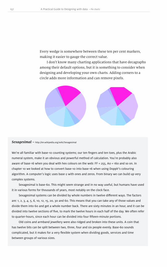
157 A Practical Guide to Designing with data
Every wedge is somewhere between these ten per cent markers,
making it easier to gauge the correct value.
I donʼt know many charting applications that have decagraphs
among their default options, but it is something to consider when
designing and developing your own charts. Adding corners to a
circle adds more information and can remove pixels.
~ Pie charts
Sexagesimal ~ http://en.wikipedia.org/wiki/Sexagesimal
Weʼre all familiar with base-10 counting systems; our ten fingers and ten toes, plus the Arabic
numeral system, make it an obvious and powerful method of calculation. Youʼre probably also
aware of base-16 when you deal with hex colours on the web: FF = 255, A0 = 160 and so on. In
chapter 10 we looked at how to convert base-10 into base-16 when using Dopplrʼs colouring
algorithm. A computerʼs logic uses base-2 with ones and zeros. From binary we can build up very
complex systems.
Sexagesimal is base-60. This might seem strange and in no way useful, but humans have used
it in various forms for thousands of years, most notably on the clock face.
Sexagesimal systems can be divided by whole numbers in twelve different ways. The factors
are: 1, 2, 3, 4, 5, 6, 10, 12, 15, 20, 30 and 60. This means that you can take any of those values and
divide them into 60 and get a whole number back. There are sixty minutes in an hour, and it can be
divided into twelve sections of five, to mark the twelve hours in each half of the day. We often refer
to quarter-hours, since each hour can be divided into four fifteen-minute portions.
Old coins and armband jewellery were also ridged and broken into these units. A coin that
has twelve bits can be split between two, three, four and six people evenly. Base-60 sounds
complicated, but it makes for a very flexible system when dividing goods, services and time
between groups of various sizes.

158
Encoding a second variable
A pie chart depicts a list of items and their relative percentage
values; thatʼs only one variable per item. When we look for ways to
add a second variable for each wedge, we quickly hit a wall.
Since each wedge in a pie chart is unique and touching its
immediate neighbours, distinct colours are needed for each one. If
not, we run the risk of juxtaposed wedges sharing the same colour
and it being impossible to tell where one starts and the other stops.
Weʼve also previously investigated other ways to encode additional
variables with limited success.
Company Departments by Gender
It is possible to put a chart on a chart, but that is just a disaster
waiting to happen. The only good solutions to encoding a second
variable in pie charts are extending the wedges in two dimensions,
or something called a belt chart. Weʼll discuss extending the
wedges in chapter 22 when we discuss polar area charts.
Belt chart
A belt chart is a series of concentric rings, each ring representing
a percentage of the area of the previous, inner ring – it is almost
as confusing as it sounds. For example in the charts below,
the innermost white circle represents all of the participants
in the Olympics. In the left chart, the next ring out represents
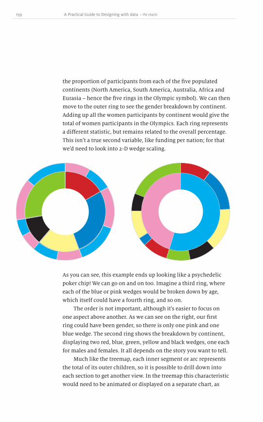
159 A Practical Guide to Designing with data
the proportion of participants from each of the five populated
continents (North America, South America, Australia, Africa and
Eurasia – hence the five rings in the Olympic symbol). We can then
move to the outer ring to see the gender breakdown by continent.
Adding up all the women participants by continent would give the
total of women participants in the Olympics. Each ring represents
a different statistic, but remains related to the overall percentage.
This isnʼt a true second variable, like funding per nation; for that
weʼd need to look into 2-D wedge scaling.
As you can see, this example ends up looking like a psychedelic
poker chip! We can go on and on too. Imagine a third ring, where
each of the blue or pink wedges would be broken down by age,
which itself could have a fourth ring, and so on.
The order is not important, although itʼs easier to focus on
one aspect above another. As we can see on the right, our first
ring could have been gender, so there is only one pink and one
blue wedge. The second ring shows the breakdown by continent,
displaying two red, blue, green, yellow and black wedges, one each
for males and females. It all depends on the story you want to tell.
Much like the treemap, each inner segment or arc represents
the total of its outer children, so it is possible to drill down into
each section to get another view. In the treemap this characteristic
would need to be animated or displayed on a separate chart, as
~ Pie charts

160
otherwise the data gets cluttered with tiny boxes, each with a
border to keep its data contained. With the radial tree chart this is
achieved by adding another ring. Each ring is a breakdown of what
is inside the parent.
Just looking at this diagram makes my eyes hurt. I can see how
many rings deep the structure is and see plenty of tiny slivers at
the edges, but I canʼt make any logical comparisions. Looking at the
inner segments, the red one makes up perhaps thirty per cent of
the total. As we move outward, most of what makes up that thirty
per cent is four levels deep. The size of that block is much larger at
the fourth level than the first, yet it represents less information.
This means that you canʼt compare a wedge in one level to a wedge
in another. You need to first figure out what percentage that wedge
shows in its ring, then look at the other wedge, figure out what
percentage that shows in its ring, and only then compare the two.
At this point, youʼre better off looking it up in a table.
Dealing with a circular visualization and trying to compare its
radial portions is always problematic. When designing with data,
the story should always be told as clearly as possible. To do so, it is
often best to avoid round charts and graphs.

161 A Practical Guide to Designing with data
Scatter plots are a useful tool to reveal relationships between any
amount of independent values. A scatter plot is like a line graph,
but without the connecting lines. The data points are placed in a
grid in an attempt to build a larger picture.
Two values that correlate well in life are age and height.
You start your early years small and grow until you reach your
adult height.
Scatter plots 20
~ Scatter plots
220cm
0
0 30Age
Hei
ght
This creates a nice trend line because age and height have a
relationship, but not everything does. For instance, we can take
the square kilometers of a countryʼs area and its population.
1,000 km
0
0 30%Density
Are
a

162
Some countries have a very dense population per square
kilometer and some do not. There are some countries with a large
population and large area, some countries with a large area and
low population, and some with high population and low area and
everything in between. There is no general trend line.
This is just fictitious data; with proper information, a trend
might be found, or an ideal zone that few countries break out of. If
conditions get too bad in any one country, people might emigrate
and so reveal a critical point. Also, this chart wonʼt be complete
until the data points are labelled; the chart isnʼt that interesting
until we know whoʼs who.
These sorts of scatter plots have their origin at zero, since all
the values are positive numbers. But itʼs possible to create graphs
that extend past the zero point in both directions. Some people
might call this a Cartesian coordinate system; some people might
just call this a table: for simplicity, letʼs call it a matrix.
Matrix
This matrix is a two-dimensional grid that extends in both
positive and negative directions from the origin. It provides a two-
dimensional space to plot data.
0
-10
0
10
-10
10
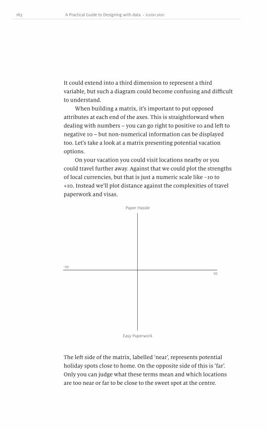
163 A Practical Guide to Designing with data
It could extend into a third dimension to represent a third
variable, but such a diagram could become confusing and difficult
to understand.
When building a matrix, itʼs important to put opposed
attributes at each end of the axes. This is straightforward when
dealing with numbers – you can go right to positive 10 and left to
negative 10 – but non-numerical information can be displayed
too. Letʼs take a look at a matrix presenting potential vacation
options.
On your vacation you could visit locations nearby or you
could travel further away. Against that we could plot the strengths
of local currencies, but that is just a numeric scale like −10 to
+10. Instead weʼll plot distance against the complexities of travel
paperwork and visas.
~ Scatter plots
Paper Hassle
Easy Paperwork
-10
10
The left side of the matrix, labelled ʻnear ,̓ represents potential
holiday spots close to home. On the opposite side of this is ʻfar .̓
Only you can judge what these terms mean and which locations
are too near or far to be close to the sweet spot at the centre.

164
Maybe it isnʼt distance thatʼs at stake here, but rather the time it
takes to get somewhere. This gives you a range of places to visit
based on perceived distance and travel time.
Paper Hassle
Easy Paperwork
Near
Far
Based on simple distance, New York could be considered near
Quebec, London near Moscow, Tokyo close to Beijing, Jerusalem
near Cairo – but each of these cities might cause different
paperwork headaches for the traveller. At the far end of the
spectrum, assuming a start point of London, UK, far away places
might included Sydney, Australia or Rio de Janeiro, Brazil. While
both of these cities are distant, there could be direct flights from
London making them straightforward to visit, so they arenʼt placed
as far away on the matrix.
Now we need to add in the second variable, the bureaucratic
hassle while youʼre preparing for your trip. This is based on your
nationality, your passport status, health precautions and how strict
each country is about tourists. At the top of the matrix weʼll place
countries with stringent criteria and at the bottom those which are

165 A Practical Guide to Designing with data
more relaxed. Starting from London, if your destination is a city
within the UK, then the data point can be put at the very bottom,
since you donʼt have to check your passport or deal with visas –
though public transport might be a factor in the distance stakes!
Within the European Union member states, citizens can
travel relatively easily, so a trip from London to Paris is both close
and very relaxed. The data point for Paris can go in the lower-left
quadrant. Alternatively, travelling from London to New York City
involves a regular seven-hour flight, so it might be placed just
within the near category, but for non-US citizens there can be a
mountain of paperwork to fill out before arriving. Therefore, New
York could be put in the upper-left quadrant: it is relatively close,
but has strict rules for tourists.
Paper HassleFrom London
Easy Paperwork
Near
New York, USA
Antarctica
Sydney, Australia
Paris, France
Far
A further-flung destination such as Sydney, Australia is
straightforward for a British citizen to visit. Therefore, Sydney
finds itself in the lower-right quadrant: it is far away, but has
relaxed rules for British tourists. The last quadrant might be filled
with more exotic places like Antarctica – as a scientific base,
Dow
nlo
ad fro
m W
ow
! eBook
<w
ww
.wow
ebook.
com
>

166
visiting as a tourist would require a few questions to be answered!
Travelling to some South American or Asian countries will require
a raft of vaccinations. Such places would be put into the upper-
right quadrant: far away and a hassle.
Now, rather than just a list of potential destinations and their
paperwork requirements, we have plotted them on to a matrix,
making it much easier to see the outliers and any clusters.
We can also see if there are any areas which are empty or
completely ignored.
Anyone working on a business plan has probably done
something similar with a SWOT analysis (Strengths versus
Weaknesses, Opportunities versus Threats). By placing strengths
and weaknesses on one scale, threats and opportunities on the
other, almost any scenario can be plotted into the matrix and
ideally help build a better company.
Itʼs also useful to use matrices to plot a company against its
competitors. If a company finds itself in the low end market and
unpopular, it might want to adjust its brand image to make its
products more popular. By plotting all of the competition into a
matrix, itʼs possible to work out who needs to be imitated or how a
company can differentiate itself.
Luxury
Commodity
Competition
Limos and
lounges
1p deals
Hard to pay for
luxury with cheap
tickets
No competition
for
expensive seats
Competition
Inex
pens
ive Expensive

167 A Practical Guide to Designing with data
It can also be a good indicator of gaps in the market. Maybe no
one is catering to the low-end market and someone could move
in and grab a portion of the revenue. The airline industry could
plot expensive versus inexpensive and luxury versus commodity.
Some airlines pick up their customers in a limousine, offer lounge
access and treat passengers like royalty; these airlines would sit
in the high luxury/high price quadrant of the matrix. Then there
are plenty of companies in the low quality/low price quadrant.
(Weʼve all probably been suckered into their one penny deals! The
old adage rings true: you get what you pay for.) There are probably
very few companies that are expensive and low quality. The sweet
spot is an ideal amount of luxury compared to price. Most airlines
would probably fall inside the two curves.
Nolan chart
The Nolan chart is a very specific type of scatter plot matrix. It is
used to determine political standing and plots economic freedom
against personal freedoms. Really, though, a Nolan chart is just a
scatter plot under a different name with a single purpose.
Libertarian
Right-w
ing
Economic
Pers
onal
fre
edom
Left-
wing
(Totalitarian)
Populist
~ Scatter plots

168
Bubble chart
So far weʼve looked at a scatter plot as a matrix comparing two
variables. These get encoded in into the axes as positive and
negative numbers or attributes. But what if we wanted to
explore encoding more variables – maybe price, luxury and
a third: availability.
The bubble chart is a specific type of scatter plot that makes
use of size to encode a third variable. Each data point is mapped
onto the axes and then the size of each point is scaled up or down
depending on the third variable.
With a small set of data, it becomes immediately apparent
which of the values is the largest, but when the set increases in
size, the chart could become cluttered with overlapping data
points, with larger dots covering or obscuring smaller ones,
affecting the interpretation of the values.
Variable 2
Variable 3: SizeVari
able
1
00
This type of chart might be called a bubble chart, but the third
variable need not be a bubble. In chapter 7 we discussed several
ways to draw attention to particular items of data and we can use
these ideas again here. We could try different shapes for each data
point, different colours, or different sizes. Itʼs also possible to
make combinations of colour and shape to encode fourth and fifth
variables. But be warned: youʼll soon be treading on the thin ice of
chart junk.
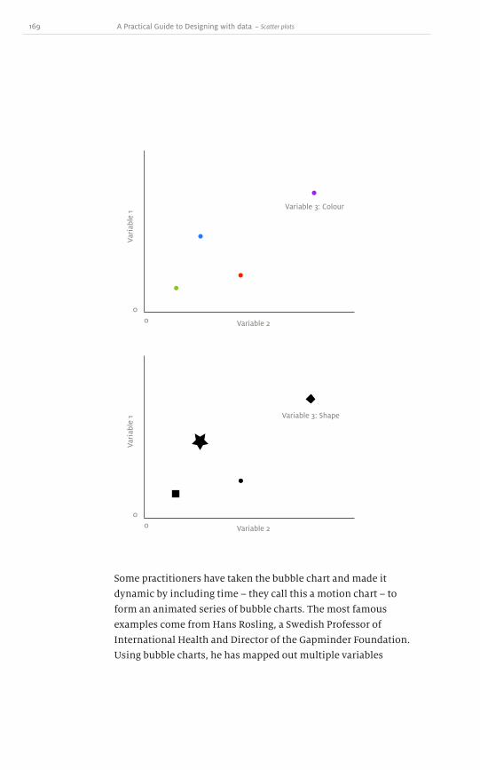
169 A Practical Guide to Designing with data
Some practitioners have taken the bubble chart and made it
dynamic by including time – they call this a motion chart – to
form an animated series of bubble charts. The most famous
examples come from Hans Rosling, a Swedish Professor of
International Health and Director of the Gapminder Foundation.
Using bubble charts, he has mapped out multiple variables
Variable 2
Variable 2
Variable 3: Colour
Variable 3: Shape
Vari
able
1Va
riab
le 1
0
0
0
0
~ Scatter plots

170
such as child mortality, GDP and population. When put together
into a motion chart, the fourth variable, time, makes for a very
interesting show1. The bubbles grow and shrink, and move around
the matrix; as countries get wealthier, their child mortality drops
and their populations increase. Static bubble charts and scatter
plots can only provide one frame of this animation at a time,
whereas the motion chart tells a much more interesting story.
Summary
You now know much more about the basic types of charts found in
most applications. The perennial line graph, bar chart, area chart,
pie chart and scatter plot have all been examined and explained in
great detail. They were once just tiny icons in a sea of options, but I
hope that you now know a lot more about which is appropriate for
your data and when.
In the final section, weʼre going to look at some less common
charts and graphs. These are lumped together for several reasons.
In some cases they are uncommon because they have quite specific
purposes, in others because they are difficult to use correctly, or
just difficult to immediately comprehend as a chart. The purpose
of walking through these more unusual charts is to spark some
new ideas and encourage you to break away from the common
types of charts.
Now that you know how to use the regular graphs and charts,
itʼs time to push the boundaries a bit and see what else is possible.
1 http://www.ted.com/talks/hans_rosling_shows_the_best_stats_you_ve_ever_seen.html
Dow
nlo
ad fro
m W
ow
! eBook
<w
ww
.wow
ebook.
com
>

171 A Practical Guide to Designing with data
So far, weʼve talked about the history of charts and graphs, issues of
colour and ink, the ability to mislead with data and some common
types of charts and graphs. Now I want to talk about some of the less
common types. They are less common not because they are poorly
designed; as we saw, pie charts are popular even though their design
often fails to convey the information properly. Rather, these less
usual charts have gone mostly unnoticed or are used for very specific
purposes. By introducing them here, I hope to make you aware of
certain problems to avoid in your own designs and show you other
interesting opportunities to illustrate your data.
Not so common charts
Part 5

172
Maps, choropleths and cartograms
Radar plots
Gauges and thermometers
Sound
Everything and the kitchen sink
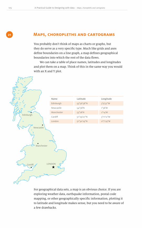
173 A Practical Guide to Designing with data
You probably donʼt think of maps as charts or graphs, but
they do serve as a very specific type. Much like grids and axes
define boundaries on a line graph, a map defines geographical
boundaries into which the rest of the data flows.
We can take a table of place names, latitudes and longitudes
and plot them on a map. Think of this in the same way you would
with an X and Y plot.
Maps, choropleths and cartograms 21
~ Maps, choropleths and cartograms
Edinburgh
Name Latitude Longitude
55°56'58"N 3°9'37"W
Newcastle 54°58'N 1°36'W
Manchester 53°28'N 2°14'W
Cardiff 51°29'07"N 3°11'12"W
London 51°30'29"N 0°7'29"W
Edinburgh
Newcastle
Manchester
Cardiff LONDON
For geographical data sets, a map is an obvious choice. If you are
exploring weather data, earthquake information, postal code
mapping, or other geographically specific information, plotting it
to latitude and longitude makes sense, but you need to be aware of
a few drawbacks.
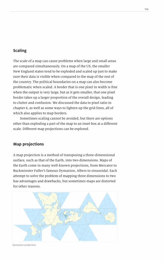
174
Scaling
The scale of a map can cause problems when large and small areas
are compared simultaneously. On a map of the US, the smaller
New England states tend to be exploded and scaled up just to make
sure their data is visible when compared to the map of the rest of
the country. The political boundaries on a map can also become
problematic when scaled. A border that is one pixel in width is fine
when the output is very large, but as it gets smaller, that one pixel
border takes up a larger proportion of the overall design, leading
to clutter and confusion. We discussed the data to pixel ratio in
chapter 6, as well as some ways to lighten up the grid lines, all of
which also applies to map borders.
Sometimes scaling cannot be avoided, but there are options
other than exploding a part of the map to an inset box at a different
scale. Different map projections can be explored.
Map projections
A map projection is a method of transposing a three-dimensional
surface, such as that of the Earth, into two dimensions. Maps of
the Earth come in many well-known projections, from Mercator to
Buckminster Fullerʼs famous Dymaxion, Albers to sinusoidal. Each
attempt to solve the problem of mapping three dimensions to two
has advantages and drawbacks, but sometimes maps are distorted
for other reasons.
Dymaxion projection

175 A Practical Guide to Designing with data
Worldmapper1 creates maps where each country is resized and
reshaped in accordance with a particular variable. The more
distorted the shape of the country is, the higher or lower the value.
The example below shows population density. The more people
within the countryʼs borders, the greater the distortion.
When the regions of a map are distorted in order to convey
more meaning, this is referred to as a cartogram. It is a specific
type of map data design.
© Copyright 2009 SASI Group (University of Sheffield)
Like the issues around comparing the sizes of pie chart wedges
(see chapter 19), relative national landmass areas cannot be judged
accurately without a comparison to the original map. If the change
is only slight, then it might be unnoticeable, but if the scale wasnʼt
known in the first place, how can the change be understood? If a
large country such as Brazil was increased in size by 1.2% would
the difference be noticeable? If so, could anyone tell that it was
1.2% rather than 1%? Probably not. Even when the change is large
and obvious, a 400% increase will still be difficult to distinguish
~ Maps, choropleths and cartograms
1 http://www.sasi.group.shef.ac.uk/worldmapper/

176
Cloudmade.com & Openstreetmap.org
from a 378% increase. These sorts of distortions work well as a
visual effect, but not for conveying actual statistical data.
When we zoom into smaller regions within maps, they too are
distorted on purpose. Have you ever really looked closely at a map
of your city? Some features are emphasized and others reduced in
importance, but this is acceptable because such maps are designed
for specific purposes more than for geographic accuracy. A map is
not a satellite photograph.

177 A Practical Guide to Designing with data
Take street widths, for instance. Street maps display different
kinds of streets at different line widths. These are not to scale by
any means, but we tend not to worry that main thoroughfares are
wider on the map and side streets are smaller, while retaining
their correct positions on the map. Streets are not scaled based on
their physical size, but instead based on the type of thoroughfare.
This distortion helps the reader understand which streets are the
major and minor roads by their representation on the map.
There are other reasons that some maps ʻlieʼ about the real
world to aid comprehension in the viewer. A perfect example of
this is the famous London Underground map. It is not laid out
with geographical accuracy, but instead is based on the relative
position of the stations. While we might think this is a somewhat
new and unusual idea – Harry Beckʼs map was drawn in 1931 and
first published in 1933, less than a century ago – it goes back a
lot further.
Station
Station
Station
In 1804, the American West was newly purchased from France
and the US government needed to know precisely what it had
bought. President Jefferson selected US Army Captain Meriwether
Lewis to lead the expedition to explore the new territory. Fellow
soldier William Clark joined the expedition at Lewisʼs request. The
Lewis and Clark expedition was the first overland expedition to
explore the new territory in search of the Pacific Ocean, mapping
~ Maps, choropleths and cartograms

178
as it went. Sacagawea and other Native American Indians helped
Lewis and Clark travel across this new land by guiding them and
supplying local maps of their areas.
Lewis and Clark found the maps the Native Americans
provided very confusing. They were quite unlike the European
maps the surveyors were used to, consisting of landmarks placed
relative only to each other. Travelling down a river, the Native
Americans were worried less about the turns and bends it might
make than about the landmarks they passed. These markers
formed the basis of navigation. Similarly, when travelling on the
London Underground, the New York City subway or other mass-
transit systems, a passenger needs to know how many stations lie
between their starting station and their intended destination, and
where to change lines rather than the precise geographical location
of either.
Once you have chosen your map projection, you need to lay
out the grid in which your data will flow. Maybe the data is just the
landmarks on the map. In that case, youʼre finished, but maybe
you have additional data about each region which needs to be
displayed.
Dow
nlo
ad fro
m W
ow
! eBook
<w
ww
.wow
ebook.
com
>

179 A Practical Guide to Designing with data
Applying a single data variable to a map
Single variable data corresponds to one value. For instance, if you
want to show which of the US states voted Republican (red) or
Democratic (blue), it is a simple binary decision. A given region
can be turned on or off by filling in the boundary with a single
colour. While the colours blue and red were chosen because
they represent the two parties, the same information could be
displayed with ink and no ink.
Applying a single variable to a map is the simplest way to start,
but the world is rarely black and white: rather, it is many shades
of grey. The next step, then, is to create a gradient of colour for the
data to represent a sliding scale of values, and develop a range of
colours between red and blue at varying intensities. The purpler
the state, the more it was a mixture. It is usually best, however,
to use shades of grey from pure black to pure white stepped in
between for all the reasons discussed in chapter 9. People with
colour-blindness will see this map in similar shades of the same
colour. When this illustration is printed in black and white, all
the beautiful shades of colour become a diluted grey. It becomes
~ Maps, choropleths and cartograms

180
impossible to tell the difference between a light red and a light
blue when both values are represented in greyscale. The data
becomes unreadable and therefore useless to the reader.
The major downside to using a gradient is that it is difficult to
distinguish 83% grey from 80% grey. Sometimes itʼs useful to group
the data into discrete blocks (for example, 100–80%, 79–60%,
59–40%, 39–20%, 19–0%). This has the advantage of clarifying the
colour distinctions, but some fine-grained nuances can be lost. By
increasing the number of discrete blocks the granularity can be
increased, but so can the potential for confusion. Depending on
the data, somewhere will be a sweet spot balancing the two, with a
few unique colours while still creating enough buckets to describe
the data.
Maps that have specific colour-coded regions are referred
to as choropleths. Choropleths can be used in conjuction with
cartograms and other map styles and projections.
In chapter 9, we discussed the use of colour and a few tips and
tricks about what is good and bad. It applies as much to maps as to
charts and graphs.
There are other ways besides colour to represent a range of
data. Take weather, for instance; it could be sunny, cloudy, raining,
snowing, thundery, and so on. This could work in a very similar
way to a gradient of colours, as there is a range of possible values
which each area falls into. Instead of discrete blocks of colour,
however, different icons representing each type of weather are

181 A Practical Guide to Designing with data
placed on the map as a graphical way to represent information.
The weather icons could be replaced with colours – green for
rain, red for sun, blue for snow, yellow for clouds – but the
choice of colours would be arbitrary and not necessarily make
sense. Similarly, the Republican and Democratic areas could be
represented with some sort of icon.
If itʼs not desirable or possible to use a map, you can display
geographic data in a list or table. When creating lists, they need to
be ordered somehow: alphabetically; numerically by temperature;
or by other factors under consideration. A map removes the need
to order the values because latitude and longitude underpin
their placement.
Edinburgh
Name Weather Temp
Cloudy 10°C
Newcastle Overcast 11°C
Manchester Overcast 10°C
Cardiff Sunny 12°C
London Sunny 12°C
~ Maps, choropleths and cartograms

182
This table of weather information, however, doesnʼt give you the
same effect as a weather forecaster standing in front of a large map.
When enough data points are plotted geographically, trends
can begin to emerge. This is as true for weather as for crime
statistics and other geographically determined data. Itʼs something
that a plain list cannot effectively convey.
Representing multi-variable data on a map
Plotting multi-variable data in a regular grid system with x- and
y-axes is easier than plotting on to a geographical map. When
adding multi-variable data to a map, different graph types begin to
merge together and trouble starts brewing.
One example of merging multi-variable data with latitude
and longitude is the addition of a bar chart or pie chart at the
corresponding geographical point. It attempts to convey that in a
particular area certain statistics have been found. If the bar or pie
chart shows only a single variable range, such as Red versus Blue,
then the gradient method can be used, but if it contains more than
two variables, the chart mixing begins.
The best way to solve this is to avoid it altogether, or re-
evaluate what is required. What is the goal? What story needs to be
told? With an answer to those questions, it should be possible to go
back and try a different design.
Maps and time
Showing data over time using a map is difficult. We see this most
often on weather satellite charts, which animate the weather
moving over the map.
It is possible to display single variable data on a map over
time using the same gradient technique where white is one value
and black a second value. Instead of quantity or intensity being
expressed in the gradient between white and black, a rate of
change can be conveyed. So, something like the value of property
68%
21%
42%
68%
21%
42%
68%
21%
42%

183 A Practical Guide to Designing with data
over a ten year period in a given city can be plotted on a map. As
house prices rose or fell they would be shaded with more white or
black accordingly. Such a chart doesnʼt describe what the value of
the property was at the start, only that it rose or fell. It is the same
technique used in the treemap in chapter 18.
In a dynamic context, animations can take initial conditions
into account because anyone can scroll back to the earliest
point to see the baseline data and compare it to the data from a
later time.
~ Maps, choropleths and cartograms
Maps and geography can also be used in a timeline. A famous
example was created in 1869 by Charles Joseph Minard, describing
Napoleonʼs 1812 campaign in Russia.

184
A map showing volume and direction is called a flow map.
Flow maps aren’t much used: they are close to the realm of
visualizations and infographics. It is hard to determine how many
items where shipped from the start and how many ended up at
each destination.
This works very well partly because Napoleonʼs army marched in
a consistent direction, west to east, before retreating east to west.
Had Napoleon taken a more complex route, this flow map might
not have been possible.
When moving from point to point across the map, time passes.
If the line crosses over itself or goes backwards, a gradient can be
added so that as time progresses to the end, the line gets darker
and darker to demonstrate change.
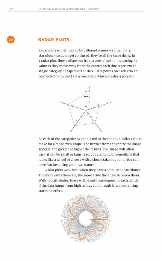
185 A Practical Guide to Designing with data
Radar plots sometimes go by different names – spider plots,
star plots – so donʼt get confused: theyʼre all the same thing. In
a radar plot, lines radiate out from a central point, increasing in
value as they move away from the centre; each line represents a
single category or aspect of the data. Data points on each arm are
connected to the next via a line graph which creates a polygon.
Radar plots 22
12
3
45
As each of the categories is connected to the others, similar values
make for a more even shape. The further from the centre the shape
appears, the greater or higher the results. The shape will often
vary: it can be small or large, a sort of diamond or something that
looks like a wheel of cheese with a chunk taken out of it. You can
have fun inventing your own names.
Radar plots work best when they have a small set of attributes.
The more arms there are, the more acute the angle between them.
With 360 attributes, there will be only one degree for each which,
if the data jumps from high to low, could result in a disorienting
starburst effect.
~ Radar Plots

186
The size and resolution of the radar plot will influence the density
of attributes which can be modelled. There is no guideline of how
many is too many, so itʼs best to err on the side of fewer arms. As
weʼll see later, if you encounter problems with too many attributes,
then maybe a radar plot isnʼt the best graph to use. Maybe a bar
chart would be more appropriate.
One argument for the existence of this type of graph is that
it works well when overlaid with other radar plots to create a
composite image. This provides you with an overview of all the
different items being modelled and trends can be easily identified.
Just like a line graph, a radar plot can contain multiple data sets
at once, and all the same problems apply: how to pick distinct
colours or (if in black and white) how to pick distinct shapes, and
so on. This example uses opacity to let the data sets show through,
but this technique works effectively only with a small number of
data sets.
All the techniques described in chapter 6 that can reduce the
number of pixels also apply to radar plots. Unnecessary axes can
be removed, as well as tick marks, the shape can be reduced to only
the observed range, and so on. But as we strip away more of what
isnʼt data, problems can emerge.
Dow
nlo
ad fro
m W
ow
! eBook
<w
ww
.wow
ebook.
com
>
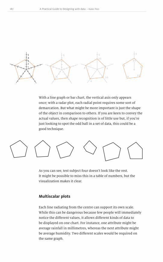
187 A Practical Guide to Designing with data
With a line graph or bar chart, the vertical axis only appears
once; with a radar plot, each radial point requires some sort of
demarcation. But what might be more important is just the shape
of the object in comparison to others. If you are keen to convey the
actual values, then shape recognition is of little use but, if youʼre
just looking to spot the odd ball in a set of data, this could be a
good technique.
54321
5 5
4
4
3
3.5
3.5
5
4
4
3
3.5
3.5
0
As you can see, test subject four doesnʼt look like the rest.
It might be possible to miss this in a table of numbers, but the
visualization makes it clear.
Multiscalar plots
Each line radiating from the centre can support its own scale.
While this can be dangerous because few people will immediately
notice the different values, it allows different kinds of data to
be displayed on one chart. For instance, one attribute might be
average rainfall in millimetres, whereas the next attribute might
be average humidity. Two different scales would be required on
the same graph.
~ Radar Plots

188
Issues
There are two major problems with the radar plot. First is the
difficulty of comparing data across the diameter of the ring.
Comparing a value on the second axis with the fourth axis is
hindered not only by the distance between them but also because
they are rotated in space. A vertical scale at each point is needed to
help determine the value. This adds ink and pixels, decreasing the
data to pixels ratio. Other chart types rarely have to repeat values
on their axes, making this a drawback for radial charts.
The second problem is the distorting effect radar plots have
on area. The outermost circumference of a radar plot encompasses
a larger area than the innermost circumference, and it therefore
acquires added visual weight. The red line connects the value five
on all the axes and the blue line marks one on each of the axes.
The area within the red line, however, is much more than five
times the area within the blue line, yet that is the ratio according to
the scale.
54321
100%
80%
60%
40%
20%

189 A Practical Guide to Designing with data
The footprint of a radar plot is usually square even when each of
the radial arms is the same length, creating a circle. The height of a
radar graph is approximately twice the size of the scale. So if there
are ten units, the plot needs to be twenty units in height. This
leaves a wasted area around the edges of the chart. Below, this area
is shaded to reveal what is not part of the graph, but is still taken
up by its footprint. Like the pie chart, there is more wasted space
than in other chart types.
A bar chart of the same data need only be ten units in height
because it does not cut an arc around a central point, but instead
extends horizontally. Depending on the number of values, the
width can be less than the corresponding radar plot. If our goal
is to reduce the data to pixel ratio, then as much cruft as possible
needs to be eliminated.
Often information on a radar plot can be illustrated more
clearly on a bar chart. Itʼs much easier to read and takes up less
space when comparing a low number of values on the same scale.
54321
54321
~ Radar Plots

190
Since order is not in itself significant in a radar plot, the same as
a bar chart, we can rearrange the values to make the order best
suit the circumstances; maybe it is best to reference the data
alphabetically, or by region, or from least to greatest.
Extra care needs to be taken with radar plots containing
different scales on each arm, as these may need to become separate
bar charts. In the previous weather example, we couldnʼt put
average rainfall in millimetres on the same bar chart as average
humidity, but they can be displayed on independent bar charts.
When overlaying radar plots, it can be useful to take averages
of all the values and display them on a bar chart. This is much
more empirical than making the viewer guess at what the averages
might be from sight.
54321
3.8 2.1 3.8 4.24 .0
It doesnʼt create as pretty a picture, but the goal of your design
is to tell the dataʼs story, not let the reader make an incorrect
interpretation.

191 A Practical Guide to Designing with data
Polar area diagram
The polar area diagram was invented by Florence Nightingale in
1858 as an aid to describing her experiences in the Crimean War.
It is sometimes used synonymously with the term coxcomb.
This is because Nightingale referred to a compilation of these
diagrams as a coxcomb and the term later became attached to
the diagrams themselves. As a nurse during the war she tried to
improve the living conditions of hospitalized soldiers. Many died
from infections and other non-battle-related injuries. At the time,
ending up in hospital actually increased a soldierʼs chances of
dying due to poor hygienic conditions.
In a report that she produced for the British government,
Nightingale outlined all the different causes of death during
several months of the war. This was represented in the
diagram below:
July
August
September
October
November
December
January 1855
Febr
uary
Mar
ch
Apr
il18
54
May
June
Bulg
aria
Crimea
Preventable or Mitigable Zymotic disease
Wounds
All other causes
The black line across November 1854 marks the boundryof the deaths from all other causes during that month.In October 1854, the black coincides with the red.
Diagram of the Causes of Mortality in the Army in the East
Florence Nightingale1856
~ Radar Plots

192
It was a very early visualization, so I wonʼt fault her for her efforts,
but there are several improvements that could be made to the
design. First, this isnʼt actually a stacked area graph: the bars
are hidden behind each other. This is why she makes the notes
about months November, October and April. The chart attempts
to compare data both within the same month and to each of the
other months.
Is anything gained by telling this story in the round? Or should
the data be converted into a bar chart? There are two options: an
area chart showing all of the casualties and the breakdown by each
type; or three separate bars for each month. Each tells a slightly
different story.
June July Aug Sept Oct Nov Dec Jan Feb MarApr May
June July Aug Sept Oct Nov Dec Jan Feb MarApr May
Dow
nlo
ad fro
m W
ow
! eBook
<w
ww
.wow
ebook.
com
>
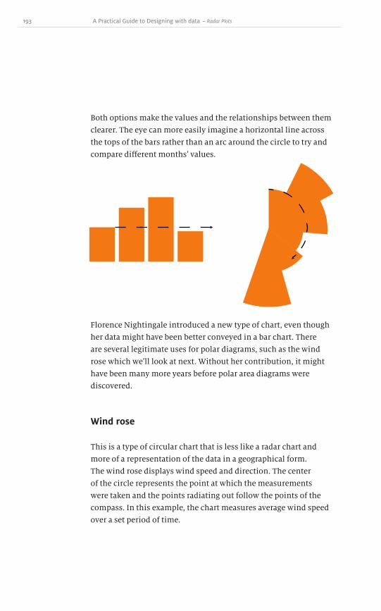
193 A Practical Guide to Designing with data
Both options make the values and the relationships between them
clearer. The eye can more easily imagine a horizontal line across
the tops of the bars rather than an arc around the circle to try and
compare different monthsʼ values.
Florence Nightingale introduced a new type of chart, even though
her data might have been better conveyed in a bar chart. There
are several legitimate uses for polar diagrams, such as the wind
rose which weʼll look at next. Without her contribution, it might
have been many more years before polar area diagrams were
discovered.
Wind rose
This is a type of circular chart that is less like a radar chart and
more of a representation of the data in a geographical form.
The wind rose displays wind speed and direction. The center
of the circle represents the point at which the measurements
were taken and the points radiating out follow the points of the
compass. In this example, the chart measures average wind speed
over a set period of time.
~ Radar Plots

194
You can easily see the prevailing wind direction is south-
southeast. We understand this chart because we are used to a
spacial world. When we stand outside looking north, we act as the
centre of the wind rose. We intuitively understand the intensity
and frequency of the wind from this diagram. It is actually a very
specific type of map, showing not political borders, but relative
spacial position. The length of the bars could represent different
attributes such as wind speed, air temperature or intensity of
sunlight falling on the detector.
This is a good chart design to have in your toolbox. It is very
specific, and fills a unique niche in spacial representations.
N
S
W E
NW NE
SW SE
50
40
30
20
10
Wind speed (m/s) by direction

195 A Practical Guide to Designing with data
Measuring devices that are not usually professionally employed to
show progress levels are the gauge and thermometer. If this is the
voice you want to speak with, then maybe thermometers are for
you, but generally they equate to kitsch chart junk.
Thermometers
Charity fundraisers like to use thermometers to show the progress
of donations. Next time you see a thermometer used in this way,
ask yourself, “What is this thermometer actually showing?” They
attempt to show two things: progress and quantity. Over time,
people can see the progress of the thermometer rising towards
the top, which is the target amount. It also shows us the current
quantity pledged toward the goal.
Gauges and thermometers23
~ Gauges and Thermometers
It is really two distinct possible charts. It could be as simple as
a bar chart with a single bar – the vertical axis is the quantity
pledged. This is exactly the same as the thermometer, but
without the chart junk bulb at the bottom and extra design of the
thermometer itself.
$10,000
$7,500
$7,400
$5,000
$2,500
$0

196
$10,000 $10,000
$7,500 $7,500
$5,000 $5,000
$2,500 $2,500
$0 $0
Jan Feb Mar Apr
The thermometer is also trying to be a line graph. Over time,
contributions are added to the pool, thereby increasing the height
of the thermometer reading. This has the same effect as adding
data points to the line graph as the time passes. The line graphʼs
vertical axis is the amount pledged. Over time it rises, which
also lets us look back at any given date and see the amount. It
could be that just before the end of the tax year more donations
are received, or perhaps around holidays or major promotional
activity. With a single bar or thermometer, this interesting data
is lost.
Gauges and dials
There have been whole books written on these topics. Most agree
that gauges and dials are a bad idea! For an excellent resource, see
Information Dashboard Design: The Effective Visual Communication of
Data by Stephen Few.
If we ignore the use of nineteenth century-style steam gauges
in a digital world, the chart junk and other unnecessary pixels
should instantly alert us to a few problems. The new generation
of people coming to computers has probably never seen a five and
a quarter inch floppy disk, or even a three and half inch disk, yet
many of our applicationsʼ save icons use this metaphor.
Dow
nlo
ad fro
m W
ow
! eBook
<w
ww
.wow
ebook.
com
>

197 A Practical Guide to Designing with data
It looks somewhat outdated now: imagine how it will look in five
to ten years. But we still persist with dashboard gauges that are not
only from a past era, but pointless.
Dials and gauges present a similar problem to pie charts
and other radial diagrams: comparing separated values with
different orientations is difficult to accomplish. Without the
labels, would anyone understand that the needle has moved
from zero to seventy? The angle would have to be estimated and
converted to the approriate scale, and the value would have to be
guessed at. Presenting the value on its own would be much more
straightforward and informative.
0
10
20
3
0 40 50 60 70 80 90
100
Not only that, but there are many wasted pixels as this is a circular
diagram. A round gauge uses only the circular area to convey data,
but a square shape is taken up within the flow of the document.
This means that over 21% of the pixels are wasted.
~ Gauges and Thermometers
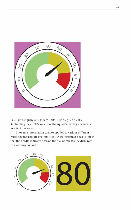
198
0
10
20
3
0 40 50 60 70 80 90
100
(4 × 4 units square = 16 square units. Circle = pi × 22 = 12.4.
Subtracting the circleʼs area from the squareʼs leaves 3.4 which is
21.4% of the area)
The same information can be supplied in various different
ways: shapes, colours or simply text! Does the reader need to know
that the needle indicates 80% on the dial or can 80% be displayed
in a warning colour?
0
10
20
3
0 40 50 60 70 80 90
100 80

199 A Practical Guide to Designing with data
The difference in legibility between the tiny arrow in the gauge
and the large number in the yellow box is marked. The text value
could be reduced in size without compromising its effectiveness
and would save space.
To its credit, what a gauge does provide is an upper limit.
If the gauge was measuring a threat level between one and five,
and it was replaced with text, then a large figure 4 isnʼt very
informative. Four out of what? Ten? Four out of four? A gauge
provides the reader with the relevant details to aid understanding.
There are two ways around this. Firstly, the scale could be
so well known that there is no need to state X out of Y – movie
classifications, for instance. The US system of movie ratings – G,
PG, PG-13, R and NC-17 – is very well known (in the US, at least).
Stating “PG-13 out of five” doesnʼt make sense. A similar problem
plagues the star ratings we talked about in chapter 17. One way to
solve this is to display empty stars so the reader knows the upper
limit. So, secondly, if replacing the gauge with text, be sure to state
the upper bound explicitly.
Part of the problem with using gauges and dials as alerts is
that they become part of the background. If 99% of the time the
needle sits in the green, the gauge isnʼt worth looking at; then
that one per cent of the time when it is in the red, the gauge will
go unnoticed. There is no need for an “everything is OK” alarm, so
why have the gauge when the value is in the green? Make it appear
only when there is a warning, then itʼs obvious when there is
trouble! But now weʼve strayed from our subject – this is less about
data and more about user interface design and human behaviour.
~ Gauges and Thermometers

200

201 A Practical Guide to Designing with data
One subject we havenʼt touched on is the use of senses other than
sight when designing with data. None of the examples in this
book make use of smell, texture, taste or sound. Thatʼs not to say
you couldnʼt make a physical, three-dimensional version of any of
these graphs for visually impaired people to understand the data.
Itʼs pretty unlikely that weʼll make a smell or taste chart any
time soon. In fact, Iʼm not sure Iʼd want to smell different stocks
and have their spiciness equate to upward trends and sourness
equate to downward trends. Without exploring this cul-de-sac
too far, there are only five basic flavours – salty, sweet, sour, bitter
and umami (sometimes referred to as savoury) – which would be
a problem if different flavours were assigned to different items
in the chart. Like colours, variations and mixtures of the flavours
would have to be used and people without sophisticated palates
would get confused. Is that sour, or sweet and sour?
Sounds as data points
We can, however, experiment with sound as an medium for data.
Back in chapter 3 we talked about the difference between dynamic
and static charts. When dealing with sound, we are no longer in
the realm of static design. Sound is dynamic information that
can be played at different times with specific durations and at
particular pitches.
There are several ways to encode sound. The obvious example
is musical notation. The key signature, tempo, note pitches
and duration are transcribed using a standardized format. This
is similar to words on a page: the written music is read and
understood by the musicians who then transform it into sound as
they play or sing.
Methods of encoding sound can also be physical or
mechanical. A vibrating needle etched sound waves on to wax
cylinders to first record sound that could be played back; vinyl
records work in a similar way. Now CDs, DVDs and MP3s use
digital bits. There are analog equivalents to those digital ones and
zeros: the old player pianos (sometimes called pianolas) whose
Sound 24
~ Sound

202
piano rolls map the music in perforated paper; or those tiny music
boxes where a toothed wheel rotates against chimes to make
sounds at the correct intervals to play a tune. These are interactive
but also analog.
The New York Times tried an experiment with an audio chart.
It took events from the 2010 Winter Olympics and plotted the
race times.
The winning athleteʼs time was placed at the zero point and
everyone elseʼs time was offset from this. For instance, if it took
the winner 1 minute 54.31 seconds to complete the course, that
becomes the zero point. If the next competitorʼs time was 1 minute
54.40 seconds weʼd subtract the winning time from it, meaning
he was 0.09 seconds behind the winner and that time would be
plotted at 0.09 seconds after the zero on the timeline.
An audible beep was added for each contestantʼs time as a data
point. Pressing play plays the series of beeps, each spaced out in
time as the athletes crossed the finish line. Itʼs an interesting way
to represent the data both visually and audibly. From a graph, the
reader canʼt feel what itʼs like to be 0.09 seconds behind, but from
a series of notes a listener can discover how close or far apart 0.09
seconds is.
This idea could be used in many different situations. Imagine
real time edits to Wikipedia as a tune. The size of the edit could
adjust the pitch, so the changes in the text could be heard as a
http://www.nytimes.com/interactive/2010/02/26/sports/olympics/20100226-olysymphony.html

203 A Practical Guide to Designing with data
melody. If the sounds consisted of ambient noises, then you could
go about your daily business until a shriek of high-pitched tones
caught your ear. Those might be frequent, large edits, possibly the
mark of a spammer.
I have heard of system administrators doing something
similar with server activity. Instead of a dashboard of green lights
and percentages of server loads (and we know how well gauges
and thermometers work as charts and graphs), they switched
to bird sounds. Maybe each server had a distinct bird chirp. As
activity increased, the sound would go from calm to a cacophony
of birdsong. At that point, the sysadmins knew something was
wrong and had a look.
In certain situations, itʼs possible to use sound as a way to
convey information behind the data and to tell a story. From
Olympic medal times and wiki updates to server loads, unique
uses to engage the other senses can be found.
Visualizing sound
Sound travels in waves, which can easily be visualized.
We recognize a waveform shape from just about any audio app.
~ Sound
1 http://bza.biz/project/wavefrom-necklace/
Dow
nlo
ad fro
m W
ow
! eBook
<w
ww
.wow
ebook.
com
>

204
Some people have turned this into art and created waveform
jewellery1. It is a nice way to visualize sound, but it doesnʼt tell
us much.
Different tones have different wavelengths, each producing
different vibrations in our ears and, therefore, different sounds in
our brains. Waveforms are one way to visualize sound, but perhaps
not the most exciting or unique. Enter Ernst Florens Friedrich
Chladni.
Ernst Chladni was born in late 1756 in Germany. Like William
Playfair, Chladni was a something of a polyglot. He had degrees
in law and philosophy, but was more interested in physics and
music. Drawing on his scientific knowledge, he researched and
developed several interesting techniques in the study of sound
and is sometimes referred to as the father of acoustics. He was also
an early pioneer in studying meteorites and is regarded by some
as the father of meteoritics, but weʼll have to leave that story for
another time.
In 1787 he published his Discoveries in the Theory of Sound,
in which he describes his development of an earlier experiment
by Robert Hooke (1635–1703) of Oxford University. Chladni drew
a bow across a metal plate (subsequently named after him as
There are peaks and valleys, dead air and noise. These waveforms
are made up of hundreds of pitches and different tones. A pure
tone on an oscilloscope would produce a smooth sine wave.

205 A Practical Guide to Designing with data
Chladni plates) whose surface was lightly covered with sand. The
vibrations through the plate excited the sand particles and settled
them into a nodal pattern caused by the sound waves. These
experiments can create beautiful designs based on
different pitches.
Today, these shapes are generated in much the same way
except that instead of a bow a loudspeaker emitting a specific
pitch is used – the effects are the same. There are plenty of
videos about how these patterns are created and the mysteries
surrounding them. In the Rosslyn Chapel just south of Edinburgh
in Scotland, there are several designs in the stonework which
look very much like these patterns. The chapel, built in the mid
fifteenth century, is one of the places reputed to be the hiding
place of the Holy Grail and is decorated with many cryptic
symbols. A father-and-son team matched the stone Chladni
patterns into their musical pitch equivalents, producing a tune
they call Rosslyn Motet.
Knowledge of these patterns is used in the construction of
acoustic instruments such as guitars and violins. The patterns
represent complex mathematical equations and all the data points
which underlie the acoustic sounds. By putting sand on the bodies
and playing a particular pitch, a specific Chladni pattern should
emerge. If not, then the construction and shape of the instrument
are incorrect. This is an ingenious way to test the design to see if it
generates the same audio data set in a consistent manner between
instruments.
The study of visible sound and vibrations is referred to as
cymatics. If you are interested in learning more, searching for
“cymatics” or “Chladni” is an excellent starting point.
~ Sound

206

207 A Practical Guide to Designing with data
Sadly, this is the last chapter and there is so much more to explore!
Before we go, itʼs important to at least touch on a few other charts
and graphs which show promise and can be adapted to uses
beyond their original purpose. Once you understand what each is
designed to represent and your data fits those critiera, you should
feel confident in using them.
Population pyramid
The population pyramid is an uncommon type of chart that youʼre
not likely to have come across. This isnʼt because it is bad, but
because its use is quite specific.
Everything and the kitchen sink25
~ Everything and the kitchen sink
80
70
60
50
40
30
20
10
0
80
70
60
50
40
30
20
10
0

208
Since the pyramids are effectively two bar charts turned on their
sides and placed back to back, all the benefits and weaknesses
discussed in chapter 17 regarding bar charts apply. The bars are
absolute values, so you can compare two different population
pyramids as long as the scale is the same.
There are opportunities to replicate the framework of a
population pyramid with other data types. The goal of the design
is to deal with a data set over time, so this could be growth of cities
each year, number of cars sold per year, and so on.
The name comes from the chartʼs appearance: it tends to look like
a pyramid in shape. It is split vertically down the middle – in the
examples, one side represents males (blue), the other females
(purple). Each horizontal bar is a count of people in a particular
age group. Age increases up the vertical axis with fewer and fewer
people in the higher age groups.
The different shapes of the pyramid give a general overview
of the population and potential troubles down the road. An aging
baby boomer generation outnumbers later births. Chinaʼs one
child per family initiative has decimated the lower half of its
pyramid. Rising child mortality rates would appear in this chart as
a straighter-sided pyramid. If there was a high birth rate but few
children survived past the age of five, there would be a large bulge
at the bottom, with a curve upwards resembling a hockey stick.
80
70
60
50
40
30
20
10
0
80
70
60
50
40
30
20
10
0
80
70
60
50
40
30
20
10
0

209 A Practical Guide to Designing with data
This, of course, could be designed as a line graph or regular
bar chart. The pyramid aspect brings with it the opportunity to
compare the two variables next to each other, just like two lines on
a line graph.
Phillips curve
In 1958, the economist William Phillips wrote a paper called ʻThe
Relationship between Unemployment and the Rate of Change of
Money Wages in the United Kingdom 1861–1957 .̓ He attempted
to show an inverse relationship between unemployment and the
inflation rate (when inflation is high, unemployment is low). For
the article, he created a new type of chart which now bears his
name: the Phillips curve.
Infla
tion
Lati
tude
Unemployment Longitude
TUR
ROM
BARAUSLIS
PAR
LON
EDI
ʼ01
ʼ08
ʼ02ʼ03
ʼ06ʼ07
ʼ04
ʼ05
~ Everything and the kitchen sink
80
70
60
50
40
30
20
10
0 8070605040
3020100
Dow
nlo
ad fro
m W
ow
! eBook
<w
ww
.wow
ebook.
com
>

210
A Phillips curve is a sort of cross between a scatter plot and a
line graph. The grid plots the unemployment rate on one axis
and inflation or deflation on the other. This makes it similar to a
scatter plot but by connecting the data points, a sort of scribbly
timeline is formed.
While Phillips tried to demonstrate a specific shape in his
paper, itʼs possible to reuse this concept in other ways. If we
look back at chapter 21 about maps, we could overlay a Phillips-
style curve of both time and direction to some travel plans: from
London to Paris; then Paris to Madrid; Madrid to Rome, and so on.
Just as the Phillips curve plots points on two axes, we can replace
unemployment and inflation with latitude and longitude, then
connect the points over time. This doesnʼt imply that latitude
and longitude have a statistical relationship, but it shows that the
visual characteristics of the Phillips curve can be repurposed.
One disadvantage of a Phillips curve is that it has the potential
to get cluttered quickly as the line retraces itself. It is a halfway
house between a scatter plot and a flow map. It isnʼt as heavy as a
flow map with large arrows and it has an extra dimension – time –
which is lacking in a scatter plot. This is another chart type to keep
in your toolbox as you design with data.
Venn diagrams
Itʼs widely believed that around 1880 John Venn – yes, he was a
real person – created a way to visualize sets graphically using
overlapping circles. This kicked off the field of set theory and had
wider impacts in a variety of other disciplines.
Venn diagrams can be used when there are several possible
relations between a finite collection of data sets. Venn diagrams
quickly map out possibilities visually to help aid understanding
of the logic. Letʼs take the statements “Humans are mammals” and
“All mammals are in the animal kingdom”, and ask “Is a human an
animal?” Because of set theory and a string of logical statements,
we can prove this true. This same chain of logic is what got
Socrates killed, so I wouldnʼt go around at the next party spouting
off. Itʼs for your own safety, trust me.

211 A Practical Guide to Designing with data
Venn diagrams allow us to quickly identify why this is true. First,
thereʼs a box which represents everything in the universe. Inside
that box is placed a circle labelled “Animal Kingdom”. Within that
is a smaller circle labelled “Mammals”. Finally, a point labelled
“Humans” is inside the mammals circle.
Everything
Animal Kingdom
Mammals
Humans
~ Everything and the kitchen sink
The question was, “Are humans animals?” Since the dot for
humans is entirely inside the mammals circle, which is entirely
inside the animal kingdom circle, then, yes, this statement is true.
If the mammals circle is removed, the point for humans remains
inside the animals circle.
Now letʼs try a slightly more complicated representation.
There is a group of people who enjoy peanut butter sandwiches,
a group of people who enjoy jam sandwiches and a third group
of people who enjoy banana sandwiches. These are three sets of
people, and there will probably be some overlap between them,
since some people will eat peanut butter and jam sandwiches and
others will eat banana and peanut butter sandwiches. Then there
are the unfortunate people who have peanut allergies and like to
eat banana and jam sandwiches.

212
Peanut Butter and Jam
Jam and BananasPeanut Butter and Bananas
JamPeanut Butter
Bananas
The Venn diagram allows us to more easily tell the story of who fits
where and how large the overlap is between the three groups.
Creating a Venn diagram creates a visual representation of the
interrelations between data. In this case, it is also a sanity check
because there canʼt be more peanut butter and banana sandwich
eaters than just plain peanut butter eaters, since every peanut
butter and banana eater is also a peanut butter eater.
There are a few downsides to Venn diagrams. The overlapping
shapes can become complex. Mapping out with consistency many
more than three sets is difficult. Also, without labels itʼs difficult to
judge accurately the percentage of overlap: is that a 50% or 52.45%
overlap? With two arcs of two overlapping circles that may be
different sizes, our mathematics might fail us.

213 A Practical Guide to Designing with data
Crop circles
Iʼm just sayinʼ! You never know! Whether hoaxes or signs of UFO
invasion, crop circles registered in the worldʼs consciousness
in the 1990s. Their designs and complexity have varied over the
years, probably because their creators practised more and more,
or tried to out-circle the other guys. Either way, some have had
incredibly mathematical and beautiful designs that it would be a
shame to pass by in a book about designing with data.
Whoʼs to say that mathematical relationships between two ratios
of objects canʼt be represented in other ways besides numbers? If
we were trying to communicate across languages and cultures,
we might need to use means other than letters and numbers. Of
course, we donʼt need to go to another world to find someone who
doesnʼt understand English. Is it better to label the chart Male and
Female, or is it better to be language agnostic and use icons?
Some scientists have given this a lot of thought over the years.
In 1977, NASA sent messages into outer space with the Voyager
spacecraft with a Golden Record containing sounds and images
portraying the diversity of life and culture on Earth. To explain to
an extraterrestrial who has never seen a record player the actions
needed to create one and at what speed to play the record required
a bizarre set of instructions1.
~ Everything and the kitchen sink
1 http://en.wikipedia.org/wiki/Voyager_Golden_Record
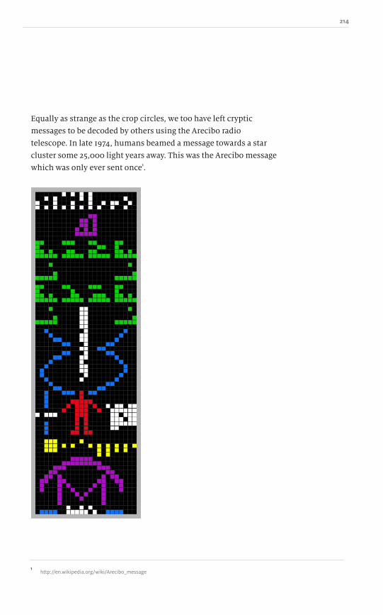
214
Equally as strange as the crop circles, we too have left cryptic
messages to be decoded by others using the Arecibo radio
telescope. In late 1974, humans beamed a message towards a star
cluster some 25,000 light years away. This was the Arecibo message
which was only ever sent once1.
1 http://en.wikipedia.org/wiki/Arecibo_message

215 A Practical Guide to Designing with data
This has to qualify as one of the densest and most well thought
out visualizations ever created. What was sent was a series of 1,679
ones and zeros, colour coded in this illustration to help identify
the shapes. The dimensions – 23 columns by 73 rows – were
chosen because they are both prime numbers. Ordering the linear
stream of ones and zeros correctly makes the rectangular graphic.
Each individual bit used and the total amount of bits contributes
to the data of the chart itself: nothing is wasted. There is a lot to
be learnt from astronomy that we can apply to our more mundane
data-driven designs.
Chernoff faces
Herman Chernoff is an American mathematician born in 1923.
His contribution to charts and graphs comes from the 1973 journal
article, ʻThe Use of Faces to Represent Points in K-Dimensional
Space Graphically .̓ Faces are interesting graphical objects. As
humans, we are very good at finding tiny but distinct differences
in peopleʼs faces. In those wildlife shows where naturalists know
the names and faces of all the monkeys and apes they study – to
me, they all look the same. Yet we donʼt confuse our friends or
even people weʼve seen only once or twice – hence the phrase,
“Your face looks familiar”. We have an inate ability to recognize
and decipher faces, and thatʼs exactly the idea behind using
Chernoff faces to describe data.
To make a Chernoff face, several pieces of data are encoded
into different features. For instance, a range of zero to ten could
be encoded in the width of the face: the larger the number, the
wider the face. The angle of the eyebrows can be tweaked and any
part of the face can be changed: nose size, hair, eyes, mouth width
and how smiley it is, ears, and plenty of other characteristics. Itʼs
almost like a police identikit or Mr. Potato Head, where different
parts can be swapped out depending on different values.
~ Everything and the kitchen sink
Dow
nlo
ad fro
m W
ow
! eBook
<w
ww
.wow
ebook.
com
>

216
If you have a set of data with different attributes, Chernoff faces
make for an excellent cross-comparison. This was done in
2008 using American baseball statistics. Each team had several
attributes: wins, losses, home runs, and so on. Each of those was
mapped to different parts of a face; placing them all side by side
immediately revealed subtle differences.
http://www.nytimes.com/2008/04/01/science/01prof.html

217 A Practical Guide to Designing with data
The face as a device to describe data works really well. It also has
a fairly high data to pixel ratio because there is very little that
isnʼt data. Edward Tufte has pointed out that a Chernoff face is
symmetrical, so twice as much data is depicted than is actually
required; each face could be split down the middle vertically and
it would contain exactly the same information. This is true, but
people respond better to a complete set of facial features.
Word clouds
If you think about it, a word cloud is similar to a pie chart: all the
words in the cloud are displayed at relative sizes to each other.
This means that word clouds suffer from many of the same
problems as pie charts. Itʼs difficult to compare two word clouds.
The largest word in one cloud could be the same size as the largest
word in another, but their respective absolute values could be
levels of magnitude apart. The sizes of words are relative only
within a single cloud, just as a 50% wedge in a pie chart canʼt yield
an absolute count when comparing it to a second pie chart.
~ Everything and the kitchen sink
218
That said, word clouds do have advantages over pie charts in that
it is clear when one section stops and another starts. A word cloud
can contain many more words than a pie chart can have wedges;
a pie chart that has 360 wedges would be ridiculous, but a word
cloud of 360 words has the potential to be very information dense.
The same colour can be reused without the concern that two
items would get confused. This allows the addition of a second
variable into the mix, making the design of a tag cloud similar
to that of a tree map. It can show both relative size and a second
variable by adjusting the colour. For instance, green words might
be trending up whereas red words might be trending down. A large
red word could indicate that in the last time period it would have
appeared even larger; a large green word could indicate that it is on
the rise.
When dealing with relative values, the shapes also need to
be relative. As we saw in chapter 11, when an itemʼs height and
width are doubled in two dimensions its area is squared; in three
dimensions the volume is cubed. If one word cloudʼs largest word
set in a 72 point font is the word ʻboyʼ and a second word clouldʼs
largest 72 point word is ʻonomatopoeia ,̓ there is a mismatch in the
relative lengths. The height may be the same, but the area each
word covers is vastly different. This makes longer words appear to
have a greater weight in the given context.
If we look at the data to pixel ratio for a word cloud, it has to
be one of the highest possible. There are no additional pixels that
describe the chart. Each one is used in conveying information.
Every drop is used in conveying information. This is both a word
cloudʼs great advantage and its downfall. Without any sort of scale,
it is nearly impossible to cross-reference and extract the numeric
values that are hidden in the design.
Word clouds are relatively new, as the software needed to
dynamically generate the sizes and prevent overlapping has only
recently become mainstream. Time will tell if word clouds can
find a seat at the adult charts and graphs table, or if they will be
relegated to the childrenʼs table, forever used as a filler and friend
only to the doughnut chart.

219 A Practical Guide to Designing with data
Summary
This is the end of our journey through the world of common and
not so common charts and graphs. In the first three parts of this
book, we laid the foundations for designing with the data. In the
final two parts, we talked about the specifics.
Weʼve come a long way since discussing the first pie chart
ever created to knowing the ins and outs of some of the craziest
and least useful graphs youʼve probably ever seen. But thatʼs all
been part of the plan. You need to know what works and, more
importantly, what doesnʼt.
These designs are always evolving. There was a time before
population pyramids and word clouds, even before bar charts and
pie charts. As the landscape shifts with time and fashion, you
need to recognize what works and what doesnʼt, as well as which
tools are best for telling a particular kind of story based on the
data. This is why it is important to understand both the common
and uncommon graphs and charts. Any new chart development
will most likely be an offshoot of an existing design, all of which
have their good and bad points.
~ Everything and the kitchen sink
Dow
nlo
ad fro
m W
ow
! eBook
<w
ww
.wow
ebook.
com
>

220

221 A Practical Guide to Designing with Data
This book is about how to design the data so that it tells a story,
enlightens your readers and helps to them to make informed
decisions.
At this point, you should be not only capable of spotting bad
chart design, but have the tools and knowledge to correct it. Weʼve
taken quite a journey since the first page. You now have the ability
to go out and create extraordinary designs using data.
As you sit down to illustrate that next chart, ask yourself a few
simple questions:
• What am I trying to convey? Will my design achieve that?
• Is this the right chart? Is the data time-sensitive? Are we looking at
only a part or the whole picture?
• Is there anything that I can remove and have the graph still tell the
same story?
• Are the colours usable? Will this be printed in black and white?
What if the audience has problems with colour?
• Did I label the chart data and provide a title for it?
As homework, you should continue to practise creating better
charts and graphs using the tips you have learnt in this book. Take
an everyday item like your phone bill and try to make a better
visualization from the table of data: who you called, how often and
for how long are all possible variables to graph. What is the story
behind those boring numbers? Once you start creating graphs,
youʼll come to understand your mistakes and gradually improve
your skills. Donʼt be afraid to try different approaches.
You might not realize it, but one of the greatest charts weʼve
all seen is under constant scrutiny. In 1869, a Russian chemist
named Dmitri Mendeleev sat down with an ordered list of data.
Each item in this list had a numeric value that was sequential,
but at the same time there were clusters of attributes that could
also be grouped. Mendeleev struggled for a long time to find the
best order for the items in this list until he noticed a number
of interesting patterns in the data. These patterns led him to
believe that there might be some pieces missing from his list,
Conclusion

222
a controversial notion in its own right. He also realized that
by reconfiguring the list as a table, some of the patterns would
be resolved. In laying out the list in this new way, he created
the periodic table of elements that weʼre all familiar with. One
hundred and fifty years have passed since the original seeds were
sown and the periodic tableʼs format remains the same. Every
once in a while people try to improve on the design, some more
successfully than others.
If you consider that people are still trying to improve a chart
150 years after its invention, you should appreciate that your
design isnʼt really finished either. It just goes to show that there is
always room for improvement.
You need to remember that visualizations and infographics
arenʼt just buzzwords. At one point in time they were just
attempts to create denser and more information-rich illustrations.
Many of them fail, annoy and just plain confuse. You are now
knowledgeable in the foundations of designing with data. From
here, you can extend your abilities into more complex and richer
visualizations. I deliberately did not cover them in this book;
you need to learn how to walk before you can run and with only
twenty-five chapters, weʼre just skimming the surface of the
basics. With practice, hard work and a lot of pondering, you can
become an expert. By all means, try to create some infographics;
just remember everything youʼve read here. It all still applies, and
if I find out that you are using doughnut charts, Iʼll hunt
you down.
Remember, the goal of any chart is to tell a certain story. If
a picture is worth a thousand words, then a properly designed
chart is worth a thousand words multiplied by the data to pixel
ratio, plus some constant, plus a really large number to sound
important, and why not square that in the process? Just like any
good book has a beginning, middle and end, a chart needs an
introduction through its title, axes, and labels, a middle which
is the data, and an end which helps the reader towards a logical
conclusion. Maybe the chart makes a statement, demonstrating
an imbalance or a worrying prediction; no matter what it is, you
Dow
nlo
ad fro
m W
ow
! eBook
<w
ww
.wow
ebook.
com
>

223 A Practical Guide to Designing with Data
are putting yourself into the design. You have chosen the story,
the data, what to show and what not to. Itʼs your duty to eliminate
confusion and to be as open and honest as possible with
the results.
As a memento, Iʼve created a special PDF file which outlines
the pros and cons of each of the major chart types. You can print
this out and keep it as a handy reference. It will help you decide
which charts and graphs to select in which situations. It is
something only for the people who have purchased this book as a
cheatsheet to remind you of everything youʼve read.
http://designingwithdata.com/select.pdf
Iʼm looking forward to seeing your creations and improving, in
my own small way, the thousands of charts and graphs printed
every day.
Dow
nlo
ad fro
m W
ow
! eBook
<w
ww
.wow
ebook.
com
>

224