
A Language-Based Approach to Categorical Analysis
81
A Language-Based Approach to Categorical Analysis by Cameron Alexander Marlow B.S. Computer Science, University of Chicago Chicago, Illinois (1999) Submitted to the Program in Media Arts and Sciences School of Architecture and Planning In partial fulfillment of the requirements for the degree of Master of Science in Media Arts and Sciences At the Massachusetts Institute of Technology June 2001 © 2001 Massachusetts Institute of Technology Signature of Author Program in Media Arts and Sciences May 21, 2001 Certified By Walter Bender Senior Research Scientist, MIT Media Laboratory Thesis Supervisor Accepted By Stephen Benton Chair, Departmental Committee on Graduate Studies Program in Media Arts and Sciences
Transcript of A Language-Based Approach to Categorical Analysis

A Language-Based Approach to Categorical Analysis
by Cameron Alexander Marlow
B.S. Computer Science, University of Chicago Chicago, Illinois (1999)
Submitted to the Program in Media Arts and Sciences School of Architecture and Planning
In partial fulfillment of the requirements for the degree of Master of Science in Media Arts and Sciences
At the Massachusetts Institute of Technology June 2001
© 2001 Massachusetts Institute of Technology
Signature of Author
Program in Media Arts and Sciences May 21, 2001
Certified By
Walter Bender Senior Research Scientist, MIT Media Laboratory
Thesis Supervisor
Accepted By
Stephen Benton Chair, Departmental Committee on Graduate Studies
Program in Media Arts and Sciences

2
A Language-Based Approach to Categorical Analysis
by Cameron Alexander Marlow
Submitted to the Program in Media Arts and Sciences School of Architecture and Planning, on May 21, 2001
In partial fulfillment of the requirements for the degree of Master of Science in Media Arts and Sciences
Abstract
With the digitization of media, computers can be employed to help us with the process of classification, both by learning from our behavior to perform the task for us and by exposing new ways for us to think about our information. Given that most of our media comes in the form of electronic text, research in this area focuses on building automatic text classification systems. The standard representation employed by these systems, known as the bag-of-words approach to information retrieval, represents documents as collections of words. As a byproduct of this model, automatic classifiers have difficulty distinguishing between different meanings of a single word.
This research presents a new computational model of electronic text, called a synchronic imprint, which uses structural information to contextualize the meaning of words. Every concept in the body of a text is described by its relationships with other concepts in the same text, allowing classification systems to distinguish between alternative meanings of the same word. This representation is applied to both the standard problem of text classification and also to the task of enabling people to better identify large bodies of text. The latter is achieved through the development of a visualization tool named flux that models synchronic imprints as a spring network.
Thesis Advisor: Walter Bender Executive Director, MIT Media Laboratory The author gratefully thanks the Motorola Fellows Program for its support and input into the development of this research

3
A Language-Based Approach to Categorical Analysis
by Cameron Alexander Marlow
The following people served as readers for this thesis:
Reader
Brian K. Smith Assistant Professor
Explanation Architecture Group MIT Media Laboratory
Reader
Warren Sack Assistant Professor
School of Information Management and Systems University of California, Berkeley

4
Acknowledgements
This work would not have been possible without the constant support and guidance of my parents, Carole and Gary; thank you for giving me the rational and objective perspective that has brought me to academics, and also for the emotional support necessary to cope with it.
To my brother Justin, a constant source of inspiration and wisdom, thanks for showing me the way.
My extended family: Dennis, for teaching me the Zen of automobiles and taxes; Joanie, for your creative vernacular and mad tales; Eileen, Christy, David, and the rest of the Forest clan, for considering me part of the family.
To my advisor, Walter who will not get to copy-edit this (which explains the errors), for giving me the courage to explore and showing me the boundaries of what is possible.
To my readers Brian and Warren, thanks for your insightful comments and persistence in focusing my ideas.
To Kris, Larry, and David, of the old school, for getting me here, and to their minions, Jay, Shannon, Kurt, Dave, Josh, and Andrei for showing me how to be an academic.
To Linda Peterson, thank you for your patience over the past two years and this extended… well, extension.
To Dan, a great programming partner and research buddy, thanks for the regular expressions and encouragement. To Vadim, for helping me start projects I knew I wouldn’t finish and fix projects that had to be done; nothing would work without your expertise. To the rest of the team, Sunil, Ramesh, Alex, LaShaun, José, and Marco, for giving me a breadth of knowledge, and help with Walter; thanks for your kindness.
My inimitable group of friends: the NikeID guy, Jonah Holmes Peretti, for twomp, coke-exploitation, and putting it in my face when my team lost; Jeana, for your support and kind ears; Jameson, the least full-of-dumb person that I know, for shooting me in the funny bone; and the rest of the unlockedgroove homies, Danny P., Heemin, and Alise, for providing the eclectic and beautiful soundtrack to my life.
And finally, to Aisling, the most interesting and thoughtful person I have met here; thanks to taking the piss, some mighty craic and a wee Irish girl, this has been the most enjoyable time of my life.
5
Contents
Abstract ........................................................................................................................................... 2 Acknowledgements ......................................................................................................................... 4 Figures............................................................................................................................................. 7 Tables .............................................................................................................................................. 9
1 Introduction................................................................................................. 10 1.1 A new representation.........................................................................................................11 1.2 An overview of the thesis..................................................................................................12
2 Example ...................................................................................................... 14 2.1 Vector space ..........................................................................................................................14 2.2 Synchronic imprints...............................................................................................................16 2.3 A visual interpretation ...........................................................................................................16
3 Theory ......................................................................................................... 18 3.1 Information retrieval .........................................................................................................19
The inverted index.......................................................................................................................... 19 The vector space model .................................................................................................................. 20 Feature selection............................................................................................................................. 21
3.2 Automatic classification....................................................................................................23 Rule-induction and decision trees................................................................................................... 24 Nearest neighbor............................................................................................................................. 24 Neural networks ............................................................................................................................. 24 Bayesian methods........................................................................................................................... 25 Support-vector machines ................................................................................................................ 26
3.3 Information visualization ..................................................................................................27 Techniques for visualization........................................................................................................... 27 Explorative interfaces..................................................................................................................... 33 Conclusion...................................................................................................................................... 36
4 Design ......................................................................................................... 37
6
4.1 Motivation .........................................................................................................................37 Structuralism .................................................................................................................................. 37 Polysemy in classification .............................................................................................................. 37
4.2 Synchronic imprints ..........................................................................................................38 Influence......................................................................................................................................... 38 A snapshot of language .................................................................................................................. 39 Word sense disambiguation............................................................................................................ 43
4.3 Flux ...................................................................................................................................44 Motivation ...................................................................................................................................... 44 Methodology .................................................................................................................................. 45 Physical modeling .......................................................................................................................... 45 Visualizing synchronic imprints..................................................................................................... 46 Visualizing connections.................................................................................................................. 49 Interactivity .................................................................................................................................... 50 Focus .............................................................................................................................................. 50
4.4 Conclusion.........................................................................................................................51
5 Evaluation ................................................................................................... 52 5.1 Synchronic imprints and automatic classification.............................................................52
Experimental setup ......................................................................................................................... 52 Evaluating text categorization ........................................................................................................ 56 SI-space .......................................................................................................................................... 58 Results ............................................................................................................................................ 61 Analysis .......................................................................................................................................... 62 Conclusion...................................................................................................................................... 67
5.2 Visual design for relational information ...........................................................................68 Recognition .................................................................................................................................... 69 Higher structure.............................................................................................................................. 71 Relational analysis.......................................................................................................................... 73 Conclusion...................................................................................................................................... 74
6 Conclusion .................................................................................................. 75 6.1 Contributions.....................................................................................................................75 6.2 Extensions .........................................................................................................................76
Feature selection............................................................................................................................. 76 Further evaluation........................................................................................................................... 76
6.3 Future work .......................................................................................................................77 Query expansion............................................................................................................................. 77 SI + LSI .......................................................................................................................................... 78 Text summarization........................................................................................................................ 78
Bibliography.................................................................................................................................. 79

7
Figures
Figure 1: A visual interpretation of this thesis ............................................................................................17
Figure 2: A simple causality network..........................................................................................................25
Figure 3: Two possible decision lines, with different margins of error ......................................................26
Figure 4: TileBars relates the structural relevance of a document to a query .............................................28
Figure 5: The Galaxy of News is an interactive 3D topical arrangement of news ......................................29
Figure 6: Two views of Valence, a three-dimensional network visualization.............................................30
Figure 7: Tree-maps, a containment visualization, here showing a directory tree ......................................31
Figure 8: Parameters for interaction............................................................................................................32
Figure 9: IndiVideo, a video editing tool uses a fisheye perspective to arrange movie sequences .............33
Figure 10: A document space in Bead.........................................................................................................34
Figure 11: Two levels of detail in the Conversation Map interface............................................................35
Figure 12: A simple Associative Relation Network....................................................................................39
Figure 13: An early prototype of flux .........................................................................................................47
Figure 14: Flux with a new spring distance model .....................................................................................49
Figure 15: Three models for edge brightness: polynomial, linear, and constant.........................................50
Figure 16: Training set sizes for Reuters-21578 ModApte split .................................................................54
Figure 17: Precision and recall. T is the set of all test documents, B is the set in a given class, A the set predicted by a classifier, and C is the intersection of A and B. ...........................................................56
Figure 18: High precision vs. high recall ....................................................................................................57
Figure 19: SI features selected in the hybrid model ....................................................................................59
Figure 20: Average χ2 by feature list number .............................................................................................60
8
Figure 21: macro-averaged f-measure in groups of 10 (from rare to common)..........................................61
Figure 22: Three sizing models for flux: frequency, connectedness, and the difference between frequency and connectedness................................................................................................................................70
Figure 23: Springs scaled by co-occurrence (left) and normalized by frequency (right) ............................71
Figure 24: Using color to provide focus in a fluctuating visualization .......................................................73

9
Tables
Table 1: Frequencies of words and relationships in this thesis ...................................................................15
Table 2: A simple visualization of terms from and issue of Time magazine...............................................44
Table 3: Performance summary of different methods.................................................................................61
Table 4: Feature lists for the category of earnings reports (earn) ...............................................................63
Table 5: Feature lists for the category of acquisitions (acq) .......................................................................64
Table 6: Feature lists for the category of foreign financial markets (money-fx) .........................................65
Table 7: Feature lists for the category of the currency market (money-supply) ..........................................65
Table 8: Feature lists for the shipping industry (ship).................................................................................66
Table 9: Feature lists for the category of the grain commodity (grain) ......................................................67

10
1 Introduction
The invention of the printing press revolutionized the way we think about media, creating an explosion in
the amount of information that an individual could obtain, resulting in a more educated and well-
connected society. The continued exponential growth of online resources is posing a similar revolution; as
the scale and speed of the Internet increases, our capacity to consume media is expanded even more.
Whereas a person fifty years ago would read only the local town’s newspaper, people today can pay
attention to thousands of newspapers from around the world that are updated by the minute, not by the
day. One mitigating circumstance in this exciting new resource is our ability to organize and remember
the media that we consume. In the era of the printed word we had librarians to depend on to perform this
task for us, but the size and rapid change of the Internet precludes even all the world’s librarians from
creating orderliness. Instead lay people are left to their own devices to arrange their bookmarks,
documents, and email.
The general way in which we organize our personal information is through classification. When we read a
book or paper, we connect the concepts it contains to the things we already know. Our understanding of
that information can be reflected by how we classify it, namely what other things we think it is related to,
and how the categories we put it in relate to the rest of our understanding. This process of integrating a
new piece of information takes some contemplation; in a study conducted at Xerox PARC before the
explosion of personal computers, subjects related a difficulty in categorizing the personal information
collected in their office space (Malone, 1983). Whenever possible, people tended to prefer unstructured
information, because it allowed them to push off the cognitive chore of integrating the items into a
coherent organization.
The digitization of media creates a new realm of possibilities. The complexity of classifying personal
information can be diminished with intervening help from computers. Computer systems can observe the
media that we consume and use an understanding of that information to help us classify it in two respects:

11
1. Based on the structure of our already existent organizational system, computers can perform classification of new material automatically.
2. Using new representations of our media, computers could allow us to explore new ways of looking at information, leading us to create classifications with less work than before.
This thesis explores computer-aided classification for the media of electronic text, also known as written
natural language in digital form. Computer systems, such as email clients, web browsers, and file systems
would all be much easier to use if some of the organizational burden was taken off of our shoulders. Why
then, are our information systems devoid of such tools? The answer lies in the way in which computers
typically represent our information, a representation that is in need of innovation.
1.1 A new representation
Most of the systems that people use today to search, navigate, and organize information utilize a
simplistic model of language; while this representation has its limitations, it provides the efficiency and
speed needed to search billions of documents of the web with sufficient results. This representation is
known as the vector-space model for information retrieval, where documents are represented by the
frequencies of the words they contain. Any person who has used a search engine has interacted with some
form of this model, using individual words to locate documents that contain them.
The limitations of the vector-space model can be seen in the frustrations of an average Internet search:
when looking for documents about the O.J. Simpson trial, the word “Simpson” returns web pages about
Simpson college, Jessica Simpson, the Simpson’s cartoon, and Simpson car-racing products. These
documents are all considered equivalent in the eyes of the search engine because the term “Simpson” is
merely a constituent part of each of them.
Automatic text classification, as performed by computers, typically uses the vector-space model to
represent documents. The classification process involves taking a computer representation and having a
system learn some quality of a particular class of information that allows it to make decisions about future
cases. The automatic classification community has focused on innovating the methods for learning,
depending on the standard representations of information retrieval. The scenario noted above has a similar
effect on the functionality of these classification systems. While people typically classify information by
its concepts, computers are restricted to the words. When a word can have many different meanings, as
with “Simpson” above, the resulting ambiguity usually results in either some misclassification, or in the
classifier ignoring that term, despite its relative importance.

12
This thesis introduces a new representation for electronic text for the purpose of classification. Similar to
the way that people use context to disambiguate a word’s meaning, this new representation contextualizes
each word by the words that surround it. Based on the assumption that sentences provide semantic
connections between words, a network of associations is built up from the co-occurrences of words in
sentences. This representation, known as a synchronic imprint, allows a computer to understand the
difference between the alternative meanings of words by recording the explicit context that they are being
used in. In the example above, every instance of “Simpson” is connected to the surrounding words; in the
case of O.J., terms such as “murder” and “trial” provide one context for a murder trial, while “Homer”
and “Bart” provide another for the cartoon.
Another side of computer-aided classification is also investigated, utilizing synchronic imprints to help
people understand electronic text in new ways. A visual tool for exploring the conceptual network
described by synchronic imprints is introduced, called flux. Using the metaphor of a spring model, flux
builds a visual representation of electronic text that reduces the text to its most important features. In this
fashion people can recognize the important concepts and themes of a large body of text in a fraction of the
time it would require to read and understand it. By focusing on a local region of the model, a user can
explore the relationships of an individual word, providing the explicit context necessary to interpret the
specific meaning implied in the text. The tool is offered as a general explorative interface to synchronic
imprints, allowing people to utilize the same tools that computers use to perform classification.
1.2 An overview of the thesis
Chapter 2, “Example”, presents an example exploring the three different representations of language
compared in this thesis: the vector space model, synchronic imprints, and the flux visualization. The
content of this thesis is represented in each of these forms, examining the qualities and assumptions of
each model, while simultaneously providing a sneak-preview of some of the words and concepts integral
to the thesis.
Chapter 3, “Theory”, outlines the theoretical backdrop for this research. At the heart of classification lies
the human conceptual system, serving as an outline of the problems passed on to computers. The standard
approach and representations of information retrieval are presented and compared to the theories of mind
already described. Finally, the relevant field of information visualization is introduced, including
important systems and related work to this thesis.

13
Chapter 4, “Design”, describes the development of synchronic imprints and the parallel construction of
the flux visualization tool. The methodology for creating a new relational model of language is
introduced, in addition to the explicit design criteria that influenced development are discussed.
Chapter 5, “Evaluation”, presents two evaluations of this work. First, a formal evaluation based on the
standards set down by the information-retrieval community was conducted. The results of these tests, in
addition to an analysis of the successes and failures of synchronic imprints are discussed. Second, the flux
visualization tool is assessed, using the parameters of design to understand the process of building visual
explorative tools.
Chapter 6, “Conclusion”, describes the major contributions and conclusions of this thesis. It also
introduces possible future work, and synergies with other topics.

14
2 Example
This thesis is about representations—four to be exact. The first and foremost representation is electronic
text, natural language in its digital form. This could be the news, a web page, or some notes in your PDA.
In order for computers to make use of electronic text, it must be converted into a form optimized for a
given task; here we concentrate on the task of automatic text classification, which is the process of
separating electronic texts into a set of pre-arranged categories. Two representations are explored for
automatic classification; one is the undefeated heavyweight champion for the task, and the other is
introduced for the first time here. The final representation is visual, investigating how we can employ
these computer models to help people better recognize, understand and classify electronic text.
To introduce the issues undertaken by this research, a good starting point is a brief introduction to each of
these representations. Taking one body of electronic text, the respective characteristics of each
representation will be extracted through comparison. With the goal of providing a good preface to the
content of this thesis, the thesis itself will be used as this body of text; an earlier draft was taken and
transformed into the other three forms mentioned above. This way, if you are unsure of what this thesis is
about after this example, not only is the example bad, but also the representations.
2.1 Vector space
We begin with the most standard representation employed by computer systems for manipulating text,
also known as the vector-space model for information retrieval. Most people have unknowingly interacted
with the vector-space model in one form or another, at least anyone who has utilized an Internet search
engine to locate a document on the web. This model represents documents by the frequencies of the
words contained within them. The left-hand table below shows the 25 most frequent words along with the
number of occurrences (from an older draft, of course); certain very common words, such as “the” and
“to” are removed due to the lack of definition they provide.
15
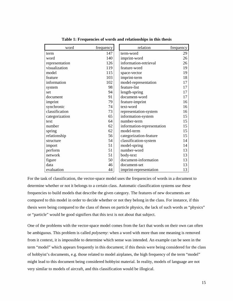
Table 1: Frequencies of words and relationships in this thesis
word frequency relation frequency term 147 term-word 29 word 140 imprint-word 26 representation 126 information-retrieval 26 visualization 119 feature-word 19 model 115 space-vector 19 feature 103 imprint-term 18 information 102 model-representation 17 system 98 feature-list 17 set 94 length-spring 17 document 91 document-word 17 imprint 79 feature-imprint 16 synchronic 74 text-word 16 classification 73 representation-system 16 categorization 65 information-system 15 text 64 number-term 15 number 62 information-representation 15 spring 62 model-term 15 relationship 56 categorization-feature 15 structure 54 classification-system 14 import 51 model-spring 14 perform 51 number-word 13 network 51 body-text 13 figure 50 document-information 13 data 46 document-set 13 evaluation 44 imprint-representation 13
For the task of classification, the vector-space model uses the frequencies of words in a document to
determine whether or not it belongs to a certain class. Automatic classification systems use these
frequencies to build models that describe the given category. The features of new documents are
compared to this model in order to decide whether or not they belong in the class. For instance, if this
thesis were being compared to the class of theses on particle physics, the lack of such words as “physics”
or “particle” would be good signifiers that this text is not about that subject.
One of the problems with the vector-space model comes from the fact that words on their own can often
be ambiguous. This problem is called polysemy: when a word with more than one meaning is removed
from it context, it is impossible to determine which sense was intended. An example can be seen in the
term “model” which appears frequently in this document; if this thesis were being considered for the class
of hobbyist’s documents, e.g. those related to model airplanes, the high frequency of the term “model”
might lead to this document being considered hobbyist material. In reality, models of language are not
very similar to models of aircraft, and this classification would be illogical.

16
Given enough examples, the classifier mentioned might be able to adjust for this problem. If the set of
documents used to train the classifier included some negative instances similar to this thesis, perhaps the
existence of the term “model” would not be considered so highly. Instead, it might use other features such
as “airplane” or “jet” to deduce the classification. However, the problems of ambiguity cannot always be
avoided by providing more examples. Consider the case of this thesis and another document with all of
the same words, but arranged in a totally different order; despite the fact that the meaning could be
entirely different, both of these documents would appear exactly the same in the view of the vector-space
model.
2.2 Synchronic imprints
A different model for representing text, introduced in this thesis is the synchronic imprint. The impetus of
the last example let to the realization that structure of language is important in defining meaning; instead
of merely using words, a new representation was built with the goal of capturing characteristics related to
the arrangement of words, in addition to the words themselves. This structure is explicitly the intra-
sentence relation of two nouns. In the previous sentence, “structure,” “relation” and “nouns” are all nouns
related to each other by the coherent meaning of that sentence. In a synchronic imprint, that sentence
would be represented by three structural links: “structure-relation,” “structure-noun” and “relation-noun.”
Each of these symbolizes a semantic link between the words, which could also be seen as a contextual
feature for interpreting the word.
The right hand side of Table 1 shows the 25 most frequent semantic links in this thesis. In the example of
the hobbyist category, the structure imparted by the synchronic imprint is enough to disambiguate the
term “model:” in the case of documents about model airplanes, relations such as “model-glue,” “model-
airplane,” and “model-kit” will be frequent, as opposed to the “model-representation,” “model-term,” and
“model-spring” found in this thesis. The synchronic imprint provides higher-level structures for
determining the features of a document, using the syntactic structure of the sentence to constrain the
context of a given word.
2.3 A visual interpretation
Both the vector-space and synchronic-imprint models are built with a computer in mind; understanding
the table above requires quite a bit of time and patience for a person. However, these representations are
merely general tools for extracting relevant information from electronic text, providing a quantitative
characteristic to a medium that is typically difficult to compare. The problem lies in the presentation, as

17
the human perceptual apparatus is not honed for making quick observations among large tables of
numbers; that is an aptitude of computers. To make the representation more palpable to human reasoning,
another visual representation can be constructed, which translates the features of the computer models
into visual structures that are simple to interpret.
Figure 1 is an image from the flux visualization system, showing a visual interpretation of this thesis. The
system uses a physical model of springs to represent the links between words specified by synchronic
imprints; the more frequently a link occurs, the stronger the link is assumed to be, which translates into a
spring with shorter length in the system. The system starts in a random state, and using the information
from the interrelationships, moves around in search of equilibrium. At any time, a user can interact with
the system by controlling the position of a word with the mouse. By observing how the system reacts to
this movement, i.e., which words are pulled with the word, and which words are not, a person can quickly
understand higher structures in how the words are connected. For instance, in the figure below, moving
the word “model” has little effect on the word “set,” while it is highly connected to “vector” and “space.”
Another feature, shown on the right, allows a user to focus on the connections of a given word. In the case
shown, the word “model” is selected, highlighting its relations to “information,” “words,” and
“classification,” projecting a very different context than one might be shown for a remote-control club
magazine.
The size of the words in the system is related to frequency information derived from the vector-space
model. This allows a person to quickly recognize the important characteristics of the system before
exploring the relationships. Within a few seconds of interaction, a user can recognize the defining
concepts and their interrelations of this long document (over 20,000 words). Using two representations
that are built for automatic classification, flux enables people to make classificatory decisions about
electronic text that would otherwise be arduous and time-consuming.
Figure 1: A visual interpretation of this thesis

18
3 Theory
This research is about classification, the process of deciding the inclusion of a given instance in a given
class. Classification is fundamental to the way that people think; as we interact with the external world,
classification is the apparatus through which we order the things that we perceive. Research in cognitive
psychology has tried to model human classification for decades, and it has by no means converged on any
general theory of the process or representations used. Furthermore the studies conducted are built on the
assumption that simple concepts should be easier to model, so most of the research focuses on everyday
objects, such as birds, boats or shoes. As noted in (Komatsu, 1992), it is unclear whether or not these
theories can scale to more abstract concepts.
However, this research is not motivated by the urge to build computer programs that mimic the human
classification system; rather it is focused on reproducing the cognitive faculty employed in this system,
using whatever representations work best. Making automatic classification systems that work in real
applications is an entirely different proposition than creating a general theory of mind; the former is
evaluated by broad performance measures, the latter by specific studies. This impetus to build working
artifacts is related most closely to fields with the same goal, namely information retrieval and artificial
intelligence. Information retrieval provides the basic data structures commonly used for automatic
classification. Artificial intelligence research in the domain of machine learning provides techniques for
building models of these data that support classification. Sections 3.1 and 3.2 of this chapter introduce
these topics, providing a framework for the construction of automatic classifiers.
This research is also about expressing a given representation visually to evoke a human understanding of
its contents. For any given data structure, there are a near infinite number of mappings to visual form that
could be chosen; the field of information visualization is devoted to understanding which of these
mappings are most efficient in evoking understanding. Section 3.3 provides a foundation for
experimenting in the domain of data visualizations, based on an array of examples from the past 10 years.

19
3.1 Information retrieval
In 1945, Vannevar Bush predicted the information revolution in an article sounding more like science
fiction than science (Bush, 1945). He did so without the help of the conception of digital storage, using
completely analog technologies to describe what today is known as the World Wide Web. His theoretical
device, the “memex,” consists of a desk containing thousands of pages of microfilm, all indexed for
immediate retrieval by typing on a keyboard. Pages of this massive library can be linked together to create
a trail of semantic connections, similar to a hyperlink on the web. This conception, fifty years ahead of its
time, is the goal of information-retrieval researchers, and although the tools and techniques have evolved
considerably, the problem has not been solved. Bush set the stage for future research by isolating the
important problems of information science: finding and relating relevant documents.
The ambition of information retrieval is to create machine-optimized representations of electronic text,
giving tasks such as retrieval, navigation and classification a much simpler interface to manipulate
documents. This simplicity comes at the expense of expression, and one could argue that the operations
performed by information-retrieval systems are far from the complexity of human thought; however, they
provide a resource that our mind cannot compete with. As a brief introduction to the field, I will present
four important representations that constitute the basis of most information systems today and some
techniques for optimizing these representations for the task of classification.
The following models are often collectively called the bag-of-words approach, because they reduce the
understanding of a document down to the constituent words of the document, ignoring the order, or any
other relationships that they might have with each other. The bag-of-words approach has two canonical
negative side-effects:
• Word-sense ambiguity (polysemy): given that one word may have many different meanings (senses), all senses are considered equivalent.
• Synonymy: distinct words with the same meaning are considered not equivalent.
Despite these disadvantages, the bag-of-words approach is used for most applications, because the
algorithms utilized have been iterated and optimized for decades. However these systems often utilize
features from other approaches to refine results in an intelligent fashion.
The inverted index
The simplest representation for locating documents, the inverted index is analogous to the index that is
found in the back of most modern books. This technique has been employed as the basic tool for

20
searching for information in a set, or corpus, of documents. Given such a collection, each document is
cataloged by every term that appears within its text. To find a document, a person can guess a set of
words that might be contained within the documents, known as a query, which is translated into sets of
documents that contain those words. The intersection of those sets, termed the result set is returned to the
inquirer. A simple optimization is to store the frequencies of words in a document with the inverted index,
and to sort the sets based on the number of times each word occurs, giving precedence to those documents
with more occurrences.
The vector space model
An alternate representation for the inverted index is an nxm matrix, where n is the number of distinct
words in all of the documents, and m is the number of documents. Each location aij corresponds the
number of times that word i occurs in document j. This representation is known as the vector-space
model, as each word can be thought of as a dimension in an n-dimensional vector space; in this model, a
document is represented by a vector where the length along any dimension corresponds to the frequency
of the word associated with that dimension. This technique was introduced by Gerard Salton (Salton &
McGill, 1983), often referred to as the father of modern information retrieval due to its influence as a
general model of language.
Representing documents as vectors gives rise to many operations borrowed from linear algebra. First,
different properties of a document collection can be stressed when searching for a document. To find
documents related to a set of words, the words are translated into a vector in the space. Similarity to other
documents is computed in one of two ways: the dot-product calculates the Euclidean distance between the
two vectors, and the cosine-similarity is a measure of the angle between the vectors, de-emphasizing the
lengths of the vectors. In some corpora, the directions of vectors are a better indicator of semantic
similarity than the distance between them.
Second, given these similarity measures, one can also find the distances between documents already
contained in the collection. The technique of looking for arbitrary groupings using these distances is
known as clustering. The assumption is that documents with similar semantic foci will be close together
because they share similar words. For instance, documents containing the word “Saturn” fall into four
neatly distinct groupings: some about the car, some about the planet, some about the rocket, and some
about the console gaming system. The most popular algorithms, k-means and hierarchical clustering,
both take as input the assumed number of clusters and return groups of documents.

21
Feature selection
Many algorithms that look at information as sets of features are often held up by unimportant features.
For instance, most automatic classification systems perform optimally when only features important to
classification are considered. To accommodate these requirements, feature selection algorithms are used
to focus the structure of representation on the given task. For most IR systems, two approaches to feature
selection are universally used as pre-processing steps: stop listing and stemming. Both of these techniques
are based on simple understandings of language that allow a system to focus on the important linguistic
components of a text. More aggressive feature-selection algorithms come in two types: those that remove
non-informative features based on some measure of importance, and those that combine low-level
features into higher-level orthogonal dimensions. Of the first type there are two popular methods designed
with classification in mind, information gain and chi-squared (χ2), which have stood out in comparative
evaluations (Yang & Pedersen, 1997). The second type is a largely unexplored space, but one technique
stands out as highly successful, latent-semantic indexing (LSI).
Stop listing
Most languages are full of structural words that provide little meaning to the text. For this reason, lists of
substantially frequent words, called stop lists, are created and checked at the first stages of representation.
Any occurrences of these stop words are removed from the body of the text to focus the representation on
the other words. Stop lists can be generated automatically for a given corpus using statistical method, but
for most systems, general lists constructed from such analysis over a large corpus of English text provide
a sufficient resource for the task.
Stemming
Another popular step in pre-processing words is their conversion into a morphologically unique form
through a technique called stemming. This process helps with the problem of synonymy, given that one
concept may have many morphological forms; for example, the words “aviator,” “aviating” and
“aviation” will all be converted into the form “aviat,” a term which has no significance to people, but
represents the concept of flying. As long as all new words introduced to the system are stemmed first, any
form of “aviation” will be transformed into the term “aviat” which will match other forms. The most
popular method, known as the Porter stemmer, does a very effective job of combining different forms of
the same word (Porter, 1980).
χ2 (chi-squared) statistic

22
The χ2 statistic is a measurement of lack of independence between term t and category c, based on the
assumption that normal distributions do accurately describe terms in most sets of documents (Dunning,
1993); the χ2 statistic instead view a corpus as a distribution of rare events. To simplify notation, consider
that ft,c is the number of documents in c which contain the term t and f!t,!c is the number of documents not
in category c which do not contain term t. Then the χ2 statistic for each term and category is calculated
with the following equation (Yang & Pedersen, 1997):
)()()()()(
),(!,!,!!,,!,!!,,!,
2!,,!!,!,2
ctctctctctctctct
ctctctct
ffffffffffffn
ct+×+×+×+
−×=χ .
If t and c are statistically independent, then the χ2 measure will have a value of zero. The χ2 value is
normalized over the entire corpus, providing information about a term’s relation to the category in the
context of the entire set of documents.
Information gain
Information gain is a popular technique for determining the importance of a term in the field of machine
learning (Mitchell, 1997). It is a measurement of the number of bits of information gained by knowing a
term in the process of classifying a document (Yang & Pedersen, 1997). For all categories ci, this quantity
can be calculated with the following equation:
)|!(log)|!()(!)|(log)|()()(log)()( tcPtcPtPtcPtcPtPcPcPtG iiiiii ∑∑∑ ++−=
Using either a predetermined threshold of information gain or a target number of terms, these values can
be used to determine a refined set of dimensions. In a comparative analysis of feature selection
techniques, information gain was shown to have a highly correlated output to χ2, despite a relatively
different approach (Yang & Pedersen, 1997).
Latent semantic indexing
Since the invention of the vector space model, there have been very few divergently new representations.
A recent technique, latent semantic indexing (LSI), was introduced in the early 90’s by Sue Dumais,
George Furnas and Michael Berry (Scott Deerwester, Susan T. Dumais, George W. Furnas, Thomas K.
Landauer, & Harshman, 1990) as a technique to improve upon the vector space model. The core idea
behind LSI is that many of the dimensions of a typical corpus vector space are not orthogonal, meaning
that some of the dimensions are related to each other. Using the method of singular-value decomposition
(SVD), the vector space is reduced into a space where each dimension has maximal meaning. This is not

23
the process of removing “unnecessary” dimensions, but rather creating new, orthogonal dimensions that
represent combinations of words that were considered related.
The claim of LSI is that by using this standard matrix dimensionality-reduction technique, each
dimension is representative of a semantic feature. It is particularly good at dealing with synonymy, as
words that have a similar meaning will represent highly correlated dimensions in the vector space. It still
suffers from the other problems of the standard vector space model, namely polysemy and a loss of
syntactic features, because it is derived from the same basic representation.
3.2 Automatic classification
Having computers perform classification on text documents has been a long-standing goal of information-
retrieval research, as it was considered by Salton early on to be one of the important tasks to be addressed
by the field (Salton, 1968). The problem is specified as a supervised-learning problem, meaning that a
computer system is expected to learn to recognize a set of specified classifications from a set of pre-
classified examples. This problem can be distinguished from the problem of automatic categorization,
which would be equivalent, but unsupervised (which could be equated with the method of clustering
mentioned earlier). AI provides a variety of learning techniques that have been applied to the problem, all
of which are optimized for different numbers and types of features. As a result, automatic classification
has been reduced to two areas of concern: feature selection, or creating an appropriate representation for
classification, and learning the specified classes. Feature selection was introduced in the discussion of
information retrieval, so I will focus on classification here.
Learning has always been fundamental to AI; without learning, an intelligent computer would have to be
explicitly programmed for each possible piece of knowledge represented. Learning enables programmers
to build necessary representations by example, a process that is much less time consuming. Because of its
centrality to the field, a well-developed community has formed around the topic, known as machine
learning. In relation to the problem of text classification, popular methods include rule-induction systems,
nearest neighbor, neural networks, Bayesian belief networks, and support-vector machines, which all
differ by the types of representations created to support classification.
The well-defined mission of automatic classification has invited a number of different techniques into
competition; the standard method of evaluating these competitors is by comparing them to their human
counterpart. In other words, automatic classifiers are tested against human classification, usually by
separating some human-classified set of documents into two sets, and then using one to train the
classifier, and the other to test it.
24
Rule-induction and decision trees
One method for describing a category is to determine all of the important attributes of category members,
make a list, and simply check this list every time a classification is made. If the rules are assumed to have
dependence on each other, then they can be organized into a hierarchical chain, known as a decision tree.
Every node of a decision tree is connected to another set of mutually exclusive possibilities. Performing
classification in a decision tree is merely a matter of following the path that holds true. Popular systems
include Quinlan’s C4.5 (Quinlan, 1993), for decision-tree induction and Cohen’s RIPPER (Cohen, 1995)
for rule induction.
Nearest neighbor
A straightforward solution to the classification problem is to look for the most similar example that has
already been encountered. This approach is known as nearest-neighbor classification (Cover & Hart,
1967), the simplicity of which has always made it popular. The algorithm is simple: for each classification
task, compare the entity in question to example instances, and use the class of the most similar case. For
example, if features are represented as dimensions in a vector space, the distance between two entities can
be described as either the Euclidian distance between them, or the angle in between them (as with the
vector space model for information retrieval). Difficulty comes in organizing the examples such that the
most similar instance can be obtained efficiently. The most popular method, known as the k-nearest
neighbor algorithm, looks for the k-nearest instances in all categories, and chooses the most frequent
category of that set (Friedman, 1994).
Neural networks
Artificial neural networks (ANN) are a general method modeled after pattern-recognition systems of the
mammalian brain. They consist of a large number of processing units, analogous to neurons, tied together
by weighted connections, analogous to synapses. Given a large enough set of training data, they perform
precise recognition, able to withstand a considerable amount of noise. Being a general approach, they
have been applied to a number of problems, including computer vision, financial-data prediction, and
speech recognition. Trained neural networks predict recognition and provide an associated expected error,
so classification is performed by merely passing a test example to the network.
One of the discriminating attributes of neural networks is that they are not a comprehensible
representation; the only information available after training a network is the weights of the connections,
which are simply numerical values. Neural networks can have a number of intermediate representations,

25
in the form of extra “layers” of nodes. These nodes amalgamate the patterns of first level nodes into a
higher-level representation (determined by the model of attachment).
Bayesian methods
Bayesian networks are a general technique for representing causality, which have recently gained wide
appeal for various applications in the AI community. For this model, it is easiest to start with an example:
assume you walk outside your house one morning, and the grass is wet. You know by deduce that one of
two events has occurred: either your sprinkler was left on overnight, or it has just recently rained. You can
ascertain one more piece of information by merely looking up to see whether or not it is cloudy; this fact
could be very informative. We can represent this situation graphically as a network of dependencies:
wet grass
sprinkler rain
cloudy
Figure 2: A simple causality network
We know that the grass is wet, which is dependent on either rain, or the sprinkler, and the probability of
those events is influenced by whether or not the sky is cloudy. Thomas Bayes, an 18th century
mathematician, conceived of a method for describing conditional probabilities such as this scenario.
Bayes theorem states that for a random event r and some evidence e that we can predict the probability of
r given e if we know the conditional probability between them. Mathematically, this is represented in the
following equation:
)()()|()|(
ePrPrRePerRP ===
If we understand the causality of a system, which in our example would mean the probabilities of it being
cloudy, the sprinkler being on, it raining, and the grass being wet, we can make reverse predictions about
the state of the world. In other words, if the grass is wet, we can predict whether or not the sprinkler was
on.
Learning in the case of Bayesian networks is a process of calculating the conditional probabilities based
on a set of examples. This process makes the assumption that a model has already been constructed (i.e.

26
nodes laid out in a causal network, as above); otherwise, the model must also be learned (Heckerman,
Geiger, & Chickering, 1994). Classification performed by checking the state of the example in question,
and determining the probability of membership; above some probabilistic threshold instances are
considered part of the class.
Support-vector machines
Support-vector machines (SVMs) are another learning method that has gained a significant following in
the past few years. They are based on Vladimir Vapnik’s theory of structural-risk minimization (Vapnik,
1995), which is a model for building theories about distributions of data. The goal of this principle is to
find a hypothesis h for a set of data that minimizes error, where error is the probability of an incorrect
prediction made by h for a randomly-selected test example
Figure 3: Two possible decision lines, with different margins of error
SVMs are an application of structural risk minimization to classification in a vector-space representation
of data. The hypothesis is a partitioning of the vector space into class and non-class areas. Figure 3 shows
two representations of such a partition for some data, where the dashed-lines are a margin where the
decision line can be moved without causing a misclassification. The SVM problem is reduced to
maximizing this margin (Joachims, 1998). The decision line is represented as a hyperplane that is written
in the form:
0=−⋅ bxw ��
Where w� and b are learned from the training data. This partition can be described by a higher-order
function (i.e. a second-order polynomial), but the hyperplane has been shown experimentally to be the
most effective (Yang & Liu, 1999). The vectors w� are called the support vectors, and are shown in
Figure 3 by the points resting on dashed lines. An interesting property of this representation is that the
only necessary instances are the support vectors; if we remove all of the rest of the examples from
training set, the same model would be built (Yang & Liu, 1999). This distinguishes the SVM technique
from the more general nearest-neighbor systems, which maintain a set of all examples.

27
3.3 Information visualization
The term visualization was first introduced to computing in 1987 in a report to the National Science
Foundation (Defanti, Brown, & McCormick, 1987). The report outlined the possible synergies between
many scientific fields and the new instrument of computer visual modeling. They proposed computers as
a new scientific instrument that allowed for an understanding of scientific data that was not possible
otherwise:
“Visualization is a method of computing. It transforms the symbolic into the geometric, enabling researchers to observe their simulations and computations. Visualization offers a method for seeing the unseen. It enriches the process of scientific discovery and fosters profound and unexpected insights. In many fields it is already revolutionizing the way scientists do science.” (Defanti et al., 1987)
The term information visualization refers to the field working explicitly on the general problem of
visualization. It assumes the existence of particular types of data, and attempts to find solutions that
extract a relevant analysis visually. In other words, “using vision to think” (Card, Mackinlay, &
Shneiderman, 1999).
Visualizations fall into two categories: task-oriented and exploratory interfaces. The first takes a specific
task, and presents a new solution based on a novel way of presenting the information necessary. The other
type might be best described as representational experiments, where a type of data is presented along with
a method for translating the data into a visual representation; the goal of the system is simply to explore
the data in a novel way, with possible application in a number of tasks. This thesis presents a new
representation for corpora, and seeks to explore possible interfaces for interacting with it. As an
introduction to related work, an overview of visualization techniques will be presented, in addition to
some recent related systems.
Techniques for visualization
The field of information visualization is very new, as research has been highly controlled by the
availability of sufficient hardware. Despite its relative infancy, there have been a number of defining
papers, many of which are collected in (Card et al., 1999); this collection is one of the first to establish a
framework for describing the field. Using their structure, I will introduce some of the major components
of visualization techniques.
Visual representations

28
Clearly the most important innovation in the field is in the uniqueness of methods employed to map raw
data to visual form. This goal of such a process is to exploit the skills of human perception to provide a
richer understanding of the data than would be possible by merely sifting through it. There are an infinite
number of visual mappings that could be used to explore data, but a few patterns have emerged based on
the familiarity they provide to our analysis. First, the use of Cartesian space is a popular focus, based on
our physical expertise in interacting with the world. Second, different types of visual metaphors, such as
trees and networks are both structures that evoke an analytical strategy that people can relate to.
Space
Much of visualization has to do with the extraction of features, namely the attributes of the data that are
necessary for comparative analysis. This technique is familiar to most scientists, whose data analysis
skills are related to their ability to choose the right variables to observe. Most scientists today are
dependent on scientific visualization and mathematics programs that allow them to plot data in three
dimensions, a facility that was generally unavailable before computer graphics.
In the case where the amount of visual space is a major concern, only one dimension can be used,
allowing for the most minimal representation possible. Marti Hearst’s TileBars, seen in Figure 4, describe
the structural makeup of a document as a series of pixels whose color is determined by the importance of
each passage to an information retrieval query (Hearst, 1994). As the output of most computer displays,
two-dimensional representations are the most ubiquitous use of space for visualization; typical
applications of two-dimensions are charts and other 2D structures (included in the next section).
Figure 4: TileBars relates the structural relevance of a document to a query
Three-dimensional space is the limit of our perceptual apparatus, and also the most familiar environment
for interaction. The Galaxy of News system pictured in Figure 5 uses three dimensions to represent the
topical structure of news (Rennison, 1994), mapping the dimensions of the screen to similar topics, and
depth to the level of detail (i.e. moving into the screen moves towards more detailed topics, until
eventually stories are reached).

29
Figure 5: The Galaxy of News is an interactive 3D topical arrangement of news
Adding a third dimension to a visualization can introduce some challenges; the typical computer displays
two, necessitating the addition of shadows and lighting to create the effect of three dimensions. This
perceptual trick can cause occlusion, the obscuring of certain objects behind other, larger objects.
In many visualization tasks, the source of data is some high-dimensional data, demanding that some
features be left out, or re-represented to fit into the dimensionality of the output device. Steven Feiner
defines a method for interacting with higher than 3-dimensional spaces (Feiner & Beshers, 1990). His
system, n-Vision represents a number of three-dimensional spaces simultaneously to represent higher-
dimensionality, allowing interaction with any 3D space at a time.
Structural metaphors
Despite the ability to represent many dimensions visually, dimensionality problems will still always pose
a problem. For instance, in the vector space model for information retrieval the number of dimensions is
equal to the number of unique words in the represented documents, a number usually in the thousands. In
these cases, sometimes another metaphor can be used to represent the crucial information through
structure. Two data structures from computer science are commonly used for this task: networks and
trees.
Networks are a visual structure corresponding to a set of relationships. Visually, instances are represented
by nodes (points) connected by edges (lines). Edges can have weights or distances associated with them,
which is reflected in the visual model. Figure 6 shows Valence, a three-dimensional network visualization
created by Ben Fry of the MIT Media Laboratory (Fry, 2000). In the images shown, the system is
displaying the network created by web traffic, where the distance of each edge relates to the amount of
traffic between two web pages. Valence uses a physical model of springs to spatially lay out network
points, a popular technique which creates a complex and informative behavior from simple physical rules.

30
A common technique to visualize high-dimensional spaces utilizes the network as a representation. For
any vector space, if a scalar relation between two vectors can be defined (such as distance, or angle), the
space can be mapped into a network. The Bead system (Chalmers & Chitson, 1992), covered later in
detail, uses this method.
Figure 6: Two views of Valence, a three-dimensional network visualization
For data that has some hierarchical component, trees are a natural data structure for visual display. Trees
are typically visualized in one of two ways: either as a network as described, or using the method of
containment. The tree data structure is special case of a network, where a starting node is defined (root),
with all nodes can be reached from this point, with no cyclic connections. The endpoints of this network
are known as leaves, and for any given node, the node directly above is known as its parent, and nodes
below it are referred to as children. The structure of trees makes them natural to layout, as opposed to the
general case of networks, which are not. Containment is an efficient two-dimensional visualization of a
tree that uses the size of the leaves to determine the area of a node. Figure 7 shows the containment
visualization Tree-maps, a representation of a common directory tree.

31
Figure 7: Tree-maps, a containment visualization, here showing a directory tree
Interaction
One of the key characteristics of computer-aided visualization is the possibility for interaction. Static
visualizations must be carefully designed to evoke the intended understanding of a set of information, but
interaction allows a user to actually manipulate the data at some level, leaving more room for
interpretation. The analysis of interaction in (Card et al., 1999), represented in Figure 8 highlights all of
the important types of interaction available to a visualization designer. At the lowest level, users can
manipulate the initial data transformation, by selecting which instances to view, the variables to stress, or
the actual metric for transformation. At the next level, the visual forms of the data can be manipulated,
changing the appearance of the data without actually affecting the data itself. At the highest level a user
can interact with the visual model itself, by selecting, moving, or adjusting focus on an object in the
model. Using the analogy of a word processor, data transformations would be the manipulation of the
text, visual mappings changing visual attributes of the text, such as font or color, and view
transformations would be the selection of text, scrolling, or changing the zoom.
32
DataTransformations
VisualMappings
ViewTransformations
RawData
DataTables
ViewsVisualStructures
Data Visual Form
Human Interaction
User
Figure 8: Parameters for interaction
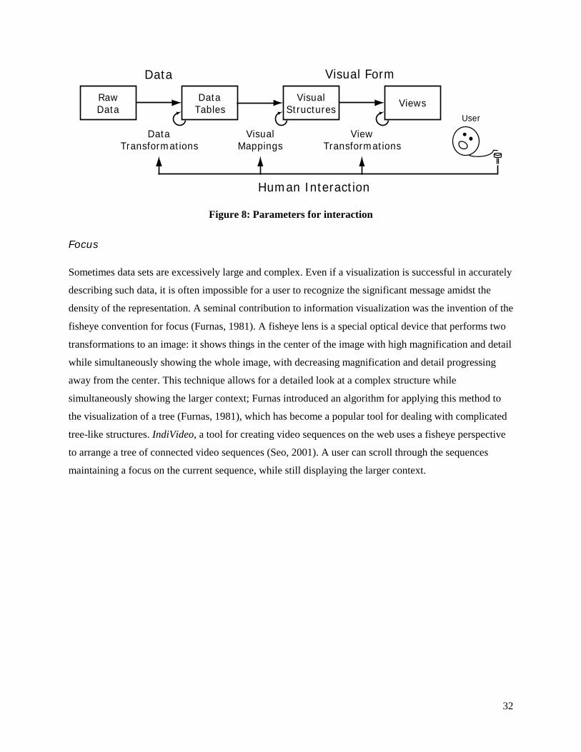
Focus
Sometimes data sets are excessively large and complex. Even if a visualization is successful in accurately
describing such data, it is often impossible for a user to recognize the significant message amidst the
density of the representation. A seminal contribution to information visualization was the invention of the
fisheye convention for focus (Furnas, 1981). A fisheye lens is a special optical device that performs two
transformations to an image: it shows things in the center of the image with high magnification and detail
while simultaneously showing the whole image, with decreasing magnification and detail progressing
away from the center. This technique allows for a detailed look at a complex structure while
simultaneously showing the larger context; Furnas introduced an algorithm for applying this method to
the visualization of a tree (Furnas, 1981), which has become a popular tool for dealing with complicated
tree-like structures. IndiVideo, a tool for creating video sequences on the web uses a fisheye perspective
to arrange a tree of connected video sequences (Seo, 2001). A user can scroll through the sequences
maintaining a focus on the current sequence, while still displaying the larger context.
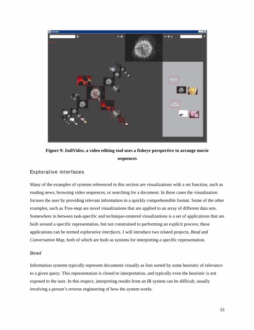
33
Figure 9: IndiVideo, a video editing tool uses a fisheye perspective to arrange movie
sequences
Explorative interfaces
Many of the examples of systems referenced in this section are visualizations with a set function, such as
reading news, browsing video sequences, or searching for a document. In these cases the visualization
focuses the user by providing relevant information in a quickly comprehensible format. Some of the other
examples, such as Tree-map are novel visualizations that are applied to an array of different data sets.
Somewhere in between task-specific and technique-centered visualizations is a set of applications that are
built around a specific representation, but not constrained to performing an explicit process; these
applications can be termed explorative interfaces. I will introduce two related projects, Bead and
Conversation Map, both of which are built as systems for interpreting a specific representation.
Bead
Information systems typically represent documents visually as lists sorted by some heuristic of relevance
to a given query. This representation is closed to interpretation, and typically even the heuristic is not
exposed to the user. In this respect, interpreting results from an IR system can be difficult, usually
involving a person’s reverse engineering of how the system works.

34
Bead is an alternative display for documents that uses the vector space model of information retrieval to
create a dynamic display of the similarities between documents (Chalmers & Chitson, 1992). Bead uses
the technique of physically modeling a network of springs to create a dynamic display of relationships;
each document is connected to all other documents by springs whose desired length is related to the
Euclidean distance between those documents in the original vector space (spring models are discussed at
length in chapter 4). Figure 10 is a snapshot in time of the simulation. The model is constantly updated,
giving an approximate view of relationships between the documents.
Figure 10: A document space in Bead
Users can then make queries to the system, as a standard information retrieval query. The results of the
query are exposed in the visualization, show in Figure 10 as darker numbers in the field. By using queries
to select documents, a user can explore the relationship between these documents; despite the reduction of
many dimensions down to only three, through interaction a user can come to understand the dynamics of
the documents in the original representation
Conversation Map
Sometimes a given representation or set of representations can convey a large number of analyses; instead
of describing the information through a simple visual mapping, several different views of the information
can be provided simultaneously. Warren Sack’s Conversation Map presents a number of linguistic and
social-dynamics representations in a single user interface (Sack, 2000). The domain of the visualization is
what Sack terms very large-scale conversations (VLSC), discussions with hundreds or thousands of
participants (i.e., newsgroups). Often these discussions have a specialized language and mode of
interacting, all of which can be found somewhere the body of the discussion. Sack takes the discussion
and parses it into a number of representations, including a semantic network of topics discussed, a
network of social interactions, sets of important themes, and trees for each individual thread of

35
conversation. Underneath each of these representations lies some set of linguistic or socio-analytic tools
used to build the representation, which is provided to the user at another level within the system.
Figure 11: Two levels of detail in the Conversation Map interface
The interface to the visualization is divided initially into 4 separate areas, shown in the first diagram of
Figure 11. In the top left corner is a spring-model visualization of the social interaction, i.e. who has
conversed with whom. In the center are general themes that have been extracted from the text, and in the
top right is a more distilled representation of the semantics of these themes. At the bottom of the interface
is a set of tiny visualizations of each thread of discussion within the entire group conversation. By
clicking on any individual thread, or set of threads, a similar style detail interface, as shown on the right,
is displayed.
In a fashion similar to n-Views, Conversation Map shows many different interconnected representations
simultaneously. As an explorative tool, the system provides an interesting form of interaction: when a
user clicks on a visual object, that object is analogously selected in other representations. For example, if
a set of people in the social network is selected, then every thread, theme and term in the semantic
network that those individuals have contributed to is highlighted. This allows a user of the system to
impose his or her own structure on the representations presented, integrating this structure with the rest of
the visualization. This type of interaction, which might be labeled expressive interaction, allows the
exploration of different theories about the representations through a system of expression and feedback.
36
Conclusion
Visualizing a representation is an easy way to understand it, given that the correct methodology is
observed in creating the visualization. Computers allow us to see data in new ways, extending the
possibilities of how we could visually represent things in the past; through space, interaction, and the
simple ease of manipulation, information visualization is a whole new paradigm for research. For this
thesis, the two systems presented in detail embody the sentiment of the explorative interface, using visual
techniques to create a general tool for understanding the nature of an unexplored representation.

37
4 Design
4.1 Motivation
Structuralism
Decentralized systems have become a subject of great interest in recent times, due to the recognition that
they play an important role in describing many natural phenomena. This trend comes from the realization
that some natural systems are difficult to model from the perspective of central control, but are simple to
understand from the viewpoint of an individual entity in the system (for a discussion and host of
examples, see (Resnick, 1994)). One of the most influential shifts in linguistics came from the
introduction of decentralized thinking now labeled structuralism. This theory, constructed from the
lectures of Ferdinand de Saussure, purports that the meaning of a word is not defined by a dictionary, or
its previous meaning, but instead by its relationships to other words in language usage.
Saussure divides the study of semantics into two fields of study: synchronic, focusing on understanding
the meaning of words at a given point in time, and diachronic, looking at how this meaning evolves. Until
his lectures in the early twentieth century (recounted in (Saussure, Bally, Sechehaye, & Reidlinger,
1983)), linguistics researchers had generally focused on diachronic analysis, using the history of a single
word to derive its current meaning. Saussure realized that there is no intentionality in language and that
changes in meaning usually occurred because usage changed, not because of other intervening
consequences. He advocated the use of structural analysis for synchronic study, focusing on
understanding words through their interrelationships with other words in a body of language.
Polysemy in classification
Most text classification systems’ performance is mitigated by the ambiguity of words. Standard classifiers
achieve the best performance when the features of the different categories are mutually exclusive; in this

38
case, it is easy to partition the space of instances with clear-cut boundaries. In the case that two categories
share similar important words, classifiers will commonly make mistakes unless the feature selection
algorithms place a higher emphasis on other features.
These faults are related to the canonical problem of polysemy, resulting from a lack of description by the
standard features of information retrieval. For people, this issue is resolved by looking at the surrounding
context of a word; when a word appears ambiguously, the words around it provide a finer detail of
definition in its interpretation. The fundamental hypothesis of this thesis is that this contextual
information should be part of the representation used by information systems associated with the task of
classification. This new set of features can be used by both computers and people to disambiguate the
vague and unclear cases that exist in typical information
In the following sections, I will retell the design process for creating a new representation for categorical
analysis, influenced by the tradition of structuralism. The semantic links that result from the coherence of
different concepts form the basis of this structural information necessary to disambiguate words; this
structure is extracted from the co-occurrence of concepts in a sentence, a lexical structure that guarantees
coherence between its terms. This new model of language was also fundamentally influential in the
construction of a visual tool for exploring relationships in large bodies of text. Although they are
described independently, these two undertakings were part of the same design cycle, with the goal of
presenting a new description for electronic text, both to computers as a new extensible structure and to
humans for visual investigation.
4.2 Synchronic imprints
Influence
The inability of automatic classifiers to understand different senses of the same term has a
representational basis; to these systems, the word “model” in the context of a model airplane instruction
manual has essentially the same meaning as the word ”model” in this thesis. To address this problem, a
representation that accounts not only for terms, but the relationships of the terms to each other seemed
like an appropriate solution. The initial attempts at building this model were inspired theoretically by
structuralist writings of Saussure, and also instrumentally by the representation used in the Galaxy of
News.
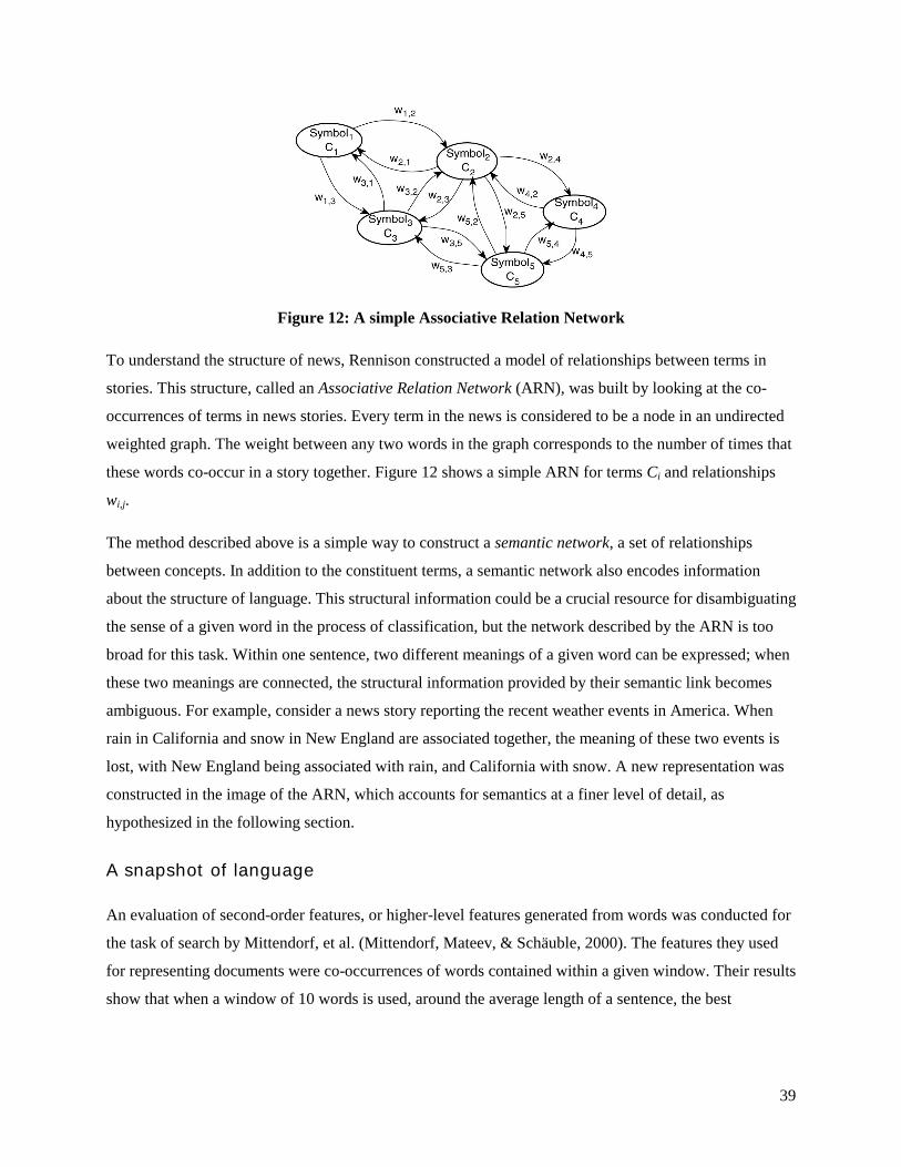
39
Figure 12: A simple Associative Relation Network
To understand the structure of news, Rennison constructed a model of relationships between terms in
stories. This structure, called an Associative Relation Network (ARN), was built by looking at the co-
occurrences of terms in news stories. Every term in the news is considered to be a node in an undirected
weighted graph. The weight between any two words in the graph corresponds to the number of times that
these words co-occur in a story together. Figure 12 shows a simple ARN for terms Ci and relationships
wi,j.
The method described above is a simple way to construct a semantic network, a set of relationships
between concepts. In addition to the constituent terms, a semantic network also encodes information
about the structure of language. This structural information could be a crucial resource for disambiguating
the sense of a given word in the process of classification, but the network described by the ARN is too
broad for this task. Within one sentence, two different meanings of a given word can be expressed; when
these two meanings are connected, the structural information provided by their semantic link becomes
ambiguous. For example, consider a news story reporting the recent weather events in America. When
rain in California and snow in New England are associated together, the meaning of these two events is
lost, with New England being associated with rain, and California with snow. A new representation was
constructed in the image of the ARN, which accounts for semantics at a finer level of detail, as
hypothesized in the following section.
A snapshot of language
An evaluation of second-order features, or higher-level features generated from words was conducted for
the task of search by Mittendorf, et al. (Mittendorf, Mateev, & Schäuble, 2000). The features they used
for representing documents were co-occurrences of words contained within a given window. Their results
show that when a window of 10 words is used, around the average length of a sentence, the best

40
performance is achieved. Why this is the case, they do not posit. To explain this phenomenon, I offer the
following hypothesis:
The sentence-semantics hypothesis: sentences are the largest lexical structure that guarantees semantic coherence.
This conjecture is based on the observation that sentences are made up of one or more syntactic structures
that are intentionally arranged to provide a higher-level meaning. While it is easy to find documents or
paragraphs with conflicting or incoherent semantics, it is very difficult to find a sentence that has this
attribute. Furthermore, a sentence that has this quality will merely sound nonsensical, so it can be
considered outside the realm of natural language. Consider the following examples:
“George W. Bush is a man. George W. Bush is a woman.”
“George W. Bush is a man and George W. Bush is a woman.”
In the first example, the author of the sentences is assumed to have a problem deciding the sex of George
Bush, implying contradictory semantics. However, in the second example, the semantic connection of
these two facts implies the inference that George Bush is, in fact, a hermaphrodite. Under this assumption,
the optimal window for building structural features is the sentence; this window maximizes the amount of
structural information while simultaneously assuring coherence.
A new representation of relational information based on this hypothesis and the method outlined by
Rennison was created. The purpose of this structure is to create a precise synchronic representation, such
that diachronic analysis may be performed by comparing different instances. This model is called a
synchronic imprint (SI); synchronic for its structural basis, and imprint referring to the fact that the actual
meaning has been removed. For instance, a connection between the terms “Simpson” and “guilty” does
not imply that O.J. Simpson murdered his wife, but simply that the two terms are structurally related in
some way (in this case, that O.J. is not guilty).
The process of creating synchronic imprints is outlined in the following paragraphs. First, the document
structure is broken into sentences. The concepts are then extracted by identifying the nouns in these
sentences. A few stages of information retrieval processing techniques to improve performance are
completed, and then finally the storage in one of two representations.
Sentence tokenization
The general algorithm for creating synchronic imprints starts with tokenizing the given text into
sentences. It has been shown that in the case of the Brown corpus, the simplest algorithm for finding
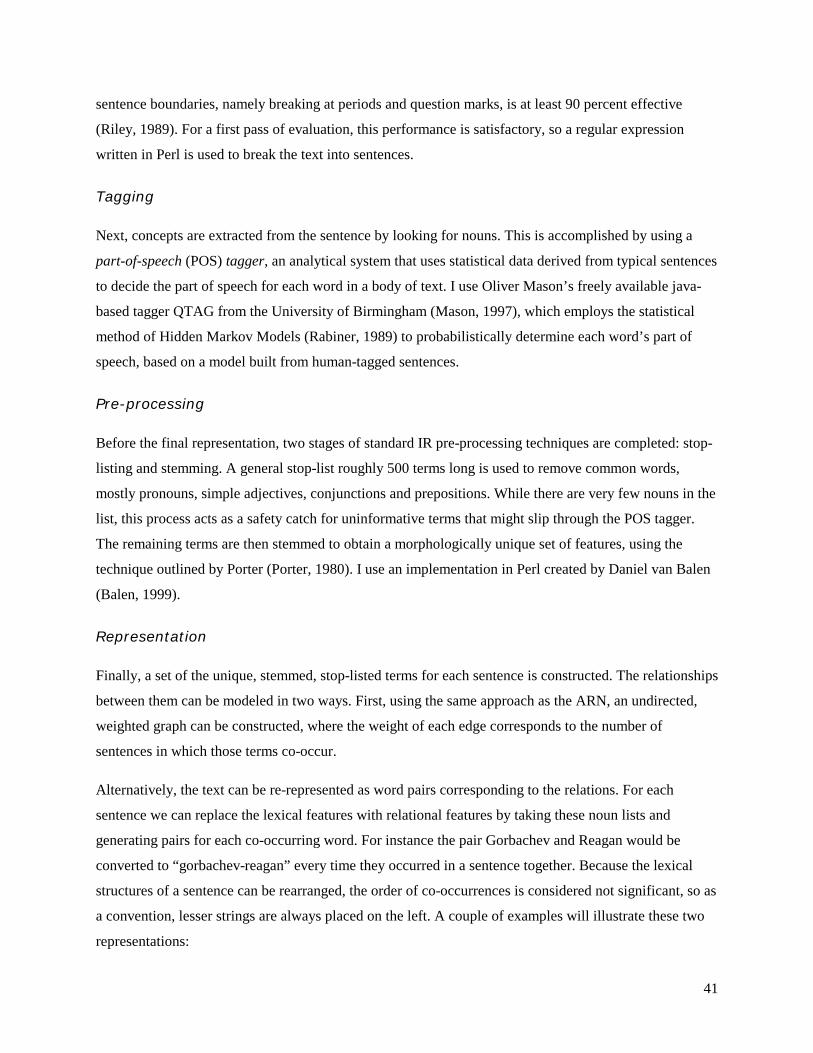
41
sentence boundaries, namely breaking at periods and question marks, is at least 90 percent effective
(Riley, 1989). For a first pass of evaluation, this performance is satisfactory, so a regular expression
written in Perl is used to break the text into sentences.
Tagging
Next, concepts are extracted from the sentence by looking for nouns. This is accomplished by using a
part-of-speech (POS) tagger, an analytical system that uses statistical data derived from typical sentences
to decide the part of speech for each word in a body of text. I use Oliver Mason’s freely available java-
based tagger QTAG from the University of Birmingham (Mason, 1997), which employs the statistical
method of Hidden Markov Models (Rabiner, 1989) to probabilistically determine each word’s part of
speech, based on a model built from human-tagged sentences.
Pre-processing
Before the final representation, two stages of standard IR pre-processing techniques are completed: stop-
listing and stemming. A general stop-list roughly 500 terms long is used to remove common words,
mostly pronouns, simple adjectives, conjunctions and prepositions. While there are very few nouns in the
list, this process acts as a safety catch for uninformative terms that might slip through the POS tagger.
The remaining terms are then stemmed to obtain a morphologically unique set of features, using the
technique outlined by Porter (Porter, 1980). I use an implementation in Perl created by Daniel van Balen
(Balen, 1999).
Representation
Finally, a set of the unique, stemmed, stop-listed terms for each sentence is constructed. The relationships
between them can be modeled in two ways. First, using the same approach as the ARN, an undirected,
weighted graph can be constructed, where the weight of each edge corresponds to the number of
sentences in which those terms co-occur.
Alternatively, the text can be re-represented as word pairs corresponding to the relations. For each
sentence we can replace the lexical features with relational features by taking these noun lists and
generating pairs for each co-occurring word. For instance the pair Gorbachev and Reagan would be
converted to “gorbachev-reagan” every time they occurred in a sentence together. Because the lexical
structures of a sentence can be rearranged, the order of co-occurrences is considered not significant, so as
a convention, lesser strings are always placed on the left. A couple of examples will illustrate these two
representations:
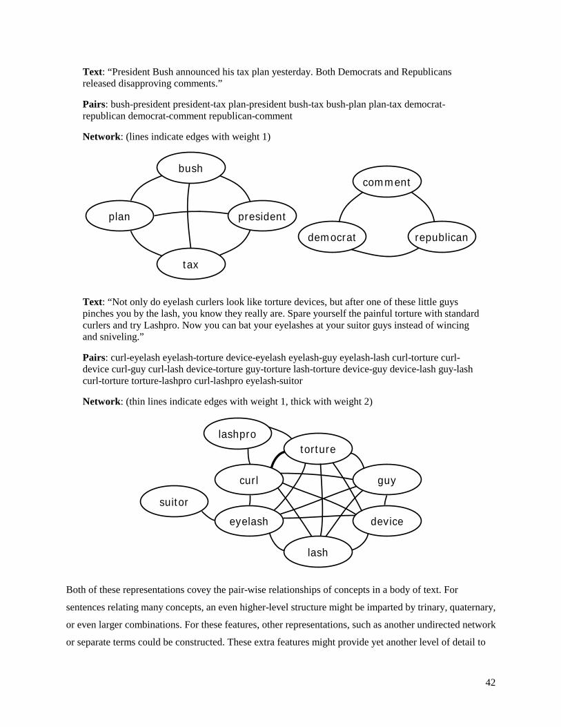
42
Text: “President Bush announced his tax plan yesterday. Both Democrats and Republicans released disapproving comments.”
Pairs: bush-president president-tax plan-president bush-tax bush-plan plan-tax democrat-republican democrat-comment republican-comment
Network: (lines indicate edges with weight 1)
bush
tax
presidentplan
democrat republican
comment
Text: “Not only do eyelash curlers look like torture devices, but after one of these little guys pinches you by the lash, you know they really are. Spare yourself the painful torture with standard curlers and try Lashpro. Now you can bat your eyelashes at your suitor guys instead of wincing and sniveling.”
Pairs: curl-eyelash eyelash-torture device-eyelash eyelash-guy eyelash-lash curl-torture curl-device curl-guy curl-lash device-torture guy-torture lash-torture device-guy device-lash guy-lash curl-torture torture-lashpro curl-lashpro eyelash-suitor
Network: (thin lines indicate edges with weight 1, thick with weight 2)
eyelash device
curl guy
torture
lash
lashpro
suitor
Both of these representations covey the pair-wise relationships of concepts in a body of text. For
sentences relating many concepts, an even higher-level structure might be imparted by trinary, quaternary,
or even larger combinations. For these features, other representations, such as another undirected network
or separate terms could be constructed. These extra features might provide yet another level of detail to
43
categorical comparison; this detail comes at the expense of a substantial increase in the number of
features necessary to represent language. As a first pass at relating structural information, only second-
order features were used. The addition of third and higher-level features is a platform for future
experimentation.
The network model shown above is a spatially optimized version of the pairs representation; they are
equivalent, as one can easily be generated from the other. The only advantage of the pairs is that they can
be seen as words in the context of standard information systems (more so if the dashes are removed). This
means that for in any existing information system, the structural information of synchronic imprints can
be added to the functionality by simply replacing the standard terms with SI terms. In the following
chapter, synchronic imprints will be evaluated as an alternative and added feature for automatic
classification systems.
Word sense disambiguation
Computational linguistics research defines polysemy as the task of word sense disambiguation (WSD).
Given a word with different possible meanings, the goal of WSD is to determine the given sense from the
surrounding context of the word. A number of different approaches to this problem are outlined in (Ide &
Veronis, 1998). The general methodology for addressing this problem is to break it into two stages:
1. Determine all of the possible senses for every relevant word to the text
2. Assign each occurrence of these words with the appropriate sense
An approach very similar to synchronic imprints is found in Marti Hearst’s system CatchWord (Hearst,
1991). Hearst uses a number of surrounding features, including words and syntactic structures to provide
a context for polysems. However, there is a fundamental difference between the WSD problem and this
thesis research, found in the formulation of the problem: WSD looks to build systems that very accurately
assign the correct meaning to a set of ambiguous words, typically looking for a mapping between
dictionary definitions and words in a body of text. A typical example would be the word ”bass,” which
can represent both fish and instruments.
Synchronic imprints on the other hand, look to provide a general context to all words, regardless of their
level of ambiguity. Instead of senses, imprints may be seen as providing context for uses, the more
general case of word meanings. Although they refer to the same sense, “bass” in terms of fishing guides
will have a very different usage than from Sierra Club literature. The difference between these two cases
could be an important factor in distinguishing documents about the topic of bass, which would be crucial
to their classification.

44
4.3 Flux
The network representation of a synchronic imprint inspired development in the space of information
visualization. Given the simplicity of the examples above, and the difficulty of understanding the
relationships between terms by looking at the pair lists, it was a natural conclusion to build a system to
help explore the relationships contained in an imprint. At the same time, such a system could used to
explore how such relational information might be used to better describe documents in comparison to, or
unison with the standard features of the text.
Motivation
A good starting point for visualizing text is an exploration of the standard vector-space model. The goal
of visualizing synchronic imprints is to provide an alternative interface to the sometimes-cumbersome
representation of electronic text. Many visualizations have used the vector-space model to show
discrepancies between documents, but few have addressed using this representation at the level of one
document.
Table 2: A simple visualization of terms from and issue of Time magazine
# term Frequency1 bush 98 2 school 97 3 abortion 92 4 people 71 5 work 69 6 state 67 7 drug 67 8 american 63 9 women 63
10 doctor 60 … … …
Table 2 shows the simplest visualization of a body of text, as seen through the vector space model. The
data is presented as a rank-ordered list of terms, sorted by the frequency of their co-occurrence. One could
also imagine using a plot to show the quantitative discrepancies in the data. Both of these visual
representations show the popular terms in a document, which can sometimes be important in discerning
the important subjects. In the case shown, taken from an issue of Time magazine which covered the topics
of political campaigns, school health, and an abortion drug, parts of each of these stories is conveyed in
the top 10 terms. What is missing is the structure: how does each of these terms interact to create a larger
story? This was motivating evidence that synchronic imprints could provide important information to
visually representing large bodies of text.

45
Methodology
The general design methodology for visualizing the information presented in synchronic imprints comes
from the pioneering work of Cleveland and McGill on the accuracy of perceptual tasks (Cleveland &
McGill, 1984). Based on a number of tests visualizing statistical data, Cleveland showed a marked
difference between the performances of subjects depending on the type of data and its graphical
presentation. From these results, they created a mapping between data types and presentation which
maximizes accuracy:
1. Quantitative: position, length, angle, slope, area, volume, density, color saturation, color hue, texture, connection containment, shape
2. Ordinal: position, density, color saturation, color hue, texture, connection, containment, length, angle, slope, area, volume, shape
3. Nominal: position, color hue, texture, connection, containment, density, color saturation, shape, length, angle, slope, area, volume
These rank ordered lists were used to decide the visual mappings employed in flux, always using the most
accurate, unused presentation when a new mapping was constructed.
Physical modeling
In interactive interfaces, physical modeling is a popular technique for representing information; this is
because people have an astounding amount of experience with the physical interfaces, and much less so
with computer ones. By making computer interfaces act more like things encountered in the physical
world, people bring an aptitude to the interaction that they otherwise would not have.
As mentioned, springs are a popular choice for interactive information displays; they were originally
introduced as a simple method for constructing a spatial layout of weighted networks (Eades, 1984). A
network is becomes a system of sprints simply by assuming that the edges are springs whose length or
tension is correlated with the weight of the edge connecting those nodes. The force on any one of the
springs is determined by how far it is from its resting state, described by Hooke’s Law:
kxF −= ,
where k is the natural property of the spring that determine its strength. An important attribute of this
force is that it affects the spring both when the spring is compressed (shorter than its desired length) and
when it is stretched (longer that its desired length). This means that at equilibrium, the ends of a spring
are some distance apart. Thus a system of springs at equilibrium will have nodes generally set apart from
each other, in a motionless state. This can be contrasted with other physical models, such as gravitation,

46
for which force only applies in one direction, and which varies at the square of the distance. In such a
model equilibrium occurs when all entities either collide or fall into some oscillatory motion (such as the
rotation of the earth around the sun).
Another important feature of spring models is that there are efficient algorithms for approximating spring
motion, which make them simple to implement and very fast. Such an algorithm was included as an
example program in an early version of the Java Developer’s Kit (Sun Microsystems, 1998), and has
inspired a number of spring-based interfaces, including Plumb Design’s Visual Thesaurus (Plumb Design,
1998) among others. The algorithm works as follows: for each spring s in the set of all springs S, adjust
the position of the two endpoints of that spring based on the current force on the spring. In this manner,
the system is iteratively updated, one spring at a time, indefinitely, or until some level of entropy has been
reached. This model has the side effect of creating unnatural oscillations; in a real spring system, all
springs would move concurrently, but as each spring is updated independently in this iterative model,
extra motion is introduced into the system, which causes nodes to overshoot their desired location
regularly. This side effect can be fixed by adjusting the constant on the springs, and adding a small
amount of dampening.
Visualizing synchronic imprints
A prototype visualization named flux was built using springs to model the relationships described by
synchronic imprints. The prototype was built in OpenGL and c++ for speed and efficiency. Initially, a
font rendering system from the Aesthetics and Computation Group (Aesthetics and Computation Group,
2001) was used to render the text of words at nodes; in later iterations, this was replaced by the FreeType
system (FreeType Project, 2000), an open source font-rendering library, for considerations of efficiency
and the ability to use TrueType fonts.

47
Figure 13: An early prototype of flux
Nodes in the network of synchronic imprints are words, and in the physical model of flux are considered
to be massless points. An immediate thought was to use frequency information about the words to set the
size of each term in the display. This allows attention to be drawn to the most important words in the
system, but gives a false impression of mass (i.e. large words look heavy). However, for large bodies of
text, it was necessary to place focus on some words, to bring some sense out of the mass. Using equal
sizes for the terms, in addition to using the relational information of the synchronic imprint to determine
size are were both considered later, and are included in the evaluation. The variance of term sizes gave an
appearance of depth to the system, which initially it did not have. Since the comparative advantage of
having interaction in the third dimension conflicted with the need for focus by different term sizes, the
model was constrained to a two-dimensional plane.
Co-occurring terms would be connected by massless springs, but two values would need to be decided
for each spring: both the strength of the spring, and the desired length. Three options were immediately
apparent:
1. Normalize the spring length. Make all springs a set length, and vary the strength of the spring
based on the relationships of the words. At equilibrium (if such a state exists), all words would be
48
equidistant from connected words, and only in movement of the system would the relationships
become apparent.
2. Normalize the spring strength. Give all of the springs the same constant, and vary the length of
the spring based on relationships. At equilibrium, the distance between words would predict
information about relationships.
3. Vary both values. Use information about co-occurrences to manipulate both the spring constant
and the length of the spring. These values could be either negatively or positively correlated,
depending on whether one wanted short springs to be stronger, or longer ones.
Since the goal of the visualization is to understand the relational structure of synchronic imprints, the
second option was implemented first, with the other two evaluated at a later time, and considered in the
evaluation. The first iteration of this model, as depicted in Figure 13, used a spring length inversely
related to the number of co-occurrences (i.e. more frequently co-occurring words would be pulled closer
together than less frequent ones), normalized by the maximum number of co-occurrences. The initial
layout of the nodes would be random, letting the springs move the system towards equilibrium.
After considerations to be discussed in the evaluation, it was realized that the spring length needed to be
normalized by the frequency of the connected terms, so the final model was based on the following
equation:
ba
baba cof
ffL
,,
),min(= ,
where f refers to the frequency of a term in the original text, and cof refers to the frequency of two terms
co-occurrence. When this modification was made to the model, the terms went from being equidistant (as
seen in Figure 13), to having their distance correlated more closely by relation (as in Figure 14). This
effect is discussed at length in the evaluation.

49
Figure 14: Flux with a new spring distance model
Visualizing connections
A crucial component of the flux visualization is the ability to recognize the existence, and additionally the
state of the springs. To facilitate this, edges are drawn in between connected terms, the color saturation of
which is determined by one of three models, corresponding to the order of images shown below:
1. Saturation is a polynomial function of the tension of the spring, brighter values corresponding to higher tensions. Below a certain threshold, the edge is invisible. This tends to place stress on only the springs in motion, as at a typical local equilibrium, most edges will be below the threshold.
2. Saturation is a linear function of the tension, and invisible below a threshold. This places emphasis on both the springs in motion, and those that are locked in a high-energy state, as the threshold is lowered.
3. Saturation is a constant function, unrelated to tension. This focuses attention on the complexity of the network, showing even those relations that are at their desired length.
Saturation was chosen since the information conveyed by the springs falls under the class of ordinal data,
as specified by (Cleveland & McGill, 1984).

50
Figure 15: Three models for edge brightness: polynomial, linear, and constant
Interactivity
Given the number of springs in the model, and its constraint to a two-dimensional space, it became
quickly evident that the system would never reach a perfect equilibrium. Furthermore, the intended
purpose of the visualization was to enable the exploration of relationships, which necessitated some level
of interactivity. After many iterations of design, three types of interactivity were implemented:
1. Local model control: using the mouse, a user could manipulate the model at a local level by fixing one of the terms to the mouse, and allowing them to move the term anywhere on the screen, and see how their local change affects the model as a whole.
2. Global model control: using various keys, a user can manipulate the global constants controlling the model.
3. Data model control: also using keys, a user can change the current data model to compare features between different bodies of text.
A complete users manual for flux is included as an appendix to this thesis, but some of the global features
available to the user include: adjusting the general spring constant, re-randomizing the model, pausing the
model update, and adjusting the maximum spring length.
Focus
One final feature that was added to flux recently was the ability to focus attention on a piece of the model.
This is accomplished by highlighting the word currently in mouse focus, and all words connected to that
word. In some sense, this is the most important feature, because it allows a user to truly explore the
relationships in complex set of associations that is otherwise difficult to parse. By adding the ability to
expand the focus to two or three connections from the focus word, the user is enabled to explore not just
the relationships that could be processed by merely listing all of the connected features for a word, but

51
how generally connected the word is to the rest of the network, the branching factor, and other curious
attributes.
4.4 Conclusion
Both elements of design for this thesis, the development of synchronic imprints and flux, were heavily
influenced by the task at hand. In the case of the synchronic imprints, this was the process of automatic
categorization, with the goal of achieving a level of accuracy comparable to a human counterpart. For flux
the problem being addressed was creating a metaphor for exploring these same categorizations visually.
While the development of both representations had a strong influence on the other, the most influential
source of guidance came from the evaluation and reiteration of design that came from benchmarking
synchronic imprints in automatic categorization, and actually using flux to explore visual categorization.

52
5 Evaluation
Synchronic imprints were built to provide a new level of detail to the analysis of electronic text; the focus
of this chapter is to establish the effectiveness of this representation. Separate evaluations were performed
for each part of the design, one evaluating the usefulness of synchronic imprints in existing information-
system infrastructure, and the other investigating the value of imprints as an analytical tool for people to
visually explore text. The computational evaluation takes a standard metric for analyzing information
systems, namely the measures of precision and recall, to compare synchronic imprints to the customary
word features in the context of the well-specified text categorization problem. The human evaluation is a
set of lessons learned while developing and displaying the flux visualization tool in its effectiveness for
understanding synchronic imprints and their functionality.
5.1 Synchronic imprints and automatic classification
Like many open problems in computer science, classification has become a rigorously defined topic space
with a comprehensive set of evaluation metrics. Over the past twenty years, the creation of standard
corpora and techniques for analyzing systems has allowed the performance bar for classification to be
iteratively raised. While the second half of my evaluation focuses on what the gain might be for people
interacting with synchronic imprints, this section adheres to the standards set down by the information-
retrieval community to understand the net return of this new representation.
Experimental setup
The most classic categorization test setup revolves around the Reuters-21578 corpus, as it is one of the
oldest and most challenging data sets available; for these reasons, variants of the corpus have been the
benchmark for evaluating text categorization systems in the past 10 years. In the past few years,
popularity of support vector machines (SVM) for classification tasks has unleashed a set of papers
benchmarking the new competitor against other systems (Joachims, 1998; Yang & Liu, 1999), all of

53
which have proclaimed SVMs a winner. In this section, I will introduce the experimental apparatus,
namely the support vector machine system SVMlight, the Reuters-21578 corpus, and the preparation of
synchronic imprints for the task of classification.
Reuters-21578
The Reuters-21578 corpus is a set of news stories that originally appeared on the Reuters newswire over
the course of 1987. The documents were hand categorized by employees of Reuters, formatted by David
Lewis and Peter Shoemaker, and released to the public in 1993 as the “Reuters-22173 distribution 1.0”
(the numbers refer to the number of total documents in the corpus). After a few years of testing and
evaluation, the corpus was reformatted to be less ambiguous, and exact duplicate stories removed,
establishing the Reuters-21578 distribution (Lewis, 1994).
Within this collection, there are a few different types of classes, but the standard set used for classification
research is one set of categories titled topics, a collection of economic subjects. Every classification
corpus is divided into two sets: one for training classification systems, and one for testing. I use the most
popular split, or division, of the Reuters-21578, known as the ModApte split (Apte, Damerau, & Weiss,
1994). The training set contains 9603 documents and the test set contains 3299, with the additional 8676
documents being unused.
After removing categories that do not contain at least one training and one test document, there are a total
of 90 categories in the ModApte split. Figure 16 shows the distribution of training documents among
these categories. This graph tells the story of the skewed nature of the Reuters collection. As noted in
(Yang & Liu, 1999), the largest category has 2877 test documents, while 82 percent of the categories have
less than 100. Most of these categories are related to commodity industries, such as corn, soybeans, and
natural gas, while a few represent more abstract classifications such as earnings reports, trade, and
acquisitions.
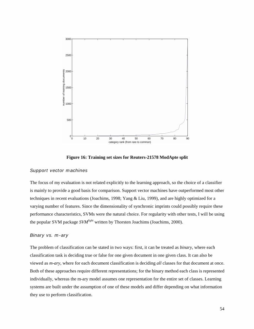
54
0 10 20 30 40 50 60 70 80 900
500
1000
1500
2000
2500
3000
category rank (from rare to common)
num
ber o
f tra
inin
g do
cum
ents
Figure 16: Training set sizes for Reuters-21578 ModApte split
Support vector machines
The focus of my evaluation is not related explicitly to the learning approach, so the choice of a classifier
is mainly to provide a good basis for comparison. Support vector machines have outperformed most other
techniques in recent evaluations (Joachims, 1998; Yang & Liu, 1999), and are highly optimized for a
varying number of features. Since the dimensionality of synchronic imprints could possibly require these
performance characteristics, SVMs were the natural choice. For regularity with other tests, I will be using
the popular SVM package SVMlight written by Thorsten Joachims (Joachims, 2000).
Binary vs. m-ary
The problem of classification can be stated in two ways: first, it can be treated as binary, where each
classification task is deciding true or false for one given document in one given class. It can also be
viewed as m-ary, where for each document classification is deciding all classes for that document at once.
Both of these approaches require different representations; for the binary method each class is represented
individually, whereas the m-ary model assumes one representation for the entire set of classes. Learning
systems are built under the assumption of one of these models and differ depending on what information
they use to perform classification.

55
The choice of a classification model is determined by the goal of the evaluation. If the goal is to compare
different learning techniques, such as some of the benchmarks used for this thesis, then the m-ary model
is chosen. In some senses, the m-ary model subsumes the binary, as binary classifiers can be used in an
m-ary representation, but not the reverse. If the evaluation’s goal is to focus on an individual learning
approach, the binary model is typically used (Lewis & Ringuette, 1994; Moulinier, Raskinis, & Ganascia,
1996), as each classification problem is mutually exclusive from the rest; this provides a better
experimental setup for comparison between classes. Since this thesis is not concentrating on approaches
to learning, with only one system being tested, the binary model will be assumed. Using this technique,
separate vector spaces will be constructed for each class, depending on the features important to that
class. The comparison of these feature spaces will be one metric for understanding the strengths and
weaknesses of each representation.
Document preparation
The Reuters-21578 collection is packaged as a set of SGML files tagged with appropriate information
regarding divisions, classes, and other attributes. The first stage of development for this evaluation was
the re-representation of the corpus into various formats necessary for testing. For the standard words
representation (words), terms in the documents were stop listed and stemmed, and for synchronic imprints
(SI), the documents were represented as SI-pairs using the algorithm described in chapter 4. A third,
hybrid representation (hybrid) was created to amalgamate both models, where each document was simply
constructed from the concatenation of terms in the same document in both other representations.
The next stage of development was to determine the features for each category. The χ2 feature-selection
algorithm was employed, based on its performance in evaluations of feature selection for the task of text
categorization (Yang & Pedersen, 1997). For each class, a list of terms was created from the training
documents, rank-ordered by the χ2 algorithm, including the dual representation of the hybrid model.
These feature lists were recorded to disk for use in the learning and classification tasks, and for reference
in analyzing the features important to each class.
The final stage of data transformation was in the conversion of test and training documents to the
representation used by SVMlight. For each class, the classifier was trained at different dimensionalities, or
using different numbers of terms to represent the documents. If the specified number of dimensions is n,
then the first n terms from the given category’s feature list was used to represent the document. As
suggested in (Joachims, 1998), the inverse document frequency, a value based on the frequency of a word
in other documents, was used to scale the dimensions. For each term ti, the document frequency DF(ti) is

56
the number of documents in the corpus that ti appears in. From this value the inverse document frequency,
is defined by:
=
)(log)(
ii tDF
ntIDF .
This value, first introduced by Salton (Salton & Buckley, 1988) is typically used for stressing important
terms in other applications of the vector-space model. The representation created for the classifier was
simply a list of the frequencies of its terms, scaled by this factor.
Evaluating text categorization
Precision and recall
The standard means for evaluating information retrieval algorithms are the measures of precision and
recall. These two statistics represent the tradeoff between specificity and coverage. Figure 17 is a
representation of this measurement applied to the domain of classification.
Figure 17: Precision and recall. T is the set of all test documents, B is the set in a
given class, A the set predicted by a classifier, and C is the intersection of A and B.
In the diagram, T is the set of all test documents, B is a set of documents in a given class, A is the set
returned by the classifier, and C is the set of correctly classified documents (the intersection of A and B).
If the cardinality of set A, or the number of elements in A is denoted by |A|, then we can define precision p
and recall r by the following equations:
AC
p = BC
r = .
Since C is at most the size of the smaller of A or B, then precision and recall fall in the range of [0,1]. In
most information retrieval systems, these two values can be changed by adjusting parameters within the

57
system; in most cases, these variables have an affect on the scope of the returned documents. Figure 18
shows the tradeoff between precision and recall, where in the first case a system is adjusted to provide
high precision and the other high recall.
Figure 18: High precision vs. high recall
Combining the two
Because of this variability, precision and recall are not usually considered good measurements by
themselves. Instead, two alternatives have become popular: the precision-recall breakeven and the F-
measure. In the case where there is a clear correlation between some variability in the system and a
performance/recall tradeoff, the precision-recall breakeven point is usually used. This is the point at
which precision and recall are the same, providing a single score that relates the two values together.
Sometimes variability of precision and recall is not a simple task, in this case, an alternate measurement
known as the F-measure has been created to relate precision and recall:
rprpF+
= 2
This measurement was introduced by van Rijsbergen (van Rijsbergen, 1979) in reference to the problem
of search but has become a popular metric for evaluating classification systems.
For my evaluation, I will use the F-measure as a metric for effectiveness of classification. My evaluation
is comparative, and my benchmark is Yang’s comparative analysis that also uses this measure (Yang &
Liu, 1999). Since the feature spaces of both words and synchronic imprints vary widely, I am testing
different size feature spaces for each class, with the final measure being designated as the feature space
that produced the maximum F-measure. Further testing could be done to determine the precision-recall
breakeven point at this number of features, but for a comparative analysis, the F-measure will suffice.
Averaging over many categories

58
Typically the evaluation of classification systems is done over a set of categories, and thus the results
from each category must be merged into a global measurement of overall performance. There are two
standard ways of combining the results: micro- and macro-averaging. The first measurement looks at the
performance of the system globally, considering all of the categories as one set of decisions. From these
decisions, the overall precision, recall and F-measure are calculated. The second method is simply to
calculate each category performance individually, and then average those scores into one value.
For most corpora, the set of categories is not distributed uniformly, and the Reuters-21578 corpus
demonstrates such skewing. In this distribution of category sizes, the micro and macro averages produce
very different scores. If the micro-average is used, a weight is placed on the performance on the larger
categories, and if the macro-average is used, a weight is placed on the smaller ones. For this evaluation,
each class is an example, and thus micro-averaging the results in a loss of information. Macro-averaging
is used whenever comparisons are made, but results are usually broken into groupings based on the size of
categories, so that overall results are not skewed.
SI-space
What does the space of synchronic imprints look like? Before jumping into a comparative analysis of
results, I will explore the fundamental differences between imprints and words. Building synchronic
imprints involves a combinatorial explosion in the number of terms associated with a document; each set
of nouns in a sentence is replaced by all combinations of those nouns in two-word pairs. In the Reuters-
21578 corpus, after the initial preparation (stemming and stop listing), there are 13,821 unique nouns in
the training set, which accounts for 67.5 percent of all terms. If the set of features for representing
documents included every pair of these nouns, there would be roughly
95,503,110!819,13!2
!821,132821,13
==
dimensions to represent the documents. Simply accounting for all of the strings associated with these
dimensions would take a considerable amount of storage. Thankfully, the actual number of dimensions in
the synchronic imprint representation is 459,055, over two orders of magnitude smaller than the upper
bound. As with the normal words, nearly half of these dimensions go away if we remove the terms that
have only one instance in the corpus.
The fact that only 0.5 percent of the possible dimensions are accounted for experimentally points to a key
feature of synchronic imprints. Every possible pair of nouns that is not represented as a feature represents
a semantic connection that does not exist. While the initial explosion of 20,000 by a factor of 20 seems

59
expansive, it is tiny in comparison to the set of all possible combinations. Each of these combinations
results in a new feature whose meaning is more specific than the sum of its constituents. For instance,
take the words “scandal” and “Clinton,” each of which is a general term that might appear in many news
stories, but together form a feature very specific to Bill Clinton’s private life. This increase in specificity
creates a reduction in the average frequency of a term, down from 33 times in the Reuters corpus using
words to 3 times using synchronic imprints.
100 101 102 103 1040.5
0.55
0.6
0.65
0.7
0.75
0.8
0.85
0.9
# of features
aver
age
% s
ynch
roni
c im
prin
ts
Figure 19: SI features selected in the hybrid model
Given that these two representations, words and synchronic imprints, have very different distributions and
numbers of terms, what then does the hybrid model look like? As noted earlier, the hybrid is simply a
combination of both sets of terms, and thus the complete vector space is merely the sum of the two
separate vector spaces. Before classification is performed though, this hybrid space is reduced to the
necessary number of dimensions by the feature selection algorithm, choosing some subset of words and
synchronic imprints. This selection is made without regard to the origin of the words; instead it is defined
by the importance of each term to the task of classification. One interesting measurement that falls out of
this model is the relative importance of each feature type to the importance of the class, which can be
measured by the percentage of terms from that type in the feature list.

60
Figure 19 shows the distribution of synchronic imprints in the hybrid model. For a given number of
features n, the percentage of synchronic imprints in the top n terms averaged across all feature lists is
recorded. Over the entire set of lists, the smallest average percentage of imprints is 50 percent, recorded
with only one feature. As we follow the values towards 100 features, the plot increases. It then decreases
between 100 and 2500 terms. This phenomenon, “tiers” of terms, is related to the χ2 feature-selection
algorithm (remember that the χ2 value of a term is related to the dependence of that term on a given
category). As shown in Figure 19, the overall dependence of words terms and synchronic imprints terms
appears to oscillate, starting with words, shifting to imprints, and then back to words again.
100 101 102 103 104-500
0
500
1000
1500
2000
2500
3000
3500
4000
feature #
aver
age
chi-s
quar
ed
wordssynchronic imprintsdifference
Figure 20: Average χχχχ2 by feature list number
This effect can be described by the relationship between the χ2 feature-selection algorithm and both
methods. Figure 20 shows the average χ2 values for the feature lists of words and imprints, i.e. feature 10
corresponds to the average value across all categories for the 10th item in the χ2 feature list. This plot,
which is shown on a logarithmic scale, shows an order of magnitude difference between the fall off of
values in the models. This difference can be described by the number of features associated with each
category. The baseline for χ2 values is very close to zero, which typically results from a term not
occurring in the given category. Due to the explosion of terms created by SIs, each category will have

61
around twenty times the number of unique terms, causing the χ2 value to fall off much more slowly,
reaching the baseline an order of magnitude later than with words.
Results
Classification tests were run for spaces of dimensionality 25, 50, 100, 250, 500, 1000, 2500, 5000, and
10000. The maximum F-measure for each category was recorded, and in the case that the same F-measure
was found for multiple dimensionalities, the smallest was logged. These results were macro-averaged to
obtain an overall performance measure for each technique, and are logged in Table 3.
Table 3: Performance summary of different methods
representation macro-p macro-r macro-F macro-p 60 macro-r 60 macro-F 60 benchmark 0.5251
words 0.4961 0.6071 0.5460 0.5862 0.7331 0.6515 synchronic imprints 0.5830 0.5184 0.5488 0.7676 0.6844 0.7236
hybrid 0.6350 0.5387 0.5829 0.8067 0.6828 0.7396
1 2 3 4 5 6 7 8 90
0.1
0.2
0.3
0.4
0.5
0.6
0.7
0.8
0.9
category group (by training set size)
mac
ro-a
vera
ged
f-mea
sure
wordssynchronic imprintshybrid
Figure 21: macro-averaged f-measure in groups of 10 (from rare to common)
The results shown in Table 3 show a words macro f-measure slightly higher than Yang (Yang & Liu,
1999), recorded in the table as “benchmark.” This can probably be accounted for by either the use of a
binary classification model or by slight differences in the feature preparation process. The first f-measure
62
accounts for all 90 categories and shows a marked performance difference between words and hybrid.
Synchronic imprints performed very poorly in categories that had very few documents (< 10 training
documents), usually scoring zero correct positive classifications. In many of these cases, there was no
overlap between the synchronic terms in the training set and in the test set, which is inevitable with a
more descriptive representation. For this reason, the macro f-measure was calculated for only the top 60
categories, or those with at least 10 training documents. This statistic shows a large gap in performance
between the standard word representation and synchronic imprints.
To get a feeling for how the frequency of documents affects the success of the different models, Figure 21
shows the macro-averaged f-measures for groups of 10, arranged from the smallest categories to the
largest. Once the threshold of 10 training documents is crossed, both synchronic imprint and hybrid
models outperform words in every group.
Analysis
The results of the Reuters-21578 corpus are easy to distinguish but have yet to be substantiated. Why, in
some cases, do synchronic imprints outperform words, and why in others is the reverse true? To analyze
the representations, three categories were isolated for both cases by finding the bounds of the following
equation for category C:
))()(( CFCFCdiff siw −×=
where Fmethod denotes the f-measure for method. At the bounds of this value are large categories with a
significant performance differences between synchronic imprints and words. The top three and bottom
three categories are listed in tables 2-7, showing the top 15 terms ranked by χ2 for each representation, the
maximum f-measure, and number of features used for the maximum. While these features (terms, f-
measure, optimal dimensionality) are not guaranteed to explain the results, they will be used to create a
hypothesis. It is worthwhile to note that these tables expose some of the errors propagated in the creation
of synchronic imprints, such as the misconstrual of “rose” as a noun in table 5, but they are nonetheless a
useful tool for analyzing the results.
In each of the following tables, the maximum f-measure is displayed beneath the category title. This
measure was achieved at some number of dimensions between 25 and 10,000. However, the
dimensionality of the categories did not have a significant impact on the performances in comparison. In
each case, the f-measure at the smallest number of dimensions (25) was comparable to the one listed, but
for consistency, the maximum is shown.

63
The constraints of concepts
Synchronic imprints are constructed from the relationships between concepts in a body of text, and as one
might expect, some categories have important features that are not concepts. The two weakest categories
for synchronic imprints come at the expense of focusing on concepts (nouns). Tables 2 and 3 report a
poor performance for imprints in the categories earn and acq; it is first important to note that both the
words and hybrid models achieved similar f-measures with very few features (25), despite the fact that
their highest performance was with a large dimensionality. On this measure, the top 15 terms should be
good discriminators of why the performance varied so much.
Earn is composed of earnings reports from various companies and industries, which are released
whenever there is a change in a company’s assets. The high frequency of these reports has led to the
creation of a standard set of abbreviations for the specific terminology. Table 2 lists the top 15 terms from
the feature lists of the respective representations. Nine of the top 15 words terms are earnings report lingo,
such as ”shr” for shares and “rev” for revenue. Of these nine terms, many are removed in the process of
isolating nouns; some do not appear at all, such as the most important word feature “ct,” and others are
considered nouns only in certain contexts. Since these defining features are not represented in synchronic
imprints, the performance is hindered. The hybrid representation regains some performance by placing
emphasis on these word terms.
Table 4: Feature lists for the category of earnings reports (earn)
earn χ2 earn si χ2 earn hybrid χ2
0.964 0.769 0.961 ct 5491 shr-year 1275 ct 5491 shr 4052 loss-year 1232 shr 4052 net 3931 rev-shr 1207 net 3931 qtr 3224 loss-profit 1188 qtr 3224 rev 2593 loss-rev 1181 rev 2593 loss 1791 loss-shr 999 loss 1791 4th 1574 rev-year 994 4th 1531 profit 1388 dlr-loss 893 profit 1388 div 1275 profit-year 815 shr-year 1275 dividend 1231 profit-rev 721 div 1275 prior 971 dlr-rev 719 loss-year 1232 record 961 dlr-shr 707 dividend 1231 qtly 961 loss-oper 637 rev-shr 1207 avg 951 dlr-profit 573 loss-profit 1188 note 852 profit-shr 573 loss-rev 1181
An analogous case can be found in acq, the category describing corporate acquisitions. Because the
category represents a process (acquiring), many of the defining word terms are verbs: “acquire,” “buy,”

64
and “complete,” all have higher χ2 values than the first-ranked synchronic imprint, and are discarded by
the part-of-speech tagger. It is important to keep in mind that this is not a disadvantage of synchronic
imprints, rather a difference in representation that determines strengths and certain weaknesses. In the
case of classes that depend on a highly specialized set of abbreviations (earn) or are associated with a
process (acq), it happens to be a weakness.
Table 5: Feature lists for the category of acquisitions (acq)
acq χ2 acq-si χ2 acq-h χ2
0.904 0.886 0.889 acquir 1991 share-stake 520 acquir 1991 stake 1243 corp-share 509 stake 1243 acquisit 1195 offer-share 445 acquisi 1195 merger 952 group-share 418 merger 952 share 841 exchang-share 380 share 841 compani 762 commis-share 379 compani 762 sharehold 724 cash-share 372 sharehold 724 bui 628 approv-subject 356 bui 628 undisclos 550 compani-merger 341 undisclos 550 complet 549 exchang-file 336 takeov 532 takeov 532 secur-share 336 share-stake 520 common 509 acquisi-corp 332 common 509 group 499 commis-file 322 corp-share 509 ct 480 group-stake 321 group 494 corp 460 group-investor 317 ct 480
Coping with polysemy
One of the purported strengths of synchronic imprints is that it provides context to terms that are
otherwise ambiguous. Two of the top performing categories for synchronic imprints are related to the
ambiguous term “money.” The first, money-fx covers the topic of foreign exchanges, while the second,
money-supply, contains stories about shifts in the currency market. In both of these categories, the term
“money” is in one of the distinguishing words, despite the fact that is ambiguous. This ambiguity is
resolved by synchronic imprints, which represent the same frequency of “money” with two separate
relationships: “money-market,” and “money-supply.” Other contexts of the term money appear as well,
such as “london-money” and “england-money” in the case of money-fx and “growth-money” for money-
supply. In both cases these terms are considered much more significant in terms of feature selection, and
make up a large percentage of the hybrid terms.

65
Table 6: Feature lists for the category of foreign financial markets (money-fx)
money-fx χ2 money-fx si χ2 money-fx hybrid χ2
0.596 0.656 0.644 currenc 1604 market-monei 1799 market-monei 1799 dollar 1585 london-monei 1716 london-monei 1716 england 1134 bank-market 1649 bank-market 1649 interven 1121 england-market 1403 currenc 1604 monei 1058 dollar-yen 1363 dollar 1585 central 907 bank-england 1326 england-market 1403 shortag 883 england-monei 1288 interven 1382 bank 865 bank-stg 1258 dollar-yen 1363 dealer 856 monei-stg 1255 bank-england 1326 yen 842 london-market 1174 england-monei 1288 intervent 826 shortag-stg 1152 bank-stg 1258 market 753 bank-shortag 1151 monei-stg 1255 band 746 england-stg 1151 london-market 1174 assist 641 exchang-rate 1148 shortag-stg 1152 stabil 584 market-stg 1104 bank-shortag 1151
Table 7: Feature lists for the category of the currency market (money-supply)
money-supply χ2 money-supply si χ2 money-supply hybrid χ2
0.429 0.613 0.619 monei 850 monei-suppli 2175 monei-suppli 2175 fed 756 monei-rise 1681 monei-rise 1681 suppli 750 dlr-week 1447 dlr-week 1447 m3 731 monei-rose 1424 monei-rose 1424 m1 413 dlr-monei 1282 dlr-monei 1282 narrowli 356 growth-monei 1052 growth-monei 1052 m2 346 monei-week 1026 monei-week 1026 reserv 343 rose-suppli 1015 rose-suppli 1015 chequabl 338 reserv-week 954 reserv-week 954 defin 332 billion-suppli 954 billion-suppli 954 week 326 growth-suppli 834 busi-loan 947 m0 301 monei-reserv 802 billion-monei 901 window 297 borrow-week 772 monei 850 grew 293 bank-suppli 760 growth-suppli 834 deposit 291 borrow-discount 683 monei-reserv 802
Trading off
In each of the cases observed so far, there has been a direct correlation between the χ2 value of a term and
the value of that term in classifying documents in the given class. For earn and acq, the value of χ2 for the
words terms was significantly higher than those of synchronic imprints, predicting a better classification
by words, and for money-fx and money-supply, the same was true for SIs. For the entire corpus, this is not
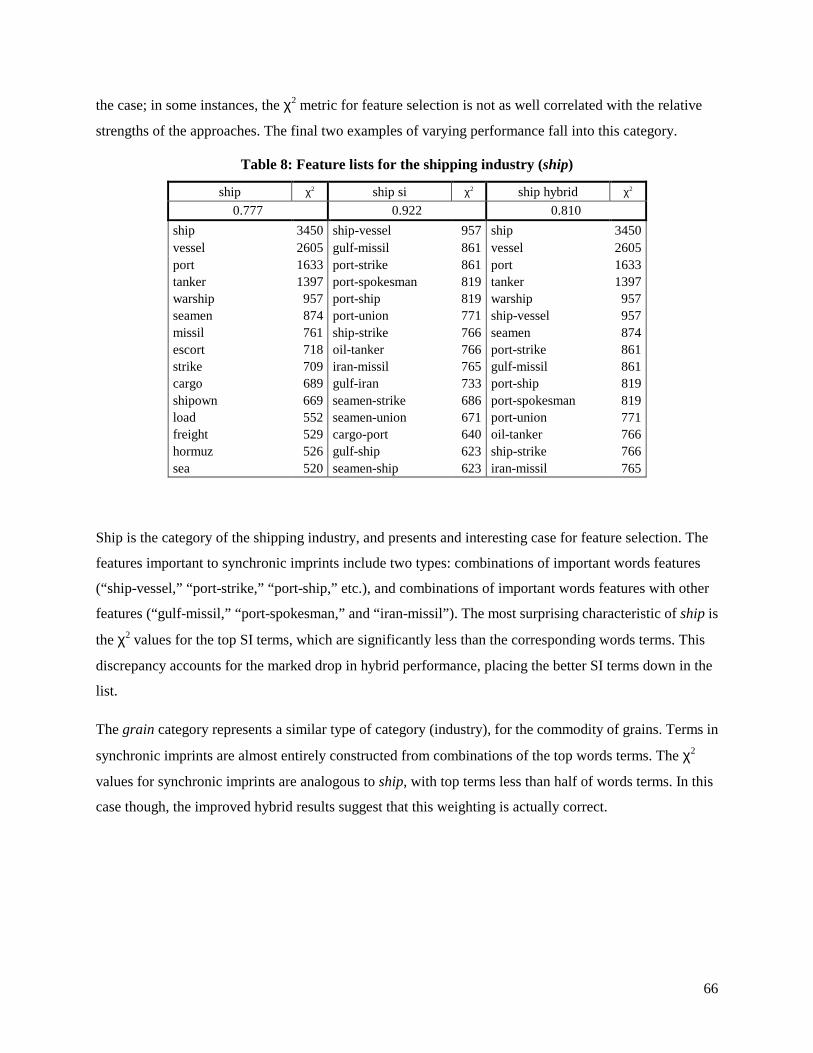
66
the case; in some instances, the χ2 metric for feature selection is not as well correlated with the relative
strengths of the approaches. The final two examples of varying performance fall into this category.
Table 8: Feature lists for the shipping industry (ship)
ship χ2 ship si χ2 ship hybrid χ2
0.777 0.922 0.810 ship 3450 ship-vessel 957 ship 3450 vessel 2605 gulf-missil 861 vessel 2605 port 1633 port-strike 861 port 1633 tanker 1397 port-spokesman 819 tanker 1397 warship 957 port-ship 819 warship 957 seamen 874 port-union 771 ship-vessel 957 missil 761 ship-strike 766 seamen 874 escort 718 oil-tanker 766 port-strike 861 strike 709 iran-missil 765 gulf-missil 861 cargo 689 gulf-iran 733 port-ship 819 shipown 669 seamen-strike 686 port-spokesman 819 load 552 seamen-union 671 port-union 771 freight 529 cargo-port 640 oil-tanker 766 hormuz 526 gulf-ship 623 ship-strike 766 sea 520 seamen-ship 623 iran-missil 765
Ship is the category of the shipping industry, and presents and interesting case for feature selection. The
features important to synchronic imprints include two types: combinations of important words features
(“ship-vessel,” “port-strike,” “port-ship,” etc.), and combinations of important words features with other
features (“gulf-missil,” “port-spokesman,” and “iran-missil”). The most surprising characteristic of ship is
the χ2 values for the top SI terms, which are significantly less than the corresponding words terms. This
discrepancy accounts for the marked drop in hybrid performance, placing the better SI terms down in the
list.
The grain category represents a similar type of category (industry), for the commodity of grains. Terms in
synchronic imprints are almost entirely constructed from combinations of the top words terms. The χ2
values for synchronic imprints are analogous to ship, with top terms less than half of words terms. In this
case though, the improved hybrid results suggest that this weighting is actually correct.

67
Table 9: Feature lists for the category of the grain commodity (grain)
grain χ2 grain si χ2 grain hybrid χ2
0.892 0.826 0.921 wheat 4559 tonn-wheat 2054 wheat 4559 grain 3611 agricultur-depart 1623 grain 3611 corn 2426 export-wheat 1470 corn 2426 agricultur 2171 grain-tonn 1280 agricultur 2171 usda 1785 wheat-year 935 tonn-wheat 2054 tonn 1667 export-tonn 893 usda 1785 crop 1307 agricultur-wheat 872 tonn 1667 maiz 1065 corn-tonn 870 agricultur-depart 1623 barlei 1041 grain-wheat 829 export-wheat 1470 farmer 831 grain-year 809 crop 1307 rice 754 program-wheat 808 grain-tonn 1280 soviet 687 market-wheat 787 maiz 1065 bushel 665 crop-wheat 765 barlei 1041 soybean 653 enhanc-export 722 wheat-year 935 ussr 637 grain-trade 703 export-tonn 893
The clearest observation of these analyses of grain and ship is that the χ2 metric is not perfect at
predicting the importance of a term to classification. This score is normalized and should be comparable
across models; in the case of grain, this discrepancy between models produced an increased performance
in the hybrid model, whereas in the ship category, it resulted in a decline. This suggests that the different
levels of detail provided by words and synchronic imprints are not equivocally analyzed by the given
feature selection, and that for the optimal results in a hybrid scenario, a different model of recombination
would be necessary.
Conclusion
The successes of synchronic imprints in the task of automatic classification far exceeded what was
originally expected. SIs provide a level of description I thought might be useful in some circumstances,
but at the expense of generality, which was assumed to be equally important. Furthermore, about one
third of all word terms are discarded in the creation of synchronic imprints (this includes verbs,
adjectives, and unrecognized parts of speech), which in some cases, for example acq and earn were
crucial to understanding the class, but in most did not seem to adversely affect performance. In classes
where non-nouns were important, a simple combination of both representations often performed better
than either representation.
Synchronic imprints provide an intermediate representation, between the lowest-level atomic features of
text and the high-level conceptual structures that define its semantics. Using the customary evaluation
measures, it was shown that this new level of description could be a useful tool for computers performing

68
automatic classification. Furthermore, through an analysis of the best and worst cases, the strengths and
weaknesses of the SI approach were revealed. In the words case, synchronic imprints are hindered by the
inability to account for categories that are strongly influenced by process, dependent on verbs for
definition. In the best case, words that were insignificant or ambiguous were combined in synchronic
imprints to create new features that defined a particular category. Overall, synchronic imprints are an
exploration into representations alternative to the standard bag-of-words approach that dominate
information retrieval.
5.2 Visual design for relational information
The second part of this evaluation is an inquiry into how the new representation of synchronic imprints
might be used by people. Obviously, information systems using SIs to perform various tasks are useful to
people, but as outlined in chapter 3, representations themselves can be transformed into extensible tools
with an appropriate interface. The interface in question here is the spring-model visualization flux
developed to explore synchronic imprints.
Information visualization is a relatively new field and has yet to agree on a standard set of evaluation
metrics. This is in large part because people working in the domain of visualizing information come from
varied disciplines and work with substantially different models. To evaluate flux, I am choosing to look to
the work of AI researchers from the 1970’s, a time when the field was also a budding discipline without
formal structure. Evaluations from that period are introspections into the development and refinement of
the systems in question, and all of the lessons learned in the process.
An alternative would be to use the techniques of the human-computer interaction community, looking at
how using flux for a particular task is enabling, by comparing some measure of a person’s effectiveness at
the task with and without the tool. However, this thesis is about a representation that is not tightly coupled
with one specific task. Evaluating it on such a task would be at the expense of describing some of the
lessons I have learned while building flux. The initial goals of flux were threefold:
1. To create a visual representation that accurately describes and distinguishes the underlying text.
2. To create a visual model that evokes the larger structural relationships in the concepts that exist above the micro-interactions of terms.
3. To create a system in which explicit relationships between words can be comparatively analyzed.
To evaluate flux, I will reflect upon the design rationale that went into its construction and the
effectiveness of the final product.

69
For experimentation, Time Inc. was generous to donate a corpus of Time magazine in digital form. This
substantial body of text constitutes the time range of 1985 until the present, with each issue accounted for.
This corpus was visualized at the level of one issue of Time, with all of the stories represented in one
visual form. This level of detail was chosen because of the focal nature of the magazine itself; generally
each issue contains two or three major themes, with varying stories on each topic. This allows for an
analysis along two dimensions, both at the micro-level, looking at the interrelationships between
individual words, and at a macro-level, looking for the partitioning of the sets of words into these
thematic groups. Most of the visualization variables (spring lengths, word sizes, and color intensity) were
adjusted to bring out these two levels of investigation, which are highly related to the corpus chosen,
knowing they would need to be altered in order to provide the same performance for another set of text.
Recognition
Text can be an impenetrable interface to knowledge at times, as most of the information occurs at the
same level of visual description. Most of us have had the experience of remembering that a piece of text
exists, but not being able to find it among the entire body. This attribute of recognition is a limiting factor
to people’s ability to categorize text. In the case of standard objects, the important features can be
recognized immediately, e.g. organizing your wardrobe can be accomplished with little attention. This
discrepancy between text and objects has to do with our ability to easily recognize the important features
for classification; since synchronic imprints were being used to accomplish the same task for automatic
classifiers, it seemed like a natural extension to use them visually for the same purpose. I hoped to give
text a visual signature that enabled the rapid recognition of the underlying concepts.
In the initial design, I assumed two visual features would be important for conveying the structure of
information: the size of words and their distance from each other. In other systems that use spring
systems, such as Fry’s Valence (Fry, 2000), Chalmer’s Bead (Chalmers & Chitson, 1992) or the Visual
Thesaurus (Plumb Design, 1998), the size of all nodes are equal. I assume that this model was chosen to
focus attention on the relationships, instead of on any individual node. In the case of recognizing a certain
text, the nodes of flux (namely the words) were assumed to be an important feature. For this reason, the
size of the words was varied by the frequency of the word, a feature that directly related to a word’s
significance in that text.
In this sense, the visualization had two separate representational goals: to describe the relative weight of
terms, and expose the overall structure of the text, size was varied to give visual prominence to frequency.
Synchronic imprints were used to lay out the terms spatially by creating a model for their interaction. The
result was the separation of the cognitive task associated with different parts of recognition. The first task

70
is to recognize the important concepts, i.e. the ones that are the focus of the text. The second task is to
look at these concepts and determine the significant relationships, or lack thereof.
The initial implementation of flux was successful in this task, providing a good lens for the Time corpus.
In most cases the particular foci of the issue were immediately recognizable by the largest terms in the
system, and given that people were familiar with the topics, they could piece together the actual themes
by exploring the relationships.
At one point it was suggested that the relational information extracted from the network be used to define
the size of terms, instead of the frequency. Although many terms might appear frequently, this usage is
not necessary correlated with co-usage. For instance, the terms “George” and “Bush” may appear very
frequently, but “Bush” will probably occur more often with other words than “George.” From this
conceptualization, three new parameterizations of the word size were created: the connectedness of a
term, the difference between connectedness and frequency, and the inverse of that difference.
Figure 22: Three sizing models for flux: frequency, connectedness, and the
difference between frequency and connectedness
For each of the three sizing models, depicted in Figure 22, the visualization has a distinctly different
signature despite the fact that the data model remained unchanged. In the first case the terms “Bush” and
“school” appear to be the most significant concepts, while in the second “abortion” has become more
significant with the diminishing of “school,” and in the third an entirely different term “life” has become
prominent. If this variable was not constrained between usages of flux, it was difficult to recognize
particular issues, despite the fact that the underlying data was always the same. This parameterization of
size turned out to be a major distraction from our goal; by dividing the same data into three different
visual models, it became extremely difficult to think of the data as a distinct object.
The model of interaction for visualizations outlined in Chapter 3 (see Figure 8) describes three levels of
user control: data transformations, visual mappings, and view transformations. In the case of flux,

71
interaction made at the first two levels, either to the data itself, or to the mapping of this data to a visual
representation have a negative correlation with the goal of recognition. Transformations made at the
highest level do not adversely impact recognition. This is not a universal attribute of visualizations; in the
case of a word processor, modifications to the visual mapping have little effect on our conception of the
text itself. Once I realized this level at which manipulation (at or below the visual mappings) affected a
person’s recognition of the underlying data, the parameters of the final implementation were constrained
to simple view transformations.
Higher structure
A feature used in recognition, as mentioned above, is the relational information extracted from the
interaction between terms in the spring model. This recognition feature was used to establish the themes
of concepts; the relationships between large (frequent) terms the smaller (less frequent) terms connected
to them dictates how those large terms are interpreted. Contextual information depends on the correct
portrayal of relational information, which is determined by the lengths of springs; if tuned appropriately,
the correct semantic interaction would be evoked, otherwise any number of misunderstandings could
occur.
Figure 23: Springs scaled by co-occurrence (left) and normalized by frequency
(right)
The initial implementation of flux assumed that the length of springs should be inversely related to the
number of times that two words co-occur, i.e. the more frequently that they appear together, the closer
they should want to be. This results in the following equation for spring length:
baba cof
L,
,1= ,
where cofa,b is the co-frequency, or number of co-occurrences. This model led to a very instable spring
system; while the model was updating at a very rapid rate (upwards of 10 times a second), after many

72
hours it had still not found stable equilibrium. The general state of this system is pictured on the left in
Figure 23. The two major topics of this issue of Time were the campaign trails of George Bush and Al
Gore, and the music property-rights issue introduced by Napster. Judging from the image, this is not
entirely apparent, considering that connected terms “music” and “Napster” are at a significant distance,
and many of the terms have a seemingly unconnected distribution.
The curious “doughnut” distribution of the terms was examined and attributed to the large number of
infrequent terms. Co-occurrence of a term is highly correlated with frequency; the more often that it
occurs, the more likely it is to co-occur often with other terms. About half of the terms in the system
occur only once in the body of the text, meaning also that they co-occur only once. Given that co-
occurrence is inversely proportional to the length of the spring, half of the terms are connected by only
one spring at a maximum possible distance. This distance can be seen in the image above as the diameter
of the doughnut, where terms on the perimeter are largely separated from their partner terms across the
void in the middle. Terms that occur more frequently have shorter spring lengths, but because they co-
occur with these infrequent terms, they too rest on the edge of the doughnut.
This creates a state where the relational information of the system is determined by the distribution of
terms, not their relationships. To adjust for this undesirable interaction, insignificant terms need to be
relationally defocused, analogous to giving the system mass. This is accomplished by adding a factor to
the spring length related to the frequency of the terms connected. The exact equation for this distance was
given in Chapter 4:
ba
baba cof
ffL
,,
),min(= .
The factor in question is the numerator of this fraction, which is the minimum of the two frequencies of
attached terms. This value normalizes the spring around the case where one term occurs only with the
other, and maximizes the spring length when large terms occur infrequently with other large terms. This
has the tendency to spatially separate the entire network, by moving the hubs of the system apart from
each other, allowing them to interact more locally with the less frequent terms occurring only in their
space. This model is seen in action on the right of Figure 23. Here a clumping effect can be seen, with
related terms forming thematic sub-networks of the system; the concepts of “Bush” and “Gore” are
surrounded by topics related to their campaign (e.g. “oil”), whereas “Napster” sits near related terms
“music” and “Internet.”

73
Relational analysis
In any visualization of interactions, unless the goal is to evoke an overwhelming feeling of complexity,
focus is necessary. Interacting with flux provides a great deal of information; by dragging words around
the visual field, one can see what sets of words are attached, and what the general independent networks
of a body of text are. However, due to the complexity of the physical model, namely that there can be
thousands of springs being updated many times, it can be difficult to parse what explicit interactions are
causing the movement on the screen. A typical example is that one word attached to another only
secondarily appears to be directly attached, due to some strong intermediate term. While this interaction is
interesting, it impairs a person from properly analyzing the relations.
The relationships between concepts produce unexpected observations that create new understandings of
the text. For instance, in an article on campaign politics, the closeness of certain words to a candidate
implies information about the importance of that issue to their platform (in the opinion of the writer on
that issue). To be able to understand relationships in more detail, some focus must be provided to the
system.
In most of the initial testing and demonstration of flux, the lack of focus was a common complaint: it is
too hard to understand the relationships with the size and complexity of the system. Based on method of
creating focus introduced by work with the fisheye lens (Furnas, 1981) an initial highlighting of terms
was created using the intensity of color.
Figure 24: Using color to provide focus in a fluctuating visualization
Color was not being used for any parameter of the system, as words are initially colored randomly to
provide distinction. Focus was established by varying the color of the words not immediately connected
to a given term. Figure 24 shows three views of the exact same state of a synchronic imprint. The first
image shows the standard coloring, the second sets the color to focus on the word “school” and the third
on “abortion.” All of the words not immediately connected to the term are brought to the same low-

74
intensity color, distinguishing the relationships of the given word. In the case of “abortion,” the words
“rights,” “doctor” and “drug” can be used to contextualize the use, implying that the theme of these
articles was on the potential use of the abortion drug RU-486.
Users typically use the focus feature when interested in the immediate relationships of a given word. This
has two consequences on the design. First, in terms of the fisheye algorithm, the immediate context is
initially shown in complete detail, with a very sharp drop off to the rest of the field of view. As a user
lingers the word, the focus is iteratively broadened, providing the larger context for the word. Second,
since the lengths of the words surrounding a given term reflect the relational value, in focus the springs
are set to their desired length. This allows the user to visually compare and extract the differences
between terms. These modifications provide focus on the task of exploring relational information in
bringing visual attention to a subset of the model.
Conclusion
The initial goals of the flux visualization were satisfied through these design innovations. Through
iteration on the visual model, and the addition of important features, it became applicable to various
classificatory applications. First, it created a visual apparatus for quickly identifying a body of text. The
concise visual form allowed for recognition on many levels, from the remembrance of the overall body of
text, to the separation of general thematic structures contained within. Second, it became an apparatus for
engaging people about particular relationships in the text. By exposing unforeseen connections and
higher-level structures, it proved a new way of analyzing the message of a text; both style and opinion are
features related to structure that can be extracted from the flux representation. Generally speaking, given a
relatively small number of parameters (size, color, and location in two dimensions), all of the important
characteristics of the synchronic imprint representation are available in a straightforward interface and a
useful set of explorative features.

75
6 Conclusion
This thesis introduced two new tools for categorical analysis: the computational model of synchronic
imprints and its visual representation in flux. Using the coherence provided by the lexical function of the
sentence, a simple and extensible structural representation of language was described and evaluated with
respect to the standard measure of the bag-of-words approach. Furthermore, employing the physical
modeling of springs, this structural information was converted into spatial layout that conveyed
recognition, higher-level structures, and focused relationships between words.
6.1 Contributions
Synchronic imprints present an alternative model to the historical hegemony of the bag-of-words
approach in information retrieval. Built from purely second-order structural features, they achieved a
performance exceeding the standard approach despite a deficit of any active or descriptive features
(imparted by verbs and adjectives). Furthermore, imprints express a general necessity to think about
representation when confronting an information related task; in the case of classification, the extension of
words to second-level features allowed for a level of description necessary to deal with polysemy.
The initial hypothesis that structural information is an integral to the category discrimination was
manifested in the results of the automatic-classification evaluation. It was further substantiated by the
recognition of thematic arrangements falling naturally out of the physical model of springs. Despite the
massive connectedness of the semantic network imparted by imprints, flux was able to find a surprisingly
stable equilibrium in a matter of seconds, without any initial constraints.
The hybrid model used in evaluating synchronic imprints proved to be an effective recombination of
multiple representations using the simplest algorithm possible, adjoining the two features spaces together.
A considerable performance gain could be achieved from reevaluating the effectiveness of the χ2 feature-

76
selection algorithm in ordering the importance of the two dissimilar distributions provided by the
respective models. However, despite this setback, the hybrid model’s accomplishments are evidence that
the feature spaces of words and synchronic imprints are not coincident.
6.2 Extensions
While the evaluation of synchronic imprints in the tasks of automatic and computer-aided classification
provides a substantial set of preliminary results for the importance of structural information, this research
is not complete. In compiling these results, a number of possible extensions to the experiments became
apparent. Some of these extensions have been collected in the following sections.
Feature selection
The performance of the χ2 feature-selection algorithm for text classification is built on the assumption
that events in language, namely the occurrences of words, are not normally distributed. This accounts for
the sharp falloff of the χ2 values for terms in a category. However, the combinatorial expansion of words
into synchronic imprints changes the distribution of terms, a shift that could affect the performance of the
χ2 statistic in predicting the importance of terms. While Yang found a strong correlation between χ2 and
information gain for word features (Yang & Pedersen, 1997), this might not be true for a different
distribution of terms. Judging from the large discrepancies in the χ2 feature selection for the hybrid
model, a comparative evaluation of different feature selection algorithms could provide a significant gain
in performance for both the imprints and hybrid approaches.
Further evaluation
Although the evaluation of flux provided a good first step in understanding how synchronic imprints can
be used for various classification-related tasks, the visualization could be the subject of a number of
different formal evaluations along these lines. For the task of recognition, an experiment could be
designed to compare how the different elements of flux (word size, spring lengths, and model controls)
affect the ability of an individual to recognize a given text. Research along this line would substantiate the
claim that flux-like interfaces would be useful in performing real classificatory work.
Support-vector machines were chosen to evaluate automatic classification based on their previous
performance with words, and due to their ability to handle the high dimensionalities that could result from
the combinatory nature of synchronic imprints. However, considering that the maximal f-measure for
imprints often occurred at 25 features, the latter quality of SVMs was not necessarily exploited. On

77
further consideration, other learning techniques, such as rule-based or Bayesian methods would have
provided representations more amiable to cross-representational analysis. In addition, testing other
learning mechanisms might expose a system that favors the types of features presented by synchronic
imprints.
The Reuters-21578 corpus is a convention in text classification research, and was chosen for this
evaluation due to its use in other comparative analyses. However, it is a quirky set of categories and
documents, which are not typical of the kind one might find in an average person’s computer. To direct
the evaluation towards the original goal, namely helping people make classificatory decisions more
easily, a set of different corpora related to common tasks should be investigated. Given that much of this
information, such as email or chat is too personal to be transformed into research corpora, informal tests
could be run merely to extract the comparison between words and synchronic imprints.
6.3 Future work
The discovery of a new text representation compatible with standard information systems begs for future
work in a number of different information-retrieval areas. The structural information revealed by
synchronic imprints could be potentially useful to any task where polysemy is a problem. The following
are a few of the topical areas in which synchronic imprints might be successfully applied.
Query expansion
Users are bad at communicating their informational desires to information systems. In a typical Internet
searches, users assume very small numbers of words (e.g. 2-3 terms) are necessary to separate relevant
documents from a corpus of over a billion. To focus a users interaction, the technique of query expansion
is employed, taking the user’s initial query and adding terms to specify the context. If the query expansion
chooses the right terms, the results will be much more appropriate for the user’s query. A standard
technique is to use feedback from the user to find documents that satisfy the user’s request, and then use
terms in those documents to seed further queries.
Synchronic imprints could be used to provide the contextual terms necessary for query expansion. If a
system can determine a piece of text related to a user’s query, either through previous interaction or
through feedback, then links in the synchronic imprint which contain query terms can be used to find
good expansion words. This is explicitly the strength of synchronic imprints, and represents a large
alternative to the standard methods, which typically use frequency information to find contextual features.

78
SI + LSI
Considering the strengths of latent semantic indexing in addressing synonymy, and the ability of
synchronic imprints in tackling polysemy, an interesting experiment would result from the synergy of
these two techniques. As noted in chapter 3, LSI intensifies the effect of polysemy by sometimes
combining two dimensions, one of which has two meanings, the other of which is only related to one of
those meanings. In this case, one of the senses of the first dimension is completely lost, and the overall
meaning of the new dimension conflated.
In order to alleviate this problem in LSI, the text could first be represented as a synchronic imprint, thus
expanding each of the polysems into its unique imprint terms. Many of the synchronic imprints features
might be combined simply by the LSI technique, but in the case of polysems, the distinct meanings would
remain intact after recombination.
Text summarization
Flux provides a solution for the visual recognition of concepts in large bodies of text. This representation
could also be seen as a visual summary of the content, as most terms are subjugated into larger thematic
structures. The problem of text summarization shares a similar goal of representing a large body of text in
a succinct and quickly comprehensible format; the distinction lies in representation of this format, namely
as another body of text (which is much smaller).
The visual structures that are resultant from the spring model could be used to aid in the process of text
summarization. Using either a network topological analysis, or simply a spring simulation, the hubs of
themes could be identified, along with the significant relationships around those themes. These terms of
these relationships could be fed into conventional text summarizers to determine the important passages
of text. Another approach might be to find all of the most crucial pairs around the distinct hubs of an
imprint, and find sentences that satisfy these pairs (such as the ones they came from). Assuming the first
sentence with each of these pairs would introduce the connection between the words, a simple summary
might be made just from these introductory sentences.

79
Bibliography
Aesthetics and Computation Group. (2001). Available: http://acg.media.mit.edu/.
Apte, C., Damerau, F., & Weiss, S. M. (1994). Automated Learning of Decision Rules for Text Categorization. ACM Transactions on Information Systems, 12(3), 233-240.
Balen, D. v. (1999). Porter stemmer in Perl. Available: http://www.muscat.com/~martin/stem.html.
Bush, V. (1945). As We May Think. Atlantic Monthly, 176, 101-108.
Card, S. K., Mackinlay, J. D., & Shneiderman, B. (Eds.). (1999). Readings in information visualization. San Fancisco, CA: Morgan Kaufmann.
Chalmers, M., & Chitson, P. (1992). Bead: Exploration on information visualization. Paper presented at the 15th Annual International ACM/SIGIR Conference on Research and Development in Information Retrieval.
Cleveland, W. S., & McGill, R. (1984). Graphical perception: Theory, experimentation, and application to the development of graphical methods. Journal of the American Statistical Association, 79(387), 531-554.
Cohen, W. W. (1995). Fast effective rule induction. Paper presented at the Twelfth International Conference on Machine Learning, Lake Tahoe, CA.
Cover, T., & Hart, P. (1967). Nearest Neighbor pattern classification. IEEE Transactions on Information Theory, 13, 21-27.
Defanti, T. A., Brown, M. D., & McCormick, B. H. (1987). Visualization in scientific computing. Computer Graphics, 21(6), 973-982.
Dunning, T. (1993). Accurate methods for hte statistics of surprise and coincidence. Computational Linguistics, 19(1), 61-74.
Eades, P. (1984). A heuristic for graph drawing. Congressus Numerantium, 42, 149-160.
Feiner, S., & Beshers, C. (1990). Worlds within worlds: Metaphors for exploring n-dimensional virtual worlds. Paper presented at the Symposium on User Interface Software and Technology, Snowbird, Utah.
FreeType Project. (2000). The FreeType TrueType rendering package. Available: http://www.freetype.org.

80
Friedman, J. H. (1994). Flexible metric nearest neighbor classification (Technical Report ). Palo Alto, CA: Stanford University.
Fry, B. J. (2000). Organic Information Design. Unpublished Masters, Massachusetts Institute of Technology, Cambridge, MA.
Furnas, G. W. (1981). The FISHEYE view: a new look at structured files (Bell Laboratories Technical Memorandum #81-11221-9). Murray Hill, NJ: Bell Laboratories.
Hearst, M. A. (1991). Noun homograph disambiguation using local context in large corpora. Paper presented at the Seventh Annual Conference of the Centre for the New OED and Text Research: Using Corpora, Oxford, UK.
Hearst, M. A. (1994). Context and structure in automated full-text information access. Unpublished Ph.D., University of California, Berkeley, Berkeley.
Heckerman, D., Geiger, D., & Chickering, D. (1994). Learning Bayesian networks: The combination of knowledge and statistical data. Machine Learning, 10(3), 197-243.
Ide, N., & Veronis, J. (1998). Introduction to the special issue on word sense disambiguation: the state of the art. Computational Linguistics, 24(1), 1-40.
Joachims, T. (1998). Text categorization with Support Vector Machines: Learning with many relevant features. Paper presented at the Tenth European Conference on Machine Learning.
Joachims, T. (2000). SVMlight v3.50. Available: http://ais.gmd.de/~thorsten/svm_light/.
Komatsu, L. K. (1992). Recent views of conceptual structure. Psychological Bulletin(112), 500-526.
Lewis, D. D. (1994). The Reuters-21578 corpus. Available: http://www.research.att.com/~lewis/reuters21578.html.
Lewis, D. D., & Ringuette, M. (1994). Comparisons of two learning algorithms for text categorization. Paper presented at the The Third Annual Symposium on Document Analysis and Information Retrieval, Las Vegas, NV.
Malone, T. W. (1983). How do people organize their desks? Implications for the design of office information systems. ACM Transactions on Office Information Systems, 1(1), 99-112.
Mason, O. (1997). QTAG: a portable probabilistic tagger. The University of Birmingham. Available: http://www.english.bham.ac.uk/staff/oliver/software/tagger/.
Mitchell, T. M. (1997). Machine Learning. New York: McGraw-Hill.
Mittendorf, E., Mateev, B., & Schäuble, P. (2000). Using the co-occurence of words for retrieval weighting. Information Retrieval, 3, 243-251.
Moulinier, I., Raskinis, G., & Ganascia, J. (1996). Text categorization: a symbolic approach. Paper presented at the The Fifth Annual Symposium on Document Analysis and Information Retrieval, Las Vegas, NV.
Plumb Design. (1998). Visual Thesaurus. Available: http://www.plumbdesign.com/thesaurus/.
Porter, M. F. (1980). An algorithm for suffix stripping. Program, 14(3), 130-137.

81
Quinlan, J. R. (1993). C4.5: Programs for machine learning. San Mateo, CA: Morgan Kaufmann.
Rabiner, L. R. (1989). A tutorial on hidden Markov models and selected applications in speech recognition. Proceedings of the IEEE, 77(2), 257-286.
Rennison, E. (1994). Galaxy of news: an approach to visualizing and understanding expansive news landscapes. Paper presented at the ACM Symposium on User Interface Software and Technology, Marina Del Ray, CA.
Resnick, M. (1994). Turtles, termites, and traffic jams : explorations in massively parallel microworlds. Cambridge, Mass.: MIT Press.
Riley, M. D. (1989). Some applications of tree-based modellnig to speech and language indexing. Paper presented at the DARPA Speech and Natural Language Workshop.
Sack, W. (2000). Design for very large-scale conversations. Unpublished Ph.D., Massachusetts Instutute of Technology, Cambridge, MA.
Salton, G. (1968). Automatic information organization and retrieval. New York,: McGraw-Hill.
Salton, G., & Buckley, C. (1988). Term weighting approaches in automatic text retrieval. Information Processing and Management, 25(4), 513-523.
Salton, G., & McGill, M. J. (1983). Introduction to modern information retrieval. New York: McGraw-Hill.
Saussure, F. d., Bally, C., Sechehaye, A., & Reidlinger, A. (1983). Course in general linguistics. London: Duckworth.
Scott Deerwester, Susan T. Dumais, George W. Furnas, Thomas K. Landauer, & Harshman, R. (1990). Indexing by Latent Semantic Analysis. Journal of the American Society of Information Science, 41(6), 391-407.
Seo, J. (2001). Intercreative cinema: Collaborative expression with digital video. Unpublished Masters, Massachusetts Institute of Technology, Cambridge, MA.
Sun Microsystems. (1998). Java Developers Kit (Version 1.0).
van Rijsbergen, C. J. (1979). Information Retrieval. London: Butterworths.
Vapnik, V. N. (1995). The Nauture of Statistical Learning Theory. New York, NY: Springer-Verlag.
Yang, Y., & Liu, X. (1999). A re-examination of text categorization methods. Paper presented at the 22nd Annual International ACM SIGIR, Berkeley, CA.
Yang, Y., & Pedersen, J. O. (1997). A comparative study of feature selection in text categorization. Paper presented at the 14th International Conference on Machine Learning.