A guide to R for biostatisticians - University of Ottawa
86
A guide to R for biostatisticians Authors: Simon Fortier-Garceau and Gilles Lamothe Supervisor: Gilles Lamothe Translation from French to English: Gilles Lamothe September 11, 2012
Transcript of A guide to R for biostatisticians - University of Ottawa

A guide to R for biostatisticians
Authors:Simon Fortier-Garceauand Gilles Lamothe
Supervisor:Gilles Lamothe
Translation from French to English:Gilles Lamothe
September 11, 2012

Contents
1 Introduction 31.1 R Environment and Installation . . . . . . . . . . . . . . . . . 41.2 Guide structure and interaction with R . . . . . . . . . . . . . 5
2 Binomial Distribution 112.1 Probability mass function and Cumulative distribution function 112.2 Example 6.2 . . . . . . . . . . . . . . . . . . . . . . . . . . . . 142.3 Example 6.3 . . . . . . . . . . . . . . . . . . . . . . . . . . . . 17
3 Poisson Distribution 183.1 Probability Mass Function and Cumulative Distribution Func-
tion . . . . . . . . . . . . . . . . . . . . . . . . . . . . . . . . 183.2 Example 6.4 . . . . . . . . . . . . . . . . . . . . . . . . . . . . 21
4 Normal Distribution 224.1 Probability Density Function and Cumulative Distribution Func-
tion . . . . . . . . . . . . . . . . . . . . . . . . . . . . . . . . 224.2 Example 7.1 . . . . . . . . . . . . . . . . . . . . . . . . . . . . 264.3 Example 7.2 . . . . . . . . . . . . . . . . . . . . . . . . . . . . 27
5 Categorical Data 305.1 Data Entry and Bar Charts . . . . . . . . . . . . . . . . . . . 305.2 Example 9.1 . . . . . . . . . . . . . . . . . . . . . . . . . . . . 335.3 Contingency Tables & Side-by-Side Bar Charts . . . . . . . . . 355.4 Example 9.2 . . . . . . . . . . . . . . . . . . . . . . . . . . . . 39
6 Importing Data from a Text File 426.1 Importing Clutch Sizes (Examples 9.3-9.4) . . . . . . . . . . . 43
7 Numerical Variables 487.1 Histogram . . . . . . . . . . . . . . . . . . . . . . . . . . . . . 497.2 Example 9.3 . . . . . . . . . . . . . . . . . . . . . . . . . . . . 517.3 Example 9.6 . . . . . . . . . . . . . . . . . . . . . . . . . . . . 55
8 Numerical Summary 578.1 Mean, standard deviation and other statistics . . . . . . . . . 578.2 Example 9.3-9.5 . . . . . . . . . . . . . . . . . . . . . . . . . . 58
1

8.3 Example 9.6 . . . . . . . . . . . . . . . . . . . . . . . . . . . . 60
9 Box Plots 619.1 Box plot for one numerical variable . . . . . . . . . . . . . . . 619.2 Example 9.6: . . . . . . . . . . . . . . . . . . . . . . . . . . . 629.3 Side-by-side box plots . . . . . . . . . . . . . . . . . . . . . . . 639.4 Example with BEES.txt . . . . . . . . . . . . . . . . . . . . . 649.5 Example 9.4 . . . . . . . . . . . . . . . . . . . . . . . . . . . . 66
10 Scatterplot, covariance and correlation 6910.1 Example 9.7 . . . . . . . . . . . . . . . . . . . . . . . . . . . . 70
11 Student’s T distribution 7211.1 T distribution . . . . . . . . . . . . . . . . . . . . . . . . . . . 7211.2 Example 9.12 . . . . . . . . . . . . . . . . . . . . . . . . . . . 76
12 Quantile-quantile plot 7812.1 Method for one variable . . . . . . . . . . . . . . . . . . . . . 7812.2 Example 9.3 . . . . . . . . . . . . . . . . . . . . . . . . . . . . 7912.3 Overlayed Quantile-Quantile Plots . . . . . . . . . . . . . . . . 8012.4 Example 9.15 . . . . . . . . . . . . . . . . . . . . . . . . . . . 83
2

1 Introduction
There are many resources and and introductory manuals for the statisticalsoftware R. However, a resource is useful only insofar as it can introduce useffectively in full or in one or another aspect of the software, depending onthe particular circumstances of our work.
In our case, the purpose of this Guide is twofold:
1. Serve students and teachers as part of an introductory course in bio-statistics;
2. Act as an extension to the textbook Expect the unexpected: A firstcourse in Biostatistics [RBGL], by Raluca Balan and Gilles Lamothe
The textbook [RBGL] discusses many theoretical aspects and allows usto put our knowledge into practice through a series of suggested problems.However, the distinctive nature of statistics forces us to work with databasesand analyze large amounts of information which can be undertaken in a moremeaningful way by the computer. This is where R, along with this guide, isuseful and offers us the chance to practice our knowledge in probability andstatistics in terms of the vastly rich world of computing.
The idea behind this guide is mainly to introduce students to the basicfeatures of R. On the other hand, its structure gives it the proper role ofa handy reference. Each algorithm is presented in full detail and indepen-dently of others. The table of contents is arranged to allow easy identificationof relevant methods. This guide is ideal, therefore, for students and teach-ers seeking to save time when implementing a specific method, whether tocompute statistics for a particular data set, calculate values associated withcertain probability distribution or build a chart or graph for analyses.
Though the guide can be used independently of the textbook [RBGL]as a reference for the methods and algorithms, its primary function is toaccompany the book in question. The progression of sections of the guide isstrongly linked to the sequence of chapters of [RBGL] and also the examples
3

discussed are taken from the latter. We therefore recommend using thisguide in conjunction with [RBGL], this way, they will be used to their fullpotential.
1.1 R Environment and Installation
A compromise was made with regard to the practicality of this guide. Thereare, strictly speaking, some libraries that are extensions to R which wouldensure that some of algorithms presented below would be more succinct. Thecompromise is that we will not make use of R libraries in the algorithms ofthis guide, so that the student learns to work more closely with the pro-gramming aspect of R as it is done without software extensions. However,we encourage the student (or reader) to explore the libraries that can actas a complement to the R experience which is after all a system of openarchitecture (that is to say that the community can freely participate in theenrichment and building software environment). It is possible to downloadR libraries by choosing “Packages” in the main window. But the first step ofcourse would be to download R, and this can be done at the following link:
http://www.r-project.org/ [Rproj]
Click on the link “CRAN”, under “Download, Packages” in the windowon the right-hand-side. Then, one is led to the “Cran Mirror”, where weselect a server for downloading (eg. Canada, USA). We must then selectour operating system (either Windows, Linux or MacOS X) under the title“Download & Install R”. Depending on the operating system, one may haveto click on various other links to get to the download. Read the instructionsto obtain the Basic binary. Once the executable file is downloaded, theinstallation is initiated and you should pay attention to the folder where youinstall the software because the installation by default does not necessarilycreate a shortcut. You can open R software by navigating to the folderand selecting the appropriate executable file. A window opens and you cantherefore work with the base interface of R, that is to say the R Console.
4

1.2 Guide structure and interaction with R
The approach of this guide is simple. Each section contains generic state-ments associated with a variety of algorithms. Examples generally followsuch statements to illustrate concrete implementations of algorithms in R.
Each algorithm specifies the parameters and commands to run in R. Theparameters specified at the beginning of each algorithm are either numericvalues or character strings in quotation marks, that we must substitute inthe commands of the algorithm so that it runs correctly. For example, if wehave an algorithm with the parameters
x1, ...,xn : a random sample for a numerical variablexname : a name for the variable (in quotation marks : ")
and that the algorithm gives the commands
> z <– c(x1, ...,xn)> plot(z, xlab=xname)
then, the data set of values x1 = 5.35, x2 = 4, x3 = 8, x4 = 6.7, x5 = 1.1234,and the name “Weight (in g)”, are entered (after the prompt symbol “>”).
z <- c(5.35, 4, 8, 6.7, 1.1234)
and press Enter afterwards.
At this point, the assignment command of values to z is executed implic-itly, and a new prompt symbol “ >” appears so that we can enter a newcommand. Then you type
plot(z, xlab="Weight (in g)")
and press Enter afterwards.
5

The later command execution is more explicit: it opens a new window(R Graphics) and a graph of our data appears with the name of our variablealong the horizontal axis. This is the end of the algorithm.
Note that the prompt symbol “ >” appearing in the statements of algo-rithms at the beginning of each command line, do not have to be entered bythe user in the console as they are generated automatically by R after theexecution of each command.
Parameters listed at the beginning of each algorithm in this guide arealways underlined in the listed commands, and they MUST be replaced bya value or by type specified in the list. Otherwise, the algorithm will runpoorly or not at all. Just enter the listed commands exactly as they are givenin the algorithms, apart from the underlined strings, that must be replacedwithout exception.
Some commands are quite long and can not be entered at once in R; theyshould be writing in several lines. When a command is not fully enteredin R and then that we press the Enter key, R detects that the command isincomplete and begins a new line with the following prompt symbol “ +” (toindicate that the rest of the command will join the previous line). For exam-ple, if we have an algorithm with the following two commands (the secondcommand is four lines):
> x <– 0: n> plot(x, dbinom(x, n, p), xlab="Number of successes",+ ylab="Probability",+ main="Binomial Distribution: Number of trials=n,+ Probability of success=p, type="h")
we must enter (let us suppose that p = 0.7 and n = 13)
x <- 0:13
6

and press the Enter key. The first command is executed implicitly (it con-structs and a vector that stores with the integers from 0 to 13 in the variablex) and we can start typing the second command:
plot(x, dbinom(x, 13, 0.7), xlab="Number of successes",
and then press on the Enter key. A new line begins with the prompt “ +”,and we enter
ylab="Probability",
and then press on the Enter key. Again, a new line is created automatically(with the prompt “+”) and you enter
main="Binomial Distribution: Number of trials=13,
followed by the Enter key. Finally, the last line begins, and you type
Probability of success=0.7", type="h")
and when pressing the Enter this time, the second command is executed (acombination of four lines of code in total).
There is an alternative method to submit commands in R using the Reditor. In the menu choose “File” and then “new script”. You can enter theR script (a series of R commands) into the R editor. Select the commandsthat you want to submit and press “CTRL-R”. The selected script will besubmitted to the R console. Below we have a display of the selected scriptwithin the R editor.
7

We should now be able to implement all the algorithms presented in thisguide, without much difficulties. It is strongly recommended to visit thewebsite R Project [?] and to read the early sections 2 and 5 from the man-ual introduction to R (the latter being available through the link “Manuals”under the tab “Documentation” in the window on the right-hand-side of thewebpage). These sections discuss basic operations on vectors and matrices,and no doubt they will make it easier to work with R overall, for those whohave never worked with this software.
Another mention concerning this guide is that we will need to importdata sets for many examples presented in the text. These sets of data areavailable as text files at follows:
http://www.worldscientific.com/page/7546-tabd [WScienPI]
The website in question is a directory managed by World Scientific and con-tains links to all data sets used in the textbook [RBGL]. This link will bevery useful throughout this guide. To download a dataset as a text file do aright click on the link with the mouse, and choose the “Save Target As ...”.The data set can then be imported into R through the command read.table(),but we this will be discussed later in the sections 5 and 7 of this guide.
Now, before we begin, we give some tips for the R console:
1. It is possible to recover one line of code previously entered into an Rsession by using the up arrow. This saves much time when we make amistake in the middle of a command and we do not want to have torewrite every line of the code.
2. You can clear the console window by typing “Ctrl + L” (or by usingthe Clear console in the tab Edit).
3. White spaces generated by the space bar does not change the natureof the command most of the time. For example, dbinom(2,7,0.3) willexecute exactly the same as dbinom( 2, 7, 0.3 ). Also, x<–(3+4)/2
8

executes exactly as x <– ( 3+ 4 ) / 2
4. The R translator is case sensitive. That is, the use of an upper case ora lower case must be exactly as given in the statement of the algorithm.For example, dbinom(2,7,0.3) is a valid command, but Dbinom(2,7,0.3)will not work. Similarly, if we declare a variable X, in upper case, it isnot the same as the variable x, in lower case.
5. It is possible to save the command history of a session in R, or even thework environment of a session (these options are found under “file” inthe main window of R). Loading a history of commands used during aprevious R session (and these commands are accessed by pressing theup arrow in the console) will not retrieve the values assigned to objectsand variables in the previous sessions. To save objects and functionsbuilt during a session, you must save/load the workspace rather thanthe command history.
6. We can write an R script (a sequence of R commands) in the R Editor.To open the editor select “file” in the menu and then “new script”.Select the commands to be submitted to the R console and then pressCTRL-R.
And finally, there are three appendices which will help us as we go throughthis guide. Appendix ?? outlines a series of file formats used for storage ofdata sets. This appendix will be very useful when we will import data setsfor our algorithms. Appendix ?? gives specifications on how to change thenames of the axes and the title of a graph when we use graphical methods inR. Appendix ?? presents alternate versions of some algorithms contained inthe text. These alternatives can save considerable time when our intentionsare to often use the same algorithms. Specifically, Appendix ?? shows ushow to build a function that automatically executes a series of commandsgiven in advance. We will present this procedure for three or four algorithms(related to confidence intervals). It is for the reader to conceive a way inwhich we can generalize this procedure for any algorithm. In truth, it’s notvery complicated to achieve.
9

And on this note, we can begin to work with our first probability distri-bution in R, the binomial distribution.
10

2 Binomial Distribution
Within this guide we will work with two discrete distributions and two con-tinuous distributions. They are the binomial distribution, the Poisson distri-bution, the normal distribution and Student’s t distribuiton, which will bediscussed in section 11, a little further.
We start with the binomial distribution in this section. Refer to Chapter6 of the manual [RBGL].
2.1 Probability mass function and Cumulative distri-bution function
Let X, be a binomial distribution with parameters n =“number of trials” andp =“probability of success”. The following commands can be used to evaluatethe probability mass function and the cumulative distribution function of X.
Algorithm 1. Computation of P (X = x), P (X ≤ x) and P (X > x),X∼binomial(n,p)
Parameters :
n : a positive integer (the number of trials)
p : a real number between 0 and 1 (the probability of success)
x : an integer between 0 and n (to evaluate the function at x)
11

Command and output for P (X = x):
> dbinom(x, n, p)
[1] “value of P (X = x)”
Command and output for P (X ≤ x):
> pbinom(x, n, p)
[1] “value of P (X ≤ x)”
Command and output for P (X > x):
> 1−pbinom(x, n, p)
[1] “value of P (X > x)”
Remark: We used the complement rule to obtain the value of P (X > x).
The procedure to evaluate fX(x) = P (X = x) and FX(x) = P (X ≤ x)in R is very simple. For example, if we enter dbinom(4,5,0.6) after the Rprompt, then R will output the value 0.2592 in the R console, which is thevalue of P (X = 4), where X∼binomial(n = 5, p = 0.6).
For a better overview of a certain binomial distribution, a graphical rep-resentation of fX and FX might be useful. We can construct the graphs inR with the following commands:
12
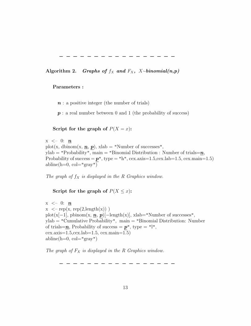
Algorithm 2. Graphs of fX and FX, X∼binomial(n,p)
Parameters :
n : a positive integer (the number of trials)
p : a real number between 0 and 1 (the probability of success)
Script for the graph of P (X = x):
x <– 0: nplot(x, dbinom(x, n, p), xlab = "Number of successes",ylab = "Probability", main = "Binomial Distribution : Number of trials=n,Probability of success = p", type = "h", cex.axis=1.5,cex.lab=1.5, cex.main=1.5)abline(h=0, col="gray")
The graph of fX is displayed in the R Graphics window.
Script for the graph of P (X ≤ x):
x <– 0: nx <– rep(x, rep(2,length(x)) )plot(x[−1], pbinom(x, n, p)[−length(x)], xlab="Number of successes",ylab = "Cumulative Probability", main = "Binomial Distribution: Numberof trials=n, Probability of success = p", type = "l",cex.axis=1.5,cex.lab=1.5, cex.main=1.5)abline(h=0, col="gray")
The graph of FX is displayed in the R Graphics window.
13

Remarks :
1. The “x” found in the above commands is not listed among the param-eters it is an object constructed in R in order to obtain the values onthe horizontal axis. To be more specific, it is a vector that contains thevalues in the domain of the function to be evaluated to produce thegraph.
2. You can change the names in the quotation marks for xlab, ylab andmain. We refer the reader to the Appendix ?? for a discussion con-cerning changing names and the title of a graph in R.
3. The command abline() is to add a line that displays the zero on thevertical axis.
4. We use cex to manipulate the font size. We interpret 1.5 as 50% largerthan the default.
We illustrate the implementation of the algorithms 1 and 2 throughexamples taken from [RBGL].
2.2 Example 6.2
For Example 6.2 in [RBGL], we use R to compute the probabilities for eachof the values of the binomial random variable X with n = 5 and p = 0.6. Wecompute P (X = x) for x from 0 to 5, one by one.
Commands and output
> dbinom(0,5,0.6)
[1] 0.01024
> dbinom(1,5,0.6)
[1] 0.0768
> dbinom(2,5,0.6)
[1] 0.2304
> dbinom(3,5,0.6)
14

[1] 0.3456
> dbinom(4,5,0.6)
[1] 0.2592
> dbinom(5,5,0.6)
[1] 0.07776
We also compute P (X ≥ 3) = 1− P (X ≤ 2).
Command and output
> 1-pbinom(2,5,0.6)
[1] 0.68256
We construct a stick diagram of the probability mass function fX , we willuse n = 5 and p = 0.6.
Script and output
x <- 0:5
plot(x, dbinom(x, 5, 0.6), xlab="Number of successes",
ylab="Probability", main="Binomial Distribution: Number of trials=5,
Probability of success=0.6", type="h",cex.axis=1.5,cex.lab=1.5,
cex.main=1.5)
abline(h=0, col="gray")
15

Similarly for the graph of the cumulative distribution function FX , withthe parameters p = 0.6 and n = 5, here is the script.
Script and output
x <- 0:5
x <- rep(x, rep(2,length(x)) )
plot(x[-1], pbinom(x,5,0.6)[-length(x)], xlab="Number of successes",
ylab="Cumulative Probability",
main="Binomial Distribution: Number of trials=5,
Probability of success=0.6", type="l",
cex.axis=1.5,cex.lab=1.5, cex.main=1.5)
abline(h=0, col="gray")
16

2.3 Example 6.3
In Example 6.3 of [RBGL], we are working with a binomial random vari-able X with n = 7 and p = 0.0003. With R, we compute the probabilityP (X ≥ 1) = 1− P (X ≤ 0) = 0.002098111.
Command and output
> 1-pbinom(1-1,7,0.0003)
[1] 0.002098111
17

3 Poisson Distribution
For this section, we are referring to Chapter 6 of [RBGL]. We will see a fewexamples of computations of probabilities and the construction of graphs.
3.1 Probability Mass Function and Cumulative Distri-bution Function
In this section, we will be working with a Poisson random variable X withmean λ. We compute the probability masses with the function dpois() inR, while the cumulative probabilities are computed with ppois(). The prefix“d” in R, which stands for density, gives the probability mass function (orprobability density function). The prefix “p”, which stands for probability,gives the cumulative distribution function. There is also the prefix “q” tofind quantiles, that we will see when working with the normal and T distri-butions.
We now see how to evaluate the probability mass function and the cumu-lative distribution function for a Poisson distribution.
Algorithm 3. Computation of P (X = x), P (X ≤ x) and P (X > x),X∼Poisson(λ)
Parameters:
λ : a real value > 0 (the mean)
x : a non-negative integer 0,1,2,3, ...; (to evaluate at x)
18

Command and output for P (X = x):
> dpois(x, λ)
[1] “value of P (X = x)”
Command and output for P (X ≤ x):
> ppois(x, λ)
[1] “value of P (X ≤ x)”
Command and output for P (X > x):
> 1−ppois(x, λ)
[1] “value of P (X > x)”
For example, if we have a Poisson random variable with a mean of λ = 4.5events and that we want to compute the probability that 2 events will occur,we enter dpois(2,4.5) in the R console. The R output is 0.1124786, which isP (X = 2).
We will see a more concrete example for dpois() and ppois(), but let ussee how to produce the graphs for fX and FX .
19

Algorithm 4. Graphs of fX and FX, X∼Poisson(λ)
Parameters :
λ : a real value > 0 (the mean)
t : a positive integer 1,2,3,4, ...;(an upper bound for the horizontal axis)
Script for the graph of P (X = x):
x <– 0: tplot(x, dpois(λ), xlab="x",ylab = "Probability",main = "Poisson distribution : Mean=λ",type = "h",cex.axis=1.5,cex.lab=1.5, cex.main=1.5)abline(h=0, col="gray")
The graph of fX is displayed in the R graphics window.
Script for the graph of P (X ≤ x):
x <– 0: tx <– rep(x, rep(2, length(x)) )plot(x[−1], ppois(x, λ)[−length(x)], xlab="x",ylab = "Cumulative Probability",main = "Poisson distribution: Mean=λ",type = "l",cex.axis=1.5,cex.lab=1.5, cex.main=1.5)abline(h=0, col = "gray")
The graph of FX is displayed in the R graphics window.
20

3.2 Example 6.4
For Example 6.4 of [RBGL], we have a random variable X∼Poisson(6). WithR, we compute P (X ≤ 3) = 0.1512039.
Command and output
> ppois(3,6)
[1] 0.1512039
Now let us consider a Poisson random variable Y with a mean of 0.5. Wecompute P (Y ≥ 2) = 1− P (Y ≤ 1) = 0.09020401.
Command and output
> 1-ppois(1,0.5)
[1] 0.09020401
We omit the construction of the graphs for a Poisson distribution becausethe method is virtually the same as for the binomial distribution.
21

4 Normal Distribution
For this section, we will refer to Chapter 7 of the textbook [RBGL]. We willwork with the probability density function and the probability cumulativefunction and graphics. We will also learn how to find quantiles of a normaldistribution.
4.1 Probability Density Function and Cumulative Dis-tribution Function
We use the notation X to represent a random variable with a normal distri-bution with mean µ and standard deviation σ. Similar to the binomial andPoisson distribution, evaluations of fX and FX for a normal distribution areas direct.
Algorithm 5. Computation of fX(x), FX(x) and P (X > x), X∼N(µ,σ2)
Parameters :
x : a real number (to evaluate fX (or FX) at x)
µ : a real number (the mean)
σ : a positive real number (the standard deviation)
Command and output for fX(x) :
> dnorm(x, µ, σ)
22

[1] “value of fX(x)”
Command and output for FX(x):
> pnorm(x, µ, σ)
[1] “value of FX(x)”
Command and output for P (X > x):
> 1−pnorm(x, µ, σ)
[1] “value of P (X > x)”
Remark: If you do not give a value for µ nor for σ, then R uses µ = 0and σ = 1 by default for dnorm() or pnorm(). In other words, if we wantto work with the standard normal, then is it sufficient to use dnorm(x), toevaluate the probability density function, or to use, pnorm(x) for the cumu-lative distribution function.
We often would like to find a quantile from a normal distribution. Ofcourse, R provides methods for calculating quantiles from several distribu-tions, but you will only see the method with the normal distribution (andthe T distribution). We will find lower and upper quantiles.
23

Algorithm 6. Computation of a quantile, X∼N(µ,σ2)
Parameters :
q : a real number between 0 and 1 (the order of the quantile)
µ : a real number (the mean)
σ : a positive real number (the standard deviation)
Command to find a lower quantile:
> qnorm(q, µ, σ)
[1] “the value x such that P (X < x) = q”
Command to find an upper quantile:
> qnorm(q, µ, σ, lower.tail=FALSE)
[1] “the value x such that P (X > x) = q”
Remark: R uses µ = 0 and σ = 1 by default for qnorm(). In otherwords, if we want quantiles from the standard normal then it suffices to usethe command qnorm(q).
Finally, we produce graphs of fX or of FX in R as follows:
24

Algorithm 7. Graphs of fX and FX, X∼N(µ,σ2)
Parameters:
µ : a real number (the mean)
σ : a real positive value (the standard deviation)
Script for the graph of fX:
x <– seq(µ−3*σ, µ+3*σ, length.out=100)plot(x, dnorm(x, µ, σ), xlab="x",ylab="Probability Density",main="Normal Distribution : Mean=µ, Standard Deviation=σ",type="l",cex.axis=1.5,cex.lab=1.5, cex.main=1.5)abline(h=0, col="gray")
The graph of fX is displayed in the R graphics window.
Script for the graph of FX:
x <– seq(µ−3*σ, µ+3*σ, length.out=100)plot(x, dnorm(x, µ, σ), xlab="x",ylab="Cumulative Probability",main="Normal Distribution: Mean=µ, Standard Deviation=σ",type="l",cex.axis=1.5,cex.lab=1.5, cex.main=1.5)abline(h=0, col="gray")
The graph of fX is displayed in the R graphics window.
Remark : It is again possible to shorten the writing of the command
25

dnorm() and pnorm() inside of the command plot(), if we are working withthe standard normal distribution. For example, for the probability densityfunction, we could have
> plot(x, dnorm(x), xlab="x",
on the 2nd line, instead of
> plot(x, dnorm(x, 0, 1), xlab="x",
Also, the star symbol “ * ” is used for multiplication in R, for those thathad not noticed it up to now.
4.2 Example 7.1
In Example 7.1 of [RBGL], we compute P (−1.25 < Z < 0.5) (which isequivalent to P (Z ≤ 0.5)− P (Z ≤ −1.25)), where Z has a standard normaldistribution. Since we are working with the standard normal distribution,we can omit the values of the parameters µ and σ. With x = 0.5 (andx = −1.25), we obtain
Command and output
> pnorm(0.5,0,1) - pnorm(-1.25,0,1)
[1] 0.5858127
We can build the graph for the density of the standard normal.
Script and output
x <- seq(0-3*1, 0+3*1, length.out=100)
plot(x, dnorm(x), xlab="z", ylab="Probability Density",
main="Standard Normal Distribution",
type="l",cex.axis=1.5,cex.lab=1.5, cex.main=1.5)
26

4.3 Example 7.2
For the Example 7.2 of the textbook [RBGL], we are working with a normalrandom variable X with mean µ = 40 and standard deviation σ = 3. Forpart (a), we compute P (X > 45), and within the R command, we use x = 45,µ = 40 and σ = 3. Using algorithm 5, we get
Command and output
> 1 - pnorm(45,40,3)
[1] 0.04779035
For part (b), we use x = 43 and x = 37 to compute P (37 < X < 43) =0.6826895.
27

Command and output
> pnorm(43,40,3) - pnorm(37,40,3)
[1] 0.6826895
For part (c), we build the graph of the cumulative distribution functionusing algorithm 7, which gives
Script and output
x <- seq(40-3*3, 40+3*3, length.out = 100)
plot(x, pnorm(x,40,3), xlab="x",
ylab="Cumulative Probability",
main="Normal Distribution: Mean=40, Standard Deviation=3",
type="l",cex.axis=1.5,cex.lab=1.5, cex.main=1.5)
28

We observe that the cumulative probability reaches 0.25 at around x = 38.More precisely, we obtain the 25th percentile (or lower quantile of order 25%),which is x = 37.97653, by using the command qnorm() :
Command and output
> qnorm(0.25,40,3)
[1] 37.97653
29

5 Categorical Data
This section, along with several others that follow, refers to Chapter 9 of[RBGL]. More specifically, the contents of this section refers to Section 9.1(Random Sampling and Data Description) of Chapter 9.
There are two types of variables : numerical and categorical. For categor-ical variables, we will enter the data directly into R. However, for numericalvariables, we will discuss two methods of data entry: a method for which thedata entry is done directly in R, and then a method for which data can beimported into R from a text file or an excel worksheet.
We consider categorical variables in this section. Numerical variables arediscussed in the following section.
5.1 Data Entry and Bar Charts
For a categorical variable, each observation represents a category. So a ran-dom sample of size n for a categorical variable contains n categorical values.For such a sample, we can construct a frequency (or relative frequency dis-tribution). In most of the examples from the textbook [RBGL], we are giventhe frequency distribution and not the raw data. So we will show the readerhow to enter the frequency distribution into R.
The method for the direct input of the frequency distribution consistsessentially of the explicit construction of two vectors in R: one containingthe names of categories, the other containing the frequencies associated withthese categories. Once the data is entered, we can quickly build a bar chart.One can also make the choice to display the frequencies or the relative fre-quencies.
30

Algorithm 8. Entry of a Frequency Distribution (CategoricalData) directly into R
Parameters :
y1, y2, y3, ..., ym : names of the categories (placed within quotes : ")
x1, x2, x3, ..., xm : the frequencies
(xi is the frequency for the category yi)
Commands for the direct data entry:
y <– c(y1, y2,..., ym)x <– c(x1, x2,..., xm)
The data are stored in the variables x and y.
Remarks:
1. We are using m to represent the number of categories, and correspondsto the length of the vector x (and of the vector y).
2. We must begin and end each name by quotation marks: ". For example,if we want to enter the categories Cat and Dog for y1 et y2, replace y1by "Cat" and y2 by "Dog" in the command. Example 9.1 clarifies thissyntax.
3. We can verify the contents of x and of y at any time, simply by typingx (or by typing y) in the R console and press the Enter key.
31

The procedure is not complicated and you can add a line or two to thisalgorithm and get a bar chart.
Algorithm 9. Direct Entry of a Frequency Distribution and Con-structing a Bar Chart
Parameters:
y1, y2, y3, ..., ym : names of the categories (placed within quotes: ")
x1, x2, x3, ..., xm : the frequencies
(xi is the frequency for the category yi)
Commands for the direct entry :
y <– c(y1, y2,..., ym)x <– c(x1, x2,..., xm)
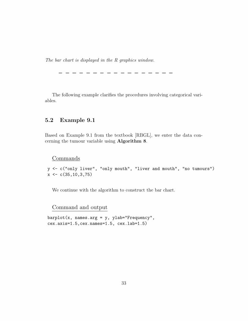
Command for a (Frequency) Bar Chart :
barplot(x, names.arg = y, ylab="Frequency",cex.axis=1.5,cex.names=1.5, cex.lab=1.5)
The bar chart is displayed in the R graphics window.
Script for a (Relative Frequency) Bar Chart:
t <– sum(x)barplot( x/t, names.arg = y, ylab="Relative Frequency",cex.axis=1.5,cex.names=1.5, cex.lab=1.5 )
32
The bar chart is displayed in the R graphics window.
The following example clarifies the procedures involving categorical vari-ables.
5.2 Example 9.1
Based on Example 9.1 from the textbook [RBGL], we enter the data con-cerning the tumour variable using Algorithm 8.
Commands
y <- c("only liver", "only mouth", "liver and mouth", "no tumours")
x <- c(35,10,3,75)
We continue with the algorithm to construct the bar chart.
Command and output
barplot(x, names.arg = y, ylab="Frequency",
cex.axis=1.5,cex.names=1.5, cex.lab=1.5)
33

(If certain names are not displayed along the horizontal axis, increase thesize of the window, and the problem should be fixed.)
Below we build a relative frequency bar chart for the tumour variable.
Commands and output
z = read.table(file.choose(), header=TRUE, sep="\t")x <- as.numeric(z)
y <- colnames(z)
t <- sum(x)
barplot(x/t, names.arg=y, ylab="Relative Frequency",
cex.axis=1.5,cex.names=1.5, cex.lab=1.5)
34

5.3 Contingency Tables & Side-by-Side Bar Charts
We will be working with two categorical variables X and Y . We will want tocompare the distributions of X conditioned on the value of Y . We will enterthe data as a contingency table and produce side-by-side bar charts.
Algorithm 10. Contingency Table
Enter data directly into R
Parameters :
35

c : number of categories for X (number of columns)
r : number of categories for Y (number of rows)
x1, x2, x3, ..., xc : the names of the categories for X
y1, y2, y3, ..., yr : the names of the categories for Y
zij : zij is the frequency for the category xj conditional on Y = yi
( z = (zij) is a matrix of size r × c; the columns vary according tothe categories of X, and the rows vary according to the categories ofY )
Data Entry :
x <– c(x1, x2,..., xc)y <– c(y1, y2,..., yr)z <– c(z11, z12,..., z1c, z21, z22,..., z2c,..., zr1, zr2,..., zrc)
(For the matrix, we enter the data one row at a time until we have enteredthe whole matrix.)
Commands to produce the contingency table:
ct <– matrix(z, nrow=r, ncol=c, byrow=TRUE, dimnames=list(y,x))ct <– as.table(as.matrix(ct))ctTotal <– addmargins(ct)colnames(ctTotal)[(length(x) + 1)] <– "Total"rownames(ctTotal)[(length(y) + 1)] <– "Total"ctTotal
The contingency table will be displayed in the console window.
36

Commands to obtain the conditional relative frequency distri-butions:
ct <– matrix(z, nrow=r, ncol=c, byrow=TRUE, dimnames=list(y,x))ct <– as.table(as.matrix(ct))condDist <– prop.table(ct,1)condDist
The contingency table will be displayed in the console window.
Remarks :
1. By default, the command addmargins() computes the row totals andthe column totals of the table. Furthermore, the name of the columnand of the row with the totals is Sum. We have added two lines to thescript to change the name Sum to Total.
2. We obtain the conditional relative frequency distributions of X (thecolumns) by conditioning on the values of Y (the rows). We can ob-tain the distributions of Y conditional on X by substituting the abovecommand prop.table(tc,1) with prop.table(tc,2).
To construct side-by-side bar charts to display the distributions of onecategorical variable conditional on another categorical variable from the con-tingency table of two categorical variables, we can use the following algo-rithm.
37

Algorithm 11. Side-by-side bar charts
Enter the contingency table into R
Parameters :
c : number of categories for X (number of columns)
r : number of categories for Y (number of rows)
x1, x2, x3, ..., xc : the names of the categories for X
y1, y2, y3, ..., yr : the names of the categories for Y
zij : zij is the frequency for the category xj conditional on Y = yi
( z = (zij) is a matrix of size r × c; the columns vary according tothe categories of X, and the rows vary according to the categories ofY )
Data Entry :
x <– c(x1, x2,..., xc)y <– c(y1, y2,..., yr)z <– c(z11, z12,..., z1c, z21, z22,..., z2c,..., zr1, zr2,..., zrc)
(For the matrix, we enter the data one row at a time until we have enteredthe whole matrix.)
38

Script for the side-by-side bar charts :
ct <– matrix(z, nrow=r, ncol=c, byrow=TRUE)condDist <– prop.table(ct,1)barplot( condDist, names.arg=x, beside=TRUE,xlab=xname, ylab="Relative Frequency", cex.axis=1.5,cex.names=1.5,cex.lab=1.5)abline(h=0, col="gray")legend(locator(1), y, fill=gray.colors(length(y)), title=yname, cex=1.2)
(R will ask you to select the location for the legend (the list of names forY ) by clicking directly on the R graphics window.)
The graph and its legend are displayed in the R graphics window.
Remarks :
1. The command abline(h=0, col="gray") is not necessary. It adds a grayon the horizontal axis; it is a matter of aesthetics.
2. The value of cex in the command legend() is to control the size of thefont in the legend. The value 1.2 means 20% larger than the default.
5.4 Example 9.2
We illustrate the construction of the contingency table and of the size-by-sidebar charts via Example 9.2 of [RBGL]. The values of the parameters c andr are 4 and 2, respectively.
39
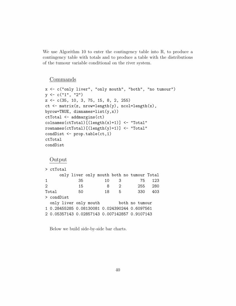
We use Algorithm 10 to enter the contingency table into R, to produce acontingency table with totals and to produce a table with the distributionsof the tumour variable conditional on the river system.
Commands
x <- c("only liver", "only mouth", "both", "no tumour")
y <- c("1", "2")
z <- c(35, 10, 3, 75, 15, 8, 2, 255)
ct <- matrix(z, nrow=length(y), ncol=length(x),
byrow=TRUE, dimnames=list(y,x))
ctTotal <- addmargins(ct)
colnames(ctTotal)[(length(x)+1)] <- "Total"
rownames(ctTotal)[(length(y)+1)] <- "Total"
condDist <- prop.table(ct,1)
ctTotal
condDist
Output
> ctTotal
only liver only mouth both no tumour Total
1 35 10 3 75 123
2 15 8 2 255 280
Total 50 18 5 330 403
> condDist
only liver only mouth both no tumour
1 0.28455285 0.08130081 0.024390244 0.6097561
2 0.05357143 0.02857143 0.007142857 0.9107143
Below we build side-by-side bar charts.
40

Commands and output
x <- c("only liver", "only mouth", "both", "no tumour")
y <- c("1", "2")
z <- c(35, 10, 3, 75, 15, 8, 2, 255)
ct <- matrix(z, nrow=length(y), ncol=length(x),
byrow=TRUE, dimnames=list(y,x))
condDist <- prop.table(ct,1)
barplot( condDist, names.arg=x, beside=TRUE,
xlab="Tumour Category", ylab="Relative Frequency",
cex.axis=1.5,cex.names=1.5, cex.lab=1.5)
abline(h=0, col="gray")
legend(locator(1), y, fill=gray.colors(length(y)),
title="River System",cex=1.2)
41

6 Importing Data from a Text File
It is convenient to enter data directly into R but too often, we will need toimport a data from a file. In particular, it would very useful to know howto import data from a text file or an Excel file. Fortunately, an Excel file iseasily converted into a text file, so we will only discuss importing data froma text file.
For all information regarding the formatting of the text file to import intoR, we refer the reader to Appendix ??. A method for converting an Excelfile to a text file is also given in this appendix.
The following algorithm can be used in general to import data from atext file. However, it is necessary that the data within the text file follow aparticular format (discussed in Appendix ??) so the data can be used withinparticular R commands. For this reason, we will always give an explicitindication concerning the format of the data within the text file in order toexecute a particular algorithm.
Algorithm 12. Import data from a text file into R
Parameters :
None
Format of the data within the text file :
A format given in the Appendix ?? of this guide.
42

Command to import data:
z = read.table( file.choose(), header=TRUE, sep="\t")
A window will open to help us find the location of the text file containingthe data.
Remarks:
• We can verify the contents of the variable z at any time, simply enterz at the prompt in the R console and press the Enter key.
• The command read.table() will create a data frame, that is a list ofcolumns. To identify the columns in the text file, we will need to usea field separator (sep). By default, R uses sep = "", which uses anywhite space (spaces, tabs or newlines) as a separator.
• We will assume that the file is tab-delimited, that is we are using a tab-ular to separate the columns. To indicate to R that the field separatoris a tab, use sep = "\t".
• Another good field separator in English is a comma (use sep = "," ),but it does not work very well in French.
• The argument header=TRUE tells R that the first row of the file shouldbe interpreted as variable names.
• To access the names of the variables use names(z). To access column1 use z[,1], to access column 2 use z[,2], and so on.
6.1 Importing Clutch Sizes (Examples 9.3-9.4)
In this section, we will refer to the data found in the text file CLUTCH-SIZE.txt. It contains two columns that are tab-delimited. We will use Algo-rithm 12 to import the data. We will be prompted to browse for the file.
43

Command
z=read.table(file.choose(),header=TRUE,sep="\t")
To view the contents of z, we enter z in the R console at the prompt andhit ENTER.
Command and Output
> z
clutch.size.1 clutch.size.2
1 11 6
2 12 7
3 11 8
4 9 8
5 11 8
6 2 9
7 6 9
8 3 9
9 17 9
10 6 9
11 10 10
12 10 10
13 8 10
14 11 10
15 5 10
16 NA 10
17 NA 10
18 NA 11
19 NA 12
20 NA 14
44

The names of the columns are in names(z) and to access each column wecan z[,1] or z[,2].
Command and Output
> names(z)
[1] "clutch.size.1" "clutch.size.2"
> z[,1]
[1] 11 12 11 9 11 2 6 3 17 6 10 10 8 11 5 NA NA NA NA NA
> z[,2]
[1] 6 7 8 8 8 9 9 9 9 9 10 10 10 10 10 10 10 11 12 14
The data frame can contain variables of various types, i.e. some columnscan be numerical and some can be categorical. As an example, say that wehave one column that contains the 35 clutch sizes. The second column canbe a categorical variable that is used to identify the region.
In Excel, we entered the data into the first two columns using the followingformat. We saved the data as a tab-delimited file. Afterwards, we importthe data into R with Algorithm 12. We then display the first and secondcolumn.
clutch size region11 Region 112 Region 111 Region 1
......
12 Region 214 Region 2
Command to import the data
z=read.table(file.choose(),header=TRUE,sep="\t")
45

Commands and output to display the variables
> names(z)
[1] "clutch.size" "region"
> z[,1]
[1] 11 12 11 9 11 2 6 3 17 6 10 10 8 11 5 6 7 8 8 8
[21] 9 9 9 9 9 10 10 10 10 10 10 10 11 12 14
> z[,2]
[1] Region 1 Region 1 Region 1 Region 1 Region 1 Region 1
[7] Region 1 Region 1 Region 1 Region 1 Region 1 Region 1
[13] Region 1 Region 1 Region 1 Region 2 Region 2 Region 2
[19] Region 2 Region 2 Region 2 Region 2 Region 2 Region 2
[25] Region 2 Region 2 Region 2 Region 2 Region 2 Region 2
[31] Region 2 Region 2 Region 2 Region 2 Region 2
Levels: Region 1 Region 2
Remarks:
• R identified the variable region as a categorical variable since there arenon-numerical characters in the field.
• If the names of the categories are numbers, R will consider the variableas numerical. It is possible to impose a data type to a vector withthe commands: as.numeric(name of variable) and as.character(nameof variable).
• Below we use the subset command to get a subset of the data frame.We selected the clutch sizes from region 1. To subset, we can use manylogical arguments to select the rows and use the argument select toselect to the columns.
46

Commands and output to display the variables
> names(z)
[1] "clutch.size" "region"
> x<-subset(z, region=="Region 1",select=c(clutch.size))
> x
clutch.size
1 11
2 12
3 11
4 9
5 11
6 2
7 6
8 3
9 17
10 6
11 10
12 10
13 8
14 11
15 5
> x<-x[,1]
> x
[1] 11 12 11 9 11 2 6 3 17 6 10 10 8 11 5
Remark: The result of the command x<–subset(z, region==”Region1”,select=c(clutch.size)) is a data frame, since we are taking a subset of adata frame. However, for most commands, the operand must be a vector,not a data frame. By using the command x<–x[,1], we are converting a dataframe with one column into a vector.
We will end this section with a data type conversion. Suppose that wehave a categorical variable x called “region”. The categories are 1, 2 and3. We will build the vector x, whose values are used to identify the regionof the observation. Since all the values are numerical, R thinks that it is anumerical variable. We will ask R, if the vector is numerical and also if the
47

vector is categorical. We will then convert its data type to categorical (calledcharacter is R) and then we will convert its data type to numerical.
Commands for data type conversion
> x <- c(1,1,1,1,2,2,3,3,3)
> x
[1] 1 1 1 1 2 2 3 3 3
> is.numeric(x)
[1] TRUE
> is.character(x)
[1] FALSE
> x <- as.character(x)
> x
[1] "1" "1" "1" "1" "2" "2" "3" "3" "3"
> is.character(x)
[1] TRUE
> is.numeric(x)
[1] FALSE
> x <- as.numeric(x)
> x
[1] 1 1 1 1 2 2 3 3 3
> is.numeric(x)
[1] TRUE
> is.character(x)
[1] FALSE
7 Numerical Variables
We now consider the case of the construction of a histogram for a numericalvariable. We will refer to Chapter 9 of [RBGL].
48

7.1 Histogram
We can again proceed by entering the data directly into R, but we will alsodiscuss importing data into R from a text file. We start with the case of dataentered directly into R.
Algorithm 13. Histogram
Constructing a histogram
Parameters :
x1, x2, x3, ..., xn : n observations of the variable x
xname : the name of the variable(between quotation marks : ")
Data Entry :
x <– c(x1, x2,..., xn)
Remark: The above is an example of direct data entry into R. We couldalternatively import a data frame into R and assign the appropriate columnto x.
Command for a (frequency) histogram:
hist(x, xlab=xname, ylab="Frequency",main="Frequency Histogram", col="lightgray",cex.axis=1.5,cex.lab=1.5, cex.main=1.5)
This histogram is displayed in the R graphics window.
49

Remarks:
• You can add the optional argument breaks=b, where b represents thenumber of breaks. If b is a vector, then they are the values of thebreaks.
• The total area under the histogram is equal to the number of observa-tions. To obtain a total area of one, we should use a density histogram,by using use the optional argument prob=TRUE.
Command for a (density) histogram:
hist(x, xlab=xname, ylab="Probability Density",main="Density Histogram", prob=TRUE, col="lightgray",cex.axis=1.5,cex.lab=1.5, cex.main=1.5)
This histogram is displayed in the R graphics window. The total area equalsone.
Remark: It is possible to obtain a relative frequency histogram, butnot directly. We must force R to do so. The first step will be to build anobject h that will be the frequency histogram. The vector of frequencies forthe histogram object h is h$counts. We will modify the counts so that itrepresents the relative frequencies instead of the frequencies. Afterwards, wecan plot the object h.
Command for a (relative frequency) histogram:
h=hist(x)h$counts = h$counts/sum(h$counts)plot(x, xlab=xname, ylab="Relative Frequency",main="Relative Frequency Histogram", col="lightgray",cex.axis=1.5,cex.lab=1.5, cex.main=1.5)
This histogram is displayed in the R graphics window.
50

7.2 Example 9.3
We enter the data directly into R and contruct the histogram for the clustersize variable of Example 9.3 of ??.
Commands and the graph
x <- c(11,12,11,9,11,2,6,3,17,6,10,10,8,11,5)
hist(x,xlab="Clutch Size",ylab="Frequency",
main="Frequency Histogram", col="lightgray",
cex.axis=1.5,cex.lab=1.5, cex.main=1.5)
Remarks:
1. By adding the argument breaks=c(2,5,8,11,14,17), we can get the sameintervals as used in Example 9.3. However, R uses inclusive upperbounds instead of inclusive lower bounds. So the graph will appear abit different than the graph in the textbook.
51

2. By using the following argument breaks=c(1.99,4.99,7.99,10.99,13.99,17),we can obtain the same histogram as in the textbook. Note that thelength of the intervals are approximately the same, but they are notexactly the same. The last interval is of length 3.01, while the othersare of length 3. In this case, R will by default construct a density his-togram. To force R to display frequencies, we must add the argumentprob=FALSE, to obtain the following frequency histogram.
52

In the above example we entered the data directly into R. We will nowconsider the case where we import a data frame into R. Consider the datain the text file CLUTCHSIZE.txt. The first column are clutch sizes fromregion 1, while the second column is for region 2.
We will build a histogram for the clutch size variable for each of the tworegions. We will display both histograms in the same graphics window.
Commands and the graphs
z = read.table( file.choose(), header=TRUE, sep="\t")par(mfrow=c(2,1))
hist(z[,1],xlab="Clutch Size (Region 1)",ylab="Frequency",
main="Frequency Histogram", col="lightgray",
cex.axis=1.5,cex.lab=1.5, cex.main=1.5)
hist(z[,2],xlab="Clutch Size (Region 2)",ylab="Frequency",
main="Frequency Histogram", col="lightgray",
cex.axis=1.5,cex.lab=1.5, cex.main=1.5)
53

Remark: To display many graphs in the same window, we can use thecommand par(mfrow=c(r,c)), where r is the number of rows and c is thenumber of columns in the display. The components of the matrix within thegraphics window are filled one by one as we produce graphs. To revert backto displaying one graph per window enter the command par(mfrow=c(1,1)).
To end example 9.3, suppose now that we importing a data frame with twocolumns: the first column contains the clutch sizes and the second columnis a categorical variable that is used to identify the region. We will produceside-by-side density histograms of the clutch sizes per region. To do so, wemust subset the data frame to obtain the two samples of clutch sizes.
Commands and the graphs
z = read.table( file.choose(), header=TRUE, sep="\t")x<-subset(z, region=="Region 1",select=c(clutch.size))
x<-x[,1]
y<-subset(z, region=="Region 2",select=c(clutch.size))
y<-y[,1]
par(mfrow=c(1,2))
hist(x,xlab="Clutch Size (Region 1)",ylab="Probability Density",
main="Density Histogram", col="lightgray", prob=TRUE,
cex.axis=1.5,cex.lab=1.5, cex.main=1.5)
hist(y,xlab="Clutch Size (Region 2)",ylab="Probability Density",
main="Density Histogram", col="lightgray", prob=TRUE,
cex.axis=1.5,cex.lab=1.5, cex.main=1.5)
54

7.3 Example 9.6
We will build the frequency histogram by importing the file SURVIVALTIMES.txt.
Commands and the graph
x = read.table(file.choose(), header=TRUE, sep="\t")hist(x[,1],xlab="Survival Times (in months)",ylab="Frequency",
main="Frequency Histogram", col="lightgray",
cex.axis=1.5,cex.lab=1.5, cex.main=1.5)
We will now produce the histogram for the logarithm of the survival timefrom Example 9.6. We are assuming that the data has already been importedand that it is in the data frame x.
55

Commands and output
hist(log(x[,1]),xlab="Survival Times (in log(months))",
ylab="Frequency", main="Frequency Histogram", col="lightgray",
cex.axis=1.5,cex.lab=1.5, cex.main=1.5)
Remark: If x is a numerical vector in R, then log(x) is the naturallogarithm of x evaluated component-wise. In other words, the ith componentof log(x) is the logarithm of the ith component of x.
This concludes the section on histograms.
56

8 Numerical Summary
By numerical summary, we refer to the set of descriptive statistics of a sample,such as a mean, variance, standard deviation, a median, quartiles, and others.
8.1 Mean, standard deviation and other statistics
We will learn how to obtain a numerical summary for a numerical variable:
Algorithm 14. Numerical summary for a numerical variable
Parameters :
x : a column of n numerical values x1,x2, . . . ,xn
Direct Entry of the data :
x <– c(x1, x2,..., xn)
Command to obtain some descriptive statistics:
summary(x)
R displays in the following order: the minimum, the first quartile, the me-dian, the mean, the third quartile, and the maximum.
57

Remarks:
• It is possible to obtain each descriptive statistics individually. Here isa list of commands for some common descriptive statistics:
summeanvarsdminmaxmedianquantile
• By default the command quantile(x) gives the minimum, the threequartiles and the maximum of the variable x. It is possible to forcethe command to only give certain percentiles. To do so, in the secondargument give a vector of probabilities. For example, quantile(x,0.5)will give only the median of x. While, quantile(x,c(0.25,0.75)) givesonly the first and third quartiles of x.
• There are many different accepted methods to compute percentiles froma random sample. The default method used by R does not corre-spond to the method in the textbook [RBGL]. However, we can forceR to use the method from the textbook, it is type 6. For example,quantile(x,c(0.25,0.5,0.75),type=6) will give the three quartiles as com-puted in textbook [RBGL]. It should be noted that the method usedby Minitab and SPSS to compute percentiles corresponds to the type6 percentiles in R.
8.2 Example 9.3-9.5
We start by entering the data from Example 9.3 of [RBGL] and computesummary statistics for this numerical variable.
58

Commands and output
> x <- c(11,12,11,9,11,2,6,3,17,6,10,10,8,11,5)
> summary(x)
Min. 1st Qu. Median Mean 3rd Qu. Max.
2.0 6.0 10.0 8.8 11.0 17.0
> mean(x)
[1] 8.8
> sd(x)
[1] 3.87667
> var(x)
[1] 15.02857
> max(x)
[1] 17
> min(x)
[1] 2
> quantile(x,type=6)
0% 25% 50% 75% 100%
2 6 10 11 17
We now enter the data from Example 9.4 of [RBGL] and compute sum-mary statistics for this numerical variable. Note that the type 6 quartilescorrespond to the quartiles from the textbook, but are not exactly the sameas those given by R by default.
Commands and output
> y <- c(6,7,8,8,8,9,9,9,9,9,10,10,10,10,10,10,10,11,12,14)
> summary(y)
Min. 1st Qu. Median Mean 3rd Qu. Max.
6.00 8.75 9.50 9.45 10.00 14.00
> mean(y)
[1] 9.45
> sd(y)
[1] 1.731291
59

> var(y)
[1] 2.997368
> max(y)
[1] 14
> min(y)
[1] 6
> quantile(y,type=6)
0% 25% 50% 75% 100%
6.00 8.25 9.50 10.00 14.00
8.3 Example 9.6
We will compute the geometric mean and geometric standard deviation forthe variable from Example 9.6. We import the data from the file SURVIVALTIME.txt.It contains one column with the survival times in months.
Commands and output
> x = read.table(file.choose(), header=TRUE, sep="\t")> x<-x[,1]
> exp(mean(log(x)))
[1] 9.639837
> exp(sd(log(x)))
[1] 2.80267
Remarks:
• Eventhough the file SURVIVALTIME.txt only contains one column,the function read.table produces a data frame. To convert x into anumerical variable, we assign x[,1] to x.
• The command log(x) computes the natural logarithm for each value inthe column x. The function exp is the exponential function, i.e. theinverse of the natural logarithm.
60

9 Box Plots
When working with one numerical variable, the construction of a box plotis fairly simple. However, for side-by-side box plots, we have to careful con-cerning the entry of the data.
9.1 Box plot for one numerical variable
Algorithm 15. Box plot for one numerical variable
Parameters :
x1, x2, ..., xn : the n values of the variable x
xname : the name of the variable x
Direct entry of the data:
x <– c(x1, x2,..., xn)
Command for a box plot:
boxplot(x, ylab=xname)
R displays a box plot in the R graphics window.
61

9.2 Example 9.6:
Consider the data from Example 9.6 from [RBGL] that is found is the fileSURVIVALTIMES.txt. It contains one column of survival times.
Commands
x = read.table(file.choose(), header=TRUE, sep="\t")boxplot(x[,1], ylab=colnames(x),main="Boxplot", col="lightgray",
cex.axis=1.5,cex.lab=1.5, cex.main=1.5)
Remarks :
• The circles are outliers.
• We assigned a data frame to x (.i.e. a list of columns). To access thenames of the columns, we an use colnames(x). Using x[,1] gives thefirst column of the data frame.
62

9.3 Side-by-side box plots
To produce side-by-side box plots, we will need two variables: a numericalvariable and a categorical variable. For each category, we obtain a box plotof the numerical variable.
Consider the data in the file BEES.tex. The numerical variable (length)is in the first column and the categorical variable (colour) is in the secondcolumn. Below, we import the data from the file BEES.tex. We assign thecolumns respectively to x and y and display the variables.
Commands and output
> z = read.table(file.choose(), header=TRUE, sep="\t")> x <- z[,1]
> y <- z[,2]
> x
[1] 7.5 5.6 6.7 6.9 5.4 7.3 8.2 7.3 8.6 4.8 9.1 7.3 5.6 6.6 7.5
> y
[1] red green red red green red green red green red
[11] green green red red red
Levels: green red
The following algorithm can be used to construct side-by-side boxplotsfor a numerical variable conditioned on a categorical variable.
63

Algorithm 16. Side-by-side box plots
Parameters :
xname : name of the numerical variable
yname : name of the categorical variable
(x1,y1), (x2,y2),..., (xn,yn) : pairs of data, whereeach numerical value xi is paired to a category yi
Direct entry of the data :
x <– c(x1, x2,..., xn)y <– c(y1, y2,..., yn)
Command to obtain side-by-side box plots :
> boxplot(x∼y, ylab=xname, xlab=yname)
R displays the side-by-side box plots in the R graphics window.
9.4 Example with BEES.txt
We will produce side-by-side box plots for the variable length by color usingthe data from the file BEES.txt.
64

Commands
z = read.table(file.choose(), header=TRUE, sep="\t")x<-z[,1]
y<-z[,2]
boxplot(x∼y, ylab=colnames(z)[1], xlab=colnames(z)[2], main="Boxplots",
col="lightgray", cex.axis=2,cex.lab=2, cex.main=2)
We could directly enter the data and use the following commands.
Commands
x <- c(7.5, 5.6, 6.7, 6.9, 5.4, 7.3, 8.2, 7.3, 8.6, 4.8, 9.1, 7.3,
5.6, 6.6, 7.5)
y <- c("red", "green", "red", "red", "green", "red", "green", "red",
"green", "red", "green", "green", "red", "red", "red")
boxplot(x∼y, ylab="length", xlab="color", main="Boxplots",
col="lightgray", cex.axis=2,cex.lab=2, cex.main=2)
The result is exactly the same.
65

9.5 Example 9.4
We want to construct side-by-side box plots for the data from Example 9.4of [RBGL]. We import the date from the text file CLUTCHSIZE.txt. Weobtain a data frame with 2 columns. They are the clutch sizes for region1 and region 2, respectively. Since the columns are not of equal size, thenNA is added at the end of the shorter column to fill the empty rows. NArepresents missing data. We will assign the columns to x and y, respectively,while omitting the missing data.
Commands and output
> z = read.table(file.choose(), header=TRUE, sep="\t")> z
clutch.size.1 clutch.size.2
1 11 6
2 12 7
3 11 8
4 9 8
5 11 8
6 2 9
7 6 9
8 3 9
9 17 9
10 6 9
11 10 10
12 10 10
13 8 10
14 11 10
15 5 10
16 NA 10
17 NA 10
18 NA 11
19 NA 12
20 NA 14
> x <- z[,1][!is.na(z[,1])]
> y <- z[,2][!is.na(z[,2])]
66

> x
[1] 11 12 11 9 11 2 6 3 17 6 10 10 8 11 5
> y
[1] 6 7 8 8 8 9 9 9 9 9 10 10 10 10 10 10 10 11 12 14
Equivalently, we could have entered the data directly into R.
Commands
x <- c(11,12,11,9,11,2,6,3,17,6,10,10,8,11,5)
y <- c(6,7,8,8,8,9,9,9,9,9,10,10,10,10,10,10,10,11,12,14)
The data is not in the appropriate format to produce side-by-side boxplots. The clutch sizes should be in one column and we need a second cat-egorical column to identify the region. We can approach this problem in afew different ways. One solution is to reformat the data outside of R andimport the data data in the correct format. Alternatively, we can use R tomanipulate our data. We will choose the latter approach.
Below we merge the two clutch size columns and call the new columnClutchSize. We also create a categorical column with two categories : “Re-gion 1” and “Region 2”. We used the function rep() to repeat the string aspecified number of times. With the numerical variable ClutchSize and thecategorical variable Region, we produce side-by-side box plots of the clutchsize by region.
Commands
ClutchSize<-c(x,y)
Region<-c(rep("Region 1",length(x)),rep("Region 2",length(y)))
boxplot(ClutchSize~Region, ylab="Clutch Size", xlab="Region",
main="Boxplots", col="lightgray",
cex.axis=1.5,cex.lab=1.5, cex.main=1.5)
67

Remark: Figure 9.4 from the textbook is very similar to the above side-by-side box plots, but they are not exactly the same. The slight differenceis due to the varying ways to compute the quartiles. The interquartile forthe clutch size from region 2 is IQR=1.75. However, R by default computesIQR=1.25. This small difference in the IQR can change the outlier status ofthe value 6.
68

10 Scatterplot, covariance and correlation
The following procedure can be used to construct a scatter plot. We alsodiscuss the commands to compute the covariance and the correlation betweentwo numerical variables.
Algorithm 17. Scatter plot, covariance and correlation
Parameters :
xname : the name of the variable x
yname : the name of the variable y
(x1,y1), (x2,y2), ..., (xn,yn) : values of the paired observations of xand y
Direct entry of the data:
x <– c(x1, x2,..., xn)y <– c(y1, y2,..., yn)
Command for the scatter plot :
plot(x, y, xlab=xname, ylab=yname)
R displays the scatter plot in the R graphics window.
69

Commands for the covariance and the correlation:
cov(x, y)cor(x, y)
R displays the covariance and the correlation in the R console window.
10.1 Example 9.7
We import the data from the file MOTHERDAUGHTER.txt and we producea scatter plot with the Algorithm 17.
Command
z = read.table(file.choose(), header=TRUE, sep="\t")plot(z[,2], z[,1], xlab=colnames(z)[2], ylab=colnames(z)[1],
cex.axis=1.5,cex.lab=1.5, cex.main=1.5)
70

Suppose that we would like to compute the covariance and the correlationbetween the heights of the mothers and their daughters. We are assumingthe data is in the data frame z. The first column is the height of the mothersand the second column is the height of the daughters.
Commands and output
> cov(z[,1], z[,2])
[1] 4.931818
> cor(z[,1], z[,2])
[1] 0.4260894
71

11 Student’s T distribution
In this section, we use T to denote a random variable with a T distribution.We refer to section 9.2 of [RBGL].
11.1 T distribution
We will learn how to evaluate the probability density function and the cu-mulative distribution of a T distribution. We will also learn to find quantilesof a T distribution.
Algorithm 18. Computation of fT , FT and P (T ≥ t), where T∼T (v)
Parameters :
t: a real value (to evaluate fT (t) (or FT (t)))
v : a positive integer (the degrees of freedom)
Command and output for fT (t) :
> dt( t, v)
[1] “value of fT (t)”
72

Command and output for FT (t):
> pt( t, v)
[1] “value of FT (t)”
Command and output for P (T ≥ t):
> 1−pt( t, v)
[1] “value of P (T ≥ t)”
For the quantiles, we use the following algorithm:
73

Algorithm 19. Finding a quantile of T (v)
Parameters :
q : a real value between 0 and 1 (order of the quantile)
v : a positive integer (i.e. the degree of freedom)
Command and output for an lower quantile of a T (n) distribu-tion:
> qt( q, v)
[1] “the value t0 such that P (T < t0) = q”
Command and output for an upper quantile of a T (n) distribu-tion:
> qt( q, v, lower.tail=FALSE)
[1] “the value t0 such that P (T > t0) = q”
Below we give commands to build a graph of fT or FT in R:
74

Algorithm 20. Graphs of fT and FT , where T∼T (v)
Parameters :
v : a positive integer (the degrees of freedom)
Commands to build the graph of fT :
t <– seq( −4, 4, length.out=100)plot(t, dt( t, v), xlab="t",ylab="Density",main="Student’s T Distribution : Degrees of Freedom=v",type="l")abline(h=0, col="gray")
The graph of fT is displayed in the R graphics window.
Commands to build the graph ofde FT :
t <– seq(−4, 4, length.out=100)plot(t, pt( t, v), xlab="t",ylab="Cumulative Probability",main="Student’s T Distribution : Degrees of Freedom=v",type="l")abline(h=0, col="gray")
The graph of FT is displayed in the R graphics window.
75

11.2 Example 9.12
For Example 9.12 of [RBGL], we work with a random variable T which hasa T distribution with 24 degrees of freedom, and we would like to computeP (T < −2.5). We use Algorithm 18 for the computation.
Commands and output
> pt(-2.5,24)
[1] 0.009827088
We can find upper quantiles of order 0.01 and 0.005, respectively, viaAlgorithme 19.
Commands and output
> qt(0.01, 24, lower.tail=FALSE)
[1] 2.492159
> qt(0.005, 24, lower.tail=FALSE)
[1] 2.79694
This means that P (T > 2.492159) = 0.01 and P (T > 2.79694) = 0.005.
To construct a graph of the density of a T distribution with 24 degreesof freedom, we use Algorithm 20.
Commands
t <- seq(-4, 4, length.out=100)
plot(t, dt(t,24), xlab="t", ylab="Probability Density",
main="Student’s T distribution: Degrees of freedom = 24",
type="l",cex.axis=1.5,cex.lab=1.5, cex.main=1.5)
abline(h=0, color="gray")
76

77

12 Quantile-quantile plot
Below we discuss the construction of a quantile-quantile plot. It can beused to assess the normality of a numerical variable. Refer to Section 9.3of [RBGL]. We will also discuss the construction of two overlayed quantile-quantile plots.
12.1 Method for one variable
To construct a quantile-quantile plot for a numerical variable, we can use thefollowing algorithm:
Algorithm 21. Quantile-Quantile Plot
Parameters:
y1, y2, ..., yn : the n values of the variable y
yname: the name of the variable
Direct Entry of the data:
y <– c(y1, y2,..., yn)
78

Commands to obtain a QQ-Plot:
qqnorm( y, xlab="Cote Z", ylab=yname,main="Quantile-Quantile Plot")qqline(y)
R displays the QQ-plot in the R graphics window.
12.2 Example 9.3
We will apply Algorithm 21 to Example 9.3 of [RBGL]. We enter directly thedata for the clutch size variable (region 1) and we build the correspondingQQ-plot.
Commands
y <- c(11,12,11,9,11,2,6,3,17,6,10,10,8,11,5)
qqnorm(y, xlab="Normal Quantile", ylab="Clutch Size",
main="Quantile-Quantile Plot",
cex.axis=1.5,cex.lab=1.5, cex.main=1.5)
qqline(y)
Remark: Comparing the graph that is found below to the graph in[RBGL], we notice that the axes are inverted. Minitab puts the normalscores on the vertical axis, while R puts the normal scores on the horizontalaxis.
79

12.3 Overlayed Quantile-Quantile Plots
We consider two numerical variables x and y. We will learn how to produceoverlayed quantile-quantile plots. In other words, we will overlay the QQ-plots for x and y.
80

Algorithm 22. Overlayed QQ-Plots
Parameters:
x1, x2, ..., xn : the numerical values of x
y1, y2, ..., ym : the numerical values of y
xname : a name to identify the variable x
yname : a name to identify the variable y
name : a name that is common between the variables)
Direct Entry of the data :
x <– c(x1, x2,..., xn)y <– c(y1, y2,..., ym)
81

Commands for the overlayed QQ-plots:
lmts <– range(x,y)qqnorm(x, xlab=”Normal Score”, ylab=name,main="Quantile-Quantile Plots", pch=15, ylim=lmts,cex.axis=1.5,cex.lab=1.5, cex.main=1.5)qqline(x, lty=1)par(new=TRUE)qqnorm(y, xlab=”Normal Score”, ylab=name,main="Quantile-Quantile Plots", pch=19, ylim=lmts,cex.axis=1.5,cex.lab=1.5, cex.main=1.5)qqline(y, lty=2)legend(locator(1), c(xname, yname), lty=c(1,2), pch=c(15,19),cex=1.5)
(R will ask you for the location of the legend. The selection is done byclicking on the R graphics window with your mouse.)
The overlayed QQ-plots are (with the legend) are displayed in the R graphicswindow.
Remarks:
• It is possible to change the symbol of the point with the pch argument.
• The line type is adjusted via the lty argument. Note, however, thatwe coordinated the values of the pch and lty arguments throughoutthe algorithm so that the legend is properly constructed to identify therespective samples.
• Furthermore, the functions qqnorm() and qqline() to offer the possibil-ity to change the colours of the points and the lines. We can consultAppendix ?? for more information concerning these graphs.
• We are actually producing two graphs and displaying them on the sameframe to get the overlay. The function par() allows us to set parameters
82

for a graphic. As we produce new graphs, R cleans the frame in theR graphics window before displaying the new graphic. By using thecommand par(new=TRUE), the frame in the graphics window is notcleaned. This allows us to overlay graphs.
12.4 Example 9.15
We consider the yields of blueberries from Example 9.15 of [RBGL] and weenter the data directly into R.
Commands
x <- c(7.3,6.5,9.4,7.2,8.4,5.5,5.6,9.7,4.5,5.3)
y <- c(20.6,5.4,8.4,8.9,14.0,12.9,10.9,5.8,4.2,13.4)
lmts <- range(x,y)
qqnorm(x, xlab="Normal Score", ylab="Yield (in kg)",
main="Quantile-Quantile Plots", pch=15, ylim=lmts,
cex.axis=1.5,cex.lab=1.5, cex.main=1.5)
qqline(x, lty=1)
par(new=TRUE)
qqnorm(y, xlab="Normal Score", ylab="Yield (in kg)",
main="Quantile-Quantile Plots", pch=19, ylim=lmts,
cex.axis=1.5,cex.lab=1.5, cex.main=1.5)
qqline(y, lty=2)
legend(locator(1), c("Method 1", "Method 2"),
lty=c(1,2), pch=c(15,19),cex=1.5)
83

84

References
[RBGL] Raluca Balan and Gilles Lamothe. 2011. Expect the unexpected: Afirst course in Biostatistics. World Scientific Publishing Co., Singapore
[WScienPI] World Scientific Publishing Co. 2012. Data sets for Expect theunexpected: A first course in Biostatistics.Available at : http://www.worldscientific.com/page/7546-tabd
[Rproj] Institute for Statistics and Mathematics of the Vienna University ofEconomics and Business. 2012. The R project for Statistical Computing.Disponible au : http://www.r-project.org/
85