
A guide for creatives to communicate Valencia’s...
7
VALENCIA BRAND STYLE GUIDE A guide for creatives to communicate Valencia’s brand values. is document should be used to compliment, not replace, the Brand Standards document
Transcript of A guide for creatives to communicate Valencia’s...
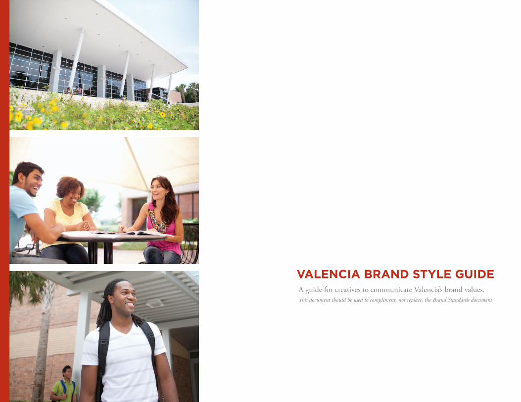
VALENCIA BRAND STYLE GUIDEA guide for creatives to communicate Valencia’s brand values.This document should be used to compliment, not replace, the Brand Standards document

BRAND PROMISEAt the heart of every community and student lies the desire to reach their potential. Valencia embraces that responsibility. Standing in the gap between what is and what can be, we guide, encourage and move our students forward, giving them not just a great college experience, but something even more powerful — a belief in themselves.
BRAND VALUES
– Learning– People– Diversity– Access– Integrity
BRAND PERSONALITY
– Encouraging– Progressive– Non-judgmental– Authentic– Optimistic– Nurturing
BRAND ATTRIBUTES
– Aspirational– Accessible– Innovative– Unique– Dynamic– Empowering– Emerging
While all communication should be clear, concise and well-written, the tone of voice for both internal and external communications, should be a direct reflection of our brand personality.
BRAND ESSENCE
We believe a better tomorrow begins every day at Valencia.
BRAND STRATEGY: Valencia College uses education as a catalyst.
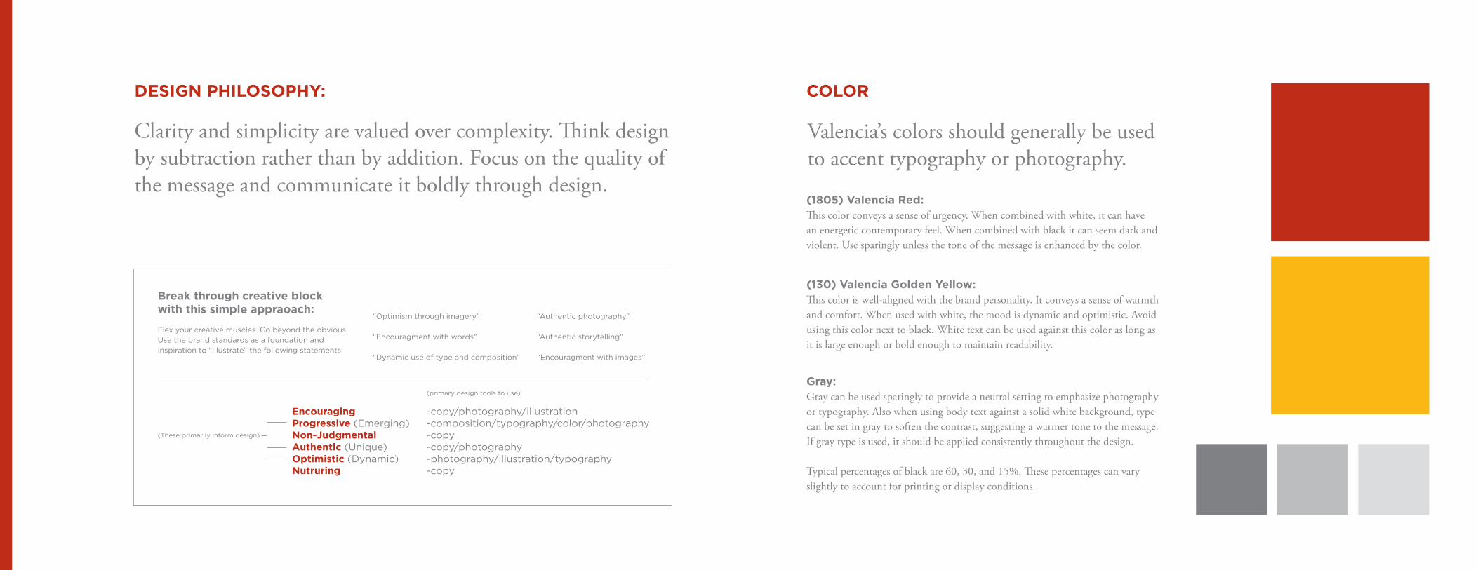
COLOR
Valencia’s colors should generally be used to accent typography or photography.
(1805) Valencia Red:This color conveys a sense of urgency. When combined with white, it can have an energetic contemporary feel. When combined with black it can seem dark and violent. Use sparingly unless the tone of the message is enhanced by the color.
(130) Valencia Golden Yellow:This color is well-aligned with the brand personality. It conveys a sense of warmth and comfort. When used with white, the mood is dynamic and optimistic. Avoid using this color next to black. White text can be used against this color as long as it is large enough or bold enough to maintain readability.
Gray:Gray can be used sparingly to provide a neutral setting to emphasize photography or typography. Also when using body text against a solid white background, type can be set in gray to soften the contrast, suggesting a warmer tone to the message. If gray type is used, it should be applied consistently throughout the design.
Typical percentages of black are 60, 30, and 15%. These percentages can vary slightly to account for printing or display conditions.
DESIGN PHILOSOPHY:
Clarity and simplicity are valued over complexity. Think design by subtraction rather than by addition. Focus on the quality of the message and communicate it boldly through design.
Encouraging -copy/photography/illustrationProgressive (Emerging) -composition/typography/color/photographyNon-Judgmental -copyAuthentic (Unique) -copy/photographyOptimistic (Dynamic) -photography/illustration/typographyNutruring -copy
(primary design tools to use)
Break through creative block with this simple appraoach:
Flex your creative muscles. Go beyond the obvious. Use the brand standards as a foundation and inspiration to “Illustrate” the following statements:
“Optimism through imagery”
“Encouragment with words”
“Dynamic use of type and composition”
“Authentic photography”
“Authentic storytelling”
“Encouragment with images”
(These primarily inform design)

Use these as guiding principles for creating and gathering appropriate imagery.
Capture authentic moments.All Categories
Each student is an inspiration.Engaged Faces & Promising Portraits
Celebrate diversity in the community.Diverse Community
Keep compositions simple.All Categories
Engaged faces in dynamic places.Engaged Faces
Portraits are accessible–“I could be her.”Promising Portraits
A collection of images work in concert.All Categories
PHOTOGRAPHY Photos should express a unique culture that is encouraging, progressive, non-judgmental, authentic, optimistic and nurturing.
Architectural HorizonsThese are low-angle to straight-on architectural photographs that also capture an immense sky and/or a pedestrian path and give the viewer a sense of possibility inherent in the campus.
Engaged FacesUsing a journalistic style of photography, these photos capture authentic moments of students engaged in the field of their study, oblivious to the camera.
Promising PortraitsThese straightforward portrait shots capture members of the Valencia community looking into the camera with an expression of pride in what they do, an accessible nature and allow the viewer to immediately connect with the person.
Diverse CommunityThese photographs capture the diverse group of individuals working together toward a common goal. These can range from classroom mentoring shots and graduation pictures to Board of Directors meetings and lectures.
Together these four categories provide a rich breadth of imagery that encapsulates the essence of Valencia College:
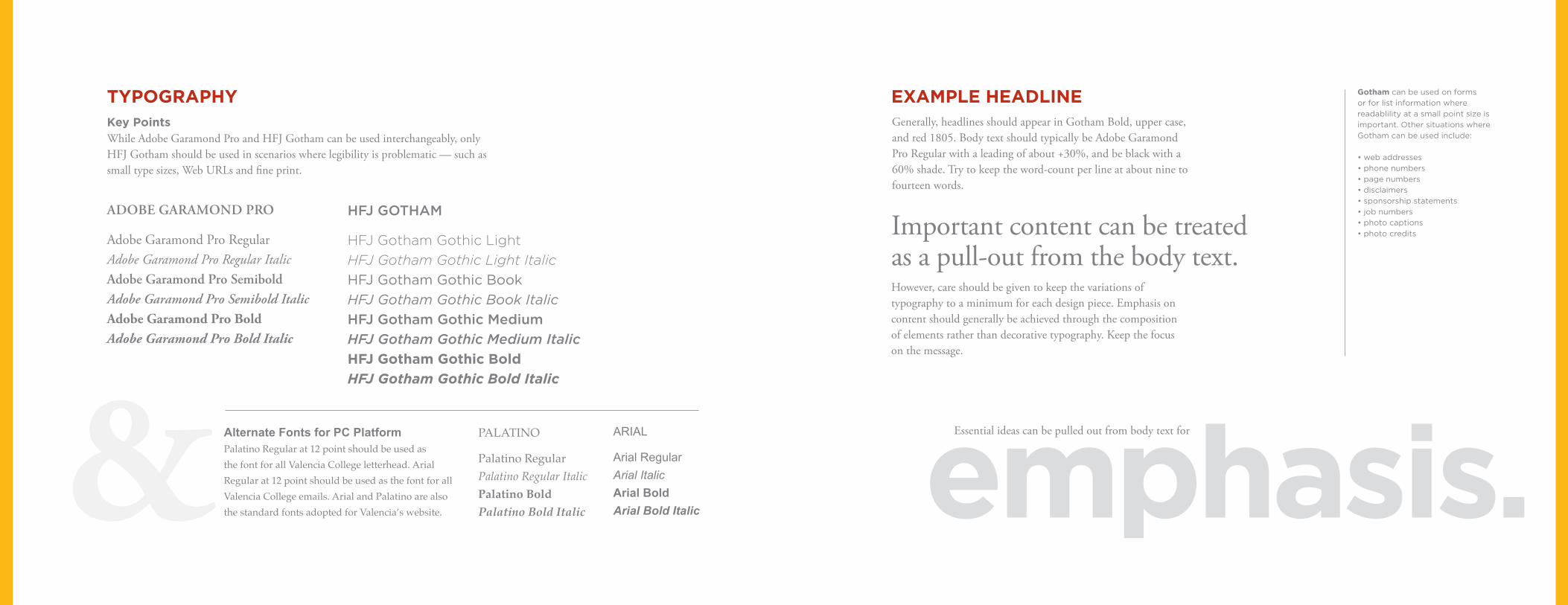
TYPOGRAPHY EXAMPLE HEADLINE
ADOBE GARAMOND PRO
Adobe Garamond Pro RegularAdobe Garamond Pro Regular ItalicAdobe Garamond Pro SemiboldAdobe Garamond Pro Semibold ItalicAdobe Garamond Pro BoldAdobe Garamond Pro Bold Italic
PALATINO
Palatino RegularPalatino Regular ItalicPalatino BoldPalatino Bold Italic
Alternate Fonts for PC PlatformPalatino Regular at 12 point should be used as the font for all Valencia College letterhead. Arial Regular at 12 point should be used as the font for all Valencia College emails. Arial and Palatino are also the standard fonts adopted for Valencia’s website.
Key PointsWhile Adobe Garamond Pro and HFJ Gotham can be used interchangeably, only HFJ Gotham should be used in scenarios where legibility is problematic — such as small type sizes, Web URLs and fine print.
Important content can be treated as a pull-out from the body text.
Generally, headlines should appear in Gotham Bold, upper case, and red 1805. Body text should typically be Adobe Garamond Pro Regular with a leading of about +30%, and be black with a 60% shade. Try to keep the word-count per line at about nine to fourteen words.
emphasis.Essential ideas can be pulled out from body text for
However, care should be given to keep the variations of typography to a minimum for each design piece. Emphasis on content should generally be achieved through the composition of elements rather than decorative typography. Keep the focus on the message.
Gotham can be used on forms or for list information where readablility at a small point size is important. Other situations where Gotham can be used include:
• web addresses• phone numbers• page numbers• disclaimers• sponsorship statements• job numbers• photo captions• photo credits
HFJ GOTHAM
HFJ Gotham Gothic LightHFJ Gotham Gothic Light ItalicHFJ Gotham Gothic BookHFJ Gotham Gothic Book ItalicHFJ Gotham Gothic MediumHFJ Gotham Gothic Medium ItalicHFJ Gotham Gothic BoldHFJ Gotham Gothic Bold Italic
ARIAL
Arial RegularArial ItalicArial BoldArial Bold Italic
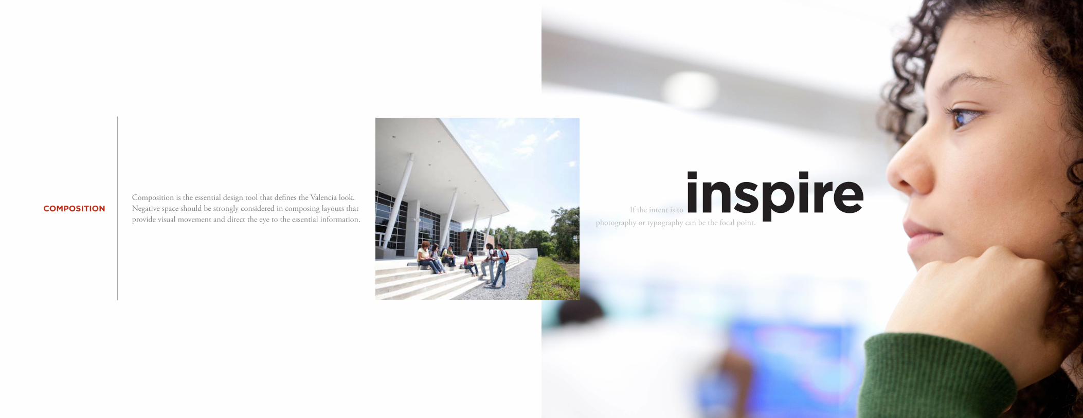
COMPOSITIONComposition is the essential design tool that defines the Valencia look. Negative space should be strongly considered in composing layouts that provide visual movement and direct the eye to the essential information.
If the intent is toinspirephotography or typography can be the focal point.
ARIAL REGULAR UPPER CASE
Arial Regular Upper/Lower Case
Arial Regular for body text
Arial Bold for Content Headlines
Arial Regular in black for footnotes
Palatino Regular Upper/Lower Case
ARIAL BOLD UPPER CASE
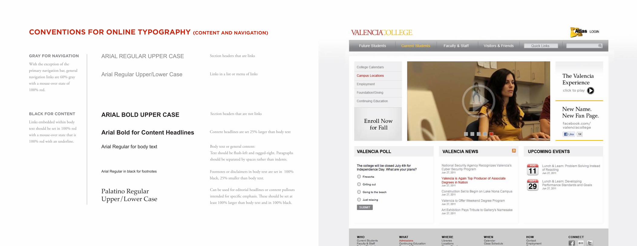
CONVENTIONS FOR ONLINE TYPOGRAPHY (CONTENT AND NAVIGATION)
Section headers that are not links
Section headers that are links
Links in a list or menu of links
Body text or general content:
Text should be flush-left and ragged-right. Paragraphs
should be separated by spaces rather than indents.
Content headlines are set 25% larger than body text
Footnotes or disclaimers in body text are set in 100%
black, 25% smaller than body text.
Can be used for editorial headlines or content pullouts
intended for specific emphasis. These should be set at
least 100% larger than body text and in 100% black.
GRAY FOR NAVIGATION
With the exception of the
primary navigation bar, general
navigation links are 60% gray
with a mouse-over state of
100% red.
BLACK FOR CONTENT
Links embedded within body
text should be set in 100% red
with a mouse-over state that is
100% red with an underline.