
A Comparison of Approaches to Advertising … Comparison of Approaches to Advertising Measurement:...
59
A Comparison of Approaches to Advertising Measurement: Evidence from Big Field Experiments at Facebook * Brett Gordon Kellogg School of Management Northwestern University Florian Zettelmeyer Kellogg School of Management Northwestern University and NBER Neha Bhargava Facebook Dan Chapsky Facebook July 14, 2016 Version 1.2 WHITE PAPER (LONG VERSION) Abstract We examine how common techniques used to measure the causal impact of ad exposures on users’ conversion outcomes compare to the “gold standard” of a true experiment (randomized controlled trial). Using data from 12 US advertising lift studies at Facebook comprising 435 million user-study observations and 1.4 billion total impressions we contrast the experimental results to those obtained from observational methods, such as comparing exposed to unex- posed users, matching methods, model-based adjustments, synthetic matched-markets tests, and before-after tests. We show that observational methods often fail to produce the same results as true experiments even after conditioning on information from thousands of behavioral variables and using non-linear models. We explain why this is the case. Our findings suggest that common approaches used to measure advertising effectiveness in industry fail to measure accurately the true effect of ads. * No data contained PII that could identify consumers or advertisers to maintain privacy. We thank Daniel Slotwiner, Gabrielle Gibbs, Joseph Davin, Brian d’Alessandro, and seminar participants at Northwestern, Columbia, CKGSB, ESMT, HBS, and Temple for helpful comments and suggestions. We particularly thank Meghan Busse for extensive comments and editing suggestions. Gordon and Zettelmeyer have no financial interest in Facebook and were not compensated in any way by Facebook or its affiliated companies for engaging in this research. E-mail addresses for correspondence: [email protected], [email protected], [email protected], chap- [email protected]
Transcript of A Comparison of Approaches to Advertising … Comparison of Approaches to Advertising Measurement:...

A Comparison of Approaches to Advertising Measurement:
Evidence from Big Field Experiments at Facebook∗
Brett Gordon
Kellogg School of Management
Northwestern University
Florian Zettelmeyer
Kellogg School of Management
Northwestern University and NBER
Neha Bhargava
Dan Chapsky
July 14, 2016Version 1.2
WHITE PAPER (LONG VERSION)
Abstract
We examine how common techniques used to measure the causal impact of ad exposures on
users’ conversion outcomes compare to the “gold standard” of a true experiment (randomized
controlled trial). Using data from 12 US advertising lift studies at Facebook comprising 435
million user-study observations and 1.4 billion total impressions we contrast the experimental
results to those obtained from observational methods, such as comparing exposed to unex-
posed users, matching methods, model-based adjustments, synthetic matched-markets tests,
and before-after tests. We show that observational methods often fail to produce the same
results as true experiments even after conditioning on information from thousands of behavioral
variables and using non-linear models. We explain why this is the case. Our findings suggest
that common approaches used to measure advertising effectiveness in industry fail to measure
accurately the true effect of ads.
∗ No data contained PII that could identify consumers or advertisers to maintain privacy. We thank Daniel
Slotwiner, Gabrielle Gibbs, Joseph Davin, Brian d’Alessandro, and seminar participants at Northwestern, Columbia,
CKGSB, ESMT, HBS, and Temple for helpful comments and suggestions. We particularly thank Meghan Busse for
extensive comments and editing suggestions. Gordon and Zettelmeyer have no financial interest in Facebook and were
not compensated in any way by Facebook or its affiliated companies for engaging in this research. E-mail addresses for
correspondence: [email protected], [email protected], [email protected], chap-
1 Introduction
1.1 The industry problem
Consider the situation of Jim Brown, a hypothetical senior marketing executive. Jim was awaiting
a presentation from his digital media team on the performance of their current online marketing
campaigns for the company’s newest line of jewelry. The team had examined offline purchase rates
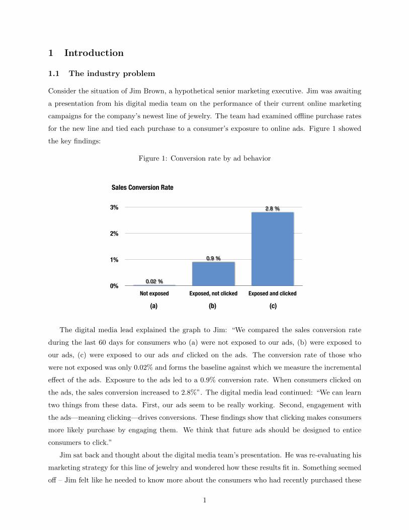
for the new line and tied each purchase to a consumer’s exposure to online ads. Figure 1 showed
the key findings:
Figure 1: Conversion rate by ad behavior
0%
1%
2%
3%
Not exposed Exposed, not clicked Exposed and clicked
2.8 %
0.9 %
0.02 %
Sales Conversion Rate
(a) (b) (c)
The digital media lead explained the graph to Jim: “We compared the sales conversion rate
during the last 60 days for consumers who (a) were not exposed to our ads, (b) were exposed to
our ads, (c) were exposed to our ads and clicked on the ads. The conversion rate of those who
were not exposed was only 0.02% and forms the baseline against which we measure the incremental
effect of the ads. Exposure to the ads led to a 0.9% conversion rate. When consumers clicked on
the ads, the sales conversion increased to 2.8%”. The digital media lead continued: “We can learn
two things from these data. First, our ads seem to be really working. Second, engagement with
the ads—meaning clicking—drives conversions. These findings show that clicking makes consumers
more likely purchase by engaging them. We think that future ads should be designed to entice
consumers to click.”
Jim sat back and thought about the digital media team’s presentation. He was re-evaluating his
marketing strategy for this line of jewelry and wondered how these results fit in. Something seemed
off – Jim felt like he needed to know more about the consumers who had recently purchased these
1

items. Jim asked his the team to delve into their CRM database and characterize the consumers
in each of the three groups in Figure 1.
The next day, the team reported their findings. There were startlingly large differences between
the groups of consumers who had seen no ads, had been exposed to ads but had not clicked, and
consumers who had both seen and clicked on ads. Almost all of the unexposed consumers were
men whereas the large majority of consumers who were exposed to the ads were women. Jim knew
that men were unlikely to buy this particular jewelry line. He was certain that even if they had
been shown the ads, very few men would have purchased. Furthermore, Jim noticed that 14.1% of
consumers who clicked on ads were loyalty club members compared to 2.3% for those who had not.
Jim was no longer convinced of the digital media team’s conclusions that the ads were working
and that clicking drove purchases. He wondered whether the primary reason the sales conversion
rates differed so much between the left two columns of Figure 1 could be that most of the unexposed
consumers were men and most of the exposed non-clicker consumers were women. Also, did the
clickers have the highest purchase rate because the ad had induced them to click or because, as
members of the loyalty program, they were most likely to favor the company’s products in the first
place?
Jim Brown’s situation is typical: Marketing executives regularly have to interpret and weigh
evidence about advertising effectiveness in order to refine their marketing strategy and media
spend. The evidence used in the above example is merely one of numerous types of measurement
approaches used to link ad spending to business-relevant outcomes. But are there better and worse
measurement approaches? Can some approaches be trusted and others not?
In this paper we investigate how well commonly-used approaches for measuring ad effectiveness
perform. Specifically, do they reliably reveal whether or not ads have a causal effect on business-
relevant outcomes such as purchases and site visits? Using a collection of advertising studies
conducted at Facebook, we investigate whether and why methods such as those presented to Jim
reliably measure the true, causal effect of advertising. We can do this because our advertising studies
were conducted as true experiments, the “gold standard” in measurement. We can use the outcomes
of these studies to reconstruct a set of commonly-used measurements of ad effectiveness and then
compare each of them to the advertising effects obtained from the randomized experiments.1
Two key findings emerge from this investigation:
• There is a significant discrepancy between the commonly-used approaches and the true ex-
periments in our studies.
1Our approach follows in the spirit of Lalonde (1986) and subsequent work by others, who compared observational
methods with randomized experiments in the context of active labor market programs.
2

• While observations approaches sometimes come close to recovering the measurement from
true experiments, it is difficult to predict a priori when this might occur.
• Commonly-used approaches are unreliable for lower funnel conversion outcomes (e.g., pur-
chases) but somewhat more reliable for upper funnel outcomes (e.g., key landing pages).
Of course, advertisers don’t always have the luxury of conducting true experiments. We hope,
however, that a conceptual and quantitative comparison of measurement approaches will arm the
reader with enough knowledge to evaluate measurement with a critical eye and to help identify the
best measurement solution.
1.2 Understanding Causality
Before we proceed with the investigation, we would like to quickly reacquaint the reader with
the concept of causal measurement as a foundation against which to judge different measurement
approaches.
In everyday life we don’t tend to think of establishing cause-and-effect as a particularly hard
problem. It is usually easy to see that an action caused an outcome because we often observe the
mechanism by which the two are linked. For example, if we drop a plate, we can see the plate
falling, hitting the floor and breaking. Answering the question “Why did the plate break?” is
straightforward. Establishing cause-and-effect becomes a hard problem when we don’t observe the
mechanism by which an action is linked to an outcome. Regrettably, this is true for most marketing
activities. For example, it is exceedingly rare that we can describe, let alone observe, the exact
process by which an ad persuades a consumer to buy. This makes the question ”Why did the
consumer buy my product—was it because of my ad or something else?” very tricky to answer.
Returning to Jim’s problem, he wanted to know whether his advertising campaign led to higher
sales conversions. Said another way, how many consumers purchased because consumers saw the
ad? The “because” is the crucial point here. It is easy to measure how many customers purchased.
But to know the effectiveness of an ad, one must know how many of them purchased because of
the ad (and would not have otherwise).
This question is hard to answer because many factors influence whether consumers purchase.
Customers are exposed to a multitude of ads on many different platforms and devices. Was it
today’s mobile ad that caused the consumer to purchase, yesterday’s sponsored search ad, or last
week’s TV ad? Isolating the impact of one particular cause (today’s mobile ad) on a specific
outcome (purchase) is the challenge of causal measurement.
Ideally, to measure the causal effect of an ad, we would like to answer: “How would a consumer
behave in two alternative worlds that are identical except for one difference: in one world they
3
see an ad, and in the other world they do not see an ad?” Ideally, these two “worlds” would be
identical in every possible way except for the ad exposure. If this were possible and we observed
a difference in outcomes (e.g. purchase, visits, clicks, retention, etc.), we could conclude the ad
caused the difference because otherwise the worlds were the same.
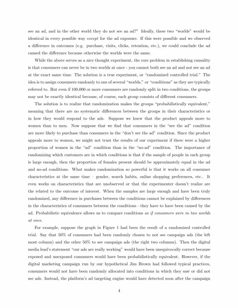
While the above serves as a nice thought experiment, the core problem in establishing causality
is that consumers can never be in two worlds at once - you cannot both see an ad and not see an ad
at the exact same time. The solution is a true experiment, or “randomized controlled trial.” The
idea is to assign consumers randomly to one of several “worlds,” or “conditions” as they are typically
referred to. But even if 100,000 or more consumers are randomly split in two conditions, the groups
may not be exactly identical because, of course, each group consists of different consumers.
The solution is to realize that randomization makes the groups “probabilistically equivalent,”
meaning that there are no systematic differences between the groups in their characteristics or
in how they would respond to the ads. Suppose we knew that the product appeals more to
women than to men. Now suppose that we find that consumers in the “see the ad” condition
are more likely to purchase than consumers in the “don’t see the ad” condition. Since the product
appeals more to women, we might not trust the results of our experiment if there were a higher
proportion of women in the “ad” condition than in the “no-ad” condition. The importance of
randomizing which customers are in which conditions is that if the sample of people in each group
is large enough, then the proportion of females present should be approximately equal in the ad
and no-ad conditions. What makes randomization so powerful is that it works on all consumer
characteristics at the same time – gender, search habits, online shopping preferences, etc.. It
even works on characteristics that are unobserved or that the experimenter doesn’t realize are
the related to the outcome of interest. When the samples are large enough and have been truly
randomized, any difference in purchases between the conditions cannot be explained by differences
in the characteristics of consumers between the conditions—they have to have been caused by the
ad. Probabilistic equivalence allows us to compare conditions as if consumers were in two worlds
at once.
For example, suppose the graph in Figure 1 had been the result of a randomized controlled
trial. Say that 50% of consumers had been randomly chosen to not see campaign ads (the left
most column) and the other 50% to see campaign ads (the right two columns). Then the digital
media lead’s statement “our ads are really working” would have been unequivocally correct because
exposed and unexposed consumers would have been probabilistically equivalent. However, if the
digital marketing campaign run by our hypothetical Jim Brown had followed typical practices,
consumers would not have been randomly allocated into conditions in which they saw or did not
see ads. Instead, the platform’s ad targeting engine would have detected soon after the campaign
4

started that women were more likely to purchase than men. As a result, the engine would have
started exposing more women and fewer men to campaign ads. In fact, the job of an ad targeting
engine is to make consumers’ ad exposure as little random as possible: Targeting engines are
designed to show ads to precisely those consumers who are most likely to respond to them. In some
sense, the targeting engine “stacks the deck” by sending the ad to the people who are most likely to
buy, making it very difficult to tell whether the ad itself is actually having any incremental effect.
Hence, instead of proving the digital media lead’s statement that “our ads are really working,”
Figure 1 could be more accurately interpreted as showing that “consumers who are not interested
in buying the product don’t get shown ads and don’t buy (left column), while consumers who are
interested in buying the product do get shown ads and also buy (right columns).” Perhaps the ads
had some effect, but in this analysis it is impossible to tell whether high sales conversions were due
to ad exposure or preexisting differences between consumers.
The non-randomization of ad exposure may undermine Jim’s ability to draw conclusions from
the differences between consumers who are and are not exposed to ads, but what about the differ-
ences between columns (b) and (c), the non-clickers and the clickers? Does the difference in sales
conversion between the two groups show that clicks cause purchases? In order for that statement to
be true, it would have to be the case that, among consumers who are exposed, consumers who click
and don’t click are probabilistically equivalent. But why would some consumers click and others
not? Presumably because the ads appealed more to one group than the other. In fact, Jim’s team
found that consumers who clicked were more likely to be loyalty program members, suggesting that
they were already positively disposed to the firm’s products relative to those who did not click.
Perhaps the act of clicking had some effect, but in this analysis it is impossible to tell whether
higher sales conversions from clickers were due to clicking or because consumers who are already
loyal consumers—and already predisposed to buy—are more likely to click.
In the remainder of this paper we will look at a variety of different ways to measure advertising
effectiveness through the lens of causal measurement and probabilistic equivalence. This will make
clear when it is and is not possible to make credible causal claims about the effect of ad campaigns.
2 Study design and measurement approach
The 12 advertising studies analyzed in this paper were chosen by two of the authors (Gordon and
Zettelmeyer) for their suitability for comparing several common ad effectiveness methodologies and
for exploring the problems and complications of each. All 12 studies were randomized controlled
trials held in the US. The studies are not representative of all Facebook advertising, nor are they
intended to be representative. Nonetheless, they cover a varied set of verticals (retail, financial
5

services, e-commerce, telecom, and tech). Each study was conducted recently (January 2015 or
later) on a large audience (at least 1 million users) and with “conversion tracking” in place. This
means that in each study the advertiser measured outcomes using a piece of Facebook-provided html
code, referred to as a “conversion pixel,” that the advertiser embeds on its web pages.2 This enables
an advertiser to measure whether a user visited that page. Conversion pixels can be embedded on
different pages, for example a landing page, or the checkout confirmation page. Depending on
the placement, the conversion pixel reports whether a user visited a desired section of the website
during the time of the study, or purchased.
To compare different measurement techniques to the “truth,” we first report the results of
each randomized controlled trial (henceforth an “RCT”). RCTs are the “gold standard” in causal
measurement because they ensure probabilistic equivalence between users in control and test groups
(within Facebook the ad effectiveness RCTs we analyze in this paper are referred to as a “lift test.”3).
2.1 RCT design
An RCT begins with the advertiser defining a new marketing campaign which includes deciding
which consumers to target. For example, the advertiser might want to reach all users that match
a certain set of demographic variables, e.g., all women between the ages of 18 and 54. This choice
determines the set of users included in the study sample. Each user in the study sample was
randomly assigned to either the control group or the test group according to some proportion
selected by the advertiser (in consultation with Facebook). Users in the test group were eligible to
see the campaign’s ads during the study. Which ad gets served for a particular impression is the
result of an auction between advertisers competing for that impression. The opportunity set is the
collection of display ads that compete in an auction for an impression.4 Whether eligible users in
the test group ended up being exposed to a campaign’s ads depended on whether the user accessed
Facebook during the study period and whether the advertiser was in the opportunity set and was
the highest bidder for at least one impression on the user’s News Feed.
2We use “conversion pixel” to refer to two different types of conversion pixels used by Facebook. One was
traditionally referred to as a “conversion pixel” and the other is referred to as a “Facebook pixel”. Both types
of pixels were used in the studies analyzed in this paper. For our purposes both pixels work the same way (see
https://www.facebook.com/business/help/460491677335370).3See https://www.facebook.com/business/news/conversion-lift-measurement4The advertising platform determines which ads are part of the opportunity set based on a combination of factors:
how recently the user was served any ad in the campaign, how recently the user saw ads from the same advertiser,
the overall number of ads the user was served in the past twenty-four hours, the “relevance score” of the advertiser,
and others. The relevance score attempts to adjust for whether a user is likely to be a good match for an ad
(https://www.facebook.com/business/news/relevance-score).
6

Users in the control group were never exposed to campaign ads during the study. This raises
the question: What should users in the control group be shown in place of the focal advertiser’s
campaign ads? One possibility is not to show control group users any ads at all, i.e., to replace the
advertiser’s campaign ads with non-advertising content. However, this creates significant oppor-
tunity costs for an advertising platform, and is therefore not implemented at Facebook. Instead,
Facebook serves each control group user the ad that this user would have seen if the advertiser’s
campaign had never been run.
We illustrate how this process works using a hypothetical and stylized example in Figure 2.
Consider two users in the test and control groups, respectively. Suppose that at one particular
instant, Jasper’s Market wins the auction to display an impression for the test group user, as seen
in Figure 2a. Imagine that the control group user, who occupies a parallel world to the test user,
would have been served the same ad had this user been in the test group. However, the platform,
recognizing the user’s assignment to the control group, prevents the focal ad from being displayed.
As Figure 2b shows, instead the second-place ad in the auction is served to the control user because
it is the ad that would have won the auction in the absence of the focal campaign.
Of course, Figure 2 is a stylized view of the experimental design (clearly there are no two
identical users in parallel worlds). For users in the test group, the platform serves ads in a regular
manner, including those from the focal advertiser.The process above is only relevant for users in
the control group and if the opportunity set contains the focal ad on a given impression. If the
focal ad does not win the auction, there is no intervention—whatever ad wins the auction is served
because the same ad would have been served in the absence of the focal advertiser’s campaign.
However, if the focal ad wins the auction, the system removes it and instead displays the second-
place ad. In the example, Waterford Lux Resorts is the “control ad” shown to the control user.
At another instant when Jasper’s Market would have won the auction, a different advertiser might
occupy the second-place rank in the auction. Thus, instead of their being a single control ad, users
in the control condition are shown the distribution of ads they would have seen if the advertiser’s
campaign had not run.
A key assumption for a valid RCT is that there is no contamination between control and test
groups, meaning users in the control group cannot have been inadvertently shown campaign ads,
even if the user accessed the site multiple times from different devices or browsers. Fortunately for
us, users must log into Facebook each time they access the service on any device, meaning that
campaign ads were never shown inadvertently to users in the control group. This allowed us to
bypass a potential problem with cookie-based measurements: that different browsers and devices
cannot always be reliably identified as belonging to the same consumer.5
5In addition, a valid RCT requires the Stable Unit Treatment Value Assumption (SUTVA). In the context of our
7

Figure 2: Determination of control ads in Facebook experiments
(a) Step 1: Determine that a user in the control would have been served the focal ad
(b) Step 2: Serve the next ad in the auction.
8

2.2 Ad effectiveness metrics in an RCT
To illustrate how we report the effectiveness of ad campaigns, suppose that 0.8% of users in the
control group and 1.2% of users in the test group purchased during a hypothetical study period. One
might be tempted to interpret this as “exposure to ads increased the share of consumers buying by
0.4 percentage points, or an increase in purchase likelihood of 50%.” This interpretation, however,
would be incorrect. The reason is that not all consumers who were assigned to the test group were
exposed to ads during the study. (This could be because, after they were assigned to the test group,
some users did not log into Facebook; because the advertiser did not win any ad auctions for some
users; because some users did not scroll down far enough in their newsfeed to where a particular
ad was placed, etc.). Hence, the test group contains some users who cannot have been affected by
ads because they did not see them.
Continuing the example, suppose that only half the users in the test group saw the ads. This
means that the 0.4% difference between the 0.8% conversion rate in the control group and the 1.2%
conversion rate in the test group must have been generated by the half of users in the test group
who actually were exposed to the campaign ads—the effect of an ad on a user who doesn’t see it
must be zero. To help see this, we can express the 0.4% difference as a weighted average of (i) the
effect of ads on the 50% of users who actually saw them (let’s call this the “incremental conversion
rate” due to the ads or “ICR”) and (ii) the 0 percent effect on the 50% of users who did not see
them:
0.5 ∗ ICR + 0.5 ∗ 0% = 0.4% (1)
Solving this simple equation for ICR shows that the incremental conversion rate due to ad
exposure is 0.8%.
ICR =0.4%
0.5= 0.8% (2)
The interpretation of this incremental conversion rate is that consumers who were exposed to
campaign ads were more likely by 0.8 percentage points to purchase the product than they would
have been had they not been exposed to these ads during the study period.6
Continuing with our example, suppose that we examine the sales conversion rate of the con-
sumers in our test sample who were exposed to the ads and find that it is 1.8%. At first, this might
seem puzzling: If the sales conversion rate for the half of the test group that saw the ads is 1.8%,
study this means that the potential outcome of one user should be unaffected by the particular assignment other
users to treatment and control groups (no interference). This assumption might be violated if users use the share
button to share ads with other users, which was not widely observed in our studies.6The ICR is also commonly referred to as the “average treatment effect on the treated.”
9
and the sales conversion rate for the whole test group is 1.2%, then the sales conversion rate for
the half of the test group who did not see the ads must be 0.6%. (This is because 0.6% is the
number that when averaged with 1.8% equals 1.2%: 0.5 ∗ 1.8% + 0.5 ∗ 0.6% = 1.2%.) This means
that the unexposed members of the test group had a lower sales conversion rate that the control
group. What happened? Did our randomization go wrong?
The answer is no—there is nothing wrong with the randomization. Remember that we can
randomize whether an individual is in the test or control group, but we can’t randomize whether
or not a person sees the ad. This depends in part on the targeting mechanism (which, as we have
already discussed, will tend to show ads to people who are likely to respond and to avoid showing
ads to people who are unlikely to respond) and in part on the person’s own behavior (someone who
is trekking in Nepal is unlikely to be spending time on Facebook and also unlikely to be making
online purchases). Said another way, the set of people within the test group who actually see the ad
is not a random sample but a “selected” sample. There are several different “selection mechanisms”
that might be at work in determining who in the test group actually sees the ad. The targeting
engine and vacations are two we have already mentioned (we will discuss a third later).
The reason for using the incremental conversion rate as the measure of the effect of the ad is to
account for the possibility that the test group members who saw the ad is a selected (rather than
random) subset of the test group. The results of our RCT were that the sales conversion rate in
the test sample, at 1.2%, was higher by 0.4 percentage points than the sales conversion rate in the
control sample, at 0.8% As we described above, this difference must be driven by half of the test
group who saw the ads, which means that the incremental effect of the ads must be to have increase
the sales conversion rate within this group by 0.8 percentage points. The actual sales conversion
rate in this exposed group was 1.8%, which implies that if the exposed group had not seen the ads,
their sales conversion rate would have been 1.0% (equal to the 1.8% sales conversion rate minus
the 0.8% calculated incremental conversion rate).
The power of the RCT is that it gives us a way to measure what we can’t observe, namely,
what would have happened in the alternative world in which people who actually saw the ad didn’t
see the ad (see figure 3). This measure, 1.0% in our example, is called the counterfactual” or “but
for” conversion rate—what the conversion rate would have been in the world counter to the factual
world, or what the conversion rate would have been but for the advertisement exposure.
The incremental conversion rate (ICR) is the actual conversion rate minus the counterfactual
conversion rate, 1.8%-1.0% in our example. The measure we that we will use to summarize outcomes
of the Facebook advertising studies, which is what Facebook uses internally, is “lift.” Lift simply
10

Figure 3: Measuring the incremental conversion rate
ControlTest
Exposed
Unexposed
50%
50%
(Eligible to be exposed) (Unexposed)
50% who would have been exposed if they had been in the test group
50% who would not have been exposed if they had been in the test group
1.8%
0.6%
1.2%
1.0%
0.6%
0.8%
ICR
expresses the incremental conversion rate as a percentage effect
Lift =Actual conversion rate – Counterfactual conversion rate
Counterfactual conversion rate(3)
In our example, the lift is 1.8%−1.0%1.0% = 0.8 or 80%. The interpretation is that exposure to the
ad lifted the sales conversion rate of the kind consumers who were exposed to the ad by 80%.
3 Alternative measures of advertising effectiveness
In this section we will describe the various advertising effectiveness measures whose performance we
wish to assess in comparison to randomized controlled trials. In order to be able to talk about these
measurement techniques concretely rather than only generally, we will apply them to one typical
advertising study (we refer to it as “study 4”). This study was performed for the advertising
campaign of an omni-channel retailer. The campaign took place over two weeks in the first half of
2015 and comprised a total of 25.5 million users. Ads were shown on mobile and desktop Facebook
newsfeeds in the US. For this study the conversion pixel was embedded on the checkout confirmation
page. The outcome measured in this study is whether a user purchased online during the study
and up to several weeks after the study ended.7 Users were randomly split into test and control
groups in proportions of 70%, and 30%, respectively.
7Even if some users convert as a result of seeing the ads further in the future, this still implies the experiment will
produce conservative estimates of advertising’s effects.
11

3.1 Results from a Randomized Controlled Trial
We begin by presenting the outcome from the randomized controlled trial. In later sections, we will
apply alternative advertising effectiveness measures to the data generated by study 4. To preserve
confidentiality, all of the conversion rates in this section have been scaled by a random constant.
Our first step is to check whether the randomization appears to have resulted in probabilistically
equivalent test and control groups. One way to check this is to see whether the two groups are
similar on variables we observe. As Table 1 shows for a few key variables, test and control groups
match very closely and are statistically indistinguishable (the p-values are above 0.05).
Table 1: Randomization check
Variable Control group Test group p-value
Average user age 31.7 31.7 0.33
% of users who are male 17.2% 17.2% 0.705
Length of time using FB (days) 2,288 2,287 0.24
% of users with status “married” 19.6 19.6 0.508
% of users status “engaged” 13.8 13.8 0.0892
% of users status “single” 14.0 14.0 0.888
# of FB friends 485.7 485.7 0.985
# of FB uses in last 7 days 6.377 6.376 0.14
# of FB uses in last 28 days 25.5 25.5 0.172
As Figure 4 shows, the incremental conversion rate in this study was 0.045% (statistically
different from 0 at a 5% significance level). This is the difference between the conversion rate of
exposed users (0.104%), and their counterfactual conversion rate (0.059%), i.e. the conversion rate
of these users had they not been exposed. Hence, in this study the lift of the campaign was 77%
(=0.045%/0.059%). The 95% confidence interval for this lift is [37%, 117%].8
We will interpret the 77% lift measured by the RCT as our gold standard measure of the truth.
In the following sections we will calculate alternative measures of advertising effectiveness to see
how close they come to this 77% benchmark. These comparisons reveal how close to (or far from)
knowing the truth an advertiser who was unable to (or chose not to) evaluate their campaign with
an RCT, would be.
3.2 Individual-based Comparisons
Suppose that instead of conducting a randomized controlled trial, an advertiser had followed cus-
tomary practice by choosing a target sample (such as single women aged 18-49, for example) and
8See the technical appendix for details on how to compute the confidence interval for the lift.
12

Figure 4: Results from RCT
ControlTest
Exposed
Unexposed
25%
75%
0.104% 0.059%
0.020%0.020%
0.042% 0.030%
(Eligible to be exposed) (Unexposed)
ICR=0.045%Lift=77%
Users who would have been exposed if they had been in the test group
Users who would not have been exposed if they had been in the test group
made all of them eligible to see the ad. (Note that this is equivalent to creating a test sample
without a control group held out). How might one evaluate the effectiveness of the ad? In the
rest of this section we will consider several alternatives: comparing exposed vs. unexposed users,
matching methods, and model-based adjustment techniques.
3.2.1 Exposed/Unexposed
One simple approach would be to compare the sales conversion rates of exposed vs. unexposed
users. This is possible because even if an entire set of users is eligible to see an ad not all of them
will (because the user doesn’t log into Facebook during the study period, because the advertiser
doesn’t win any auctions for this user, etc.). We can simulate being in this situation using the data
from study 4 by using data only from the test condition. Essentially, we are pretending that the
30% of users in the target segment of study 4 who were randomly selected for the control group do
not exist.
Within the test group of study 4, the conversion rate among exposed users was 0.104% and
the conversion rate among unexposed users was 0.020%, implying an ICR of 0.084% and a lift of
416%. This estimate is more that five times the true lift of 77% and therefore greatly overstates
the effectiveness of the ad.
It is well known among ad measurement experts that simply comparing exposed to unexposed
consumers yields problematic results. Many of the methods we describe in the following subsection
were designed to improve on the well-known failings of this approach. In the remainder of this
13

subsection we will delve into why this comparison yields problematic results in the first place. The
answers are helpful for understanding then other analysis on this paper.
Recall that one can attribute the difference in conversion rates between the groups solely to
advertising only if consumers who are exposed and unexposed to ads are probabilistically equivalent.
In practice, this is often not true. As we have discussed above, exposed and unexposed users likely
differ in many ways, some observed and others unobserved.
Figure 5 depicts some of the differences between the exposed and unexposed groups (within
the test group) in study 4. The figure displays percentage differences relative to the average of the
entire test group. For example, the second item in Figure 5 shows that exposed users are about
10% less likely to be male than the average for the test group as a whole, while unexposed users
are several percentage points more likely to be male than the average for the whole group. The
figure shows exposed and unexposed users differ other ways as well. In addition to having more
female users, the exposed group is slightly younger, more likely to be married, has more Facebook
friends, and tends to access Facebook more frequently from a mobile device than a desktop. The
two groups also own different types of phones.
These differences warn us that a comparison of exposed and unexposed users is unlikely to
satisfy probabilistic equivalence. The more plausible it is that these characteristics are correlated
with the underlying probability that a user will purchase, the more comparing groups that differ in
these characteristics will confound the effect of the ads with the differences in group composition.
The inflated ICR of 416% generated by the simple exposed vs. unexposed comparison suggests
that there is a strong confounding effect in study 4. In short, exposed users converted more
frequently than unexposed users because they were different in other ways that made them more
likely to convert in the first place, irrespective of advertising exposures. This confounding effect—
the differences in outcomes that arise from differences in underlying characteristics between groups
are attributed instead to differences in ad exposure—is called selection bias.
One remaining question is why the characteristics of exposed and unexposed users are so dif-
ferent. While selection effects can arise in various advertising settings, there are three features of
online advertising environments that make selection bias particularly significant.
First, an ad is delivered when the advertiser wins the underlying auction for an impression.
Winning the auction implies the advertiser out-bid the other advertisers competing for the same
impression. Advertisers usually bid more for impressions that are valuable to them, meaning more
likely to convert. Additionally, Facebook and some other publishers prefer to show ads to consumers
they are more likely to enjoy. This means that an advertisers’ ads are more likely to be shown to
users who are more likely to respond to its ads, and users who are less likely to respond to the other
advertisers who are currently active on Facebook. Even if an advertiser triggers little selection bias
14

Figure 5: Comparison of exposed and unexposed users in the test group of study 4
(expressed as percentage differences relative to average of the entire test group)
-50%
-40%
-30%
-20%
-10%
0%
10%
20%
30%
Age Male FBAge Married Single #ofFriends FBWeb FBMobile PhoneA PhoneB PhoneC
Unexposed
Exposed
based on their own advertising, it can nevertheless end up with a selected exposure because of
what another advertiser does. For example, Figure 5 shows that in study 4, exposed users were
more likely to be women than men. This could be because the advertiser in study 4 was placing
relatively high bids for impressions to women. But it could also be because another advertiser who
was active during study 4 was bidding aggressively for men, leaving more women to be won by the
advertiser in study 4.
A second mechanism that drives selection is the optimization algorithms that exist on modern
advertising delivery platforms. Advertisers and platforms try to optimize the types of consumers
that should be shown an ad. A campaign that seeks to optimize on purchases will gradually refine
the targeting and delivery rules to identify users who are most likely to convert. For example,
suppose an advertiser initially targets female users between the ages of 18 and 55. After the
campaign’s first week, the platform observes that females between 18 and 34 are especially likely to
convert. As a result, the ad platform will increase the frequency that the ad campaign enters into
the ad auction for this set of consumers, resulting in more impressions targeted at this narrower
group. These optimization routines perpetuate an imbalance between exposed and unexposed test
group users: the exposed group will contain more 18-34 females and the unexposed group will
contain more 35-55 females. Assessing lift by comparing exposed vs. unexposed consumers will
15

therefore overstate the effectiveness of advertising because exposed users were specifically chosen
on the basis of their higher conversion rates.9
The final mechanism is subtle, but arises from the simple observation that a user must actually
visit Facebook during the campaign to be exposed. If conversion is purely a digital outcome (e.g.,
online purchase, registration, key landing page), exposed users will be more likely to convert simply
because they happened to be online during the campaign. Lewis, Rao, and Reiley (2011) show that
consumer choices such as this can lead to activity bias that complicates measuring causal effects
online.
We have described why selection bias is likely to plague simple exposed vs. unexposed compar-
isons, especially in online advertising environment. However, numerous statistical methods exist
that attempt to remedy these challenges. Some of the most popular ones are discussed next.
3.2.2 Exact Matching and Propensity Score Matching
In the previous section, we saw how comparing the exposed and unexposed groups is inappropriate
because they contain different compositions of consumers. But if we can observe how the groups
differ based on characteristics observed in the data, can we take them into account in some way
that improves our estimates of advertising effectiveness?
This is the logic behind matching methods. For starters, suppose that we believe that age and
gender alone determine whether a user is exposed or not. In other words, women might be more
likely to see an ad than men and younger people more likely than older, but among people of the
same age and gender, whether a particular user sees an ad is as good as random.
In this case a matching method is very simple to implement. Start with the set of all exposed
users. For each exposed user, choose randomly from the set of unexposed users a user of the same
age and gender. Repeat this for all the exposed users, potentially allowing the same unexposed
user to be matched to multiple exposed users. This method of matching essentially creates a
comparison set of unexposed users whose age and gender mix now matches that of the exposed
group. If it is indeed the case that within age and gender exposure is random, then we have
constructed probabilistically equivalent groups of consumers. The advertising effect is calculated
as the average difference in outcomes between the exposed users and the paired unexposed users.10
9Facebook’s ad testing platform is specifically designed to account for the fact that targeting rules for a campaign
change over time. This is a accomplished by applying the new targeting rules both to test and control groups, even
though users in the control group are never actually exposed to campaign ads.10In practice, the matching is not usually a simple one-to-one pairing. Instead, each exposed user is matched
to a weighted average of all the unexposed users with the same age and gender combination. This makes use of
all the information that can be gleaned from unexposed users, while adjusting for imbalances between exposed and
16

We applied exact matching on age and gender to study 4. Within the test group of study 4, there
were 113 unique combinations of age and gender for which there was at least one exposed and at
least one unexposed user.11 Using this method, which we’ll label “Exact Matching,” exposed users
converted at a rate of 0.104% and unexposed users at 0.032%, for a lift of 221%.12 This estimate
is roughly half the number we obtained from directly comparing the exposed and unexposed users.
Matching on age and gender has reduced a lot of the selection bias, but this estimate is still
almost three times the 77% measure from the RCT, so we haven’t eliminated all of it. An obvious
reason for this is that age and gender are not the only factors that determine advertising exposure.
(We can see this for study 4 by looking at Figure 5). In addition to age and gender, one might want
to match users on their geographic location, phone type, relationship status, number of friends,
Facebook activity on mobile vs. desktop devices, and more. The problem is that as we add new
characteristics on which to match consumers, it gets harder and harder to find exact matches. This
becomes especially difficult when we think about the large number of attributes most advertisers
observe about a given user.
Fortunately there are matching methods that do not require exact matching, many of which
are already commonly used by marketing modelers. At a basic level, matching methods try to pair
exposed users with similar unexposed users. Previously we defined “similar” as exactly matching
on age and gender. Now we just need a clever way of defining “similarity” that allows for inexact
matches.
One popular method is to match users on their so-called propensity score. The propensity score
approach uses data we already have on users’ characteristics and whether or not they were exposed
to an ad to create an estimate, based on the user’s characteristic, of how likely that user is to
have been exposed to an ad.13 The idea is that the propensity score summarizes all of the relevant
unexposed users.11It would have been possible to create as many as 120 age-gender combinations but seven combinations were
dropped because that combination was absent from either the exposed or unexposed group. A total of 15 users
were dropped for this reason. A lack of comparison groups is a common problem in matching methods. There is no
guarantee a good match for each exposed user will always exist. In our case, for example, there was a 78-year-old
male who was exposed to advertising but there were no 78-year-old males in the unexposed group. The general
recommendation in these situations is to drop users that do not have a match in the other group, which is known as
enforcing a common support between the groups. We cannot make a reliable inference about the effect of exposure
on a user who does not have a match in the unexposed group. Of course, we could pair a 78-year-old male with a
77-year-old male but the match would not be exact. Other matching methods, such as propensity score matching
and nearest-neighbor matching, permit such inexact matches, and we discuss these methods shortly.12For these result we used the weighted version of exact matching described in footnote 10, rather than the one-
to-one matching described in the main body of the text.13Calculating the propensity score for each user is easy and typically done using standard statistical tools, such
as logistic regression. More sophisticated approaches based on machine learning algorithms, such as random forests,
17

information about a consumer in a single number. Said another way, propensity scores enable us
to collapse many dimensions of consumer attributes into a single scale that measures specifically
how similar consumer are in their propensity to be exposed to an ad. With this measure in hand,
we just match people using their propensity scores in much the same way as we did earlier. For
each exposed user, we find the unexposed user with the closest propensity score, discarding any
individuals that don’t have a close enough match in the other group. Advertising effectiveness
is estimated as the difference in conversion rates between the matched exposed and unexposed
groups. The key assumption underlying this approach is that, for two people with the same (or
very close) propensity scores, exposure is as good as random. Hence, for two consumers who both
had propensity scores of 65%, one of whom was actually exposed while the other was not, we are
assuming it’s as if a coin flip had determined which user ended up being exposed. By pairing users
with close propensity scores, we can once again construct probabilistically equivalent groups to
measure the causal effect of ad exposure.14
We calculated propensity scores for the exposed and unexposed users in the test group from
study 4 using a logistic regression model and then created propensity score matched samples of
exposed and unexposed users. The upper part of panel (a) of Figure 6 shows the distributions of
the propensity scores for all exposed and unexposed users (i.e. before matching). The lower part of
panel (a) shows the distributions of the matched sample. Prior to matching, the propensity score
distribution for the exposed and unexposed users differ substantially. After matching, however,
there is no visible difference in the distributions, implying that matching did a good job of balancing
the two groups based on their likelihood of exposure.15
Propensity score matching matches users based on a composition of their characteristics. One
might wonder how well propensity-score matched samples are matched on individual characteristics.
In panel (b) of Figure 6, we show the distribution of age for exposed and unexposed users in the
unmatched samples (upper) and in the matched samples (lower). Even though we did not match
directly on age, matching on the propensity score nevertheless balanced the age distribution between
exposed and unexposed users.
An important input to propensity score matching (PSM) is the set of variables used to predict
can also be used. Rather than matching on the propensity score directly, most researchers recommend matching on
the “logit” transformation of the propensities because it linearizes values on the 0-1 interval.14As with the exact matching, there are propensity score methods that work by attributing greater weight to
unexposed users that are more similar in propensity score to exposed users rather than implementing one-to-one
matching. In the results we present, we use one of these weighted propensity score methods. See the appendix for
details.15This comparison also helps us check that we have sufficient overlap in the propensities between the exposed and
unexposed groups.
18

01
23
0 .2 .4 .6 .8 1
Unmatched
0.5
11.
52
2.5
0 .2 .4 .6 .8 1
Exposed Unexposed
Matched
Propensity Score
(a) Propensity Score
0.02
.04
.06
.08
20 30 40 50 60 70 80
Unmatched
0.02
.04
.06
.08
20 30 40 50 60 70 80
Exposed Unexposed
Matched
Age
(b) Age
Figure 6: Comparison of Unmatched and Matched Characteristic Distributions
the propensity score itself. We tested three different PSM specifications for study 4, each of which
used a larger set of inputs.
PSM 1: In addition to age and gender, the basis of our exact matching (EM) approach, this specifi-
cation uses common Facebook variables, such as how long users have been on Facebook, how
many Facebook friends the have, their reported relationship status, and their phone OS, in
addition to other user characteristics.
PSM 2: In addition to the variables in PSM 1, this specification uses Facebook’s estimate of the user’s
zip code of residence to associate with each user nearly 40 variables drawn from the most
recent Census and American Communities Surveys (ACS).
PSM 3: In addition to the variables in PSM 2, this specification adds a composite metric of Facebook
data that summarizes thousands of behavioral variables. This is a machine-learning based
metric used by Facebook to construct target audiences that are similar to consumers that
an advertiser has identified as desirable.16 Using this metric bases the estimation of our
propensity score on a non-linear machine-learning model with thousands of features.17
16See https://www.facebook.com/business/help/164749007013531 for an explanation.17Please note that, while this specification contains a great number of user-level variables, we have no data at
the user level that varies over time within the duration of each study. For example, while we know whether a user
used Facebook during the week prior to the beginning of the study, we don’t observe on any given day of the study
whether the user used Facebook on the previous day or whether the user engaged in any shopping activity. It is
possible that using such time-varying user-level information could improve our ability to match. We hope to explore
this in a future version of the paper.
19

Table 2 presents a summary of the estimates of advertising effectiveness produced by the exact
matching and propensity score matching approaches.18 As before, the main result of interest will
be the lift. In the context of matching models, lift is calculated as the difference between the
conversion rate for matches exposed users and matched unexposed users, expressed as a percentage
of the conversion rate for matched unexposed users. Table 2 reports each of the components of
this calculation, along with the 95% confidence interval for each estimate. The bottom row reports
the AUCROC, a common measure of the accuracy of classification models (it applies only to the
propensity score models).19
Note that the conversion rate for matched exposed users barely changes across the model speci-
fications. This is for the most part we are holding on to the entire set of exposed users and changing
across specifications which unexposed users are chosen as the matches.20
What does change across specifications is the conversion rate of the matched unexposed users.
This is because different specifications choose different sets of matches from the unexposed group,
When we go from exact matching (EM) to our most parsimonious propensity score matching model
(PSM 1), the conversion rate for unexposed users increases from 0.032% to 0.042%, decreasing the
implied advertising lift from 221% to 147%. PSM 2 performs similarly to PSM 1, with an implied
lift of 154%.21 Finally, adding the composite measure of Facebook variables in PSM 3 improves
the fit of the propensity model (as measured by a higher AUCROC) and further increases the
conversion rate for matched unexposed users to 0.051%. The result is that our best performing
PSM model estimates an advertising lift of 102%.
When we naively compared exposed to unexposed users, we estimated an ad lift of 416%.
Adjusting these groups to achieve balance on age and gender, which differed in the raw sample,
suggested a lift of 221%. Matching the groups based on their propensity score, estimated with a
rich set of explanatory variables, gave us a lift of 102%. Compared to the starting point, we have
gotten much closer to the true RCT lift of 77%.
Next we apply another class of methods to this same problem, and later we will see how the
collection of methods fair across all the advertising studies.
18See the appendix for more detail on implementation.19See http://gim.unmc.edu/dxtests/roc3.htm for a short and Fawcett (2006) for a detailed an explanation of
AUCROC.20Exposed users are dropped if there is no unexposed user that has a close enough propensity score match. In
study 4, the different propensity score specifications we use do not produce very different sets of exposed users who
can be matched. This need not be the case in all settings.21As we add variables to the propensity score model, we must drop some observations in the sample with missing
data. However, the decrease in sample size is fairly small and these dropped consumers do not significantly differ
from the remaining sample.
20

Table 2: Exact Matching (EM) and Propensity Score Matching (PSM 1-3)
EM PSM 1 PSM 2 PSM 3
Est. 95% CI Est. 95% CI Est. 95% CI Est. 95% CI
Conversion rates for matched unexposed users (%)
0.032 [0.029, 0.034] 0.042 [0.041, 0.043] 0.041 [0.040, 0.042] 0.051 [0.050, 0.052]
Conversion rates for matched exposed users (%)
0.104 [0.097, 0.109] 0.104 [0.097, 0.109] 0.104 [0.097, 0.109] 0.104 [0.097, 0.110]
Lift (%) 221 [192, 250] 147 [126, 168] 154 [132, 176] 102 [83, 121]
AUCROC N/A 0.72 0.73 0.81
Observ 7,674,114 7,673,968 7,608,447 7,432,271
∗Slight differences in the number of observations are due to variation in missing characteristics across users in
the sample. Note that the confidence intervals for PSM 1-3 on the conversion rate for matched unexposed users
and the lift are approximate (consult the appendix for more details).
3.2.3 Regression Adjustment
Regression adjustment (RA) methods take an approach that is fundamentally distinct from match-
ing methods. In colloquial terms, the idea behind matching is “If I can find users who didn’t see the
ad but who are really similar in their observable characteristics to users who did see the add, then
I can use their conversion rate as a measure of what people who did see the ad would have done if
they had not seen the ad (the counterfactual).” The idea behind regression adjustment methods is
instead the following: “If I can figure out the relationship between the observable characteristics of
users who did not see the ad and whether they converted, then I can use that to predict for users
who did see the ad, on the basis of their characteristics, what they would have done if they had
not seen the ad (the counterfactual).” In other words, the two types of methods differ primarily in
how they construct the counterfactual.
A very simple implementation would be the following. Using data from the unexposed members
of the test group, regress the outcome measures (e.g. did the consumer purchase) on the observable
characteristics of the users. Take the estimated coefficients from this specification and use them to
extrapolate for each exposed user a predicted outcome measure (e.g., the probability of purchase).
The lift estimate is then based on the difference between the actual conversion rates of the exposed
users and their predicted conversion rates.22
22More generally, one would start by constructing one model for each “treatment level” (e.g., exposed/unexposed).
Next, one would use these models to predict the counterfactual outcomes necessary to estimate the causal effect.
Suppose we want to predict what would have happened to an exposed user if they had instead not been exposed.
For this exposed user, we would use the model estimated only on all unexposed users to predict the counterfactual
outcome for the exposed user had they been unexposed. We repeat this process for all the exposed users. The causal
21
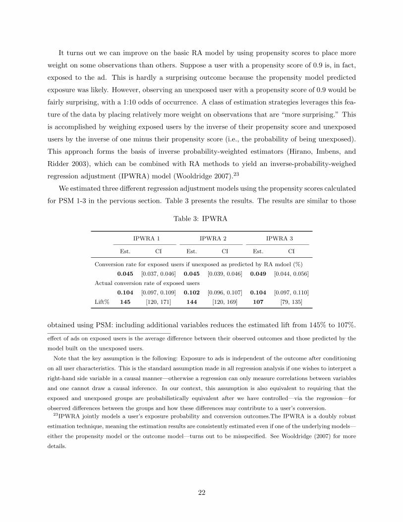
It turns out we can improve on the basic RA model by using propensity scores to place more
weight on some observations than others. Suppose a user with a propensity score of 0.9 is, in fact,
exposed to the ad. This is hardly a surprising outcome because the propensity model predicted
exposure was likely. However, observing an unexposed user with a propensity score of 0.9 would be
fairly surprising, with a 1:10 odds of occurrence. A class of estimation strategies leverages this fea-
ture of the data by placing relatively more weight on observations that are “more surprising.” This
is accomplished by weighing exposed users by the inverse of their propensity score and unexposed
users by the inverse of one minus their propensity score (i.e., the probability of being unexposed).
This approach forms the basis of inverse probability-weighted estimators (Hirano, Imbens, and
Ridder 2003), which can be combined with RA methods to yield an inverse-probability-weighed
regression adjustment (IPWRA) model (Wooldridge 2007).23
We estimated three different regression adjustment models using the propensity scores calculated
for PSM 1-3 in the pervious section. Table 3 presents the results. The results are similar to those
Table 3: IPWRA
IPWRA 1 IPWRA 2 IPWRA 3
Est. CI Est. CI Est. CI
Conversion rate for exposed users if unexposed as predicted by RA mdoel (%)
0.045 [0.037, 0.046] 0.045 [0.039, 0.046] 0.049 [0.044, 0.056]
Actual conversion rate of exposed users
0.104 [0.097, 0.109] 0.102 [0.096, 0.107] 0.104 [0.097, 0.110]
Lift% 145 [120, 171] 144 [120, 169] 107 [79, 135]
obtained using PSM: including additional variables reduces the estimated lift from 145% to 107%.
effect of ads on exposed users is the average difference between their observed outcomes and those predicted by the
model built on the unexposed users.
Note that the key assumption is the following: Exposure to ads is independent of the outcome after conditioning
on all user characteristics. This is the standard assumption made in all regression analysis if one wishes to interpret a
right-hand side variable in a causal manner—otherwise a regression can only measure correlations between variables
and one cannot draw a causal inference. In our context, this assumption is also equivalent to requiring that the
exposed and unexposed groups are probabilistically equivalent after we have controlled—via the regression—for
observed differences between the groups and how these differences may contribute to a user’s conversion.23IPWRA jointly models a user’s exposure probability and conversion outcomes.The IPWRA is a doubly robust
estimation technique, meaning the estimation results are consistently estimated even if one of the underlying models—
either the propensity model or the outcome model—turns out to be misspecified. See Wooldridge (2007) for more
details.
22

3.2.4 Summary of individual-based comparisons
We summarize the result of all our propensity score matching and regression methods for study 4
in Figure 7.
Figure 7: Summary of lift estimates and confidence intervals
221**
147**154**
102
145** 144**
107
77
5010
015
020
025
0Li
ft
EMPSM1
PSM2PSM3
IPWRA1
IPWRA2
IPWRA3RCT
S4 Checkout
** (*) Statistically significantly different from RCT lift at
1% (5%) level.
As the figure shows, propensity score matching and regression methods perform compara-
bly well. Both methods tend to overstate lift, although including our complete set of predictor
variables—especially the composite Facebook variable—produce lift estimates that are statistically
indistinguishable from the RCT lift. However, if one ignores the uncertainty represented in confi-
dence intervals and focuses on the point estimates alone, even a model with a rich set of predictors
overestimates the lift by about 50%.
3.3 Market-based comparisons
In many cases in which it would be difficult to randomize at the individual consumer level (necessary
for an RCT), it is possible to randomize at the geographic market level. This is commonly referred
to as a “matched market test.” Typically an advertiser would choose a set of, for example, 40
markets and assign 20 of these markets to the test group and the remaining 20 markets to the
control group. Users in control markets are never exposed to campaign ads during the study. Users
in the test markets are targeted with the campaign ads during the study period. The quality of this
comparison depends on how well the control markets allow the advertiser to measure what would
23

have happened in the test markets, had the ad campaign not taken place in those markets. Not
surprisingly, the key to the validity of such a comparison is to assign the available markets to test
and control groups such that consumers in test and control markets are as close to probabilistically
equivalent as possible.
There are two basic ways to achieve this goal. First, one can find pairs of similar or “matched”
markets based on market characteristics and then, within each pair, assign one market to the test
group and the other market to the control group. Alternatively, as long the number of markets
is sufficiently large, one can randomly assign markets to test and control groups, without first
choosing matches pairs.
All the studies used in this paper assigned individual users to test and control groups. However,
we can still assess what would have happened if, instead, the assignment had been at the market
level. Since each consumer in an advertiser’s target group for a campaign was randomly assigned
to either the test or control group prior to the study, each geographic market contains both users
in the test group and users in the control group. Moreover, the randomization ensures that both
the test and and the control group users in each market are representative of targeted Facebook
users in that market. This means that the behavior of users in the control group in a market is
representative of the behavior of all users in the advertiser’s target group in that market, had the
entire market not been targeted with campaign ads. Similarly the behavior of users in the test
group in a market is representative of the behavior of all users in the advertiser’s target group in
that market, had the entire market been targeted with campaigns ads. We can therefore simulate a
matched market test by assigning each market to be either a test market or a control market, and
using the data only from the corresponding set of study users in that market.
We define geographic markets using the US Census Bureaus definition of a “Core Based Sta-
tistical Area” (CBSA). There are 929 CBSAs, 328 of which are “Metropolitan Statistical Areas”
(MSAs) and the remaining 541 of which are “Micropolitan Statistical Areas.” For example, “San
Francisco-Oakland-Hayward,” “Santa Rosa,” and “Los Angeles-Long Beach-Anaheim” are CB-
SAs.24
To construct our matched market test we selected the 40 largest markets in the U.S. by popu-
lation (see Table 4). We picked 40 because Facebook ad researchers reported that this was typical
for the number of markets requested by clients for conducting matched market testing. Next, we
found pairs of similar markets based on market characteristics. We considered three sets of market
characteristics. First, we used a rich set of census demographic variables to describe consumers
24See Figure A-1 in the appendix for a map of CBSAs in California. Maps for other states can be found at
https://www.census.gov/geo/maps-data/maps/statecbsa.html.
24

in each market (we refer to this as “demographics-based matching”).25 Second, we proxied for an
advertiser’s relative sales in each geographic market by using the conversion percentages derived
from the advertiser’s conversion pixel in the month prior to the beginning of the study (we refer to
this as “sales-based matching”).26 Third, we combine census data and conversion percentage data
in calculating the best match between markets (we refer to this a “sales- and demographics-based
matching”).
We need to choose some rule for how markets should be matched before dividing them into
control and test groups. One objective we might choose is to minimize the total difference between
markets across all pairs by some metric. This is referred to as “optimal non-bipartite matching”
(Greevy, Lu, Silber, and Rosebaum 2004). When we perform this procedure for the 40 largest
markets in the US, demographics-based matching yields the matched pairs shown in Table 4.27 To
perform a matched market test we need to assign, for each optimally matched pair, one CBSA
to the test group and one CBSA to the control group. In practice, an ad measurement researcher
randomizes one CBSA in each pair to the test group and the other CBSA in each pair to the control
group. Of course, to the degree that matching does not yield probabilistically equivalent groups
of consumers across market, the choice of which CBSA ends up in the test and control groups
can matter for measurement. In our case we can estimate how sensitive measured lifts are to this
choice. This is because the RCT design produced consumers in both test and control groups for
each market. Hence, across all pairs, we can draw many different random allocations of CBSAs to
test and control and report the resulting lift for each allocation.
Recall from the discussion on page 9 that we derive the incremental conversion rate or ICR
by dividing the difference between the conversion rate in the test group and the control group by
25We used the % of CBSA population that is under 18, % of households in CBSA who are married-couple families,
median year in which housing structures were built in CBSA, % of CBSA population with different levels of education,
% of CBSA population in different occupations, % of CBSA population that classify themselves as being of different
races and ethnicities, median household income in 1999 (dollars) in CBSA, average household size of occupied housing
units in CBSA, median value (dollars) for all owner-occupied housing units in CBSA, average vehicles per occupied
housing unit in CBSA, % of owner occupied housing units in CBSA, % of vacant housing units in CBSA, average
minutes of travel time to work outside home in CBSA, % of civilian workforce that is unemployed in CBSA, % of
population of 18+ who speaks English less than well, % of population below poverty line in CBSA.26Advertisers can keep the conversion pixel on relevant outcome pages of their website, even if they are not currently
running Facebook campaigns. This is the case for 7 out of the 12 studies we analyze. For these studies we observe
“attributed conversions.” This is a conversion which Facebook can associate with a specific action, such as an ad
view or a click.27We use the mahalanobis distance metric and the R package “nbpMatching” by Beck, Lu, and Greevy (2015). See
Tables A-1 and A-2 in the appendix for the equivalent tables using sales-based matching and sales- and demographics-
based matching, respectively.
25
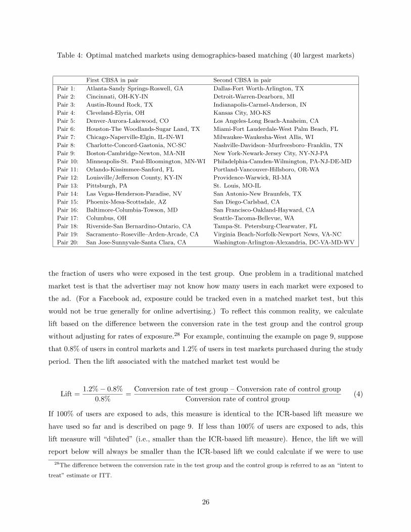
Table 4: Optimal matched markets using demographics-based matching (40 largest markets)
First CBSA in pair Second CBSA in pair
Pair 1: Atlanta-Sandy Springs-Roswell, GA Dallas-Fort Worth-Arlington, TX
Pair 2: Cincinnati, OH-KY-IN Detroit-Warren-Dearborn, MI
Pair 3: Austin-Round Rock, TX Indianapolis-Carmel-Anderson, IN
Pair 4: Cleveland-Elyria, OH Kansas City, MO-KS
Pair 5: Denver-Aurora-Lakewood, CO Los Angeles-Long Beach-Anaheim, CA
Pair 6: Houston-The Woodlands-Sugar Land, TX Miami-Fort Lauderdale-West Palm Beach, FL
Pair 7: Chicago-Naperville-Elgin, IL-IN-WI Milwaukee-Waukesha-West Allis, WI
Pair 8: Charlotte-Concord-Gastonia, NC-SC Nashville-Davidson–Murfreesboro–Franklin, TN
Pair 9: Boston-Cambridge-Newton, MA-NH New York-Newark-Jersey City, NY-NJ-PA
Pair 10: Minneapolis-St. Paul-Bloomington, MN-WI Philadelphia-Camden-Wilmington, PA-NJ-DE-MD
Pair 11: Orlando-Kissimmee-Sanford, FL Portland-Vancouver-Hillsboro, OR-WA
Pair 12: Louisville/Jefferson County, KY-IN Providence-Warwick, RI-MA
Pair 13: Pittsburgh, PA St. Louis, MO-IL
Pair 14: Las Vegas-Henderson-Paradise, NV San Antonio-New Braunfels, TX
Pair 15: Phoenix-Mesa-Scottsdale, AZ San Diego-Carlsbad, CA
Pair 16: Baltimore-Columbia-Towson, MD San Francisco-Oakland-Hayward, CA
Pair 17: Columbus, OH Seattle-Tacoma-Bellevue, WA
Pair 18: Riverside-San Bernardino-Ontario, CA Tampa-St. Petersburg-Clearwater, FL
Pair 19: Sacramento–Roseville–Arden-Arcade, CA Virginia Beach-Norfolk-Newport News, VA-NC
Pair 20: San Jose-Sunnyvale-Santa Clara, CA Washington-Arlington-Alexandria, DC-VA-MD-WV
the fraction of users who were exposed in the test group. One problem in a traditional matched
market test is that the advertiser may not know how many users in each market were exposed to
the ad. (For a Facebook ad, exposure could be tracked even in a matched market test, but this
would not be true generally for online advertising.) To reflect this common reality, we calculate
lift based on the difference between the conversion rate in the test group and the control group
without adjusting for rates of exposure.28 For example, continuing the example on page 9, suppose
that 0.8% of users in control markets and 1.2% of users in test markets purchased during the study
period. Then the lift associated with the matched market test would be
Lift =1.2% − 0.8%
0.8%=
Conversion rate of test group – Conversion rate of control group
Conversion rate of control group(4)
If 100% of users are exposed to ads, this measure is identical to the ICR-based lift measure we
have used so far and is described on page 9. If less than 100% of users are exposed to ads, this
lift measure will “diluted” (i.e., smaller than the ICR-based lift measure). Hence, the lift we will
report below will always be smaller than the ICR-based lift we could calculate if we were to use
28The difference between the conversion rate in the test group and the control group is referred to as an “intent to
treat” estimate or ITT.
26

Figure 8: Histogram of lifts∗
020
040
060
0Fr
eque
ncy
[-2 True Lift=33 80]
-50 0 50 100 150Lift
40 markets
* For top 40 largest markets, demographics-based match-
ing, 10,000 random allocations of CBSAs in each matched
market pair to test and control markets.
information on how many users in each market were exposed to the campaign ads. Recall that in
study 4 the ICR-based lift measure was 77%. If we calculate lift according to equation 4 we obtain
an estimate of 38%, with a 95% confidence interval of [29%, 49%]. This is the measure of lift that
is analogous to what we will report for the matched market results.
In Figure 8 we show a histogram of the lifts generated from matched market tests for each of
10,000 random allocations of CBSAs to test and control markets. These allocations hold fixed the
pairings between markets and randomize over which market is assigned to test and control. If we
use the data from just these 40 markets we can calculate the true (RCT-based) lift in those 40
markets, which is 33%. The dashed lines on the left and the right of the histogram bracket 95%
of the lift measurements across the 10,000 random allocations of CBSAs. Notice that the dashed
lines do not correspond to a traditional confidence interval due to sampling of observations (we will
add those in the next subsection). Instead, they represent the middle 95% of lift estimates when
CBSAs, within matched market pairs, are randomly allocated to test and control markets.
Figure 8 shows both good news and bad news for the validity of matched market tests in the
context of online advertising. The good news is that the matched market test appears to neither
systematically overstate nor systematically understate the true lift (the true lift of 33% is close
to the middle of the distribution in Figure 8). This is small consolation to the ad measurement
researcher, however, because Figure 8 shows that any individual matched market test is likely to
27

Figure 9: Sales-based matching (left histogram), sales- and demographics-based matching (right
histogram)∗0
200
400
600
Freq
uenc
y
[ 1 True Lift=33 77]
-50 0 50 100 150Lift
40 markets
020
040
060
0Fr
eque
ncy
[ 3 True Lift=33 72]
-50 0 50 100 150Lift
40 markets
* Histogram of lifts for top 40 markets, for 10,000 random allocations of CBSAs in each matched
market pair to test and control markets.
produce a result that is quite far off from 33%—95% of the time the researcher will estimate a lift
between -2% and 80%. If the researcher had the luxury of running 10,000 version of the matched
market test, he or she could tell from the distribution what the true lift is likely to be. But a single
matched market test seems unlikely to produce a reliable result.
Next, we explore whether we can reduce the variance of the lift estimates by using sales-
based or sales- and demographic-based matching. Figure 9 shows the results for the 40 largest
markets using sales-based matching (left histogram) and sales- and demographics-based matching
(right histogram). Notice that sales-based matching and sales- and demographics-based matching
somewhat improve the lift estimates. However, the variance of the lift estimates remains large.
We also explore whether we can reduce the variance of the lift estimates by increasing the
number of markets used for the matched market test. We increase the number of markets to 80
and use sales- and demographics-based matching since it produced the smallest variance in lifts for
40 markets. The results in Figure 10 show that matched market tests for this study yield estimates
of lift that can be surprisingly far off from the result of the RCT, even with 80 markets. In summary,
this study suggests that the ad campaign lifts from matched market tests can be significantly lower
or higher than the true lift, even using sales- and demographics-based matching and a large number
of markets.29
29Instead of matching, we can also randomly assign markets to test and control groups. The results are in the
online appendix in Figure A-2. As in the matched market case, the ad campaign lifts from matched market tests can
be significantly lower or higher than the true lift.
28

Figure 10: Sales- and demographics-based matching for 40 and 80 markets∗
020
040
060
0Fr
eque
ncy
[ 3 True Lift=33 72]
-50 0 50 100 150Lift
40 markets
020
040
060
0Fr
eque
ncy
[ 9 True Lift=32 59]
-50 0 50 100 150Lift
80 markets
* Histogram of lifts for 10,000 random allocations of CBSAs in each matched market pair to test
and control markets.
So far we have not estimated traditional confidence intervals around each individual lift estimate.
Doing so accounts for sampling-based uncertainty (the ever-present uncertainty that arises when
researchers don’t observe the entire population) in addition to the uncertainty generated by which
markets are assigned to treatment and control. We illustrate the compounded uncertainty in
Figure 11 for the top 40 markets. To read the figure, notice that the right panel of the graph is the
histogram in the left panel of Figure 10 laid on its side. The y-axis of the histogram displays the lift
for different random allocations of CBSAs in each matched market pair to test and control markets.
A horizontal line marks the true lift of 33%. The left side of the graph shows the confidence interval
for each of the 10,000 random allocations of CBSAs in each matched market pair to test and control
markets.30 To read the confidence interval, find the lift of interest on the y-axis on the right panel
of the figure and read off the corresponding confidence interval measured along the x-axis of the
left panel.
To illustrate, suppose that a researcher’s random allocation of CBSAs to test and control mar-
kets yielded a lift estimate equal to the true lift of 33%. (This is a purely a thought exercise given
that one cannot do this in a traditional matched market test). The graph then shows that the
sampling-based confidence interval would be between about -10% and 75%. However, if a different
random allocation of CBSAs to test and control markets yielded a different lift, the confidence in-
tervals would be shifted considerably, meaning that the true uncertainty associated with a matched
markets test is greater than what is indicated by a traditional sampling-based confidence interval.
30To account that the assignment of users to treatment and control groups happened by market we cluster the
standard errors at the CBSA level.
29
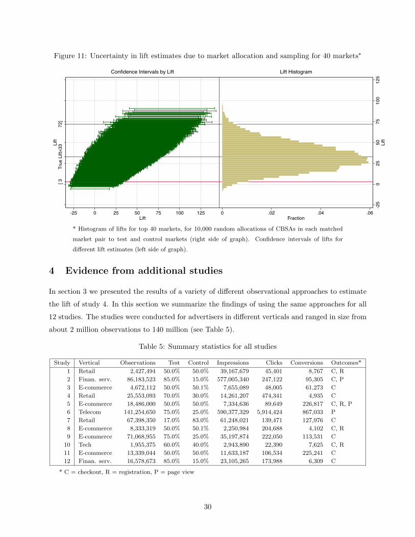
Figure 11: Uncertainty in lift estimates due to market allocation and sampling for 40 markets∗[ 3
True
Lift
=33
72]
Lift
-25 0 25 50 75 100 125Lift
Confidence Intervals by Lift
-25
025
5075
100
125
Lift
0 .02 .04 .06Fraction
Lift HistogramS4 Checkout
* Histogram of lifts for top 40 markets, for 10,000 random allocations of CBSAs in each matched
market pair to test and control markets (right side of graph). Confidence intervals of lifts for
different lift estimates (left side of graph).
4 Evidence from additional studies
In section 3 we presented the results of a variety of different observational approaches to estimate
the lift of study 4. In this section we summarize the findings of using the same approaches for all
12 studies. The studies were conducted for advertisers in different verticals and ranged in size from
about 2 million observations to 140 million (see Table 5).
Table 5: Summary statistics for all studies
Study Vertical Observations Test Control Impressions Clicks Conversions Outcomes*
1 Retail 2,427,494 50.0% 50.0% 39,167,679 45,401 8,767 C, R
2 Finan. serv. 86,183,523 85.0% 15.0% 577,005,340 247,122 95,305 C, P
3 E-commerce 4,672,112 50.0% 50.1% 7,655,089 48,005 61,273 C
4 Retail 25,553,093 70.0% 30.0% 14,261,207 474,341 4,935 C
5 E-commerce 18,486,000 50.0% 50.0% 7,334,636 89,649 226,817 C, R, P
6 Telecom 141,254,650 75.0% 25.0% 590,377,329 5,914,424 867,033 P
7 Retail 67,398,350 17.0% 83.0% 61,248,021 139,471 127,976 C
8 E-commerce 8,333,319 50.0% 50.1% 2,250,984 204,688 4,102 C, R
9 E-commerce 71,068,955 75.0% 25.0% 35,197,874 222,050 113,531 C
10 Tech 1,955,375 60.0% 40.0% 2,943,890 22,390 7,625 C, R
11 E-commerce 13,339,044 50.0% 50.0% 11,633,187 106,534 225,241 C
12 Finan. serv. 16,578,673 85.0% 15.0% 23,105,265 173,988 6,309 C
* C = checkout, R = registration, P = page view
30

Table 6: Lift for all studies and measured outcomes
Study Outcome Pct Exposed RCT Lift Confidence Interval
1 Checkout 76% 33% [19.5% 48.9%]
2 Checkout 46% 0.91% [-4.3% 7.2%]
3 Checkout 63% 6.9% [0.02% 14.3%]
4 Checkout 25% 77% [55.4% 108.2%]
5 Checkout 29% 418% [292.8% 633.5%]
7 Checkout 49% 3.5% [0.6% 6.6%]
8 Checkout 26% -3.6% [-20.7% 19.3%]
9 Checkout 6% 2.5% [0.2% 4.8%]
10 Checkout 65% 0.6% [-13.8% 16.3%]
11 Checkout 40% 9.8% [5.8% 13.8%]
12 Checkout 21% 76% [56.1% 101.2%]
1 Registration 65% 789% [696.0% 898.4%]
5 Registration 29% 900% [810.0% 1001.9%]
8 Registration 29% 61% [12.3% 166.1%]
10 Registration 58% 8.8% [0.4% 18.2%]
2 Page View 76% 1617% [1443.8% 1805.2%]
5 Page View 46% 601% [538.6% 672.3%]
6 Page View 26% 14% [12.9% 14.9%]
RCT Lift in red: statistically different from zero at 5% level. Confidence
intervals obtained via bootstrap.
The studies also differed by the conversion outcome that the advertiser measured; some advertis-
ers tracked multiple outcomes of interest. In all studies but one, the advertiser placed a conversion
pixel on the checkout confirmation page, therefore gaining the ability to measure whether a Face-
book user purchased from the advertiser. In four studies the advertiser placed a conversion pixel to
measure whether a consumer registered with the advertiser. In three studies the advertiser placed
a conversion pixel on a (landing) page of interest to the advertiser. Table 6 presents the results of
the RCTs for all studies.
Note that lifts for registration and page view outcomes are typically higher than for checkout
outcomes. The reason is as follows: Since specific registration and landing pages are typically
tied to ad campaigns, users who are not exposed to an ad are much less likely to reach that page
than users who see the ad, simply because unexposed users may not know how to get to the page.
For checkout outcomes, however, users in the control group lead to a checkout outcome simply by
purchasing from the advertiser—it does not take special knowledge of a page to trigger a conversion
pixel.31
31One might ask why lifts for registration and page view outcomes are not infinite since—as we have just claimed—
users only reach those pages in response to an ad exposure. The reason is that registration and landing pages are
often shared among several ad campaigns. Therefore, users who are in our control group might have been exposed
to a different ad campaign which shared the same landing or registration page.
31

4.1 Individual-based Comparisons
We summarize the results of the exact matching specification (EM), the three propensity score
matching specifications (PSM 1-3), and the three regression adjustment specifications (IPWRA
1-3) using the same graphical format with which we summarized study 4 (see Figure 7). Figures 12
and 13 summarize results for the eleven studies for which there was a conversion pixel on the
checkout confirmation page.
• In study 1, the exact matching specification (EM), the first two propensity score matching
specifications (PSM 1 and 2), and the first two inverse-probability-weighed regression adjust-
ment specifications (IPWRA 1 and 2) yield lift estimates between 85% and 117%, which are
statistically higher than the RCT lift of 33%. Including the composite metric of Facebook
data that summarizes thousands of behavioral variables (PSM 3 and IPWRA 3) lowers the
lift estimate to 59%, which is not statistically different from the RCT lift. Hence, study 1
shows a similar pattern to the one we observed in study 4.
• The results for study 2 look very different. The RCT shows no significant lift. Nonetheless,
the EM and all PSM specifications yield lift estimates of 116 to 535%, all of which are
statistically higher than the RCT estimate of 0.91%. The lift estimates of the IPWRA
specifications are between 65 and 72%, however, they are also very imprecisely measured and
therefore statistically not different from the RCT estimate.
• Study 3 follows yet another pattern. The RCT lift is 6.9%. EM, PSM 1, PSM 2, IPWRA 1,
and IPWRA 2 all overestimate the lift (34-73%). PSM 3 and IPWRA 3, however, significantly
underestimate the RCT lift (-12 to -14%).
• Study 4 was already discussed in section 3.
• In study 5 all estimates are statistically indistinguishable from the RCT lift of 418%. The
point estimates range from 515% for EM to 282% for PSM 3.
• Study 6 did not feature a checkout conversion pixel.
• In study 7 all estimates are different from the RCT lift of 3.5%. EM overestimates the lift
with an estimate of 38%. All other methods underestimate the lift with estimates between
-11 and -18%.
• Moving to Figure 13, study 8 finds an RCT lift of -3.6% (not statistically different from 0).
All methods overestimate the lift with estimates of 23 to 49%, except for IPWRA3 with a lift
of 16%, which is not statistically different from the RCT lift.
32

• The RCT lift in study 9 is 2.5%. All observational methods massively overestimate the lift;
estimates range from 1413 to 3288%.
• Study 10 estimates an RCT lift of 0.6% (not statistically different from 0). The point
estimates of different methods range from -18 to 37%, however, only the EM lift estimate
(37%) is statistically different from the RCT lift.
• Study 11 estimates an RCT lift of 9.8%. EM massively overestimates the lift at 276%.
PSM 1, PSM 2, IPWRA 1, and IPWRA 2 also overestimate the lift (22-25%), but to a much
smaller degree. PSM 3 and IPWRA 3, however, estimate a lift of 9.4 and 3.5%, respectively.
The latter estimates are not statistically different from the RCT lift. PSM 3 in study 11 is
the only case in these 12 checkout conversion studies of an observational method yielding a
lift estimate very close to that produced by the RCT.
• In study 12 we did not have access to the data that allowed us to run the “2” and “3”
specifications. The RCT lift is 76%. The observational methods we could estimate massively
overstated the lift; estimates range from 1231 to 2760%.
Figure 14 summarizes results for the four studies for which there was a conversion pixel on
a registration page. Figure 15 summarizes results for the three studies for which there was a
conversion pixel on a key landing page. The results for these studies vary across studies in how
they compare to the RCT results, just as they do for the checkout conversion studies reported in
Figures 12 and 13.
We summarize the performance of different observational approaches using two different metrics.
We want to know first how often an observational study fails to capture the truth. Said in a
statistically precise way, “For how many of the studies do we reject the hypothesis that the lift of
the observational method is equal to the RCT lift?” Table 7 reports the answer to this question.
We divide the table by outcome reported in the study (checkout is in the top section of Table 7,
followed by registration and page view). The first row of Table 7 tells us that of the 11 studies
that tracked checkout conversions, we statistically reject the hypothesis that the exact matching
estimate of lift equals the RCT estimate. As we go down the column, the propensity score matching
and regression adjustment approaches fare a little better, but for all but one specification, we reject
equality with the RCT estimate for half the studies or more.
We would also like to know how different the estimate produced by an observational method is
from the RCT estimate. Said more precisely, we ask “Across evaluated studies of a given outcome,
what is the average absolute deviation in percentage points between the observational method
estimate of lift and the RCT lift?” For example, the RCT lift for study 1 (checkout outcome) is
33

Figure 12: Results for checkout conversion event, studies 1-7
117**
98**86**
59
88** 85*
59
33
050
100
150
Lift
EMPSM1
PSM2PSM3
IPWRA1
IPWRA2
IPWRA3RCT
S1 Checkout
535**
123** 116** 134**69 72 65.91
-200
020
040
060
0Li
ft
EMPSM1
PSM2PSM3
IPWRA1
IPWRA2
IPWRA3RCT
S2 Checkout
73**
35** 34**
-12**
39** 38**
-14*
6.9
-50
050
100
Lift
EMPSM1
PSM2PSM3
IPWRA1
IPWRA2
IPWRA3RCT
S3 Checkout
221**
147** 154**
102
145** 144**
10777
5010
015
020
025
0Li
ft
EMPSM1
PSM2PSM3
IPWRA1
IPWRA2
IPWRA3RCT
S4 Checkout
505
425 426
282
427 432
308
418
200
300
400
500
600
Lift
EMPSM1
PSM2PSM3
IPWRA1
IPWRA2
IPWRA3RCT
S5 Checkout
38**
-12** -11**-18**
-13** -12**-18**
3.5
-20
020
40Li
ft
EMPSM1
PSM2PSM3
IPWRA1
IPWRA2
IPWRA3RCT
S7 Checkout
[*] Lift of method significantly different from RCT lift at 5% level; [**] at 1% level.
[RCT Lift in red]: statistically different from zero at 5% level.
34

Figure 13: Results for checkout conversion event, studies 8-12
49**
34** 35**
23*
40**45**
16
-3.6
-20
020
4060
Lift
EMPSM1
PSM2PSM3
IPWRA1
IPWRA2
IPWRA3RCT
S8 Checkout
3288**
1680** 1659**1438**
1685** 1678**1413**
2.5010
0020
0030
0040
00Li
ft
EMPSM1
PSM2PSM3
IPWRA1
IPWRA2
IPWRA3RCT
S9 Checkout
37**
22 23
-16
22 21
-18
.6
-40
-20
020
4060
Lift
EMPSM1
PSM2PSM3
IPWRA1
IPWRA2
IPWRA3RCT
S10 Checkout
276**
22** 23** 9.424** 25**
3.59.8
010
020
030
0Li
ft
EMPSM1
PSM2PSM3
IPWRA1
IPWRA2
IPWRA3RCT
S11 Checkout
2760**
1277** 1231**
76
010
0020
0030
00Li
ft
EMPSM1
PSM2PSM3
IPWRA1
IPWRA2
IPWRA3RCT
S12 Checkout
[*] Lift of method significantly different from RCT lift at 5% level; [**] at 1% level.
[RCT Lift in red]: statistically different from zero at 5% level.
35
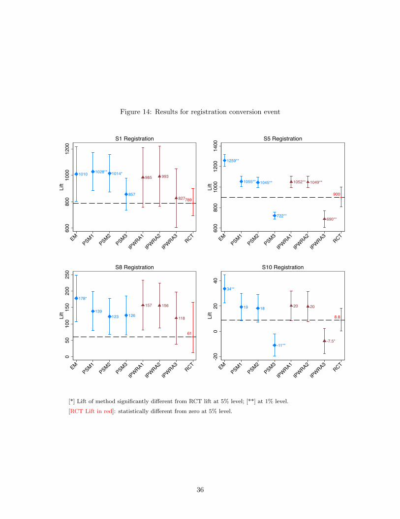
Figure 14: Results for registration conversion event
1010 1028** 1014*
857
985 993
827789
600
800
1000
1200
Lift
EMPSM1
PSM2PSM3
IPWRA1
IPWRA2
IPWRA3RCT
S1 Registration
1259**
1055** 1045**
722**
1052** 1049**
690**
900
600
800
1000
1200
1400
Lift
EMPSM1
PSM2PSM3
IPWRA1
IPWRA2
IPWRA3RCT
S5 Registration
178*
139123 126
157 156
118
61
050
100
150
200
250
Lift
EMPSM1
PSM2PSM3
IPWRA1
IPWRA2
IPWRA3RCT
S8 Registration
34**
19 18
-11**
20 20
-7.5*
8.8
-20
020
40Li
ft
EMPSM1
PSM2PSM3
IPWRA1
IPWRA2
IPWRA3RCT
S10 Registration
[*] Lift of method significantly different from RCT lift at 5% level; [**] at 1% level.
[RCT Lift in red]: statistically different from zero at 5% level.
36

Figure 15: Results for key page view conversion event
4200**
2214*1994 1974 1916 1954 1790 1617
020
0040
0060
00Li
ft
EMPSM1
PSM2PSM3
IPWRA1
IPWRA2
IPWRA3RCT
S2 Page View
839**
749** 740**
489**
748** 744**
506*
601
500
600
700
800
900
Lift
EMPSM1
PSM2PSM3
IPWRA1
IPWRA2
IPWRA3RCT
S5 Page View
228**
17 206.6
33
.59** .12**
14
050
100
150
200
250
Lift
EMPSM1
PSM2PSM3
IPWRA1
IPWRA2
IPWRA3RCT
S6 Page View
[*] Lift of method significantly different from RCT lift at 5% level; [**] at 1% level.
[RCT Lift in red]: statistically different from zero at 5% level.
37

33%. The EM lift estimate is 117%. Hence the absolute lift deviation is 84 percentage points. For
study 2 (checkout outcome) the RCT lift is 0.9%, the EM lift estimate is 535%, and the absolute
lift deviation is 534 percentage points. When we average over all studies, exact matching leads to
an average absolute lift deviation of 661 percentage points relative to an average RCT lift of 57%
across studies (see the last two columns of the first row of the table.)
As the table shows, inverse probability weighted regression adjustment with the most detailed
set of variables (IPWRA3) yields the smallest average absolute lift deviation across all evaluated
outcomes. For checkout outcomes, the deviation is large, namely 173 vs. an average RCT lift
of 57%. For registration and page view outcomes, however, the average absolute lift deviation is
relatively small, namely 80 vs. an average RCT lift of 440%, and 94 vs. an average RCT lift of
744%.
In general, observational methods to a better job of approximating RCT outcomes for registra-
tion and page view outcomes than for checkouts. We believe that the reason for this lies in the
nature of these outcomes. Since unexposed users (in both treatment and control) are compara-
tively unlikely to find a registration or landing page on their own, comparing the exposed group in
treatment to a subset of the unexposed group in the treatment group (the comparison all observa-
tional methods are based on) yields relatively similar outcomes to comparing the exposed group in
treatment to the (always unexposed) control group (the comparison the RCT is based on).
4.2 Market-based comparisons
In this subsection we summarize across all studies the uncertainty in lift estimates introduced
by performing a matched market test. This uncertainty is generated by the random allocation
of markets in matched market pairs to treatment and control. We present results in two tables.
Table 8 presents the studies for which we were able to perform sales- and demographics-based
matching. Table 9 presents studies for which we did not have sales-relevant information prior to
the beginning of the study. Therefore, we could only perform demographics-based matching. Each
table describes the middle 95% of lift estimates when CBSAs, within matched market pairs, are
randomly allocated to test and control markets. We also report the true lift of the ad campaign in
the selected markets. The left three columns present this information for the largest 40 markets;
the right three columns present this information for the largest 80 markets.
As Tables 8 and 9 show, for most studies matched market testing introduces substantial un-
certainty in lift estimates in addition to traditional sampling-based uncertainty (the latter is not
reported).
38

Table 7: Summary of performance by method for different conversion types
Method Outcome # of # of studies % of studies Average absolute Average RCT Lift
evaluated studies with Lift 6= with Lift 6= Lift deviation in percent
RCT Lift∗ RCT Lift∗ from RCT Lift
in percentage points
EM Checkout 11 10 91 661 57
PSM1 Checkout 11 9 82 296 57
PSM2 Checkout 10 8 80 202 57
PSM3 Checkout 10 5 50 184 57
IPWRA1 Checkout 11 8 73 288 57
IPWRA2 Checkout 10 7 70 201 57
IPWRA3 Checkout 10 3 30 173 57
EM Registration 4 3 75 180 440
PSM1 Registration 4 2 50 120 440
PSM2 Registration 4 2 50 110 440
PSM3 Registration 4 2 50 82 440
IPWRA1 Registration 4 1 25 114 440
IPWRA2 Registration 4 1 25 115 440
IPWRA3 Registration 4 2 50 80 440
EM Page View 3 3 100 1012 744
PSM1 Page View 3 2 67 250 744
PSM2 Page View 3 1 33 174 744
PSM3 Page View 3 1 33 159 744
IPWRA1 Page View 3 1 33 155 744
IPWRA2 Page View 3 2 67 165 744
IPWRA3 Page View 3 2 67 94 744
* Difference is statistically significant at a 5% level.
5 Additional Methods of Evaluation:
PSAs and Time-Based Comparisons
This section briefly discusses two other common approaches to advertising measurement: using
public service announcements (PSAs) as control ads and comparing conversion outcomes before
and after a campaign. Both approaches have their own distinct shortcomings, which help to further
illustrate the inherent challenges of ad effectiveness measurement.
5.1 PSAs
In an RCT performed by an advertiser, test group users are shown ads from that advertiser and
control group users are not. But what should the control group users be shown in place of the ads of
the advertiser? This seemingly innocuous question actually has critical implications for interpreting
advertising measurements using randomized experiments.
One possibility noted in Section 2.1 is not to show control users any ads at all, i.e., to replace
the ad with non-advertising content. However, this compares showing an ad to an unrealistic
39

Table 8: Uncertainty in lift estimates due to random allocation of matched markets to treat-
ment and control (sales- and demographics-based matching)
Study Outcome 40 markets 80 markets
5th percentile True 95th percentile 5th percentile True 95th percentile
of lift Lift of lift of lift Lift of lift
estimates estimates estimates estimates
S1 Checkout 13 31 50 .98 29 62
S3 Checkout -37 6.2 72 -27 6.1 51
S4 Checkout 3.3 33 72 9.1 32 59
S8 Checkout -42 -6.8 50 -37 -2.8 49
S9 Checkout -16 .071 19 -11 .26 12
S11 Checkout -21 8.8 51 -19 8.9 46
S1 Registration 534 643 769 554 653 773
S8 Registration -40 -.61 61 -26 5.5 49
Table 9: Uncertainty in lift estimates due to random allocation of matched markets to treat-
ment and control (demographics-based matching)
Study Outcome 40 markets 80 markets
5th percentile True 95th percentile 5th percentile True 95th percentile
of lift Lift of lift of lift Lift of lift
estimates estimates estimates estimates
S2 Checkout -80 -.17 391 -82 .0015 482
S5 Checkout 110 146 190 109 140 175
S7 Checkout -11 -.2 12 -8.4 .63 10
S10 Checkout -12 .23 15 -10 .73 15
S2 Key Page 396 848 2283 407 887 2533
S5 Key Page 192 217 245 199 219 239
S6 Key Page 2.8 11 21 3.4 11 20
S5 Registration 305 336 369 308 336 365
S10 Registration -1.3 6.9 16 -.0037 7 14
counterfactual. Instead, the publisher is likely to show the ad of another advertiser instead. Hence,
we would like to answer the question: “How well does an ad (the “focal ad”) perform relative to
the user being shown the ad that would have appeared had the focal ad not been shown?”
One common choice is to use PSAs as the ads shown to the control group. The key feature of
a PSA is that its message is viewed as being neutral relative to the focal ad. For example, Nike
may not object to showing control group users an ad for the American Red Cross, but it certainly
wouldn’t want to pay for ad impressions from Reebok. Sometimes an agency or advertising network
partner will partly fund the cost of PSA impressions in order to deliver an estimate of the campaign’s
effectiveness.
In fact, the ad inserted as the PSA does not have to be an actual PSA—any ad from an
unrelated company could fulfill this purpose. We will refer to such ads as “PSAs” even though,
40

strictly speaking, they don’t have to be for a charity or non-profit.
Despite the industry’s reliance on PSAs as control ads, this approach presents at least two
problems. First, the PSA control ad does not correspond to the question of interest to the advertiser.
Comparing the test and control group measures the effect of showing the focal ad relative to showing
the PSA ad. But suppose the advertiser, say Nike, never implemented the campaign in the first
place, would the users still have seen the PSA ad? Probably not. Instead, they might have seen an
ad from Reebok, which implies that the PSA ad experiment doesn’t compare the Nike ad to the
appropriate counterfactual and therefore fails to yield a causal estimate of Nike’s ad effectiveness.
The second problem from the perspective of advertising research is that most modern adver-
tising platforms (including Facebook) implement some type of performance optimization in their
ad delivery algorithm (also discussed at the end of section 3.2.1). These algorithms automatically
adjust the delivery of impressions for both the focal ad and the PSA depending on the types of
users who are most likely to click, visit, or purchase after exposure. The issue is that these algo-
rithms can lead to violations of probabilistic equivalence between the test and control groups, if
not properly accounted for. Recently, Google has implemented a methodology that circumvents
these challenges on its online display network (Johnson, Lewis, and Nubbemeyer 2015).
Figure 16: Constructing a PSA Experiment
We can illustrate this measurement issue using two of our studies, study 6 and study 7. Both
studies have distinct messages and calls-to-action but they target a large overlapping set of about 50
million users. As Figure 16 shows, users can fall into one of four bins depending on their assignment
to test and control groups in each study. Our interest is the roughly 30 million users that are in
groups A and B, i.e. who are in the test group of one study and the control group for the other
study.
Suppose we are interested in running a PSA test for study 6. We need to compare outcomes
of users who are shown ads for study 6 to a PSA control group that is shown a neutral ad. Then
41

we can compare outcomes of Group A, our “test group,” to the outcomes of Group B, our “control
group” who is not shown any ads from study 6 but is shown ads from study 7. In this way the
study 7 ads effectively serve the same role as a PSA ad. A similar comparison can be made by
examining the outcomes from study 7 and reversing the roles of each group. If study 7 is the focal
advertiser, the “test group” switches to Group B and the “control” group becomes Group A.
In both cases, the advertising platform will optimize ad impression delivery to maximize the
conversion rate of each campaign. To the extent that this results in changes in the mix of users
receiving impressions, the PSA-based lifts might diverge from the RCT-based lifts.
The results appear in Table 10. As in the section on matched market tests, we calculate lift
based on the difference between the conversion rate in the test group and the control group without
adjusting for rates of exposure (see page 26). As a baseline, for both studies we report the RCT
lift based on the restricted set of users who were in both studies. The first row reports a test
using study 6 as the focal advertiser and study 7 as the PSA; we find that the PSA lift is similar
to the RCT lift. However, when the studies are flipped, there is a striking difference. The RCT
finds a positive lift of 1.8% (p-value<0.02) but the PSA test estimates a negative lift of -4.2%
(p-value<0.05). Using PSA’s as control ads for this study would lead the advertiser to draw the
incorrect conclusion that the campaign actually hurt conversion rates.
Table 10: PSA Tests∗
RCT PSA
Focal Study PSA Study Lift p-val CI Lift p-val CI
6 7 12.1% <1e-4 [10.7%, 13.5%] 11.6% <1e-4 [8.3%, 15.0%]
7 6 1.8% 0.0183 [0.0%, 3.5%] -4.2% 0.0492 [-0.7%, -7.7%]
* All statistics are specific to the set of users in both studies, hence the RCT conversion results may
differ from those reported in Table 6. p-val is the p-value associated with the null hypothesis that a
lift is not significantly different from zero. CI is the 95% confidence interval on the lift.
5.2 Time-based Comparisons
Another way to measure the effect of advertising is to perform a time-based comparison, or a
before/after. An advertiser might, for example, compare conversion outcomes during a period
immediately before the beginning of a campaign (the control period) with the outcomes during
the duration of campaign (the test period). Time-based comparisons rely on the assumption that
outcomes during the control period allow the advertiser to infer what would have happened in the
test period, had the ad campaign not been run during test period. This assumption (called “time-
invariance”) is met if, in the absence of ads, conversion outcomes are stable over some (reasonably)
42

short period of time.
We can directly test this assumption in our studies by examining conversion outcomes of in-
dividuals in the control group over the duration of the study. Since these individuals were never
exposed to campaign ads, it should be the case—if the time-invariance assumption is right—that
there should be no difference in conversion outcomes for control users between the first and the
second half of the campaign period.32
Table 11 reports, for each conversion outcome and each study, the conversion rates in the first
and second halves for control users.33 As the table shows, we reject the hypothesis that there is
no difference in conversion outcomes for control users between the two halves of the study for all
but one study in each of the conversion outcomes. This suggests that for these studies a purely
time-based comparison would yield incorrect lift measures of ad effectiveness.
Table 11: Time-based comparison
Study Outcome Conversion rate Conversion rate Difference in Difference in
during first half during second half percentage points percent
S1 Checkout 0.113% 0.096% -0.017% -15%
S2 Checkout 0.104% 0.000% -0.104%** -100%
S3 Checkout 0.155% 0.303% 0.148%** 95%
S4 Checkout 0.012% 0.020% 0.0076%** 63%
S5 Checkout 0.004% 0.007% 0.0034%** 94%
S7 Checkout 0.135% 0.125% -0.0091%** -7%
S8 Checkout 0.009% 0.027% 0.018%** 200%
S9 Checkout 0.217% 0.125% -0.091%** -42%
S10 Checkout 0.041% 0.114% 0.073%** 177%
S1 Registration 0.058% 0.053% -0.0053% -9%
S5 Registration 0.033% 0.064% 0.031%** 93%
S8 Registration 0.002% 0.006% 0.0037%** 160%
S10 Registration 0.092% 0.264% 0.172%** 188%
S2 Page View 0.014% 0.012% -0.0017% -13%
S5 Page View 0.032% 0.072% 0.040%** 127%
S6 Page View 0.523% 0.348% -0.175%** -34%
* Difference is statistically significant at a 5% level.** Difference is statistically significant at a 1% level.
32One concern for implementing this test is that Facebook’s targeting algorithm selects different users as potential
targets during the first and second half of the study. To avoid this potential concern we restrict our sample to users
in the control group who were selected by the targeting algorithm as potential targets during the first day of the
study. We can do this because our data contains information on when a user was first selected as a target, even if
that user was in the control group and therefore never received an ad.33All conversion rates have been scaled by the same random constant as in previous sections.
43

6 Summary of Results
Estimating the causal effect of advertisements, especially in digital settings, can be challenging. We
hope this article provides the reader with a better understanding of causal measurement and an
appreciation for the critical role that randomized controlled trials serve in advertising measurement.
Randomization of a treatment—whether it be an advertisement, an email message, or a new phar-
maceutical drug—across probabilistically equivalent test and control groups is the gold standard
in establishing a causal relationship. In the absence of randomization, observational methods try
to estimate advertising lift by comparing exposed and unexposed users, adjusting for pre-existing
differences between these groups. Naturally, this leads to the question: How accurate and reliable
are such methods at recovering the true advertising lift?
To this end, we have explore how several common observational techniques for advertising
measurement compare to results obtained using an RCT. This comparison relies on 12 large-scale
randomized experiments from Facebook that spanned a mix of industry verticals, test/control
splits, and business-relevant outcomes. Using individual-level data, we compared conversion rates
(i) between exposed and unexposed users, (ii) after reweighing the groups by matching exactly on
age and gender, (iii) using propensity matching to flexibly model exposure likelihoods, and (iv)
with regression-based methods that incorporated both outcome and exposure models. We chose to
investigate these methods because they are well-accepted and commonly employed in the industry
and academia.
Our results present a mixed bag. In some cases, one or more of these methods obtained ad lift
estimates that were statistically indistinguishable from those of the RCT. However, even the best
method produced an average absolute deviation of 173% relative to an average RCT lift of 57%, with
most of the methods yielding upwardly biased estimates. The variance in the performance of the
observational methods across studies makes it difficult to predict when, and if, these methods would
obtain reliably accurate estimates. Given this, a manager should hesitate in trying to establish a
rule-of-thumb relationship between the observational and RCT estimates.
We have also found unsettling results when trying approaches that use aggregate data. While
matched market tests appears to neither systematically overstate nor understate the RCT lift, any
individual matched market test is likely to produce a results that is quite far off from the RCT lift.
As a result, we find that a single matched market test seems unlikely to produce reliable results.
We also find evidence that before/after comparisons would have been problematic in our studies.
The time-invariance assumption on which time-based comparisons rely is violated in most studies,
even over the course of just a few weeks.
Finally, we have found some evidence that PSA’s as controls would lead an advertiser to draw
44

the incorrect conclusion about the true lift of an ad campaign.
In summary, two key findings emerge from this investigation:
• There is a significant discrepancy between the commonly-used approaches and the true ex-
periments in our studies.
• While observations approaches sometimes come close to recovering the measurement from
true experiments, it is difficult to predict a priori when this might occur.
• Commonly-used approaches are unreliable for lower funnel conversion outcomes (e.g., pur-
chases) but somewhat more reliable for upper funnel outcomes (e.g., key landing pages).
These findings should be interpreted with the caveat that our observational approaches are only
as good as the data at our disposal allowed us to make them. It is possible that better data, for
example time-varying user-level data on online activity and generalized shopping behavior, would
significantly improve the performance of observational methods.
In the next section we offer some recommendations. When firms are able to employ RCTs, we
offer some suggestions on best practices to help managers get the most out of their measurement.
In the case that RCTs aren’t practical or feasible, we highlight the circumstances under which
different observational methods might be best.
7 Recommendations FAQ
Question 1: I want to run experiments! The platform on which I want to advertise
uses a “control group” to measure the effects of ads. What recommendations do
you have for evaluating or interpreting these experiments?
Congratulations, you are on the path to great measurement! But first you have to make sure
your proposed experiment is indeed an RCT and does not just masquerade as one. Even if
your ad platform uses “control groups,” it may not be running RCTs. Our recommendation
is to ask any advertising platform the following questions:
• How do you create control and test groups? Do you randomly assign users into each
group, or do you use “forensic” control groups?
• If you randomize, how exactly is the randomization performed? Does your randomization
lead to probabilistically equivalent test and control groups?
• Do you randomize at the identity-level or the cookie-level (see question 6)?
45

If the advertising platform convinces you they are randomizing at the identity-level and are
creating probabilistically equivalent test and control groups, they are probably running an
RCT. If they randomize at the cookie-level, they are trying to run an RCT—but be aware
that test and control groups might overlap, which will make results less reliable.
If the advertising platform uses “forensic” control groups, they are using what we have called
observational methods in this white paper. These are not RCTs. Even given this serious
limitation, there are still questions you can ask to assess the quality of their observational
method:
• What variables or features do you use to create the forensic control group?
• Can you provide these variables or features so I can verify that users in control and test
groups match on these variables?
Question 2: I understand that RCTs are the gold standard in measurement. But how
can I make sure that whatever I learn from an RCT is useful beyond this specific
campaign?
Don’t rely on data alone to improve advertising. If you want generalizable results you also
need good theories of behavior—that is, strong beliefs about how advertising works, and what
mechanisms affect what.
Use these theories to guide the questions your RCTs should be testing. Your ultimate goal
should be to decide which competing hypotheses or explanation is correct. Perhaps you
believe that display advertising works better than search advertising for a given campaign.
Ask yourself: Why might that be the case?
Only if you begin to understand why can you begin to use data from one campaign to inform
another campaign. Because RCTs rely on much weaker assumptions than observational meth-
ods, they are preferable to answering these kinds of questions—as long as they are feasible to
implement.
This question ties into a recent debate of what RCTs can and cannot do. You can read our
take on this debate in section 8.
Question 3: I can run an RCT! How many users do I need to target to determine
whether my ad campaign worked?
You may need to bring in an expert to help you determine the appropriate sample size for
your RCT; depending on what you are trying to do, these calculations can be tricky.
46

As a general guideline, the further down the funnel your conversion outcome is, the larger
the sample size will have to be. You can get away with a smaller sample size when you
want to measure conversion outcomes like page views than if you want to measure purchase
outcomes. Offline conversion outcomes usually require the largest sample sizes of all, easily
reaching several millions of users.
Question 4: I understand that RCTs provide a more accurate measurement of lift than
observational methods. However, all I want to know is whether my campaign
worked or not. Are observational methods good enough for that?
Our analyses suggest that they are not. Our best approaches incorrectly determined whether
a campaign achieved positive lift 40-50% of the time for checkout conversion outcomes and
about 30% of the time for registration and page view outcomes. This strikes us as a relatively
high rate of error. A caveat is that we only analyzed a relatively small number of campaigns
and that they were not necessarily representative of all Facebook advertising.
Question 5: I understand that RCTs are more reliable than observational methods.
However, I can only run RCTs on some advertising platform but not on others.
If so, is it worth running RCTs at all?
We think it is. It is true that unless two platforms both enable RCTs it will be tough to make
comparisons across platforms. However, by running RCTs on one platform you can at least
learn something about that platform—as well as, more generally, what kind of ads work and
why. And that sure beats not learning anything.
Question 6: I can run RCTs on several advertising platforms. Can I directly compare
the results?
Not necessarily. It depends on how the RCTs were implemented, how the results were re-
ported, and whether you targeted the same consumers. Pay particular attention to two issues:
First, make sure that the randomization into test and control groups was performed at the
same level. Typically, randomization occurs either at the “identity-level” or at the “cookie-
level”. Identity-level randomization is better because it ensures that users are in test or
control groups irrespective of the device or browser they use. Cookie-level randomization can
lead to a user being both in test and control groups. As a result, identity- and cookie-level
randomization can give different lift estimates, even if the campaign has the same effect.
Second, make sure that the results are reported in the same way. There are two standard
ways to report lift: The first is based on the difference in conversion rates between users in
test vs. control groups. This measure is sensitive to the percent of users in the test group
47

who were exposed to the ad. If few users in the test group saw the ad, even if the ad had a
big effect, the overall difference in the conversion rate between test and control groups will
be small. The second way to report lift compares the conversion rate of exposed users in the
test group with the conversion rate they would have had, had they not been exposed. Both
methods are correct and easy to compute; however they answer different questions. The first
measures the effect of targeting a group of users with an ad, while the second measures the
effect of actually exposing a group of users to the ad (as we report in this white paper). When
you compare RCTs across platform, make sure to compare the same measure.
Question 7: My advertising platform says they can run an RCT! However, they suggest
exposing the control group to a public service announcement (PSA). Is this good
practice?
Using PSAs presents at least two problems. First, it changes the nature of what you are
measuring. Suppose an advertiser, say Nike, never implemented the campaign in the first
place. Instead of seeing that PSA, users in the control group might have seen an ad from
Reebok. This implies that the PSA ad experiment doesn’t compare the Nike ad to the correct
counterfactual. In other words, you are measuring something correctly, but it might not be
what you are interested in.
The second problem with PSAs is that most modern advertising platforms (including Face-
book) implement some type of performance optimization in their ad delivery algorithm. These
algorithms automatically and adjust the delivery of impressions for ads, depending on the
types of users who are most likely to click, visit, or purchase after exposure. Since the
algorithm treats the focal ad and the PSA as two separate ads, these algorithms can break
probabilistic equivalence between the test and control groups, if not properly accounted for.
Please check out the long WP for an example of this problem.
You should ask your advertising platform for a detailed explanation of how they deal with
these challenges.
Question 8: Is there a reliable scaling factor I can use to translate the lift from an
observational method to the lift from an RCT?
When we started this project we hoped there would be. For example, suppose an observational
method such as propensity score matching systematically produced lift measures that were
40% too high. Then one could divide all lift numbers by 1.4 and avoid having to run RCTs.
Regrettably, neither we nor any researchers we know of can reliably come up with a scaling
factor to arrive at true ad effectiveness based on an observational method.
48

It might be that the same advertiser or product would get the same scaling factor over time.
At the moment, however, we don’t know.
Question 9: I understand that RCTs are more reliable than observational methods.
However, the platform on which I want to advertise is not enabled for RCTs.
What should I do?
Don’t despair! There is a lot you do without RCTs to get to good measurement as long as you
plan ahead before you run your ad campaign. They key to good observational measurement
is to strategically engineer variation in the data. The core idea is to roll out your advertising
campaign in a way that—although you could not run an RCT—you can interpret the data
as if you had. This takes some planning but is often very doable.
Let us explain with an example: Colleagues of ours, Tom Blake, Chris Nosko, and Steve
Tadelis of eBay wanted to find out whether paid non-brand search advertising for effective
for eBay (see http://faculty.haas.berkeley.edu/stadelis/BNT_ECMA_rev.pdf). They
could not run an RCT because they had no control over the exposure of ads on Google or
other search engines at the individual level. All they could do is to bid or not bid for keywords.
Luckily, Google allows advertisers to place bids by DMA. Blake, Nosko, and Tadelis used this
to strategically engineer variation in the data. Their idea was to take 65 randomly chosen
DMAs and continue eBays’ standard practice of bidding for thousands of keywords. For the
remaining 65 DMAs, however, they stopped all non-brand keyword advertising for six weeks.
Notice that comparing sales between the 155 DMAs with non-brand keyword advertising and
the 65 DMAs without such advertising does not quality this experiment as an RCT: the
randomization was not done at the level of individual consumers (or cookies). Instead, the
randomization was done at the DMA level and there are too few DMAs to ensure that the
consumers in both DMA groups are probabilistically equivalent.
To deal with this problem Blake, Nosko, and Tadelis looked not just across DMA groups but
also over time. Here is the idea: Instead of just comparing the two DMA groups during the
6 weeks where the 65 DMAs did not get any eBay ads, they also compared sales in the two
groups before the study started (i.e. while eBay was still bidding for keywords in all DMAs).
Here are the results (sales are disguised to preserve confidentiality):
method.Wedidfindafewexceptionswhichcanbefoundunderthequestion“AretheresituationswhereIwillbeOKnottouseanRCT?”
• Weplantoinvestigateinthefuturewhetherthesameadvertiserorproductwouldgetthesamescalingfactorovertime.Atthemoment,however,wedon’tknow.
Q: I understand that RCTs are more reliable than observational methods. However, the platform on which I want to advertise is not enabled for RCTs. What should I do? A: • Don’tdespair!ThereisalotyoudowithoutRCTstogettogoodmeasurementaslongas
youplanaheadbeforeyourunyouradcampaign.Theykeytogoodobservationalmeasurementistostrategicallyengineervariationinthedata.Thecoreideaistorolloutyouradvertisingcampaigninawaythat---althoughyoucouldnotrunanRCT---youcaninterpretthedataasifyouhad.Thistakessomeplanningbutisoftenverydoable.
• Letusexplainwithanexample:Colleaguesofours,TomBlake,ChrisNosko,andSteveTadelisofeBaywantedtofindoutwhetherpaidnon-brandsearchadvertisingforeffectiveforeBay(seehttp://faculty.haas.berkeley.edu/stadelis/BNT_ECMA_rev.pdf).TheycouldnotrunanRCTbecausetheyhadnocontrolovertheexposureofadsonGoogleorothersearchenginesattheindividuallevel.Alltheycoulddoistobidornotbidforkeywords.Luckily,GoogleallowsadvertiserstoplacebidsbyDMA.Blake,Nosko,andTadelisusedthistostrategicallyengineervariationinthedata.Theirideawastotake65randomlychosenDMAsandcontinueeBays’standardpracticeofbiddingforthousandsofkeywords.Fortheremaining65DMAs,however,theystoppedallnon-brandkeywordadvertisingforsixweeks.Noticethatcomparingsalesbetweenthe155DMAswithnon-brandkeywordadvertisingandthe65DMAswithoutsuchadvertisingdoesnotqualitythisexperimentasanRCT:therandomizationwasnotdoneatthelevelofindividualconsumers(orcookies).Instead,therandomizationwasdoneattheDMAlevelandtherearetoofewDMAstoensurethattheconsumersinbothDMAgroupsareprobabilisticallyequivalent.
• TodealwiththisproblemBlake,Nosko,andTadelislookednotjustacrossDMAgroupsbutalsoovertime.Hereistheidea:InsteadofjustcomparingthetwoDMAgroupsduringthe6weekswherethe65DMAsdidnotgetanyeBayads,theyalsocomparedsalesinthetwogroupsbeforethestudystarted(i.e.whileeBaywasstillbiddingforkeywordsinallDMAs).Herearetheresults(salesaredisguisedtopreserveconfidentiality):
• 65DMAs 155DMAs
BeforeexperimentSearchadsSales=100
SearchadsSales=98.8
DuringexperimentNoads
Sales=115SearchadsSales=114.4
GrowthinSales 15.0% 15.8%
• Ifwejustcomparesalesduringtheexperimentinthe65DMAswithoutads(115)totheDMAswithsearchads(114.4)wefindnotstatisticallysignificantdifference.However,doesthismeanthatthesearchadshavenocausaleffect?Perhapsnot,becauseitcouldbeen49

If we just compare sales during the experiment in the 65 DMAs without ads (115) to the
DMAs with search ads (114.4) we find not statistically significant difference. However, does
this mean that the search ads have no causal effect? Perhaps not, because it could been that
sales in the 65 DMAs without search ads would have been much higher had we advertised.
This is where it helps us to see how the two DMA groups compared before the experiment
where search ads were shown in all DMAs, namely 100 vs. 98.8. This shows that the sales
in the 65 DMAs were not significantly higher than in the 155 DMAs, even when we were
advertising in all DMAs. In other words, switching ads off did not lead to a noticeable
decrease in sales relative to DMAs where advertising remained unchanged.
The lesson is this: By being clever about rolling out ads over time and over regions one can
create variation in advertising so that one can get close to causal measurement. However,
this has to be planned. Blake, Nosko, and Tadelis could not have done this analysis if they
had simply switched off search ads across the entire US all at once.
Question 10: Are there situations where RCTs are less important—or even unneces-
sary?
RCTs are not necessary if a conversion outcome simply cannot occur unless you have been
exposed to the ad campaign, for example, launching a brand new startup with a majority
(or even all) of the marketing occurring through one platform. Could you just compare
consumers who were exposed to the ad with those who were not? In section 3.2.1, “Ex-
posed/Unexposed,” we find that this comparison massively overstated lift in most studies we
analyzed. The reason was that the type of consumers who were unexposed were much less
likely to buy than exposed consumers, even if these exposed consumers had not been exposed.
If consumers never buy unless they were exposed (as in the startup example), this problem
goes away because the conversion probability in a control group is zero, regardless of whether
that control group was probabilistically equivalent or simply consisted of consumers who were
part of the original target group but happened not to be exposed to the ad.
Not running RCTs is also less problematic for conversion outcomes on pages where consumers
are unlikely to go on their own, for example, some registration or landing pages. As our
results show, observational methods do a better job of approximating RCT outcomes for such
pages than for checkouts. Since unexposed users (in both treatment and control) are unlikely
to visit such pages on their own, comparing the exposed group to the unexposed group in
treatment (the comparison all observational methods are based on), yields similar outcomes
to comparing the exposed group to the unexposed group in control (the comparison the RCT
is based on).
50

Question 11: I want to run RCTs but my organization does not see the value. What
do I do?
This is a hard one because to understand the need for RCTs your co-workers need to un-
derstand something about data science. A start is to have someone read the first two sec-
tions of long WP. You can also recommend the following Harvard Business Review article
to them, written by one of colleagues at Kellogg: A Step-by-Step Guide to Smart Business
Experiments (https://hbr.org/2011/03/a-step-by-step-guide-to-smart-business-experiments).
Another idea is to find champions for experiments inside your organization. For example,
traditional mail-order departments typically have understood how essential experimentation
is. Finally, feel free to reach out to us–we have experience talking to leaders about how
important experiments are.
Question 12: Do you have any other recommendations?
We believe that any decision maker in advertising needs to have a “working knowledge of data
science.” This means being familiar with concepts such as probabilistic equivalence, causality,
incrementality, RCTs, observational methods, matching, control groups, etc. By no means
do we think that decision makers need to become data scientists. However, these concepts
are so fundamentally tied to measuring advertising effectiveness that becoming familiar with
them is necessary for evaluating and overseeing advertising research and vendors.
8 What RCTs can and cannot do
A common critique of RCTs is that one can only test relatively few advertising strategies relative to
the enormous possible variation in advertising; which creative? which publisher? which touchpoint?
which sequence? which frequency? This critique of RCTs is not unique to advertising effectiveness
research. For example, Angus Deaton, a recent winner of the Nobel Prize in Economics made a
similar point about evaluating initiatives in development economics.34
To understand the critique, consider an example made by the economist Ricardo Hausman.35
Suppose we wanted to learn whether tablets can improve classroom learning. Any RCT would need
to hypothesize a certain test condition that specifies exactly how the tablets are used: how should
teachers incorporate them into the classroom, how should students interact with them, in what
subjects, on what frequency, with what software, etc. An RCT would tell us whether a particular
treatment is better than the control of no tablets. However, the real goal is to find the best ways
to use tablets in the classroom.
34See Deaton (2010) or https://youtu.be/yiqbmiEalRU?list=PLYZdiPCblNEULWpJALSk_nNIJcn51bazU35https://www.project-syndicate.org/commentary/evidence-based-policy-problems-by-ricardo-hausmann-2016-02
51
This points to two problems that would equally apply to advertising effectiveness research.
First, with such a large design space, an RCT testing a small number of strategies would be too
slow to be useful. Second, whatever we learn from the RCT might not transfer well if the strategy
is extended to a different setting (this is referred to as external validity).
However, this is not really a critique of RCTs as opposed to using other observational method for
measuring advertising effectiveness—the exact same critique applies to any observational method,
including the ones we have evaluated in this paper. Instead, this critique points to the deficiency
of using data alone (through RCTs or observational methods) to discover what drives advertising
effectiveness. Instead, generalizing from such data fundamentally requires a theory of behavior,
i.e. the mechanism by which advertising works on consumers, that implies that the proposed
advertising will change outcomes a certain way. For example, theories of consumer behavior tell
us what types of advertising creative tend to produce larger responses (e.g., fear appeals do well
in political advertising). While RCTs are the gold-standard for accurately assessing the proposed
advertising, RCTs cannot tell you what advertising should be tested in the first place (of course,
neither can any observational methods).
In some contexts, theories are not very important because technology allows for “brute em-
piricism.” This applies, for example, to web site optimization where thousands of tests allow for
the publisher to optimize the color, page features, button placement, etc. However, in advertising,
the set of possible choices is much too large relative to the amount of tests that are feasible to.
This highlights one potential benefit of observational methods, which is that, relative to RCT’s,
much more data for high-dimensional problems is typically available because the data are generated
more easily and by more actors. The usual issues of selection bias, suitable controls, etc., must
be addressed, and of course this is exactly what observational methods try to do. However, our
paper shows that in the setting of online advertising—with the data we had at our disposal—these
methods do not seem to reliably work.
Overall, we think this discussion has important implications for advertising research. We list
these in response to Question 2 in section 7.
52

References
Abadie, A., and G. Imbens (2015): “Matching on the Estimated Propensity Score,” Working
paper, Stanford GSB.
Abadie, A., and G. W. Imbens (2008): “On the Failure of the Bootstrap for Matching Estima-
tors,” Econometrica, 76(6), 1537–1557.
Andrews, D. W. K., and M. Buchinsky (2000): “A three-step method for choosing the number
of bootstrap repetitions,” Econometrica, 68(1), 213–251.
Beck, C., B. Lu, and R. Greevy (2015): “nbpMatching: Functions for Optimal Non-Bipartite
Matching,” R package version 1.4.5.
Deaton, A. (2010): “Instruments, Randomization, and Learning about Development,” Journal of
Economic Literature, 48, 424–455.
Fawcett, T. (2006): “An introduction to ROC analysis,” Pattern Recognition Letters, 27, 861–
874.
Greevy, R., B. Lu, J. Silber, and P. Rosebaum (2004): “Optimal multivariate matching
before randomization,” Biostatistics, 5(2), 263–275.
Hirano, K., G. W. Imbens, and G. Ridder (2003): “Efficient Estimation of Average Treatment
Effects Using the Estimated Propensity Score,” Econometrica, 71(4), 1161–1189.
Johnson, G. A., R. A. Lewis, and E. I. Nubbemeyer (2015): “Ghost Ads: Improving the
Economics of Measuring Ad Effectiveness,” Working paper, Simon Business School.
Lalonde, R. J. (1986): “Evaluating the Econometric Evaluations of Training Programs with
Experimental Data,” American Economic Review, 76(4), 604–620.
Politis, D. N., and J. P. Romano (1994): “Large Sample Confidence Regions Based on Sub-
samples under Minimal Assumptions,” The Annals of Statistics, 22(4), 2031–2050.
Stuart, A., and K. Ord (2010): Kendall’s Advanced Theory of Statistics, Distribution Theory,
vol. 1. Wiley.
Wooldridge, J. M. (2007): “Inverse probability weighted estimation for general missing data
problems,” Journal of Econometrics, 141, 1281–1301.
53

ONLINE APPENDIX
Matched Markets
Table A-1: Optimal matched markets using sales-based matching (40 largest markets)
First CBSA in pair Second CBSA in pair
Pair 1: Houston-The Woodlands-Sugar Land, TX Louisville/Jefferson County, KY-IN
Pair 2: Indianapolis-Carmel-Anderson, IN Miami-Fort Lauderdale-West Palm Beach, FL
Pair 3: Atlanta-Sandy Springs-Roswell, GA Milwaukee-Waukesha-West Allis, WI
Pair 4: Detroit-Warren-Dearborn, MI Nashville-Davidson–Murfreesboro–Franklin, TN
Pair 5: Las Vegas-Henderson-Paradise, NV New York-Newark-Jersey City, NY-NJ-PA
Pair 6: Dallas-Fort Worth-Arlington, TX Philadelphia-Camden-Wilmington, PA-NJ-DE-MD
Pair 7: Columbus, OH Phoenix-Mesa-Scottsdale, AZ
Pair 8: Kansas City, MO-KS Pittsburgh, PA
Pair 9: Cleveland-Elyria, OH Providence-Warwick, RI-MA
Pair 10: Cincinnati, OH-KY-IN Riverside-San Bernardino-Ontario, CA
Pair 11: Chicago-Naperville-Elgin, IL-IN-WI Sacramento–Roseville–Arden-Arcade, CA
Pair 12: Charlotte-Concord-Gastonia, NC-SC St. Louis, MO-IL
Pair 13: Baltimore-Columbia-Towson, MD San Antonio-New Braunfels, TX
Pair 14: Portland-Vancouver-Hillsboro, OR-WA San Diego-Carlsbad, CA
Pair 15: Minneapolis-St. Paul-Bloomington, MN-WI San Francisco-Oakland-Hayward, CA
Pair 16: Los Angeles-Long Beach-Anaheim, CA San Jose-Sunnyvale-Santa Clara, CA
Pair 17: Denver-Aurora-Lakewood, CO Seattle-Tacoma-Bellevue, WA
Pair 18: Austin-Round Rock, TX Tampa-St. Petersburg-Clearwater, FL
Pair 19: Orlando-Kissimmee-Sanford, FL Virginia Beach-Norfolk-Newport News, VA-NC
Pair 20: Boston-Cambridge-Newton, MA-NH Washington-Arlington-Alexandria, DC-VA-MD-WV
Lift Confidence Intervals
Below we have copied equation (3) from section 2 that defines lift:
Lift =Actual conversion rate – Counterfactual conversion rate
Counterfactual conversion rate
To facilitate exposition, we rewire the above with some notation:
Lift =ye(e) − ye(u)
ye(u)
where ye(e) is the conversion rate of the exposed users assuming they had actually been exposed
and ye(u) is the conversion rate of exposed users had they instead been unexposed. The former
is directly observed in the data whereas the latter requires a model to generate the counterfactual
prediction. Next we can rewrite this equation another way, using the fact that the counterfactual
conversion rate is the difference between the actual conversion rate and the estimated average
Appendix-1

Table A-2: Optimal matched markets using sales- and demographics-based matching (40 largest
markets)
First CBSA in pair Second CBSA in pair
Pair 1: Austin-Round Rock, TX Denver-Aurora-Lakewood, CO
Pair 2: Boston-Cambridge-Newton, MA-NH Detroit-Warren-Dearborn, MI
Pair 3: Dallas-Fort Worth-Arlington, TX Houston-The Woodlands-Sugar Land, TX
Pair 4: Charlotte-Concord-Gastonia, NC-SC Indianapolis-Carmel-Anderson, IN
Pair 5: Cleveland-Elyria, OH Kansas City, MO-KS
Pair 6: Las Vegas-Henderson-Paradise, NV Los Angeles-Long Beach-Anaheim, CA
Pair 7: Atlanta-Sandy Springs-Roswell, GA Louisville/Jefferson County, KY-IN
Pair 8: Chicago-Naperville-Elgin, IL-IN-WI Orlando-Kissimmee-Sanford, FL
Pair 9: Minneapolis-St. Paul-Bloomington, MN-WI Philadelphia-Camden-Wilmington, PA-NJ-DE-MD
Pair 10: New York-Newark-Jersey City, NY-NJ-PA Phoenix-Mesa-Scottsdale, AZ
Pair 11: Cincinnati, OH-KY-IN Pittsburgh, PA
Pair 12: Providence-Warwick, RI-MA Sacramento–Roseville–Arden-Arcade, CA
Pair 13: Nashville-Davidson–Murfreesboro–Franklin, TN St. Louis, MO-IL
Pair 14: Baltimore-Columbia-Towson, MD San Diego-Carlsbad, CA
Pair 15: Portland-Vancouver-Hillsboro, OR-WA San Francisco-Oakland-Hayward, CA
Pair 16: San Antonio-New Braunfels, TX San Jose-Sunnyvale-Santa Clara, CA
Pair 17: Columbus, OH Seattle-Tacoma-Bellevue, WA
Pair 18: Miami-Fort Lauderdale-West Palm Beach, FL Tampa-St. Petersburg-Clearwater, FL
Pair 19: Milwaukee-Waukesha-West Allis, WI Virginia Beach-Norfolk-Newport News, VA-NC
Pair 20: Riverside-San Bernardino-Ontario, CA Washington-Arlington-Alexandria, DC-VA-MD-WV
treatment effect on the treated (ATT), which is ye(u) = ye(e) −ATT , and gives us:
Lift =ye(e) − ye(u)
ye(u)
=ye(e) − (ye(e) −ATT )
ye(e) −ATT
=ATT
ye(e) −ATT
To determine the confidence interval on the lift, we require the standard error of the numerator
and the denominator. The standard error of the ATT is available in each of the methods we
consider. In the denominator, the standard error on ye(e) is straightforward to calculate because,
unlike the ATT, the term does not rely on a model to estimate it. That is, given the set of
relevant exposed users, we calculate the standard error on their conversion rates using the usual
formula for a standard error. However, the tricky issue is that the numerator and denominator are
clearly not independent. This implies we must calculate the covariance between the numerator and
denominator to estimate the standard error on the lift. The exception is when we can performing
a bootstrap is feasible and the standard error can be calculated from the bootstrapped samples.
We discuss our procedures for estimating the standard errors for each method below.
• RCT Lift. Rather than estimating the covariance explicitly, we implement a nonparametric
bootstrap to calculate the confidence intervals for the RCT lift estimates. We use the method
Appendix-2

in Andrews and Buchinsky (2000) to choose a suitable number of bootstrap draws to ensure
an accurate estimate of the confidence interval. This approach has the advantage that it
automatically integrates uncertainty about ye(e), the ATT, the share of exposed users, and
the ratio statistic.
• IPWRA. We recover the covariance for the estimates through the covariance matrix estimated
from the GMM procedure in Stata. This output contains separate estimates of the ATT and
(ye(e) − ATT ), estimates for the standard errors of each term, and the covariance estimate.
We can substitute these point estimates for the means, standard errors and covariance into
the following approximation (based on Taylor expansions) for the variance of the ratio of two
(potentially dependent) random variables:
V ar
(x
y
)≈
(E(x)
E(y)
)2(V ar(x)
E(x)2+
V ar(y)
E(y)2− 2
Cov(x, y)
E(x)E(y)
)The interested reader should refer to Stuart and Ord (2010).
• PSM. The standard errors for the ATT are computed using the methods explained in Abadie
and Imbens (2015) to account for the uncertainty in the propensity score estimates. The
standard error for the conversion rate of exposed matched users (ye(e)) is calculated directly
from the data using the standard formula. However, no formal results exist to estimate the
covariance between the ATT and conversion rate of exposed users. Instead, we implement a
subsampling procedure (Politis and Romano 1994) to generate multiple estimates of the ATT
and the conversion rate of the exposed users, since bootstrapping is invalid in the context of
matching prodedures (Abadie and Imbens 2008). We calculate the covariance based on these
results and use it to construct the standard error on the lift using the approximation above.
In general, the covariance is small enough relative to the standard error of each term that both
the quantitative and qualitative conclusions of the various hypothesis tests are unaffected.
Appendix-3

Figure A-1: CBSAs in for California
111 11 1 1
111111
1 11 111
Eureka-Arcata-Fortuna
San Francisco-Redwood City-South San Francisco
SAN LUIS OBISPO-PASO ROBLES-ARROYO GRANDE
3
SAN FRANCISCO-OAKLAND-HAYWARD
111111111111
IDAHO
Pacific Ocean
NEVADA
OREGON
ARIZONA
Inyo
Kern
San Bernardino
Fresno
Tulare
Riverside
Siskiyou
Lassen
Modoc
Mono
Shasta
Imperial
Trinity
San Diego
Tehama
Humboldt
Monterey
Plumas
Los Angeles
Mendocino
Butte
Madera
Lake
Merced
Yolo
Kings
Placer
Ventura
Tuolumne
Glenn
Sonoma
El Dorado
Santa Barbara
Colusa
Sierra
Mariposa
Napa
Solano
Alpine
San Luis Obispo
Stanislaus
Yuba
Nevada
SanBenito
SanJoaquin
SantaClara
Orange
CalaverasMarin
Sutter
Alameda
Sacra-mento Amador
Contra Costa
San Mateo
SantaCruz
San Francisco
DelNorte
Los Angeles-Long Beach
Fresno-Madera
Redding-Red Bluff
Sacramento-Roseville
San Jose-San Francisco-
Oakland
Visalia-Porterville-Hanford
Modesto-Merced
FRESNO
RIVERSIDE-SAN BERNARDINO-ONTARIO
BAKERSFIELD
REDDING
EL CENTRO
SALINAS
CHICO
MERCED
VISALIA-PORTERVILLE
MADERA
SAN DIEGO-CARLSBAD
MODESTO
NAPASANTAROSA
LOS ANGELES-LONG BEACH-ANAHEIM
SACRAMENTO--ROSEVILLE--ARDEN-ARCADE
YUBACITY
STOCKTON-LODI
SANTA MARIA-SANTA BARBARA
HANFORD-CORCORAN
OXNARD-THOUSAND
OAKS-VENTURA
1
SANTA CRUZ-WATSONVILLE
Ukiah
Susanville
Red Bluff
Sonora
Clear-lake
CrescentCity
Truckee-Grass Valley
Los Angeles-Long Beach-
Glendale
San Rafael
2
Anaheim-Santa Ana-Irvine
M E X I C O
CALIFORNIA - Core Based Statistical Areas (CBSAs) and Counties
±0 20 40 60 80 Kilometers
0 20 40 60 80 Miles
U.S. DEPARTMENT OF COMMERCE Economics and Statistics Administration U.S. Census Bureau
LEGENDFresno-Madera Combined Statistical Area
Metropolitan Statistical Area
Micropolitan Statistical Area
NAPA
Ukiah1 1 1 1 1 1San Rafael Metropolitan Division
M E X I C O InternationalNEVADA State or Statistical Equivalent
County or Statistical EquivalentAlamedaCoastlinePacific Ocean
CBSA boundaries and names are as of February 2013. Allother boundaries and names are as of January 1, 2012.
KEY1 VALLEJO-FAIRFIELD
3 SAN JOSE-SUNNYVALE-SANTA CLARA2 Oakland-Hayward-Berkeley
Appendix-4

Figure A-2: Random matching for 40 and 80 markets∗
020
040
060
080
0Fr
eque
ncy
[-1 True Lift=34 78]
-25 0 25 50 75 100 125Lift
40 markets0
200
400
600
800
Freq
uenc
y
[ 4 True Lift=32 66]
-25 0 25 50 75 100 125Lift
80 markets
* Histogram of lifts for 10,000 random allocations of CBSAs in each matched market pair
to test and control markets.
Appendix-5


