52376061 PDF Charting the Economy
57
Page 1 Charting the Econo A Research Project Coverin my the Last Ten Years of the US Economy Copyright 2011 by Robert Kientz
-
Upload
jeremy-aryeh-saks -
Category
Documents
-
view
220 -
download
0
Transcript of 52376061 PDF Charting the Economy
8/6/2019 52376061 PDF Charting the Economy
http://slidepdf.com/reader/full/52376061-pdf-charting-the-economy 1/57
Page 1
Charting the Econo
A Research Project Coverin
my
the Last Ten Years of the US Economy
Copyright 2011 by Robert Kientz
8/6/2019 52376061 PDF Charting the Economy
http://slidepdf.com/reader/full/52376061-pdf-charting-the-economy 2/57
Page 2
Table Of Contents
Part 1: Employment Page 4
Part 2: GDP, Wages, and Wealth Page 15
Part 3: Money Supply Page 28
Part 4: Inflation Page 41
Part 5: Debt Page 48
Part 6: Stocks and Commodities Page 53

8/6/2019 52376061 PDF Charting the Economy
http://slidepdf.com/reader/full/52376061-pdf-charting-the-economy 3/57

8/6/2019 52376061 PDF Charting the Economy
http://slidepdf.com/reader/full/52376061-pdf-charting-the-economy 4/57
Page 4
Part 1: Employment
Source: BLS. All numbers are in thousands.
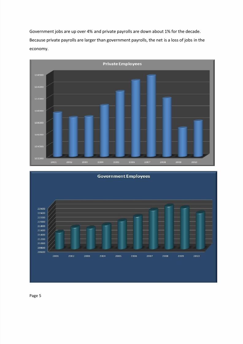
From the first graph, we note that total non-farm payrolls have fallen since 2001.
8/6/2019 52376061 PDF Charting the Economy
http://slidepdf.com/reader/full/52376061-pdf-charting-the-economy 5/57
Page 5
Government jobs are up over 4% and private payrolls are down about 1% for the decade.
Because private payrolls are larger than government payrolls, the net is a loss of jobs in the
economy.

8/6/2019 52376061 PDF Charting the Economy
http://slidepdf.com/reader/full/52376061-pdf-charting-the-economy 6/57
Page 6
Next we note which categories gained the most jobs, and which lost the most jobs. Private
services, education, government, and leisure and hospitality had the biggest gains.

8/6/2019 52376061 PDF Charting the Economy
http://slidepdf.com/reader/full/52376061-pdf-charting-the-economy 7/57
Page 7
Construction, manufacturing, durable and non-durable goods, trade and transportation, and
information dropped the most. This clearly signals that the productive capacity of our economy
is being lost which will increase our trade deficit.
Job gains show that government spending is up. Private services and leisure and hospitality
show that those who still have jobs are spending more on leisure items, indicating a growing
disparity between the haves and have nots.
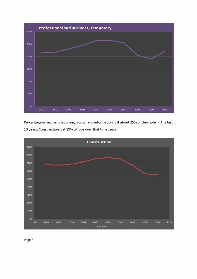
Professional and Business Services showed a positive gain of 5%. Half of that (2.5%) came in the
last year, and 73% of the last year’s gain was in temporary workers. This suggests that while the
category is growing, recent growth are not permanent jobs. Time will tell if these temporary
workers are converted to full time workers.
8/6/2019 52376061 PDF Charting the Economy
http://slidepdf.com/reader/full/52376061-pdf-charting-the-economy 8/57
Page 8
Percentage-wise, manufacturing, goods, and information lost about 25% of their jobs in the last
10 years. Construction lost 19% of jobs over that time span.

8/6/2019 52376061 PDF Charting the Economy
http://slidepdf.com/reader/full/52376061-pdf-charting-the-economy 9/57
Page 9
On a good note, mining and logging is up 22% over the decade, signaling at least a very small
portion of productive capacity of the country is not declining. However, mining and logging is a
very small portion of the overall jobs economy in the US.
8/6/2019 52376061 PDF Charting the Economy
http://slidepdf.com/reader/full/52376061-pdf-charting-the-economy 10/57
Page 10
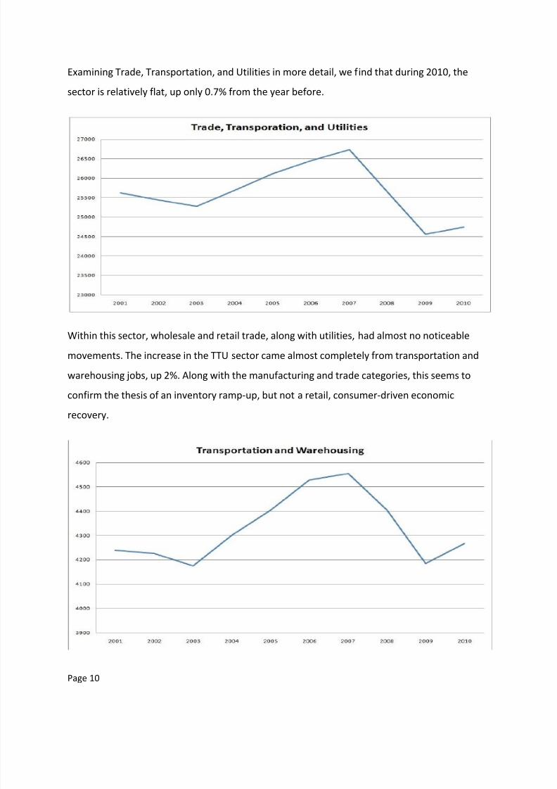
Examining Trade, Transportation, and Utilities in more detail, we find that during 2010, the
sector is relatively flat, up only 0.7% from the year before.
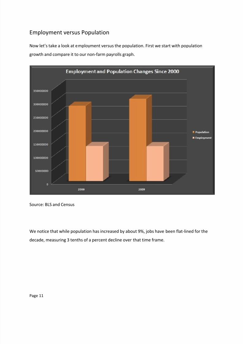
Within this sector, wholesale and retail trade, along with utilities, had almost no noticeable
movements. The increase in the TTU sector came almost completely from transportation and
warehousing jobs, up 2%. Along with the manufacturing and trade categories, this seems to
confirm the thesis of an inventory ramp-up, but not a retail, consumer-driven economic
recovery.
8/6/2019 52376061 PDF Charting the Economy
http://slidepdf.com/reader/full/52376061-pdf-charting-the-economy 11/57
Page 11
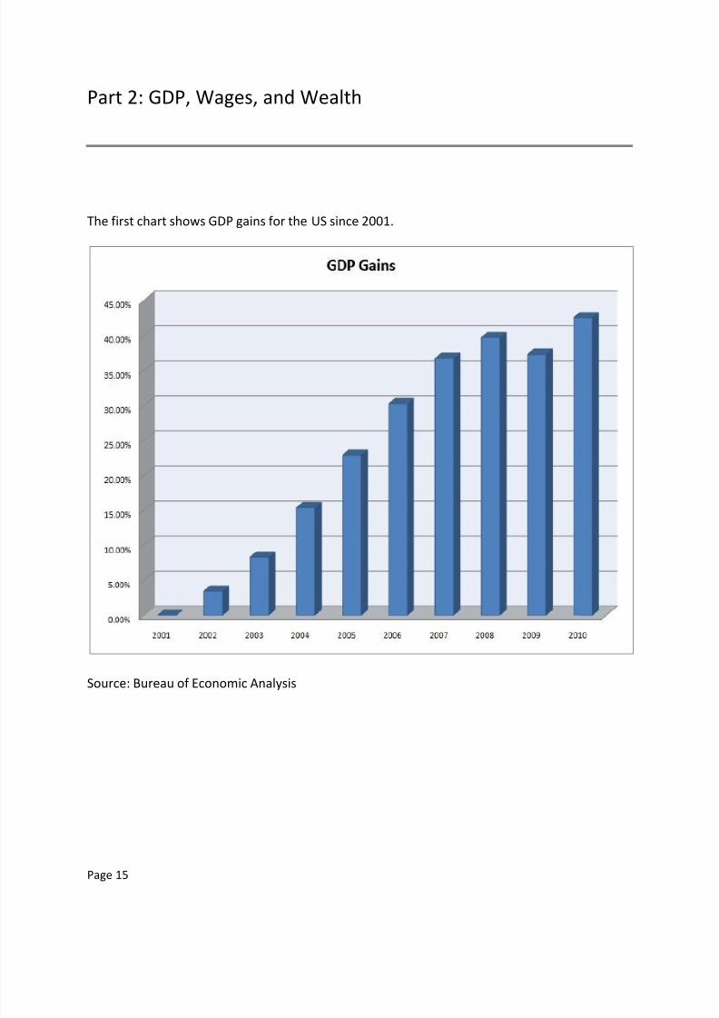
Employment versus Population
Now let’s take a look at employment versus the population. First we start with population
growth and compare it to our non-farm payrolls graph.
Source: BLS and Census
We notice that while population has increased by about 9%, jobs have been flat-lined for the
decade, measuring 3 tenths of a percent decline over that time frame.

8/6/2019 52376061 PDF Charting the Economy
http://slidepdf.com/reader/full/52376061-pdf-charting-the-economy 12/57
Page 12
We break down employment versus population changes by age category. Note the large
increases of baby boomers versus the relative flat Generation X and Millenials by population.
During the same time frame, those baby boomers have been taking more and more of the
available jobs while the younger groups are suffering higher unemployment. And as they retire,
the baby boomers will put more pressure on entitlement programs that cannot be funded by
the smaller Generation X and Millenials.

8/6/2019 52376061 PDF Charting the Economy
http://slidepdf.com/reader/full/52376061-pdf-charting-the-economy 13/57
Page 13
More interestingly, those 65 and above are taking a much higher proportion of jobs than their
population increase, suggesting many of the retired are moving back into the workforce at the
expense of the younger generations.

8/6/2019 52376061 PDF Charting the Economy
http://slidepdf.com/reader/full/52376061-pdf-charting-the-economy 14/57
Page 14
Wages By Age Group
The biggest increases came for the more experienced workers. Given our entitlement spending
problem, it appears the only way we balance the budget is to tax those closest to receiving the
benefits more (because nobody else can afford it), or drastically cut programs.
8/6/2019 52376061 PDF Charting the Economy
http://slidepdf.com/reader/full/52376061-pdf-charting-the-economy 15/57
Page 15
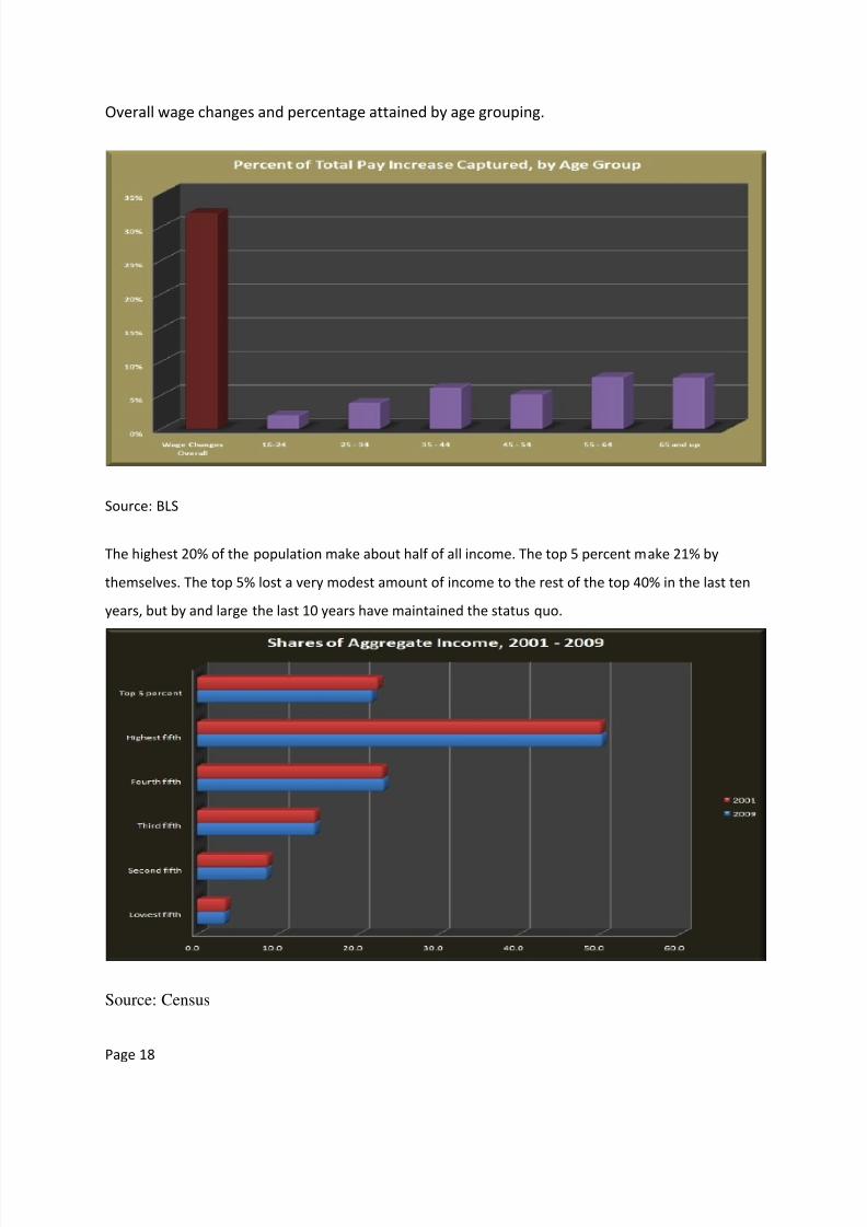
Part 2: GDP, Wages, and Wealth
The first chart shows GDP gains for the US since 2001.
Source: Bureau of Economic Analysis

8/6/2019 52376061 PDF Charting the Economy
http://slidepdf.com/reader/full/52376061-pdf-charting-the-economy 16/57
Page 16
The biggest raise comes in government, followed by other services, services, and private
industries. ‘Other services’ includes information, finance, real estate, scientific, professional,
education, healthcare, and technical. Manufacturing wages fell (along with available jobs), and
goods producing industries stayed stagnant. The service industry and government workers are
clearly taking home larger portions of the wage pie.

8/6/2019 52376061 PDF Charting the Economy
http://slidepdf.com/reader/full/52376061-pdf-charting-the-economy 17/57
Page 17
GDP has risen strongly compared to population, suggesting great efficiency gains. Since we
know overall employment has remained flat-lined for the decade, we should be able to make a
1:1 comparison in wages to GDP.
When taken together, the percentage increase in population * the percentage increase in
wages equals the percentage increase in GDP.
8/6/2019 52376061 PDF Charting the Economy
http://slidepdf.com/reader/full/52376061-pdf-charting-the-economy 18/57
Page 18
Overall wage changes and percentage attained by age grouping.
Source: BLS
The highest 20% of the population make about half of all income. The top 5 percent make 21% by
themselves. The top 5% lost a very modest amount of income to the rest of the top 40% in the last ten
years, but by and large the last 10 years have maintained the status quo.
Source: Census
8/6/2019 52376061 PDF Charting the Economy
http://slidepdf.com/reader/full/52376061-pdf-charting-the-economy 19/57
Page 19
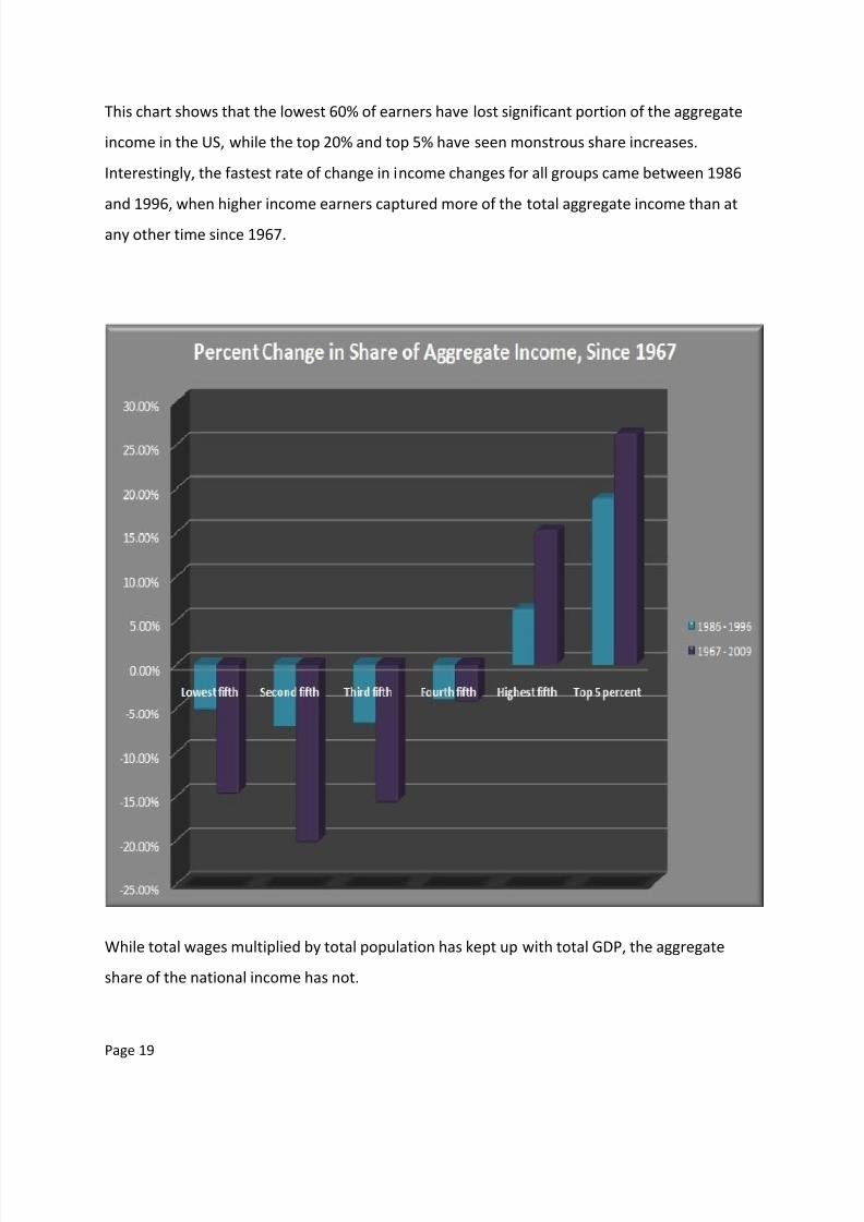
This chart shows that the lowest 60% of earners have lost significant portion of the aggregate
income in the US, while the top 20% and top 5% have seen monstrous share increases.
Interestingly, the fastest rate of change in income changes for all groups came between 1986
and 1996, when higher income earners captured more of the total aggregate income than at
any other time since 1967.
While total wages multiplied by total population has kept up with total GDP, the aggregate
share of the national income has not.

8/6/2019 52376061 PDF Charting the Economy
http://slidepdf.com/reader/full/52376061-pdf-charting-the-economy 20/57
Page 20
The chart shows that because the lowest 40% of earners cannot increase their share of
aggregate income, their rates of poverty increase. Inflation is stealing away their purchasing
power and putting them in the poor house.

8/6/2019 52376061 PDF Charting the Economy
http://slidepdf.com/reader/full/52376061-pdf-charting-the-economy 21/57
Page 21
The chart is in thousands. We can see that the bottom 50% of people have not grown their net
worth measurably. The top 10 percent have tripled their net worth. The chart shows that the
wealth affect, or the ability of existing assets to multiply wealth over time at an exponential
rate, has left a severely deepening gulf between the haves and have nots.
This data, of course, ignores the movement amongst the classes. But it does show that those
with assets are more easily able to multiply it to create wealth for their families.
Source: Federal Reserve 2007 Survey of Consumer Finances

8/6/2019 52376061 PDF Charting the Economy
http://slidepdf.com/reader/full/52376061-pdf-charting-the-economy 22/57
Page 22
We can see the poorer brackets have primarily cash accounts and retirement accounts, while
having small percentages of CDs, savings bonds, and life insurance. Higher brackets have a
larger mix of financial assets, likely due to having more money to purchase various assets with.
Note: Bonds had less than 10 responses for all but the highest bracket.
8/6/2019 52376061 PDF Charting the Economy
http://slidepdf.com/reader/full/52376061-pdf-charting-the-economy 23/57
Page 23
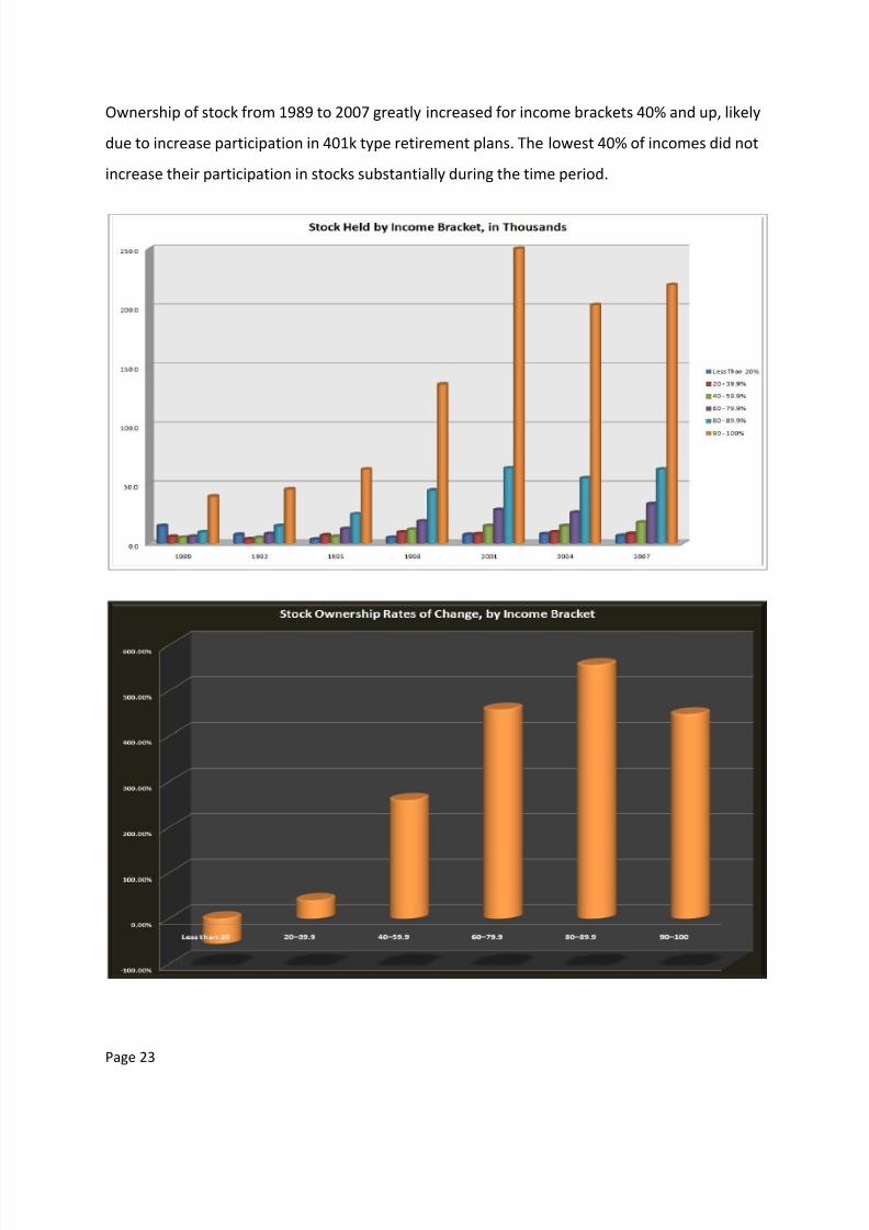
Ownership of stock from 1989 to 2007 greatly increased for income brackets 40% and up, likely
due to increase participation in 401k type retirement plans. The lowest 40% of incomes did not
increase their participation in stocks substantially during the time period.
8/6/2019 52376061 PDF Charting the Economy
http://slidepdf.com/reader/full/52376061-pdf-charting-the-economy 24/57
Page 24
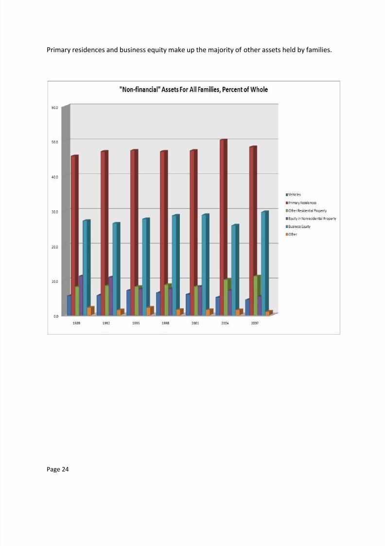
Primary residences and business equity make up the majority of other assets held by families.

8/6/2019 52376061 PDF Charting the Economy
http://slidepdf.com/reader/full/52376061-pdf-charting-the-economy 25/57
Page 25
Checking accounts, interest bearing bank accounts and CDs, stocks and retirement accounts,
primary residences, and cars make up the majority of ‘financial assets’ held by the public, as per
the census.
Source: Census

8/6/2019 52376061 PDF Charting the Economy
http://slidepdf.com/reader/full/52376061-pdf-charting-the-economy 26/57
Page 26
The largest debt is the primary residence, and the percentage equity of all owners has dropped
9% from 1989 to 2007. Other debt tied to residential property has risen 32% over that time
frame (equity loans). Credit card balances jumped 21% in that same time frame, while lines of
unsecured credit dropped 38%.
The leverage ratio shows that the poorest use the most debt per their income. Because their
share of income is so small, any debts carried inhibit their ability to increase their net worth.

8/6/2019 52376061 PDF Charting the Economy
http://slidepdf.com/reader/full/52376061-pdf-charting-the-economy 27/57
Page 27
There is really no point in putting specific investments here. Based upon existing net worth
stats, it is clear that no current class of workers are financially prepared for retirement. This
means we can expect additional dependence on social security and for retirees to continue
working past the age of 65 to make ends meet. Even if these numbers had doubled since 2004
(an extremely unlikely scenario), workers would simply not have nearly enough to retire on
without substantial assistance required. Most estimates of minimum retirement nest eggs start
in the millions of dollars.

8/6/2019 52376061 PDF Charting the Economy
http://slidepdf.com/reader/full/52376061-pdf-charting-the-economy 28/57
Page 28
Part 3: Money Supply
Our opening chart looks at the broadest measures of cash and credit in the U.S. money supply,
M2 and M3. We can see that both measures have been expanding this decade. Note: The
Federal Reserve stopped reporting on M3 after 2006 due to what it considered low importance
to the measurement of money in the system.
M3 is the broadest measure of money and credit in the U.S. It consists of credit, savings, and
cash in the system. For our purposes, we want to examine those elements of U.S. monetary
measures that are inflationary and affect the prices of goods that people buy every day.
8/6/2019 52376061 PDF Charting the Economy
http://slidepdf.com/reader/full/52376061-pdf-charting-the-economy 29/57
Page 29
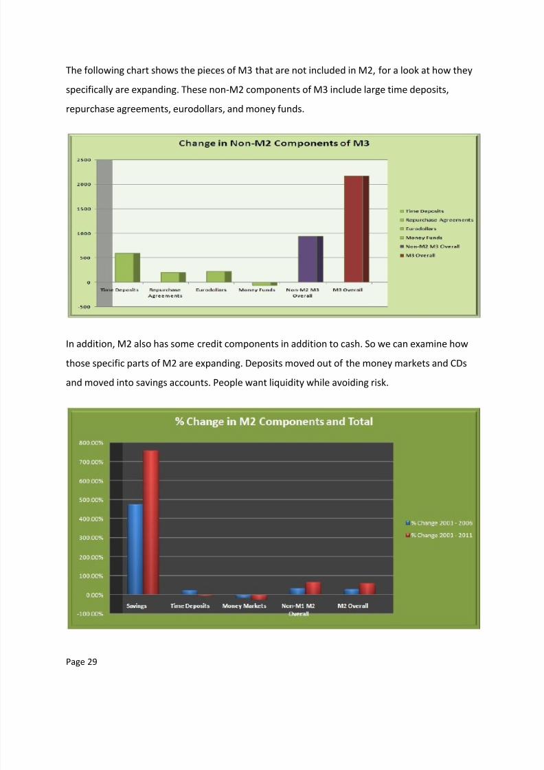
The following chart shows the pieces of M3 that are not included in M2, for a look at how they
specifically are expanding. These non-M2 components of M3 include large time deposits,
repurchase agreements, eurodollars, and money funds.
In addition, M2 also has some credit components in addition to cash. So we can examine how
those specific parts of M2 are expanding. Deposits moved out of the money markets and CDs
and moved into savings accounts. People want liquidity while avoiding risk.
8/6/2019 52376061 PDF Charting the Economy
http://slidepdf.com/reader/full/52376061-pdf-charting-the-economy 30/57
Page 30
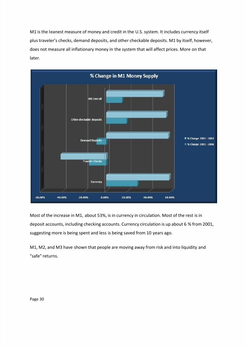
M1 is the leanest measure of money and credit in the U.S. system. It includes currency itself
plus traveler’s checks, demand deposits, and other checkable deposits. M1 by itself, however,
does not measure all inflationary money in the system that will affect prices. More on that
later.
Most of the increase in M1, about 53%, is in currency in circulation. Most of the rest is in
deposit accounts, including checking accounts. Currency circulation is up about 6 % from 2001,
suggesting more is being spent and less is being saved from 10 years ago.
M1, M2, and M3 have shown that people are moving away from risk and into liquidity and
"safe" returns.
8/6/2019 52376061 PDF Charting the Economy
http://slidepdf.com/reader/full/52376061-pdf-charting-the-economy 31/57
Page 31
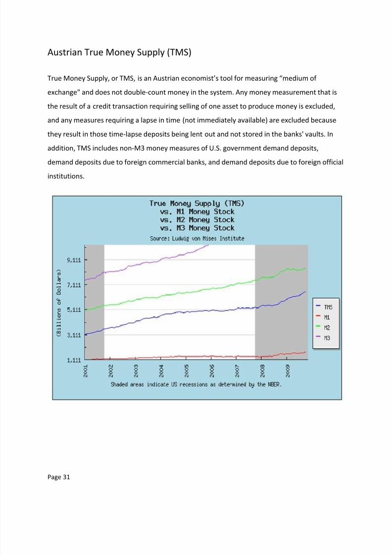
Austrian True Money Supply (TMS)
True Money Supply, or TMS, is an Austrian economist’s tool for measuring “medium of
exchange" and does not double-count money in the system. Any money measurement that is
the result of a credit transaction requiring selling of one asset to produce money is excluded,
and any measures requiring a lapse in time (not immediately available) are excluded because
they result in those time-lapse deposits being lent out and not stored in the banks' vaults. In
addition, TMS includes non-M3 money measures of U.S. government demand deposits,
demand deposits due to foreign commercial banks, and demand deposits due to foreign official
institutions.
8/6/2019 52376061 PDF Charting the Economy
http://slidepdf.com/reader/full/52376061-pdf-charting-the-economy 32/57
Page 32
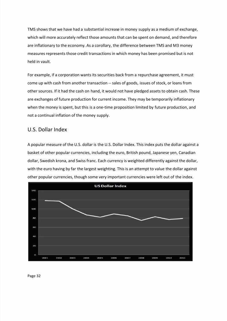
TMS shows that we have had a substantial increase in money supply as a medium of exchange,
which will more accurately reflect those amounts that can be spent on demand, and therefore
are inflationary to the economy. As a corollary, the difference between TMS and M3 money
measures represents those credit transactions in which money has been promised but is not
held in vault.
For example, if a corporation wants its securities back from a repurchase agreement, it must
come up with cash from another transaction -- sales of goods, issues of stock, or loans from
other sources. If it had the cash on hand, it would not have pledged assets to obtain cash. These
are exchanges of future production for current income. They may be temporarily inflationary
when the money is spent, but this is a one-time proposition limited by future production, and
not a continual inflation of the money supply.
U.S. Dollar Index
A popular measure of the U.S. dollar is the U.S. Dollar Index. This index puts the dollar against a
basket of other popular currencies, including the euro, British pound, Japanese yen, Canadian
dollar, Swedish krona, and Swiss franc. Each currency is weighted differently against the dollar,
with the euro having by far the largest weighting. This is an attempt to value the dollar against
other popular currencies, though some very important currencies were left out of the index.
8/6/2019 52376061 PDF Charting the Economy
http://slidepdf.com/reader/full/52376061-pdf-charting-the-economy 33/57
Page 33
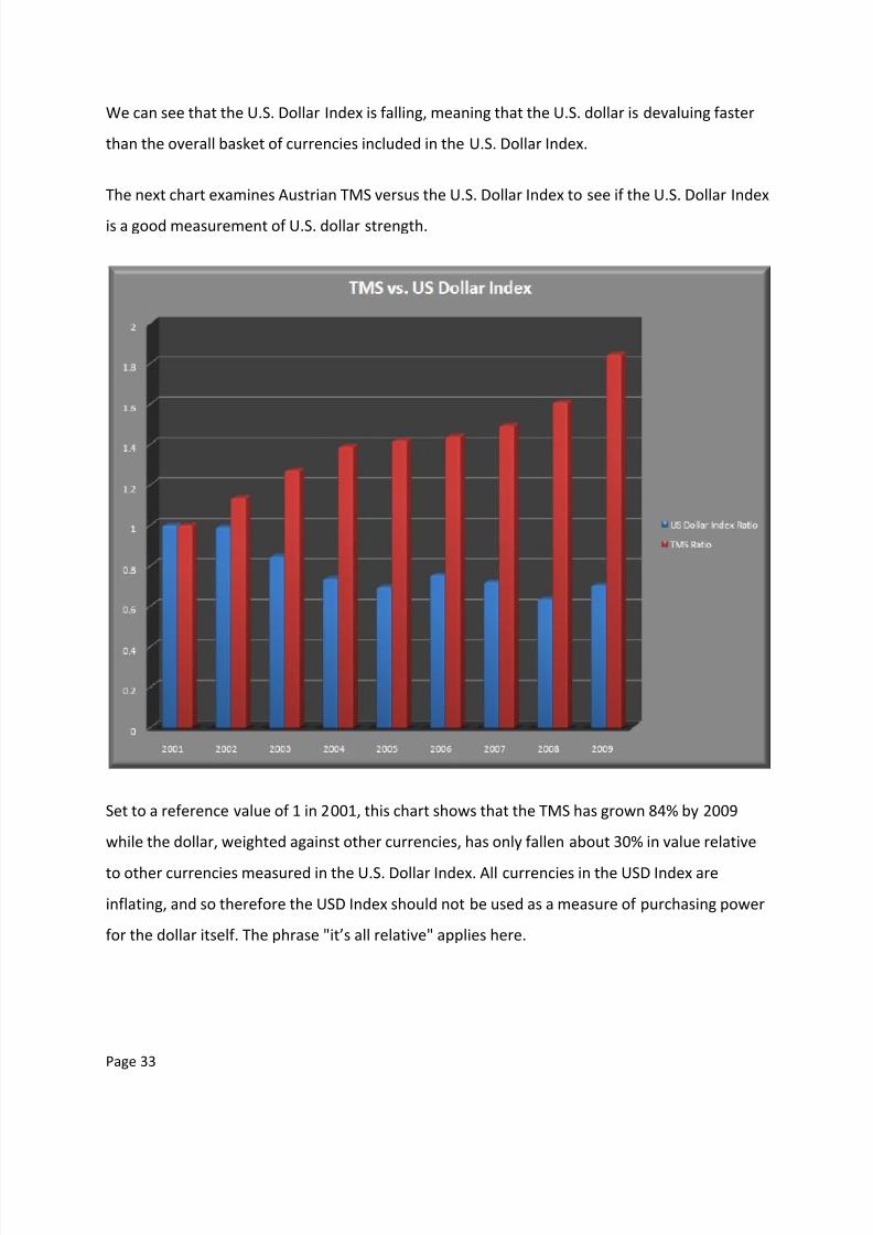
We can see that the U.S. Dollar Index is falling, meaning that the U.S. dollar is devaluing faster
than the overall basket of currencies included in the U.S. Dollar Index.
The next chart examines Austrian TMS versus the U.S. Dollar Index to see if the U.S. Dollar Index
is a good measurement of U.S. dollar strength.
Set to a reference value of 1 in 2001, this chart shows that the TMS has grown 84% by 2009
while the dollar, weighted against other currencies, has only fallen about 30% in value relative
to other currencies measured in the U.S. Dollar Index. All currencies in the USD Index are
inflating, and so therefore the USD Index should not be used as a measure of purchasing power
for the dollar itself. The phrase "it’s all relative" applies here.
8/6/2019 52376061 PDF Charting the Economy
http://slidepdf.com/reader/full/52376061-pdf-charting-the-economy 34/57
Page 34
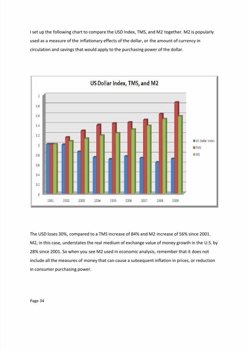
I set up the following chart to compare the USD Index, TMS, and M2 together. M2 is popularly
used as a measure of the inflationary effects of the dollar, or the amount of currency in
circulation and savings that would apply to the purchasing power of the dollar.
The USD loses 30%, compared to a TMS increase of 84% and M2 increase of 56% since 2001.
M2, in this case, understates the real medium of exchange value of money growth in the U.S. by
28% since 2001. So when you see M2 used in economic analysis, remember that it does not
include all the measures of money that can cause a subsequent inflation in prices, or reduction
in consumer purchasing power.

8/6/2019 52376061 PDF Charting the Economy
http://slidepdf.com/reader/full/52376061-pdf-charting-the-economy 35/57
Page 35
Other World Currencies
To compare the dollar against other currencies, it is helpful to find corresponding values in
those currencies. Here we look at the different measurements of the euro.
The euro measures are composed thusly:
M1: Currency in circulation + overnight deposits
M2: M1 + deposits with an agreed maturity up to two years + deposits redeemable at a period
of notice up to four months.
M3: M2 + repurchase agreements + money market fund (MMF) shares/units + debt securities
up to two years.
8/6/2019 52376061 PDF Charting the Economy
http://slidepdf.com/reader/full/52376061-pdf-charting-the-economy 36/57
Page 36
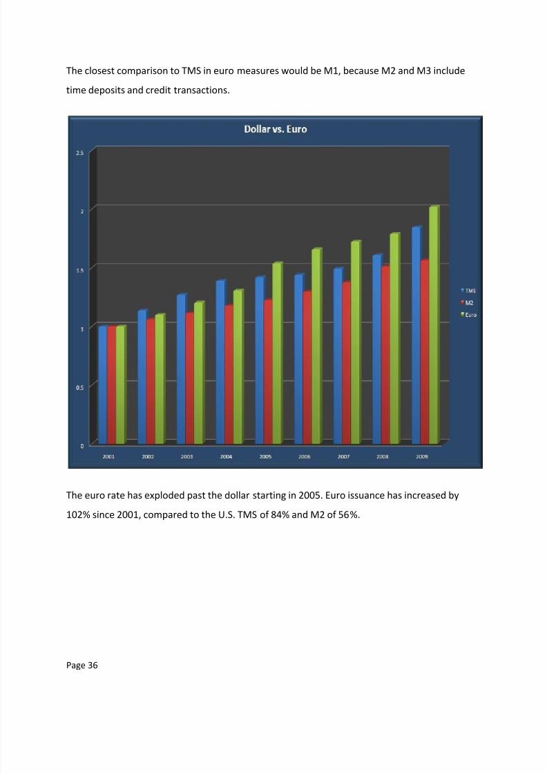
The closest comparison to TMS in euro measures would be M1, because M2 and M3 include
time deposits and credit transactions.
The euro rate has exploded past the dollar starting in 2005. Euro issuance has increased by
102% since 2001, compared to the U.S. TMS of 84% and M2 of 56%.
8/6/2019 52376061 PDF Charting the Economy
http://slidepdf.com/reader/full/52376061-pdf-charting-the-economy 37/57
Page 37
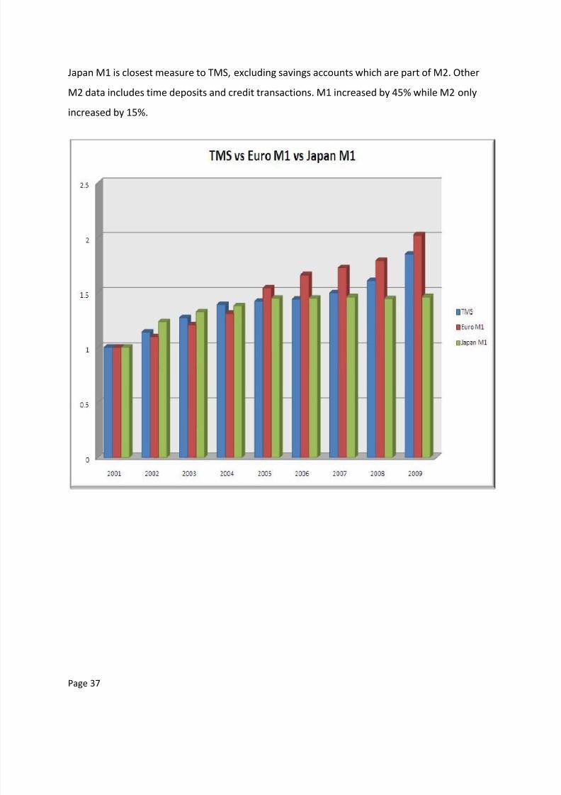
Japan M1 is closest measure to TMS, excluding savings accounts which are part of M2. Other
M2 data includes time deposits and credit transactions. M1 increased by 45% while M2 only
increased by 15%.

8/6/2019 52376061 PDF Charting the Economy
http://slidepdf.com/reader/full/52376061-pdf-charting-the-economy 38/57
Page 38
Here we see the Austrian TMS against four major currencies in the U.S. Dollar Index basket (by
weighting).
The euro is the highest-weighted currency in the USD Index basket, and has depreciated in
value more than the dollar, which has allowed the dollar to appear less devalued than it is.
Again, the USD Index is not a measure of purchasing power, as all currencies in the basket have
been inflated.
Note: Reporting on British M0, the closest measure of the two made available to actual money
in the system stopped in 2006. The British money measures were the following:
M0: Cash outside Bank of England + banks’ operational deposits with Bank of England. (No
longer published.)
M4: Cash outside banks (i.e. in circulation with the public and non-bank firms) + private-sector
retail bank and building society deposits + private-sector wholesale bank and building society
deposits and certificate of deposit.
M4 is a poor substitute for actual inflationary money supply, so I did not graph it.

8/6/2019 52376061 PDF Charting the Economy
http://slidepdf.com/reader/full/52376061-pdf-charting-the-economy 39/57
Page 39
China
China is a large trading partner of the U.S., and currently holds the most Treasury debt behind
the Federal Reserve. Therefore, China’s currency strength is an important factor in how the U.S.
trades with it and how much debt the Chinese can afford to buy from the U.S.
China has been inflating money supply to support its rapid economic expansion. It appears as
though it is very vulnerable to rising prices resulting from currency inflation. Japan has the
lowest rates of currency inflation since 2001 as it tries to keep exports competitive.

8/6/2019 52376061 PDF Charting the Economy
http://slidepdf.com/reader/full/52376061-pdf-charting-the-economy 40/57
Page 40
Lastly, we have U.S. Austrian TMS versus other major currencies.
Notice China has been printing Renminbi at a faster pace this decade than the dollar or euro.
When researching for this project, this was quite a shock. While China’s currency is not a world
reserve currency as the U.S. dollar is, the Chinese are following the same path the U.S. has. This
piece of data reinforces the idea that at least part of China’s economy is in a fiat money-
induced bubble, which is a topic for another article.
8/6/2019 52376061 PDF Charting the Economy
http://slidepdf.com/reader/full/52376061-pdf-charting-the-economy 41/57
Page 41
Part 4: Inflation
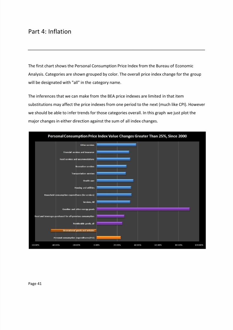
The first chart shows the Personal Consumption Price Index from the Bureau of Economic
Analysis. Categories are shown grouped by color. The overall price index change for the group
will be designated with "all" in the category name.
The inferences that we can make from the BEA price indexes are limited in that item
substitutions may affect the price indexes from one period to the next (much like CPI). However
we should be able to infer trends for those categories overall. In this graph we just plot the
major changes in either direction against the sum of all index changes.

8/6/2019 52376061 PDF Charting the Economy
http://slidepdf.com/reader/full/52376061-pdf-charting-the-economy 42/57
Page 42
From this chart, we see that the largest reduction in price index occurred in recreational goods
and vehicles, and that the largest increase was in gas and energy goods. Services as a whole
increased more than the net value of all PCE index value changes. Durable goods, not shown,
had the least amount of positive change (inflation) in index values, which include motor
vehicles and durable household equipment.
Food, housing, transportation and energy are the three most important monthly budget items
for most families. Energy prices almost doubled over the last decade and rose three times as
fast as wages over the same timeframe. Food increased by over 33%, outpacing wages by 4%.
Because the BEA notes the indexes are limited by substitution effects, we search for more
accurate measures of price inflation.
We can look at the BLS Inflation data, as graphed below. The first graph has some of the
essential budget items.
Look at the nice smooth curve in housing inflation, which started slowing in 2005 and hasn’t
stopped. Most of the values are below 5%, with transportation jumping around the most.

8/6/2019 52376061 PDF Charting the Economy
http://slidepdf.com/reader/full/52376061-pdf-charting-the-economy 43/57
Page 43
Energy items are specifically graphed below.
Fuel oil and gasoline have risen the most. All items since 2001 graphed below.
8/6/2019 52376061 PDF Charting the Economy
http://slidepdf.com/reader/full/52376061-pdf-charting-the-economy 44/57
Page 44
Inflation kicked up quite a bit in energy factors, which is telling of why the BLS does not include
it in the core inflation. And even though gasoline plunged once, it is back up to much higher
levels this year. This indicates that speculation is not the only factor driving oil prices. Fuel oil
has almost tripled.
Of course we know that some of the BLS figures are largely BS, due to hedonic, geometric
weighting and substitution affects. Since energy items have harder substitutes, we can
reasonably rely on those from the BLS. But we’ll need to find substitutes for the housing, food
and other categories.
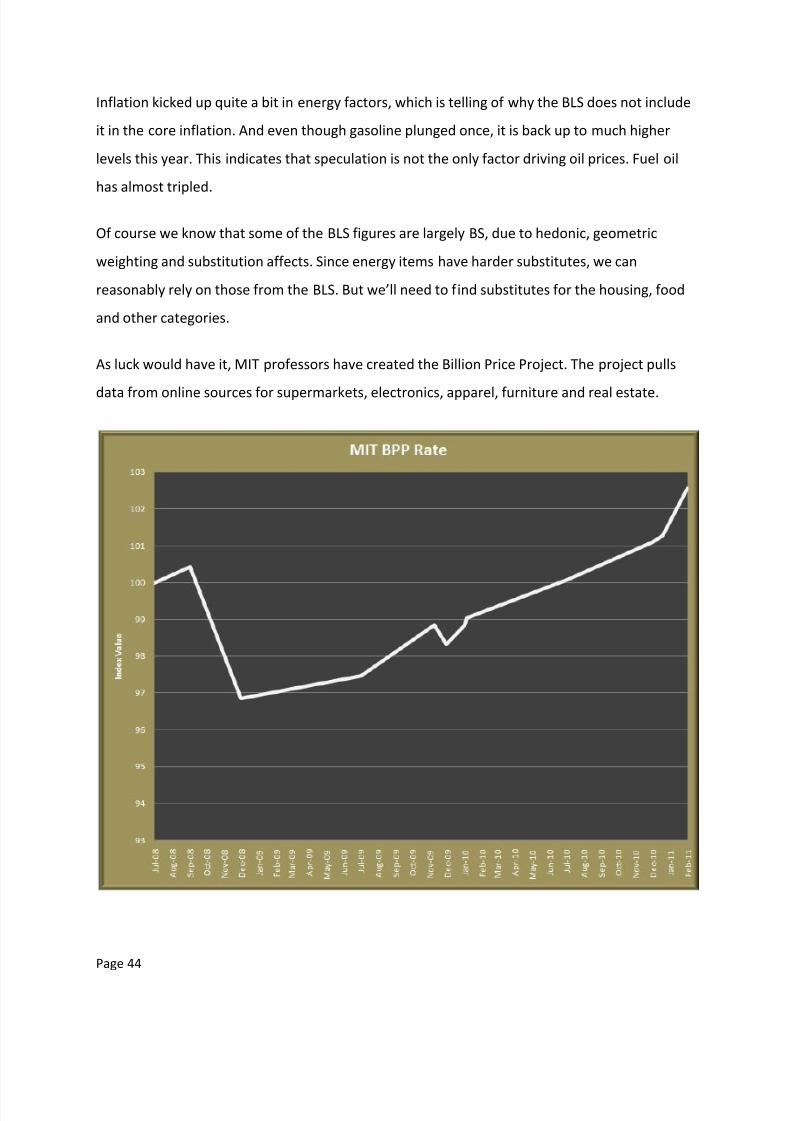
As luck would have it, MIT professors have created the Billion Price Project. The project pulls
data from online sources for supermarkets, electronics, apparel, furniture and real estate.
8/6/2019 52376061 PDF Charting the Economy
http://slidepdf.com/reader/full/52376061-pdf-charting-the-economy 45/57
Page 45
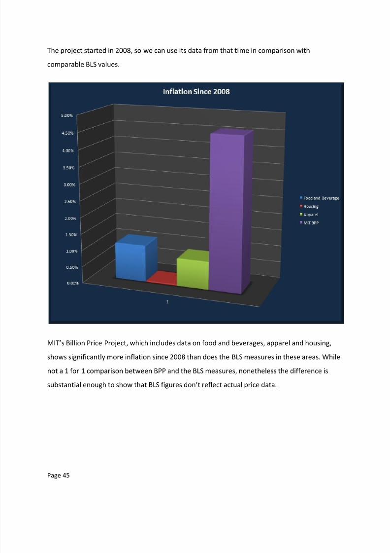
The project started in 2008, so we can use its data from that time in comparison with
comparable BLS values.
MIT’s Billion Price Project, which includes data on food and beverages, apparel and housing,
shows significantly more inflation since 2008 than does the BLS measures in these areas. While
not a 1 for 1 comparison between BPP and the BLS measures, nonetheless the difference is
substantial enough to show that BLS figures don’t reflect actual price data.
8/6/2019 52376061 PDF Charting the Economy
http://slidepdf.com/reader/full/52376061-pdf-charting-the-economy 46/57
Page 46
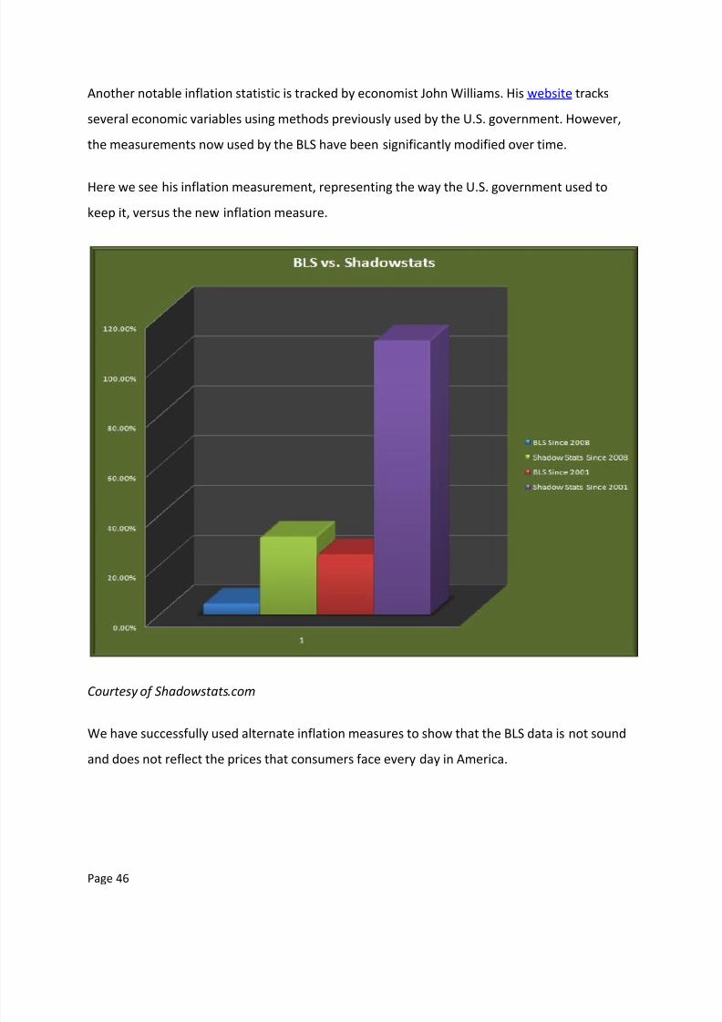
Another notable inflation statistic is tracked by economist John Williams. His website tracks
several economic variables using methods previously used by the U.S. government. However,
the measurements now used by the BLS have been significantly modified over time.
Here we see his inflation measurement, representing the way the U.S. government used to
keep it, versus the new inflation measure.
Courtesy of Shadowstats.com
We have successfully used alternate inflation measures to show that the BLS data is not sound
and does not reflect the prices that consumers face every day in America.

8/6/2019 52376061 PDF Charting the Economy
http://slidepdf.com/reader/full/52376061-pdf-charting-the-economy 47/57
Page 47
As we can see, the Austrian True Money Supply (TMS) as a measure of inflationary currency
tracks the Shadowstats inflation rate very well. We can also see by this chart about an 18 -24
month lag time between TMS movements, and the resulting price movements in Shadowstats
price inflation. Starting values for both measures were set to 100 index.
8/6/2019 52376061 PDF Charting the Economy
http://slidepdf.com/reader/full/52376061-pdf-charting-the-economy 48/57
Page 48
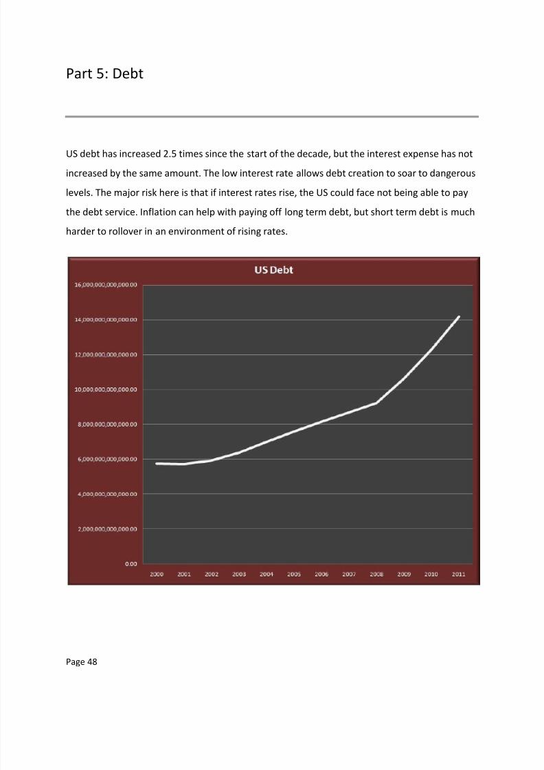
Part 5: Debt
US debt has increased 2.5 times since the start of the decade, but the interest expense has not
increased by the same amount. The low interest rate allows debt creation to soar to dangerous
levels. The major risk here is that if interest rates rise, the US could face not being able to pay
the debt service. Inflation can help with paying off long term debt, but short term debt is much
harder to rollover in an environment of rising rates.

8/6/2019 52376061 PDF Charting the Economy
http://slidepdf.com/reader/full/52376061-pdf-charting-the-economy 49/57
Page 49
Low interest demanded by creditors have allowed the US to borrow it’s way to potential
economic insolvency.
Debt has caught up to GDP in early 2011. The growth rates of debt are stunning, and prove that
additional debt does not automatically increase production.

8/6/2019 52376061 PDF Charting the Economy
http://slidepdf.com/reader/full/52376061-pdf-charting-the-economy 50/57
Page 50
Kenneth Rogoff and Carmen Reinhart, in their book This Time Is Different, note that when debt
exceeds 90% of GDP historically, growth rates in that country slow 2% over countries with
lower debt thresholds. When debts reach 100% of GDP, default is much more likely. The US is
facing this dynamic even as official budget projections forecast GDP increases for the next
several years.
Typically, countries experiencing greater than 20% inflation also have a higher chance of
defaulting on debt. The US is not quite there yet.

8/6/2019 52376061 PDF Charting the Economy
http://slidepdf.com/reader/full/52376061-pdf-charting-the-economy 51/57
Page 51
Here is why US borrowing costs are rising, as shown in the previous chart. We can see that after
the financial crisis, rates that had jumped up from previous years had fallen again. The public
bought into stabilization of US debt. The rates are beginning to rise again, though not as much
on the shorter issues. The public obviously feels there is much risk on the horizon, but not in
the immediate term.
However, shorter term securities have leveled out in 2011 and it would not be a surprise to see
them jump as well, if the economic conditions do not improve. If short term rates rise, this
could make it very difficult for the US to finance its debt. The Federal Reserve would have to
continue to pump freshly printed currency into the system, risking hyperinflation.
Note: The US did not issue 30 year Treasuries for 2003 – 2005.

8/6/2019 52376061 PDF Charting the Economy
http://slidepdf.com/reader/full/52376061-pdf-charting-the-economy 52/57
Page 52
The Federal Reserve bank, known as the central bank of the US, has twice in the past few years
vaulted to the top as owners of Treasury debt. Once during the mortgage meltdown and again
as the economic recession in America continues.
This process of central bank buying debt is called monetizing the debt, and is often one of the
final warning signs of debt collapse. China and Japan have been slowly deleveraging out of US
debt and building portfolios of hard assets such as commodities. The market for US debt paper
is increasingly falling to the Federal Reserve to fund. The US is running large budget deficits,
which puts increasing pressure on additional yearly borrowing to make the difference up.
Because rolling over previous debts requires new debts to be created, it will be interesting to
see if anyone else has the capacity and willingness to take on additional US IOUs. No suitors
have volunteered and there may not be any capable to do so.

8/6/2019 52376061 PDF Charting the Economy
http://slidepdf.com/reader/full/52376061-pdf-charting-the-economy 53/57
Page 53
Part 6: Stocks and Commodities
Stocks have been up and down, but overall are at about the same level as they were ten years
ago.

8/6/2019 52376061 PDF Charting the Economy
http://slidepdf.com/reader/full/52376061-pdf-charting-the-economy 54/57
Page 54
Commodities prices have been rising since 2002.
The CCI (Continous Commodity Index) is comprised of:
17.64% Energy
17.64% Grains
11.76% Livestock
29.4% Soft goods (sugar, cotton, cocoa, etc..)
23.52% Metals (gold, silver, copper, etc..)
We can see that commodities prices are rising, which results from monetary inflation.
Consumers will pay more for the same goods.

8/6/2019 52376061 PDF Charting the Economy
http://slidepdf.com/reader/full/52376061-pdf-charting-the-economy 55/57
Page 55
Gold has had a massive run up in the last decade.
Silver is not far behind.
8/6/2019 52376061 PDF Charting the Economy
http://slidepdf.com/reader/full/52376061-pdf-charting-the-economy 56/57
Page 56
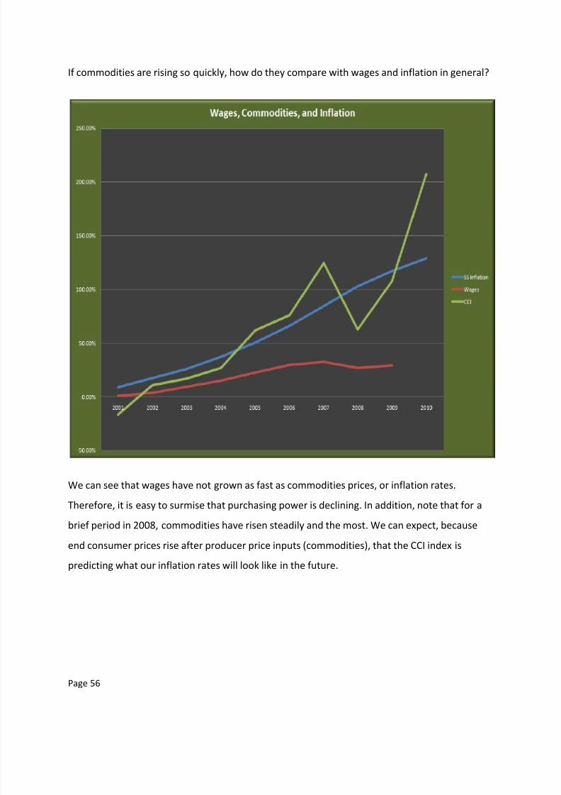
If commodities are rising so quickly, how do they compare with wages and inflation in general?
We can see that wages have not grown as fast as commodities prices, or inflation rates.
Therefore, it is easy to surmise that purchasing power is declining. In addition, note that for a
brief period in 2008, commodities have risen steadily and the most. We can expect, because
end consumer prices rise after producer price inputs (commodities), that the CCI index is
predicting what our inflation rates will look like in the future.

8/6/2019 52376061 PDF Charting the Economy
http://slidepdf.com/reader/full/52376061-pdf-charting-the-economy 57/57
In the following chart, we see how the prices of things are related to the increase in the money
supply. The prices are highly correlated to the increase in money supply, as measured by TMS.
You have completed your journey through the US economy of the last decade. I hope you found
the information fruitful. The information contained herein is owned by Robert Kientz, who
retains all copyrights to the material. You are free to distribute the piece to anyone you choose,