
4.8 Usability requirements - kimberlylovely.comkimberlylovely.com/Portfolio/Healthcare_IT/Usability...
27
4.8 USABILITY REQUIREMENTS Top Ten Enhancements Open Window Method Description: Estimat e Web Services Description: Estimat e Contextual menu (Right Click Menus) Description: A context menu (also called contextual, shortcut, and popup or pop-up menu) is a menu in a graphical user interface (GUI) that appears upon user interaction, such as a right mouse click or middle click mouse operation. A context menu offers a limited set of choices that are available in the current state, or context, of the operating system or application. Usually the available choices are actions related to the selected object. The right mouse button is often used to open contextual menus, which are pop-up menus that change depending where you click (target area). For example, if you right click on the desktop, you may see a menu pop up that includes "Change View Options" and "Change Desktop Background." If you right click on a folder, the menu might include options such as "Open" and "Properties." Certain programs, such as video games, may use the right click to perform other functions, such as firing a secondary weapon in a first-person shooter. Most programs, however, use the right click to open contextual menus. Example: Estimat e 1
Transcript of 4.8 Usability requirements - kimberlylovely.comkimberlylovely.com/Portfolio/Healthcare_IT/Usability...

4.8 USABILITY REQUIREMENTS
Top Ten Enhancements
Open Window Method
Description:
Estimate
Web Services
Description:
Estimate
Contextual menu (Right Click Menus)
Description: A context menu (also called contextual, shortcut, and popup or pop-up menu) is a menu in a graphical user interface (GUI) that appears upon user interaction, such as a right mouse click or middle click mouse operation. A context menu offers a limited set of choices that are available in the current state, or context, of the operating system or application. Usually the available choices are actions related to the selected object.
The right mouse button is often used to open contextual menus, which are pop-up menus that change depending where you click (target area). For example, if you right click on the desktop, you may see a menu pop up that includes "Change View Options" and "Change Desktop Background." If you right click on a folder, the menu might include options such as "Open" and "Properties." Certain programs, such as video games, may use the right click to perform other functions, such as firing a secondary weapon in a first-person shooter. Most programs, however, use the right click to open contextual menus.
Example:
Estimate
1

Model Windows (Modal Dialogs)Description: In user interface design, a modal window is a child window that requires users to interact with it before they can return to operating the parent application, thus preventing the workflow on the application main window. Modal windows are often called heavy windows or modal dialogs because the window is often used to display a dialog box.
Modal windows are commonly used in GUI systems to command user awareness and to display emergency states. In the web, they are often used to show images in detail.
Example:
Estimate
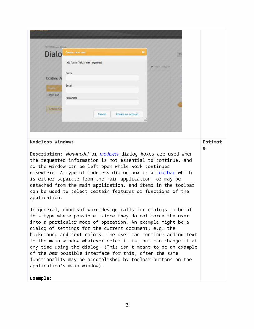
Modeless Windows
Description: Non-modal or modeless dialog boxes are used when the requested information is not essential to continue, and so the window can be left open while work continues elsewhere. A type of modeless dialog box is a toolbar which is either separate from the main application, or may be detached from the main application, and items in the toolbar can be used to select certain features or functions of the application.
In general, good software design calls for dialogs to be of this type where possible, since they do not force the user into a particular mode of operation. An example might be a dialog of settings for the current document, e.g. the background and text colors. The user can continue adding text to the main window whatever color it is, but can change it at any time using the dialog. (This isn't meant to be an example of the best possible interface for this; often the same functionality may be accomplished by toolbar buttons on the application's main window).
Estimate
2
Example:
Liquid Layout
Description: No horizontal scrolling in user interface at these screen resolutions. 1024x768 and 1280x1024 liquid horizontal as well as vertical.
Example: 1280 x 1024
Estimate
3

Example: 1024 x 768
4

Drag and Drop functionality in CM
Description: Drag and dropping capabilities from a modeless tool bar.
Example:
Estimate
Divs no frames (Divs Only)
Description: Moving forward no more frames use divs only. CM project no frames excepted.
Estimate
Accessibility – Font sizes to small
Description: All fonts need to be 12 px and above unless it’s legal disclaimer copy that can be at 11 px.
Accessibility – Contrast
Description: Accessibility Findings
Estimate
Icon elimination
Description: Where a label is evident take out the icon. This taxes out users especially during training. Visual clutter.
Estimate
5

Accessibility Findings
Color Contrast Analyser
It is a tool for checking foreground & background color combinations to determine if they provide good color visibility. Determining "color visibility" is based on algorithms suggested by the World Wide Web Consortium (W3C):
Failed:
Report: Fail (The contrast ratio is: 4.53)
Foreground:#D4EBFC Background:#086BB5Text or diagrams and their background must have a luminosity contrast ratio of at least 5:1 for level 2 conformance to guideline 1.4,and text or diagrams and their background must have a luminosity contrast ratio of at least 10:1 for level 3 conformance to guideline 1.4.
Failed:
Fail (The contrast ratio is: 3.94)
Foreground:#086BB5 Background:#C7DBEF
Text or diagrams and their background must have a luminosity contrast ratio of at least 5:1 for level 2 conformance to guideline 1.4,and text or diagrams and their background must have a luminosity contrast ratio of at least 10:1 for level 3 conformance to guideline 1.4.
Failed:
Fail (The contrast ratio is: 4.51)
Foreground:#086BB5 Background:#D8EAF8
6

Text or diagrams and their background must have a luminosity contrast ratio of at least 5:1 for level 2 conformance to guideline 1.4,and text or diagrams and their background must have a luminosity contrast ratio of at least 10:1 for level 3 conformance to guideline 1.4.
Failed:
Fail (The contrast ratio is: 4.91)
Foreground:#086BB5 Background:#EAF2FB
Text or diagrams and their background must have a luminosity contrast ratio of at least 5:1 for level 2 conformance to guideline 1.4,and text or diagrams and their background must have a luminosity contrast ratio of at least 10:1 for level 3 conformance to guideline 1.4.
Failed:
Fail (The contrast ratio is: 4.19)
Foreground:#086BB5 Background:#C8E3F7
Text or diagrams and their background must have a luminosity contrast ratio of at least 5:1 for level 2 conformance to guideline 1.4,and text or diagrams and their background must have a luminosity contrast ratio of at least 10:1 for level 3 conformance to guideline 1.4.
Failed:
Fail (The contrast ratio is: 4.50)
Foreground:#086BB5 Background:#D7EAF7
Text or diagrams and their background must have a luminosity contrast ratio of at least 5:1 for level 2 conformance to guideline 1.4,and text or diagrams and their background must have a luminosity contrast ratio of at least 10:1 for level 3 conformance to guideline 1.4.
7

Failed:
Fail (The contrast ratio is: 4.58)
Foreground:#0D6BB5 Background:#E8E8F6
Text or diagrams and their background must have a luminosity contrast ratio of at least 5:1 for level 2 conformance to guideline 1.4,and text or diagrams and their background must have a luminosity contrast ratio of at least 10:1 for level 3 conformance to guideline 1.4.
Failed:
Fail (The contrast ratio is: 4.76)
Foreground:#086BB5 Background:#E4EFF7
Text or diagrams and their background must have a luminosity contrast ratio of at least 5:1 for level 2 conformance to guideline 1.4,and text or diagrams and their background must have a luminosity contrast ratio of at least 10:1 for level 3 conformance to guideline 1.4.
Failed:
8

Fail (The contrast ratio is: 4.98)
Foreground:#086BB5 Background:#E7F5FB
Text or diagrams and their background must have a luminosity contrast ratio of at least 5:1 for level 2 conformance to guideline 1.4,and text or diagrams and their background must have a luminosity contrast ratio of at least 10:1 for level 3 conformance to guideline 1.4.
Failed:
Fail (The contrast ratio is: 2.61)
Foreground:#999999 Background:#EFF8FF
Text or diagrams and their background must have a luminosity contrast ratio of at least 5:1 for level 2 conformance to guideline 1.4,and text or diagrams and their background must have a luminosity contrast ratio of at least 10:1 for level 3 conformance to guideline 1.4.
9

Failed:
Fail (The contrast ratio is: 4.59)
Foreground:#086BB5 Background:#DAECF8
Text or diagrams and their background must have a luminosity contrast ratio of at least 5:1 for level 2 conformance to guideline 1.4,and text or diagrams and their background must have a luminosity contrast ratio of at least 10:1 for level 3 conformance to guideline 1.4.
Failed:
Fail (The contrast ratio is: 4.51)
Foreground:#096BB4 Background:#D7EAF7
Text or diagrams and their background must have a luminosity contrast ratio of at least 5:1 for level 2 conformance to guideline 1.4,and text or diagrams and their background must have a luminosity contrast ratio of at least 10:1 for level 3 conformance to guideline 1.4.
Failed:
Fail (The contrast ratio is: 4.50)
Foreground:#086BB5 Background:#D7EAF7
Text or diagrams and their background must have a luminosity contrast ratio of at least 5:1 for level 2 conformance to guideline 1.4,and text or diagrams and their background must have a luminosity contrast ratio of at least 10:1 for level 3 conformance to guideline 1.4.
10

User has 20/20 vision and is age 30 yrs.
Simulations of different eye sights done in aDesigner (version 1.10) IBM. Description: The aDesigner is a disability simulator that helps Web designers ensure that their pages are accessible and usable by the visually impaired. Web developers can use aDesigner to test the accessibility and usability of Web pages for low-vision and blind people. The tool looks at such elements as the degree of color contrast on the page, the ability of users to change the font size, the appropriateness of alternate text for images, and the availability of links in the page to promote navigability. The tool also checks the pages' compliance with accessibility guidelines.
1. Resizing of the text can only happen in the top frame.2. 8 Pixel font size used below 508 regs.
11

User has 20/40 vision. (View Full Screen)
User has 20/70 vision. (View Full Screen)
12

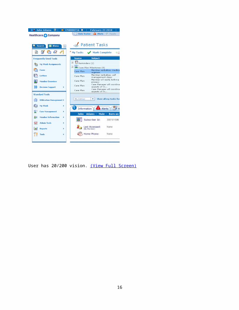
User has 20/200 vision. (View Full Screen)
13

14

Eye Chart for Reference.
15
Usability Studies
USABILITY GOALS
The following section is a list of generalized goals for application usability based on conducted studies and usability experience. Unless explicitly called out in the above high level design section, none of these items should be implemented without further discussion.
o No scrolling horizontally in a 1024x768 screen resolution.o Reductions in clicks in tasks.o Adding right click menu functionality in the user interface.o Leveraging modal, modeless, pop-up windows and right click menus for a
better user experience for task completion. In leveraging the usage of such UI it eliminates the number of clicks and unnecessary navigation away from the subject matter.
o Included visual affordances.o User validation of design direction.o User validation of user interface using an interactive prototype.o Applying usability best practices to the design.o Applying accessibility best practices such as contrast on visuals, tabbing
design and font size. The section 508 laws are aimed for the public facing sites. This application is used internally and may not be exposed to legal conflict unless a customer has a disabled user in their organization. WellPoint has a workman’s comp regulation that we may have to comply with.
STUDY RESULTS BASED ON USER OBSERVATIONS
The following is a list of desired change and enhancements made by various users during the usability studies.
AssessmentsSelecting Goals/Milestones in Assessments - Neighborhood Health Plan (NHP) uses assessments to generate care plans for them. These assessments generate the care plan based on the answers that they provide to various questions. They would like the generation of the care plan to in the assessment to allow them to pick what goal/milestone they want to be in the care plan instead of the assessment module importing all items. Take notes per question – It would be nice to take notes per question. NHP users are taking these notes on paper and later may enter them as a progress note. We’ve designed this idea out already once. The initial designs in navigating assessments allowed for a note feature.
16

LettersInsert helpful content into letters – During design sessions, NHP has noted that some intelligence with generating letters would be nice. The statement made by a CM nurse was, “If I’m working on a problem where a mother is not using a car seat for her child, it would be great if when generating the letter I could insert content from health wise or other source as to why she should use a care seat.”
Care Plans
My Work
MiscellaneousHome Page Enhancements –
Undo Features –
Manage two members in CCA at a time –
Care Plans across family members –
Terminology
Term or Acronym DefinitionModal Window In user interface design, a modal window is a child window
that requires users to interact with it before they can return to operating the parent application, thus preventing the workflow on the application main window. Modal windows are often called heavy windows or modal dialogs because the window is often used to display a dialog box.
Modal windows are commonly used in GUI systems to command user awareness and to display emergency states. In the web, they are often used to show images in detail.[
17

Term or Acronym DefinitionGUI A graphical user interface (GUI) (sometimes pronounced
gooey[1]) is a type of user interface item that allows people to interact with programs in more ways than typing such as computers; hand-held devices such as MP3 players, portable media players or gaming devices; household appliances and office equipment with images rather than text commands. A GUI offers graphical icons, and visual indicators, as opposed to text-based interfaces, typed command labels or text navigation to fully represent the information and actions available to a user. The actions are usually performed through direct manipulation of the graphical elements.[2]
The term GUI is historically restricted to the scope of two-dimensional display screens with display resolutions capable of describing generic information, in the tradition of the computer science research at the Palo Alto Research Center (PARC). The term GUI earlier might have been applicable to other high-resolution types of interfaces that are non-generic, such as videogames, or not restricted to flat screens, like volumetric displays.[3]
Contextual Menu A context menu (also called contextual, shortcut, and popup or pop-up menu) is a menu in a graphical user interface (GUI) that appears upon user interaction, such as a right mouse click or middle click mouse operation. A context menu offers a limited set of choices that are available in the current state, or context, of the operating system or application. Usually the available choices are actions related to the selected object.
Contextual Tabs Some tabs, called Contextual Tabs, appear only when certain objects are selected. Contextual Tabs expose functionality specific only to the object with focus. For example, selecting a picture brings up the Pictures tab, which presents options for dealing with the picture. Similarly, focusing on a table exposes table-related options in a specific tab. Contextual Tabs remain hidden except when an applicable object is selected.
18

Term or Acronym DefinitionModeless Window Non-modal or modeless dialog boxes are used when the
requested information is not essential to continue, and so the window can be left open while work continues elsewhere. A type of modeless dialog box is a toolbar which is either separate from the main application, or may be detached from the main application, and items in the toolbar can be used to select certain features or functions of the application.
In general, good software design calls for dialogs to be of this type where possible, since they do not force the user into a particular mode of operation. An example might be a dialog of settings for the current document, e.g. the background and text colors. The user can continue adding text to the main window whatever color it is, but can change it at any time using the dialog. (This isn't meant to be an example of the best possible interface for this; often the same functionality may be accomplished by toolbar buttons on the application's main window).
Pop-up Window Pop-ups are generally new web browser windows to display information. The pop-up window containing information is usually generated by JavaScript, but can be generated by other means as well. This window will not have top navigation and can be closed by the user.
Right Click Menu The right mouse button is often used to open contextual menus, which are pop-up menus that change depending where you click. For example, if you right click on the desktop, you may see a menu pop up that includes "Change View Options" and "Change Desktop Background." If you right click on a folder, the menu might include options such as "Open" and "Properties." Certain programs, such as video games, may use the right click to perform other functions, such as firing a secondary weapon in a first-person shooter. Most programs, however, use the right click to open contextual menus.
19

Term or Acronym DefinitionKeyboard Shortcut In computing, a keyboard shortcut or hotkey is a finite set of
one or more keys that invoke a software or operating system operation when triggered by the user.
Keyboard shortcuts are typically an alternate means for invoking one or more commands that would otherwise be accessible only through a menu, a pointing device, different levels of a user interface, or via a command console. Keyboard shortcuts generally expedite common operations by reducing input sequences to a few keystrokes, hence the term "shortcut".[1]
Some keyboard shortcuts require the user to press a single key or a sequence of keys one after the other. Other keyboard shortcuts require pressing and holding several keys simultaneously. For simultaneous keyboard shortcuts, one usually first holds down the modifier key(s), then quickly presses and releases the regular (non-modifier) key, and finally releases the modifier key(s). This distinction is important, as trying to press all the keys simultaneously will frequently either miss some of the modifier keys, or cause unwanted auto-repeat. One exception is shortcuts involving the Esc key, which almost always requires pressing and releasing the Esc key before pressing the next key.
20

Term or Acronym DefinitionUsability Usability is a quality attribute that assesses how easy user
interfaces are to use. The word "usability" also refers to methods for improving ease-of-use during the design process.
Usability is defined by five quality components:
Learnability: How easy is it for users to accomplish basic tasks the first time they encounter the design?
Efficiency: Once users have learned the design, how quickly can they perform tasks?
Memorability: When users return to the design after a period of not using it, how easily can they reestablish
proficiency? Errors: How many errors do users make, how severe
are these errors, and how easily can they recover from the errors?
Satisfaction: How pleasant is it to use the design?
There are many other important quality attributes. A key one is utility, which refers to the design's functionality: Does it do what users need? Usability and utility are equally important: It matters little that something is easy if it's not what you want. It's also no good if the system can hypothetically do what you want, but you can't make it happen because the user interface is too difficult. To study a design's utility, you can use the same user research methods that improve usability.
21

Term or Acronym DefinitionAccessibility Accessibility is a general term used to describe the degree to
which a product, device, service, or environment is accessible by as many people as possible. Accessibility can be viewed as the "ability to access" and possible benefit of some system or entity. Accessibility is often used to focus on people with disabilities and their right of access to entities, often through use of assistive technology.
Accessibility is not to be confused with usability which is used to describe the extent to which a product (e.g., device, service, environment) can be used by specified users to achieve specified goals with effectiveness, efficiency and satisfaction in a specified context of use.
Accessibility is strongly related to universal design when the approach involves "direct access". This is about making things accessible to all people (whether they have a disability or not). An alternative is to provide "indirect access" by having the entity support the use of a person's assistive technology to achieve access (e.g., screen readers).
Section 508
22


![vertical neck regular [VNR] - Implant System · 2017. 7. 4. · XIC10 1.9 10 4.8 4.1 0.7 4.1 4.8 XIC12 1.9 12 4.8 4.1 0.7 4.1 4.8 XIC14 1.9 14 4.8 4.1 0.7 4.1 4.8 XIC16 1.9 16 4.8](https://static.fdocuments.us/doc/165x107/60c62ef912a4697e3b3f34ad/vertical-neck-regular-vnr-implant-2017-7-4-xic10-19-10-48-41-07-41.jpg)