
3D Creative Magazine - January 2009
110
Interviews David Giraud & Aaron Sims Tutorials ZBrush Character Creation Series: Part 5 – Beaten-Up, plus more! Making Of’s ‘Living Room’ by Felipe Lobo, plus more! Issue041 January 2009 $4.50 / €3.25 / £2.25 He’s been in the games industry for the past 11 years and is currently working for one of the top games companies around today. Find out more about David Giraud in this issue!
Transcript of 3D Creative Magazine - January 2009

InterviewsDavid Giraud & Aaron Sims
TutorialsZBrush Character Creation Series: Part 5 – Beaten-Up, plus more!
Making Of’s‘Living Room’ by Felipe Lobo, plus more!
Issue041 January 2009 $4.50 / €3.25 / £2.25
He’s been in the games industry for the past 11 years and is currently working for one of the top games companies around today. Find out more about David Giraud in this issue!

page 2www.3dcreativemag.com Issue 041 January 2009
Contents
Contents What’s in this month?
David Giraud Character Artist for Ubisoft
Aaron Sims Creature Concept Artist
Igor Hunchback of Another Name
The Gallery10 of the Best 3D Artworks
Speed SculptingWith Jesse Sandifer & Dalton Alves Muniz
ZBrush Character Character Creation Tutorial Series – Part 5
Orc Maori Project Overview by Nicolas Collings
Living Room Project Overview by Felipe Lobo
Digital Art Masters: v3Free Chapter Book Promotion
About us 3DTotal.com Ltd Information & Contacts
Aged & Weathered Final Part for 3ds Max, Maya, C4D, LW & XSI
EditorialWelcome to the first issue of 2009 – Happy New Year! This month, keeping with 3DCreative tradition, we have our two artist interviews, the first of which is with the one and only David Giraud, possibly best known for his work as senior character artist on Assassin’s Creed at Ubisoft Montreal, and who is currently working on the upcoming game based on the 3D science-fiction film directed by James Cameron, Avatar. Check out page 007 for our interview with
David, and then, because one is never enough, flick to page 019 for our interview with movie monster genius Aaron Sims of the Aaron Sims Company, whose company creates concept art through to fully rendered 3D models for the film, TV and videogame industries. With work on recent titles including The Incredible Hulk and The Golden Compass under his belt, we find out a little more about what happens at the Aaron Sims Company in this issue of 3DCreative. And whilst on the subject of feature films, we also introduce an article this month on the 3D animated film, Igor. Find out more on page 027 about how Autodesk Maya was used in the bringing of Igor to life.Our tutorials this month see the end of another 3DCreative era, as we welcome the final instalment and wave farewell to the mega tutorial series for 3ds Max, Cinema 4D, LightWave, Maya and Softimage XSI: Creating a Complete Scene from Concept to Render (page 083). I’m sure you’ll agree that our artists have done some fantastic work on this series over the past few issues, and for those of you who simply want more, more, more, then stay tuned for the February 2009 issue of 3DCreative where we will bring to you the first instalment of a 6-chapter series on creating a gothic church interior scene for 3ds Max, Cinema 4D, LightWave, Maya and – new to 3DCreative’s tutorials – modo! Yes, that’s right: modo will be amongst the tutorial line up in the February issue, so we hope you’ll all give a huge welcome to our new modo tutorial artist next month. Also to be expected in the next big series is a chapter on ZBrush, and the final chapter will be an in-depth look into post-production in Photoshop. There’s lots more to come from us this year – so stick around! Our ZBrush tutorials this month include the speed sculpting of a space ninja by Jesse Sandifer and Dalton Alves Muniz, and Rafael Ghencev talks us through the creation of a character that he’s badly beaten up – for purely artistic purposes of course (please note that no people were hurt during the making of this issue of 3DCreative). Check out page 055 for Rafael’s sculpted and textured character created entirely in ZBrush, and page 045 for this month’s speed sculpting challenge. To round things up, we have two making of articles for you this month, the first of which has been created by Nicolas Collings on the creation of his Orc Maori character image (page 063), and the second is a wonderful living room interior created by Felipe Lobo (page 069).As a final note, I hope your New Years have all kicked off well and we look forward to bringing you many more issues in 2009. Thanks for your support, and keep those gallery images coming in! Best wishes, Ed.
001
007
019
027
033
045
055
063
069
078
081
083
EditorLynette Clee
Lead DesignerChris Perrins
Free Stuff!Wherever you see
this symbol, click it to download resources,
extras and even movies!
LayoutLayla Khani Matt Lewis
MarketingJo Hargreaves
ContentLynette Clee
Tom GreenwayRichard TilburyChris Perrins
ProofingJo Hargreaves

Setting up your PDF reader For optimum viewing of the magazine, it is recommended that you
have the latest Acrobat Reader installed. You can download it for free,
here: DOWNLOAD!
To view the many double-page spreads featured in 2DArtist magazine,
you can set the reader to display ‘two-up’, which will show double-
page spreads as one large landscape image:
1. Open the magazine in Reader;
2. Go to the View menu, then Page display;
3. Select Two-up Continuous, making sure that
Show Cover Page is also selected.
That’s it!
Get the most out of your
Magazine!If you’re having problems viewing the double-page spreads that we
feature in this magazine, follow this handy little guide on how to set
up your PDF reader!
page 4www.3dcreativemag.com Issue 041 January 2009
Contributors
Roman KesslerA freelance 3D artist
in Germany. In ‘93
he made his first
3D model using
a shareware 3D
software for DOS that
was very limited. He got addicted and started
with LightWave in ‘97. Since 2005 he has
worked professionally as a freelancer. Besides
client-based work, he also works on personal
animation projects.
http://www.dough-cgi.de
Luciano Iurino
Started back in ‘94
with 3D Studio on MS-
DOS as a modeller/
texture artist. In 2001,
he co-founded PM
Studios and still works
there as lead 3D artist. He also works freelance
for magazines, web portals, GFX & videogame
companies. He recently left the 3ds Max
environment to move on to XSI.
http://www.pmstudios.it
Contributing artistsEvery month, many artists around the world contribute to 3DCreative
magazine. Here you can read all about them. If you would like to be a part
of 3DCreative or 2DArtist magazines, please contact:
The start of this tutorial series saw Richard Tilbury
tackle the opening 3 chapters. Richard has now
handed the Cinema 4D, Lightwave, Maya &
Softimage XSI versions over to our latest tutorial
artists; these wonderful people will be responsible for
creating the remainder of the series. Richard will be
continuing with the 3ds Max version.
RichardTilburyHas had a passion for
drawing since being
a couple of feet tall.
He studied fine art
and was eventually
led into the realm
of computers several years ago. His brushes
have slowly been dissolving in white spirit
since the late 90s, and now his graphics tablet
has become their successor. He still sketches
regularly, balancing his time between 2D and
3D.
http://www.richardtilburyart.com
Niki Bartucci
A freelance 3D
modeller in
Italy. She started
working in the field of
computer graphics in
2000 as an illustrator
and web designer. In 2003 she started using 3D
software, such as C4D & 3ds Max. In that year
she worked on ETROM - The Astral Essence,
an RPG video game for PC, developed by
PM Studios.
http://www.pikoandniki.com
GiuseppeGuglielmucciFreelance 3D
modeller/animator.
He began using
computers with the
epoch of the VIC-20
and Cinema 4D was
his first 3D software. He started working in the
field of CG in ‘99 in commercial design. In 2003
he worked on ETROM - The Astral Essence, an
RPG video-game for PC, developed by
PM Studios.
http://www.pikoandniki.com

page 5www.3dcreativemag.com Issue 041 January 2009page 5www.3dcreativemag.com Issue 041 January 2009
Contributors
David Giraud
Born in Paris in
1975 and has spent
11 years working
in the videogame
industry. He was a
traditional artist before
specialising in computer graphics, working in
various positions from concept artist to animator.
He later became a sculptor/concept artist. David
has been at Ubisoft Montreal since ‘05 where
he worked on Assassin’s Creed. He’s currently
working on James Cameron’s Avatar the game.
http://www.mojette.deviantart.com
Rafael Ghencev Is a 25 year old
character artist, based
in São Paulo, Brazil.
He has had a passion
for art since he was
a young boy and
saw his grandfather painting and drawing. He
has since been searching to increase his skills
and knowledge, and his passion for sculpture
and drawing drives him to balance his studies
between traditional art and 3D.
http://www.rafestuff.blogspot.com
Jesse Sandifer
Is a self-taught digital
artist with 8 years’
experience. He
co-owns Green Grass
Studios in Dallas,
Texas, which works on
a variety of projects for films, games, television,
commercials and in-game arena entertainment.
Most of his spare time is spent participating in
online challenges, doing personal artwork and
dabbling with drawing and traditional sculpting.
http://www.jessesandifer.com
Dalton Alves Muniz Is a freelance artist
who has worked with
some great agencies
and productions in
Brazil as an illustrator,
modeller and art
director, working on the likes of storyboards
for TV commercials and illustrations. He is
now focusing on games and characters, using
programmes like XSI and ZBrush, and using his
2D skills in his 3D art.
http://daltonmuniz.wordpress.com/
Felipe Lobo From Brazil, is 31
years old, and he’s
been working with 3D
since he was just 18.
He started in computer
graphics by focusing
on architecture. After graduating in engineering
at Pontificia Universidade Católica of Rio de
Janeiro, he went back to work with 3D and today
has his own company, Image Society, where, in
partnership with the Vision Lab/PUC-Rio, they
develop videos and software.
http://www.imagesociety.com.br
Nicolas Collings
Comes from Belgium
and is currently living
in Canada, working in
the games industry as
a character modeller
at Ubisoft Montréal on
a highly anticipated next-gen title. As a student
back in 2004, he was immediately hooked by
character art and has made it his own area of
expertise over the past 4 years.
http://www.nicolascollings.com

for more products in our range visit http://www.3dtotal.com/shop
: volume 3
Alon Chou
Damien Canderlé
Gerhard Mozsi
John Wu
Laurent Pierlot
Levente Peterffy
Marek Denco
Neil Blevins
Nathaniel West
Matt Dixon
Buy the book to see just how they create their
incredible imagery!Hardback 21.6cm x 27.9cm in size
288 Full Colour premium paper pages
Features 60 of the finest digital2d and 3d artists working in the indusrty today, from the
likes of:
Available Now Only!UK - £32 USD - $64 EUR - €49
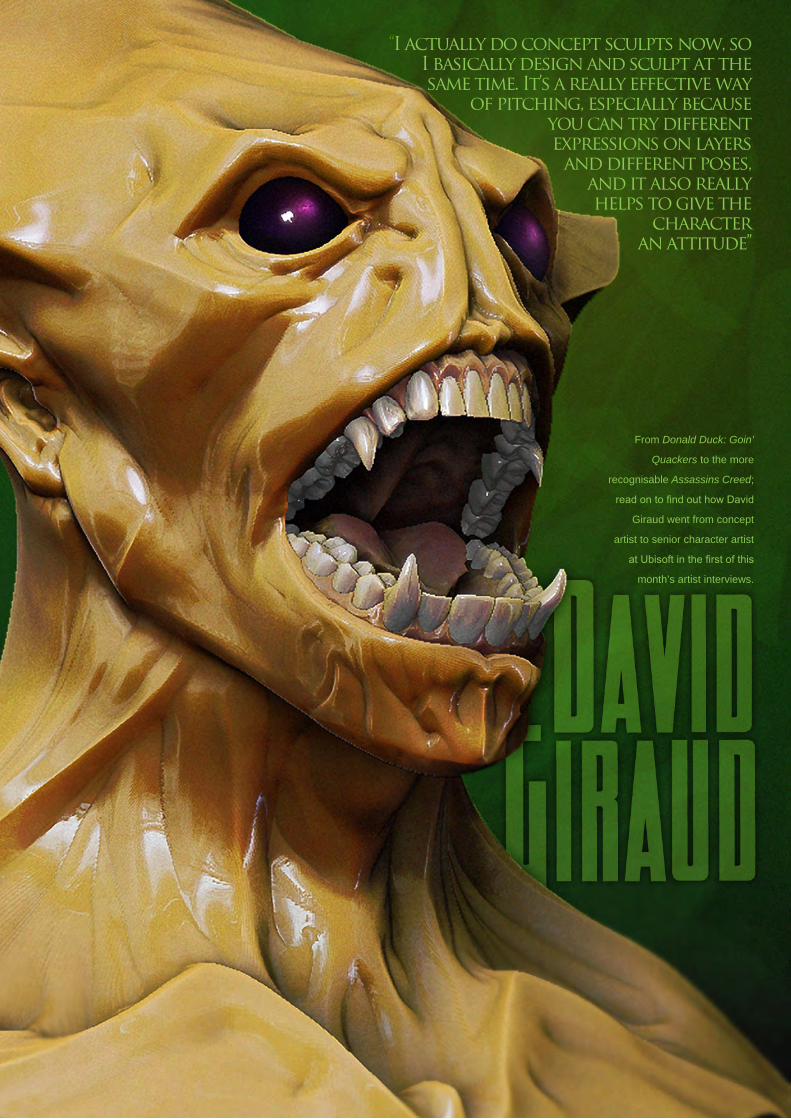
“I actually do concept sculpts now, so I basically design and sculpt at the same time. It’s a really effective way
of pitching, especially because you can try different expressions on layers and different poses,
and it also really helps to give the
character an attitude”
From Donald Duck: Goin’
Quackers to the more
recognisable Assassins Creed;
read on to find out how David
Giraud went from concept
artist to senior character artist
at Ubisoft in the first of this
month’s artist interviews.

page 8www.3dcreativemag.com Issue 041 January 2009
Interview David Giraud
Hi, David. At what moment in your life did you
start taking notice of 3D and realise that’s what
you wanted to do for a career?
I’ve always been attracted by art. At a very
young age I remember doing drawings for my
friends and even temporary tattoos. I had the
same great art teacher in secondary school
for three years and he really pushed me to do
better all the time - but it was so much fun at
the same time. In my family most of my uncles
are engineers or they have real jobs (they never
considered art as a job!) and I remember never
knowing what else I could do aside from taking
an artistic path!
I got into 3D because it seemed to be an
artistic job, but one that I could actually make
a living out of! This decision lead me to go to a
specialised school in Montreal in 1996.
So after your time at school, what was your first
job in the real world?
My first real job in the CG industry was in 1998,
for the video game division of Lotto-Quebec.
I worked there for two years. We were a
very small core team - just five people at the
beginning - so I touched on everything (except
programming of course!). I animated, modelled,
textured and lit the characters and backgrounds,
and I also got to do game design, level design
etc. It was a great first job, but I wanted to
move on and work for a real game studio (not
a government-owned Lottery Company). I got
hired by Ubisoft Montreal in 2000 and the first
game I worked on was Donald Duck: Goin’
Quackers [Laughs].
You’re currently a senior character artist for
Ubisoft. Could you tell us how this job came
about and how do you feel the company has
benefited your career to this date?
I actually started as a concept artist, but at the


page 12www.3dcreativemag.com Issue 041 January 2009
Interview David Giraud
time we needed to be very versatile so I also
started to make some 3D characters (my first
real project doing 3D characters was Splinter
Cell). I still did some concepts alongside the
modelling, but with the arrival of sculpting
programs like ZBrush, things really started to
get interesting. I actually do concept sculpts
now, so I basically design and sculpt at the
same time. It’s a really effective way of pitching,
especially because you can try different
expressions on layers and different poses,
and it also really helps to give the character an
attitude (the standard T-stance doesn’t help to
get something approved) [Laughs]. Working for
a company like Ubisoft helped me to develop a
good work discipline and taught me how to work
as part of a team, which are really the essential
component of all projects. If you can’t work with
other people, you won’t get very far!
You mentioned you design sculpt, is this
something that most artists who use ZBrush
do, or is this something that you’ve found works
best with your working style?
Well, some character artist don’t really design
and they strictly follow the design or the photo
references (which I also do when needed).
In my case, I design because it is really what
gets me going. I love sculpting, but I equally
love making concepts. ZBrush is a really viable
design solution and there are more and more concept artist that are
reaching for it!
So what’s a normal day like for you?
Depending on the mandate, sometimes I have to follow a concept and
sometimes I get the freedom to really have fun creating something new!
But my main focus these days is to make concepts full time again. I’ll
never stop sculpting, but I want to be able to continue creating most of all!
“The funny thing is I never liked Thor that much,
but that ultimate version kicked ass!”

I’ve been a big admirer of your work ever since
I saw your Thor image on ZBrush Central.
Could you tell us why you decided to model this
particular character from the huge line-up of
Marvel characters?
I’ve always been a big fan of the Marvel
universe; my older cousin used to have entire
boxes of comics! He decided to give them to me
when I was a kid and he got me totally hooked.
A few years ago I saw the ultimate Thor version
that Joe Madureira did and I just had to make
my interpretation of it! The funny thing is I never
liked Thor that much, but that ultimate version
kicked ass!
Besides Thor you’ve also modelled Wolverine,
Venom and Ironman. What other characters
would you like to have a go at modelling?
I really don’t know - there are too many cool
heroes to choose from! I will probably focus
more on my own designs and stories from now
on. I’m not excluding the possibility of making
heroes again, but I would love to do it as a
contract since I don’t have much free time with
my little family (wife and daughter).
You’re quite a big user of ZBrush by the looks
of your portfolio. What is it about this program
that’s captivated you?
The freedom to create is what captivates me
about this software. In fact sometimes I just
forget it’s software; it’s become an extension
of my creativity. The fascinating thing about
ZBrush is that I think in the same manner as
when I model with real clay. The tools are a bit
different, but the approach is the same; it’s all
about the form and the emotion you’re trying to
convey!
I have to ask this question: Have you ever used
Mudbox, or are you a “diehard” fan of ZBrush?
I did try Mudbox and it’s a great tool, but I
really prefer ZBrush, I’m just happy that digital
sculpting programs exist and competition make
those programs even better!
“The freedom to create is what captivates me about
this software. in fact sometimes I just forget it’s software; it’s become an
extension of my creativity”


page 16www.3dcreativemag.com Issue 041 January 2009
Interview David Giraud
One of your latest pieces is “Harry”. Could you
tell us a bit about this character and how you
came to sculpt him?
Harry is the hero of the art book from Steambot
that’s due out for Halloween. I had the chance
to become friends with those awesome artists
and the collaboration just became obvious!
So I decided to sculpt Harry from the concept
of Joel Dos Reis Viegas’ “Feerik” and Thierry
Doizon’s “Barontieri”. I eventually asked Offload
Studios to print the statue to be presented at
the Siggraph 2008 and they did a bang up
job - thanks again guys! It’s now in my office
back home and there is also a copy of Harry on
display at the Pixologic office in California.
http://steambotstudios.com/
http://offloadstudios.com
Well it has been a really pleasure chatting with
you and I wish you all the best for the future.
One last question before we call it a day: I’ve
noticed a little symbol appearing on your work.
Could you tell us a bit more about it?
Thank you very much for the opportunity and the
symbol is my name in Japanese. Even though
I’m not Japanese, I always loved Japan and it’s
a great culture.
David GiraudFor more work by this artist please visit:
http://mojette.deviantart.com/
Or contact them at:
Interviewed by: Chris Perrins
“the symbol is my name in Japanese. even though I’m not Japanese, I always
loved Japan and it’s a great culture.”
© SteamBot Studios - www.steambotstudios.com

Vancouver Film School alumni credits include Across the Universe Geeta Basantani, Digital Compositor Alias Scott Dewis, Visual
Effects Artist Ant Bully Ben Sanders, Character Animator | Rani Naamani, Animator | Ernesto Bottger, Character Animator AVP:
Alien Vs. Predator Shawn Walsh, Color & Lighting Technical Director Babel Luis Blackaller, Storyboard Artist | Lon Molnar,
Visual Effects Supervisor Battlestar Galactica Daniel Osaki, Lead Modeler | Megan Majewski, 3D Animator | Alec McClymont,
3D Artist Blizzard Entertainment Alvaro Buendia, Cinematic Artist Bolt Lino Di Salvo, Supervising Animator/Voice of
Vinnie Charlotte’s Web Aruna Inversin, Digital Compositor | Adam Yaniv, Character Animator | Tony Etienne, Lead Lighter
Kristin Sedore, Lighter Chicago Lon Molnar, Animation Supervisor The Chronicles of Narnia: The Lion, the Witch
and the Wardrobe Kristin Sedore, Lighter | Shawn Walsh, Lighter | Adam Yaniv, Character Animator The Chronicles
of Narnia: Prince Caspian Andreas Hikel, Pre-Visualization Artist | Christoph Schinko, Character Animator | Jami
Gigot, Senior Layout Artist Cloverfield Nicholas Markel, Pre-Visualization Supervisor Constantine Aruna Inversin,
Digital Compositor The Dark Knight Pietro Ponti, Lead CG Lighting Artist Dead Like Me Daniel Osaki, Visual
Effects Artist | Alec McClymont, 3D Artist Diablo III Alvaro Buendia, Cinematic Artist | Steven Chen, Cinematic
Artist Family Guy Michael Loya, Storyboard Artist Fantastic Four: Rise of the Silver Surfer Arun Ram-Mohan,
Lighting Technical Director | Shawn Walsh, Visual Effects Executive Producer | Jessica Alcorn, Compositor
Flags of our Fathers Aruna Inversin, Digital Compositor Gears of War (VG) Scott Dossett, Animator
The Godfather (VG) Kirk Chantraine, Motion Capture Specialist The Golden Compass Adam
Yaniv, Animator | Chad Moffitt, Animator | Thom Roberts, Animator | Ben Sanders, Animator
Andrew Lawson, Animator | Matthias Lowry, Visual Effects | Tony Etienne, Look Development
Justin Hammond, Lighter Pearl Hsu, Effects
Technical Director | Aruna Inversin, Digital
Compositor | Fion Mok, Matchmove Artist
Hairspray Lon Molnar, Visual Effects Production Executive Halo 3 Bartek Kujbida, Character
Animator Happy Feet Ben Sanders, Character Animator | Thom Roberts, Character Animator
Harry Potter and the Prisoner of Azkaban Shawn Walsh, Color & Lighting Technical Director
Harry Potter and the Order of the Phoenix Pietro Ponti, Technical Director Harry Potter
and the Half-Blood Prince Harry Mukhopadhyay, Lead Effects Technical Director Hellboy Aruna
Inversin, Digital Compositor Hellboy II: The Golden Army Christoph Ammann, 3D Sequence
Supervisor Horton Hears a Who Arun Ram-Mohan, Lighting Technical Director | Brent Wong, Modeler
Hulk Geoff Richardson, Visual Effects Editor I, Robot Daniel Osaki, CGI Modeler | Megan Majewski,
Pre-Visualization Ice Age: The Meltdown Ben Sanders, Character Animator | Arun Ram-Mohan,
Lighting Technical Director The Incredible Hulk Shawn Walsh, Visual Effects Executive Producer
Tony Etienne, Look Development Lead Indiana Jones and the Kingdom of the Crystal Skull
Henri Tan, Creature Technical Director Iron Man Adam Marisett, Visual Effects Artist King Kong
Chad Moffitt, Senior Animator King of the Hill Michael Loya, Director Kingdom Hospital Daniel
Osaki, Visual Effects Artist | Megan Majewski, 3D Animator | Alec McClymont, 3D Artist Kingdom
of Heaven Shawn Walsh, Digital Compositor Letters from Iwo Jima Aruna Inversin, Digital
Compositor Live Free or Die Hard Jessica Alcorn, Compositor Lord of the Rings Trilogy Chad
Moffitt, Senior Animator Lost Scott Dewis, Visual Effects Artist Lucasfilm Animation Singapore
Sandro Di Segni, Senior Effects Technical Director/Lead Digital Artist | Ming Chang, Lighting Technical
Director | Adrian Ng Chee Wei, Character AnimatorSeema Gopalakrishnan, CG Software Developer
Mass Effect (VG) Sung-Hun (Ryan) Lim, 3D Modeler Matrix: Revolutions Aruna Inversin, Digital
Compositor | Shawn Walsh, Color & Lighting Technical Director Master & Commander: The Far Side of the
World Robert Bourgeault, CG Artist Metal Gear Solid 4 (VG) Josh Herrig, Artist | Yuta Shimizu, Artist The Mummy:
Tomb of the Dragon Emperor Aruna Inversin, Digital Compositor Night at the Museum Allen Holbrook,
Animator | Adam Yaniv, Character Animator | Chad Moffitt, Animator | Kristin Sedore, Lighter Persepolis
Marianne Lebel, Animator Pirates of the Caribbean: At World’s End Ben Sanders, Character Animator
Allen Holbrook, Animator | Aruna Inversin, Digital Compositor The Pirates Who Don’t Do Anything:
A VeggieTales Movie Mike Dharney, Animation Supervisor Reign of Fire Lino DiSalvo, Animator
Resident Evil: Extinction Joshua Herrig, Visual Effects Artist Robots Arun Ram-Mohan, Additional
Lighting Rome Teh-Wei Yeh, Matchmove Artist The Santa Clause 2 Aruna Inversin, Digital Compositor
Daniel Osaki, Visual Effects Artist Scarface (VG) Maya Zuckerman, Mocap 3D Generalist Shrek the
Third Rani Naamani, Animator Shrek the Third (VG) Samuel Tung, Technical Artist Sin City Michael
Cozens, Lead Animator Smallville Geeta Basantani, Lead Compositor Speed Racer Aruna Inversin,
Digital Compositor Star Wars Episode III: Revenge of the Sith Andrew Doucette, Character
Animator | Nicholas Markel, Pre-Visualization Star Wars: Knights of the Old Republic (VG) Arun
Ram-Mohan, 3D Artist | Jessica Mih, Level Artist Stargate SG-1 Aruna Inversin, Digital Compositing
Artist | Daniel Osaki, Visual Effects Artist | Shawn Walsh, Digital Effects Supervisor Stargate:
Atlantis Daniel Osaki, 3D Animator | Megan Majewski, 3D Animator | Alec McClymont, 3D
Artist Sweeney Todd: The Demon Barber of Fleet Street Jami Gigot, Concept
Artist Transformers Allen Holbrook, Animator | Henri Tan, Creature Technical Director
Unreal Tournament III (VG) Scott Dossett, Artist Valiant Robert
Bourgeault, Lighting Technical Director Viva Pinata Megan Majewski,
Animator WALL-E Mark Shirra, Layout Artist Watchmen Jelmer
Boskma, Previs Modeler | Lon Molnar, Visual Effects Supervisor | Cynthia
Rodriguez del Castillo, Visual Effects Artist World of Warcraft:
Burning Crusade (VG) Carman Cheung, Animator A Wrinkle
in Time Aruna Inversin, Digital Compositor and many more.
Your name here.
VFS student work by Jeff Plamondon
Vancouver Film School. Countless paths. vfs.com/animationvfx3D ANIMATION & VISUAL EFFECTS | CLASSICAL ANIMATION | DIGITAL CHARACTER ANIMATION

The “Aaron Sims
Company” is a fully-
equipped character
design studio for
film, TV and video
games, where they
provide simple
concept sketches of
characters, through
to fully-rendered
3D models. Having
worked on some of
the most famous
feature films of recent
years, such as The
Hulk, The Mummy and
The Golden Compass,
we were itching to find
out more!
“I’ve had some wonderful experiences
working with directors who
have fascinating ideas about why a character might
look or feel a certain way, such as when I worked
with Steven on A.I.”

page 20www.3dcreativemag.com Issue 041 January 2009
Interview Aaron Sims
Hi Aaron, thanks for taking the time to talk to us.
Let’s start by getting everyone up to speed with
what you’re doing, so how long have you been
running your own company? What exactly are
the goals of your company and can you tell us a
few of the recent projects you have worked on?
I have been working on my own for about two
years now, and it’s been fantastic. I’ve learned
so much from the great effects mentors, such
as Rick Baker and Stan Winston, and I’ve also
had the chance to work with some of the most
amazing directors. It was time to venture out
on my own and adapt to the changing industry,
especially when it comes to characters and
visual effects.
You mention the changing industry - can
you elaborate on what the main parts of this
were that you wanted to follow with your own
business?
The visual effects industry is complicated,
saturated, and unwieldy in terms of the amount
of work that can be involved in any job. I could
see early on that the competition for jobs would
result in longer hours and a harder approval
process, since the studios know that the team
will work to keep the gig.
For me, working with the director in an
efficient, creative way allows me to sidestep
the complications of the actual VFX, but
remain potent in the design and influence of
the characters by working on the front end. I
often stay on throughout a project to work with
the VFX Supervisor as a character supervisor,
making sure the right parts of the visual and
physical parts of the character are worked out in
a cost effective way.
As a specialist character designer I want to find
out a little about how your mind works! If I was
to give you the following briefs, what would your
working progress be?
a. Creatures that has harnessed the power of
the wind.
b. Sea animals that evolved as the seas
evaporated.
c. Delicate, intelligent beings that walk on water.
In all of these cases, I would try to interpret what
the director is telling me, as well as having an
intense research period. At the same time, I
would try to come at the design process from
a variety of angles, letting inspiration guide me
where possible. It’s always important to me that


page 22www.3dcreativemag.com Issue 041 January 2009
Interview Aaron Sims
the creatures have some grounding in reality,
but we are always surprised to find out how
bizarre that can be!
Take a famous character, Abomination from The
Incredible Hulk, for example. What are some
of the biggest challenges you faced with this
concept?
In this case the creature already had an
established fan base. Coupled with the intense
thematic ideas that the director wanted to
incorporate into the film and I certainly had my
work cut out for me!
You inspire a lot of artists, but who inspires you?
And besides other artists, where else do you
find your inspiration?
There are so many amazing and talented artists
out there, I couldn’t begin to name them all! I’m
also inspired by storytellers and directors who
are interested in characters in unusual ways.
I’ve had some wonderful experiences working
with directors who have fascinating ideas about
why a character might look or feel a certain way,
such as when I worked with Steven [Spielberg]
on A.I.
With a mainstream project such as A.I. can you
sum up what a freelance concept designer’s job
entails? Are you on set? Attending meetings
with big names? Or sending emails with
attachments throughout?
I usually work out the parameters of the
characters with the director and then begin the
process of defining them within the limitations of the show; budget, time,
physical requirements, etc. Once that process begins, I remain with the
director or PD until we get the studio guys on board. From there I consult
throughout the production to make sure the division of work is smart and
efficient. Throughout the process there are tons of meetings, variations


and presentations. We usually work through
high security ftp servers or directly through
couriers.
I imagine the development of the ZBrush
software has had a big impact on the way you
work. What features of this software especially
appeal to you and are there any features or
tools that you still think it lacks?
The best part of the software is that the team
keeps developing it, and they really respond
to the artist’s voice. There are so many great
features too; simple ones like symmetry or
mirror, and then of course more complicated
shapes and sculpt tools, as well as the export
options.
Working on a big feature is a dream for most
artists, as I am sure it was for you “back in the
day”. Can you somehow sum up how it feels,
and if there are any lows as well as highs?
I am humbled and grateful for the experiences I
have had, and I am so lucky to be able to work
so hard in a field I absolutely love! The only low
I can think of is having to turn down a project
because of scheduling. Everything else is a
definite high!
Aaron SimsFor more work by this artist please visit:
http://www.theaaronsimscompany.com
Or contact them at:
Interviewed by: Tom Greenway

Sparx Animation Studios uses Autodesk Maya
to help Exodus Film Group and director Anthony
Leondis bring Igor to life.
“With a combined team of 250 artists working in their offices in Paris,
France and Ho Chi Minh City, Vietnam, Sparx Animation Studios
created 70 environments, 125 characters and 250 objects for this ambitious 3D animated feature film.”

page 28www.3dcreativemag.com Issue 041 January 2009
Hunchback of another name Igor
It’s been said that behind every successful
man, there’s a woman rolling her eyes. Director
Anthony Leondis’ Igor begins with a similar
premise: that behind every mad scientist
obsessed with creating life, there’s a long-
suffering laboratory assistant who knows he
can do it better. Before the film’s titular hero
could create life, however, somebody had to
create him. Exodus Film Group called on one
of France’s leading animation studios to get the
job done.
With a combined team of 250 artists working in
their offices in Paris, France and Ho Chi Minh
City, Vietnam, Sparx Animation Studios created
70 environments, 125 characters and 250
objects for this ambitious 3D animated feature
film, starring the voices of John Cusack, Molly

page 29www.3dcreativemag.com Issue 041 January 2009
Igor Hunchback of another name
Shannon, John Cleese, Steve Buscemi, among
others. Released in the UK on 17th October
2008, Igor was completed in just 19 months
using a production pipeline based on Autodesk
Maya 3D modelling and animation software.
Set up“Igor is the first, big, internationally distributed,
animated film to be handled from start to finish
in France,” says Jean-Phillippe Agati, CEO of
Sparx. “From the conception to final visual and
audio post-production, everything was created
by Sparx and our partners. We can’t help but
be proud of that fact. Our production pipeline is
based on Autodesk Maya, which is our principal
animation tool.”
Sparx began their adventure with Igor in the
late autumn of 2006. Once Thierry Malherbe,
Sparx’s head of CG and Fabrice Delapierre,
Sparx’s CG supervisor learned the film’s main
storyline and scope, they initiated the design
of the major characters and environments,
and began assembling what they knew would
become a very large CG team. They also
knew the sheer size of the project and the
tight timeline would require the most efficient
workflow.
“We needed a production pipeline and workflow
that was efficient and reliable,” says Malherbe.
“Sparx has a long history with Maya, but we had
to be sure it was the best software for a project
as important as Igor. We spent several weeks
evaluating all the animation solutions on the
market, and we came to the conclusion that a
project this ambitious needed Autodesk Maya.”
Having settled on their choice of 3D software,
the Sparx Animation team got to work.
According to Delapierre, creating the various
teams for the project was eased by their choice
of software:
“We saved a lot of time because so many
animators out there are already familiar with
Maya,” he says. “For Igor, we simply created
specific teams for different parts of the overall
pipeline. The entire production, from A to Z, was
done using Maya.”
The Challenge: From Ideas to IgorAs any director will tell you, bringing a team
together is one thing. Bringing a project to life is
quite another.

page 30www.3dcreativemag.com Issue 041 January 2009
Hunchback of another name Igor
“On the morning of 6th November 2006, we
had no idea what the main characters would
even look like,” says Agati. “Seven weeks later,
we had a team of 20 people creating Igor’s
universe. By mid-January 2007, we had 10
people modelling characters and by May, we’d
created a 3D animatic with music and sound.
Still, we weren’t sure whether the scenes that
we were working on would be major or minor
to the film as a whole, so we had to make
everything as detailed as possible. Creating an
animatic in parallel with development meant
Thierry and Fabrice had to be able to modify
animations easily, and insert new characters
and environments, as well as the director’s
subtle touches.”
As complex as it was to bring Igor to life, it was
still more challenging bringing life to Igor. More
than anything, Igor is the story of essentially
human characters feeling human emotions, all
of which needed to come through in their faces.
Nowhere was this element more important than
for the character of Eva, the imposing, vaguely
neurotic and ultimately loveable “monster” Igor
creates.

page 31www.3dcreativemag.com Issue 041 January 2009
Igor Hunchback of another name
“A turning point in the film is when Eva
evolves from Igor’s monster into a beautiful,
sensitive heroine,” says Malherbe. “All of that
transformation had to come through in her
facial expressions. We were striving for a subtle
facial quality, much like you might see in a film
from the 1950s - one with strong expressions,
realistic nuances and wrinkles, and an
exceptional level of quality.”
The ResultIn total, the Sparx animation team created some
1,437 shots, including a climactic battle scene
involving huge crowds, an enormous stadium
and some serious render time.
“Our challenge was to create this complex,
seamless scene as quickly as possible,” says
Delapierre. “Maya enabled us to get exceptional
quality on this huge scene, exceeding even the
director’s hopes and expectations.”
From the start of the project, Malherbe and
Delapierre knew they’d be relying heavily on
Maya’s integrated mental ray renderer, but that
it would require specific enhancements and
features for use on Igor.
“We worked hand-in-hand with the Autodesk
R&D teams to ensure the best integration of
mental ray and the most efficient optimisation
of our workflow,” says Malherbe. “We had lots
of ideas to improve our productivity, and we’ve
been able to work closely with Autodesk to
implement those ideas into future versions of the
software. That’s very gratifying.”
“Maya is robust and reliable, solid and stable,”
says Delapierre. “You can really push the
software to the limit and rely on it throughout a
project. We were able to make quick corrections
to the animation, characters and textures based
on the subtle suggestions of the director and
artistic director. We had the stability to run the
kind of tight production that would only have
been possible using Maya.”
Jean-Philippe Agati, CEO, Sparx Animation StudiosFor more information, please visit:
http://www.sparx.com/

This month we feature:
Fayez Salka
Jonathan Simard
David Arcanuthurry
Alexandre Desmassias
Marco Capone
Dan Roarty
Pascal Raimbault
Claudius Vesting
István Vastag
Vincent Guibert

page 34www.3dcreativemag.com Issue 041 January 2009
10 of the Best The Galleries
My Wife Has GoneDan Roarty
http://www.danroarty.com
The Mechanical Blue MusselFayez Salka
http://fayezalsalka.cgsociety.org/


page 38www.3dcreativemag.com Issue 041 January 2009
10 of the Best The Galleries
KamahiPascal Raimbault
http://zegritch.cgsociety.org/gallery/
Station SquareAlexandre Desmassias
http://www.gkaster.com

JS Fashion CollectionJonathan Simard
http://pikmin.cgsociety.org/gallery/

B.O.B.-712Vincent Guibert
http://www.vincentguibert.fr


page 42www.3dcreativemag.com Issue 041 January 2009
10 of the Best The Galleries
The CatchMarco Capone
http://www.0nd.org
Friday NightClaudius Vesting
www.chainsaw-clausen.de

This series will run over the next six months and will endeavour to give you an insight into how a fully realised 3D scene may be
arrived at from beginning to end. The tutorials will attempt to address the key issues and
techniques appropriate in achieving this, from concept sketches through to building the 3D
scene, mapping and unwrapping, texturing and eventually to lighting and rendering, culminating in a final render. The emphasis over the course of the series will be on the texturing, which will be covered in two of the six instalments, and principally the aging and wear of materials.
3DSMax Version
Page 83
Cinema4D Version
Page 87
Lightwave Version
Page 93
Maya Version
Page 101
Softimage XSi Version
Page 107
This Month : Part 6: Lighting & Rendering
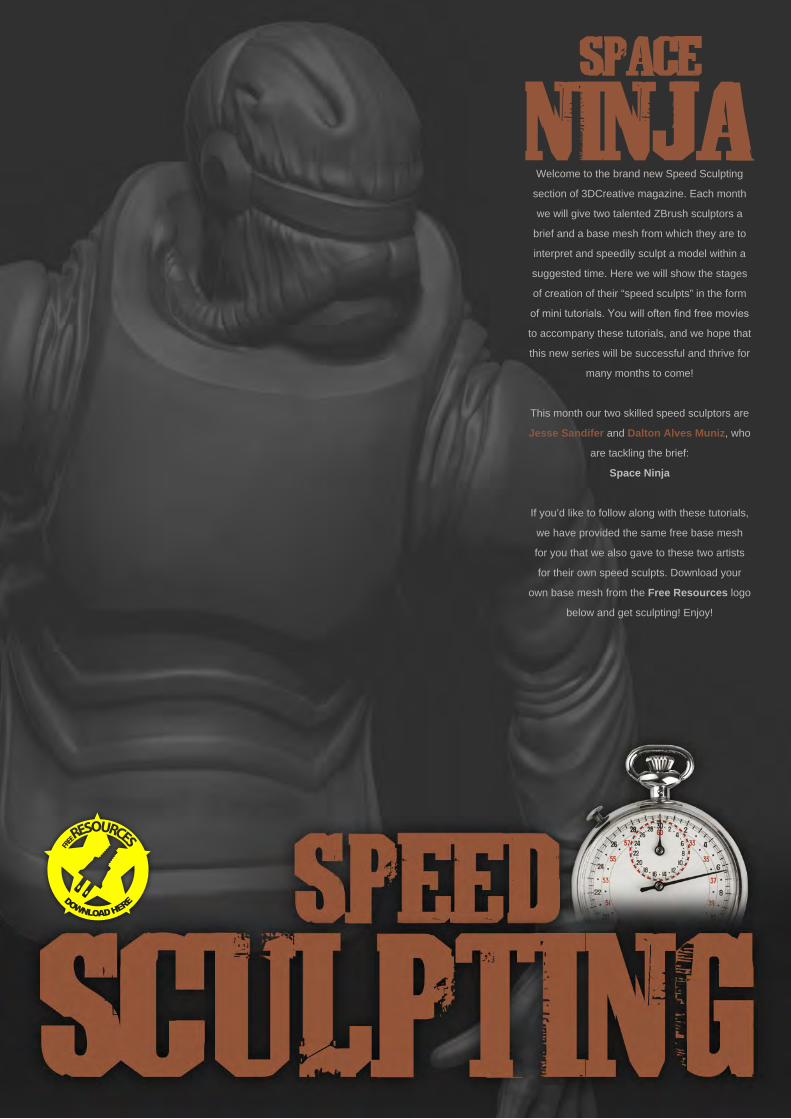
Welcome to the brand new Speed Sculpting
section of 3DCreative magazine. Each month
we will give two talented ZBrush sculptors a
brief and a base mesh from which they are to
interpret and speedily sculpt a model within a
suggested time. Here we will show the stages
of creation of their “speed sculpts” in the form
of mini tutorials. You will often find free movies
to accompany these tutorials, and we hope that
this new series will be successful and thrive for
many months to come!
This month our two skilled speed sculptors are
Jesse Sandifer and Dalton Alves Muniz, who
are tackling the brief:
Space Ninja
If you’d like to follow along with these tutorials,
we have provided the same free base mesh
for you that we also gave to these two artists
for their own speed sculpts. Download your
own base mesh from the Free Resources logo
below and get sculpting! Enjoy!
page 46www.3dcreativemag.com Issue 041 January 2009
Space Ninja Speed Sculpting
Created In:ZBrush
IntroductionWhen I was presented with the topic for this
month’s tutorial, I had a hard time at first
thinking of a concept I wanted to develop.
There’s something about “space ninja” that
seems a bit of a challenge to define. But what’s
good about that is that it presents an idea that
combines two different genres of character to
create something visually interesting. So the
direction I went with for this concept was to bring
together some hard surface spacesuit designs
with some ninja style cloth.
Step 1To start, I knew I wasn’t going to need eyes or
mouth topology and elected to use a very similar
mesh that was provided for a past Threedy.
com challenge that didn’t have the eyes or
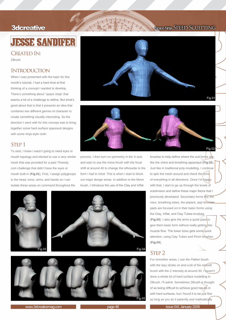
mouth built in (Fig.01). First, I assign polygroups
to the head, torso, arms, and hands so I can
isolate these areas on command throughout the
process. I then turn on symmetry in the X-axis
and start to use the move brush with the focal
shift at around 40 to change the silhouette to the
form I had in mind. This is when I start to block
out major design areas. In addition to the Move
brush, I introduce the use of the Clay and Inflat
brushes to help define where the suit forms are,
like the chest and breathing apparatus (Fig.02).
Just like in traditional poly-modelling, I continue
to spin the mesh around and check the form
of everything in all directions. Once I’m happy
with that, I start to go up through the levels of
subdivision and define these major forms that I
previously developed. Secondary forms like the
visor, breathing tubes, the jetpack, and shoulder
pads are focused on in their basic forms using
the Clay, Inflat, and Clay Tubes brushes
(Fig.03). I also give the arms a quick pass to
give them basic form without really getting into
muscle flow. The lower torso gets some quick
attention, using Clay Tubes and Pinch brushes
(Fig.04).
Step 2For smoother areas, I use the Flatten brush
with the lazy stroke on and a bit of the smooth
brush with the Z intensity at around 30. I haven’t
done a whole lot of hard surface modelling in
ZBrush, I’ll admit. Sometimes ZBrush is thought
of as being difficult to achieve good results in
with hard surfaces, but I found it to be just fine
as long as you do it patiently and methodically

page 47www.3dcreativemag.com Issue 041 January 2009
Speed Sculpting Space Ninja
(Fig.05). The key is to use that lazy stroke with
the lazy radius at above 8 or so. The higher the
number, the longer the smooth drag effect it will
have. So with that effect on, the Flatten brush
will make a nice smooth stroke. Also do these
in steps as you go up the levels of subdivision;
I leave the highest level of subdivision to the
fine details only. I don’t do major strokes at the
highest level most times because it ends up
getting lumpy and you get caught in this painful
back and forth of smoothing and flattening
that only seems to get worse as you go along.
Perhaps some of you have gone through this!
Another method I use is to incorporate the Pinch
Effect brush that I’ve used in past 3DCreative
tutorials. With that same Lazy Mouse (or a real
steady hand), you get a nice tight raised pinch
that gives you an automatic edge. The Dam
standard brush, created by Damien Canderle,
is another handy brush that can give you the
same effect. I use this brush with the Alt key
(or just the ZSub mode if you prefer) to start
digging some creases that meet up with the
visor, and then I inflate those areas out to give
them form and to indicate cloth characteristics.
I mask off the visor to help me to not affect that
flattened out form. When doing these folds and
wrinkles, I just start going for it and try to keep
the look natural and think about how the tension
and compression would change the cloth’s
form. It can be quite difficult to get right and it’s
something I continue to work on. It’s especially
hard to get perfect in a speed sculpt and I really
had to keep myself from getting too ingrained in
getting it all fancy and perfect for sake of time.
Step 3I know I want the top part of the head to look
cloth-like, and the mouth and cheek area to
look like it’s stretching around the breathing
tube and tucking into the hard surface breathing
apparatus (Fig.06). I just need to get enough to
indicate this and then move on to the next area.
Then I go around the torso area and continue to
use the Flatten, Pinch, Pinch Effect (created by
Fatmir Gjevukaj), and Dam standard brushes to
get the hard surfaces some tight edge definition.
Once happy with those parts, I start working on
the area between the main suit and the shoulder
pad pieces. I want that part be very cloth-like
and bunched up. Masking off the hard surfaces
that surround this transition area, I then continue
to use the Inflat and Pinch Effect brushes to get
some inward and outward wrinkles going. I go
back and forth using the brushes in ZAdd and
ZSub (I just use the Alt key for this) and finish
out the basic folded forms. It’s a bit of tight area
so I have to be careful not to overdo it.
Step 4It’s about time to pose this guy because I am
about to start working on the arm wrinkles and
those will depend on the angle of the arms.
Normally in speed sculpting, I like to pose at
the start, but sometimes I feel the need to keep
it static until a certain phase in the sculpting
session. I want to make his pose look ninja-like,
in that he’s trying to be stealthy and he has his
arms out ready for action. I imagine him coming
up to a corner in a room and peering around
it (Fig.07). Of course, I use Transpose Master
to pose him out and I do it on the two lowest
subdivisions. There will probably be areas of
cleanup to do after getting him posed (where

page 48www.3dcreativemag.com Issue 041 January 2009
Space Ninja Speed Sculpting
parts got stretched or squeezed) but that’s okay.
The breathing tubes give me a bit of a trouble to
fix, especially one that gets pinched as his head
turns. There’ll always be fun spots to fix like that
when speed sculpting, so always account for
that.
Step 5Once I get him posed, I move onto the arms
and give him just a little more muscle definition,
since the cloth is a bit tight. Then using the
Pinch Effect brush, I start stroking in wrinkles
with a bunched up style. As I go along, some
wrinkles work great and some look out of place.
It’s always a work in progress with wrinkles and
I get the feel of how they work together as I go
along. So if they don’t work, I just smooth them
out and try another approach. I wanted to have
some larger wrinkles on the upper arm and
some tight pinched wrinkles toward the lower
arm and bunch them up as they get closer to
the wrist. The Pinch Effect gives me a good
start for lying in wrinkle paths and then I use the
Inflat and Clay brushes to give more form and
volume to certain areas of transition, so that it
doesn’t just look like a bunch of lines. I also try
to keep the wrinkles interlocking, meaning they
kind of crisscross or flow into each other. Again,
this kind of stuff can be very tempting to work
on for hours so I quickly realise I need to move
on to the other arm. I have to go asymmetric
with the arms because of the differing tension
and compression angles. It adds more work
for me but I think it helps the overall look of the
character and helps it to be more convincing
(Fig.08). I apply the same technique of using the
Pinch, Inflat, Clay, and Pinch Effect brushes on
the other arm, but it’s a bit different because of
the elbow bend. After getting all the wrinkles in, I
go back to the head and smooth out some of the
wrinkles there because I think it should look a bit
more stretched, which means smoother areas. I
also give some Pinch Effect strokes to indicate
tight wrinkles again. The same thing applies to
the right arm and I decided to smooth out some
wrinkles around the elbow because the tension
would make it a bit smoother and the inner
elbow needed more folds from compression.
Again, not perfect and perhaps a bit too busy
or inaccurate in areas, but good enough for a
speed sculpt I think.

page 49www.3dcreativemag.com Issue 041 January 2009
Speed Sculpting Space Ninja
Step 6I then head off to the hands, which haven’t had
any attention in the whole sculpt session. Since
I’m short on time I have to keep it simple. I
block in the top of the hands with a hard surface
design and Clay brush in the rest of the pads of
the fingers and palms. Using the Pinch Effect
brush again, I dig in the creases in the fingers
and palm, and then stroke in a seam all the way
around the perimeter of the hands. I try to keep
everything else on the hands kind of “space-
suit” like. Then I blend the wrist wrinkles into
the hand design. The same thing applies to the
other hand (Fig.09 & Fig.10). With time really
running out, I try to get in some hard lines on
the lower torso area to further the suit design
and help the flow of the character (Fig.11). I
finish up by doing some quick fixes on different
areas of the character and doing a final check
throughout.
ConclusionAll in all, the whole session took around five
hours because I got caught up in wrinkles and
hard surfaces. I really enjoyed the challenge
of trying to define this character with both a
sci-fi design and the ninja cloth. It was great
practice to try and do the folds and wrinkles in
a time crunch and I think it definitely pushed
me to continue to intuitively figure out flow and realism in an efficient
manner. Here are the final shots of the model (Fig.12 – Fig.15). Thanks
for reading!
Note from the Editor: Jesse Sandifer has kindly provided five movies for
download with this tutorial, which you can download my clicking on the
free movies icon at the end of this tutorial. So for a real insight into Jesse’s
working practice, click to download now and enjoy! Please note that the
movies have been supplied as .wmv files of up to 30MB each, so please
be aware of their sizes when downloading the files. And of course: enjoy!
Jesse SandiferFor more from this artist visit:
http://www.jessesandifer.com
Or contact:

page 50www.3dcreativemag.com Issue 041 January 2009
Space Ninja Speed Sculpting
Created In:ZBrush
Section TitleHello everyone, this month’s theme for the
Speed Sculpting tutorial is to make a “space
ninja”! I found the theme very interesting, as
well as challenging – after all, what exactly is
a space ninja? What are the characteristics
that would in fact make him a space ninja?
To answer such questions, I started to sketch
some drawings and put some ideas onto paper
(Sketch.01). This sketching stage is vitally
important – with it I can save many hours of
work on the model because I’ve already defined
the concept, giving me a clearer idea of what
I want for the appearance of my warrior-type
character and the direction I want to take.
I’m going for something pretty high-tech here,
something which improves the performance of
the ninja, making him capable of survival even
in the most extreme hostile conditions – such as
space!
Okay, so let’s start the speed sculpt. Starting
with the base mesh provided, I divide it six times
(Fig.01) and return it back to Division 3 to begin
shaping its basic form; at this stage I’m using
the Move brush. It is very important to say here
that you should always make the basic shapes
and proportions in the initial divisions, leaving
the upper levels for the fine details. To divide the
model use the Ctrl + D command, between the
divisions use “D”, and use “Shift + D” to return.
I start to sculpt the basic form of the muscles
and head using more angular and sharp shapes
– less organic, more like armour over his body
(Fig.02 – Fig.05).

page 51www.3dcreativemag.com Issue 041 January 2009
Speed Sculpting Space Ninja
Not being too satisfied with the face, I adjust it
to keep it closer to my original concept sketches
(Fig.06).
At this stage, I’m setting the design of the ninja
using mainly the Mallet Fast, Flatten and Pinch
brushes, which are perfect for defining forms
with sharp corners and edges (Fig.07 & Fig.08).
I fill the holes in the head with the ZBrush
sphere primitive, which you can access by going
into the palette tools, selecting the sphere and
then pressing the Make PolyMesh3D button and
adding it as a SubTool, positioning it as desired
(Fig.09).
I’m defining the shapes of the arms now, hiding
the rest of the model (Ctrl + Shift) (Fig.10), and
then transferring the work done to the other side
using the Smart Resym command under the
Deformation tab (Fig.11). To use it you must
isolate the area to be transferred with Ctrl, and
then press the command once for each division.
Focusing on the face of the ninja now I start to
define the head design (Fig.12). I also detail the
organic area of his face (Fig.13).
Right now, I’m working with the Layer brush
a lot, which is essential when working on this
aspect of layers in the armour (Fig.14 – Fig.18).
Again, I use the Smart Resym command
(Fig.19).
page 52www.3dcreativemag.com Issue 041 January 2009
Space Ninja Speed Sculpting
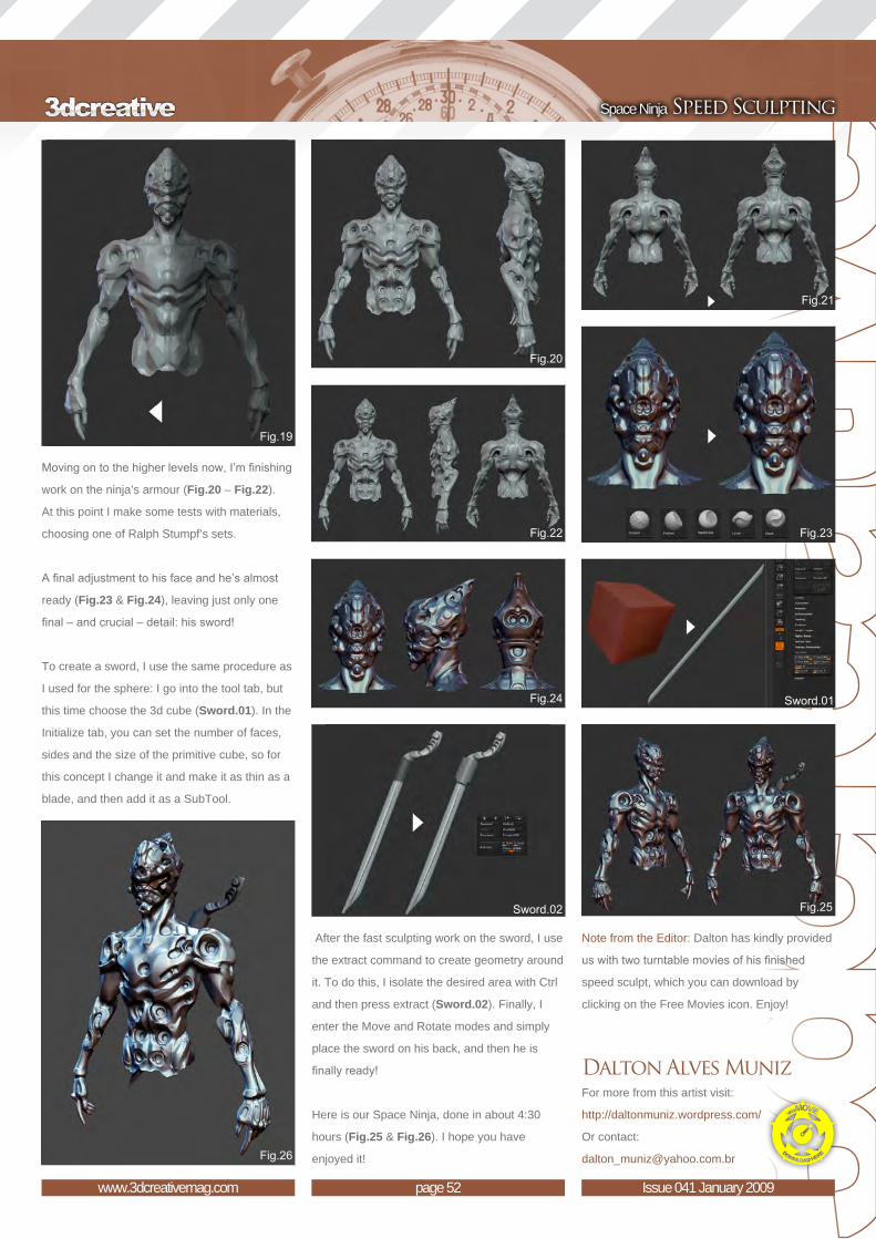
Moving on to the higher levels now, I’m finishing
work on the ninja’s armour (Fig.20 – Fig.22).
At this point I make some tests with materials,
choosing one of Ralph Stumpf’s sets.
A final adjustment to his face and he’s almost
ready (Fig.23 & Fig.24), leaving just only one
final – and crucial – detail: his sword!
To create a sword, I use the same procedure as
I used for the sphere: I go into the tool tab, but
this time choose the 3d cube (Sword.01). In the
Initialize tab, you can set the number of faces,
sides and the size of the primitive cube, so for
this concept I change it and make it as thin as a
blade, and then add it as a SubTool.
After the fast sculpting work on the sword, I use
the extract command to create geometry around
it. To do this, I isolate the desired area with Ctrl
and then press extract (Sword.02). Finally, I
enter the Move and Rotate modes and simply
place the sword on his back, and then he is
finally ready!
Here is our Space Ninja, done in about 4:30
hours (Fig.25 & Fig.26). I hope you have
enjoyed it!
Note from the Editor: Dalton has kindly provided
us with two turntable movies of his finished
speed sculpt, which you can download by
clicking on the Free Movies icon. Enjoy!
Dalton Alves MunizFor more from this artist visit:
http://daltonmuniz.wordpress.com/
Or contact:


“A bad shape means a bad model. The details are not so important here; a character with a beautiful shape and few details is much better than a bad shape with lots of wrinkles and pores. So take your time”
September 2008Part 1: Old / Gaunt
October 2008Part 2: Obese
November 2008Part 3: Steroid-Pumped Guy
December 2008Part 4: Extreme Piercings & Tattoos
January 2009Part 5: Beaten-Up
February 2009Part 6: Zombie
March 2009Part 7: Vampire
April 2009Part 8: Werewolf
May 2009Part 9: Frankenstein
Download your free
base mesh here!
Welcome to the new ZBrush Character Creation tutorial series. Each month, Rafael
Ghencev will take us step-by-step through the transformation of a clean, generic
head base mesh into a character type of 3DCreative’s choice! We thought that
topics such as a wrinkled, gaunt, old man, a steroid-pumped guy with popping
veins, an extreme tattooed and pierced dude, and even some real extreme cases
of personality disorders in the form of a vampire and a werewolf, would be fantastic
for detailed sculpting work! On top of all these, Rafael thought it would be cool to
sculpt and texture Frankenstein, and we agreed, so we’ve even thrown that one
into the line- up for you as well. So stay-tuned over the next nine months to see
Rafael at work and to learn a thing or two about detailed sculpting in ZBrush for
characters. This Fifth tutorial covers the development of a beaten-up man.
Enjoy!

page 56www.3dcreativemag.com Issue 041 January 2009
Beaten-Up ZBrush Character Creation
Created In:ZBrush
ConceptThis month I’ve been asked to model and
texture a “beaten-up” character in ZBrush. I
decided to create a boxer with some injuries.
Before starting the modelling process, I did a
little research about typical fighting injuries, and
then later did some more research to get some
references for the fighter too. With the concept
starting to mature, I began the modelling
process.
Sculpting the Basic ShapeThe first thing I did was to play with the Move
brush to find a better shape for my character. It’s
very important to concentrate on this part of the
process. A bad shape means a bad model. The
details are not so important here; a character
with a beautiful shape and few details is much
better than a bad shape with lots of wrinkles
and pores. So take your time at this part of the
process. Afterwards, with a Standard brush,
I’ll start to add more volume and information to
the shape, but right now I’m just working on the
basic shape (Fig.01).
With the basic shape ready, I pick the Clay
brush and start to add the bone structure and
muscle volume. Here I can block some big
wrinkles using the Clay and Standard brushes.
With the same brushes I then start to refine the
shape of the nose and the mouth. I add in the
sternocleidomastoid muscle in his neck here as
well (Fig.02).
Next, I isolate the ear in order to start work on
it. I basically use a Standard brush on the ear
(Fig.03); with the Clay brush I’ll be blocking his
body muscles in, like the chest and shoulder
muscles. He’s a boxer, remember, so his
muscles will be strongest in the shoulder region,
like the trapeziums and deltoids.
Refining the Shape and Adding Details With the shape looking good I can work more
on the specific areas, like the eyes, nose, mouth
and chin. With the Clay brush I start to refine all

page 57www.3dcreativemag.com Issue 041 January 2009
ZBrush Character Creation Beaten-Up
of these parts, giving a little more subtle detail
to his face. I can also refine the shape of the ear
here, too (Fig.04).
I then pick the Standard brush with alpha 38 and
start to mark some wrinkles, like the eyebrow
wrinkles, neck, etc. It’s still only marks at this
stage though; we’re not going into all those finer
little details yet.
Final DetailsHere the shape is finished and I can start to
add detail to my character, so I continue now
with the Standard brush and refine the wrinkles,
working details into his mouth, eyes and neck
areas. For the body I also add some more detail
to his muscles and some of the folds of skin
between the chest and arms, to achieve a more
natural look. For this I use the Inflat brush to
approach the normals and to make it look like
the skin is pressed against more skin (Fig.05).
Now it’s time to add more detail to his face. I
decide to make his face with lots of little injuries
and marks, so I choose the Clay brush with a
low radius and start to draw lots of irregularities.
Then I change the stroke to spray, pick alpha 38
and add some pores to his face (Fig.06).
Asymmetry and Injuries It’s time now to put the injuries onto his face. So
I turn off the symmetry here and start with the
Move brush to take away his symmetry. I twist
his nose a little and his mouth, too. Then I start with the Clay brush and
the Standard brush to add the swelling around his eyes and his mouth, as
if he’s taken a real beating. Then, with the Inflat brush, I dilate these areas
to make it look like there’s a lot of pressure behind the skin (Fig.07).
The Blood Here I’ll show you a great tip about how to create drops of blood! Pressing
the Control button, I paint some areas like little blood drops. Then, in the
SubTool palette, I decrease the thickness value and press the Extract
button. The selection will create a new tool with the same shape of this
selection. You can then model in the new tools to give a more natural look
(Fig.08).

page 58www.3dcreativemag.com Issue 041 January 2009
Beaten-Up ZBrush Character Creation
Finally, here is the result of the sculpting
process (Model.01).
TexturingAt this point I decide not to lose time by starting
from a new texture and so I select a base
texture that I painted for the last character, and
change it to suit my needs for this character
piece. I pick a simple brush in the Projection
Master and start to paint some colour variations
onto his swelling eyes. I then pick a purple
colour and start painting his injuries. I find a dark
green colour to paint around his swellings ideal
to show the bruising.
At the top and bottom of his right eye, I paint
some cuts in using a red colour, as if he’s
received lots of punches (Fig.09). At the bottom
of his eye I paint some blood dripping down his
face (Fig.10). For the eyes, I project them and
paint many different shades of red around the
pupil (Fig.11).

page 59www.3dcreativemag.com Issue 041 January 2009
ZBrush Character Creation Beaten-Up
For the shader, I once again pick a TriShader
from the Shaders palette and blend it with a
free skin shader that you can find in the ZBrush
central MatCap library. For the eye and blood
drops, I use the toy shader.
For the lighting setup, I increase the rays to 230,
the aperture to 102, and shadow length to 300.
I turn on the ZMode to fake GI. I turn the fog on
in the render palette as well, and make some
tests to find the best result. And here is the final
image (Final.01) – hope you like it, see you next
month!
Note from the EditorRafael has kindly provided us with movie
footage to support this tutorial on the creation
of a beaten-up character in ZBrush. You can
download the movies via the Free Movies icon,
and enjoy this master at work!
Please note: There are 14 movies in total and
so they may take some time to download, but
we’re sure they will help you to understand
Rafael’s working process in ZBrush. Enjoy!
Rafael GhencevFor more from this artist visit:
http://www.rafestuff.blogspot.com/
Or contact:

page 60www.3dcreativemag.com Issue 041 January 2009
Beaten-Up ZBrush Character Creation
Zoo Publishing presents the new issue of 2dartistmagazine a downloadable monthly magazine for concept art, digital & matte painting for only $4.50US
visit www.2dartistmag.com to download the free ‘lite’ issue, the full issue, subscription offers and to purchase back issues.
OU
T NO
W!
OU
T NO
W!

modo is for artists
PMS COLORED
116 U
404 U
TM
3D image created in modo by Luxology. Credit: Gelmi
®
3D image created in modo by Luxology. Credit: Gelmi For more information, visit modo3D.com

Fresh on the heals for his last “Making Of”
(which was featured in the September 2008
issue), Nicolas Collings gives us yet another
amazing insight into his creation process.
This time it’s for his Orc Maori character,
which he created using ZBrush.
“A few rules to keep in mind are to first of all start by blocking in the basic masses and forms of the model, and secondly, if you want to avoid any “blobby” effects, I recommend you always set your brush to a low intensity.” © Nicolas Collings

page 64www.3dcreativemag.com Issue 041 January 2009
Making Of Orc Maori
model might have, what kind of pose or expression I want, and how I’m
going to equip him, etc. I like to know more or less where I’m going before
starting any 3D work, even if at the end I often come up with a slightly
different result (Fig.01).
ModellingI’m not going to extend myself too much on this aspect of the article
because I’ve already written a making of (Wolverine Tribute) for
3DCreative which went into more depth in the modelling section, and there
are also “Making Of” articles available on my website, too.
So basically, modelling is one of the most enjoyable steps for me.
Depending on the model, I start either from a base cage created in 3ds
Max or from a ZSphere directly in ZBrush. Once your base cage is done
you can start sculpting your character inside ZBrush or Mudbox – that’s
where all the fun and magic happens!
A few rules to keep in mind are to first of all start by blocking in the basic
masses and forms of the model, and secondly, if you want to avoid
any “blobby” effects, I recommend you always set your brush to a low
intensity. Be sure to choose an appropriate brush size according to the
scale of the details you want to add, and most importantly, be sure to go
as far as possible in the current level before subdividing the geometry
even further. Please also do not be afraid to smooth out details and then
refine the area.
Created In:ZBrush and 3ds Max
IntroductionHello everyone, my name is Nicolas Collings and in this article I’m going
my latest artwork, Orc Maori, and the techniques I used to quickly get an
illustrative look from my 3D sculpt.
Inspiration for this piece came after watching one of the Gnomon
Workshop DVDs by Aaron Sims, Creature Design with Aaron Sims.
During the process I only used ZBrush, and then Photoshop was used for
the final compositing. No external render engine was used – just ZBrush.
So let’s get started!
ReferenceI started by doing a couple of sketches. Preliminary sketches help me to
develop the initial look of the character; to define the different features the

page 65www.3dcreativemag.com Issue 041 January 2009
Orc Maori Making Of
Once my sculpting was done, I started trying
out a few poses with the powerful tool called
Transpose (find more information about the
tool on ZBrush: http://www.zbrush.info/). After
I’d decided on the pose I was going for, I kept
sculpting a bit more, working with the pose, the
muscle tension and tendons, cloth folds and so
on – whatever required further work (Fig.02).
TexturingSince the goal was to create an illustration, I
didn’t need to really texture my model as if it
was intended to end up in a cinematic game or
movie. I simply wanted to create a concept and
quickly visualise the model as a final product.
So to do this, I just used the automatic AUV
tile inside ZBrush. Like I said, there was no
need to bother with clean UVs and unwrapping
because I wasn’t intending on painting on the
flat UV template, but on the actual 3D sculpt
instead, using polypaint (you can find out more
information about the tool on ZBrush: http://
www.zbrush.info/).
Since I planned the look of the character in my
initial sketches, I already knew what I had to
do at this stage. I had to split my basic texture
into two layers; the first one was obviously for
the tattoo, and the second was for the skin
tone colour. For the tattoo, I extensively used
the Lazy tool, which helps you to control your
brush strokes more precisely. For the skin, I
used a painting technique explained by Scott
Spencer, which basically consists of painting the
skin colour in layers. Depending on the area,
you paint in blue, red or yellow, and then finally
cover everything with a thin tonal layer of brown/
orange. This is a really effective technique, I
must say!
Render PassesOnce my two maps were ready, I thought about
the different passes I would need. I came
up with these main passes: an Occlusion,
Specular, Reflection, ZDepth and Mask pass
(Fig.03). These passes were achieved simply
by assigning a specific MatCap to the model
which mimicked the desired effect. I saved each
render separately by exporting the doc.
For information, there is a great MatCap
repository thread on ZBrush Central, but you
can, of course, create your own MatCap. If
you’re interested in this, simply take a look on
ZBrush Central – just look at the ZBrush Info
page, there’s a great tutorial there that clearly
explains the process of how to create your own
MatCap.
The ZDepth pass is really easy to get: go to the
alpha palette, click on grab doc, and then save
the document. For the Mask pass, I assigned a
colour to each SubTool and then selected the
flat material. This render was useful to be able
to later select the different object easily.
With all the texturing covered, let’s now go on
to discuss the compositing work, which was all
done in Photoshop.

CompositingDuring this phase, a lot of experimentation was
necessary. There were few common things
though, such as the specular and occlusion
render, which were going to be set respectively
to Screen and Multiply modes. As for the other
passes, they were, most of the time, set to
Overlay or Soft Light modes. Keep in mind
however that experimentation with the other
modes is the best way to achieve an interesting
look.
See Fig.04 to see how I managed my layers
for this project. Once all of my basic passes
were composited, I began adding some photos
of leather, metal and dirt on top of it. Again,
test the different blending modes to suit your
personal aims and objectives.
The purpose of this step was to apply texture
information and to add a touch of realism to the
image. I also hand-painted some elements like
the drool going on inside his mouth, as well as
some highlights and shadows here and there.
Finally, I used a filter, such as the Lighting Effect
one, and a photo filter to give the overall image
a uniform feel. Radial Blur was also used to add
some movement and depth to the image. And
here is the final result (Fig.05).
Nicolas CollingsFor more from this artist visit:
http://www.nicolascollings.com
Or contact:
© Nicolas Collings

Read on to find out how Felipe
Lobo used 3ds Max and VRay
to create his image:
“Living Room”
“You can control the opening of the diaphragm, the type of ISO of the film, the length of exposure, the lens distortion, along with many other parameters. So for those who are already accustomed to dealing with photography, you should find that you pick up using the VRay camera pretty quickly and easily” © Felipe Lobo

page 70www.3dcreativemag.com Issue 041 January 2009
Making Of Living Room
moonlight – and to explore the use of VRay
physical cameras and see how they interact.
To make the study even more interesting, I
imposed the condition that I could only use one
lamp in each case. The rest of the lighting had
to be obtained through Global Illumination.
References Before starting any project I like to do some
research into what I am trying to create and
the effect I want to achieve. In this case, as I
was intending to study the lighting, I made a
collection of images with various effects that
I wanted to create and that I could use as
reference. I was basically looking for clues in
the reference images as to how to operate the
shadows, subsurface, reflections, where the
light was stronger or weaker, and so on.
ModellingMy focus for this study was not on the
modelling, so I decided to get some models
ready and place them as I wanted. I tried to
create a simple environment (Fig.01) that could
be used for my three types of lighting under
study: artificial light, sunlight and moonlight.
There are several excellent web sites that
sell great models – some of which also have
free ones available – such as Evermotion.org,
3DTotal.com and many others. Some have even
been textured and are ready for use in a scene.
Physical CameraThe VRay physical camera is much better than
the 3D Studio Max camera; it has all the controls
Created In:3DS Max, VRay
IntroductionHello everyone, my name is Felipe Lobo, I’m
from Rio de Janeiro in Brazil, and I would like
to thank the 3DCreative team for giving me this
opportunity – and pleasure – to talk about the
creation process behind my work in this article.
My main goal with this image was to study three
types of lighting – artificial light, sunlight and

page 71www.3dcreativemag.com Issue 041 January 2009
Living Room Making Of
of a real camera. You can control the opening
of the diaphragm, the type of ISO of the film, the
length of exposure, the lens distortion, along
with many other parameters. So those who are
already accustomed to dealing with photography
should find that they pick up using the VRay
camera pretty quickly and easily, but for those
who do not have such practice, here are the
main parameters (Fig.02).
1. Film gate (Lens Aperture)
2. F-number (Diaphragm Aperture)
3. Distortion (Lens Distortion)
4. Vignetting (Reduction of an image’s
brightness or saturation at the periphery)
5. Shutter speed (Exposition Time)
6. Film speed (ISO - photographic film’s
sensitivity to light).
Here is the image captured with the final
configuration of the camera (Fig.03 & Fig.04).
Lighting & RenderingAfter configuring the camera, I moved onto the
configuration of the light. The camera will be the
same for all lighting setups.
Artificial LightingFor the artificial light scene, I used a
Photometric Free Point Light with VrayShadow
and a Web distribution (Fig.05). This light, with
this distribution, lets you use the IES file-type.
IES is a file that basically gives the distribution
of light (intensity) in ASCII format. You can
think of it as a digital profile of a light in the real
world. These files are created by many of the
leading manufacturers of lighting and can be
downloaded for free from their site. One of these
manufacturers is Lithonia Lighting (http://www.
lithonia.com), which has an extensive library of
IES files in different categories.
To select certain files for each case, I used the
IES Viewer (Fig.06). This enables you to view
the distribution of light in real time, and it can
also be downloaded for free. The settings of the
render are shown in Fig.07.
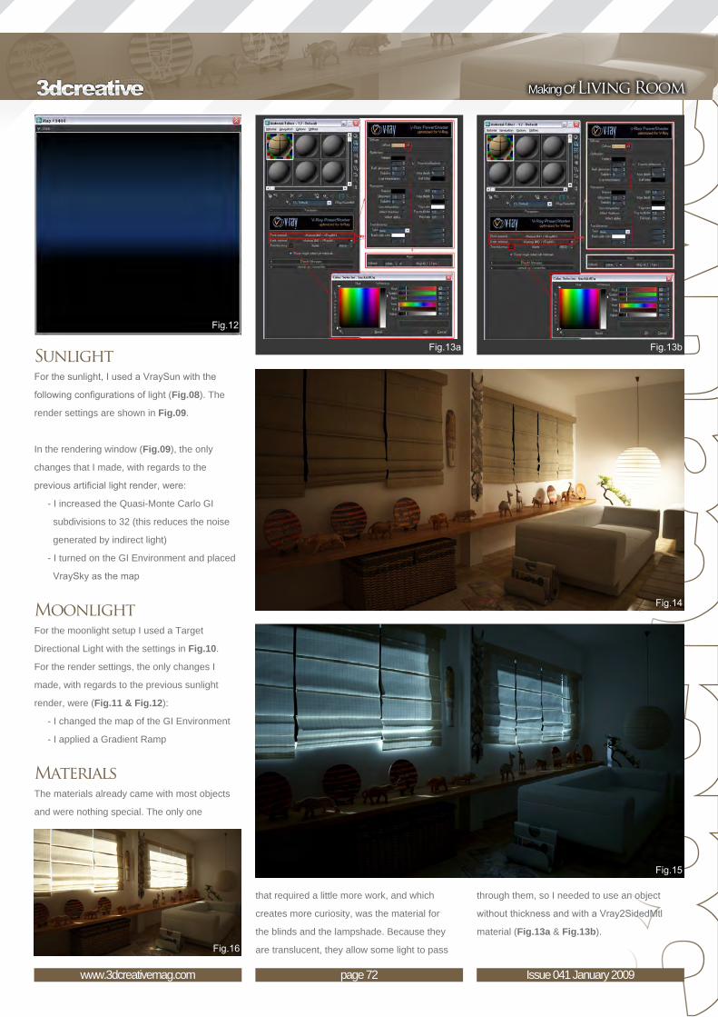
page 72www.3dcreativemag.com Issue 041 January 2009
Making Of Living Room
SunlightFor the sunlight, I used a VraySun with the
following configurations of light (Fig.08). The
render settings are shown in Fig.09.
In the rendering window (Fig.09), the only
changes that I made, with regards to the
previous artificial light render, were:
- I increased the Quasi-Monte Carlo GI
subdivisions to 32 (this reduces the noise
generated by indirect light)
- I turned on the GI Environment and placed
VraySky as the map
MoonlightFor the moonlight setup I used a Target
Directional Light with the settings in Fig.10.
For the render settings, the only changes I
made, with regards to the previous sunlight
render, were (Fig.11 & Fig.12):
- I changed the map of the GI Environment
- I applied a Gradient Ramp
MaterialsThe materials already came with most objects
and were nothing special. The only one
that required a little more work, and which
creates more curiosity, was the material for
the blinds and the lampshade. Because they
are translucent, they allow some light to pass
through them, so I needed to use an object
without thickness and with a Vray2SidedMtl
material (Fig.13a & Fig.13b).
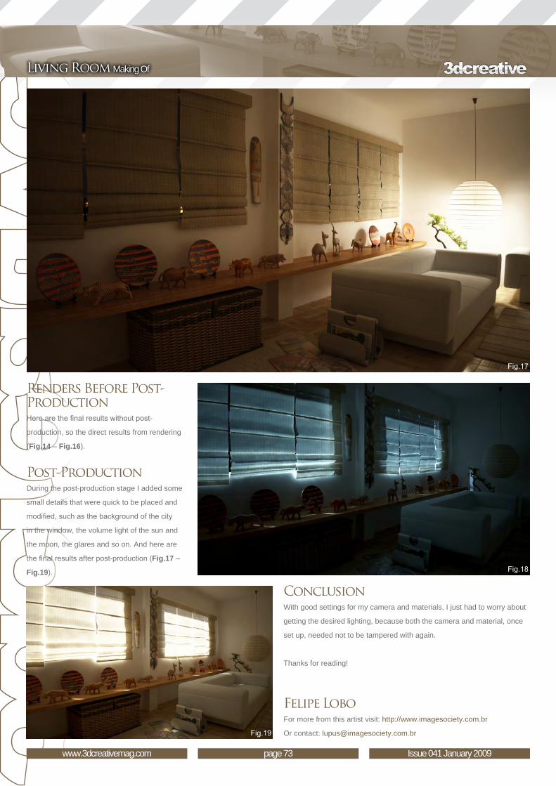
page 73www.3dcreativemag.com Issue 041 January 2009
Living Room Making Of
Renders Before Post-ProductionHere are the final results without post-
production, so the direct results from rendering
(Fig.14 – Fig.16).
Post-ProductionDuring the post-production stage I added some
small details that were quick to be placed and
modified, such as the background of the city
in the window, the volume light of the sun and
the moon, the glares and so on. And here are
the final results after post-production (Fig.17 –
Fig.19).
ConclusionWith good settings for my camera and materials, I just had to worry about
getting the desired lighting, because both the camera and material, once
set up, needed not to be tampered with again.
Thanks for reading!
Felipe LoboFor more from this artist visit: http://www.imagesociety.com.br
Or contact: [email protected]

© Felipe Lobo

© Felipe Lobo

visit www.3dcreativemag.com for full information and to purchase current and previous issues for only $4 US each!Image : Vincent Guibert
Here is what’s in next months issue of 3dcreative
InterviewsFrancisco A. CortinaJulianna KolakisRoman Style
ArticlesEscape Studios
TutorialsNEW - Creating a Gothic Church InteriorNew 5 Part Mega SeriesSpeed SculptingVegetation CreatureZBrush Character CreationPart 6: Zombie Galleriesanother 10 of the best Images from around the world!
PLUS MUCH MUCH MORE!!
With the release of 3DTotal’s latest book,
Digital Art Masters: Volume 3, we have
some exclusive chapters for you...
This book is more than just an artwork
book. Not only does it feature
full-colour, full-page images, but each artist
has given a detailed description, in their
own words, of the creation process behind
each piece of published artwork. And
they’ve done it especially for this book!
This month we feature:
“Rail Haven”
by Marco Edel Rolandi

The following shots of the “Rail Haven” book pages are featured here in full-resolution and can be read by zooming in...

3DCreative readers can purchase Digital Art Masters: Volume 1, 2 & 3 with a special 20% Discount
To claim your discount simply purchase here:
http://www.3dtotal.com/books/
(Note: if a security dialogue box appears, tick ‘Remember’, then click ‘Allow’)

image : David Giraud
SUBSCRIBE NOW &
SAVE UP TO 25%
on this already amazing value
publication!
12 ISSUES FOR THE
PRICE OF 9 $36 save $12 (25%)
6 ISSUES FOR THE
PRICE OF 5
$20 save $4 (16%)
Have your 3DCreative Magazine Download
link delivered automatically to your inbox
every month...and have it before anyone else!
www.3dcreativemag.com

page 81www.3dcreativemag.com Issue 041 January 2009
3DTotal About us
Is a resource website for the CG community;
amongst our growing number of products for CG
artists, we produce two monthly downloadable
PDF magazines – 2DArtist and 3DCreative.
We are based in the West Midlands, in the UK,
and our intention with our magazines is to make
each issue as full of great articles, images,
interviews and tutorials as possible. If you
would like more information on 3DTotal or our
magazines, or if you have a question for one our
team, please use the links below.
Contact Informationhttp://www.3dtotal.com
http://www.3dcreativemag.com
http://www.2dartistmag.com
Editor & Content Manager > Lynette Clee
Lead Designer > Chris Perrins
Marketing > Jo Hargreaves
PartnersIf you have a CG community website and would
like to support 3DCreative and/or 2DArtist
magazine by showing our banners, please
contact Lynette Clee at the email address above

Introduction:The original character of the Swordmaster was created by Seong-wha Jeong and we had 3DTotal’s in-house 3d artist Richard Tilbury, re-create the character in 3dsmax as well as create the textures in Photoshop, in our new precise, step-by-step tutorial for highly polished, low polygon game character with detailed texturing for real-time render-ing. We have also converted the tutorials into Cinema 4D, Maya, Lightwave and Softimage platforms. Even if you are not a user of one of them, the principles should be easily followed in nearly all other 3D applications.
The Swordmaster tutorials is spread over 8 Chapters which outline, in detail, the process for creating the Swordmaster below are the details.
for more products in our range visit http://www.3dtotal.com/shop
Chapter 1: Modelling the HeadChapter 2: Modelling the Torso Chapter 3: Modelling the Arms & Legs Chapter 4: Modelling the Clothing & Hair Chapter 5: Modelling the Armour Chapter 6: Mapping & Unwrapping Chapter 7: Texturing the Skin & Body Chapter 8: Texturing the Armour & Clothing
image by Seong-wha Jeong
Downloadable Tutorial EBook

This series will run over the next six months and will endeavour to give you an insight into how a fully realised 3D scene may be
arrived at from beginning to end. The tutorials will attempt to address the key issues and
techniques appropriate in achieving this, from concept sketches through to building the 3D
scene, mapping and unwrapping, texturing and eventually to lighting and rendering, culminating in a final render. The emphasis over the course of the series will be on the texturing, which will be covered in two of the six instalments, and principally the aging and wear of materials.
The schedule is as follows:
Issue 037 September 2008
Part 1: Importance of Reference The series will begin with a look at the gathering and importance of reference material, and then transposing these into some concept sketches
and a concept / production painting.
Issue 037 September 2008Part 2: Modelling Overview
This chapter will go on to deal with a general modelling overview, which will be non-software
specific, and then follow with a look at Photoshop and some general preparation of textures.
Issue 038 October 2008
Part 3: Preparing the Textures This chapter will focus on Photoshop and
more specifically, the job of preparing textures, including painting out seams and making images
tileable.
Issue 041 January 2009Part 4: Mapping
This chapter will focus on the mapping and unwrapping of your scene
Issue 041 January 2009Part 5: Texturing Principles
This chapter will focus on texturing principles and will cover texture resolution, bump specular and normal maps along with combining textures. It
will also cover using masks and adding dirt and grime
Issue 041 January 2009Part 6: Lighting & RenderingThe final chapter will discuss lighting and
rendering techniques and show how a simple lighting rig can be set up, along with different render passes ready for a final composite in
Photoshop.

Page 84www.3dcreativemag.com Issue 041 January 2009
Part 6: Lighting & Rendering Aged & Weathered Environment
that I didn’t want really dark shadows and so
under the shadow Parameters tab, changed the
Density to 0.7 - but you this is entirely subjective
(Fig.05).
This is a good start for the general lighting
conditions but we need to add a further light
to show a highlight on the wall suggesting
Rendering and Lighting Set UpBefore we start adding lights into our scene
we first need to set up the renderer. Click on
the Render Setup tab along the main toolbar
(highlighted in yellow in Fig.01) and open
the Common tab. Scroll down to the Assign
Renderer tab and change the Default Scanline
Renderer to mental ray Renderer. Now open the
Indirect Illumination tab and tick the box next to
enable Final Gather in the top left of the rollout
(Fig.02). We are now ready to start adding
lights.
The principal light which will represent our
sun and be named accordingly is a Target
Directional light placed above and to the right of
our scene (Fig.03). You can see the parameters
for this on the right panel. I have enabled Ray
Traced shadows as well as altering the Hotspot
and Falloff to the settings shown. You may also
notice that I have tinted the colour (R255 G248
B226) slightly towards yellow to help match
the concept painting and sky texture which is
mapped to a simple curved plane behind the
scene together with the mountain. When this
is rendered out it looks like Fig.04. I decided
where the sun has broken through the clouds
momentarily. In Fig.06 you can see the settings
used for this light. It has a higher intensity
(Multiplier 1.5) than our main light and a smaller
hotspot and falloff to focus the light on the wall.
Once rendered you can compare the difference
between our previous version and this one
(Fig.07).
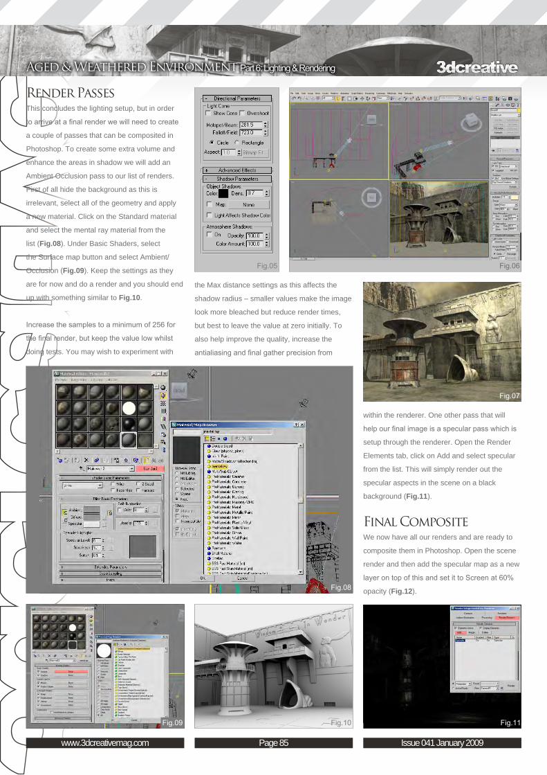
Page 85www.3dcreativemag.com Issue 041 January 2009
Aged & Weathered Environment Part 6: Lighting & Rendering
the Max distance settings as this affects the
shadow radius – smaller values make the image
look more bleached but reduce render times,
but best to leave the value at zero initially. To
also help improve the quality, increase the
antialiasing and final gather precision from
Render PassesThis concludes the lighting setup, but in order
to arrive at a final render we will need to create
a couple of passes that can be composited in
Photoshop. To create some extra volume and
enhance the areas in shadow we will add an
Ambient Occlusion pass to our list of renders.
First of all hide the background as this is
irrelevant, select all of the geometry and apply
a new material. Click on the Standard material
and select the mental ray material from the
list (Fig.08). Under Basic Shaders, select
the Surface map button and select Ambient/
Occlusion (Fig.09). Keep the settings as they
are for now and do a render and you should end
up with something similar to Fig.10.
Increase the samples to a minimum of 256 for
the final render, but keep the value low whilst
doing tests. You may wish to experiment with
within the renderer. One other pass that will
help our final image is a specular pass which is
setup through the renderer. Open the Render
Elements tab, click on Add and select specular
from the list. This will simply render out the
specular aspects in the scene on a black
background (Fig.11).
Final CompositeWe now have all our renders and are ready to
composite them in Photoshop. Open the scene
render and then add the specular map as a new
layer on top of this and set it to Screen at 60%
opacity (Fig.12).

Page 86www.3dcreativemag.com Issue 041 January 2009
Part 6: Lighting & Rendering Aged & Weathered Environment
Open the AO pass and using Image-
Adjustments –Curves, increase the contrast
and lighten the brightest areas (Fig.13). Now
add this above the specular layer and set it to
Multiply at around 35% opacity. Go to Image-
Adjustments-Colour Balance and change the
grey tones to a warmer hue similar to Fig.14.
You can see here that I have duplicated the
layer to show how it looks before the blending
mode and opacity have been altered (right side).
In order to make the scene just look that little
bit more dramatic, I added a Curves Adjustment
Layer to create a more intense light, as well as
substituting the mountain (Fig.15).
The final render can be seen here.
Aged & Weathered Environment Creating a Complete Scene from Concept to Render Part 6: Lighting & Rendering
Richard TilburyFor more from this artist visit:
http://www.richardtilburyart.com
Or contact them:

This series will run over the next six months and will endeavour to give you an insight into how a fully realised 3D scene may be
arrived at from beginning to end. The tutorials will attempt to address the key issues and
techniques appropriate in achieving this, from concept sketches through to building the 3D
scene, mapping and unwrapping, texturing and eventually to lighting and rendering, culminating in a final render. The emphasis over the course of the series will be on the texturing, which will be covered in two of the six instalments, and principally the aging and wear of materials.
The schedule is as follows:
Issue 037 September 2008
Part 1: Importance of Reference The series will begin with a look at the gathering and importance of reference material, and then transposing these into some concept sketches
and a concept / production painting.
Issue 037 September 2008Part 2: Modelling Overview
This chapter will go on to deal with a general modelling overview, which will be non-software
specific, and then follow with a look at Photoshop and some general preparation of textures.
Issue 038 October 2008
Part 3: Preparing the Textures This chapter will focus on Photoshop and
more specifically, the job of preparing textures, including painting out seams and making images
tileable.
Issue 041 January 2009Part 4: Mapping
This chapter will focus on the mapping and unwrapping of your scene
Issue 040 December 2008Part 5: Texturing Principles
This chapter will focus on texturing principles and will cover texture resolution, bump specular and normal maps along with combining textures. It
will also cover using masks and adding dirt and grime
Issue 041 January 2009Part 6: Lighting & RenderingThe final chapter will discuss lighting and
rendering techniques and show how a simple lighting rig can be set up, along with different render passes ready for a final composite in
Photoshop.

Page 88www.3dcreativemag.com Issue 041 January 2009
Part 6: Lighting & Rendering Aged & Weathered Environment
In this instalment of tutorial we will talk about
lighting set up, rendering parameters, GI
settings, render passes and post production.
First of all, look at the scene. It represents an
outdoor environment and therefore then the sun
will be our light source. So we should start by
deciding where to put our light source, so let’s
take a look at our aquarium scene. Assuming
that the focal point of the scene is the tower,
place the light “Infinite” as seen in Fig.01.
As you can see from the image, in Cinema
4D there are several light objects, divided as
follows: Omni Light; Spot Light; Infinite Light;
Area Light and Sun Light. We chose Infinite
Light because it is cast from an infinite distance
- the light has no actual origin. Distant light
sources such as this are suitable for simulating
sunlight. Since the distant light is infinite, its
position has no effect on the scene’s objects,
however, the direction in which the light is
facing is important. Go to the Attribute Manager
settings by selecting the Infinite Light object
from the object manager. Here you can modify
the type, the colour, the brightness, the shadow
and other parameters. The attributes of the light
object are divided into the following categories:
Basic, Coordinates, General, Details, Visibility, Shadow, Caustics, Noise,
Lens, Scene and Target. Go into the general control tab and change the
colour of the Infinite Light as shown in Fig.02.
Now choose the type of shadow. As you can see, in reality all objects are
lit by several partial light sources. The result of this is a gradual transition
from light to shadow. You can simulate this soft edge in Cinema 4D by
using a Shadow Map. It is a greyscale image of the scene as viewed from
the light source. Set this type of shadow for our light source (Fig.03).
There are other two type of shadows. Raytraced (Hard) Shadow
generates the kind of hard, sharp shadow borders that are rarely found
in real world environments. Area Shadow is the shadow that is better for
a realistic scene. We can say that the difference between the three types

Page 89www.3dcreativemag.com Issue 041 January 2009
Aged & Weathered Environment Part 6: Lighting & Rendering
of shadows is the edge, or umbra: Raytraced
Shadow generates a very sharp edge that
always has the same width. The closer an object
is to a surface on which it casts its shadows,
the sharper this edge will be. Area Shadow
simulates this effect, but it increases the render
time. So we will see how to make a fake that
simulates this effect by using only the shadow
maps. Go back to the attributes of the Infinite
Light object, then go in the shadow control tab
and here increase the resolution of the shadow
map, as shown in Fig.04.
As you can see from Fig.04, you already have
some default resolutions, but you can enter
your own value if it exceeds the last resolution
listed. In the shadow control tab, you can also
modify the parameters such the density, colour,
transparency, sample radius, etc. Now make
a copy of the Infinite Light object and leave
its position unchanged. I named the main
light source “K_Sun”, while its copy “1k_Sun”.
Since we have two lights, we can’t leave their
brightness at 100%, so decrease the brightness
of both lights (Fig.05).
Now change the resolution of shadow map of
the 1k_Sun light object. We will use a resolution
of 250x250. Let’s make a render just to see how
the scene is coming out (Fig.06).
At the left of figure you can see a render of
the scene. A render of the scene with only
the K_Sun light object active is shown at the
top right of figure, while a render with only the
1k_Sun light active is shown on the bottom right
of figure. We may group these two lights into a
“Null object”, it’s name will be “K_light_set”. Add
a Target Light and position the target behind the
tower object, as seen in Fig.07. Delete the light,
because we just need the target, which we will
then assign to our scene’s light. Add a target to
the K_light_set object by selecting it from the
right mouse menu (Cinema 4D Tags > Target).
Select the tag to go into its properties, add the
name of the light target object into the Target
Object box, as shown in Fig.07.
Now make a copy of the null object “K_light_set”
and change its name to “Sx_light_set”. Place
it to the left of the K_light_set object. Make
another copy, rename it in “Dx_light_set” and
position it to the right of the K_light_set object
(Fig.08). Now select all of the light objects and
decrease their intensity.
Before making a render of the scene, let’s
check the render settings. So select Render
> Render Settings from the main menu. A list
of parameters will appear. Under the General
control tab, choose “Geometry” mode as
Antialiasing. Disable “Global Illumination” - we
will see it in detail later. Disable the “Auto Light”
parameter from the Options control tab, as
shown in Fig.09. Now make a render of the
scene.
Now I’m going to add a background object and
a sky object to the scene. We will assign a
material to these two objects; the material will
use a texture like that shown in Fig.10 and the
colour channel will be the only enabled channel.
Add a background object (Objects > Scene >
Background). Assign the material “BK”. Select
Texture and in its properties change the default

Page 90www.3dcreativemag.com Issue 041 January 2009
Part 6: Lighting & Rendering Aged & Weathered Environment
projection to “Frontal”. Add a sky object
(Objects > Scene > Sky). Assign it the same
material used for the background, change the
default projection of the texture in “Spherical”.
Add a Composit Tag to the sky object by
selecting it from the right mouse menu. Select
the tag and in its properties enable only the
“Seen by GI” option (Fig.10).
In Fig.11, it shows a render of the scene.
As you can see, the lighting is not very realistic.
For this reason we will use Global Illumination,
which simulates the natural behaviour of light.
So open the Render Settings window and let’s
take a look at the Global Illumination parameters
(Fig.12).
There are two types of GI: Standard and
Stochastic. This last one is suitable for
animation, so we will use Standard. The strength parameter controls the
strength of the GI effect. Accuracy controls the general quality of the GI.
Prepass Size defines the ratio of the prepass image size in relation to the
final render size. The prepass image is rendered first and it shows the
shading points as dots. Always use 1/1 for final rendering. Lower setting
reduces render time, but also lowers the quality of the render. Diffuse
Depth is the maximum number of reflections for each ray of light. The
default value (3) is suitable for most scenes. Stochastic Samples defines
the number of the rays that come out in a dome shape from a ray that
hits a surface. Min Resolution and Max Resolution optimise the accuracy
setting. Min Resolution sets the number of shading points for the least
important areas, while Max Resolution sets the number of shading points
for the most important areas. Recompute uses three modes: “First Time”,
the GI will be calculated for the first render only, further renders will reuse
the data; “Always”, the GI data is always recalculated when you render;
“Never”, GI is not calculated when you render. Identical Noise Distribution
makes the noise homogeneous. In Standard mode this setting has little
effect. Now set your GI parameters and make a render (Fig.13).
In Fig.13 you can see a render with GI using the settings shown in Fig.12.
You can refine the GI effect for each material using the GI settings on the
illumination page of the Material Editor. I have disabled the Receive GI
parameter in the Illumination page of the BK material and all the rest of
the materials are set as default, as shown in Fig.14.
We may also use Ambient Occlusion to make the render more realistic.
Ambient Occlusion (AO) determines to what degree each individual
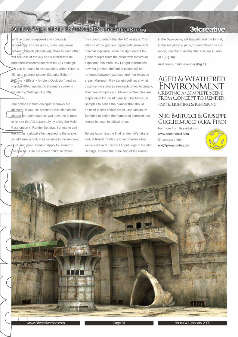
Page 91www.3dcreativemag.com Issue 041 January 2009
Aged & Weathered Environment Part 6: Lighting & Rendering
surface point is exposed and colours it
accordingly. Corner areas, holes, and areas
between objects placed very close to each other
will see less of the sky and will therefore be
darkened in accordance with the AO settings.
AO can be found in two locations within Cinema
4D: as a channel shader (Material Editor >
Texture > Effect > Ambient Occlusion) and as
a global effect applied to the entire scene in
Rendering Settings (Fig.15).
The options in both dialogue windows are
identical. If you use Ambient Occlusion as the
shader for each material, you have the chance
to render the AO separately by using the Multi-
Pass option in Render Settings. I chose to use
the AO as a global effect applied to the scene,
so let’s take a look at its settings in the Ambient
Occlusion page. Enable “Apply to Scene” to
use the AO. Use the colour option to define
in the Save page, set the path and the format,
in the Antialiasing page, choose “Best” as the
mode, use “Sinc” as the filter and use GI and
AO (Fig.16).
And finally, make a render (Fig.17).
Aged & Weathered Environment Creating a Complete Scene from Concept to Render Part 6: Lighting & Rendering
Niki Bartucci & Giuseppe Guglielmucci (a.ka. Piko)For more from this artist visit:
www.pikoandniki.com
Or contact them:
the colour gradient that the AO assigns. The
left end of the gradient represents areas with
minimal exposure, while the right end of the
gradient represents the areas with maximum
exposure. Minimum Ray Length determines
how the gradient defined in colour will be
rendered between exposed and non-exposed
areas. Maximum Ray Length defines at what
distance the surfaces see each other. Accuracy,
Minimum Samples and Maximum Samples are
responsible for the AO quality. Use Minimum
Samples to define the number that should
be used in less critical areas. Use Maximum
Samples to define the number of samples that
should be used in critical areas.
Before launching the final render, let’s take a
look at Render Settings to summarise what
we’ve said so far. In the Output page of Render
Settings, choose the resolution of the render,

This series will run over the next six months and will endeavour to give you an insight into how a fully realised 3D scene may be
arrived at from beginning to end. The tutorials will attempt to address the key issues and
techniques appropriate in achieving this, from concept sketches through to building the 3D
scene, mapping and unwrapping, texturing and eventually to lighting and rendering, culminating in a final render. The emphasis over the course of the series will be on the texturing, which will be covered in two of the six instalments, and principally the aging and wear of materials.
The schedule is as follows:
Issue 037 September 2008
Part 1: Importance of Reference The series will begin with a look at the gathering and importance of reference material, and then transposing these into some concept sketches
and a concept / production painting.
Issue 037 September 2008Part 2: Modelling Overview
This chapter will go on to deal with a general modelling overview, which will be non-software
specific, and then follow with a look at Photoshop and some general preparation of textures.
Issue 038 October 2008
Part 3: Preparing the Textures This chapter will focus on Photoshop and
more specifically, the job of preparing textures, including painting out seams and making images
tileable.
Issue 041 January 2009Part 4: Mapping
This chapter will focus on the mapping and unwrapping of your scene
Issue 041 January 2009Part 5: Texturing Principles
This chapter will focus on texturing principles and will cover texture resolution, bump specular and normal maps along with combining textures. It
will also cover using masks and adding dirt and grime
Issue 041 January 2009Part 6: Lighting & RenderingThe final chapter will discuss lighting and
rendering techniques and show how a simple lighting rig can be set up, along with different render passes ready for a final composite in
Photoshop.

Page 94www.3dcreativemag.com Issue 041 January 2009
Part 6: Lighting & Rendering Aged & Weathered Environment
Welcome to the last part of this tutorial series.
I hope you’ve finished all the textures and
materials from part five, because in this part
we are going to be setting up the scene for
rendering!
Create a new scene and load your object. Now
bring your camera into a position that fits the
look you want to deliver. I suggest you play
around with the look; for example, try to use a
high value for the Lens Focal Length and move
the camera very far away from the object so you
have a telephoto lens optic. Or do the opposite
and use a wide angle lens by using a small
value for the Lens Focal Length (Fig.01).
Don’t rely on using the default perspective
camera – there are more interesting options. For
example, if you want to get rid of perspective
distortions, you can use a “Shift Camera”.
This would be the right choice for architectural
visualisations.
I used a “Real Lens Camera”, simulating a
Canon SLR camera with an EF 28-70mm lens.
This way I even added a bit of lens distortion
and some vignette. I also banked the camera a
bit, to create a more dynamic look.
While in the camera settings, set your render
resolution. I used full HD (1920 x 1280 pixels)
for my final render. For test rendering I used
50% of the resolution. The other settings will be
okay for the purpose of test rendering (Fig.02).
Next we have to set the light. For the key light,
choose an Area light that is shining in from the
right side, slightly above the camera. Scale the
area light to 20 on each axis so the shadow
is softened a bit. Instead of an Area light, you
could also choose a sphere light (LW 9.5) – the
look is almost identical, but rendering might be
faster, depending on the scene.
Choose a light intensity of 80% and an orange
colour. For Ambient Colour I suggest using blue,
and as a value for the Ambient Intensity – 10%.

Page 95www.3dcreativemag.com Issue 041 January 2009
Aged & Weathered Environment Part 6: Lighting & Rendering
These colours follow the basic rule of sunlight,
being more yellowish; shadows are more bluish
(Fig.03).
A spherical back light is now placed right behind
the tower. By doing this you can ensure that the
tower stands out from the background more.
The spherical light should have the size of 30m
and a light bluish colour. Light intensity should
be 50%.
The light size will change the appearance of the
shadow – the bigger the light, the smoother the
shadow. If anything at all, we want a very soft
shadow here.
Make sure that the sphere of the light does
not intersect with any object, or there will be
unwanted shadows.
You can also use a Point light instead of the
spherical light, if you want. You can also turn of
the shadow, as the light only serves to highlight
the elements behind the tower (Fig.04).
To make the tower even more prominent, you
can highlight the front a bit more too. Add a
Point light and place it in front of the tower.
Use the same colour and intensity as for the
key light. The Intensity Falloff should be set to
Linear; the Range should be 30m.
Make sure to disable the shadows for this one,
as we only want the highlight spot on the tower
this time (Fig.05).
We are using ray traced shadows for all our
lights, so check “Raytrace Shadows” in your
Render Globals before you make any test
renders.
If you compare the rendered image with
(bottom) and without (top) the fill and backlight,

Page 96www.3dcreativemag.com Issue 041 January 2009
Part 6: Lighting & Rendering Aged & Weathered Environment
you will see that the look is much more
interesting and focused (Fig.06).
The rendered image already looks quite
nice. For rendering animations this is almost
everything you need. But as render times are
not our biggest concern for this scene, I think we
can allow ourselves to use Radiosity.
You might have noticed the blue background
colour in my test renders. Radiosity is also using
the background colour, so make sure to enable
the Gradient Backdrop. The default setting will
already give you good results; however, feel free
to test with fully different background gradients
to gain a more dramatic look (Fig.07).
Don’t worry about the background itself though
as it will be replaced later in Photoshop.
In the Global Illumination tab from the Render
Globals, enable Radiosity. Set type to Final
Gather using the Interpolated modus. I am again
going to render with the default settings, as they
usually work really well and also render fast.
If you feel the image is too noisy in the end,
you can simply increase the value for Rays Per
Evaluation (Fig.08).
I think the test render looks alright, so it’s time to
prepare the final rendering (Fig.09).
In Camera Properties, change the resolution multiplier back to 100% so
you have the final render resolution again.
Set the Antialiasing Level to 3 and activate Adaptive Sampling with a
Threshold of 0.05. These settings ensure a noiseless image. If your render
times are way too slow this way, reduce the Antialiasing Level to 1 and
increase the Adaptive Sampling Threshold to the default value of 0.1. This
will result in a noisier image, but renders a lot faster (Fig.10).
In order to have the best possibilities for post production in Photoshop,
it would be best to use layered output. In the Processing panel, add the
image filter “PSD Export”. In the filter settings, set a path for the output of
the PSD and check the layers you’d like to output. I like to keep it simple
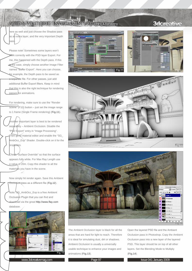
Page 97www.3dcreativemag.com Issue 041 January 2009
Aged & Weathered Environment Part 6: Lighting & Rendering
here as well and just choose the Shadow pass
as an extra layer, and the very important Depth
pass.
Please note: Sometimes some layers won’t
work correctly with the PSD layer Export. For
me, this happened with the Depth pass. If this
is the case, simply choose another Image Filter
named “Buffer Export”. Here you can choose,
for example, the Depth pass to be saved as
a separate file. For other passes, just add
additional Buffer Export filters. Keep in mind
that this is also the right technique for rendering
passes for animations.
For rendering, make sure to use the “Render
Scene” (F10) button – just set the image range
to 1 frame (Single Frame rendering) (Fig.11).
Another important layer is best to be rendered
separately – Ambient Occlusion. Disable the
“PSD Export” entry in “Image Processing”.
Then go to material editor and enable the “SG_
AmbOcc_Exp” Shader. Double-click on it for the
properties.
Check “Surface Override” so that the surface
appears fully white. For Max Ray Length use
a value of 20m. Copy this shader to all the
materials you have in the scene.
Now simply hit render again. Save this Ambient
Occlusion pass as a different file (Fig.12).
Note: SG_AmbOcc_Exp is a free Ambient
Occlusion Plugin that you can find and
download via the great http://www.flay.com
database.
Open the layered PSD file and the Ambient
Occlusion pass in Photoshop. Copy the Ambient
Occlusion pass into a new layer of the layered
PSD. This layer should be on top of all other
layers. Set the Blending Mode to Multiply
(Fig.14).
The Ambient Occlusion layer is black for all the
areas that are hard for light to reach. Therefore
it is ideal for simulating dust, dirt or shadows.
Ambient Occlusion is usually a universally
usable technique to enhance your images and
animations (Fig.13).

Page 98www.3dcreativemag.com Issue 041 January 2009
Part 6: Lighting & Rendering Aged & Weathered Environment
Now you have all the layers in place and are
able to adjust them individually. For example,
let’s make the specular stronger by duplicating
layer L5: Specular. Now the specular is twice as
strong. Now use a bit of blur on that layer for a
slight glow effect on all shiny surfaces. Finally,
you can adjust the levels for that layer, to bring
out the effect even more.
I simply used the duplicated layer as it is with
50% visibility (Fig.15).
Take a look at layer L3: Surface. This layer
contains the colour information. I used a
Selective Colour adjustment layer to get rid of
the very prominent red tone. To give the whole
image a brownish look, I also added a Hue/
Saturation adjustment layer set to Colorize at
30% visibility (Fig.16).
Now create a new layer folder. Click on Select
> Load Selections and choose the Alpha in the
Channel box. Invert this selection so only the
sky is masked. Add a vector mask to the folder.
Now every layer you put into this folder is only
visible for the part of the image where the sky is.
In this example I used a photographed sky and
some big rock for the background (Fig.17).
When you are done with your image
manipulation, copy the layer “Depth” and paste
it as new Alpha Layer. Now flatten all layers
(Fig.18). Click on the Filter > Blur > Lens Blur.
As Depth Map source choose the Alpha map
we just created (Alpha 1). Now click into the
image preview to set the point that is in focus – for example the tower.
The amount of Blur is now adjusted via the Iris Radius. A value of 10 is
just perfect. I suggest using this effect at 30% to 40% visibility only, this
way the image does not look like a miniature, but only slightly blurred in
the distance (Fig.19).
Tip: The depth map can also be used to add a bit of haze by simple using
the screen blend for it.
Have a look at the final image. As you can see, there is a lot you can do
to change the look of the rendered image after rendering by working with
layers. This can be especially powerful when working on animations, as

Page 99www.3dcreativemag.com Issue 041 January 2009
Aged & Weathered Environment Part 6: Lighting & Rendering
you have full control over every aspect of the
image (Fig.20).
I hope this tutorial has proved to be interesting
for you. If you have any questions, please feel
free to contact me via my homepage: http://
www.dough-cgi.de
Aged & Weathered Environment Creating a Complete Scene from Concept to Render Part 6: Lighting & Rendering
dOUGh-CGI : Roman KesslerFor more from this artist visit:
http://www.dough-cgi.de
Or contact them:

for more products in our range visit http://www.3dtotal.com/shop
: volume 2
Philip Straub
Jonny Duddle
Alessandro Baldasseroni
Benita Winckler
Fred Bastide
James Busby
Marek Denco
Patrick Beaulieu
Jonathan Simard
Buy the book to see just how they create their
incredible imagery!Hardback 21.6cm x 27.9cm in size
288 Full Colour premium paper pages
Features 58 of the finest digital 2d and 3d artists working in the indusrty today, from the
likes of:
Only!GBP£32USD$64EUR€49
This series will run over the next six months and will endeavour to give you an insight into how a fully realised 3D scene may be
arrived at from beginning to end. The tutorials will attempt to address the key issues and
techniques appropriate in achieving this, from concept sketches through to building the 3D
scene, mapping and unwrapping, texturing and eventually to lighting and rendering, culminating in a final render. The emphasis over the course of the series will be on the texturing, which will be covered in two of the six instalments, and principally the aging and wear of materials.
The schedule is as follows:
Issue 037 September 2008
Part 1: Importance of Reference The series will begin with a look at the gathering and importance of reference material, and then transposing these into some concept sketches
and a concept / production painting.
Issue 037 September 2008Part 2: Modelling Overview
This chapter will go on to deal with a general modelling overview, which will be non-software
specific, and then follow with a look at Photoshop and some general preparation of textures.
Issue 038 October 2008
Part 3: Preparing the Textures This chapter will focus on Photoshop and
more specifically, the job of preparing textures, including painting out seams and making images
tileable.
Issue 041 January 2009Part 4: Mapping
This chapter will focus on the mapping and unwrapping of your scene
Issue 041 January 2009Part 5: Texturing Principles
This chapter will focus on texturing principles and will cover texture resolution, bump specular and normal maps along with combining textures. It
will also cover using masks and adding dirt and grime
Issue 041 January 2009Part 6: Lighting & RenderingThe final chapter will discuss lighting and
rendering techniques and show how a simple lighting rig can be set up, along with different render passes ready for a final composite in
Photoshop.

Page 102www.3dcreativemag.com Issue 041 January 2009
Part 6: Lighting & Rendering Aged & Weathered Environment
will give us a higher quality of shadow (in
multiples of 64); however, at the same time it will
also increase the render time. First, let’s set it to
512, and the Filter size will allow us to smooth
the edge of the shadow.
2. For the Fill light and Backlight, the settings
are almost the same; the only difference is that
we don’t use shadows for both of these two
lights, and the intensity will be set it to 0.1 for
both of them (Fig.02).
3. We can see the backlight is placed under the
floor, and this will block out our backlight for the
scene. To avoid this we can just break up the
connection between the backlight and the floor.
To do this, let’s select our backlight and the
floor, go to the main menu and select Lighting/
Shading > Break Light Links; this will break
up the connection between the two objects
(Fig.03). Under this menu you’re also able to
break up some object shadows.
4. After the basic lights are set up, let’s create a
camera (Create > Cameras > Camera), switch
the view to our created camera inside our View
port (Panels > Perspective > Camera1), and
usually set up a basic 3-point lighting system
for a scene. A key light simulates our main light
source, and a fill light/backlight helps to light up
the dark area (Fig.01).
A. Depth Map Shadow
1. In this 3-point lighting setup example, we
use three spot lights for our scene. If we switch
to the Attributes Editor of our spot light, the
two key sections we are focusing on are Spot
Light Attributes and Shadows. Inside Spot Light
Attributes we have a Colour section, to control
our light colour. If you click on the white colour
box, a Colour Chooser menu will pop-up for us
to select the colour we want. Let’s pick a warm
colour (H50, S0.14, V1) to simulate sunlight.
The Cone Angle section allows us to control the
size of the light, so let’s set it to 80. A higher
value in the Penumbra Angle section can soften
the edge of the light, so let’s enter a value of
8 here. The Dropoff value of 3 is to control the
width of our light being cast on the scene. Go
to the Shadows section, and in Maya there are
two types of shadows provided: Depth Map and
Ray Traced shadows. We’ll start by using the
Depth Map Shadows for our scene, and in the
Resolution section a higher value of Resolution
IntroductionIn the final part of this tutorial, I will introduce
the basic idea of how to set up the lighting
in our scene and render the image for a final
composition. When it comes to the rendering, it
is always related to time, and you will discover
that every object/light/shadow inside your scene
can cause different render times. To finish up
at the end, we will composite our render in the
post-production stage.
Different Methods to set up LightingYou can find a detailed description in Maya’s
help file for every type of light available in Maya;
here I will introduce some basic methods of
lighting setups for our scene.
3-Point LightsIf we don’t use an advanced lighting system,
like Final Gather/Global Illumination, we’d
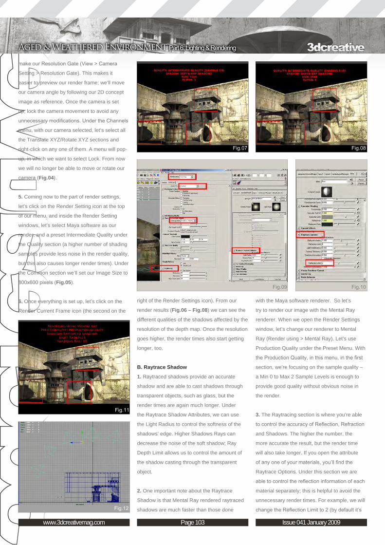
Page 103www.3dcreativemag.com Issue 041 January 2009
Aged & Weathered Environment Part 6: Lighting & Rendering
make our Resolution Gate (View > Camera
Setting > Resolution Gate). This makes it
easier to preview our render frame; we’ll move
our camera angle by following our 2D concept
image as reference. Once the camera is set
up, lock the camera movement to avoid any
unnecessary modifications. Under the Channels
menu, with our camera selected, let’s select all
the Translate XYZ/Rotate XYZ sections and
right-click on any one of them. A menu will pop-
up, in which we want to select Lock. From now
we will no longer be able to move or rotate our
camera (Fig.04).
5. Coming now to the part of render settings,
let’s click on the Render Setting icon at the top
of our menu, and inside the Render Setting
windows, let’s select Maya software as our
render, and a preset Intermediate Quality under
the Quality section (a higher number of shading
samples provide less noise in the render quality,
but this also causes longer render times). Under
the Common section we’ll set our Image Size to
800x600 pixels (Fig.05).
6. Once everything is set up, let’s click on the
Render Current Frame icon (the second on the
with the Maya software renderer. So let’s
try to render our image with the Mental Ray
renderer. When we open the Render Settings
window, let’s change our renderer to Mental
Ray (Render using > Mental Ray). Let’s use
Production Quality under the Preset Menu. With
the Production Quality, in this menu, in the first
section, we’re focusing on the sample quality –
a Min 0 to Max 2 Sample Levels is enough to
provide good quality without obvious noise in
the render.
3. The Raytracing section is where you’re able
to control the accuracy of Reflection, Refraction
and Shadows. The higher the number, the
more accurate the result, but the render time
will also take longer. If you open the attribute
of any one of your materials, you’ll find the
Raytrace Options. Under this section we are
able to control the reflection information of each
material separately; this is helpful to avoid the
unnecessary render times. For example, we will
change the Reflection Limit to 2 (by default it’s
right of the Render Settings icon). From our
render results (Fig.06 – Fig.08) we can see the
different qualities of the shadows affected by the
resolution of the depth map. Once the resolution
goes higher, the render times also start getting
longer, too.
B. Raytrace Shadow
1. Raytraced shadows provide an accurate
shadow and are able to cast shadows through
transparent objects, such as glass, but the
render times are again much longer. Under
the Raytrace Shadow Attributes, we can use
the Light Radius to control the softness of the
shadows’ edge. Higher Shadows Rays can
decrease the noise of the soft shadow; Ray
Depth Limit allows us to control the amount of
the shadow casting through the transparent
object.
2. One important note about the Raytrace
Shadow is that Mental Ray rendered raytraced
shadows are much faster than those done

Page 104www.3dcreativemag.com Issue 041 January 2009
Part 6: Lighting & Rendering Aged & Weathered Environment
set to 1) for our Floor Material. Going back to
the Render Settings window, let’s set a value
of 2 for Reflection and Shadows under the
Raytracing section (Fig.09 & Fig.10). After all
the basics have been done, let’s click again on
Render Current Frame.
4. Once our render is finished we’ll notice the
shadow inside our scene appears much more
accurate when compared to the Depth Map
Shadows (Fig.11).
Dome Light (Simulating Environment Lighting)1. We’ll use a so-called Dome light to simulate
an outdoor environment lighting setup. With the
Dome lighting method we create lots of lights
to surround our scene in order to simulate a
complex sky lighting condition, with an additional
spotlight to act as the direction of our sun.
2. First we’ll create a spotlight and set the Cone
Angle to 70, the Penumbra Angle to 10, and
the Intensity to 0.02. Turn on the Ray Trace
sky. Let’s open a sky image (text_V3_r2 / Sky
_04), and in the Render View windows (File >
Open Image), with our sky image open, let’s
select each of our spot lights inside the scene
and use the colour chooser to change the light
colour randomly from the selections made on
our sky image, until all the spot light colours
have been chosen. Once that’s done, it’s time to
render (Fig.14). We’ll keep our previous settings
(Mental Ray) for the render (Fig.15).
Rendering with Final Gather (Mental ray)In this last part covering lighting methods, we’ll
use Final Gather in Mental Ray to render our
image. With a simple lighting set up, it’s usually
hard to simulate light in the real world. In our
world the light comes from different directions
and is cast onto our object with different colours.
Final Gather will produce the highest-quality
lighting for our scene, but at the same it will take
the longest to render.
1. First of all we’ll create a sphere and scale it
until it covers up our entire scene. We’ll cut off
half of the sphere which is facing the bottom of
our scene and then we need to create a spot
Shadows. Once the spot light is created, from
the side view, start to duplicate and re-position
the duplicated spot lights to create a curve
shape over the top of the scene (Fig.12).
3. Let’s create a group for our spot light and
set the pivot to the centre of the group (Modify
> Centre Pivot). Keep duplicating the group of
the spot light and re-positioning them until they
become a sphere shape covering the entire
scene.
4. Once our Dome light is created, we’ll create
another spot light and set the Intensity to 0.7,
the Cone Angle to 80, and the Penumbra Angle
to 15. This will be treated as the sun inside our
scene, so once again let’s give it a warm colour.
We now need to create another two fill lights
and place them under the floor. Break up the
link between these two fill lights with the floor
(Fig.13).
5. The last thing to set up in our scene is the
simulation of the colour of the environment
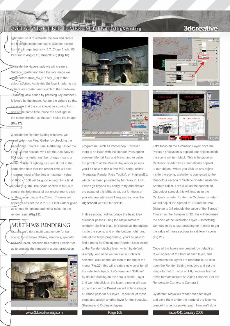
Page 105www.3dcreativemag.com Issue 041 January 2009
Aged & Weathered Environment Part 6: Lighting & Rendering
programme, such as Photoshop. However,
there is an issue with the Render Pass option
between Mental Ray and Maya, and to solve
the problem of the Mental Ray render passes
you’ll be able to find a free MEL script, called
“Mentalray Render Pass Toolkit”, on Highend3d,
which has been provided by Mr. Tran Vu Linh.
I won’t go beyond my ability to try and explain
the usage of this MEL script, but for those of
you who are interested I suggest you visit the
Highend3d website for details.
In this section, I will introduce the basic idea
of render passes using the Maya software
renderer. So first of all, let’s select all the objects
inside the scene, and on the bottom right hand
side of the Maya programme, you’ll be able to
find a menu for Display and Render. Let’s switch
to the Render display layer, which by default
is empty, and once we have all our objects
selected, click on the last icon at the top of the
menu (Fig.20); this will create a new layer for all
the selected objects. Let’s rename it “Diffuse”
by double-clicking on the default name, Layer
2. If we right-click on the layer, a menu will pop
up, and under the Preset we will able to assign
a Diffuse pass for our layer. Repeat all of these
steps and assign another layer for the Specular,
Shadow and Occlusion layers.
light and use it to simulate the sun and create
the highlight inside our scene (Colour: picked
from the image, Intensity: 0.7, Clone Angle: 80,
Penumbra Angle: 15, Dropoff: 25) (Fig.16).
2. Inside the Hypershade we will create a
Surface Shader and load the sky image we
used before (text_V3_r2 / Sky _04) to the
colour section. Apply this Surface Shader to the
sphere we created and switch to the Hardware
Texturing view option by pressing key number 6,
followed by the image. Rotate the sphere so that
it’s where that the sun should be coming from,
and at the same time, place the spot light in
the same direction as the sun, inside the image
(Fig.17).
3. Inside the Render Setting windows, we
need to turn on Final Gather by checking the
Secondary Effects > Final Gathering. Under the
Final Gather section, we’ll set the Accuracy to
500 rays – a higher number of rays means a
better quality of lighting as a result, but at the
same time note that the render time will also
increase; most of the time a maximum value
of 1000 - 1500 will be good enough for a final
render (Fig.18). The Scale section is for us to
control the brightness of our environment: click
on the colour bar, and a Colour Chooser will
appear. Let’s set the V to 1.8. Final Gather gives
us smoother lighting and richer colour in the
render result (Fig.19).
Multi-Pass RenderingUsually we’d do a multi-pass render for our
scene; for example diffuse, shadows, specular
and occlusion, because this makes it easier for
us to process the renders in a post-production
Let’s focus on the Occlusion Layer: once the
Preset > Occlusion is applied, our objects inside
the scene will turn black. This is because an
Occlusion shader was automatically applied
to our objects. When you click on any object
inside the scene, a shader is connected to the
Out-colour section of Surface Shader inside the
Attribute Editor. Let’s click on the connected
Out-colour symbol; this will lead us to the
Occlusion shader. Under the Occlusion shader
we will adjust the Spread to 1.8 and the Max
Distance to 3.6 (double the value of the Spread).
Finally, set the Sampler to 32; this will decrease
the noise of the Occlusion Layer – something
we need to do a test rendering for in order to get
the value of those sections in a different scene
(Fig.21).
Once all the layers are created, by default an
R will appear at the front of each layer, and
this means the layers are renderable. So let’s
open the Render Setting windows and set the
image format to Targa or Tiff, because both of
these formats include an Alpha Channel. Set the
Renderable Camera to Camera 1.
By default, Maya will render out each layer
and save them under the name of the layer we
created inside our project path. Now we’ll do a

Page 106www.3dcreativemag.com Issue 041 January 2009
Part 6: Lighting & Rendering Aged & Weathered Environment
us to import our previous 2D image’s sky as
our background. Add a highlight from the sun’s
direction, and finally apply a Levels and a Hue/
Saturation layer to do a final adjustment on the
contrast and saturation of the image (Fig.23).
The benefit of multiple-pass rendering is that it
allows us to control each layer separately, and
at the same time this can save us a lot of time
without the need to re-render the entire scene
when only one of the layers may need to be
changed.
Final Conclusion Rendering is always related to time; it can vary
from five minutes to five hours to render one
single frame. Different kinds of setups provide
different kinds of results. Most of time we need
to choose between the quality and the time –
24 hours for only a single frame doesn’t really
mean anything, but 24 minutes for each frame
of 100 will become another story. How to get a
good balance is always an important factor of
3D rendering. And on this final note comes the
end of the tutorial. Many thanks once again for
reading and following this series, I hope it has
been helpful.
Aged & Weathered Environment Creating a Complete Scene from Concept to Render Part 6: Lighting & Rendering
Tiong-seah YapFor more from this artist visit:
www.schokoladenmann2plus3.blogspot.com/
Or contact them:
Batch Render for each of our layers, so let’s go
to Render > Batch Render and Maya will send
out our files for rendering until finished.
Post-Production in PhotoshopOnce our multiple layers are rendered, we will
open all of our layers up in Photoshop (Fig.22).
First of all, the Diffuse layer is our basic layer,
onto which we will start to load the Specular
layer and blend it with the Colour Dodge layer
blending mode, setting the opacity to 50%. For
the next layer, blend the Shadows layer with the
Multiply layer blending mood option, and change
the Levels of the layer to make it a little darker,
along with a Colour Balance adjustment to make
the shadows a little more blue-toned. At the end,
we’ll then blend in the Occlusion layer with the
Multiply blending mode, and set the opacity to
50%. After all the layers have been correctly
merged, create a group for all these layers and
apply a mask to mask out the sky; this will allow

This series will run over the next six months and will endeavour to give you an insight into how a fully realised 3D scene may be
arrived at from beginning to end. The tutorials will attempt to address the key issues and
techniques appropriate in achieving this, from concept sketches through to building the 3D
scene, mapping and unwrapping, texturing and eventually to lighting and rendering, culminating in a final render. The emphasis over the course of the series will be on the texturing, which will be covered in two of the six instalments, and principally the aging and wear of materials.
The schedule is as follows:
Issue 037 September 2008
Part 1: Importance of Reference The series will begin with a look at the gathering and importance of reference material, and then transposing these into some concept sketches
and a concept / production painting.
Issue 037 September 2008Part 2: Modelling Overview
This chapter will go on to deal with a general modelling overview, which will be non-software
specific, and then follow with a look at Photoshop and some general preparation of textures.
Issue 038 October 2008
Part 3: Preparing the Textures This chapter will focus on Photoshop and
more specifically, the job of preparing textures, including painting out seams and making images
tileable.
Issue 041 January 2009Part 4: Mapping
This chapter will focus on the mapping and unwrapping of your scene
Issue 041 January 2009Part 5: Texturing Principles
This chapter will focus on texturing principles and will cover texture resolution, bump specular and normal maps along with combining textures. It
will also cover using masks and adding dirt and grime
Issue 041 January 2009Part 6: Lighting & RenderingThe final chapter will discuss lighting and
rendering techniques and show how a simple lighting rig can be set up, along with different render passes ready for a final composite in
Photoshop.

Page 108www.3dcreativemag.com Issue 041 January 2009
Part 6: Lighting & Rendering Aged & Weathered Environment
0.020 for all the three parameters. Switch to
the Rendering tab and set the Aliasing Min and
Max Levels to -1 and 1 (Fig.05). Set all the
Sampling Contrast values to 0.020. Select the
sphere which is surrounding all the scene and
disable its Primary visibility (Fig.06). You can
Welcome to the last part of the Aquarium
tutorial. This time we’ll set the scene for the final
rendering, and then we’ll do some compositing
and retouching in Photoshop.
Open the Aquarium_Part6_START.scn scene
file and create a new Infinite light. Try to position
it just like in Fig.01. Open the light’s Properties
Page and set its parameters to those shown
in Fig02. We don’t need it to be too strong in
intensity - it will just be used to give a general
shading in the scene - so set its intensity quite
low and its colour to a very pale blue, almost
white (Fig.02).
Now we need another type of light: a Point light.
It will give the scene the general “mood”, so we
need to position it correctly to light the bas-relief
(Fig.03).
Open its Properties Page and set the colour
to a pale yellow and the intensity to about 0.5.
Also, enable Shadows and set the Umbra value
to 0. Switch to the Area tab and enable Area
Light. Set the Geometry Type to Sphere and
the U/V values to 3/3. Finally, open the Region
rendering options and enable Final Gathering
(Fig.04). Set the Mode to Automatic, the number
of rays to 256 and the Sampling Contrast to
do that by selecting the sphere, opening the XSI
Explorer and clicking on the Visibility node. Set
the Ambiece value (in the Rendering menu) to 0
and do a final quick region render test to check
that everything is in place for the final rendering
(Fig.07).
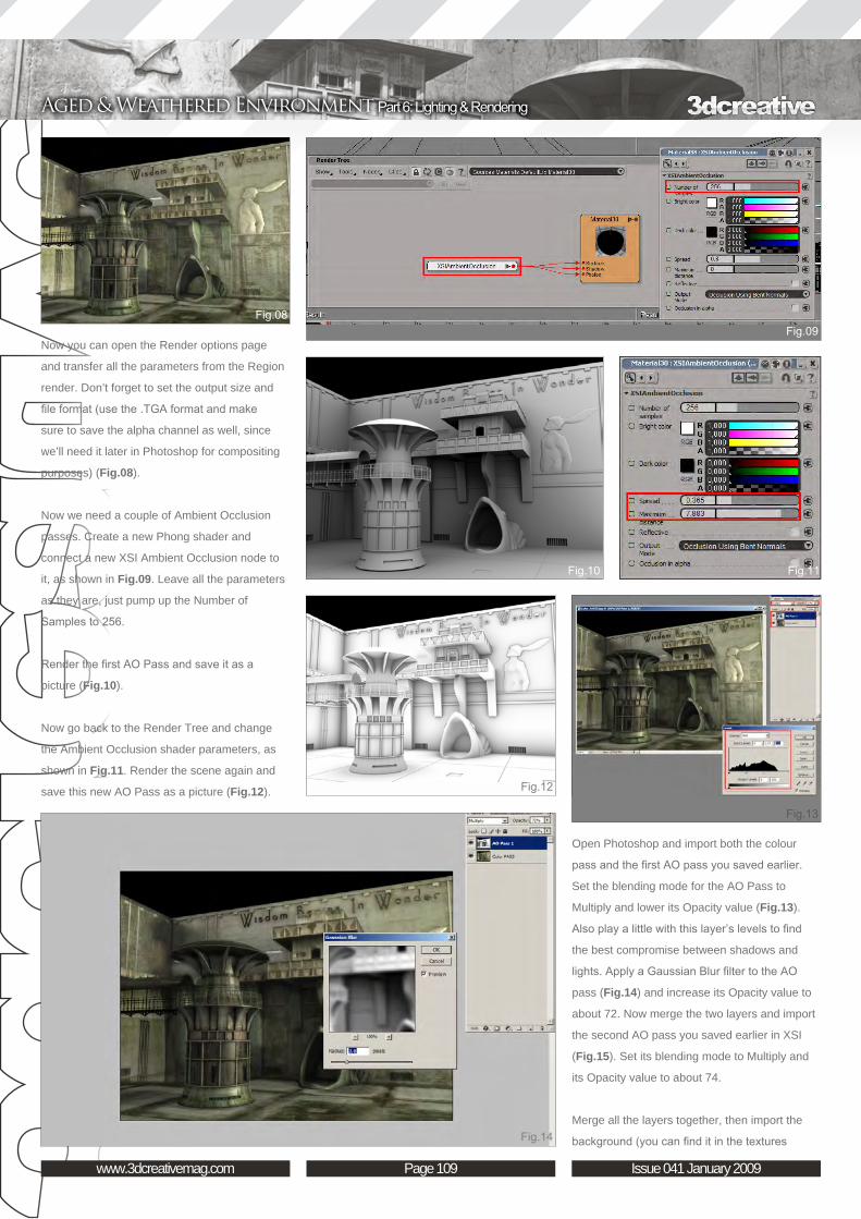
Page 109www.3dcreativemag.com Issue 041 January 2009
Aged & Weathered Environment Part 6: Lighting & Rendering
Now you can open the Render options page
and transfer all the parameters from the Region
render. Don’t forget to set the output size and
file format (use the .TGA format and make
sure to save the alpha channel as well, since
we’ll need it later in Photoshop for compositing
purposes) (Fig.08).
Now we need a couple of Ambient Occlusion
passes. Create a new Phong shader and
connect a new XSI Ambient Occlusion node to
it, as shown in Fig.09. Leave all the parameters
as they are, just pump up the Number of
Samples to 256.
Render the first AO Pass and save it as a
picture (Fig.10).
Now go back to the Render Tree and change
the Ambient Occlusion shader parameters, as
shown in Fig.11. Render the scene again and
save this new AO Pass as a picture (Fig.12).
Open Photoshop and import both the colour
pass and the first AO pass you saved earlier.
Set the blending mode for the AO Pass to
Multiply and lower its Opacity value (Fig.13).
Also play a little with this layer’s levels to find
the best compromise between shadows and
lights. Apply a Gaussian Blur filter to the AO
pass (Fig.14) and increase its Opacity value to
about 72. Now merge the two layers and import
the second AO pass you saved earlier in XSI
(Fig.15). Set its blending mode to Multiply and
its Opacity value to about 74.
Merge all the layers together, then import the
background (you can find it in the textures
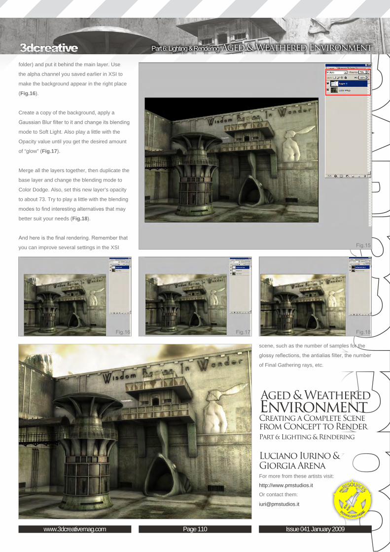
Page 110www.3dcreativemag.com Issue 041 January 2009
Part 6: Lighting & Rendering Aged & Weathered Environment
folder) and put it behind the main layer. Use
the alpha channel you saved earlier in XSI to
make the background appear in the right place
(Fig.16).
Create a copy of the background, apply a
Gaussian Blur filter to it and change its blending
mode to Soft Light. Also play a little with the
Opacity value until you get the desired amount
of “glow” (Fig.17).
Merge all the layers together, then duplicate the
base layer and change the blending mode to
Color Dodge. Also, set this new layer’s opacity
to about 73. Try to play a little with the blending
modes to find interesting alternatives that may
better suit your needs (Fig.18).
And here is the final rendering. Remember that
you can improve several settings in the XSI
scene, such as the number of samples for the
glossy reflections, the antialias filter, the number
of Final Gathering rays, etc.
Aged & Weathered Environment Creating a Complete Scene from Concept to Render Part 6: Lighting & Rendering
Luciano Iurino & Giorgia ArenaFor more from these artists visit:
http://www.pmstudios.it
Or contact them: