27286 Brand Standards - Wisconsin
14
VERSION 1.0 MAY 1, 2008 LOGO USAGE AND BRAND STANDARDS
Transcript of 27286 Brand Standards - Wisconsin

VERSION 1.0 MAY 1, 2008
LOGO USAGE AND BRAND STANDARDS

1.0 Introduction
2.0 Purpose and Use
3.0 WAB Logo
3.1 Printed Materials
3.2 Sponsorship Acknowledgment
3.3 Color
3.4 Black and White
3.5 Reversed Format
3.6 Multimedia and Film
3.7 Online
3.8 Apparel
4.0 Questions, Exceptions and Contact Information
TABLE OF CONTENTS
VERSION 1.0 MAY 1, 2008

INTRODUCTION
1.0
To ensure a consistent and coordinated
brand identity, the Wisconsin Arts Board has
created the following brand standards manual.
When visual communications are aligned, we enhance our
overall presence, become more cost-efficient, reinforce our
visual impact, and maximize effective brand communication
for the Wisconsin Arts Board.
VERSION 1.0 MAY 1, 2008

PURPOSE AND USE
This brand standards manual will serve as a
basic tool for board members, staff, partners and
affiliates. It will guide the use of the type, icon and all related
Wisconsin Arts Board visual expressions. By working within its
framework, we are able to prevent poor applications and
ensure proper usage of the identifier logo.
This manual is an evolving work. If you encounter a situation
that is not covered, please use proper judgment and alert a
Wisconsin Arts Board Staff Member so we may update
the manual.
2.0 VERSION 1.0 MAY 1, 2008

WAB LOGO AND USAGE GUIDELINES
3.0
Follow these general guidelines when using the Wisconsin Arts
Board logo.
The Wisconsin Arts Board logo, figure 1, completely replaces the
old logo, figure 2. As of May 1, 2008, the new logo should be
used in all collateral materials and business correspondences.
There is no situation where the old logo should be used in
any way. Figure 3 Shows the individual elements that make up the
new WAB logo.
figure 1: WAB logo
figure 3: logo elements
figure 2: old logo
VERSION 1.0 MAY 1, 2008
logo type
logo icon
logo tagline

COLOR LOGO USAGE
The color logo should be used whenever possible, figure 1.
Follow the color guideline below. A series of colors were
chosen to complement the WAB logo colors, figure 2.
NOTE: These colors are only a
guideline and are to be used to
create visual continuity between
marketing pieces. The logo should
never appear in these colors.
NOTE: The WAB logo may only be
reproduced as shown. The purple
and green may not be inverted.
The logo icon, type and tagline must
always be used together as shown.
In some instances the logo’s icon
and its pieces can be used as graphic
elements, as covered in section 3.4.
figure 1: logo colors
figure 2: complementary colors palette
10c 0m 100y 0k
0c 14m 100y 0k
0c 60m 65y 0k
5c 50m 0y 0k
0c 83m 0y 0k
30c 0m 100y 0k
55c 0m 100y 0k
90c 0m 76y 0k
60c 90m 0y 0k
75c 90m 0y 0k
3.1VERSION 1.0 MAY 1, 2008
spot color: Pantone® 258process equivalent: 52c 78m 0y 0k
spot color: Pantone® 345process equivalent: 40c 0m 35y 0k

BLACK & WHITE LOGO USAGELIMITED COLOR USAGE
3.2VERSION 1.0 MAY 1, 2008
The black and white version of the logo should only be used when
absolutely necessary, figure 1. Always use the color logo when
applicable, see section 3.3. In limited color use applications, where
less than four-color process is used, the logo must appear in black
or the darkest available value, figure 2.
figure 1: b/w logo
figure 2: limited color use example
Colors available:
NOTE: Logo should appear in the darker of the two values.In this case, the brown is used versus the lighter cream.

REVERSED FORMAT LOGO USAGE
3.3
Reversing the logo is permitted on a solid tone background.
Follow the visual guidelines below for proper usage, figure 1,
and improper usage, figure 2.
VERSION 1.0 MAY 1, 2008
figure 1: proper reverse usage figure 2: improper reverse usage
Background valuetoo light.
Background valuetoo light.
Background toobusy, needs tobe a solid tone.
Background toobusy, needs tobe a solid tone.
Note: The green example above showsthe use of texture, but overall thebackground has a solid tone feel, not a busy or disruptive feel.

PRINTED MATERIALS
3.4
Size: The logo’s minimum size should allow easy
readability of the tagline. The smallest the taglines
type should be is equivalent to 5pt or 0.069", figure 1.
This equals a minimum logo size, in inches, as 1-7/8"
or 1.875"
Area of Isolation: A safe area of X, where X equals
the height of the “W” in “Wisconsin”, should be
given around all four sides of the logo, figure 2.
Color: The logo should be used in color whenever
possible. See sections 3.1 and 3.2 for color specifications.
Individual Logo Elements: The logo icon and its
individual pieces may be used as graphic elements,
figure 3. However, the logo must be used in its
entirety somewhere on the communication piece.
Note: You should receive approval from
a Wisconsin Arts Board Staff Member in
any instance that the logo icon is used
to create a graphic treatment.
VERSION 1.0 MAY 1, 2008
minimum height 5pt or 0.069"
X
X
X
figure 1: size
figure 2: area of isolation
figure 3: graphic treatments
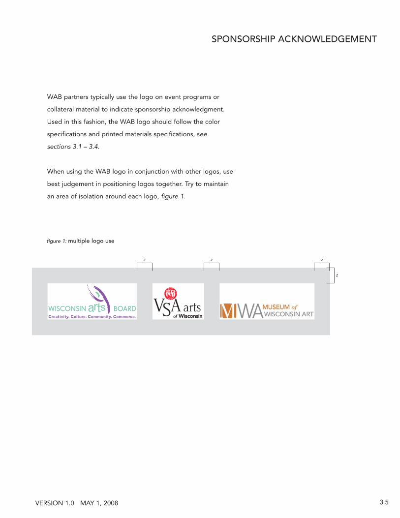
SPONSORSHIP ACKNOWLEDGEMENT
3.5
WAB partners typically use the logo on event programs or
collateral material to indicate sponsorship acknowledgment.
Used in this fashion, the WAB logo should follow the color
specifications and printed materials specifications, see
sections 3.1 – 3.4.
When using the WAB logo in conjunction with other logos, use
best judgement in positioning logos together. Try to maintain
an area of isolation around each logo, figure 1.
VERSION 1.0 MAY 1, 2008
figure 1: multiple logo use
z z z
z

MULTIMEDIA AND FILM LOGO USAGE
3.6
Whenever possible, the WAB logo should be used in color for
all multimedia and film executions. Below are the RGB color
equivalents, figure 1, to the print color specifications shown in
sections 3.1 – 3.3. Logo size and logo isolation area should
also be maintained in multimedia and film use, see section 3.4.
Below is a visual sample of the logo as it was unveiled in a
video presentation, figure 2.
VERSION 1.0 MAY 1, 2008
figure 2: video sample
figure 1: rgb color equivalents
1 2 3
4 5 6
7 8 9
NOTE: The logo elements begin to appear on screen and
build to reveal the logo, it is shown in its entirety at the end.
See section 3.4, Individual Logo Elements.
spot color: Pantone® 258RGB equivalent: R 149 G 81 B 158
spot color: Pantone® 345RGB equivalent: R 142 G 215 B 176

ONLINE LOGO USAGE
3.7
Whenever possible, the WAB logo should be used in color
for all online executions. Below are the Web Safe color
equivalents, figure 1, to the print color specifications shown
in sections 3.1 – 3.3. Logo size and logo isolation area should
also be maintained in online uses, see section 3.4.
Below is a logo to screen size ratio. When using the WAB
logo online you need to maintain a minimum visual size
equal to one-quarter the screen width, see figure 2.
figure 1: web safe colors
figure 2: logo ratio to screen (this example not actual size)
spot color: Pantone® 258
web safe equivalent: 996699
spot color: Pantone® 345
web safe equivalent: 99cc99
VERSION 1.0 MAY 1, 2008
NOTE: In this example, the screen size is
1024 x 768 pixels. The logo’s minimum
width should be one-quarter of the
screens width or 256 pixels.

APPAREL LOGO USAGE
3.8
To gain awareness of the Wisconsin Arts Board and to increase
visibility, certain apparel can be created for board members, partners,
affiliates and patrons of the arts. Follow the guidelines below when
applying the WAB logo to any type of apparel.
Size: The most important aspect of size needs to be the readability
of all aspects of the logo. The logo needs to be large enough that
the tagline can be easily read.
Color: Follow the print color specifications shown in sections 3.1 – 3.3.
Logo size and logo isolation area should also be maintained on
apparel, see section 3.4.
Fabrics: The fabric colors need to complement the logo colors and
not compete, or cause difficult readability. Fabrics with heavy texture
should be avoided because they lessen readability.
Shown here are a few examples of how to create apparel branding.
VERSION 1.0 MAY 1, 2008

QUESTIONS, EXCEPTIONS AND CONTACT INFORMATION
4.0
Please remember this brand standards manual is an evolving
work. Contact the Wisconsin Arts Board if you encounter a
situation that is not covered, or if you believe there are
exceptions to these guidelines. Exceptions will be granted
with written permission from the Wisconsin Arts Board.
Always use proper judgment when applying the new Wisconsin
Arts Board logo to ensure that our consistent brand identity
is preserved.
Contact Information:
Wisconsin Arts Board
608/266-0190
fax: 608/267-0380
www.arts.state.wi.us
www.portalwisconsin.org
VERSION 1.0 MAY 1, 2008