2016 Yr 7 Seal Statistics notes booklet FINAL.pdf
24
1 Yr 7 Seal Statistics Statistics * Give yourself a challenge Task Description Exercise Questions check 1 Frequency Tables Ex 8B: Q1, 3, 4, 6, 10, 12, *13 2 Dotplots & Column graphs Worksheet 1 3 Line graphs & Stem-and leaf plots Worksheet 2 4 Pie charts & Divided bar graphs Worksheet 3 5 Graph interpretation Ex 8A: Q1, 2, 4, 5, 6, 9, 10, 12 6 Histograms Ex 8C: Q1, 2, 3ac, 4ad, 5a, 7, 8, 9, 10, *11 7 Measures of Centre: mean, median & mode Ex 8D:Q1, 3, 4, 5aeik, 6(1/2), 7(1/2), 8, 11, 14ae, 16,17, *20 8 Measures of Spread: range & IQR Ex 8E:Q1, 2, 3, 4, 7ac, 8ae, 9(1/2), 10ae, 11, 13, 14, 17, 18, *20 10 Boxplots Worksheet 4 11 Interpreting Survey results Ex 8F:Q1, 2, 3, 5, 6, *8, *12 12 Review (pg 516) M/C Q1-5, Short Answer Q1-7
-
Upload
minecraftmlgrekt -
Category
Documents
-
view
218 -
download
0
Transcript of 2016 Yr 7 Seal Statistics notes booklet FINAL.pdf

1
Yr 7 Seal Statistics
Statistics
* Give yourself a challenge
Task Description Exercise Questions check 1 Frequency Tables Ex 8B: Q1, 3, 4, 6, 10, 12, *13 2 Dotplots & Column graphs Worksheet 1 3 Line graphs & Stem-and
leaf plots Worksheet 2
4 Pie charts & Divided bar graphs
Worksheet 3
5 Graph interpretation Ex 8A: Q1, 2, 4, 5, 6, 9, 10, 12 6 Histograms Ex 8C: Q1, 2, 3ac, 4ad, 5a, 7, 8, 9, 10, *11
7 Measures of Centre: mean, median & mode
Ex 8D:Q1, 3, 4, 5aeik, 6(1/2), 7(1/2), 8, 11, 14ae, 16,17, *20
8 Measures of Spread: range & IQR
Ex 8E:Q1, 2, 3, 4, 7ac, 8ae, 9(1/2), 10ae, 11, 13, 14, 17, 18, *20
10 Boxplots Worksheet 4 11 Interpreting Survey
results Ex 8F:Q1, 2, 3, 5, 6, *8, *12
12 Review (pg 516) M/C Q1-5, Short Answer Q1-7
2
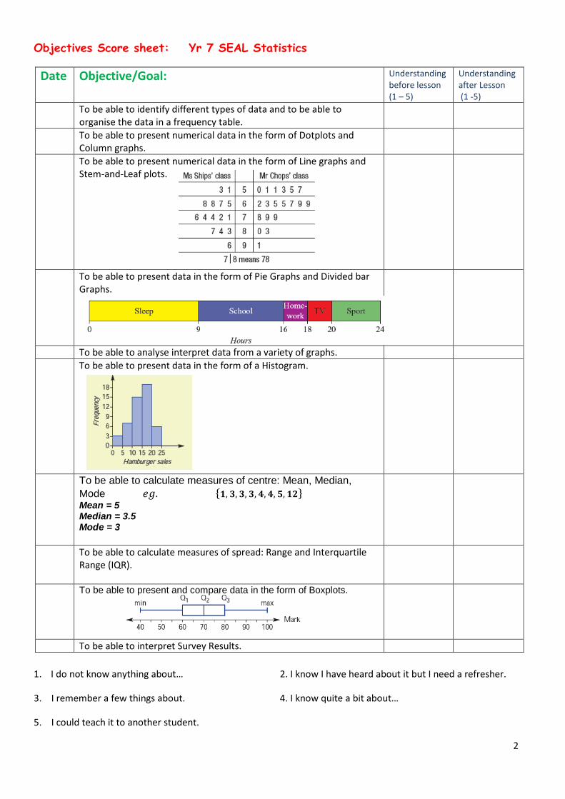
Objectives Score sheet: Yr 7 SEAL Statistics
Date Objective/Goal: Understanding before lesson (1 – 5)
Understanding after Lesson (1 -5)
To be able to identify different types of data and to be able to organise the data in a frequency table.
To be able to present numerical data in the form of Dotplots and Column graphs.
To be able to present numerical data in the form of Line graphs and Stem-and-Leaf plots.
To be able to present data in the form of Pie Graphs and Divided bar Graphs.
To be able to analyse interpret data from a variety of graphs. To be able to present data in the form of a Histogram.
To be able to calculate measures of centre: Mean, Median, Mode 𝑒𝑔. {𝟏, 𝟑, 𝟑, 𝟑, 𝟒, 𝟒, 𝟓, 𝟏𝟐} Mean = 5 Median = 3.5 Mode = 3
To be able to calculate measures of spread: Range and Interquartile Range (IQR).
To be able to present and compare data in the form of Boxplots.
To be able to interpret Survey Results.
1. I do not know anything about… 2. I know I have heard about it but I need a refresher.
3. I remember a few things about. 4. I know quite a bit about…
5. I could teach it to another student.

3
What is Statistics? Statistics is the “science” of working with and analysing data (information).
What does it involve? -Posing a question or a problem -Collecting Data-
-
-Organising-
-Displaying- - - - - - - - -Summarising/Analysing -Interpreting data- -Making decisions-
Task 1 Survey- we will use information gathered throughout this unit.
Task 2 Graph characteristics:
For each graph answer the following questions in your books:
What is the data about? What kind of data is it? What type of graph is it? What does the graph tell you about the data? What is missing from the graph that could help you know more about the data? In general what do graphs require to be useful?

4
Organising Data-Frequency tables Often the actual value in a set of data are not needed, knowing how many data values fall into each range of values is all that is needed. A frequency table allows us to do this. Eg1. Eg2.

5
Eg3.
Ex 8B
Displaying Graphs- Bar Charts/Column graphs Bar graphs are a useful way of displaying categorical data.
Q1.
Q2.

6
Task3: Q1. Out of one hundred children surveyed in year 7, 25 were blondes, 40 had dark brown hair, 25 had black hair and 10 were redheads. Using the grid below draw a bar graph(chart) showing this information.
Q2. Given below is miss Pham’s weekly budget. Using the grid below draw a fully labelled bar-chart to show this information. Budget food $85 clothes $60 rent $130 entertainment $30 gas $15 electricity $40 Task5: Use ___________data from survey to construct frequency table and bar chart.

7
Dot-plots and Column Graphs Consider a survey of students asked to choose their favourite colour.
In Summary: Task6: Use ___________data from survey to construct frequency table dot plot.

8
Dotplots can also be used to display numerical data if it is discrete and ungrouped.
Eg1. We can also use multiple column graphs to compare data (categorical). Eg2.
Wk 1

9
Line graphs- Numerical Data Some questions to consider: In Summary when constructing a line graph remember that:

10
Eg1. Eg2. f) How far is he travelling: (i) between the 2nd & 5th hour? (ii) in the 4th hour? g) How much did he cycle that day, if he took another 3 hrs to reach home? h) How far away from home is he after 6hrs? i) Where is he after 7hrs?
Wk2 Q1-Q4

11
Stemplots-Numerical Discrete Data Stem and leaf plot is a useful way of presenting numerical data in a way that allows trends to be spotted easily. Interpreting Stem and leaf plots: Eg1. Constructing Stem and leaf plots: Eg2. Step1 choose stem size and define key Step2 put in leaves in ascending order Task7:Use _________data from survey to construct frequency stem leaf Wk2 Q5-Q9

12
Pie Charts and divided bar charts- Categorical data Reading a Pie Graph We can estimate the amount that one section represents by comparing it to the whole circle and to the other sections Eg1. This graph show the primary schools previously attended by students who are now at Wenty High School. Write a paragraph to describe the number of students who attended the different primary schools. Constructing a Pie chart Eg2. Jon decided to sort his CDs into categories. He found that he had 30 Rock CDs, 10 country & Western, 15 Classical and 5 Pop CDs.
CD Type Number Calculation Angle Rock 30
3060
×360°
1= 180°
Country & Western
Classical
Pop
Total
Total
\

13
Categorical data can also be represented as a divided bar Chart:
Eg3. Represent the table as a divided bar graph, to help you complete the following % table Category Proportion % TV Internet Sport Homework
Wk 3
Task 8: Use _________data from survey to construct pie graph. Use _________data from survey to construct divided bar graph.
Interpreting a variety of Graphs. EX 8A

14
Histograms- numerical (discrete and continuous) A histogram is a graphical representation of a frequency table so that patterns can be observed more easily. The vertical axis(y-axis) is used to represent the frequency of each item. Columns are placed next to one another with no gaps in between. If a scale does not start at zero there is a gap placed between the y-axis and the first bar. For discrete data ungrouped Eg1. For discrete data grouped Eg2. For continuous data grouped Eg3. Time spent on mobile phone
Time(minutes) frequency 0-9 10-19 20-29 30-39 40-49
Note: 10-19 includes all times between 9.50- 19.49 Time (min)

15
Eg4. - Describe each class on the basis of these graphs. - Which class has the highest average score? - Which class has the highest overall score? - Which class would be the easiest to teach and which would be the hardest, do you
think?

16
Eg5. Q3a) EX8C construct a histogram. Eg6. Q5b) EX8C Refer to Q9 EX8C Task 9: Use _________data from survey to construct freq. table histogram (grouped). Use _________data from survey to construct freq. table and histogram (ungrouped).
EX8C

17
Measures of Centre
Calculating the Mean (usually what we mean when we say average).
The mean for a set of data is calculated by: Mean = 𝑡ℎ𝑒 𝑡𝑜𝑡𝑎𝑙 𝑜𝑓 𝑡ℎ𝑒 𝑛𝑢𝑚𝑏𝑒𝑟𝑠 𝑖𝑛 𝑡ℎ𝑒 𝑠𝑒𝑡𝑡ℎ𝑒 𝑛𝑢𝑚𝑏𝑒𝑟 𝑜𝑓 𝑛𝑢𝑚𝑏𝑒𝑟𝑠 𝑖𝑛 𝑡ℎ𝑒 𝑠𝑒𝑡
Eg. Find the mean of the data set 2, 5, 9, 9, 11, 12
Mean = 2+5+9+9+11+126
= 486
= 8
Q1.Find the mean of the following numbers: 14, 21, 13, 16, 17, 20, 13, 22, 9, 8
Q2.Find the mean of the following student test scores: 54, 70, 23, 65, 88, 24, 96, 58, 60, 70,76
Calculating the Median.
The median is the middle value when all the values are placed in order. The median of the numbers {0, 9, 31, 38, 42} is 31. Eg. Calculating the median these ages: 18, 15, 22, 20, 17, 16, 24, 17, 11 Solution: First arrange the values in order 11, 15, 16, 17, 17, 18, 20, 22, 24 The median is 17 Eg. Calculate the median of these car prices: $21,500 $25,500 $22,000 $18,799 $30,699 $24,500 Solution: First arrange in order $18,799, $21,500 $22,000 $24,500 $25,500 $30,699 The median = 22,000+24,500
2 = 46,500
2 = 23,250 ∴ The median car price is $23,250
Q1. Find the median of these student heights(cm): 161, 159, 180, 162, 171, 158, 163, 161, 161
Q2. Find the median of these computer prices($): $1,450 $1,760 $1,499 $1,399 $2,199 $1,760
18
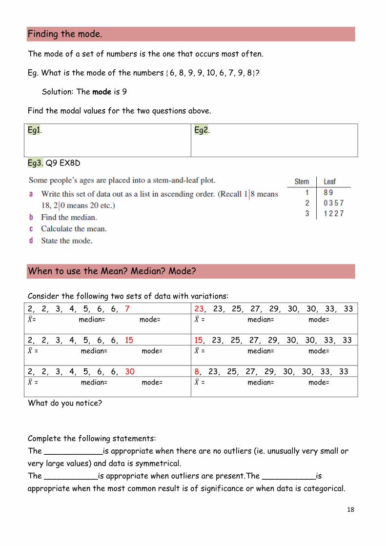
Finding the mode.
The mode of a set of numbers is the one that occurs most often.
Eg. What is the mode of the numbers {6, 8, 9, 9, 10, 6, 7, 9, 8}?
Solution: The mode is 9
Find the modal values for the two questions above.
Eg1.
Eg2.
Eg3. Q9 EX8D
When to use the Mean? Median? Mode? Consider the following two sets of data with variations: 2, 2, 3, 4, 5, 6, 6, 7 23, 23, 25, 27, 29, 30, 30, 33, 33 𝑋�= median= mode=
𝑋� = median= mode=
2, 2, 3, 4, 5, 6, 6, 15 15, 23, 25, 27, 29, 30, 30, 33, 33 𝑋� = median= mode=
𝑋� = median= mode=
2, 2, 3, 4, 5, 6, 6, 30 8, 23, 25, 27, 29, 30, 30, 33, 33 𝑋� = median= mode=
𝑋� = median= mode=
What do you notice? Complete the following statements: The ____________is appropriate when there are no outliers (ie. unusually very small or very large values) and data is symmetrical. The ___________is appropriate when outliers are present.The ___________is appropriate when the most common result is of significance or when data is categorical.

19
Eg4. If you were reporting to your parents the average of your following test scores which would you choose? 10%, 10%, 52%, 55%, 79% Explain. Mean= 40.6% Median= 52% Mode= 10% Eg5.
Eg6. Find the missing number
Eg7.
EX 8D

20
Measures of Spread
The Range Eg1. The Interquartile Range (IQR)
Eg2. Eg3. Q6 EX8E
EX8E

21
Boxplots A boxplot is a commonly used graph for a data set when it is large. It helps show the measures of centre and spread visually. For any boxplot 5 pieces of information are required- the maximum and minimum values, the upper and lower quartiles and the median. Interpreting Boxplots: Eg1. a) State the minimum and maximum book prices. b) Find the range in book prices. c) State the median book price. d) Find the interquartile range. e) Fifty percent of books are priced below what amount? f) Twenty-five percent of books are priced above what amount? g) If there were 1000 books in the store, how many would be priced below $15?

22
Boxplots can also tell you something about the shape of the distribution just like in a histogram
Constructing Boxplots: Eg2.

23
Parallel Boxplots: Eg3. a) Identify the median, range, and interquartile range for each bloxplot. Box High Plot Secondary Min.= Max.= Min.= Max.= Q1= Q3= Q1= Q3= Median= Range= Median= Range= IQR= IQR= b) Compare the performance of both schools referring to shape, measures of centre, measures of spread and presence of outliers.
Task10: Use _________data from survey to calculate measures of centre and spread. Use _________data from survey to construct boxplot.
Wk4

24
Surveying and Sampling
Surveys are used to find out all sorts of information. They are useful because they help you to find out things about a large group of people by only asking questions of a small group of people. The large group is called a population. The small group is called a sample. Sample selection. You must be careful to select the right type of sample. If you don’t your results will be misleading. For example if you survey the entire class about whether they like their school uniform and half of them say they do, can you use that to say that half the students like their school uniform? Market researchers and pollsters choose the people in the surveys extremely carefully so that people chosen are truly representative. Some rules for choosing Samples. 1. The sample has to be reasonably large. How large depends on a lot of things, such as how big your population is and what sort of people you have in your population. Generally, the larger the sample the better it is. 2. You cannot simply ask the people who just happen to be around at the time. You have to select a wide range of people. The sample has to be random. 3. You cannot ask only the people who volunteer or who offer their strong opinion straight away. The person who is loudest or quickest is often not the most representative. Samples should be made up of selected people not just volunteers. Refer to examples pgs 476-478 Eg1. Q12 EX8F (answer this in your book)