2016 BRAND GUIDELINES - e-cdns-files.dzcdn.net · 9 LOGO DON’TS 1. In order to preserve the...
29
2016 BRAND GUIDELINES
Transcript of 2016 BRAND GUIDELINES - e-cdns-files.dzcdn.net · 9 LOGO DON’TS 1. In order to preserve the...

1
2016 BRANDGUIDELINES
2
CONTENTSVisual Identity 3Visual ID 4
Logo 5Primary Logo 6Alternative Logo Option 7Positioning The Logo 8Logo Don’ts 9Logo Colours 10Tagline 11Secondary Logo 12The App Logo 13Sub-Branding 14Sub-Branding 15
Typography 16Typography 17Meet the Family 18
Colours 19Our Core Colours 20Supporting Colours 21
Photography 22Choosing Photography 23Photography Examples 24Examples Treatements 25
Voice 26Our Tone of Voice 27What That Looks Like 28
3
WHATGOOD MUSICLOOKS LIKE
4
Every element of our visual identity has been chosen to strengthen the idea that Deezer is serious about your music and we understand how important it is to you.
We want people to see Deezer and know that we’re here to connect them to their music, then get out of the way. We need to create that connection at first sight.
All of our design choices are based on creating that connection. From image choices to colour palettes to layouts, we have to capture the emotional relationship between a person and their music.
“At the end of the day, people are always buying what you sell [...] But the thing that I believe sways them to choose your brand over everyone else’s brand is how they feel.” – Alison Lewis, Global Chief Marketing Officer at Johnson &Johnson
VISUAL IDWe need to own the way we look and the way we look needs to stand out in a global market. So we are moving away from generic California youthfulness and towards a more genuine kind of music moment.
What makes Deezer look like Deezer?

5
IT’S NOT JUST AN EQUALIZERIT’S DEEZER

6
The Primary logo is a horizontal layout with tagline below. When the logo is smaller than 100 pixels wide, or the design demands it, we can remove the tagline.1. When using the logo, maintain a clear space the same size as the E all the way around 2. Minimum size for digital use is 150 x 35 pixels3. The logo is made up of two parts, the equalizer and wordmark. Do not amend it ever.
PRIMARY LOGO
2
LOGO SIZE
When using the logo, maintain a safety space that equals the width of the letter «E» around it.
CLEAR SPACE
DIGITAL MATERIAL 150x35 px
1 2
7
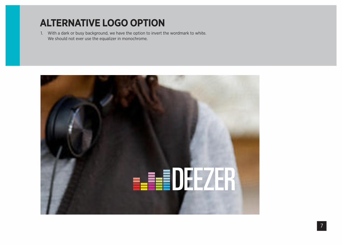
1. With a dark or busy background, we have the option to invert the wordmark to white. We should not ever use the equalizer in monochrome.
ALTERNATIVE LOGO OPTION
8
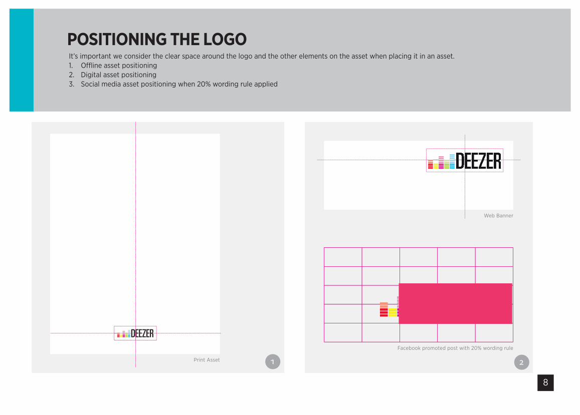
It’s important we consider the clear space around the logo and the other elements on the asset when placing it in an asset.1. Offline asset positioning 2. Digital asset positioning3. Social media asset positioning when 20% wording rule applied
POSITIONING THE LOGO
LOGO PLACEMENT
Facebook promoted post with 20% wording rule
Web Banner
Print Asset

9
LOGO DON’TS1. In order to preserve the integrity of the brand, you should avoid changing or distorting the Deezer
logo. Here are some examples of logo misuse.2. Never pick from Google or the web or copy and paste from other documents
DO’S AND DONT’S
P R E M I U M +
P R E M I U M Where Music Comes Alive
Never reposition the logo itemsNever use the equaliser on it’s own No wave & no wetfloor
Wrong subbranding Wrong subbranding & wrong colours
No wordmark alone & no wetfloor Wrong equalizer & wrong subbranding
Never reverse the logo white out of black
Never use the logo as a Monochrome
It’s important that we always respect the usage of our primary logo. Never create or position your own pre-defined taglines below it. If you have any requirements that sit outside of these rules then please contact the Brand Team first.1. Don’t change the logo in any way. Ever. Below are some examples of incorrect logos.2. Only source the logo from the Studio. Don’t take one from Google or old documents.3. Always leave sufficient clear space around the logo (equivalent to the width of the E)
10
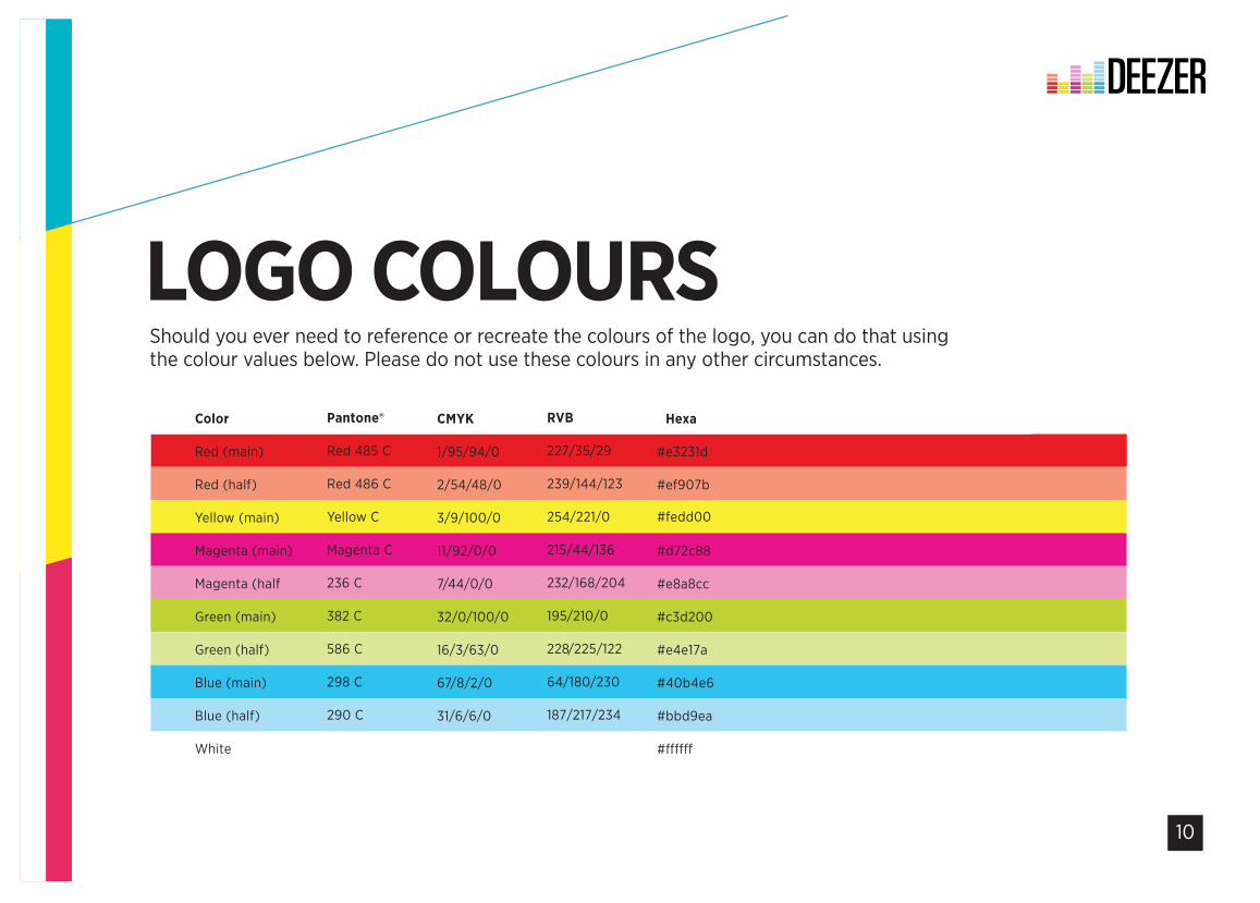
LOGO COLOURSShould you ever need to reference or recreate the colours of the logo, you can do that using the colour values below. Please do not use these colours in any other circumstances.
LOGO COLOURS
Color
Red (main)
Red (half)
Yellow (main)
Magenta (main)
Magenta (half
Green (main)
Green (half)
Blue (main)
Blue (half)
White
Pantone®
Red 485 C
Red 486 C
Yellow C
Magenta C
236 C
382 C
586 C
298 C
290 C
CMYK
1/95/94/0
2/54/48/0
3/9/100/0
11/92/0/0
7/44/0/0
32/0/100/0
16/3/63/0
67/8/2/0
31/6/6/0
RVB
227/35/29
239/144/123
254/221/0
215/44/136
232/168/204
195/210/0
228/225/122
64/180/230
187/217/234
#Hexa
#e3231d
#ef907b
#fedd00
#d72c88
#e8a8cc
#c3d200
#e4e17a
#40b4e6
#bbd9ea
Below we have the colour values for the each of the equalizer bars
11
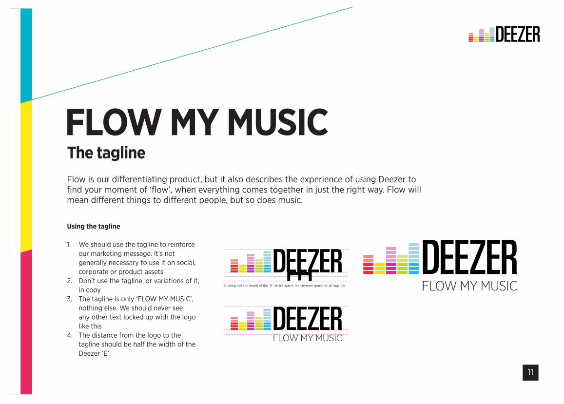
Using the tagline
1. We should use the tagline to reinforce our marketing message. It’s not generally necessary to use it on social, corporate or product assets
2. Don’t use the tagline, or variations of it, in copy
3. The tagline is only ‘FLOW MY MUSIC’, nothing else. We should never see any other text locked up with the logo like this
4. The distance from the logo to the tagline should be half the width of the Deezer ‘E’
FLOW MY MUSICFlow is our differentiating product, but it also describes the experience of using Deezer to find your moment of ‘flow’, when everything comes together in just the right way. Flow will mean different things to different people, but so does music.
The tagline
TAGLINES
1. Full clearence rule 2. Using half the depth of the “E” on it’s side is the clerence space for all taglines
2. Tagline clearence in practice

12
Sometimes the horizontal logo lockup doesn’t fit the space we have to work with, often when we’re working with partners and third parties. In this case, we have a secondary, vertical logo lockup.
SECONDARY LOGOPlaying nicely with others
13
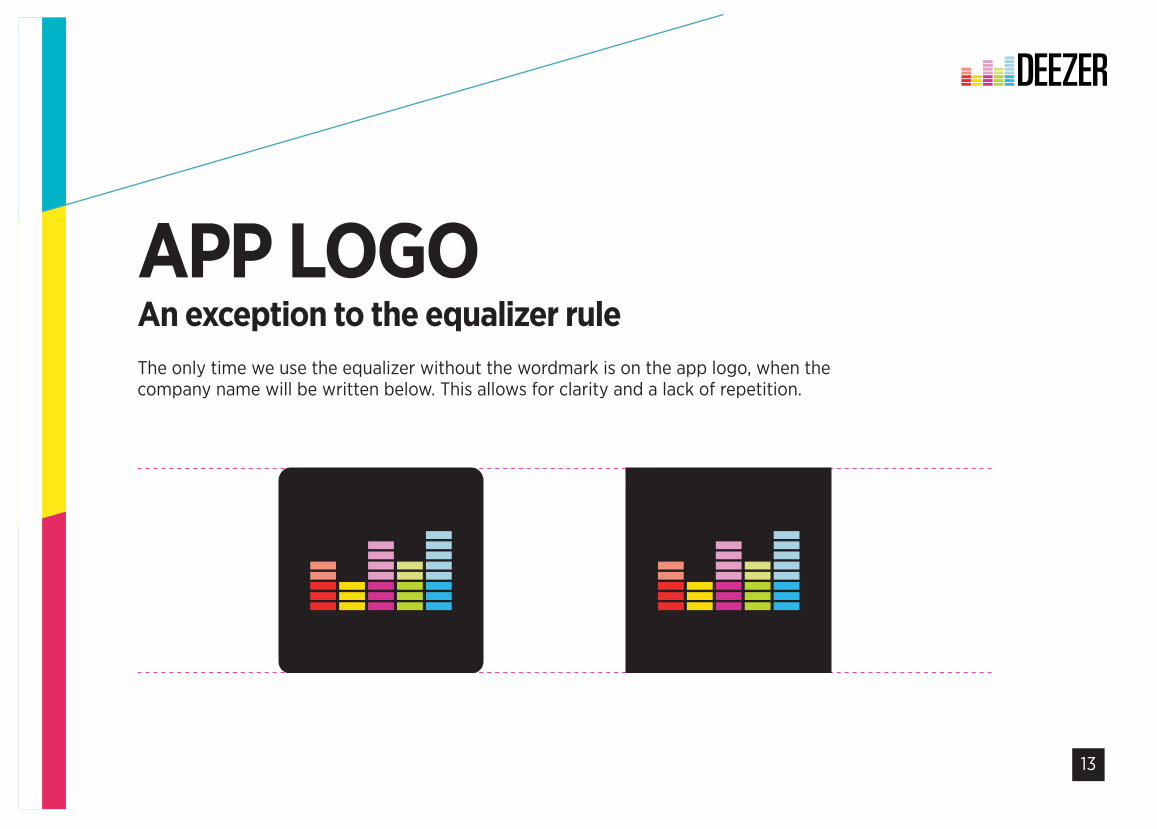
APP LOGOThe only time we use the equalizer without the wordmark is on the app logo, when the company name will be written below. This allows for clarity and a lack of repetition.
An exception to the equalizer rule
14
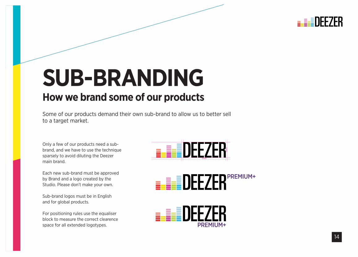
SUB-BRANDINGSome of our products demand their own sub-brand to allow us to better sell to a target market.
How we brand some of our products
Only a few of our products need a sub-brand, and we have to use the technique sparsely to avoid diluting the Deezer main brand.
Each new sub-brand must be approved by Brand and a logo created by the Studio. Please don’t make your own.
Sub-brand logos must be in English and for global products.
For positioning rules use the equaliser block to measure the correct clearence space for all extended logotypes.
Using the equaliser block to measure the correct clearence space for all extended logotypes.
PREMIUM+
PREMIUM+
15
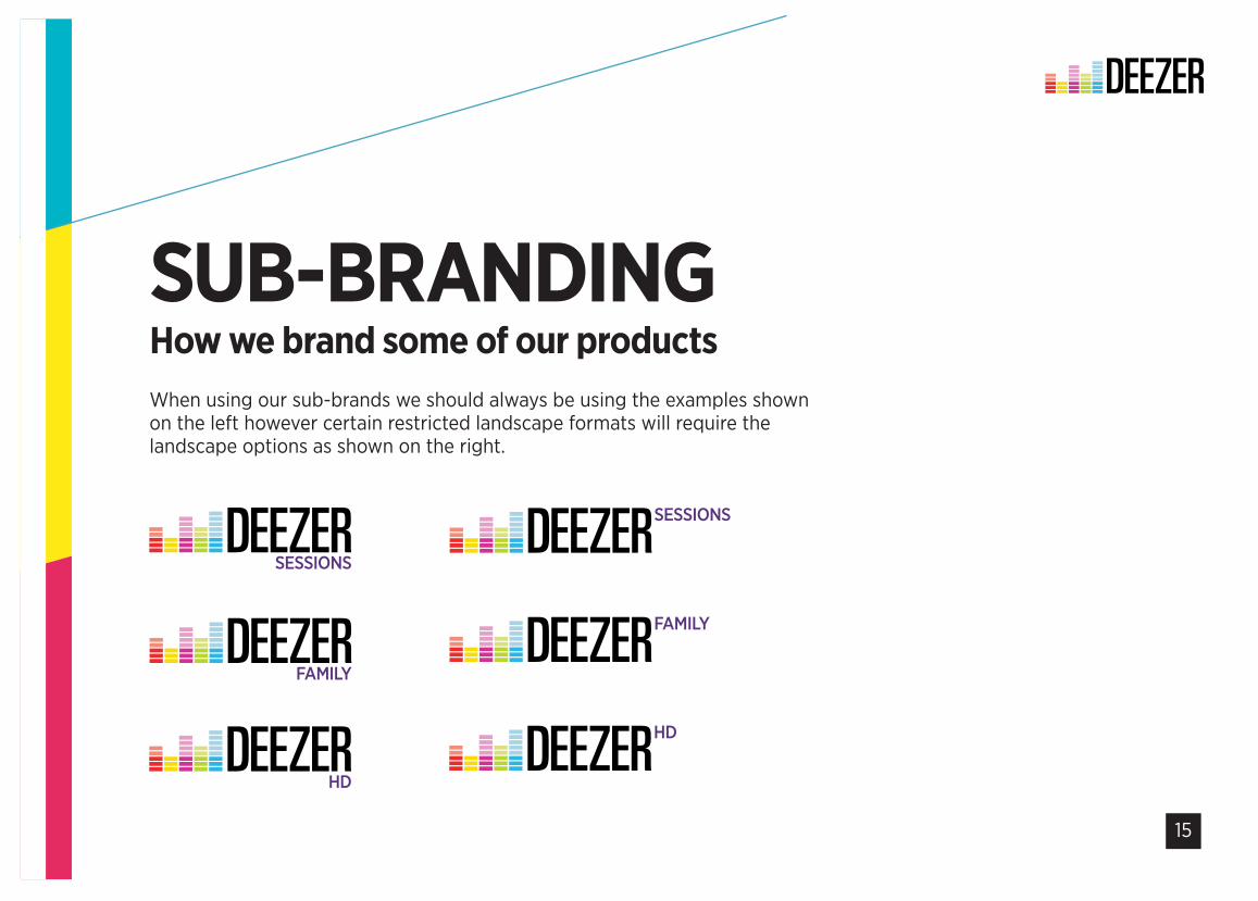
When using our sub-brands we should always be using the examples shown on the left however certain restricted landscape formats will require the landscape options as shown on the right.
SESSIONS
SESSIONS
FAMILY
FAMILY
HD
HD
SUB-BRANDINGHow we brand some of our products

16
GOD IS IN THEKERNING
17
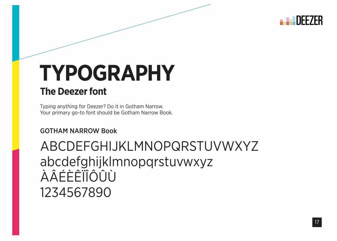
TYPOGRAPHYThe Deezer fontTyping anything for Deezer? Do it in Gotham Narrow. Your primary go-to font should be Gotham Narrow Book.
TYPOGRAPHYOUR PRIMARY FONT
GOTHAM NARROW Book
ABCDEFGHIJKLMNOPQRSTUVWXYZabcdefghijklmnopqrstuvwxyzÀÂÉÈÊÏÎÔÛÙ1234567890
Explain the key value and benefits of the Gotham Type Face, its also Screen Friendly for web usage / digital usage.
18
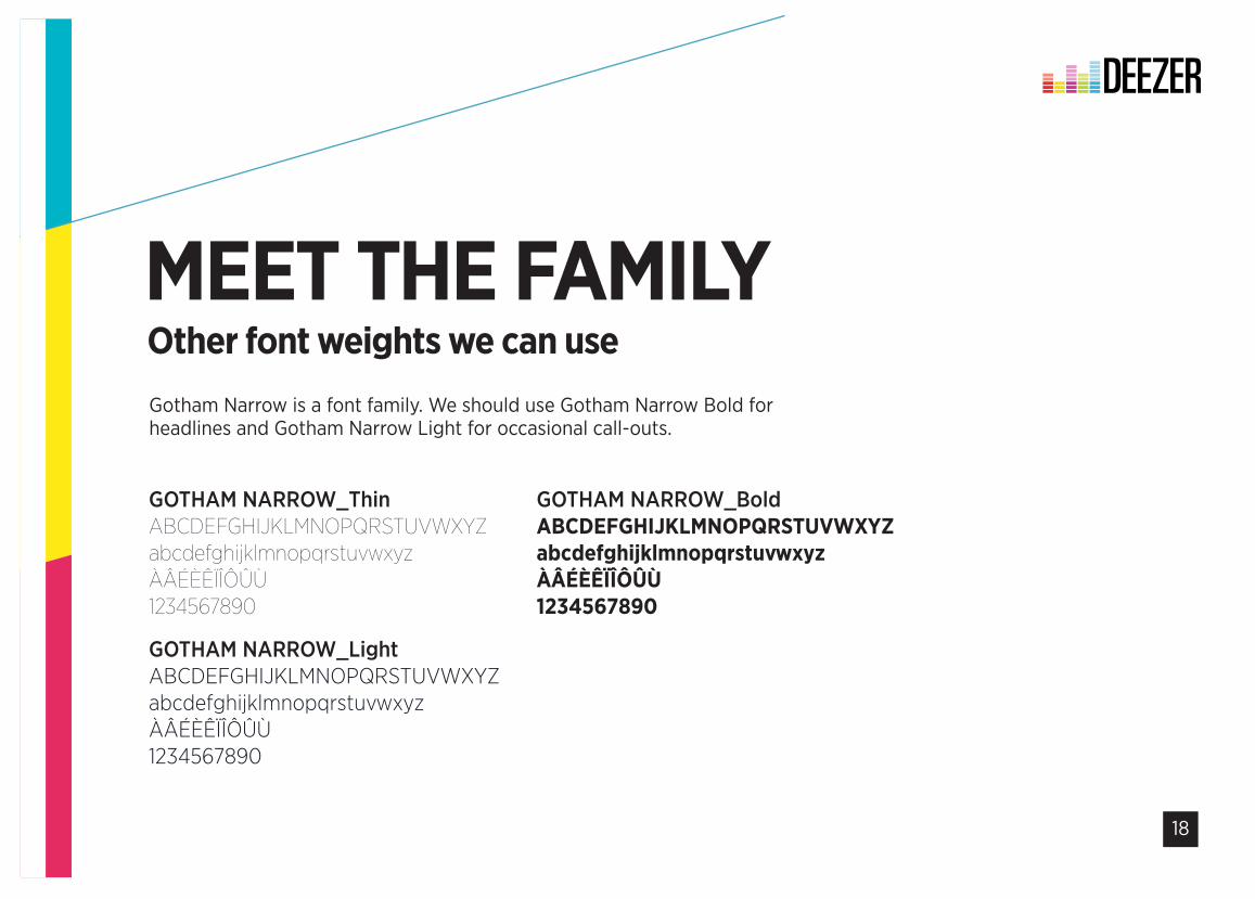
MEET THE FAMILYOther font weights we can useGotham Narrow is a font family. We should use Gotham Narrow Bold for headlines and Gotham Narrow Light for occasional call-outs.
PRIMARY FONTSMEET THE FAMILY
GOTHAM NARROW_ThinABCDEFGHIJKLMNOPQRSTUVWXYZabcdefghijklmnopqrstuvwxyzÀÂÉÈÊÏÎÔÛÙ1234567890
GOTHAM NARROW_Light ABCDEFGHIJKLMNOPQRSTUVWXYZabcdefghijklmnopqrstuvwxyzÀÂÉÈÊÏÎÔÛÙ1234567890
GOTHAM NARROW_Bold ABCDEFGHIJKLMNOPQRSTUVWXYZabcdefghijklmnopqrstuvwxyzÀÂÉÈÊÏÎÔÛÙ1234567890
Gotham has also a wide range of fonts that we can really apply some great typographic styles and adds visual depth for OOH and advertising projects with key messaging.
19
COLOUR MEDEEZER
20
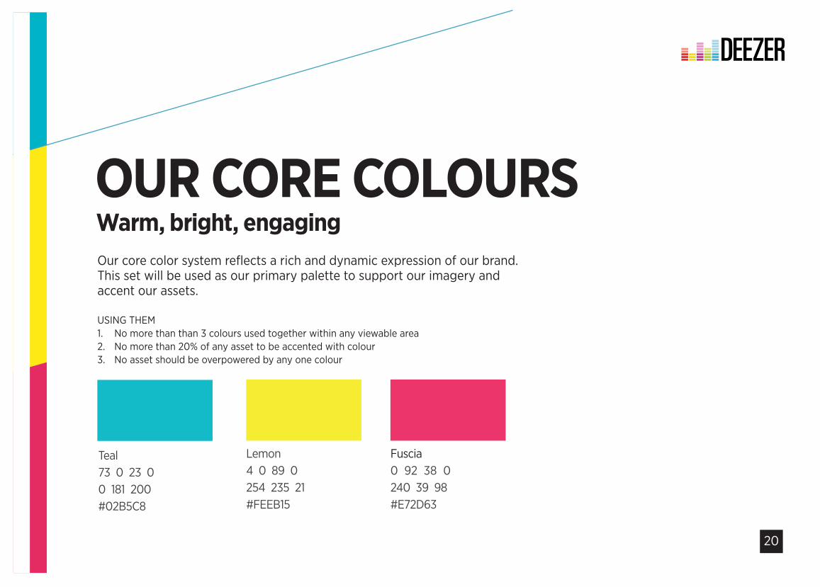
USING THEM1. No more than than 3 colours used together within any viewable area 2. No more than 20% of any asset to be accented with colour 3. No asset should be overpowered by any one colour
OUR CORE COLOURSOur core color system reflects a rich and dynamic expression of our brand. This set will be used as our primary palette to support our imagery and accent our assets.
Warm, bright, engaging
Lemon4 0 89 0254 235 21#FEEB15
Fuscia0 92 38 0240 39 98#E72D63
Teal73 0 23 00 181 200#02B5C8
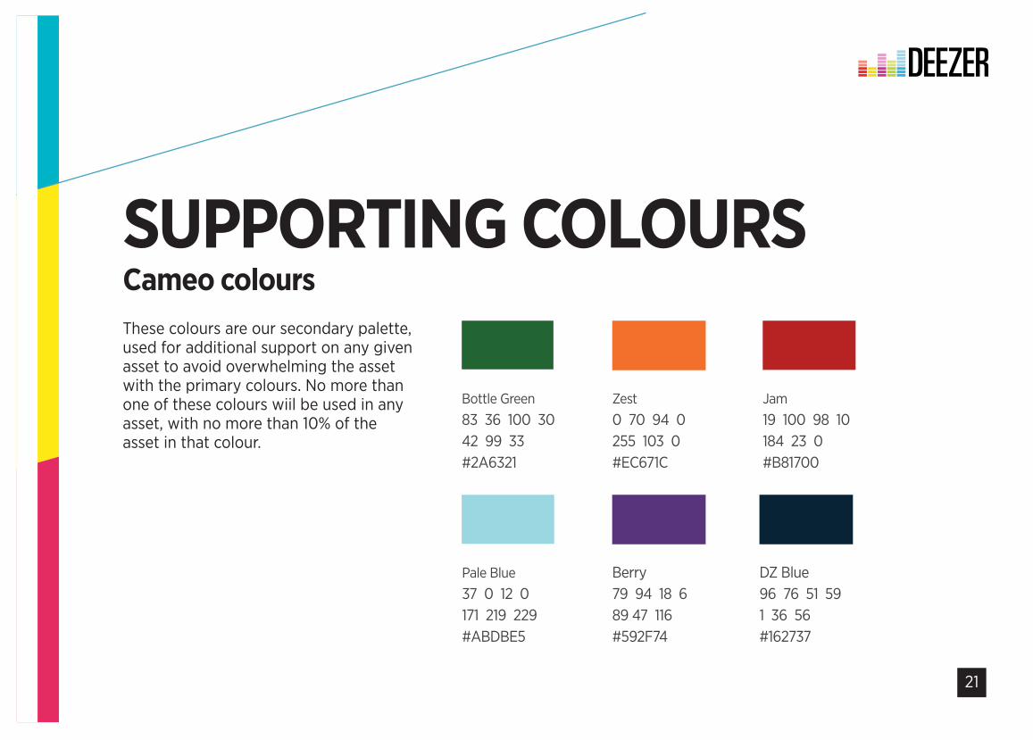
Bottle Green83 36 100 3042 99 33#2A6321
Zest0 70 94 0255 103 0#EC671C
Jam19 100 98 10184 23 0#B81700
Pale Blue37 0 12 0171 219 229#ABDBE5
Berry79 94 18 689 47 116#592F74
BRAND CORE COLOURS
DZ Blue96 76 51 591 36 56#162737
21
SUPPORTING COLOURSCameo colours
Lemon4 0 89 0254 235 21#FEEB15
Fuscia0 92 38 0240 39 98#E72D63
Teal73 0 23 00 181 200#02B5C8
Bottle Green83 36 100 3042 99 33#2A6321
Zest0 70 94 0255 103 0#EC671C
Jam19 100 98 10184 23 0#B81700
Pale Blue37 0 12 0171 219 229#ABDBE5
Berry79 94 18 689 47 116#592F74
BRAND CORE COLOURS
DZ Blue96 76 51 591 36 56#162737
These colours are our secondary palette, used for additional support on any given asset to avoid overwhelming the asset with the primary colours. No more than one of these colours wiil be used in any asset, with no more than 10% of the asset in that colour.
22
BRINGINGYOUR MUSICTO LIFE
23
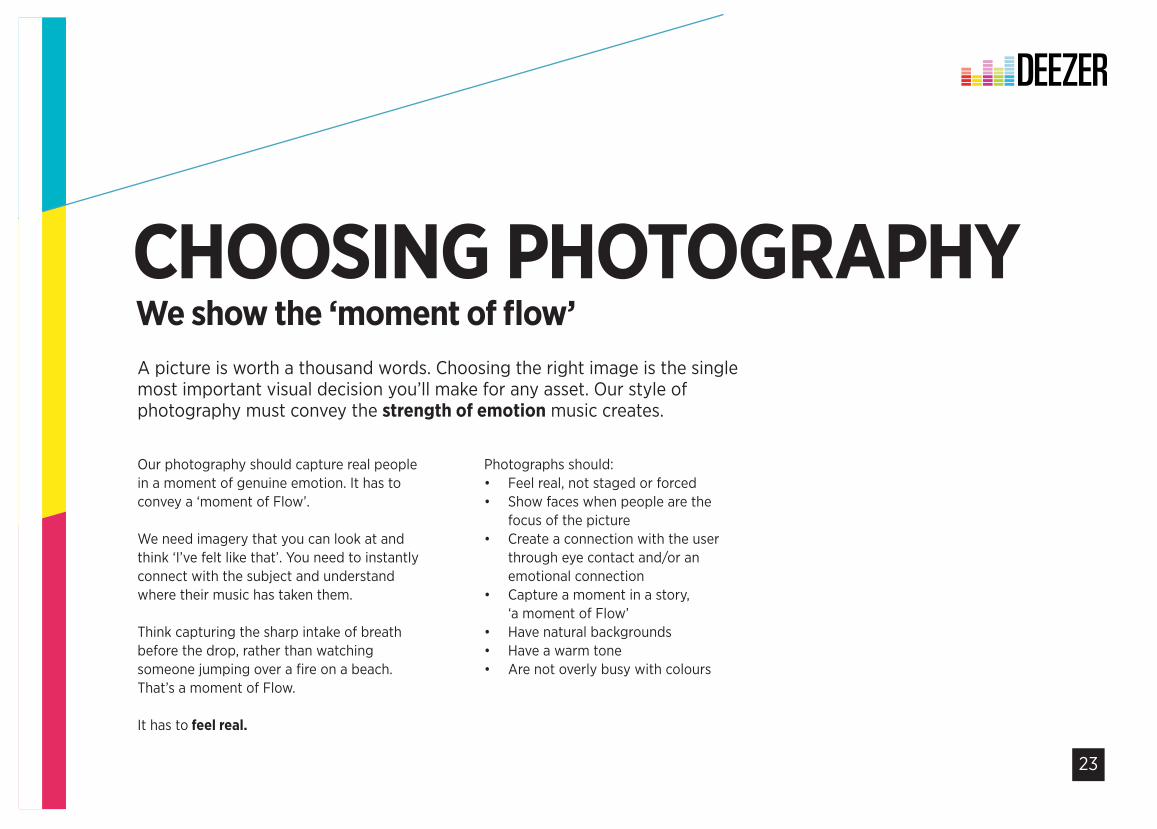
Our photography should capture real people in a moment of genuine emotion. It has to convey a ‘moment of Flow’.
We need imagery that you can look at and think ‘I’ve felt like that’. You need to instantly connect with the subject and understand where their music has taken them.
Think capturing the sharp intake of breath before the drop, rather than watching someone jumping over a fire on a beach. That’s a moment of Flow.
It has to feel real.
CHOOSING PHOTOGRAPHYA picture is worth a thousand words. Choosing the right image is the single most important visual decision you’ll make for any asset. Our style of photography must convey the strength of emotion music creates.
We show the ‘moment of flow’
Photographs should:• Feel real, not staged or forced • Show faces when people are the
focus of the picture • Create a connection with the user
through eye contact and/or an emotional connection
• Capture a moment in a story, ‘a moment of Flow’
• Have natural backgrounds • Have a warm tone • Are not overly busy with colours
24
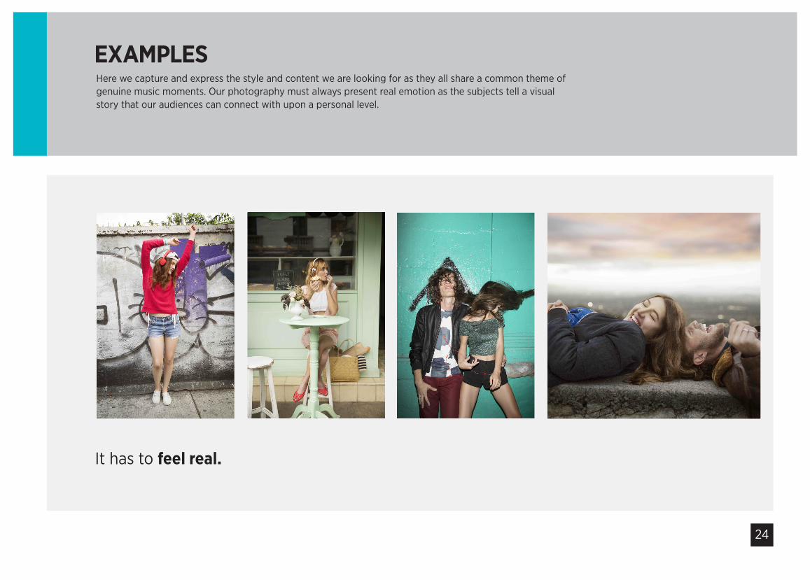
Here we capture and express the style and content we are looking for as they all share a common theme of genuine music moments. Our photography must always present real emotion as the subjects tell a visual story that our audiences can connect with upon a personal level.
EXAMPLES
It has to feel real.
25
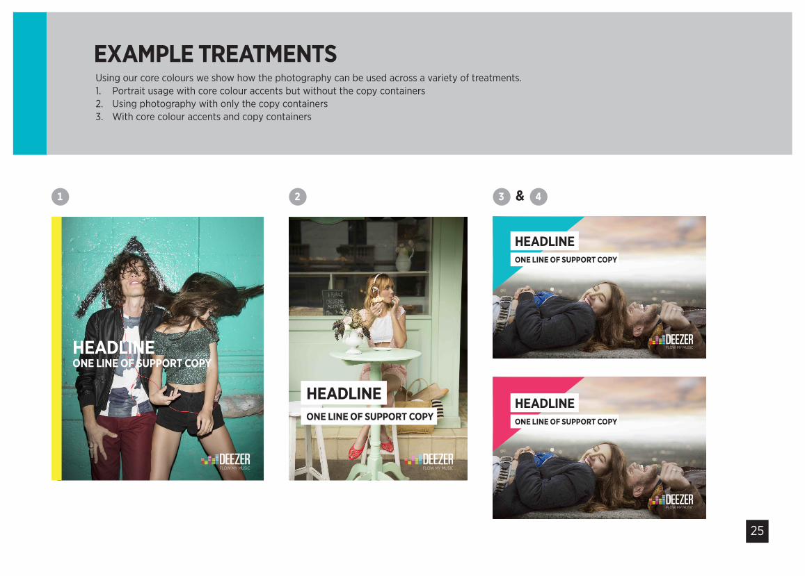
3 4
Using our core colours we show how the photography can be used across a variety of treatments.1. Portrait usage with core colour accents but without the copy containers2. Using photography with only the copy containers3. With core colour accents and copy containers
EXAMPLE TREATMENTS
&
HEADLINEONE LINE OF SUPPORT COPY
HEADLINEONE LINE OF SUPPORT COPY
HEADLINEONE LINE OF SUPPORT COPY
1
HEADLINEONE LINE OF SUPPORT COPY
2
26
NOW HEARTHIS
27
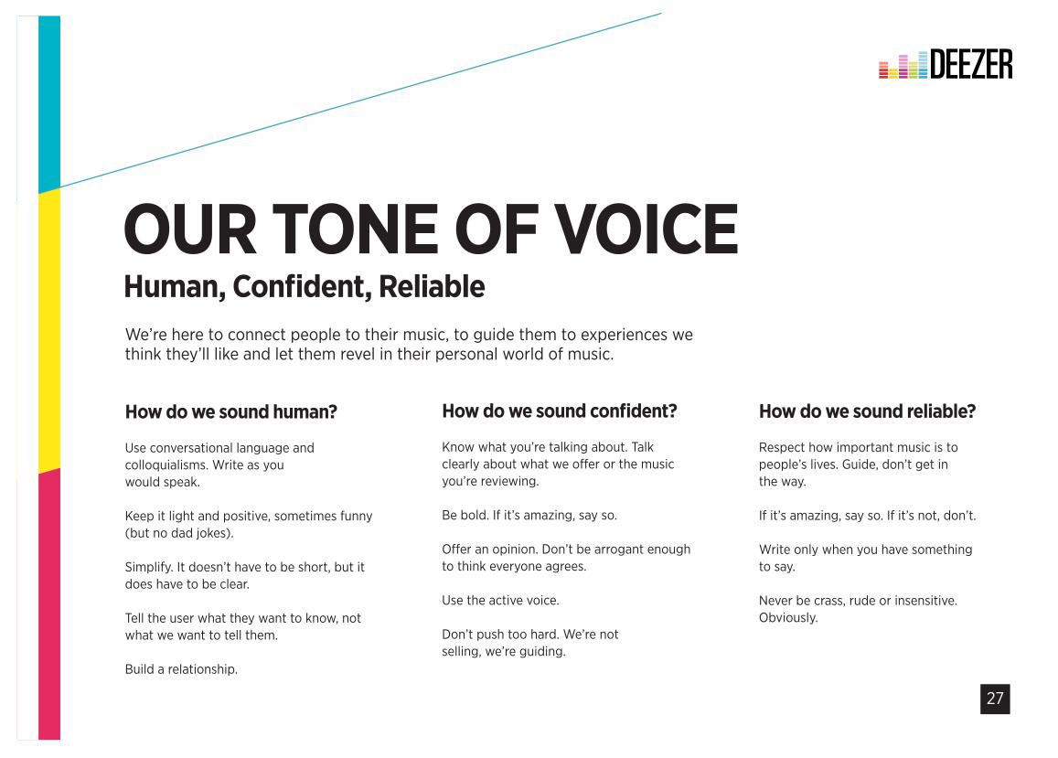
How do we sound human?
Use conversational language and colloquialisms. Write as you would speak.
Keep it light and positive, sometimes funny (but no dad jokes).
Simplify. It doesn’t have to be short, but it does have to be clear.
Tell the user what they want to know, not what we want to tell them.
Build a relationship.
How do we sound confident?
Know what you’re talking about. Talk clearly about what we offer or the music you’re reviewing.
Be bold. If it’s amazing, say so.
Offer an opinion. Don’t be arrogant enough to think everyone agrees.
Use the active voice.
Don’t push too hard. We’re not selling, we’re guiding.
OUR TONE OF VOICEWe’re here to connect people to their music, to guide them to experiences we think they’ll like and let them revel in their personal world of music.
Human, Confident, Reliable
How do we sound reliable?
Respect how important music is to people’s lives. Guide, don’t get in the way.
If it’s amazing, say so. If it’s not, don’t.
Write only when you have something to say.
Never be crass, rude or insensitive. Obviously.
28
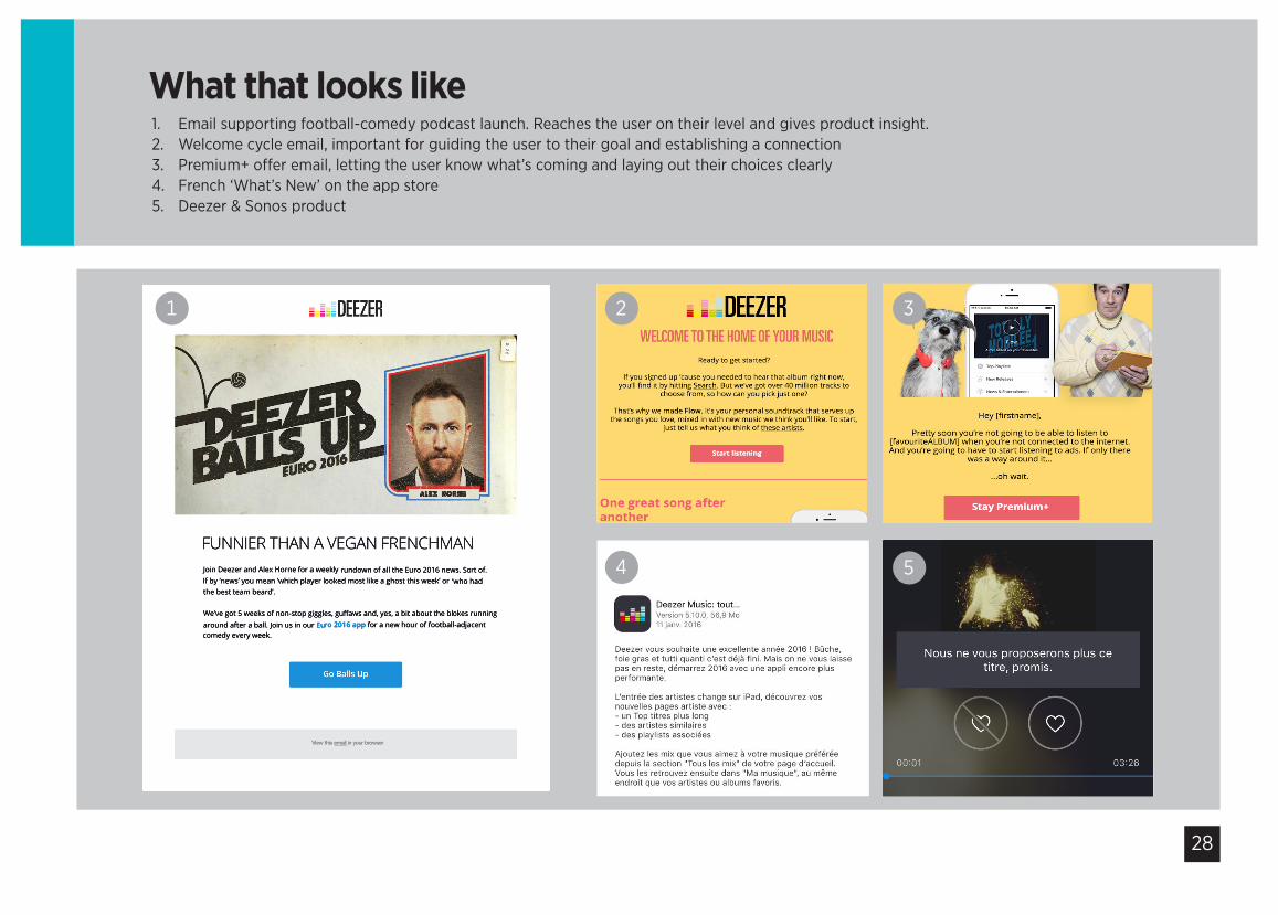
1. Email supporting football-comedy podcast launch. Reaches the user on their level and gives product insight. 2. Welcome cycle email, important for guiding the user to their goal and establishing a connection 3. Premium+ offer email, letting the user know what’s coming and laying out their choices clearly4. French ‘What’s New’ on the app store5. Deezer & Sonos product
What that looks likeWEB WELCOME SEQUENCE INTEGRATED TV CAMPAIGN // THIRD STAGE DEVELOPMENT
4 5
WEB WELCOME SEQUENCE INTEGRATED TV CAMPAIGN // THIRD STAGE DEVELOPMENT
1 2 3
29
Grazia TribulatoHead of Brand and GlobalMarketing Projects
D: +44 (0) 20 3141 5714 M: +44 (0) 790 366 7065E: [email protected] Skype: grazia.deezer
Danielle Battleson-PorterfieldLead Copywriter
D: +44 (0) 20 3141 5722E: [email protected] Skype: dan.deezer
Graham BeardCreative Director
D: +44 (0) 20 3141 5722 E: [email protected] Skype: graham.deezer
LET’STALK BRAND