1Overview1 - Louise Harnby | Proofreader · PDF fileproofreader who is a fairly proficient...
15
Transcript of 1Overview1 - Louise Harnby | Proofreader · PDF fileproofreader who is a fairly proficient...

1Overview1
Certainly there’s no one true way to self-publish, but my intention is to share the lessons I have learned about navigating the process in a way that delivers minimal stress and professional results, using tools that most of us already have on our desktops.
My way isn’t everyone’s way. The internet is awash with advice on self-publishing, much of it excellent, some of it rather prescriptive. Ideas differ about the best distribution channels, formatting options, what we can do ourselves, and when we need professional help.
I am not a tech specialist or a graphic designer. I am a professional proofreader who is a fairly proficient user of Microsoft Word, and I have worked in publishing (in-house or freelance) for over two decades. I’ve also self-published three ebooks (two of which are available in print).
My self-publishing goals were twofold: professionalism and simplicity. The guidance in this mechanics toolkit reflects the choices I made in order to achieve those objectives.
The mechanics of epublishing are not difficult. The process is affordable, too – you can use software that you already own.
As long as you keep the design and layout simple, style the elements of your text consistently (and according to your distributor’s guidelines), and attend to convention, you can provide your reader with a professional ebook that is available on multiple distribution channels and readable on multiple devices.
The enclosed information includes recommendations and guidance on following basic publishing conventions regarding layout and design. Why? Because every deviation from convention disengages your reader from what your words say, and engages them with how those words look. Yes, there’s no law when it comes to layout. However, readers are used to seeing book text laid out in a certain way (even on ereaders), and deviations act as red flags that scream ‘DIY job’ from the rafters.

When I self-published my books, I wanted people to think, ‘Great! – Louise Harnby’s written a book that will be interesting to me’, not ‘Louise Harnby has self-published’. It is the content that counts and that is where I want my customers’ focus to be. Reader disengagement is therefore a fail, though one that can be avoided with just a little extra effort.
Each of the 10 sections has been designed so that it can be read in a minute, no more. So without further ado, let’s get going – the clock’s ticking!
100: 10:001
Formatting your ebook: Microsoft Word
Using Word as the foundation is not the only option, of course, and professional formatters and designers will argue that it is not the ideal solution for epublications. They may well be right but, in my experience, Word does the job very well. I have used it to self-publish three ebooks, and it is my preferred self-publishing solution.
Here’s the thing about Word – you probably already own it and you probably already know how to use it. Even if you are not currently working with all of Word’s functionality, it is far less time-consuming and anxiety-inducing to learn to use that additional functionality than will be the case if you opt for a completely new application.
If you do not have access to the tools that professional formatters and designers use, and you begrudge handing over your money to Microsoft, there are alternative document- and word-processing tools on the market that ‘have many of the same powerful features that Microsoft expects you to pay for,’ says David Bayon (‘What’s the best free word processor alternative to Microsoft Word?’, PC Advisor, 2013), citing OpenOffice and LibreOffice as two examples.
Here’s the rub, though: using Word allows the likes of Amazon KDP and Smashwords to convert your file to the formats they work with, including
EPUB, LRF (Sony Reader), mobi (Kindle), PDB (Palm Doc), HTML, and PDF. Allowing these distributors to do the conversion means you don’t have to. Again, it is about simplicity and professionalism – using tools that will give you the results you want but that are also used by the other ‘partners’ in your self-publishing chain.
The next three minutes are dedicated to my three golden rules of formatting Word files for epublication.
100:09:001
Golden rule of formatting I – keep it simple
Ebooks are not like print books (see the section on eformatting snags below). If you try to be too clever with design, at best your ebook will look a mess; at worst it won’t even meet the submission criteria for conversion by your distributor.
Ebooks that look a mess focus the reader’s eye away from the content; instead, it’s all about how things look. That’s reader disengagement.
Ebooks that don’t meet the distributor’s submission criteria will not be accepted for publication; in that case, the only place you’ve self-published is on your own computer.
I do believe that book readers are open to creative and unusual designs and text layouts, but the self-publisher has to keep in mind the limitations of ereader software. I own a Kindle Paperwhite. That tool lets me – the reader – decide how big the text will be and which font will appear on the screen. I also own a PC and have a Microsoft Office licence. I used these tools to create this PDF. Those tools let me – the author – decide how big the text will be and which font(s) will appear on the screen.
For this reason, when it comes to the mechanics of digital self-publishing, keeping things simple is essential. It’s about putting yourself in your customers’ shoes and remembering that when you choose to go down
the route of epublishing, and you want to make your content available via established distributors, you hand over some of the decisions about how your book looks to your readers. How your writing appears on the digital page is determined in large part by their preferences, not yours. With that in mind, help those readers to make their choices in a way that harms neither your words nor their engagement. If you want to strike out and create an unconventional layout, hire a professional ebook designer rather than doing the job yourself.
100:08:001
Golden rule of formatting II – use the Styles palette
To prevent reader disengagement, use Word’s Styles palette to ensure that each element of your text (chapter headings, subheadings, body text, quoted material, and so on) is consistently presented throughout the file.
If you’ve not used this function before, it is worth learning. It will save you time, honestly!
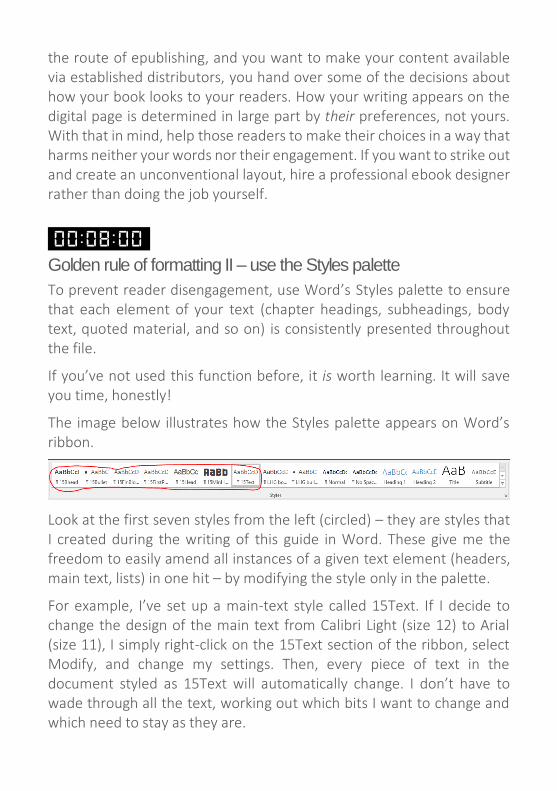
The image below illustrates how the Styles palette appears on Word’s ribbon.
Look at the first seven styles from the left (circled) – they are styles that I created during the writing of this guide in Word. These give me the freedom to easily amend all instances of a given text element (headers, main text, lists) in one hit – by modifying the style only in the palette.
For example, I’ve set up a main-text style called 15Text. If I decide to change the design of the main text from Calibri Light (size 12) to Arial (size 11), I simply right-click on the 15Text section of the ribbon, select Modify, and change my settings. Then, every piece of text in the document styled as 15Text will automatically change. I don’t have to wade through all the text, working out which bits I want to change and which need to stay as they are.

When formatting for epublication, the Styles palette is your best friend because it will help you format your Word file in a way that meets your distributor’s guidelines and displays the different elements of your text consistently. Don’t forget that with epublishing we are aiming for simplicity and professionalism, while respecting the fact that our customers have a degree of control over how they choose to view our content in their ereaders.
There isn’t space in a 10-minute guide to provide a full tutorial on style creation. Actually, Smashwords’s Mark Coker has already done the job rather well …
100:07:001
Golden rule of formatting III – have the Smashwords Style Guide to hand
Mark Coker’s excellent, easy-to-use and free Smashwords Style Guide for preparing Word files is a must-have. Every time I format a Word file for epublication, I open Coker’s PDF guide and check that I’ve followed his digestible advice, step by step.
Coker’s guide is 117 pages long, but here’s a taster of what’s on offer:
choosing the best paragraph separation method
managing and modifying paragraph styles and fonts
defining a proper first-line indent
defining line spacing
managing paragraph returns
managing external hyperlinks
designating chapter, page and section breaks
working with images
managing font sizes
style formatting, symbols and glyphs
headers and footers

There are other tools available to the author who wants help with organizing the content of an ebook – Sigil, Scrivener and Jutoh are three options to consider. I have not used them but my colleague Corina Koch MacLeod, one half of the Beyond Paper Editing team, discusses their merits in ‘Scrivener Cheat Sheet: Start Using Scrivener Now’, ‘From Word to Jutoh: Ebook Creation Made Easy’ and ‘How to Create an Ebook With Sigil: It’s Easier Than You Think’.
100:06:001
Layout conventions – hyphenation
When preparing a file for epublication, there are some basic layout conventions that are worth attending to in order to prevent reader disengagement. Hyphenation is the first thing to consider.
You’ll recall that I own a Kindle Paperwhite. My eyesight is not what it used to be and I have my eyes tested annually to ensure that my prescription glasses are still doing the job properly. I wear my glasses for proofreading and writing, both onscreen and on paper, and for leisure paperback reading. When I read on my Paperwhite, I take them off. That’s because I can increase the font size of the text display with just a touch of the screen.
There’s nothing wrong with including hyphens in your Word file (for example in compound modifiers, e.g. ‘dark-haired man’). Do not, however, add them in to your file simply because you don’t like a particular wordbreak as it appears in a Word document.
In fact, I’d recommend writing your document in Word with the hyphenation settings turned off (Layout, Page Setup, Hyphenation, None).
The reason for this is that if you introduce hard hyphens, these will appear in your uploaded ebook. If your customer chooses to read the book in a particular font and font size, the hard hyphen in the wordbreak might appear at the end of the line as you wished it to. If, on the other

hand, your customer chooses a different font or font size, the hyphen will still exist but end up stran-ded mysteriously in the middle of a sentence. It will look like a mistake – that’s a red flag to your reader that disengages them from your content, something that you want to avoid.
100:05:001
Layout conventions – block or run-on paragraph styles?
Consistency is king, though most fiction work tends to be presented in a run-on style, while non-fiction might be styled in either way. Block paragraphs have a space between each one; run-on paragraphs are indented (with the exception of the first line in a new chapter or section). Think about what your readers are used to seeing when they open a printed book in a particular genre, and which style choice will make it as easy as possible for them to engage with, and navigate, your content.
The following is an example of blocked paragraphs
This is an example of blocked paragraphs. This is an example of blocked paragraphs. This is an example of blocked paragraphs. This is an example of blocked paragraphs.
This is an example of blocked paragraphs. This is an example of blocked paragraphs. This is an example of blocked paragraphs. This is an example of blocked paragraphs.
The following is an example of run-on paragraphs
This is an example of run-on paragraphs. This is an example of run-on paragraphs. This is an example of run-on paragraphs. This is an example of run-on paragraphs.
This is an example of run-on paragraphs. This is an example of run-on paragraphs. This is an example of run-on paragraphs. This is an example of run-on paragraphs.

100:04:001
Layout conventions – first-paragraph indents
In mainstream publishing, whether print or digital, we don’t usually indent the first paragraph in a chapter or in a new section of run-on text (e.g. under a heading). Nor do we usually indent any of the paragraphs in blocked text. If you do choose to indent such first paragraphs, the layout will jar your reader for no other reason than it is unconventional. If you are unconvinced, go to your bookshelf, pull down any book, and look at how the paragraphs have been styled.
In the examples below, the green text reflects conventional first-paragraph indentation styles, whereas the red text shows examples of unconventional styling.
Chapter or section heading
This is an example of conventional first-paragraph indentation in run-on text. This is an example of conventional first-paragraph indentation in run-on text.
This is an example of a run-on paragraph. This is an example of a run-on paragraph. This is an example of a run-on paragraph This is an example of a run-on paragraph.
Chapter or section heading
This is an example of unconventional first-paragraph indentation in run-on text. This is an example of unconventional first-paragraph indentation in run-on text.
This is an example of a run-on paragraph. This is an example of a run-on paragraph. This is an example of a run-on paragraph This is an example of a run-on paragraph.
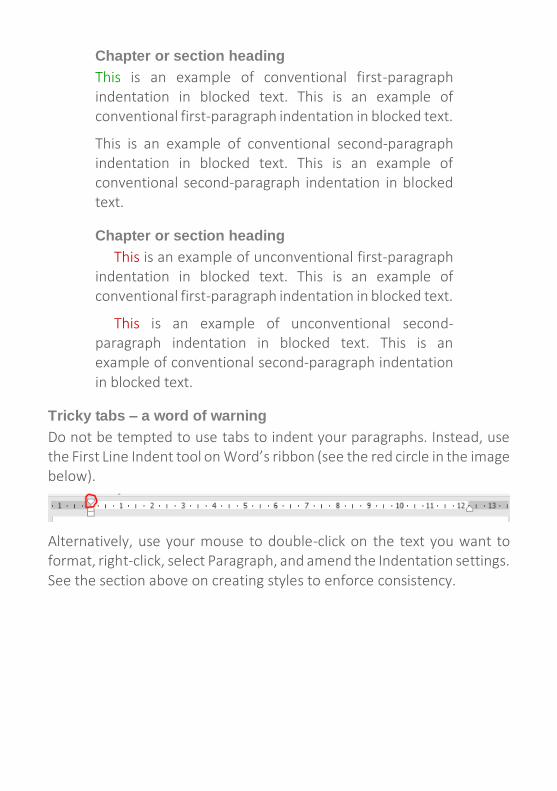
Chapter or section heading
This is an example of conventional first-paragraph indentation in blocked text. This is an example of conventional first-paragraph indentation in blocked text.
This is an example of conventional second-paragraph indentation in blocked text. This is an example of conventional second-paragraph indentation in blocked text.
Chapter or section heading
This is an example of unconventional first-paragraph indentation in blocked text. This is an example of conventional first-paragraph indentation in blocked text.
This is an example of unconventional second-paragraph indentation in blocked text. This is an example of conventional second-paragraph indentation in blocked text.
Tricky tabs – a word of warning
Do not be tempted to use tabs to indent your paragraphs. Instead, use the First Line Indent tool on Word’s ribbon (see the red circle in the image below).
Alternatively, use your mouse to double-click on the text you want to format, right-click, select Paragraph, and amend the Indentation settings. See the section above on creating styles to enforce consistency.
100:03:001
Layout conventions – double spaces
Avoid placing two spaces after a full point. It isn’t necessary. Even if you were taught that this is the proper thing to do, or it is something you prefer, follow professional convention. Readers who like two spaces won’t notice that you’ve only used one (because it’s not noticeable!) while readers who like one space will be irritated that you’ve used two. Anyway, it looks rather gappy.
If you love a double space (because 30 years ago your English teacher said, ‘That it is the right way to do it’), take a look at these two examples, and decide which of the following two options, created using 21st-century word-processing software, looks the most aesthetically pleasing.
Here is an example of text written in Microsoft Word with two spaces after a full point. Can you see that it looks rather gappy? Do you own any professionally published books with text that is spaced like this?
Here is an example of text written in Microsoft Word with one space after a full point. Can you see that it is easier on the eye? Do the professionally published books in your home have text that is spaced like this?
Still not convinced? Think about this. Professional typesetters don’t do it. Professional book designers don’t do it. Professional publishers don’t do it. The Chicago Manual of Style discourages it, calling it unnecessary practice. The Modern Language Association, Oxford University Press’s New Hart’s Rules, the American Psychological Association, and a host of other academic and professional bodies all concur (‘Sentence spacing in language and style guides’).
Standard professional publishing asks for one space, and given that we want our books to appear professionally published, I’d recommend you use one, too. Farhad Manjoo in ‘Space invaders’ presents a lively and
entertaining summary of why using two spaces is not advisable, and how this practice emerged in the first place.
100:02:001
Eformatting snags
Customer preferences
Different customers will engage with your ebook using different devices – laptops, tablets, smart phones, Kindles, Kobos and so on. Given that we don’t know our customers’ preferences, it makes good sense to format ebooks in a way that is sensitive to this. Keep things simple and create ebook text that does not depend on colour, font size or font style to enable your reader to navigate your content. There’s nothing wrong with incorporating these elements as long as we remember than not all of our readers will be able to take advantage of them, and this may lead to confusion and disengagement – two things we want to avoid.
Focus instead on using capitalization, italic, bold, numbered headings, centring and paragraph styling to enable your reader to identify different elements in your ebook’s text.
Troublesome tabs, pesky paragraph returns, bothersome bullets and sticky spacing …
You might regularly use particular characters, keys and functions to organize the layout of your text – the bullet function on Word’s menu ribbon, or the space/enter and tab keys on your keyboard. Take care in particular to note the following:
Avoid using the tab key, especially when creating paragraph indents (see ‘Tricky tabs’ above).
Remove all double spaces from your file by pressing Ctrl H (which brings up the Find and Replace tool). Type two spaces in the Find box and one space in the Replace box.
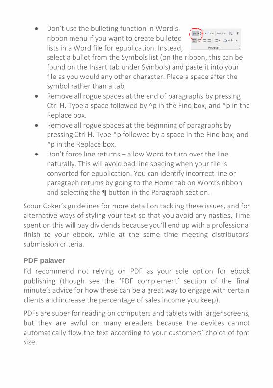
Don’t use the bulleting function in Word’s ribbon menu if you want to create bulleted lists in a Word file for epublication. Instead, select a bullet from the Symbols list (on the ribbon, this can be found on the Insert tab under Symbols) and paste it into your file as you would any other character. Place a space after the symbol rather than a tab.
Remove all rogue spaces at the end of paragraphs by pressing Ctrl H. Type a space followed by ^p in the Find box, and ^p in the Replace box.
Remove all rogue spaces at the beginning of paragraphs by pressing Ctrl H. Type ^p followed by a space in the Find box, and ^p in the Replace box.
Don’t force line returns – allow Word to turn over the line naturally. This will avoid bad line spacing when your file is converted for epublication. You can identify incorrect line or paragraph returns by going to the Home tab on Word’s ribbon and selecting the ¶ button in the Paragraph section.
Scour Coker’s guidelines for more detail on tackling these issues, and for alternative ways of styling your text so that you avoid any nasties. Time spent on this will pay dividends because you’ll end up with a professional finish to your ebook, while at the same time meeting distributors’ submission criteria.
PDF palaver
I’d recommend not relying on PDF as your sole option for ebook publishing (though see the ‘PDF complement’ section of the final minute’s advice for how these can be a great way to engage with certain clients and increase the percentage of sales income you keep).
PDFs are super for reading on computers and tablets with larger screens, but they are awful on many ereaders because the devices cannot automatically flow the text according to your customers’ choice of font size.
As soon as you force your readers to stop reading and adjust their screen settings, you’ve moved their focus away from your content and towards how they can actually access it. That’s additional reader disengagement and therefore to be avoided.
100:01 :001
Digital distribution options
There are a number of different distribution options for publishing your ebook – two of the best-known are Kindle Direct Publishing (KDP, an Amazon company) and Smashwords.
I chose to take advantage of both for the following reasons:
they allowed me to upload Word files (my simplicity objective)
they offered me visibility (my books would be available via multiple online book retailers such as Amazon, Apple iBooks, Barnes & Noble, Sony, Kobo and WH Smith)
they enabled my books to be read on multiple devices (e.g. Kindle, iPad, Sony Reader and Palm Doc)
they allowed me to distribute my books internationally
the percentage of sales income I’d receive met my requirements
they provided an end result that was as professional as I could have hoped for given the limitations of e-delivery
Other distribution options include BookBaby, Blurb, Google Play, Lulu, and Nook Press. Naturally, you are advised to read any distributor’s terms and conditions to ensure you are satisfied with the income and distribution rights on offer.
The PDF complement
PDFs don’t work well on ereaders. They do, however, work extremely well on desktops, laptops and some tablets. There is, therefore, nothing to stop you creating a PDF version of your book and selling it yourself (though make sure you read the terms and conditions of any distribution
channels you’ve signed up with to make sure you’re not contravening the terms of your contract).
Direct selling allows you to keep a higher percentage of the sales income. And if you have a platform (like a blog) related to the content of your book, or are already part of a network of target readers via social media platforms, you’ll be in a good position to market your PDF book alongside the ereader version. This won’t be what all your customers want, but it may be preferable for some, particularly if you’ve written business-related content that readers want to access as part of their working day.
The beauty of PDF is that you get to design your book in the same aesthetically pleasing way you would a print book while still offering digital delivery.
__________________________________________________________
Time’s up! I hope these 10 guidelines in 10 minutes have given you food for thought on the mechanics of self-publishing an ebook. Good luck!
Copyright Louise Harnby 2016
Louise Harnby | Proofreader
+44 (0)7767 028976
West Cottage, South Walsham Road, Panxworth,
Norfolk, NR13 6JG, UK