1B L88: T REVIEW #3 STATISTICS - Mr. Wieckhorst's … · 2016-06-03 · 1B L88: TOPICAL REVIEW #3...
12
1B L88: TOPICAL REVIEW #3 – STATISTICS Name: ____________________________________ Date: ____________________ Ms. Wright's Algebra class consists of 28 students who recently took a 20 point quiz on factoring. The distribution of scores is shown on the dot plot above. Answer questions 1 through ? based on this graph. 1. Which of the following is closest to the percent of students who scored less than a 16 on the quiz? (1) 8% (3) 29% (2) 50% (4) 44% 2. Which of the following would be the median score of this data set? (1) 15.5 (3) 16.5 (2) 16 (4) 17 3. Which of the following represents the range of the scores? (1) 8 (3) 12 (2) 15 (4) 20 10 11 12 13 14 15 16 17 18 19 20 Scores on 20 Point Math Quiz
Transcript of 1B L88: T REVIEW #3 STATISTICS - Mr. Wieckhorst's … · 2016-06-03 · 1B L88: TOPICAL REVIEW #3...

1B L88: TOPICAL REVIEW #3 – STATISTICS
Name: ____________________________________ Date: ____________________ Ms. Wright's Algebra class consists of 28 students who recently took a 20 point quiz on factoring. The distribution of scores is shown on the dot plot above. Answer questions 1 through ? based on this graph.
1. Which of the following is closest to the percent of students who scored less than a 16 on the quiz? (1) 8% (3) 29% (2) 50% (4) 44% 2. Which of the following would be the median score of this data set? (1) 15.5 (3) 16.5 (2) 16 (4) 17 3. Which of the following represents the range of the scores? (1) 8 (3) 12 (2) 15 (4) 20
10 11 12 13 14 15 16 17 18 19 20Scoreson20PointMathQuiz
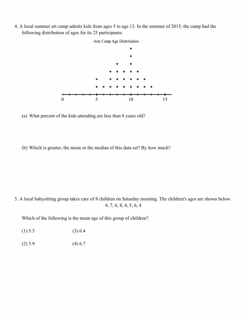
4. A local summer art camp admits kids from ages 5 to age 13. In the summer of 2015, the camp had the following distribution of ages for its 25 participants:
(a) What percent of the kids attending are less than 8 years old? (b) Which is greater, the mean or the median of this data set? By how much? 5. A local babysitting group takes care of 8 children on Saturday morning. The children's ages are shown below.
4, 7, 6, 8, 4, 5, 6, 4 Which of the following is the mean age of this group of children? (1) 5.5 (3) 6.4 (2) 5.9 (4) 6.7

6. The two sets of data below represent the number of runs scored by two different youth baseball teams over the course of a season.
Team A: 4, 8, 5, 12, 3, 9, 5, 2 Team B: 5, 9, 11, 4, 6, 11, 2, 7
Which set of statements about the mean and standard deviation is true? 1)
2)
3)
4)
Standard Deviation: tells you how spread (variability) out the data values are from the mean. Represents the typical deviation from the mean. If the standard deviation is 0, then the data has no spread. If the standard deviation is small, then the data is close to the mean. If the standard deviation is large, then the data is more spread out from the mean. Standard deviation is the measure of variability for symmetrical data set. The IQR (Q3- Q1) is the measure of variability for a skewed data set. 7. Which of the following data sets would have a standard deviation closest to zero? (1) {1, 3, 4, 6, 9} (3) {6, 6, 6, 7, 7} (2) {15, 18, 20, 25} (4) {1, 1, 3, 3, 7} 8. A sample of ten large eggs were weighed with the results shown below, in grams.
58, 64, 61, 56, 60, 57, 60, 62, 59, 68 Which of the following is this standard deviation to the nearest tenth of a gram? (1) 2.7 (3) 4.8 (2) 3.4 (4) 5.1

9. A survey of 52 graduating seniors was conducted to determine if there was a connection between the gender of the student and whether they were going on to college. Which of the following represents the proportion of those going to college who are male?
(1) 0.53 (3) 0.55 (2) 0.31 (4) 0.16 10. A marketing company did a survey of 40 people with ages from 12 to 20 and broke them into the three age
categories shown below. Each person tried three colas and specified which their favorite cola was. (a) What are the relative frequencies of a person choosing each of the following as their favorite? Cola A Cola B Cola C (b) Is a person in the 15 to 17-age range more likely or less likely to choose Cola B as their favorite
compared to all those surveyed? Justify your answer. (c) Which is more likely: (A) that a person who chooses Cola C as their favorite is in the 18 to 20 age
bracket or (B) that a person in the 18 to 20 age bracket chooses Cola C as their favorite? Justify your answer.
Gender
Male Female TotalGoingtoCollege 16 13 29NotGoingtoCollege 14 9 23Total 30 22 52
ColaType
ColaA ColaB ColaC Total
AgeRa
nge
12to14 3 6 1 10
15to17 1 8 4 13
18to20 2 8 7 17
Total 6 22 12 40

11. A random sample of 200 surveys was selected. The frequency table that summarized these 200 surveys is below. Unfortunately, some of the cells were not filled in. GREEN BLUE RED ORANGE PINK TOTAL
FEMALES 24 30 10 110
MALES 32 20 6 90
TOTAL 48 50 18 200
a) Fill in the missing cells b) What is more likely, a male that completed a green survey or the survey that was slected was pink?
Support your answer
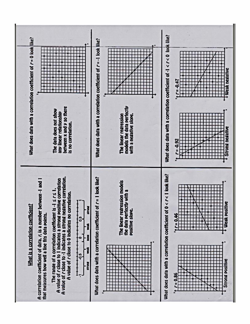
12. What is the correlation coefficient of the linear fit of the data shown below, to the nearest hundredth?
1) 1.00 2) 0.93 3) 4) 13. Which of the following correlation coefficient values below indicates the greatest correlation between the
two variables? (1) 0.78r = (3) 0.12r = (2) 0.54r = − (4) 0.97r = −
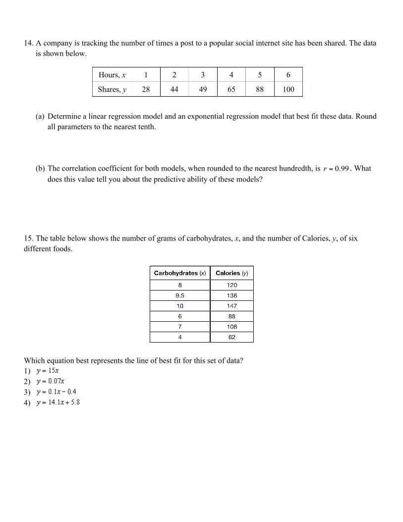
14. A company is tracking the number of times a post to a popular social internet site has been shared. The data is shown below.
(a) Determine a linear regression model and an exponential regression model that best fit these data. Round all parameters to the nearest tenth.
(b) The correlation coefficient for both models, when rounded to the nearest hundredth, is 0.99r = . What does this value tell you about the predictive ability of these models?
15. The table below shows the number of grams of carbohydrates, x, and the number of Calories, y, of six
different foods.
Which equation best represents the line of best fit for this set of data? 1) 2) 3) 4)
Hours, x 1 2 3 4 5 6
Shares, y 28 44 49 65 88 100

16. The table below shows the attendance at a museum in select years from 2007 to 2013.
State the linear regression equation represented by the data table when is used to represent the year 2007 and y is used to represent the attendance. Round all values to the nearest hundredth. State the correlation coefficient to the nearest hundredth and determine whether the data suggest a strong or weak association.
Residuals = actual 𝑦-value− predicted 𝑦-value Residuals help determine how accurately the linear function could predict actual points on the scatter plot. If the values of the residuals are small; the linear function is a good fit for the data.

17. Four different types of regression were used on a data set. Which of the following four residual plots shows the model that is the most appropriate to use?
(1) (3) (2) (4) 18. Which of the following scatter plots most likely indicates a quadratic regression equation is most
appropriate for the data? (1) (3) (2) (4)
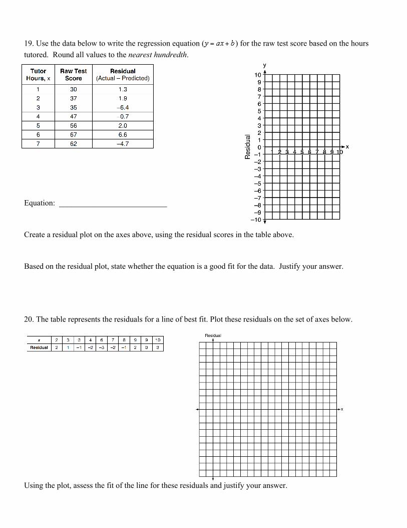
19. Use the data below to write the regression equation ( ) for the raw test score based on the hours tutored. Round all values to the nearest hundredth.
Equation: ___________________________ Create a residual plot on the axes above, using the residual scores in the table above. Based on the residual plot, state whether the equation is a good fit for the data. Justify your answer. 20. The table represents the residuals for a line of best fit. Plot these residuals on the set of axes below.
Using the plot, assess the fit of the line for these residuals and justify your answer.

21. The high temperatures in March in Dutchess County, New York, are shown in the box plot shown below. Which of the following is the median high temperature?
(1) 28 (3) 40 (2) 36 (4) 48 22. Which of the following is the interquartile range of the data set shown in the box plot below? (1) 110 (3) 55 (2) 60 (4) 85
23. The box-and-whisker plot below represents a set of grades in a college statistics class.
Which interval contains exactly 50% of the grades? 1) 63-88 2) 63-95 3) 75-81 4) 75-88
0 50 100
20 30 40 50

24. During the last 15 years of his baseball career, Andrew hit the following number of home runs each season.
State and label the values of the minimum, 1st quartile, median, 3rd quartile, and maximum. Using the line
below, construct a box-and-whisker plot for this set of data.
25. Using the line provided, construct a box-and-whisker plot for the 12 scores below.
26, 32, 19, 65, 57, 16, 28, 42, 40, 21, 38, 10