1836875 Logo Design Tutorial
25
WEB 2.0 Logo Design Tutorial by Logo Samurai.com
-
Upload
pintilei-liviu -
Category
Documents
-
view
218 -
download
0
Transcript of 1836875 Logo Design Tutorial


There are literally dozens of different ways to design a Web 2.0 logo, the most time consuming methods will definetely bring you better results but there are also extremely simple ways to create a good looking logo within a few minutes.
Today we are going to show you a very basic tutorial that if used in the right way can give your logo a very nice glossy look.
If you like this tutorial but would like a professional to design your logo check out LOGOSAMURAI.com our logos are very professional and very affordable, visit us for cheap logo design.
Today you will learn how to create this:

Step1
For this tutorial, we will be using Photoshop. Although there are other softwares you could use to design your logo Photoshop is surely the most popular one and that's whay we are going to use it.
1- Open your Photoshop ( any version of Photoshop is OK ), click the tab FILE > NEW
Make sure to select PIXELS as your size scale.
Also remember to set the
WIDTH = 500
and the
HEIGHT = 300
Now just hit the OK buttoon.

Now that you have your 500 x 300 window created let's pick our text color. In order to do this simply click the SQUARE like the picture below shows.
Choose the color BLACK ( don't worry, you will be able to change the color later).

Once you picked your color it's time to write your text, for this tutorial we will be using the word " SAMURAI " ( because of Logo Samurai of course =P ) but you can use whatever you want.
To Start typing your text just click the " T " in the tool bar like the picture below shows.

Once your text is ready go ahead and click the tab LAYER > RASTERIZE > TYPE.
This step will change your text from it's vector format to a pixel format, which is easier to work with in Photoshop.

Now that your text is written and RASTERIZED go ahead and duplicate your layer.
To duplicate your layer right click your text's layer and choose DUPLICATE LAYER.
Now you have this:

In case you can't find your LAYERS menu don't freak out! Just chill and click the tab WINDOW and select LAYERS. Check out the picture below:

OK, this is the best part, now you will your text will to start to look like a Web 2.0 logo.
Select the layer that contains your text ( the layer without the "copy" next to it ) , and then click the tabs EDIT > Stroke.

You will then see a little window like the one we're showing below:
ps: Make sure to keep the same configurations as the image below, the same width, color and location ( outside ) else.
Once you hit the OK button your text will look like this:

Now the magic begins, select the LAYER where your text with a red outline is located and double-click it.
You will see a menu with many options, see the image below:

Now you will double-click that BLACK to WHITE gradient in order to choose your own colors.
In order to get a nice gradient effect you need to select two tones of the same color, for example, if I want my text to be outlined by a nice orange gradient I must select a DARK BLUE and then a LIGHT BLUE ( you may do this with the colors you prefer )
To selece the dark orange you must double-click the black square and choose a dark blue.
To select the light orange you must double-click the white square and choose a light blue.
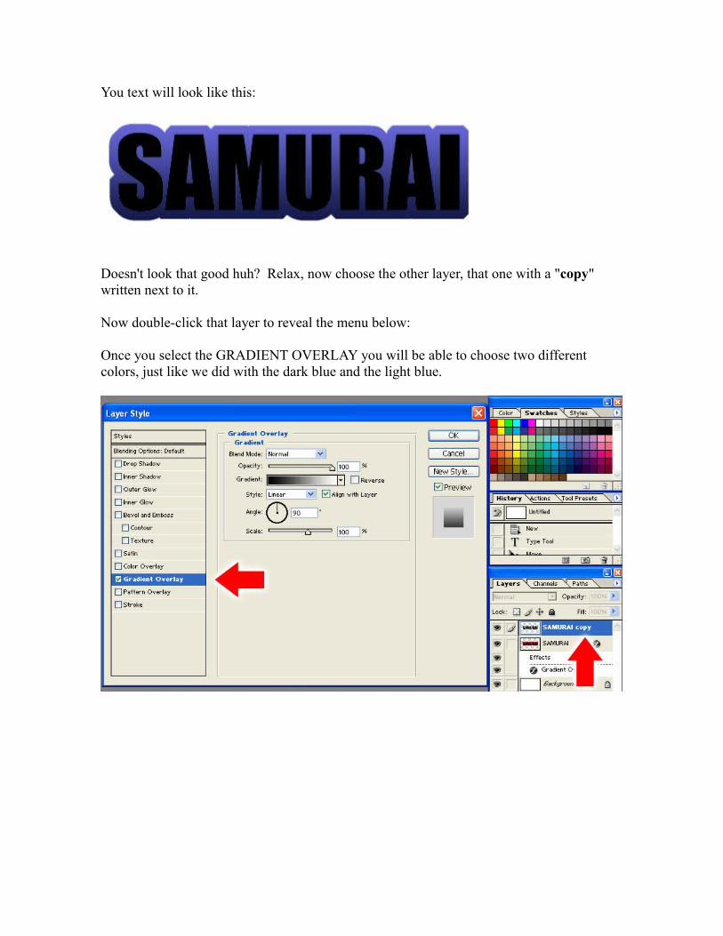
You text will look like this:
Doesn't look that good huh? Relax, now choose the other layer, that one with a "copy" written next to it.
Now double-click that layer to reveal the menu below:
Once you select the GRADIENT OVERLAY you will be able to choose two different colors, just like we did with the dark blue and the light blue.

This time you won't select anything too colorful, your first color must be LIGHT GRAY and the second one WHITE:
You text will look like this:

It looks much better than before but we still have some effects to add.
Now click and hold the SQUARE located at the tool bar and select the ELLIPSE TOOL:

After you selected the Ellipse Tool draw an ellipse right over your current logo. If your ellipse has any color other than white just click the COLOR BUTTON at the top of the screen and change the color to white:
After you change the color of your ellipse to WHITE your logo will look like this:

In order to get the effect we want you must select the LAYER where the ELLIPSE is located and decrease its opacity to 30%.
It's pretty simple, check this out:
We already have something good here, let's just get rid of all these layers that are on the way. Click the tab LAYER > FLATTEN IMAGE, this will delete all the unnecessary things and keep only what realy matters.
Here's the logo:
Looks pretty good huh? It can get better, if you are just a regular person you may use this text this way but...if you are a SAMURAI , you'll probably want to take the next step.

Step2
Let's add a reflection on the ground.
You will select the RECTANGULAR MARQUEE TOOL and slect all your logo. Once this is done you will press Ctrl + C ( to copy your logo ) and then Ctrl + V ( to paste it in the same place ).

Ok, now that you've already copied and pasted your logo you have to press Ctrl + T , to be able to transform your logo.
Once you see a rectangle around your logo try to deform it to make it look like this:
What we will do now is fade this layer a little bit in order to make it look like a reflection.
To do this you must select the deformed logo's layer and double click, we've done this before, again select the GRADIENT OVERLAY:
The only difference is that this time you will select the second SQUARE at the top of the window instead of picking colors:

When you select that square you will see something like this:
You will pick those two little squares at the bottom of the image and turn them to WHITE.
Here's your logo:

If you want to enhance the looks of this refelction you may decrease the opacity of the reflection's layer.
The best result will be reached at 40% of opacity:
And here's the final logo:

If you have a website, a company, a blog or even just a MySpace page visit LOGO SAMURAI to check out our logos and other services.
We have designed thousands of logos during the past months and we would love to design your logo as well.
Our prices are definetely lower than those from other websites on the internet and our designs....well, take a look at them yourself and let us know what you think =)


These are just a few of our logos, to see more of our work or to purchase a cheap logo design make sure to visit LOGO SAMURAI.
You may also send us an e-mail ( [email protected] )