1/43 Practical Results from Large-Scale Web Usability Testing Rolf Molich DialogDesign.
44
1/43 Practical Results from Large-Scale Web Usability Testing Rolf Molich DialogDesign
-
Upload
gyles-rice -
Category
Documents
-
view
215 -
download
1
Transcript of 1/43 Practical Results from Large-Scale Web Usability Testing Rolf Molich DialogDesign.

1/43
Practical Results from Large-Scale
Web Usability Testing
Rolf Molich
DialogDesign

2/43
http://www.dialogdesign.dk/cue2.htm
Slides in Microsoft PowerPoint 97 format
Download Test Reports and Slides

3/43
A recent survey shows that
80% of all Danish drivers think that their driving skills are above average.
How about usability testers?
How It All Started...

4/43
Too much emphasis on one-way mirrors and scan converters
Little knowledge of REAL usability testing procedures - mainly beautified descriptions
Too little emphasis on usability test procedures and quality control (”Who checks the checker?”)
How It All Started...

5/43
Who Checks the Checker?
When did YOU last have an objective check of your usability testing skills?
Who would you trust as an evaluator of your skills?

6/43
Test End Test object Student Professional
teams teams
1 Oct 97 9 Danish web-sites 50 0
2 Dec 97 CUE-1: Win Calendar Progr. 0 4
3 Oct 98 9 Danish web-sites 50 0
4 Dec 98 CUE-2: www.hotmail.com 2+3 7
5 Mar 99 Web Text - Encyclopedia 0 4
Comparative Evaluations

7/43
Introductory couse in Human-Computer Interaction at the Technical University of Copenhagen
Two courses in the fall of 1997 and 1998
120 students per course
Fifty teams of one to three students
2 x 9 Danish web-sites tested by four to nine teams with at least four test participants
Three weeks to complete test and write report
Student Tests

8/43
Quality of Usability tests and reports is acceptable considering that most teams used 20-50 hours
Some teams wrote quite professional reports after just one month of the course (Surprise?)
Few false problems and opinions
Limited overlap between findings
Can Students do Usability Testing?


10/43
Buttons in lower right corner:
Empty shopping basket
Change order
Continue shopping
Go on with your purchase
Would a human bookseller act like this?
www.bokus.com - Bookstore

11/43
Inhuman treatment of users on many e-commerce web-sites
On-site searching seldom works. Users are better off without on-site searching
Many web-sites focus on the company, not the user
Conclusions
-

12/43
Nice layout and graphics
Good response time
Give correct results
Conclusions
+

13/43
User task:
You want to take your business to BG Bank. Make an appointment with the bank
Hard to find in menu structure
Users entered ”appointment” as keyword for Search
Problem Example


15/43
Tolerate user input errors
Provide human error messages (constructive)
Recommend index, site-map
Special handling of frequent keywords
Show user search keywords in context
How to Improve Search

16/43
CUE-1Comparative Usability Evaluation 1
Four professional teams usability tested the same Windows calendar program
Two US teams (Sun, Rockwell), one English (NPL) and one Irish (HFRG, Univ. Cork)
Results published in a panel and a paper at UPA98
Main conclusions similar to CUE-2

17/43
CUE-2Comparative Usability Evaluation 2
Nine teams have usability tested the same web-site– Five professional teams
– Two semi-professional teams
– Two student teams
– (plus three student teams from TUD)
Test web-site: www.hotmail.com

18/43
Purposes of CUE-2
Provide a survey of the state-of-the art within professional usability testing of web-sites.
Set a benchmark against which other usability labs can measure their usability testing skills.
Investigate the reproducibility of usability test results
Give participating teams an idea of strengths and weaknesses in their approach to usability testing

19/43
NON Purposes of CUE-2
To pick a winner
To make a profit
20/43
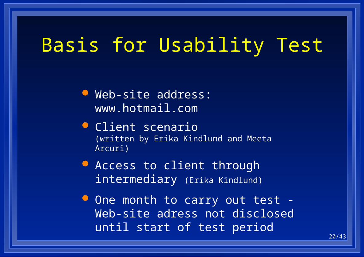
Basis for Usability Test
Web-site address: www.hotmail.com
Client scenario (written by Erika Kindlund and Meeta Arcuri)
Access to client through intermediary (Erika Kindlund)
One month to carry out test -Web-site adress not disclosed until start of test period

21/43
What Each Team Did
Familiarize with Hotmail
Define test scenarios
Define user profile; recruit test participants
Run a suitable number of tests, determined by the team
Write usability test report in standard company format and anonymize it

22/43
Problems Found
CUE-1 CUE-2 Total number of problems 141 300
Found by seven teams - 1 Found by six teams - 1 Found by five teams - 4 Found by four teams 1 4 Found by three teams 1 15 Found by two teams 11 49 Found only by one team 128 (91%) 226 (75%)

23/43
Comparison of Tests
Based mainly on test reports
Focus on significant differences
Selection of parameters for comparison based on two generally recognized textbooks:
– Dumas and Redish, ”A Practical Guide to Usability Testing”
– Jeff Rubin, ”Handbook of Usability Testing”

24/43
Resources
Team A B C D E F G H J
Person hours used for test 136 123 84 (16) 130 50 107 45 218
# Usability professionals 2 1 1 1 3 1 1 3 6
Number of tests 7 6 6 50 9 5 11 4 6

25/43
Usability Test Reports
Team A B CD E F G H J
# Pages 16 36 105 36 19 18 11 22
Exec summary Y Y NN N Y N Y Y
# Screen shots 10 0 80 1 2 1 2 0
Severity scale 2 3 21 2 1 1 3 4

26/43
Usability Results
Team A B C D E F G H J
# Positive findings 0 8 4 7 24 25 14 4 6
# Problems 26 150 17 10 58 75 30 18 20
% Exclusive 42 71 24 10 57 51 33 56 60
% Core problems (100%=26) 38 73 35 8 58 54 50 27 31
Person hours used for test 136 123 84 NA 130 50 107 45 218

27/43
Results
There are overwhelmingly many usability problems.
There are many ”serious” usability problems.
Limited overlap between team findings.

28/43
Conclusions
In most cases, no form of cost-effective testing will find all or most of the problems - or even most of the serious ones
Claims like ”Method x finds at least 80% of all serious usability problems” are not in accordance with the results of this study
29/43
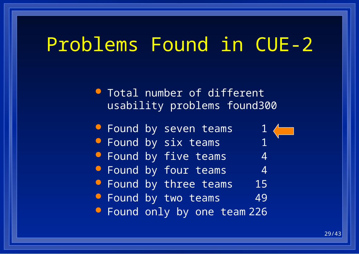
Problems Found in CUE-2
Total number of different usability problems found 300
Found by seven teams 1 Found by six teams 1 Found by five teams 4 Found by four teams 4 Found by three teams 15 Found by two teams 49 Found only by one team 226

30/43
Problem Found by Seven Teams
During the registration process Hotmail users are asked to provide a password hint question. The corresponding text box must be filled.
Most users did not understand the meaning of the password hint question. Some entered their Hotmail password in the text box.
Clever but unusual mechanisms like the password hint question must be explained carefully to users.


32/43
Problem Example
Users consistently glanced briefly at this screen and then without hesitation clicked the button ”I Accept”
The button ”I Accept” is very conveniently placed (”usable”), but the text is quite difficult to read. The text is written in legalese, not in webbish.
Users want text that they can ”Skim, skim, and read”.
Do unusable ”Terms of Service” have any legal value?


34/43
Difficult to read - legalese, not English Does not answer important user questions
about privacy, cost Not in native language
Signals ”Don’t waste your time on this”: Button ”I agree” is too usable No information on how to return to
Terms of Service
Problems with Terms of Service


37/43
Examples of language related problems that were detected by European teams
Send Mail: Term "Compose" difficult to understand. Use "Create new message" or "Write Mail” (5/9)
Create new account: "State/Province" textbox is required but does not make sense in many countries (2/9)
Language Related Problems

38/43
Some language related problems suggested by US teams were not confirmed by European test teams
Change "last name" to "family name" Meaning of "U.S. Residents only" and
"Non-U.S. Residents Only" is unclear
Language Related Problems


40/43
Problems listed with severity, #users Distinguish clearly between
– Personal opinions, – Expert opinions, – User opinions, – User findings
Advice for a Usable Usability Report

41/43
No power user test, although four teams also recruited power users
Few tests that require complicated setup. Examples: Attachments; boundary testing, e.g. large number of e-mails in in-box
Teams completed their usability tests within schedule, but they never compared their results to those from the other teams
Some State-of-the-Art Boundaries

42/43
The total number of usability problems for each tested web-site is huge,much larger than you can hope to find in one series of usability tests
Usability testing techniques can be improved considerably
We need more awareness of the usability of usability work
Conclusions

43/43
http://www.dialogdesign.dk/cue2.htm
Slides in Microsoft PowerPoint 97 format
CUE-2 Panel:Tuesday at 4.30 p.m.
Download Test Reports and Slides