10 example fonts
5
10 EXAMPLE FONTS I am considering naming my magazine “Blare” so I am using this word ty test out
-
Upload
steph2000 -
Category
Art & Photos
-
view
11 -
download
0
Transcript of 10 example fonts
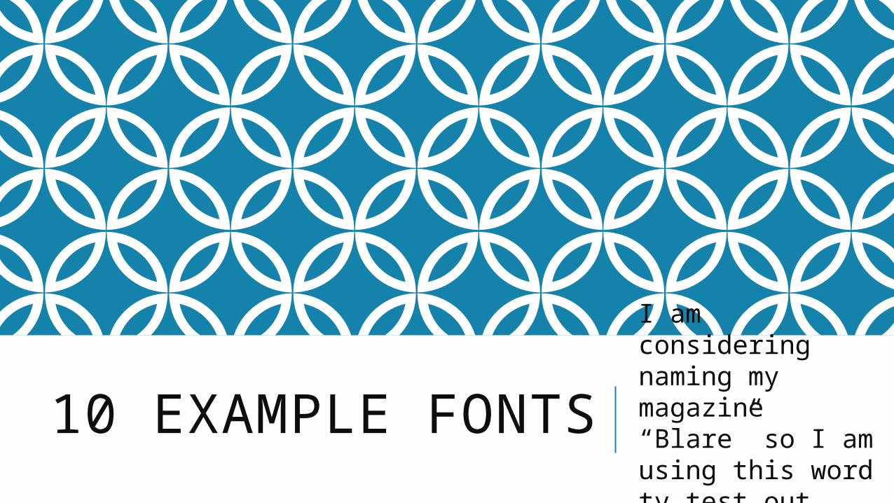
10 EXAMPLE FONTSI am considering naming my magazine “Blare” so I am using this word ty test out fonts.
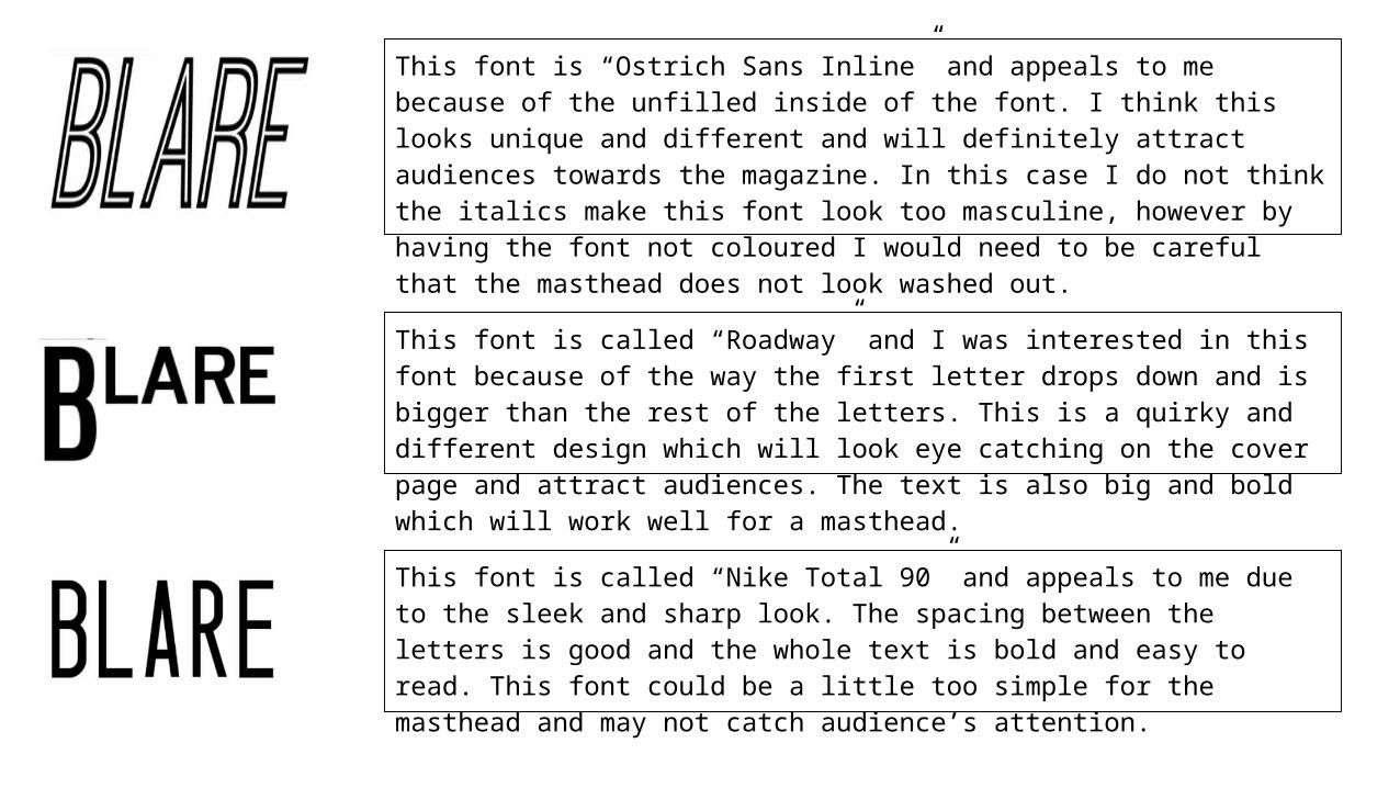
This font is “Ostrich Sans Inline” and appeals to me because of the unfilled inside of the font. I think this looks unique and different and will definitely attract audiences towards the magazine. In this case I do not think the italics make this font look too masculine, however by having the font not coloured I would need to be careful that the masthead does not look washed out.
This font is called “Roadway” and I was interested in this font because of the way the first letter drops down and is bigger than the rest of the letters. This is a quirky and different design which will look eye catching on the cover page and attract audiences. The text is also big and bold which will work well for a masthead.
This font is called “Nike Total 90” and appeals to me due to the sleek and sharp look. The spacing between the letters is good and the whole text is bold and easy to read. This font could be a little too simple for the masthead and may not catch audience’s attention.

This font is called “Droidiga” and appeals to me because of the unique styling of the letter R. This different style would work well in the masthead as it attracts the audience and the quirkiness would fit the style and theme of an indie/alternative magazine. The font is also bold; however I would have to be careful with the background to ensure that this font is still easy to read.
The font is called “Coffee Shop” and appeals to me due to the softer rounder edges; I like this effect as it creates a less harsh look and is more appealing for audiences. The design is bold and clear, however could be too simple and not attract audiences.
This is the font “Lotte Paperfang” and I like this font as I feel it would be appropriate for the masthead of my magazine. The font is big and eye catching, it is unique and I feel this would attract my target audience. However the font consists of wide spaces between the letters, which would not make it a good general font and something to be aware of while creating the magazine.

This is the font “Bebas Neue” and this font I believe fits my potential title of Blare. The font and the word pair and work well together, and as my target audience can see the link they would be encouraged to buy the magazine. This font is also bold enough to attract the attention of audiences, however could be viewed as too simple and not very unique, which I would have to take into consideration while creating the rest of my title page, to ensure my magazine has individuality.
This font is called “Aliens and Cows” and just like the name has a quirky feel to it. I like the font because of the way that the first letter is slightly bigger than the other letters; I believe this would work well as a masthead as this will attract the audience’s attention. Similar to “Lotte Paperfang” there are big spacing between the letters and this would not be practical for bulk or smaller text.
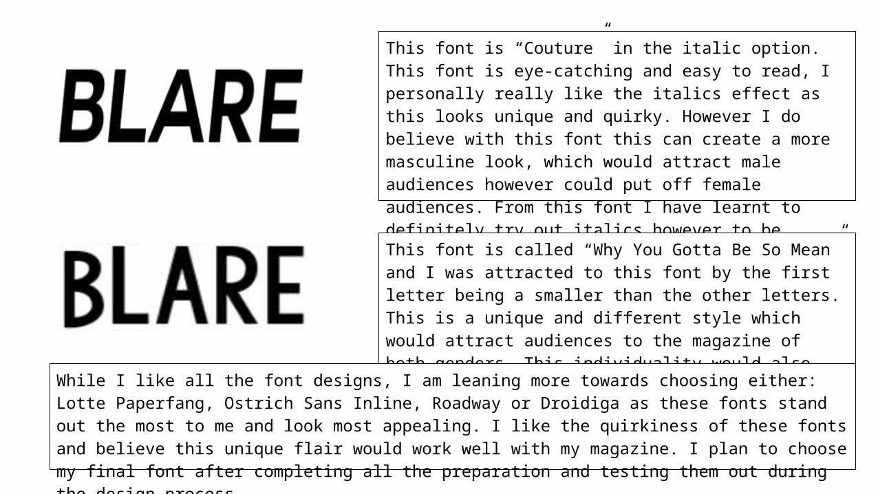
This font is “Couture” in the italic option. This font is eye-catching and easy to read, I personally really like the italics effect as this looks unique and quirky. However I do believe with this font this can create a more masculine look, which would attract male audiences however could put off female audiences. From this font I have learnt to definitely try out italics however to be careful to ensure that this still appeals to both genders.
This font is called “Why You Gotta Be So Mean” and I was attracted to this font by the first letter being a smaller than the other letters. This is a unique and different style which would attract audiences to the magazine of both genders. This individuality would also fit my magazine genre.
While I like all the font designs, I am leaning more towards choosing either: Lotte Paperfang, Ostrich Sans Inline, Roadway or Droidiga as these fonts stand out the most to me and look most appealing. I like the quirkiness of these fonts and believe this unique flair would work well with my magazine. I plan to choose my final font after completing all the preparation and testing them out during the design process.