1 i247: Information Visualization and Presentation Marti Hearst How to Critique a Visualization.
30
1 i247: Information Visualization and Presentation Marti Hearst How to Critique a Visualization
-
Upload
brionna-merryfield -
Category
Documents
-
view
216 -
download
3
Transcript of 1 i247: Information Visualization and Presentation Marti Hearst How to Critique a Visualization.

1
i247: Information Visualization and PresentationMarti Hearst
How to Critique a Visualization

2
How to Critique a Visualization
What are your ideas?

3
Critiquing a Visualization
• First, consider the purpose of the visualization and who the intended audience is.
• Then, ascertain your initial reaction.
• Then, examine the visualization in detail.
• Then, answer questions like the following.

4
Over-Arching Questions• Is the design visually appealing/aesthetically pleasing?
• Is it immediately understandable? If not, is it understandable after a short period of study?
• Does it provide insight or understanding that was not obtainable with the original representation (text, table, etc)?
• Does it provide insight or understanding better than some alternative visualization would? What kind of visualization might have been better?

5
How Successful is the Visualization?
• Does the visualization reveal trends, patterns, gaps, and/or outliers?
• Does the visualization successfully highlight important information, while providing context for that information?
• Does it distort the information? If it transforms it in some way, is this misleading or helpfully simplifying?
• Does it omit important information?

6
Questions about the Visual Transformation
• Does it use visual components properly? – That is, does it properly represent the data using lines,
color, position, etc? – Does it transform nominal, interval, and quantitative
information properly?
• Does it use labels and legends appropriately?

7
Example: news.com’s “What’s Hot”
• “What's Hot gives a visual snapshot of which stories are most important on CNET news.com right now. What's Hot is updated every time a story is published, or at least once an hour.”
• What makes a story hot?– The story is new. Any story published in the last 72
hours is eligible. – The story is widely-read. The more individuals
who read the story, the hotter it is. Data is updated hourly, or when new stories are published.
http://www.news.com/Hot/2030-12_3-5843382.html

8
Example: news.com’s “What’s Hot”

9
Few on “Eloquence Through Simplicity”
• Well-designed dashboard are:– Well-organized– Condensed
• Summaries and exceptions
– Concise, communicate the data and its message in the clearest and most direct way possible.
– Can be assimilated quickly– Provide a broad, high-level overview– Address specific information needs

10
More General Guidelines
• Simplify, simplify, simplify!• Must be the best way to show this data.

11
Data-to-Pixel Ratios
• Examples of wasteful pixels:– Decorative graphics– Meaningless variations in color– Borders to separate when white space will suffice– Distracting backgrounds and fill colors– Unnecessary grid lines in tables and graphs– 3D when not needed (nearly always not needed)– Ornate/physical looking widgets

12

13
14
Data-to-Pixel Ratios
• How to make non-data pixels work well:– Use light, low-saturated colors
• Hard to see when printed though!
– Regularize the appearance of non-data visual elements.

15

16

17

18
Distinguishing Important Information
• Static vs. Dynamic Information• Make use of location on screen
– All quadrants are not created equal.
• Don’t highlight too much!

19
20
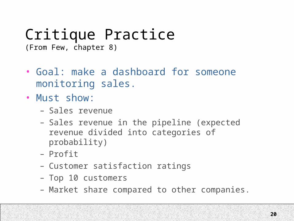
Critique Practice(From Few, chapter 8)
• Goal: make a dashboard for someone monitoring sales.
• Must show:– Sales revenue– Sales revenue in the pipeline (expected revenue
divided into categories of probability)– Profit– Customer satisfaction ratings– Top 10 customers– Market share compared to other companies.

21
Design Decisions
• What to summarize, and how?• Which units of measurement to use?• What information will be helpful as context?• What measures to compare against?• Which visual components are most effective?

22

23

24
25

26

27

28

29

30
Next Week
• More Tufte• Start on Interactive Visualization