˘ˇ ˆ ˙ ˘ ˝˛ ˆ ˙ ˙ - REDI3x3 | 2016 REDI3x3 Working... · Younger people have had less...
50
Transcript of ˘ˇ ˆ ˙ ˘ ˝˛ ˆ ˙ ˙ - REDI3x3 | 2016 REDI3x3 Working... · Younger people have had less...

����������� � ���������� ��
� ���������� ��������� ������������������������
�
�
���� ����������������� ��������
���������������������������
�
������ ��� � ��
�
�
�
��������
�
������������������� ����� ������� ������������� ����� �������������������� �������
� �������� ������������������������� ��������������� �!�� ������������������������
������ "�� �������� �������� ������� �#� ������ ��� ��� �� �!�� � �#� ���"� ������ ����
�� ������������������ �!��� ��������$�������������������������������� ������������
���� ������� ���� �������� ����� ����"� %������ ��� ����������� ��� ��� �������� ��� �����
������� $� �������������� ������������������� ������������� ���& �������������������
��������� ���� ����������'����������������"� $�� ���� ���� $� ����� �� �� ��������� ���
���������� ������� ��& ���������� ���������������� ����������������� ����������
�������(�!()�������������������������������))!�������������������� ��������"�*�����
+���� ����������� ��� ��� � �"()� ,�������� �� �"-� ��� �������.�� ��� �� �� ������� ������
����� ���������� ��& ������������������������������"�
�
�
!�"����#$������������ ���������������� ��������������
��%�&���#$����������
��
'��� ���� � ��� ��� ��� ��!������"� ������ �������������
������������#��$� � �(�)�(�*����#�%��+��������+��,� (��-�� �
&����'�����*�(���� ��*�)-�����.������/�' ��(� -��0��(���1
� �((�*� ��� �������� �� ����� 2��� (� � �� ���(�� � � ���� ����� (�
��*�� ���������)����� �)���*������-�� ����(����(��������(�

Wealth Inequality in South Africa:
Insights from Survey and Tax Data
Anna Orthofer∗†
Stellenbosch University
1 Introduction
The Global Financial Crisis, the Great Recession and the increase in economic
inequality have brought considerable attention to the issues of wealth distribution
and redistribution (see, e.g. Piketty, 2014; IMF 2014; OECD, 2015). In many
countries, however, the debates are ahead of the evidence. One such country is
South Africa.
Despite the concern about the persisting economic disparities since the end
of apartheid, existing research has focused almost exclusively on income inequality
(see, e.g., Leibbrandt et al., 2010; Van der Berg, 2010; Alvaredo and Atkinson,
2010). Even though South Africa was one of the first countries to publish a large-
scale wealth survey in 2012, this data was given much less attention than the income
data collected in the same survey.1 This is particularly surprising given that capital
receives almost 40 percent of total output in South Africa, suggesting that wealth
inequality plays an important role in shaping overall inequality (Orthofer, 2015).
Without trusted domestic data, recent proposals on tax reform have been based
on findings from other countries, primarily Thomas Piketty’s work on the major ad-
vanced economies (Davis Tax Committee, 2015). In this paper I re-evaluate the
available survey data by combining it with novel tax records and the official house-
hold sector balance sheets. I not only want to shed more light on the distribution
of income and wealth in South Africa, but also seek to propose a way in which
researchers can integrate multiple data sources to study inequality even in countries
in which each individual source is subject to various biases and inaccuracies.
∗Anna Orthofer ([email protected]) is a PhD candidate at the Department of Economicsof Stellenbosch University. This work has benefited enormously from the advice of my supervisorsStan du Plessis, Dieter von Fintel and Monique Reid. I also wish to thank Elizabeth Gavin (SARS)and Ingrid Woolard (UCT/SALDRU) for getting 2.5 million tax records safely onto my computer,and Facundo Alvaredo (PSE) for very helpful comments.†The financial assistance of the Research Project on Employment, Income Distribution and
Inclusive Growth is acknowledged. Findings, opinions and conclusions are those of the author andare not to be attributed to said Research Project, its affiliated institutions or its sponsors.
1Two early exceptions are McGrath’s (1982) analysis of the wealth distribution in the NatalProvince of the 1970s and van Heerden’s (1997) thesis on the wealth distribution of the Transvaalin 1985. Both studies use the estate multiplier method to estimate the wealth distribution fromestate accounts. Daniels et al.’s (2014) analysis of the quality of the wealth data in the second waveof the National Income Dynamics Study (NIDS) is the only study using the new survey data.
©REDI3x3 2 www.REDI3x3.org

The survey data presented in this paper stem from the second wave of the
National Income Dynamics Study (NIDS), which was conducted in 2010-2011 and
included a special module on wealth. Surveys are a common source of information
on personal wealth, but tend to understate both assets and liabilities due to the
social sensitivity and cognitive complexity of the topic. Since rich households are
often found to have the lowest response rates, surveys are particularly prone to
understate the wealth at the top of the distribution (ECB2013a; Vermeulen, 2014;
Daniels et al., 2014).
Tax filing is mandatory for people with incomes above certain thresholds, such
that personal tax records are not subject to the same biases as voluntary surveys.
In South Africa, however, wealth itself is not liable to taxation, such that taxable
investment incomes must hold as a proxy for wealth. In this paper I use a previously
unpublished dataset of almost 1.2 million Personal Income Tax (PIT) records for
the 2010-2011 tax year. Although the PIT should provide better information on
the top of the distribution than the NIDS, the data have other limitations. First,
the PIT provides no information on forms of wealth that do not generate taxable
investment incomes to the tax filer, such as owner-occupied housing, pension assets
or assets held in trusts. Second, the PIT excludes all individuals whose incomes are
below the filing thresholds. While non-filers are not of much concern to researchers
in advanced economies, they constitute the majority of the population in developing
countries. Less than 20 percent of the South African adult population are liable to
file income taxes, and less than a tenth of these filers—about one percent of the
total adult population—declared any investment incomes at all.
To compare the information from both data sources I treat the PIT as a proxy
for the wealth of the tax-filing top tail of the distribution, and “scale” the results
by simulating the wealth of non-filers from a bottom-censored lognormal distribu-
tion.2 I also test the NIDS for potential misreporting of top wealth by dropping and
re-drawing the richest one percent from a top-censored Pareto distribution. This
approach is validated by the finding that the resulting measures of income inequality
coincide almost perfectly between the two sources: one percent of the population
earns 16-17 percent of all incomes; ten percent earn 56-58 percent.
With regards to wealth inequality, the results coincide less neatly. Tail wealth
remains particularly hard to pinpoint, with top one percent shares ranging from 60
percent in the NIDS to almost 90 percent in the PIT. Nevertheless, both sources
agree that wealth inequality is extreme: ten percent of the population own more than
2Researchers in other countries have estimated the underlying asset holdings by capitalizingincomes using average investment returns for each asset class (Wolff, 1987; Saez and Zucman, 2014).Given the low granularity of the PIT records (split into interest income and other investment incomeonly) and given the additional sensitivity that would be introduced by making assumptions on thereturns of the other financial assets category, I use investment incomes directly. This equates tothe assumption that all asset classes generate the same average returns.
©REDI3x3 3 www.REDI3x3.org

90 percent of all wealth while 80 percent have no wealth to speak of; a propertied
middle class does not exist.
Since neither the NIDS nor the PIT reflects the asset composition in the national
accounts, I also combine the estimates using the PIT to measure of the concentration
of financial assets, the NIDS to measure the concentration of non-financial assets,
and the national accounts to define appropriate weights. The resulting top wealth
shares of 67 percent for the top centile and 93 percent for the top decile should
provide the most reliable first estimates for wealth inequality in South Africa. With
a combined Gini coefficient of 0.95 (compared to 0.7 for income), they suggest that
the country itself is as unequal as the world at large.
Age and race can play a role in explaining the high degree of wealth inequality in
South Africa. Younger people have had less time to accumulate savings than older
ones; non-white citizens were denied access to most forms of capital during the
apartheid system (see, e.g., McGrath, 1982). Yet, neither of these factors is found
to contribute more than five percent to total wealth inequality. While the age-
wealth profiles lend some support for the life-cycle hypothesis among middle class
households, inequality within generations remains much more important than inter-
generational inequality. And while non-white households are still much poorer on
average than white households, it stands out that the inequality within the African
majority population far exceeds the inequality of all other groups. Paradoxical
as it sounds, the presence of (disproportionately wealthy) white households lowers
overall wealth inequality in South Africa. This finding supports existing research
on incomes, according to which South Africas highly unequal income distribution is
increasingly shaped by growing within-group inequality (Leibbrandt et al., 2010).
To my knowledge, this is the first study that systematically examines private
wealth, its distribution and composition in South Africa. It draws on a growing
literature on wealth inequality using household wealth surveys (e.g., ECB 2013a,b;
Vermeulen 2014) and income tax records (e.g., Saez and Zucman, 2014; Bricker
et al., 2016), and extends it to a context in which both surveys and tax records are
less reliable. My initial hypothesis was that an integrated view of the two sources
would be necessary in a country in which each individual data source is highly
incomplete and inaccurate. I was thus surprised to find that the two data sets
led to surprisingly similar conclusions on the overall income and wealth distribution
(outside the top one percent). Although this paper suggests that more accurate data
is necessary for designing concrete policies on wealth redistribution, it should provide
some encouragement to practitioners who wish to study the degree of inequality in
countries with even scarcer data than South Africa.
©REDI3x3 4 www.REDI3x3.org

2 Household wealth: The aggregate view
The concept and measure of wealth in this paper follows directly from the household
sector balance sheets in the South African national accounts. Based on the work of
Aron and Muellbauer (2006) and Aron et al. (2008) the definition is consistent with
those in the major advanced economies. Wealth is calculated as the residual between
the market value of all assets and liabilities – a quantity also known as “net worth”.
Assets include financial assets (such as cash, stocks, bonds, unit trusts, pension and
long-term insurance assets) and non-financial assets (real estate, land and other fixed
assets), but exclude durable consumer goods (such as cars). Although the combined
assets of the household sector typically exceed its liabilities on the aggregate level,
the net worth of individual households can therefore also be negative.
At 255 percent of national income, private wealth plays a much smaller role
in South Africa than in the major advanced economies (where it ranged from 400
to 700 percent in 2010; see Piketty, 2014). Two thirds of this wealth is in the
form of financial assets, with pension and life-insurance assets being the single most
important form of private wealth (36 percent of total assets in 2010).
Despite the relatively low level of private wealth, capital receives an even larger
share in South Africa than elsewhere. The net capital share of output is just below
40 percent – significantly higher than the 25-30 percent reported in Piketty’s sample
of advanced economies.3 In combination, these figures point to a disproportionately
high return on capital in South Africa (Piketty, 2014; Orthofer, 2015).
A high capital share of total income means that wealth inequality plays an
important role in determining the structure of overall inequality: almost 40 percent
of total income accrues to capital owners, which tend to form a much smaller group
than the recipients of labour incomes. To what extent the factor distribution shapes
the overall personal income distribution depends on the size of this group as well as
on the concentration of investment incomes and wealth relative to labour incomes
and employment. The remainder of this paper will attempt to address this question.
3 Wealth distribution: Data sources
There are two main sources for microeconomic data on wealth: large-scale house-
hold surveys and administrative records from tax authorities. The main advantage
3The methodology of dividing the aggregate compensation of employees through GDP tendsto understate the labour share, since incomes of those not formally employed in the corporatesector are included in the denominator but not the numerator (Gollin, 2002). An alternativemethodology is to divide the corporate compensation of employees through corporate value addedonly (Karabarbounis and Neiman, 2014). For South Africa, the corporate sector shares are verysimilar to the total economy estimates. Using SARB data, the corporate and total capital shares for2010 are 51 and 50 percent; in Karabarbounis and Neiman’ database they are 48 and 46 percent.To obtain net capital shares, I subtract depreciation from the denominator (Karabarbounis andNeiman, 2014).
©REDI3x3 5 www.REDI3x3.org

of surveys is that they allow researchers to pose a large number of questions to a
large number of people. The second wave of the biannual National Income Dy-
namics Study (NIDS)—conducted by the Southern Africa Labour and Development
Research Unit (SALDRU) in 2010-2011—included a special module on wealth, and
asked almost 9,000 households with 36,000 adult members about the value of all
their assets and debts. The main disadvantage of surveys is that the participation is
voluntary; surveyed households can refuse to answer certain questions or decline par-
ticipation altogether. In the case that the willingness to participate differs between
poorer and richer people, this introduces a bias in the survey results (Wolff, 1987;
Ravallion, 2003; Vermeulen, 2014). The accuracy of wealth survey data also suffers
from the social sensitivity and cognitive complexity of the topic, which tends to lead
people across the distribution to understate the value of their assets vis-a-vis the
interviewer (ECB 2013a; Daniels et al. 2014).
Since taxation is mandatory for people with incomes above certain thresholds,
tax records can provide better information on the top of the wealth distribution.
In South Africa, however, wealth itself is not liable to taxation, such that taxable
investment incomes must hold as a proxy. For this study, the South African Revenue
Service (SARS) provided a previously unpublished 20 percent sample of the 2010-
2011 Personal Income Tax (PIT) assessment, which consists of almost 1.2 million
individual records.4 Since not all assets produce income streams and since not all
income streams can be tracked at the level of the individual, however, the wealth
coverage of the PIT records is much narrower than can be achieved by household
surveys.5 The following sections discuss the South African survey and tax data in
greater detail.
3.1 Wealth concepts in the NIDS and the PIT
3.1.1 What is included in the NIDS?
In theory, the wealth concept of the NIDS is closely comparable to the national
accounts. A household questionnaire asks the oldest woman in the household about
the value of the household’s non-financial assets and mortgages, while an adult
questionnaire asks each household member about their financial assets and liabilities.
Both questionnaires also contain a “one-shot” question on wealth. This question
asks whether the respondent would be in debt, break even or have something left
over if they would sell all assets and repay all debts, and asks them to quantify
4The 2011 assessment covers the tax year from March 2010 to February 2011. SARS alsoprovided a 20% sample of the 2014 assessment for the 2013-2014 tax year, which is briefly discussedin Appendix B.4.
5A third type of data, also administrative, comes from estate tax records. When combined withmortality tables, these can be used to estimate the underlying wealth distribution (Wolff, 1987;Piketty and Saez, 2006). The first analyses on the South African wealth distribution were basedon estate tax records from Natal (McGrath, 1982).
©REDI3x3 6 www.REDI3x3.org

this amount. From these four sources one can (in theory) construct comprehensive
estimates of household and individual wealth.
To generate such a wealth variable, I first aggregate all asset-level data from
the adult and household questionnaires into pension and life-insurance assets, other
financial assets/liabilities, real estate assets/liabilities and other non-financial assets.
I do not impute missing values, unless the answer is given in preceding or subsequent
questions. I then aggregate the individual-level assets and liabilities across household
members to arrive at the bottom-up estimate for household-level wealth. Analogous
to this, I break down household-level assets and liabilities to arrive at individual
wealth estimates.6
In certain cases, the answer to the one-shot wealth question might provide a
more reliable indicator than the bottom-up estimates. I substitute valid, non-zero
one-shot results for the bottom-up estimate if these estimates are missing or zero.
I also substitute one-shot results in cases in which these exceed the bottom-up
estimate in absolute terms due to item non responses on the category level (i.e., the
household does not have valid responses for all classes of assets and liabilities), or
due to unit non-responses within households.7
If all questions are answered accurately, this procedure should provide a com-
prehensive estimate of private wealth. In practice, however, it is unlikely that survey
respondents disclose their entire wealth. Although half of all formal-sector employ-
ees are covered by occupational pension schemes, for instance (National Treasury,
2012), only five percent of adults reported owning a pension or retirement annuity,
and only a third of these were able or willing to provide a quantification. While pen-
sion and long-term insurance assets thus constitute more than 30 percent of assets
in the national accounts, they only account for 10 percent of assets in the NIDS. For
non-pension financial assets, the under-statement is even more pronounced.8 If fin-
ancial assets are more concentrated than non-financial assets (see, e.g. ECB, 2013b;
Saez and Zucman, 2014; OECD, 2015), the under-statement of financial wealth is
likely to introduce a downward-bias to our estimates on wealth inequality.9
6The NIDS asks for up to three home owners. Where available, I use this information to allocatereal estate assets and mortgages to household members; otherwise, I allocate these items evenly toall household members.
7Appendix A.1 and A.2.2 provide detail on the treatment of missing values and the constructionof our wealth aggregates.
8Note that the national accounts and the NIDS are not perfectly comparable: The nationalaccounts include non-profit institutions in the household sector, while the NIDS does not surveysuch institutions. National accounts and surveys also differ in the treatment of business assets andthe coverage of land (ECB 2013b). However, the discrepancies seem to large to be explained byconceptual differences. See Appendix A.5 for a Table with the portfolio composition, and AppendixA.6 for a detailed discussion of pension wealth in the NIDS.
9Financial assets have also been found to be understated in other countries (see, for example,Sierminska et al., 2008; Andreasch and Lindner, 2014). Apart from general under-reporting, the highconcentration of financial assets among very wealthy households (who tend to be under-representedin surveys) can also play a role in explaining the discrepancy.
©REDI3x3 7 www.REDI3x3.org

3.1.2 What is included in the PIT?
Whereas the concept of wealth in the NIDS is at least theoretically comprehensive,
the coverage of the PIT is from the outset limited to those assets that generate
taxable incomes in the name of the individual tax filer (see also Table 1). It there-
fore provides no information whatsoever on assets that do not generate investment
incomes (such as owner-occupied housing), assets whose incomes are exempt from
taxation, or assets whose incomes accrue to a different entity (such as in the case of
pension funds or trusts).
In countries with more comprehensive (or better integrated) wealth-related tax
systems, researchers usually estimate underlying asset holdings before analyzing the
wealth distribution (Wolff, 1987; Saez and Zucman, 2014; Bricker et al., 2016). This
capitalization technique makes assumptions on the average investment returns for
each asset class, and uses these returns to convert flows into stocks. Given the low
granularity of the PIT records provided by SARS (split into interest income and
other investment income only in order to protect anonymity) and given the addi-
tional sensitivity that would be introduced by making assumptions on the average
return of the other financial assets category, the analyses presented in this paper
are based on investment incomes directly. Compared to the income capitalization
methodology, this simplification equates to the assumption that all asset classes
generate the same average returns.
The following provides an overview about all forms of wealth that are missing
in the PIT:
Tax exemptions: Local interest up to R22,300 is exempt from taxation, and
local dividends are liable to the dividend withholding tax rather than the PIT.
While these incomes are reported for informational purposes in the PIT files, they
are not verified by the tax authorities. If recipients of interest incomes below the
tax threshold don’t bother to report their earnings, this could lead us to overstate
the degree of inequality.10
Owner-occupied housing: For most lower and middle income households, their
homes constitute a large share of their wealth. Since owner-occupied houses do not
generate incomes, these assets are not reflected in the PIT – an omission that is
likely to further overstate the degree of inequality, and that we cannot correct for
with the available data.
Pension assets: Interests in pension funds and long-term insurers are an even
more important asset class for South African households than housing. However,
pension and insurance assets are only taxable through the PIT when paid out to
10I impute non-reported interest incomes based on draws from a fitted distribution, which shouldprovide a lower bound for the inequality of local interest incomes. See Section 3.3.1 for details onthe imputation of interest incomes under the filing threshold.
©REDI3x3 8 www.REDI3x3.org

the beneficiary (as an annuity or lump-sum withdrawal), which would lead us to
overstate inequality significantly. I propose to impute the value of pension assets
from current pension and retirement annuity contributions, which are reported as
deductions in the PIT. However, the lack of information on individual contribution
periods and pre-retirement withdrawals limits the accuracy of this correction and
likely leads us to understate the degree of inequality.11
Private trusts: While the investment incomes of trusts are liable to taxation,
the PIT does not link the tax files of private trusts to individual beneficiaries. Since
private trusts are widely used among wealthy South Africans, their omission is likely
to understate the degree of inequality further.
Business assets: Although the PIT includes profits of unincorporated busi-
nesses, these are likely to include a significant labour component. Since the estim-
ation on the basis of investment returns is highly sensitive (R100,000 in entrepren-
eurial income would be interpreted as one million Rand worth of business assets
under a rate of return of 10 percent), I decide to exclude business profits from our
measure of investment income. Since real business assets are among the most highly
concentrated forms of wealth, this exclusion will further contribute to understate the
degree of inequality.
Capital gains: In addition to regular income streams, many assets generate
capital gains or losses when the current value differs from the purchase price. How-
ever, these paper gains or losses only become liable to PIT filing when they are sold,
donated, bequeathed or otherwise disposed of. If the data spanned several decades,
the distribution of reported capital gains and losses could provide very valuable
insight on the underlying wealth distribution. Due to the irregularity of asset dis-
posals, however, the inclusion of realized capital gains and losses in a cross-sectional
study would bias our findings. I therefore exclude capital gains and losses from the
investment income data, despite the fact that this also contributes to understate
inequality.12
Tax evasion: Although PIT filings are verified in tax inspections, it is likely
that a non-negligible portion of investment incomes bypasses the tax system due to
tax evasion – particularly through offshore assets. As with private trusts, offshore
portfolios are more common among the wealthy, thus constituting another omission
that biases our estimates downwards.
11See Appendix B.2 for details on the imputation of pension assets.12While I exclude local capital gains, I cannot exclude foreign capital gains since these series
were not provided for confidentiality reasons. Foreign capital gains are relatively small – in 2011,2,024 individuals reported foreign capital gains of R73,361 on average (compared to 54,050 indi-viduals reporting local capital gains of R105,730 and 190,318 individuals reporting interest incomesof R55,537 on average) (South African Revenue Service, 2012). Nevertheless, the failure to ex-clude individuals with high foreign once-off capital gains is likely to increase measured inequalitysignificantly.
©REDI3x3 9 www.REDI3x3.org

Liabilities: The PIT provides no information on liabilities. This could lead us
to either over- or understate the degree of inequality: On the one hand, we implicitly
treat indebted people as if they had zero or even positive wealth; on the other, we
also overstate the wealth of highly leveraged investors. Since assets are distributed
very similarly to wealth in the NIDS, this indicates that the bias should only be
moderate.
Whether our estimates of wealth inequality from the PIT investment incomes
are over- or understated (relative to the NIDS and relative to the true level of
inequality) will depend on the relative magnitude of the individual biases.
3.2 Coverage of the NIDS and the PIT
3.2.1 Who is included in the NIDS?
One of the main advantages of the NIDS dataset is its scope. As one of South Africa’s
largest household surveys, it covers roughly 9,000 households with 36,000 adult
members. Despite a relatively high non-response rate on wealth-related questions,
it still contains 18,820 observations on individual wealth – thus covering a larger
share of the population than some of the American and European wealth surveys.
Despite the comparably large size of the NIDS, the survey is unlikely to provide
an unbiased representation of the South African wealth distribution. It is commonly
found that higher-income households are less likely to be successfully interviewed in
surveys (Wolff, 1987; Ravallion, 2003; Vermeulen, 2014). SALDRU provides two sets
of weights to correct for systematic differences in the probability that a household is
interviewed in the initial and subsequent waves of the survey, as well as to calibrate
the dataset to national, provincial and sex-race-age group population totals.13 While
these weights help to correct for the under-representation of middle-class households
relative to poorer ones, they cannot correct for the fact that a survey with roughly
9,000 households is unlikely to include one of the few thousand ultra-high-net worth
households that tend to control a significant proportion of wealth in any country. Of
the 10 South Africans on the African Forbes ranking, the poorest had a net worth
of more than R3 billion (US$400 million). With a net worth of “only” R300 million,
the richest person in the NIDS is thus well below this cut-off of the ultra-wealthy.14
3.2.2 Who is included in the PIT?
South African residents are liable to file income taxes as soon as their income exceeds
a certain filing threshold. In 2011, 5.9 individuals filed their taxes; about 17 percent
13I use SALDRU’s post-stratified weights in all analyses of the NIDS. Appendix A.2.1 providesdetails on these weights.
14Even when rich households are included and interviewed in the survey, they might be lesslikely to respond to wealth-related questions than others (Vermeulen, 2014). In the NIDS we donot find that item non-response rates differ systematically between income deciles – if anything,non-respondents have higher incomes than non-respondents once we impute the one-shot wealthestimates. See Appendix A.2.1 and A.2.2 for details on sampling and response biases.
©REDI3x3 10 www.REDI3x3.org

of the adult population of 34.5 million.15 Filing thresholds imply that our data is
censored for the bottom 83 percent of the distribution: We have no other information
on the incomes of the non-filing majority than that their labour income must have
been less than R120,000 and their local interest income below R22,300 in 2010.
In addition to being bottom-censored, the PIT data is effectively top-coded for
individuals with taxable incomes above R10 million (602 individuals in 2010-11).
For confidentiality reasons, SARS provides only aggregate statistics for this group
of people.16 Even with top-coding, the richest person in the PIT reports interest
incomes of R22 million – in line with assets of R2-4 billion at a rate of return of
5-10 percent and a 20 percent share of interest-bearing assets. Although the Forbes
rankings report even wealthier South Africans, this suggests that the coverage of
the top tail is indeed much better than in the PIT than in the survey data.
3.3 Scaling and resampling
3.3.1 Scaling the bottom tail of the PIT
Since the PIT only includes the sub-population of tax filers, we have to make as-
sumptions on the incomes of non-filers before calculating distributional metrics for
the overall population. A standard assumption on the shape of the income distribu-
tion is a leptokurtic lognormal distribution: While the thick upper tail of the income
distribution are described through a power law, the majority of incomes follow a
lognormal distribution (Pareto, 1897; Lydall, 1976; Montroll and Shlesinger, 1982;
Battistin et al., 2009). To “scale” the distributional estimates from the 5.9 million
tax filers to the total adult population of 34.5 million, I simulate the incomes of
non-filers by fitting a censored lognormal distribution to the data.
I first add 5.7 million observations (5.7 = 0.2 × (34.5 − 5.9)) to the dataset,
and set their incomes equal to the filing thresholds. I take logarithms and use a
Tobit model to estimate the mean µ and variance σ2 of the censored distribution. I
then impute the missing data as random draws from a normal distribution ln(y∗) ∼N(µ, σ), conditional on the data being below the threshold b. The conditional mean
15For labour incomes, the 2011 threshold is R120,000 (one employer) or R60,000 (more than oneemployer). With regards to investment income, the filing threshold is R22,300 for local interestand R3,700 for foreign interest or dividends – an amount consistent with financial assets of morethan R300,000 at 2010 deposit interest rates of 6-8 percent (see Appendix B.1). The exception tothis overlap are non-compliant high-income individuals (who do not file tax returns for the purposeof tax evasion) and low-income individuals who do file tax returns in order to claim deductions.Voluntary filing is common: In the 2011 assessment sample, 25 percent of filers have labour incomesbelow R60,000 and 50 percent below R120,000, and 98 percent of filers have interest incomes belowthe filing threshold of R22,300.
16While this top-coding does not bias our results on top wealth shares for the larger population, itdoes introduce a minor downward bias to some distributional metrics (such as Gini coefficients). Ithas been proposed to correct for right-censoring by simulating the topcoded values from a censoreddistribution (see e.g. Jenkins et al., 2011). Given the small number of top-coded observations (120individuals in a sample of almost 1.2 million) and the complications arising from top-coding on thebasis of a third variable (taxable income), I proceed with the imputation of averages.
©REDI3x3 11 www.REDI3x3.org

and variance for bottom-censored observations are derived as
E(y|y ≤ b) = µ− σ φ(β)
Φ(β)(1)
V ar(y|y ≤ b) = σ2[1− β φ(β)
Φ(β)−(φ(β)
Φ(β)
)2](2)
where b is the lower censoring value, µ and σ the estimated mean and standard devi-
ation of the censored distribution, φ the standard normal density, Φ the cumulative
standard normal density, and β = b−µσ (see Greene, 2012, Ch.19).
Even among filers, individual data points might be censored because of tax
exemptions on investment incomes. A person with a labour income of R200,000
and interest incomes of R10,000 is liable to file taxes because he or she exceeds the
filing threshold on employment incomes, but might decide to omit his or her interest
income as it is irrelevant to the bottom line. Applying the scaling approach to these
non-reporters (zero entries among filers) should correct for any such bias.
3.3.2 Resampling the top tail of the NIDS
While the PIT excludes the bottom 83 percent of the population, the NIDS runs the
risk of under-representing the very top. While there are some very wealthy individu-
als in the NIDS, Daniels et al. (2014) suggest that these observations may just be
the result of measurement error rather than of genuinely rich respondents. Indeed,
a detailed analysis of the wealthiest people in the survey reveals some irregularities
regarding the composition of assets and the associated income streams, support-
ing the measurement error hypothesis. Since it would be imprudent to discard
all “too-rich-to-be-true” observations without replacement, I test the sensitivity of
the results by dropping the wealthiest one percent of respondents from the dataset
(therefore artificially truncating the sample to the right) and re-drawing them from
a power-law distribution.
A variable x follows a power law if all x > xmin are drawn from a probability
distribution p(x) = Cx−α, where xmin is the lower bound on power law behaviour,
the tail index α determines the weight of the tail (with lower α indicating a fatter
tail), and C is a normalization constant that ensures that the total probability sums
to one. I follow the procedure proposed by Clauset et al. (2009) to estimate α under
different levels of xmin. In the NIDS, our estimates cluster around α ≈ 1.0 for the
top 1-5 percent of the wealth distribution, although the fit of the distribution is
poor. In the PIT, we are more successful at fitting a Pareto distribution for the
top one percent of tax filers, and estimate a tail index of α ≈ 1.5. This estimate
is closer to Pareto’s original findings (Pareto, 1897), as well as to recent findings
on the wealth distribution of advanced economies (Klass et al., 2006; Gabaix, 2009;
Vermeulen, 2014). I resample the richest one percent of respondents (all individuals
©REDI3x3 12 www.REDI3x3.org

with more than one million Rand) using both the fitted (α = 1.0) and “theoretical”
(α = 1.5) distributions, averaging the distributional results from 100 inverse random
draws.17
3.4 Summary: Biases in NIDS and PIT
The main limitation of the NIDS is its coverage of the top tail of the wealth dis-
tribution and the quality of its responses across the distribution. Targeted wealth
surveys such as the Eurosystem HFCS or the American SCF are specifically designed
to reduce the sampling and response biases, and to ensure a high level of accuracy of
responses by using a detailed questionnaire and extensive consistency checks during
and after the computer-assisted interviews.18 Nevertheless, the HCFS understates
aggregate household wealth (and particularly financial wealth) compared to the na-
tional accounts (ECB 2013b), and understates wealth inequality compared to results
from rich lists (Vermeulen, 2014). Given the fact that wealth was just a “special
theme” in the second Wave in the NIDS, the biases that are associated with wealth
surveys are thus likely to be much more severe in the South African case.
Being mandatory and cross-checked in tax inspections, the PIT is not subject
to the same biases as the NIDS. However, the main weakness of the PIT is the
limited coverage of investment incomes and the challenges in drawing conclusions
about the distribution of the underlying assets and liabilities. Table 2 provides an
overview over the coverage and biases in the survey data and the tax records.
4 Wealth distribution: Results
4.1 Individual results
Despite the differences in the two data sources, their results on income inequality
coincide almost perfectly. One percent of the population receives 16-17 percent of
all incomes; together, the top decile receives 56-58 percent. Overall inequality is
high, with a Gini coefficient of 0.70 in the PIT and 0.72 in the NIDS. Although
these figures reflect poorly on the South African labour market, their comparability
supports the validity of our scaling approach.
17Appendix A.4 provides details on the resampling methodology and summarizes results on thefitted distribution.
18In the U.S. SCF and the French and Spanish HFCS surveys, information from tax records is usedto create a separate sampling frame of wealthy individuals (Saez and Zucman, 2014; Vermeulen,2014). In other countries, the HCFS attempts to oversample wealthy households on the basis ofregional incomes (Vermeulen, 2014). In some European countries, the HFCS attempts to increasethe sampling and response rates of wealthy households by providing incentives against the selectionof “easier” households by interviewers. (see, e.g., Albacete et al., 2012). The survey design alsocontains measures to increase the accuracy of responses. For instance, households are not askedabout the value of their life insurance, but about the inception date, contract duration, frequencyand amount of contributions. In addition to over 150 internal checks, all survey responses are thenanalysed by experts, and inconsistent or unusual responses are confirmed or corrected in follow-upinterviews (Albacete et al., 2012; ECB 2013a).
©REDI3x3 13 www.REDI3x3.org

Table 1: PIT – Measure of “wealth”
Asset class % oftotal
Income ConcentrationCoveredin PIT?
Pension and long-term in-surance assets
35 Various Medium Partly†
Other financial assetsCash equivalents 11 Interest Medium Yes‡
Other securities∗ 22Interest anddividends
High Yes‡
Real estate assets 26Owner-occupied Implied rent Low NoRented out Rental income High Yes
Other non-financial assets(e.g., agricultural land,livestock, business assets)
6Business andrental income
High Yes
Liabilities 20 Interest Low No
Note: Portfolio composition in the national accounts and coverage in the PIT. The distributionof total assets is estimated from the balance sheets for households and financial institutions.The degree of concentration is based on Piketty (2014) and Saez and Zucman (2014). ∗Othersecurities includes government securities, stocks, debentures, preference shares and ordinaryshares. †Current contributions to pension and retirement annuity funds only. ‡Local interestbelow the threshold of R22,300 and local dividend income in its entirety is exempt from thePIT, and the accuracy of exempt incomes is not verified in the tax inspection process.
Table 2: NIDS vs PIT – Coverage and biases
NIDS PIT
Coverage
Pension and long-terminsurance assets
Good in theory, poorin practice: many n/a
Good coverage of current contri-butions, but no information ontotal assets
Other financial assetsGood in theory, poorin practice: many n/a
Good for most assets except do-mestic equities and assets heldthrough trusts
Real estate assets Good Rented out real estate only
Other non-financial assetsBusiness wealth asone-shot question only
Good, although business incomeincludes labour component
Biases
Sampling bias Severe n/a
Response bias Limited n/a
Recall bias SevereLimited (false responses for taxevasion reasons only)
Note: Comparison of coverage and biases in the NIDS and PIT data.
©REDI3x3 14 www.REDI3x3.org
With regards to investment incomes and wealth, the results coincide less neatly.
Particularly top inequality is much higher in the tax records than in the survey data:
one percent of the population owns about 60 percent of wealth in the NIDS, but
receives almost 90 percent of investment incomes in the PIT. Yet both sources agree
on the extent of overall wealth inequality – likely because they are so close to the
upper bound: ten percent of the population own almost all wealth (95 percent)
and receive almost all investment incomes (99 percent); in both sources, the Gini
coefficient approaches unity (see Table 3 and Figure 1 for the NIDS, and Table 4
and Figure 2 for the PIT). If these figures are in the vicinity of the truth, South
Africa as a country is as unequal as the world as a whole (see Davies et al., 2016).19
4.2 Concepts of wealth and combined estimates
The comparison between the NIDS and the PIT is, in theory, a comparison between
total wealth on the one hand and investment incomes on the other. The coverage
of the PIT is much more limited than the NIDS, but neither of the two measures
is representative of the portfolio composition in the national accounts: The NIDS
over-states the share of non-financial assets by a factor of 2, the PIT does not include
non-financial assets at all; the NIDS under-states the share of pension assets by a
factor of 3, the PIT provides only information on current contributions.
When we use the information on current contributions to adjust the PIT for
investment incomes on pension assets, the top wealth shares in the PIT start to co-
incide almost perfectly with those in the NIDS. The share of the top percentile drops
from 90 to “only” 60 percent; that of the top decile adjusts from 99 to 96 percent.20
Since pension assets constitute the most important asset class for South African
households, this measure seems more meaningful than the unadjusted measure from
the PIT (and maybe even the NIDS). However, it is likely that it constitutes a lower
bound for true pension inequality, since neither dataset provides information on
interruptions to contribution periods and pre-retirement withdrawals from pension
funds – both of which are possible under the South African system, and are likely
to be more common among lower-income households (National Treasury, 2012).21
19Davies et al. (2016) estimate the global wealth distribution by estimating a relationship betweenincome and wealth inequality (based on 31 countries with micro-level wealth data, not includingSouth Africa). They estimate the global Gini coefficient at 0.91, the top 10 percent wealth shareat 87 percent and the top 1 percent wealth share at 48 percent.
20If we were to replace reported pensions in the NIDS with comparable imputations (using afixed share of labour incomes as current contributions), the wealth share of the top one percentwould drop to only 50 percent and re-introduce a wedge between results from the two datasets.However, the pension adjustment has much less impact on the wealth share of the top 10 percent(91 compared to 95 percent).
21To estimate the value of pension assets in the PIT, I assumed a price inflation of 6 percent,wage inflation of 8 percent, investment returns of 10 percent and a starting age of 25 to calculatethe current value of all pension and retirement fund contributions. To account for pre-retirementwithdrawals, I also applied a uniform 50 percent discount to the current value of these assets
©REDI3x3 15 www.REDI3x3.org

Figure 1: NIDS – Income and wealth distribution
Note: Income distribution, NIDS, 2010. Calculations based on weighted sample usinghousehold-level data and post-stratified weights. Left panel: Kernel density curves of loggedincomes; right panel: Lorenz curves.
Figure 2: PIT – Income and wealth distribution
Note: Income distribution, PIT, 2010. Results scaled to the total adult population (see Section3.3.1). Left panel: Kernel density curves of logged incomes; right panel: Lorenz curves.
©REDI3x3 16 www.REDI3x3.org

Since the PIT provides no information from which to make a comparable ad-
justment for owner-occupied housing and other non-financial assets, we instead “im-
pute” the estimates of inequality from the NIDS by calculating a weighted average
of the individual distributional metrics. With a Gini coefficient of at least 0.96 for
pension assets (PIT), 0.99 for other financial assets (PIT) and 0.90 for non-financial
assets (NIDS), and with portfolio shares of 36, 32 and 32 percent in the national
accounts, we find a combined Gini coefficient of 0.95 and top wealth shares of at
least 67 and 93 percent for the richest centile and decile.
While the findings on tail wealth are thus highly sensitive with regards to the
concept of wealth under study, our finding that 10 percent of the population owns
at least 90-95 percent of all wealth remains robust across all specifications.22
4.3 Resampling of tail wealth
The fact that top income wealth shares in the NIDS are comparable to the PIT is
surprising given that survey data tends to understate the very top of the distribution.
Given the relatively small number of observations on wealth in the NIDS (18,820
observations, of which only half are non-zero), our results risk being determined by a
few (potentially erroneous) outliers rather than by the appropriate representation of
genuinely wealthy people. To test the robustness of our estimates to such potential
outliers, we can re-sample the top tail from a fitted or a theoretical distribution.
I drop and re-draw all individuals with a net worth of more than one million
Rand (the top one percent of the wealth distribution in the NIDS) from the distri-
butions described in section 3.3. While the fitted parametrization (α = 1.0) results
in even higher top wealth shares than the original data, the top one percent share
drops to 45 percent when using the “theoretical” tail index of α = 1.5. Since all
other data in this paper suggest that inequality is higher in South Africa than in
the developed economies for which the tail index of 1.5 was derived, these results
should be interpreted as a lower bound. For the top 10 percent wealth share, our
lower bound remains robust at 90-95 percent under all parametrizations.23
(although not for assets in retirement annuities). Appendices A.6 and B.2 give more details on themethodology.
22Instead of broadening the coverage of assets in the PIT, we could also focus on a more limitedconcept of wealth in the NIDS. Looking at financial assets only, the degree of inequality in theNIDS surpasses even the unadjusted measure of inequality in the PIT; with regards to investmentincomes, we find that inequality is somewhat lower. Note, however, that only 430 individualsreported non-zero investment incomes (compared to 13,505 individuals with non-zero wealth).
23As a further sensitivity analysis, I also attempt to resample only those individuals that wereidentified as “outliers” in a multivariate outlier analysis (see Appendix A.3), and find that theresults remain robust. For income, the findings are robust to resampling the top one percent froma fitted distribution with α = 2.0.
©REDI3x3 17 www.REDI3x3.org

Table 3: NIDS – Income and wealth distribution
Top1%
Top10%
Middle40%
Bottom50%
Gini
Wealth
Full sample 61 95 6 -1 0.98Top 1% resampled, α = 1.0 69 96 5 -1 0.93Top 1% resampled, α = 1.5 45 92 9 -1 0.87
Income
Full sample 17 58 35 7 0.72
Note: Quantile shares, NIDS, 2010, in percent. Calculations based on weighted sample usingadult-level data and post-stratified weights.
Table 4: PIT – Income and wealth distribution
Income source Top 1% Top 10% Gini
Investment income
Local interest∗ 84 98 0.98Total investment∗ 88 99 0.99Total investment & pensions∗ 61 96 0.96
Income
Employment income 16 56 0.70
Note: Quantile shares, PIT, 2010. Results scaled to the total adult population (see Section3.3.1). ∗Adjusted for tax-exempt interest income.
Table 5: NIDS – Wealth distribution by asset class
Full sample Trimmed sampleTop 1 % Top 10 % Top 1 % Top 10 %
Wealth 61 95 47 92
Total assets 62 95 50 92Total liabilities 51 99 42 99One-shot wealth 63 97 60 97
Pension and life assets 99 100 97 100Non-pension financial assets 96 99 96 99Real estate assets 54 80 32 71
Capital income 70 100 58 100
Note: Quantile shares, NIDS, 2010, in percent. Calculations based on weighted sample us-ing adult-level data and post-stratified weights. “Trimmed sample” excludes outliers (seeAppendix A.3).
©REDI3x3 18 www.REDI3x3.org

4.4 Comparison with rich lists
For the wealthiest of all people, “rich lists” can provide additional information. Ac-
cording to the Forbes Africa’s 50 Richest list, 10 South Africans had a combined
net worth of $25 billion (R390 billion at year-end exchange rates) in 2015, almost
five percent of the entire wealth of all 54 million citizens. New World Wealth, a
consultancy, estimates that there were 46,800 high net worth individuals with a
combined wealth of $184 billion (R2,140 billion) in the country in 2014. When
compared with the aggregate data from the household sector balance sheets, this
suggests that 0.1 percent of the South African population owns a quarter of total
household wealth. This high share lends some support to the very high top wealth
shares presented in this paper. If anything, our top wealth shares could be under-
stated due to the failure to capture the very top of the distribution (NIDS) or their
assets in complex ownership structures (PIT).
4.5 The equalizing effect of households
Wealth surveys typically use households rather than individuals as the main unit of
analysis (see, for example, ECB 2013a; 2013b). As with income and consumption,
household-level data on wealth is understood to better reflect the fact that many
assets and debts tend to owned or guaranteed jointly by members of the household
(such as the family house and mortgage, joint bank accounts, or even through the
contingent division of property in the case of bereavement or divorce).
If we consider household instead of individual-level data, the degree of inequality
softens somewhat: The income and wealth shares of the top 10 percent drop by 6-8
percentage points; the shares of the middle 40 percent increase by almost as much.24
This reflects the fact that the pooling of wealth within households smoothes out
some of the spikes in income and wealth, while the distribution for the bottom half
of the population is largely unaffected. Although the PIT provides no information
on household membership, we would expect to find a similar pattern in the tax
database.
5 Other analyses on the wealth distribution
5.1 Wealth distribution and demography
One advantage of surveys is that they contain questions on a wide range of topics
other than personal finance, which allows researchers to analyse the wealth distribu-
tion by any number demographic, geographic or other characteristics. Tax records
contain much less demographic information; in the case of the PIT we can infer only
24Detailed results for the household-level income and wealth distribution are provided in Ap-pendix A.7.
©REDI3x3 19 www.REDI3x3.org

age and gender of the tax filer. In this section, I use these data for an overview of
the wealth distribution by demographic characteristics.
5.1.1 Wealth and age
From a theoretical perspective, the most interesting link between wealth distribu-
tion and demography is that between wealth and age. According to the life-cycle
hypothesis of consumption and saving, individuals save during their work-life and
dis-save during retirement (Modigliani and Brumberg, 1954; Ando and Modigliani,
1963). This implies that very young and very old people should be asset poor, while
people at their transition to retirement should be the wealthiest group.
Indeed, Figure 3 confirms this theory in the NIDS: Among individuals with
non-zero wealth, median wealth increases steadily from less than R5,000 for youths
to around R15,000 for the pre-retirement cohort, before declining back to R10,000
for the 75+ group. However, it would be incorrect to deduce that wealth inequal-
ity is explained entirely by the demographic pyramid: For all age groups < 55,
within-group wealth inequality is as least as high as overall wealth inequality. A
decomposition based on the Theil index suggests that less than one percent of total
wealth inequality is explained by the inequality between age groups.
Inter-generational inequality is even less pronounced in the PIT. While there
is a slight hump-shaped curve between ages 30 and 70—particular for lower-income
people—, people under 30 and over 70 constitute the wealthiest age groups in the
tax database. This discrepancy between the NIDS and the PIT could suggest that
inheritances and bequests play a more important role among relatively well-to-do
tax filers than among the larger population in the NIDS.25
5.1.2 Wealth, race and gender
Although there is no economic reason to expect a correlation between wealth and
race or gender, the survey data confirms the suspicion that the degree of inequal-
ity remains high between racial groups – a legacy of the system of apartheid, which
denied non-white citizens the access to most forms of capital until 1994 (see, e.g., Mc-
Grath, 1982). However, the NIDS also shows that the degree of inequality within the
African group exceeds that for the overall population, being much higher than the
level of inequality within any other racial group (see Figure 4). The decomposition
based on the Theil index suggests that less than five percent of total wealth inequal-
ity and less than 15 percent ot total income inequality is explained by between-group
inequality. This is consistent with earlier findings on the South African income dis-
25In theory, the observed pattern could also point to a selection bias: Since very young and veryold people are not generally employed, only those with high investment incomes become subjectto tax filing requirements. However, the pattern persists when calculating the age-wealth profilesfor recipients of employment incomes only. Since I do not track individuals over time, the life-cycleprofile might also be shaped by generational effects (e.g., the greater impact of the financial crisisand economic downturn on younger people). I do not control for these.
©REDI3x3 20 www.REDI3x3.org
tribution, according to which the structure of inequality is increasingly shaped by
growing inequality within racial groups (Leibbrandt et al., 2010; Van der Berg,
2010).
With regards to gender, both sources show little difference in the mean and
median wealth of men and women, although the larger number of men in the PIT
implies that men receive a larger share of total reported investment incomes than
female taxpayers (60 percent versus 40 percent). In neither case does the Theil
index suggest that inequality between men and women plays a role in explaining
total wealth inequality.
Overall, the demographic analyses paint a more favourable picture of the quality
of the survey data than the aggregate analyses did earlier: although the NIDS
struggles to capture financial assets and very wealthy individuals, it seems to provide
robust results on the wealth distribution in the majority population.26
5.2 Joint distribution of income and wealth
Although wealth generates income in the form of dividends, interest and rents,
income and wealth are not generally closely linked. In the NIDS, the rank correlation
between total income and wealth is 0.35; in the PIT, the equivalent figure for gross
and investment income is 0.5. Both figures are in line with the correlations observed
in other countries (0.2-0.6 in the OECD countries, see OECD, 2015).
The correlation between income and wealth is most pronounced in the upper
end of the distribution: About 70 percent of people in the top income quintile of
the NIDS are also in the top two wealth quintiles (and vice-versa), explaining why
the correlation may be higher in the unscaled PIT than in the NIDS. With regards
to race, we find a much higher correlation for the (richer and more egalitarian)
white sub-population than for the African majority (as seen in the concentration
curves presented in Figure 4). This suggests that the wealth of white households
corresponds more closely to their incomes than in the African sub-population, where
even high-income households often have very little wealth (and vice-versa).
Overall, the relatively low correlation between income and wealth suggests that
the taxation of employment incomes targets a different group than the taxation of
investment incomes and wealth. Alongside the greater degree of concentration of
wealth, this discrepancy highlights the policy importance of studying the wealth
distribution in addition to the income distribution.
26Detailed results for wealth by race and gender in Appendix A.7.
©REDI3x3 21 www.REDI3x3.org

Figure 3: Wealth by age
Note: Median wealth by age, NIDS and PIT, 2010, in Rand. Calculations exclude individualswith zero wealth / investment incomes. Left panel: NIDS, Right panel: PIT.
Figure 4: NIDS – Wealth by race
Note: Wealth distribution by racial group, NIDS, 2010. Calculations based on weightedsample using adult-level data and post-stratified weights. Top left panel: Kernel density curvesof logged wealth; top right panel: Lorenz curves of wealth; Bottom panels: Concentrationcurves for income and wealth.
©REDI3x3 22 www.REDI3x3.org

6 Conclusion
Wealth is much more unequally distributed than incomes. One percent of the South
African population owns at least half of all wealth, the top decile together owns more
than 90-95 percent. With a Gini coefficient of about 0.95, wealth is as unequally
distributed within South Africa as it is in the world at large. For incomes, the
equivalent figures are 10-20 and 55-60 percent, and the Gini coefficient is close to
0.7.
The fact that a large majority of people are asset-poor is not unique to South
Africa: Even in rich countries, the wealth share of the bottom half amounts to only
about five percent of total (Piketty, 2014; OECD, 2015). What stands out, however,
is the small wealth share of the middle of the distribution, or the virtual absence of a
socioeconomic group that Piketty refers to as “patrimonial” or “propertied” middle
class – the emergence of which “was the principal structural transformation of the
distribution of wealth in the developed countries in the twentieth century.” (Piketty,
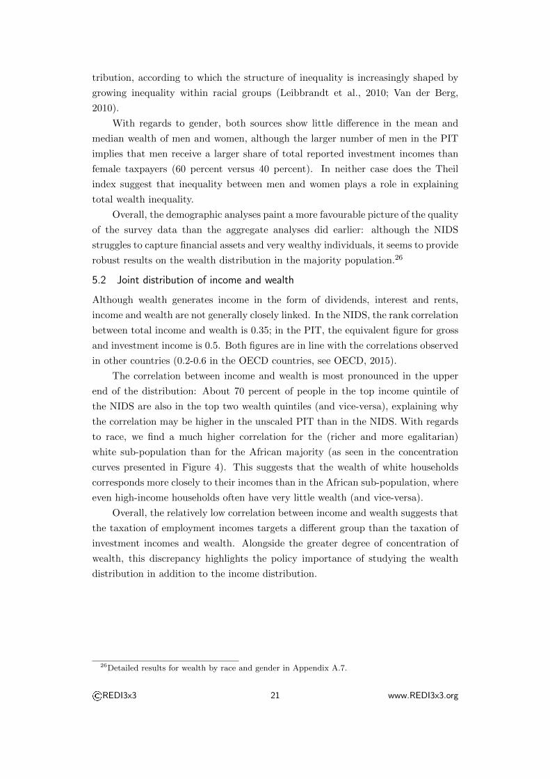
2014, p. 260). Table 6 compares the results for South Africa with other countries.
This paper started with the hypothesis that the two data sets on investment
incomes and wealth were incomplete and inaccurate, and needed to be integrated in
order to gain robust estimates of the wealth distribution. I expected the survey data
to represent only the bottom 95 percent or so of the population, while I knew that the
tax data only covered the top 20 percent. I was thus surprised to find that the two
data sets led to surprisingly similar conclusions once I defined appropriate censoring
rules and parametric assumptions for the underlying distributions. Although the
wealth shares for the top one percent of the population ranged from around 50 to
just under 100 percent, the wealth share for the top 10 percent remained close to
90-95 percent across a variety of specifications. For labour incomes (whose definition
is more comparable between the survey and the tax data), the distributional metrics
coincided almost perfectly between the two sources.
The comparability of the scaled estimates could be a result of the extreme
degree of concentration: With a top 10 percent wealth share above 90 percent even
in the survey that was thought to understate wealth inequality, all other estimates
were bound to be close. Yet despite its shortcomings, this study concludes on the
optimistic note that we can learn a lot about the wealth distribution even if the data
are incomplete and inaccurate. This finding should provide some encouragement to
researchers practitioners who wish to study wealth inequality in other countries in
which the data is even scarcer data than in South Africa.
©REDI3x3 23 www.REDI3x3.org
Table 6: Top wealth shares across countries and sources
CountryTop10%
Top1%
Data Reference
South Africa∗ ≥ 90 ≥ 50 Survey author’s calculationsSouth Africa∗ ≥ 95 ≥ 60 PIT author’s calculationsSouth Africa 72 40 Estimated Stierli et al. (2014)
United States 75 34 Survey Federal Reserve Bank (2014)United States 79 37 Survey + Forbes Vermeulen (2014)United States 77 58 PIT Saez and Zucman (2014)
France 50 18 Survey ECB (2013b)France 51 19 Survey + Forbes Vermeulen (2014)France∗ 61 21 Estate Tax Piketty et al. (2006)
Germany 59 24 Survey ECB (2013b)Germany 68 33 Survey + Forbes Vermeulen (2014)
World 87 48 Estimated Davies et al. (2016)
Note: Comparison of top wealth shares across countries and data sources. ∗Asterisks denotewealth shares on the level of individuals rather than households.
References
Albacete, N., P. Lindner, K. Wagner, and S. Zottel (2012). Eurosystem House-
hold Finance and Consumption Survey 2010: Methodological Notes for Austria.
Monetary Policy & the Economy Q3/12 Add.
Alvaredo, F. and A. B. Atkinson (2010). Colonial Rule, Apartheid and Natural Re-
sources: Top Incomes in South Africa, 1903-2007. CEPR Discussion Paper 8155.
Ando, A. and F. Modigliani (1963). The “Life Cycle” Hypothesis of Saving: Ag-
gregate Implications and Tests. American Economic Review 53 (1), 55–84.
Andreasch, M. and P. Lindner (2014). Micro and Macro Data: A Comparison of the
Household Finance and Consumption Survey with Financial Accounts in Austria.
ECB Working Paper Series 1673.
Aron, J. and J. Muellbauer (2006). Estimates of Household Sector Wealth for South
Africa, 1970-2003. Review of Income and Wealth 52 (2), 285–307.
Aron, J., J. Muellbauer, and J. Prinsloo (2008). Estimating the Balance Sheet of
the Personal Sector in an Emerging Market Country: South Africa, 1975-2005.
In J. B. Davies (Ed.), Personal Wealth from a Global Perspective, Volume 99, pp.
196–223. Oxford: Oxford University Press.
©REDI3x3 24 www.REDI3x3.org

Battistin, E., R. Blundell, and A. Lewbel (2009). Why Is Consumption More
Log Normal than Income? Gibrat’s Law Revisited. Journal of Political Eco-
nomy 117 (6), 1140–1154.
Billor, N., A. S. Hadi, and P. F. Velleman (2000). BACON: Blocked Adaptive
Computationally Efficient Outlier Nominators. Computational Statistics and Data
Analysis 34 (3), 279–298.
Bricker, J., A. Henriques, J. Krimmel, and J. Sabelhaus (2016). Estimating Top
Income and Wealth Shares: Sensitivity to Data and Methods. American Economic
Review: Papers & Proceedings 106 (5), 641–645.
Brown, M., R. C. Daniels, L. D. Villiers, and I. Woolard (2015). National Income
Dynamics Study Wave 2 User Manual, Version 2.3.
Clauset, A., C. R. Shalizi, and M. E. J. Newman (2009). Power-Law Distributions
in Empirical Data. SIAM Review 51 (4), 661–703.
Daniels, R. C., A. Finn, and S. Musundwa (2014). Wealth Data Quality in the
National Income Dynamics Study Wave 2. Development Southern Africa 31 (1),
31–50.
Davies, J. B., R. Lluberas, and A. F. Shorrocks (2016). Estimating the Level and
Distribution of Global Wealth, 2000-14. UNU-WIDER Research Paper 2016/3.
Davis Tax Committee (2015). First Interim Report on Estate Duty for the Minister
of Finance, January 2015.
European Central Bank (2013a). The Eurosystem Household Finance and Con-
sumption Survey - Methodological Report for the First Wave. ECB Statistics
Paper Series 1.
European Central Bank (2013b). The Eurosystem Household Finance and Con-
sumption Survey - Results From the First Wave. ECB Statistics Paper Series 2.
Federal Reserve Bank (2014). Changes in US Family Finances from 2010 to 2013:
Evidence from the Survey of Consumer Finances. Federal Reserve Bulletin 98 (2),
1–80.
Gabaix, X. (2009). Power Laws in Economics and Finance. Annual Review of
Economics 1, 255–294.
Gollin, D. (2002). Getting Income Shares Right. Journal of Political Eco-
nomy 110 (2), 458–474.
Greene, W. H. (2012). Econometric Analysis (7th ed.). Essex: Pearson.
©REDI3x3 25 www.REDI3x3.org

International Monetary Fund (2014). Fiscal Policy and Income Inequality. IMF
Policy Paper .
Jenkins, S. P., R. V. Burkhauser, S. Feng, and J. Larrimore (2011). Measuring
Inequality Using Censored Data: A Multiple-Imputation Approach to Estimation
and Inference. Journal of the Royal Statistical Society. Series A: Statistics in
Society 174 (1), 63–81.
Karabarbounis, L. and B. Neiman (2014). The Global Decline of the Gabor Share.
Quarterly Journal of Economics 129 (1), 61–103.
Klass, O. S., O. Biham, M. Levy, O. Malcai, and S. Solomon (2006). The Forbes
400 and the Pareto Wealth Distribution. Economics Letters 90 (2), 290–295.
Leibbrandt, M., I. Woolard, and L. De Villiers (2009). Methodology: Report on
NIDS Wave 1. NIDS Technical Paper 1.
Leibbrandt, M., I. Woolard, A. Finn, and J. Argent (2010). Trends in South African
Income Distribution and Poverty Since the Fall of Apartheid. OECD Social,
Employment and Migration Working Papers 101.
Lydall, H. F. (1976). Theories of the Distribution of Earnings. In A. B. Atkinson
(Ed.), The Personal Distribution of Incomes, pp. 15–46. London: Allen & Unwin.
McGrath, M. D. (1982). Distribution of Personal Wealth in South Africa. Economic
Research Unit, University of Natal Occasional Paper 14.
Mitzenmacher, M. (2001). A Brief History of Generative Models for Power Law and
Lognormal Distributions. Internet Mathematic 1 (2), 226 – 251.
Modigliani, F. and R. Brumberg (1954). Utility Analysis and the Consumption
Function: An Interpretation of Cross-Section Data. In K. Kurihara (Ed.), Post
Keynesian Economics, pp. 388–436. New Brunswick: Rutgers University Press.
Montroll, E. W. and M. F. Shlesinger (1982). On 1/f Noise and Other Distributions
with Long Tails. Proceedings of the National Academy of Sciences of the United
States of America 79 (10), 3380–3383.
National Treasury (2012). Strengthening Retirement Savings: Overview of the 2012
Budget Proposals. Pretoria: National Treasury.
OECD (2015). In it Together. Why Less Inequality Benefits All. Paris: OECD
Publishing.
Orthofer, A. (2015). Private Wealth in a Developing Country: A South African
Perspective on Piketty. ERSA Working Paper 564.
©REDI3x3 26 www.REDI3x3.org

Pareto, V. (1897). Cours d’Economie Politique, Professe a l’Universite de Lausanne.
Tome Second. Lausanne: F. Rouge.
Piketty, T. (2014). Capital in the Twenty-First Century. Cambridge: Harvard
University Press.
Piketty, T., G. Postel-Vinay, and J.-L. Rosenthal (2006). Wealth Concentration
in a Developing Economy: Paris and France, 1807-1994. American Economic
Review 96 (1), 236–256.
Piketty, T. and E. Saez (2006). The Evolution of Top Incomes. NBER Working
Paper 11955.
Ravallion, M. (2003). Measuring Aggregate Welfare in Developing Countries: How
Well do National Accounts and Surveys agree? Review of Economics and Stat-
istics 85 (3), 645–652.
Saez, E. and G. Zucman (2014). Wealth Inequality in the United States since 1913:
Evidence From Capitalized Income Tax Data. NBER Working Paper 20625.
Sierminska, E., A. Brandolini, and M. Timothy (2008). Comparing Wealth Distribu-
tion Across Rich Countries: First Results From the Luxembourg Wealth Study.
IFC Bulletin 25 (1).
South African Revenue Service (2011). Guide on Income Tax and the Individual
(2010/2011). Pretoria: South African Revenue Service.
South African Revenue Service (2012). 2012 Tax Statistics. Pretoria: National
Treasury and South African Revenue Service.
Southern Africa Labour and Development Research Unit (2015). National In-
come Dynamics Study 2010-2011, Wave 2 [dataset], Version 2.3. Cape Town:
DataFirst.
Stierli, M., A. Shorrocks, J. B. Davies, R. Lluberas, and A. Koutsoukis (2014).
Credit Suisse Global Wealth Report 2014. Zurich: Credit Suisse AG.
Van der Berg, S. (2010). Current Poverty and Income Distribution in the Context
of South African History. Stellenbosch Economic Working Papers 22.
van Heerden, J. (1997). Personal Wealth in South Africa: Facts about its Distribu-
tion and the Forces Behind its Redistribution. Doctoral thesis, Rice University.
Vermeulen, P. (2014). How Fat is the Top Tail of the Wealth Distribution? ECB
Working Paper Series 1692.
©REDI3x3 27 www.REDI3x3.org

Weber, S. (2010). Bacon: An Effective Way to Detect Outliers in Multivariate Data
Using Stata (and Mata). Stata Journal 10 (3), 331–338.
Wittenberg, M. (2009). Weights: Report on NIDS Wave 1. NIDS Technical Paper 2.
Wolff, E. N. (Ed.) (1987). International Comparisons of the Distribution of House-
hold Wealth. Oxford: Clarendon Press.
©REDI3x3 28 www.REDI3x3.org

Appendices
Appendix A: NIDS
This appendix contains additional information on the wealth data in the second
wave of the National Income Dynamics Study (NIDS) and on the methodology used
to analyse it (sections A.1 - A.6). It also contains additional tables on some of
the results that were discussed only briefly in this paper, notably on the distribu-
tion at the level of households and the distribution of wealth within and between
demographic groups (section A.7).
A.1 Non-response and imputations
There are two types of missing values in survey data: Unit non-response occurs
when a household or individual is not successfully interviewed (because he or she is
unavailable or refuses to participate); item non-response occurs when an interviewee
does not answer a specific question (because he or she doesn’t know the answer or
refuses to answer). For the latter case, NIDS/SALRDU provides a set of regression-
based imputations (see Brown et al., 2015).
Since imputations run the risk of smoothing out the wealth distribution, I do not
use imputed series. However, I treat missing values in three straightforward ways:
First, I substitute missing values for zeros when this follows from previous responses
on categorical questions (e.g., setting banking assets to zero if the answer to “Do
you have a bank account?” was negative). For some variables, the NIDS poses
bracket questions (“Would you say the amount was more or less than X Rand?”)
when respondents don’t know the value of their income or wealth. In this case,
I substitute missing values on the quantification question for the mid-point of the
resulting brackets. Third, I follow SALDRU’s approach of substituting valid answers
to the one-shot question for missing values on income and wealth, as described in
Section 3.1.1. Fourth, I substitute one-shot responses when these exceed the bottom-
up estimate in absolute terms due to item non-responses on category level (i.e, the
individual or household does not have valid responses for all classes of assets and
liabilities).27 Table 7 provides an overview of this process for four selected variables,
while Table 8 summarizes the process of construction the final wealth aggregates.28
27The results from the one-shot wealth question are an imperfect substitute for bottom-up data:On the adult level, the correlation between bottom-up and one-shot wealth is 14 percent, on thehousehold level it is 42 percent.
28The NIDS also includes durable goods, informal loans from family or friends and unpaid servicebills or taxes. For consistency with the national accounts, I do not consider these items as assets andliabilities. Although housing is included in the household questionnaire, the individual questionnairecontains a question on outstanding home loans. I use these data to impute missing values on thehousehold level.
©REDI3x3 29 www.REDI3x3.org

Table 7: Treatment of missing values: Selected variables
Adult Questionnaire Household
Labourincome
Bankingassets
One-shotwealth
One-shotwealth
Questionnaires 23 846 23 846 23 846 8986Entries for question 17 601 16 869 16 872 6196% of total 74 71 71 69% of total, weighted 86 82 82 91
Categorical questions (“yes/no” or “zero/non-zero”)
Don’t know (%) 0 0 44 37Refused (%) 0 2 5 6Answered no/zero (%) 77 66 36 36Answered yes/non-zero (%) 23 32 15 21
“Quantifiable” responses 4018 5449 2469 1326% of total 17 23 10 15
Quantification questions
Missing (%) 0 1 4 0Don’t know (%) 3 14 18 26Refused (%) 8 20 1 1Quantified (%) 88 65 77 73
“Raw” observations 3541 3559 1910 964% of total 15 15 8 11
Data imputations
Drop ‘unjustified’ zeros 0 −1302 −2 0Include missing zeros∗ 13 515 11 101 6038 2227Values from brackets∗ 511 461 321
Used observations 17 567 13 358 8407 3512% of total 74 56 35 39% of total, weighted 60 45 55
Note: Treatment of missing values, selected variables, NIDS, 2010. Un-weighted counts. *Re-placement of missing values with data from categorical questions (zero values for “no”/“zero”-answers). **Replacement of missing values with data from bracket questions (e.g., R2500 forthe bracket R0-5000).
©REDI3x3 30 www.REDI3x3.org

Table 8: Derivation of total wealth
Response rate (%)Item Survey Total Non-zero Notes
Private pension A 78 1+ Life insurance A 77 5
= Assets: pension/life 80 2 (1)
Cash on hand A 76 19+ Bank account A 60 15+ Trusts, stocks, shares A 81 0
= Assets: other financial 66 27 (1)
Personal loan A 81 2+ Study loan A 82 0+ Vehicle finance A 81 1+ Hire purchase A 82 2+ Credit card A 81 2+ Store card A 81 6+ Mashonisa loan A 82 1+ Micro loan A 82 0
= Liabilities: non-mortgage 82 11 (1)
Net business wealth A 29 1 (2)
⇒ Individual-level wealth (bottom-up) 81 31 (3)
Assets: real estate H 70 57+ Assets: livestock H 85 4− Liabilities: mortgages H 95 7
⇒ Household-level wealth (bottom-up) 94 59 (4)
⇒ Total individual wealth (bottom-up) 81 31 (5)One-shot wealth A 45 17 (2)
⇒ Total individual wealth 93 55 (6)
Note: Derivation of household-level wealth data, NIDS, 2010. Calculations based on weightedsample using post-stratified weights. Specific notes: (1) Aggregation of above items; (2) Fromone-shot question; (3) Aggregation of financial assets, financial liabilities (−), net businesswealth; (4) Aggregation of real estate assets, mortgage liabilities (−), livestock assets; (5)Allocation of real estate wealth evenly to co-owners (where available) or household members,allocation of livestock assets evenly to household members; (6) Imputation of valid, non-zeroone-shot question for missing values or zero values in bottom-up estimate or when one-shotresponse exceeds bottom-up estimate in absolute terms due to item non-responses on categorylevel (not all asset/liability classes with valid responses).
©REDI3x3 31 www.REDI3x3.org

A.2 Sampling and response biases
A.2.1 Sampling bias and survey weights
A sampling bias arises when a survey systematically under-samples specific groups.
SALDRU provides two sets of weights to correct for sampling biases in the NIDS.
Design weights correct for biases in the probability that a household is included and
interviewed in the survey. Post-stratified weights further adjust the weights to reflect
the national, provincial and sex-race-age group population totals as given by current
population estimates in each wave. Since income, expenditure and wealth variables
tend to be correlated with sex, race and age, SALDRU recommends the use of these
weights to reduce the sampling bias for cross-sectional analyses (Leibbrandt et al.,
2009; Wittenberg, 2009; Brown et al., 2015).
As Table 9 shows, the use of post-stratified weights has little impact on the
estimates of income inequality, but lowers our estimate for (top one percent) wealth
inequality significantly.
A.2.2 Response bias
A response bias arises if respondents to the survey or certain questions within the
survey differ systematically from non-respondents. The typical finding is that better-
off households are less likely to participate in surveys.
Figure 5 depicts non-response rates by income deciles. It suggests that non-
response rates do not differ strongly between income deciles, and are actually higher
among higher-income individuals once we impute one-shot questions for non-responses.
This finding is confirmed in a formal F-test on the null hypothesis of equal income
between respondents and non-respondents (see Table 10). One reason for the pos-
itive gradient between derived response rates and incomes could be that a “break-
even” response to the one-shot wealth question is counted as zero wealth, while the
response that the individual would have “something left over” needs to be quantified
to count as non-missing.
In contrast to the finding that non-respondents have equal (bottom-up) or lower
(derived wealth) incomes, the same tests suggest that non-respondents are more
highly educated than respondents. Although we also find that non-respondents
to the bottom-up wealth questions are more likely to be white and female than
respondents, the results are inconclusive for age, race and gender at the level of
derived wealth.
©REDI3x3 32 www.REDI3x3.org

Table 9: Distributional implications of survey weights
No weights Design weights Calibrated weights
Wealth
Top 1 % 79 66 61Top 10 % 98 97 95Middle 40% 4 4 6Bottom 50% −2 −1 −1
Total (%) 100 100 100
Income
Top 1 % 20 20 17Top 10 % 56 60 59Middle 40% 37 34 35Bottom 50% 7 6 6
Total (%) 100 100 100
Note: Quantile shares, NIDS, 2010, in percent. Calculations using adult-level data.
Figure 5: Response rates by income quintile
Note: Response rate by income quintile, NIDS, 2010. Left column shows response rates(including split between zero and non-zero quantifications) for asset-level questions; rightcolumn shows availability of data once asset-level questions from individual and householdsurvey are combined with one-shot responses.
©REDI3x3 33 www.REDI3x3.org

Table 10: Test for response bias
Share of total (%) Mean income (R) F-TestResp. Non-Resp. Resp. Non-Resp.
Bottom-upIndividual 81 19 2 850 3 253 0.75Household 92 8 6 506 5 872 0.39
Derived wealthIndividual 94 7 2 988 1 518 12.7∗∗∗
Household 99 1 6 457 6 647 0.00
Note: Comparison of survey means of monthly income by respondent status on wealth ques-tions, NIDS, 2010. “Bottom-up” refers to the completion of the wealth-related questions inthe adult- or household questionnaire, “Derived wealth” includes one-shot wealth alongsideresults from both adult questionnaires. Column “F-Test” reports the value of the F-statisticand indicates the p-value (∗∗∗ : p < 0.01, ∗∗ : 0.01 ≤ p < 0.05, ∗ : 0.05 ≤ p < 0.1). Calculationsbased on weighted sample using adult-level data and post-stratified weights.
©REDI3x3 34 www.REDI3x3.org

A.3 Outliers
I attempt to systematically identify outliers using the multivariate approach pro-
posed by Billor et al. (2000) and implemented in STATA by Weber (2010). This
algorithm starts with the subset with the smallest Mahalabonis distance from the
whole sample, and iteratively adds all observations with a distance smaller than
some threshold, defined as a percentile of the χ2-distribution (Billor et al., 2000;
Weber, 2010). One challenge when using this method is therefore the specification
of the relevant variables, the other is the definition of the threshold: Which charac-
teristics plausibly predict a household’s wealth, and how far shall we allow them to
deviate from the predicted levels before we dismiss the household as an outlier?
Ideally, we would like to determine the outliers based on a broad set of predictive
variables. Since wealth generates income in the form of interest, dividends or rents,
I include the person’s income from capital sources (interests, dividends, rents and
private pension incomes), alongside his or her total income and an indicator whether
or not he or she receives government grants (which, being means-tested, should be
inversely related to wealth). In line with the life-cycle hypothesis of savings and
wealth, I also include the age and squared age of the individual. I include level
of education of as a proxy of lifetime income as well as financial acumen. Finally,
I include an indicator of whether a person uses sophisticated financial products –
either a private pension, life insurance or trusts, stocks and shares, and whether he
or she is a co-owner of the house.
Table 11 summarizes the results of the multivariate outlier detection model.
As soon as we exclude about 20 people, the wealth share of the richest 10 percent
starts to stabilize at around 90 percent. The analysis of these outliers suggests that
we are excluding primarily the wealthiest people in the survey, although we also
drop several people whose wealth is low compared to their incomes. The mean and
median wealth and incomes of the outlier population are much larger than that of
the full sample.
©REDI3x3 35 www.REDI3x3.org

Table 11: NIDS – Multivariate outlier analysis
Wealth Income
Threshold Outliers Top 10% Top 1% Top 10% Top 1%
0.01% 24/13 497 92 47 57 170.05% 32/13 497 92 47 56 160.10% 374/13 497 90 33 56 160.50% 388/13 497 89 29 55 151% 402/13 497 89 28 55 155% 438/13 497 88 23 53 1110% 454/13 497 88 24 52 11
Full sample 0/19 436 95 61 58 17
Note: Multivariate outlier detection based on the household’s income (total and capital in-come), age/squared age and education level, as well as indicator variables for the ownershipof a home, a bank account, pension annuity, trusts, stocks or shares, and of receipt of a gov-ernment grant. “Threshold” denotes the 1-xth percentile of the χ2-distribution; “Outliers”gives the number of outliers identified under this threshold. Calculations based on weightedsample using adult-level data and post-stratified weights.
©REDI3x3 36 www.REDI3x3.org
A.4 Re-sampling of the top tail
A variable follows a power law if it is drawn from a probability distribution
p(x) = Cx−α if x ≥ xmin (3)
where xmin is the lower bound on power law behaviour, the “tail index” α determines
the “weight” of the tail, and C is a normalization constant that ensures that the
total probability sums up to one. Taking logarithms, this means that ln p(x) =
α ln x+constant, so a power law distribution is consistent with a linearly downward-
sloping histogram on a log-log chart (Mitzenmacher, 2001; Clauset et al., 2009). The
break-point between the concave and straight portion of the histogram then provides
an indication for the value of xmin.
Figure 6 shows the log-log histogram (empirical complementary cumulative dis-
tribution function) for income and wealth in the NIDS. For incomes, the chart in-
dicates power-law behaviour within the top 1% of the distribution; for wealth, the
threshold seems to be closer to 0.25% (which could point to under-sampling or
under-reporting at the top of the distribution).
I follow the procedure proposed by Clauset et al. (2009) to fit and test a power
law distribution under different levels of xmin.29 Table 12 and Table 13 summarize
the results for the NIDS and the PIT. With estimates for xmin and α, we can make
conditional draws from the distribution using inverse random sampling,
x =xmin
U1/α(4)
where U denotes uniformly distributed random number over the interval [0,1). Since
I only re-sample a limited number of observations, I use a bootstrapping approach
to increase the robustness. I run 100 draws with replacement for each resampled
individual, and average the resulting top-wealth shares and Gini coefficients over
these draws.
29Clauset et al. (2009) suggest to chose the threshold at which the Kolmogorov-Smirnov stat-istic (which measures the distance between the density functions of the actual and fitted data) isminimized.
©REDI3x3 37 www.REDI3x3.org

Figure 6: NIDS – Power-law distribution
Note: Empirical complementary cumulative distribution function (CCDF) on a log-log chart,NIDS, 2010. Plots of unweighted adult-level data.
Table 12: NIDS – Power law distribution
wmin Observations % of total KS α
500 000 383 2.0 0.12∗∗∗ 1.0 (0.05)750 000 267 1.4 0.10∗∗∗ 1.0 (0.06)
1 000 000 209 1.1 0.13∗∗∗ 1.1 (0.07)1 250 000 160 0.8 0.15∗∗∗ 1.0 (0.08)2 500 000 83 0.4 0.26∗∗∗ 1.0 (0.11)5 000 000 61 0.3 0.24∗∗∗ 1.8 (0.23)
Note: Fitting the power law distribution for wealth > wmin, NIDS, 2010. Column “KS”reports the value of the (combined) Kolmogorov-Smirnov statistic and indicates the p-value(∗∗∗ : p < 0.01, ∗∗ : 0.01 ≤ p < 0.05, ∗ : 0.05 ≤ p < 0.1). Column “α” reports standarderrors in parentheses. Calculations based on weighted sample using adult-level data and post-stratified weights.
Table 13: PIT – Power law distribution
wmin Observations % of total KS α
50 000 89 857 7.7 0.01∗∗∗ 1.4 (0.01)75 000 50 446 4.3 0.02∗∗∗ 1.4 (0.01)
100 000 34 239 2.9 0.02∗∗∗ 1.5 (0.01)125 000 25 124 2.1 0.03∗∗∗ 1.5 (0.01)250 000 9331 0.8 0.01 1.6 (0.02)500 000 2968 0.3 0.02∗ 1.6 (0.03)
Note: Fitting the power law distribution for total investment income > wmin, PIT, 2010.Column “KS” reports the value of the (combined) Kolmogorov-Smirnov statistic and indicatesthe p-value (∗∗∗ : p < 0.01, ∗∗ : 0.01 ≤ p < 0.05, ∗ : 0.05 ≤ p < 0.1). Column “α” reportsstandard errors in parentheses. Calculations based on unadjusted, unscaled PIT data.
©REDI3x3 38 www.REDI3x3.org

A.5 Portfolio composition
Table 14 compares the portfolio composition in the NIDS data to the national ac-
counts. One salient feature in this comparison is the understatement if financial
assets relative to the non-financial assets in the survey. Pension and non-pension
financial assets each constitute a third of total assets in the national accounts, but
only 10 percent of total assets in the NIDS. While the composition of liabilities
matches the national accounts more closely, the debt-asset ratio shows that liabil-
ities are understated to an even greater extent than assets. This finding is largely
robust to the removal of outliers (as identified in Appendix A.7).
Table 5 reports the wealth distribution by asset class. It shows that the distri-
bution of total assets is very similar to the distribution of net wealth, which justifies
the comparison between wealth in the NIDS and assets in the PIT.
Table 14: NIDS – Portfolio composition
Full NIDSsample
Trimmedsample
Pensionadjusted
Nationalaccounts
Pension/life assets 11 16 47 36Non-pension financial assets 9 13 5 32Real estate assets 76 67 45 26Other non-financial assets 4 4 2 6
Total assets 100 100 100 100
Mortgage debt 52 76 52 57Other debt 48 24 48 43
Total liabilities 100 100 100 100
Liabilities/assets (%) 11 6 7 20Wealth/income (%) 538 426 774 231
Note: Portfolio composition, NIDS, 2010, in percent of total assets (liabilities). “Trimmedsample” excludes outliers (see Appendix A.3). “Pension adjusted sample” includes adjustmentfor pensions (see Appendix A.6). Calculations based on weighted sample using adult-level dataand post-stratified weights, using complete observations only (i.e. individuals without missingvalues on the level of any asset class: n = 4, 917 in full sample; n = 4, 275 in trimmed sample).
©REDI3x3 39 www.REDI3x3.org

A.6 Pensions in the NIDS
Despite the fact that half of private- and public-sector employees are covered by
occupational pension schemes (National Treasury, 2012), only five percent of adults
reported owning a pension or retirement annuity in the NIDS, and only a third of
these were able or willing to provide a quantification. I attempt to correct for this
by imputing pension assets for all employed individuals with zero- or non-responses
regarding the current value of these assets.
Under the assumption of consumer price inflation (πp) of 6%, wage inflation
(πw) of 8% (including promotional effects), nominal investment returns (r) of 10%,
a constant contribution rate of 15% of the annual labour market income (y) and
a starting age of 25 years, we can estimate the current value of a person’s pension
from his or her age and current contributions (ccurr = 0.15×y). Since pension funds
allow people to withdraw their pension assets when switching between jobs, I also
apply a 50% withdrawal discount (w) on the estimated assets in pension funds.30
I first estimate the initial pension and retirement fund contribution at age 25
(cini) per Equation 5, and then calculate the current value of previous contributions
per Equation 6, where n denotes the number of years between 25 and the current
age:
cini =ccurr
(1 + r)n(5)
passets = cini ×(1 + r)n − (1 + πw)n
(r − πw)× (1− w) (6)
This imputation raises the share of pension assets from just above 10 to to
just below 50 percent of assets – considerably higher than in the national accounts
(see Table 14). Since withdrawal rates are likely higher for low-income people (who
switch jobs more often and have greater need to use their pensions to support con-
sumption between jobs), this estimation likely understates true inequality (National
Treasury, 2012).
30The author acknowledges the advice of Davy Corobulo and Natalie Van Zyl with regards torealistic assumptions on retirement saving dynamics in South Africa.
©REDI3x3 40 www.REDI3x3.org

A.7 Additional results
Table 15 summarizes income and wealth shares on the level of households. Com-
pared to the results on the level of individuals, the income and wealth shares of
the top 10 percent drop by 6-8 percentage points; the shares of the middle 40 per-
cent increase by almost as much. This reflects the fact that the pooling of wealth
within households smoothes out some of the spikes in income and wealth, while the
distribution for the bottom half of the population is largely unaffected.
Tables 16 and 17 contain detailed results for the wealth distribution by ra-
cial group and gender. With regards to race, Table 16 shows that between-group
inequality remains very high, but also shows that within-group inequality of the
African group exceeds that for the overall population, being much higher than the
level of inequality within any other racial group. With regards to gender, Table 17
shows little difference in the mean and median wealth of men and women.
Table 15: NIDS – Individual vs. household-level distribution
Wealth IncomeIndividual Household Individual Household
Top 1% 61 47 17 10Top 10% 95 89 35 51Middle 40% 6 12 35 39Bottom 50% −1 −1 7 10
Gini 0.98 0.89 0.72 0.62
Note: Quantile shares, NIDS, 2010, in percent. Calculations based on weighted sample usingpost-stratified weights.
©REDI3x3 41 www.REDI3x3.org

Table 16: Wealth and race: Within- and between-group inequality
African Coloured Indian White
Median wealth (’000 R) 0 0 10 200Average wealth (’000 R) 32 68 994 1 810
Top 10% wealth share (%) 98 84 84 72Middle 40% (%) 6 17 16 27Bottom 50% (%) -4 -1 0 1Total (%) 100 100 100 100
Observations 15 321 2 547 218 585
Note: Wealth by racial group, NIDS, 2010. Calculations based on weighted sample usingadult-level data and post-stratified weights.
Table 17: Wealth and gender: Within- and between-group inequality
NIDS PIT (unscaled)
Male Female Male Female
Median wealth (’000 R) 0 0 0 3Average wealth (’000 R) 105 103 18 15
Top 10% wealth share (%) 95 94 73 60Middle 40% (%) 7 7 28 41Bottom 50% (%) -2 -1 -1 -1Total (%) 100 100 100 100
Observations 8 004 10 667 668 369 493 397
Note: Wealth by gender, NIDS and PIT, 2010. NIDS calculations based on weighted sampleusing adult-level data and post-stratified weights. PIT calculations based on total investmentincomes, with adjustments for tax-exempt interest income and pensions (unscaled, relative tothe tax-filing sub-population).
©REDI3x3 42 www.REDI3x3.org

Appendix B: PIT
This appendix contains additional information on the data in the second wave of
the Personal Income Tax (PIT) assessment sample of 2011 (section B.1), on the
imputation of pension assets (section B.2) and on the results before scaling to non-
filers (section B.3). It also provides an overview of the assessment sample of 2014,
which was made available by SARS but which was not analysed in this paper (section
B.4).
B.1 PIT Data and Sample
B.1.1 PIT assessment sample
The South African Revenue Services gave us access to a 20 percent sample of the
2011 income tax assessment. Table 18 provides an overview over the series provided
in the assessment sample, and the derivations of the variables used in this paper.
Table 19 then provides an overview over the observations in the 20 percent sample.
B.1.2 PIT filing thresholds
Whether or not someone is included in the PIT database depends on their liability
to file income taxes. In 2011, South African residents were liable to file personal
income taxes if their incomes exceeded the following thresholds (SARS, 2011):
– income from a single employer exceeds R120,000 for the year, and/or
– income from more than one employer exceeds R60,000, and/or
– local interest income in excess of R22,300 for taxpayers below the age of 65 or
R32,000 for taxpayers aged 65 and older and/or
– foreign interest or dividend income in excess of R3,700, and/or
– income from own business, irrespective of the amount.
According to the NIDS, the labour income threshold should be exceeded by only
3-7 percent of employees, while the investment income threshold should be exceeded
by about one third of recipients of investment incomes. In reality, about 95 percent
of tax filers (16 percent of the population) declared incomes from employment in
the PIT, while only 7 percent (1 percent of the population) declared incomes from
investments.
©REDI3x3 43 www.REDI3x3.org
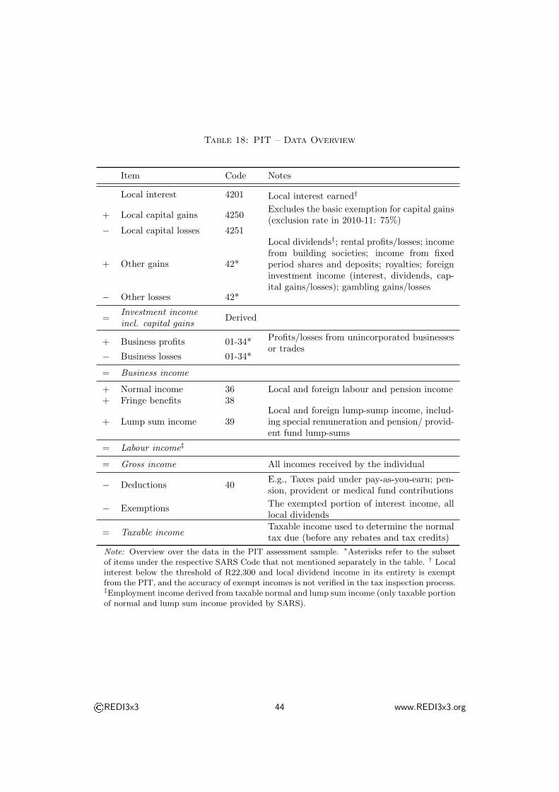
Table 18: PIT – Data Overview
Item Code Notes
Local interest 4201 Local interest earned†
+ Local capital gains 4250Excludes the basic exemption for capital gains(exclusion rate in 2010-11: 75%)
− Local capital losses 4251
+ Other gains 42*
Local dividends†; rental profits/losses; incomefrom building societies; income from fixedperiod shares and deposits; royalties; foreigninvestment income (interest, dividends, cap-ital gains/losses); gambling gains/losses
− Other losses 42*
=Investment incomeincl. capital gains
Derived
+ Business profits 01-34* Profits/losses from unincorporated businessesor trades
− Business losses 01-34*
= Business income
+ Normal income 36 Local and foreign labour and pension income+ Fringe benefits 38
+ Lump sum income 39Local and foreign lump-sump income, includ-ing special remuneration and pension/ provid-ent fund lump-sums
= Labour income‡
= Gross income All incomes received by the individual
− Deductions 40E.g., Taxes paid under pay-as-you-earn; pen-sion, provident or medical fund contributions
− ExemptionsThe exempted portion of interest income, alllocal dividends
= Taxable incomeTaxable income used to determine the normaltax due (before any rebates and tax credits)
Note: Overview over the data in the PIT assessment sample. ∗Asterisks refer to the subsetof items under the respective SARS Code that not mentioned separately in the table. † Localinterest below the threshold of R22,300 and local dividend income in its entirety is exemptfrom the PIT, and the accuracy of exempt incomes is not verified in the tax inspection process.‡Employment income derived from taxable normal and lump sum income (only taxable portionof normal and lump sum income provided by SARS).
©REDI3x3 44 www.REDI3x3.org

Table 19: PIT – Sample Overview
2010-2011 2013-2014 Notes
Total population 49 991 300 52 982 000
Of which aged 15+ 34 487 100 37 527 258
Submitted tax records 5 876 889 5 149 506
Implausible/null values 956 1 516Implausible or null values excludedby SARS
Remaining tax records 5 875 933 5 147 990
Of which high-earners 602 1 259“High earners” with taxable incomes> R10 million to be considered sep-arately for confidentiality reasons
20% sample excluding high-earners
1 175 187 1 029 598Assessment sample as made availableby SARS to the author
Ages 15+ only 1 173 469 1 027 289
20% sample of high-earners
120 252
Summary statistics on all 602/1259high earners made available to theauthor (mean, standard deviation,minimum, maximum, 25th, 50th and75th percentiles)
Note: Overview over the observations in the PIT assessment sample. Population totals fromStatsSA mid-year population estimates for 2010 and 2013.
©REDI3x3 45 www.REDI3x3.org

B.2 Pensions in the PIT
The PIT provides no information on investment incomes on pension assets. However,
the PIT contains data on current contributions to pension or retirement annuity
funds, which allow us to estimate the current value of pension assets in analogy
to the procedure described for the NIDS (see Appendix A.6). The main difference
is that we can read current contributions directly from the data (as opposed to
estimating it at 15% of current earnings), and that we can distinguish contributions
to pension funds and from contributions to retirement annuity funds. Since assets
in the latter cannot be withdrawn before retirement, I apply the 50% discount to
the assets in pension funds only.
Since the PIT works records investment incomes rather than the underlying
assets, the annual investment income on pension assets needs to be estimated per
Equation 7:
pincome = passets × r (7)
I set the investment income from pension assets to zero for people below 25,
and to missing for people above 65.31 When calculating distributional statistics for
pension assets (or total investment income including pension assets), we work on
the population below 65 years only.
When estimating investment incomes on pension assets with this approach, we
find that they constitute almost 80 percent of total investment incomes. As in the
case of the NIDS, our estimates likely understate the true inequality of pension
wealth significantly (since withdrawal rates and interruptions to contribution times
are likely higher for low-income people).
31Ideally, we would set only retirees to missing, while keeping zero pension wealth for people whoabove 65, do not receive a pension and do not contribute to pension or retirement annuity funds.However, the current SARS dataset does not distinguish between labour and pension incomes underemployment income.
©REDI3x3 46 www.REDI3x3.org

B.3 PIT Unscaled results
Table 20 and Figure 7 provide results on the wealth distribution within the tax-
filing sub-population (prior to scaling), and show the importance of the adjustments
made to the measure of wealth. The imputation of interest incomes below the
filing threshold via a bottom-censored log-normal distribution is the most important
adjustment in the unscaled sample. In the scaled sample, the imputation of interest
incomes below the filing threshold has a much smaller impact.
©REDI3x3 47 www.REDI3x3.org

Table 20: PIT – In-sample (unscaled) distribution
Income source Share 6= 0 Top 10% Top 1% Gini
Employment 91 38 10 0.52
Local interest 3 100 77 0.99Other investment 5 105 82 1.09
Total investment 7 104 68 1.05
Pensions† 52 62 22 0.79
Local interest, adjusted for tax-exempt omissions∗
100 36 12 0.46
Total investment, adjusted fortax-exempt interest∗
100 50 24 0.59
Total investment, adjusted fortax-exempt interest & pensions‡
100 47 19 0.59
Note: Quantile shares, PIT, 2010. Results relative to the tax-filing population (not scaled tonon-filers). Second column contains share of non-zero observations. ∗Adjustment for omissionsof tax-exempt interest income described in Section 3.3.1. †Adjustment for investment incomeon pension assets described in Appendix B.2; Distributional metrics for the population < 65years only. ‡Distributional metrics for the total population (results for the population < 65years only marginally lower). Note that in the presence of individuals with negative investmentincomes, the Gini coefficient is no longer bounded to one (see also OECD, 2015).
Figure 7: PIT – In-sample (unscaled) distribution
Note: Income distribution, PIT, 2010. Unscaled results. Left panel: Kernel density curves oflogged incomes; right panel: Lorenz curves.
©REDI3x3 48 www.REDI3x3.org

B.4 PIT 2014: Main results
SARS also provided us with a 20 percent sample of the 2014 tax assessment for 2013-
2014 tax year. Table 21 summarizes the results for the within-sample distribution.
It suggests that inequality is slightly lower than in the 2010-2011 tax year, although
this is likely due to higher filing rates.
Table 21: PIT – 2010-2011 vs 2013-2014
Income source Share 6= 0 Top 10% Top 1% Gini
2011
Employment 91 38 10 0.52
Local interest 3 100 77 0.99Other investment 5 105 82 1.09
Total investment 7 104 68 1.05
2014
Employment 94 36 10 0.49
Local interest 4 100 78 0.99Other investment 7 102 81 1.02
Total investment 9 102 71 1.01
Note: Quantile shares, PIT, 2010 and 2013. Results relative to the tax-filing population (notscaled to non-filers). Second column contains share of non-zero observations. Note that inthe presence of individuals with negative investment incomes, the Gini coefficient is no longerbounded to one (see also OECD, 2015).
©REDI3x3 49 www.REDI3x3.org

��������� � ������������ ���
���� ��������� ������ � ������� ��� � ���� ���������� � � �� � �������� �������
�������� ������������������ ���� ����������� ����������������������������� � !�������"��� �
�##�����$ ����%&����'������ � �����(����)���������#� �������������������
��� �������#����#�� ��������#������#���� &�����#�������� &��� � �����(� ��� ������#�
�� � ���� �� ���� ����#�(� ��� ���������� ��� & ������� �� ���� ������ ������ ��� ��������
��������������������
���� � !���� ��� #������#� � � � � ��� #��� ���� ��� ��� #���� ������ ��#� ���#����� ��#� � �
& ���� �� ��� ����� ����������� �������� ��������� ��#� �������"����� *�� ����������� ���
��#� ��#���(� ����� ��#� ������#� "� ���#��� ����� ��#� �� ���� ���� �"(� ��� �����#�� � �
� ��������� � � ���������#� ��#� � ��������� ������� ��#� #���� ����� ����������� ����� �����
�##�������������������������� � ������������&&����������
+ ���� ���� �� ����� ������������ ��� ������������� ��#� ��������� ��������� ��#� & ��������
���������������������������������#� ������"��������"��� �!�������� &������������������
���� � !���� �������#����$%,��-��������-���������� &�+� ��� �����#��� ���#���� ����
.��� ���������������
+ ������������������& ����& ����� �� ��������������������#���� ������ ���
�
���/�0123�4�52�
������������ ���


![Untitled-2 []...˘ˇ ˆ ˙ ˇ ˙ ˝ ˛ ˚ˆ ˇ ˛ ˆ ˜ ˆ ˜ ˛ ˆˆ˙ !" # ˙ ˇ ˆ $ ˜ˆ ˆˆ $ ˛ ˙ ˛ ˛ ˆ ˆ ˜ ˆ ˆ $ ˝ ˛ ˚ˆ ˇ ˛ ˙ ˇ ˆ ˇˇ ˆˆ ...](https://static.fdocuments.us/doc/165x107/5e66db259e270c079278a430/untitled-2-oe-oe-.jpg)


![Home [] · ˆ =ˆ - $ #$ ˆ =ˆ ˆ # # #$ ˙ 8 ˆ # > $ # =ˆ ) # $ˆ 8 # # # # # #$ ˆ](https://static.fdocuments.us/doc/165x107/60ebdcabf181280b2f133a78/home-8-8-.jpg)